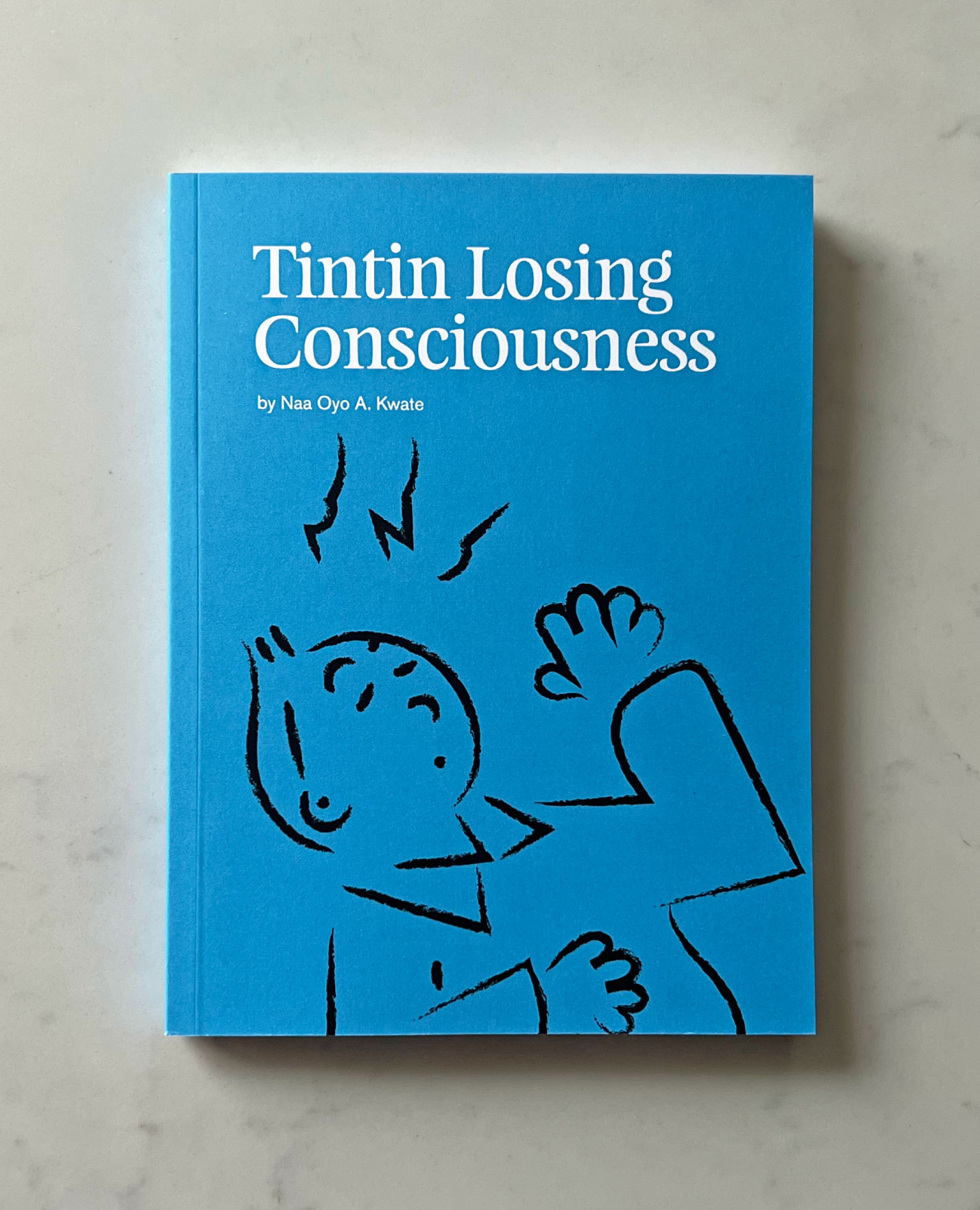
Tintin Losing Consciousness
Naa Oyo A. Kwate
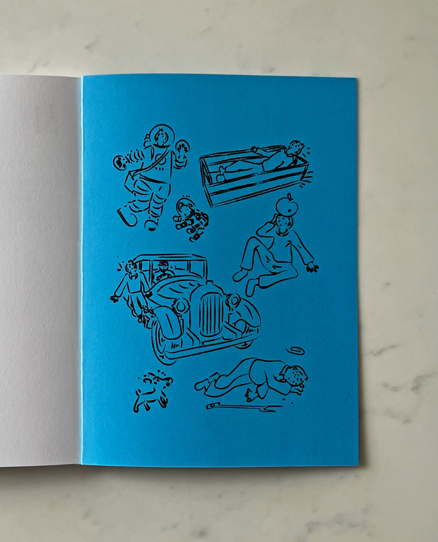
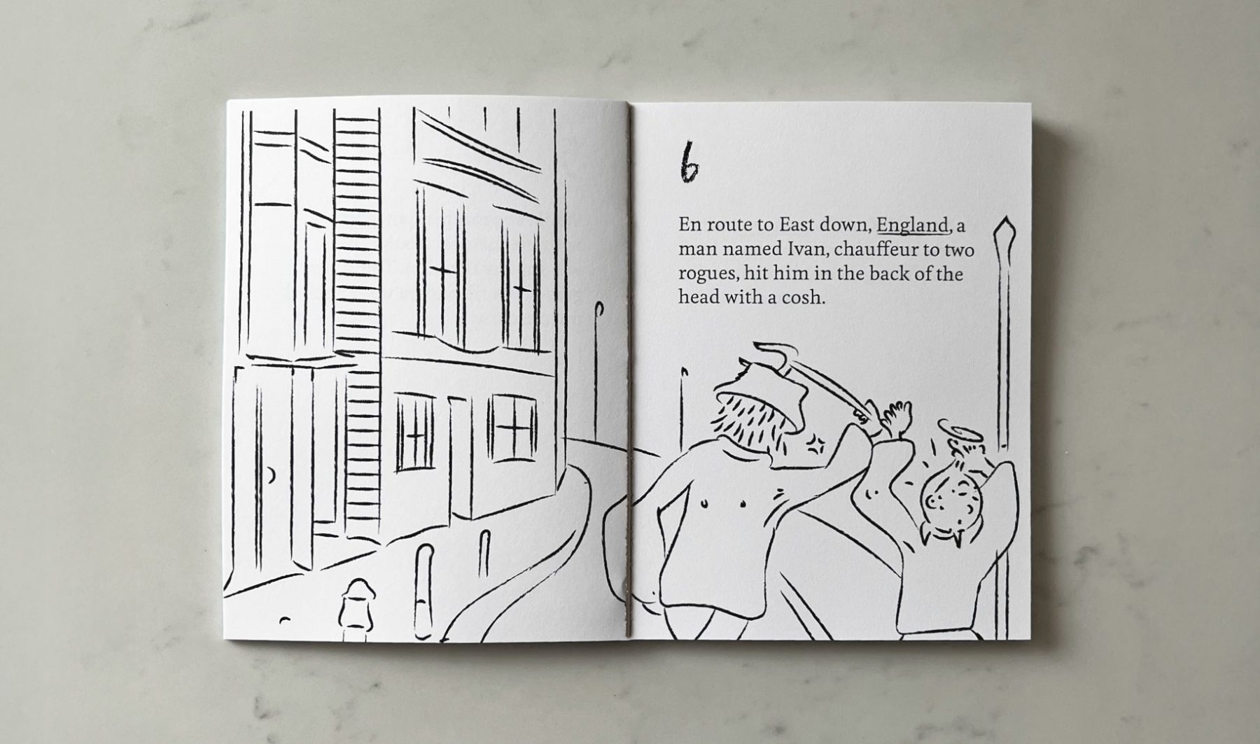
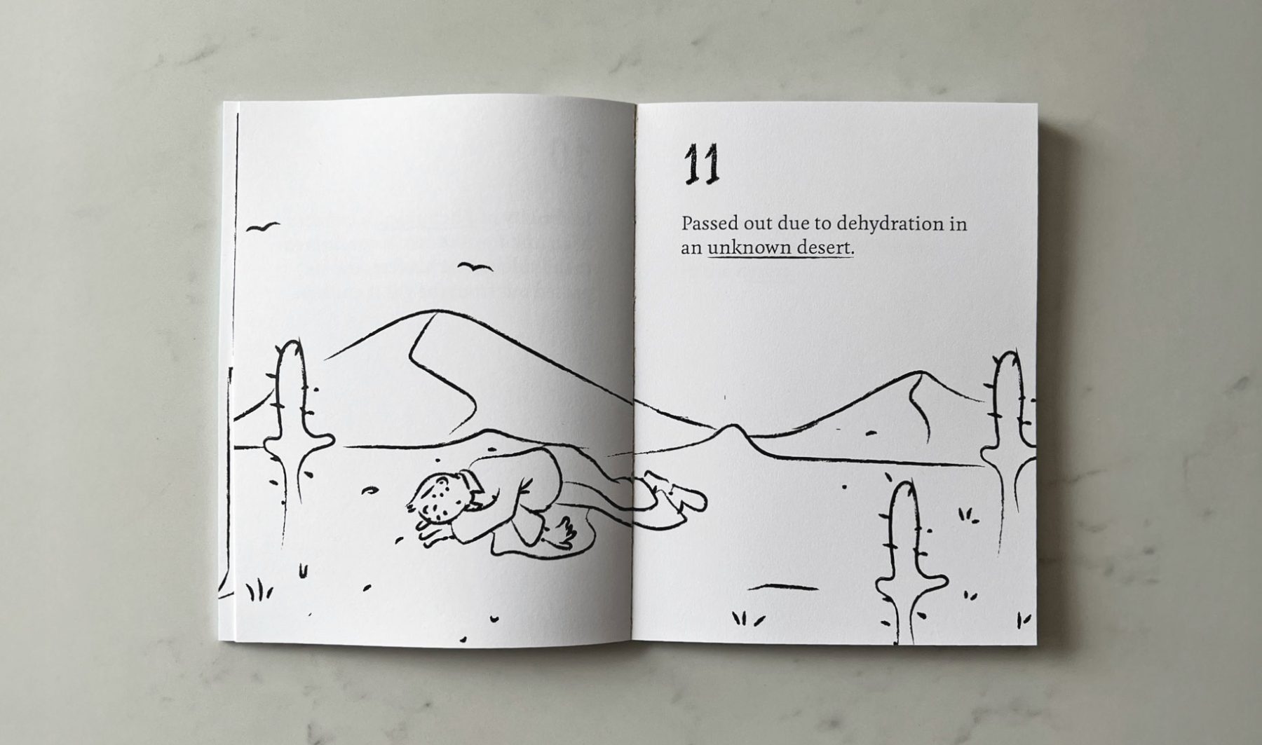
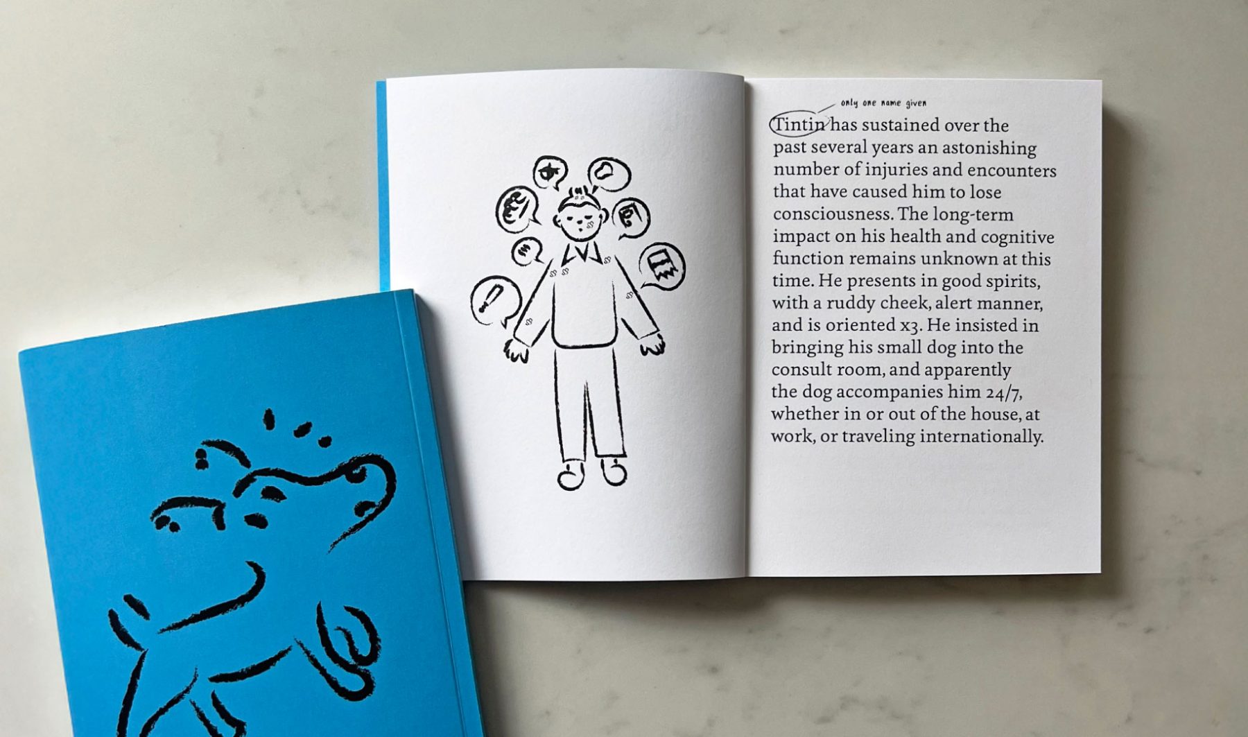
A cheeky look at the fact that Tintin was knocked unconscious an extraordinary number of times and different ways across the adventures penned by Hergé. Conceptualized and written By Naa Oyo A. Kwate, this artist book includes fan-art style drawings of the many incidents in which Tintin has lost consciousness. Self-published in an edition of 50.
Buy from Good Press UK
KUDOS Design Collaboratory
-
John Kudos
Creative Director -
Fay Qiu
Designer -
Lauwrencia Eka Darmawan
Illustrator -
Muhammad Syamil
Illustrator
Black Power to Black People
Poster House
Capabilities
Focus Area
Client
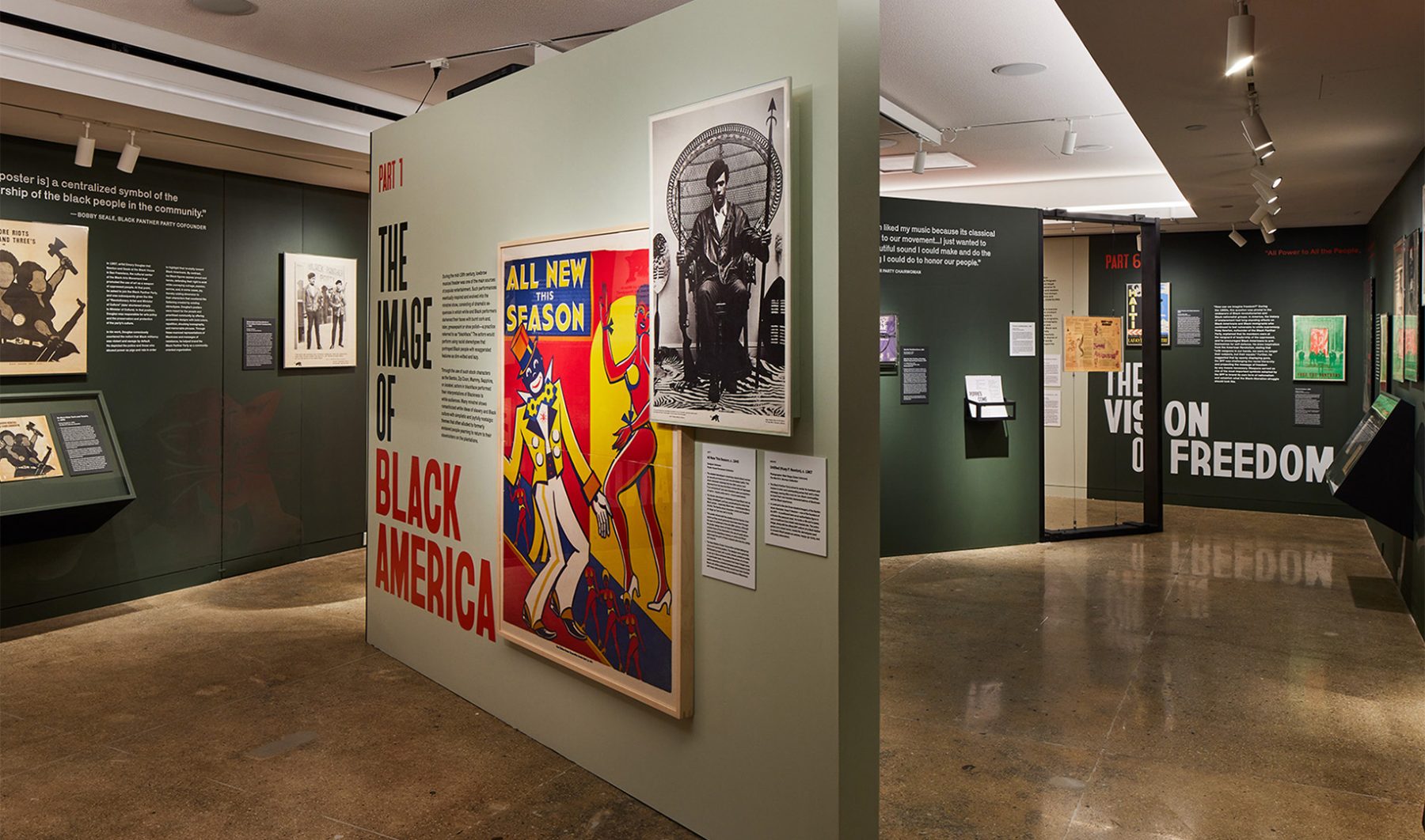
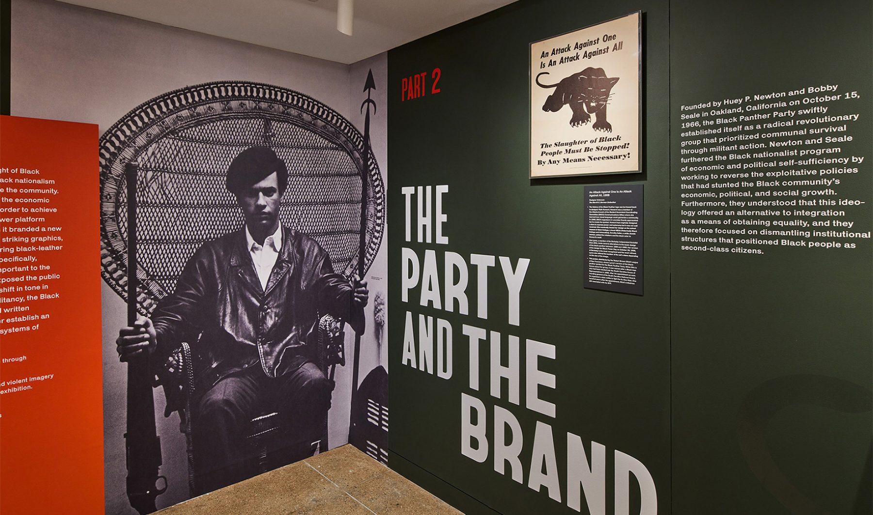
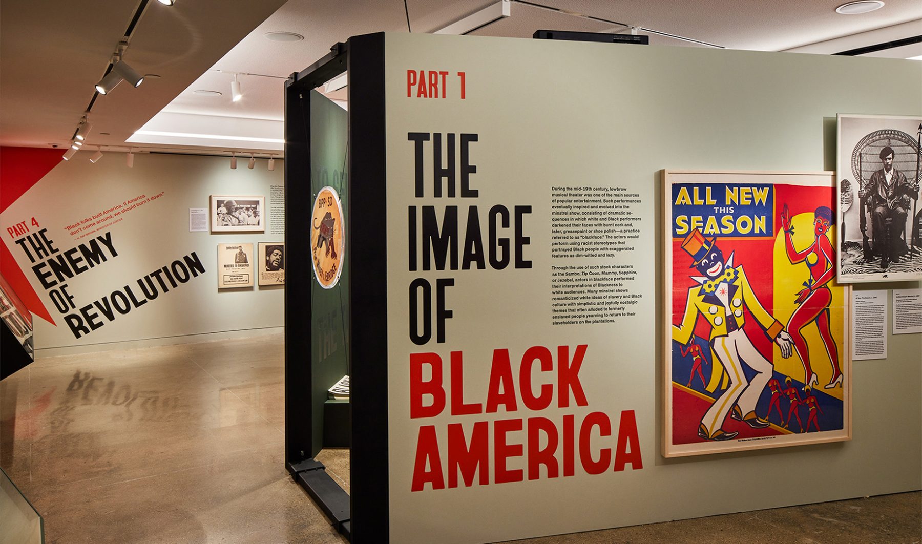
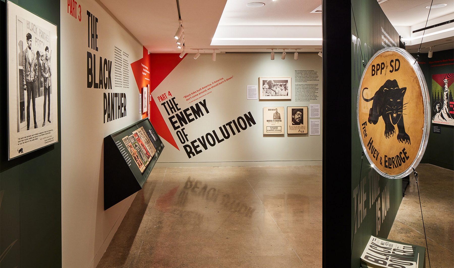
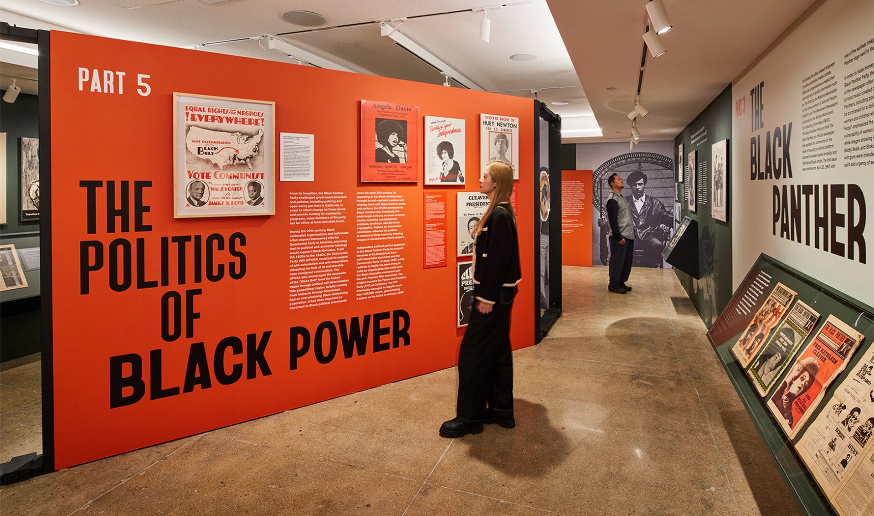
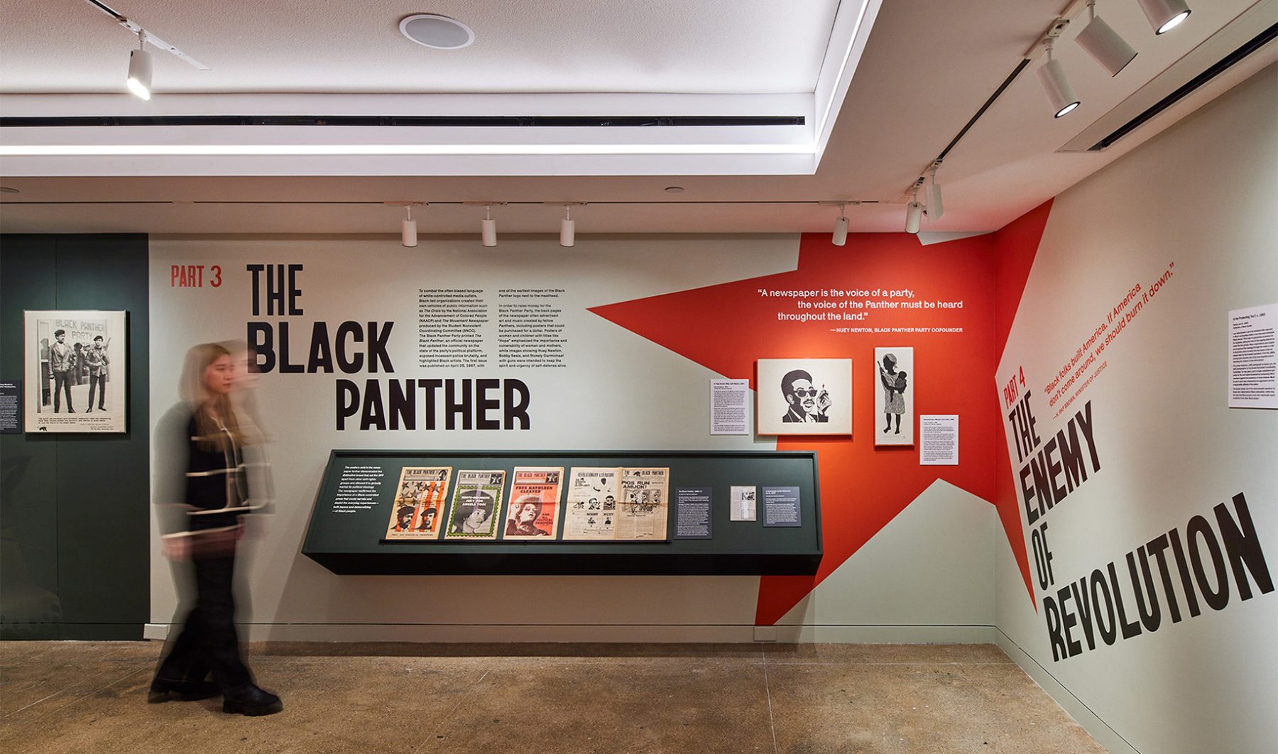
Poster House’s “Black Power to Black People” exhibit was an intimate look at how the Black Panther Party harnessed the power of branding and media to control its own narrative, rally community support, and become one of the most influential militant groups of its time.
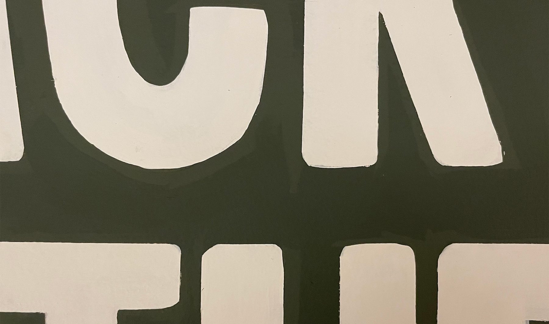
Our exhibition design began outside the gallery with two oversized protest signs leaning against the wall, amplified with hand-painted lettering reminiscent of protest signs from the Civil Rights era.
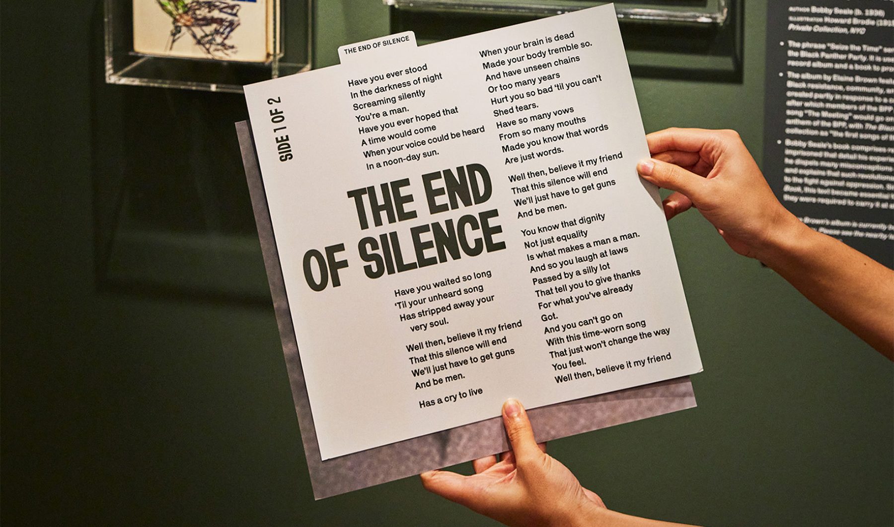
Bayard (typeface) evokes lettering from the 1960s Civil Rights protest signs. Condensed, bold and handmade…transporting viewers to that era.
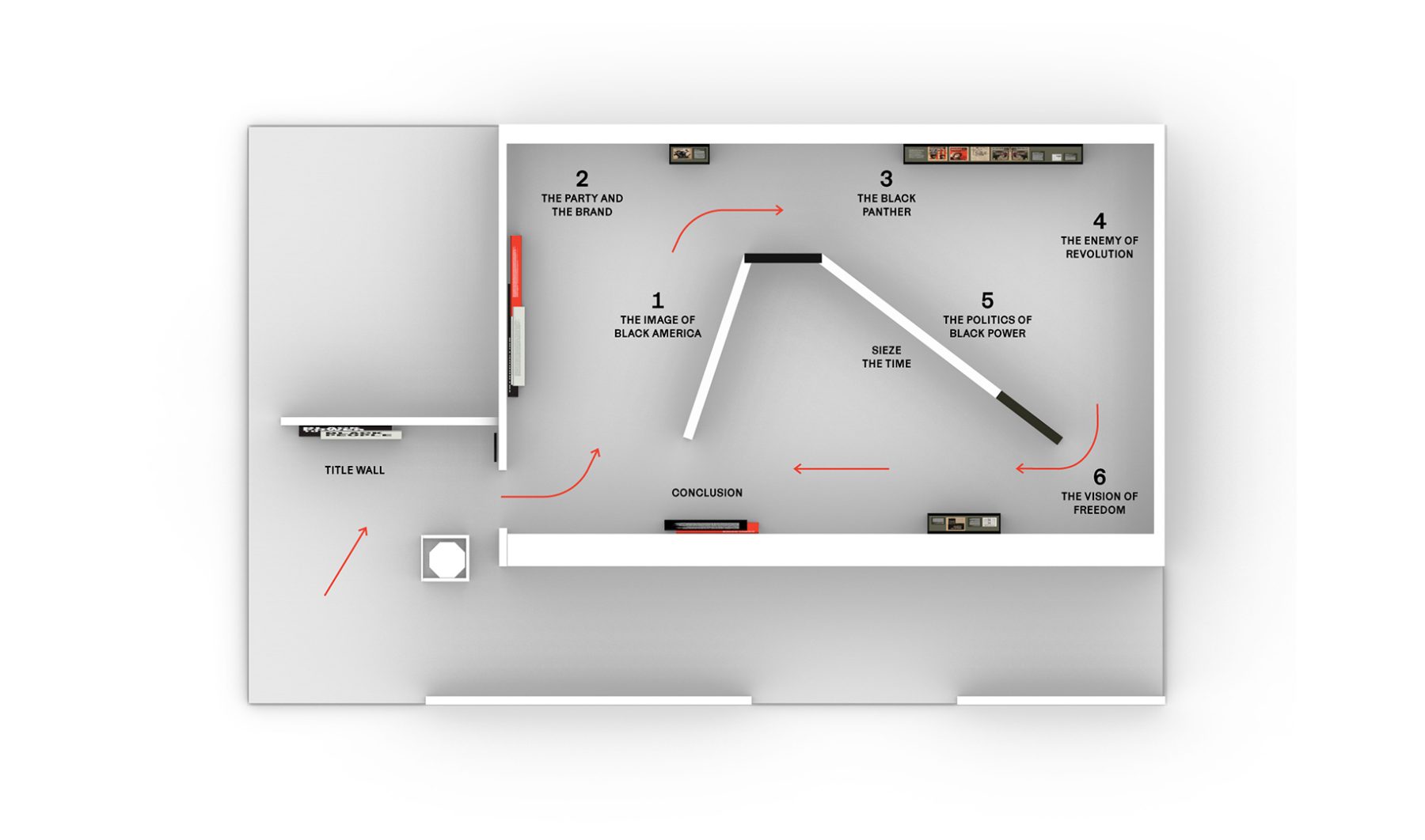
Inside, the exhibit started with an iconic photograph of Huey Newton (1967) and followed the development of Black Panther branding through six chronological sections. In the background, tracks from Seize the Time LP by Elaine Brown played on a loop, capturing the aspirations of the Black Panther Party.
We used bold type, militaristic colors, striking icons, and heroic photographs of Black Panther members carrying exposed firearms to echo the powerfully moving design strategies used by the Black Panthers themselves—and to show how effective those strategies remain, even decades after the party’s rise to fame.
KASA Collective
-
John Kudos
Creative Director -
Robert de Saint Phalle
3D Creative Director -
Ashley Wu
Art Director -
Fay Qiu
Designer -
Saskia Wulandiarti
Design Intern -
Imam Fadillah
3D Renderer -
Amanda Knott
Project Manager -
Samuel Sachs Morgan
Photographer
POSTER HOUSE
-
Es-pranza Humphrey
Curators -
Angelina Lippert
Chief Curator & Director of Content -
Ola Baldych
Director of Design & Exhibits -
John F. Lynch
Associate Director of Exhibits -
Mihoshi Fukushima Clark
Assistant Director of Design -
Rob Leonardi
Fabricator
Boston Lyric Opera Season Artworks
Boston Lyric Opera
Capabilities
Focus Area
Client
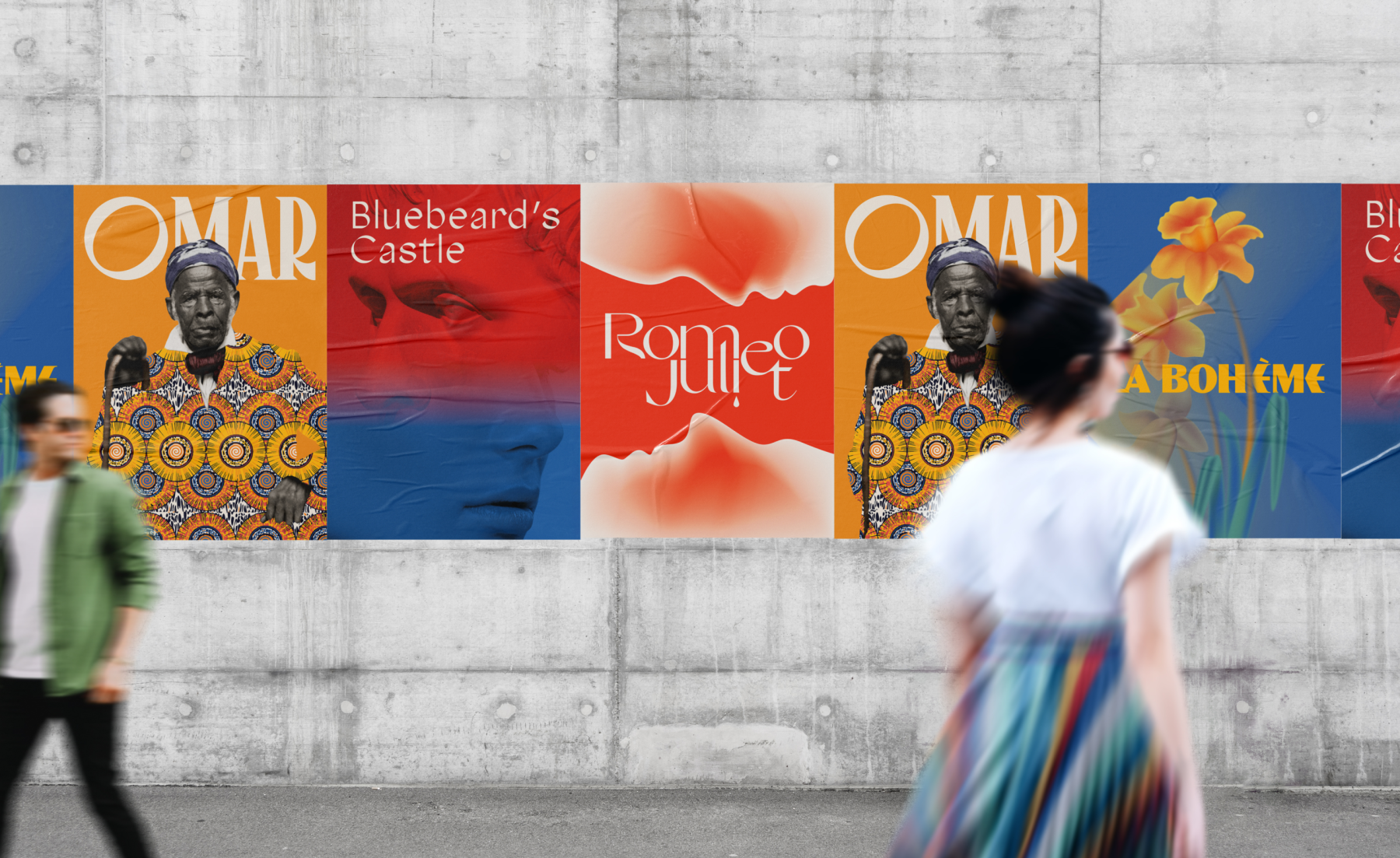
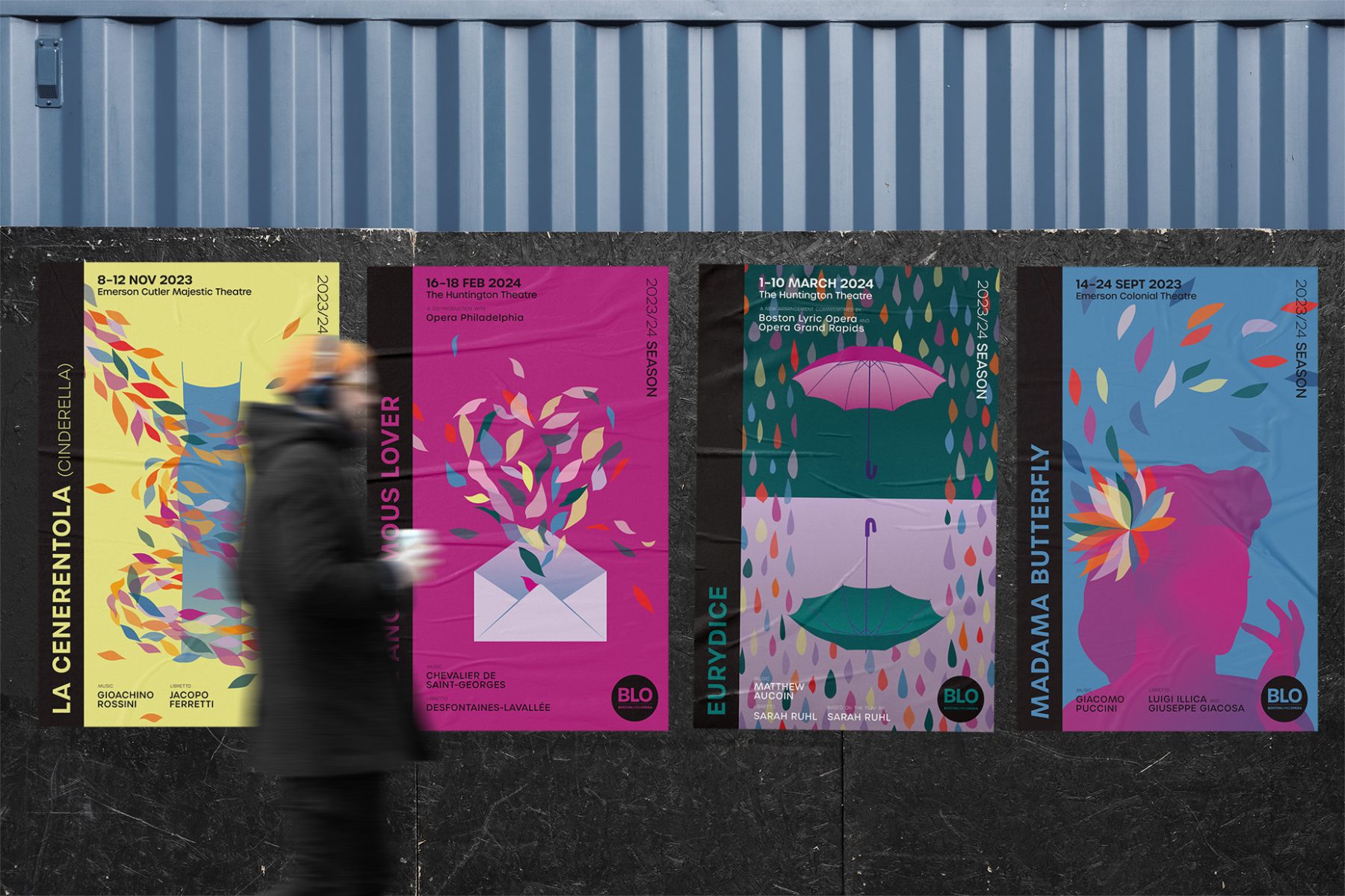
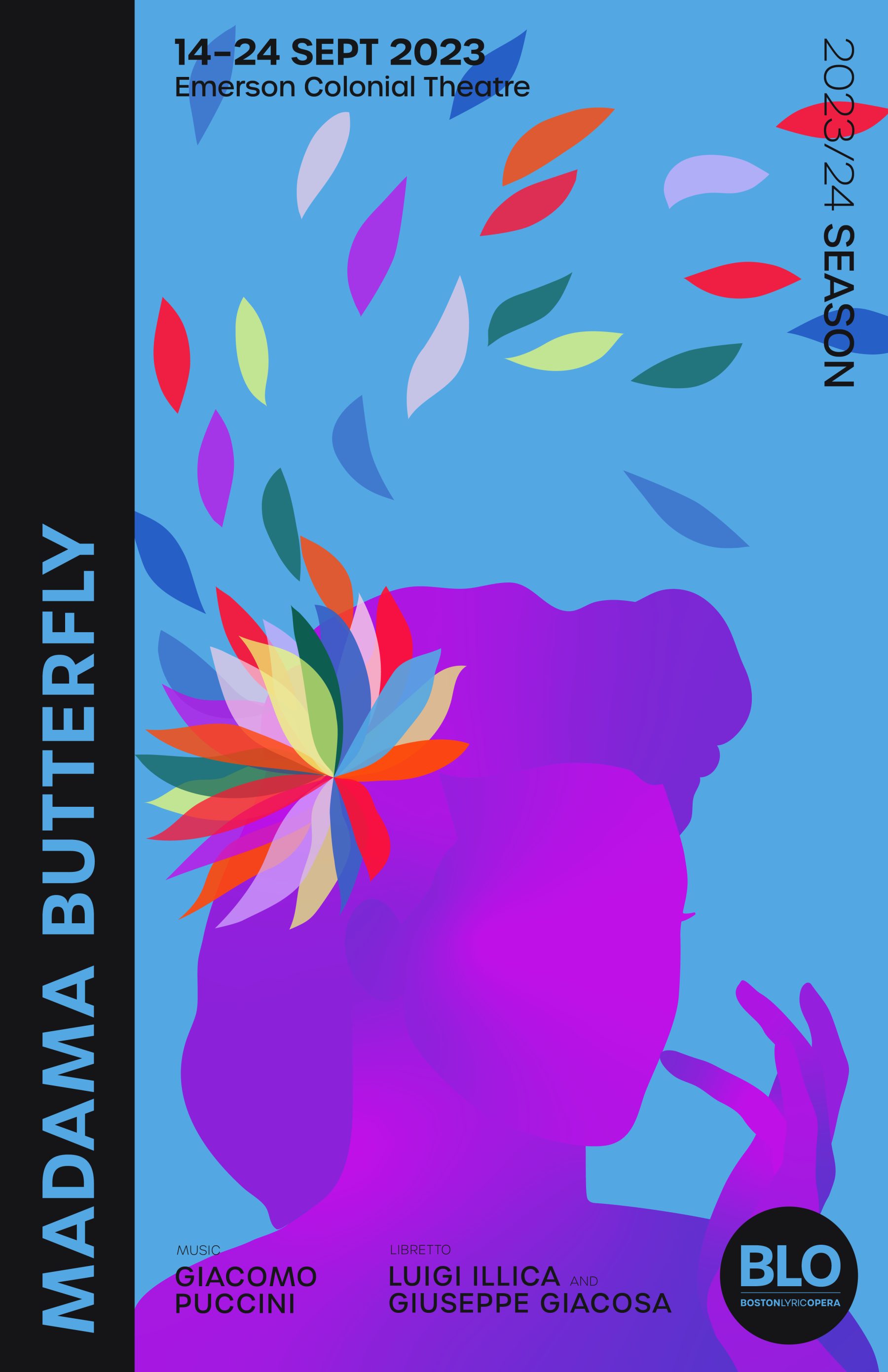
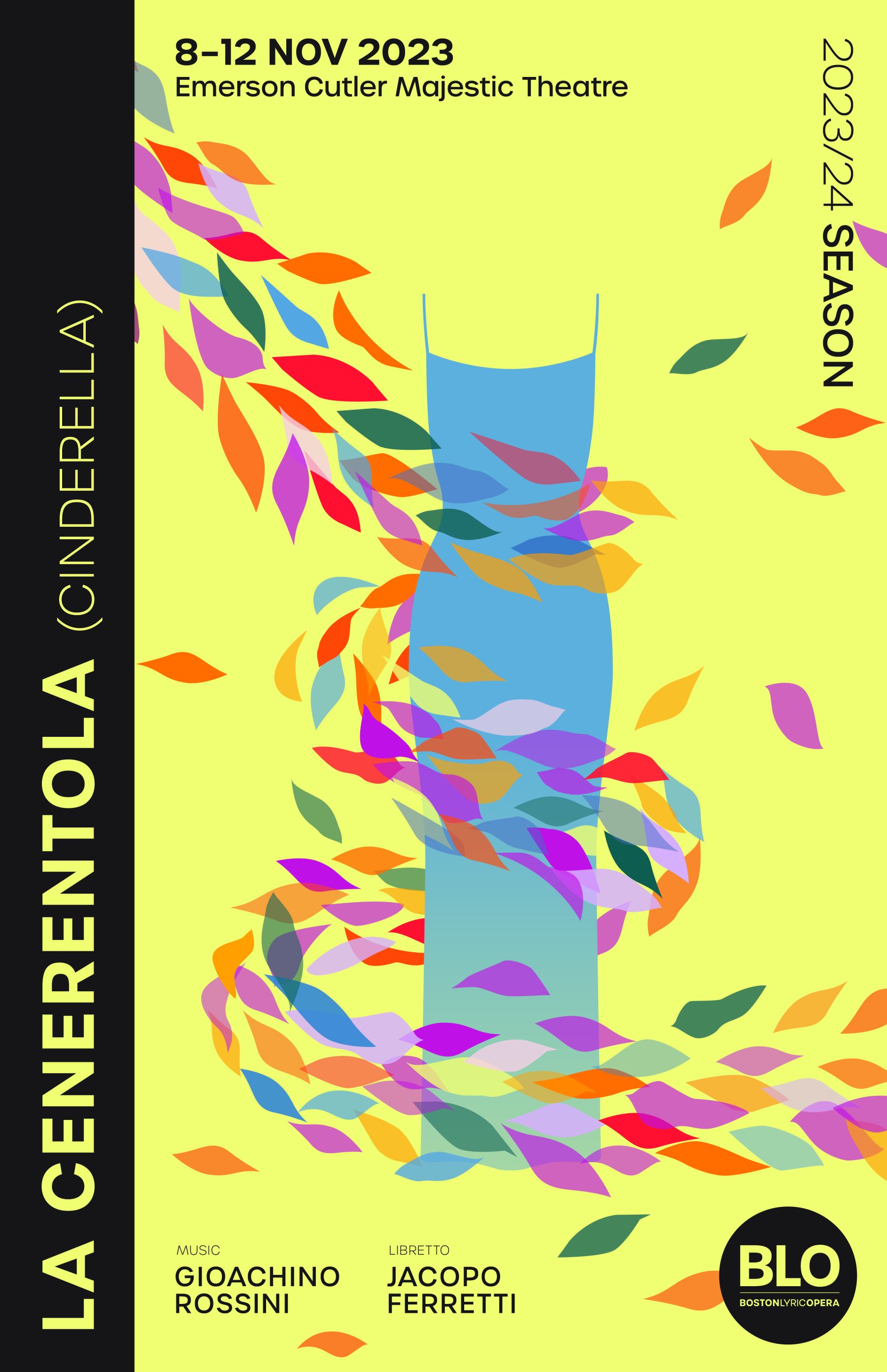
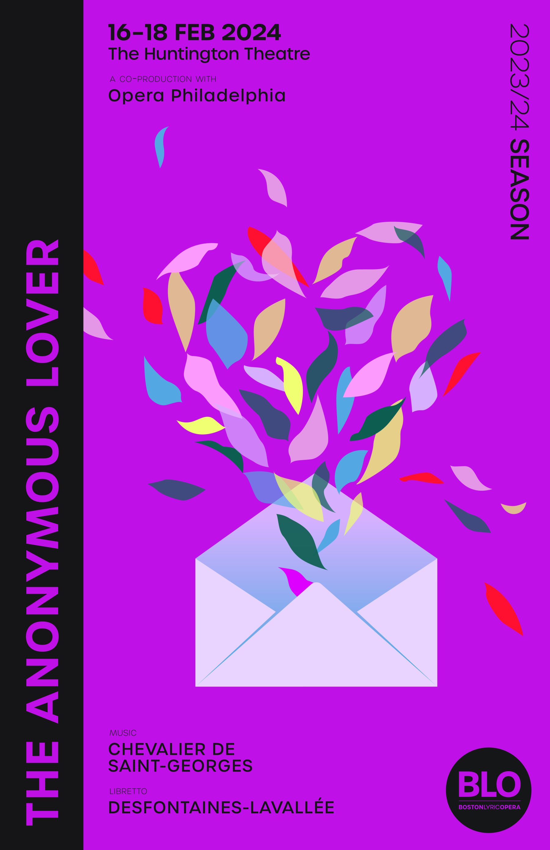
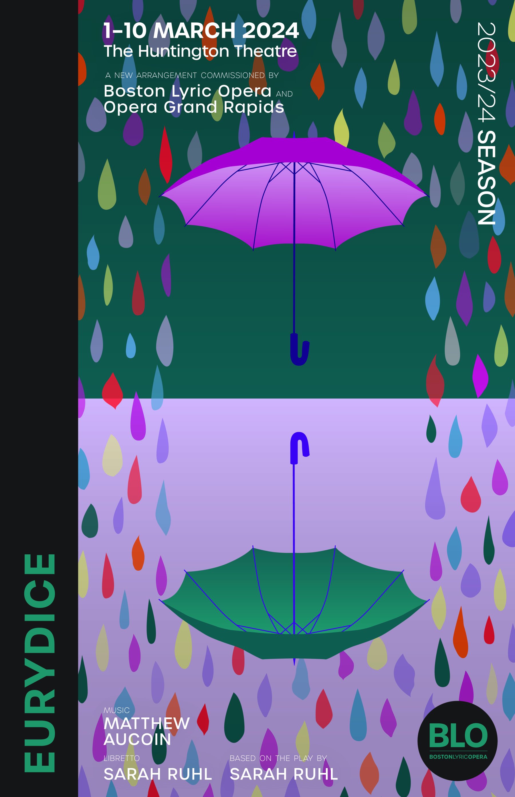
Boston Lyric Opera’s mission is to inspire, entertain, and connect the community through compelling opera performances, programs, and gatherings.
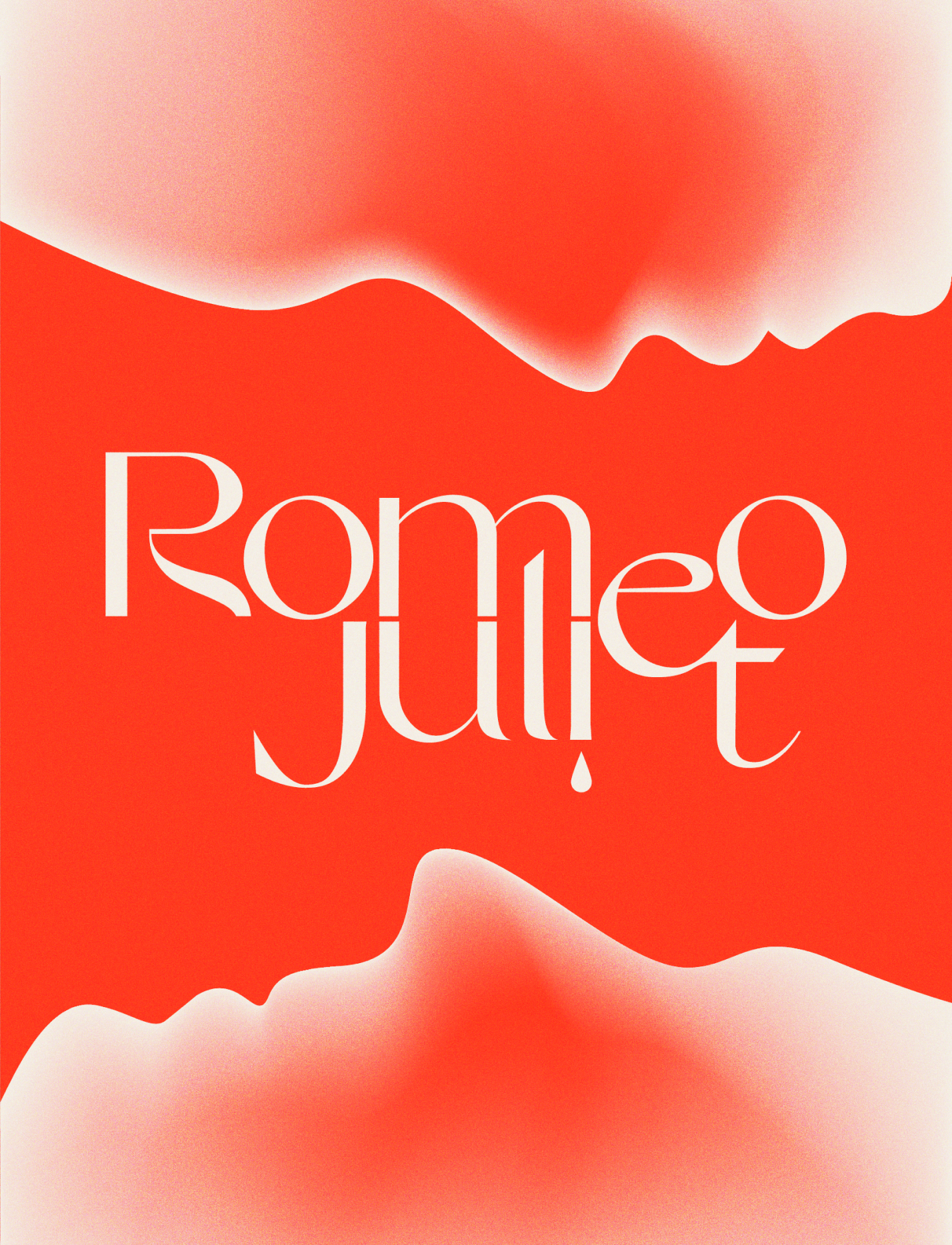
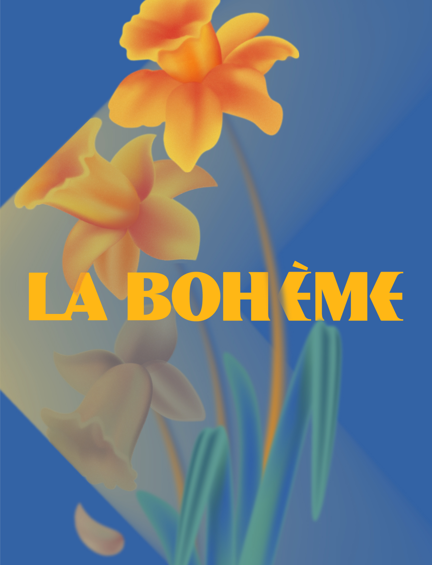
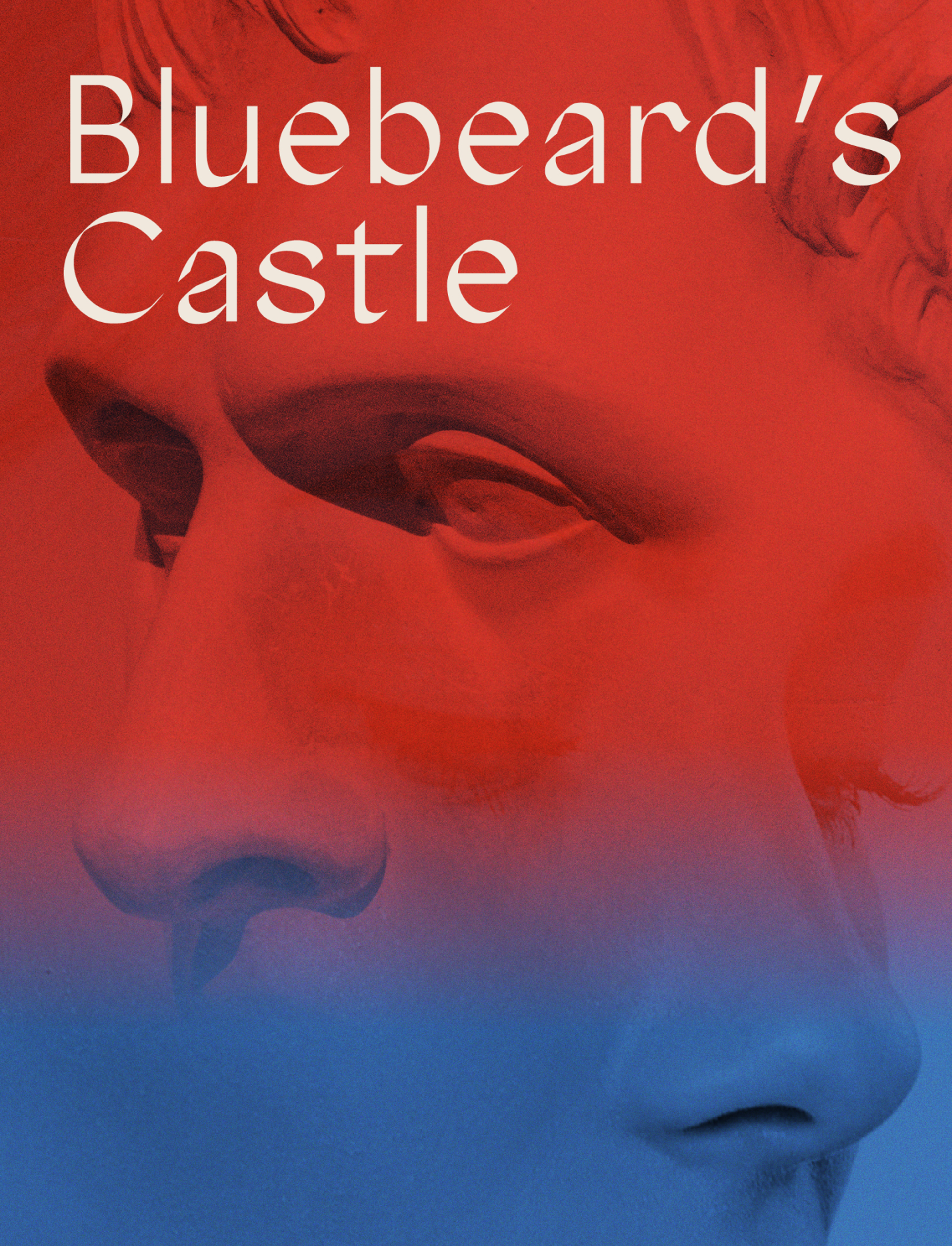
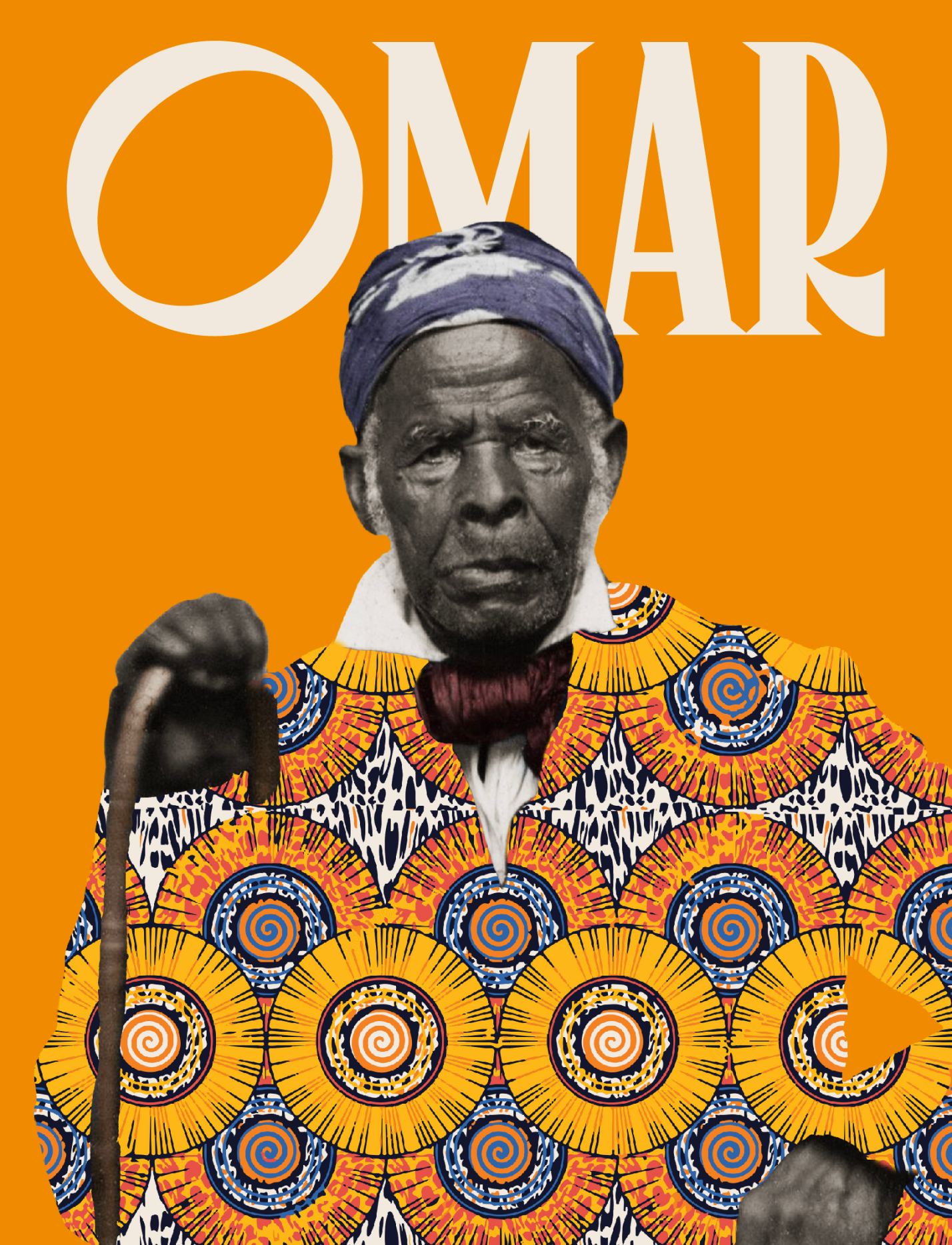
We were tasked with designing a cohesive visual branding system for the Opera and its 2022-23 and 2023-24 seasons, along with distinct concept art for each of four opera productions for each season. For the Opera as a whole, our brand refresh included the creation of a new BLO logo and typeface. For each production, we developed a unique typography language and matching color palette, as well as design elements reflecting their distinctive themes and concepts.
KUDOS Design Collaboratory
-
John Kudos
Creative Director -
Jamus Marquette, Imam Fadilah, Owen Febiandi, Fay Qiu, Jennifer Wiriawan, Putu Yogiswara, Andini Pratiwi, Irpan Alfian
Designer -
Amanda Knott, Robi Dafit
Project Manager -
Asha Adelia Rahayu, Rias Amalia
Illustrator -
Rias Amalia
Motion Designer -
Faris Han
Motion Developer
BCL @ SXSW 2022
Blockchain Creative Labs
Capabilities
Focus Area
Client
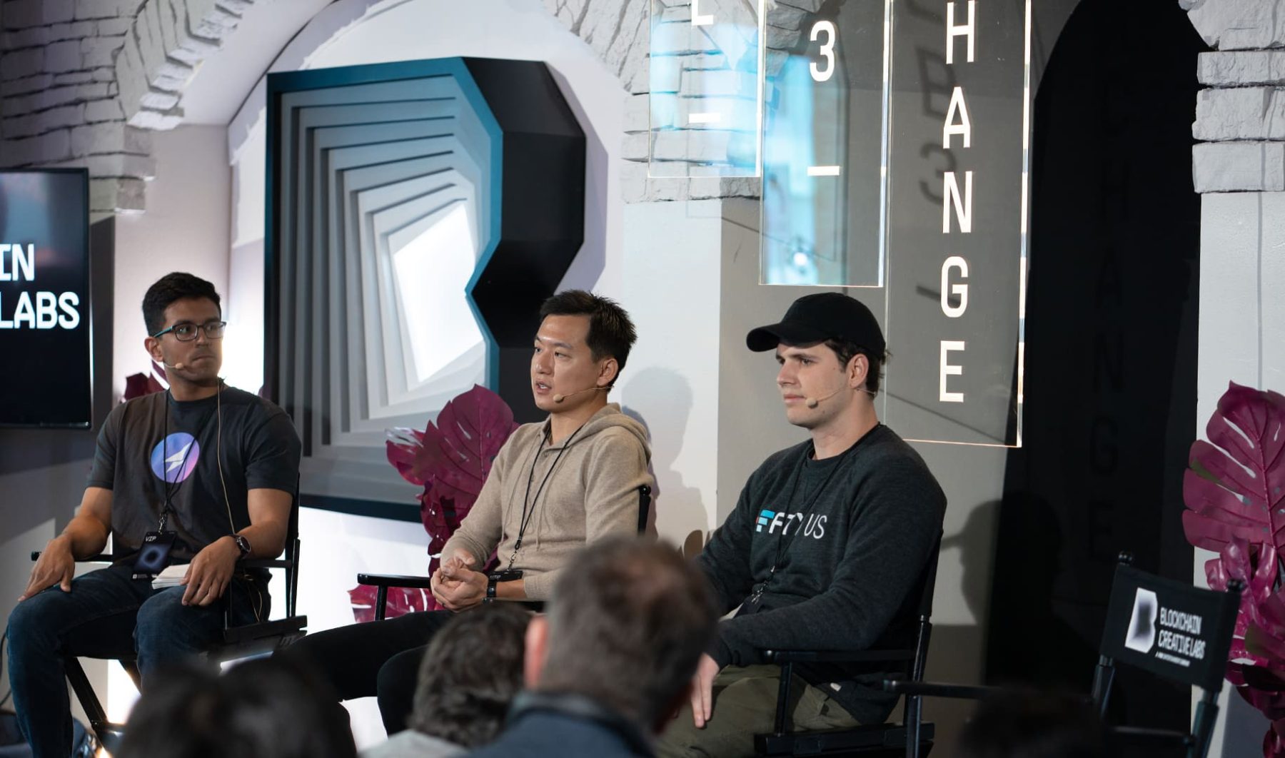
Blockchain Creative Labs (BCL), FOX’s technology research and development arm, is on a mission to shape the future of content creation, distribution, and monetization by connecting creators and communities using innovative technology.
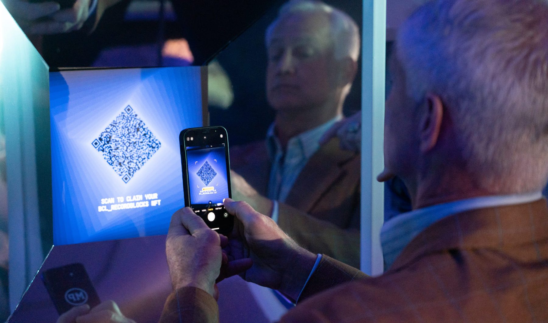
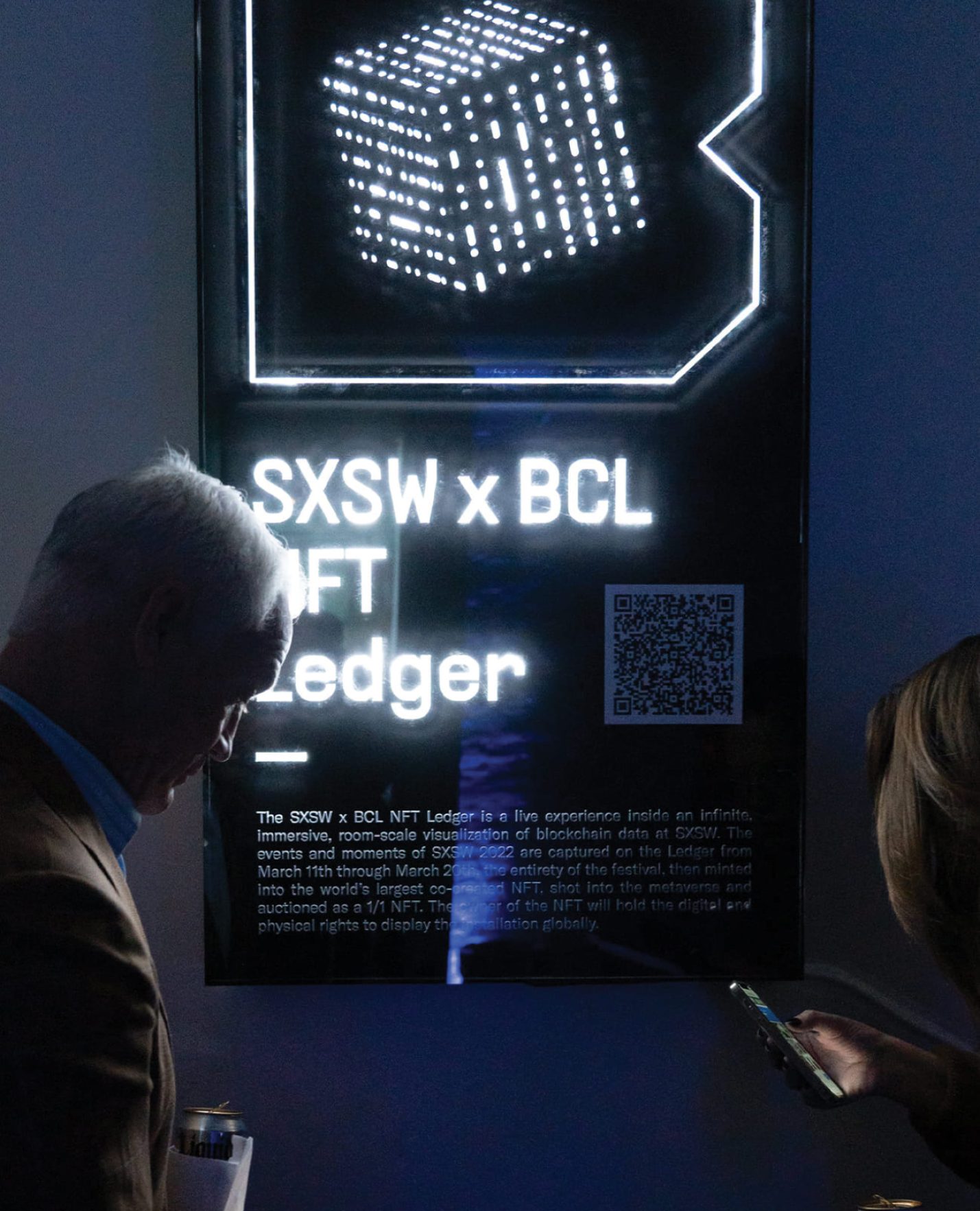
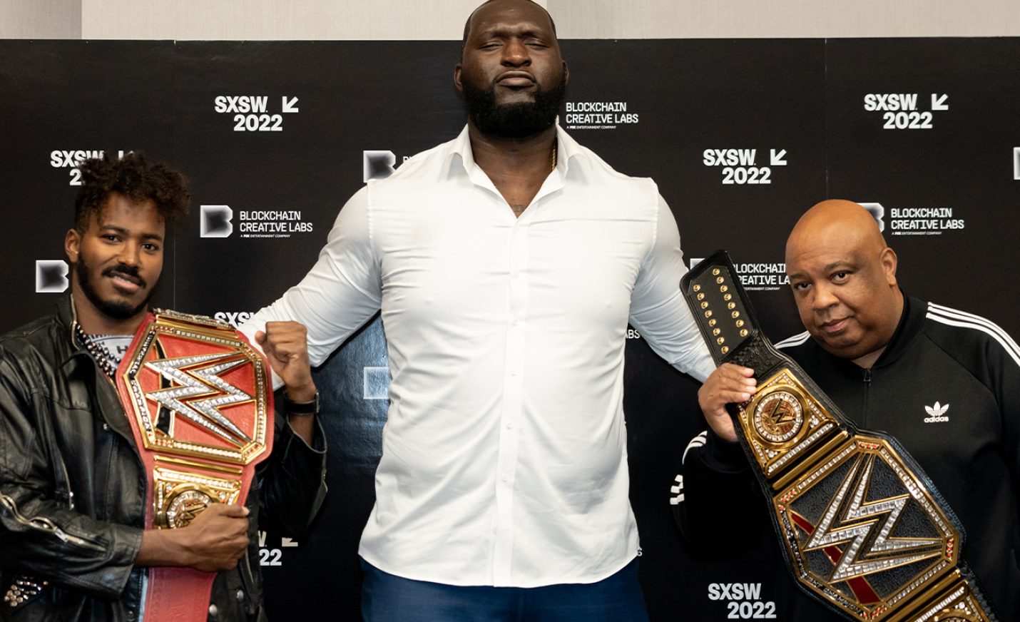
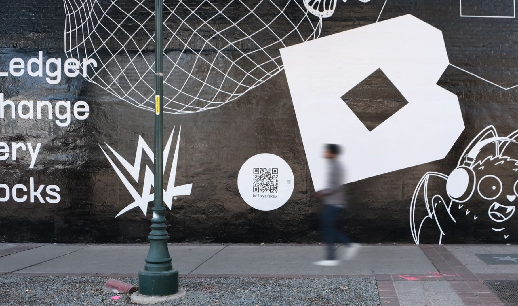
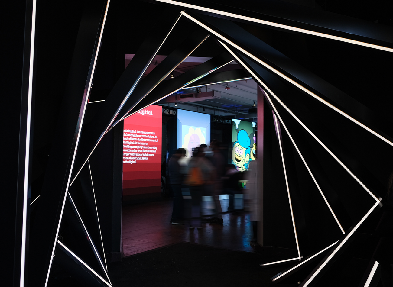
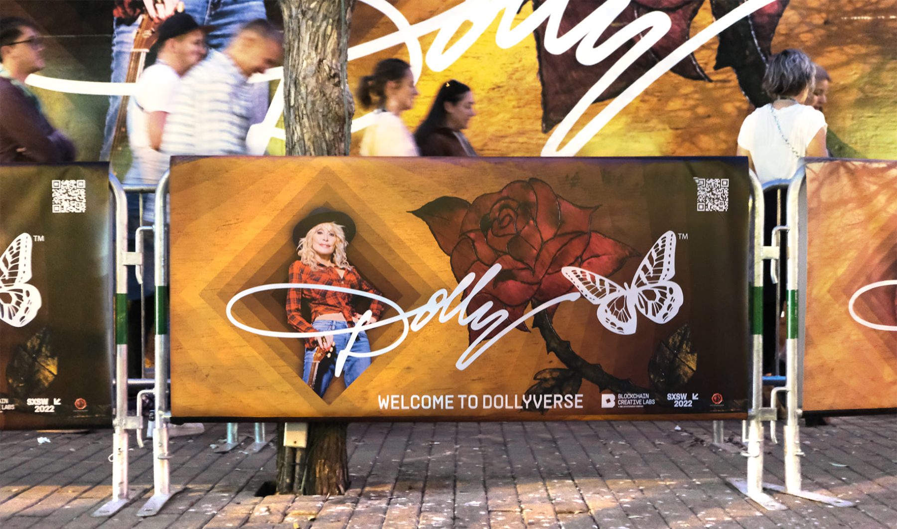
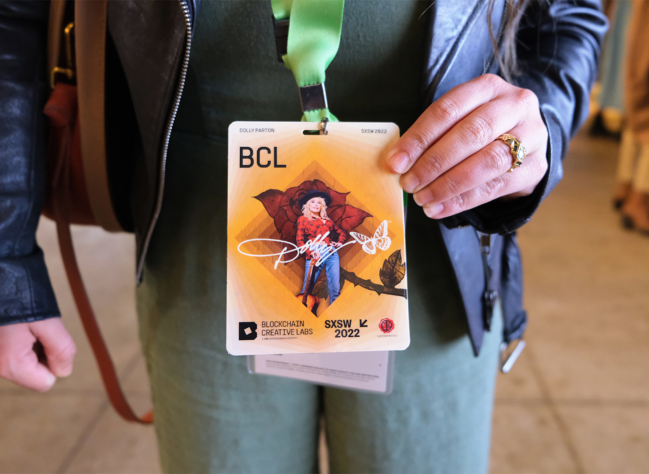
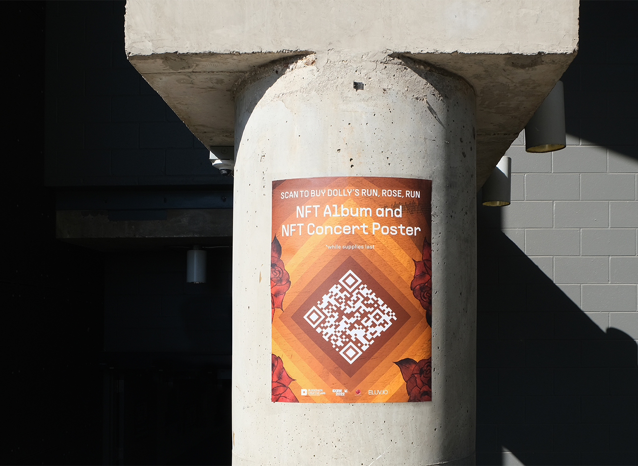
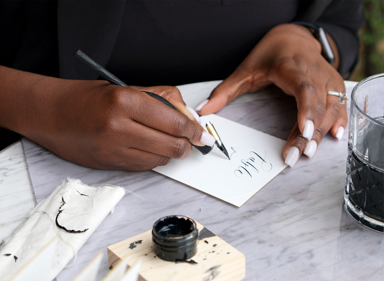
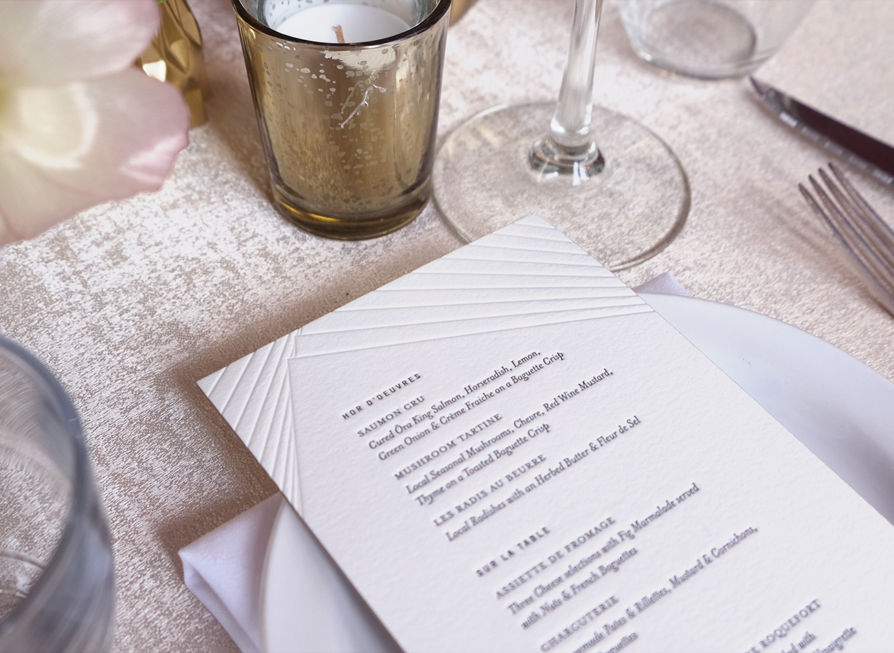
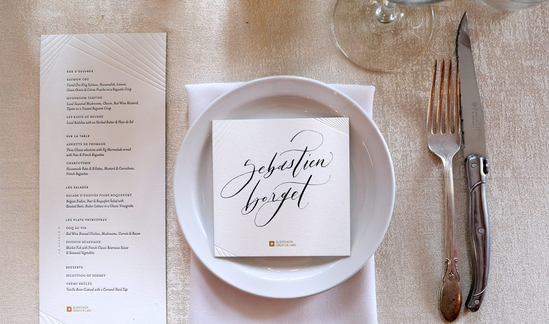
Whatever.co teamed up with KUDOS and a large cohort of producers to launch the BCL brand at the SXSW festival in March, 2022, in Austin, Texas. KUDOS was put in charge of creating a new visual branding system for BCL that was then applied to all aspects of the BCL House venue at SXSW. This included everything from a logo to a Web3-inspired website, lenticular badges, event posters, wayfinding graphics, animated POAP NFTs, Dolly Parton’s Dollyverse, and letterpress cards for the exclusive gala dinner—all aimed at delivering an immersive experience that spotlighted FOX’s new foray into the world of blockchain.
PROJECT TEAMS
-
Blockchain Creative Labs
Client -
Whatever
Lead Concept & Creative Direction -
KUDOS Design Collaboratory
Branding & Graphic Design -
Small Bands of Misbehavior
Production Design
KUDOS Design Collaboratory
-
John Kudos
Managing Director -
Ashley Wu
Art Director -
Jessica Mackta
Project Manager -
Fay Qiu, Jamus Marquette, Owen Febiandi, Lauwrencia E. D., Putu Yogiswara, Ilham Muhamad Firdaus, Greg Wong, Brian Smith, Adriana Marquette, Erica Remmele, MacKenzie Schroeder
Graphic Designers -
Imam Fadilah
3D Design -
Christian Marc Schmidt, Joseph Gray, Kevin Hanes
POAPs
Zeen Packaging
Exokinetics, Inc.
Capabilities
Focus Area
Client
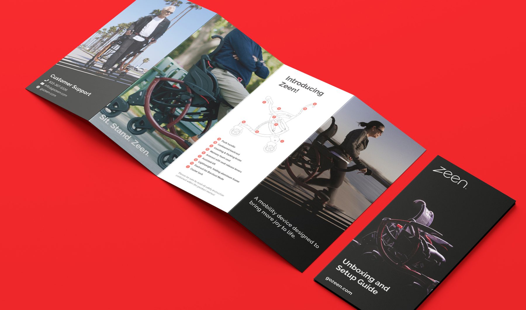
Wheelchairs are stable because when you’re using one, you’re seated. But they also are clunky, often require assistance, and prevent full-body exercise, which ultimately makes users’ muscles and bones decline more quickly. Rollators and walkers, on the other hand, give users some autonomy—but also cause over 47,000 people in the U.S. to end up in emergency rooms each year due to falls. That’s because when you use a walker, your weight is often behind the device, and if you lose your balance, walkers inhibit your natural ability to side-step out of a fall.
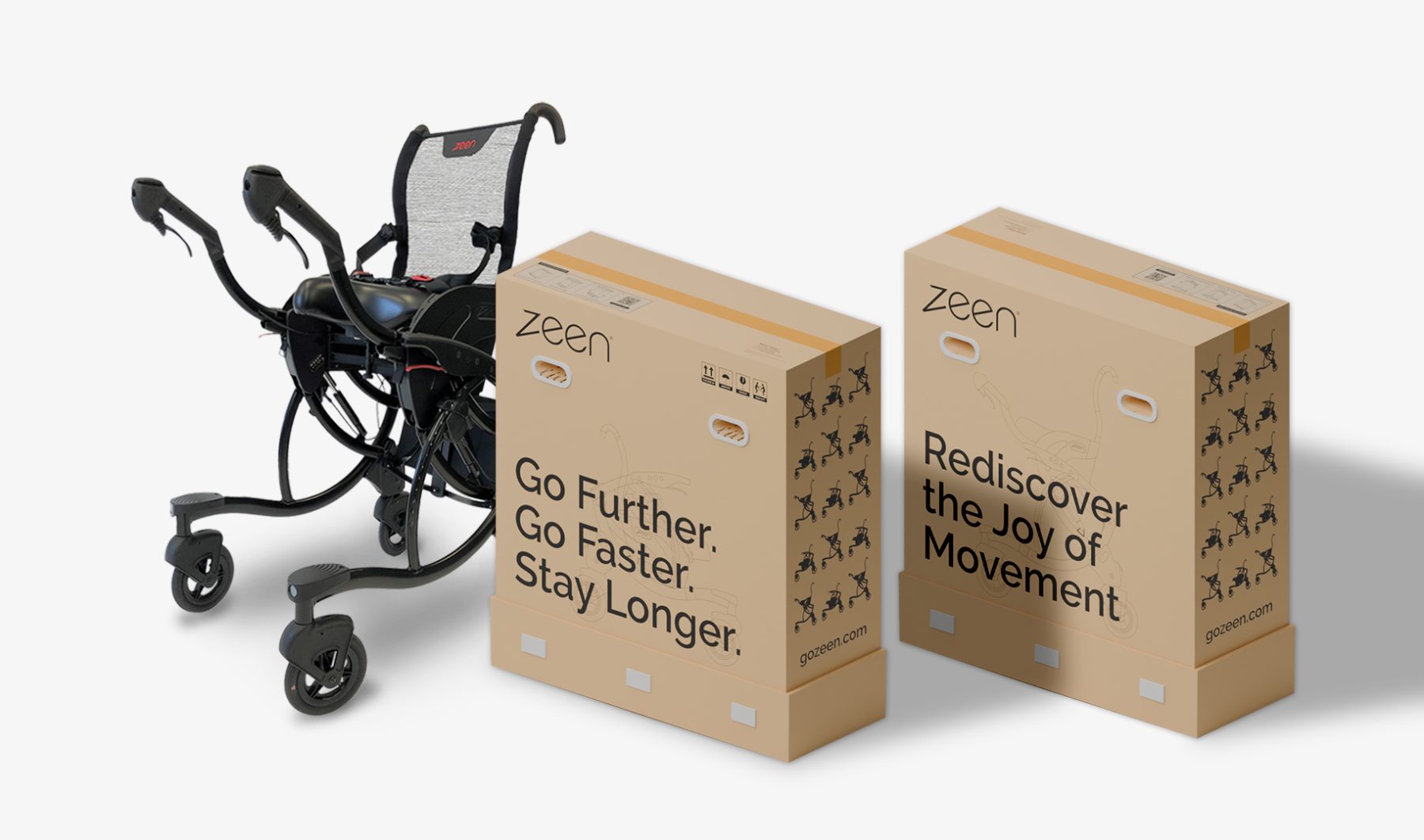
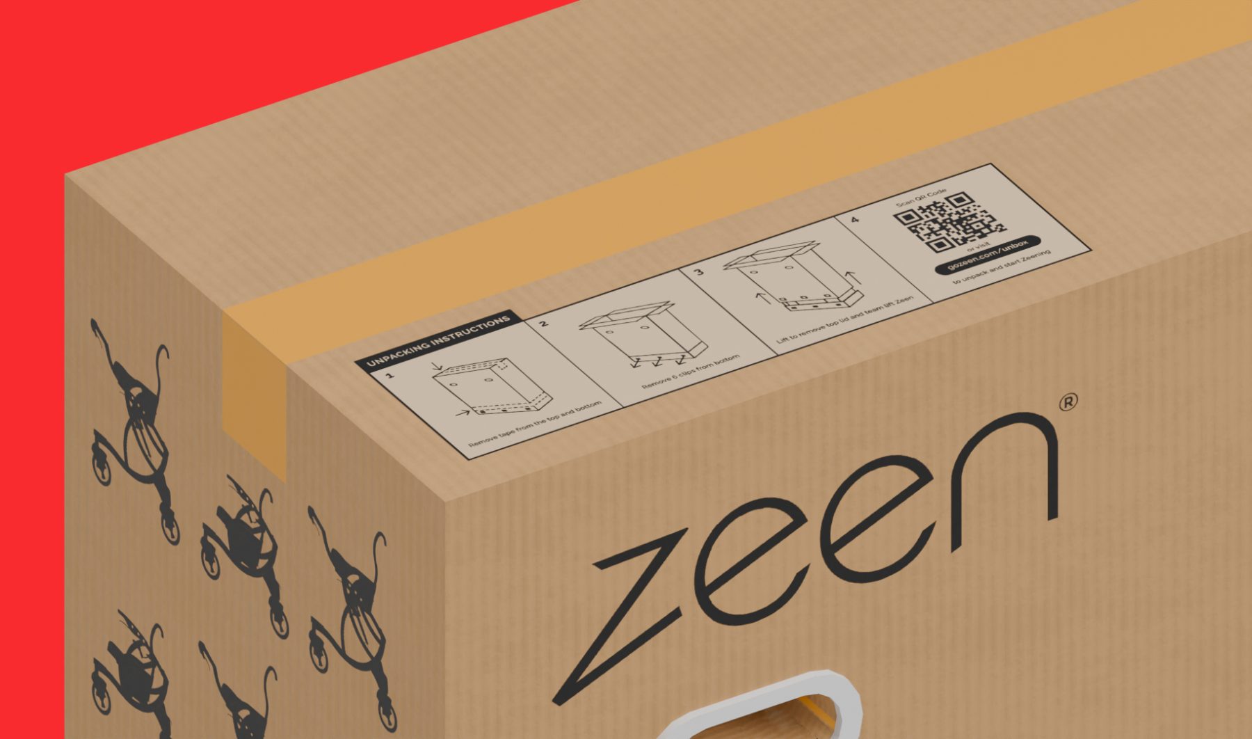
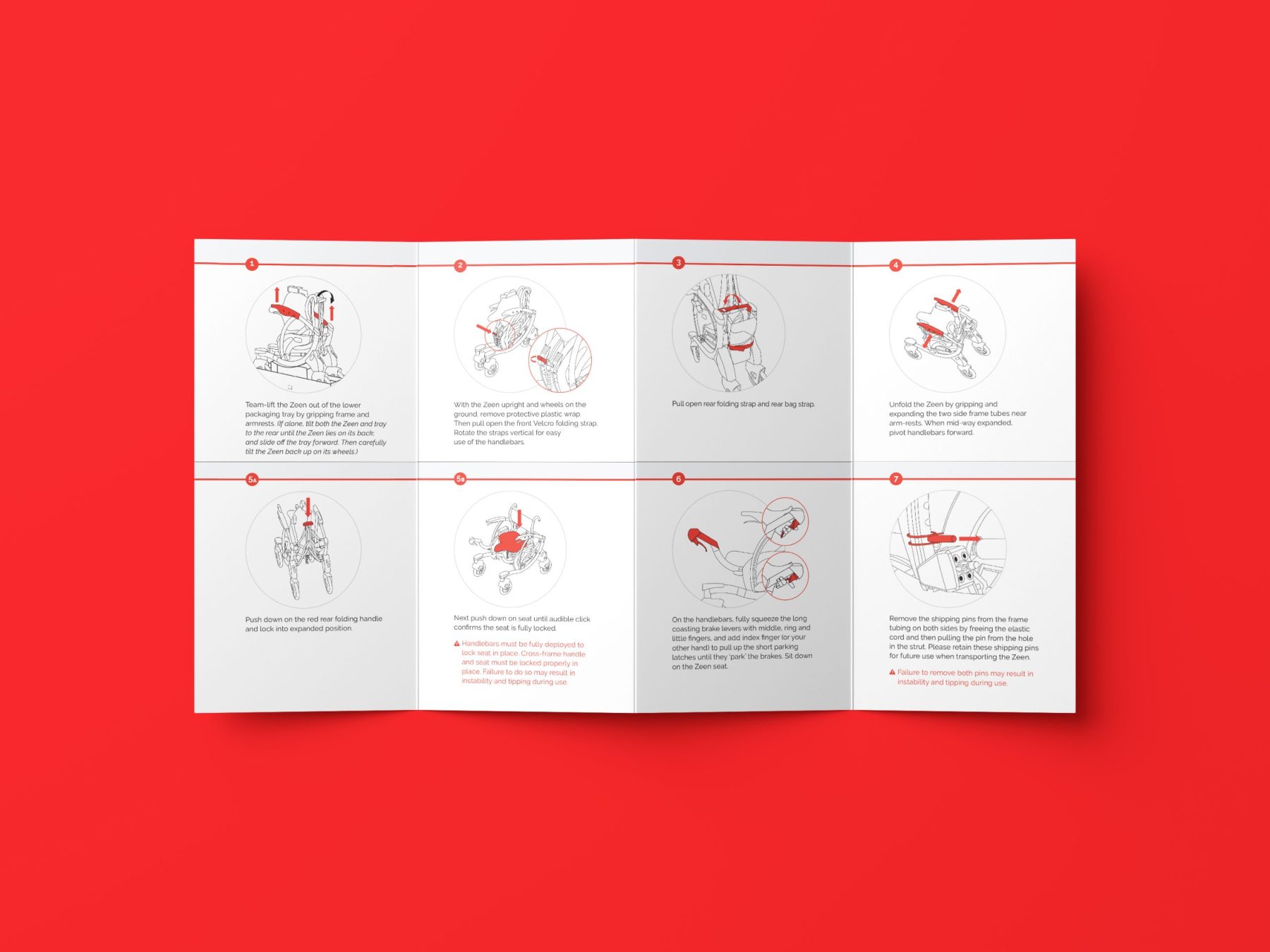
The Zeen was designed with help from physical therapists to keep users’ center of gravity at the center of the device, like a wheelchair does, but to also keep them active like a rollator does, without fatiguing the hands. We designed the Zeen’s shipping packaging and product manual, which provides clear and easily accessible step-by-step instructions for unboxing and setting up the device.
KUDOS Design Collaboratory
-
Ashley Wu
Art Director -
Owen Febiandi
Designer -
Putu Yogiswara
Designer -
Reza Risnaldi
3D designer
Fragile Legacy
Corning Museum of Glass
Capabilities
Focus Area
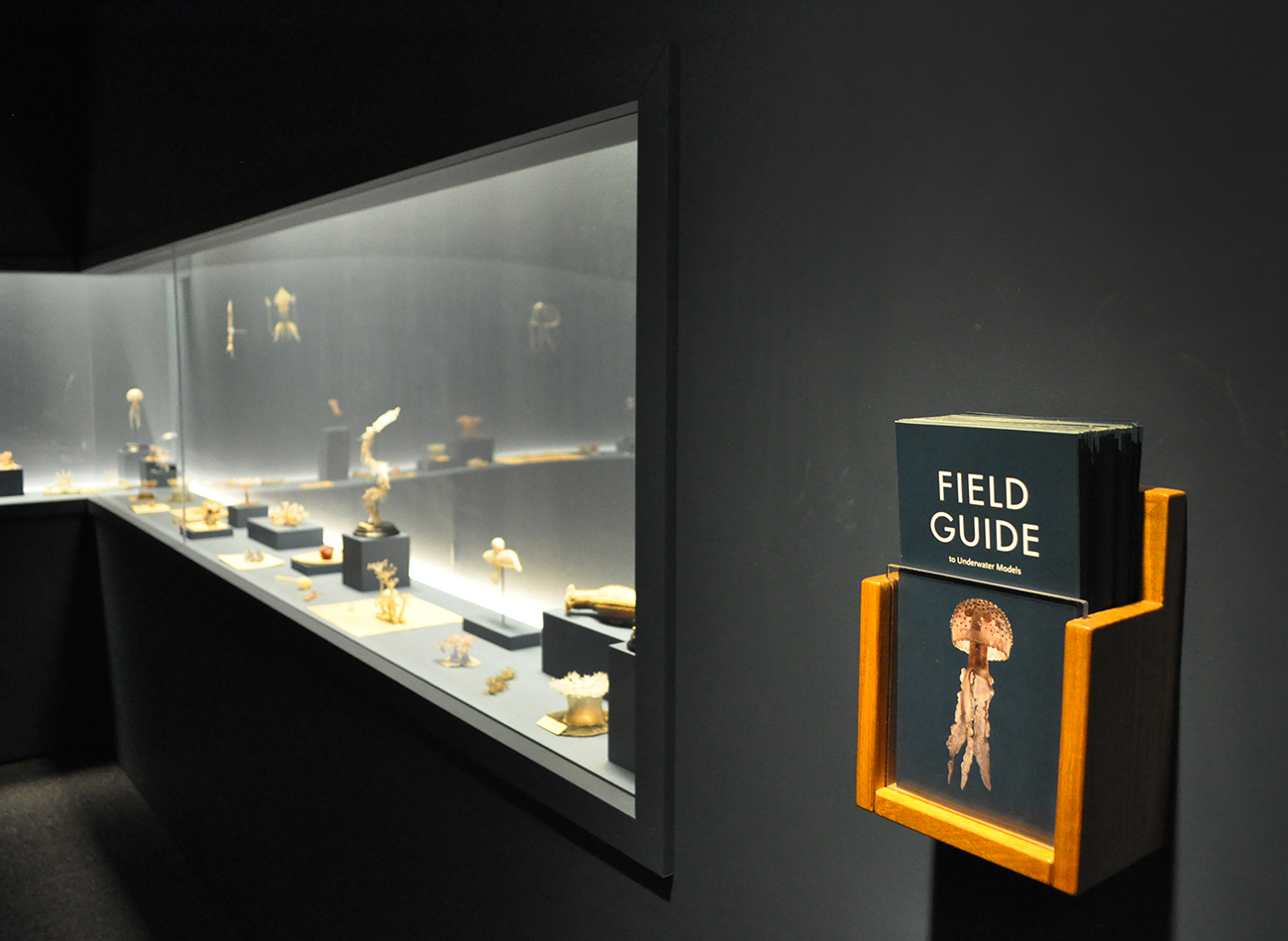
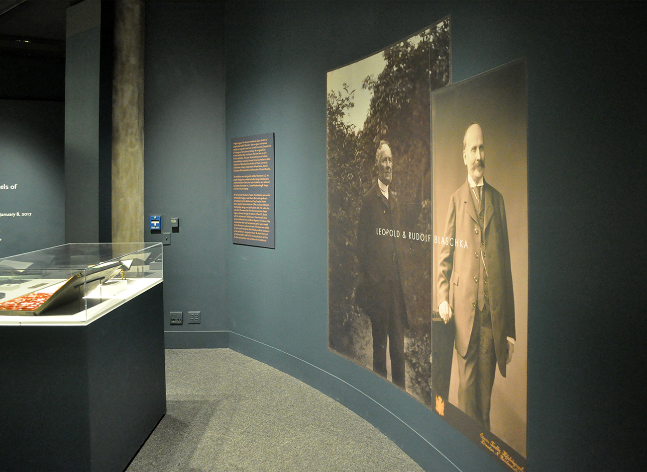
For these exhibition graphics for “Fragile Legacy” at the Corning Museum of Glass, we collaborated with Selldorf Architects and the museum’s in-house team to ensure that all graphic and text panels followed the museum’s visual theme.
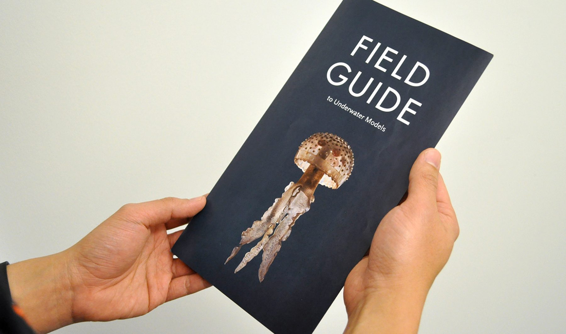
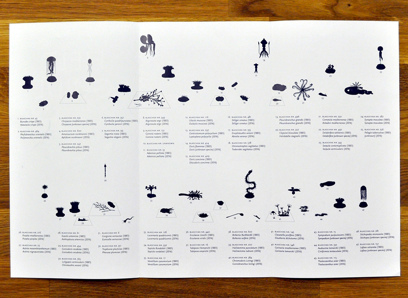
For the show’s exhibition of Blaschka marine invertebrate glass models, we combined Futura and Scala Sans typefaces to create a classic-modern underlying tone, starting with the oversized typography on the title wall. A “field guide” trifold brochure provided detailed information on displayed objects, eliminating the usual clutter of text labels.
KUDOS Design Collaboratory
-
John Kudos
Creative Director
Selldorf Architects
-
Lisa Green
Partner in charge
NY 22 Benefit
Design Trust for Public Space
Capabilities
Focus Area
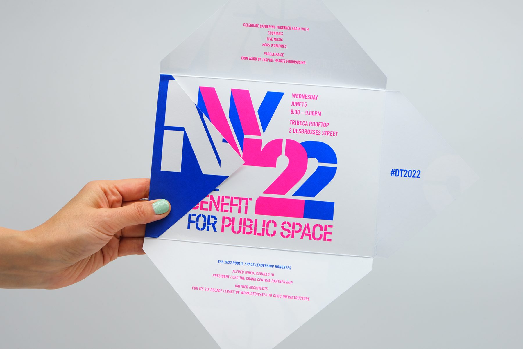
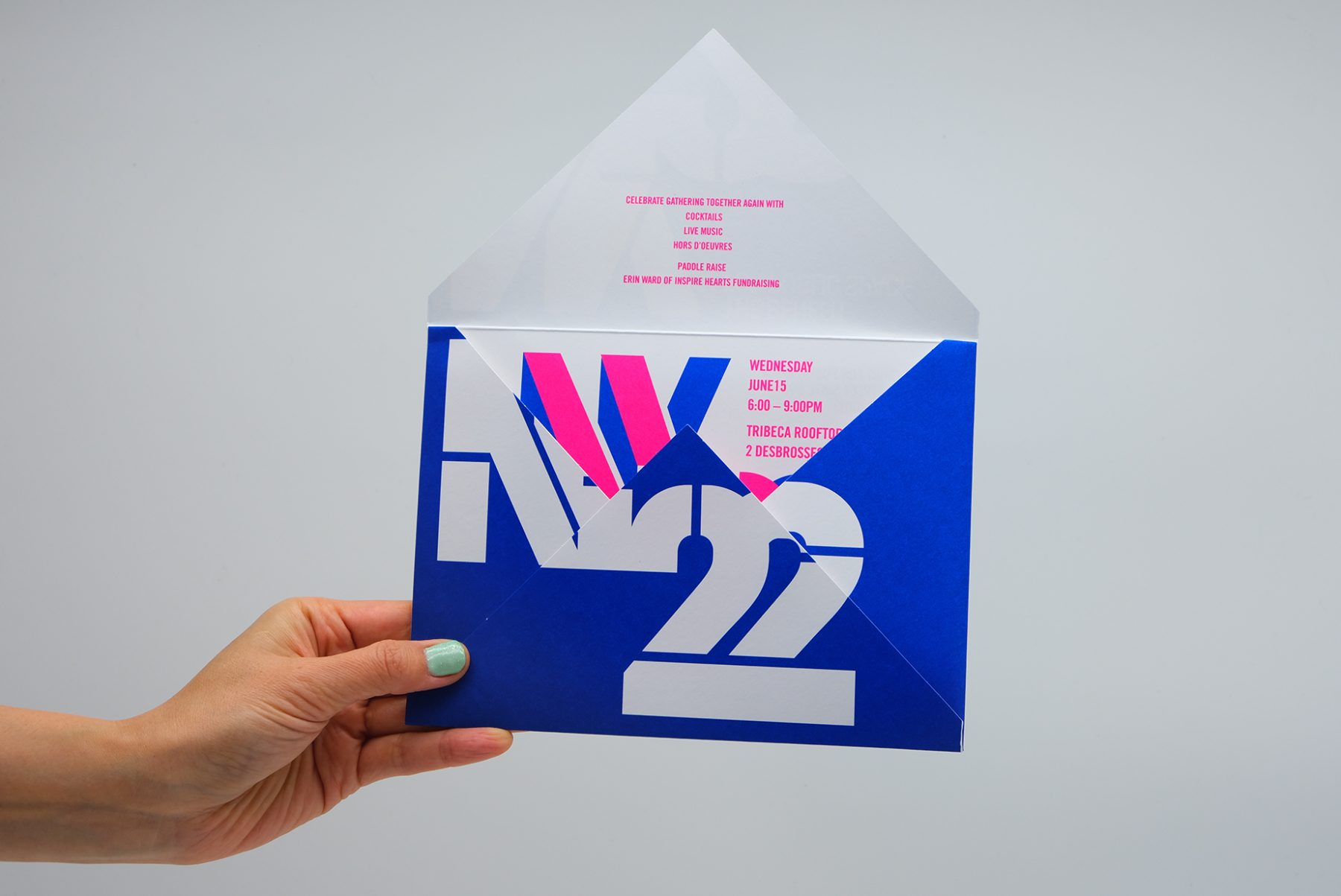
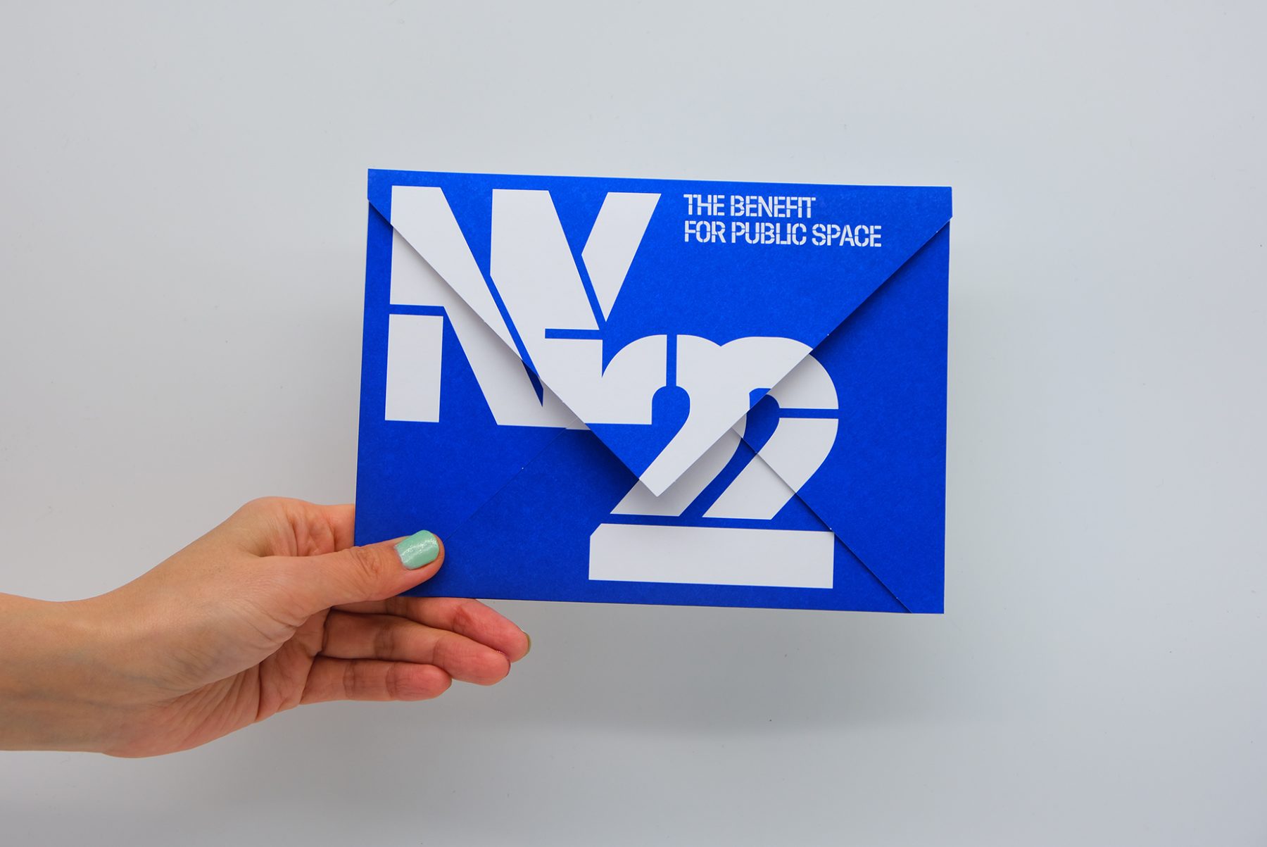
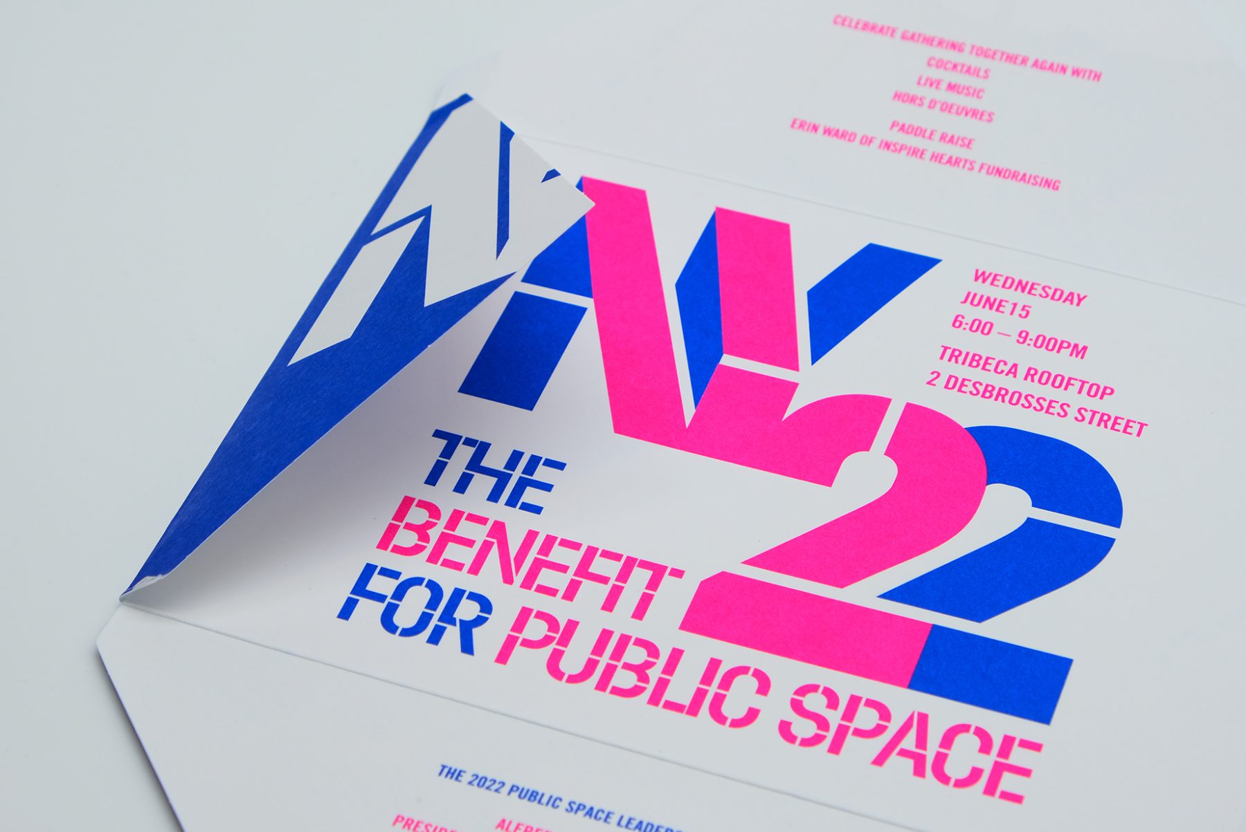
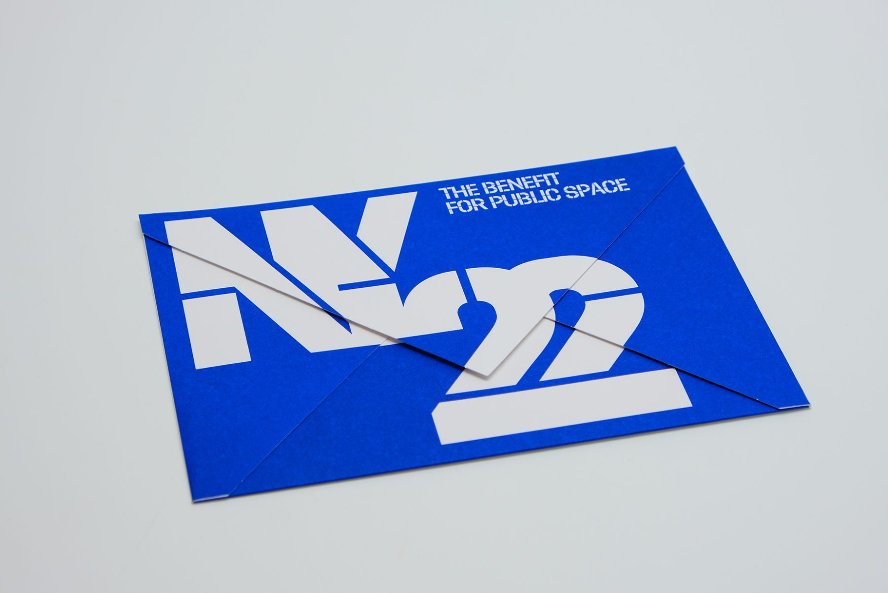
This was our invitation design for an annual benefit hosted by the Design Trust for Public Space, a New York–based nonprofit whose members believe in the transformative power of design within urban landscapes.
We crafted a unique invitation in which each panel of the envelope reveals a message as it unfolds. We combined typography, vibrant colors, and the angular shape of the envelope to emulate architectural forms, creating a visual metaphor for the symbiotic relationship between design and public space.
KUDOS Design Collaboratory
-
John Kudos
Creative Director -
Fay Qiu
Designer -
Amanda Knott
Project Manager
#CombatCovid Poster
Poster House
Capabilities
Focus Area
Client
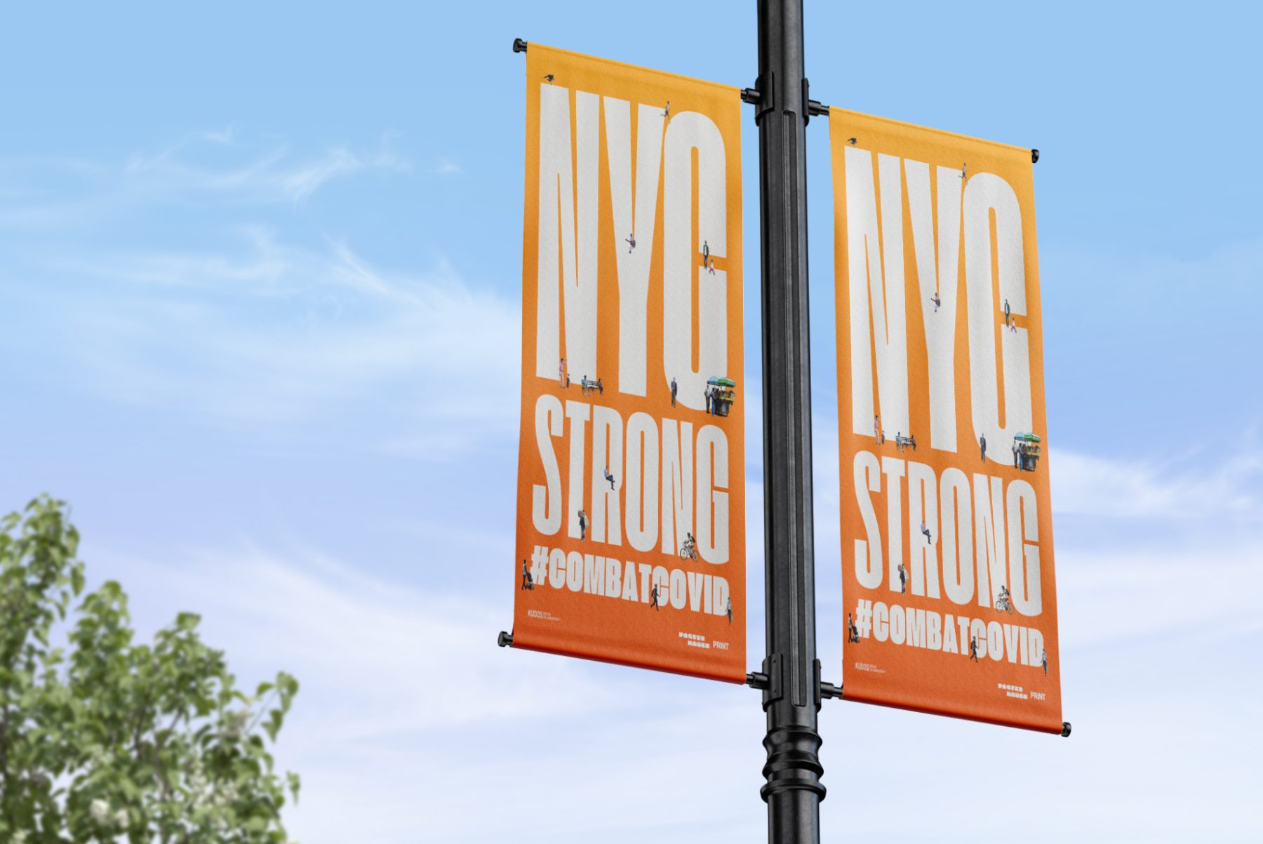
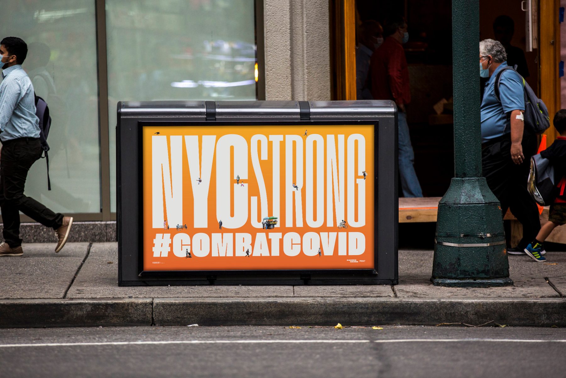
At the height of the COVID-19 pandemic in New York, Poster House teamed up with PRINT magazine, Times Square Arts, and For Freedoms to launch a citywide public art campaign featuring PSAs and messages of love, gratitude, and solidarity with New York City’s frontline workers.
For this project, we produced uplifting poster designs around the theme of “New York Strong.” These can now be found throughout New York City on nearly 1,800 digital screens and billboards, thanks to partnerships with LinkNYC, JCDecaux, Silvercast, Pearl Media, and Times Square Arts.
KUDOS Design Collaboratory
-
John Kudos
Creative Director -
Ashley Wu
Designer -
Giovanni Adrian Sitepu
Animator

Feed Juice Immersive Space
Feed Juice
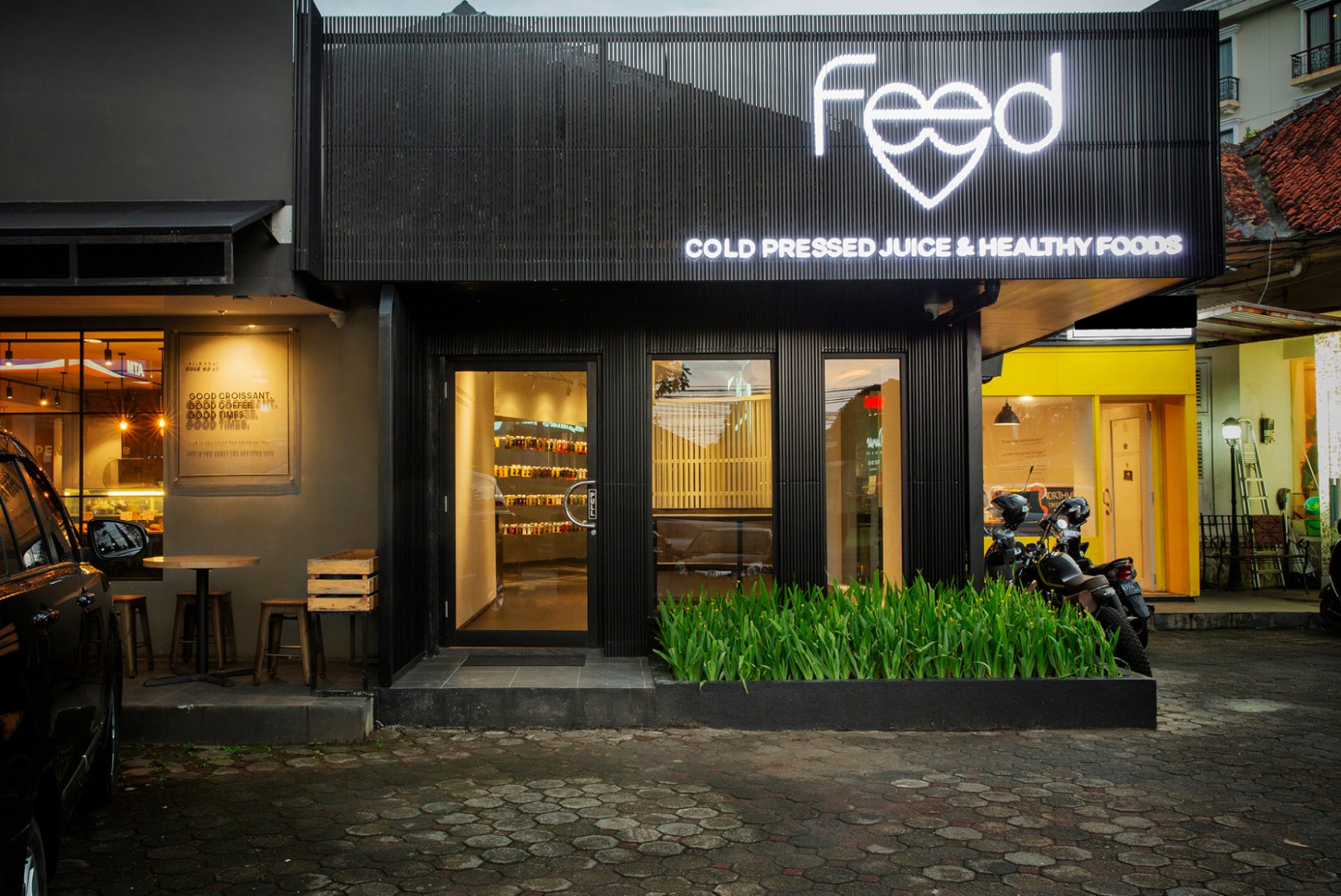
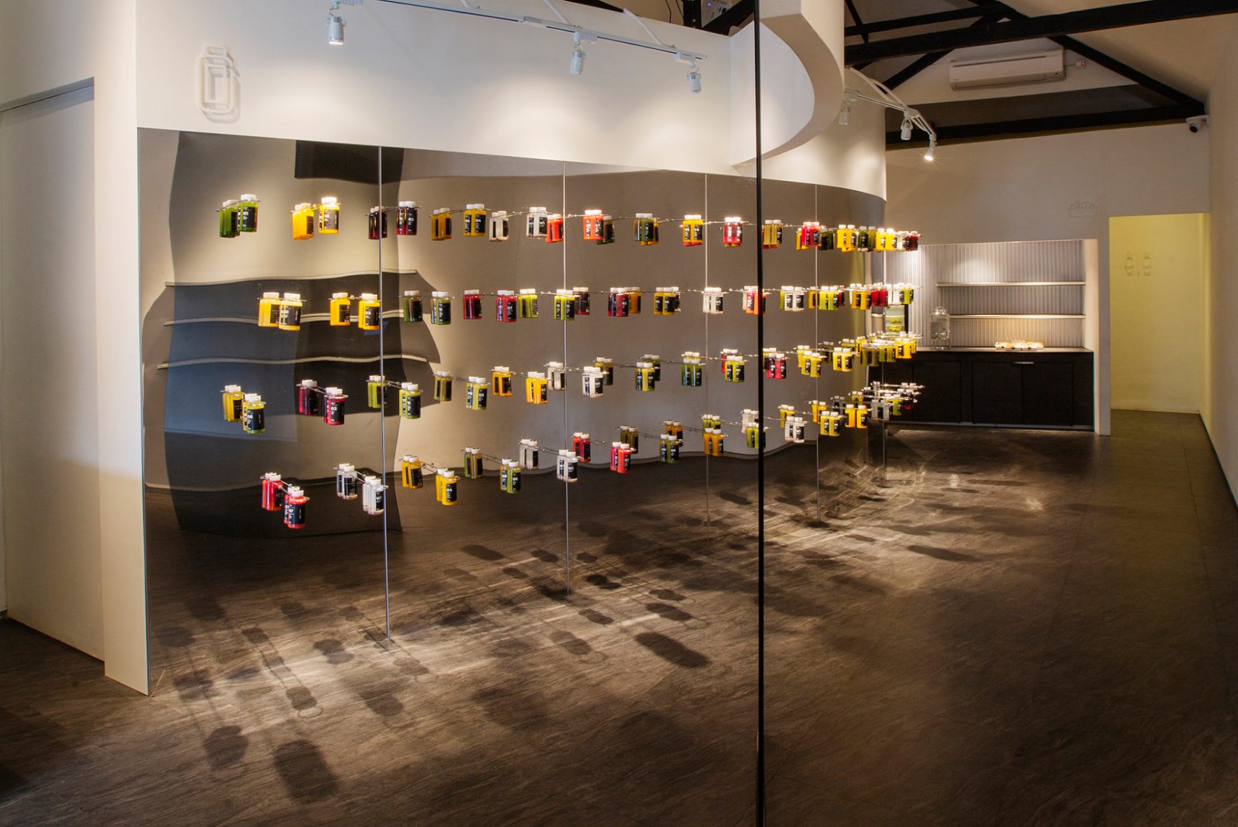
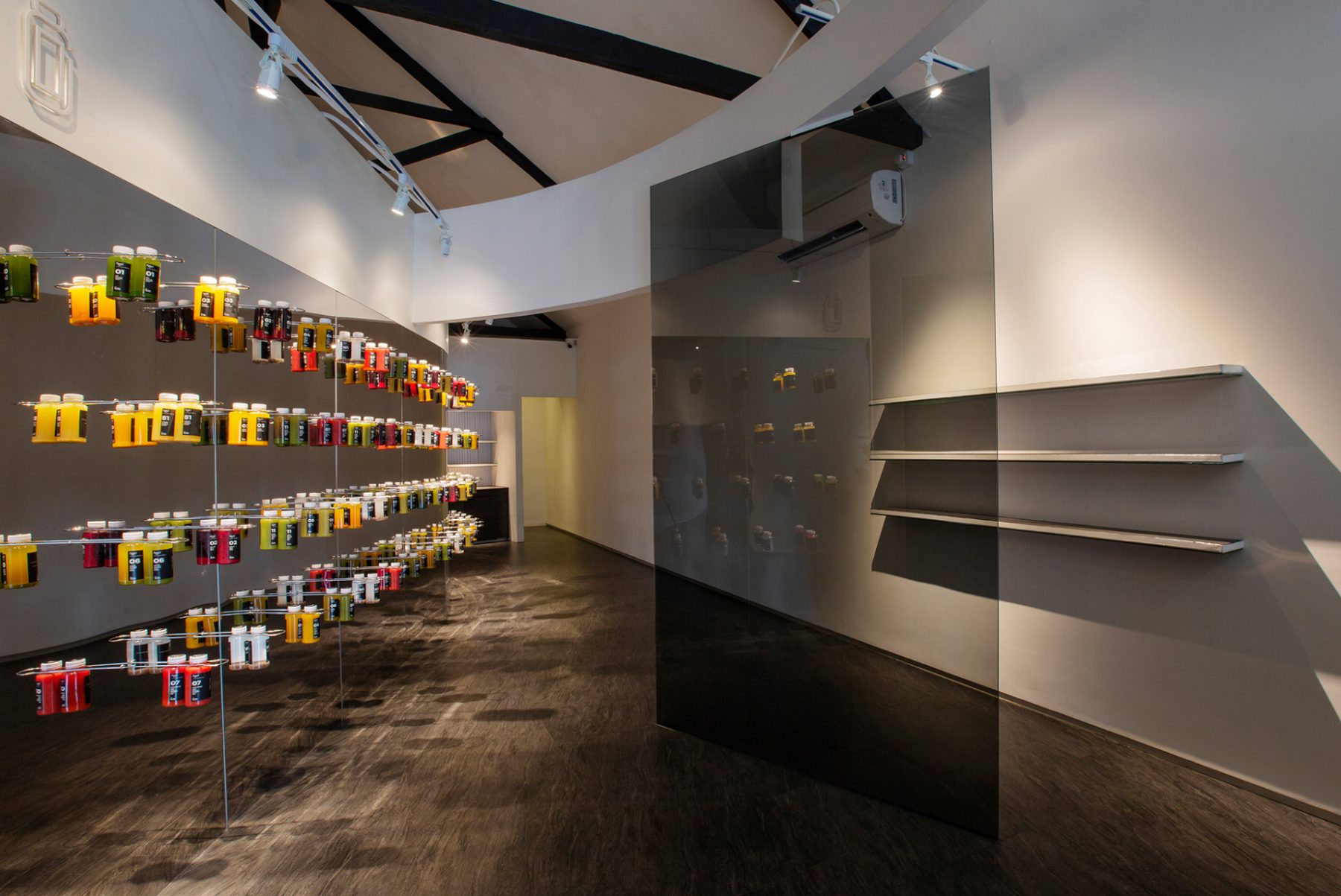
FEED offers fresh juice and food made from organic produce that is cultivated using sustainable agricultural methods by farmers in West Java, Indonesia. The company promotes physical and psychological wellbeing through proper body nourishment, following a holistic approach based on simplicity and mindfulness.
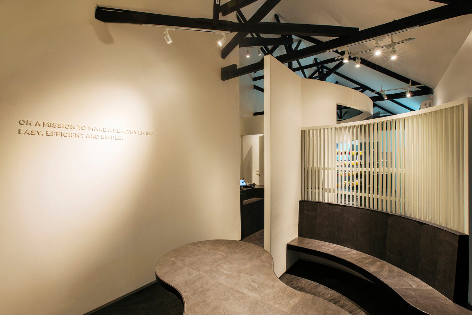
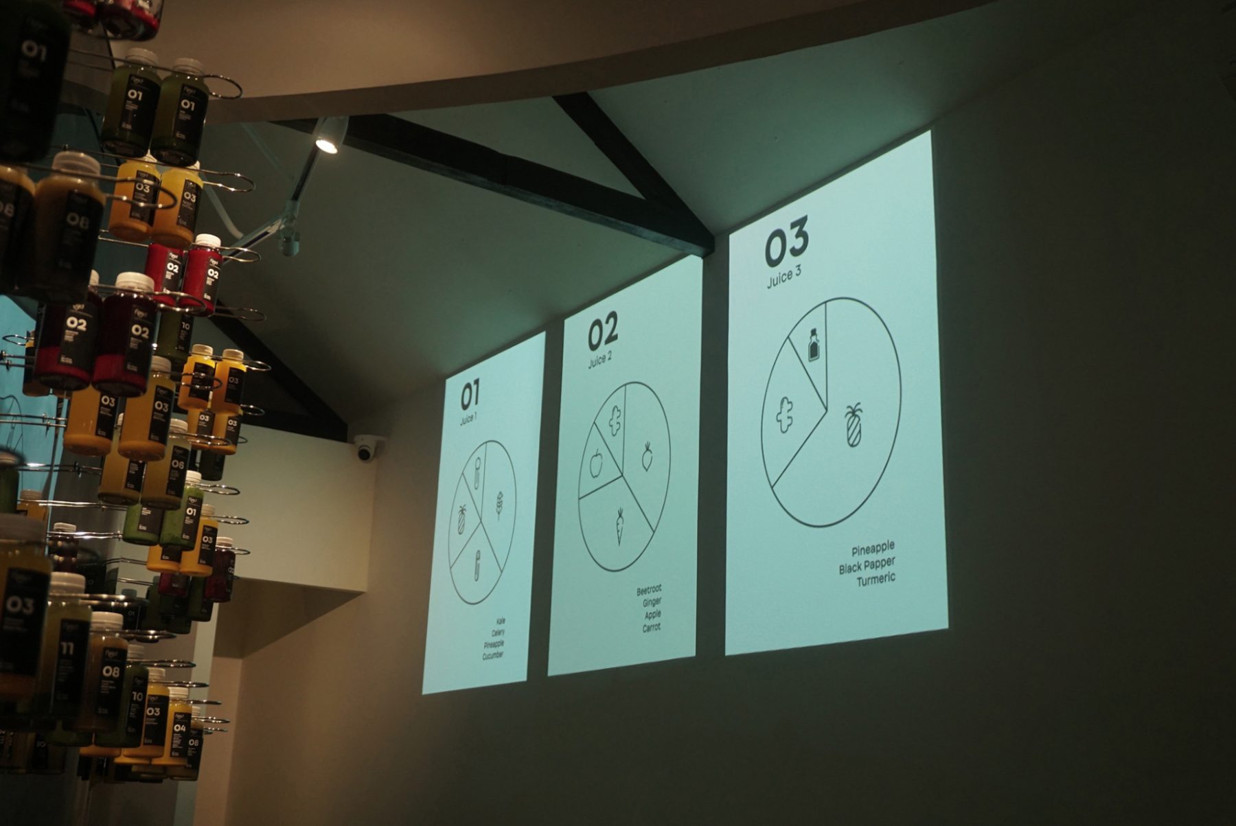
We collaborated with HGT Architects to design FEED’s first store in Bandung, Indonesia. We designed the icons, signage, juice packaging, and motion graphics to seamlessly blend with the store’s intimate, minimalist, and modern space, which draws inspiration from contemporary art installations.
Awarded GDUSA 2019 American Graphic Design
KUDOS Design Collaboratory
-
Andy kurniawan
Creative Director -
Fahmi Maulana Fajar
Art Director -
Sidiq Nurmawan
Designer
Guitar Heroes Exhibition Catalogue
The Met
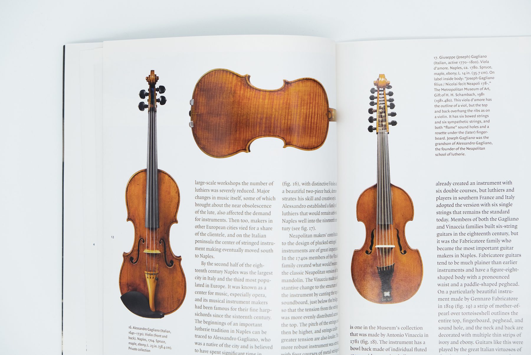
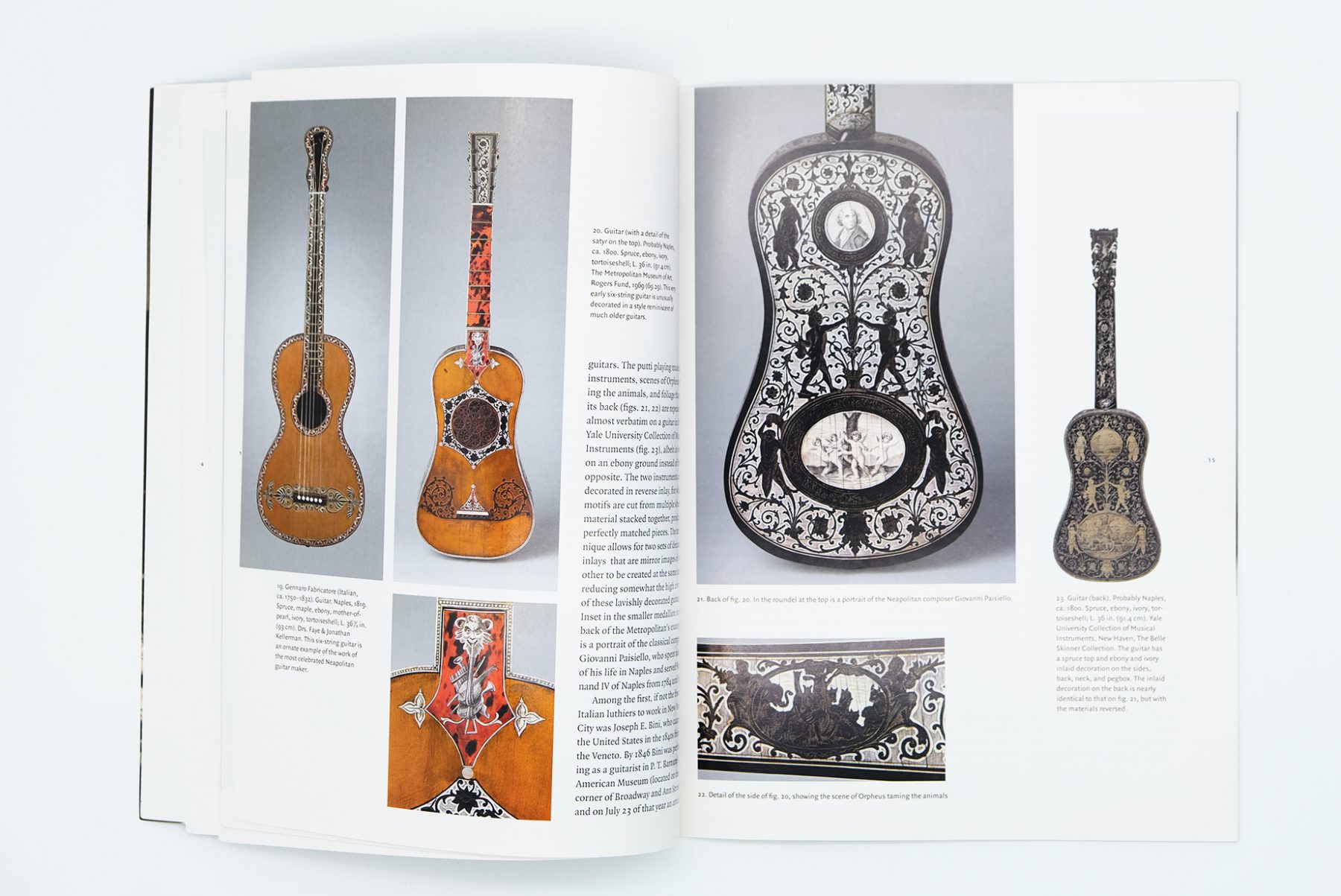
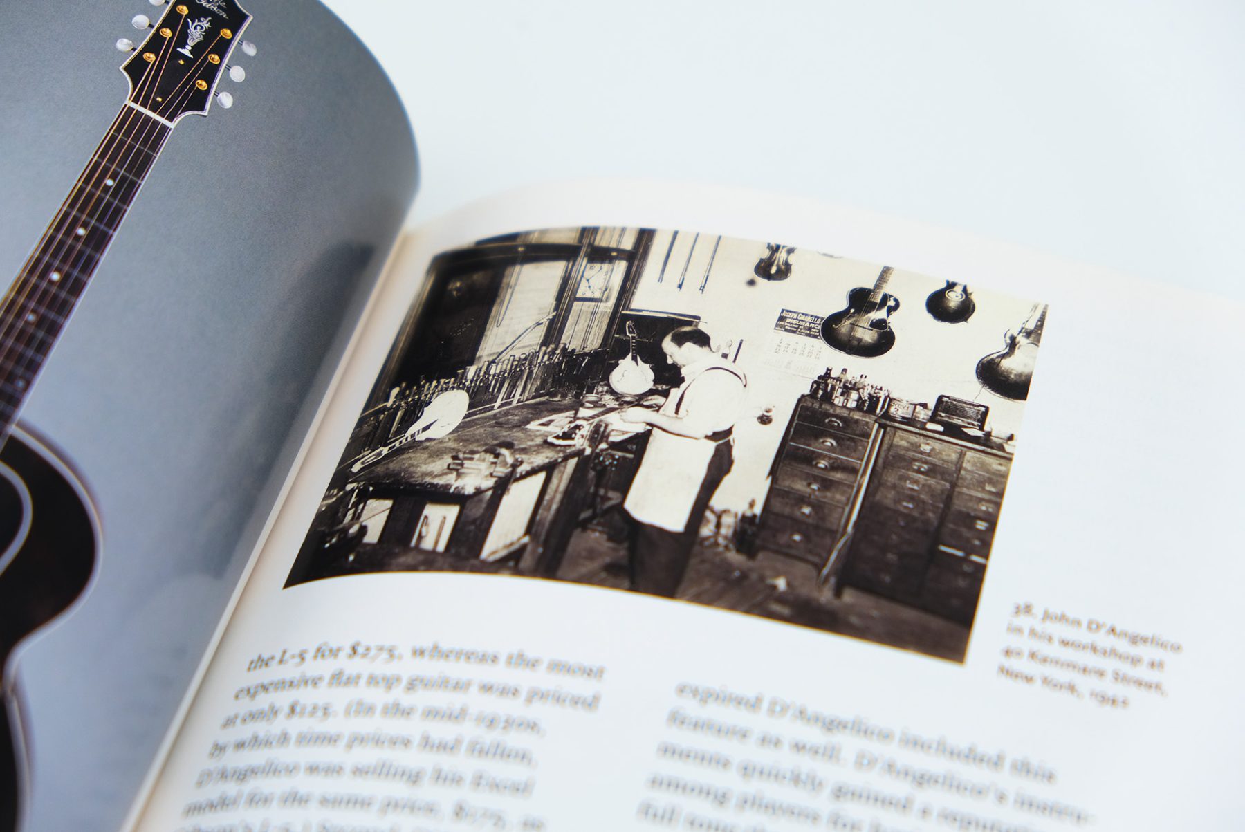
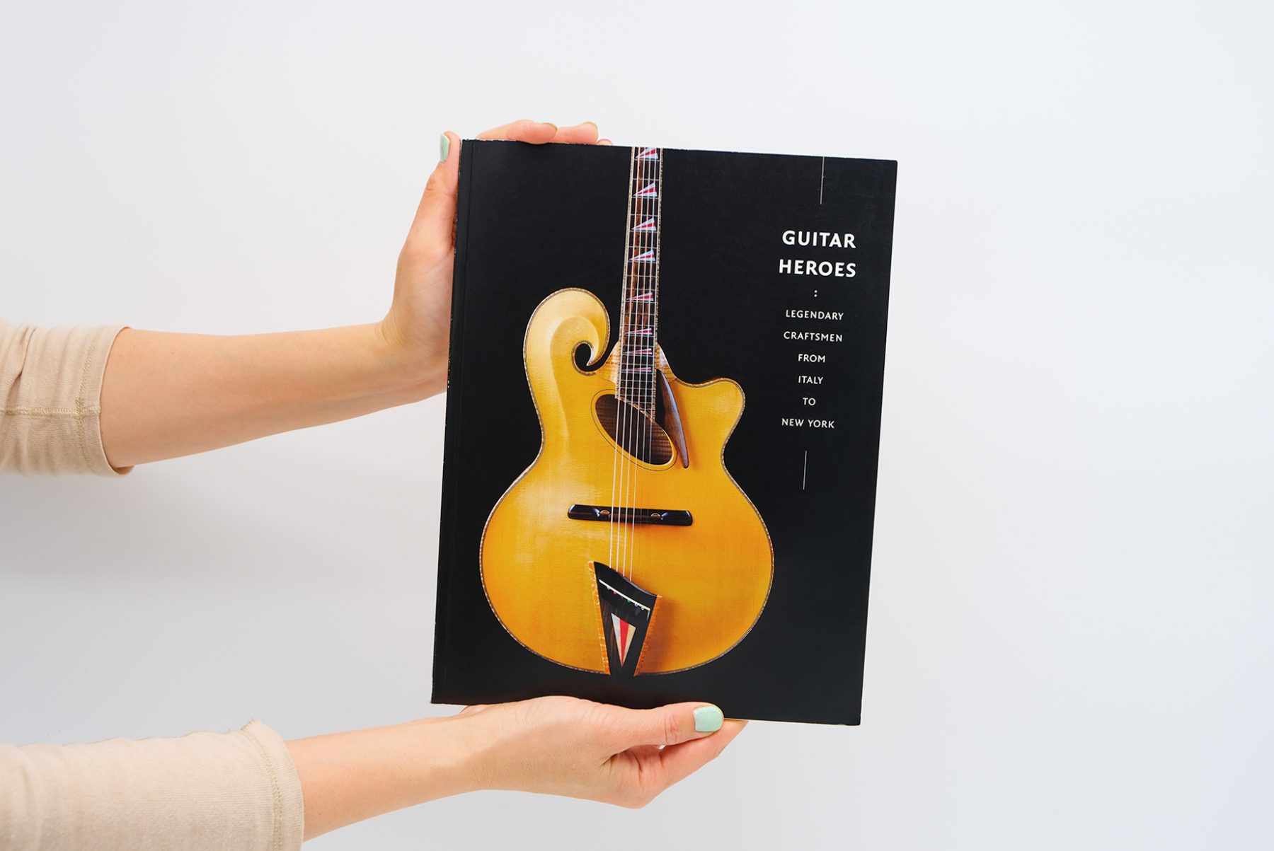
“Guitar Heroes: Legendary Craftsmen from Italy to New York” was a special exhibition at the Metropolitan Museum of Art in New York.
We designed the show’s exhibition catalogue. The cover and interior pages are decorated with typography, arranged vertically to evoke the appearance of guitar strings.
KUDOS Design Collaboratory
- John Kudos, Creative Director
AAP Event Posters
Cornell AAP
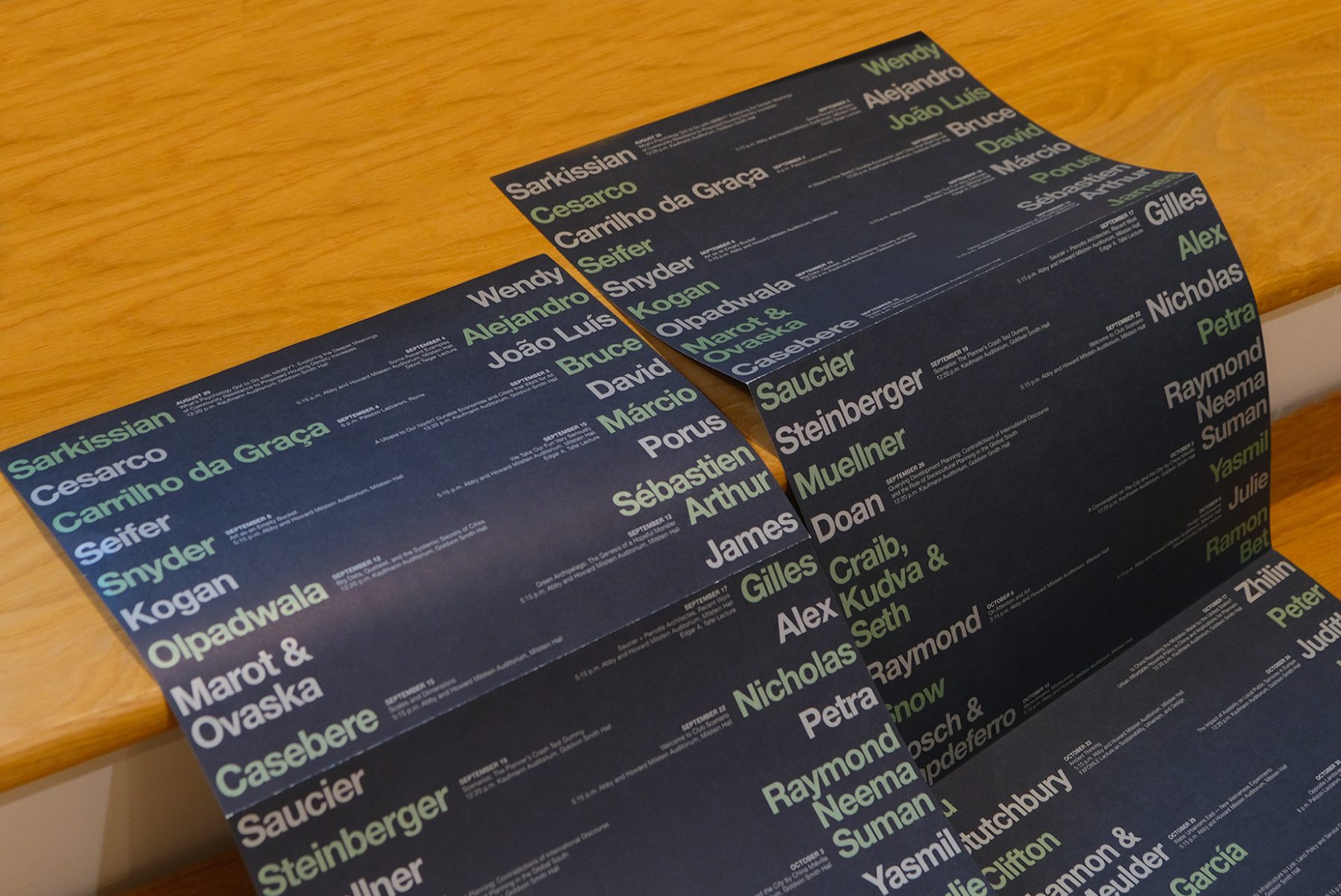
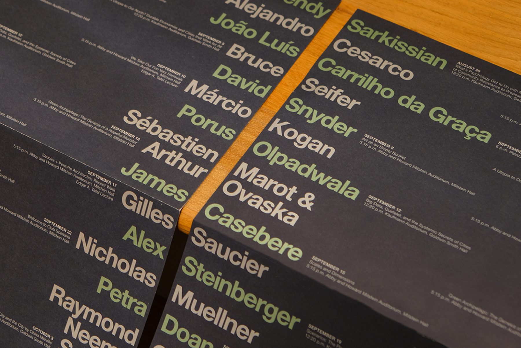
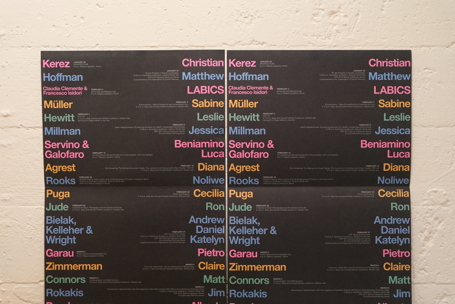
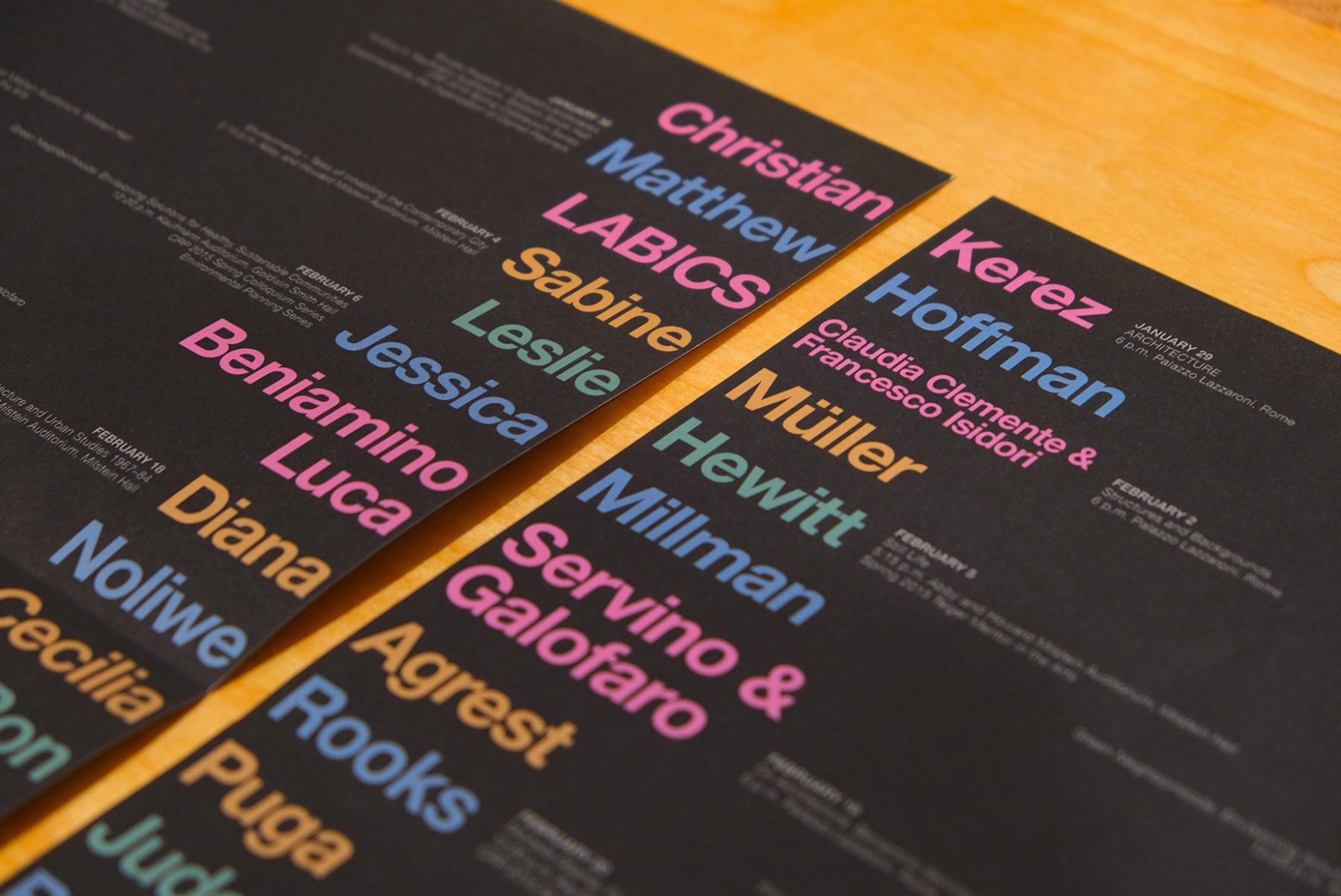
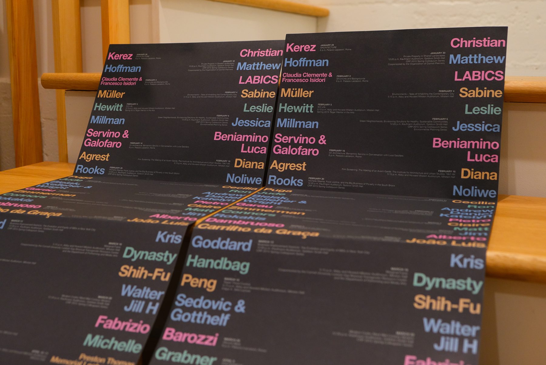
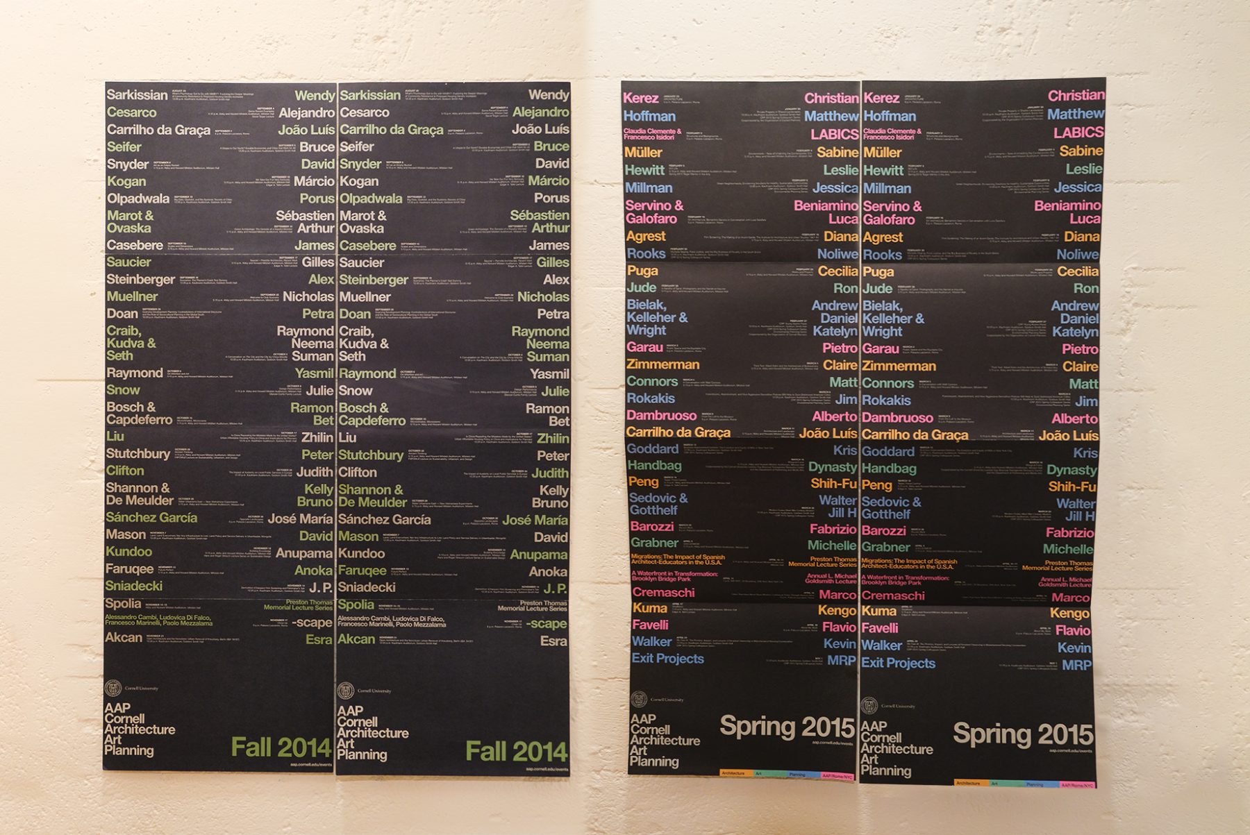
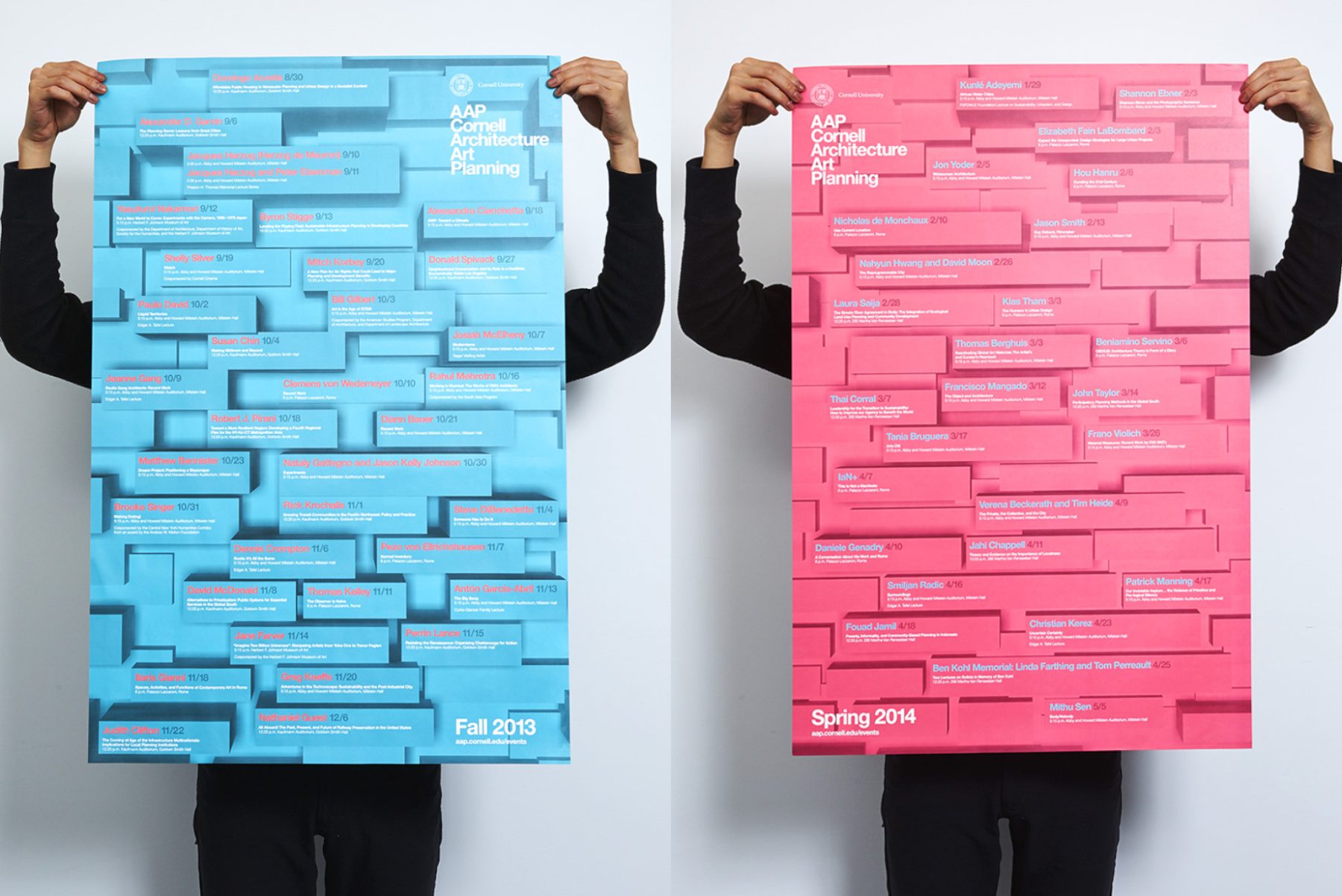
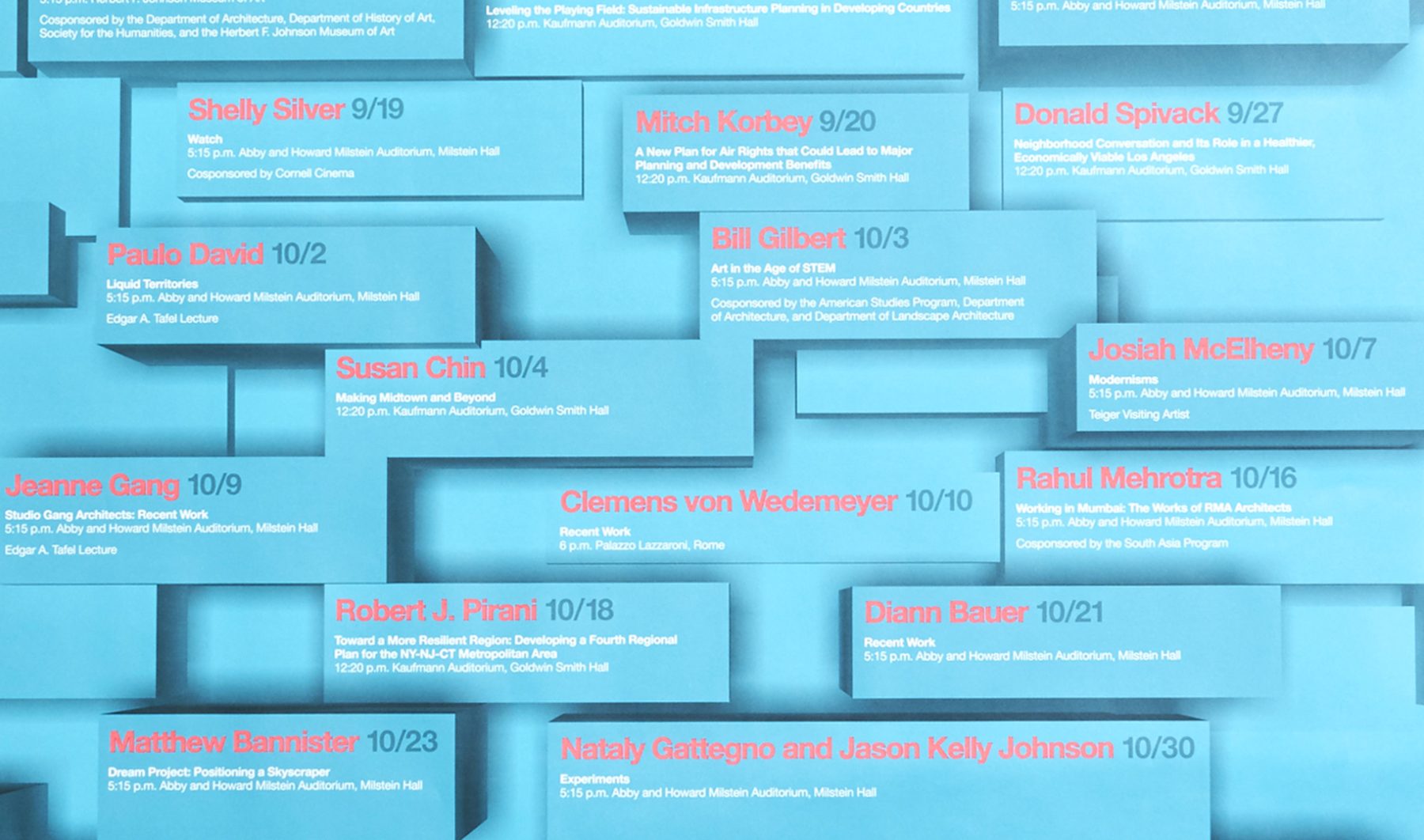
Cornell AAP is a world-renowned college offering a triple focus of studies in architecture, fine arts, and regional planning. We’ve been producing printed communications for the college since 2011.
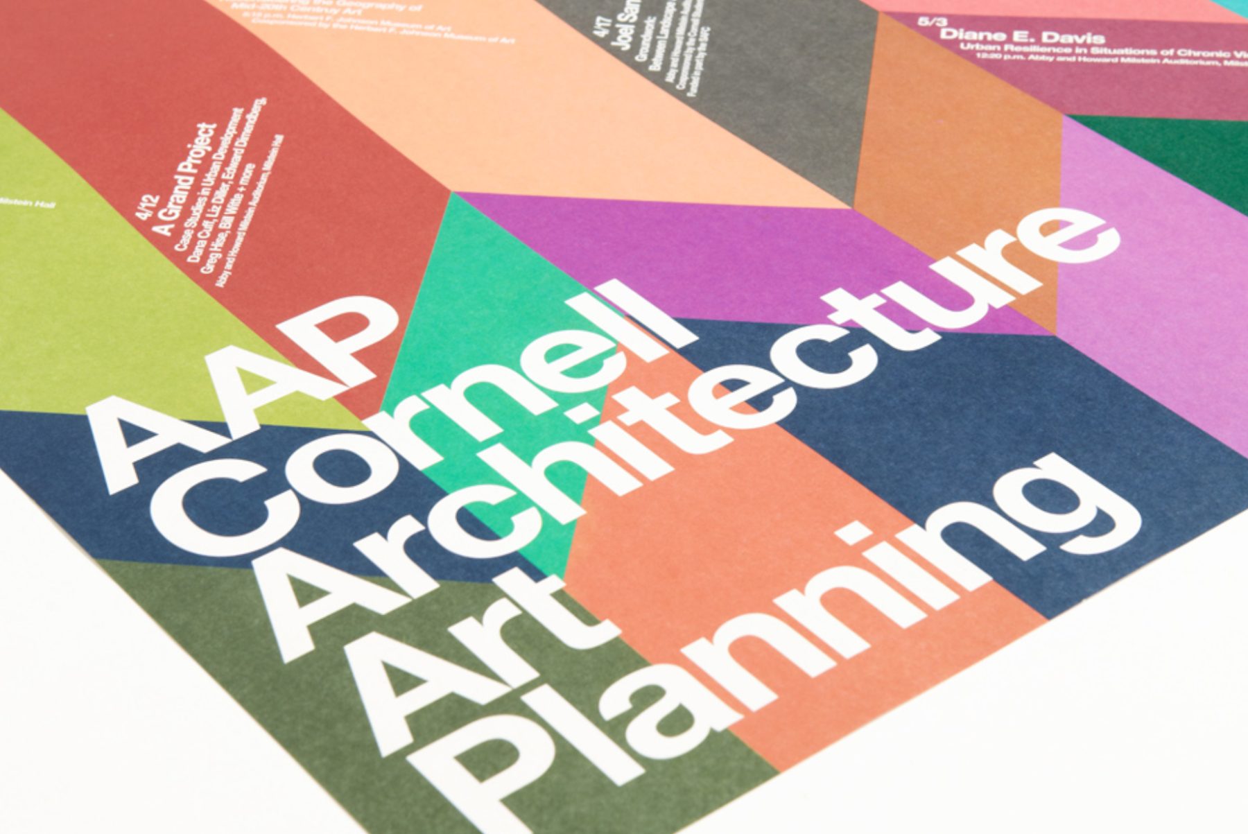
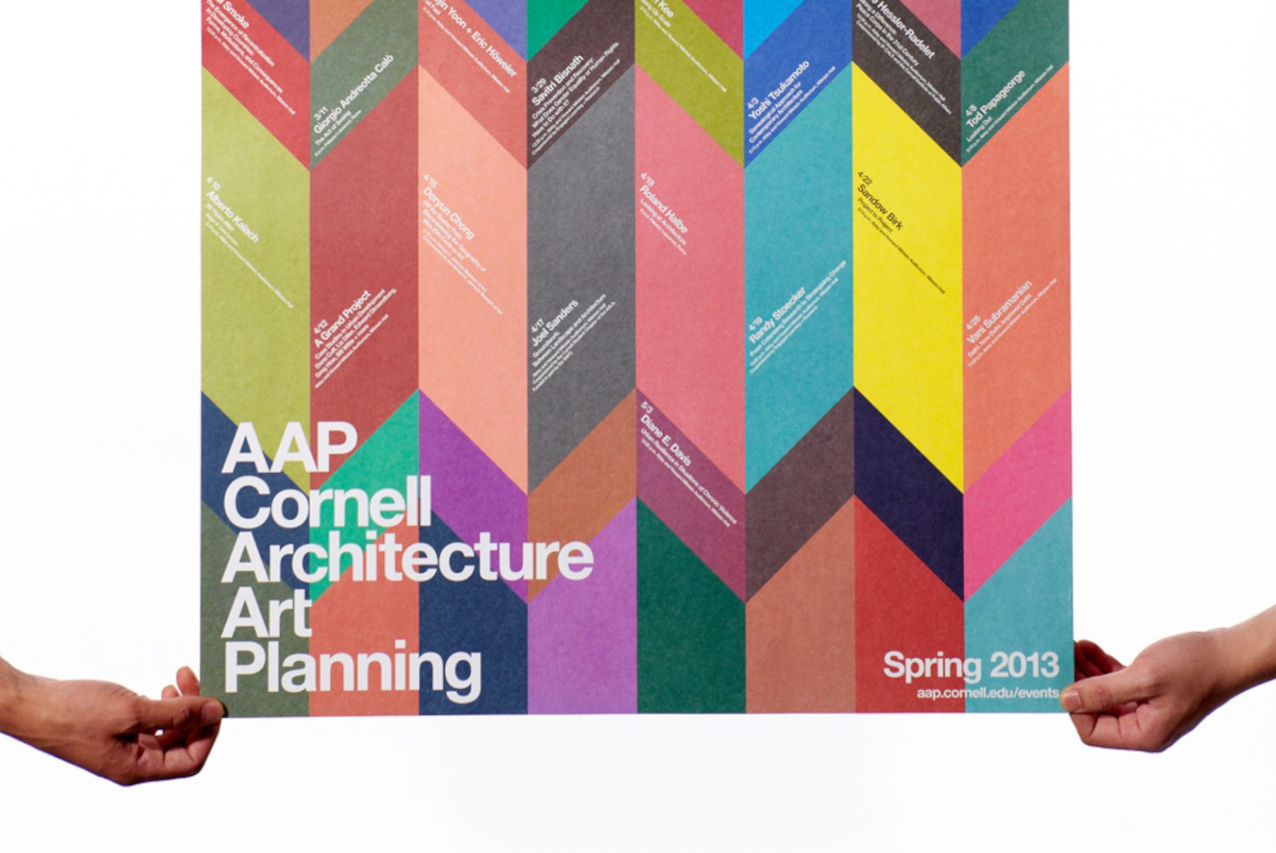
For this event’s poster, we were tasked by the Department of Architecture, Art, and Planning at Cornell University to experiment with new ways of presenting its array of distinguished speakers. We concluded with a concept that blends an origami folding pattern with color planes that challenge viewers’ sense of depth. Smaller posters were also distributed on campus to promote individual departmental events.
KUDOS Design Collaboratory
-
John Kudos
Creative Director -
Karen Vanderbilt
Designer
ARITA: Eternally Modern at NY NOW
Made in Japan Project
Capabilities
Client
Awards
-
GDUSA 2018 American Web Design
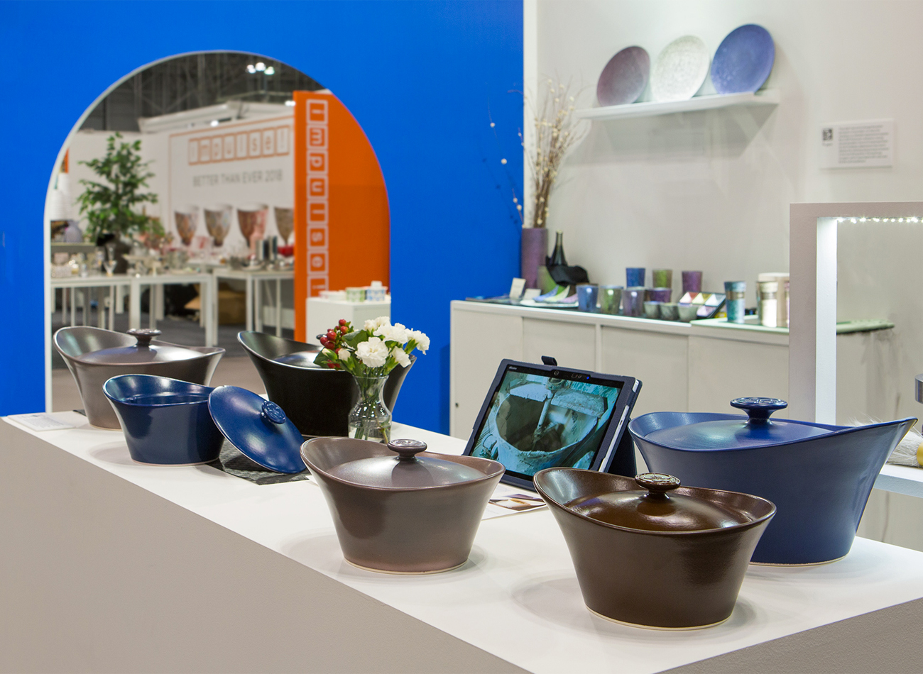
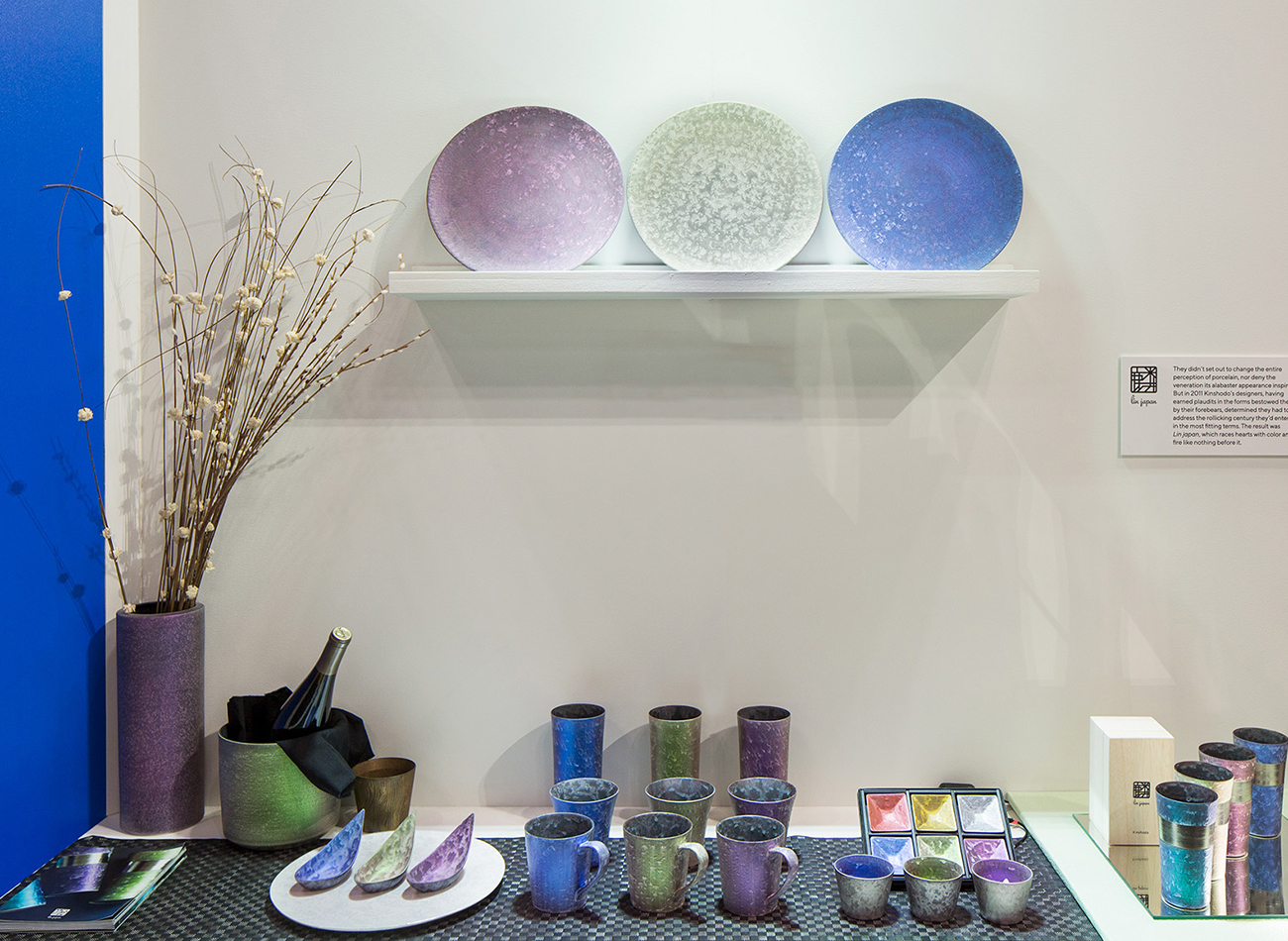
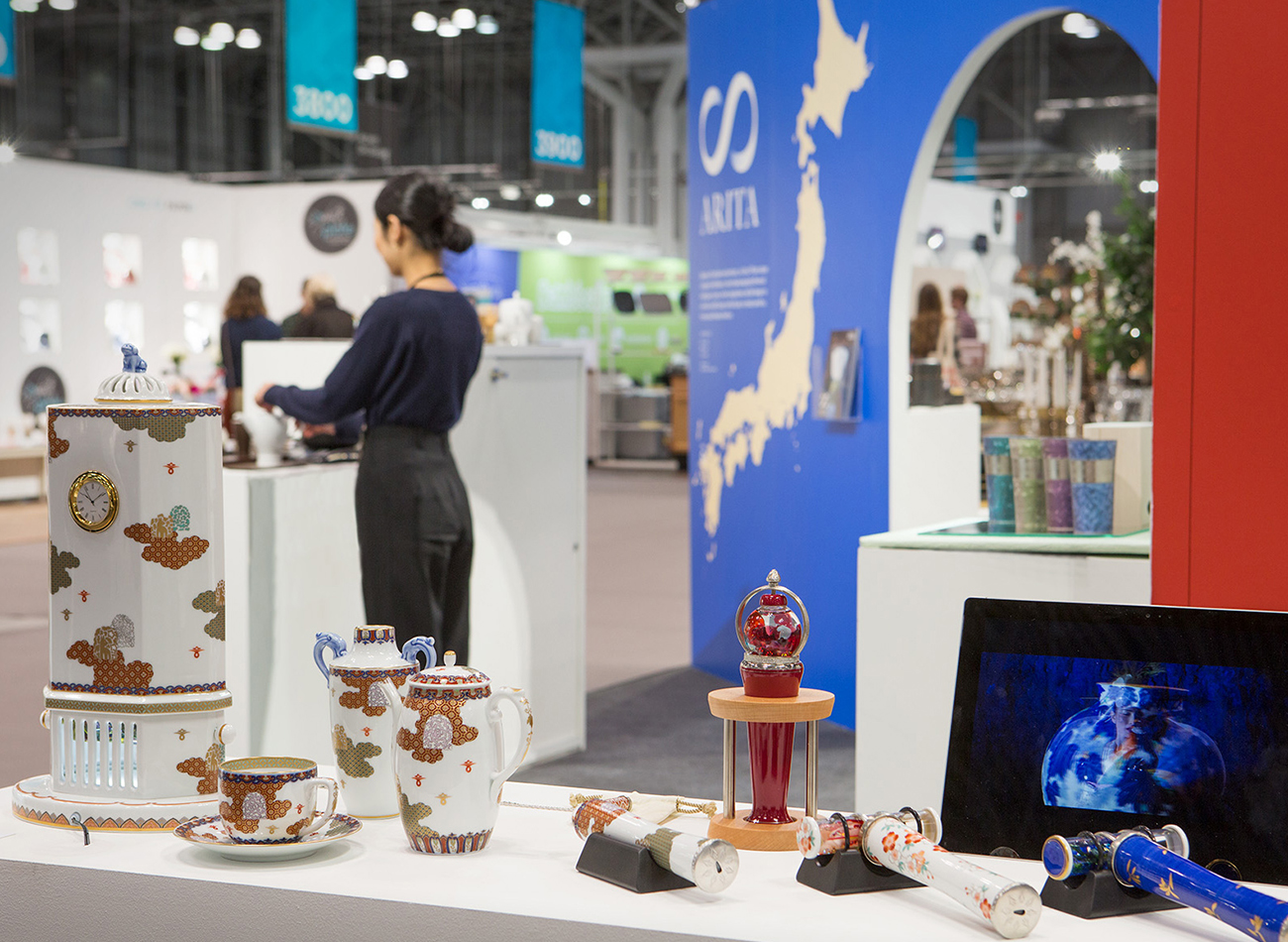
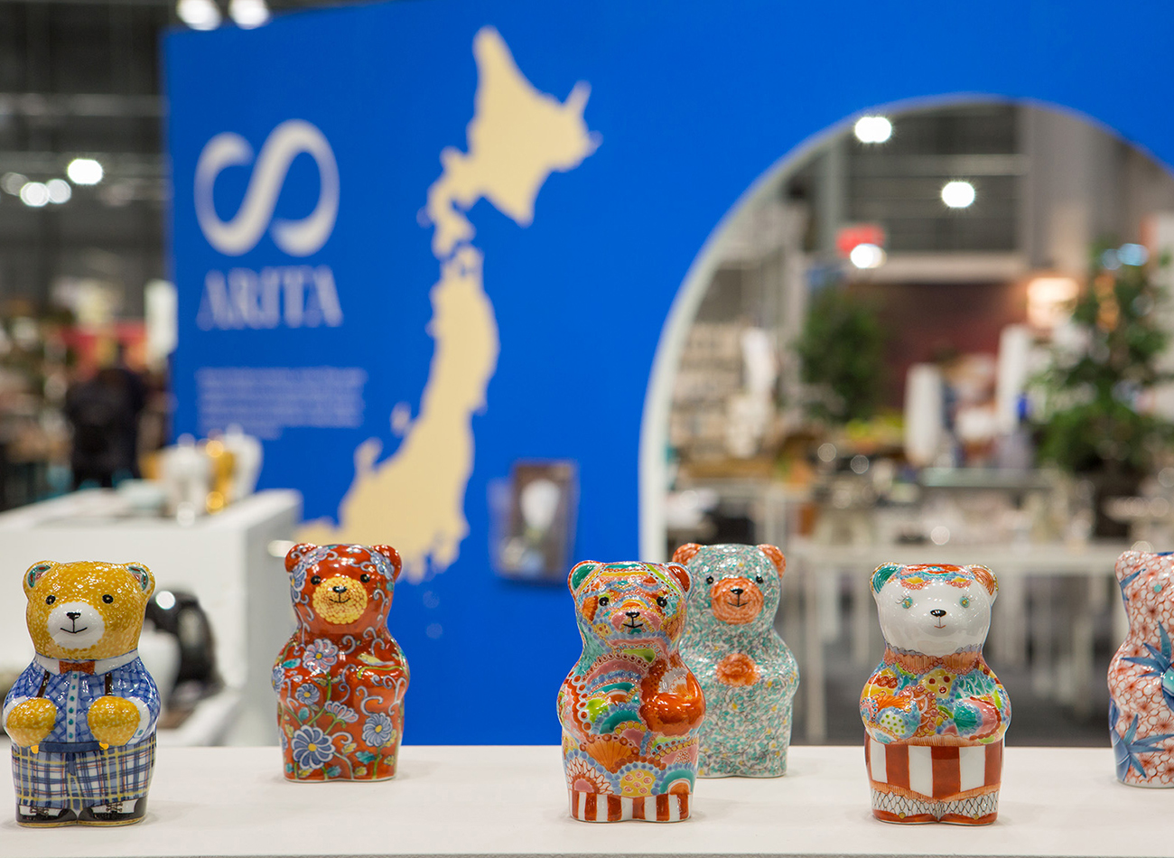
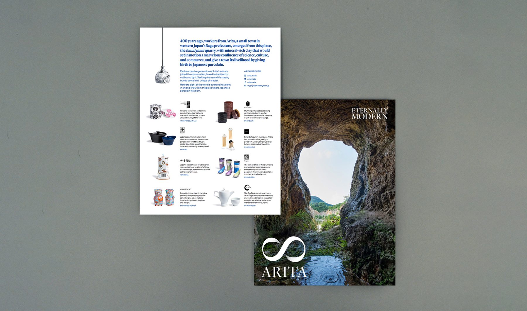
This was a collaboration with Made in Japan Project, funded by the Saga Prefectural Government. For the project, we completed the overall brand strategy, naming, exhibition design, art direction, website, and product design consultation for a government-led initiative promoting porcelain creators from Arita and their efforts to bring innovative Japanese design to the American market through NY NOW.
RESEARCH & CONSULTATION
Over the course of nine months, we visited Arita—the birthplace of porcelain in Japan—to consult with participating kilns and distributors over ideas for their product design, brand positioning, and marketing strategy for the U.S. market.
BRANDING
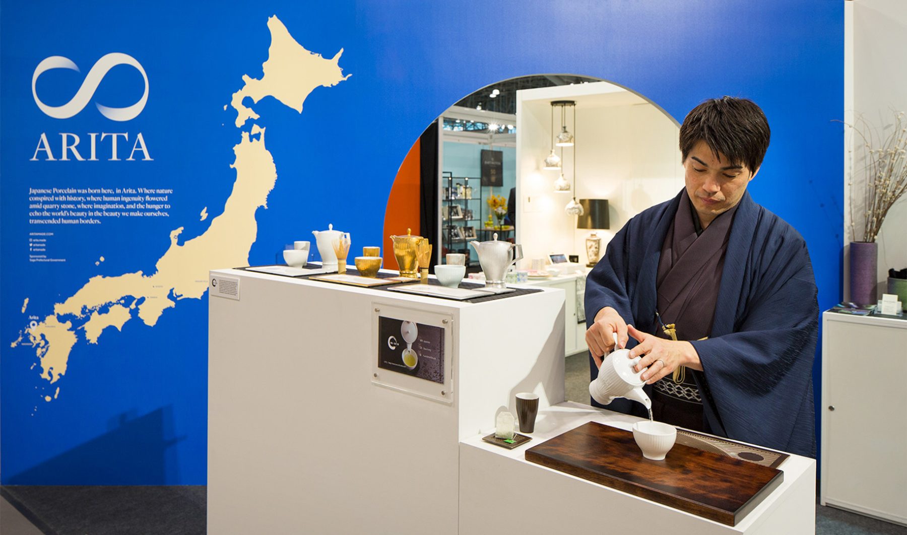
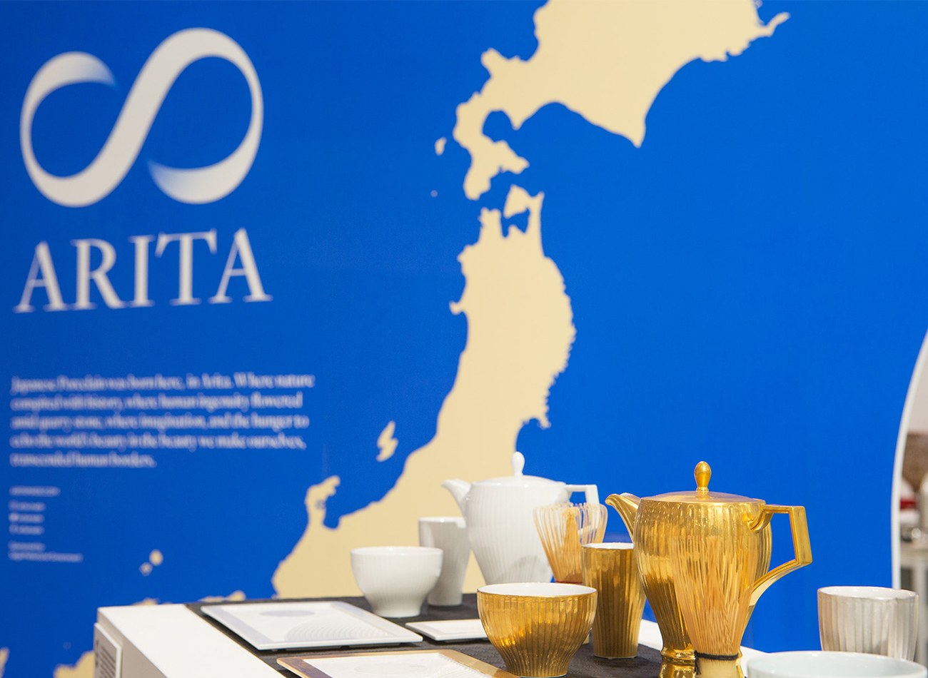
For the visual identity, we designed a lemniscate ∞ paired with the town’s name and the tagline “Eternally Modern,” pointing to how Arita creators continue to evolve four centuries of tradition, craftsmanship, and innovation into distinctively modern everyday products.
WEBSITE
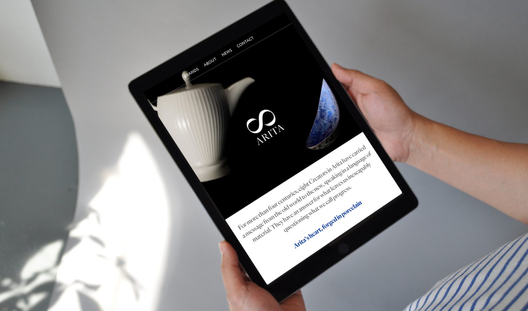
Our responsive bilingual website was written for both Western and Japanese readers, with distinct messaging catered to each audience. We art-directed all of the website’s videos and photography, including a portrayal of key products falling in slow motion, close-ups in 360-degree rotation, documentary photos of Arita, and a video showing the porcelain-creation process.
EXHIBITION BOOTH
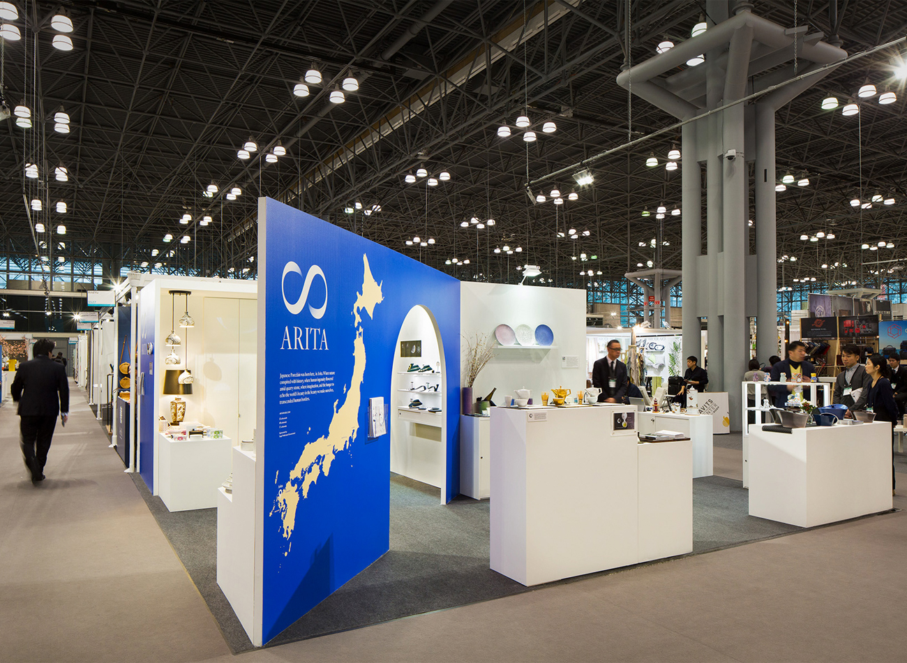
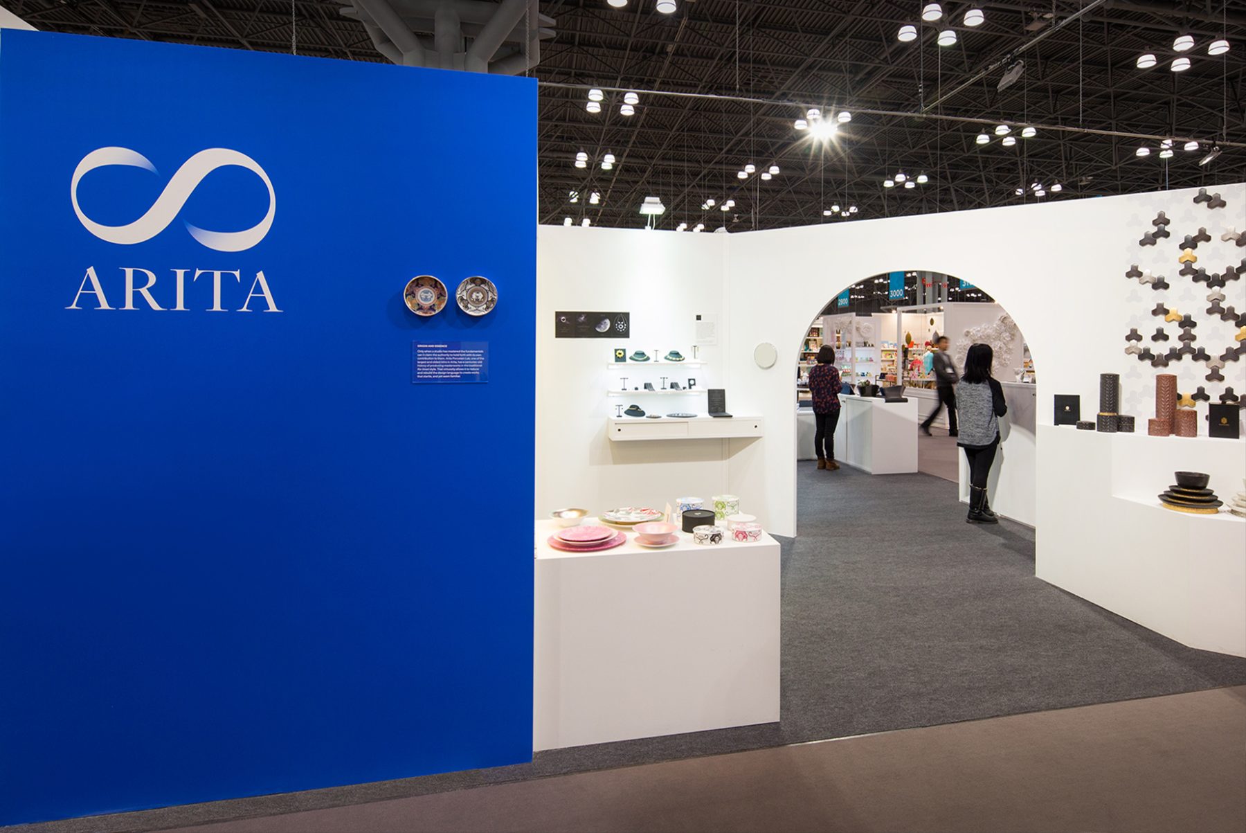
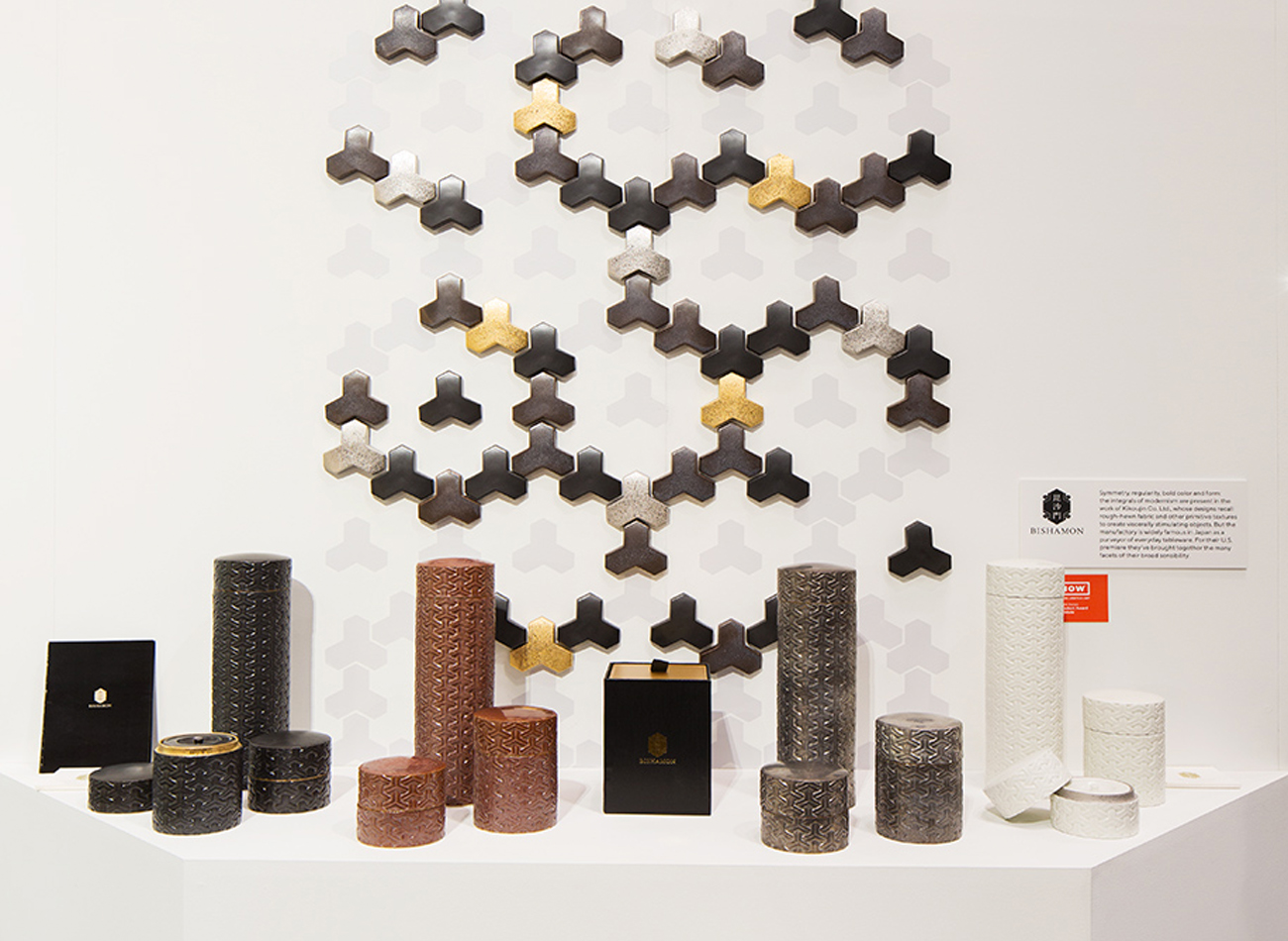
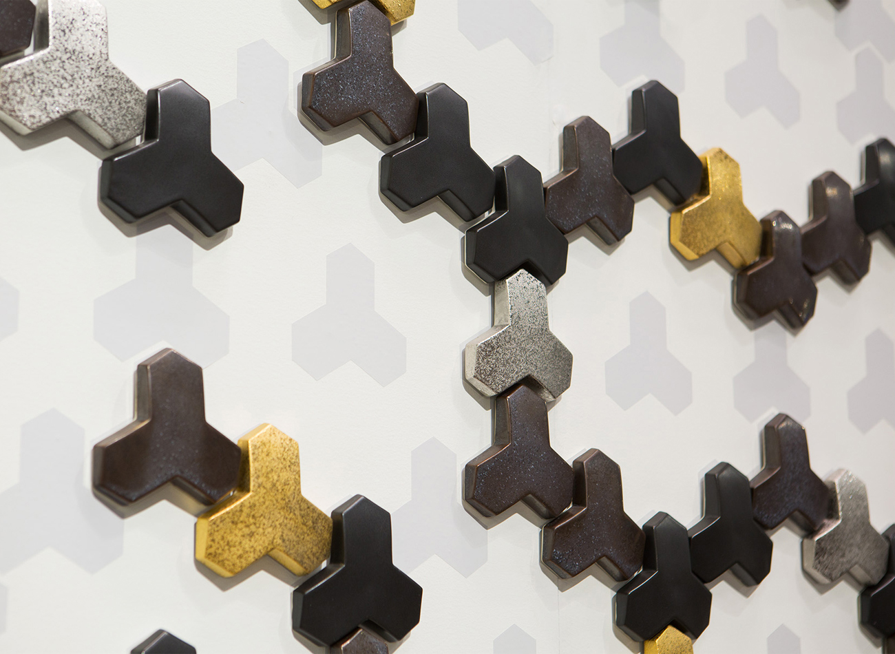
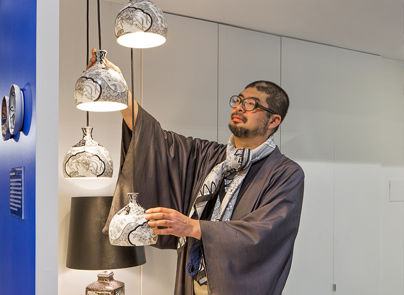
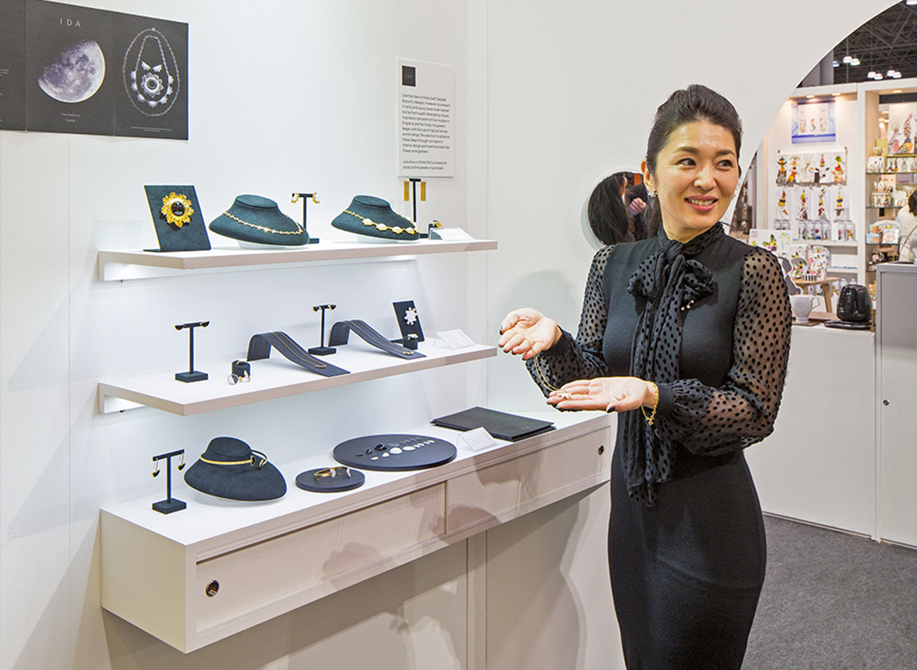
For the NY NOW market exhibition in February 2018, we designed a corner booth divided by a diagonal wall archway similar to those typically found in traditional porcelain kilns. Each creator had a museum-like stage and hidden storage underneath.
KUDOS Design Collaboratory
-
John Kudos
Creative Director -
Kiki Katahira
Art Director -
Ashley Wu
Designer -
Sumit Paul
Web Designer & Developer -
Mika Yoshida & David Imber (Maniform)
Copywriter
MANIFORM
-
David Imber
Copywriter -
Mika Yoshida
Copywriter
Photography
- Sam Morgan Photography
Revealing the Invisible
Corning Museum of Glass
Capabilities
Focus Area
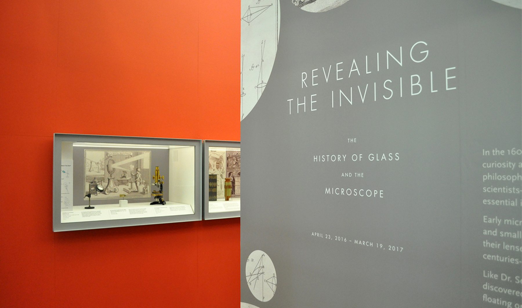
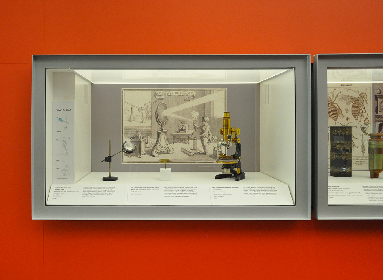
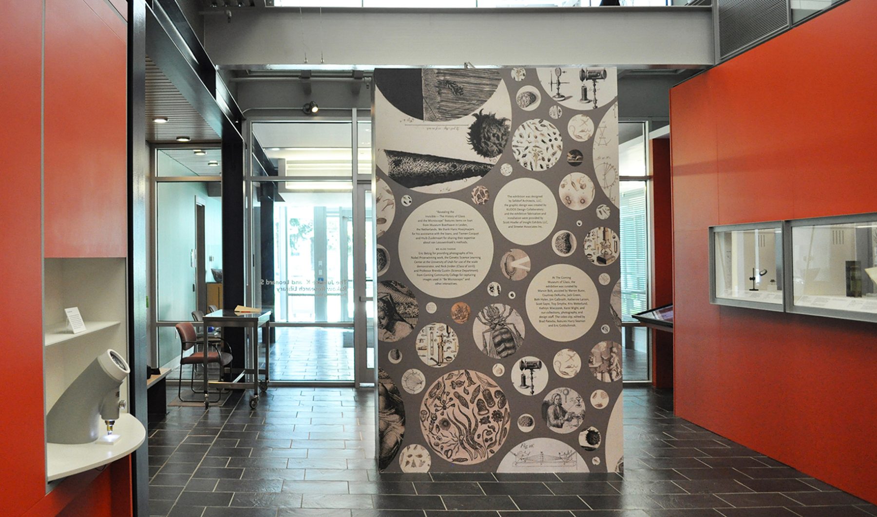
For these exhibition graphics for “Revealing the Invisible” at the Corning Museum of Glass, we collaborated with Selldorf Architects and the museum’s in-house team to ensure that all graphic and text panels followed the museum’s visual theme.
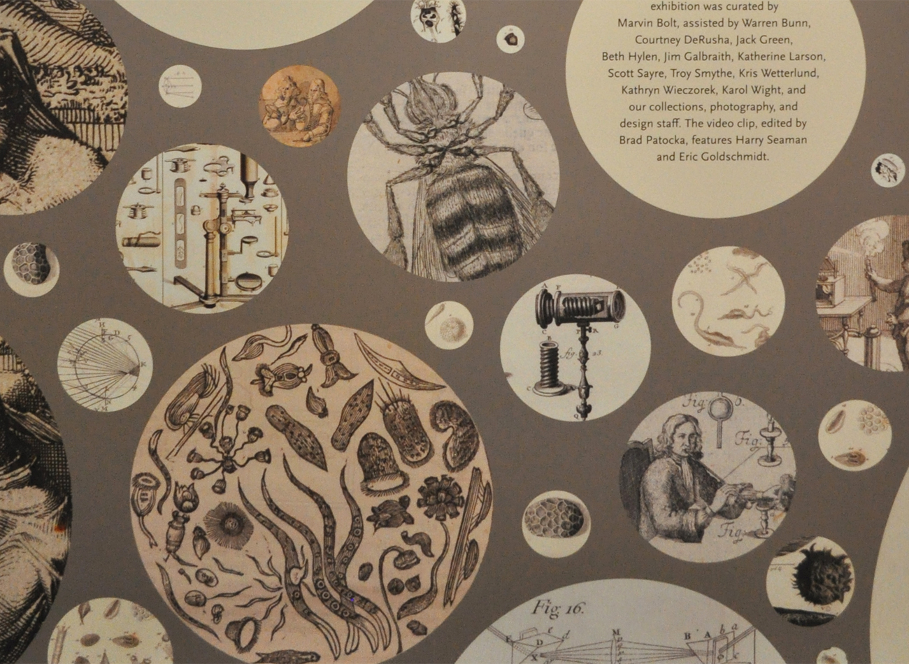
We designed a circular graphic pattern, inspired by the microscope lens, to cover the title wall. Each circle contains a close-up detail of drawings depicting objects that were discovered through the microscope.
KUDOS Design Collaboratory
-
John Kudos
Creative Director
Selldorf Architects
-
Lisa Green
Partner in charge
Digital Equity Accelerator Brand & Illustration Playbook
Aspen Digital
Capabilities
Focus Area
Client
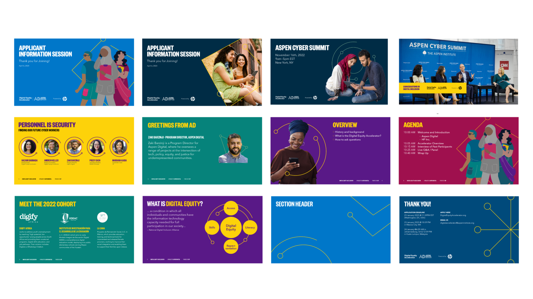
By empowering local NGOs and non-governmental organizations to accelerate digital inclusion in their communities, Aspen Digital Equity advances social and economic equality, bridging the digital divide and creating opportunities for all.
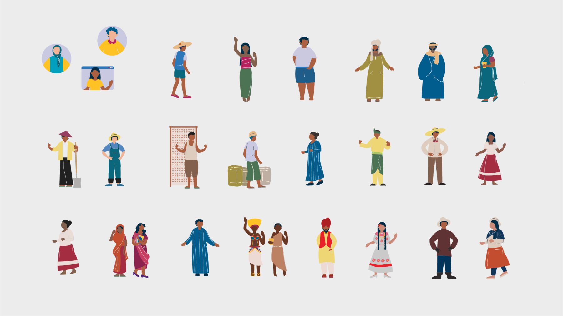
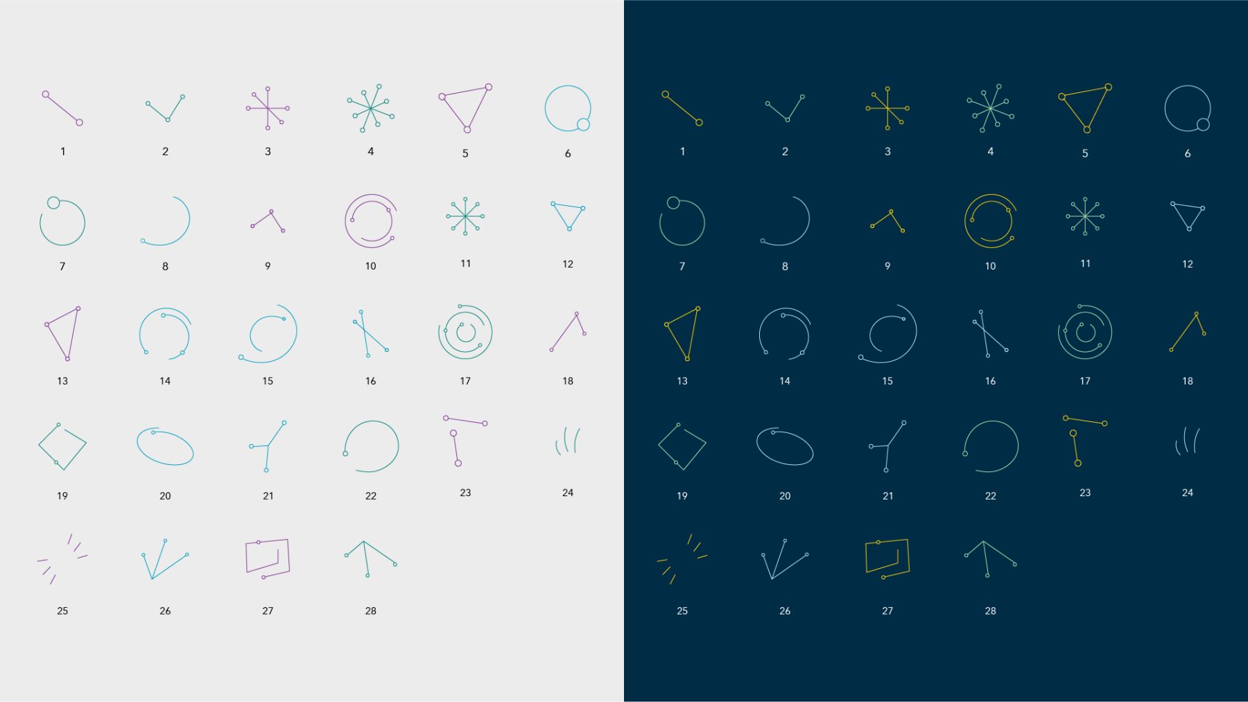
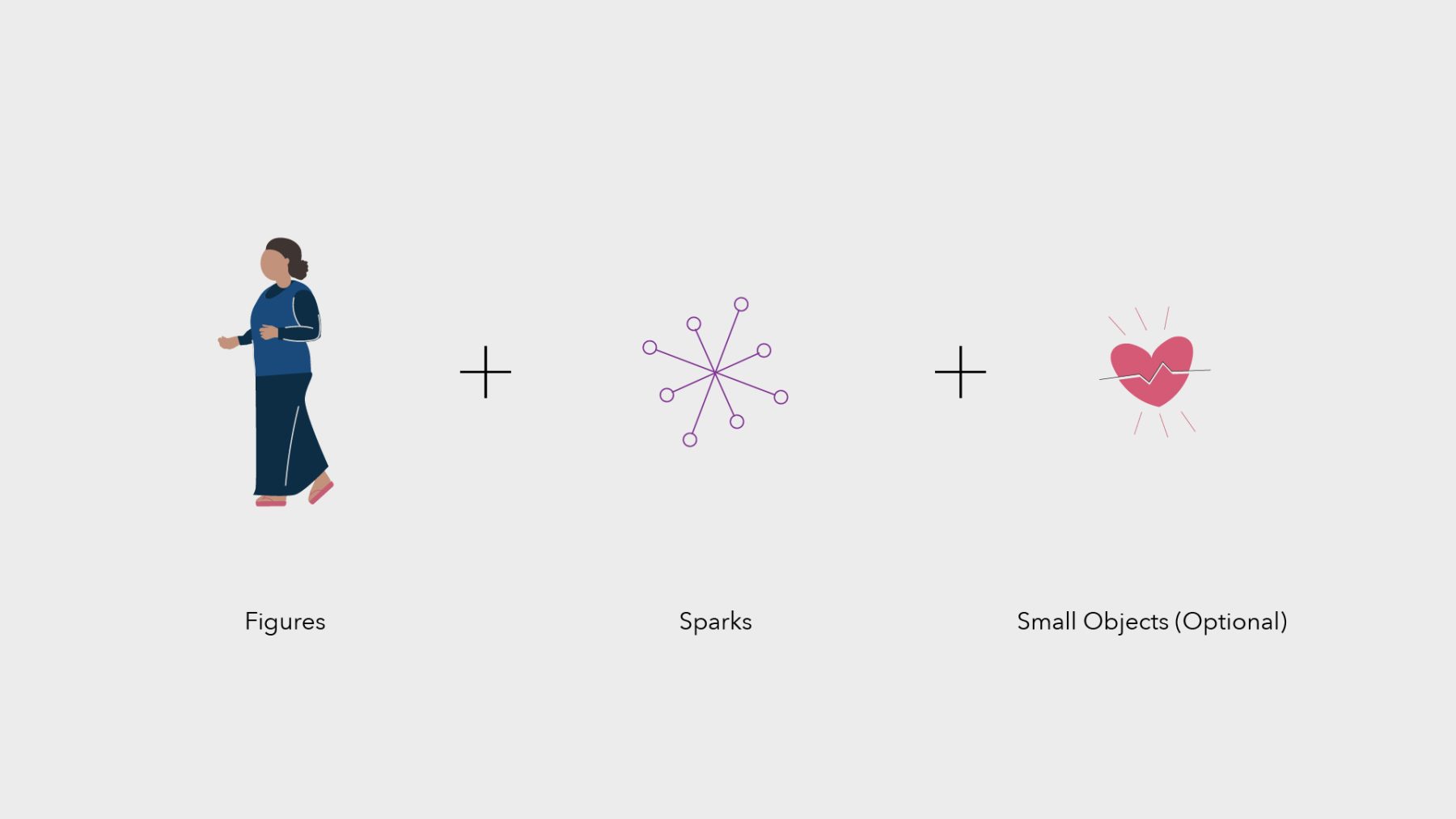
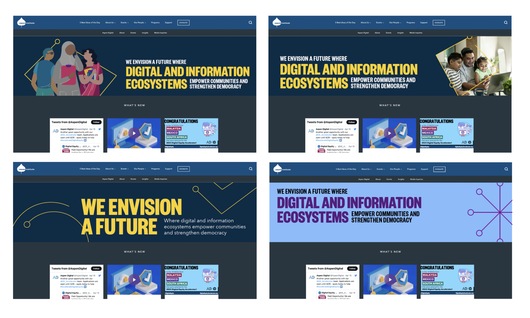
This branding project for Aspen Digital Equity reflects their commitment to fostering social innovation and digital inclusion worldwide. Collaborating with Aspen Institute’s Aspen Digital, we crafted a vibrant and inclusive visual identity, characterized by a fun, vivid palette. Custom digital templates and an illustration playbook were also developed, enabling seamless customization and reinforcing the organization’s commitment to inclusivity.
KUDOS Design Collaboratory
-
John Kudos
Creative Director -
Andini Pratiwi
Art Director -
Fay Qiu
Designer -
Jessica Mackta
Project Manager -
Syamil Haqqoni, Imam Fadhillah, Nicole Olivia Mulya, Salma Azhar, Asha Adelia Rahayu
Illustrator -
Robi Dafit
Project Manager

Design Tech Brochure
Cornell University AAP
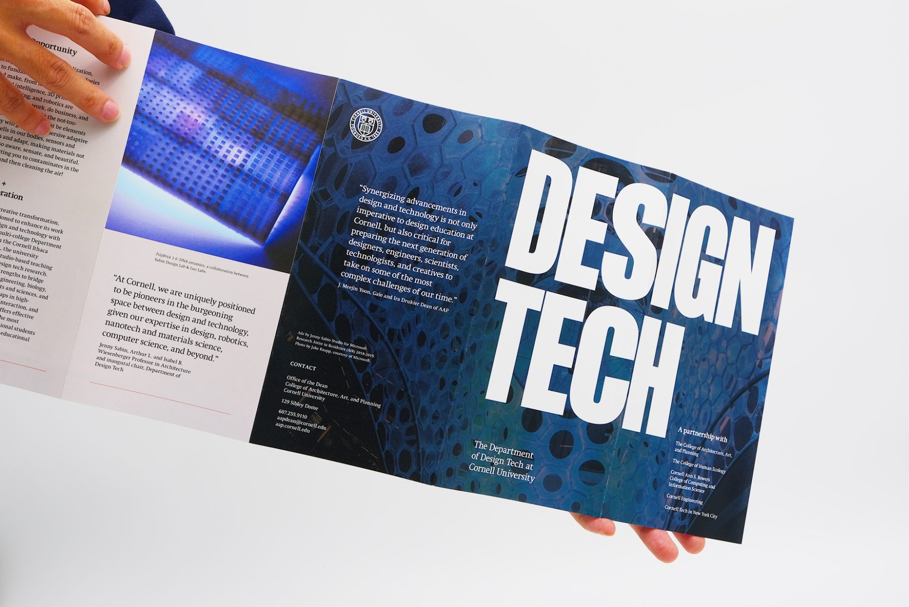
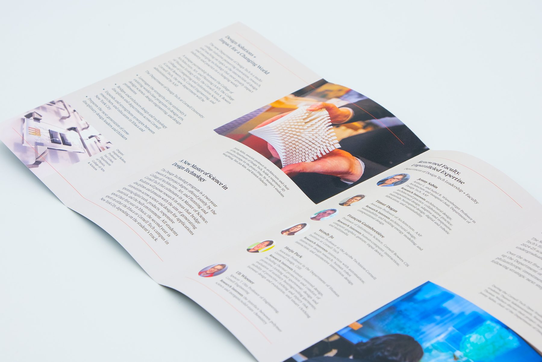
Cornell University’s new Department of Design Tech is a multi-college, transdisciplinary initiative pioneering innovation, research, and teaching on those topics at the intersection of design and emerging technology that most greatly impact research, industry, and practice in an ever-evolving world.
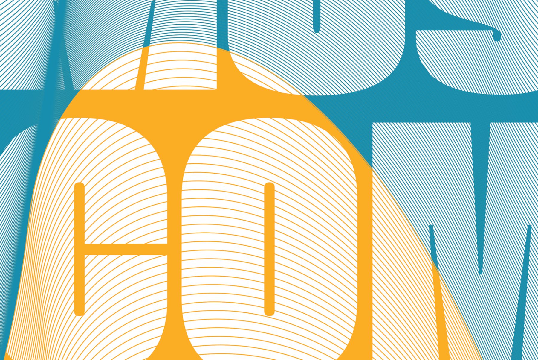
The five-panel pamphlet we designed for the Department of Design Tech serves as a captivating gateway into the innovative world of design and emerging technology. With a bold “Des Tec” letterform adorning the front cover, the brochure invites viewers to explore further, unveiling the full “design tech” message as they delve deeper into its contents. Curated images, serving as full-blown backgrounds, seamlessly merge with the technological narrative, showcasing the department’s commitment to innovation, research, and education. Integrated red lines weave subtly throughout the pamphlet, harmonizing the college’s existing branding with the pamphlet’s fresh and contemporary aesthetic.
KUDOS Design Collaboratory
-
John Kudos
Creative Director -
Fay Qiu
Designer -
Amanda Knott
Project Manager
Cornell Tech
Made in Tokyo
Japan Society
Capabilities
Focus Area
Client
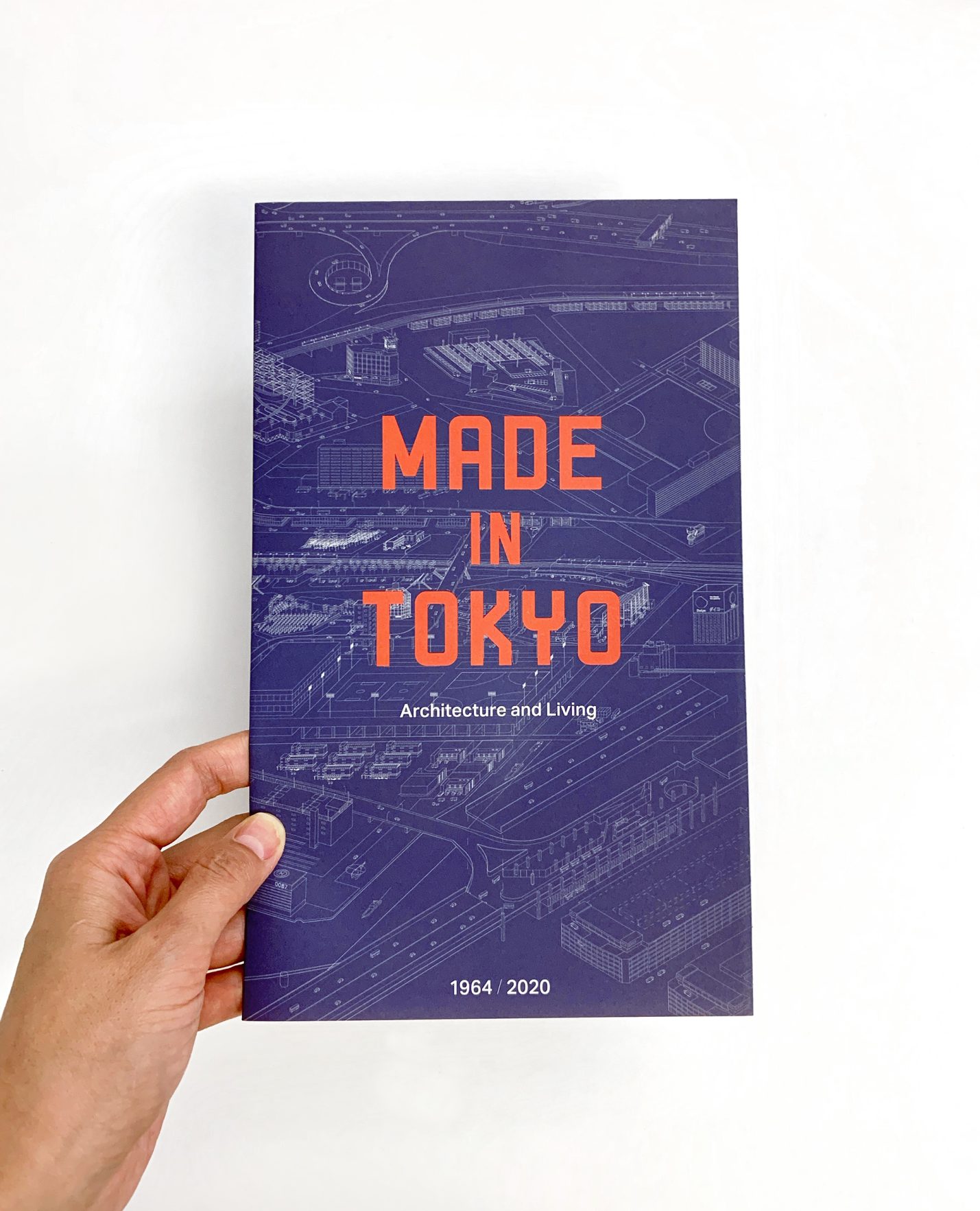
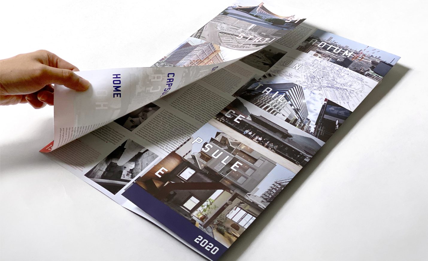
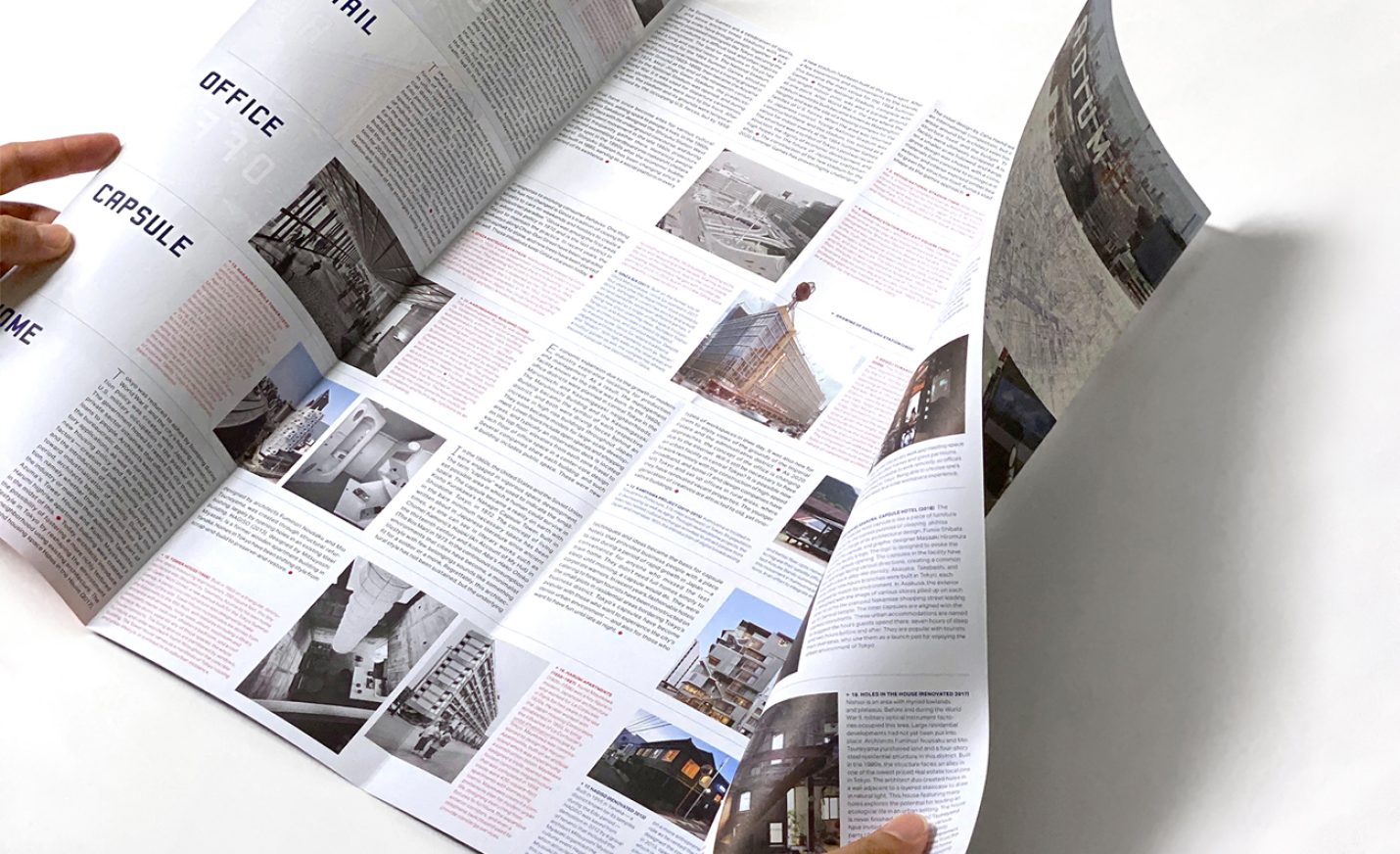
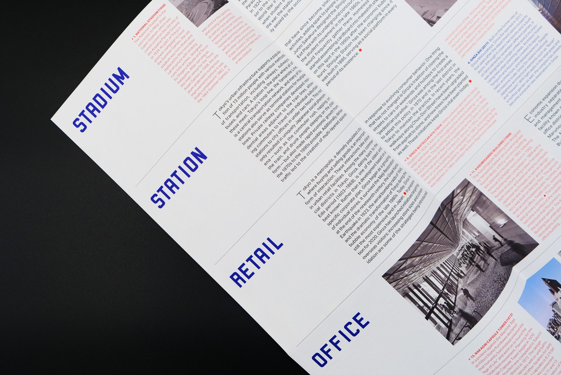
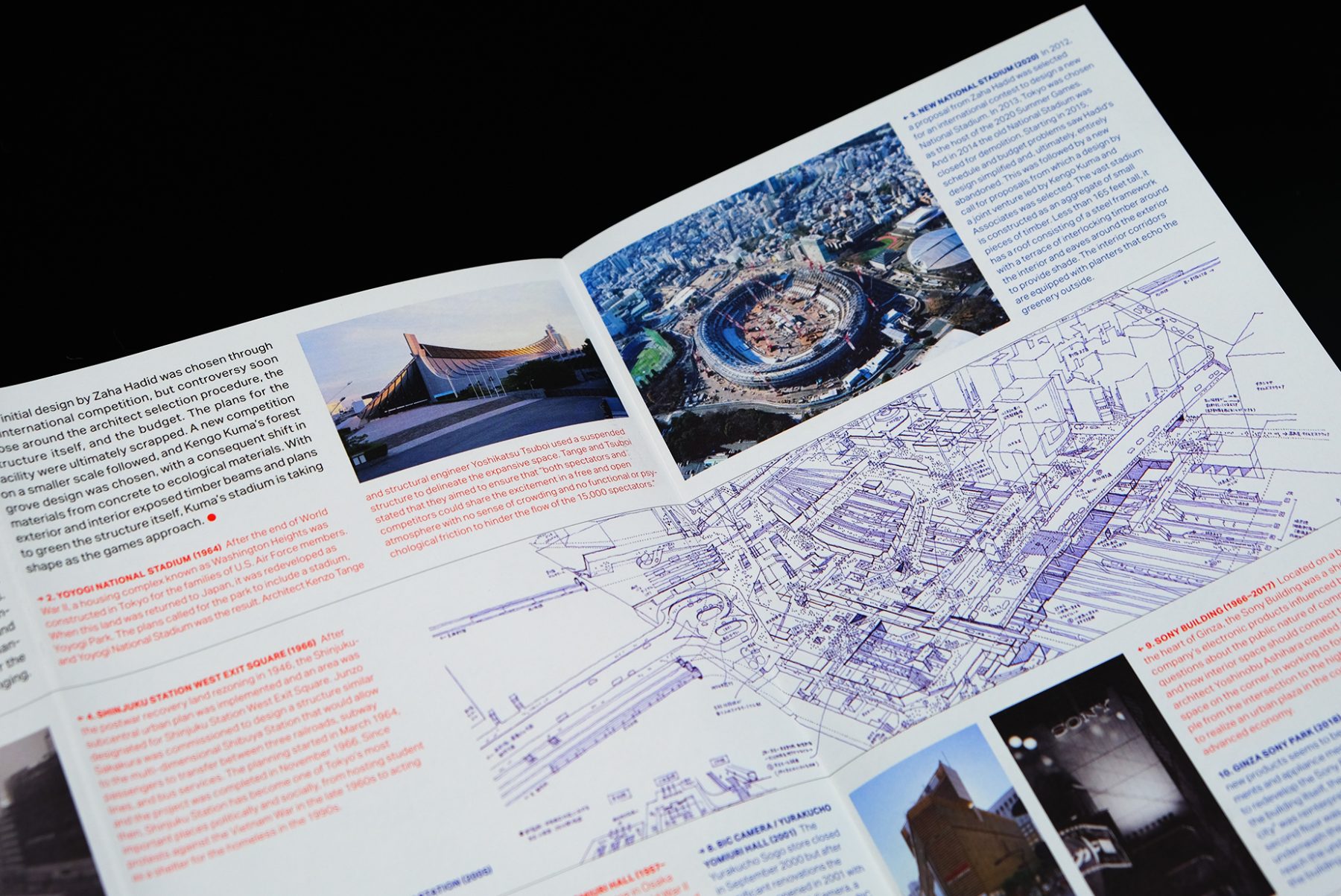
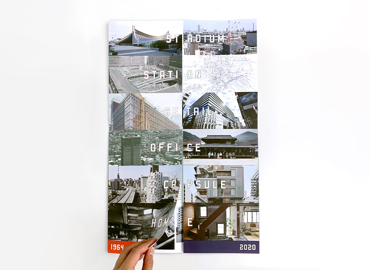
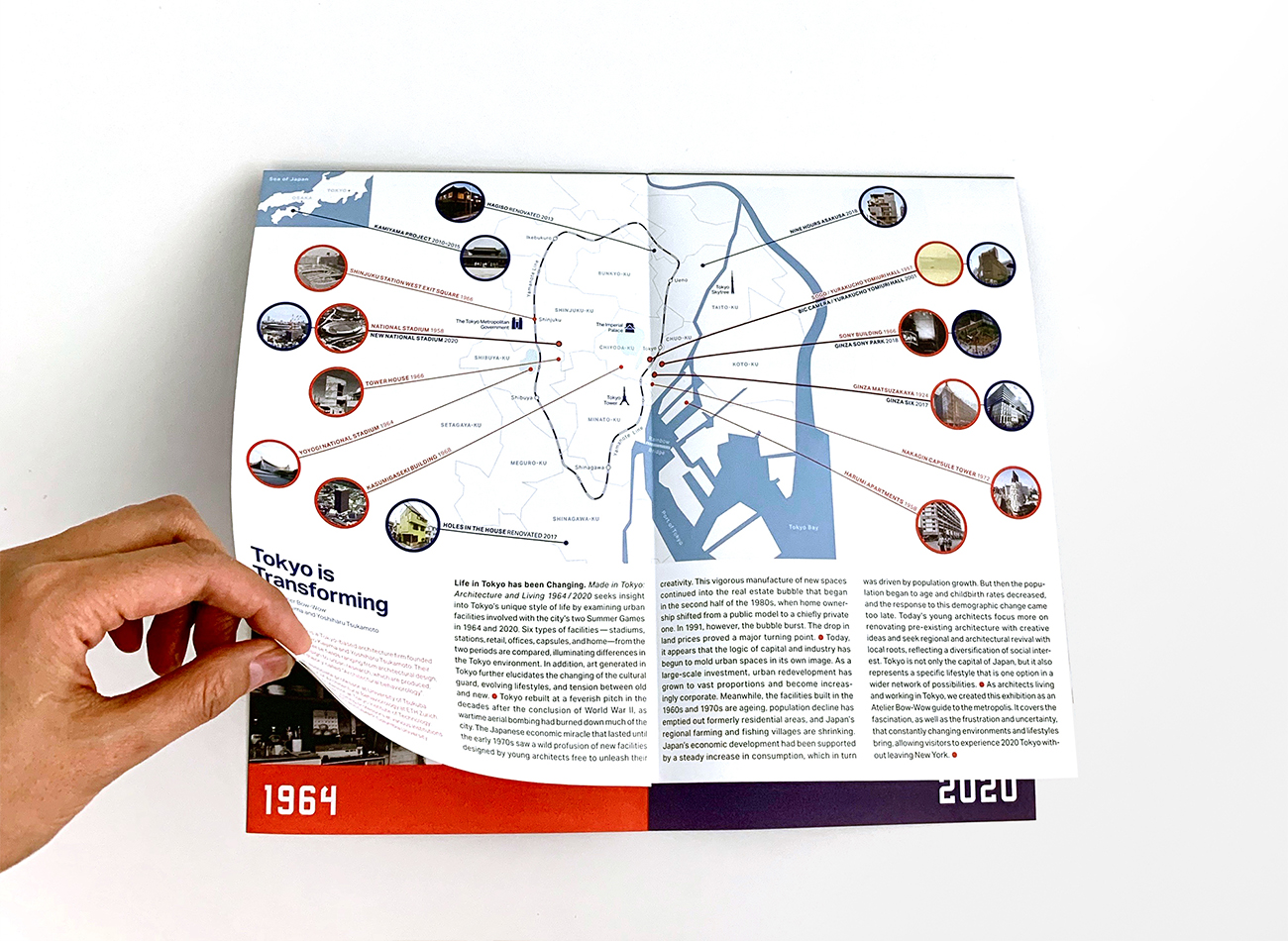
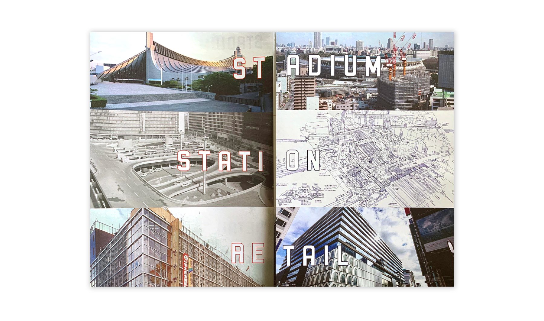
The Japan Society’s “Made in Tokyo” exhibition explored the development of socio-architectural facilities and compared landscapes with art and performance generated in Tokyo between the city’s two seminal Olympic Games events in 1964 and 2020. Atelier Bow-Wow, a Japanese architectural firm, curated and designed the exhibition.
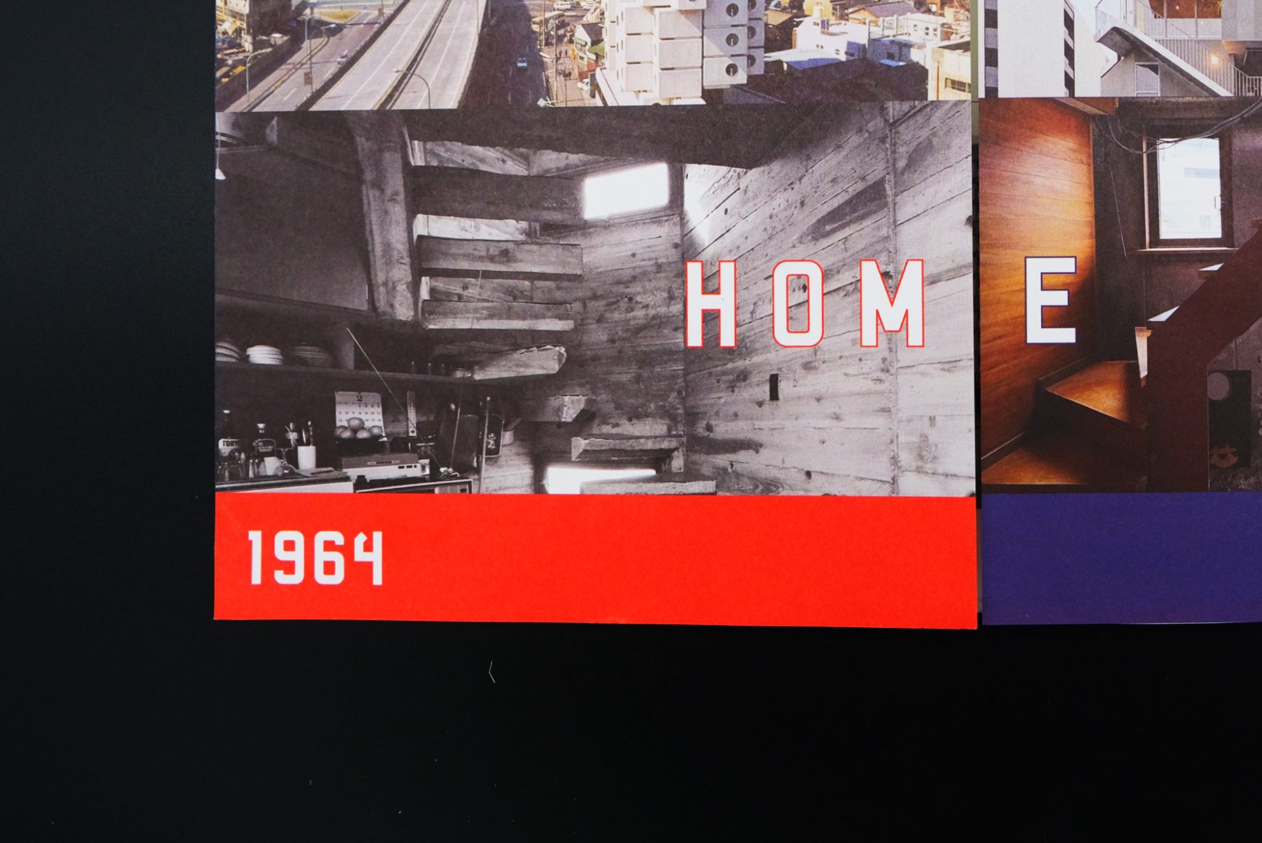
We designed an exhibit brochure that unfolds as a map of Tokyo. The brochure features buildings covered in the exhibition, organized into six functional themes.
KUDOS Design Collaboratory
-
John Kudos
Creative Director -
Saori Tahara
Designer
Japan Society
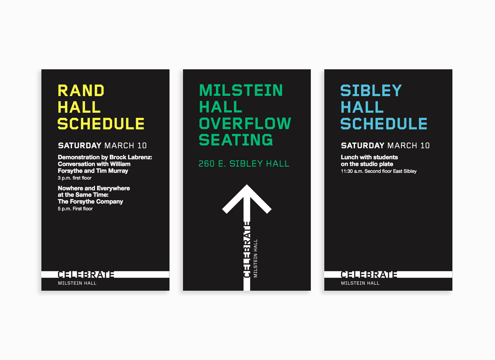
Celebrate Milstein Hall
Cornell University AAP
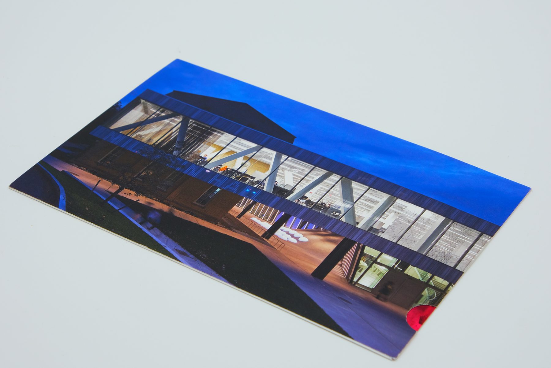
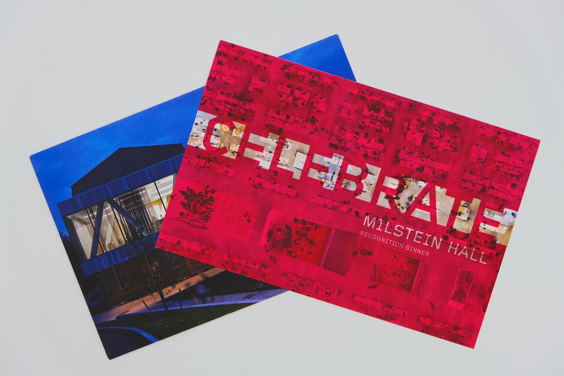
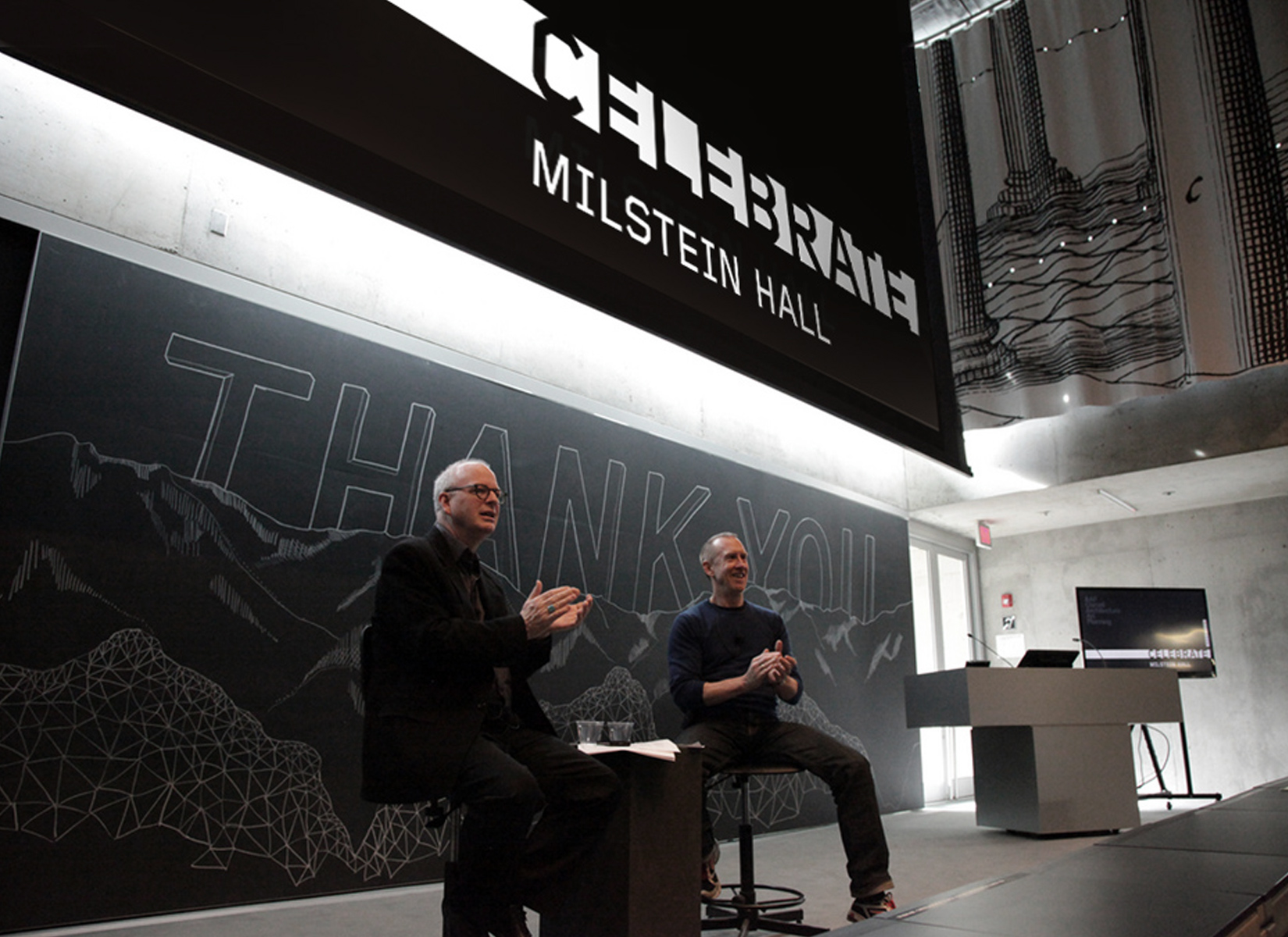
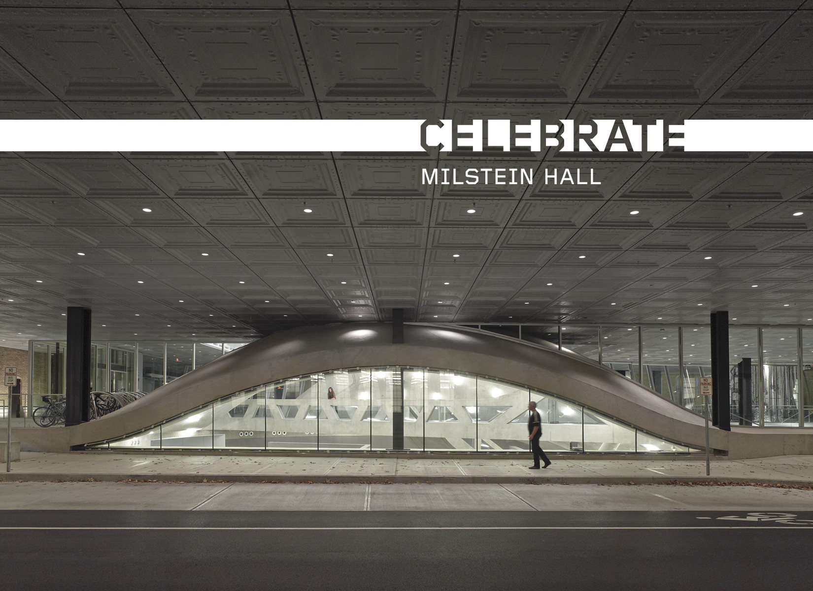
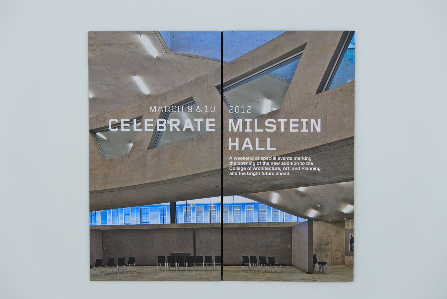
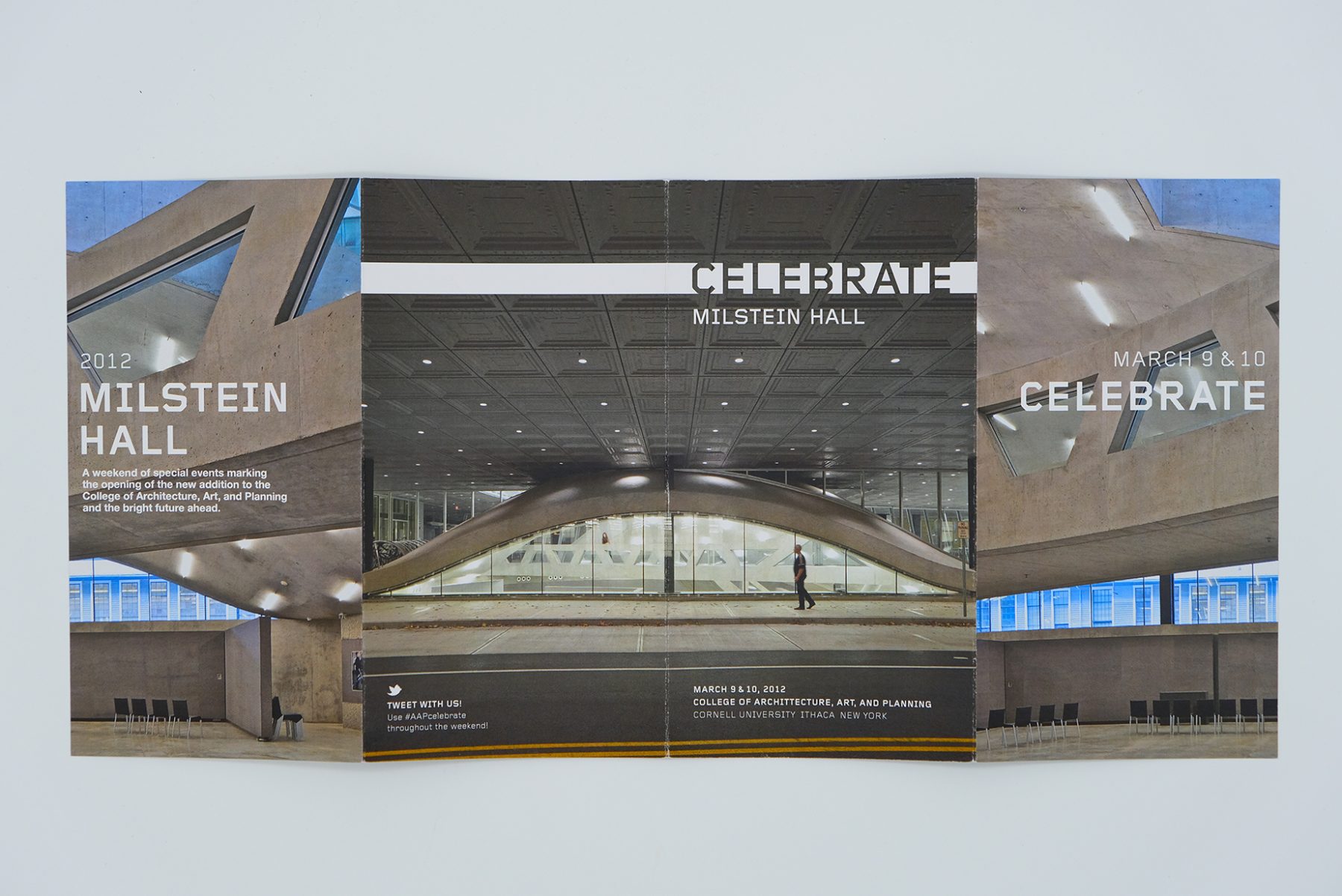
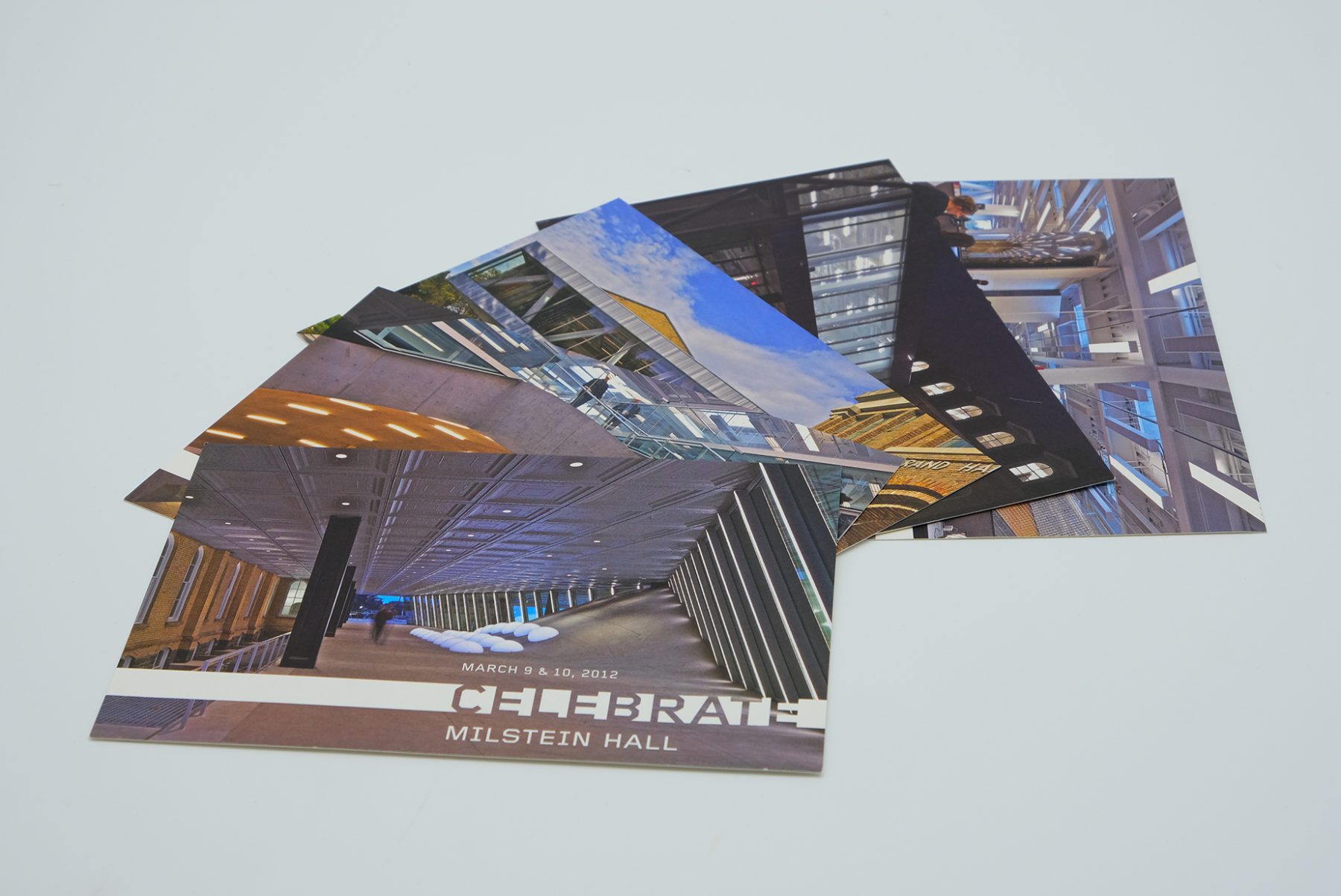
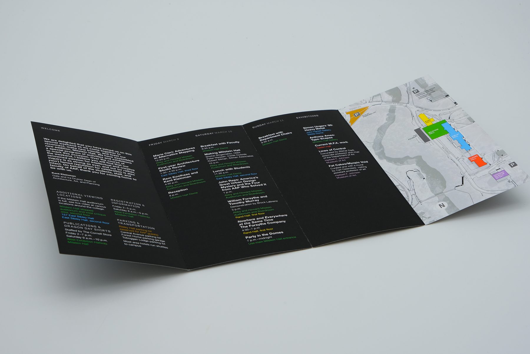
To celebrate the opening of Milstein Hall at Cornell University, we developed a look-and-feel for the event collateral.
We developed our stencil-bar logotype based on the building’s floor-to-ceiling windows. We also produced a series of printed materials for the opening event, from postcards and brochures to invitations and wayfinding posters.
KUDOS Design Collaboratory
-
John Kudos
Creative Director -
Karen Vanderbilt
Designer
