Fallout: Atoms for War & Peace
Poster House
Two days before the outbreak of World War II, a scientific paper was published explaining the theoretical process of nuclear fission in which the controlled splitting of an atomic nucleus releases a vast amount of energy.
Over the next decade, scientists around the world would perfect the process of harnessing that energy, developing two of the most impactful inventions of the modern era: the nuclear bomb and the nuclear power station.
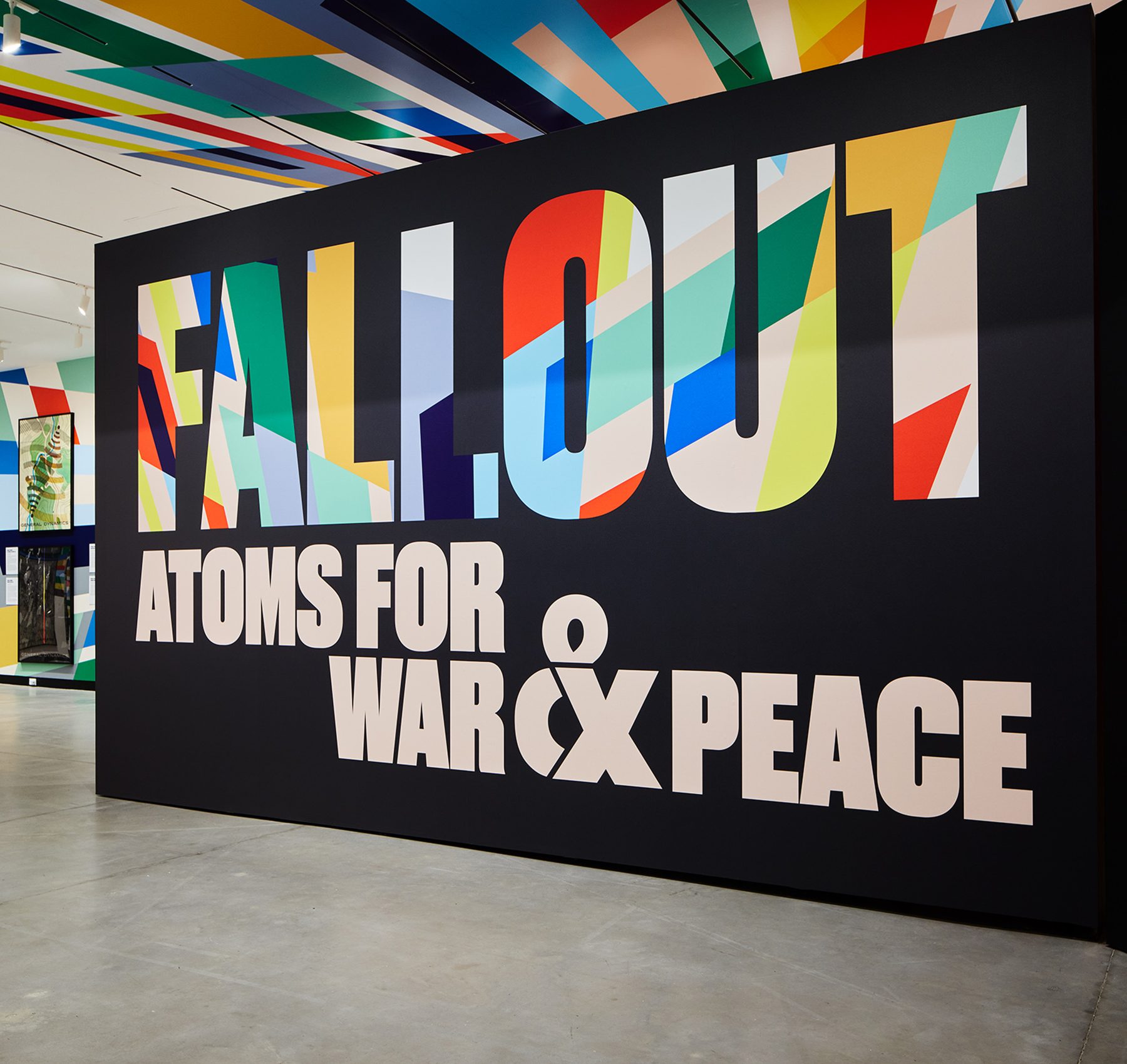
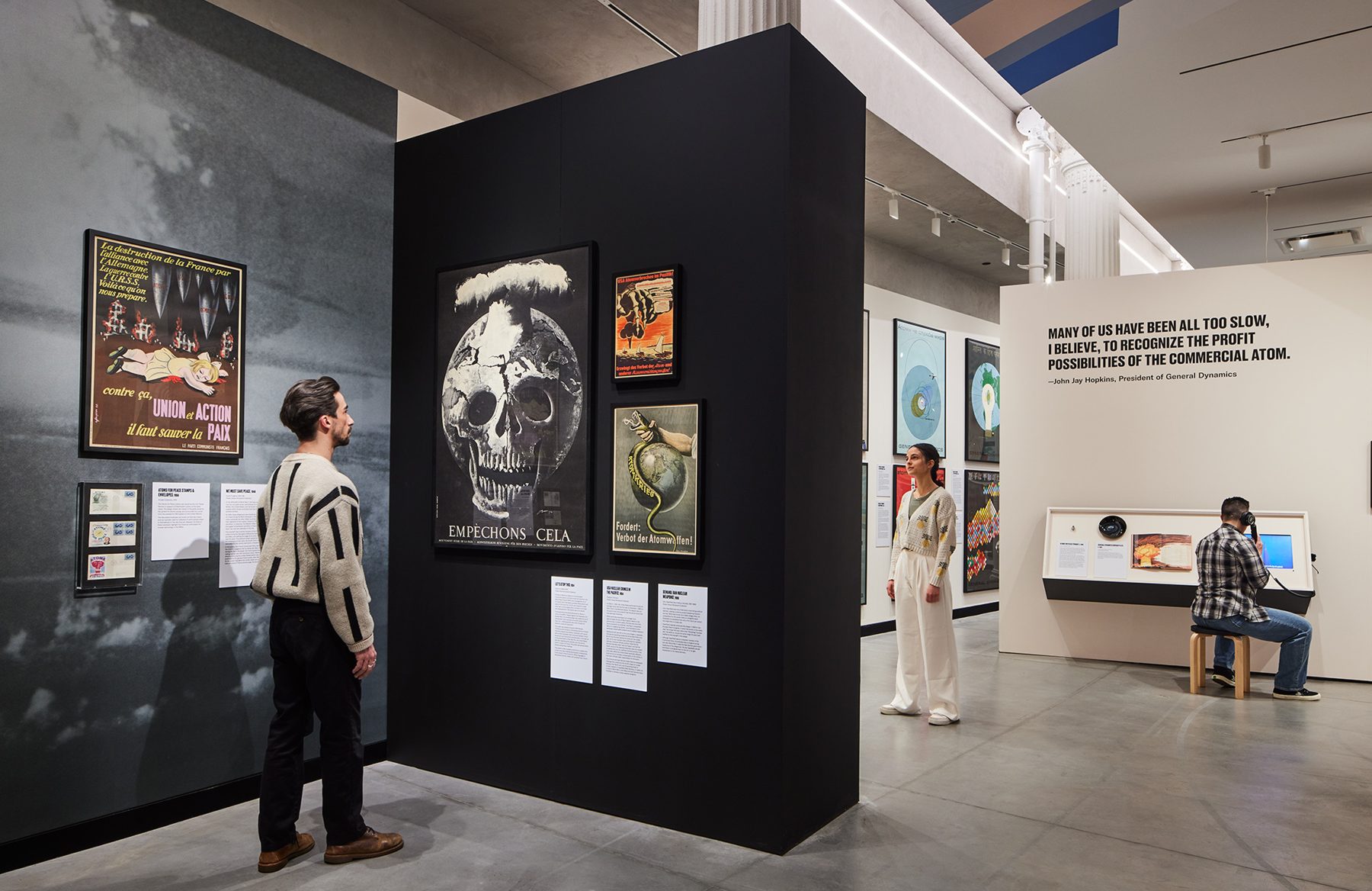
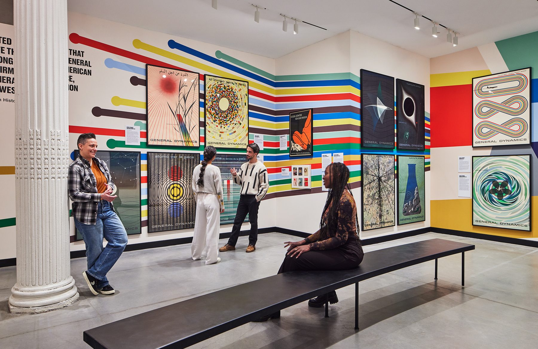
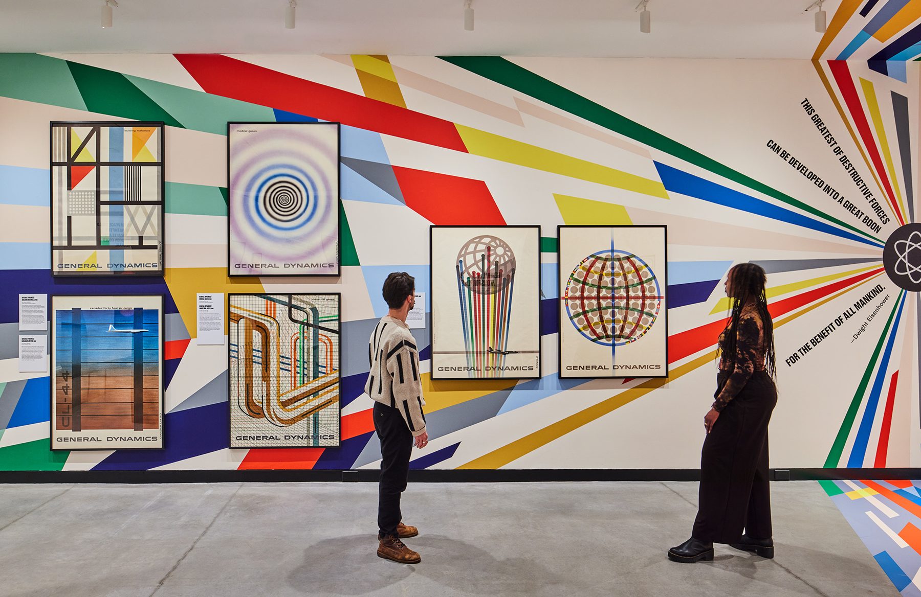
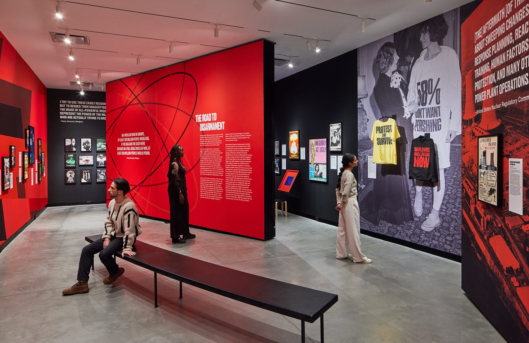
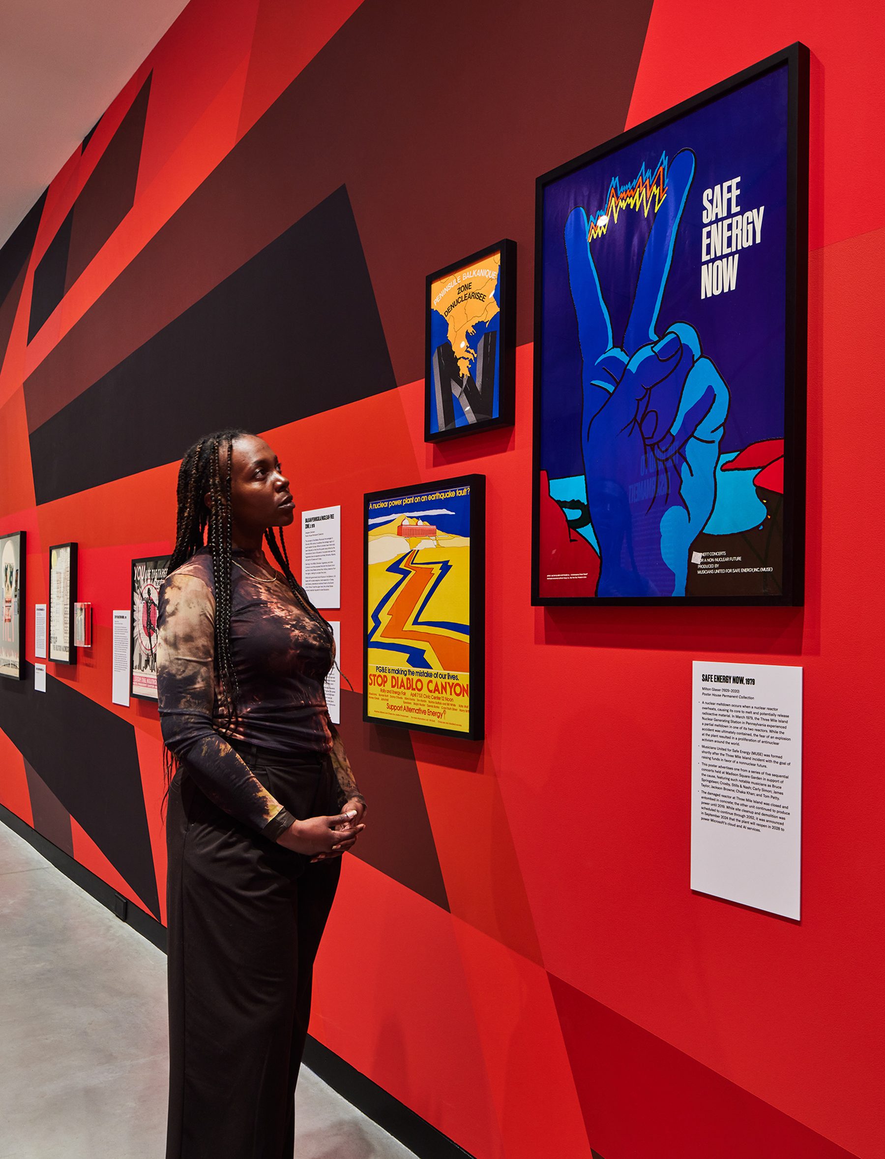
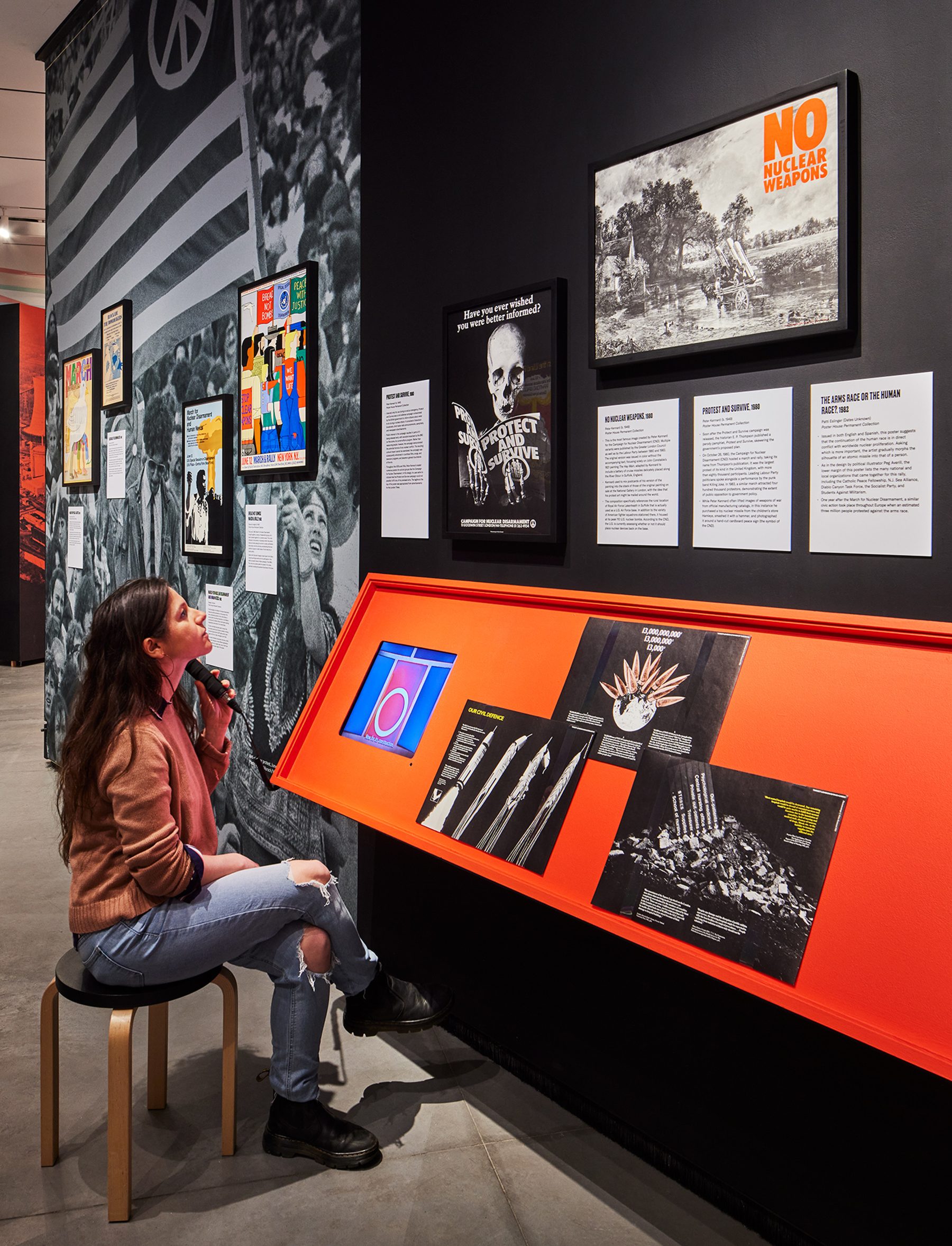
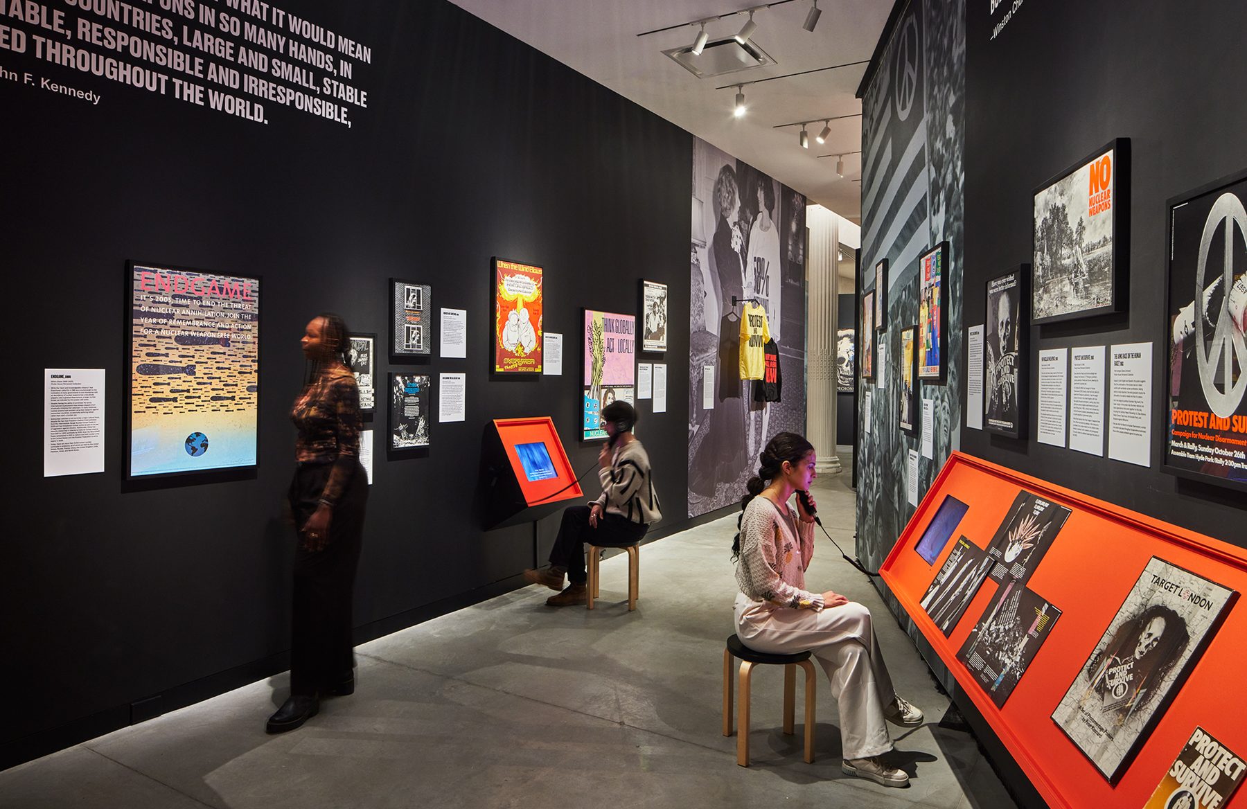
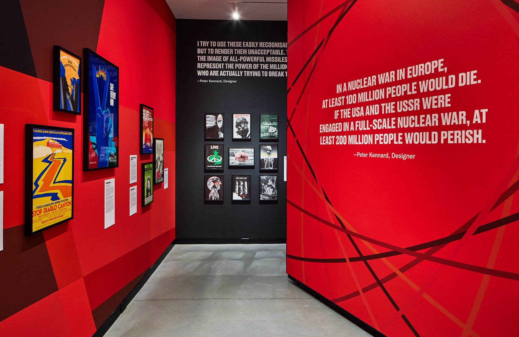
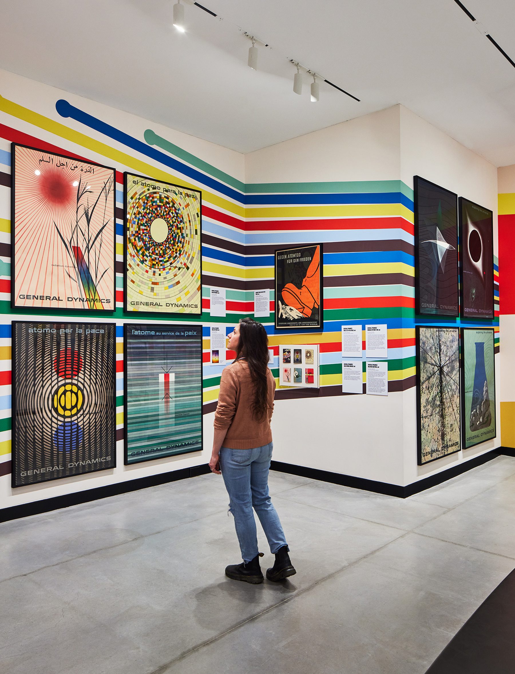
Fallout chronicles the global development of the nuclear industry, for peaceful and offensive means, examining posters that both promoted and protested its use throughout the second half of the 20th century. It features the entire General Dynamics poster series, the finest examples of corporate propaganda ever created against over 60 other posters criticizing the proliferation of nuclear technology.
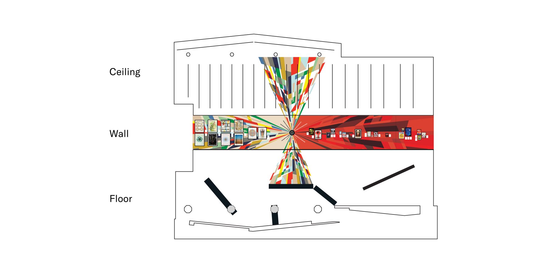
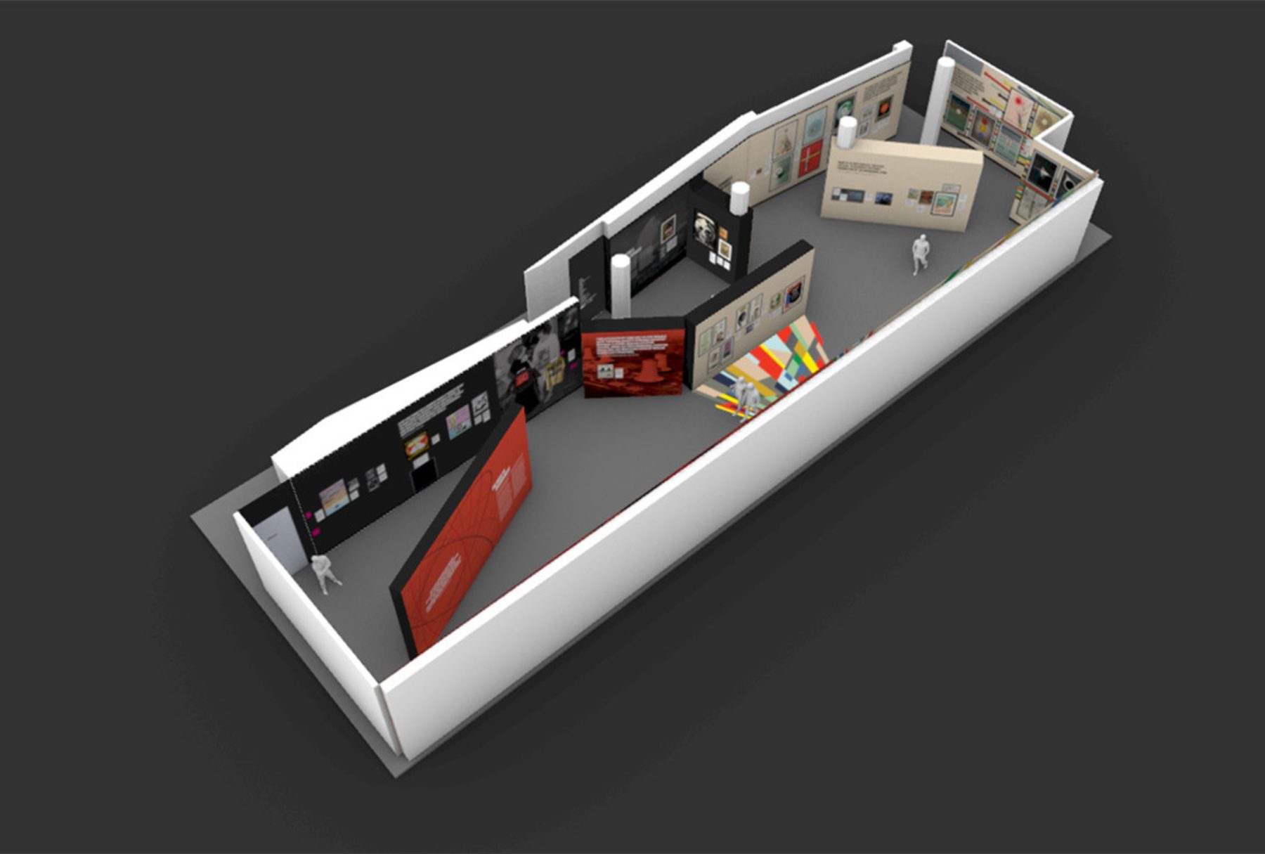
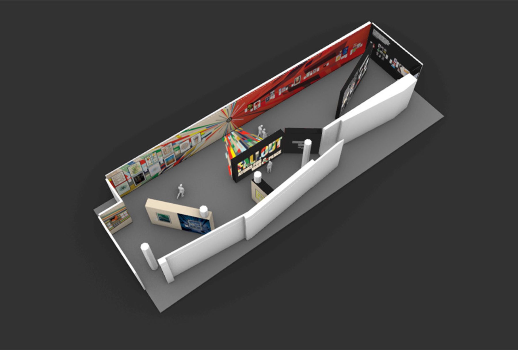
We designed the exhibition as two conjoined chapters. The colorful side features General Dynamics’ Atoms for Peace poster campaign, originally designed by Erik Nitsche. The darker half explores the nuclear arms buildup, the military industrial complex, and the corresponding poster protest. For those of a certain generation, the exhibition revisits the intense anxiety triggered by constant fear that the Cold War could heat up at any time.
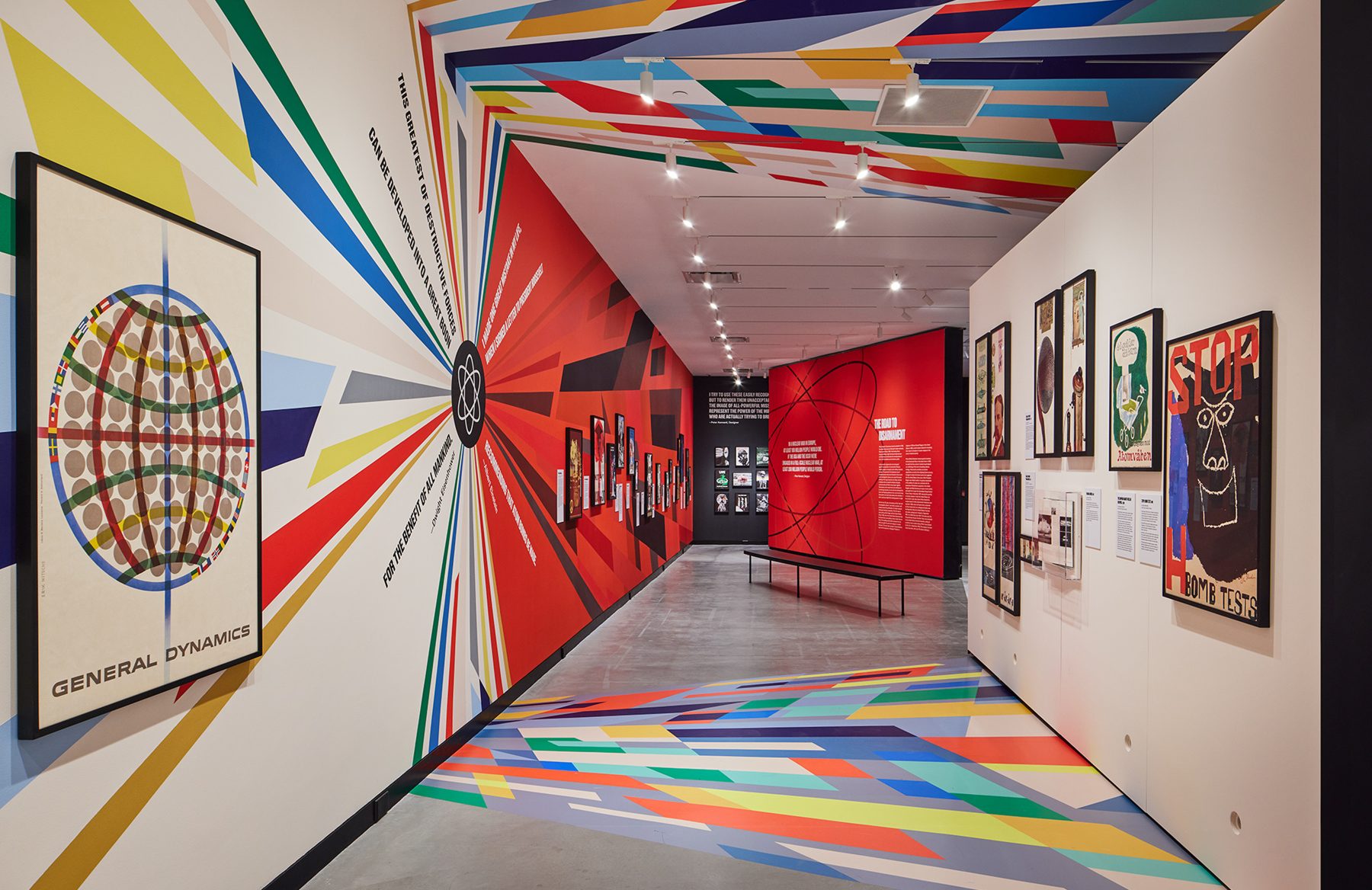
There is a clear opposing duality to the exhibition. We determined that there needs to be a clear indicator when the overarching narrative took a 180-turn, both visually and spatially.
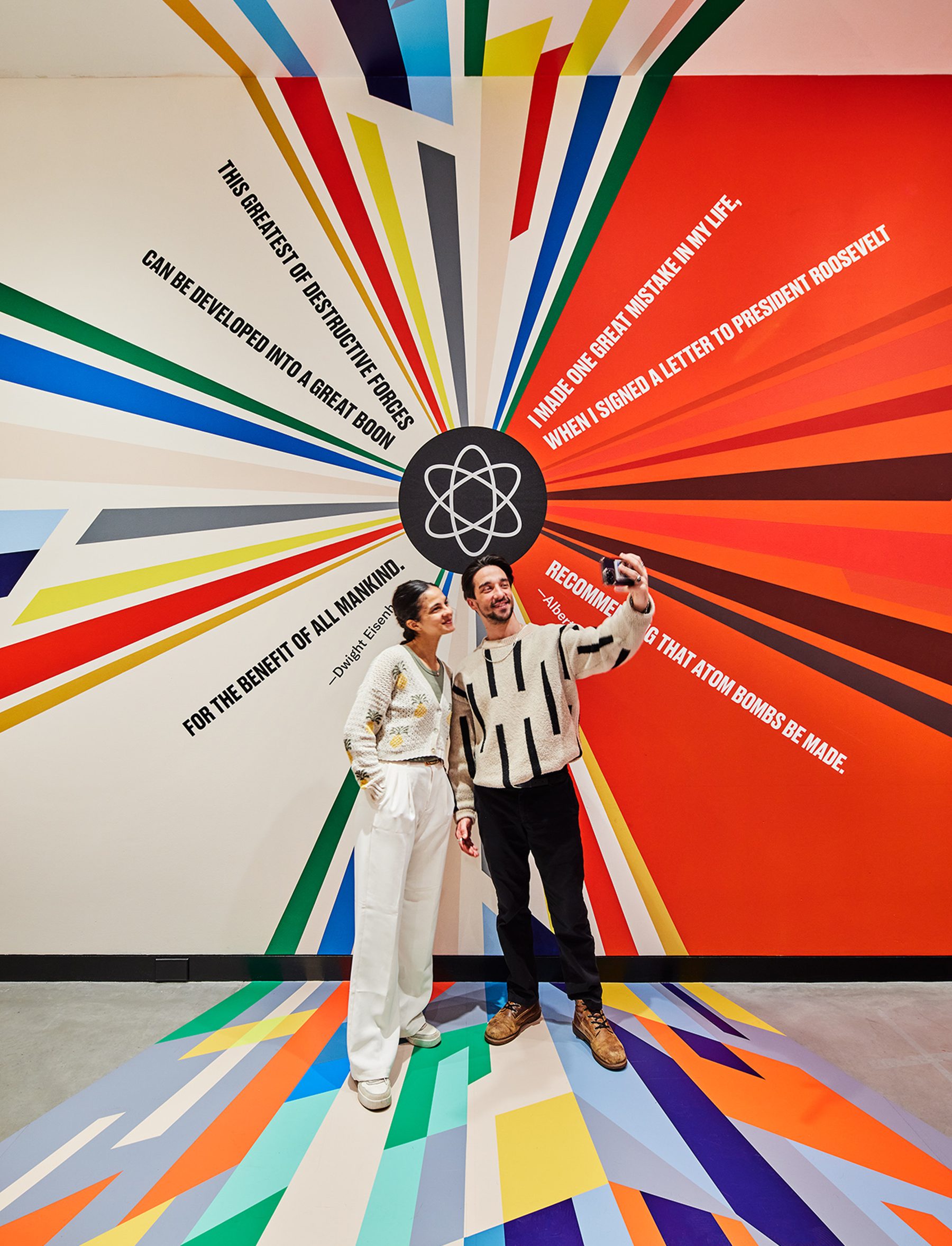
We wanted to carve out a physical threshold within the gallery that forces visitors to experience an inflection point in the narrative as they walk through. We refer to it as the quantum superposition moment in the gallery, where a particle can exist in multiple states (like being in two places at once, or two narratives at once) until measured, at which point it “chooses” one state.
Within this area, we juxtaposed a hopeful quote from Eisenhower against Einstein’s horrific regret, in the form of a colorful explosion, a schism resulting from the splitting of the atom, releasing color graphics that span distances, time and surfaces. These color fields were hand-painted color-by-number on the longest wall surface available in the gallery and meticulously wallpapered to the ceiling and the floor.
The exhibition is about the ideal future versus grim reality filled with contradictions. This is captured in the ‘x’ within the title graphic that also forms an ampersand.
KUDOS Design Collaboratory / KASA Collective
-
John Kudos
Creative Director -
Robert de Saint Phalle
3D Creative Director -
Fay Qiu
Designer -
Amanda Knott
Project Manager
POSTER HOUSE
-
Angelina Lippert, Tim Medland
Curator -
Ola Baldych
Creative Producer -
Mihoshi Fukushima Clark, Randee Ballinger, John F. Lynch, Rob Leonardi
Production

Black Power to Black People
Poster House
Capabilities
Focus Area
Client
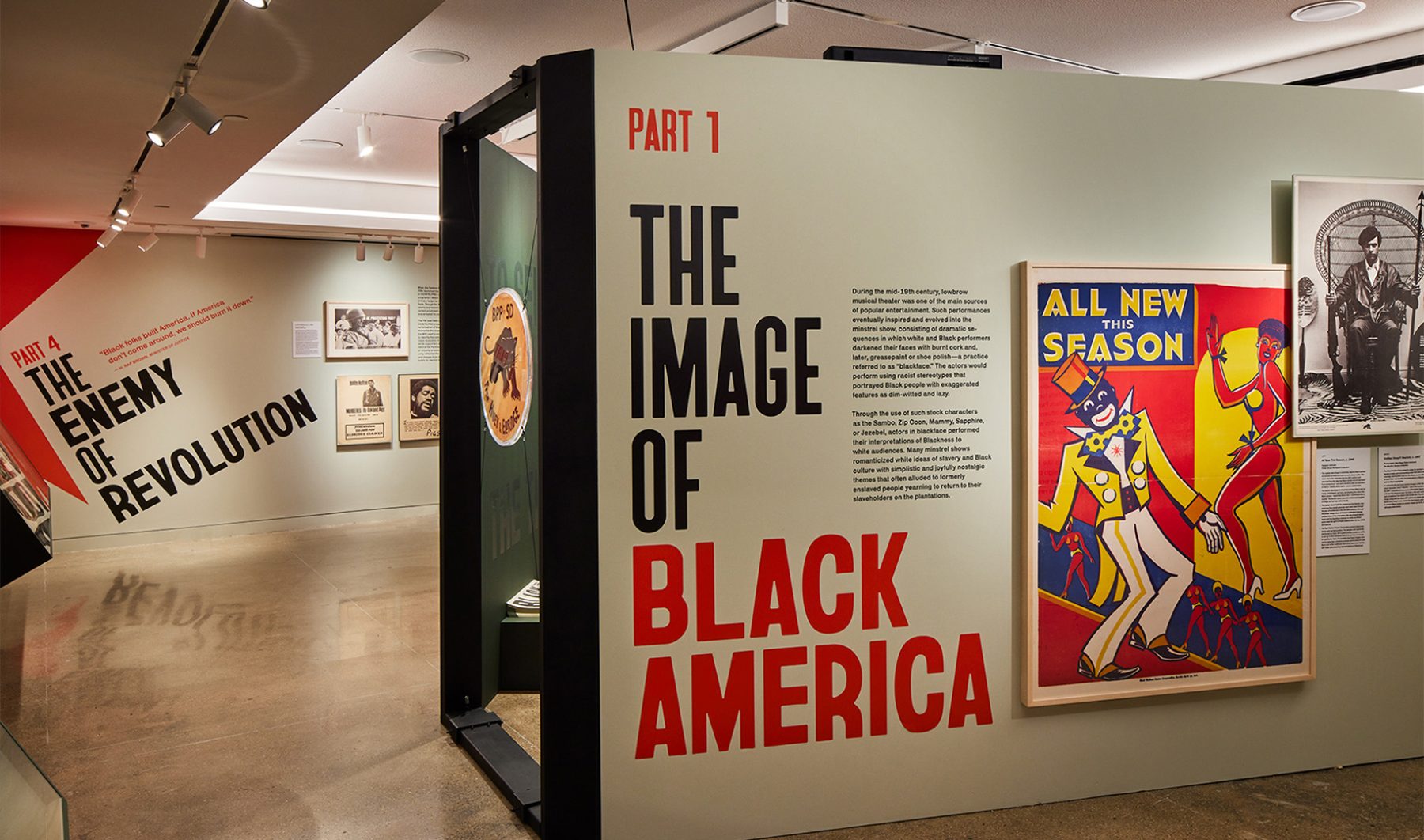
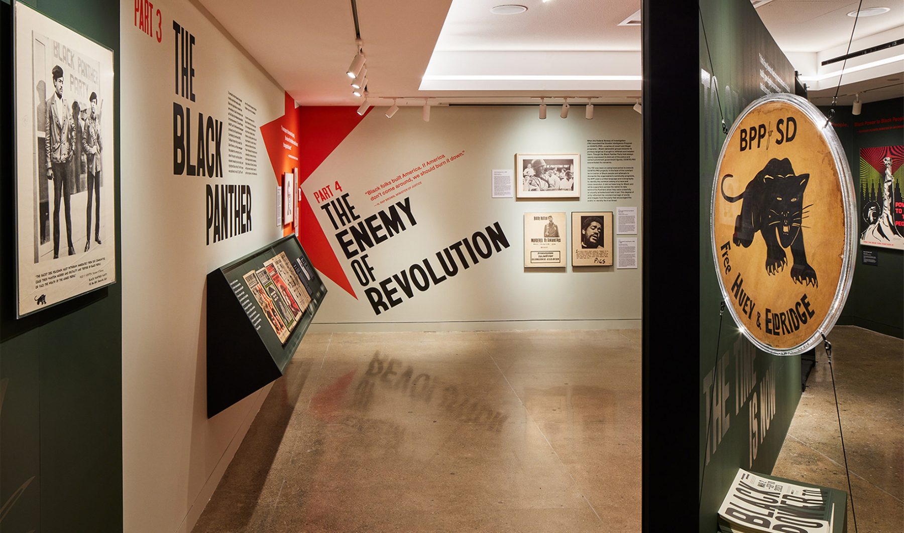
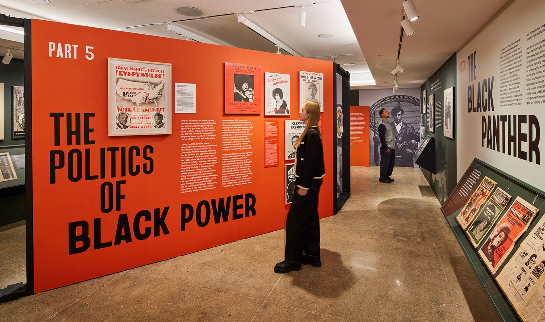
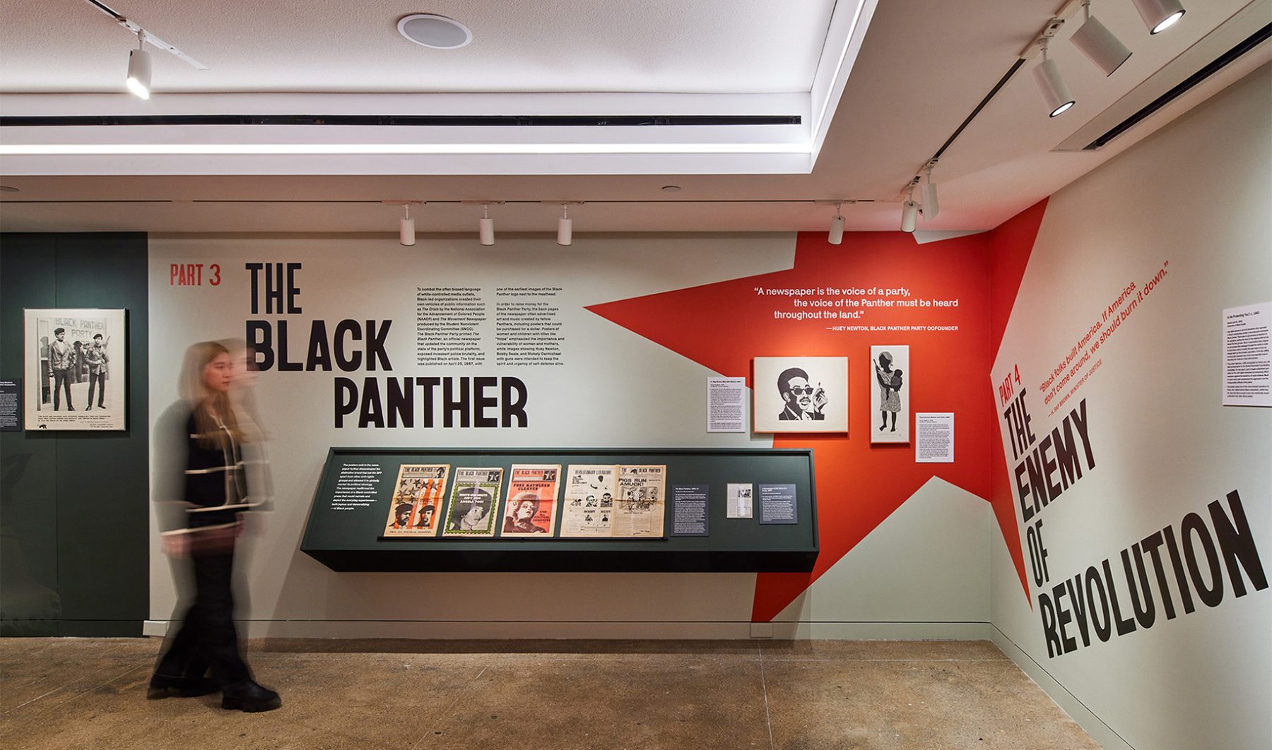
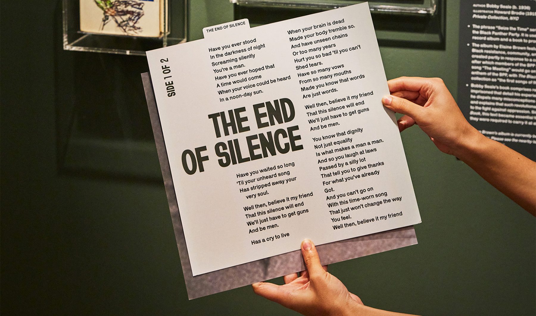
Poster House’s “Black Power to Black People” exhibit was an intimate look at how the Black Panther Party harnessed the power of branding and media to control its own narrative, rally community support, and become one of the most influential militant groups of its time.
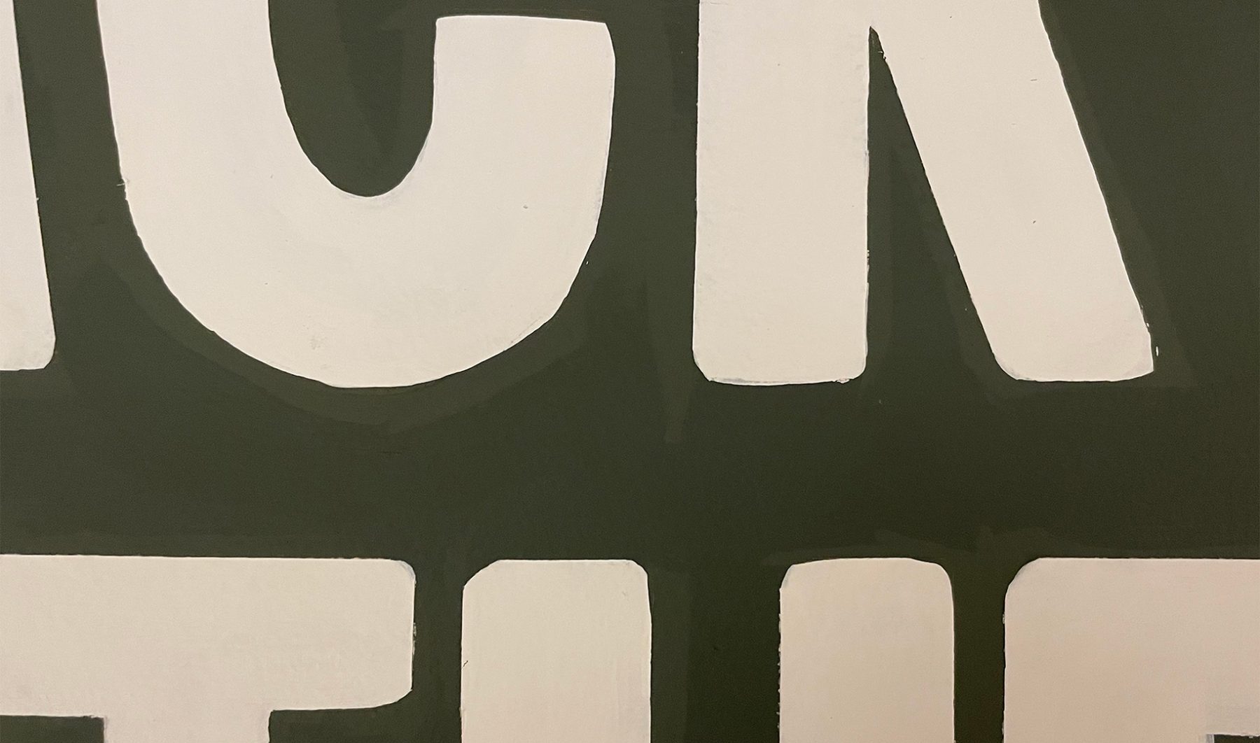
Our exhibition design began outside the gallery with two oversized protest signs leaning against the wall, amplified with hand-painted lettering reminiscent of protest signs from the Civil Rights era.
Bayard (typeface) evokes lettering from the 1960s Civil Rights protest signs. Condensed, bold and handmade…transporting viewers to that era.
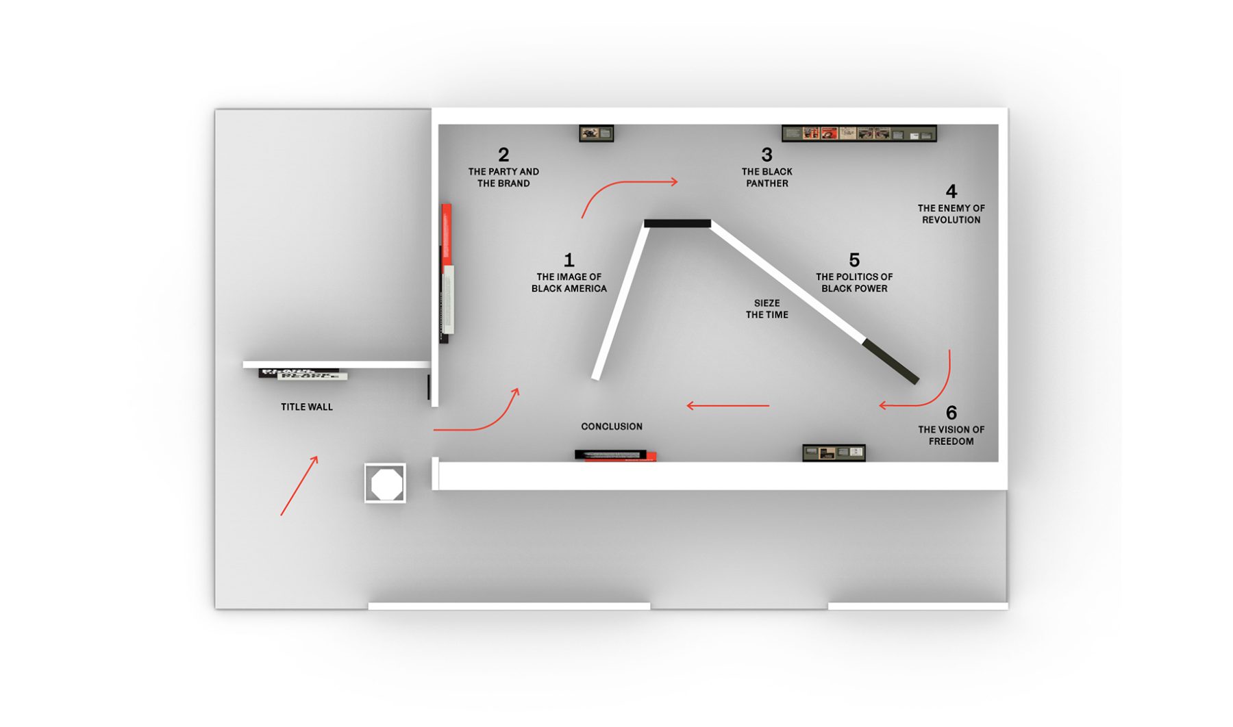
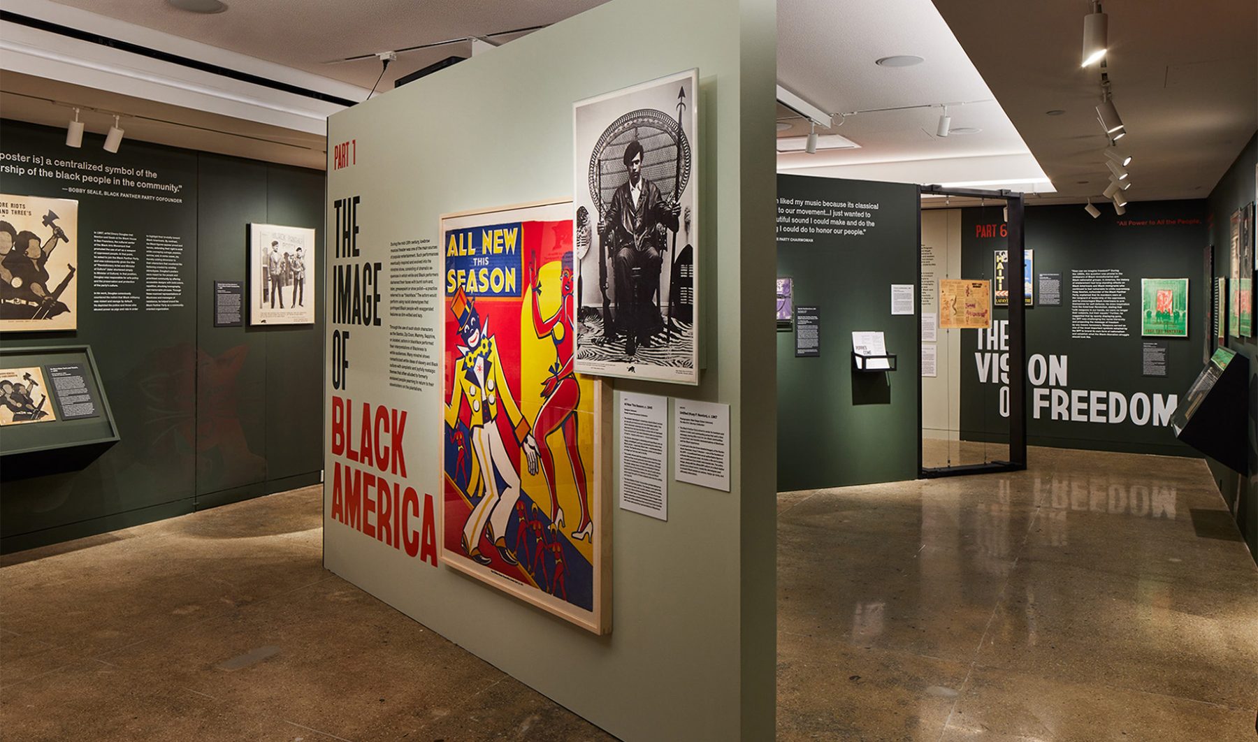
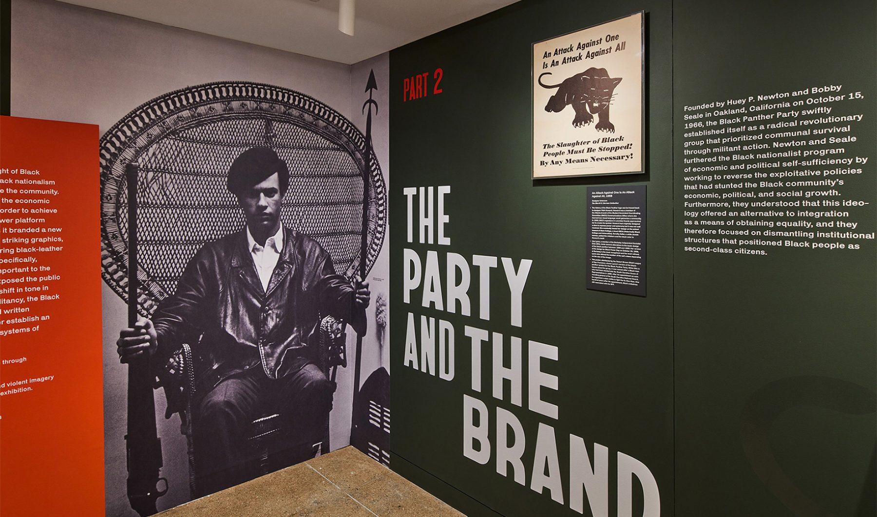
Inside, the exhibit started with an iconic photograph of Huey Newton (1967) and followed the development of Black Panther branding through six chronological sections. In the background, tracks from Seize the Time LP by Elaine Brown played on a loop, capturing the aspirations of the Black Panther Party.
We used bold type, militaristic colors, striking icons, and heroic photographs of Black Panther members carrying exposed firearms to echo the powerfully moving design strategies used by the Black Panthers themselves—and to show how effective those strategies remain, even decades after the party’s rise to fame.
KASA Collective
-
John Kudos
Creative Director -
Robert de Saint Phalle
3D Creative Director -
Ashley Wu
Art Director -
Fay Qiu
Designer -
Saskia Wulandiarti
Design Intern -
Imam Fadillah
3D Renderer -
Amanda Knott
Project Manager -
Samuel Sachs Morgan
Photographer
POSTER HOUSE
-
Es-pranza Humphrey
Curators -
Angelina Lippert
Chief Curator & Director of Content -
Ola Baldych
Director of Design & Exhibits -
John F. Lynch
Associate Director of Exhibits -
Mihoshi Fukushima Clark
Assistant Director of Design -
Rob Leonardi
Fabricator
Made in Japan
Poster House
Capabilities
Focus Area
Client
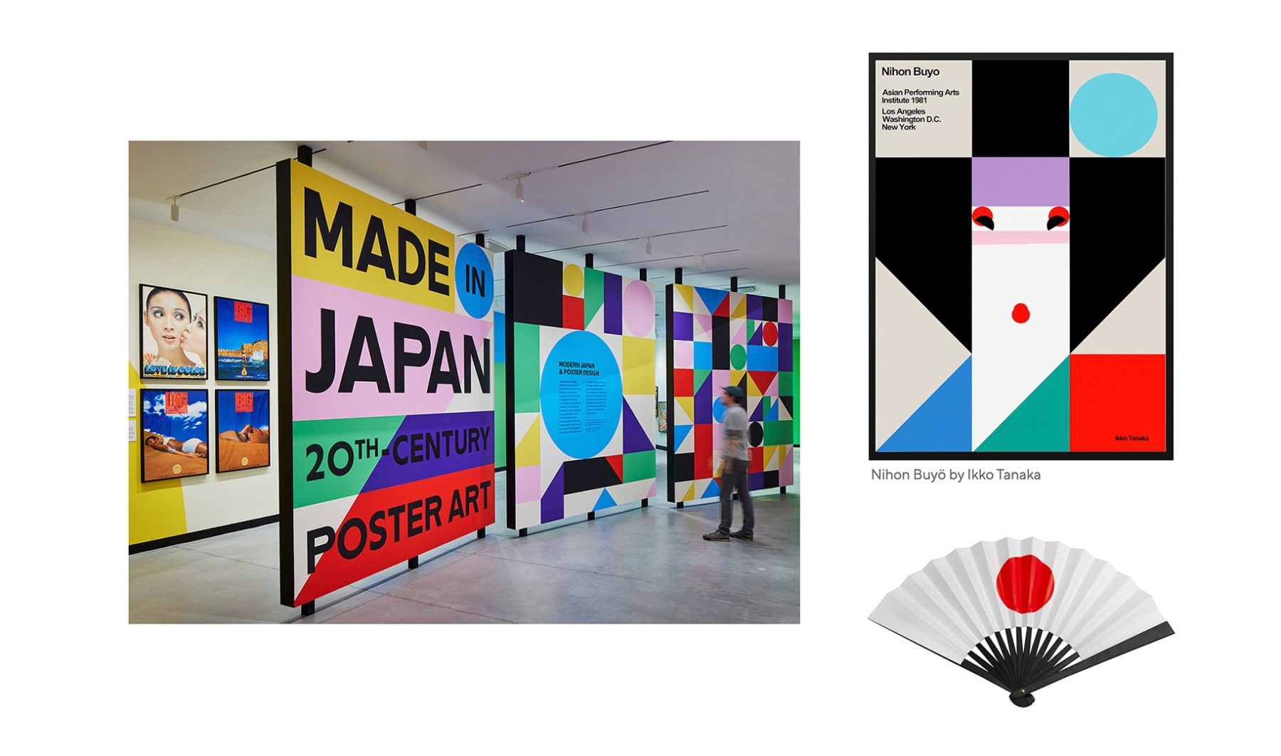
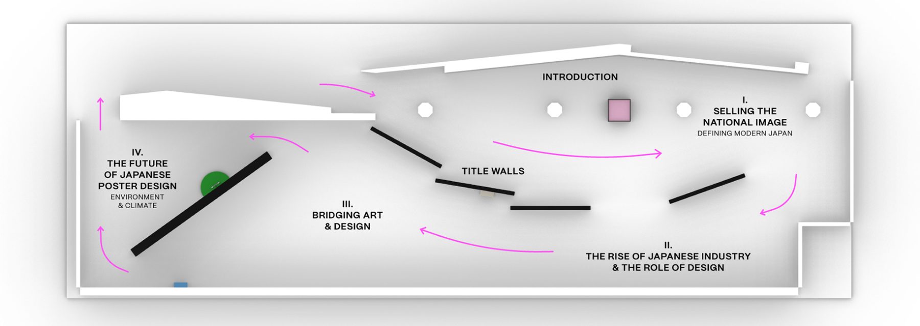
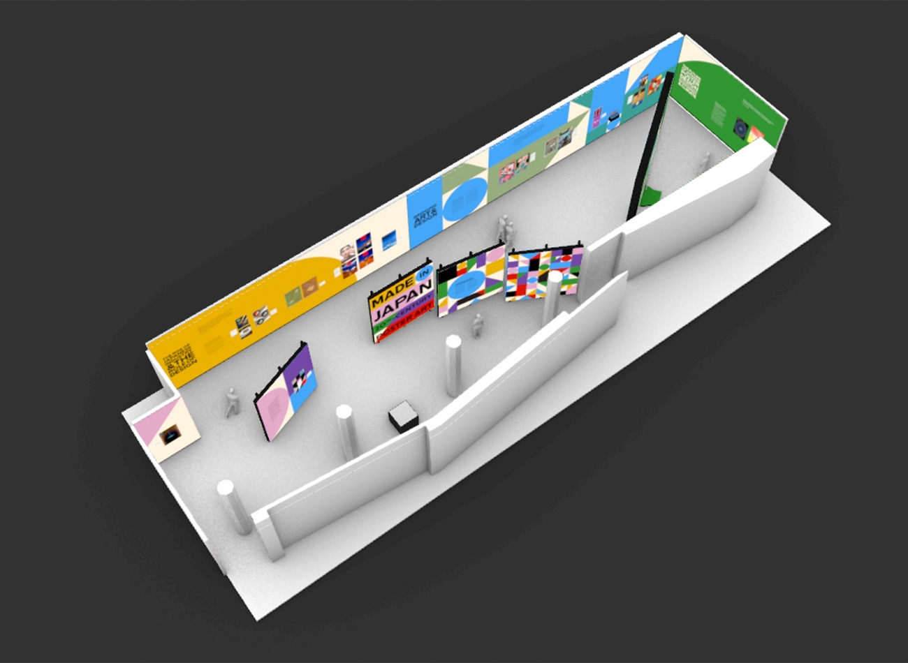
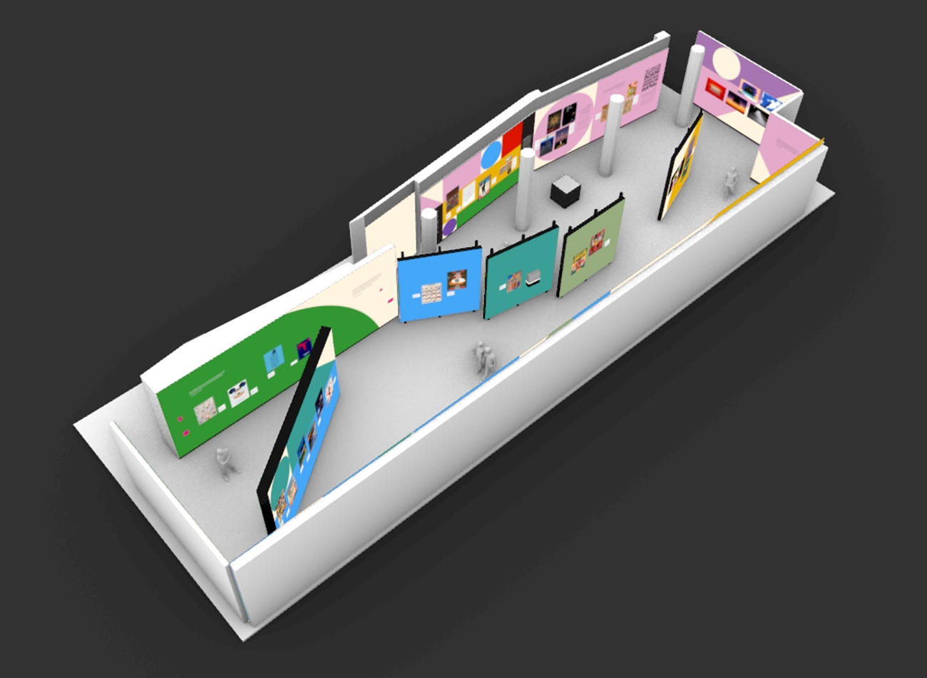
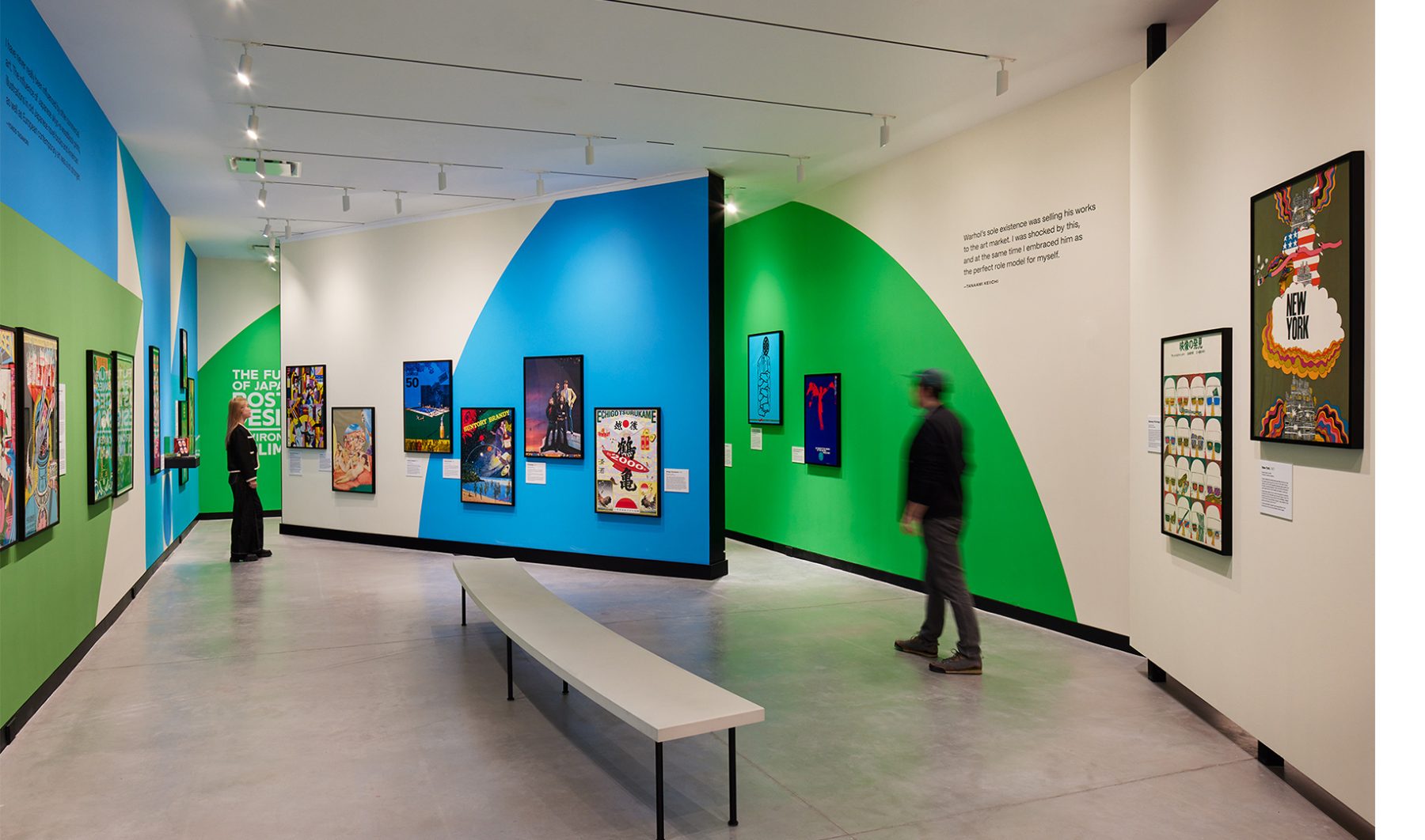
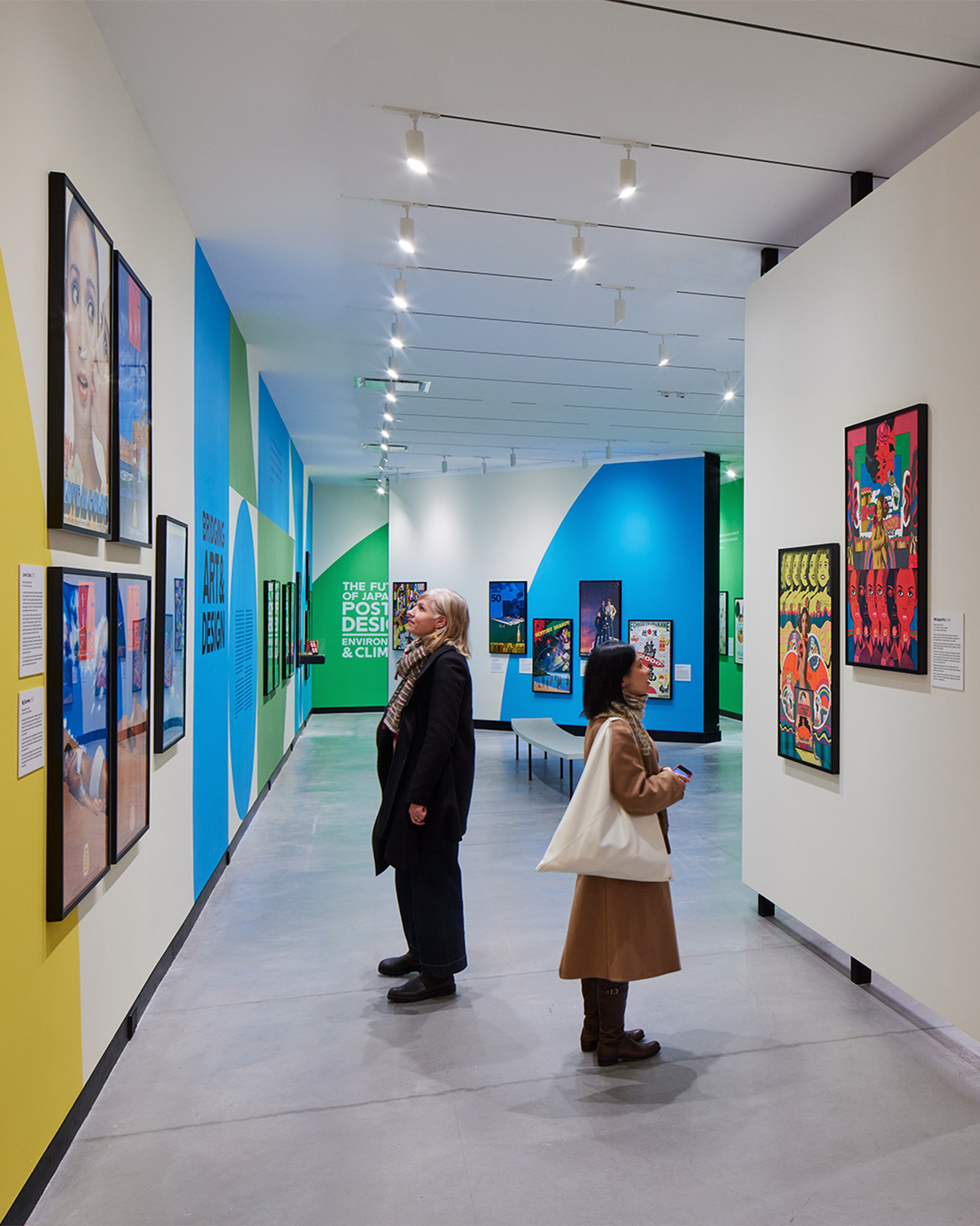
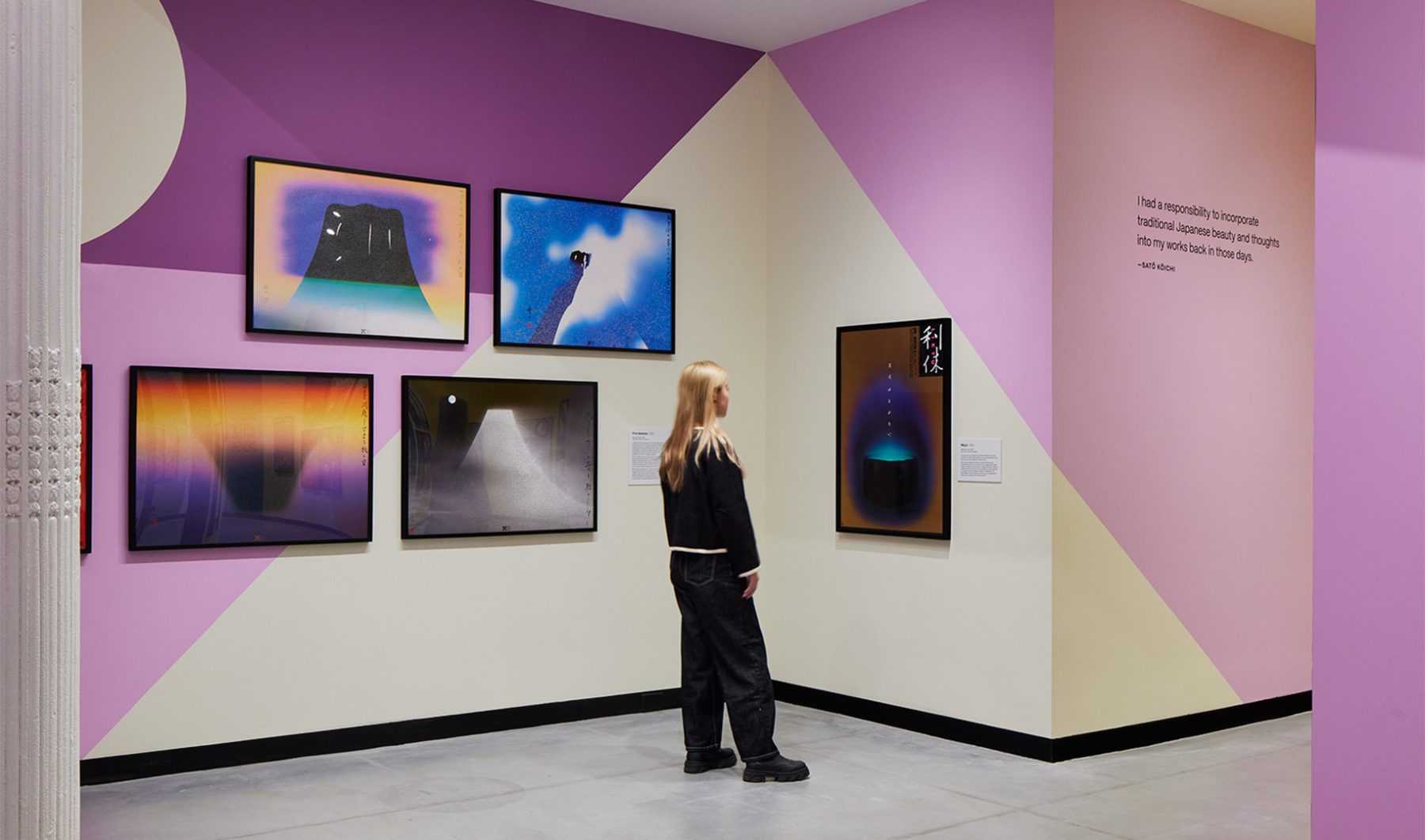
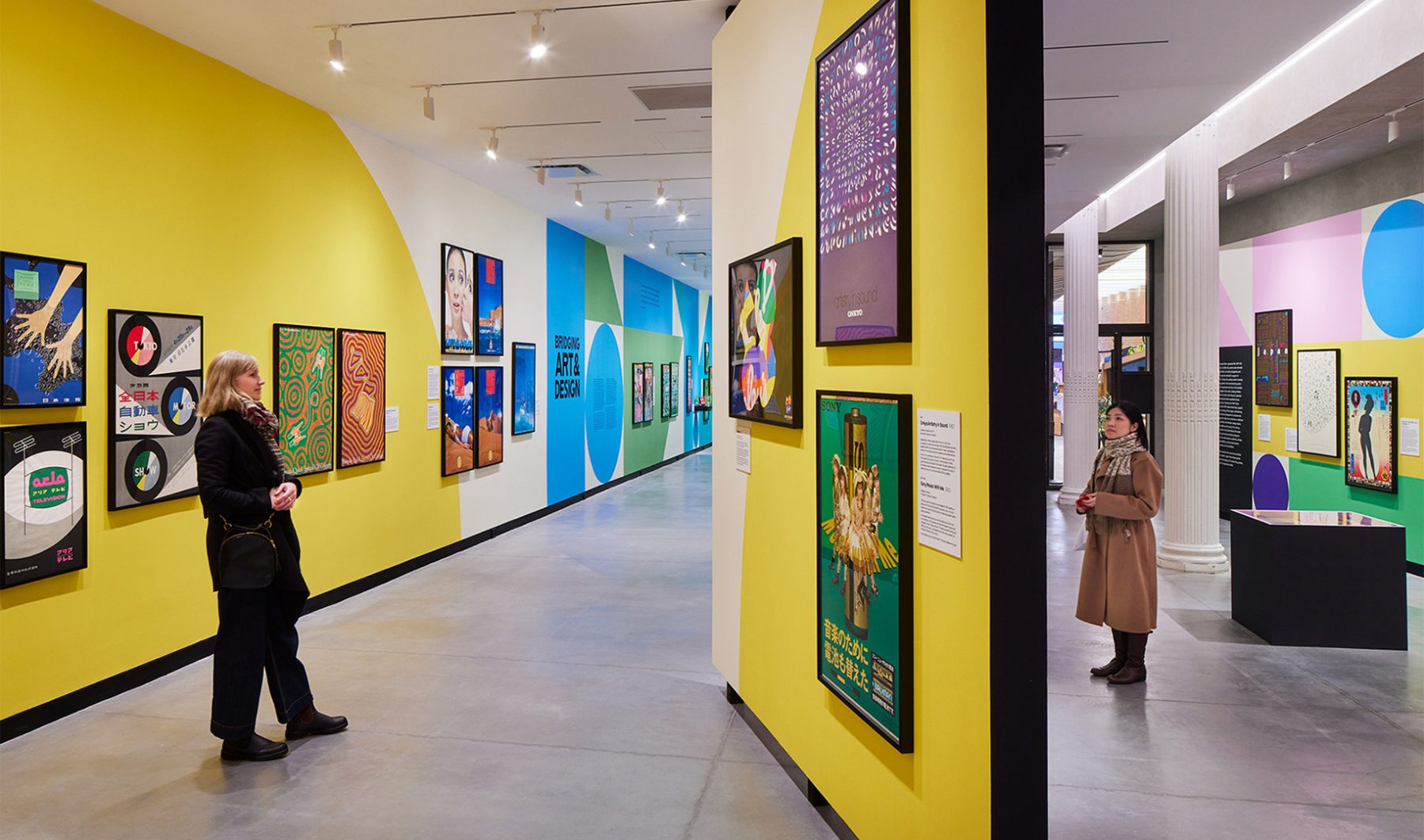
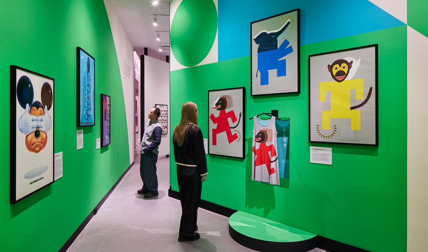
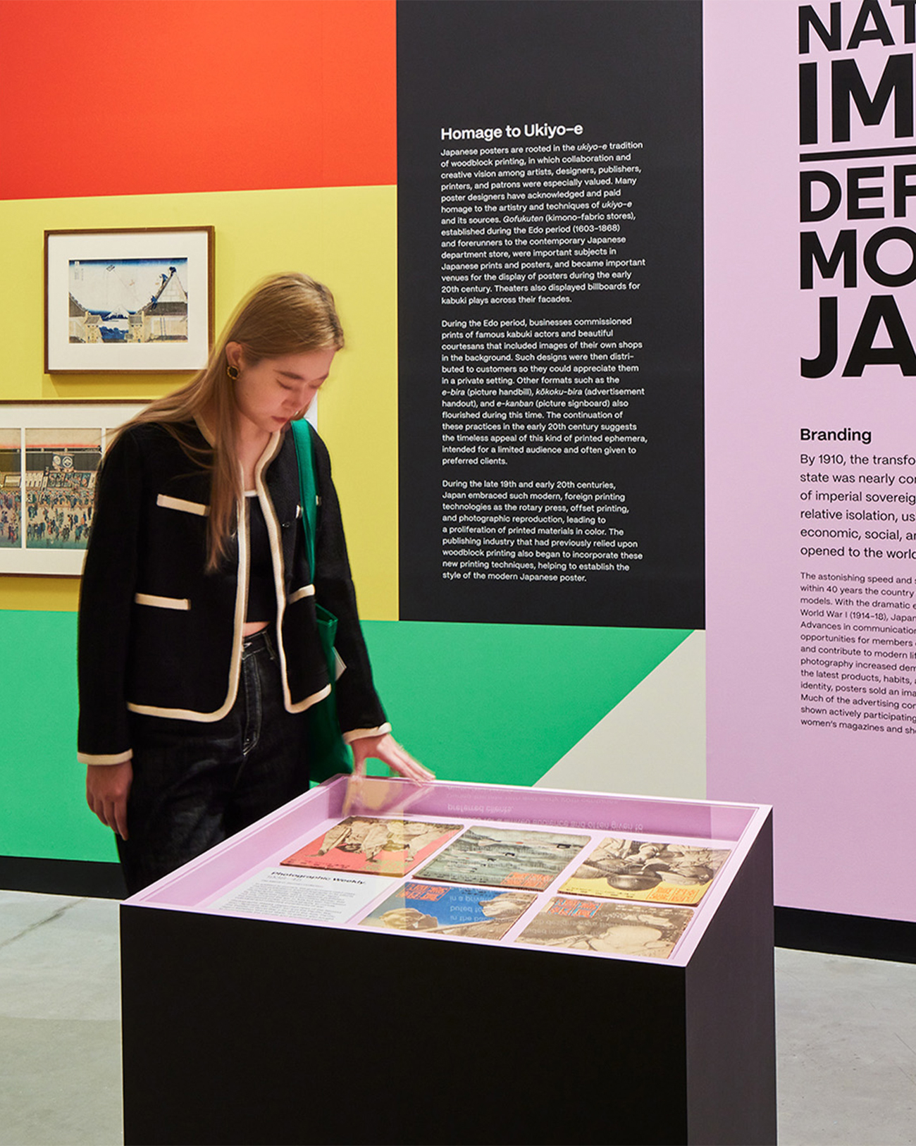
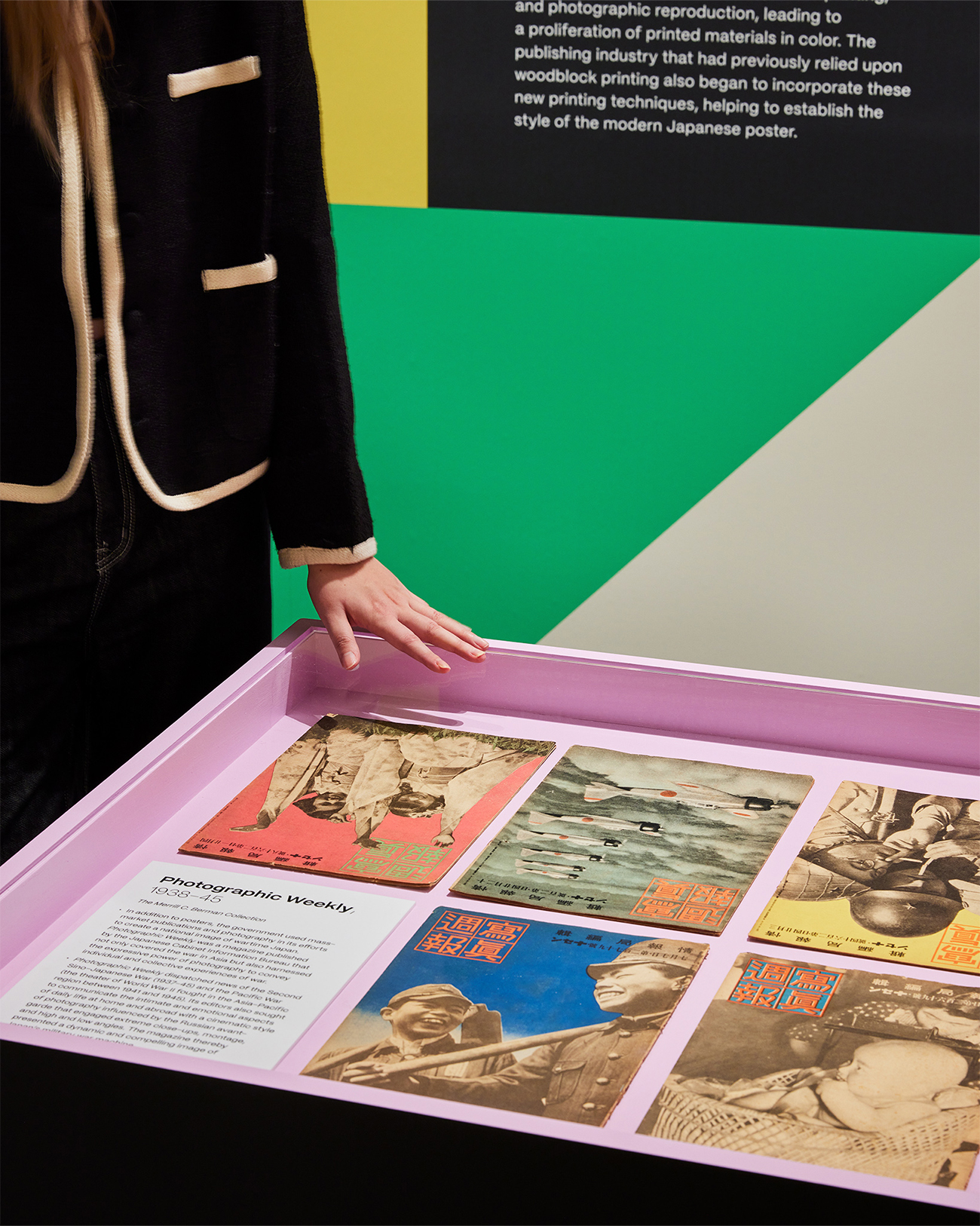
“Made in Japan” was an immersive visual journey through Japan’s golden age of graphic design, told through posters. Curated works from the Merrill C. Berman Collection ran the gamut from century-old to recent design.
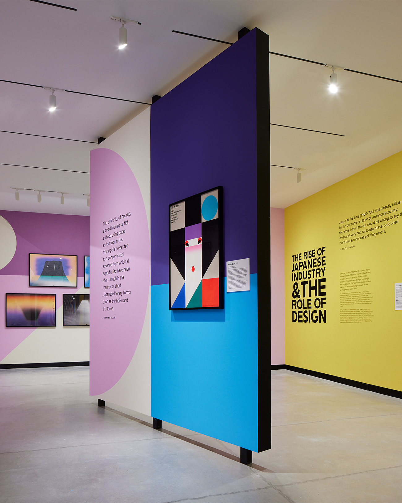
Our exhibition design for Poster House took inspiration from geometric shapes found in Nihon Buyö, a poster designed by Ikko Tanaka, a godfather figure in Japanese graphic design history. A triptych of oversized title walls unfurled like a Japanese folding fan to greet visitors at the entrance and create a permeable exhibit space to carry them seamlessly through the exhibit timeline.
We wanted an immersive motif to accentuate the posters and create a visual through-line for all the posters designed in the last century.
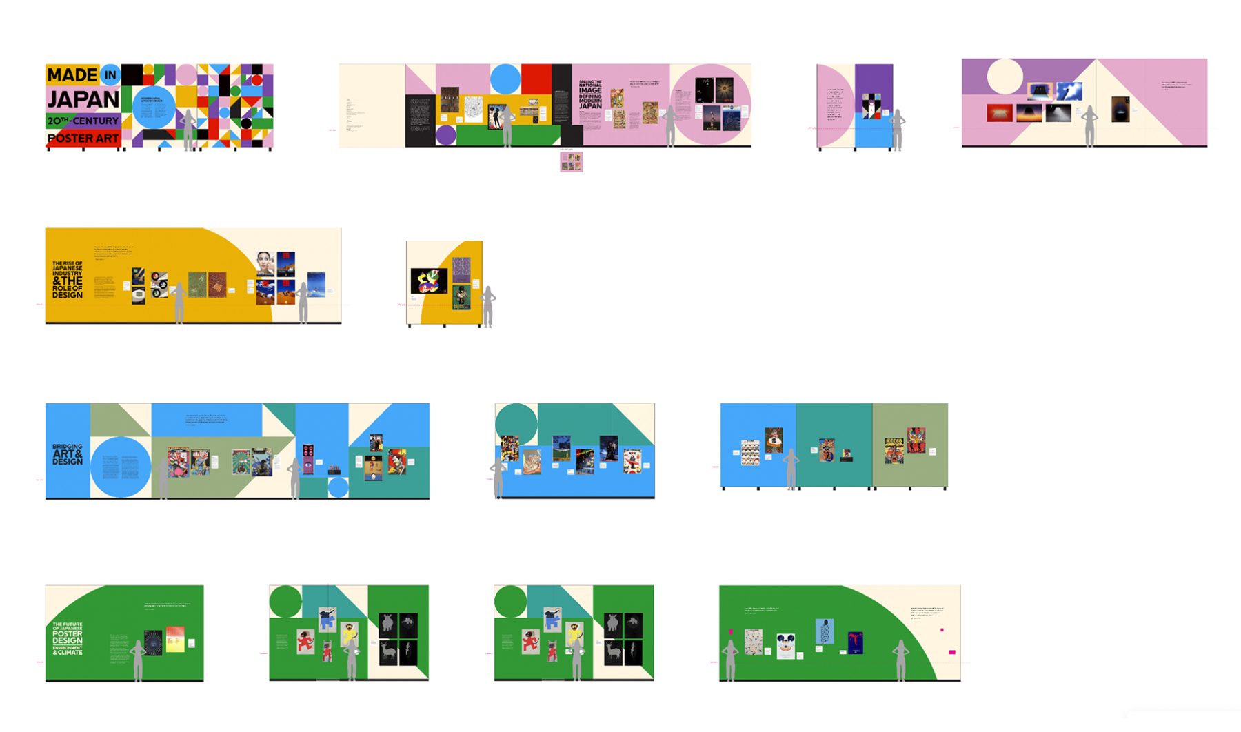
We chose color hues to serve as thematic backdrops for each section of the gallery. These vividly colorful shapes started small but quickly became larger as one progressed through the exhibit, finally becoming larger than the gallery walls.
Oversized typography—inspired by lettering found on the ships that brought Japanese immigrants to the American continent—infused the exhibit with a sense of industrialization and globalization, two forces that greatly influenced the evolution of graphic design in Japan.
KASA Collective
-
John Kudos
Creative Director -
Robert de Saint Phalle
3D Creative Director -
Ashley Wu
Art Director -
Fay Qiu
Designer -
Imam Fadillah
3D Renderer -
Amanda Knott
Project Manager -
Samuel Sachs Morgan
Photographer
POSTER HOUSE
-
Nozomi Naoi
Erin Schoneveld -
Angelina Lippert
Chief Curator & Director of Content -
Ola Baldych
Director of Design & Exhibits -
John F. Lynch
Associate Director of Exhibits -
Mihoshi Fukushima Clark
Assistant Director of Design -
Rob Leonardi
Fabricator
Poster House Website
Poster House
Capabilities
Focus Area
Client
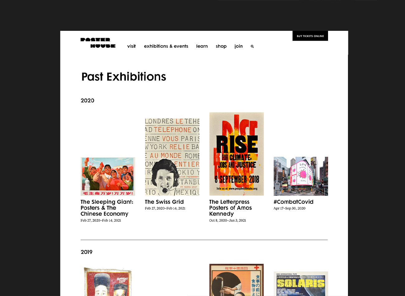
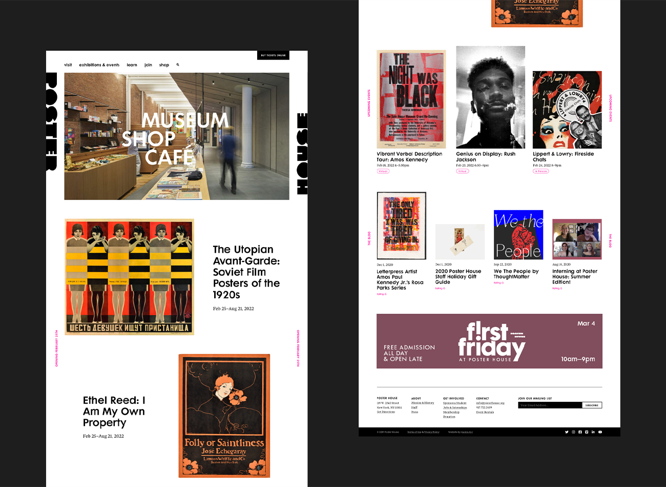
Poster House (New York City) is the first museum in the U.S. to be dedicated exclusively to posters, presenting a global view of the medium from its earliest appearances in the late 1800s to present-day uses.
We designed a seamless, clean, and immersive new website for the museum that carries the boldness, simplicity, and clarity of a poster exhibition, ensuring the museum’s events and poster collections were showcased prominently. On the back end, we developed the website to provide comprehensive information on events, collections, and admission, along with an online shop—all delivered with rigorously tested web-accessibility.
View posterhouse.org
KUDOS Design Collaboratory
-
Ashley Wu
Designer -
Owen Febiandi
Designer -
Putu Yogiswara
Designer -
Amanda Knott
Project Manager -
Christian Juniady Setiawan
Web Developer

Poster House Interactive Exhibitions
Poster House
Capabilities
Focus Area
Client
Poster House (New York City) is the first museum in the U.S. to be dedicated exclusively to posters, presenting a global view of the medium from its earliest appearances in the late 1800s to present-day uses.
We were tasked to create four interactive exhibits (three digital exhibits and one children’s area) as permanent fixtures of the museum, to be seamlessly integrated into its newly built architecture. In acknowledgement of the poster medium’s journey from oversized ink-on-paper communications to its many contemporary forms—digital, animated, interactive, generative—we ensured that all of our interactive components offered a good mix of tactile, physical, and screen-based experiences.
PHOTO BOOTH
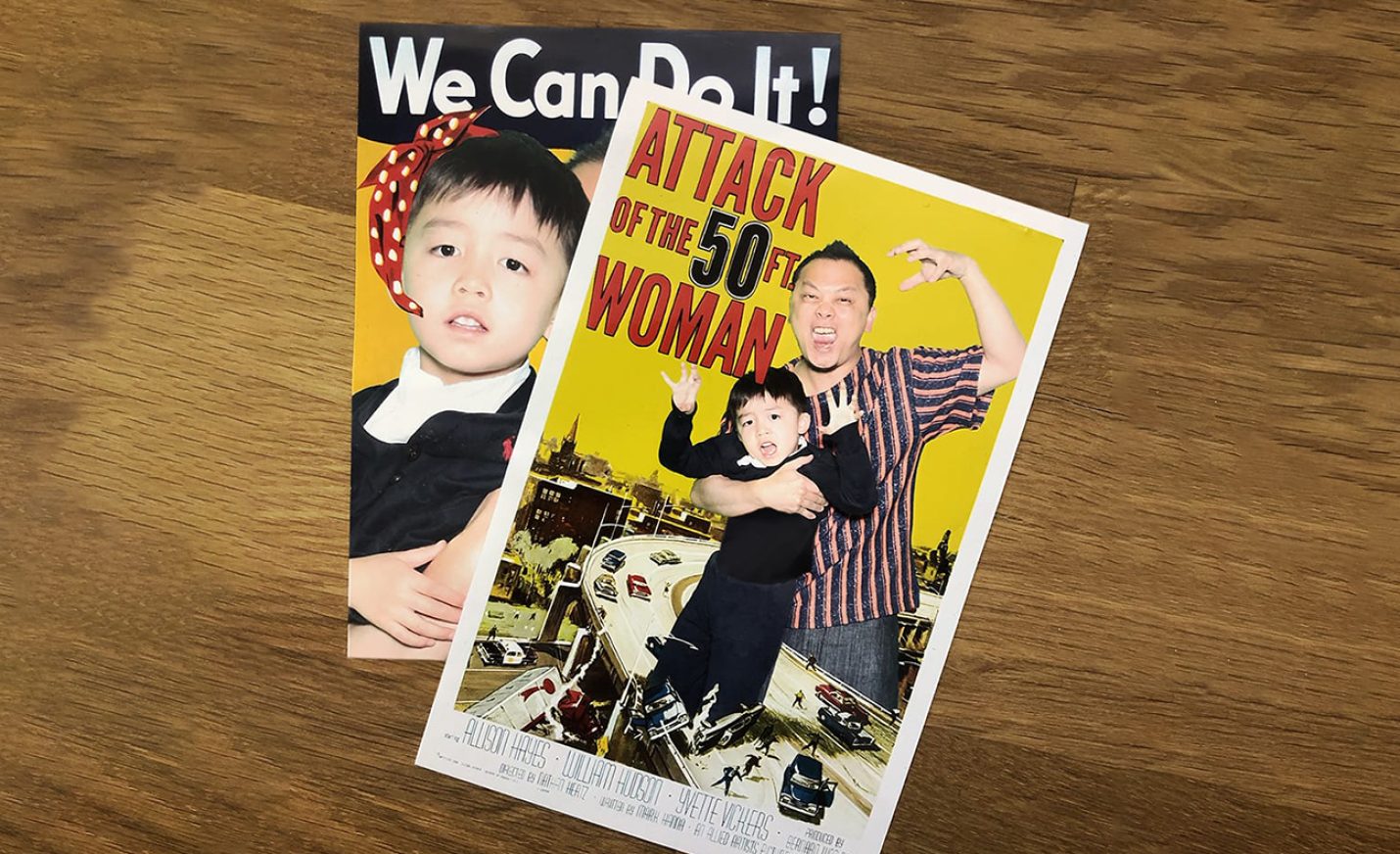
This green-screen photo booth, visible from the street and embedded into an alcove at the museum’s entrance, allows visitors to place themselves in iconic posters using a custom interface, and receive the final posters via email, text message, and print.
Since the museum’s opening 5 months ago, over 6,500 images have been texted, emailed, and printed through the highly visible photo booth.
The photo booth continues to be a big draw for passersby, with an average of 15 minutes per visitor engagement.
DIGITAL POSTER WALL
This oversized 4K screen displays a curated grid of larger-than-life posters from the collection, which are randomly enlarged periodically, or whenever a visitor presses a nearby button. Located adjacent to the ticketing counter, our digital poster wall provides a good preview of what to expect in the museum.
CHILDREN’S AREA
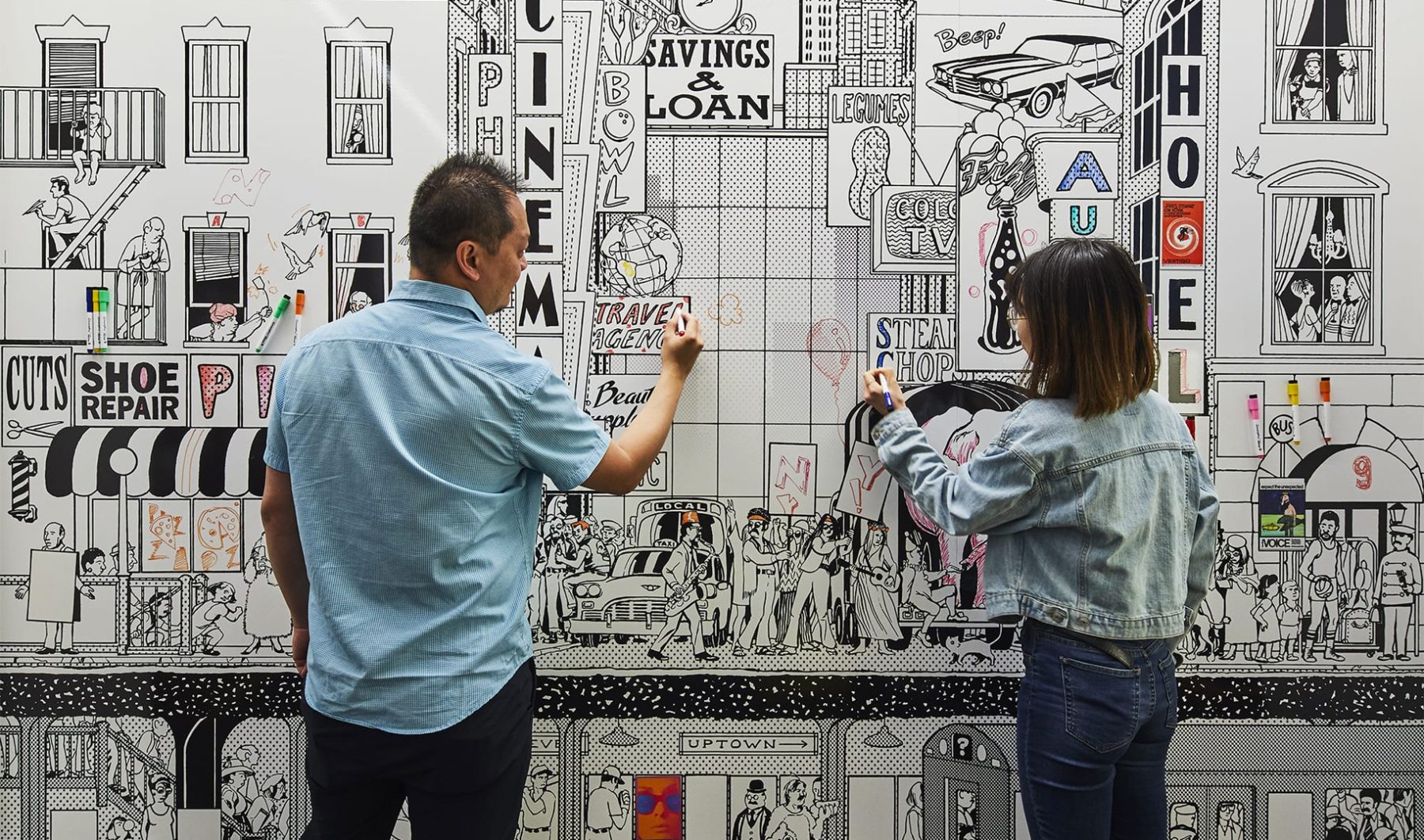
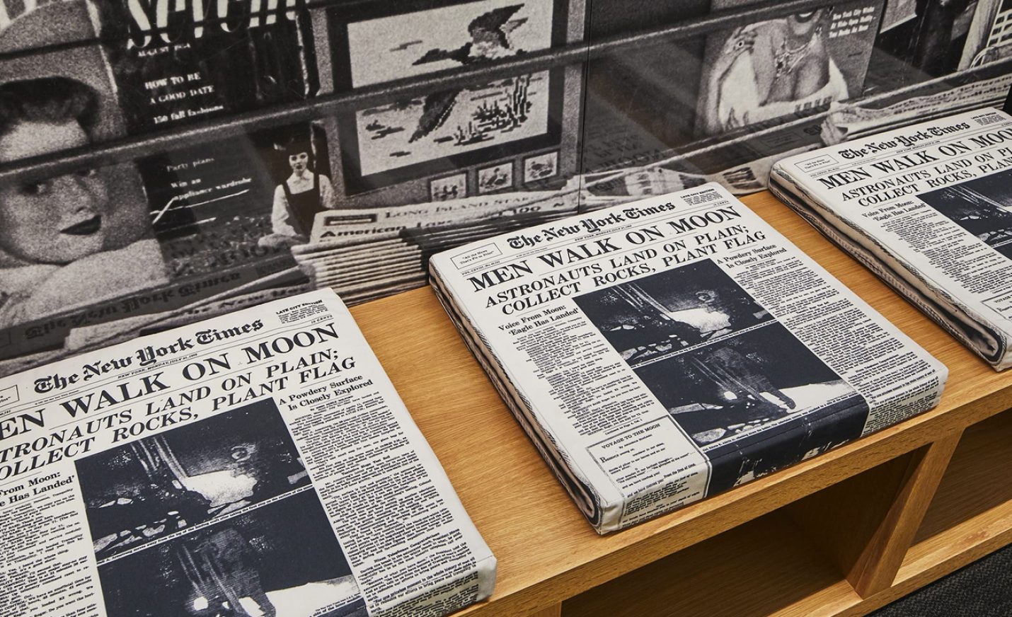
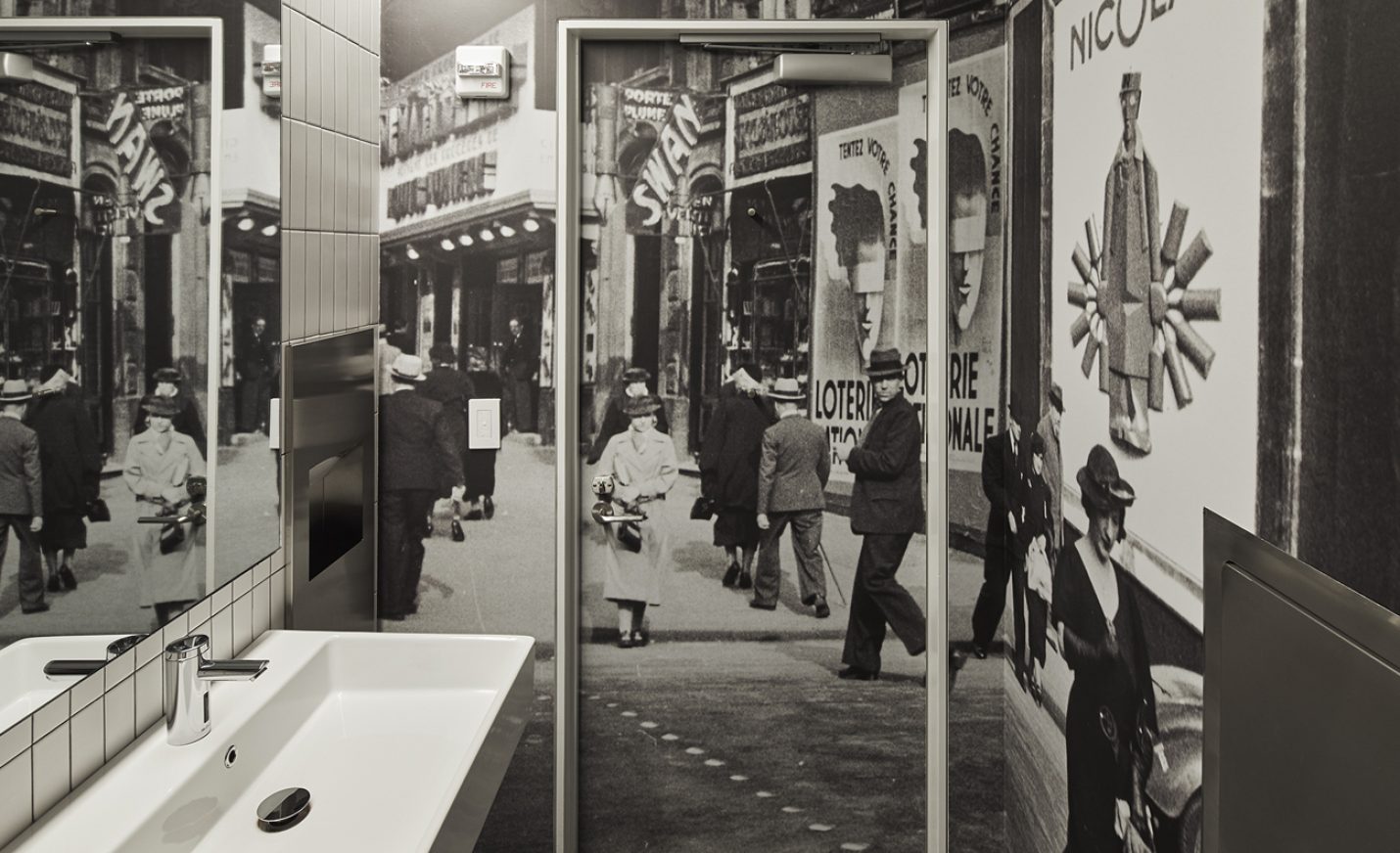
Our children’s area is a blast from the past, featuring 1960s New York City scenes. A coloring mural wall with magnetic posters, interactive vintage payphones by a newsstand, and layering stations explaining how posters are made engages an audience of all ages.
POSTER MACHINE
These tabletop interactive kiosks allow visitors to experience the poster-creation process. To design them, we deconstructed what goes through a designer’s brain to create a choose-your-own-adventure poster-design game, each step of which explains the significance and thought process behind the basic ingredients of any poster—symbols, colors, phrases, fonts, and design styles. There are three themes—Propaganda, Film, or Advertising—for which we created over 143,000 images to represent all the possible design paths one can take.
KUDOS Design Collaboratory
-
John Kudos
Creative Director -
Ashley Wu
Designer -
Sumit Paul
Designer -
Whatever
Software Developer -
Darius Wang
Animator






#CombatCovid Poster
Poster House
Capabilities
Focus Area
Client
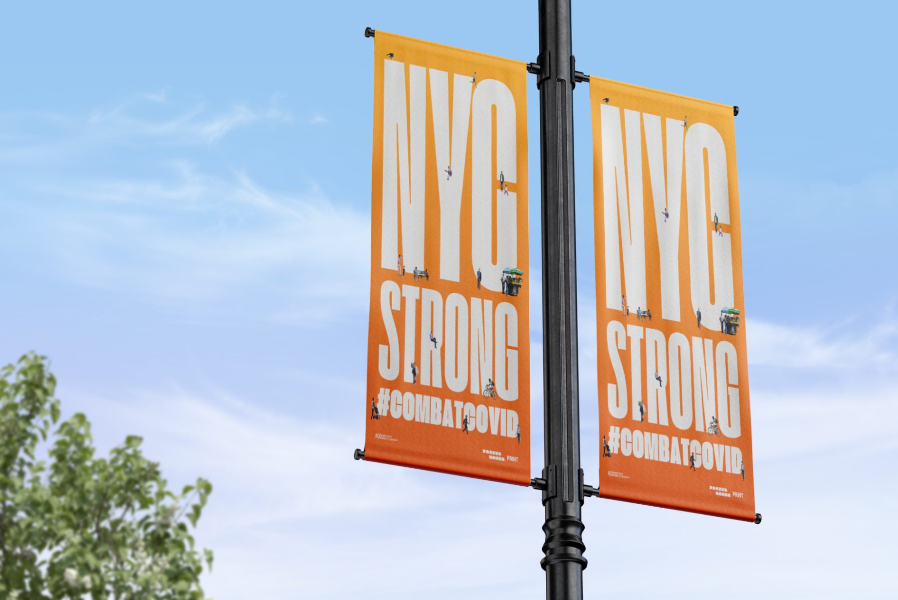
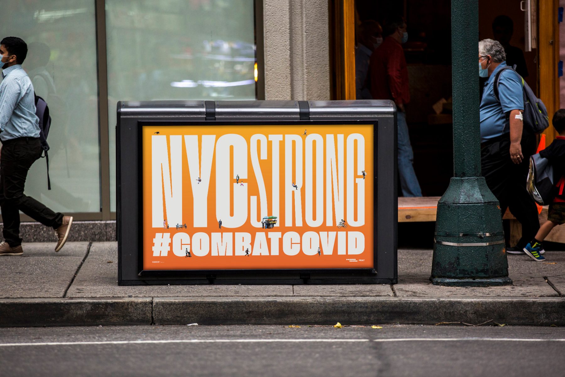
At the height of the COVID-19 pandemic in New York, Poster House teamed up with PRINT magazine, Times Square Arts, and For Freedoms to launch a citywide public art campaign featuring PSAs and messages of love, gratitude, and solidarity with New York City’s frontline workers.
For this project, we produced uplifting poster designs around the theme of “New York Strong.” These can now be found throughout New York City on nearly 1,800 digital screens and billboards, thanks to partnerships with LinkNYC, JCDecaux, Silvercast, Pearl Media, and Times Square Arts.
KUDOS Design Collaboratory
-
John Kudos
Creative Director -
Ashley Wu
Designer -
Giovanni Adrian Sitepu
Animator


The Swiss Grid
Poster House
Capabilities
Focus Area
Client
Poster House (New York City) is the first museum in the U.S. to be dedicated exclusively to posters, presenting a global view of the medium from its earliest appearances in the late 1800s to present-day uses.
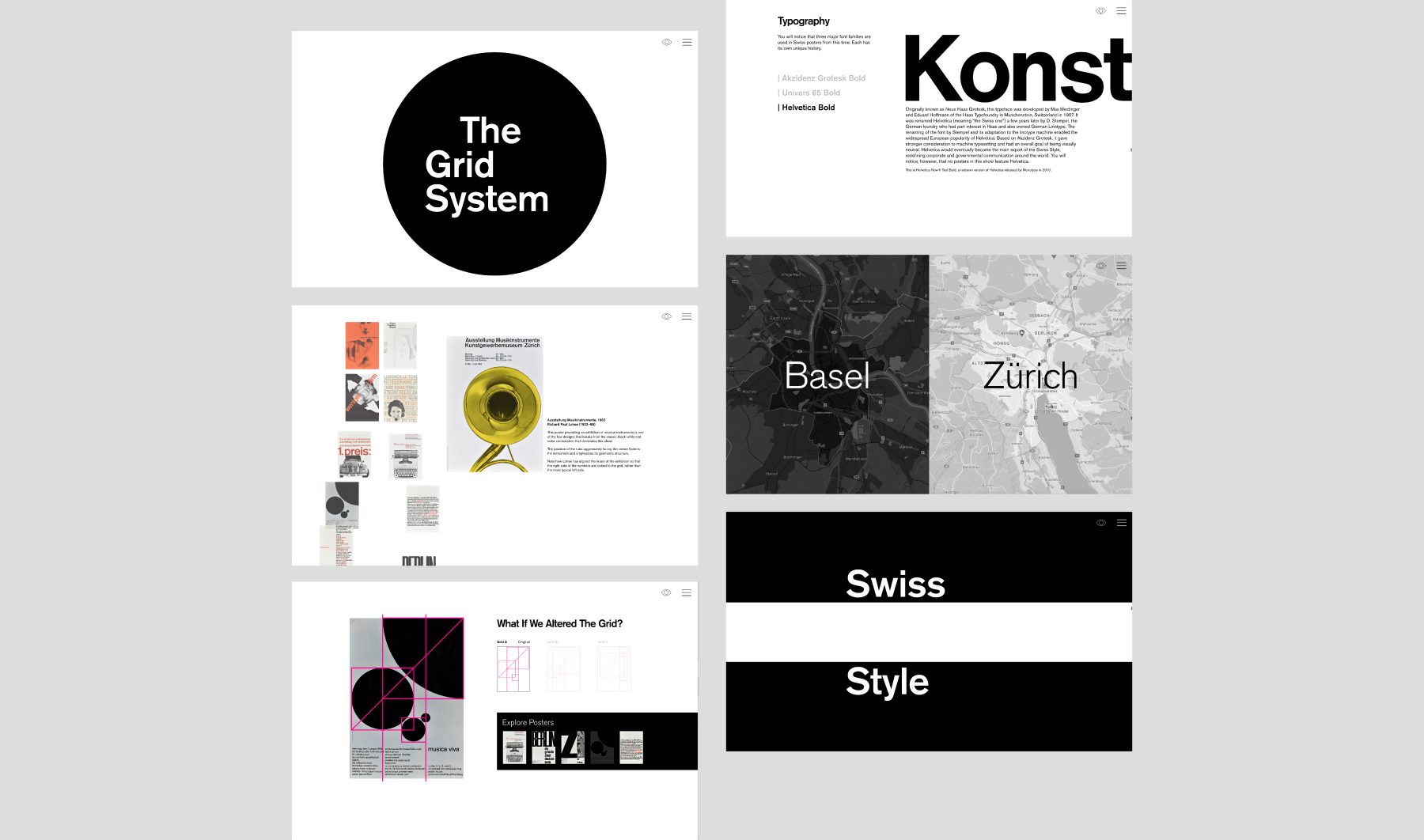
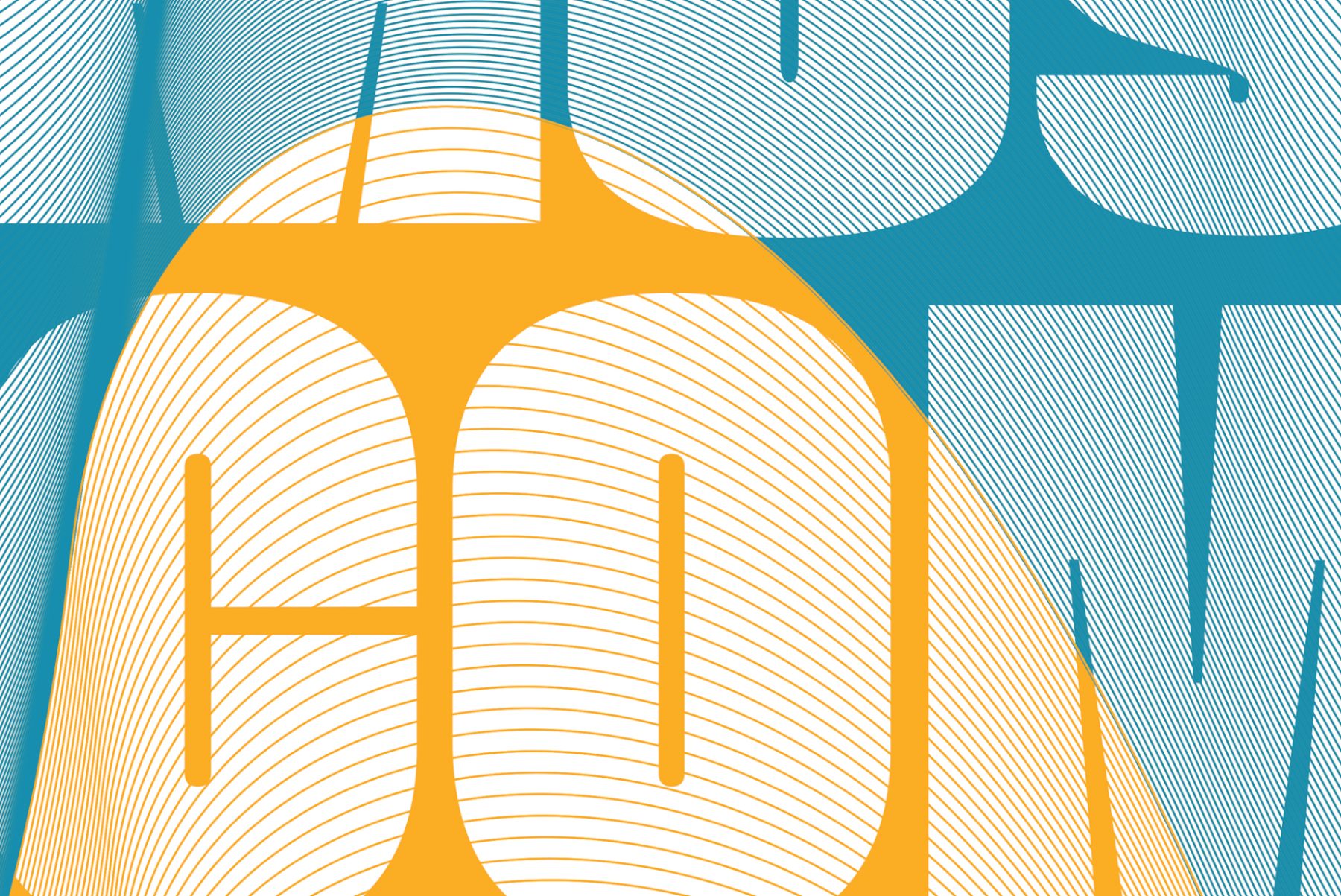
The Swiss Grid was a Poster House exhibition that launched on February 26, 2020. Ten days after the opening, the museum shut down due to COVID-19. We helped Poster House transition the exhibition into a remote-learning tool that provides historical and pedagogical context for some of the technical teachings of design.
Using core material from the original exhibition, the microsite shows how a particular aesthetic—referred to as “The Swiss Grid”—developed in post–World War II Switzerland and spread around the world through generations of practitioners, and how that aesthetic was used to create incredible posters for the cultural sector. The site interweaves contemporary attitudes toward teaching mid-century Modernism and the desire to both break free of and find new use for grid systems in contemporary design.
KUDOS Design Collaboratory
-
John Kudos
Creative Director -
Ashley Wu
Designer -
Fay Qiu
Designer -
Chris Manlapid, Arif Widipratomo
Web Developer
