Typographic Objects Museum
Typographic Objects
Capabilities
Focus Area
Client
Typographic Objects is a private museum of small objects from around the world featuring curious, hyperlocal, beautiful, and timeless typography in various languages. The museum is located within the workspace of KUDOS Design Collaboratory in Forest Hills (NYC). Visiting the museum is an intimate guided tour for designers, students, and educators alike.
Since its opening in December 2024, more than 350 objects have been acquired from Africa, America, Bangladesh, Brazil, Canada, China, France, Greece, India, Indonesia, Italy, Japan, Malaysia, Netherland, Portugal, Russia, Saudi Arabia, Singapore, Taiwan, Thailand, and United Kingdom. We developed an AI-powered app to read and identify any objects in the collection.
Visit typographicobjects.com and the instagram museum
Contact us to schedule a private visit!
KUDOS Design Collaboratory
-
John Kudos
Creative Director -
Inwoo Baek
Lead Designer -
Chris Manlapid
Web Developer


Fallout: Atoms for War & Peace
Poster House
Two days before the outbreak of World War II, a scientific paper was published explaining the theoretical process of nuclear fission in which the controlled splitting of an atomic nucleus releases a vast amount of energy.
Over the next decade, scientists around the world would perfect the process of harnessing that energy, developing two of the most impactful inventions of the modern era: the nuclear bomb and the nuclear power station.
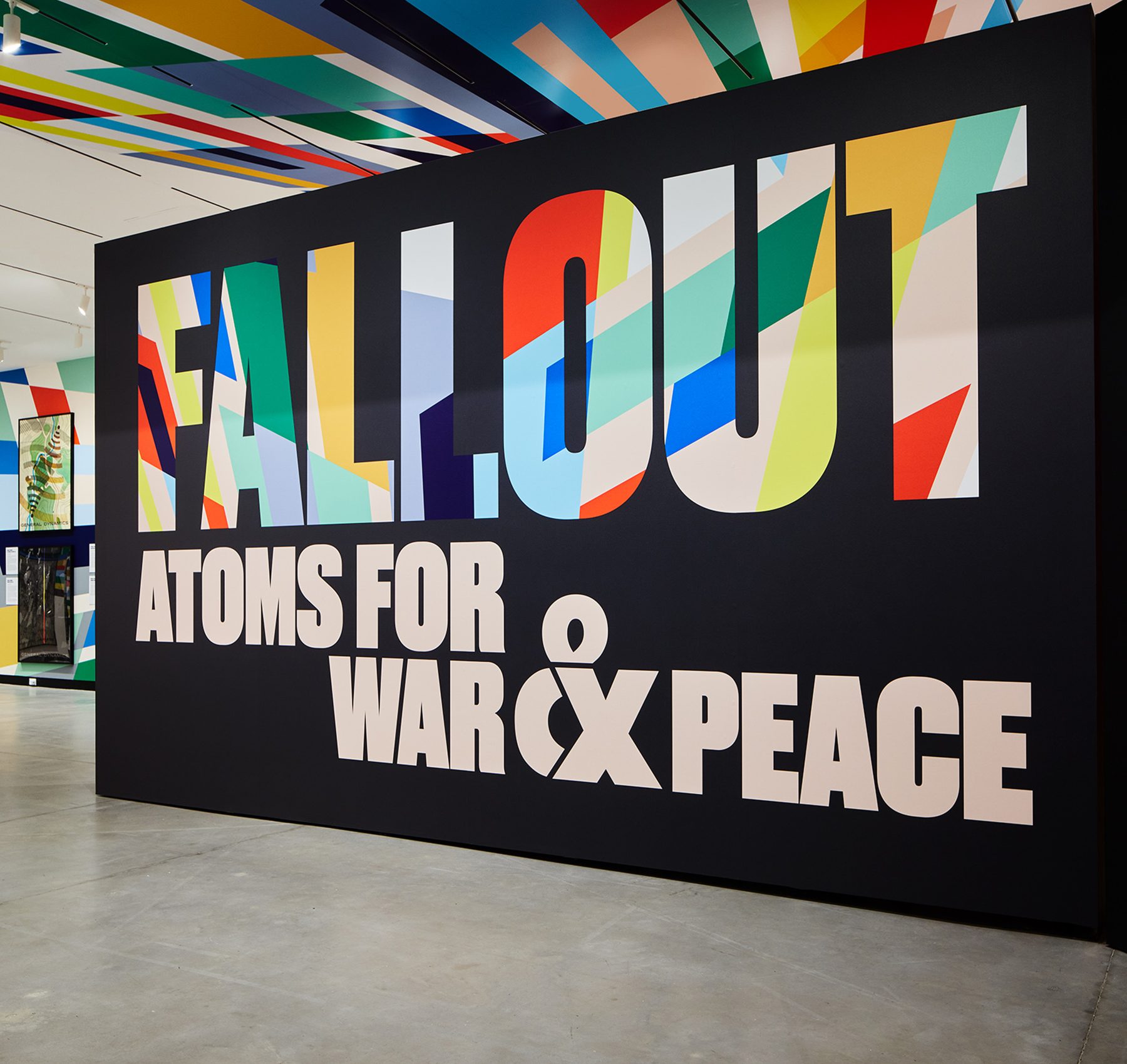
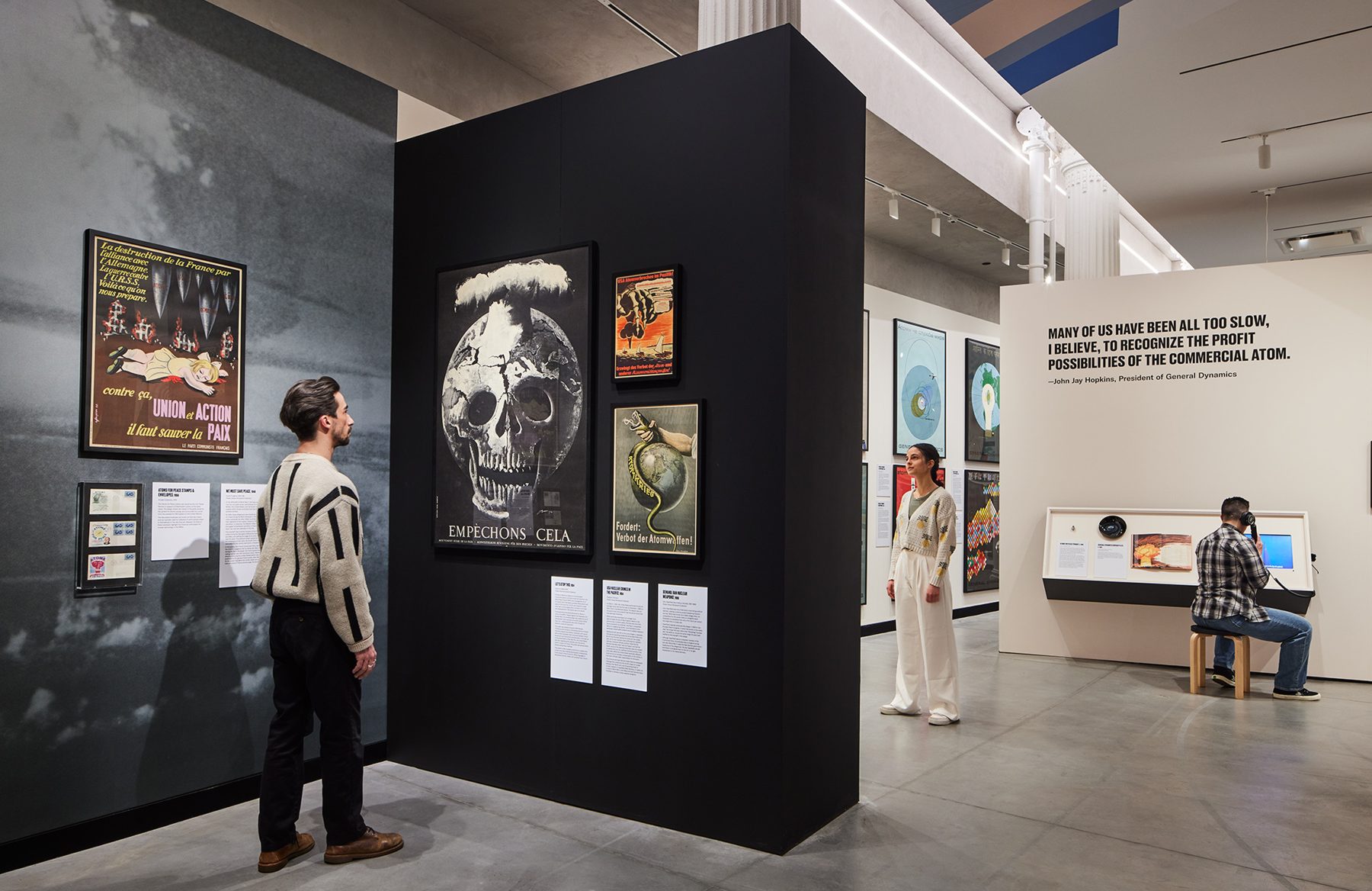
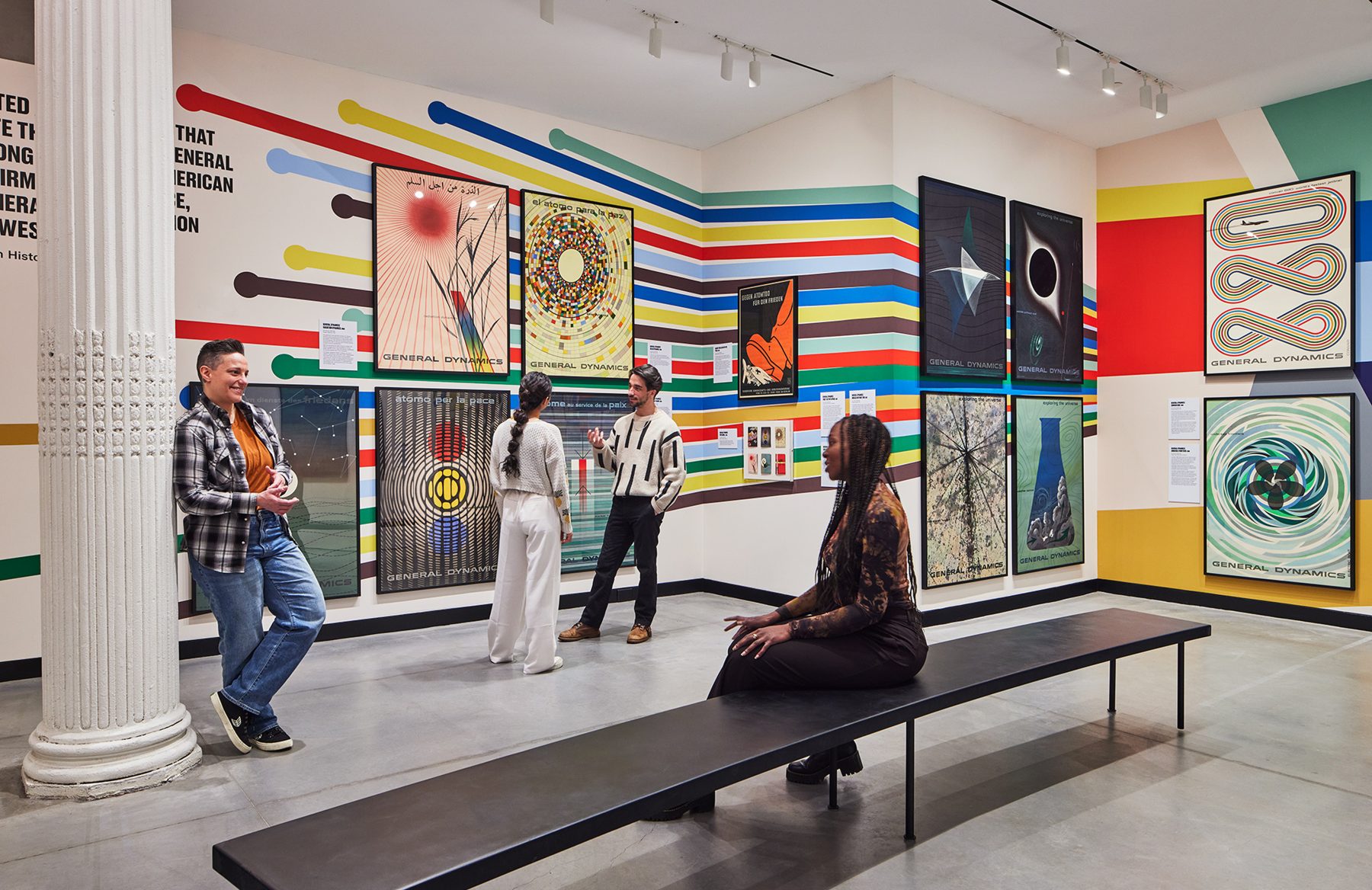
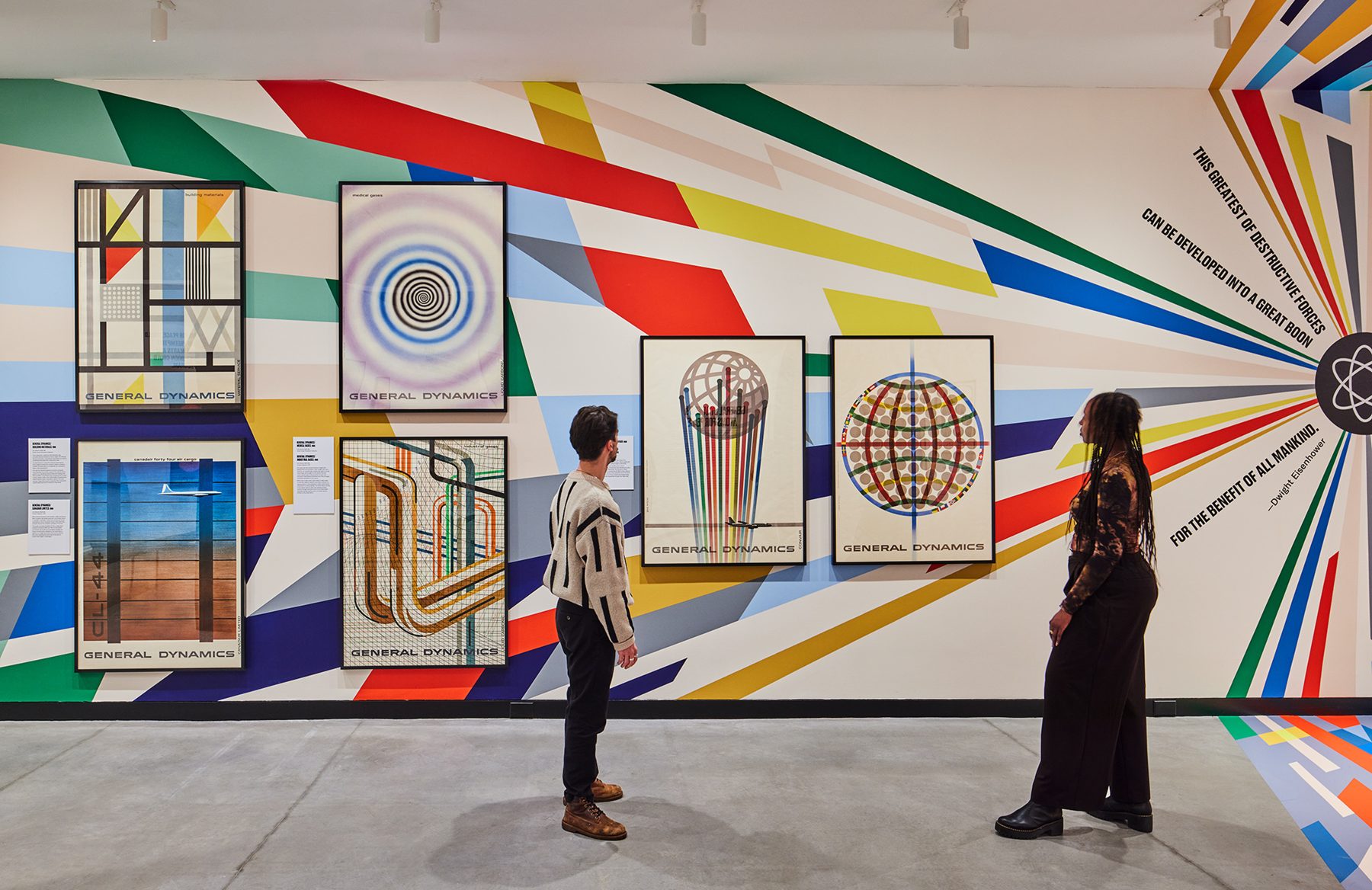
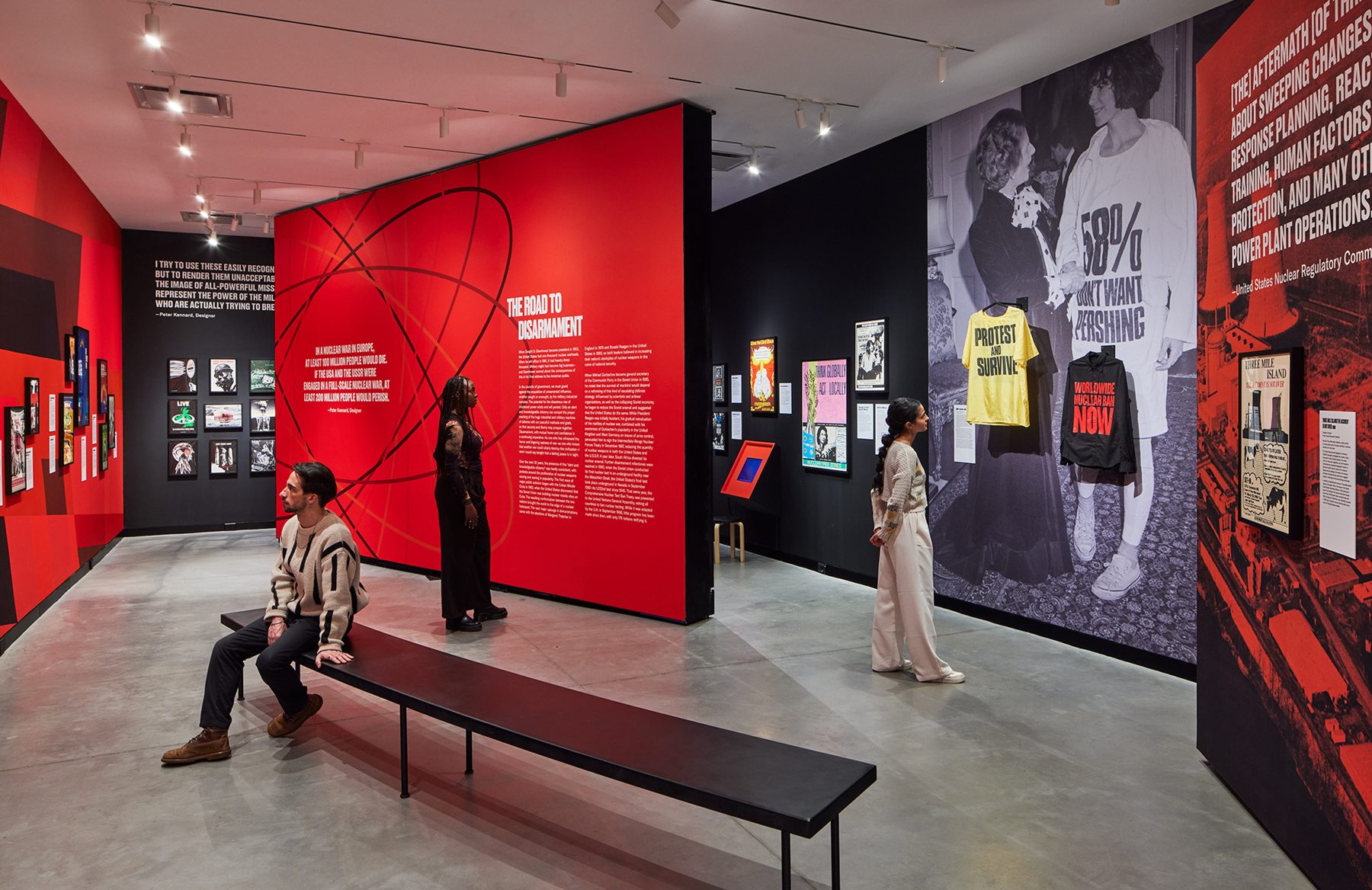
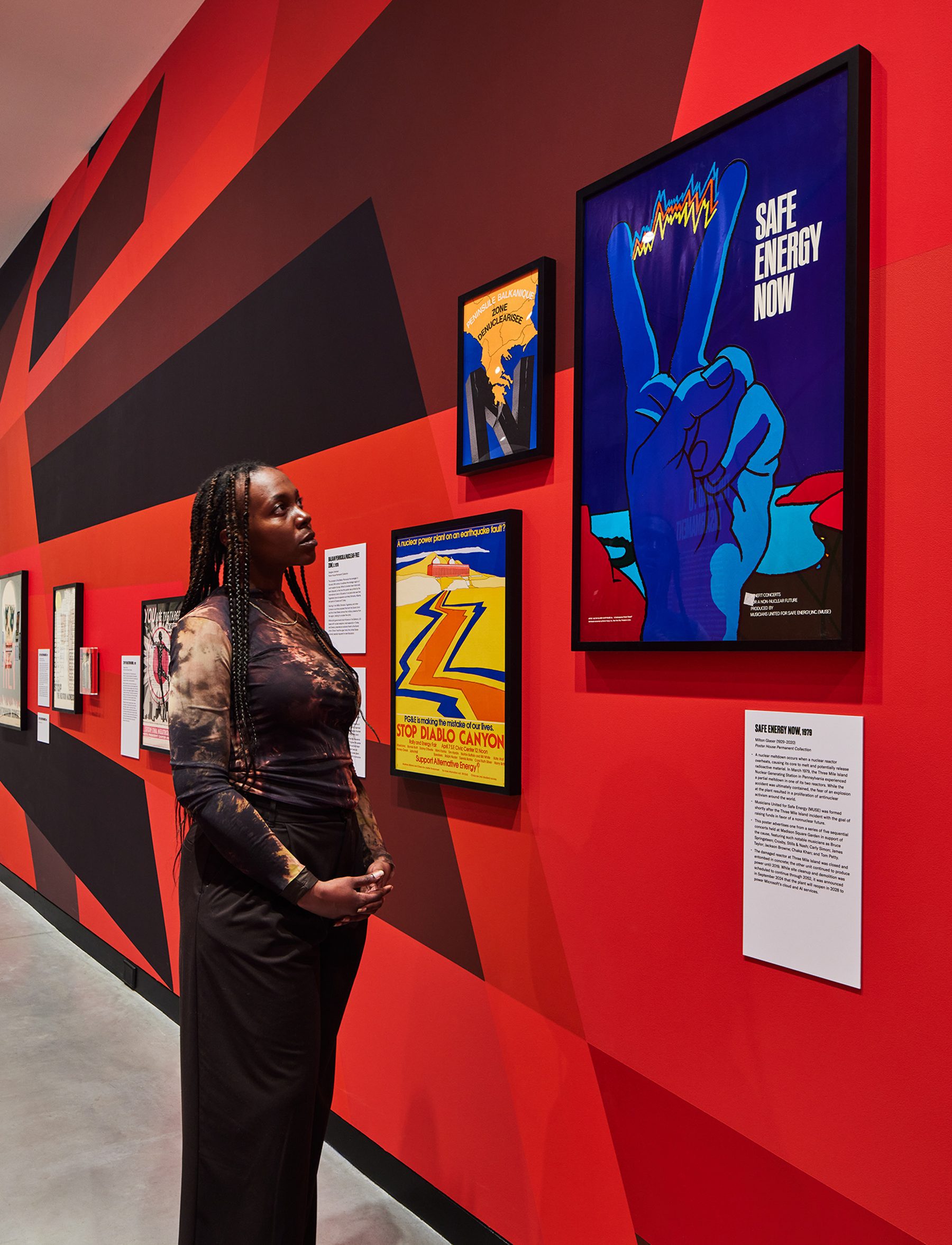
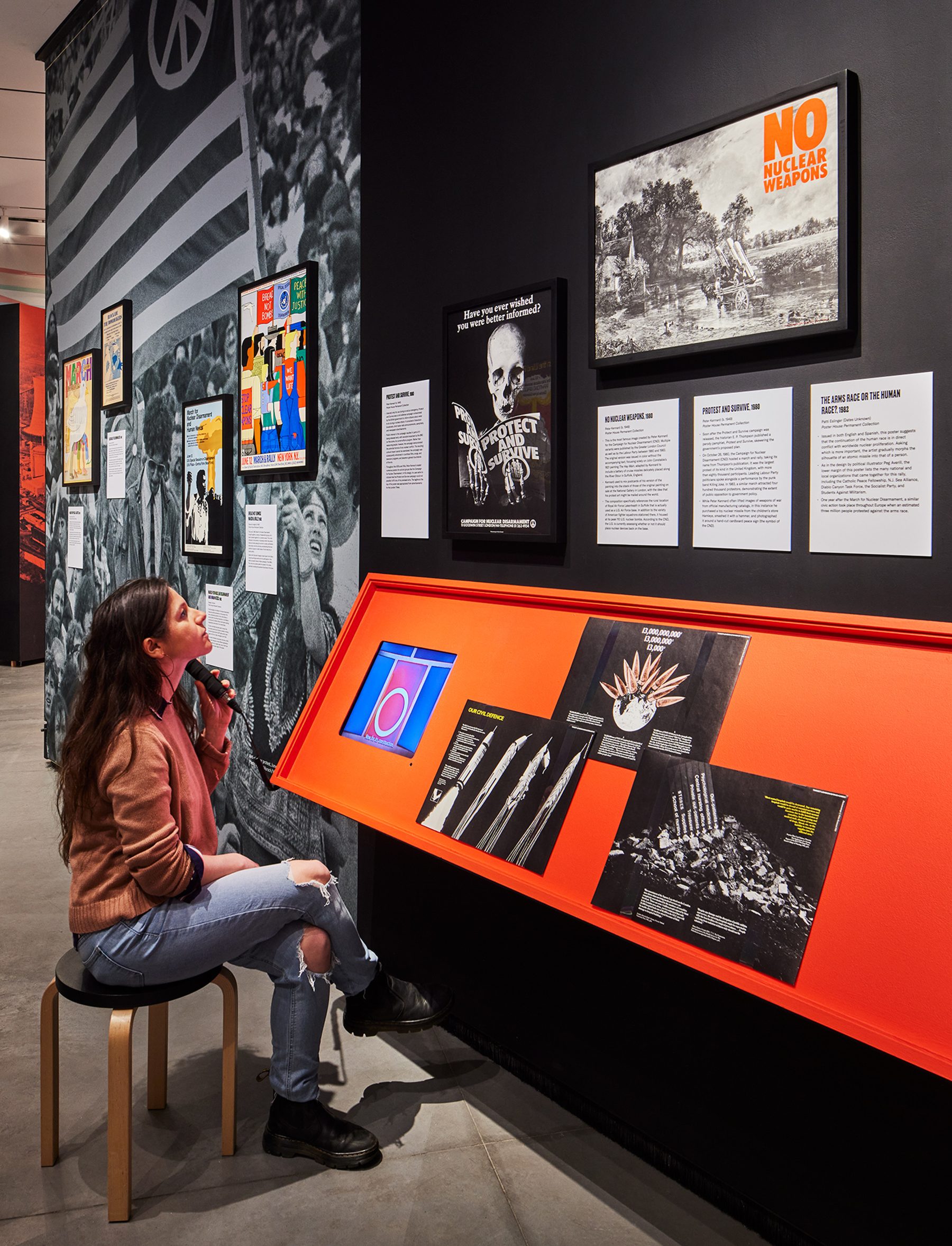
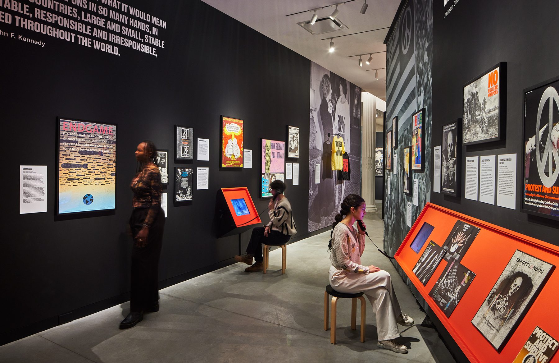
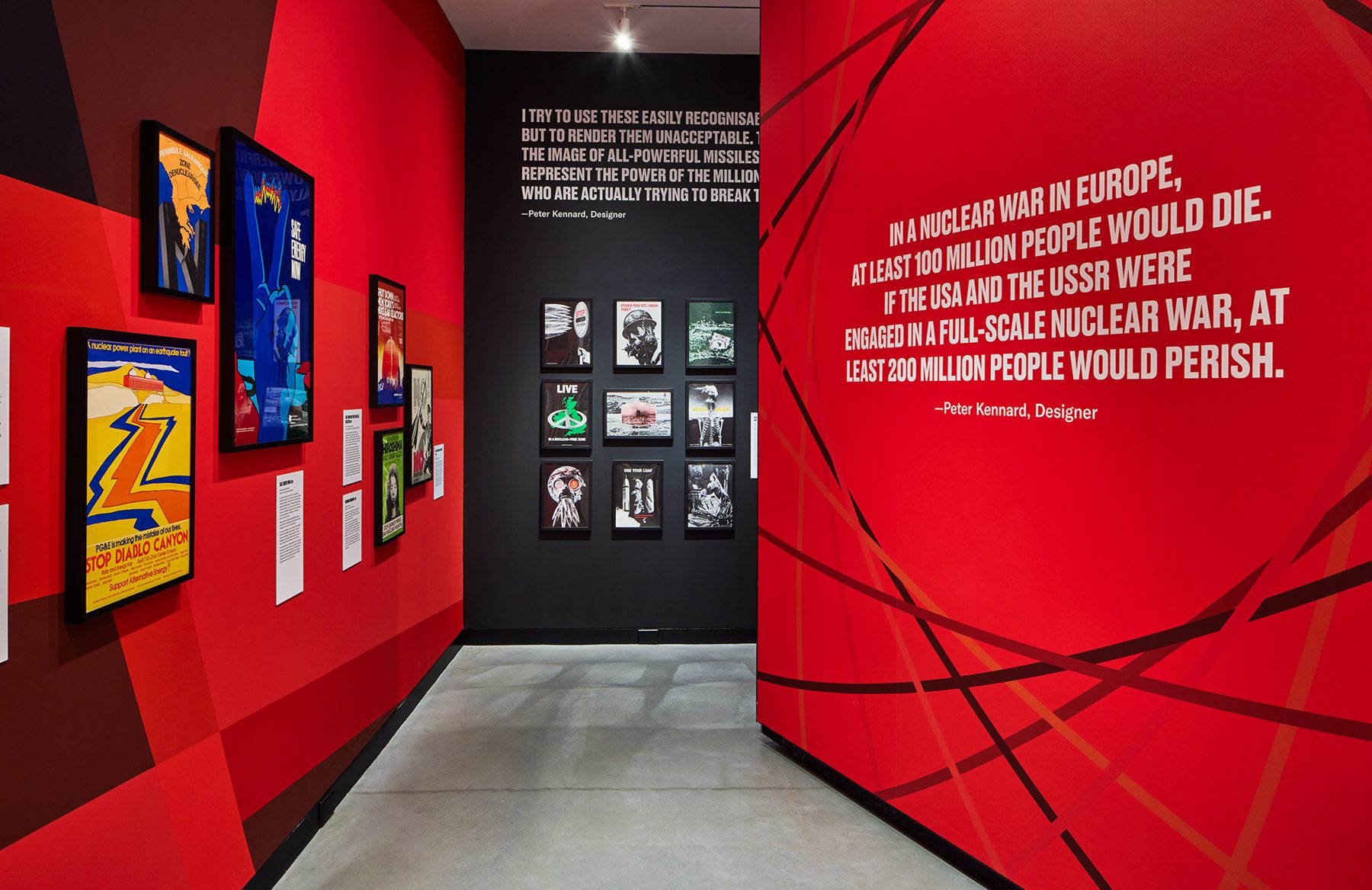
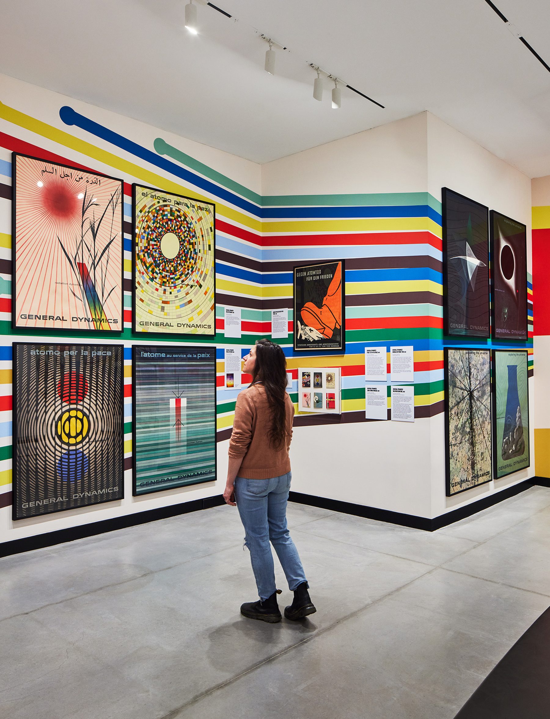
Fallout chronicles the global development of the nuclear industry, for peaceful and offensive means, examining posters that both promoted and protested its use throughout the second half of the 20th century. It features the entire General Dynamics poster series, the finest examples of corporate propaganda ever created against over 60 other posters criticizing the proliferation of nuclear technology.
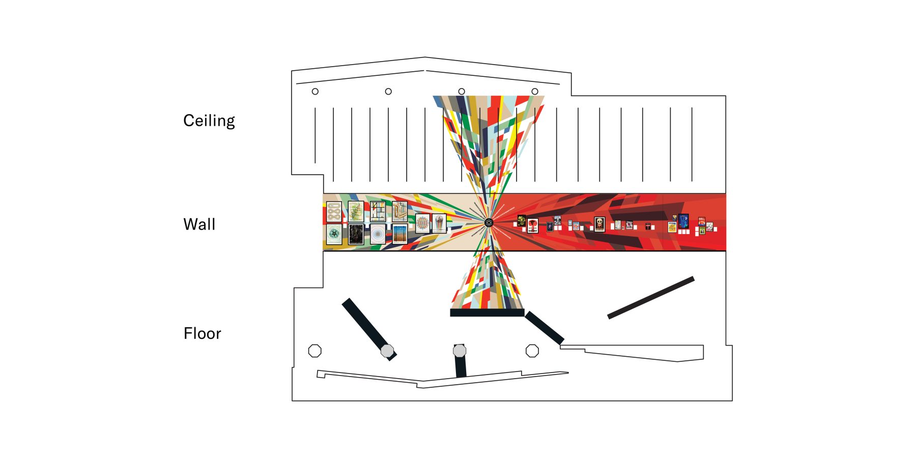
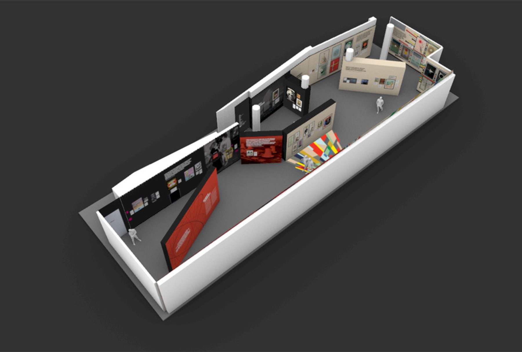
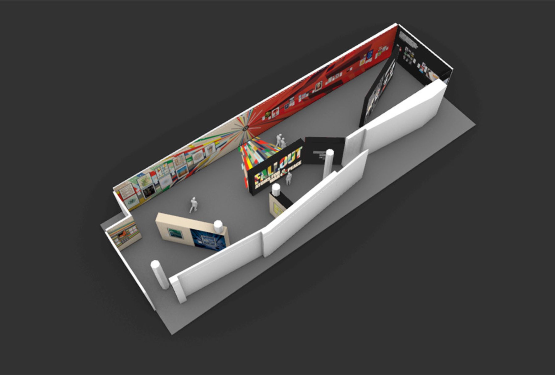
We designed the exhibition as two conjoined chapters. The colorful side features General Dynamics’ Atoms for Peace poster campaign, originally designed by Erik Nitsche. The darker half explores the nuclear arms buildup, the military industrial complex, and the corresponding poster protest. For those of a certain generation, the exhibition revisits the intense anxiety triggered by constant fear that the Cold War could heat up at any time.
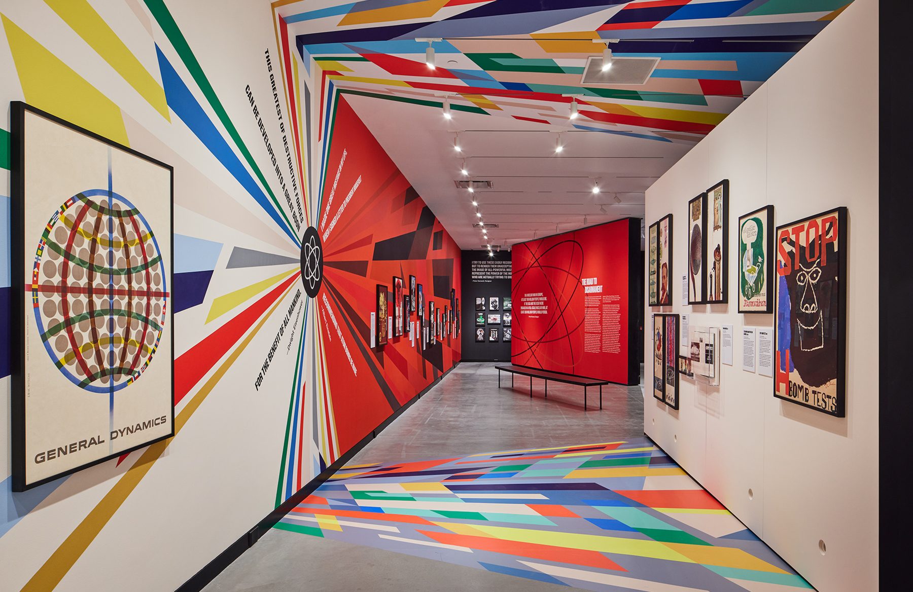
There is a clear opposing duality to the exhibition. We determined that there needs to be a clear indicator when the overarching narrative took a 180-turn, both visually and spatially.
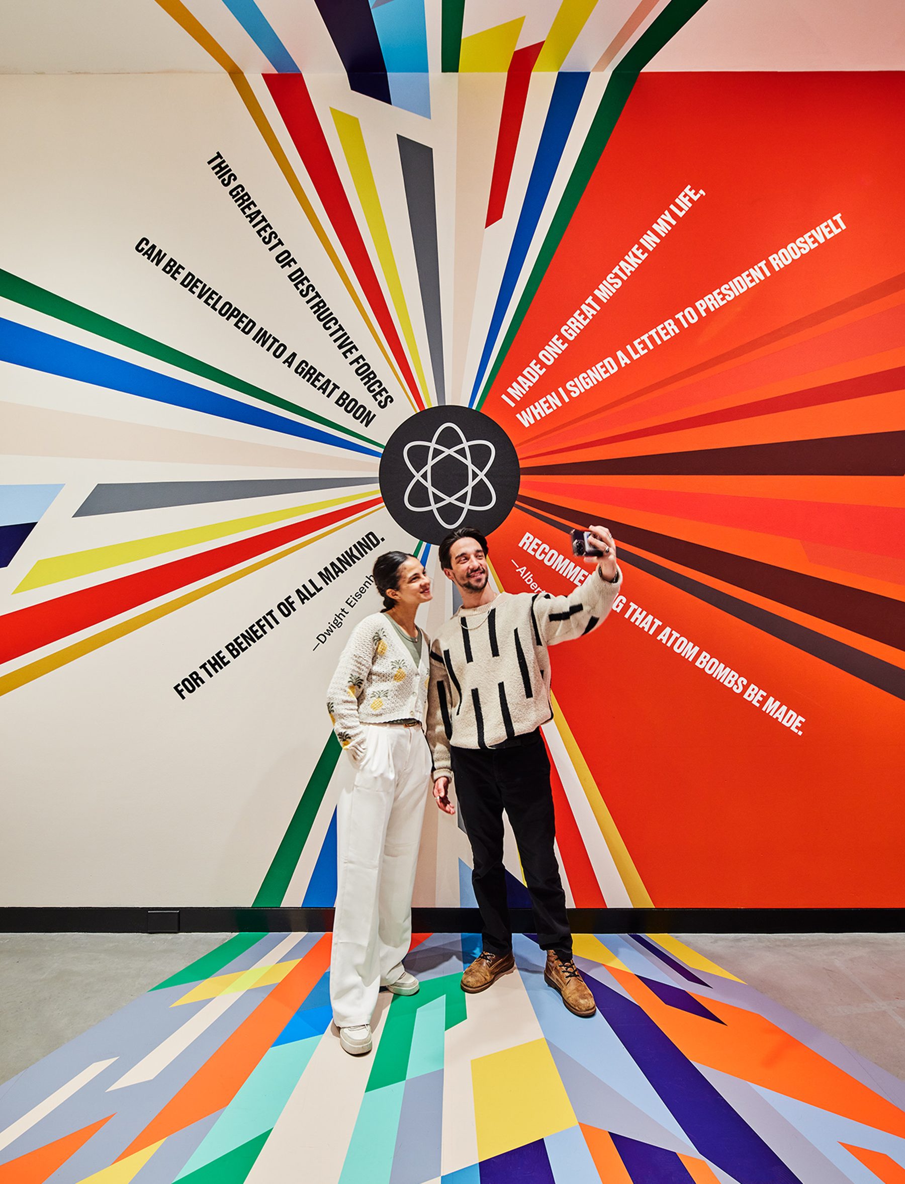
We wanted to carve out a physical threshold within the gallery that forces visitors to experience an inflection point in the narrative as they walk through. We refer to it as the quantum superposition moment in the gallery, where a particle can exist in multiple states (like being in two places at once, or two narratives at once) until measured, at which point it “chooses” one state.
Within this area, we juxtaposed a hopeful quote from Eisenhower against Einstein’s horrific regret, in the form of a colorful explosion, a schism resulting from the splitting of the atom, releasing color graphics that span distances, time and surfaces. These color fields were hand-painted color-by-number on the longest wall surface available in the gallery and meticulously wallpapered to the ceiling and the floor.
The exhibition is about the ideal future versus grim reality filled with contradictions. This is captured in the ‘x’ within the title graphic that also forms an ampersand.
KUDOS Design Collaboratory / KASA Collective
-
John Kudos
Creative Director -
Robert de Saint Phalle
3D Creative Director -
Fay Qiu
Designer -
Amanda Knott
Project Manager
POSTER HOUSE
-
Angelina Lippert, Tim Medland
Curator -
Ola Baldych
Creative Producer -
Mihoshi Fukushima Clark, Randee Ballinger, John F. Lynch, Rob Leonardi
Production

Blueprints Branding & Website
Blueprints for Arts and Policy
Capabilities
Focus Area
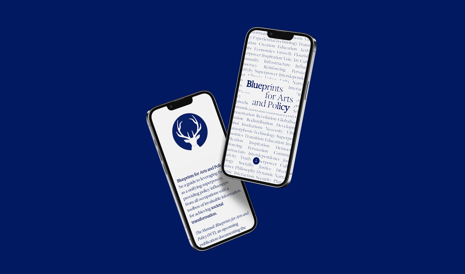
Blueprints for Arts and Policy is a platform in which esteemed global voices in arts and policy exchange ideas, case studies, and recommend actions to inspire collective creativity and bridge ideological, economic, cultural, and social divides. A series of salons will be held in contribution to the project, bringing together leaders in a variety of fields to discuss how the arts can be harnessed for social and policy interventions.
KUDOS developed a generative type branding system that embody the ever-changing nature of these complex exchanges. We also created a series of icons that morph through a Rorschach effect, visualizing the melding of unconscious minds and voices.
Visit blueprintsartpolicy.com
KUDOS Design Collaboratory
-
John Kudos
Creative Director -
Owen Febiandi
Lead Designer -
Putu Yogiswara
Designer -
Iman Fadillah
Motion Designer -
Amanda Knott
Project Manager -
Christian Juniady Setiawan
Web Developer
Shigeko Kubota Video Art Foundation Branding
Shigeko Kubota Video Art Foundation
Capabilities
Focus Area
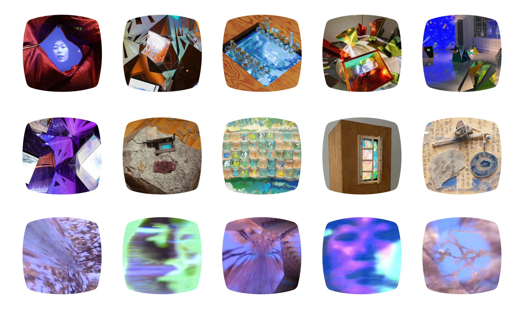
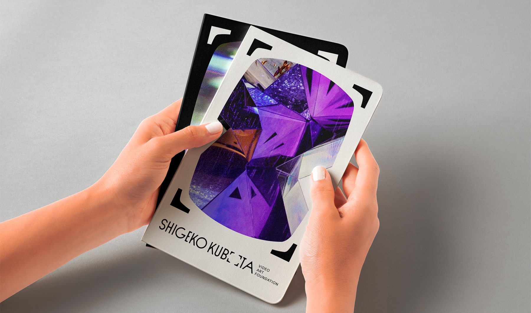
Shigeko Kubota (1937–2015) was a pioneering video artist, recognized as a significant early progenitor of the medium through her multifaceted roles as an artist, curator, critic, and essayist.
The Shigeko Kubota Video Art Foundation is dedicated to preserving her work and cultural legacy while fostering broader awareness, appreciation, and understanding of the history and future of video art through diverse programs and initiatives.
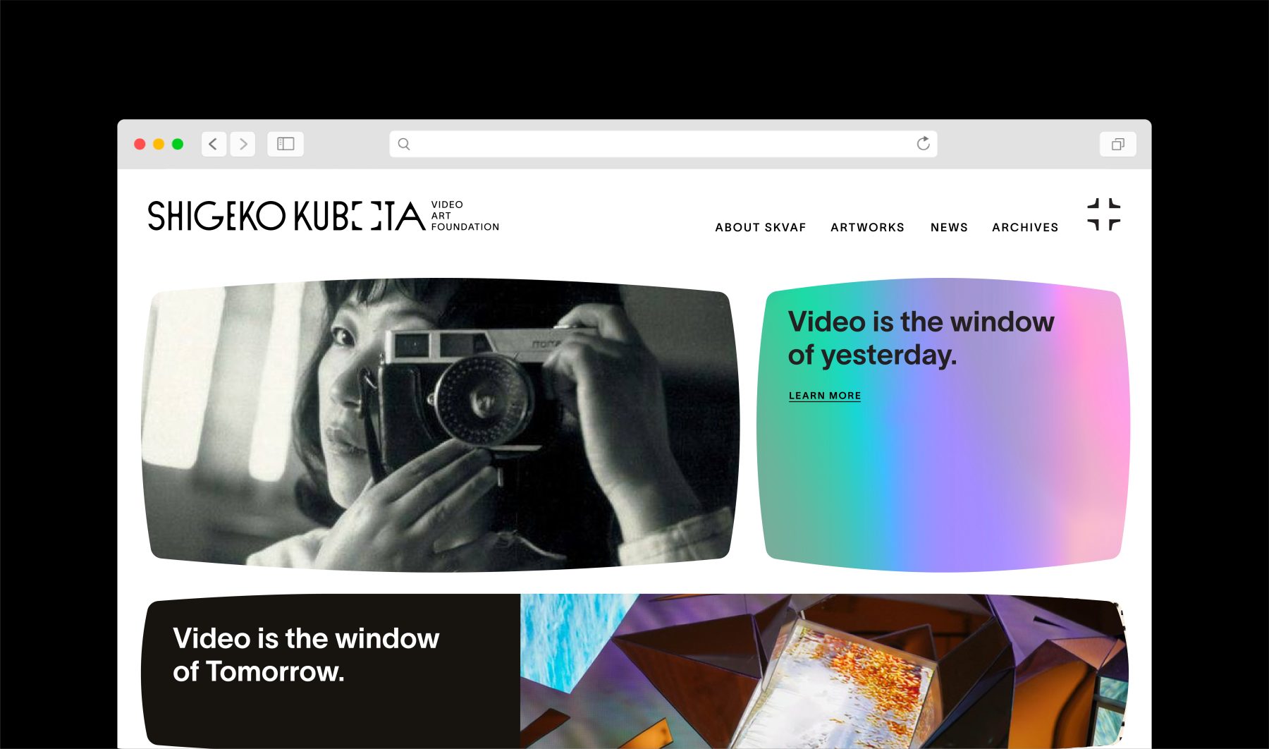
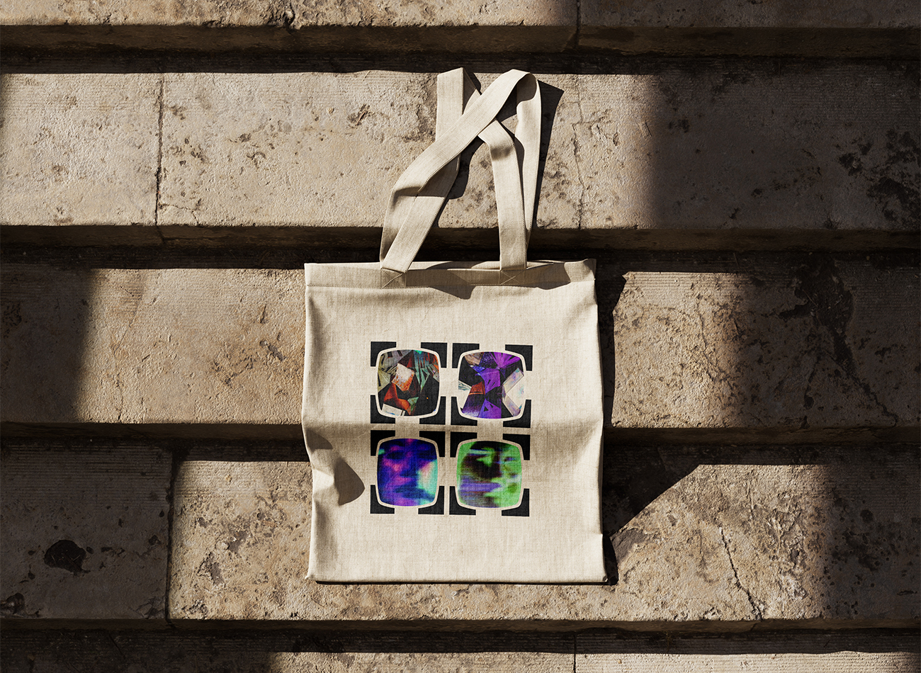
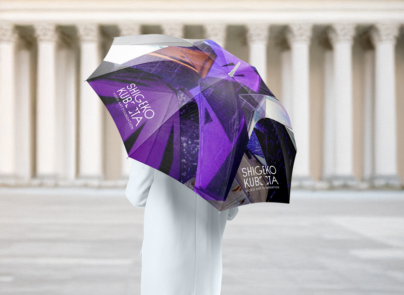
To brand the foundation, we drew inspiration from iconic visual cues in Kubota’s work—most notably the 4×3 television frame and her 2004 artwork, Video is the Window of Yesterday, Video is the Window of Tomorrow. The new visual identity system modernizes these forms within the logotype, allowing the frames to dynamically expand around any subject. Deliberately minimalist and monochromatic, the identity reflects the enduring and timeless nature of Kubota’s contributions to the field of video art.
KUDOS Design Collaboratory
-
John Kudos
Creative Director -
Fay Qiu
Designer -
Owen Febiandi
Designer -
Putu Yogiswara
Designer -
Muhammad Syamil Haqqoni
Designer -
Imam Fadilah
Motion Designer -
Amanda Knott
Project Manager
Lincoln Square Branding & Website
Lincoln Square BID
Capabilities
Focus Area
Client
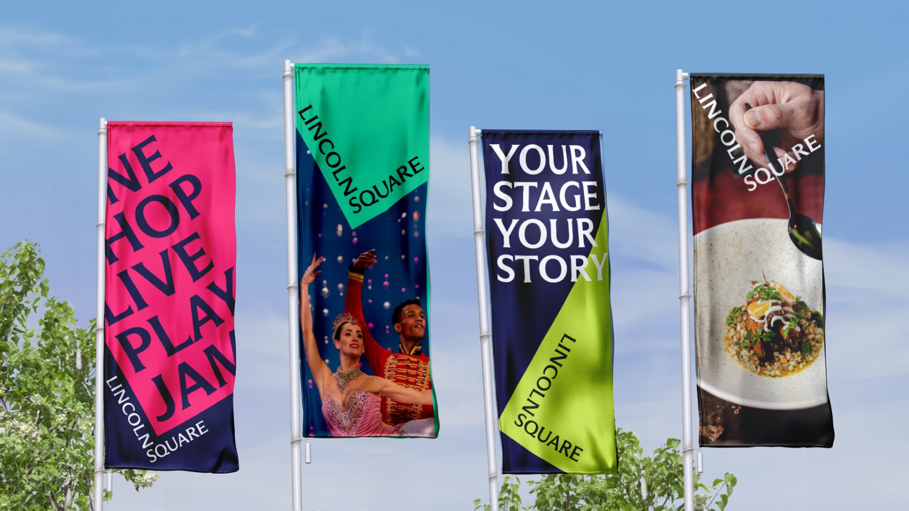
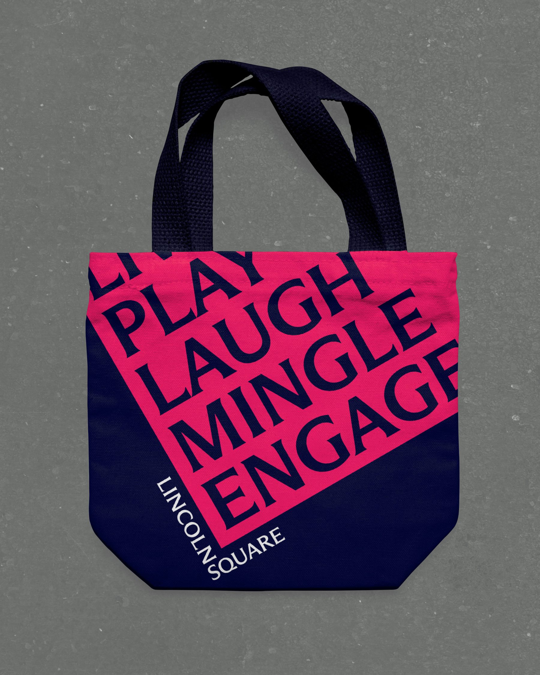
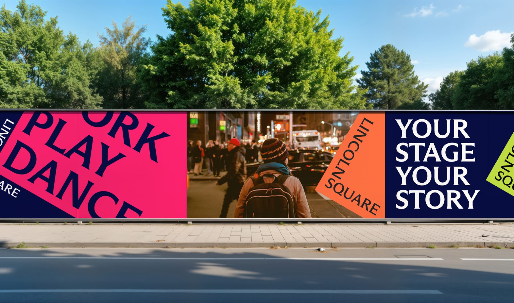
Lincoln Square BID is a nonprofit organization dedicated to keeping the neighborhood clean, safe, and beautiful while promoting its vibrant cultural, commercial, and residential life year-round. Through dynamic marketing efforts, the BID ensures Lincoln Square remains in the spotlight across all seasons.
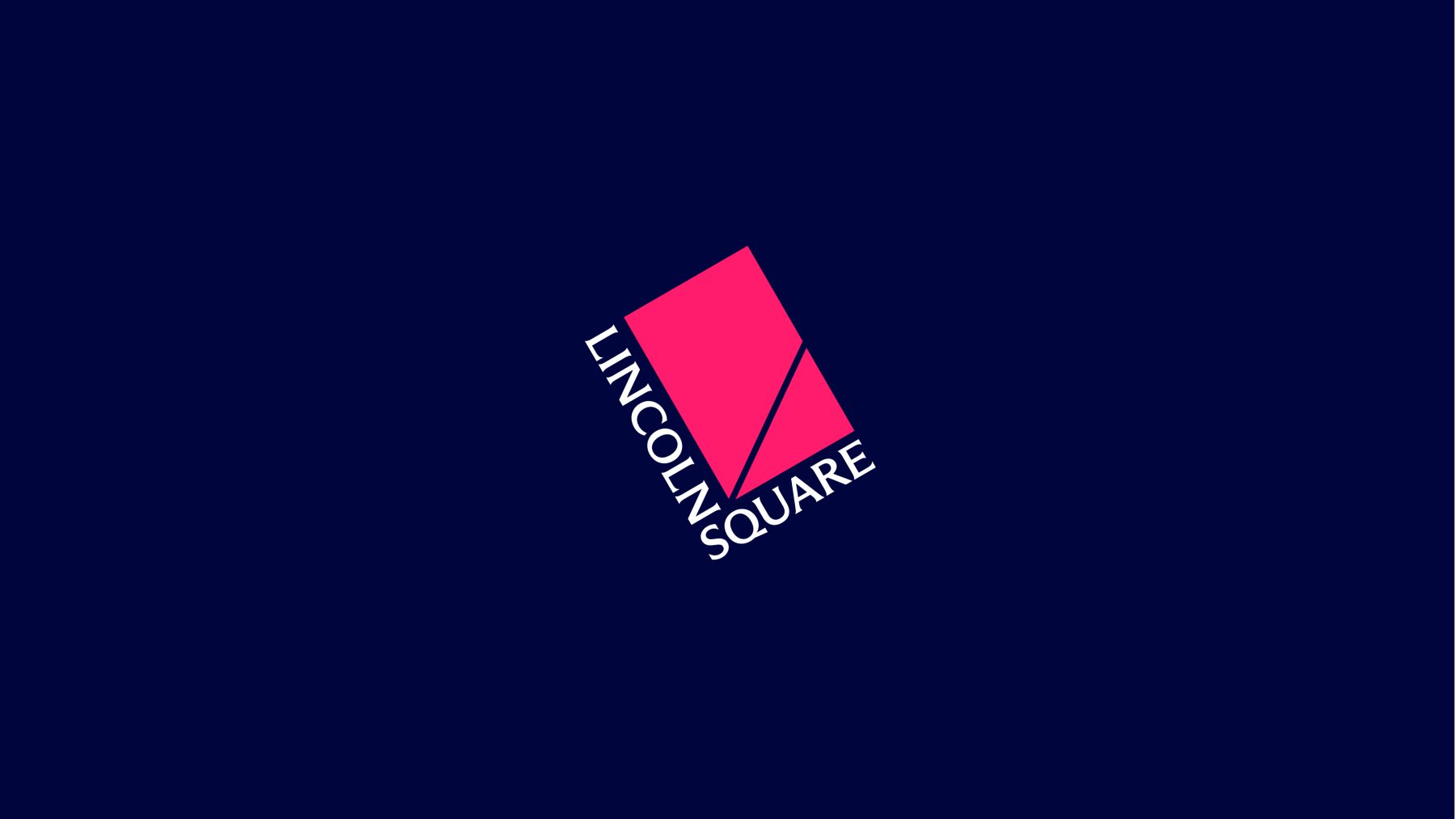
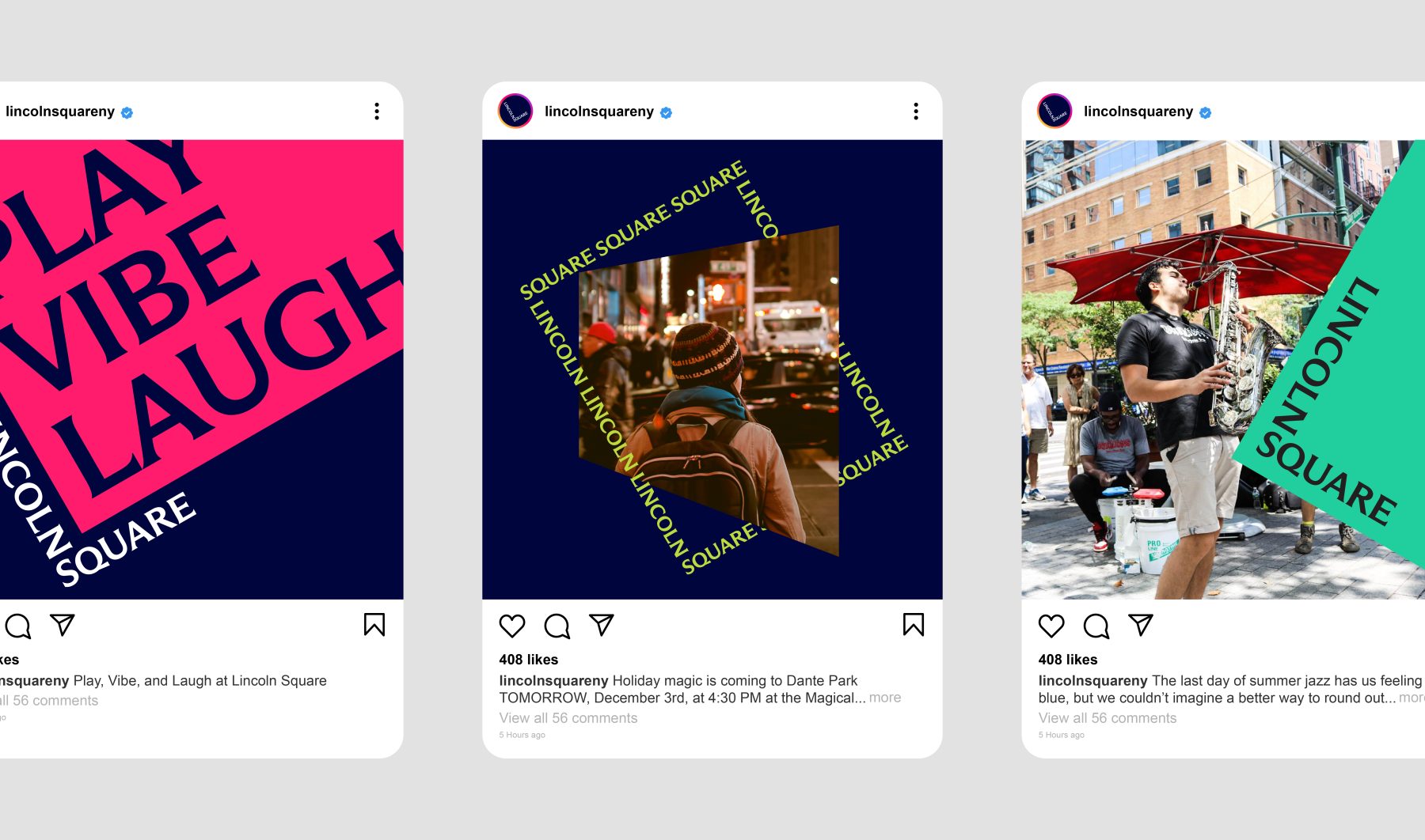
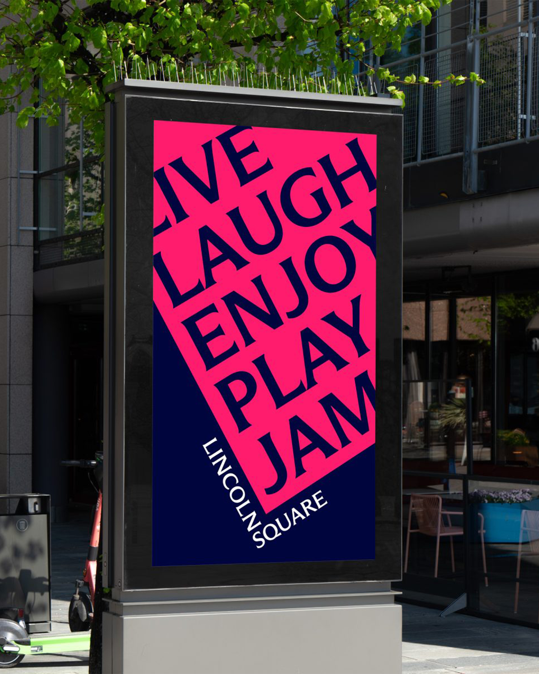
For this project, we introduced a bold new design system. The words LINCOLN and SQUARE interlock to form an “L,” wrapped around a rubin red block tilted at a 30º angle—a visual nod to the way Broadway cuts diagonally through the heart of Manhattan’s Upper West Side.
The block itself serves as a dynamic window into Lincoln Square’s rich cultural landscape. It rotates, shifts colors, and reveals visual moments and words that capture the neighborhood’s spirit, energy, and enduring legacy as one of New York City’s iconic destinations.
A new website will be coming in the Spring of 2025.
KUDOS Design Collaboratory
-
John Kudos
Creative Director -
Fay Qiu
Lead Designer -
Owen Febiandi
Designer -
Jamus Marquette
Designer -
Amanda Knott
Project Manager -
Imam Fadilah
Animator

Shaun Leonardo Website
Shaun Leonardo
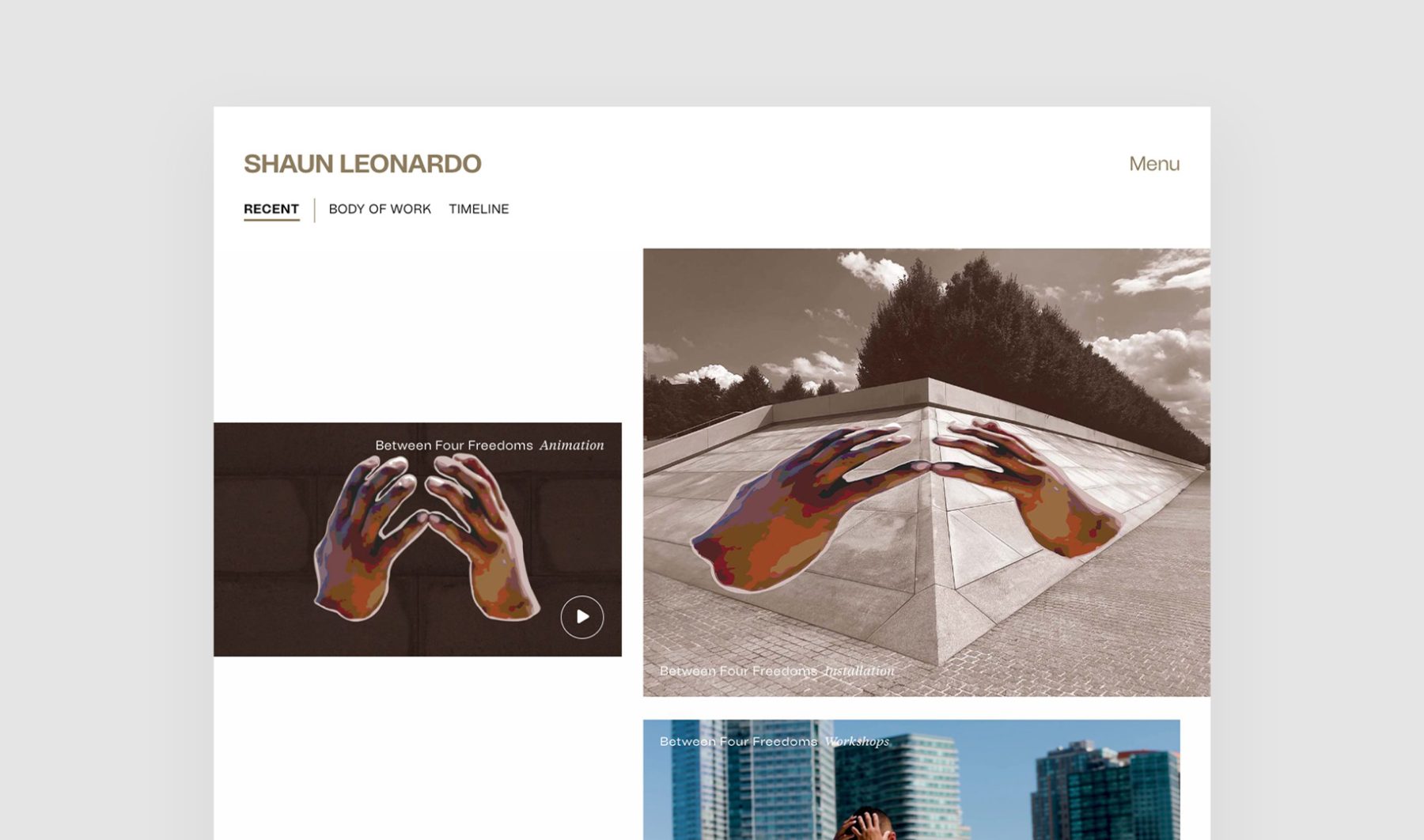
Shaun Leonardo is a Brooklyn-based artist from Queens, New York, whose work has been featured at the Guggenheim, the High Line, and the New Museum, and profiled by The New York Times and CNN. Leonardo engaged KUDOS to design his website.
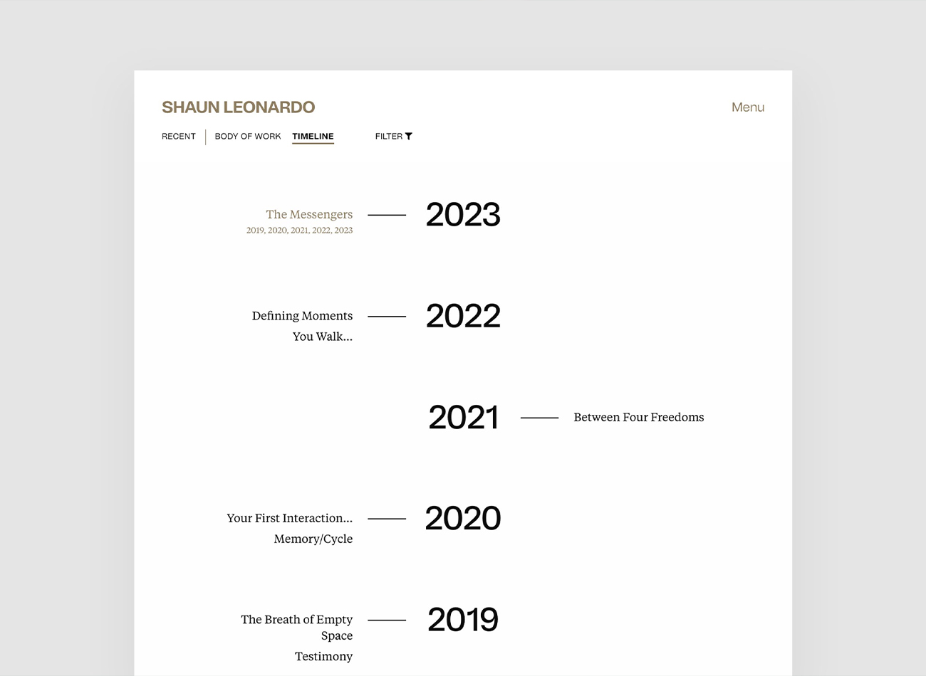
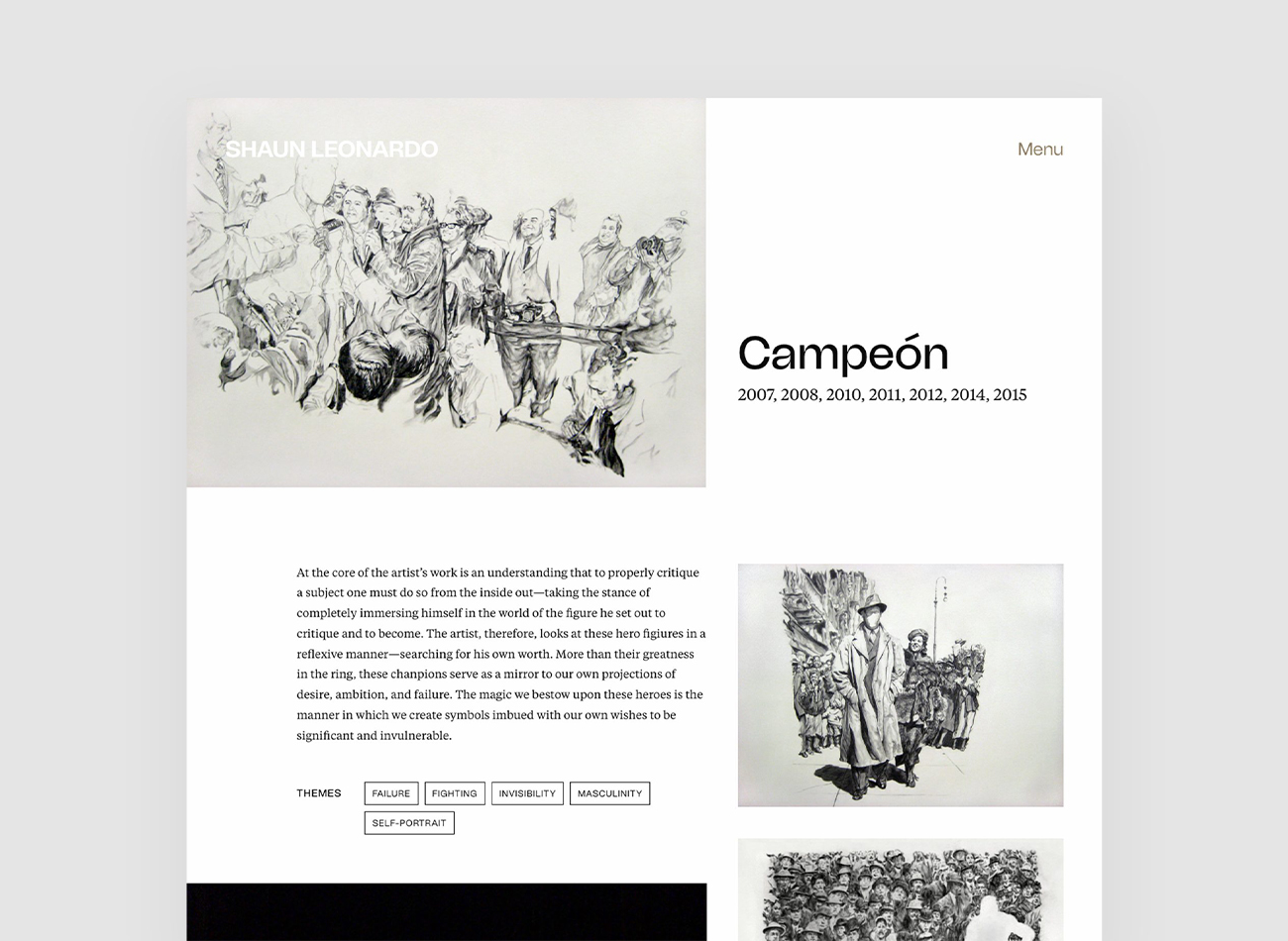
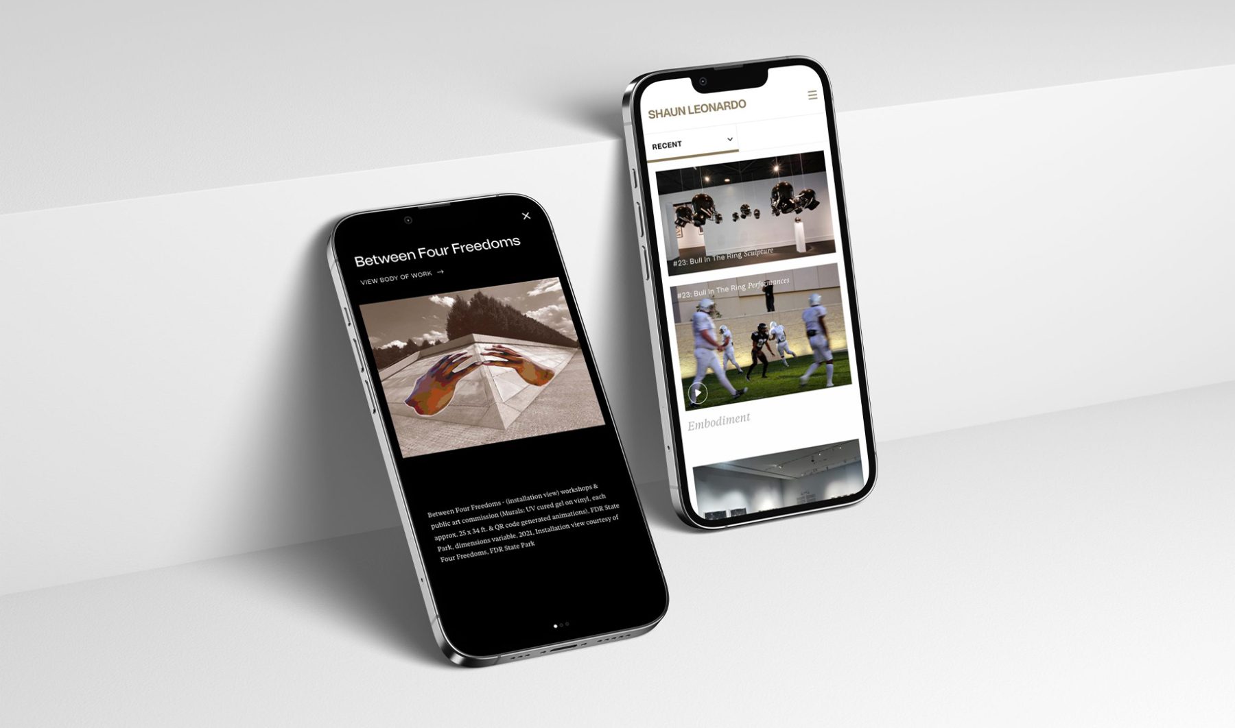
During the design process, our collaboration with Shaun focused on effectively showcasing the complex nature of his artworks. This resulted in a design solution that allowed users to navigate seamlessly through filtered timelines and body of works, ensuring both visual appeal and user-friendly functionality. In addition to its filtering feature, the website serves as a comprehensive source for Shaun’s extensive archive of lectures, keynotes, writings, press releases, and interviews, all thoughtfully organized in a visually polished layout.
View shaunleonardo.com
KUDOS Design Collaboratory
-
John Kudos
Creative Director -
Owen Febiandi
Designer -
Putu Yogiswara
Designer -
Amanda Knott
Project Manager -
Christian Juniady Setiawan
Web Developer
Lewis Latimer Interactives
Lewis Latimer House Museum
Capabilities
Focus Area
Client
Lewis Howard Latimer was the son of self-emancipated enslaved people, a self-taught draftsman, and major contributor to the invention of the lightbulb and the telephone. Some of his own inventions are the early air conditioning unit and the railroad car bathroom.
Growing up, Latimer faced many challenges due to racial discrimination prevalent at the time. He enlisted in the Union Navy in 1864 at the age of 16 and—with no access to formal education—taught himself mechanical drawing which eventually led him to become a chief draftsman, patent expert, and inventor.
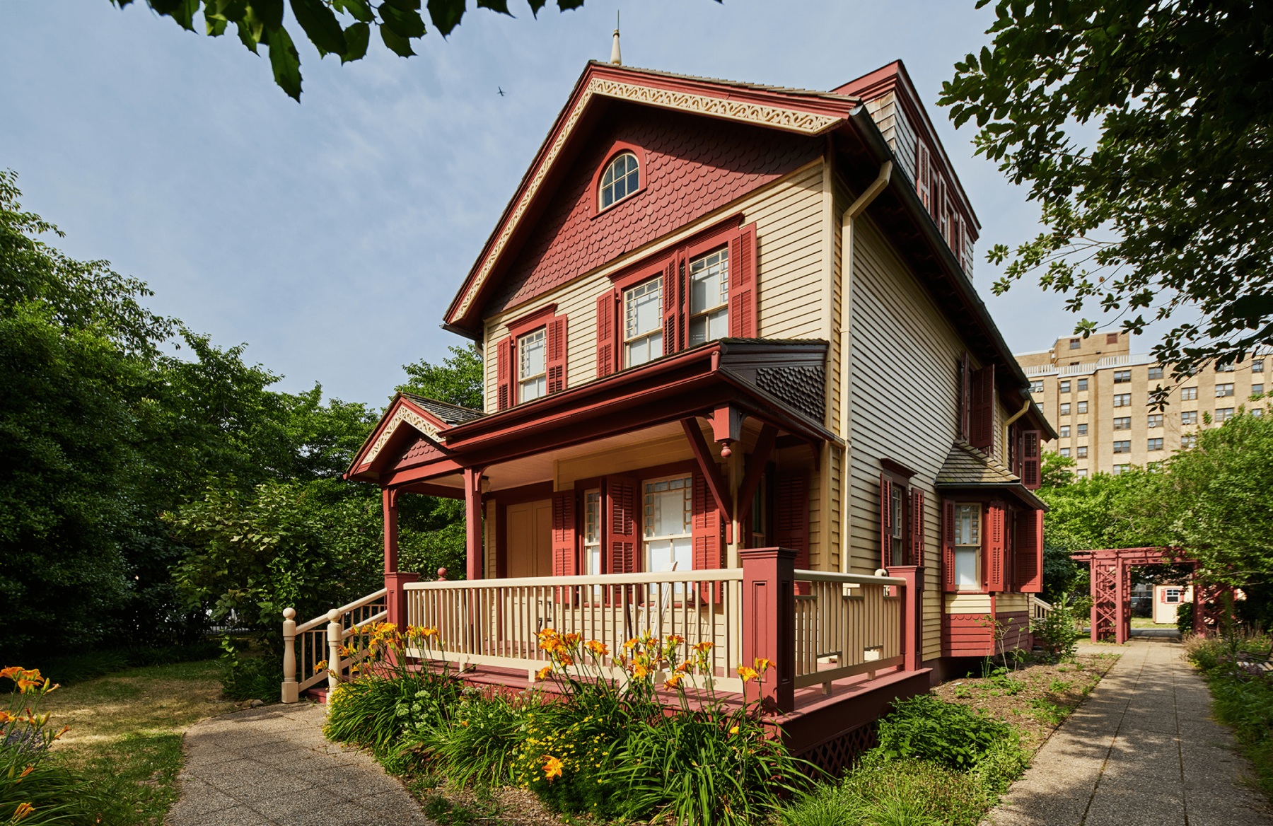
The Lewis Latimer House Museum in Flushing, New York is the very same house that Latimer lived in from 1903 until his passing at the age of 80 in 1928. Threatened with demolition, the house was relocated from Holly Avenue in East Flushing to its present location in 1988. It is now a historic house museum owned by the New York City Department of Parks & Recreation, operated by the Lewis H. Latimer Fund, Inc., and is a member of the Historic House Trust.
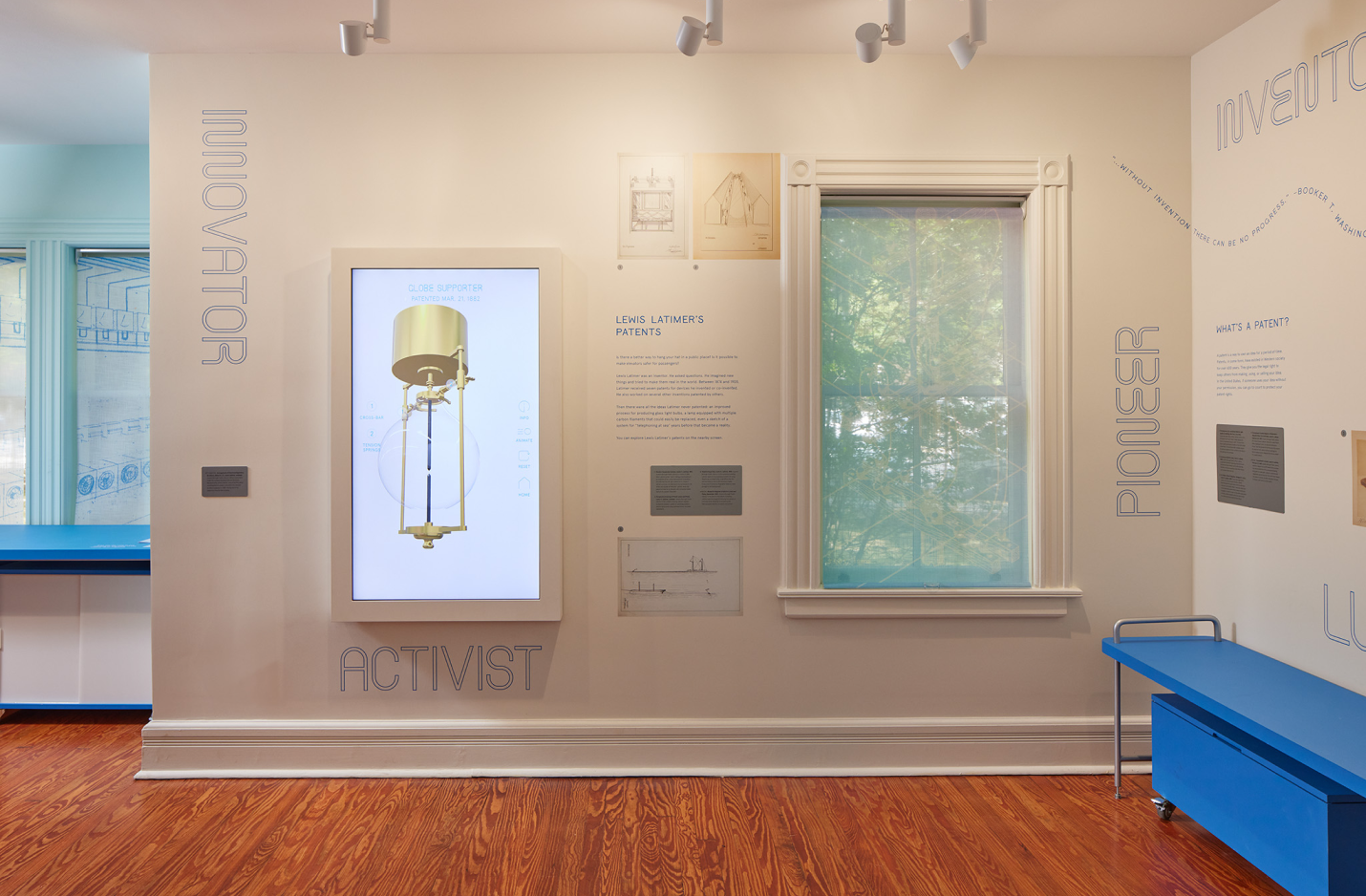
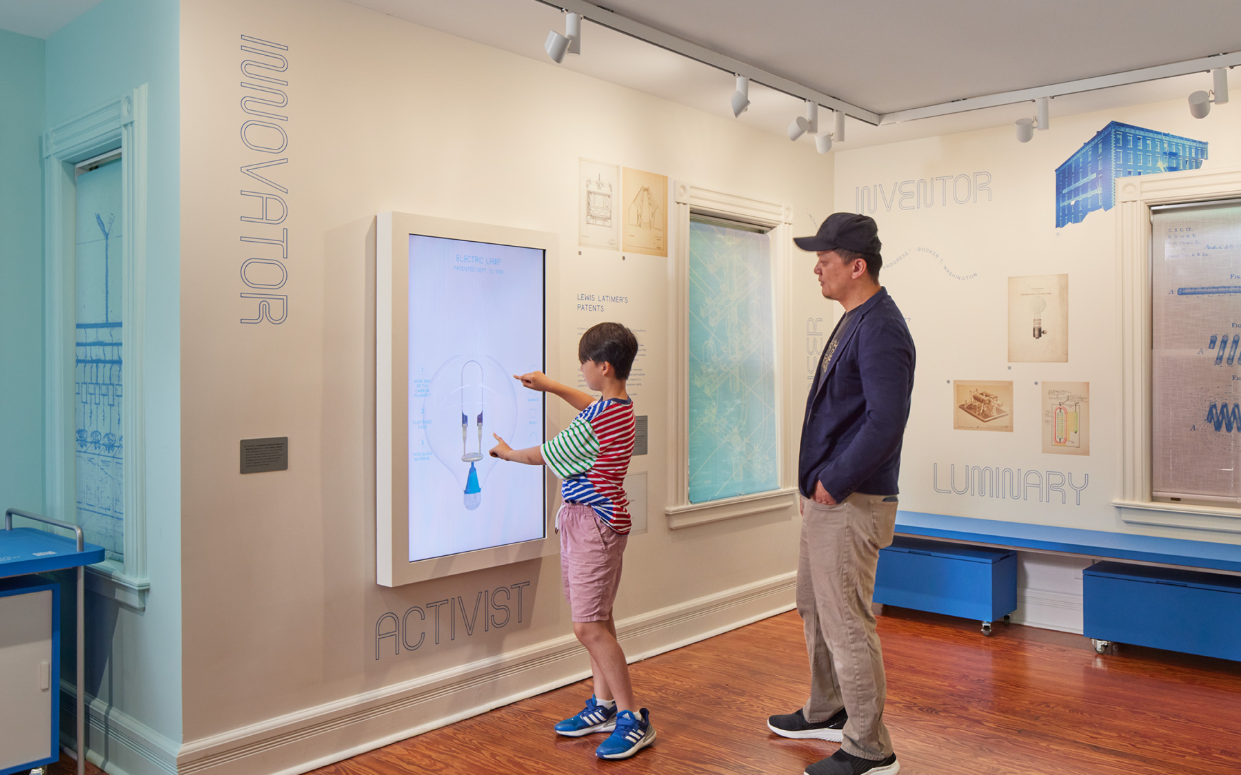
We worked closely with Isometric, the lead exhibition designer, to produce four interactive exhibitions through a combination of digital and physical experiences that educate, entertain, and inspire—all rooted in Latimer’s legacy as an mold-breaking inventor of his time.
INVENTION MACHINE
Vertical screen displaying inventions Latimer patented, but never built. Oversized blueprints reimagined as 3D objects which brings the inventions to life.
TOGETHER WE RISE
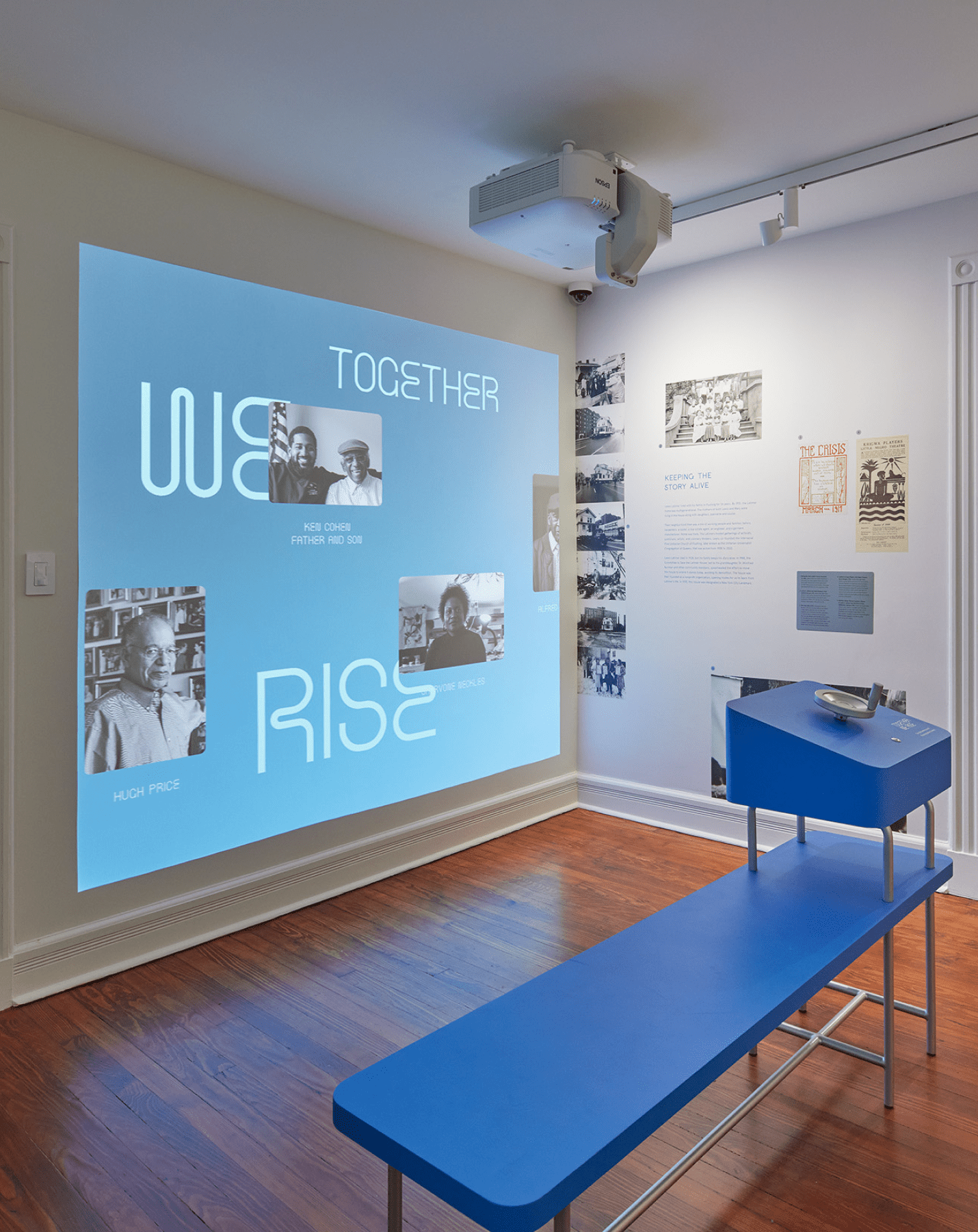
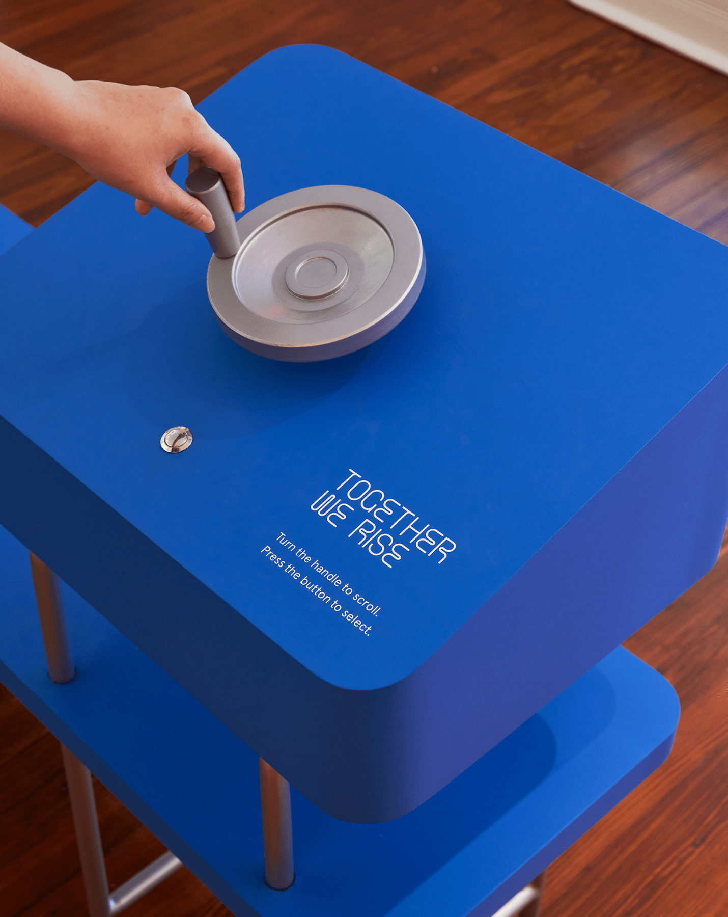
An interactive “family portraits wall” of contributors and leaders integral to Latimer’s legacy. A bench in front of the projection wall holds a hand-crank allowing viewers to navigate to a particular profile by rotating and pressing a physical button.
POETRY MACHINE
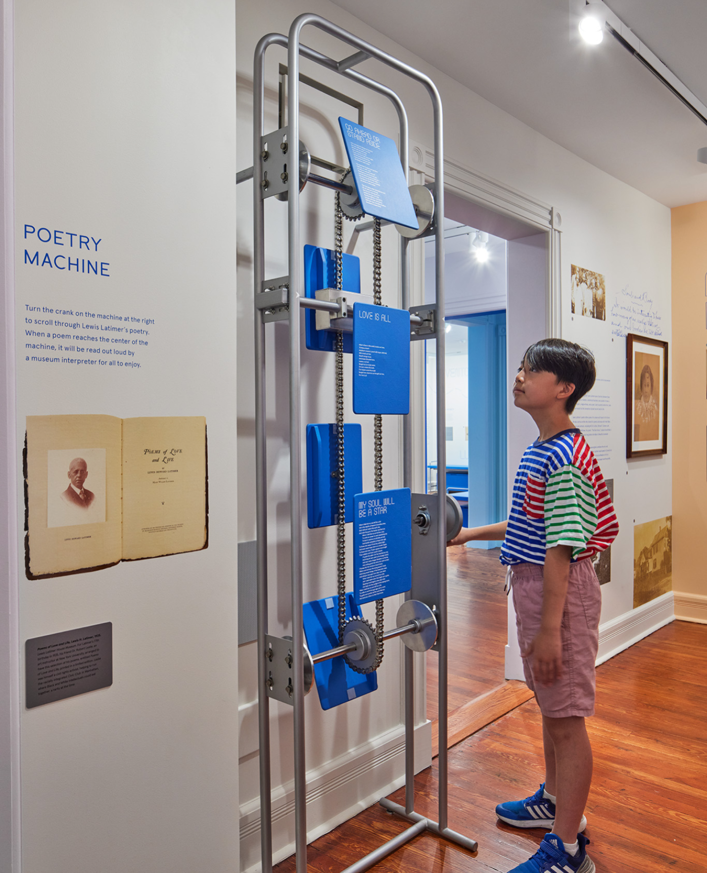
A skeletal mechanical crank allowing visitors to rotate between panels of Latimer’s poetry. When cranked to the right position, the selected poetry plays audibly, allowing visitors to experience the poetry as an audio-visual sensory experience.
LATIMER BUZZ SELFIE APP
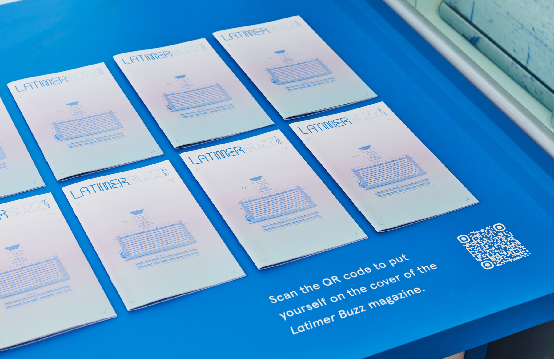
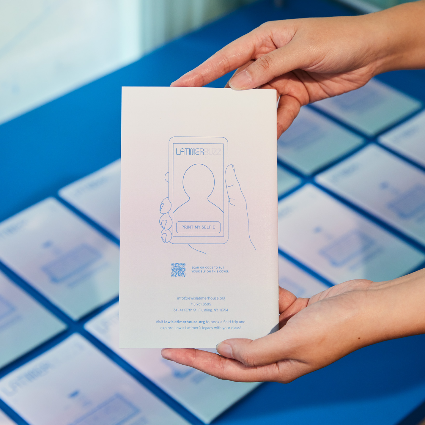
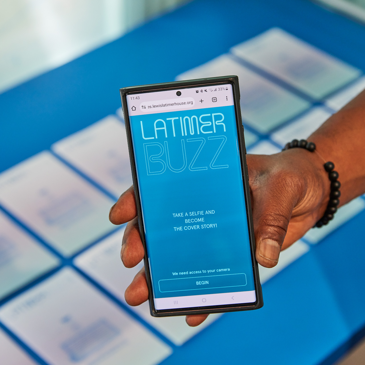
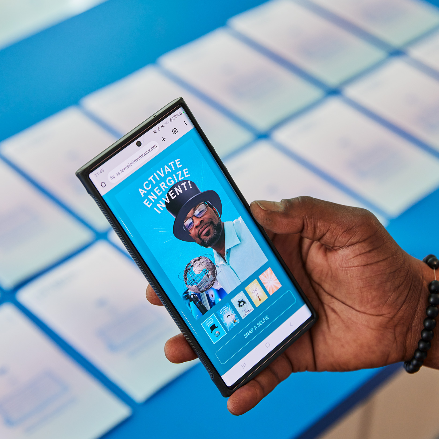
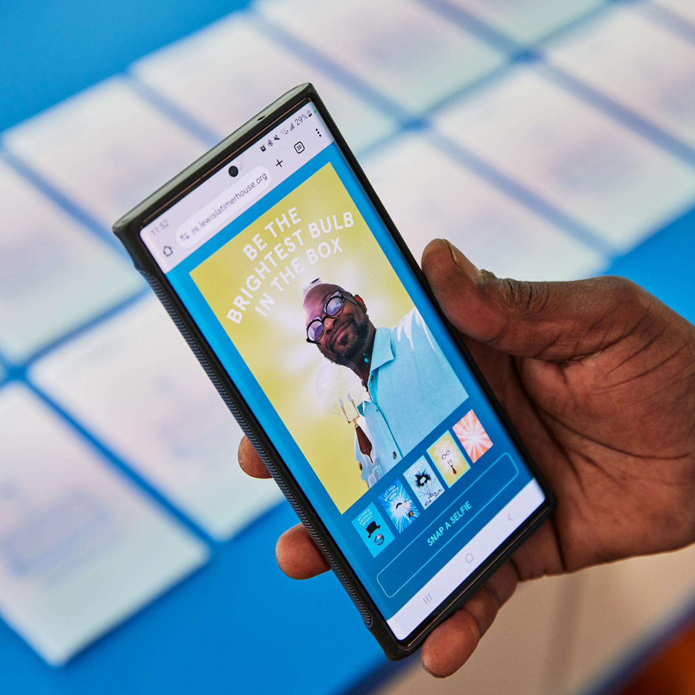
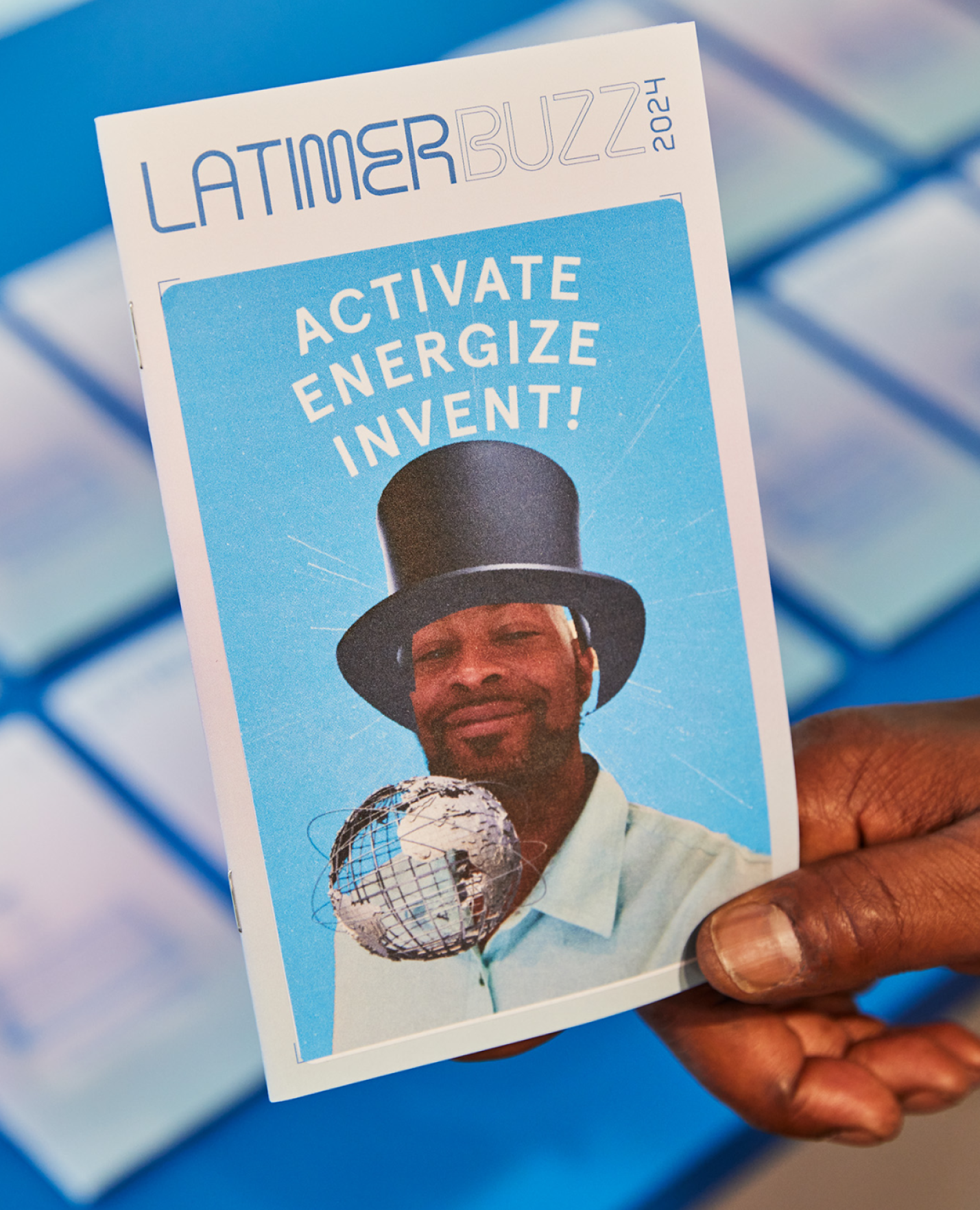
A selfie app that can be loaded directly on visitor’s smart phones using a QR code on the printed Latimer Buzz magazine. Through the app, everyone can take a fun selfie image as the cover of Latimer Buzz magazine, and actually print a physical sticker that can be affixed to the magazine as a keepsake item—a kid-friendly activity and souvenir from a memorable experience.
KUDOS Design Collaboratory
-
John Kudos
Creative Director -
Robert de Saint Phalle
3D Creative Director -
Jess Mackta
Project Manager -
Jamus Marquette
Lead Designer -
Fay Qiu, Owen Febiandi
Designer -
Imam Fadillah
3D Designer -
Chris Manlapid, Arif Widipratomo, Faris Han
Software Developer -
Ed Bear
Engineer -
Levy Murphy
Fabricator -
Electrosonic
A/V Consultant
Isometric
- Lead Exhibition Design

Glenn Ligon Website
Glenn Ligon
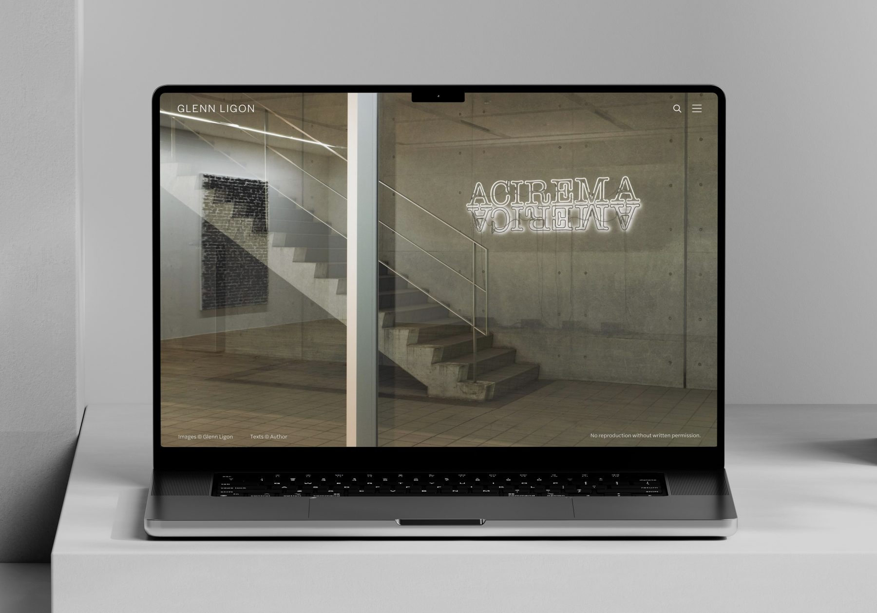
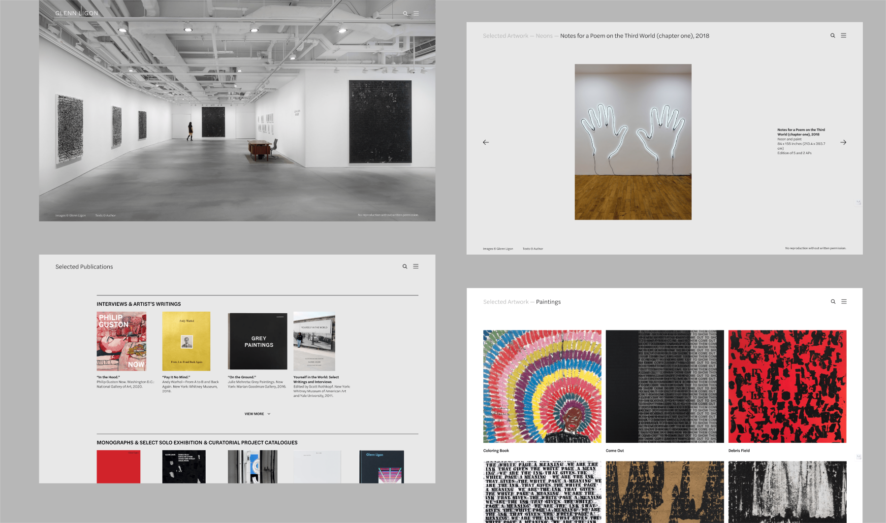
Glenn Ligon is an artist living and working in New York pursuing an incisive exploration of American history, literature, and society across bodies of work that build critically on the legacies of modern painting and conceptual art.
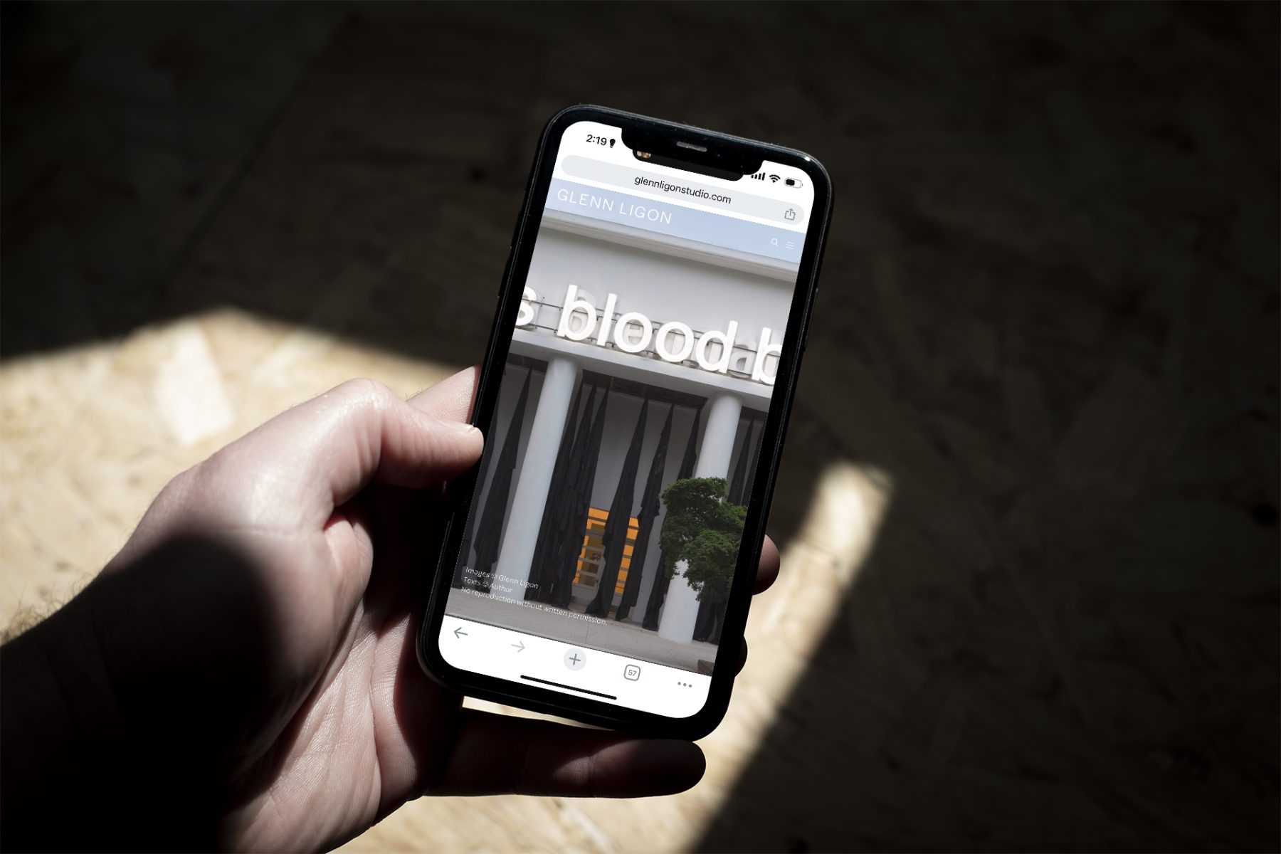
We worked closely with Ligon to produce a website that showcases the full breadth of of his work, from neons, paintings, prints, photo-based, to videos and multimedia installations. The website is designed with minimal interface to allow viewers to discover Ligon’s work as if experiencing the work in a physical gallery space.
Visit glennligonstudio.com
KUDOS Design Collaboratory
-
John Kudos
Creative Director -
Amanda Knott
Project Manager -
Fay Qiu
Lead Designer -
Chris Manlapid
Web Developer
Kinematic Pavilion
ARCH:ID JAKARTA
Capabilities
Focus Area
Client
Awards
-
ARCH:ID Best Booth Awards Winner 2024
ARCH:ID is Indonesia’s most awaited annual architecture forum and trade event organized by Indonesian Institute of Architect (IAl) in collaboration with CIS Exhibition. This industry-focused event present a host of activities and programs that serves as effective platform for place-makers and stakeholders in architecture and built industry to congregate, collaborate, and connect.
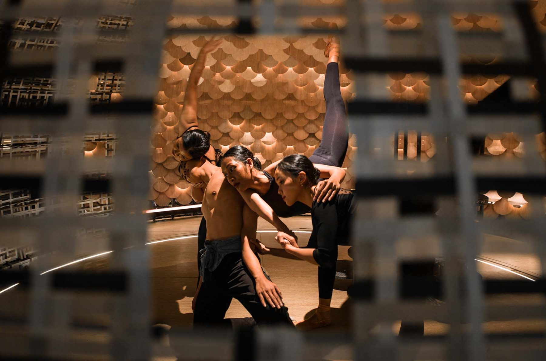
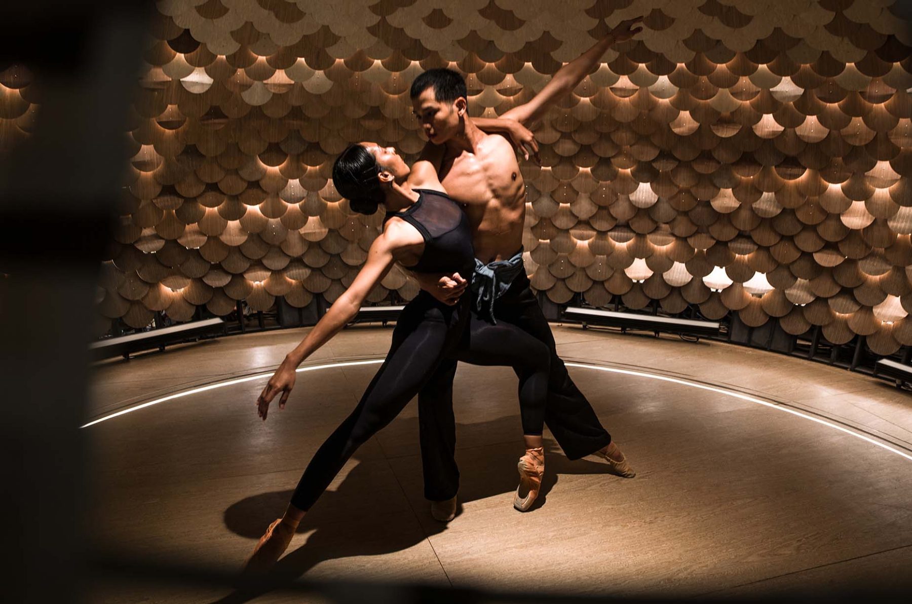
Kinematic Pavilion is a kinetic installation that fosters a dynamic relationship between architecture and movement. Is it possible to create a transformable space that adapts to a range of community activities? Inspired by the camera aperture, our installation seamlessly shifts from an open to enclosed circular space, offering a 360-degree backdrop for immersive experiences.
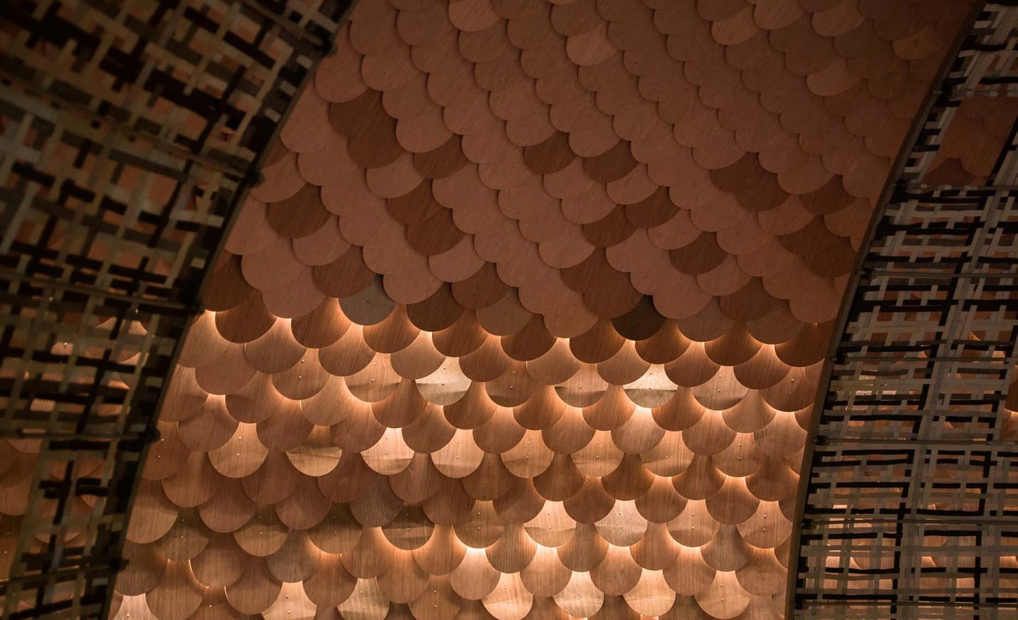
People and performers are seen as living art, interacting with architecture and becoming part of the installation. A kinetic system enhances the backdrop by revealing warm light in the shape of elegant wipes and sparkles.
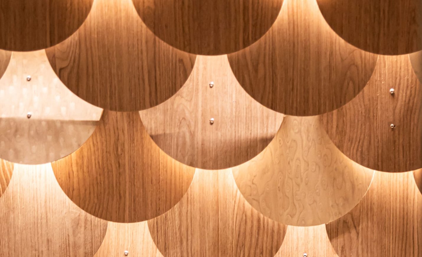
The collaboration also involves experimenting with a range of sustainable materials like patinated copper cladding, engineered wood veneer, and woven blinds fabric waste.
Kinematic Pavilion showcases a synergy of architectural creativity, sustainable practices, and technological integration, inviting communities to actively shape their environment.
On view 22-25 February 2024 in ICE BSD, Jakarta, Indonesia.
PROJECT TEAMS
-
Helen Agustine Studio
Architectural Design -
RootsLab & BYO Living
Exhibition Installation -
KUDOS
Kinetic Panel System -
Estica
Rotating Dome System -
ErreLuce
Architectural Lighting -
The Ballet Academy & Grey Audio Lab
Performance
KUDOS Design Collaboratory
-
John Kudos
Creative Director -
Calvin Hadiardja
Chief Producer -
Andy Kurniawan
Art Director -
Reza Risnaldi
3D Simulator -
Abraham Junior
Motion Technician -
Setiawan Gemawidjaja
Technical Lead -
Chauwen
Software Engineer -
Benny
Software Engineer -
Alvin Yonathan
Photographer
Black Power to Black People
Poster House
Capabilities
Focus Area
Client
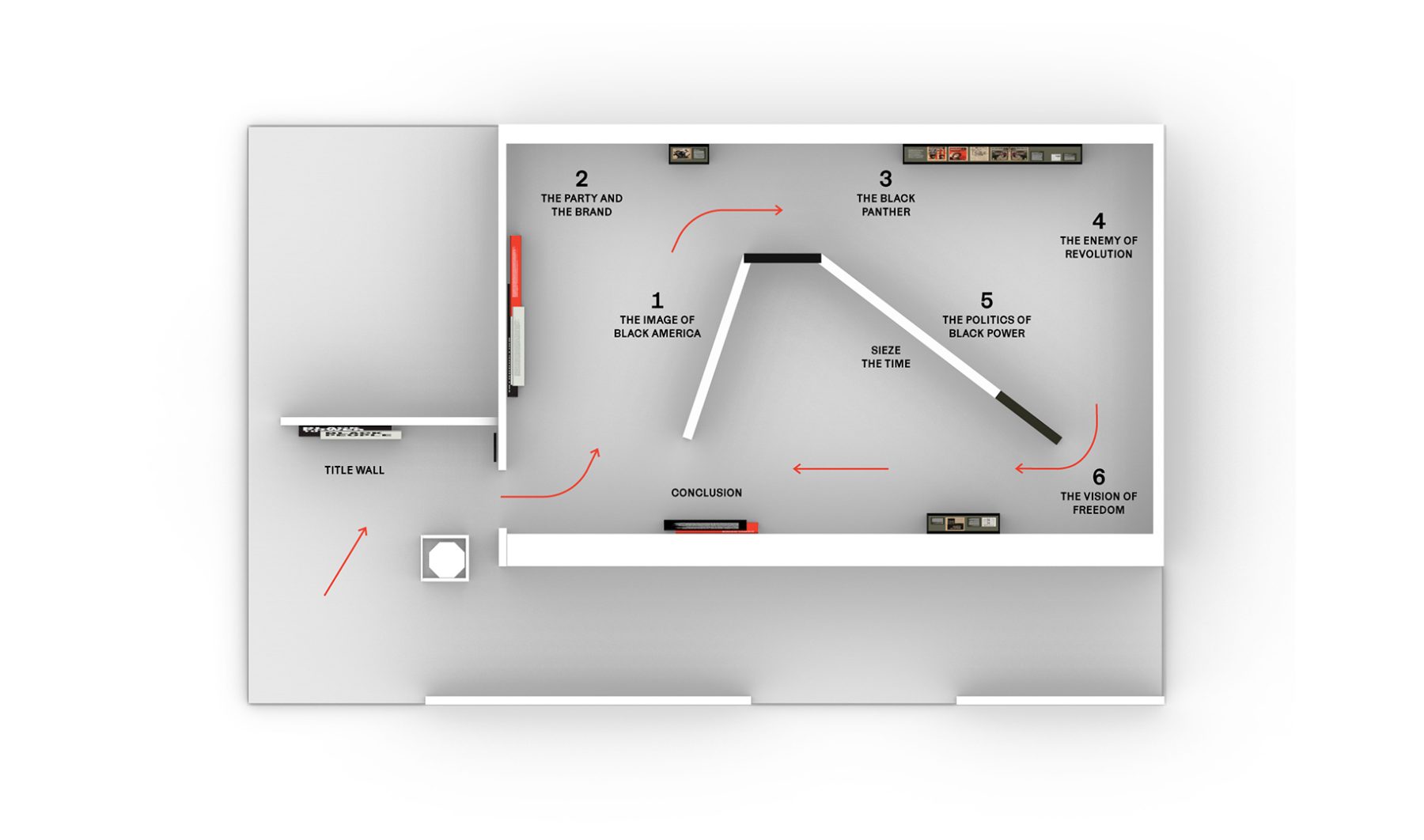
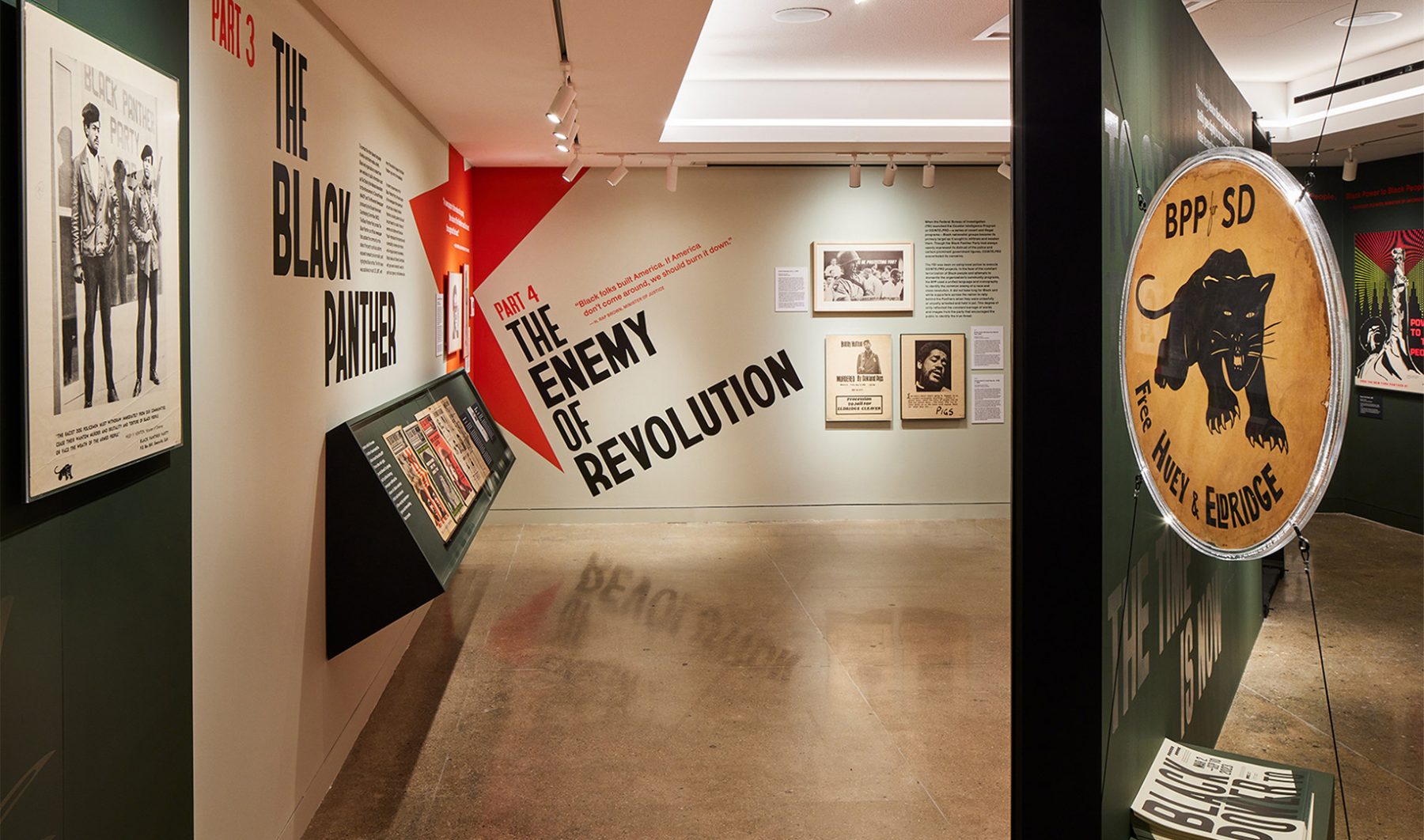
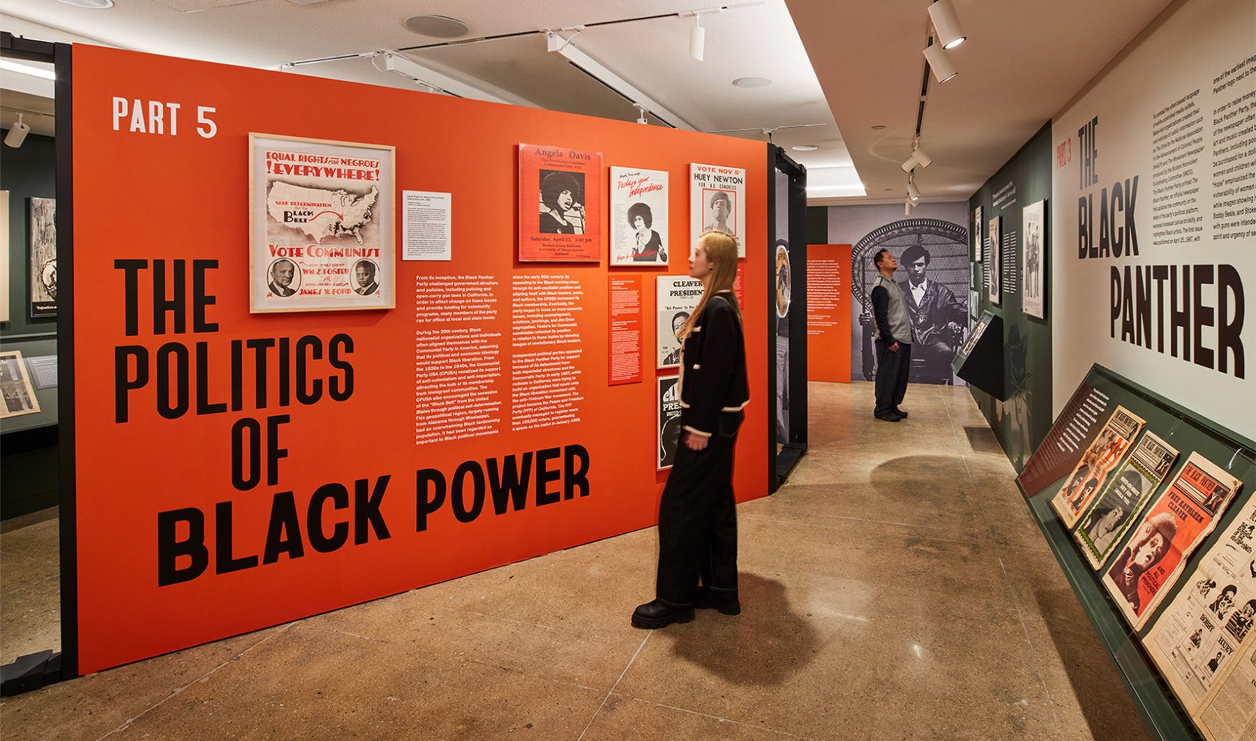
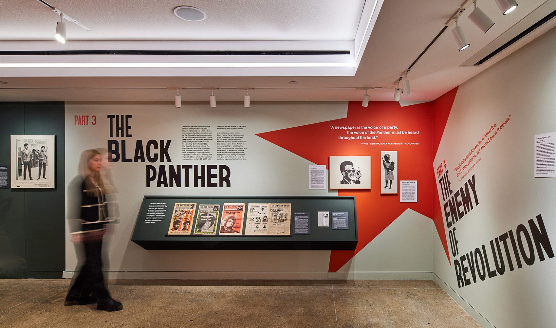
Poster House’s “Black Power to Black People” exhibit was an intimate look at how the Black Panther Party harnessed the power of branding and media to control its own narrative, rally community support, and become one of the most influential militant groups of its time.
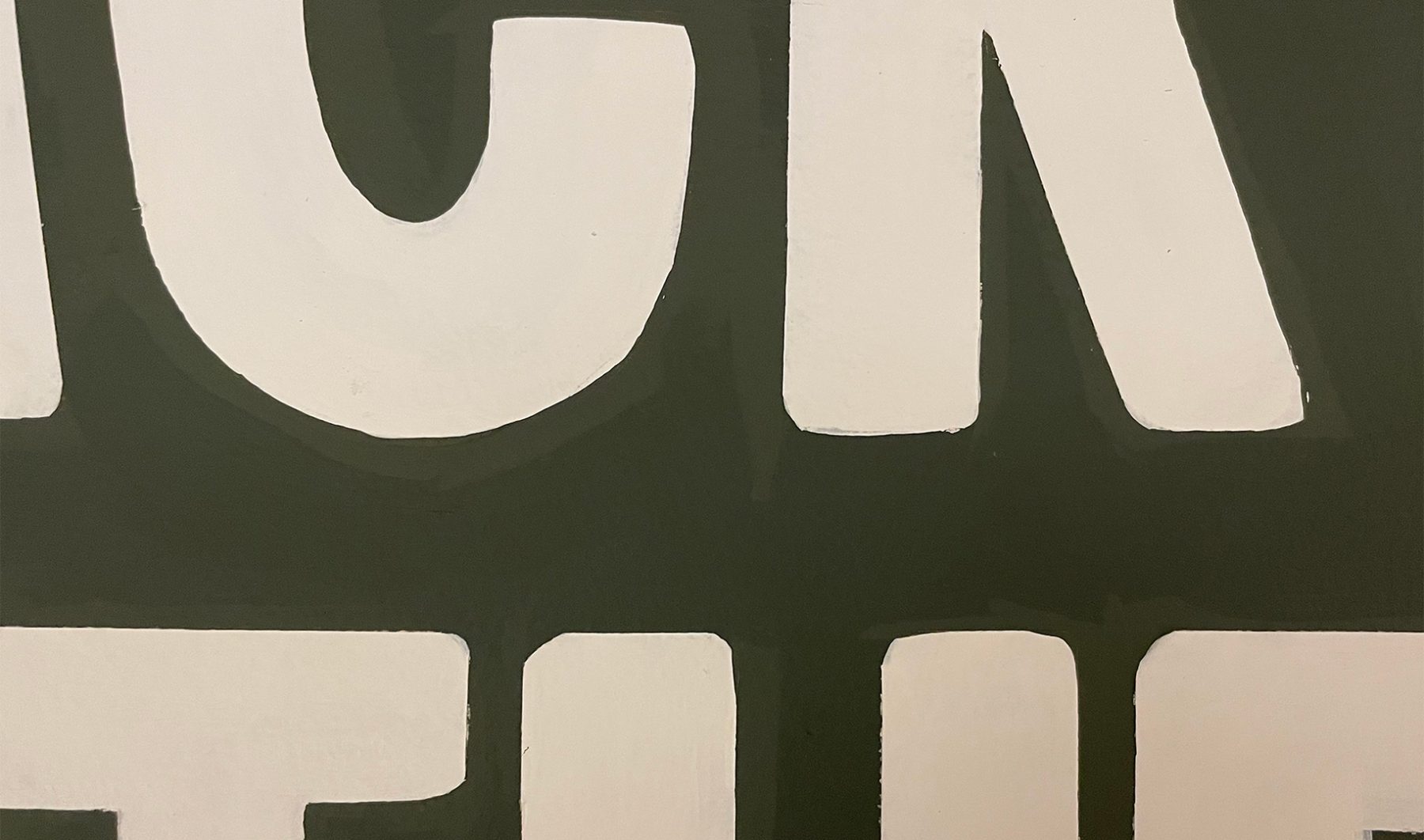
Our exhibition design began outside the gallery with two oversized protest signs leaning against the wall, amplified with hand-painted lettering reminiscent of protest signs from the Civil Rights era.
Bayard (typeface) evokes lettering from the 1960s Civil Rights protest signs. Condensed, bold and handmade…transporting viewers to that era.
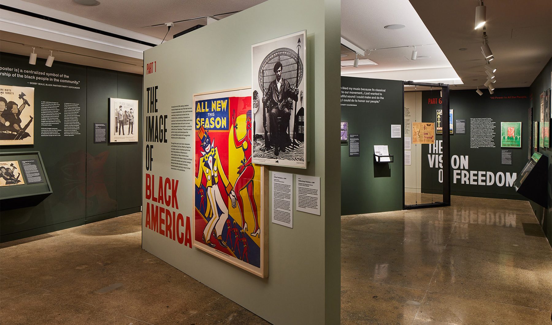
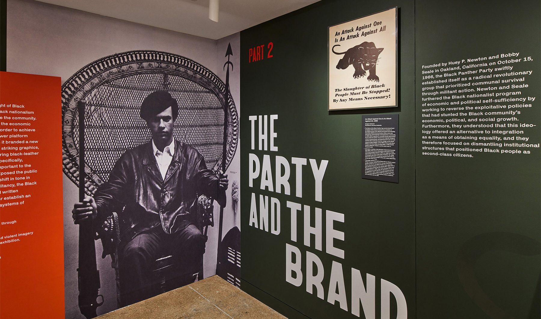
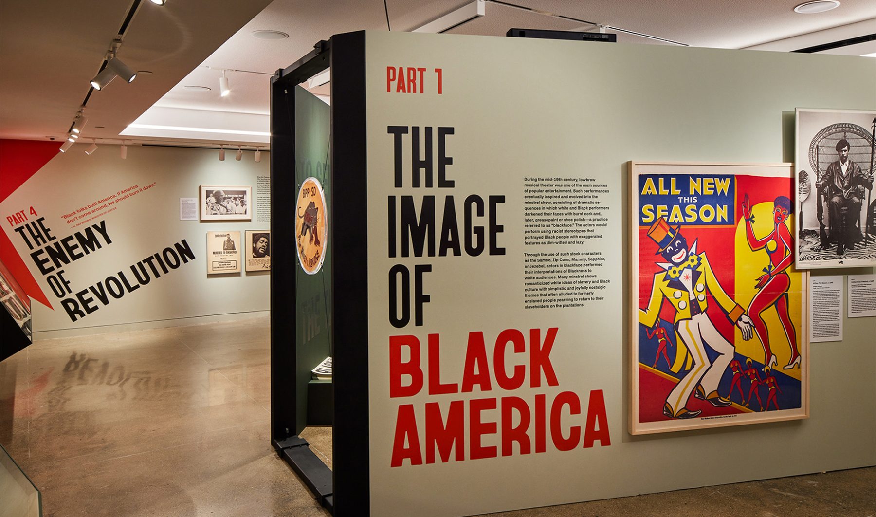
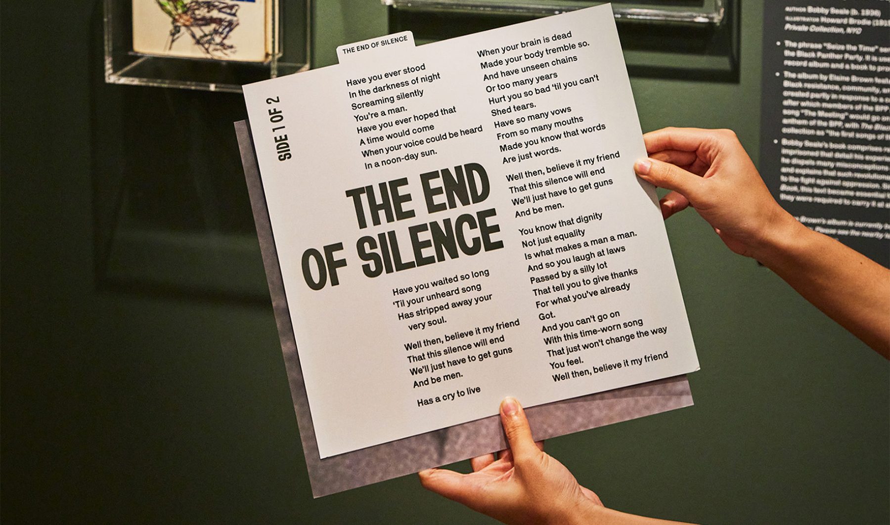
Inside, the exhibit started with an iconic photograph of Huey Newton (1967) and followed the development of Black Panther branding through six chronological sections. In the background, tracks from Seize the Time LP by Elaine Brown played on a loop, capturing the aspirations of the Black Panther Party.
We used bold type, militaristic colors, striking icons, and heroic photographs of Black Panther members carrying exposed firearms to echo the powerfully moving design strategies used by the Black Panthers themselves—and to show how effective those strategies remain, even decades after the party’s rise to fame.
KASA Collective
-
John Kudos
Creative Director -
Robert de Saint Phalle
3D Creative Director -
Ashley Wu
Art Director -
Fay Qiu
Designer -
Saskia Wulandiarti
Design Intern -
Imam Fadillah
3D Renderer -
Amanda Knott
Project Manager -
Samuel Sachs Morgan
Photographer
POSTER HOUSE
-
Es-pranza Humphrey
Curators -
Angelina Lippert
Chief Curator & Director of Content -
Ola Baldych
Director of Design & Exhibits -
John F. Lynch
Associate Director of Exhibits -
Mihoshi Fukushima Clark
Assistant Director of Design -
Rob Leonardi
Fabricator
Banishing Orientalism
Phil Chan
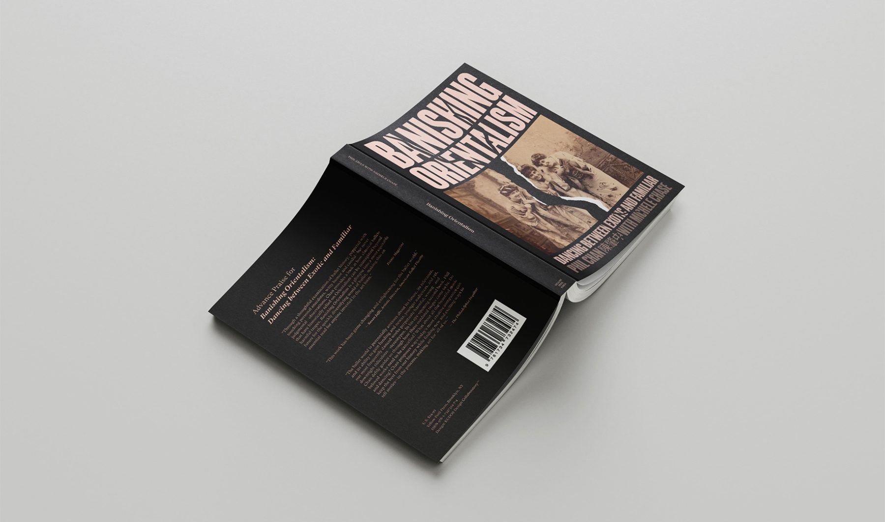
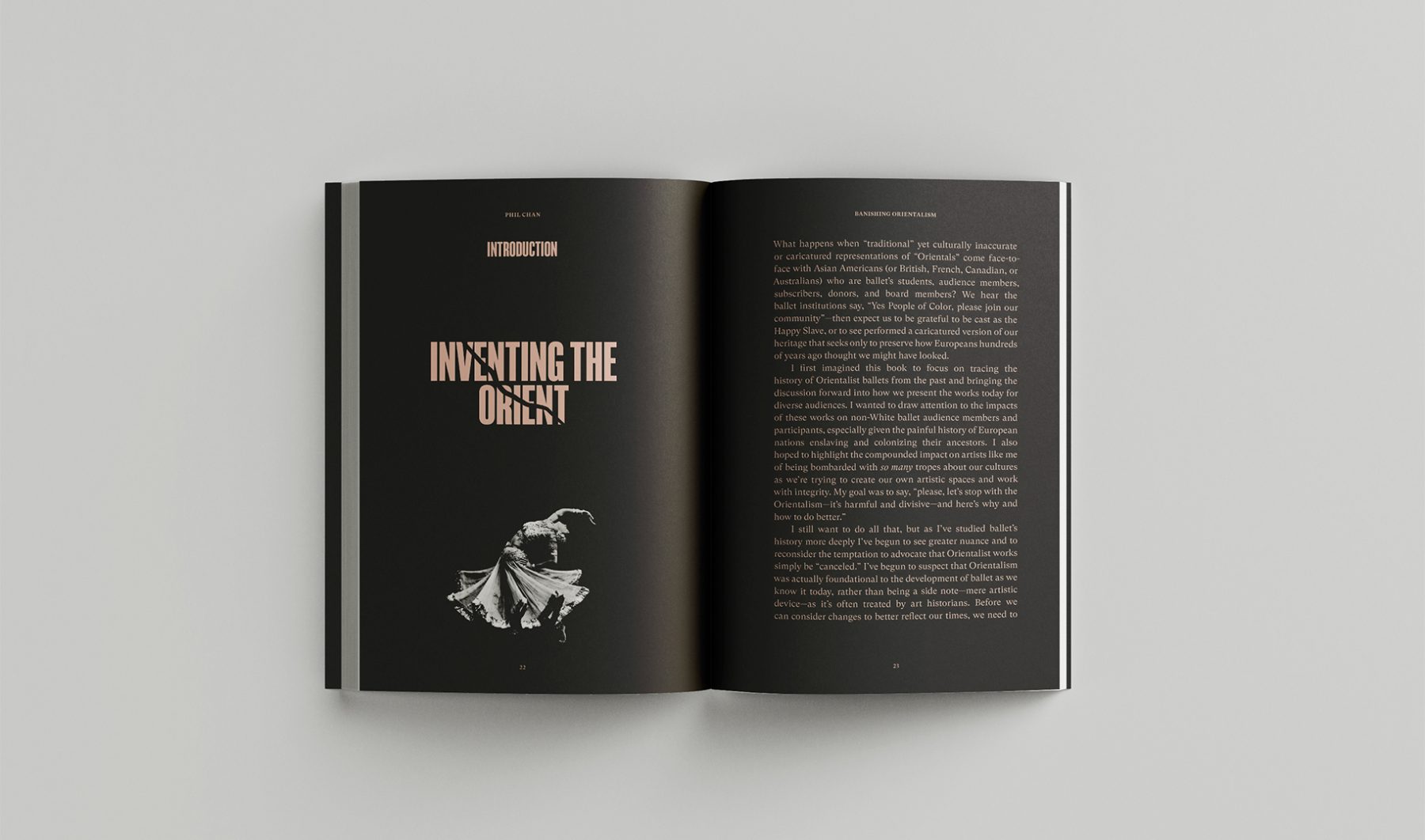
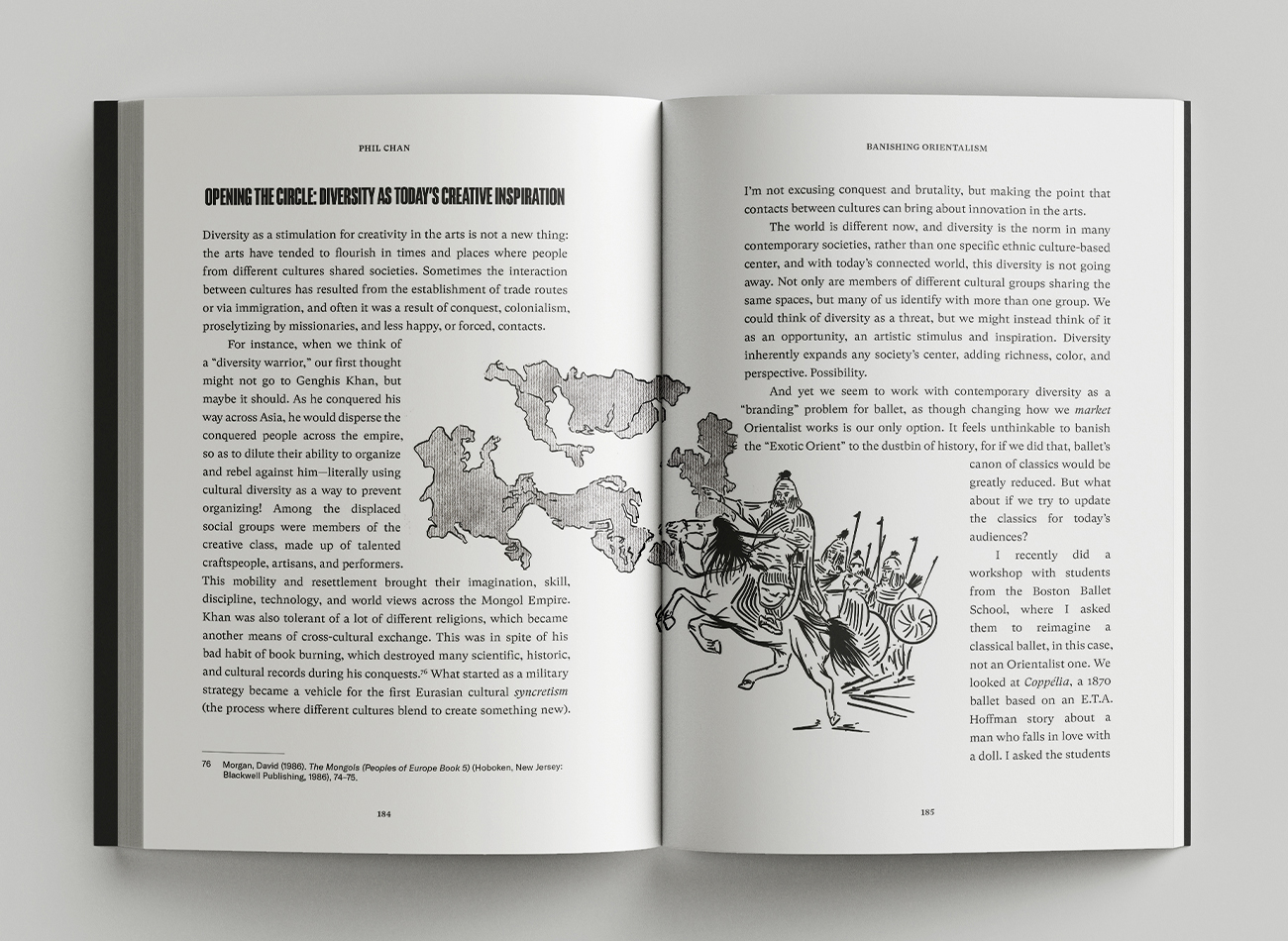
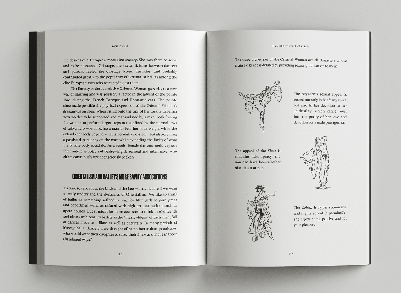
“Through a thoughtful examination of ballet history, peppered with touching personal anecdotes, witty humor, and candid—but never judgmental—observations, Banishing Orientalism provides a look at how classical ballets that have historically relied on Orientalism can be reimagined beyond harmful tropes. Banishing Orientalism is a glimpse into a more equitable future for the quickly diversifying world of ballet, making this an essential read for anyone invested in the art form.” —Pointe Magazine
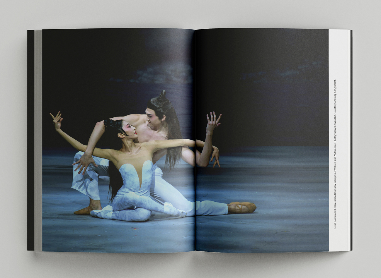
Our publication design for Phil Chan’s book Banishing Orientalism incorporates a combination of storytelling illustration, dynamic typography, and historic photography.
Creative Director
-
John Kudos
Creative Director -
Fay Qiu
Designer -
Muhammad Syamil Haqqoni
Illustrator -
Amanda Knott
Project Manager

Boston Lyric Opera Season Artworks
Boston Lyric Opera
Capabilities
Focus Area
Client
Boston Lyric Opera’s mission is to inspire, entertain, and connect the community through compelling opera performances, programs, and gatherings.
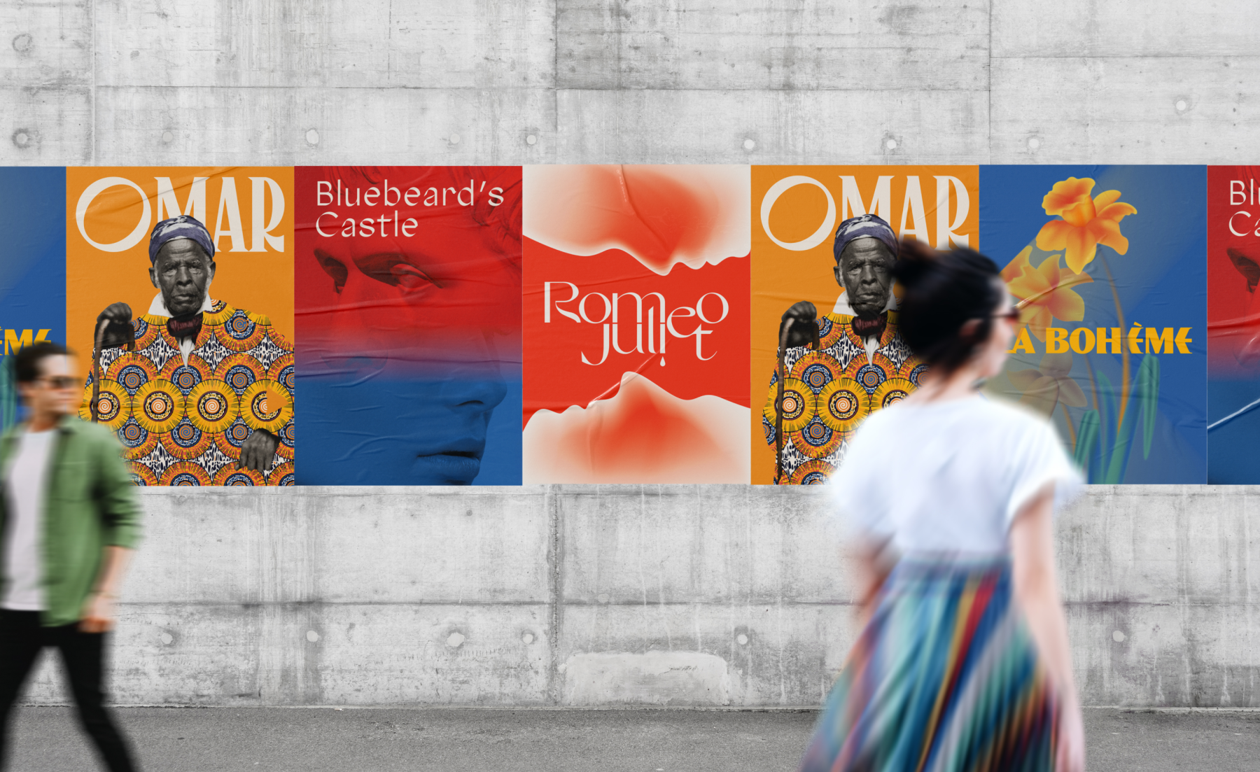
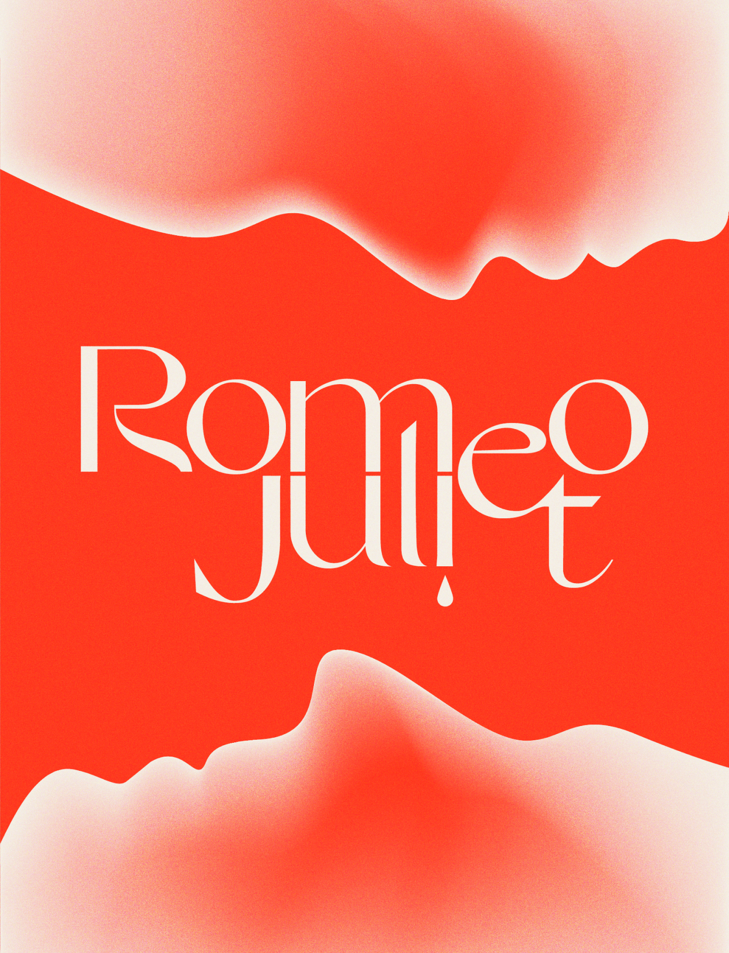
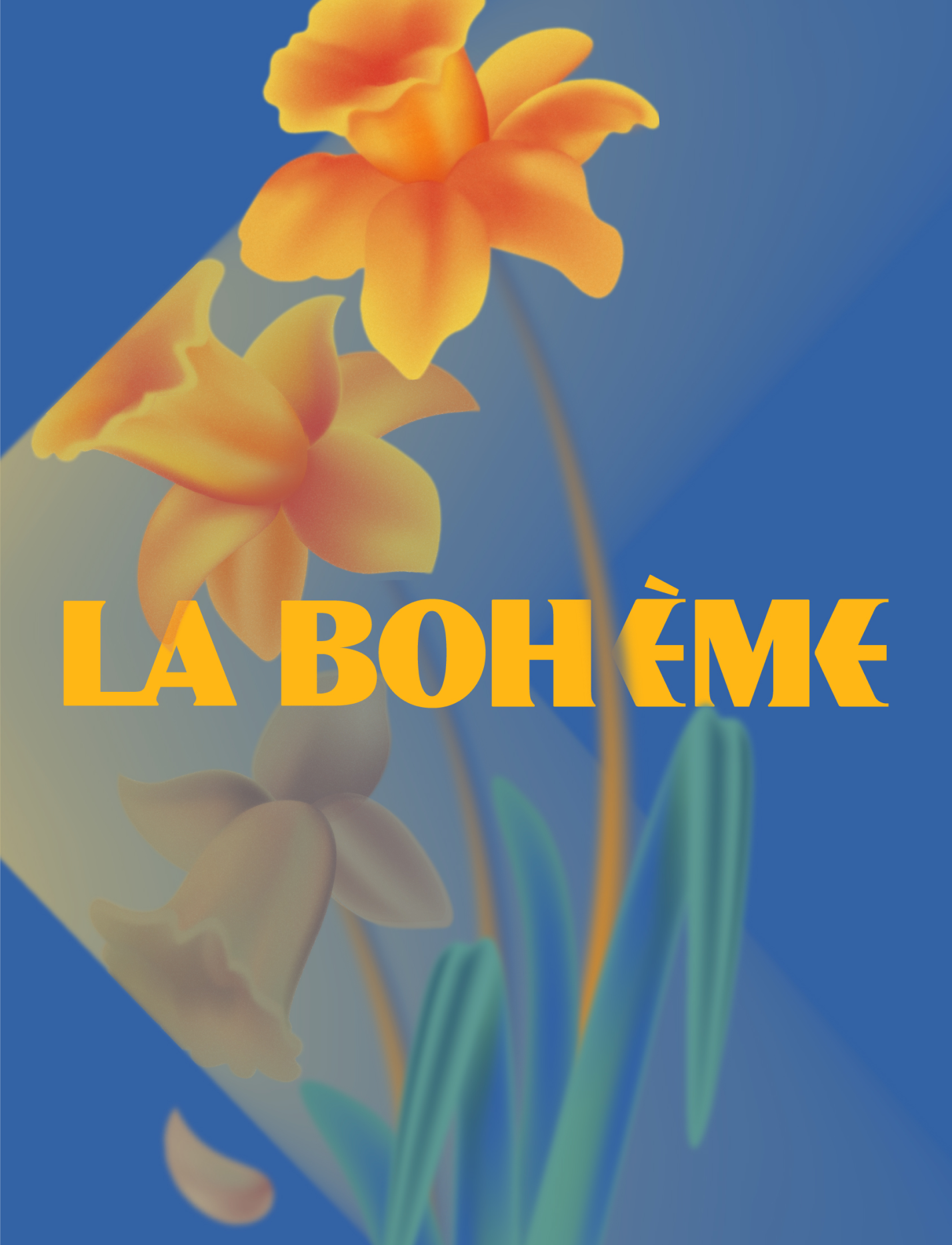
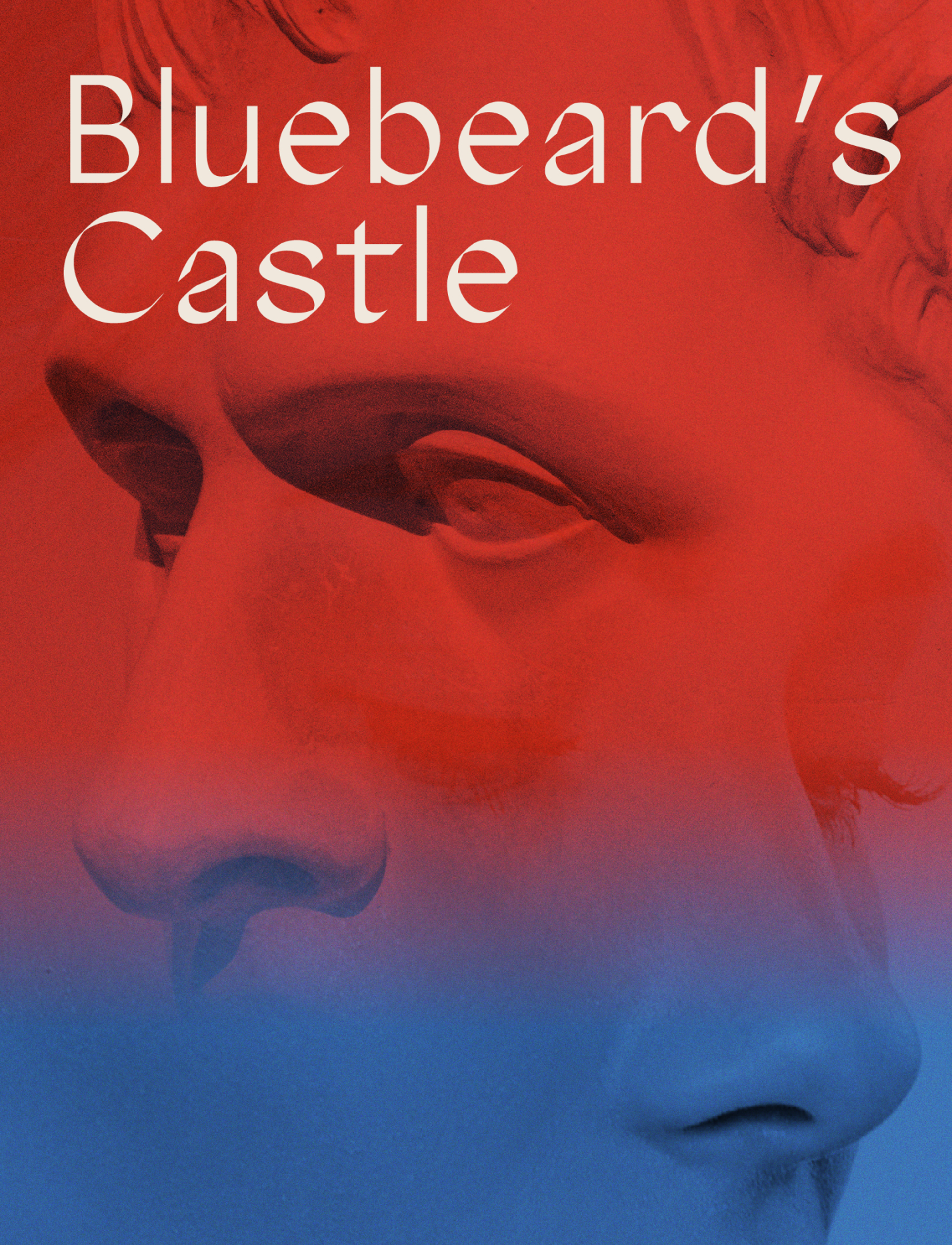
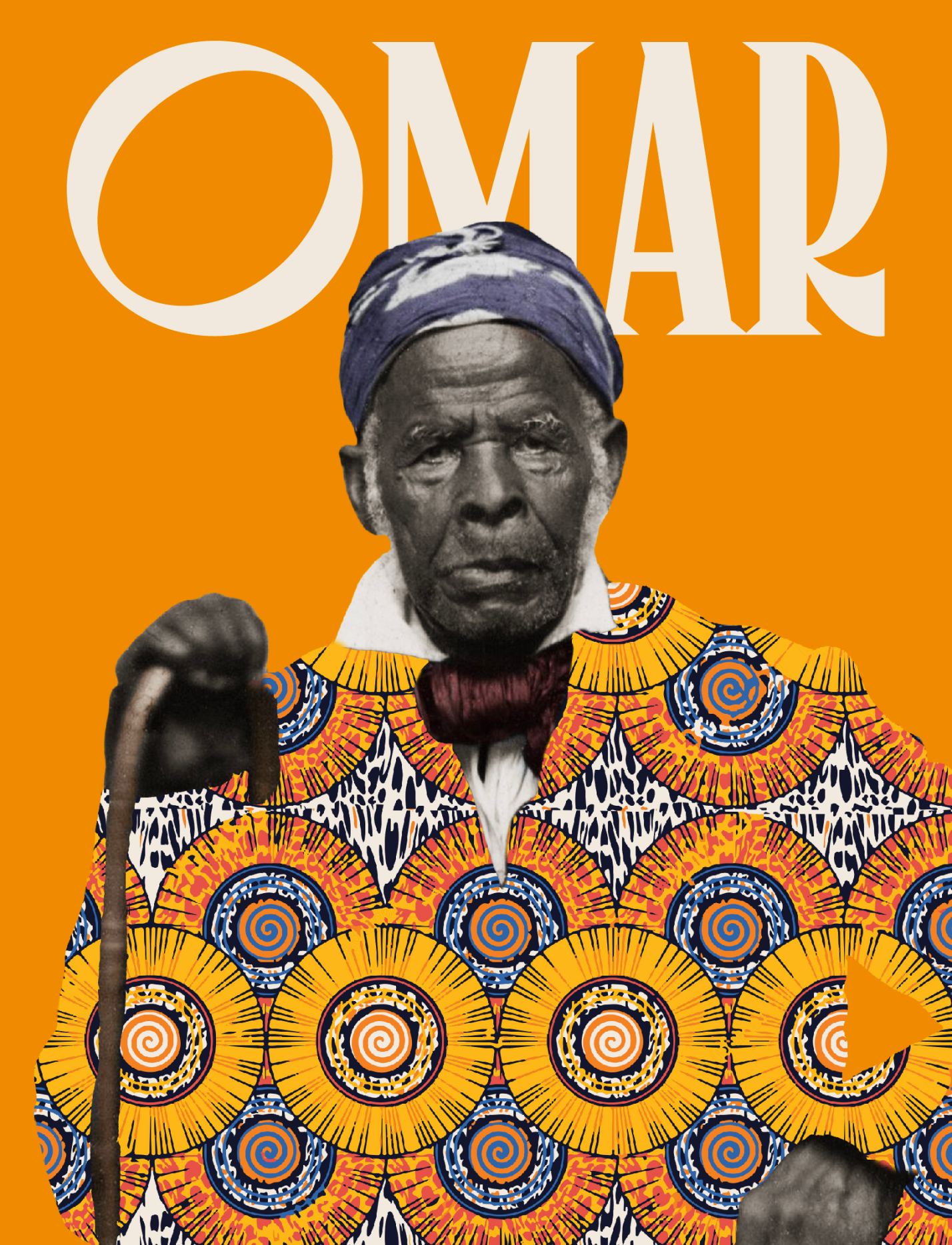
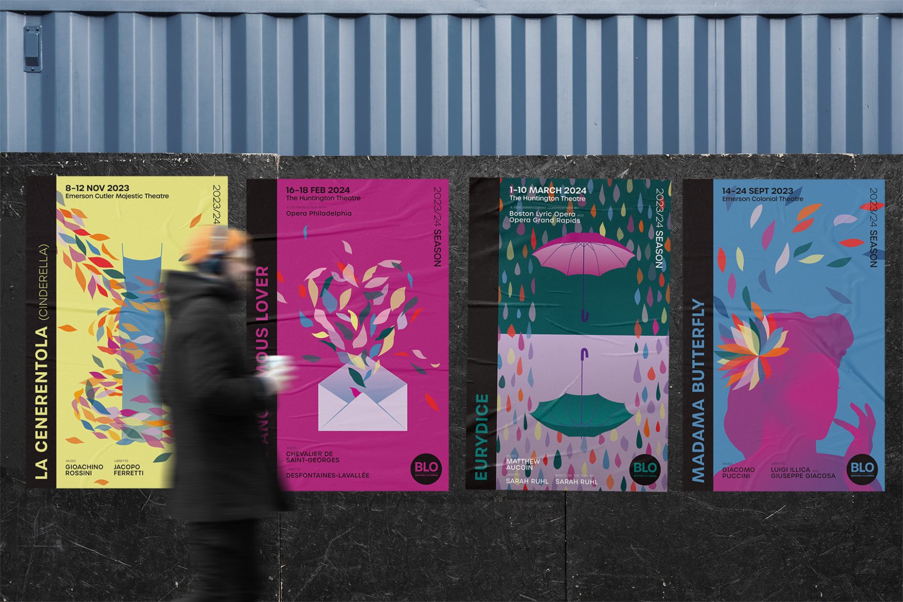
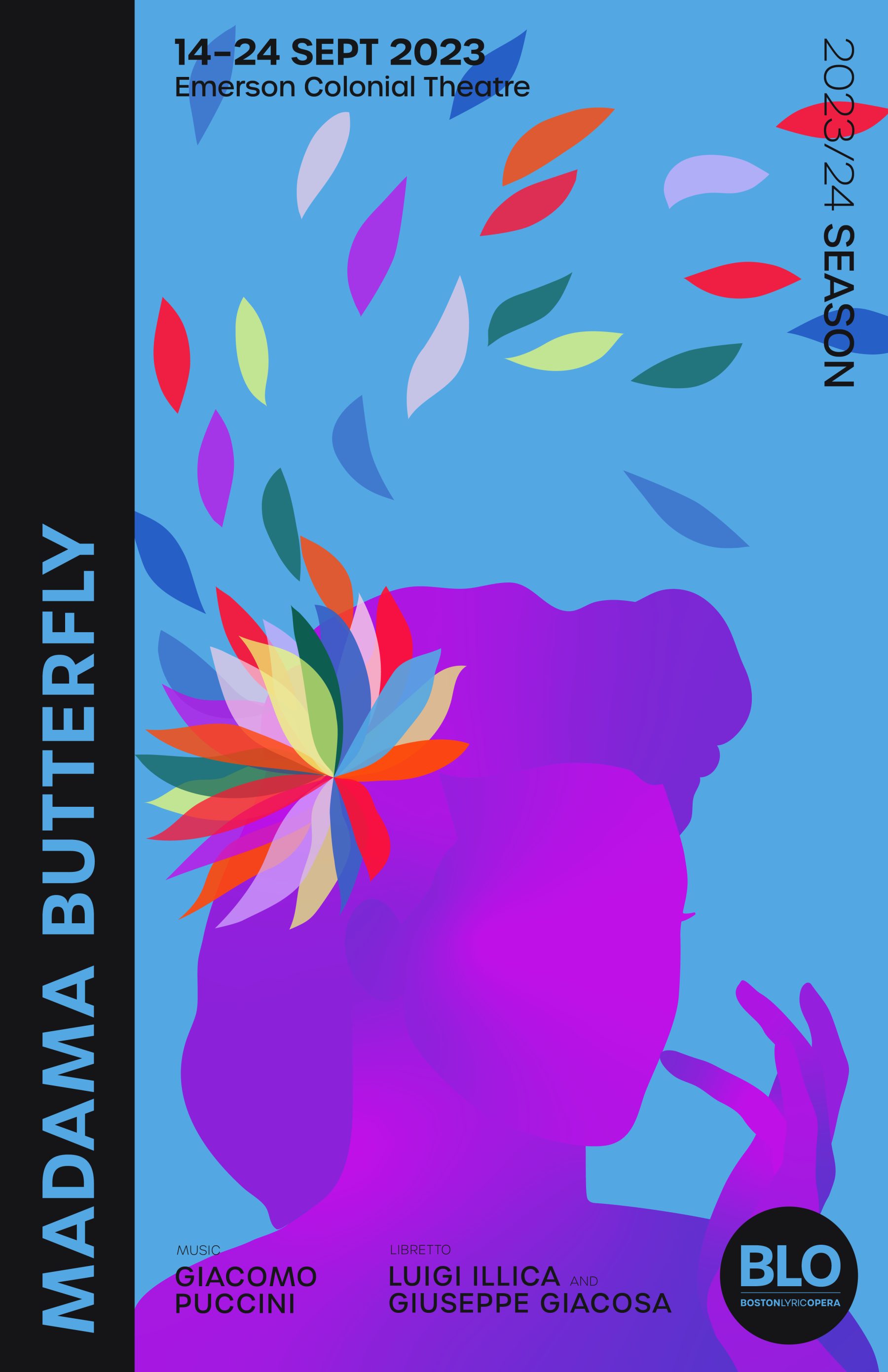
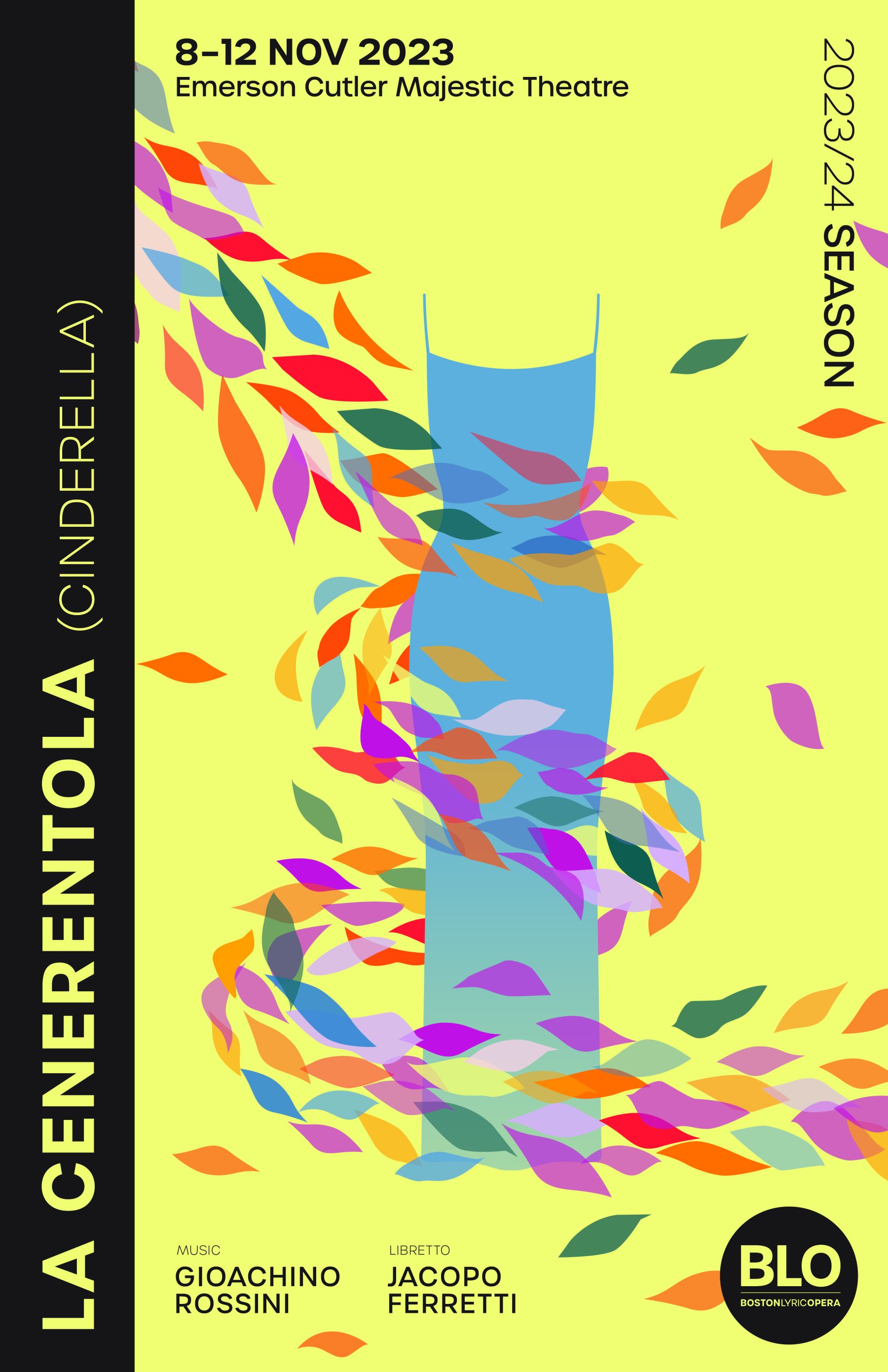
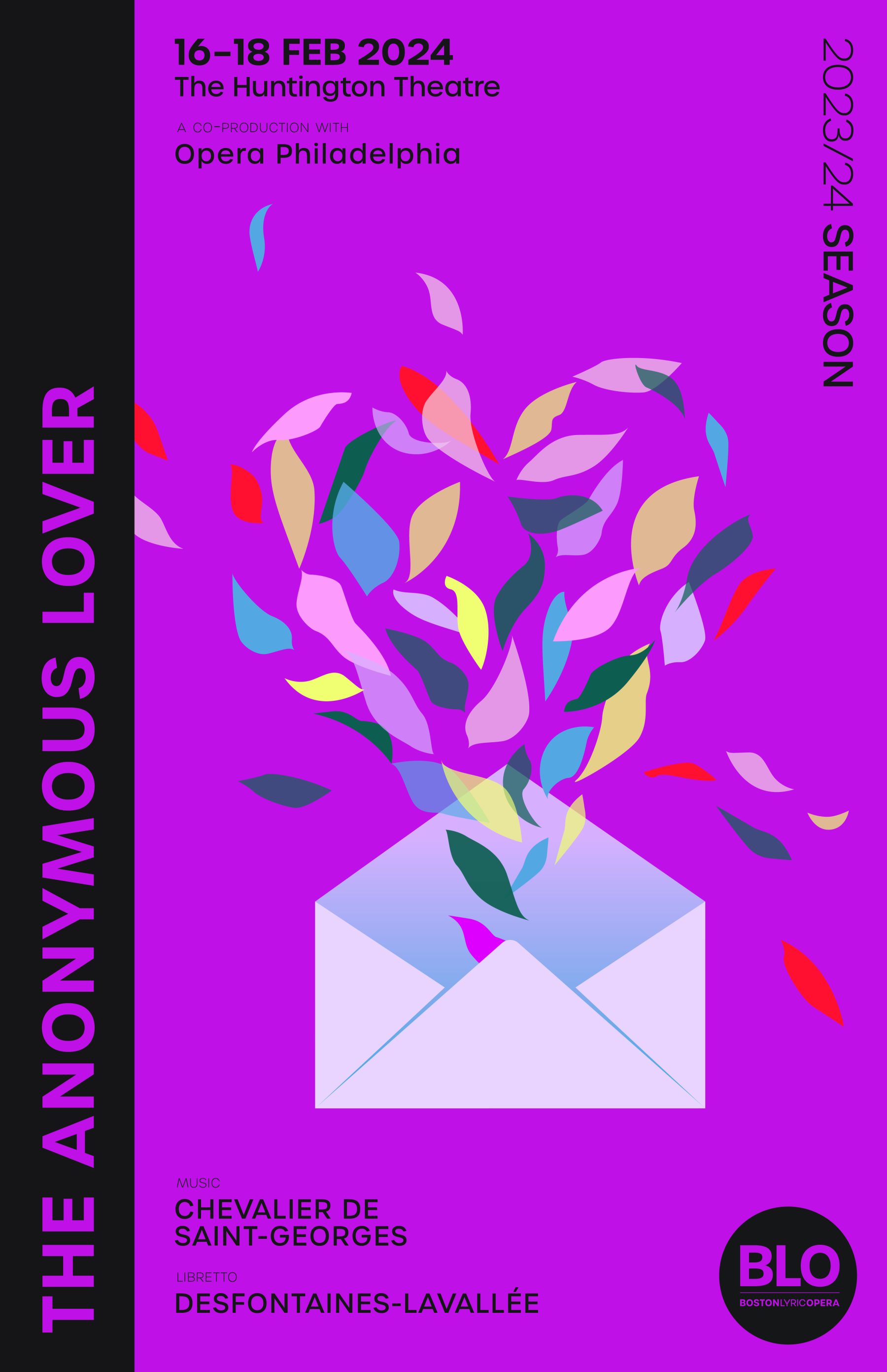
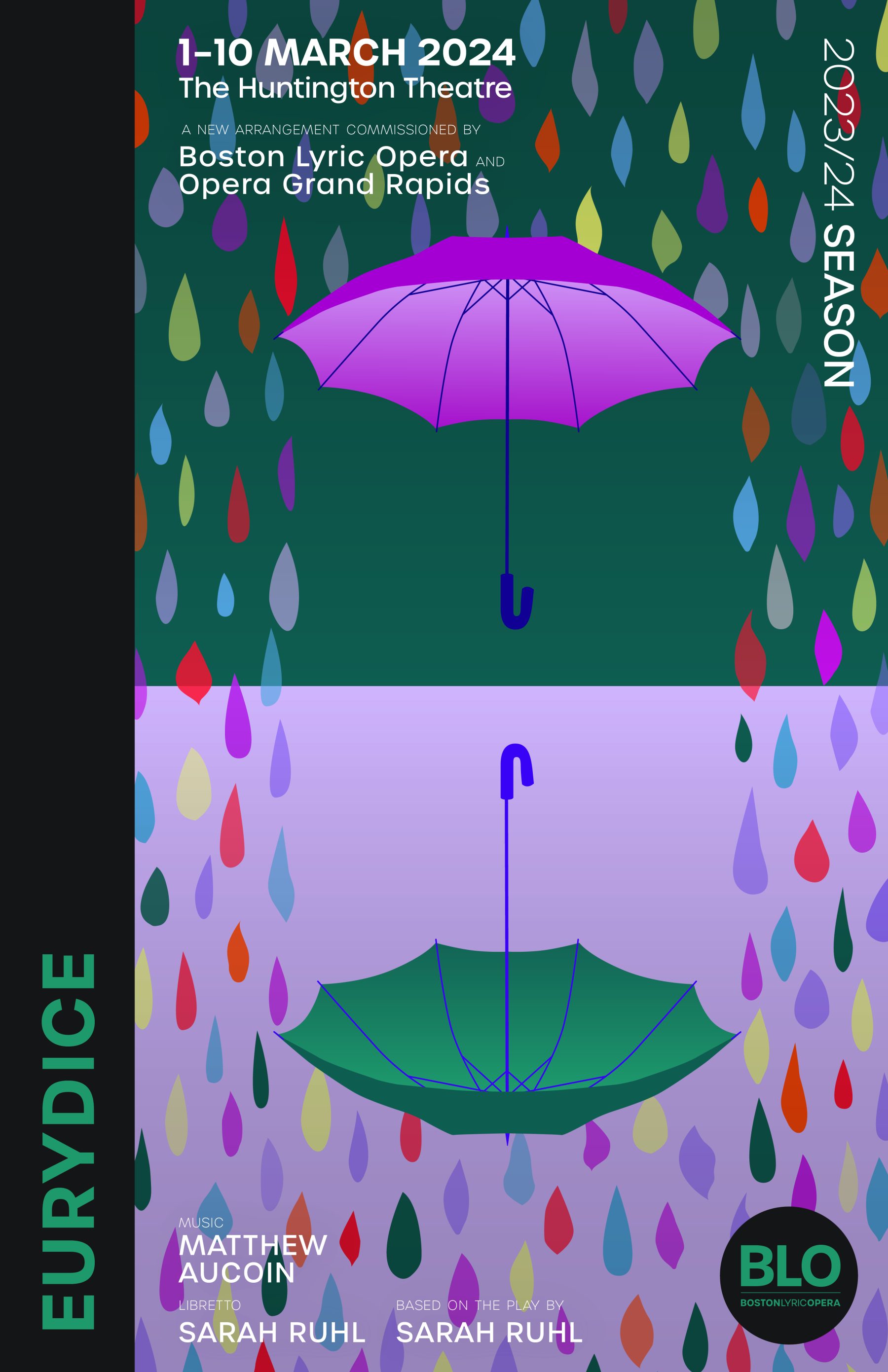
We were tasked with designing a cohesive visual branding system for the Opera and its 2022-23 and 2023-24 seasons, along with distinct concept art for each of four opera productions for each season. For the Opera as a whole, our brand refresh included the creation of a new BLO logo and typeface. For each production, we developed a unique typography language and matching color palette, as well as design elements reflecting their distinctive themes and concepts.
KUDOS Design Collaboratory
-
John Kudos
Creative Director -
Jamus Marquette, Imam Fadilah, Owen Febiandi, Fay Qiu, Jennifer Wiriawan, Putu Yogiswara, Andini Pratiwi, Irpan Alfian
Designer -
Amanda Knott, Robi Dafit
Project Manager -
Asha Adelia Rahayu, Rias Amalia
Illustrator -
Rias Amalia
Motion Designer -
Faris Han
Motion Developer
Made in Japan
Poster House
Capabilities
Focus Area
Client
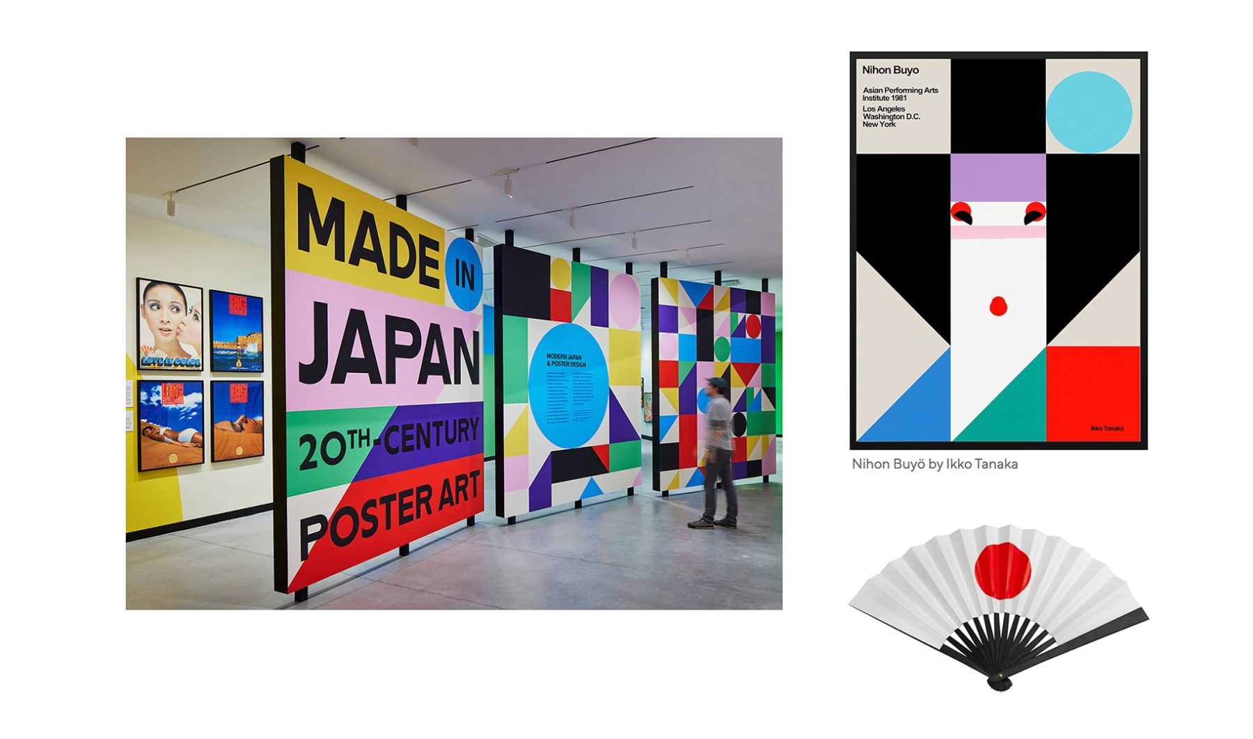
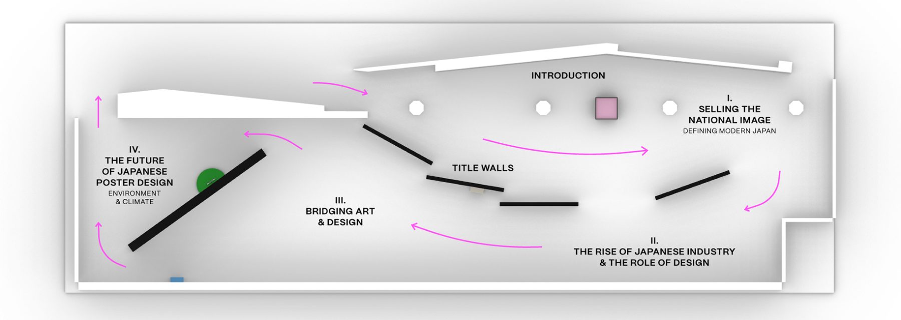
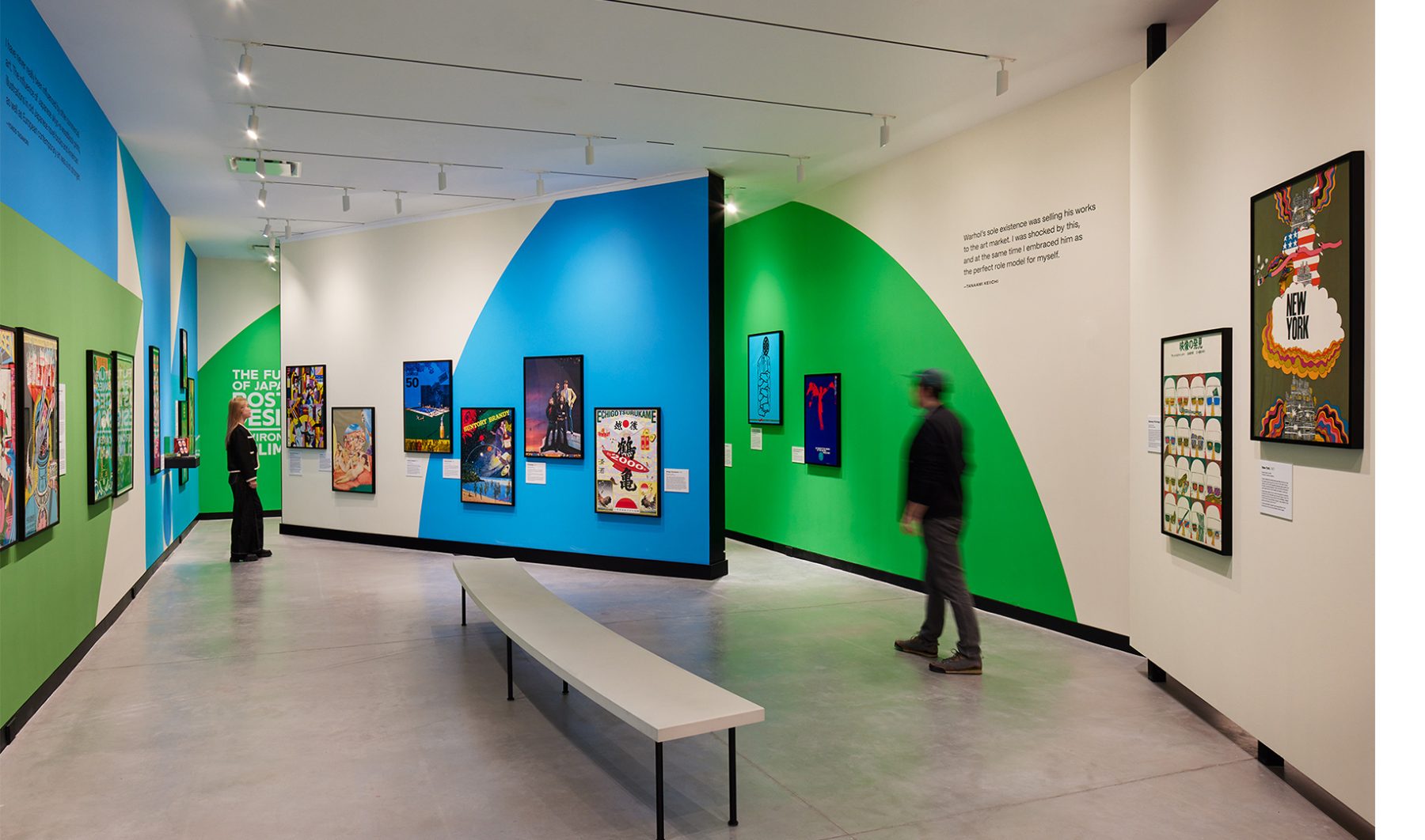
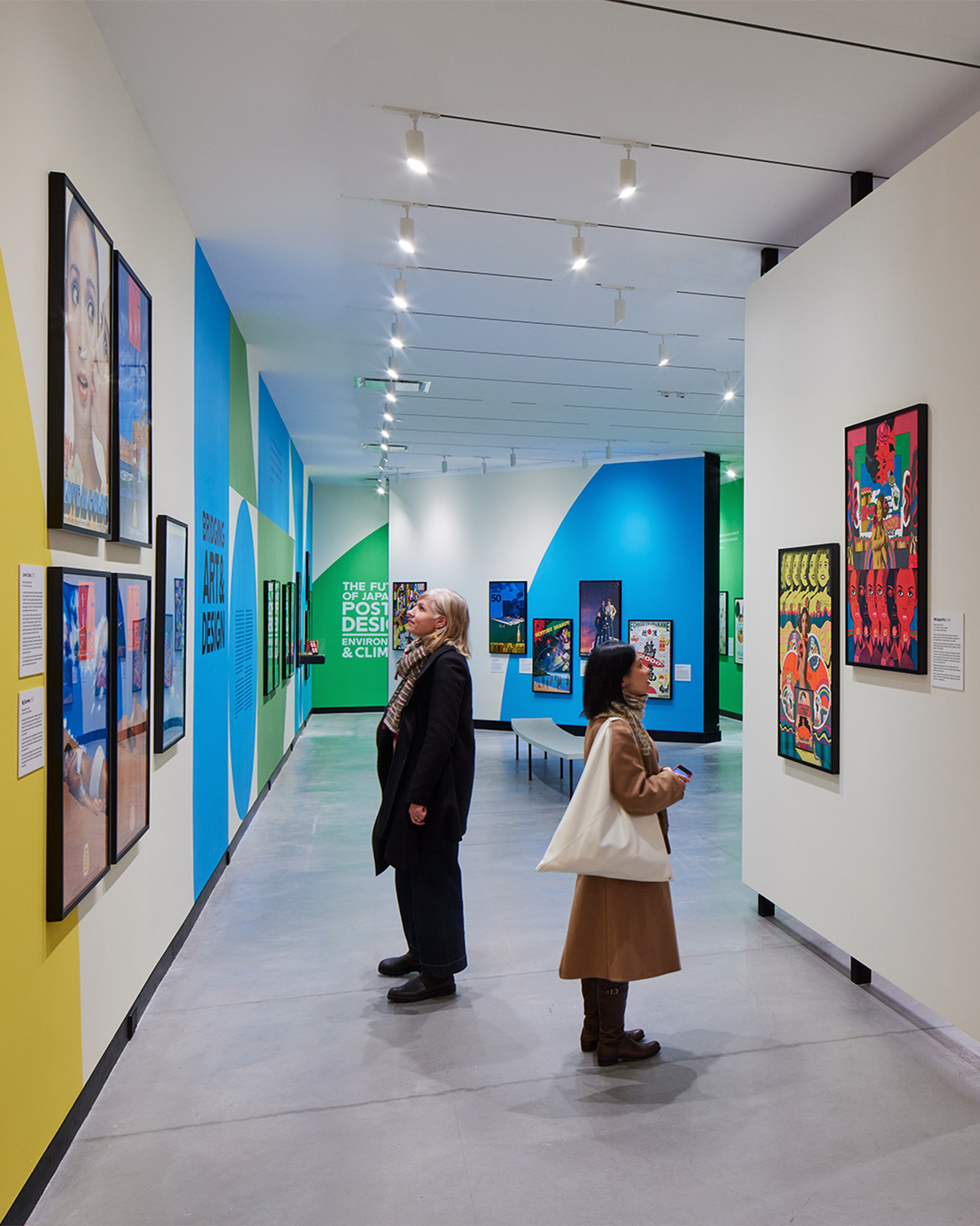
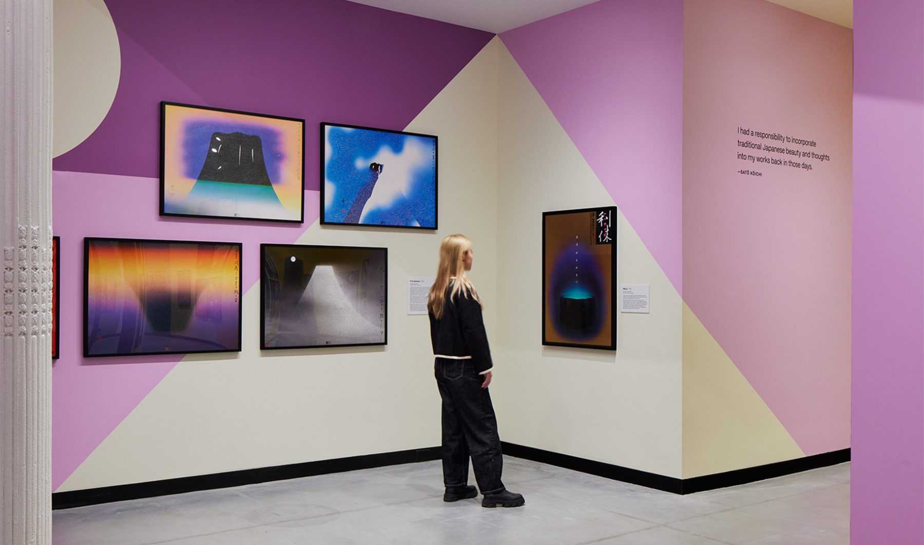
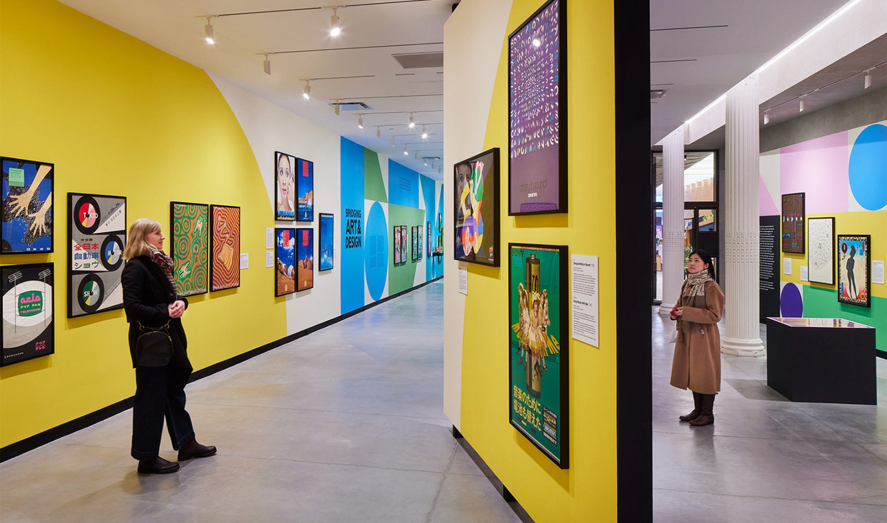
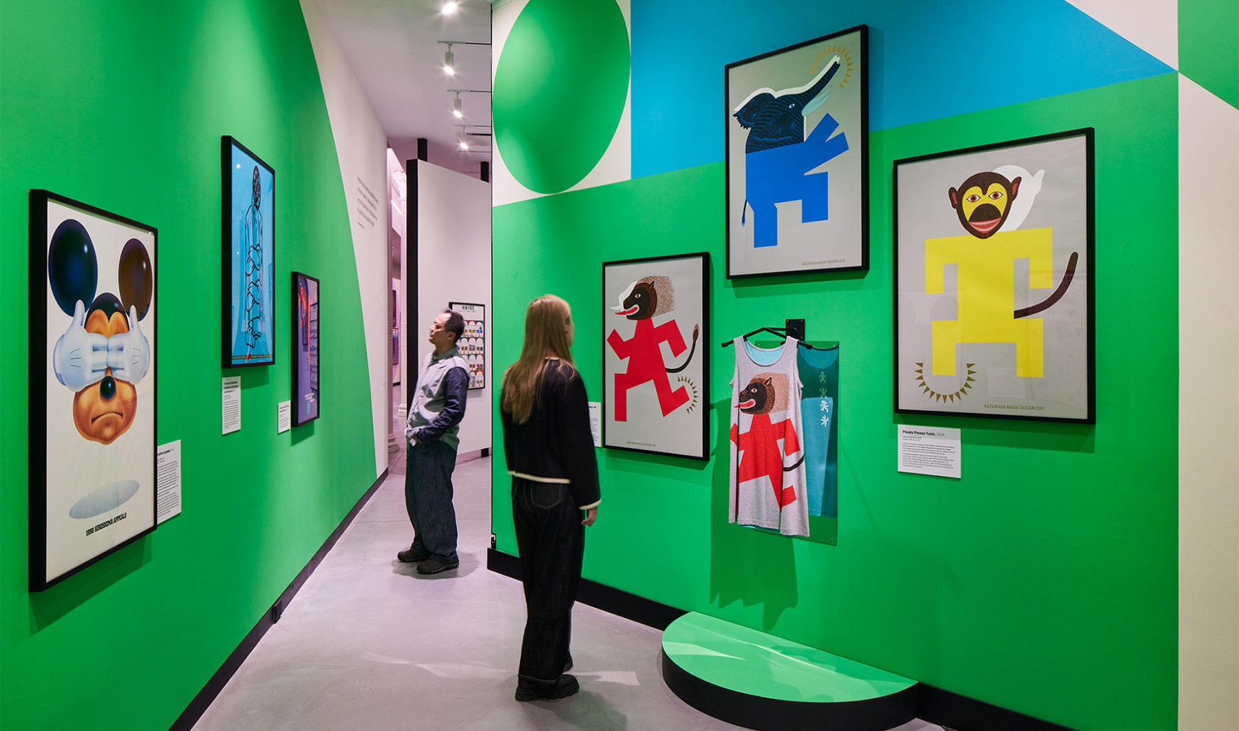
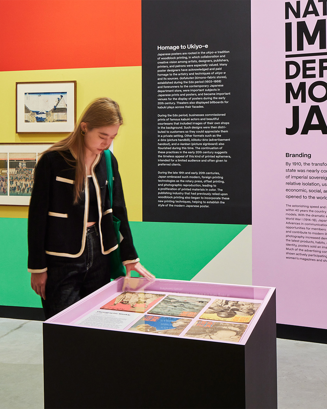
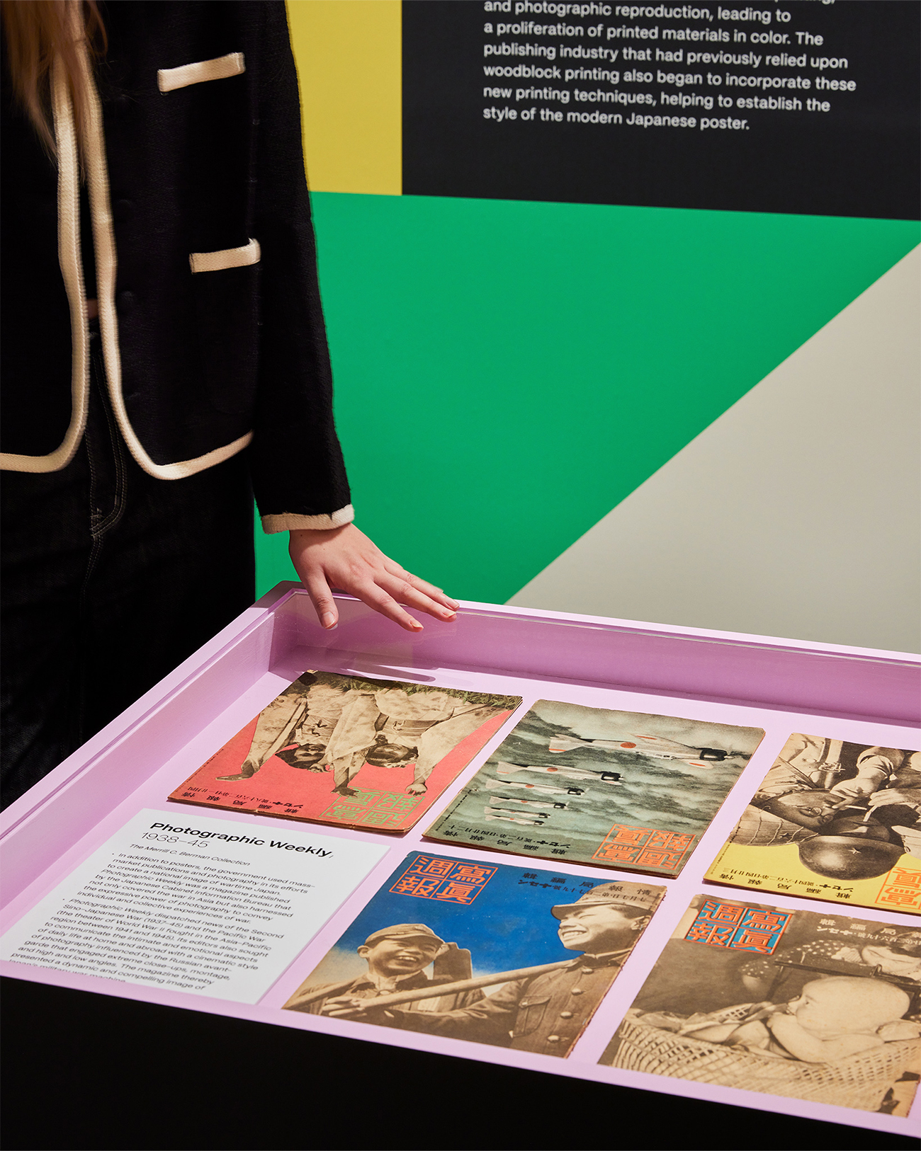
“Made in Japan” was an immersive visual journey through Japan’s golden age of graphic design, told through posters. Curated works from the Merrill C. Berman Collection ran the gamut from century-old to recent design.
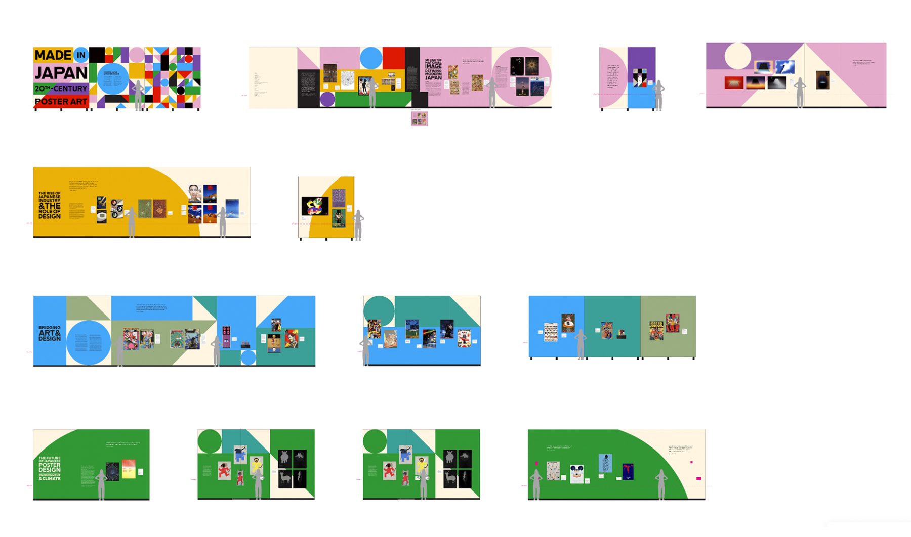
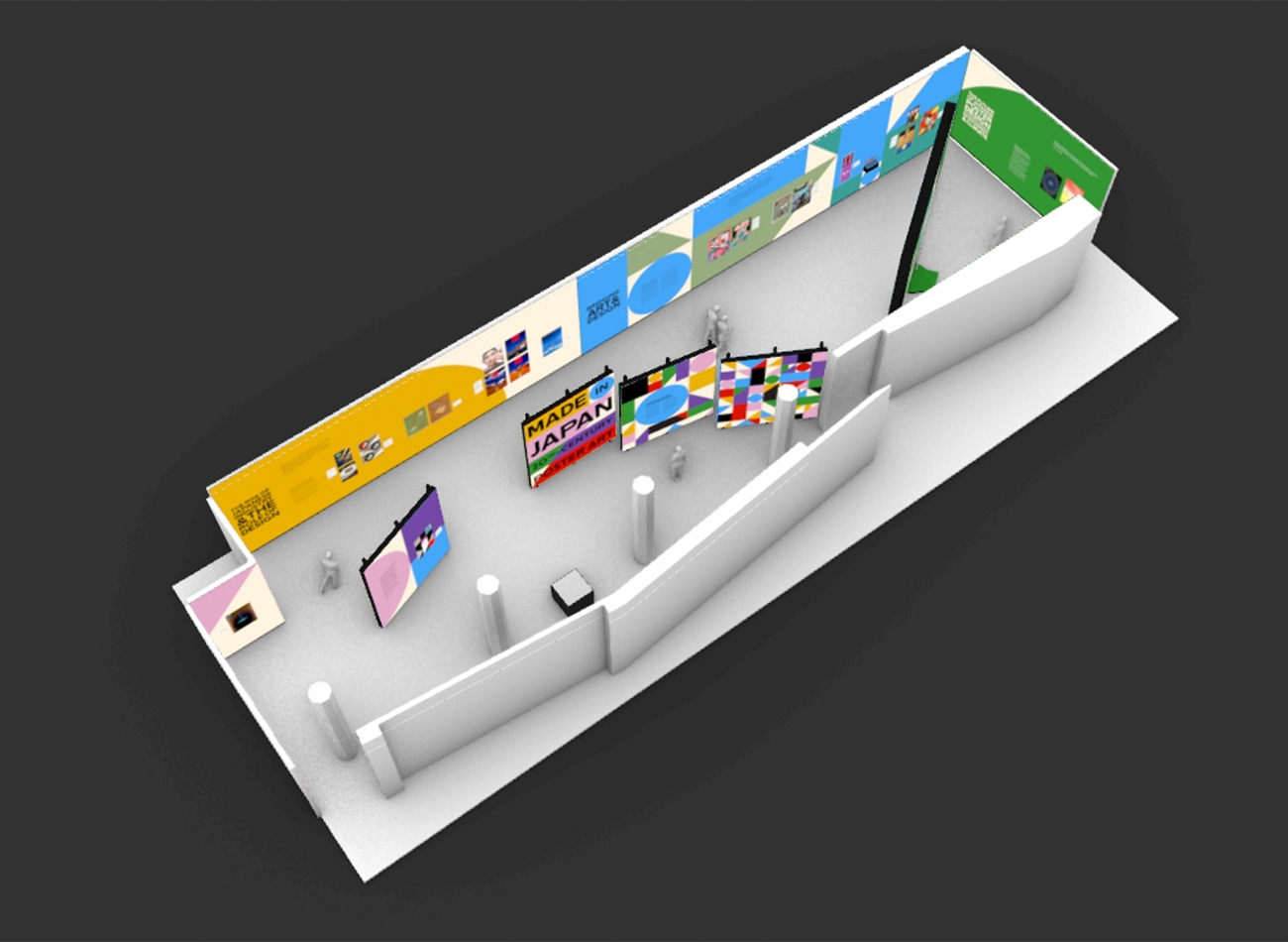
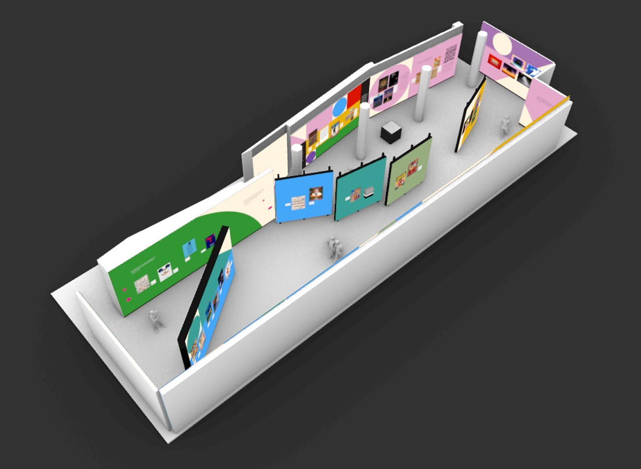
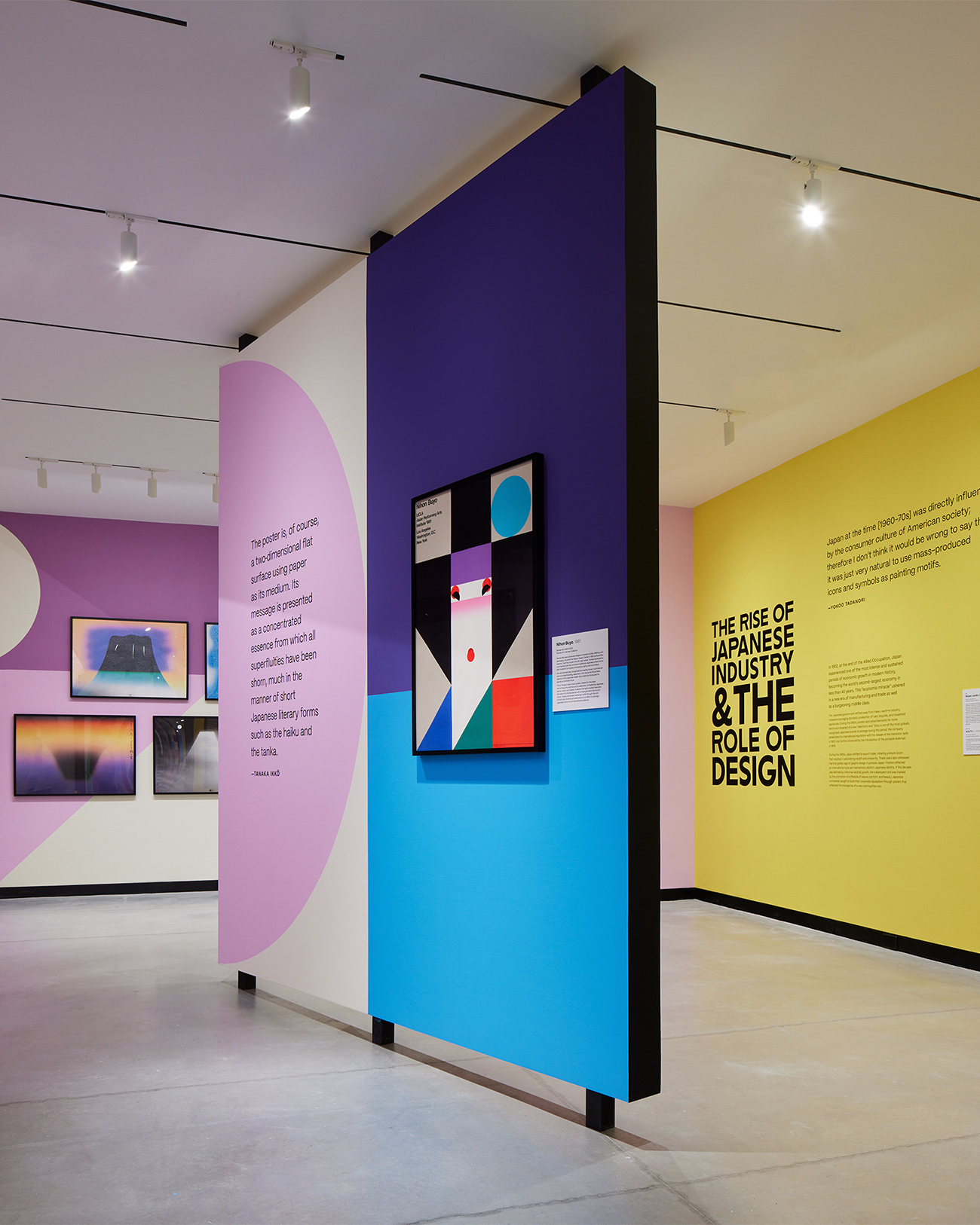
Our exhibition design for Poster House took inspiration from geometric shapes found in Nihon Buyö, a poster designed by Ikko Tanaka, a godfather figure in Japanese graphic design history. A triptych of oversized title walls unfurled like a Japanese folding fan to greet visitors at the entrance and create a permeable exhibit space to carry them seamlessly through the exhibit timeline.
We wanted an immersive motif to accentuate the posters and create a visual through-line for all the posters designed in the last century.
We chose color hues to serve as thematic backdrops for each section of the gallery. These vividly colorful shapes started small but quickly became larger as one progressed through the exhibit, finally becoming larger than the gallery walls.
Oversized typography—inspired by lettering found on the ships that brought Japanese immigrants to the American continent—infused the exhibit with a sense of industrialization and globalization, two forces that greatly influenced the evolution of graphic design in Japan.
KASA Collective
-
John Kudos
Creative Director -
Robert de Saint Phalle
3D Creative Director -
Ashley Wu
Art Director -
Fay Qiu
Designer -
Imam Fadillah
3D Renderer -
Amanda Knott
Project Manager -
Samuel Sachs Morgan
Photographer
POSTER HOUSE
-
Nozomi Naoi
Erin Schoneveld -
Angelina Lippert
Chief Curator & Director of Content -
Ola Baldych
Director of Design & Exhibits -
John F. Lynch
Associate Director of Exhibits -
Mihoshi Fukushima Clark
Assistant Director of Design -
Rob Leonardi
Fabricator
Frock Magazine
Eli Schmidt
Capabilities
Focus Area
Client
Awards
-
PRINT Awards 2022: First Place in Editorial Design
365:AIGA Year in Design: Winner in Editorial Design
SPD 58: Print Merit Winner
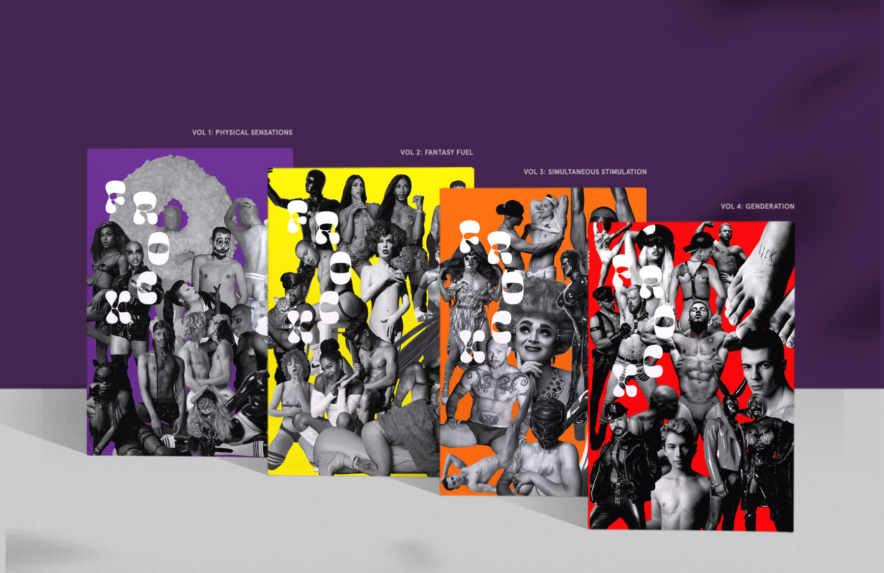
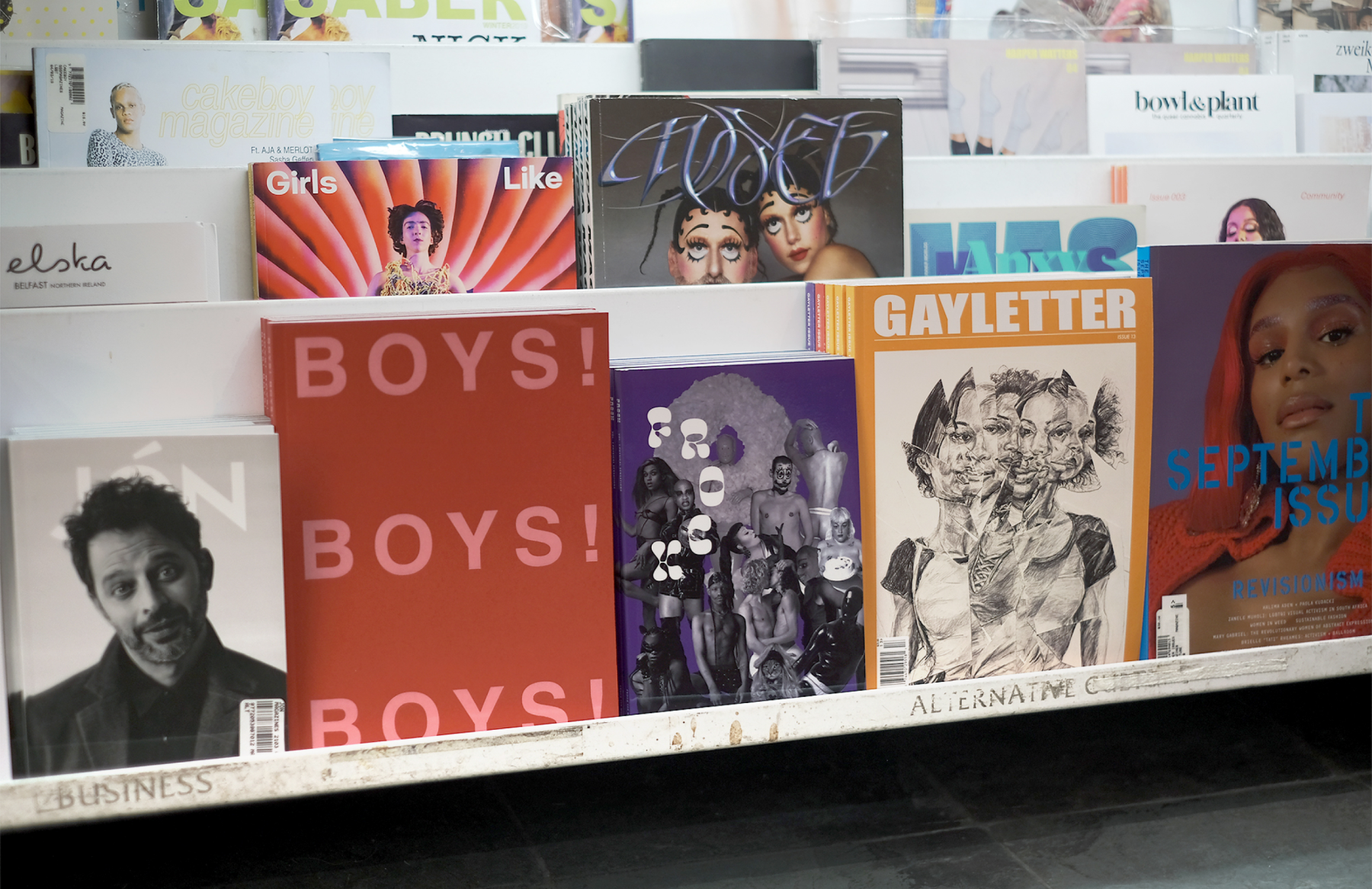
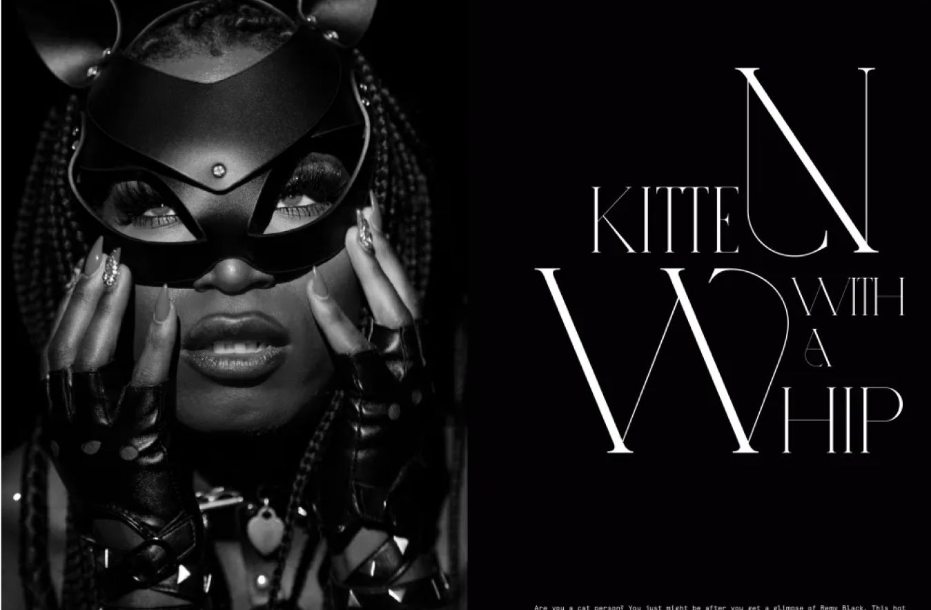
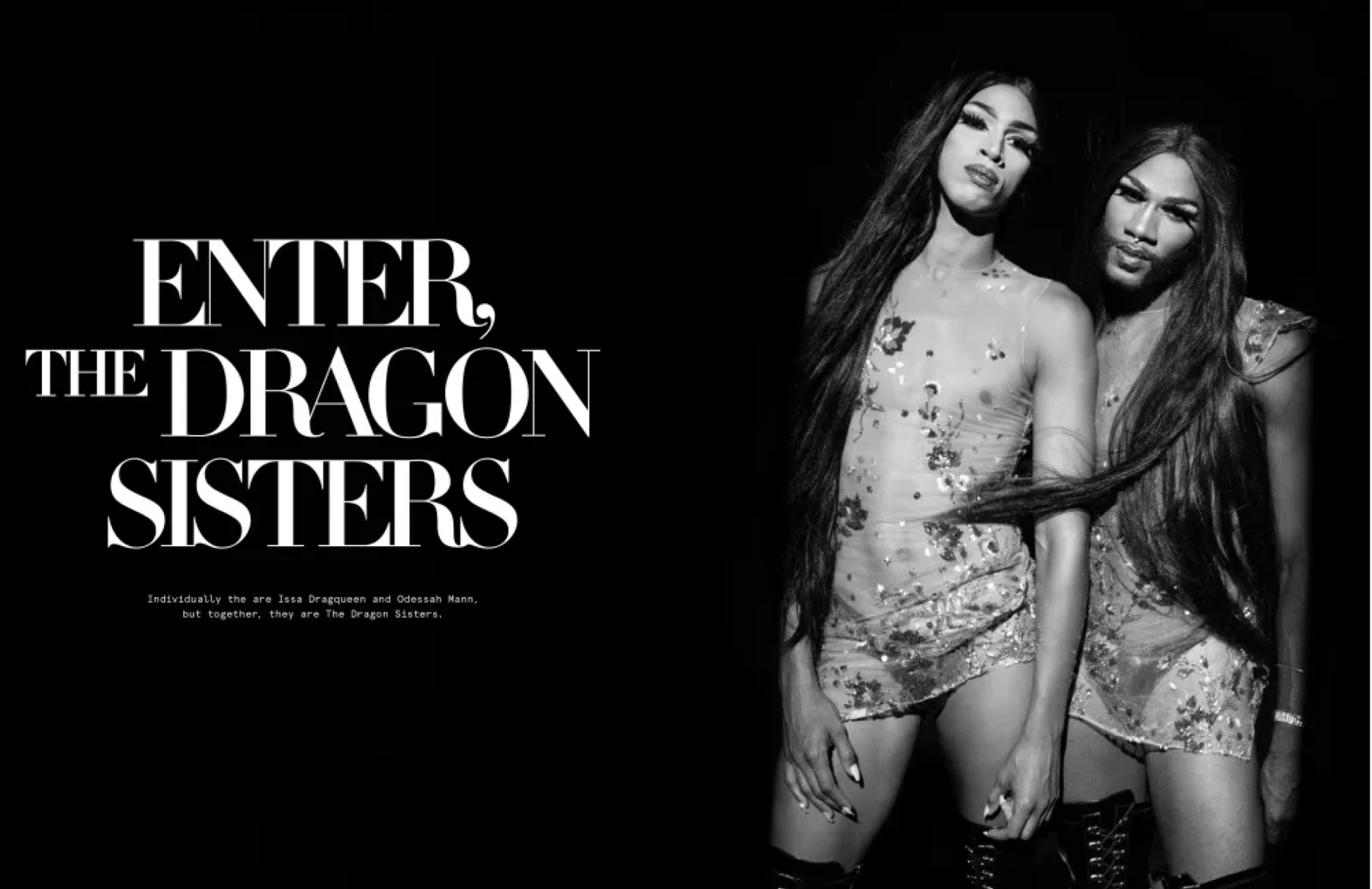
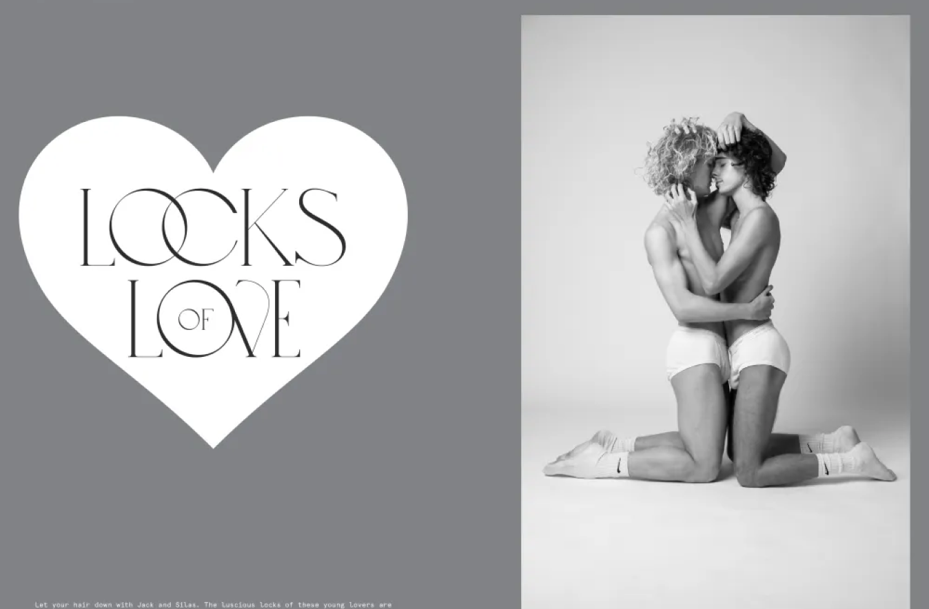
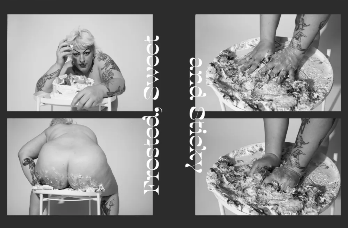
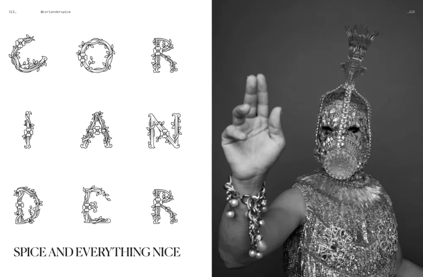
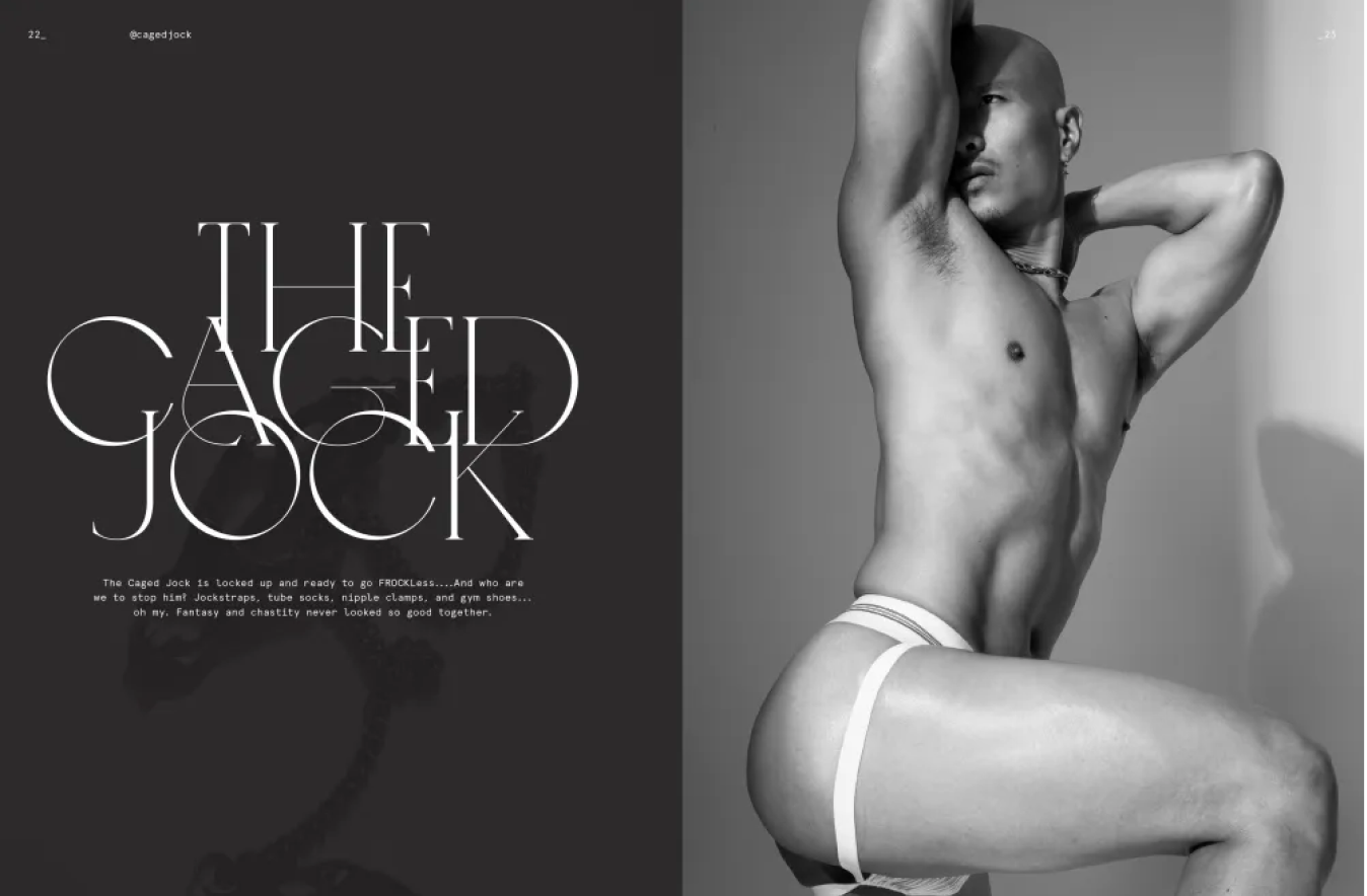
Visibility matters—and the desire to see ourselves represented without censorship is what keeps our language and lineage clear, pure, and authentic. This unselfconscious attitude is the unifying attribute shared by all of the artists, personalities, and performers represented in Frock, a magazine launched by photographer and publisher Eli Schmidt in 2019 as a source for queer photo stories, interviews, performance, and erotic films.
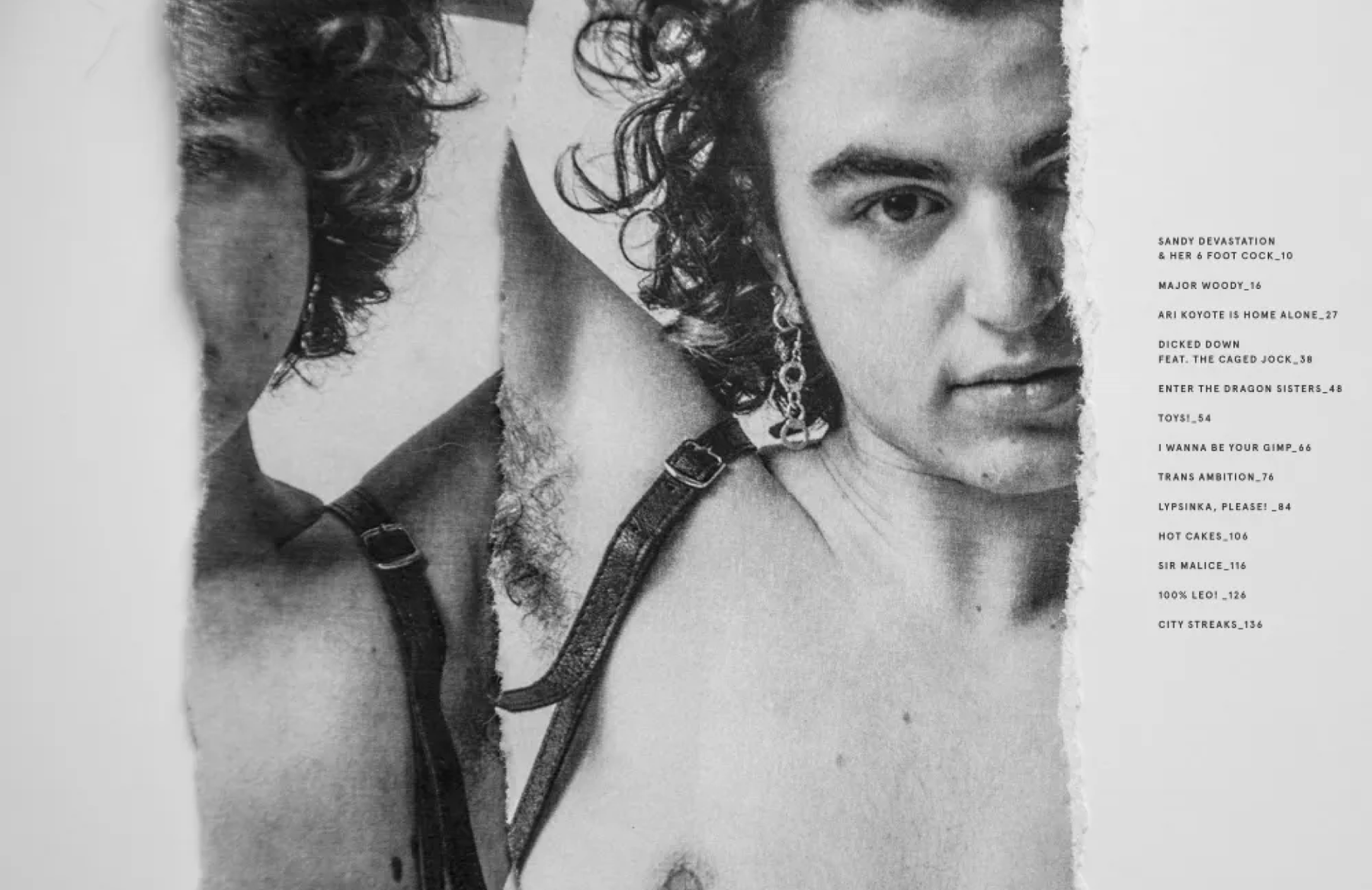
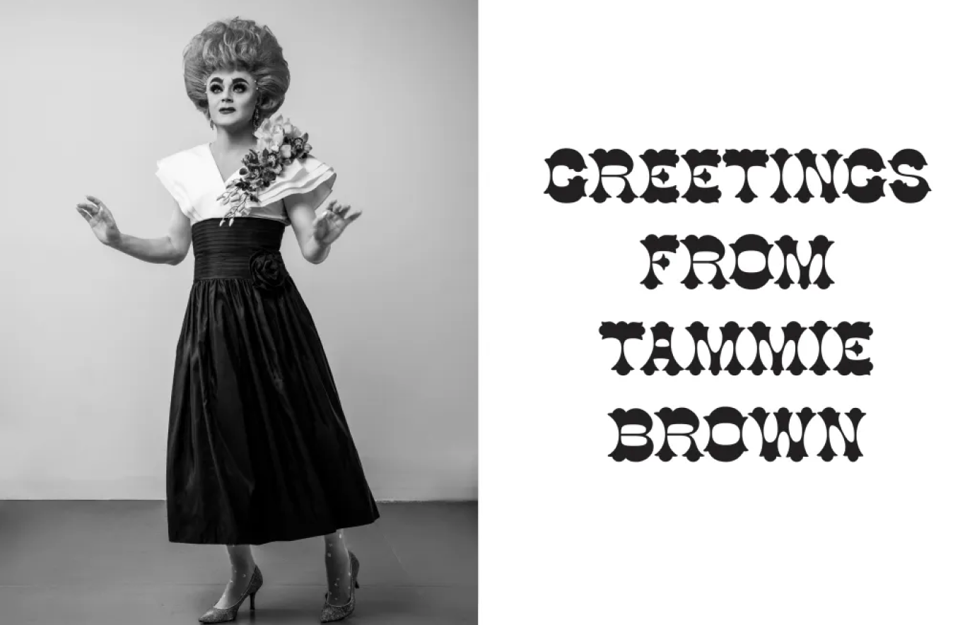
Our publication design drew upon the language of artist journals, homoerotic photography, and independent zine culture to create a platform for celebrating authentic queer joy. We worked closely with Schmidt to experiment with pairings of typography and photography that embody uninhibited concepts and emotions—the kink in the straight line.
KUDOS Design Collaboratory
-
John Kudos
Creative Director -
Amanda Knott
Project Manager -
Fay Qiu
Lead Designer
Connecting Stories Interactive
Smithsonian National Museum of Asian Art
Capabilities
Focus Area
Client
The “Connecting Stories” exhibition opened on the Mall on April 29, 2023, at the Smithsonian National Museum of Asian Art in Washington, D.C. “Connecting Stories” was designed to encourage visitors to explore the museum’s collection and develop personal connections to the stories and artwork preserved by the museum.
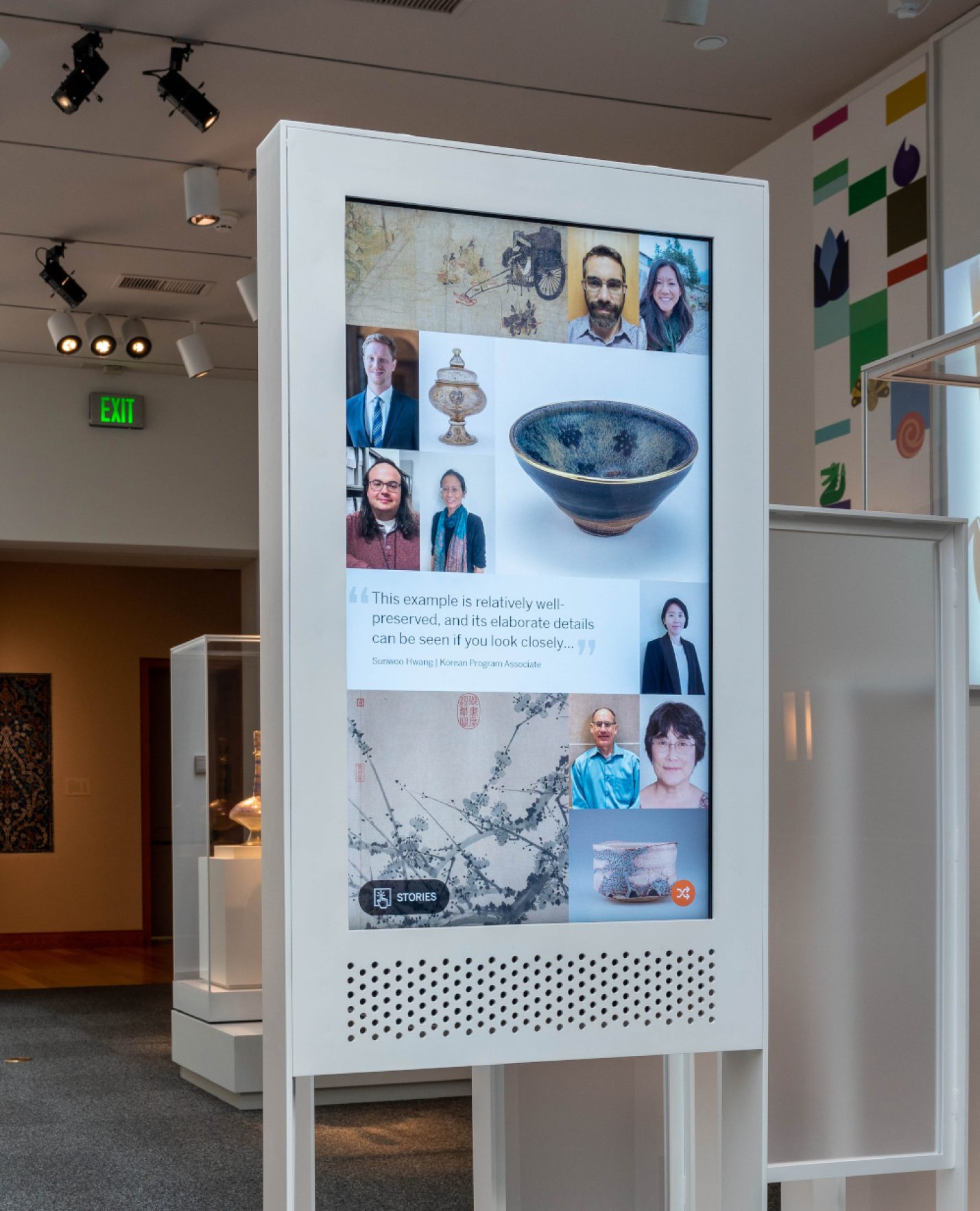
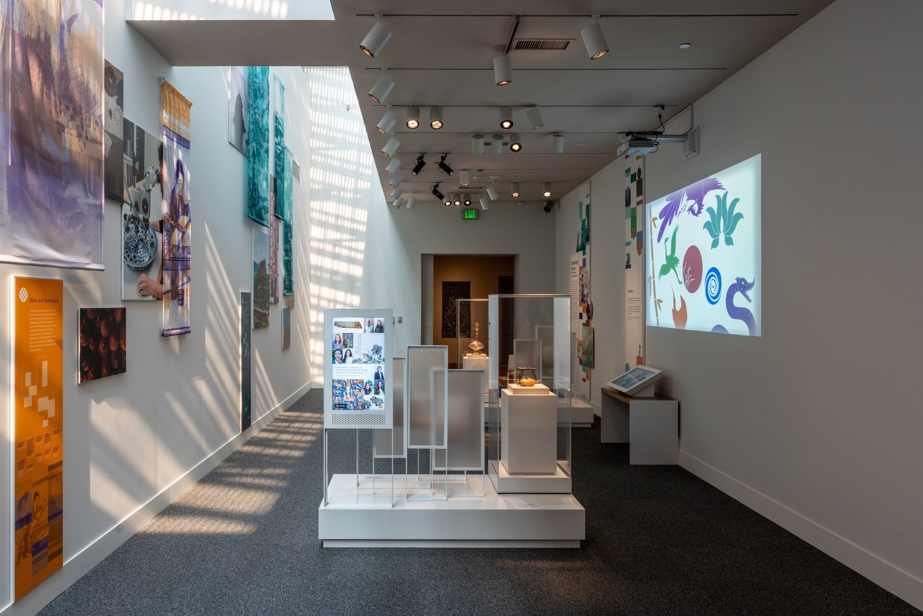
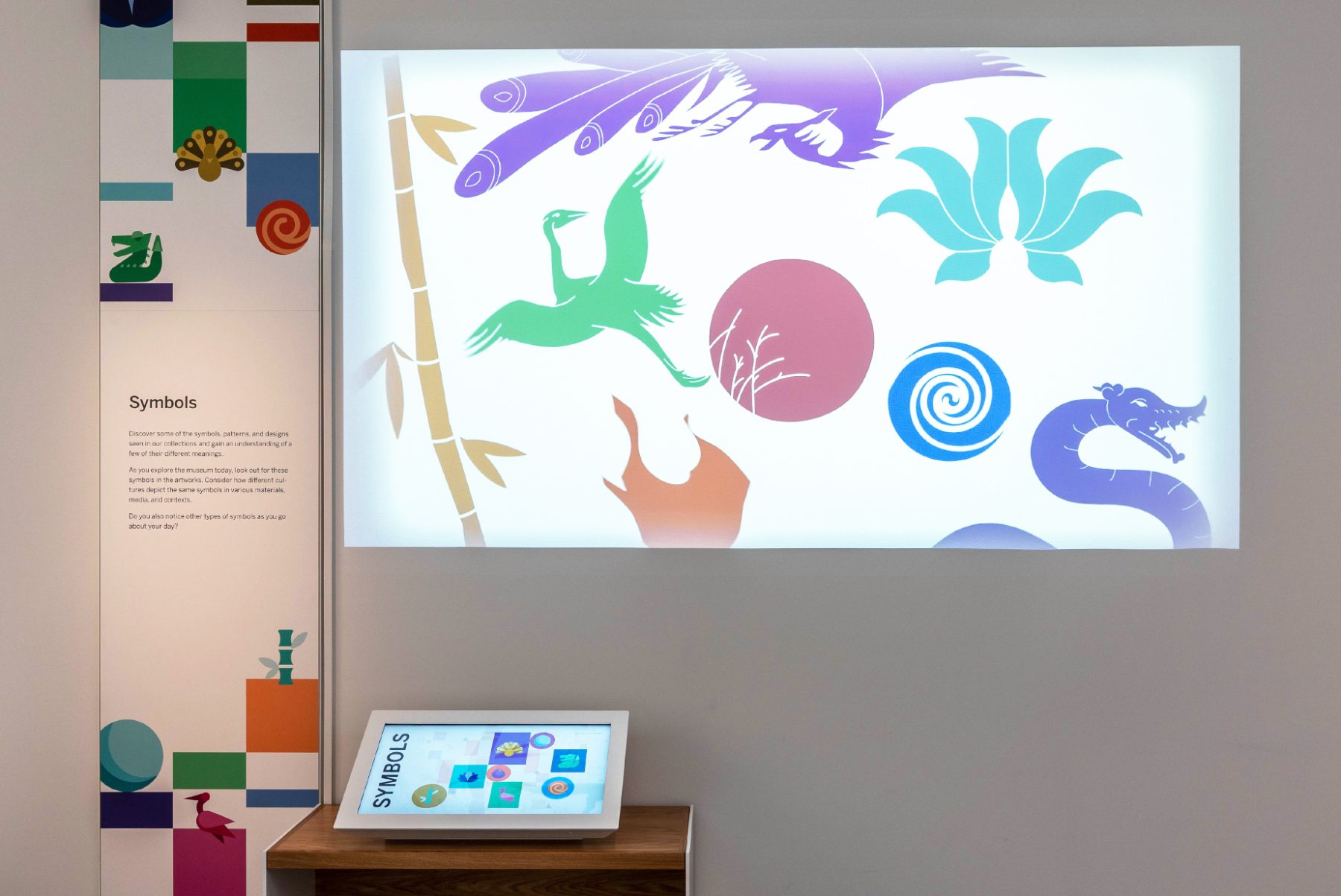
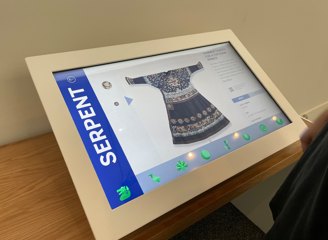
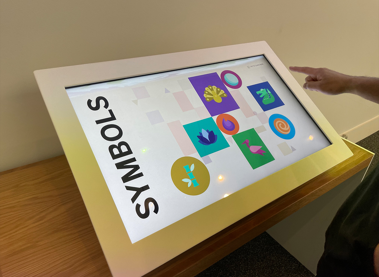
The interactive experience at the museum’s Freer Sackler Gallery offered visitors an engaging journey through the rich tapestry of Asian art, via a carefully curated selection of objects, images, maps, and interactive displays. Via a digital touchscreen and a colorful, animated projection, audiences could discover some of the symbols, patterns, and designs seen across the collection and learn about how their meanings change in different contexts. On a second touchscreen, National Museum of Asian Art staff and volunteers shared stories of their personal connections to objects in the collection.
We designed our two interactive pieces to enhance visitor engagement by deepening their understanding and appreciation of the gallery’s treasures. The first horizontal touchscreen unveiled the intricate motifs and symbols recurring across artworks, offering visitors an immersive exploration of their meanings and significance. The complementary vertical touchscreen panel invited audiences to explore the perspectives of gallery staff, tapping on headshots to discover their insights into selected artworks. Additionally, our motion design for the exhibit’s screensaver mode enhanced the space’s ambiance, projecting captivating visuals onto the gallery walls and ensuring an enriching and immersive experience for visitors.
Bridging the gap between audience and artifact, these interactive installations served as dynamic tools for deciphering and interpreting the complexities and cultural significance of Asian art. The experience fostered a deeper connection with the artworks, enriching visitors’ Freer Sackler Gallery experience.
Exhibition Teams
-
Cultural Innovation
Lead Exhibition Design -
KASA Collective
Interactive Kiosks -
Kubik Maltbie
A/V Fabrication
KASA Collective
-
John Kudos
Creative Director -
Robert de Saint Phalle
3D Creative Director -
Ashley Wu
Art Director -
Fay Qiu
Lead Designer -
Owen Febiandi
Designer -
Putu Yogiswara
Designer -
Imam Fadilah
Animator -
Muhammad Syamil Haqqoni
Designer -
Chris Manlapid
Lead Software Developer -
Joe Baker
Engineer (Informal) -
Jess Mackta
Project Manager
Kubik Maltbie
-
Thomas Miller
A/V Fabricator -
Donald Sweetman
A/V Fabricator
Poster House Website
Poster House
Capabilities
Focus Area
Client
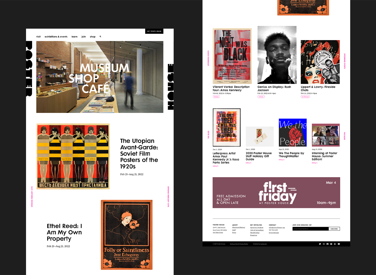
Poster House (New York City) is the first museum in the U.S. to be dedicated exclusively to posters, presenting a global view of the medium from its earliest appearances in the late 1800s to present-day uses.
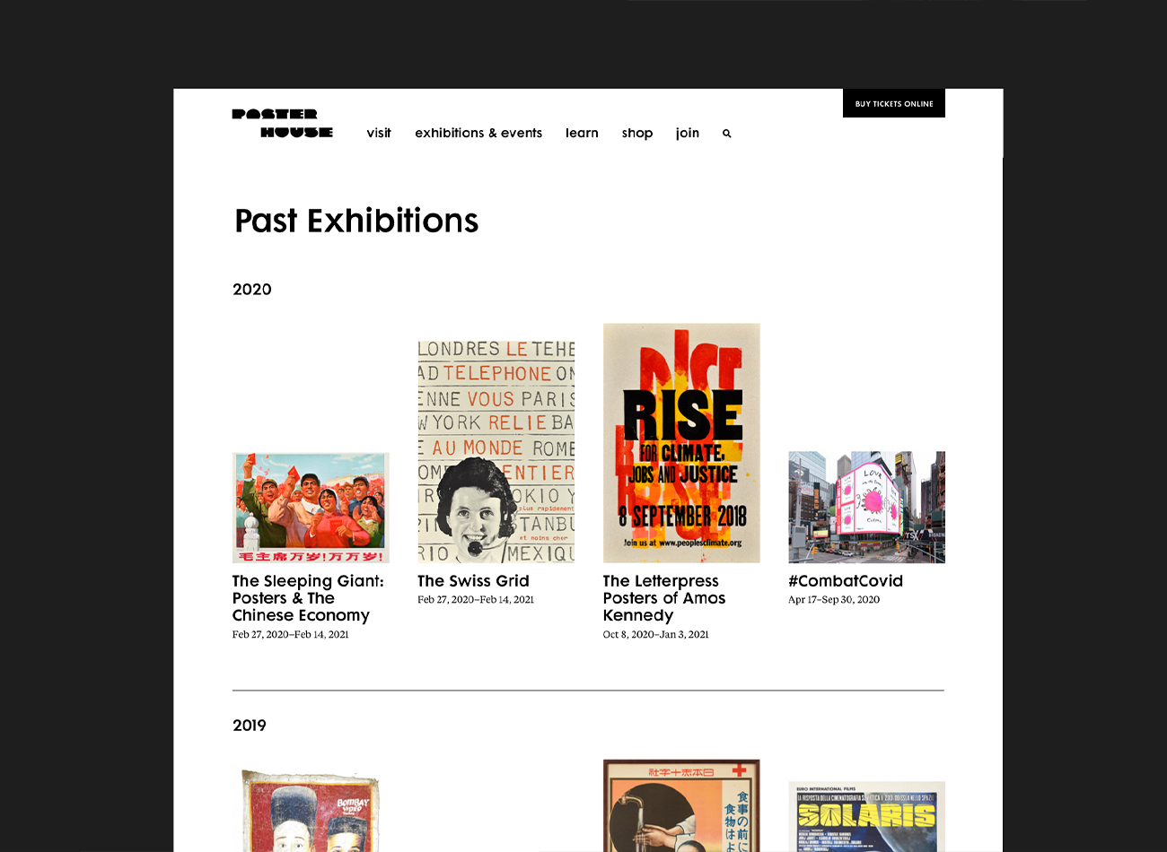
We designed a seamless, clean, and immersive new website for the museum that carries the boldness, simplicity, and clarity of a poster exhibition, ensuring the museum’s events and poster collections were showcased prominently. On the back end, we developed the website to provide comprehensive information on events, collections, and admission, along with an online shop—all delivered with rigorously tested web-accessibility.
View posterhouse.org
KUDOS Design Collaboratory
-
Ashley Wu
Designer -
Owen Febiandi
Designer -
Putu Yogiswara
Designer -
Amanda Knott
Project Manager -
Christian Juniady Setiawan
Web Developer

Cornell Johnson Museum Website
Cornell University
Capabilities
Focus Area
Client
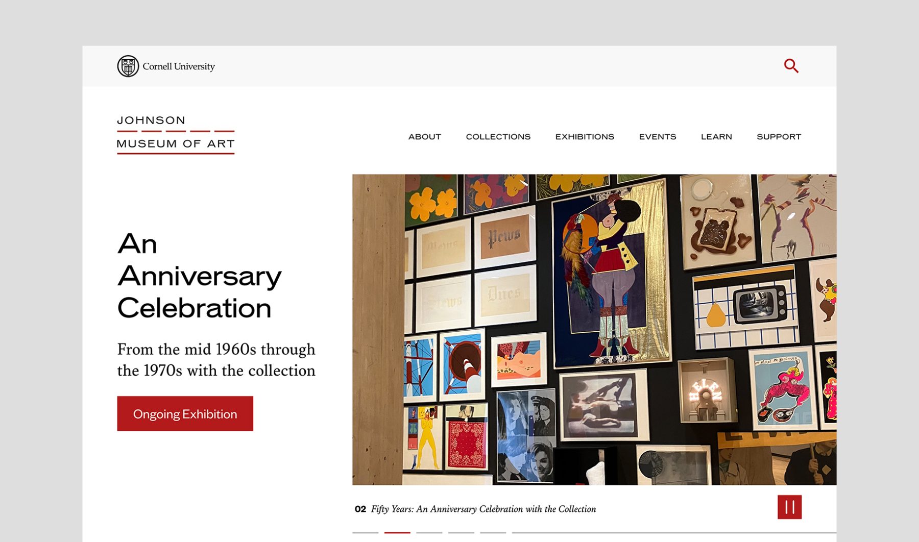
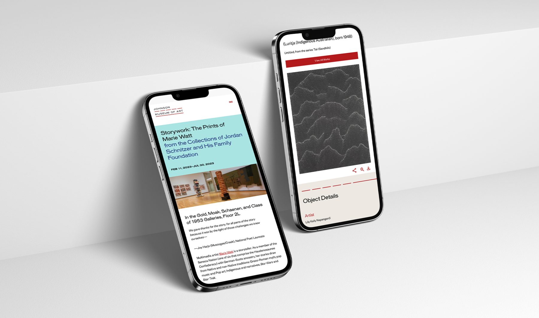
In 2022, Isometric rolled out a wide-ranging new visual identity and website design for the Johnson Museum of Art at Cornell University. Coinciding with the 50th anniversary of the museum, the new design celebrates its architecture by I.M. Pei, abstracting its iconic ribbon window into a simple, dashed line motif to signify the view from the museum onto the picturesque landscape of Ithaca and its role in interpreting the world beyond. KUDOS was tasked with developing the website, created in close collaboration with the museum and Isometric’s design team.
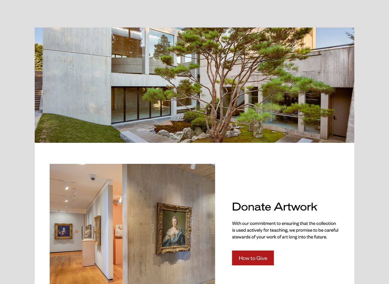
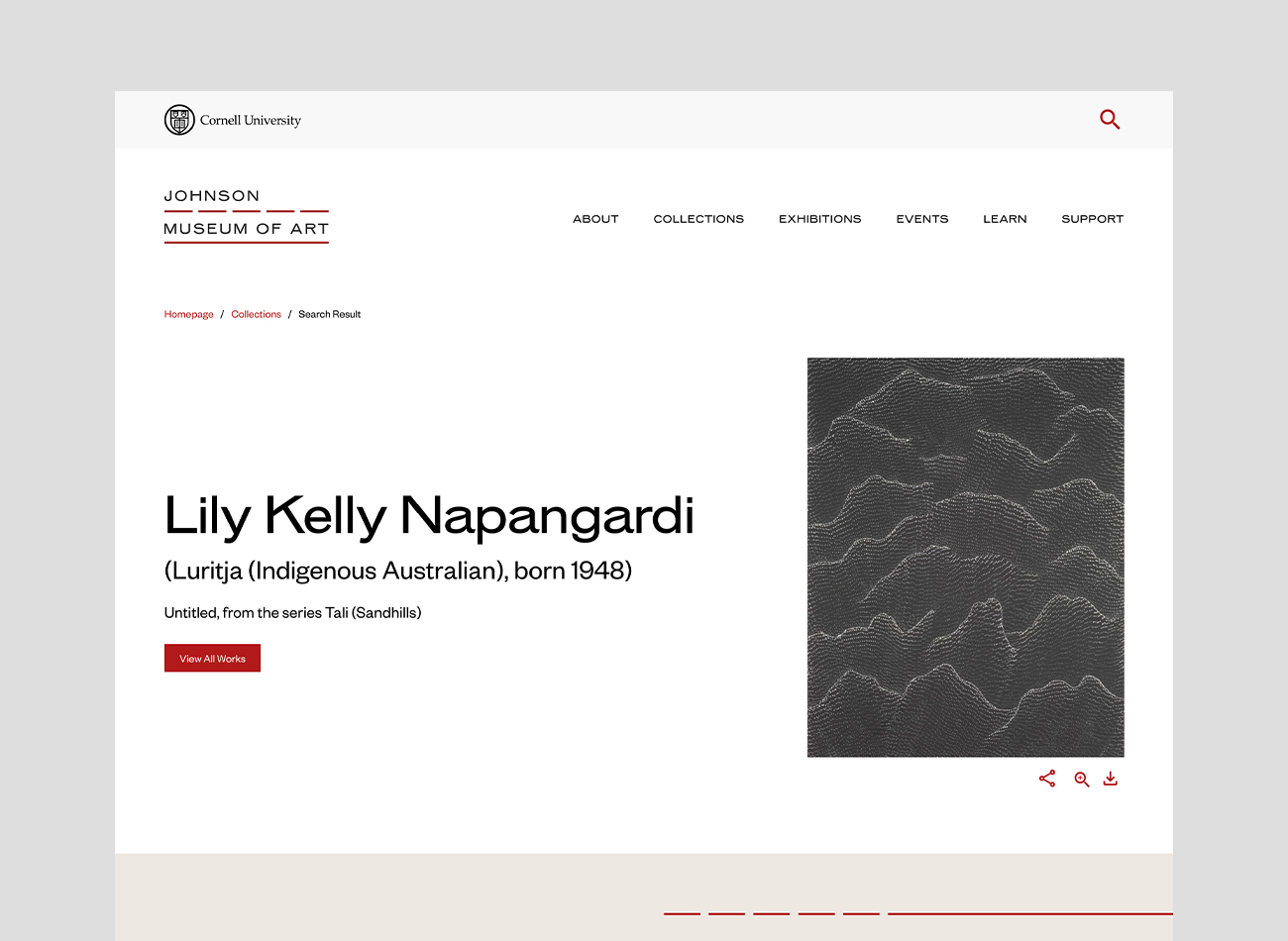
The resulting site is a transformative online platform that gives visitors unprecedented access to the Johnson’s astounding collection of 40,000 works that span six millenia and most world cultures. Beyond serving as a crucial archive, the website also acts as a dynamic educational platform, offering a variety of activities for children via the Johnson Kids portal, and an opportunity through the Community Exhibition Creator for visitors to create their own online exhibitions incorporating artworks from the museum’s collection. Through these functions, visitors are empowered to engage with the collection on their own terms, creating an egalitarian and inclusive experience of the museum.
View museum.cornell.edu
PROJECT TEAMS
-
Isometric
Visual Identity & Website Design -
KUDOS Design Collaboratory
Web Development
KUDOS Design Collaboratory
-
Amanda Knott
Project Manager -
Chris Manlapid
Lead Web Developer -
Christian Junaedi Setiawan, Faris Hanugraha, Arif Widipratomo
Web Developer
GII 100 Exhibition
GII Hok Im Tong
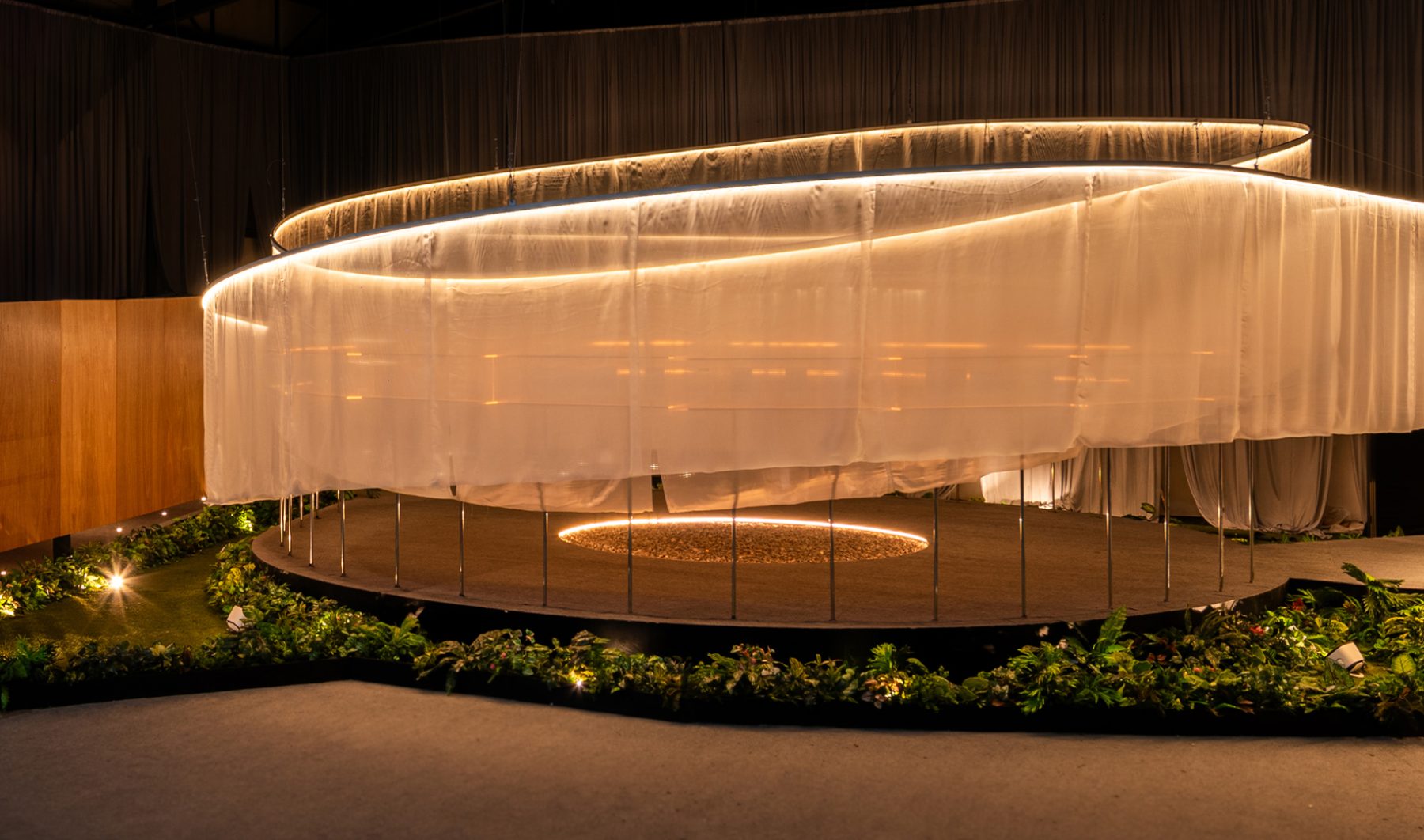
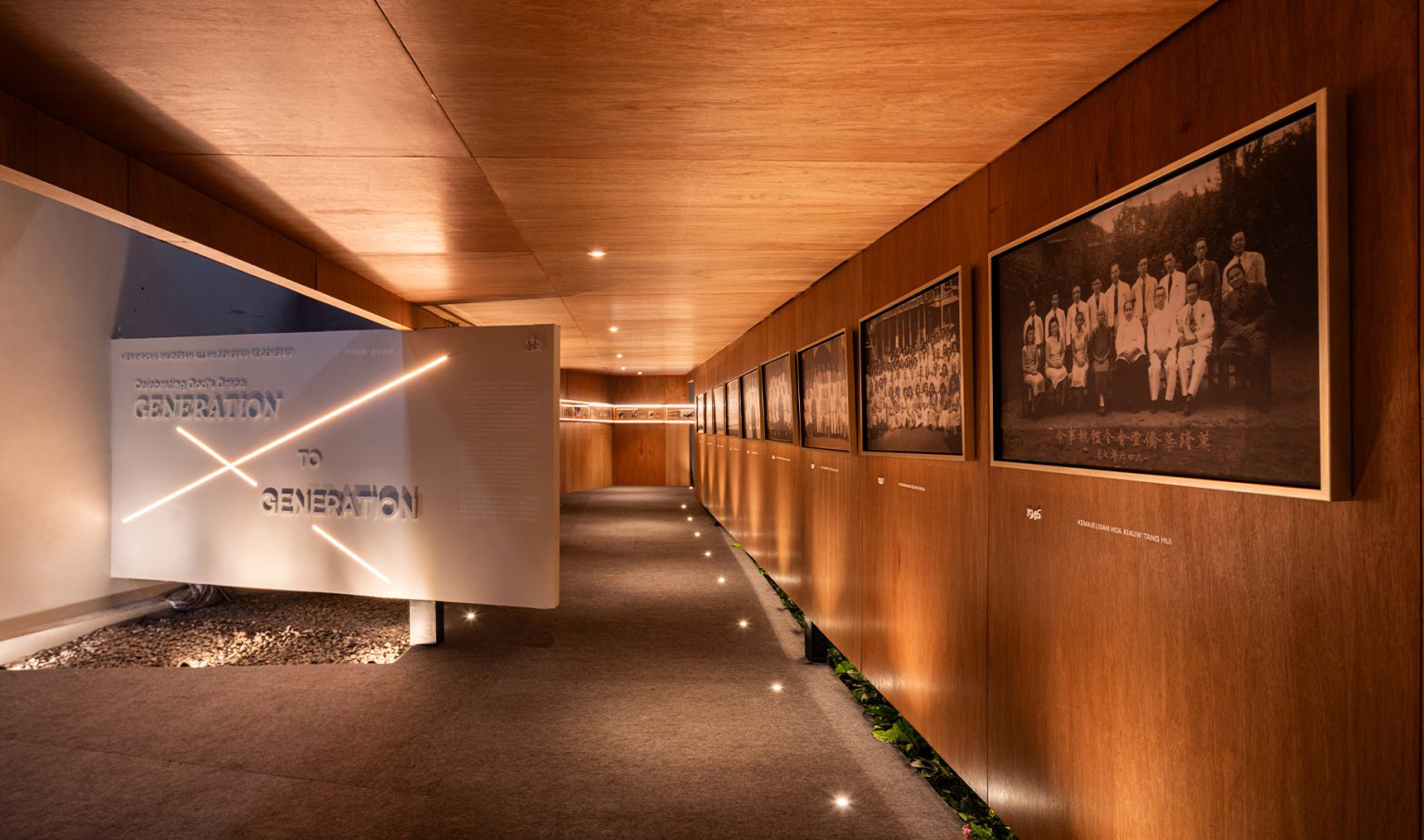
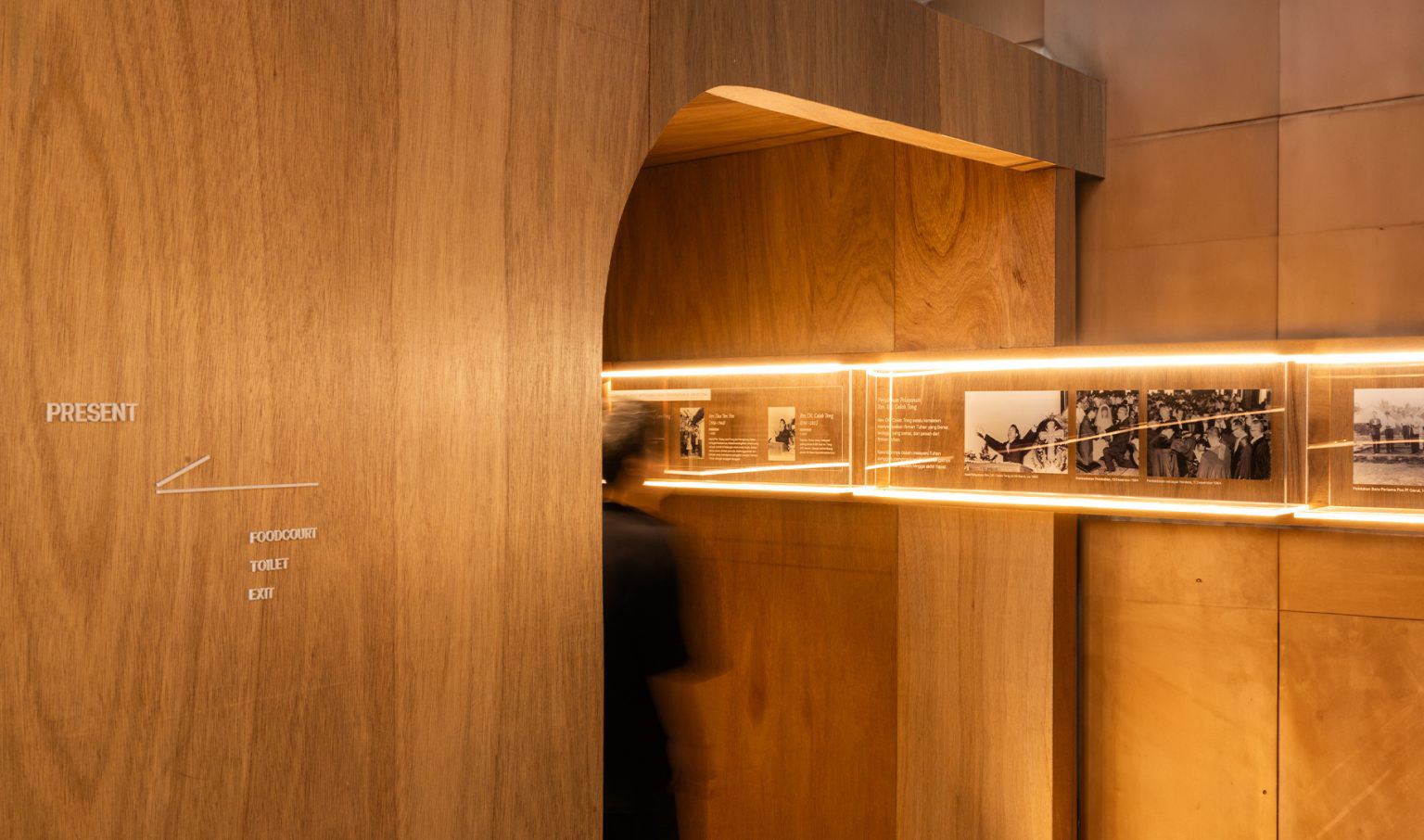
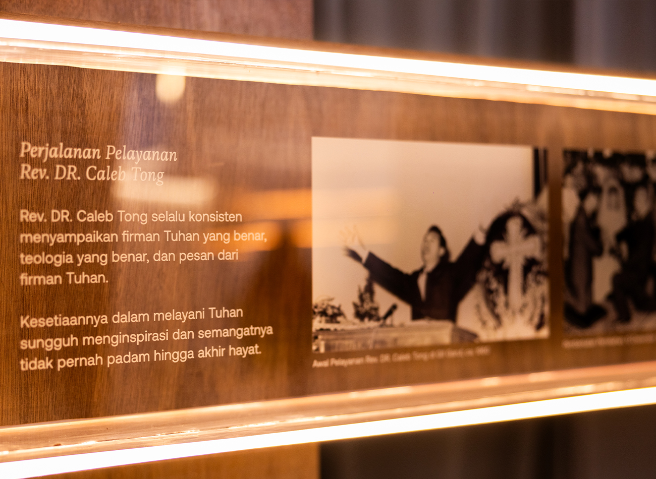
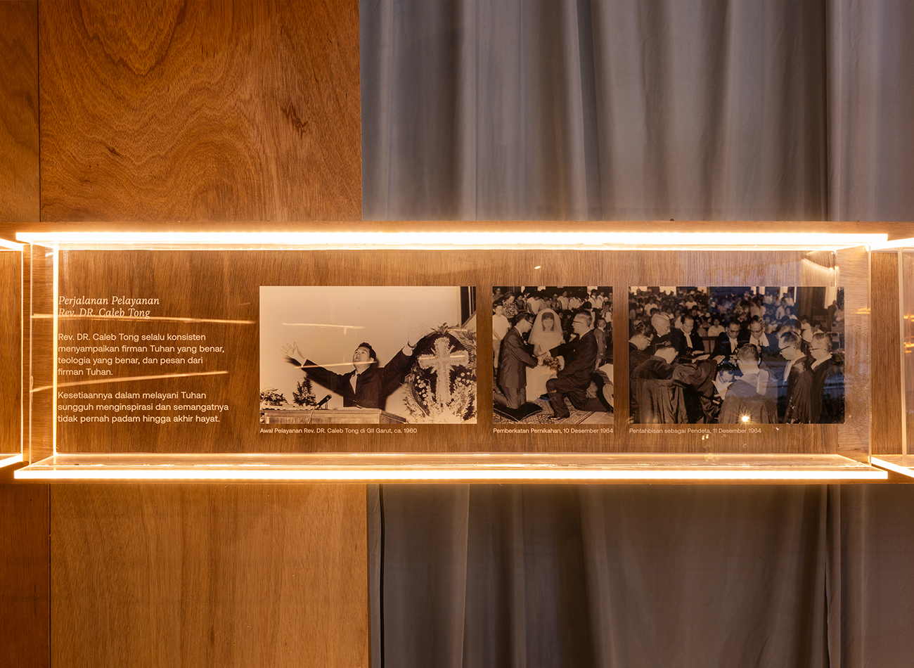
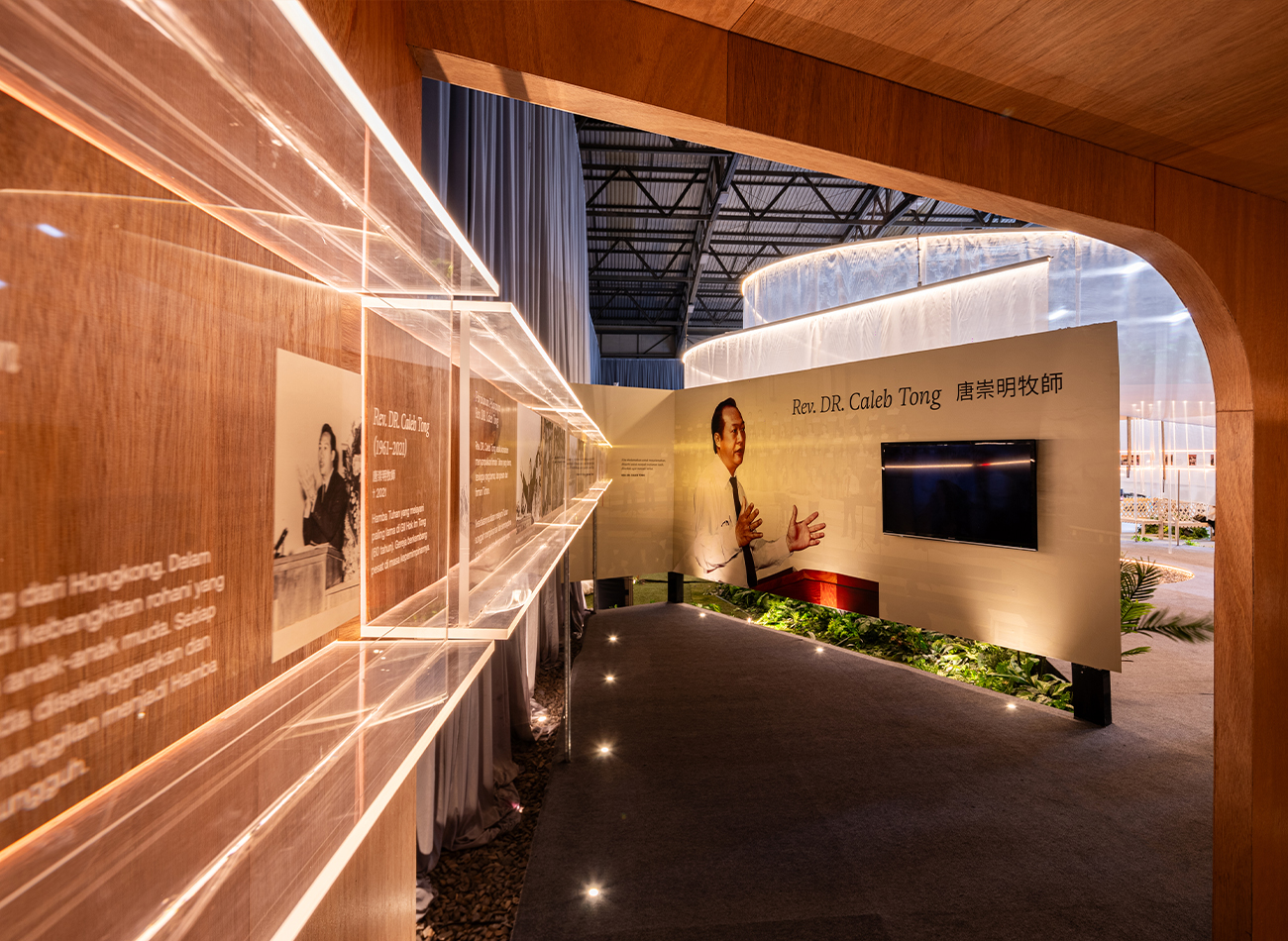
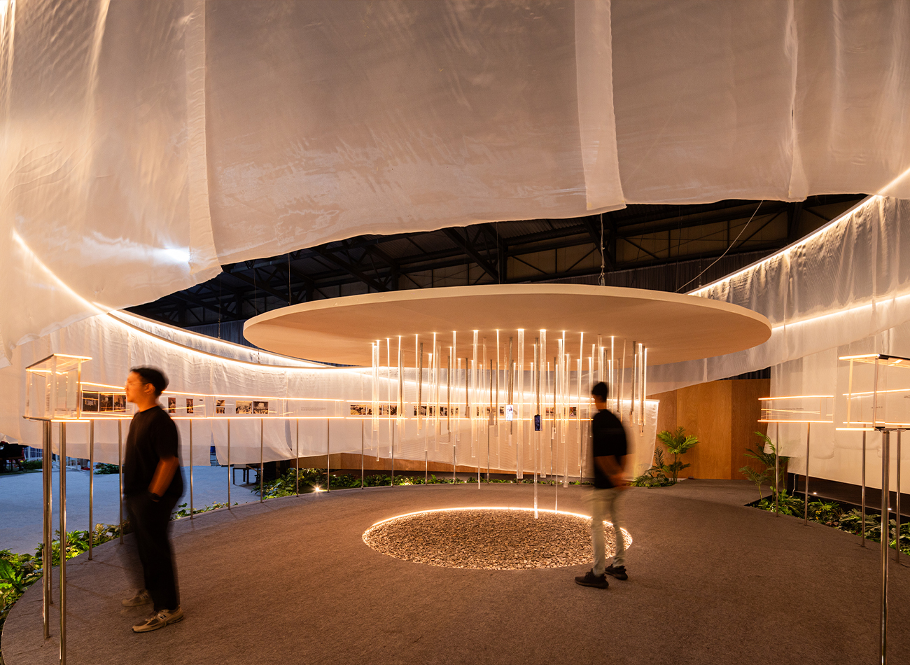
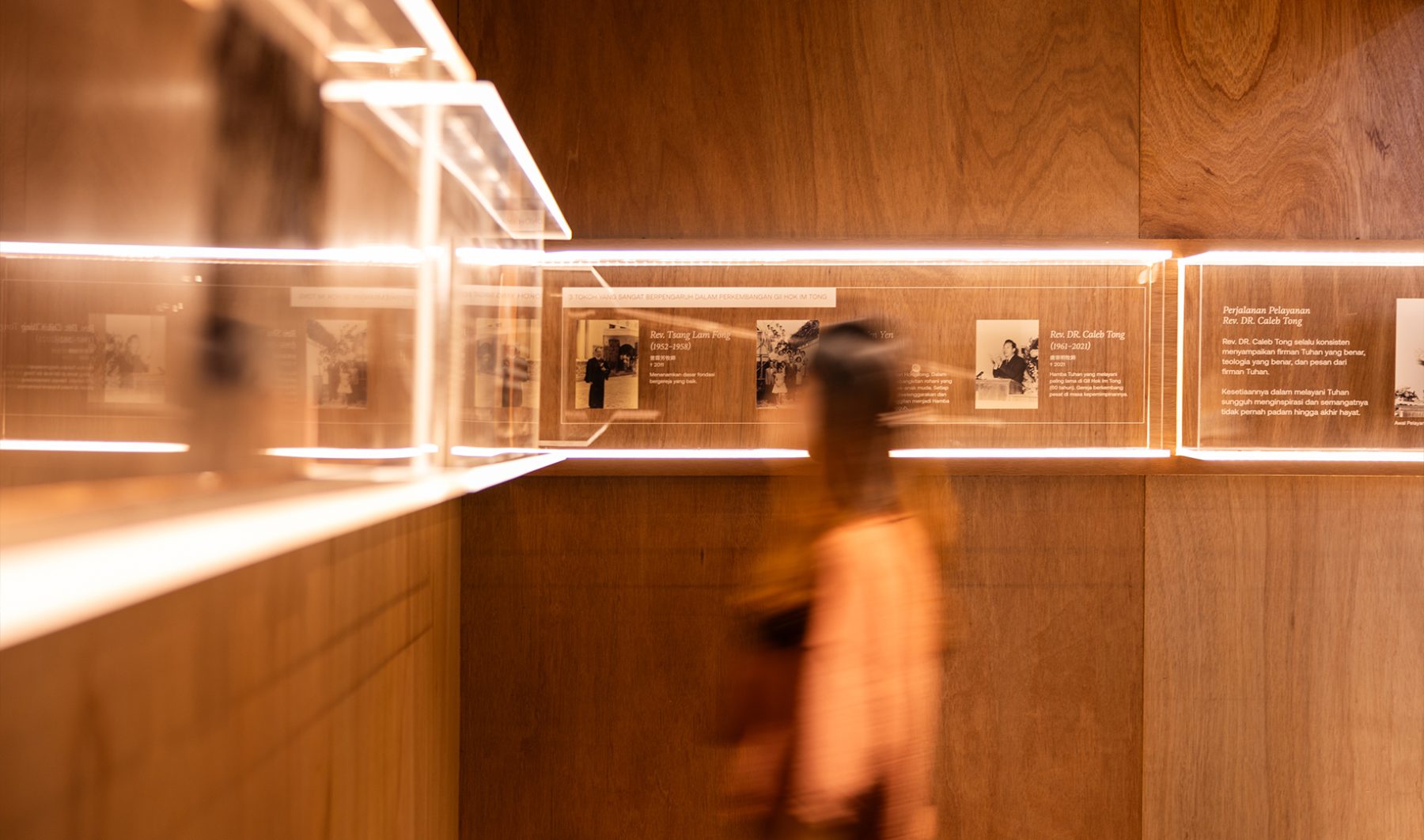
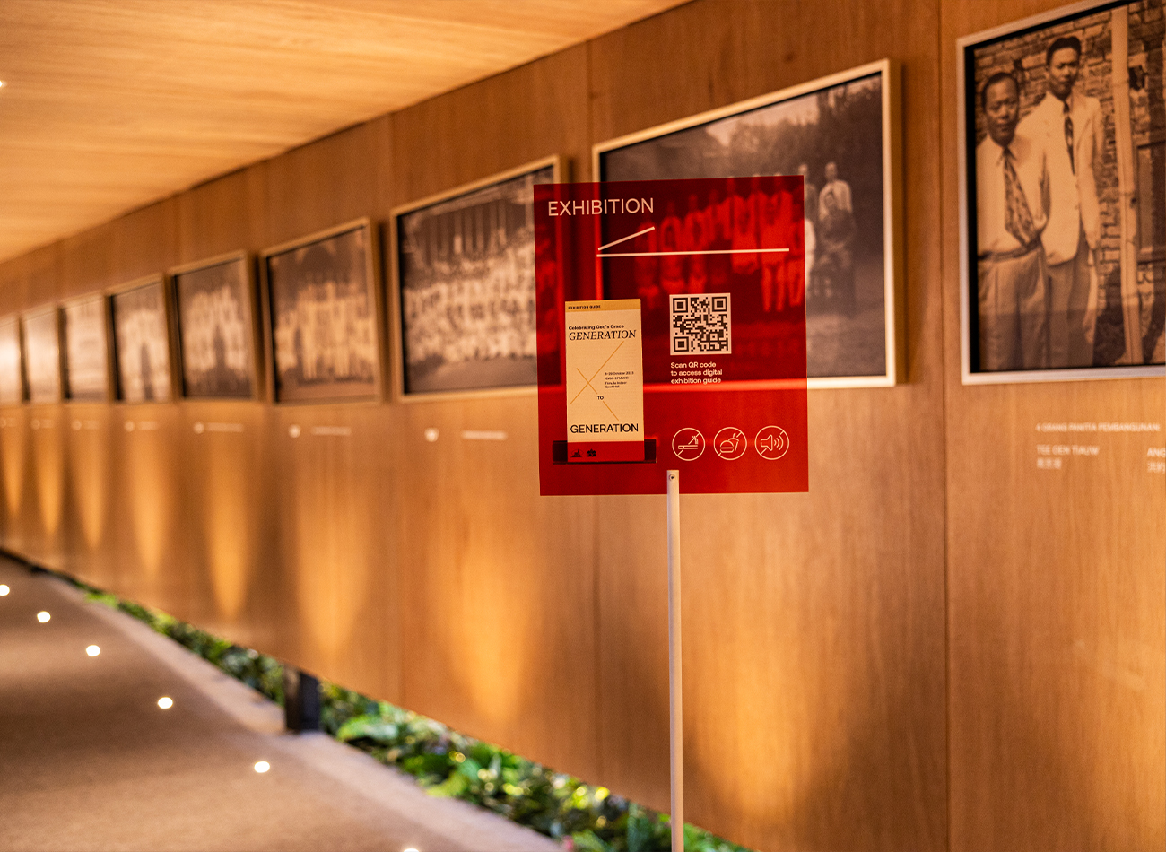
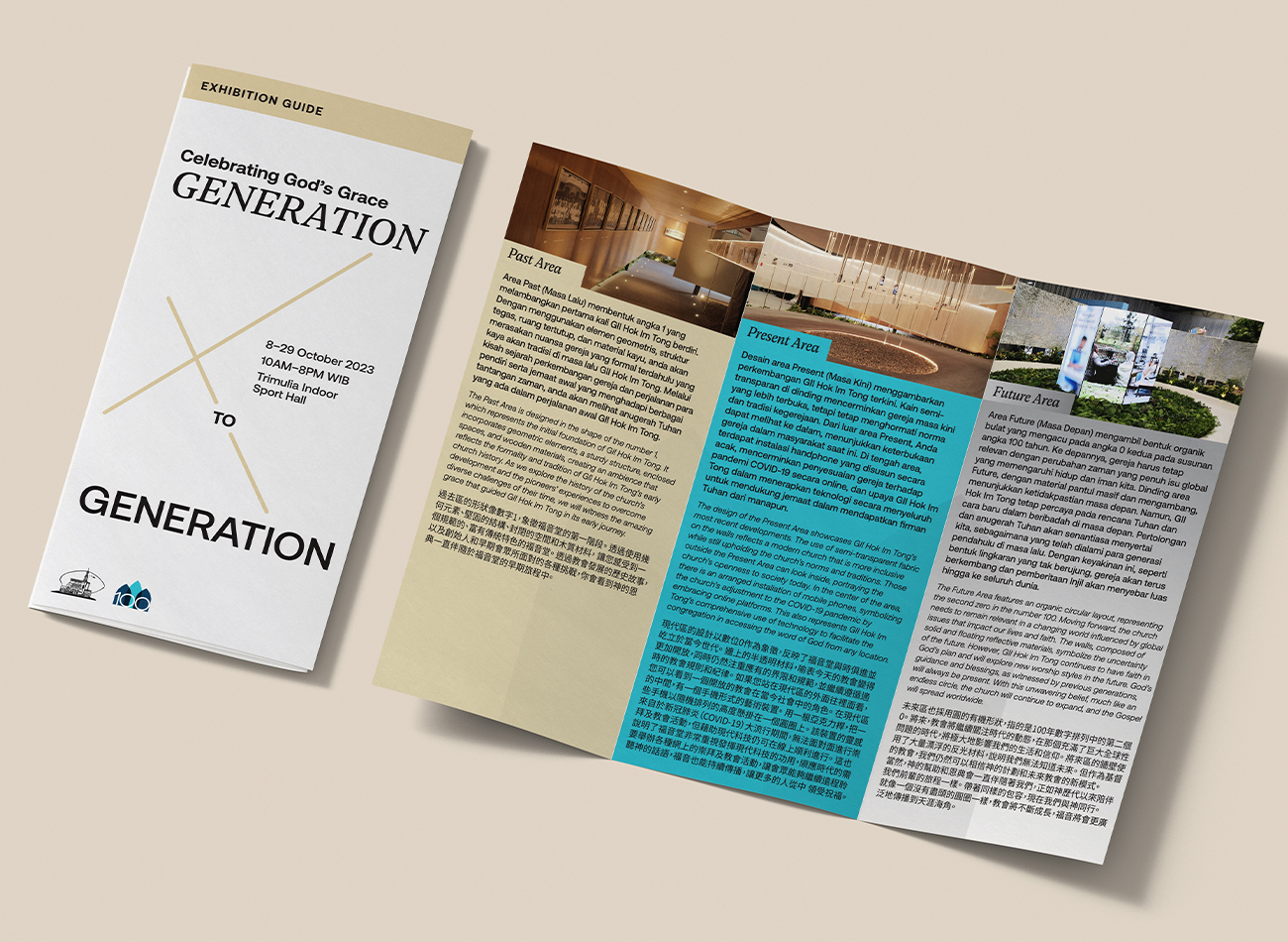
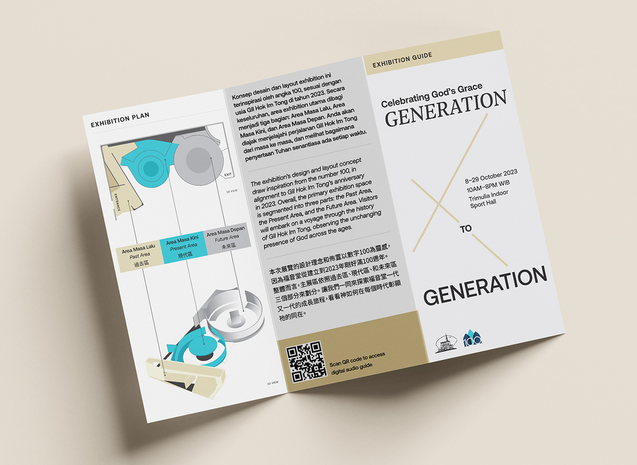
The church of Gereja Injili Indonesia (GII) Hok Im Tong in Indonesia celebrated its 100th anniversary in 2023. To commemorate the occasion, the church organized a three-week exhibition and tasked Kudos with creating the space—complete with branding, an information display and wayfinding system, and a full exhibition guide.
Our exhibition space was subdivided into three sections, representing the past, present, and future of the church. Visitors were invited to embark on a voyage through GII Hok Im Tong’s 100-year history and observe the unchanging nature of God’s grace through the ages. We presented key exhibition information on a 12-inch wall-mounted display illuminated by warm-white LED strips, which provided a thorough review of the church’s history, leaders, and activities along with a guide to the exhibition’s three sections. Ultimately, more than three thousand people visited the exhibition to take part in the church’s ongoing journey.
KUDOS Design Collaboratory
-
Andy Kurniawan
Creative Director -
Owen Febiandi
Art Director -
Imam Fadilah
Designer -
Reza Risnaldi
Designer
Bahtera Associates
-
Donny Kristianto
Architect -
Ryan Setiadi
Architect
Elway Studio
-
Alvin Yonathan
Interior & Architecture Photographer

Poster House Interactive Exhibitions
Poster House
Capabilities
Focus Area
Client
Poster House (New York City) is the first museum in the U.S. to be dedicated exclusively to posters, presenting a global view of the medium from its earliest appearances in the late 1800s to present-day uses.
We were tasked to create four interactive exhibits (three digital exhibits and one children’s area) as permanent fixtures of the museum, to be seamlessly integrated into its newly built architecture. In acknowledgement of the poster medium’s journey from oversized ink-on-paper communications to its many contemporary forms—digital, animated, interactive, generative—we ensured that all of our interactive components offered a good mix of tactile, physical, and screen-based experiences.
PHOTO BOOTH
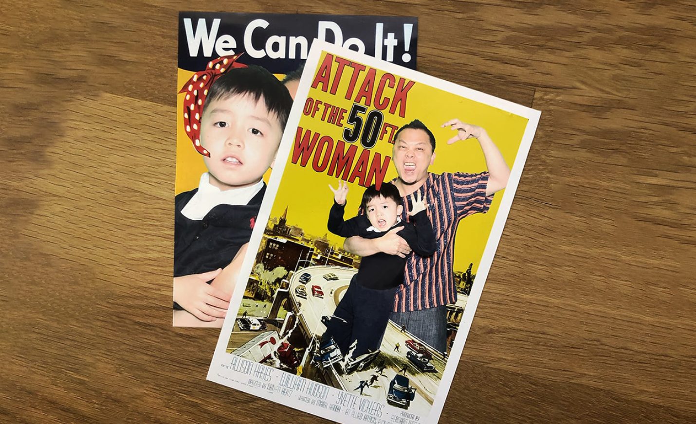
This green-screen photo booth, visible from the street and embedded into an alcove at the museum’s entrance, allows visitors to place themselves in iconic posters using a custom interface, and receive the final posters via email, text message, and print.
Since the museum’s opening 5 months ago, over 6,500 images have been texted, emailed, and printed through the highly visible photo booth.
The photo booth continues to be a big draw for passersby, with an average of 15 minutes per visitor engagement.
DIGITAL POSTER WALL
This oversized 4K screen displays a curated grid of larger-than-life posters from the collection, which are randomly enlarged periodically, or whenever a visitor presses a nearby button. Located adjacent to the ticketing counter, our digital poster wall provides a good preview of what to expect in the museum.
CHILDREN’S AREA
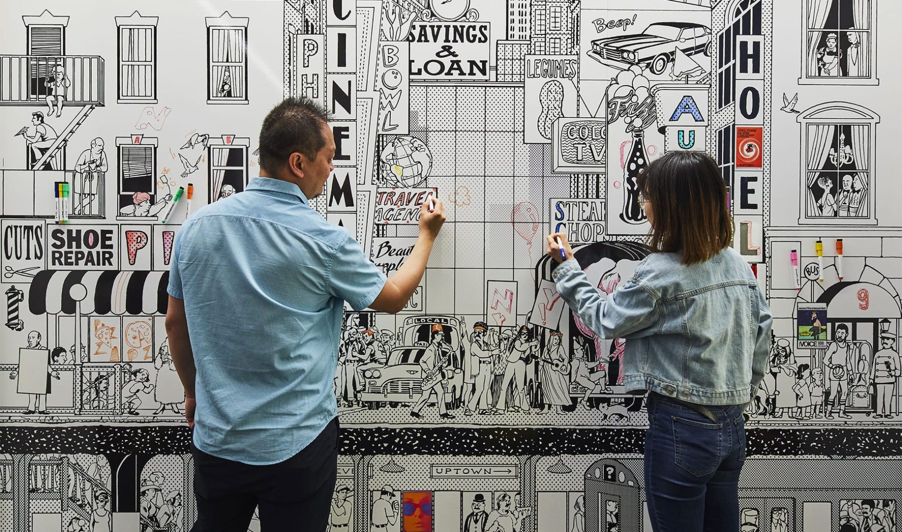
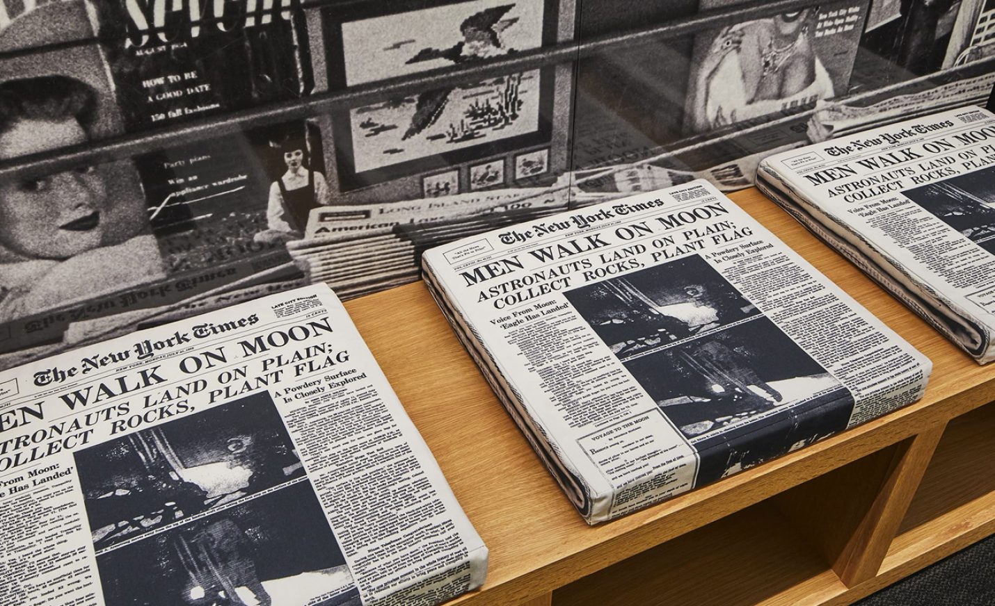
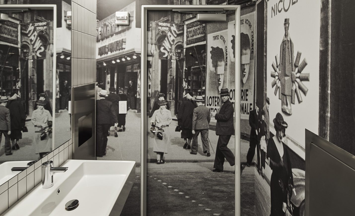
Our children’s area is a blast from the past, featuring 1960s New York City scenes. A coloring mural wall with magnetic posters, interactive vintage payphones by a newsstand, and layering stations explaining how posters are made engages an audience of all ages.
POSTER MACHINE
These tabletop interactive kiosks allow visitors to experience the poster-creation process. To design them, we deconstructed what goes through a designer’s brain to create a choose-your-own-adventure poster-design game, each step of which explains the significance and thought process behind the basic ingredients of any poster—symbols, colors, phrases, fonts, and design styles. There are three themes—Propaganda, Film, or Advertising—for which we created over 143,000 images to represent all the possible design paths one can take.
KUDOS Design Collaboratory
-
John Kudos
Creative Director -
Ashley Wu
Designer -
Sumit Paul
Designer -
Whatever
Software Developer -
Darius Wang
Animator






Fragile Legacy
Corning Museum of Glass
Capabilities
Focus Area
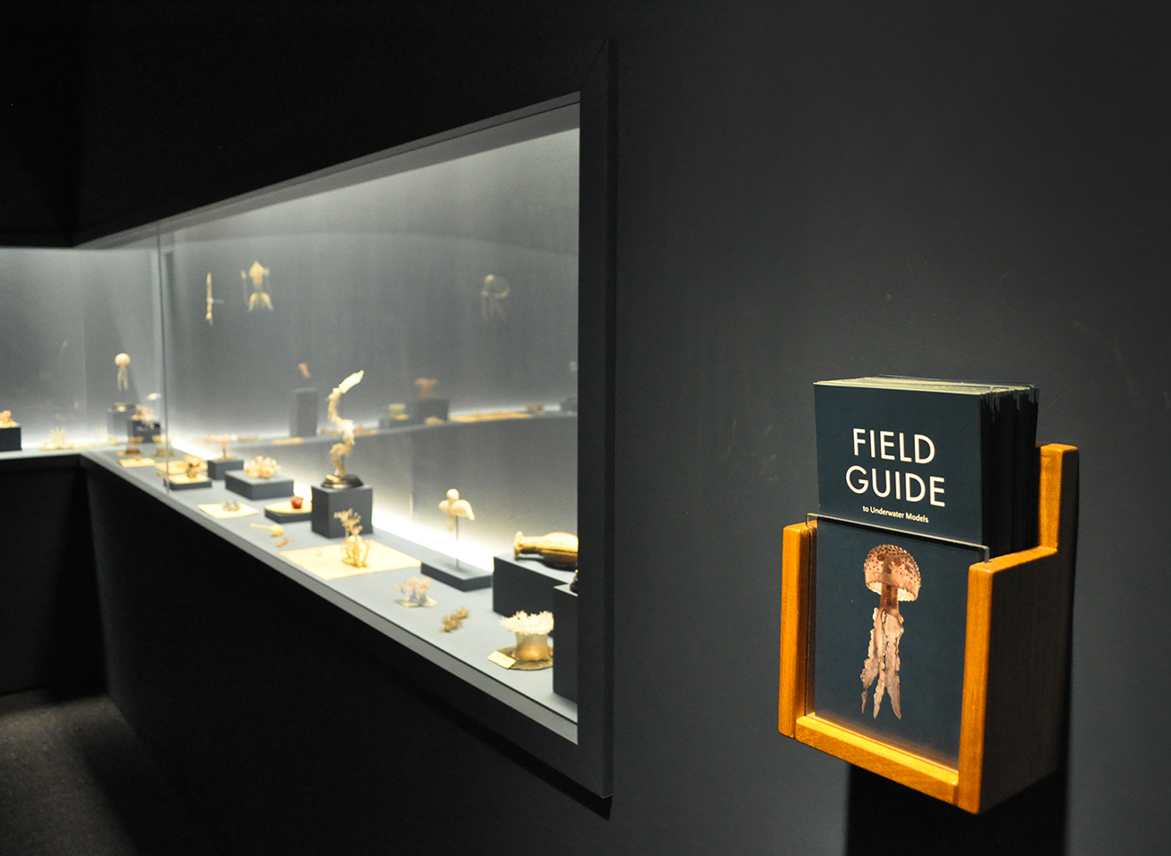
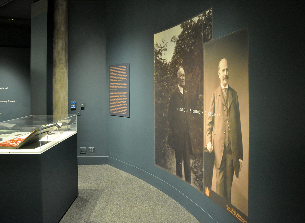
For these exhibition graphics for “Fragile Legacy” at the Corning Museum of Glass, we collaborated with Selldorf Architects and the museum’s in-house team to ensure that all graphic and text panels followed the museum’s visual theme.
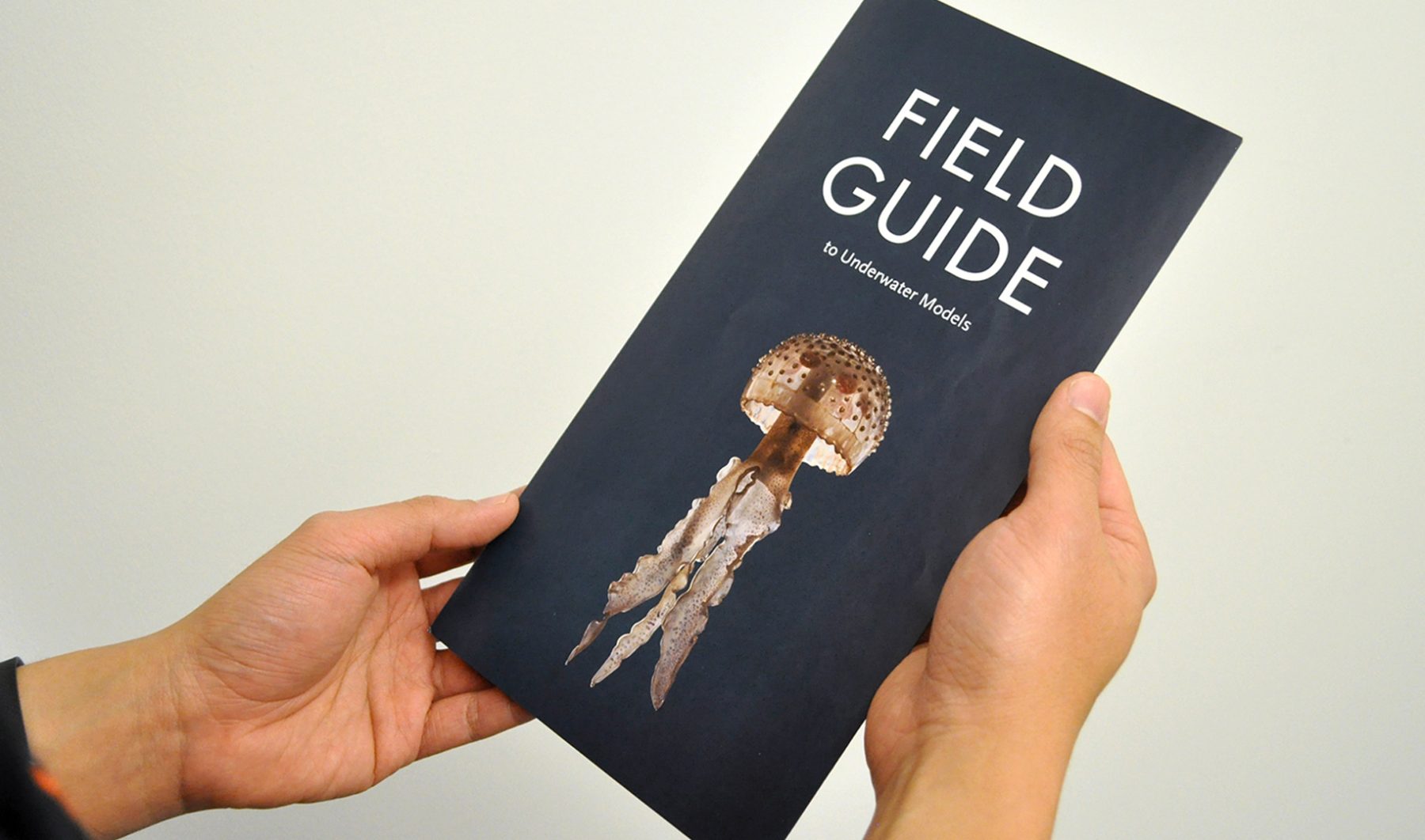
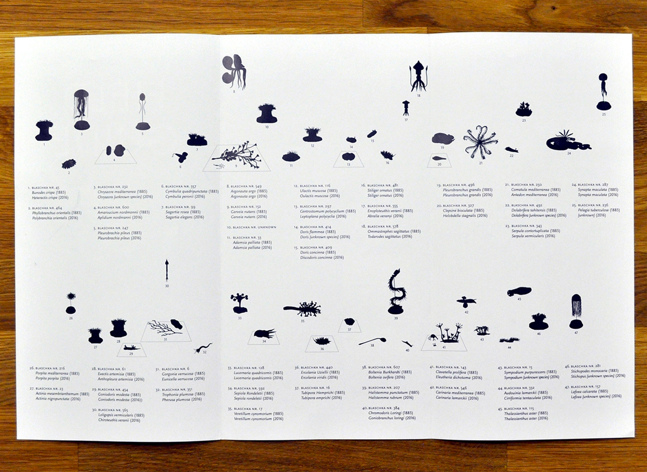
For the show’s exhibition of Blaschka marine invertebrate glass models, we combined Futura and Scala Sans typefaces to create a classic-modern underlying tone, starting with the oversized typography on the title wall. A “field guide” trifold brochure provided detailed information on displayed objects, eliminating the usual clutter of text labels.
KUDOS Design Collaboratory
-
John Kudos
Creative Director
Selldorf Architects
-
Lisa Green
Partner in charge
TDC62 Traveling Exhibition, Jakarta
Type Directors Club
Capabilities
Client
Awards
-
HOW 2017 International Design Awards
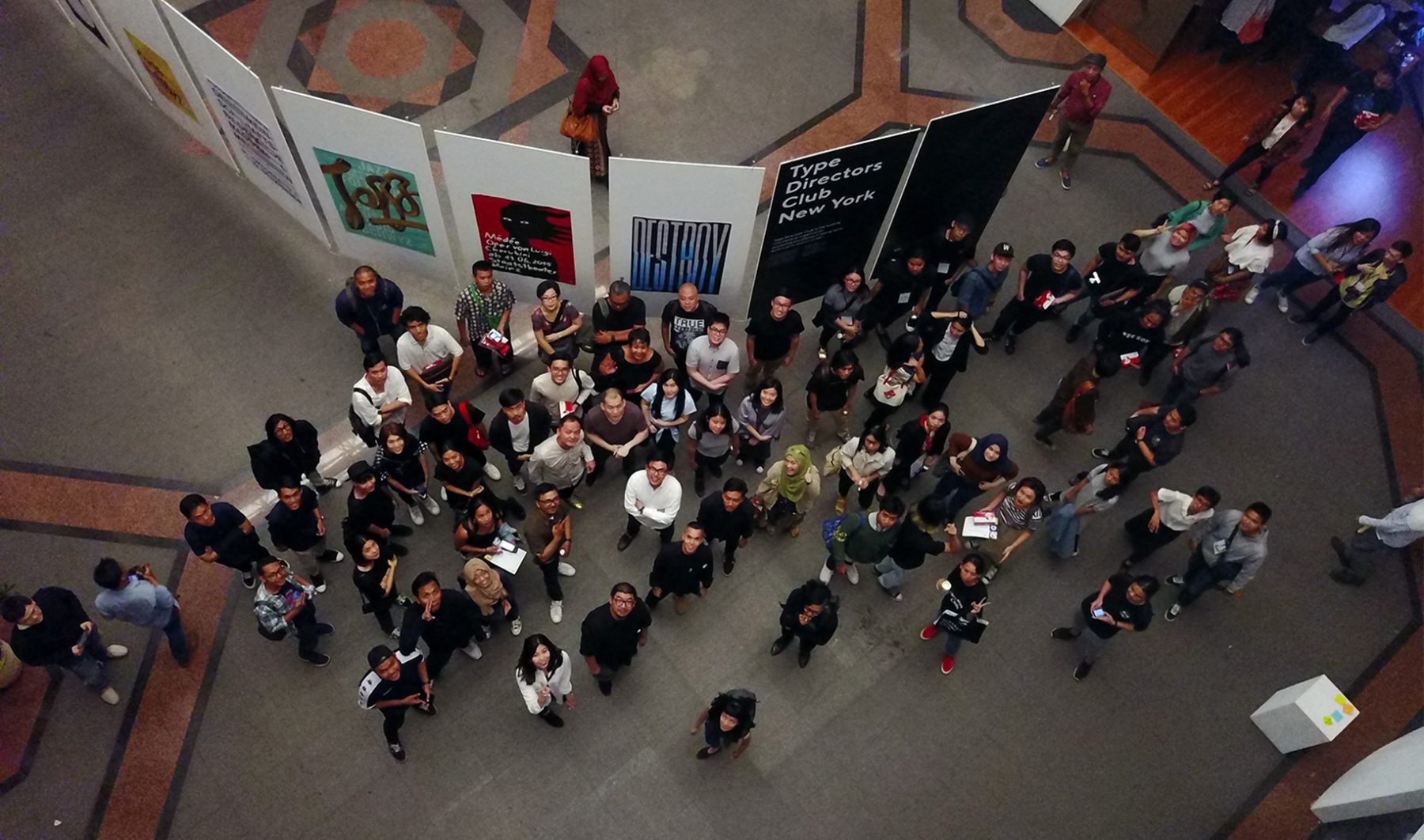
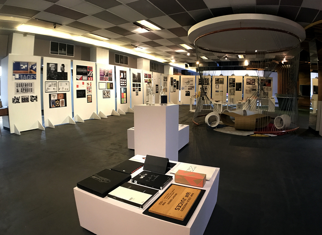
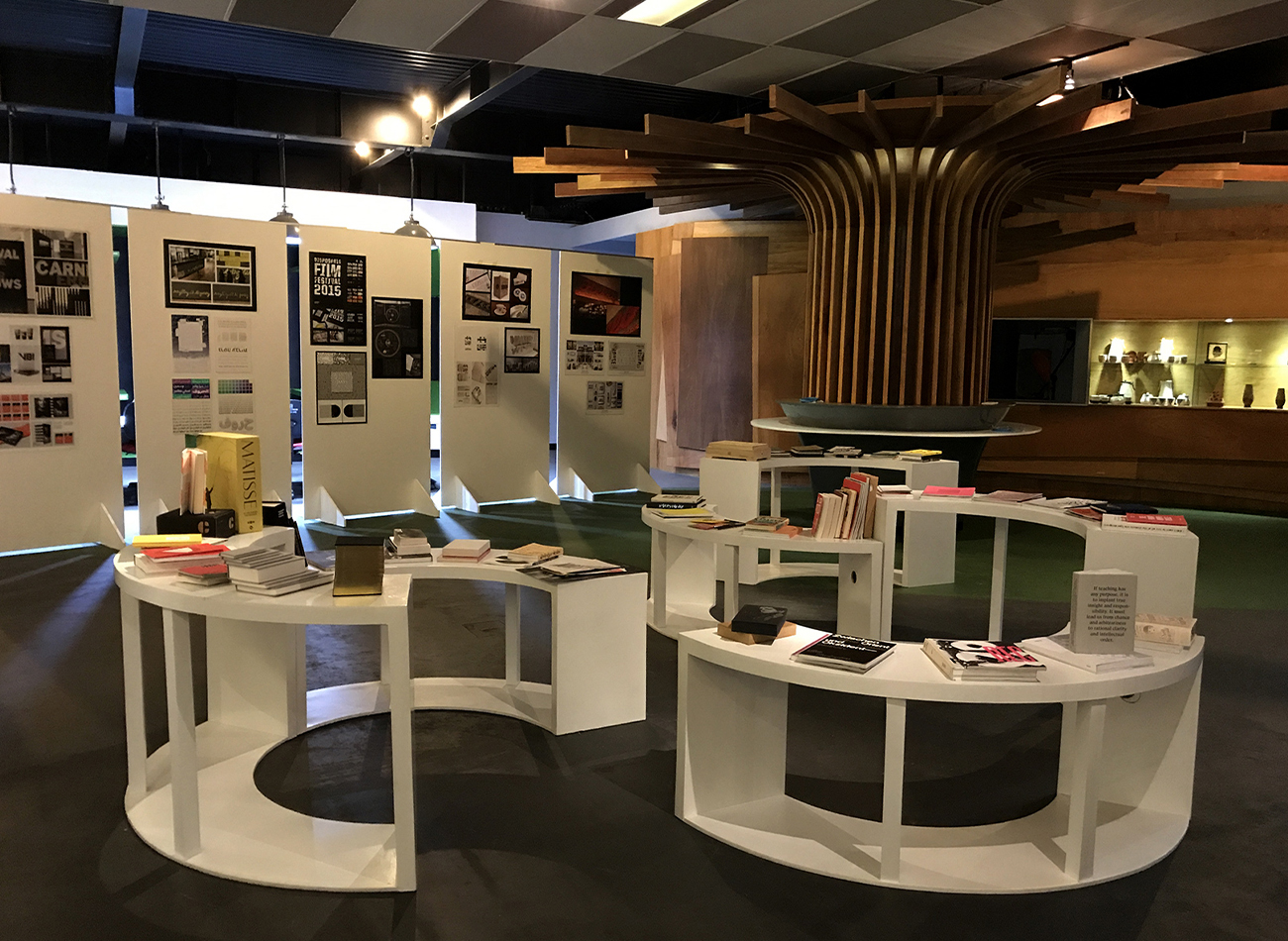
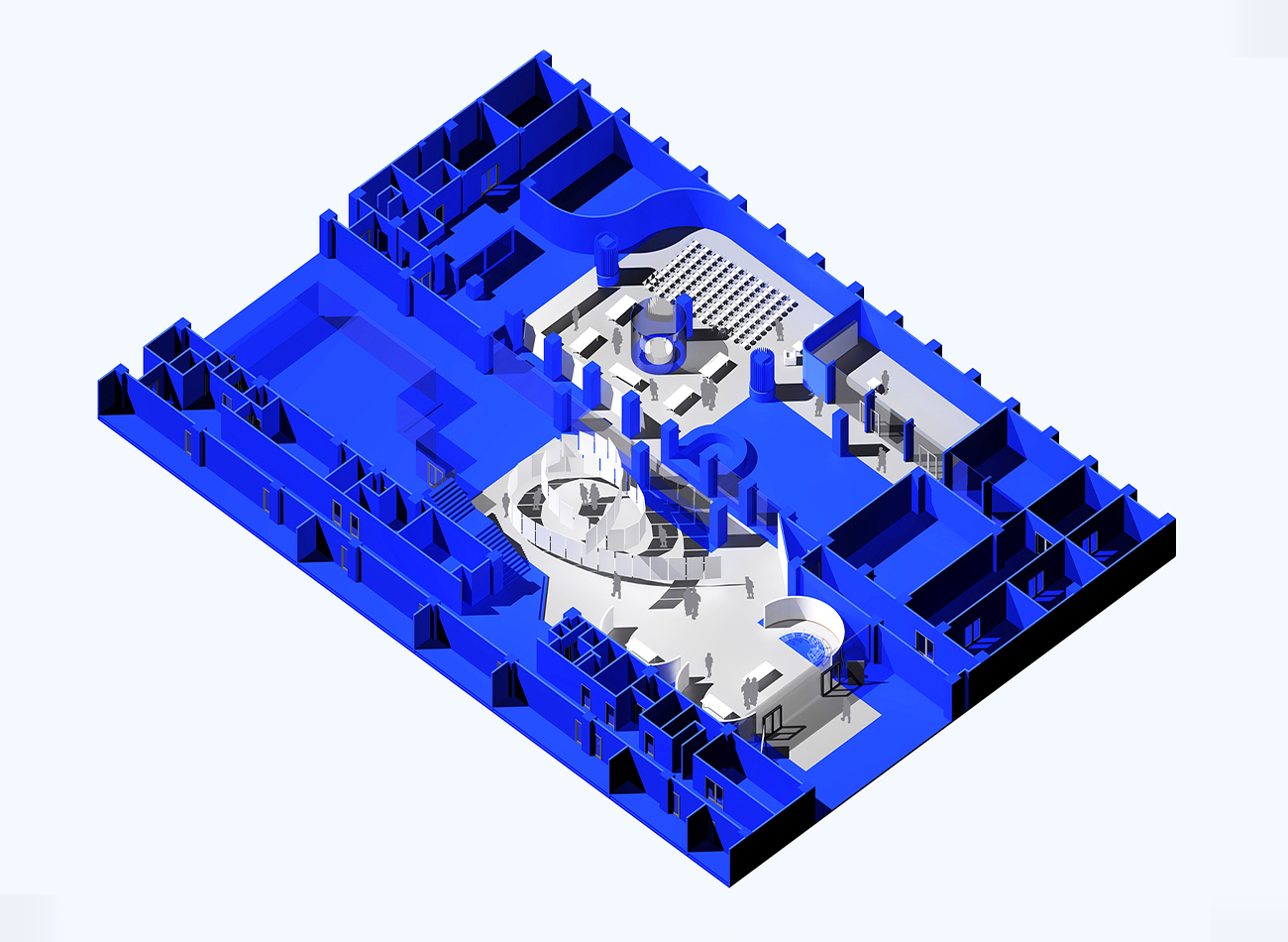
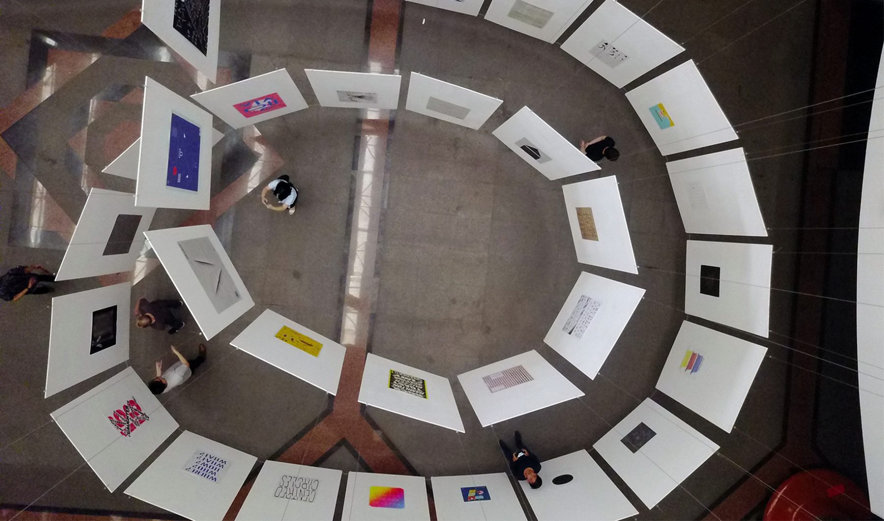
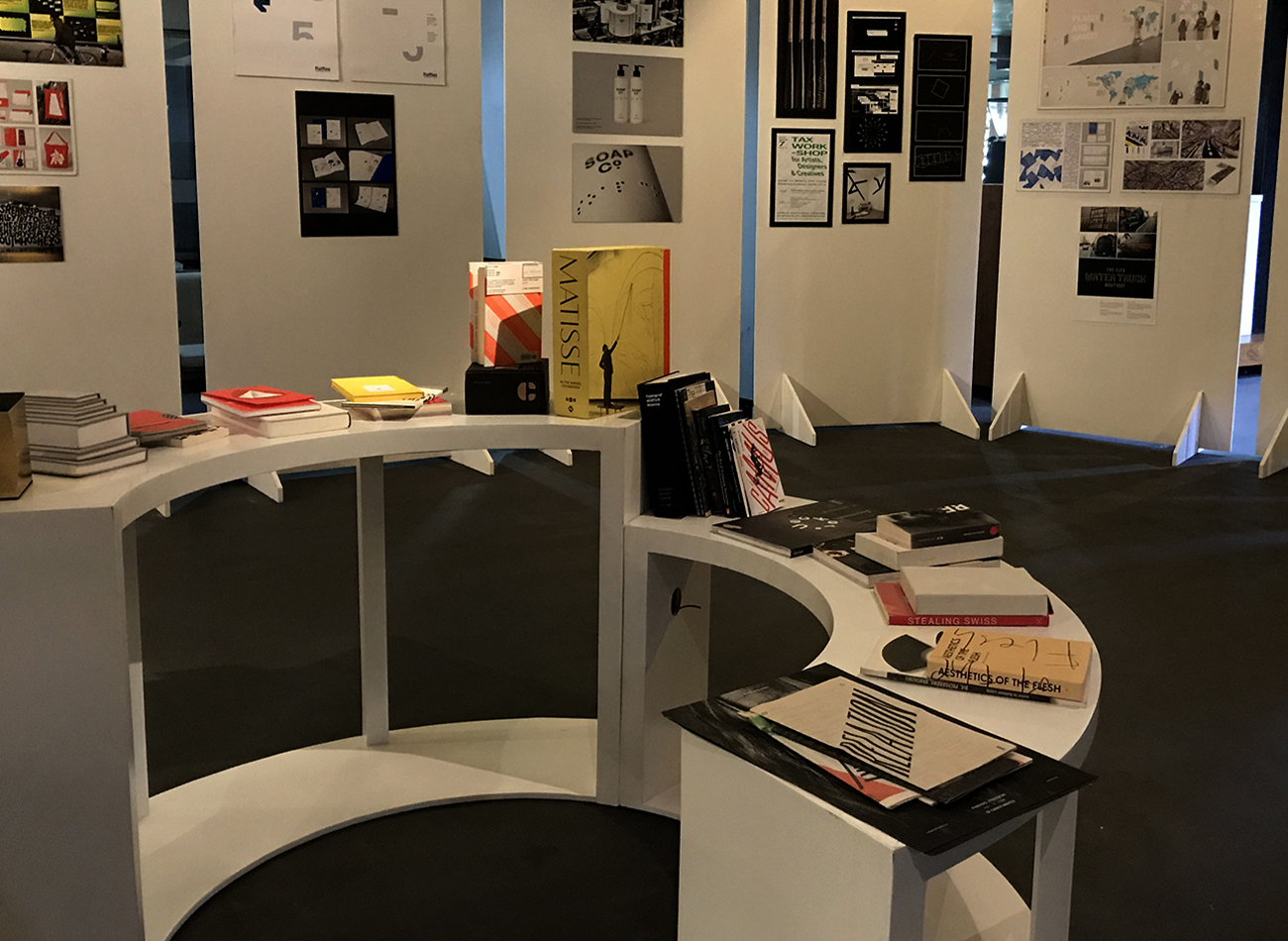
The Type Directors Club in New York produced a traveling exhibition showcasing over 400 winners of its 2016 annual competition, which highlighted the best of the best in typographic work in both communication and typeface design from studios and individuals internationally. After visiting many cities in the U.S., France, Germany, Spain, China, Taiwan, Japan, Thailand, and Vietnam, the exhibition traveled to Jakarta, Indonesia, where it was on view from August 12 to September 7, 2017, at the Indonesian Design Development Center (IDDC). Design and typography lectures were held at this venue during the exhibit. In partnership with the IDDC and Asosiasi Design Grafis Indonesia (ADGI), Kudos was tasked with developing design graphics for the traveling exhibition.
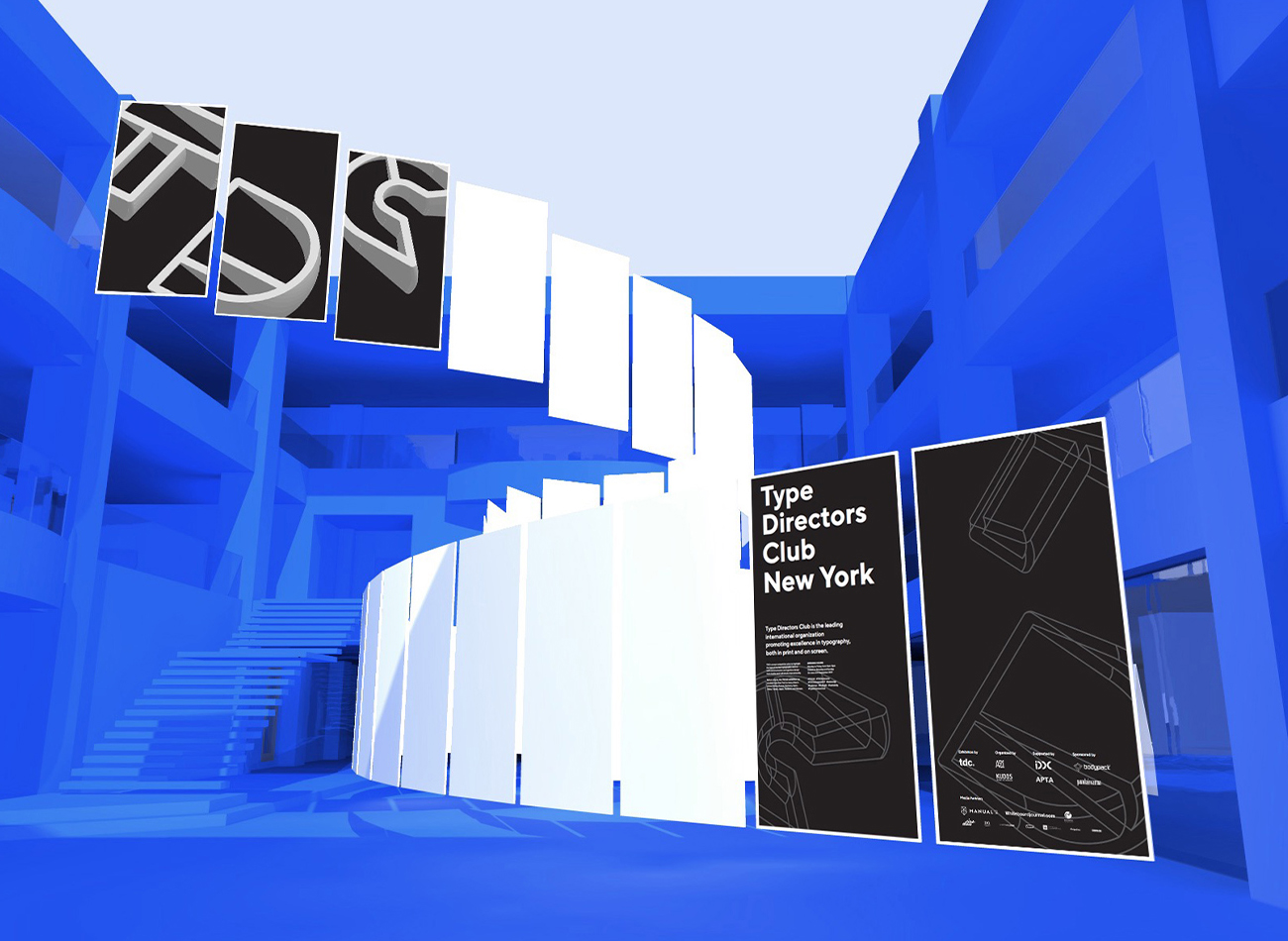
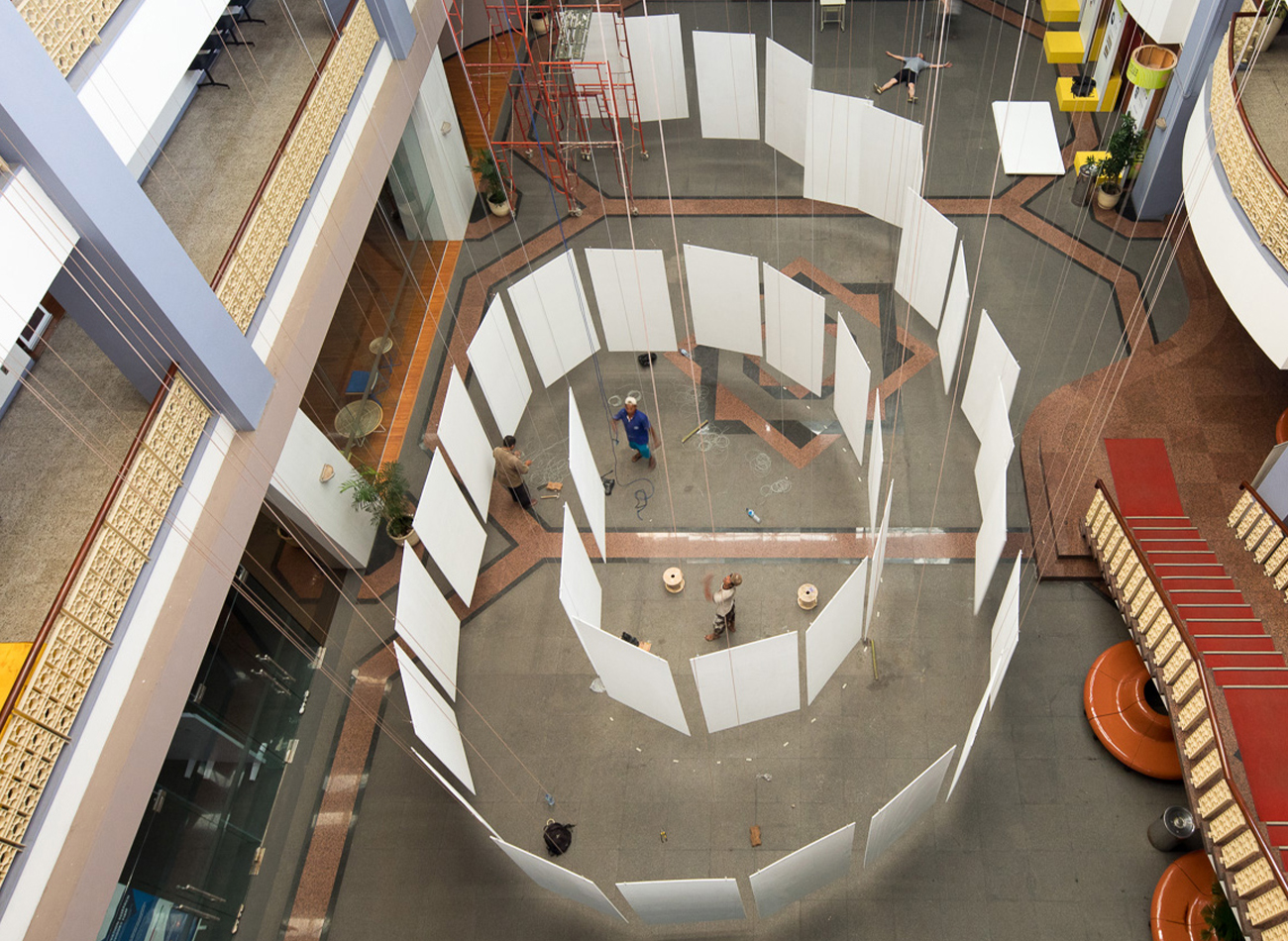
We designed 3D graphics for the exhibition by revolving T-D-C letterforms in sequential angles and floating them in space. These graphics were then applied to all aspects of marketing communications. For the exhibit space, we collaborated with APTA to design spiraling poster panels to be suspended in space.
KUDOS Design Collaboratory
-
John Kudos
Creative Director -
Andy kurniawan
Art Director -
Ilham Muhamad Firdaus
Designer -
Fahmi Maulana Fajar
Designer
Type Directors Club
Between Four Freedoms
Four Freedoms Park Conservancy
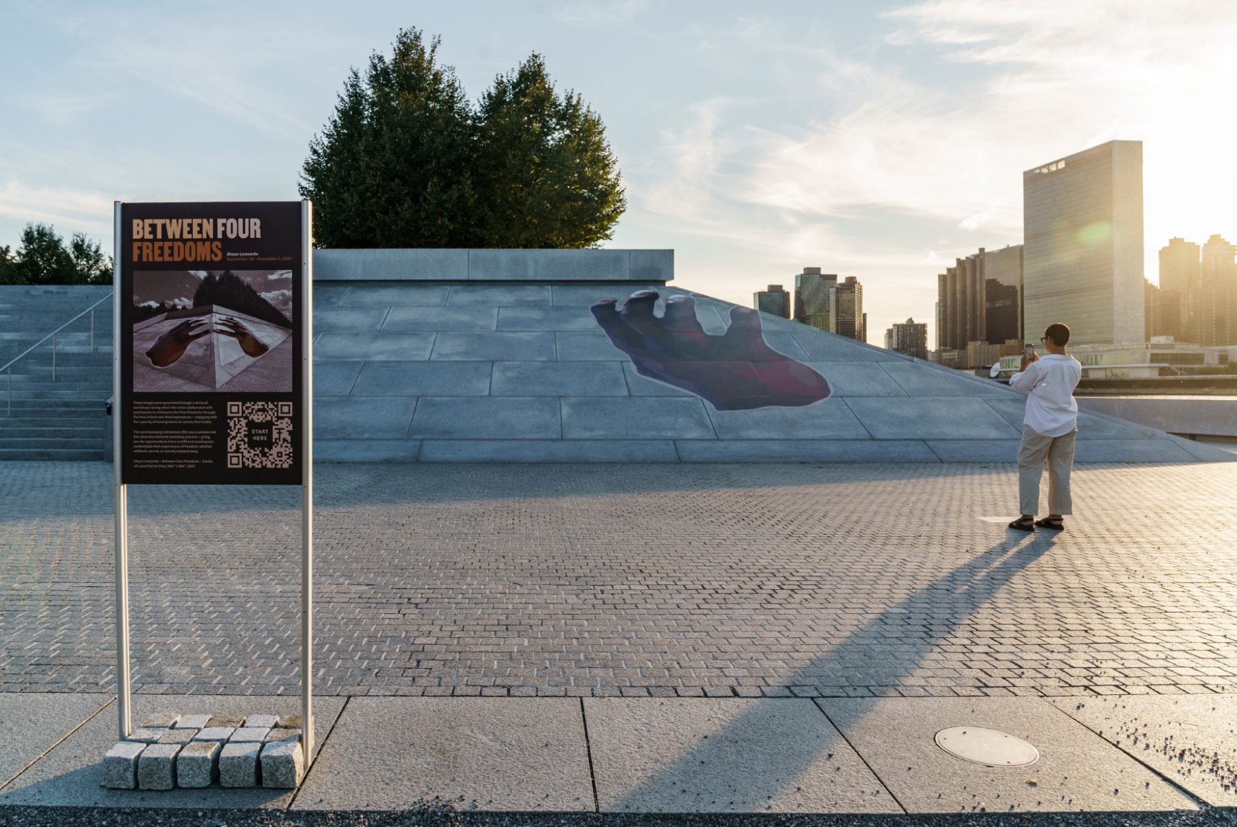
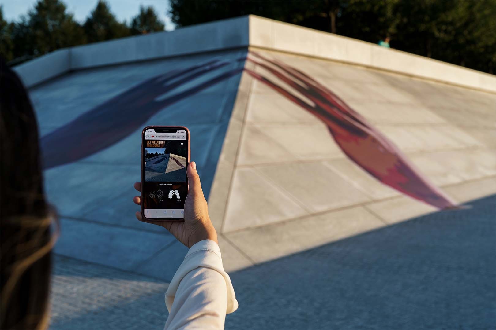
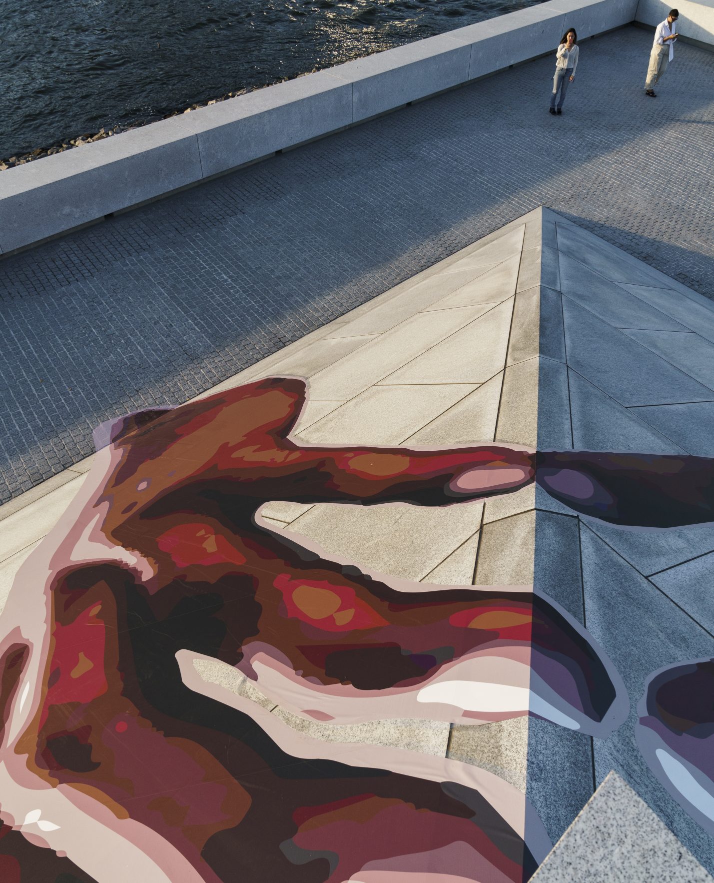
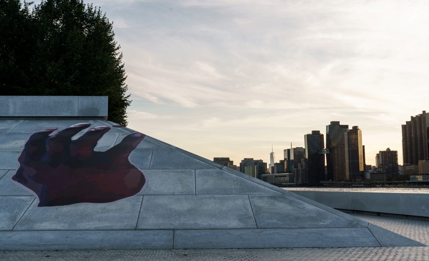
Artist Shaun Leonardo’s 2021 outdoor installation “Between Four Freedoms” reinterpreted and celebrated Franklin D. Roosevelt’s seminal 1941 address calling for freedom of worship, freedom of speech, freedom from want, and freedom from fear. The interactive experience for the installation at Franklin D. Roosevelt Four Freedoms State Park redefines public engagement with art and social discourse.
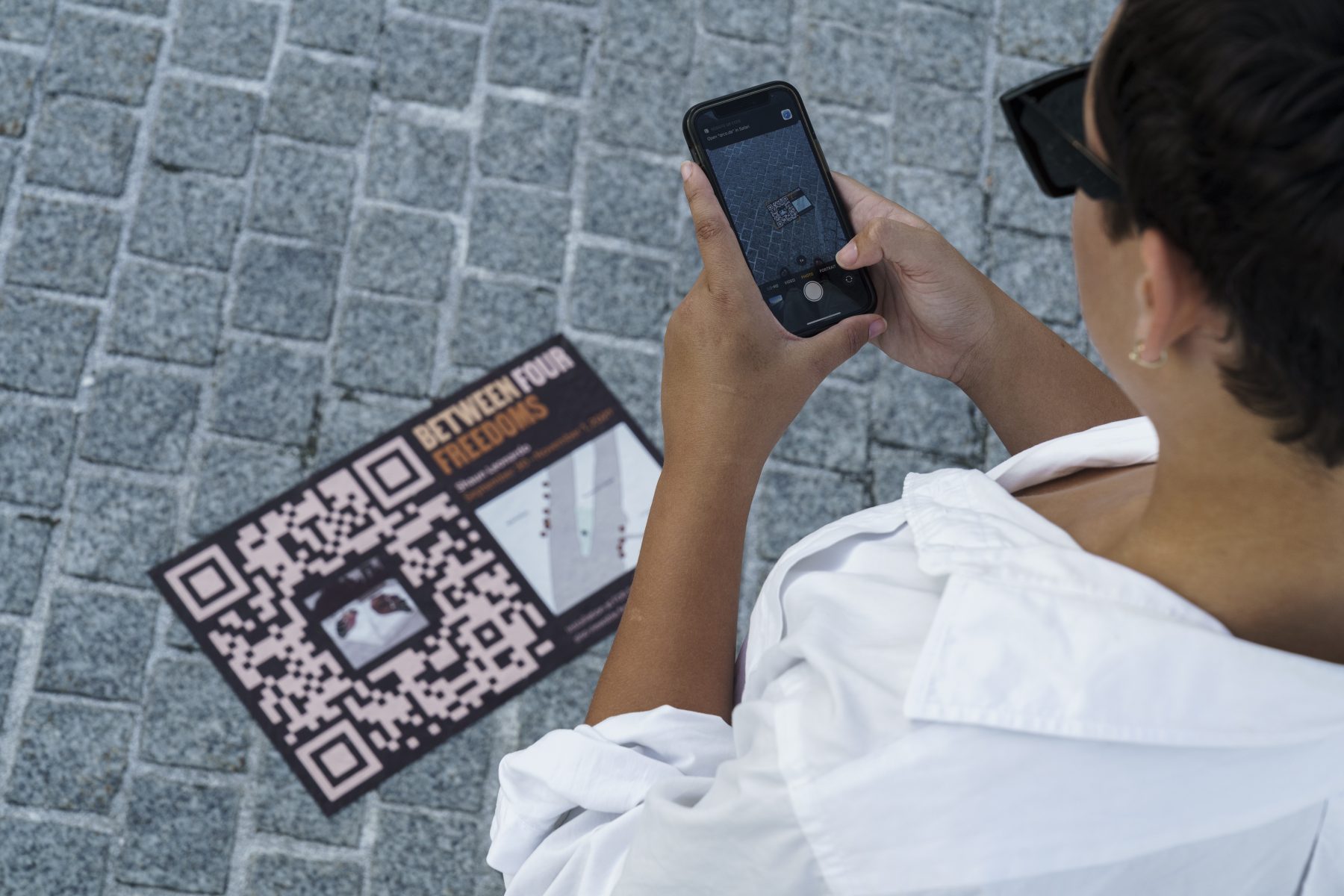
Guided by Leonardo’s vision, our branding mirrors the project’s ethos, employing a brown color scheme evocative of human skin tones and the “Martin” typeface, inspired by the Memphis Sanitation Strike of 1968, to represent a message of non-violence and inclusivity. Leveraging innovative technology such as image recognition, we enabled visitors to engage with the artwork by scanning QR codes, launching the mobile website, and exploring workshop videos led by Leonardo. With over 25,000 images collected, the installation ensured accessibility and interactivity on both the Manhattan and Long Island City sides, inviting visitors to delve into the narratives of vulnerable communities and rediscover Roosevelt’s timeless call for freedom and dignity.
KUDOS Design Collaboratory
-
John Kudos
Creative Director -
Fay Qiu
Designer -
Christyan Junaedi Setiawan
Web Developer -
Imam Fadilah
Animator
#CombatCovid Poster
Poster House
Capabilities
Focus Area
Client
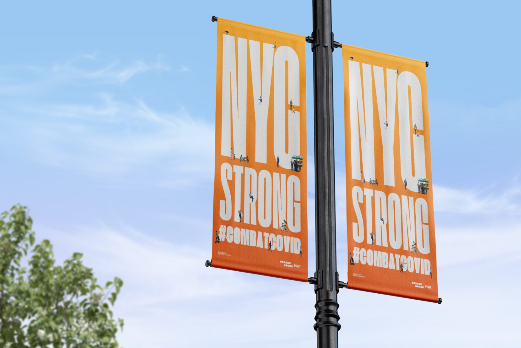
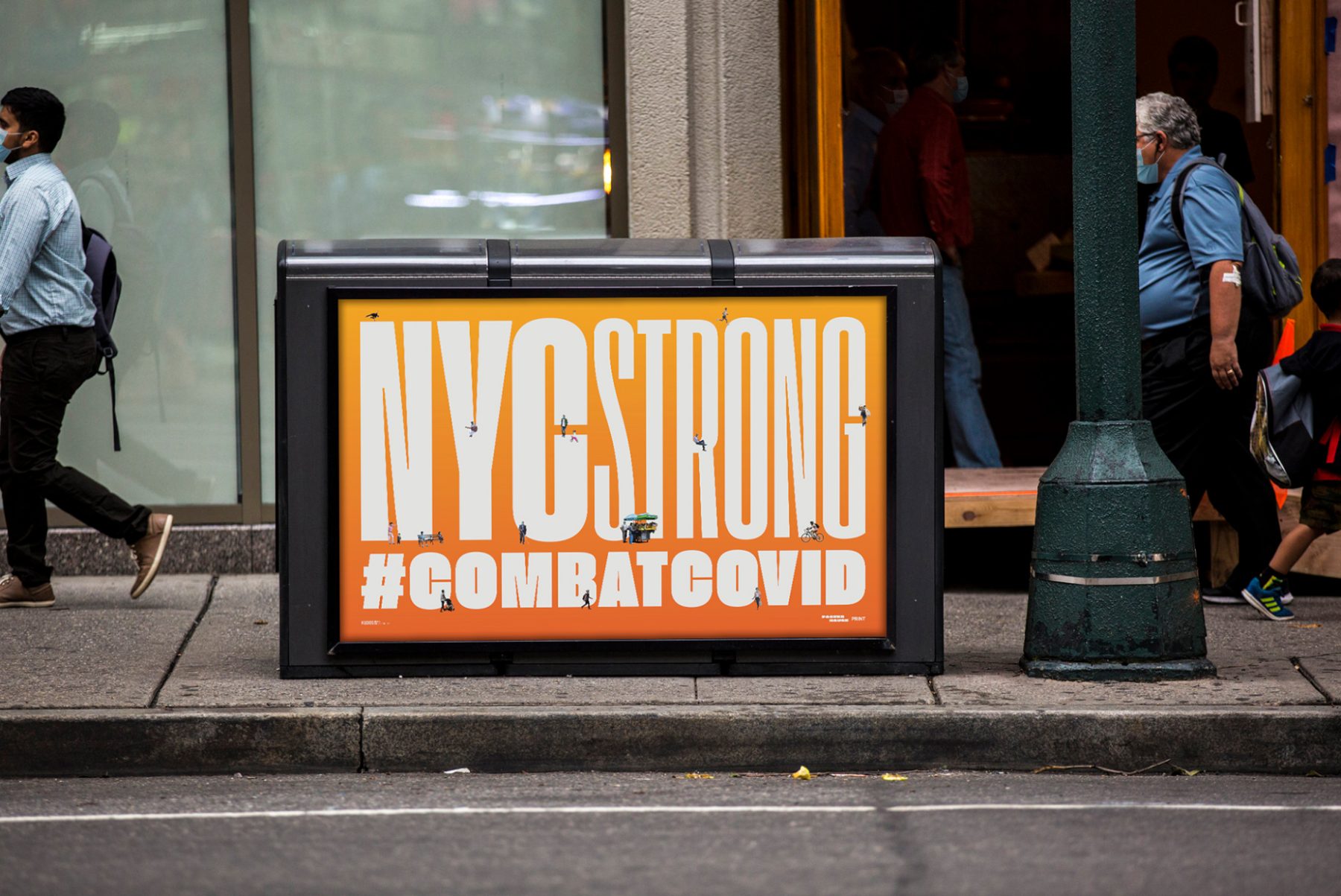
At the height of the COVID-19 pandemic in New York, Poster House teamed up with PRINT magazine, Times Square Arts, and For Freedoms to launch a citywide public art campaign featuring PSAs and messages of love, gratitude, and solidarity with New York City’s frontline workers.
For this project, we produced uplifting poster designs around the theme of “New York Strong.” These can now be found throughout New York City on nearly 1,800 digital screens and billboards, thanks to partnerships with LinkNYC, JCDecaux, Silvercast, Pearl Media, and Times Square Arts.
KUDOS Design Collaboratory
-
John Kudos
Creative Director -
Ashley Wu
Designer -
Giovanni Adrian Sitepu
Animator

Power of Science
The Phillip and Patricia Frost Museum of Science
Focus Area
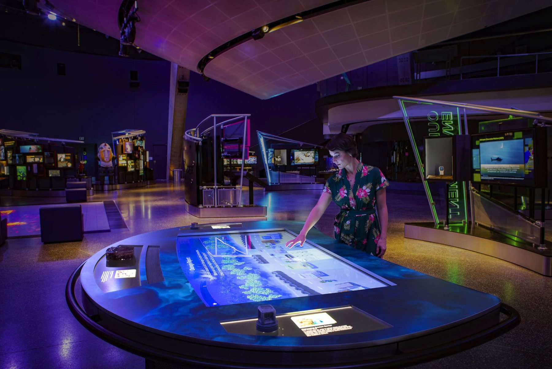
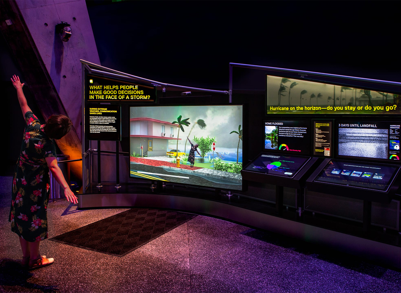
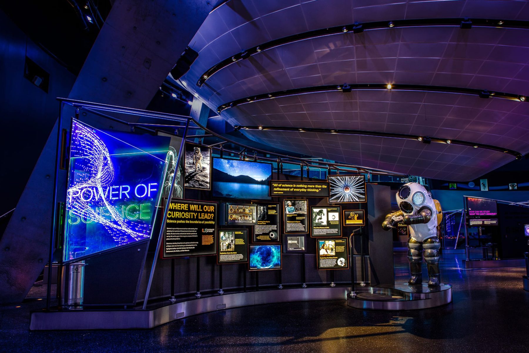
The “Power of Science” exhibition, now on view at the Frost Museum in Miami, Florida, invites visitors to explore how science pushes the boundaries of possibility as they learn about groundbreaking scientific research and discoveries. The exhibit is a playground for curious minds, filled with tangible and digital experiences spanning a 6,000-square-foot area.
We worked with Squint/Opera to develop user flows and UX/UI components for various gamified exhibits in the exhibit’s Environment section, including:
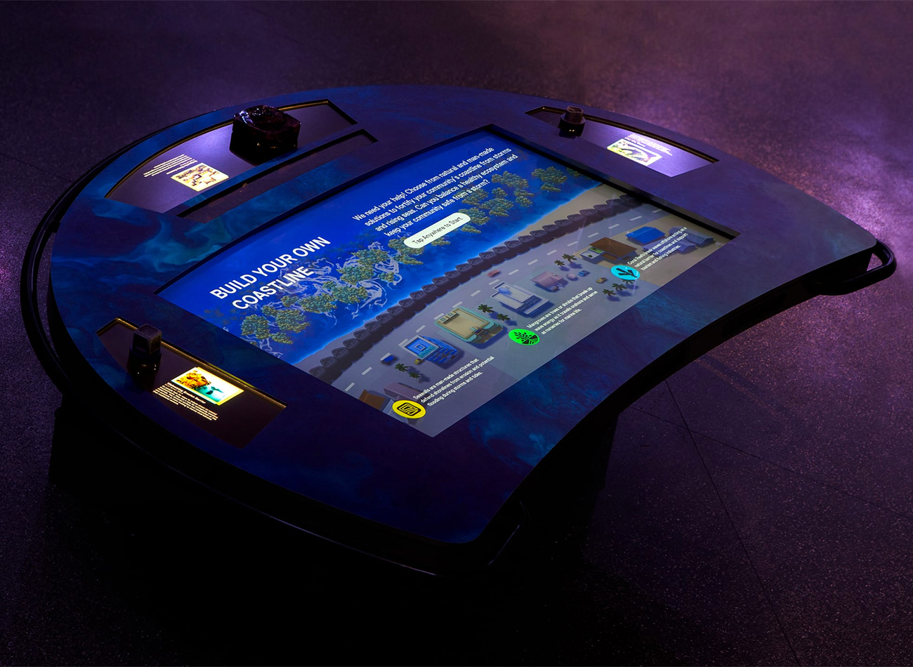
BUILD YOUR OWN COASTLINE
This activity engages up to three players in building natural and man-made infrastructures on shorelines to help against natural disasters.
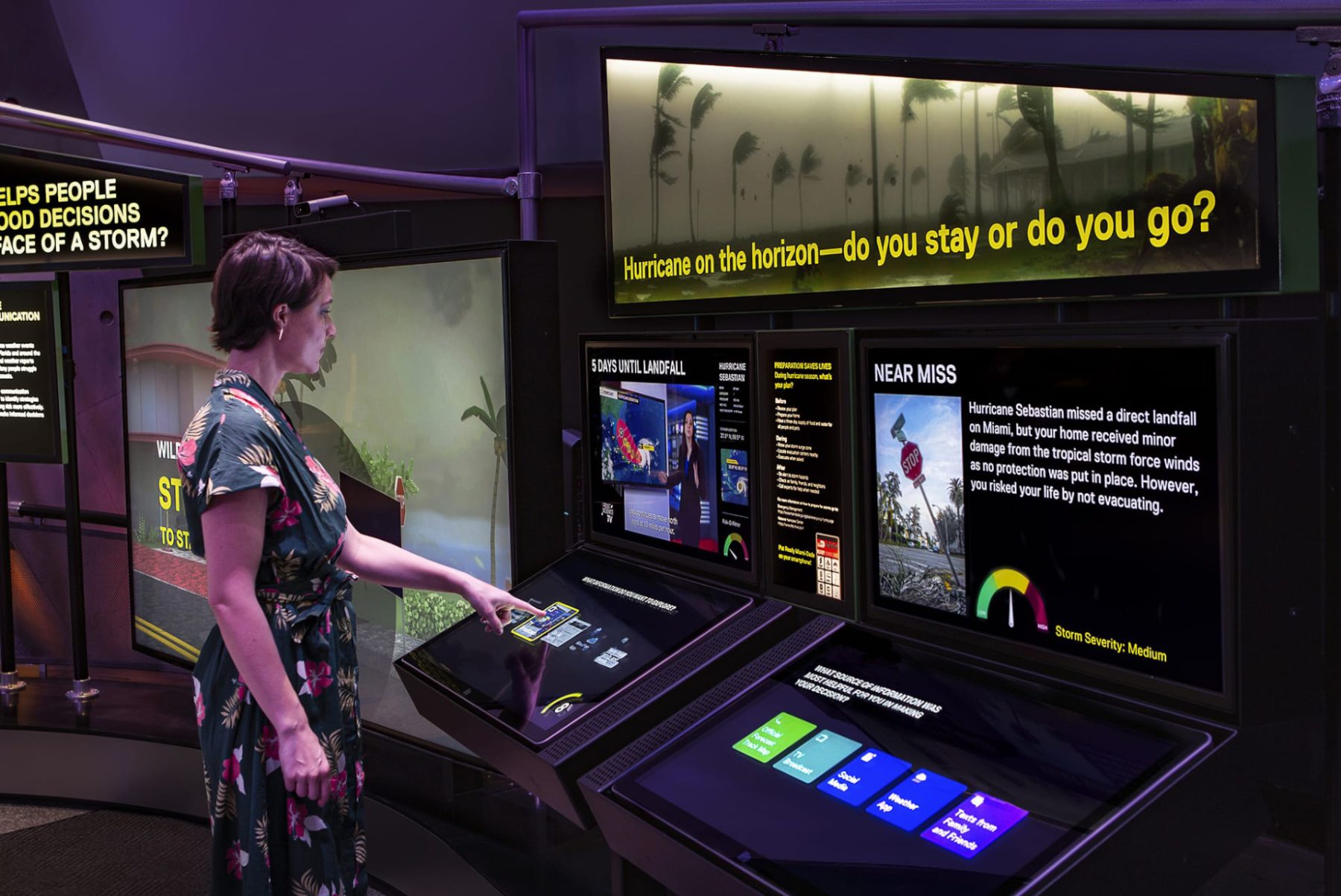
HURRICANE HINDSIGHT
This dual-screen game explores how we measure the risk of hurricanes, and whether it’s safer to stay or evacuate—a topic of great importance in Florida.
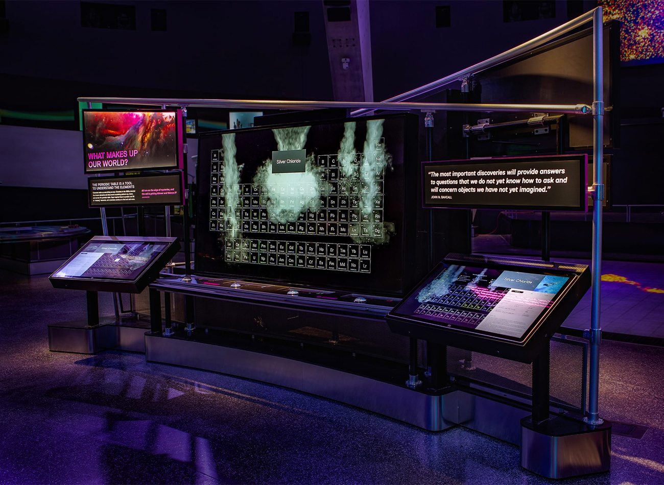
PERIODIC TABLE
This two-player station allows in-depth study of the periodic elements, enabling the discovery of chemical reactions when the right elements are combined by both players.
RAMP ANIMATIONS
These animated narratives on transparent LEDs reveal related artifacts behind their glass display case.
The Power of Science is on view at Frost Museum of Science in Miami, Florida.
Exhibit Team
-
Thinc Design
Lead Exhibition Design -
Squint/Opera
Lead Digital Media -
KUDOS Design Collaboratory
UX/UI Design -
Kubik Maltbie
Fabrication & Hardware
KUDOS Design Collaboratory
-
John Kudos
Creative Director -
Sumit Paul
UX/UI Designer -
Ashley Wu
UX/UI Designer
Pen+Brush: Domesticity Revisited
Pen+Brush
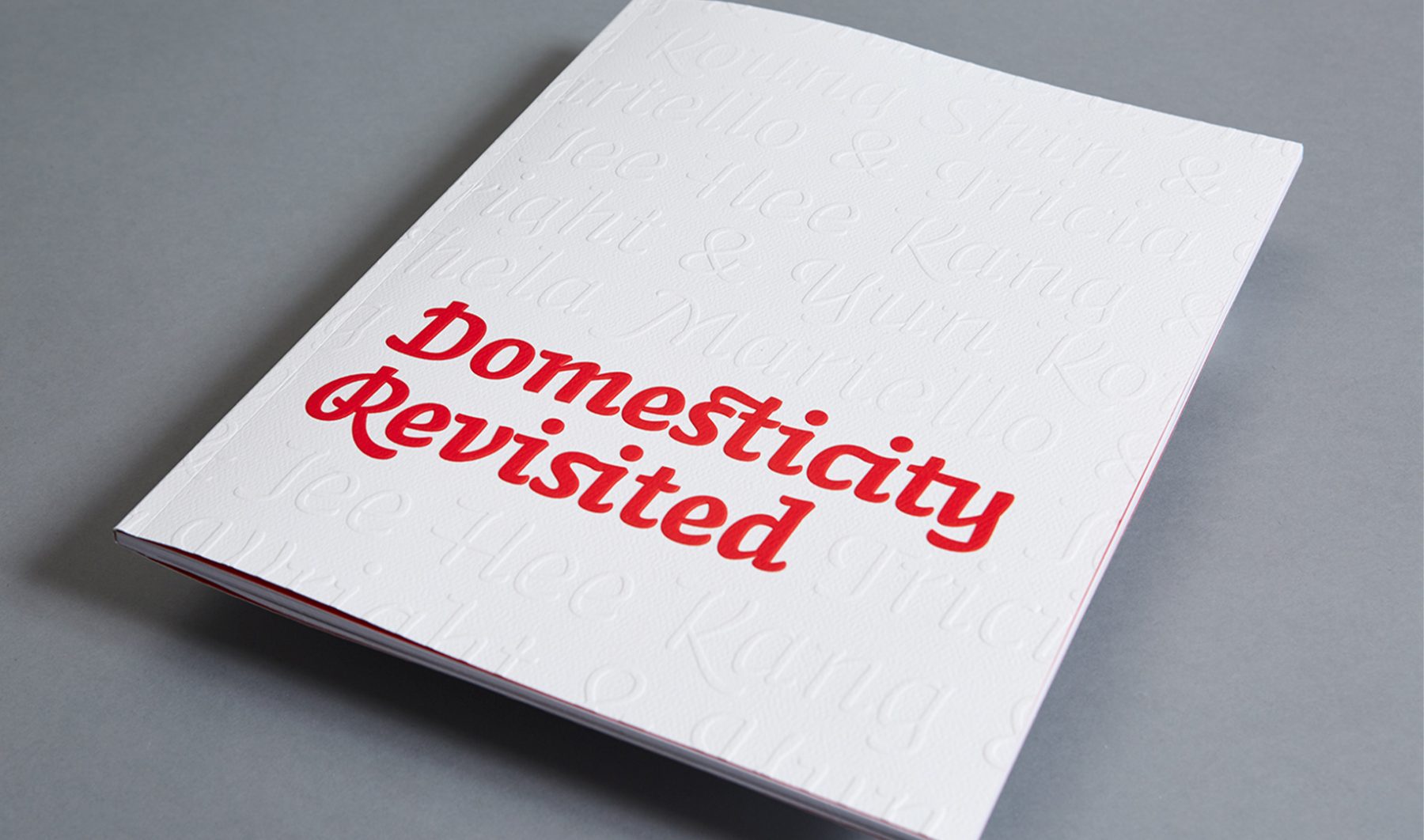
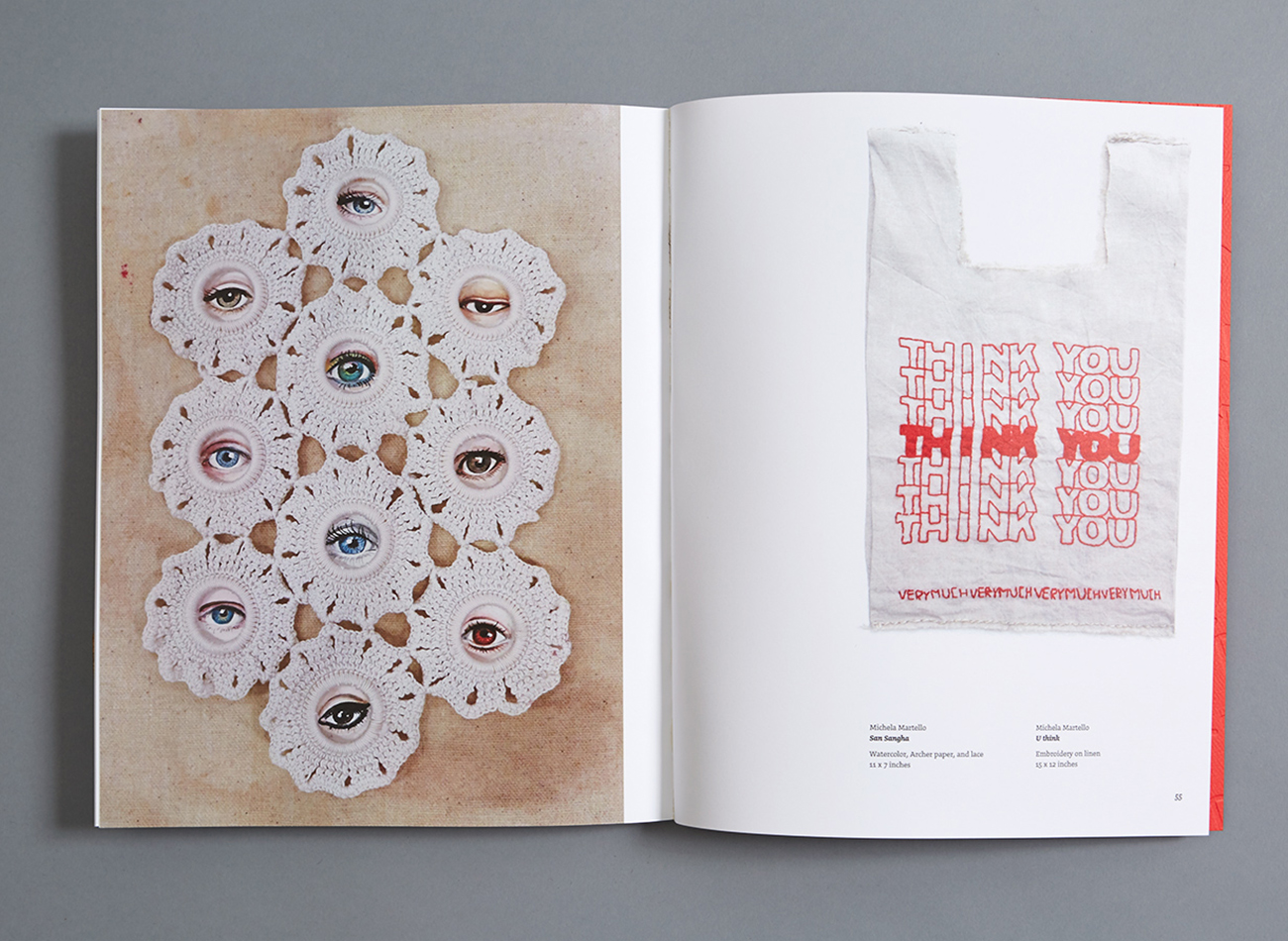
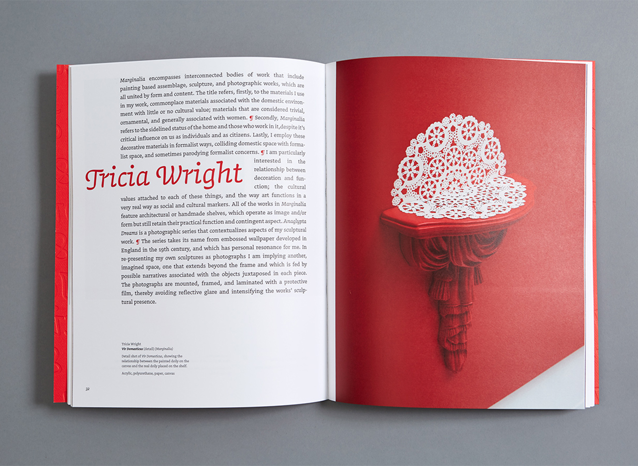
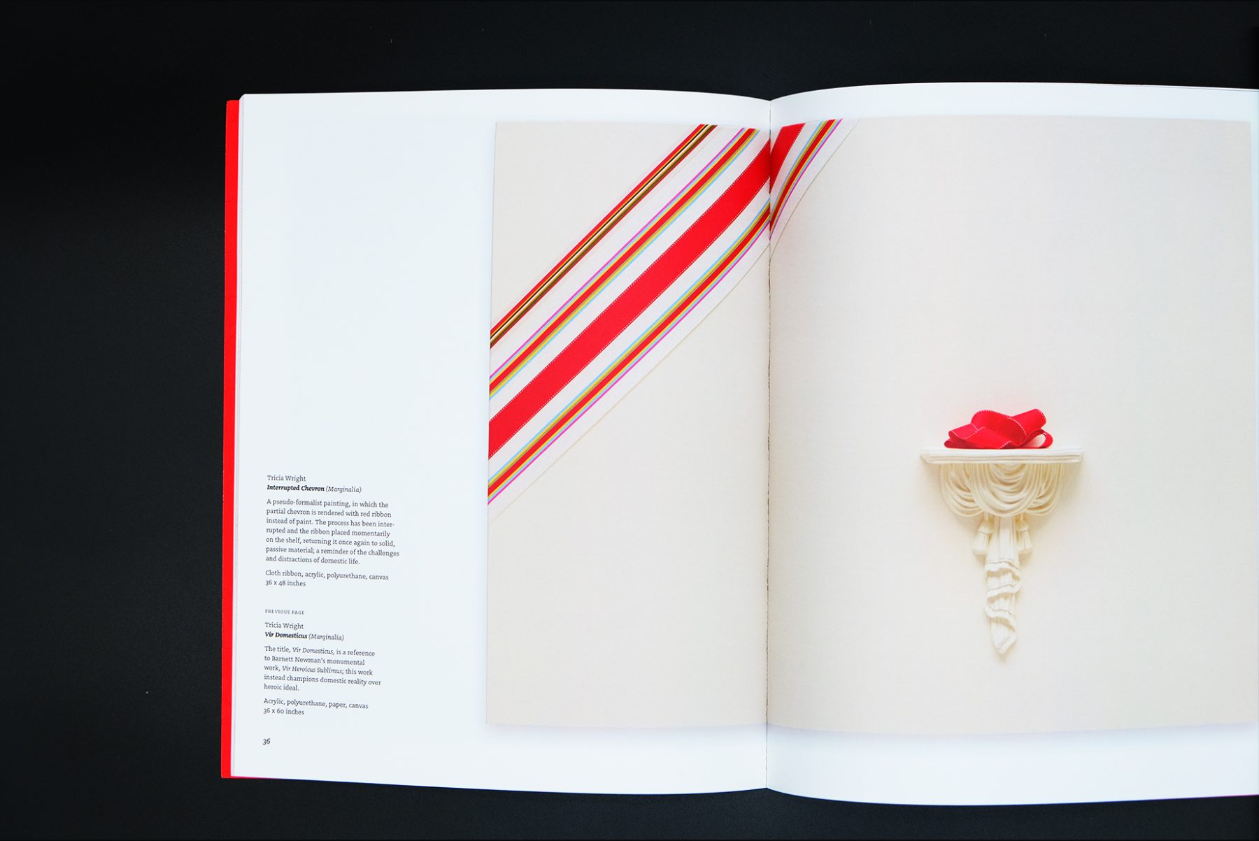
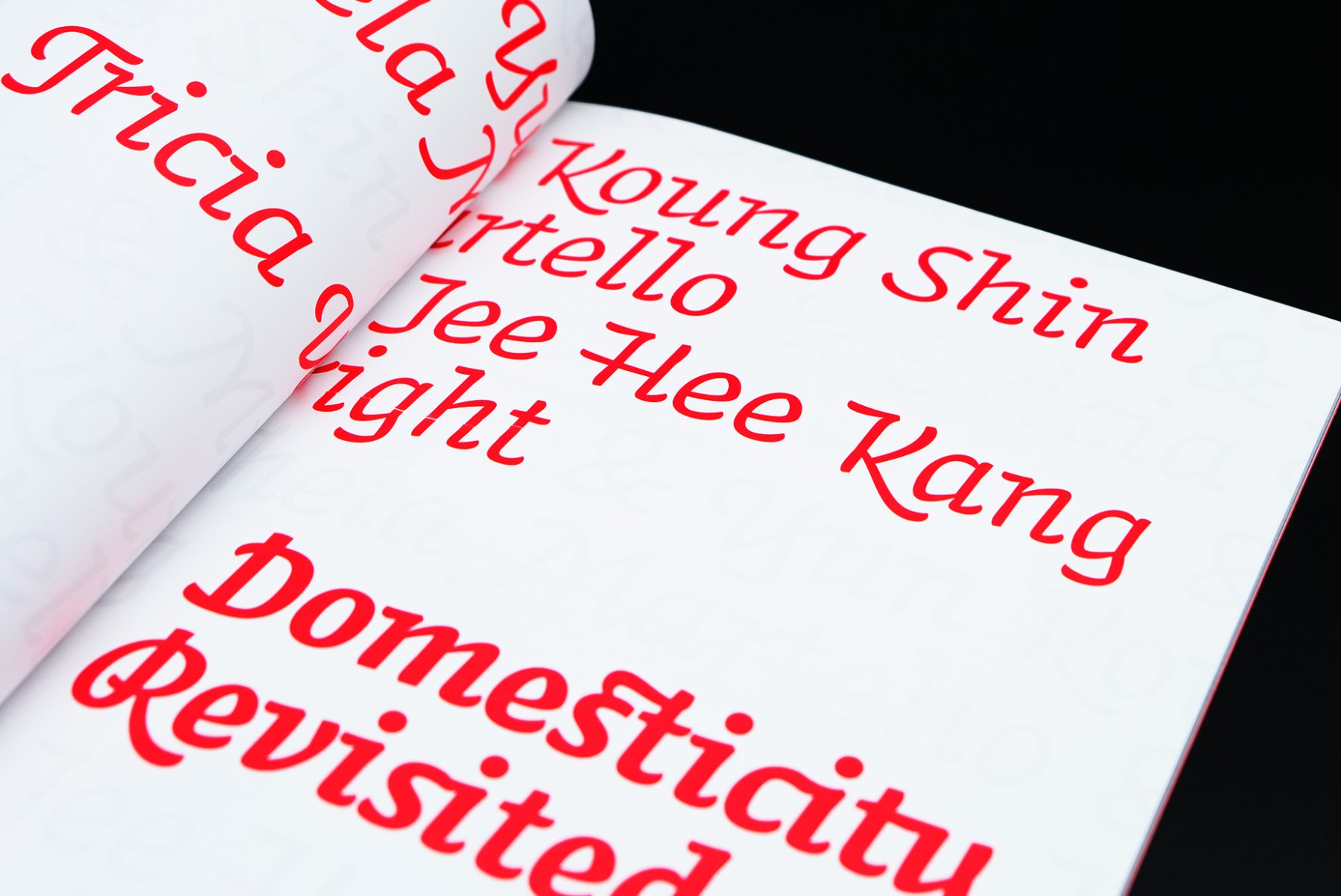
“Domesticity Revisited” was an exhibition at Pen+Brush Gallery, showcasing four women artists who explored the theme of “home.”
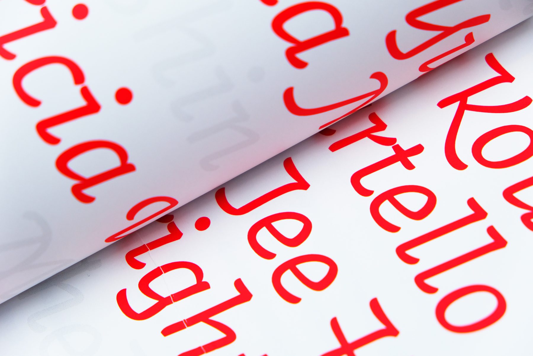
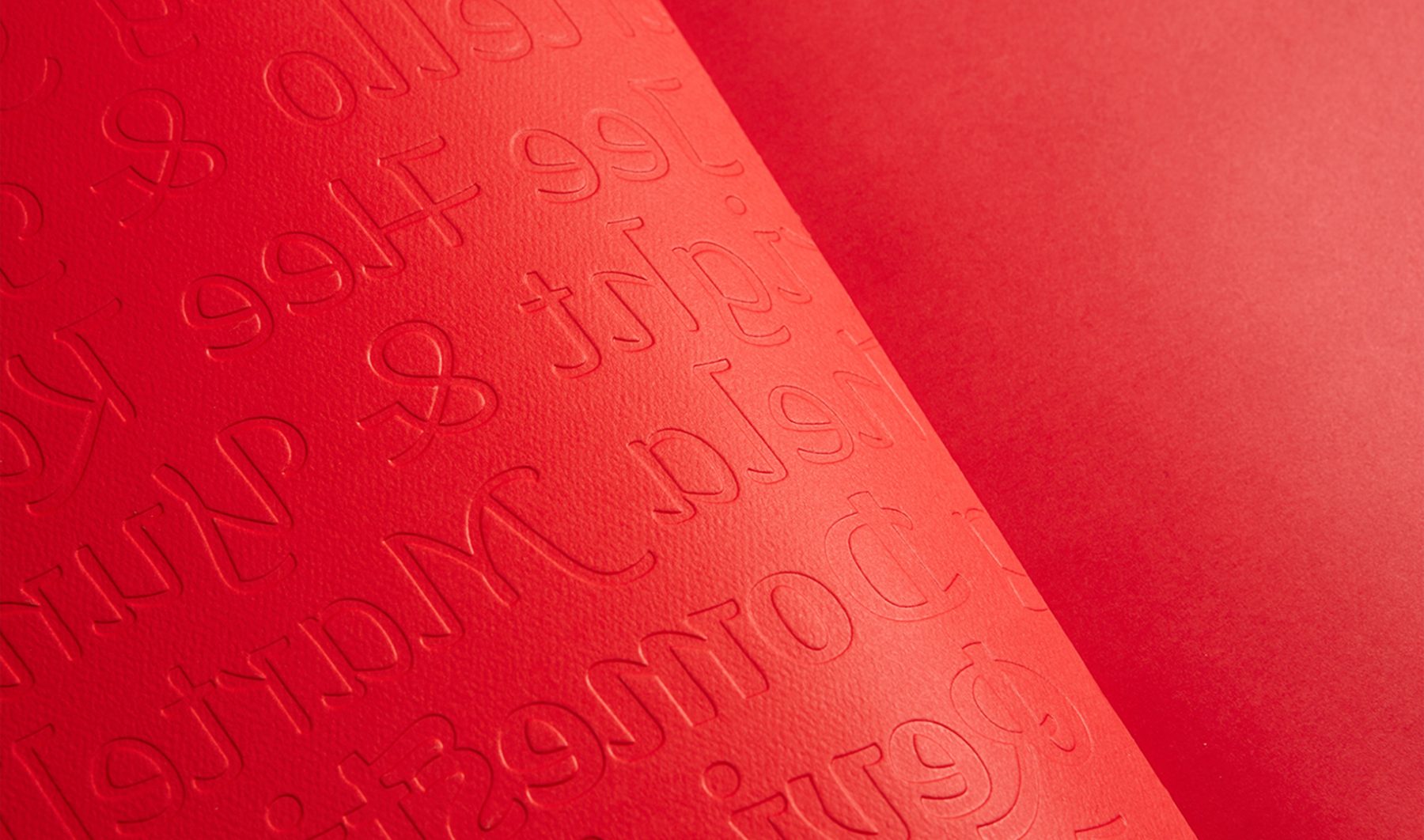
Tasked with creating the exhibition’s catalogue, we created a typographic pattern reminiscent of wallpaper, with which we covered the book as a blind embossing. The color red, a recurring element in the featured artists’ work, is used throughout.
KUDOS Design Collaboratory
-
John Kudos
Creative Director
Pen+Brush
IFFestNY 2019 Branding
Indonesian Film Forum NY
Capabilities
Focus Area
Client
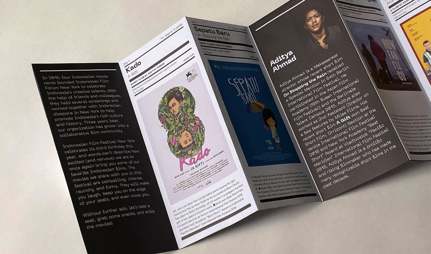
IFFestNY is the biggest Indonesian film festival in the East Coast. Held annually, the festival introduces works by internationally acclaimed Indonesian filmmakers. In 2019, the festival took place at SVA Theatre (New York) on September 6–7.
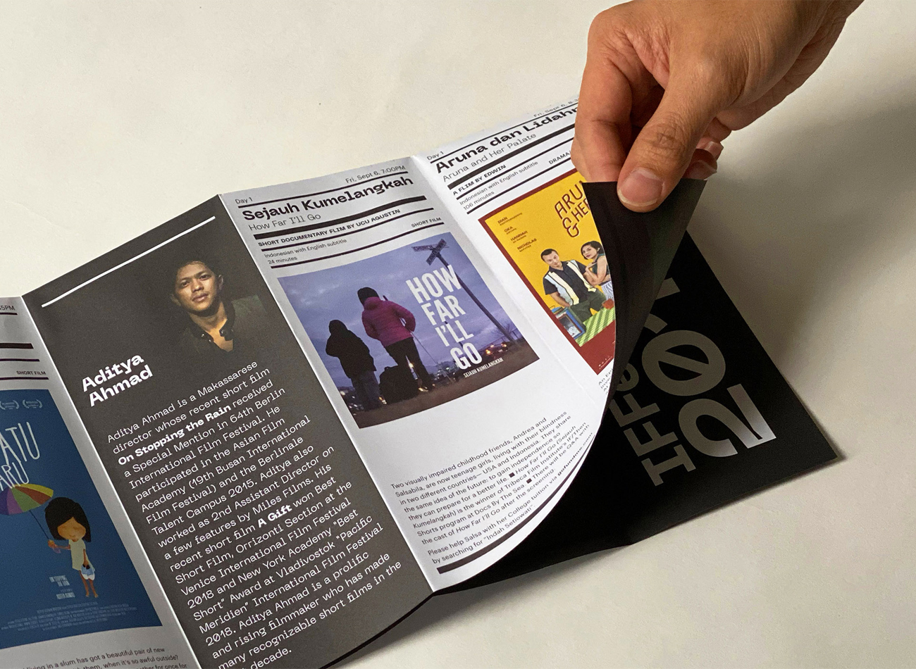
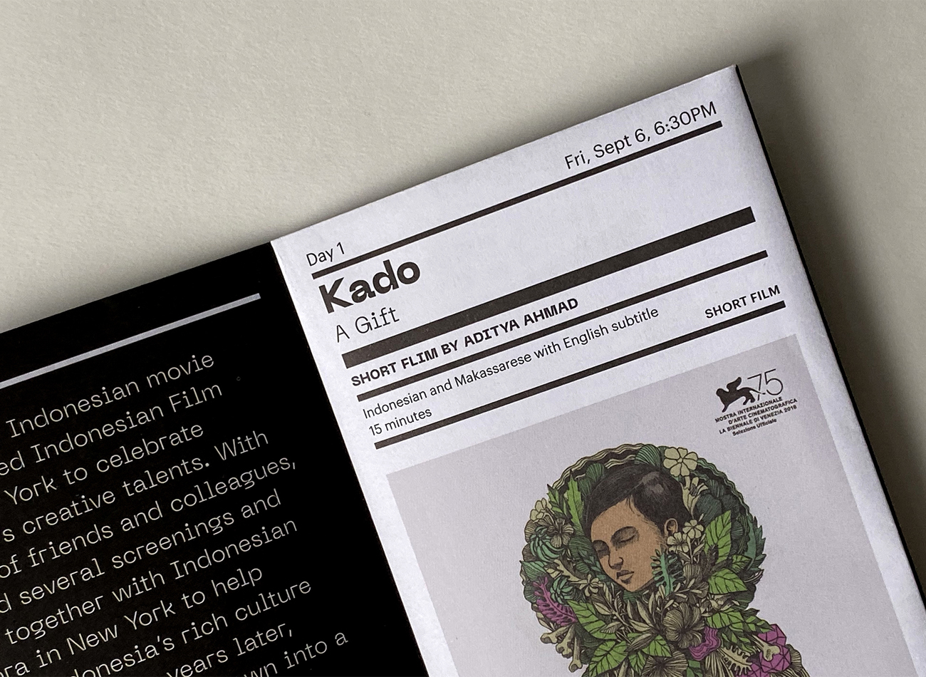
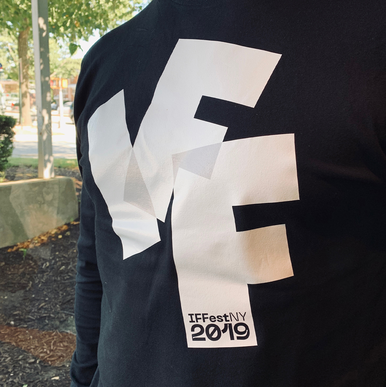
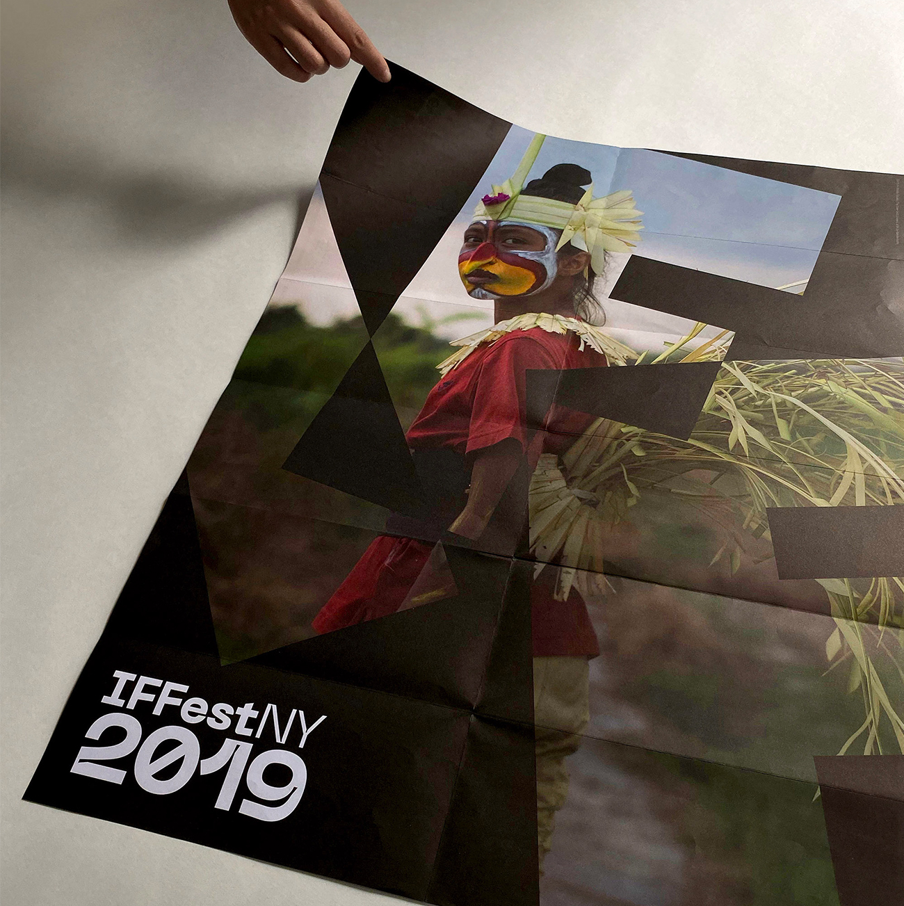
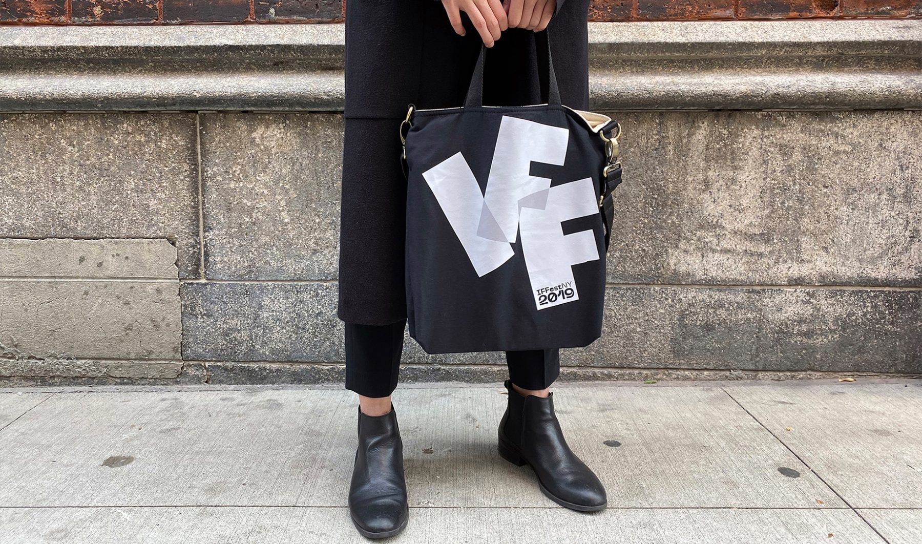
We designed a brand identity system for the festival that was made up of three overlapped letterforms, I-F-F, which animate the surrounding frame. The program brochure unfolds to reveal a poster featuring a striking scene from one of the festival’s showcased films.
KUDOS Design Collaboratory
-
John Kudos
Creative Director -
Owen Febiandi
Designer -
Aditya Bayu Perdana
Designer
Indonesian Film Forum NY
ARITA: Eternally Modern at NY NOW
Made in Japan Project
Capabilities
Client
Awards
-
GDUSA 2018 American Web Design
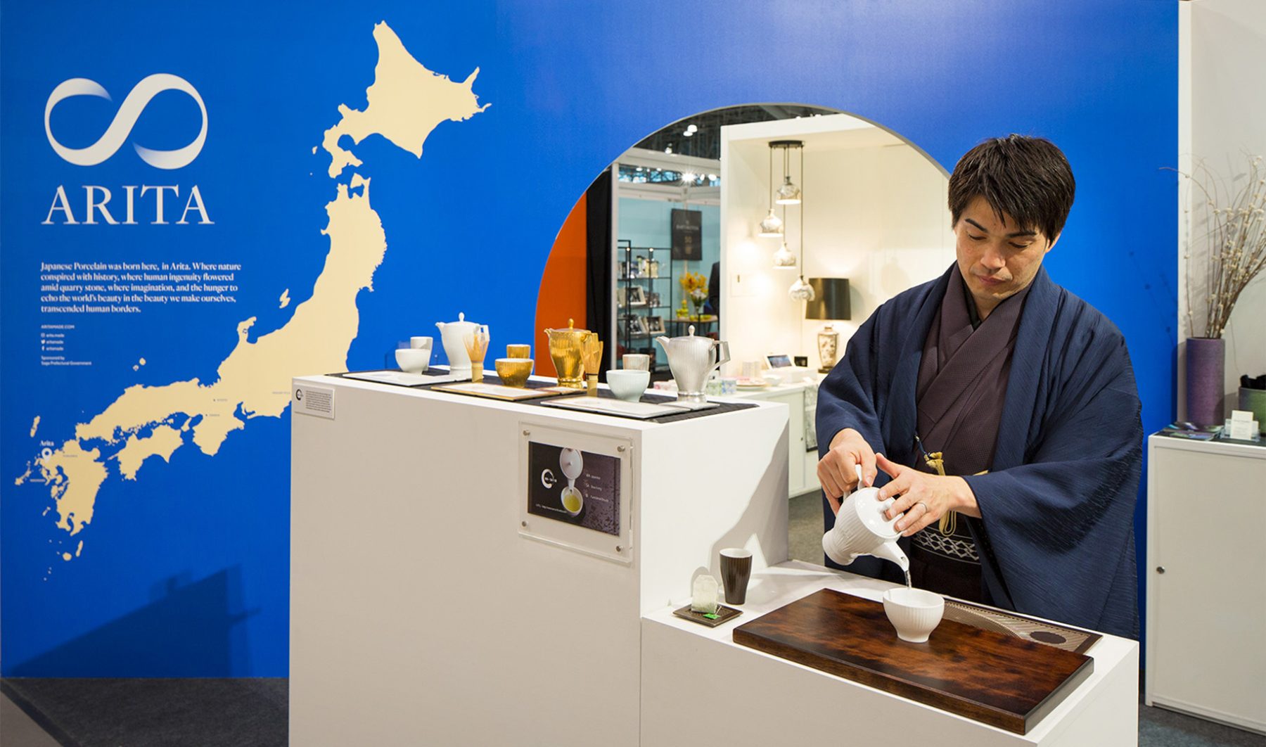
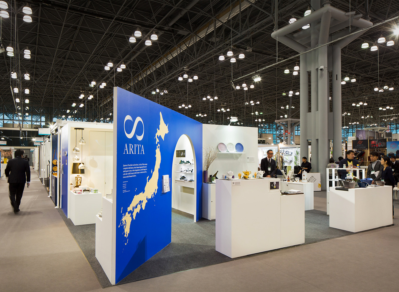
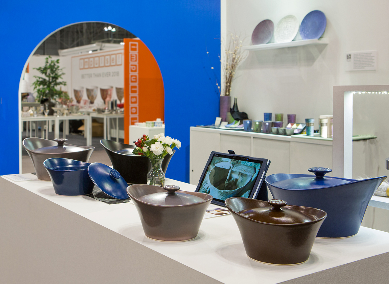
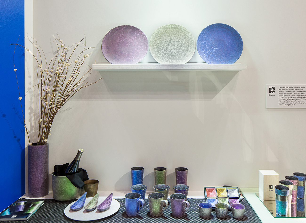
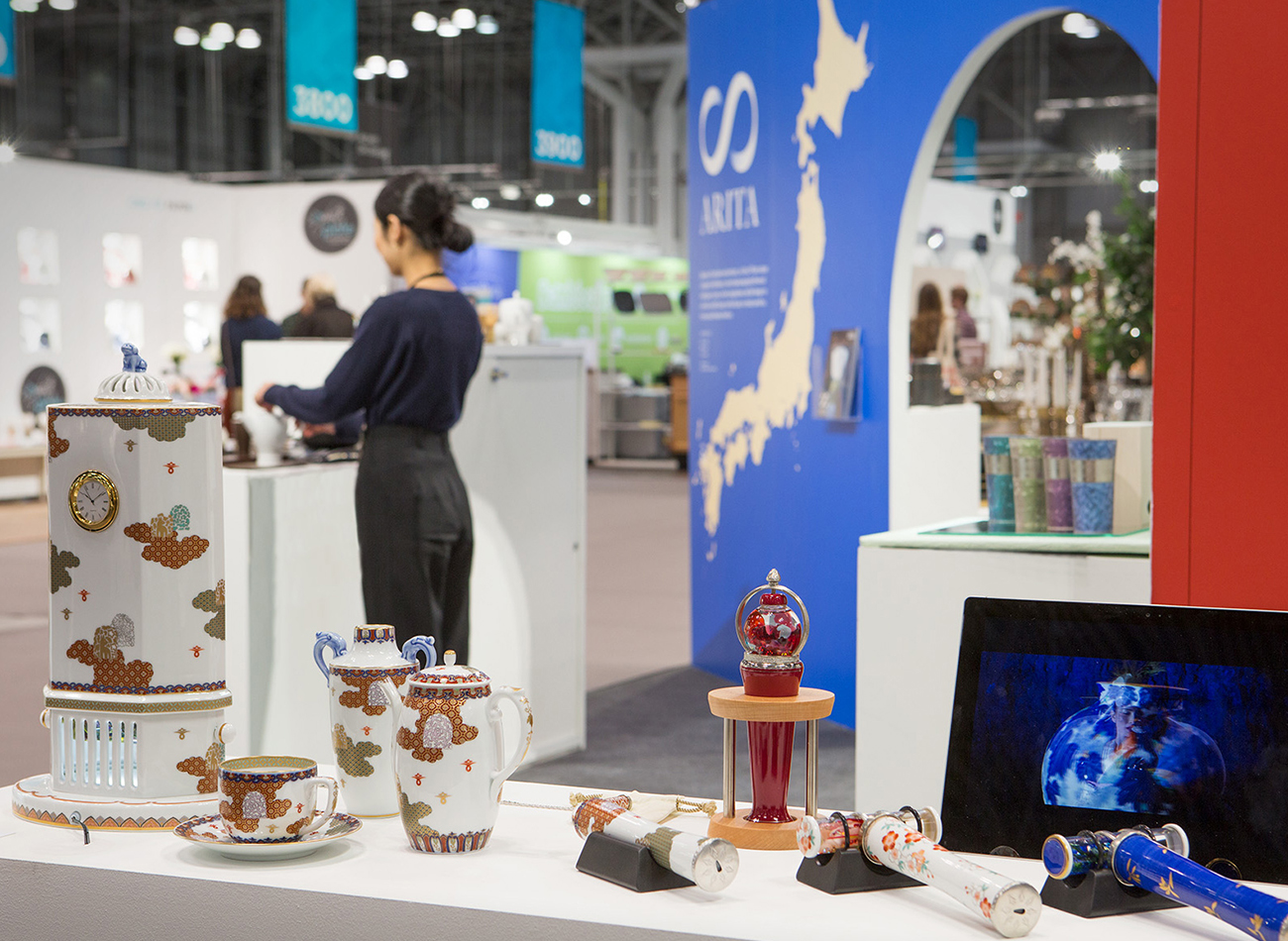
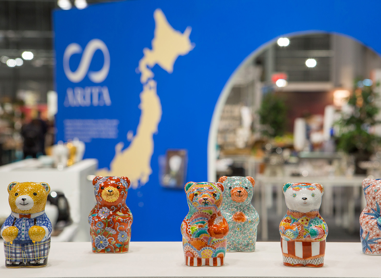
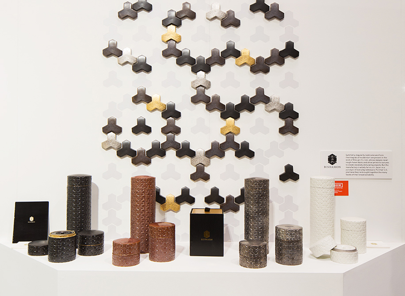
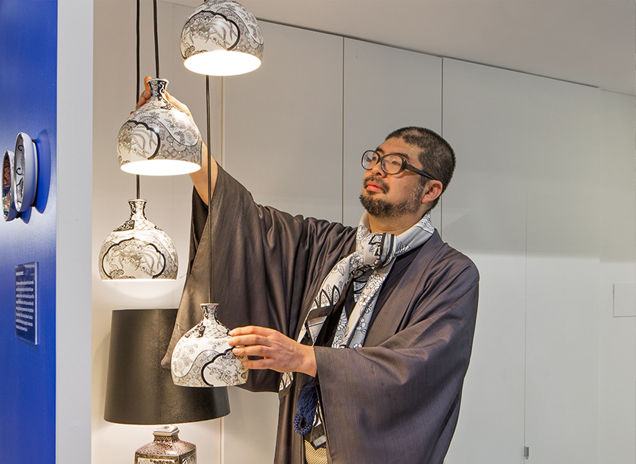
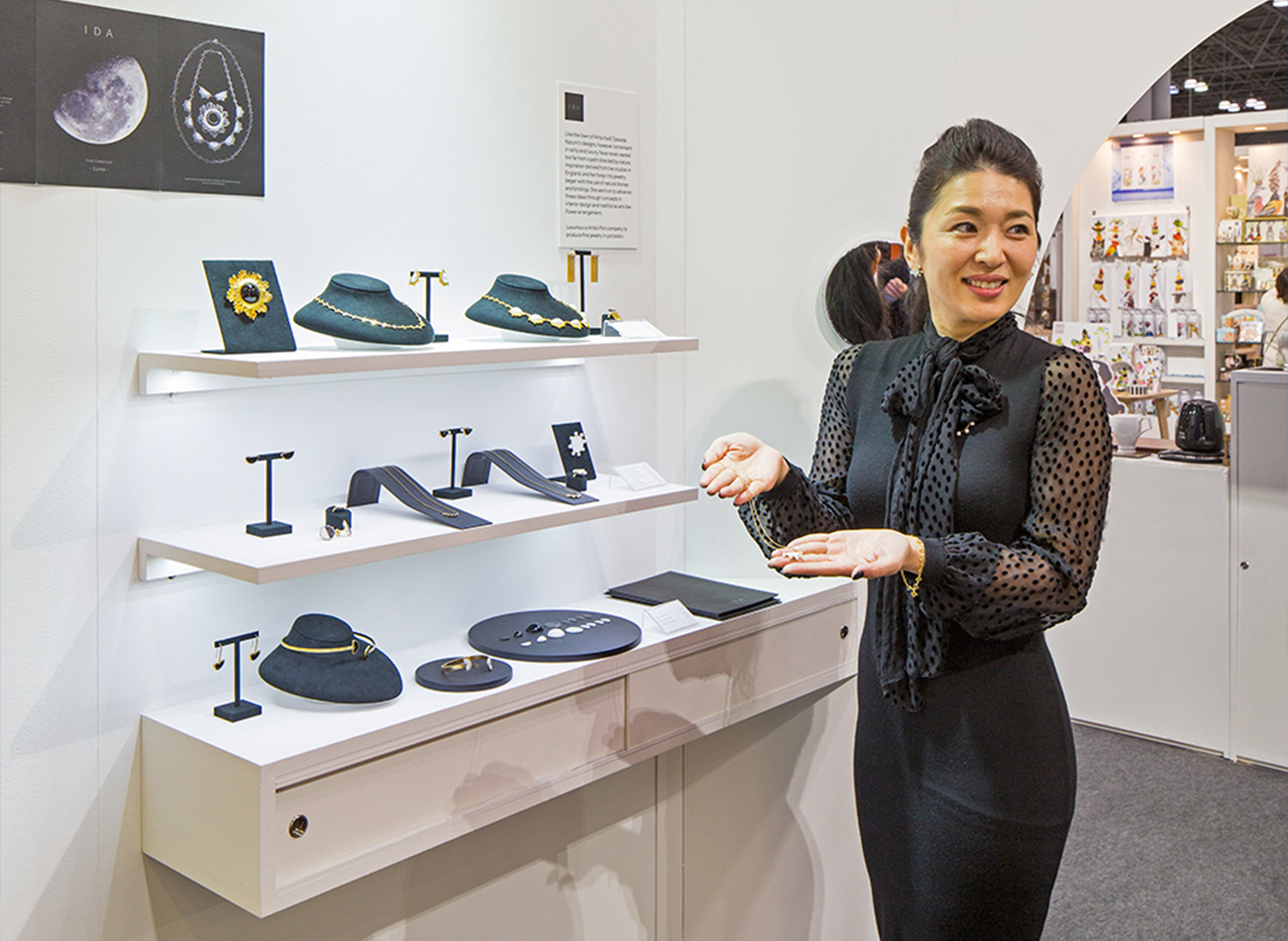
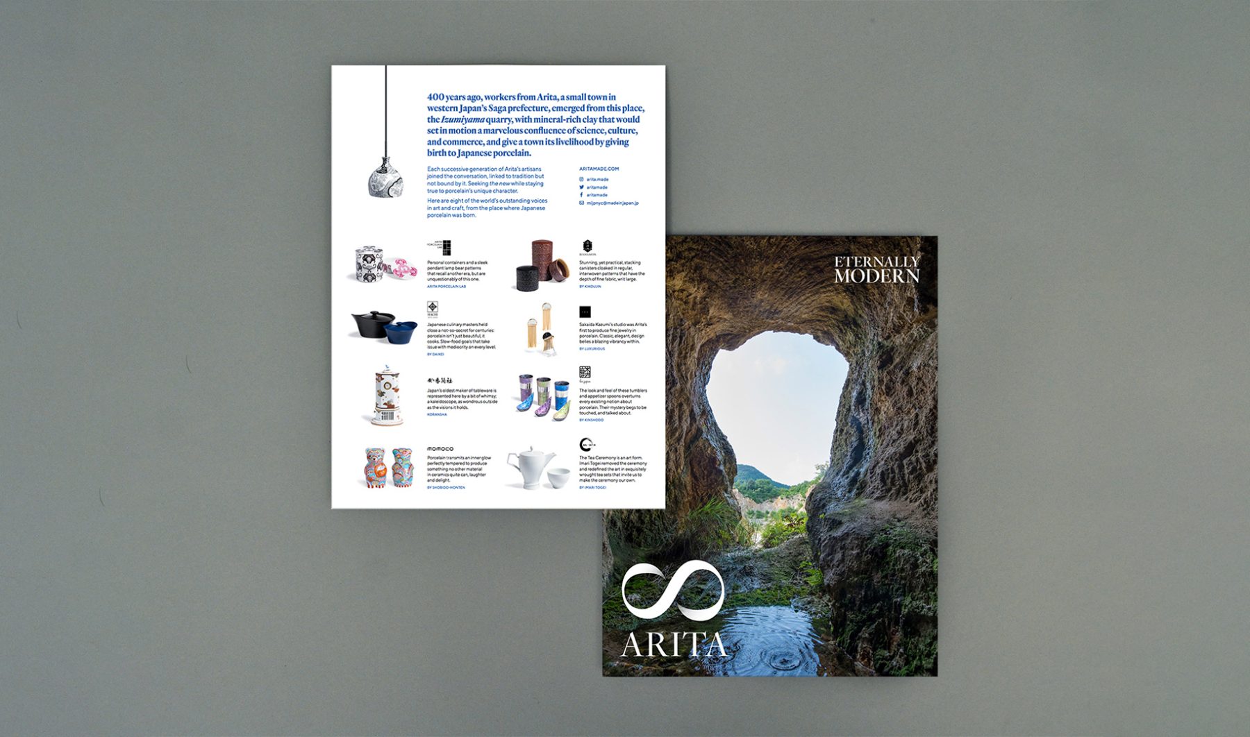
This was a collaboration with Made in Japan Project, funded by the Saga Prefectural Government. For the project, we completed the overall brand strategy, naming, exhibition design, art direction, website, and product design consultation for a government-led initiative promoting porcelain creators from Arita and their efforts to bring innovative Japanese design to the American market through NY NOW.
RESEARCH & CONSULTATION
Over the course of nine months, we visited Arita—the birthplace of porcelain in Japan—to consult with participating kilns and distributors over ideas for their product design, brand positioning, and marketing strategy for the U.S. market.
BRANDING
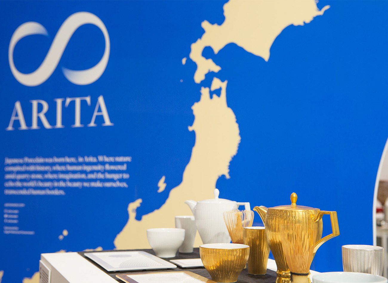
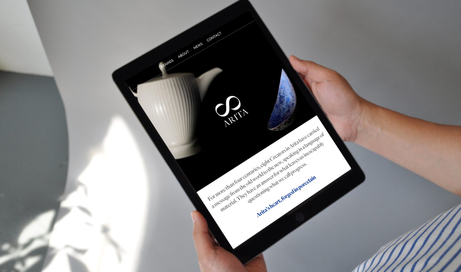
For the visual identity, we designed a lemniscate ∞ paired with the town’s name and the tagline “Eternally Modern,” pointing to how Arita creators continue to evolve four centuries of tradition, craftsmanship, and innovation into distinctively modern everyday products.
WEBSITE
Our responsive bilingual website was written for both Western and Japanese readers, with distinct messaging catered to each audience. We art-directed all of the website’s videos and photography, including a portrayal of key products falling in slow motion, close-ups in 360-degree rotation, documentary photos of Arita, and a video showing the porcelain-creation process.
EXHIBITION BOOTH
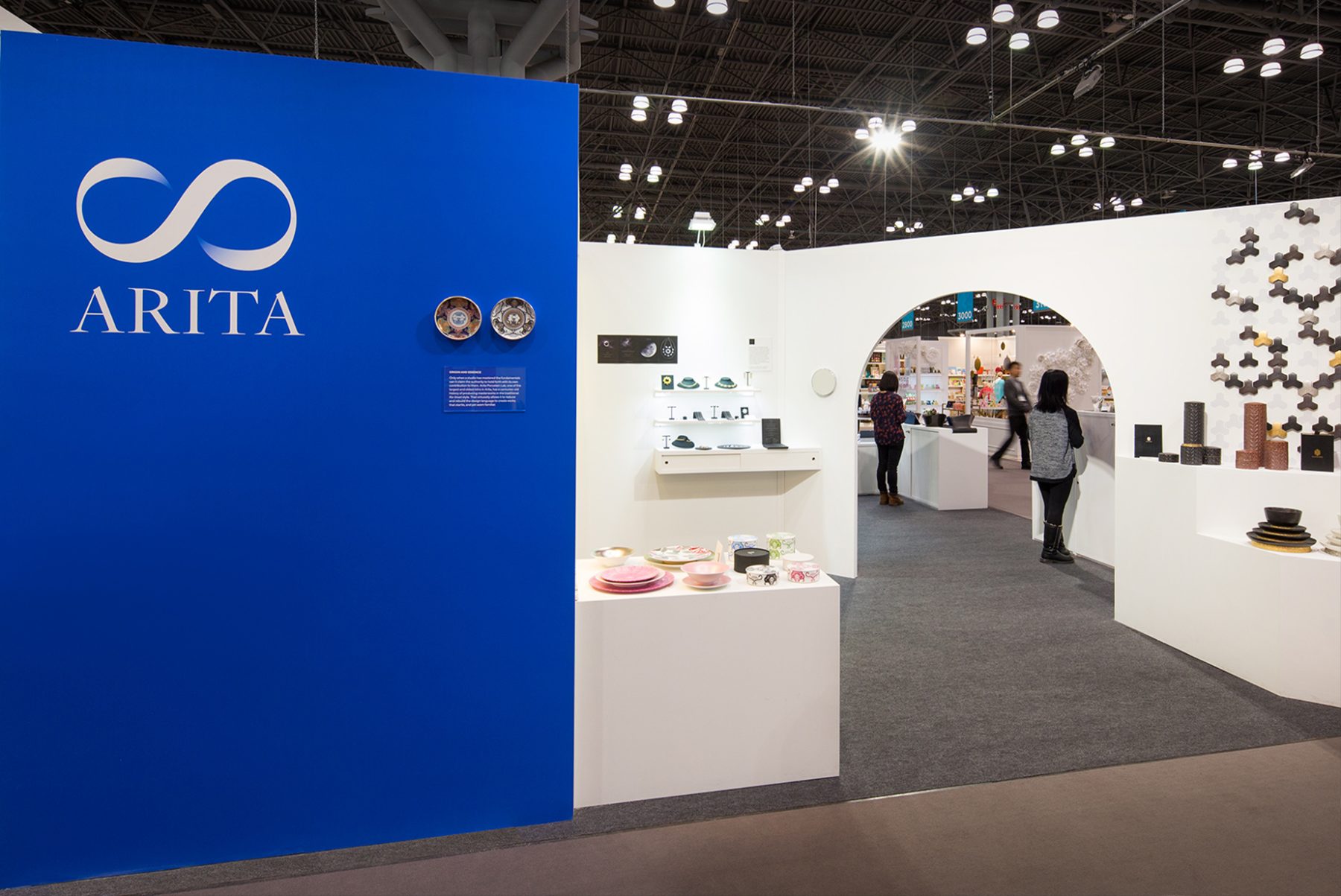
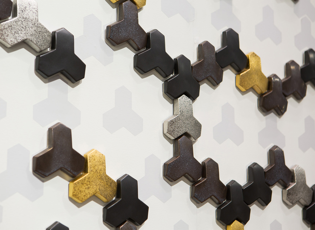
For the NY NOW market exhibition in February 2018, we designed a corner booth divided by a diagonal wall archway similar to those typically found in traditional porcelain kilns. Each creator had a museum-like stage and hidden storage underneath.
KUDOS Design Collaboratory
-
John Kudos
Creative Director -
Kiki Katahira
Art Director -
Ashley Wu
Designer -
Sumit Paul
Web Designer & Developer -
Mika Yoshida & David Imber (Maniform)
Copywriter
MANIFORM
-
David Imber
Copywriter -
Mika Yoshida
Copywriter
Photography
- Sam Morgan Photography
Revealing the Invisible
Corning Museum of Glass
Capabilities
Focus Area
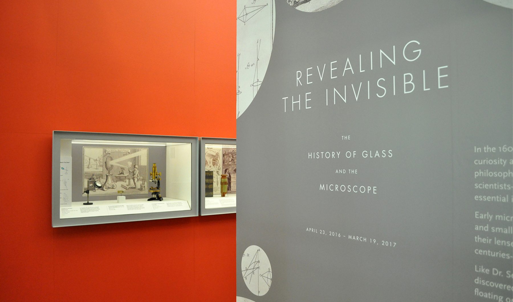
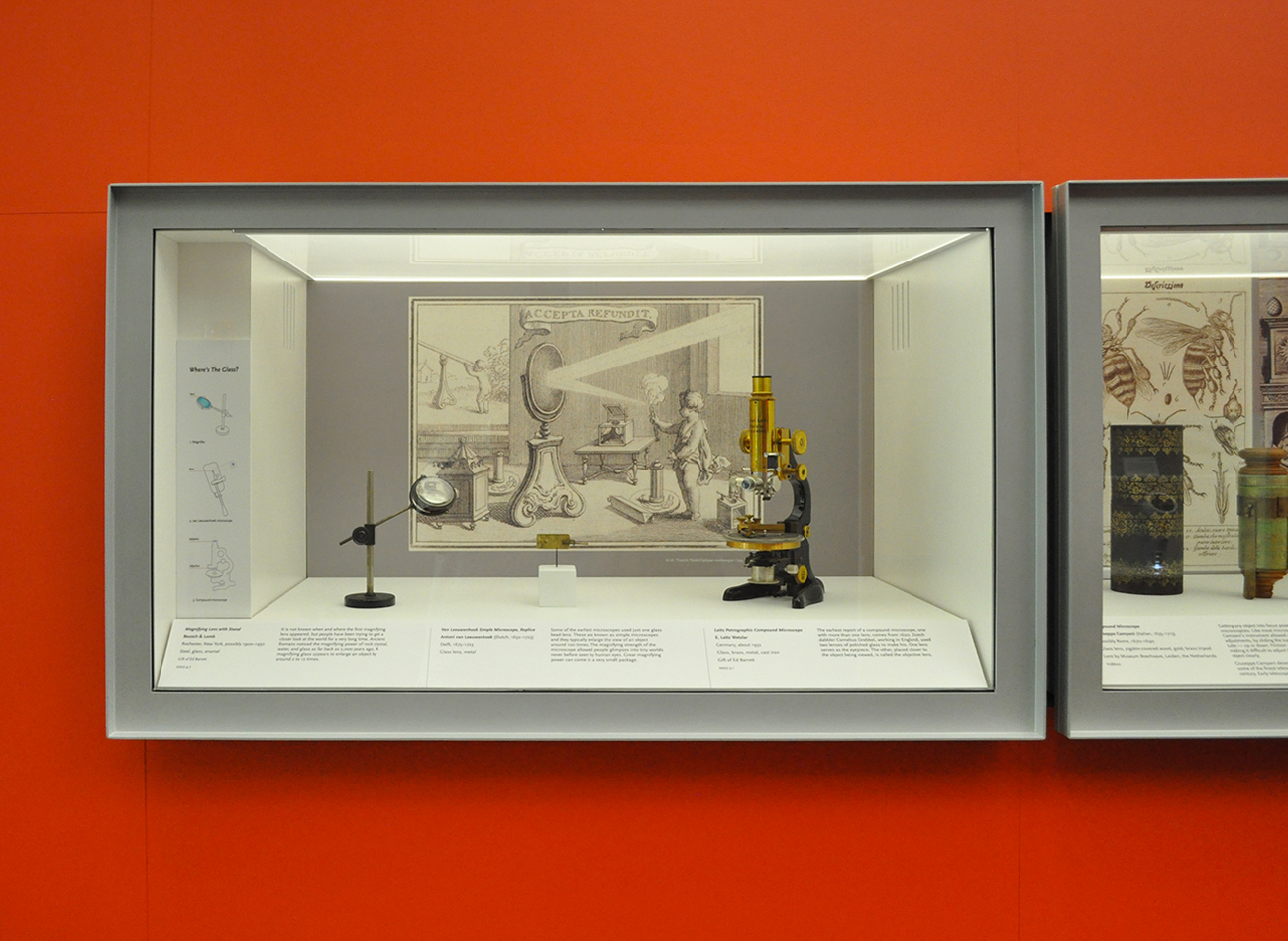
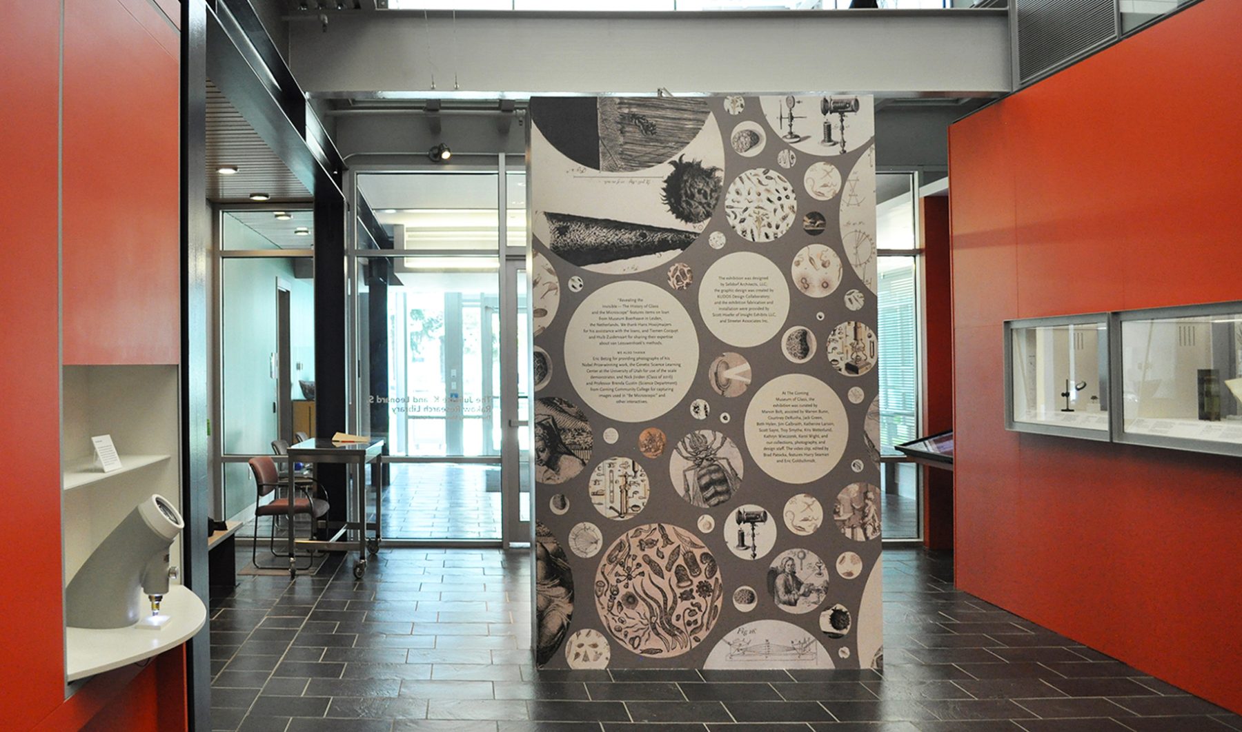
For these exhibition graphics for “Revealing the Invisible” at the Corning Museum of Glass, we collaborated with Selldorf Architects and the museum’s in-house team to ensure that all graphic and text panels followed the museum’s visual theme.
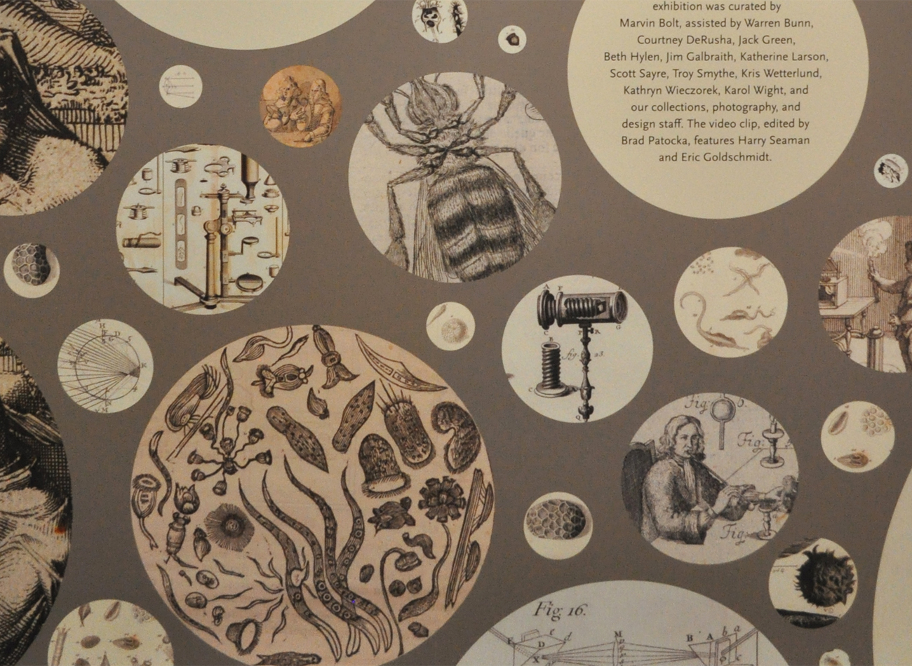
We designed a circular graphic pattern, inspired by the microscope lens, to cover the title wall. Each circle contains a close-up detail of drawings depicting objects that were discovered through the microscope.
KUDOS Design Collaboratory
-
John Kudos
Creative Director
Selldorf Architects
-
Lisa Green
Partner in charge
Yasumasa Morimura: Ego Obscura Catalogue
Japan Society
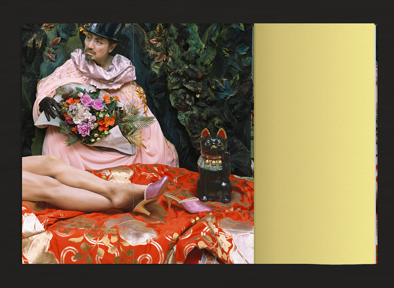
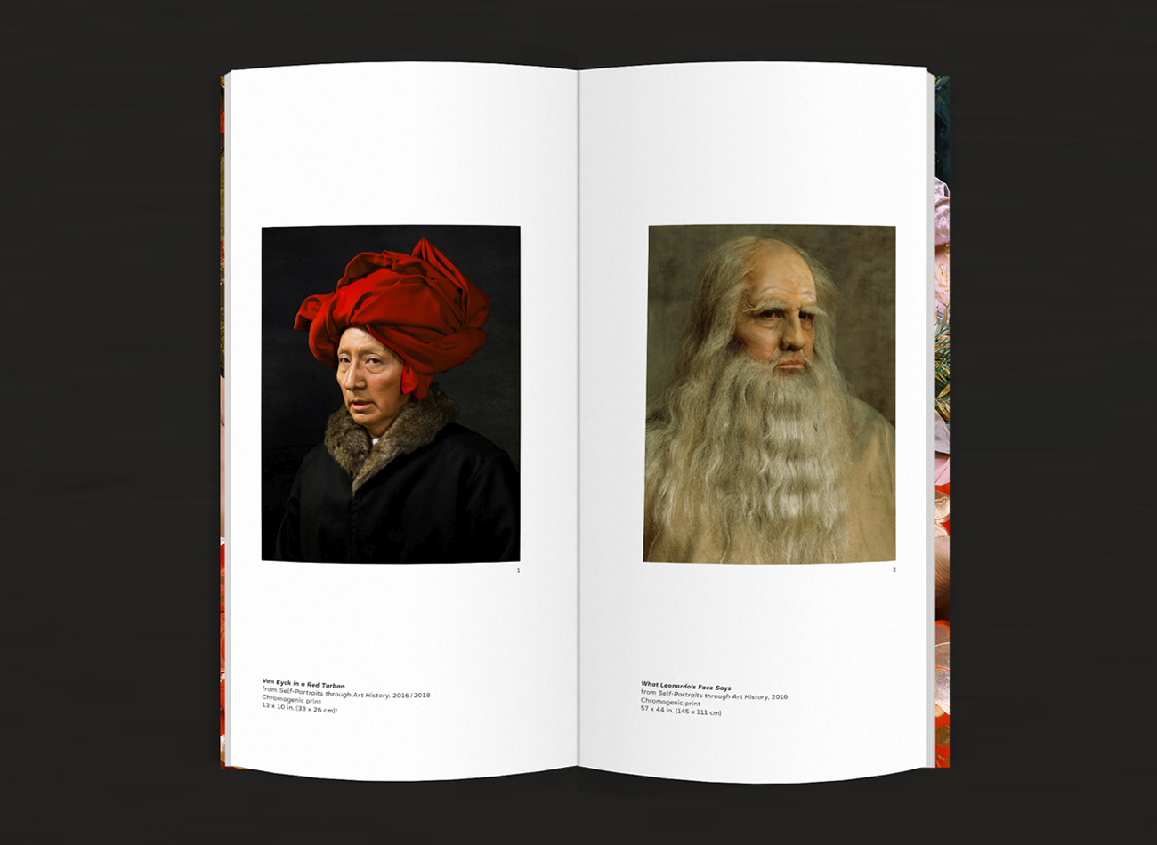
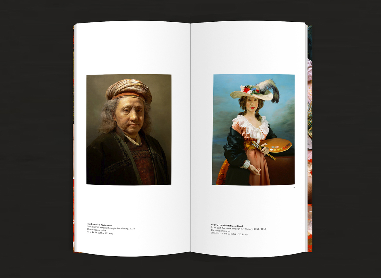
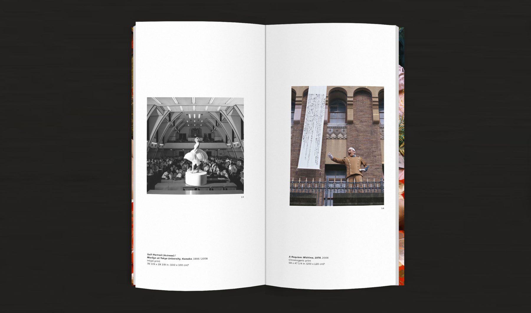
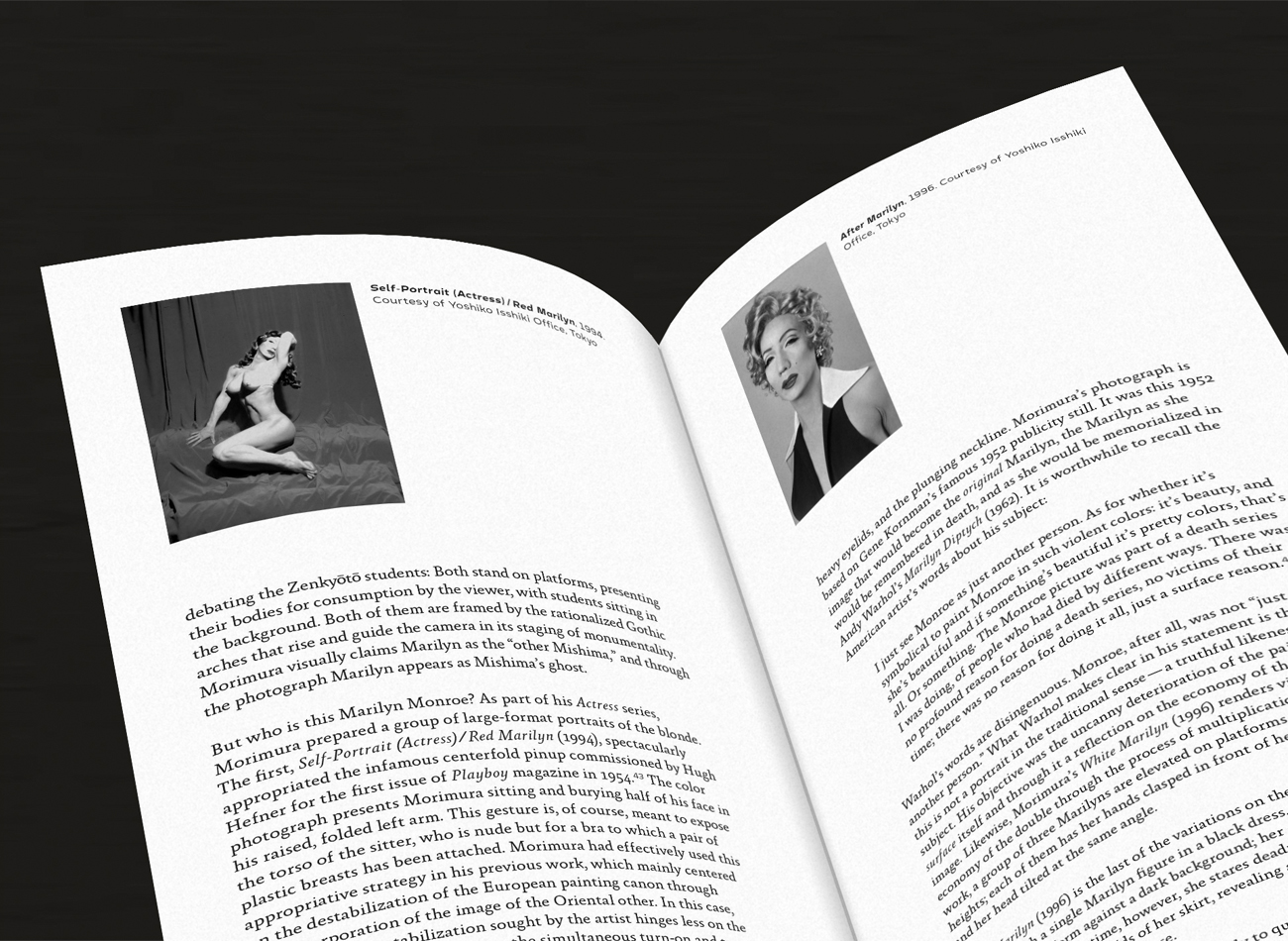
For this solo exhibition at the Japan Society in New York, Ego Obscura highlighted Morimura’s 30-year project of de-centering “the self” by excavating it from layers of art history, Japanese postwar history, and personal history. It also featured the U.S. premiere of the artist’s first full-length video work, Egó Sympósion (2016), and his latest cinematic installation, Egó Obscura (2018), presented in conjunction with a live performance, Morimura’s Nippon Cha Cha Cha!
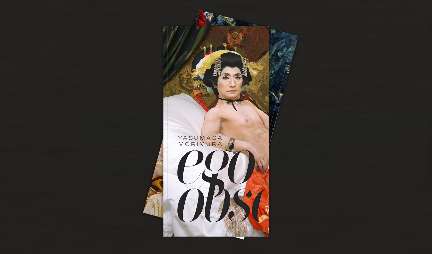
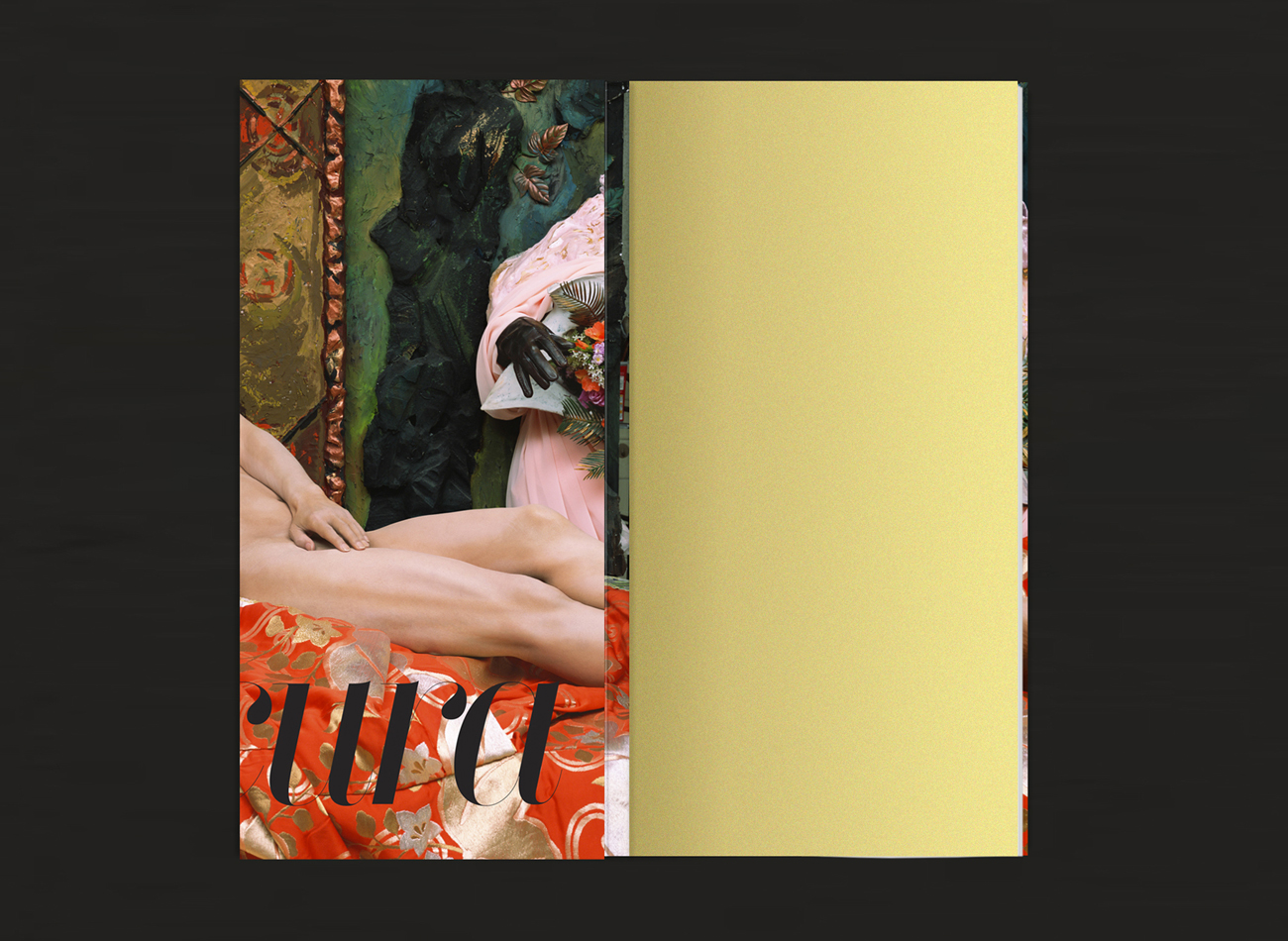
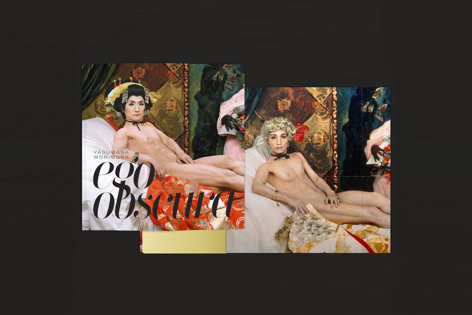
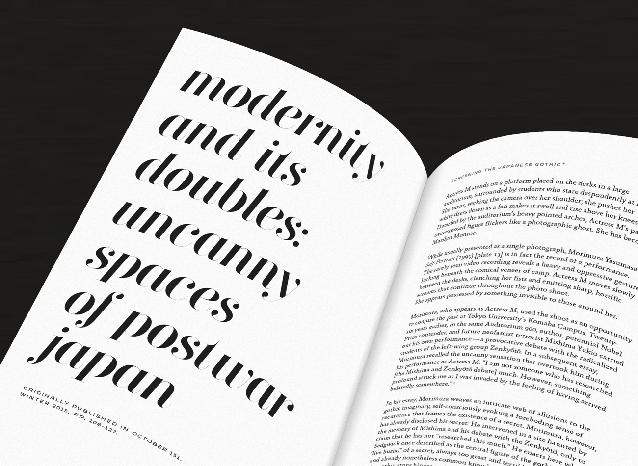
We designed the show’s exhibit catalogue to feature Morimura’s latest work, Une Moderne Olympia (2018), on the front cover, contrasted with Portrait (Futago) (1988)—the artist’s work from 30 years prior, with different gender and race portrayals—on the back cover. The slim format of the book made for greater readability of its essays and performance scripts.
KUDOS Design Collaboratory
-
John Kudos
Creative Director -
Ashley Wu
Designer
Japan Society
Whiteness Project: Intersection of I at Storyscapes
Tribeca Film Festival
Capabilities
Focus Area
Client
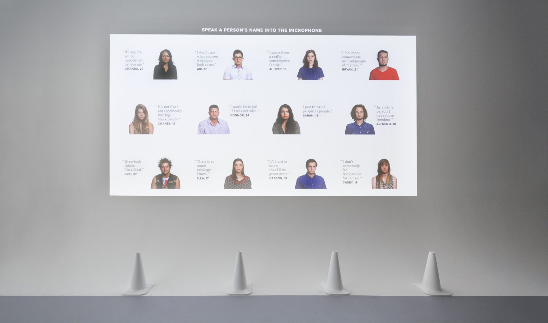
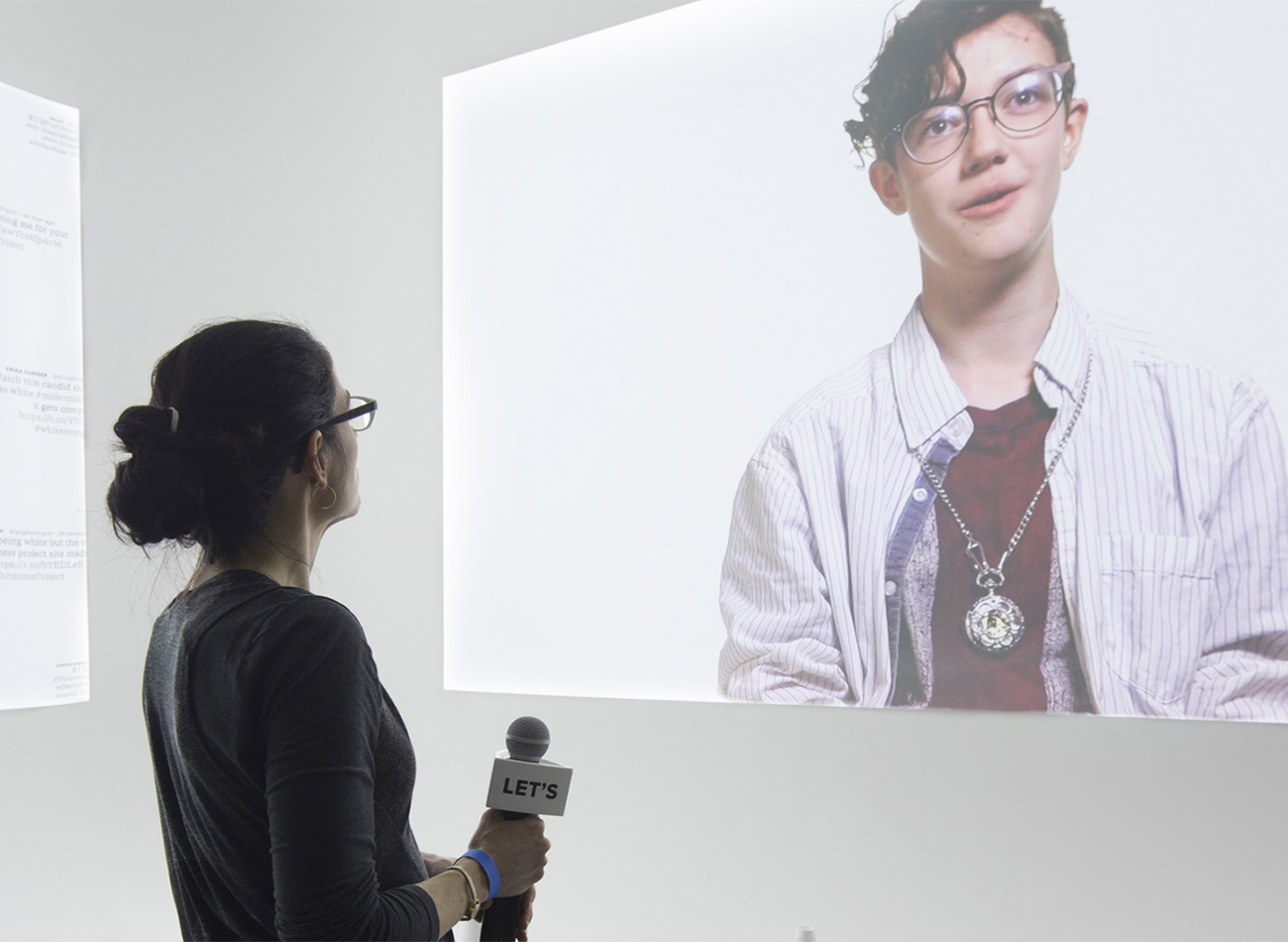
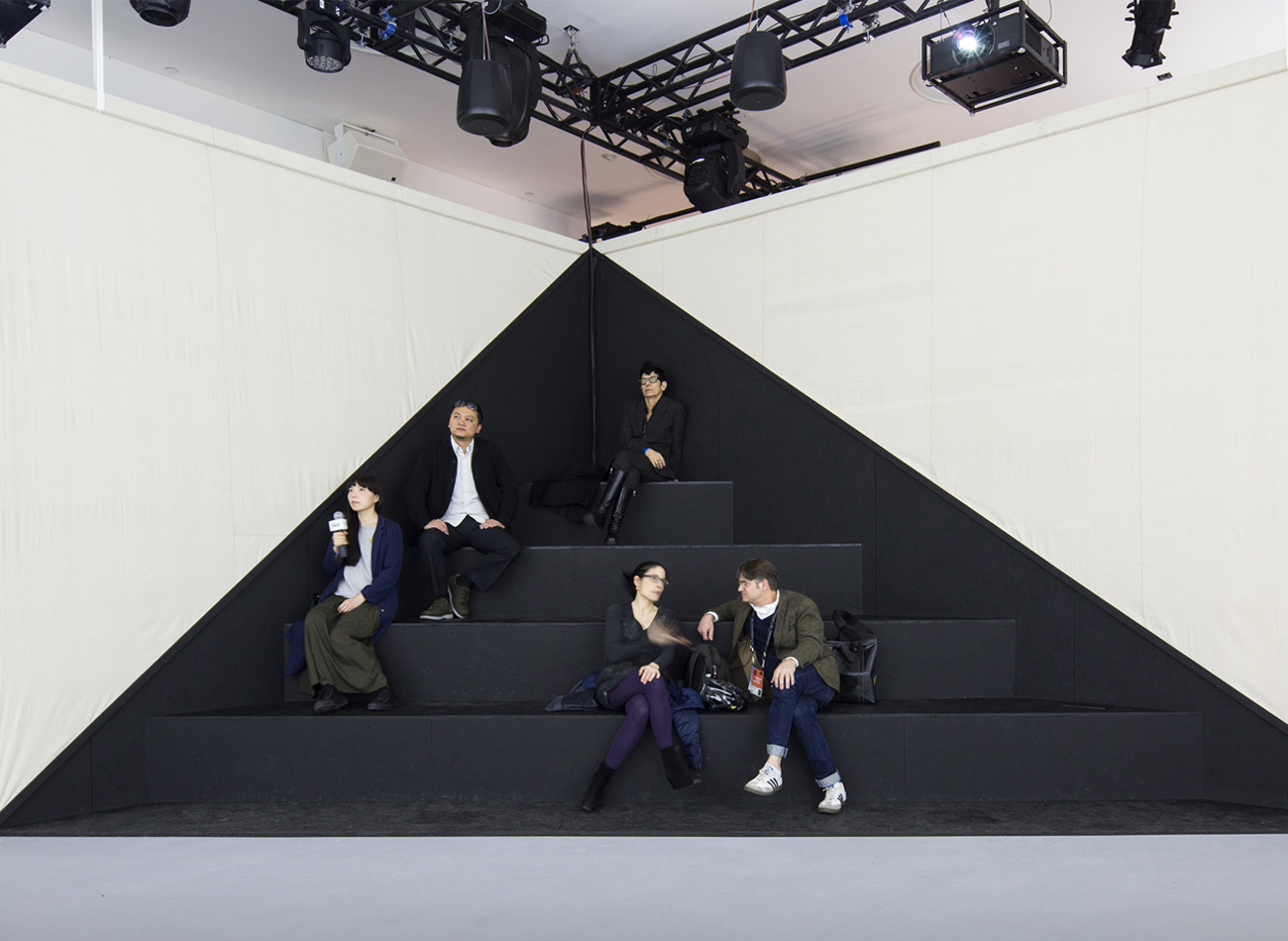
Created in collaboration with filmmaker Whitney Dow, this second installment of the Whiteness Project took form as a week-long interactive installation at the Tribeca Film Festival in New York. With a space designed by LOT-EK and audiovisuals by Arup, the Festival tasked Kudos with the project’s exhibition design.
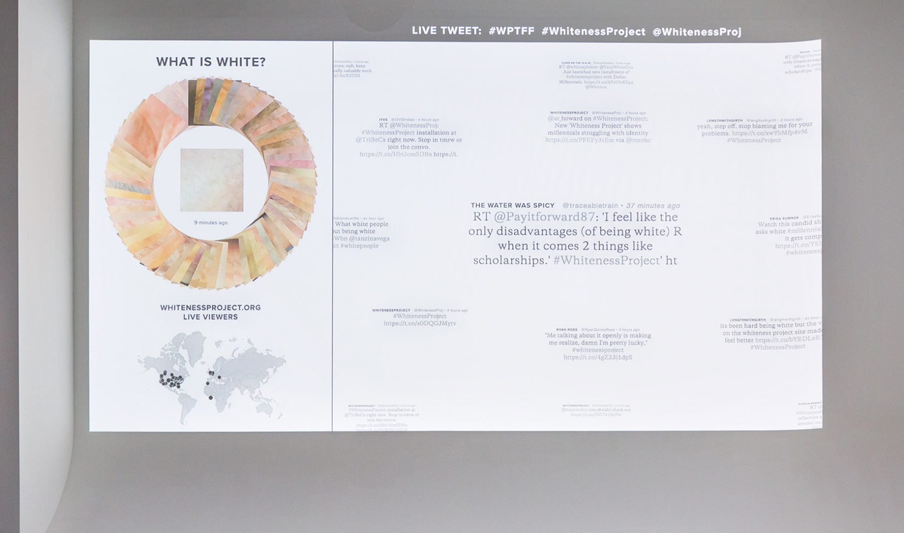
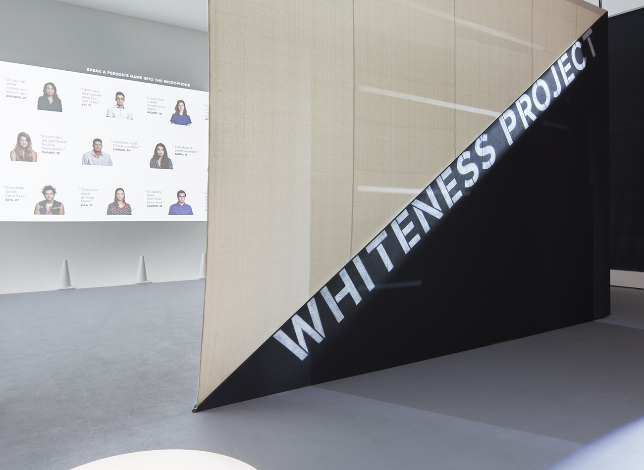
In our resulting exhibition, audience members were photographed as they entered the space. Within seconds their skin tones were added to a color wheel arranged from dark to light, engaging them in questioning the perceived color of their skin and public perceptions of racial identity. The audience was then able to use a provided microphone to activate interviews by calling out the name of a person displayed on the grid.
Read full article on GDUSA.
KUDOS Design Collaboratory
-
John Kudos
Creative Director -
Sumit Paul
Web Design & Development -
Chris Manlapid
Software Developer -
Whitney Dow
Filmmaker
Tribeca Film Festival

Americans Exhibition
National Museum of The American Indian
Capabilities
Focus Area
Client
Awards
-
GDUSA 2018 American Graphic Design Awards
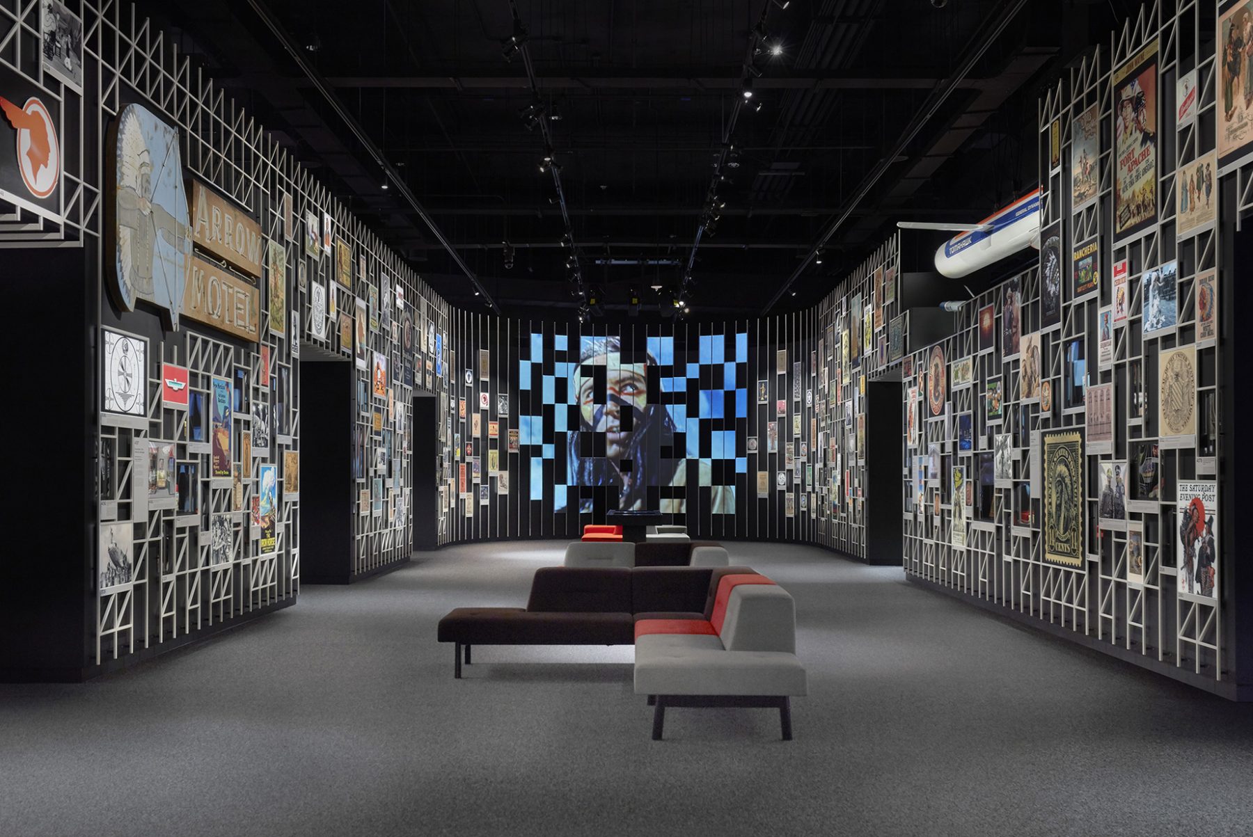
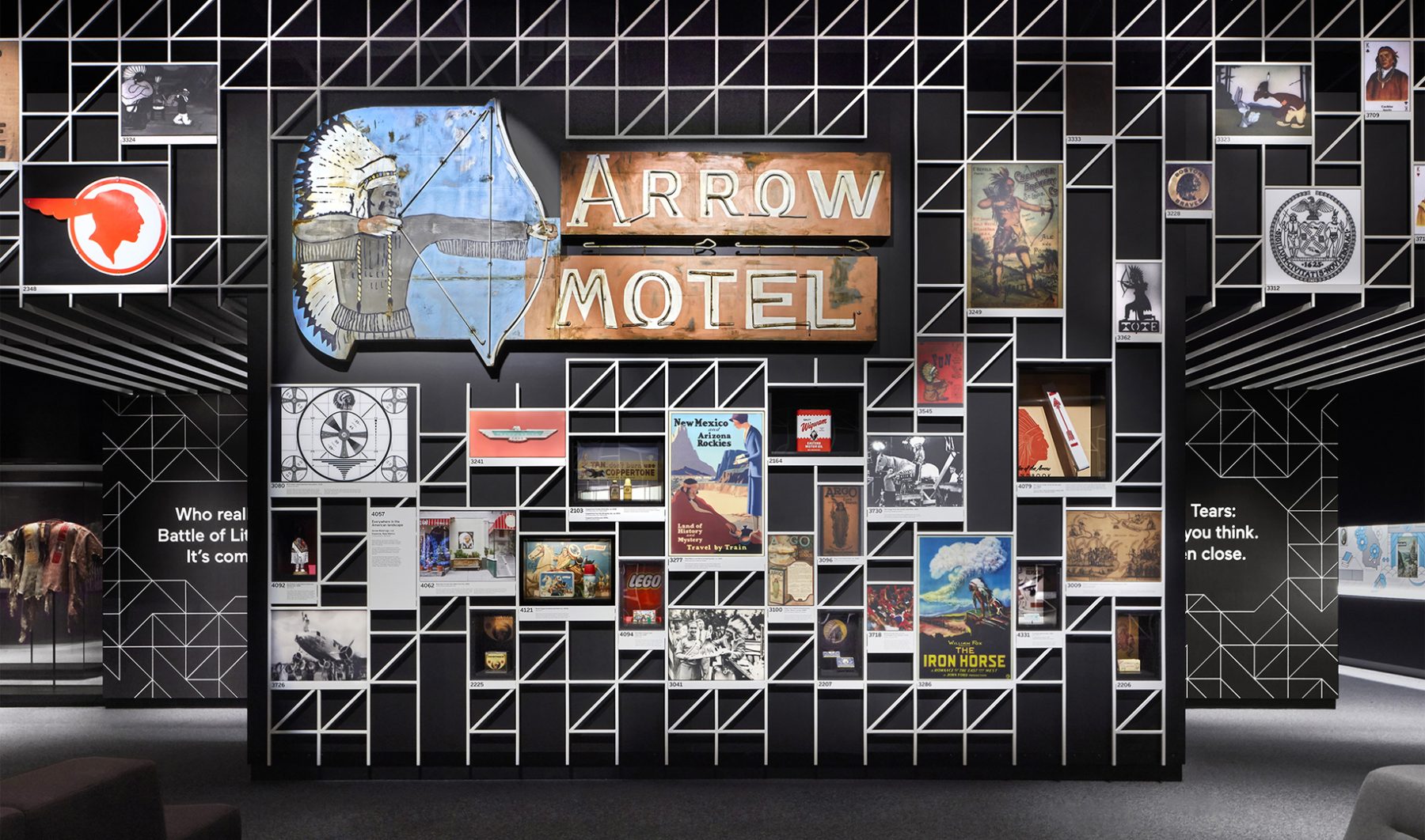
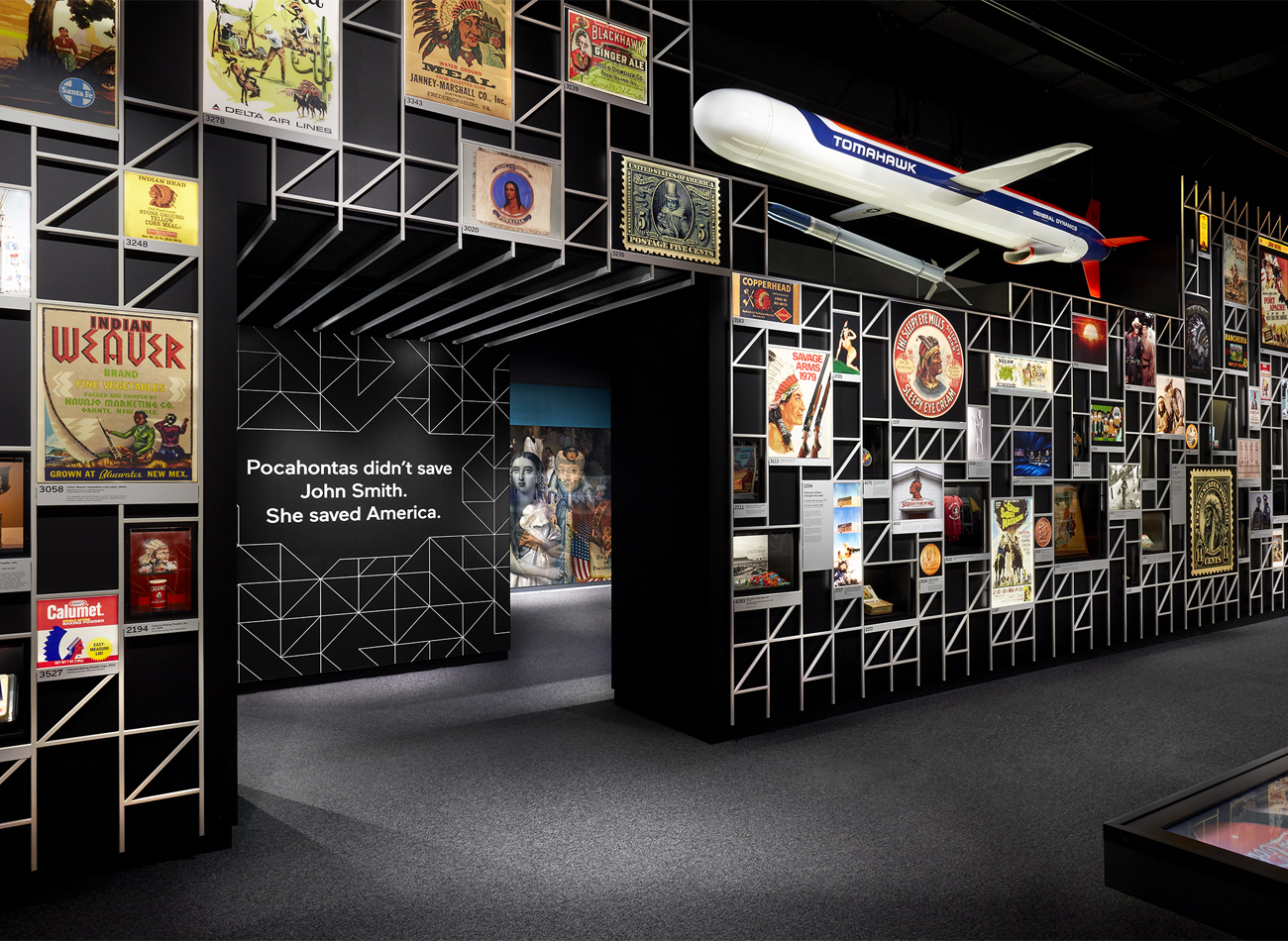
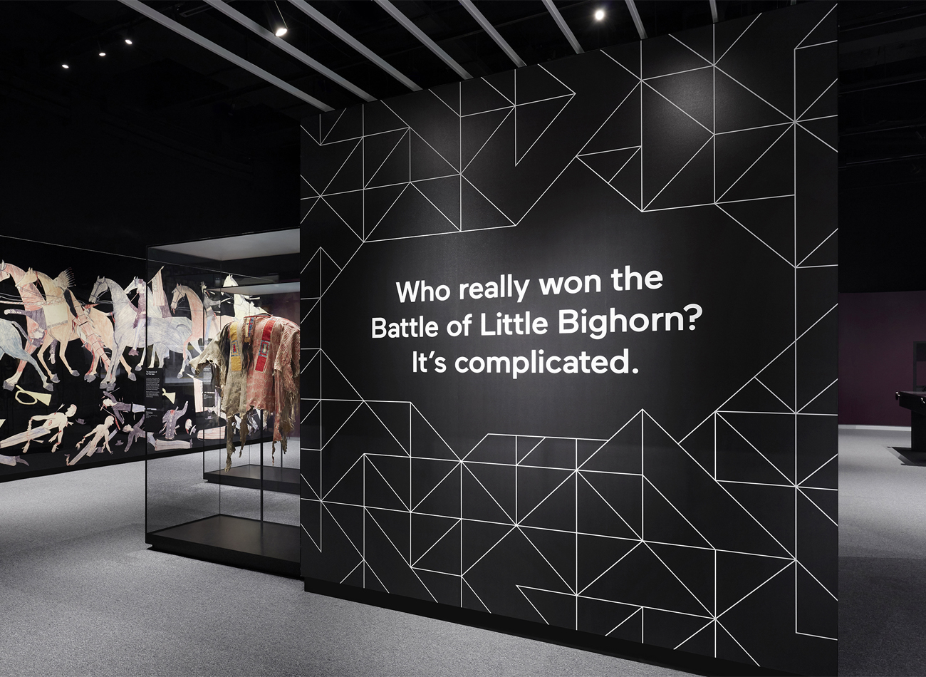
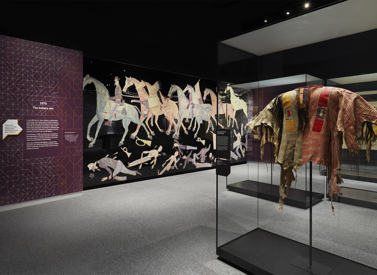
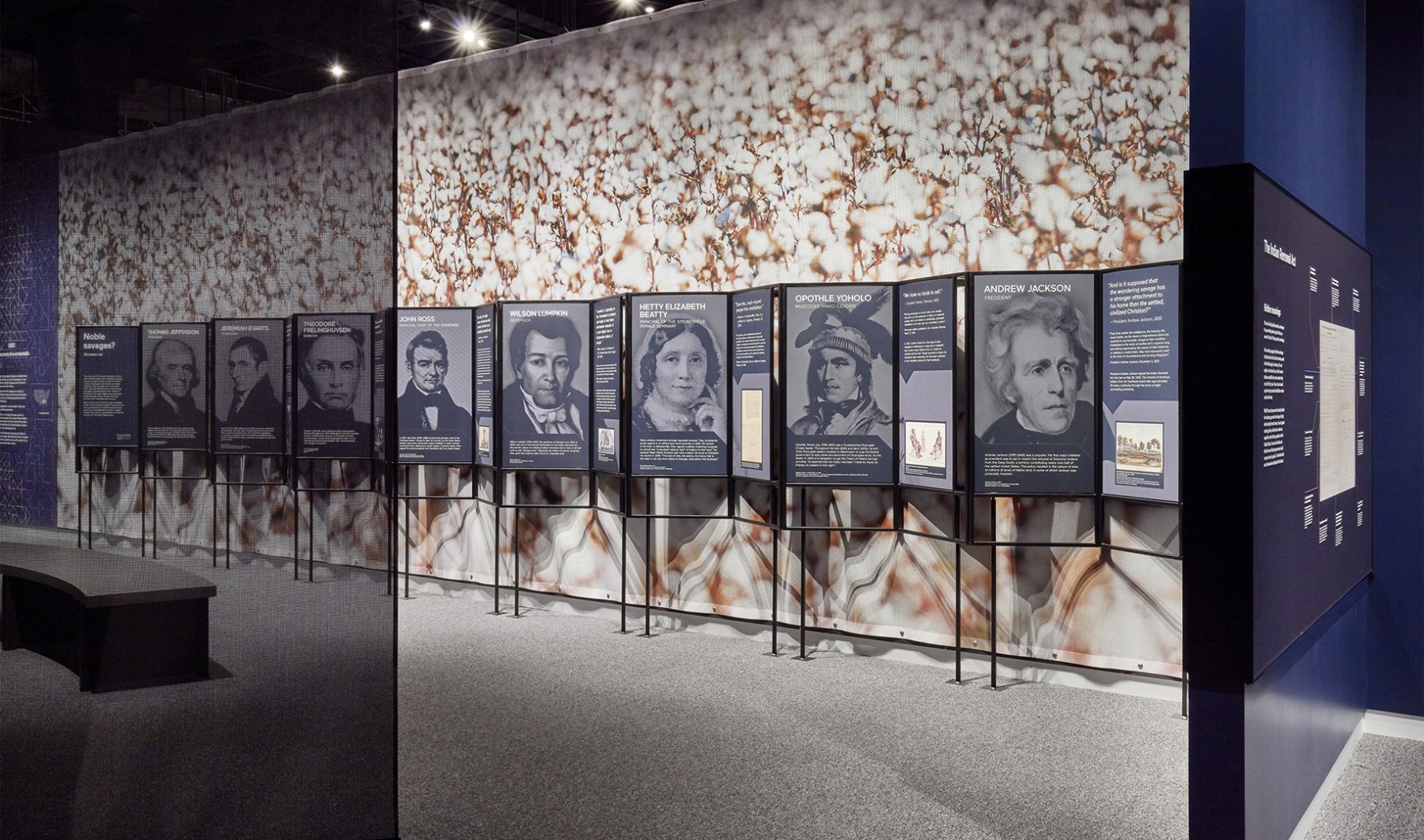
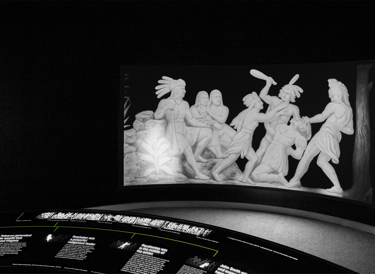
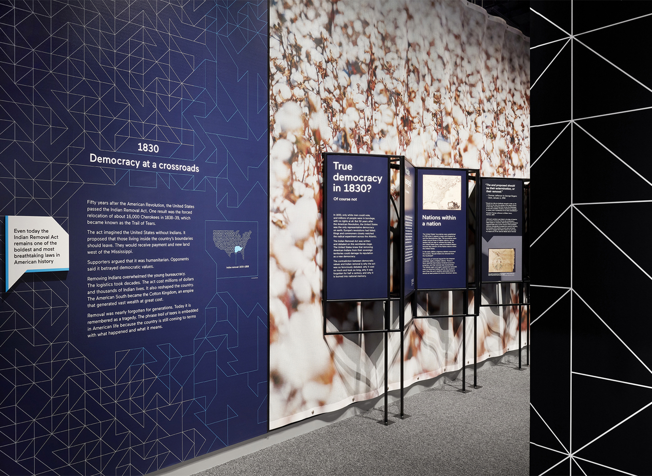
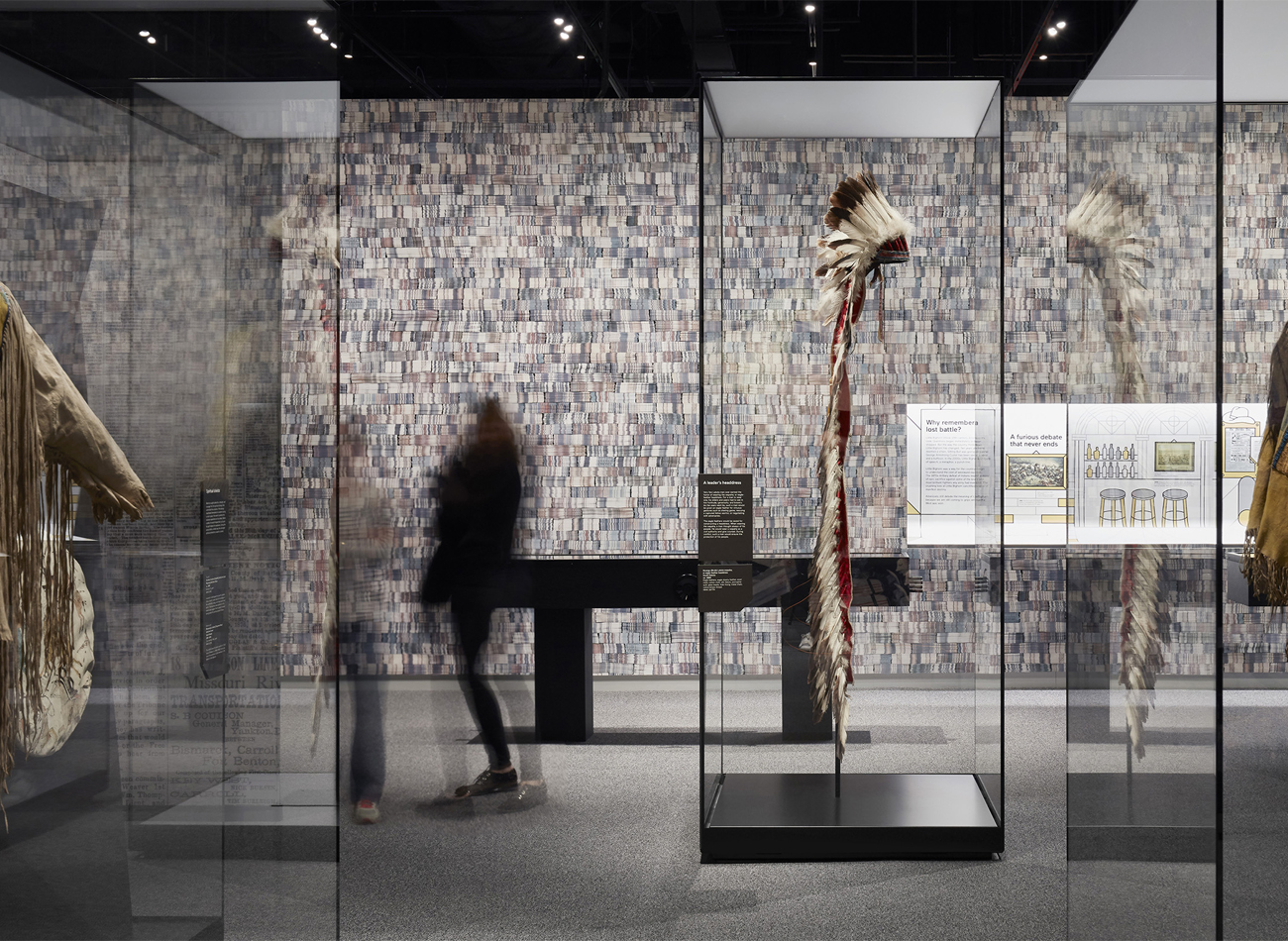
For the “Americans” exhibition at the National Museum of the American Indian, Kudos was tasked with the exhibition’s production design.
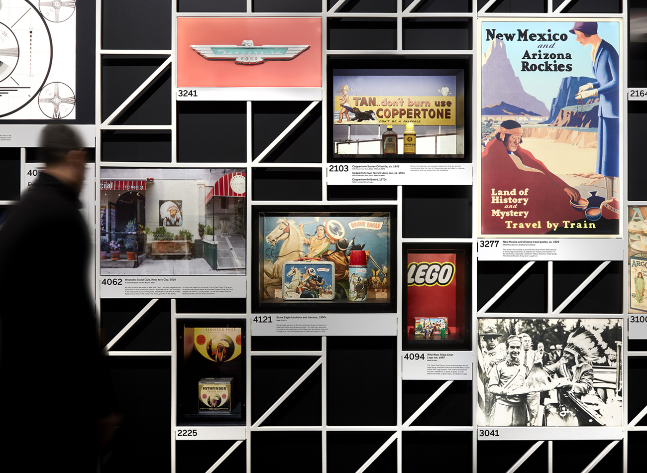
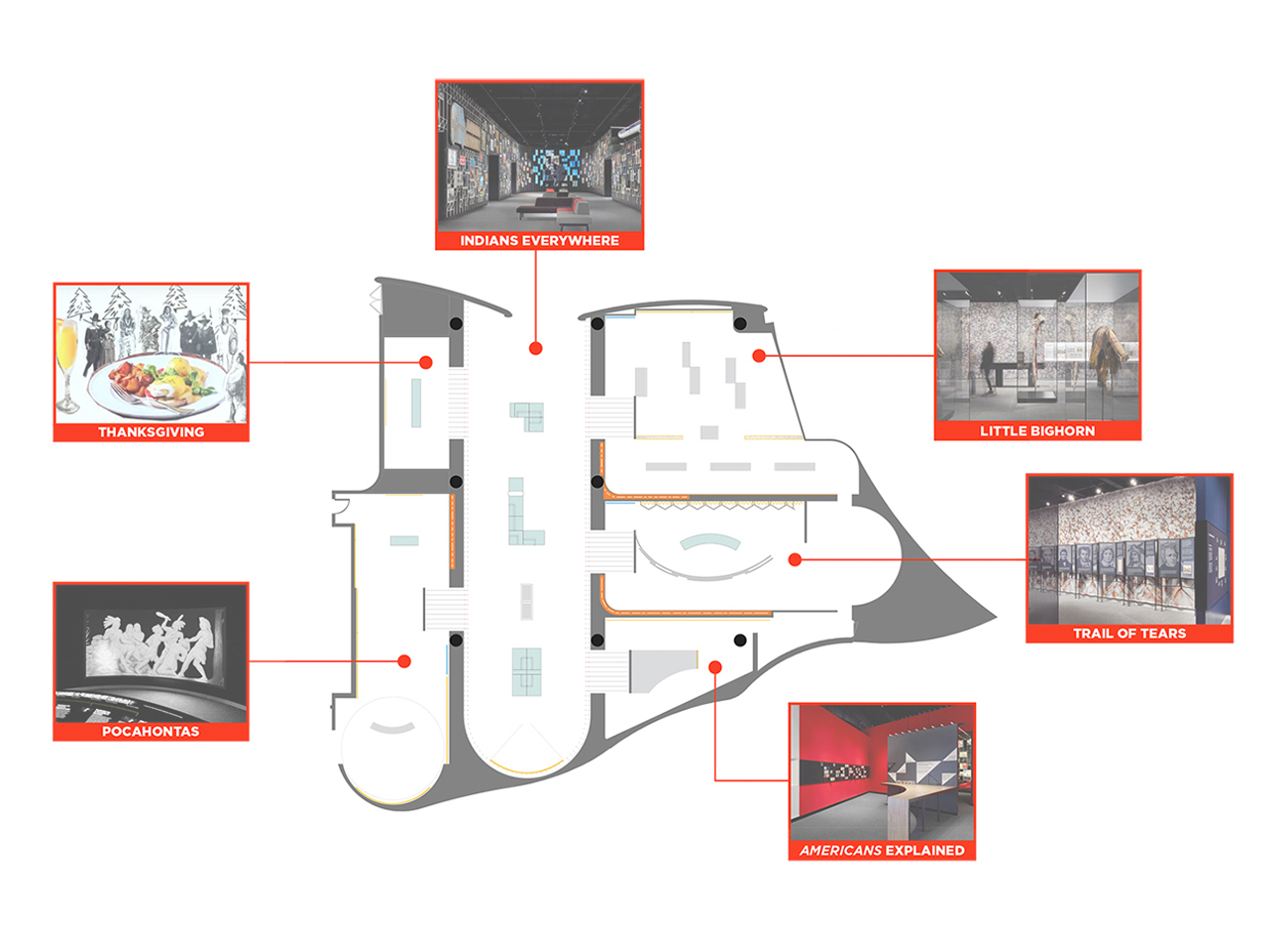
We showcased hundreds of graphics and artifacts representing American Indians from three centuries of American life, all gathered in six interconnected galleries in the southwest wing of the museum. Each gallery covered a familiar topic like Pocahontas, the Battle of Little Bighorn, Thanksgiving, and the Trail of Tears. We worked closely with Studio Joseph to ensure a clear typographic hierarchy and optimum production/installation methods for all graphic components across the various galleries and surfaces.
KUDOS Design Collaboratory
-
John Kudos
Creative Director -
Ashley Wu
Designer
National Museum of the American Indian
Photography
- Thomas Loof
Simone Leigh 2022 Venice Biennale Website
ICA Boston
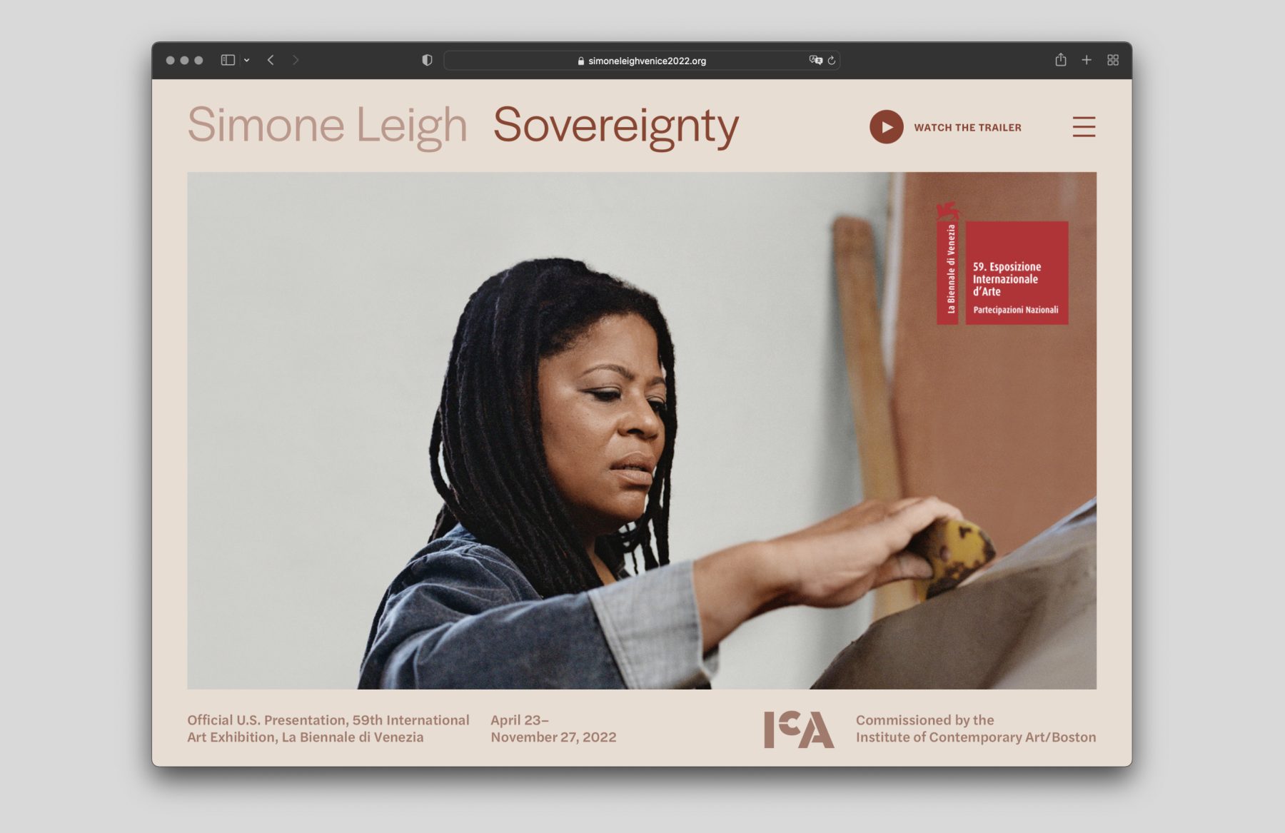
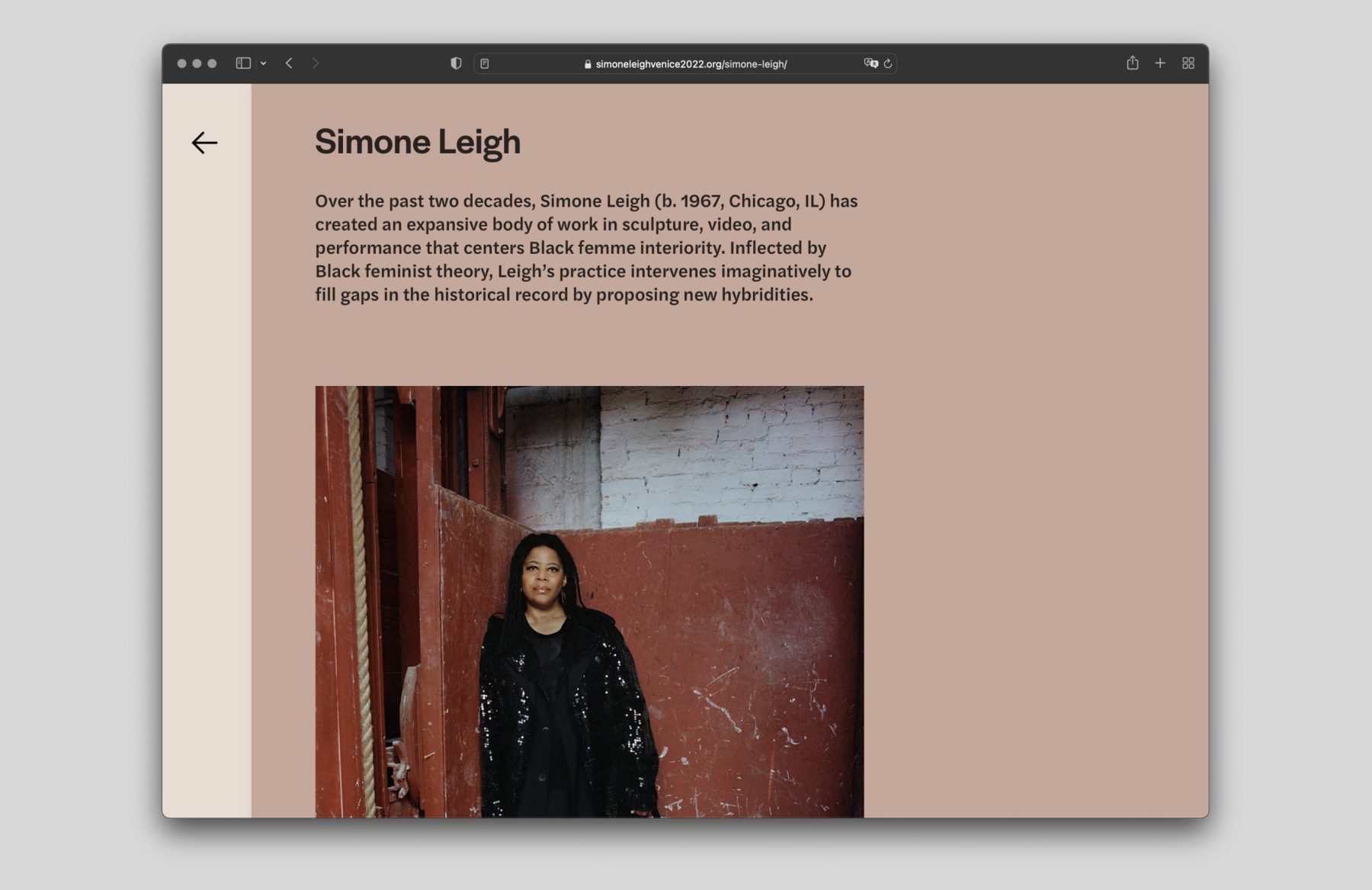
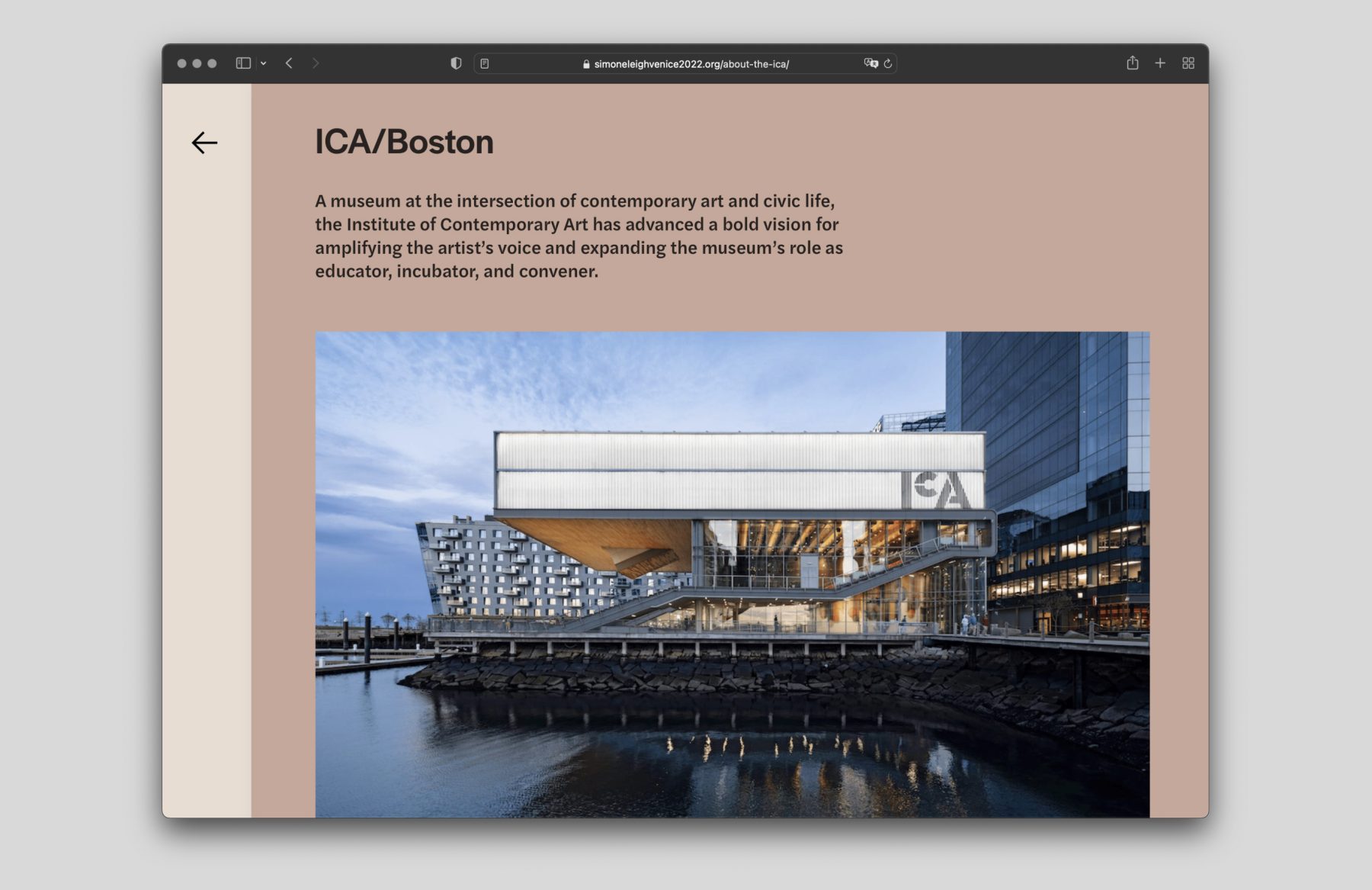
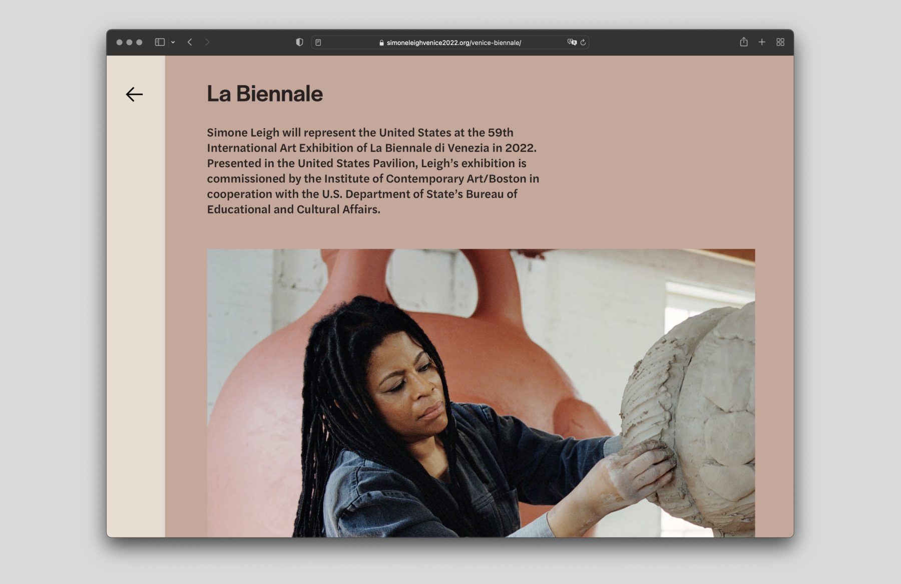
“Simone Leigh: Sovereignty” was the 2022 Venice Biennale exhibition for acclaimed artist Simone Leigh. Presented by the Institute of Contemporary Art/Boston in partnership with the Bureau of Educational and Cultural Affairs of the U.S. Department of State, the exhibition was produced with the collaboration of the Peggy Guggenheim Collection, Venice, and the Solomon R. Guggenheim Foundation, New York. Leigh’s expansive practice parsed the construction of Black femme subjectivity in a series of large-scale bronze and ceramic works, commingling disparate histories and narratives from Africa, the United States, and Europe.
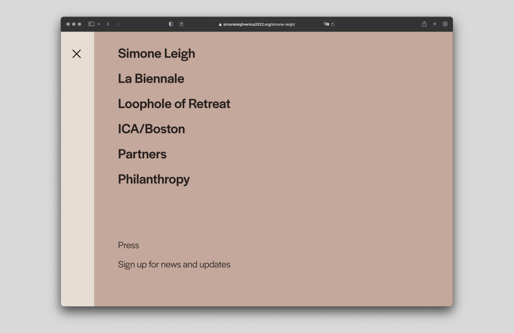
Tasked with website design and development for the exhibition, we worked closely with Miko McGinty Inc. to craft a website that presented Leigh’s work and profile in an elegantly layered interface design, complete with a color palette and typography that matched the tones of her work.
KUDOS Design Collaboratory
-
John Kudos
Creative Director -
Ashley Wu
UX/UI Designer -
Chris Manlapid
Web Developer
Miko McGinty Inc
-
Miko McGinty
Principal -
Rebecca Sylvers
Designer
Colonists Citizens Constitutions Virtual Exhibition
Dorothy Tapper Goldman Foundation
Capabilities
Focus Area
Awards
-
GDUSA 2020 American Web Design
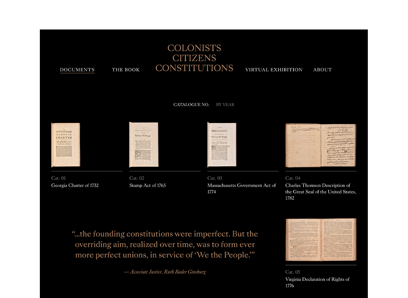
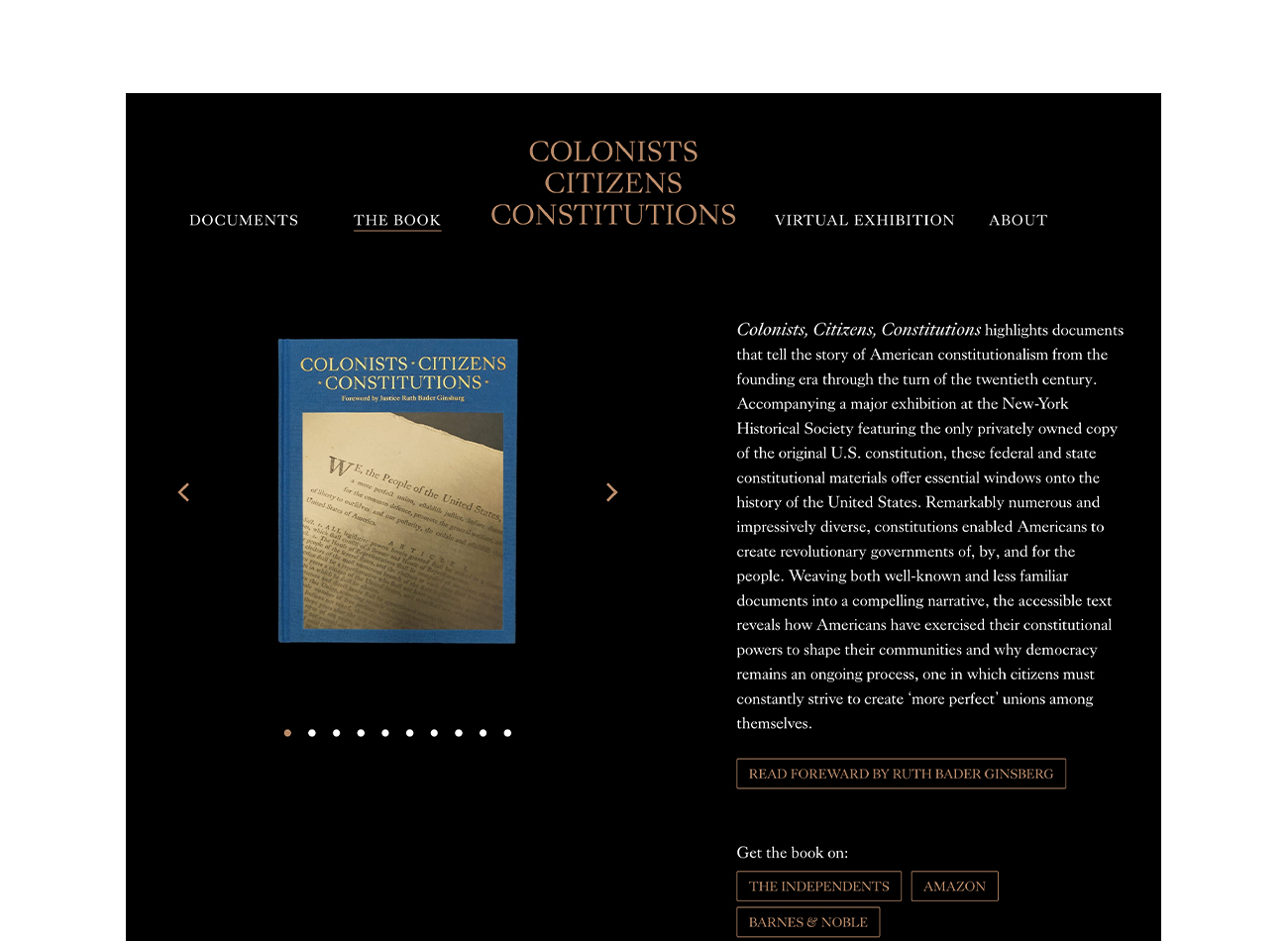
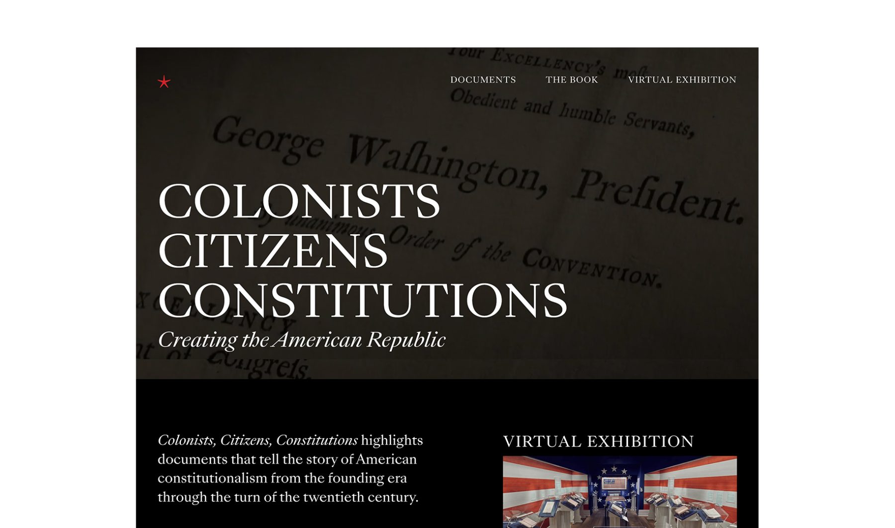
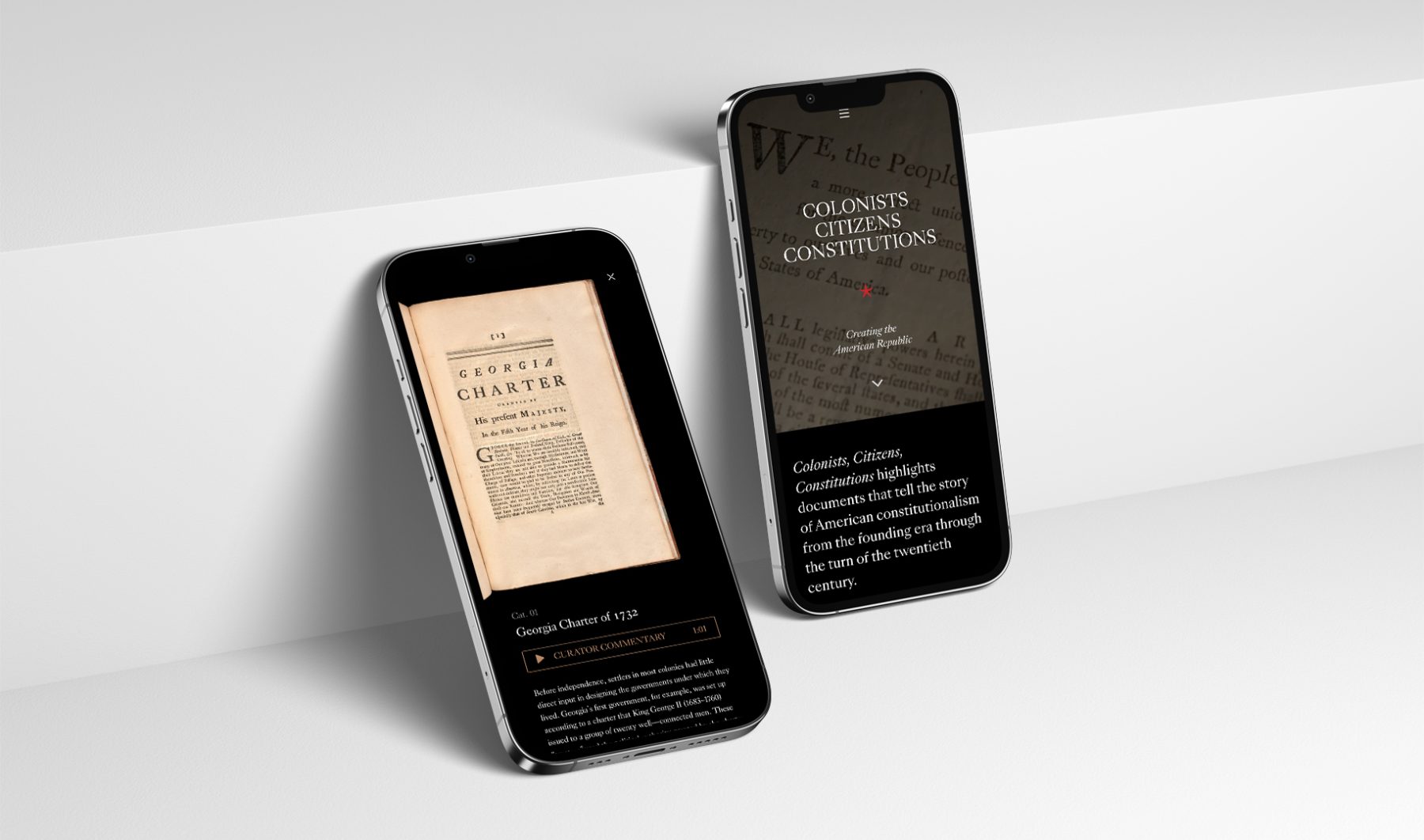
The “Colonists Citizens Constitutions” exhibit, launched in February 2020 in collaboration with the Dorothy Tapper Goldman Foundation, spotlights 42 rare documents from the Foundation’s extensive collection of Americana, telling the story of how our state and federal constitutions were imagined, formulated, written, and approved by ordinary people. These individuals arrived in America as colonists then made themselves its first citizens, while codifying their philosophies of governance and human rights via the writing of constitutions.
We originally designed the show’s website to serve as a supplement to the in-person exhibition at the New-York Historical Society. However, due to museum closures caused by COVID-19, we ultimately published a virtual tour of the gallery instead, ensuring its documents remained accessible to the public.
KUDOS Design Collaboratory
-
John Kudos
Creative Director -
Owen Febiandi
Designer -
Chris Manlapid
Web Developer
Colonists Citizens Constitutions
The Swiss Grid
Poster House
Capabilities
Focus Area
Client
Poster House (New York City) is the first museum in the U.S. to be dedicated exclusively to posters, presenting a global view of the medium from its earliest appearances in the late 1800s to present-day uses.
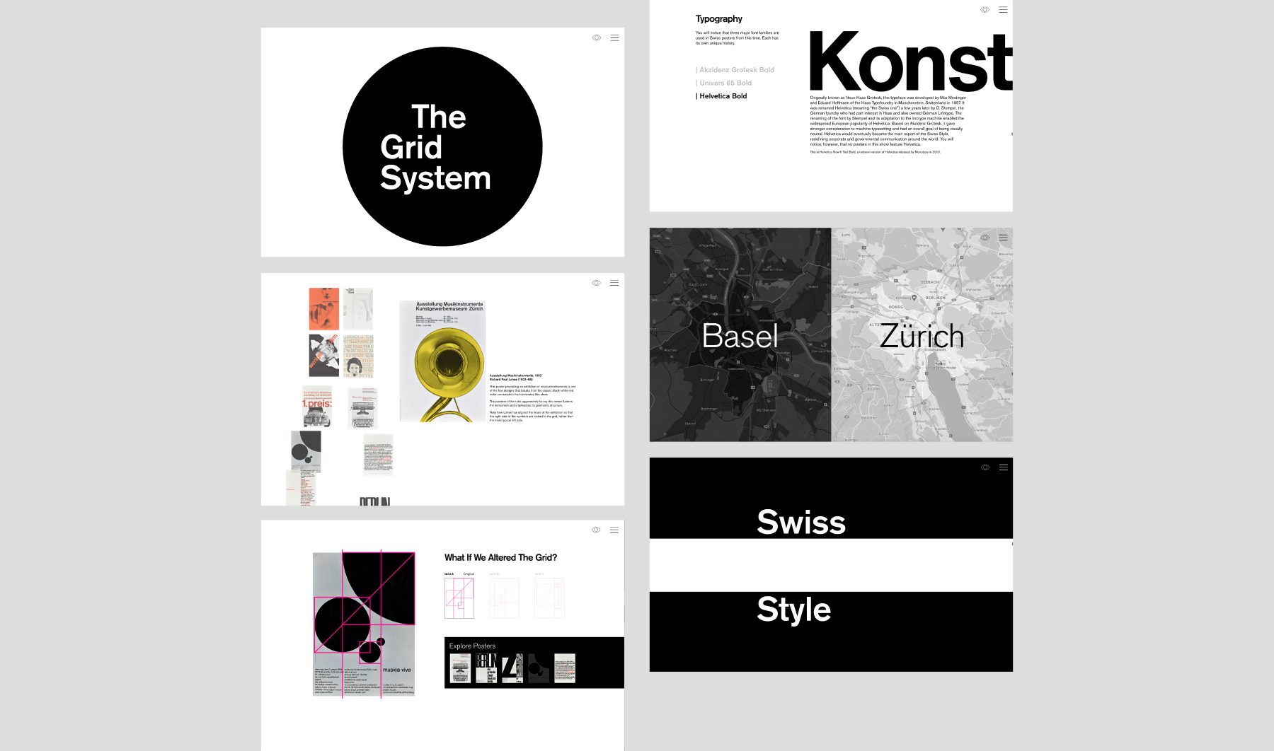
The Swiss Grid was a Poster House exhibition that launched on February 26, 2020. Ten days after the opening, the museum shut down due to COVID-19. We helped Poster House transition the exhibition into a remote-learning tool that provides historical and pedagogical context for some of the technical teachings of design.
Using core material from the original exhibition, the microsite shows how a particular aesthetic—referred to as “The Swiss Grid”—developed in post–World War II Switzerland and spread around the world through generations of practitioners, and how that aesthetic was used to create incredible posters for the cultural sector. The site interweaves contemporary attitudes toward teaching mid-century Modernism and the desire to both break free of and find new use for grid systems in contemporary design.
KUDOS Design Collaboratory
-
John Kudos
Creative Director -
Ashley Wu
Designer -
Fay Qiu
Designer -
Chris Manlapid, Arif Widipratomo
Web Developer
Parpulo Batak Art Branding
Indonesian Ministry Of Tourism And Creative Economy
Capabilities
Focus Area
Parpulo is the foremost custodian of Batak art, offering unique wood carvings, textiles, and cultural experiences from the picturesque region of Toba, Indonesia. Since 1983, Parpulo has been instrumental in promoting Batak culture, supported by the nation’s Ministry of Tourism and Creative Economy.
In response to the pandemic, we revamped Parpulo’s brand, creating a fresh visual identity, innovative packaging, and captivating photography to enhance their global presence in a post-Covid global market. Our rebranding efforts successfully positioned Parpulo on the international stage, ensuring that the brand’s rich cultural heritage and artistic value are now shared with a wider audience.
KUDOS Design Collaboratory
-
Creative Director
Zaki Fitria -
Designer
Zaki Fitria -
Researcher
Angela Muliana -
Motion Designer
Rias Amalia -
Project Manager
Robi Dafit
Brand Strategist
- Andini Endah Pratiwi


Made in Tokyo
Japan Society
Capabilities
Focus Area
Client
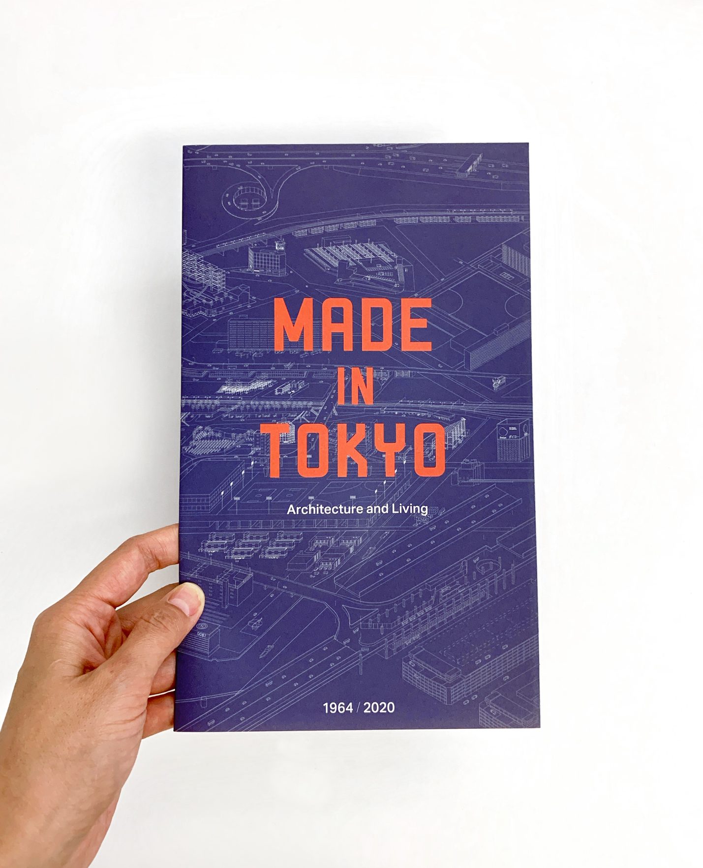
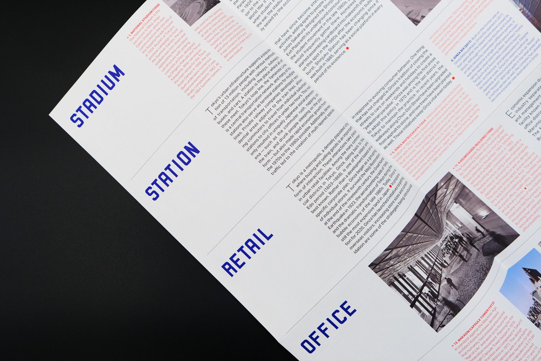
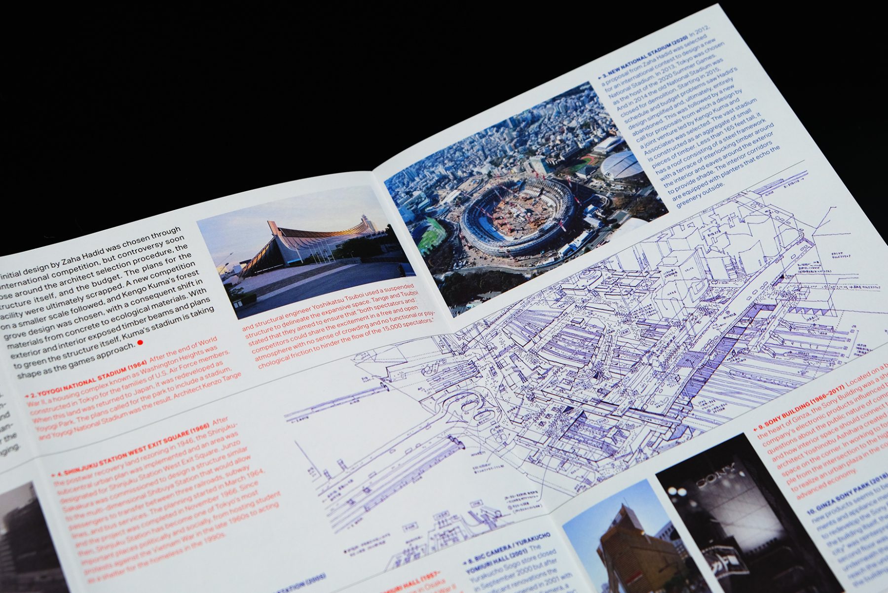
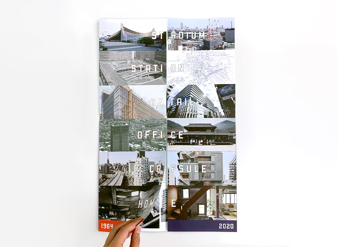
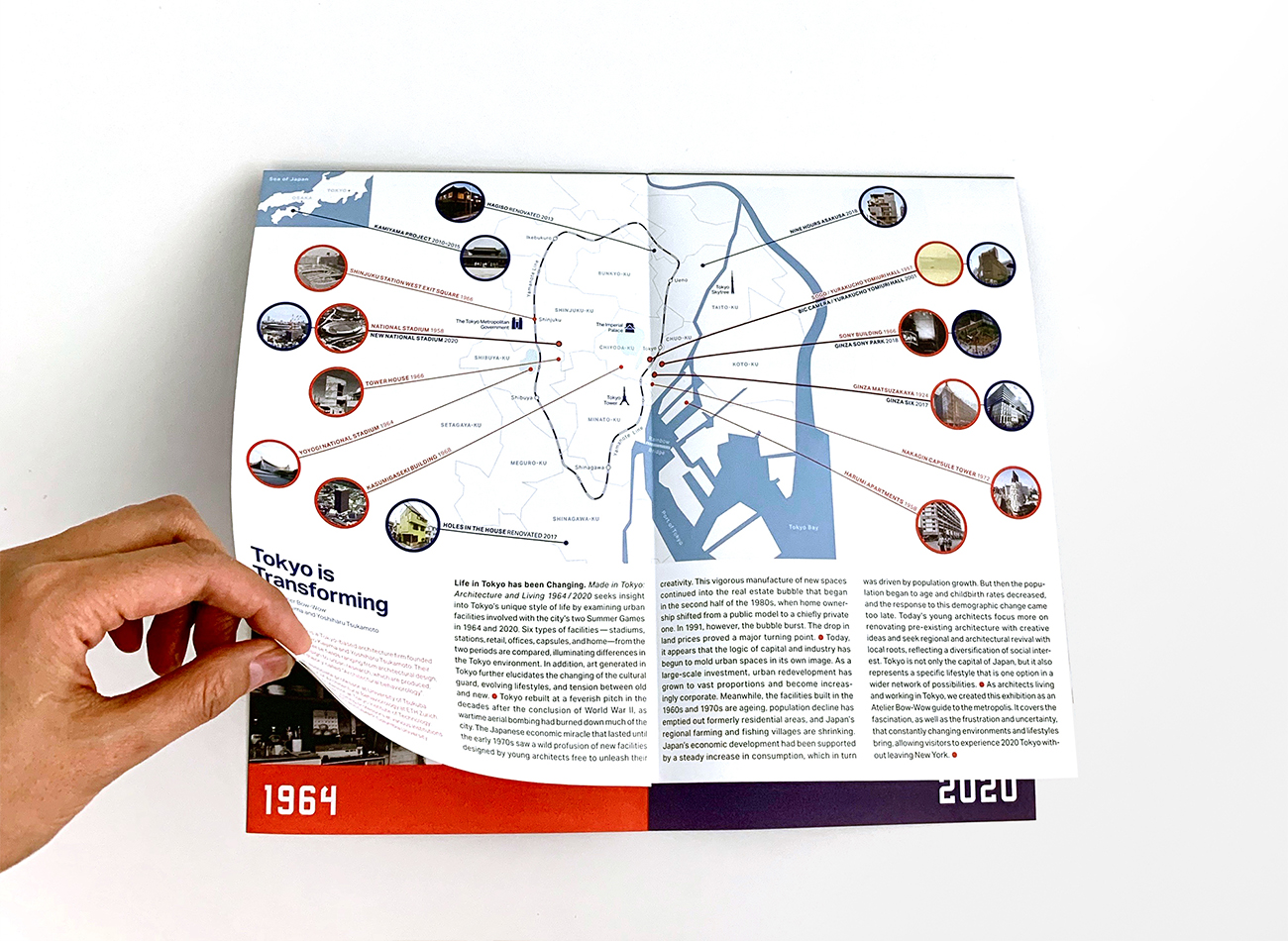
The Japan Society’s “Made in Tokyo” exhibition explored the development of socio-architectural facilities and compared landscapes with art and performance generated in Tokyo between the city’s two seminal Olympic Games events in 1964 and 2020. Atelier Bow-Wow, a Japanese architectural firm, curated and designed the exhibition.
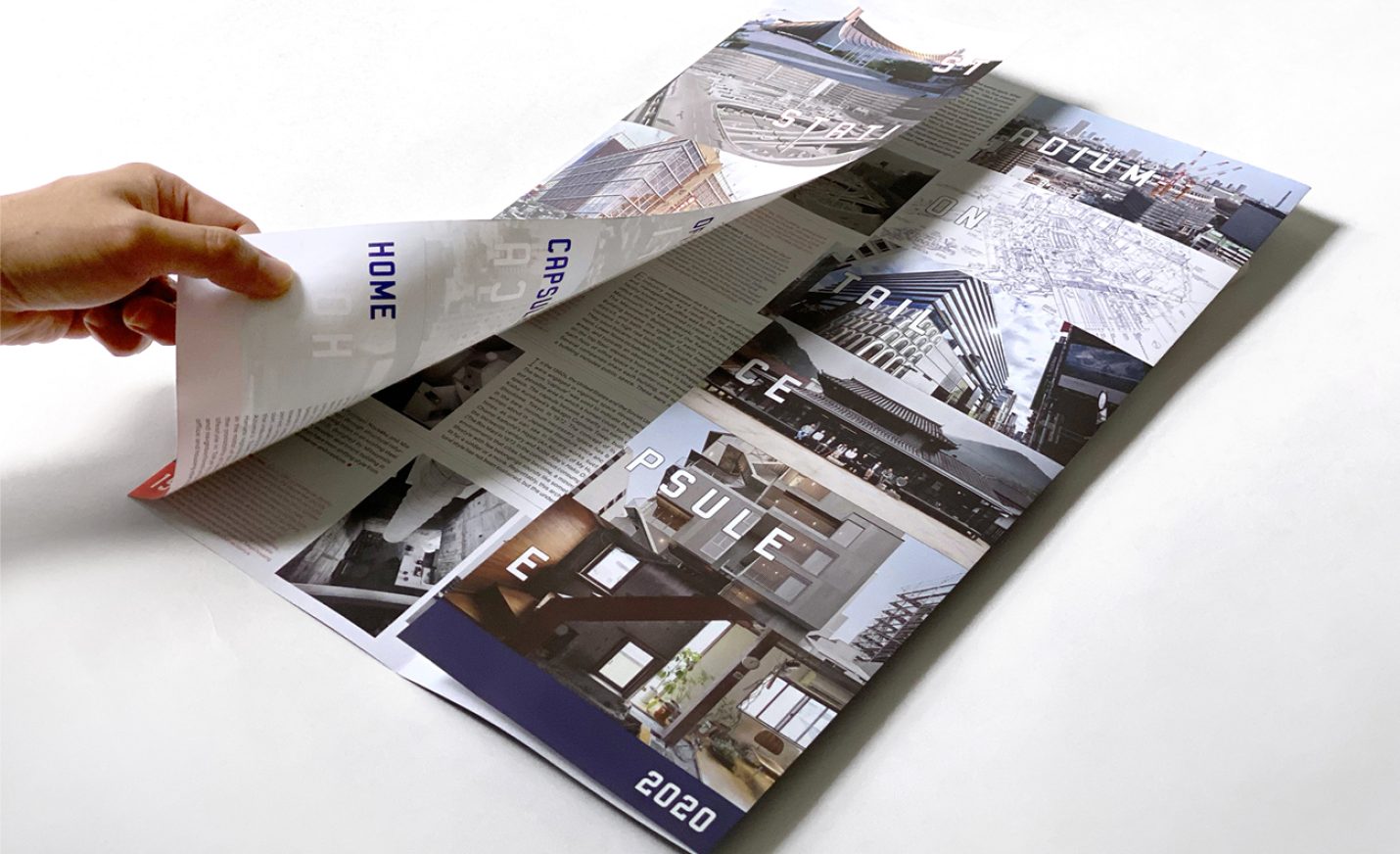
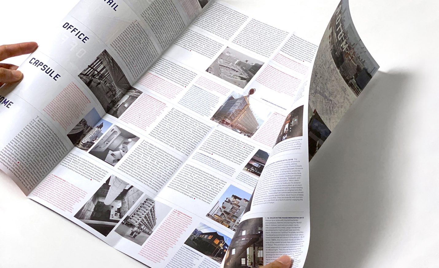
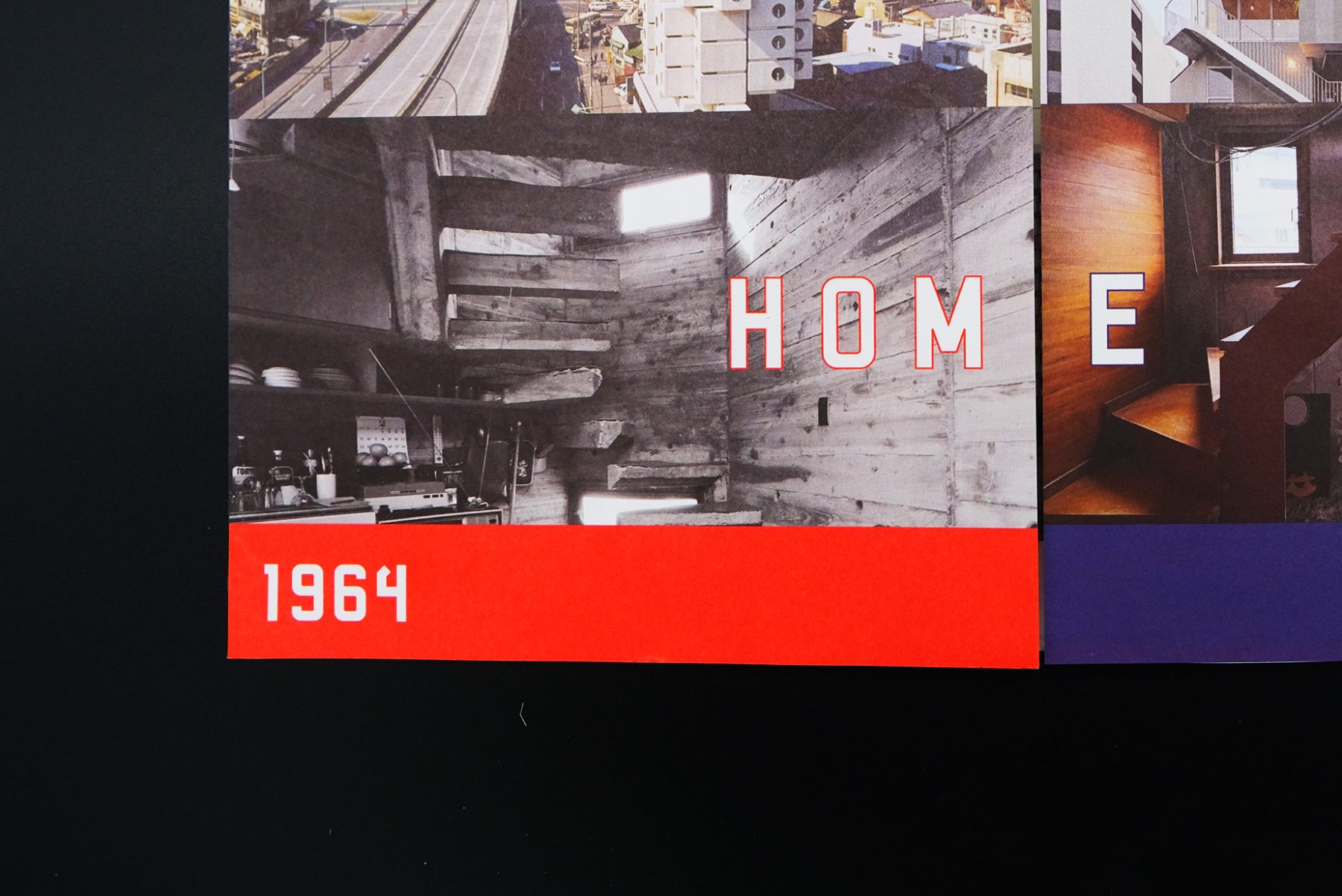
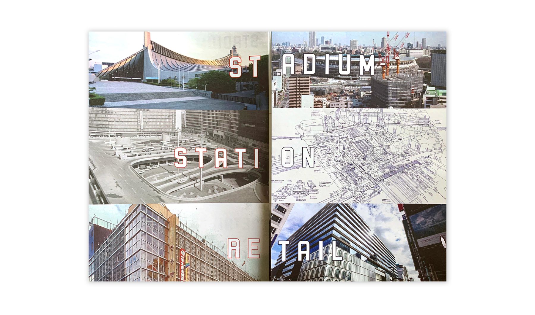
We designed an exhibit brochure that unfolds as a map of Tokyo. The brochure features buildings covered in the exhibition, organized into six functional themes.
KUDOS Design Collaboratory
-
John Kudos
Creative Director -
Saori Tahara
Designer
Japan Society
