Lewis Latimer Interactives
Lewis Latimer House Museum
Capabilities
Focus Area
Client
Lewis Howard Latimer was the son of self-emancipated enslaved people, a self-taught draftsman, and major contributor to the invention of the lightbulb and the telephone. Some of his own inventions are the early air conditioning unit and the railroad car bathroom.
Growing up, Latimer faced many challenges due to racial discrimination prevalent at the time. He enlisted in the Union Navy in 1864 at the age of 16 and—with no access to formal education—taught himself mechanical drawing which eventually led him to become a chief draftsman, patent expert, and inventor.
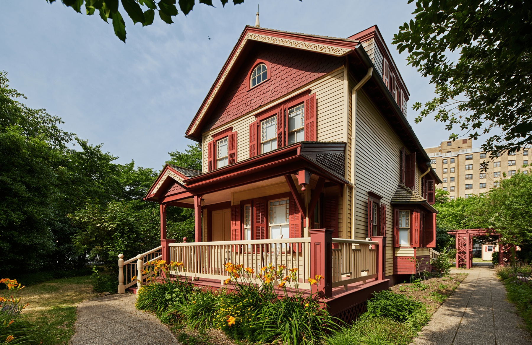
The Lewis Latimer House Museum in Flushing, New York is the very same house that Latimer lived in from 1903 until his passing at the age of 80 in 1928. Threatened with demolition, the house was relocated from Holly Avenue in East Flushing to its present location in 1988. It is now a historic house museum owned by the New York City Department of Parks & Recreation, operated by the Lewis H. Latimer Fund, Inc., and is a member of the Historic House Trust.
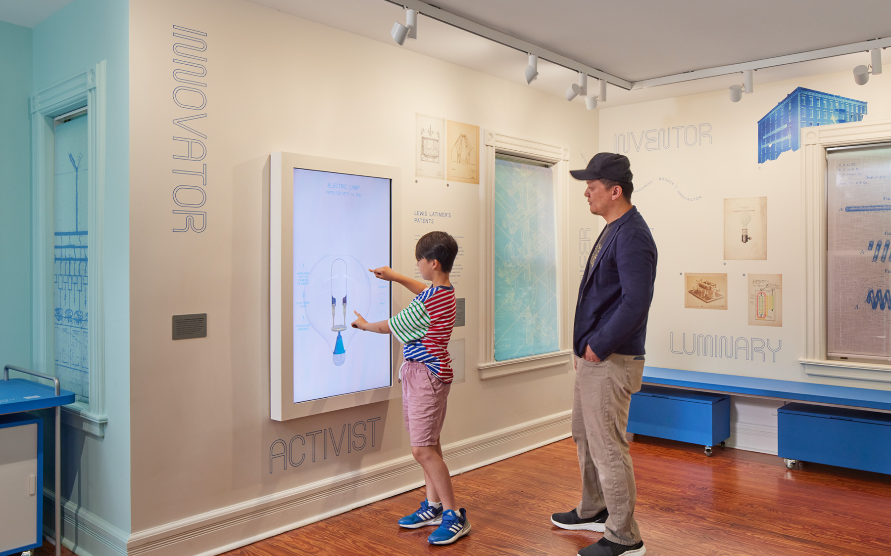
We worked closely with Isometric, the lead exhibition designer, to produce four interactive exhibitions through a combination of digital and physical experiences that educate, entertain, and inspire—all rooted in Latimer’s legacy as an mold-breaking inventor of his time.
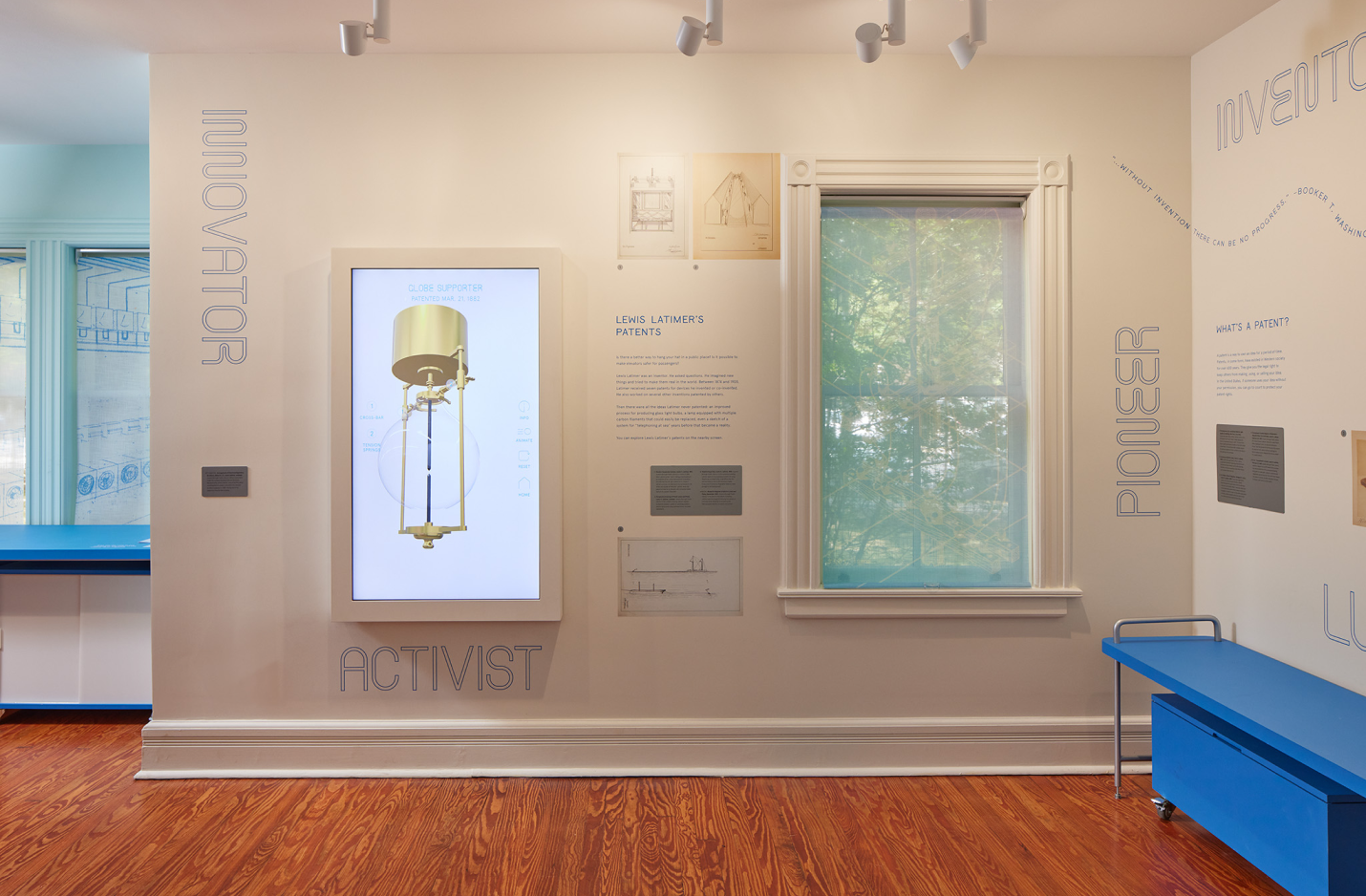
INVENTION MACHINE
Vertical screen displaying inventions Latimer patented, but never built. Oversized blueprints reimagined as 3D objects which brings the inventions to life.
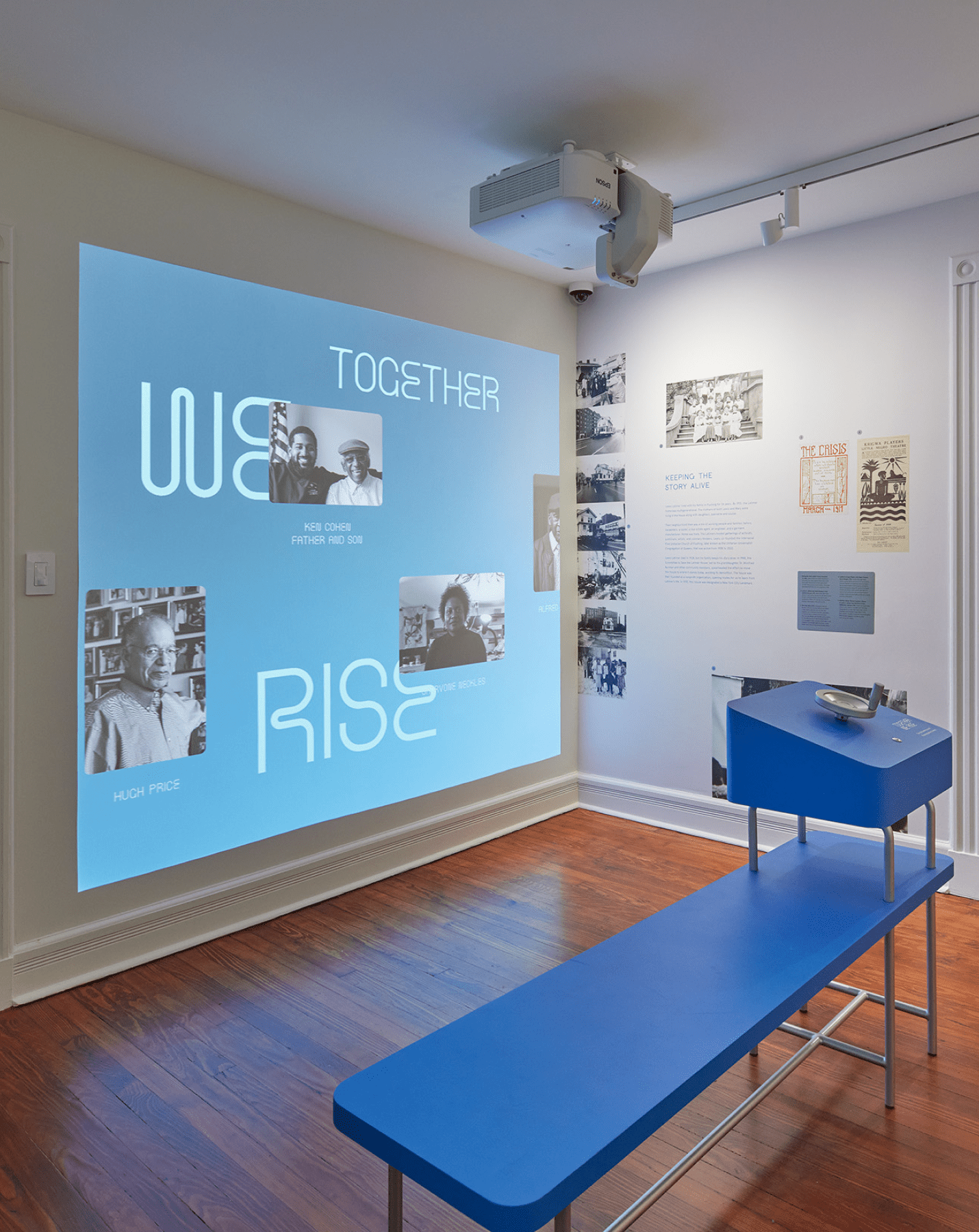
TOGETHER WE RISE
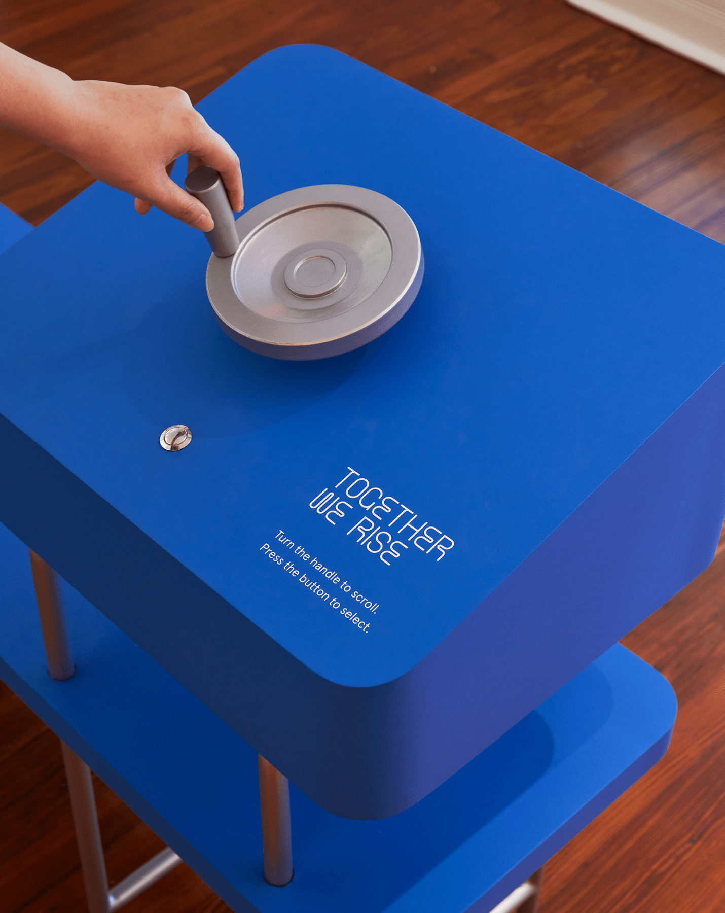
An interactive “family portraits wall” of contributors and leaders integral to Latimer’s legacy. A bench in front of the projection wall holds a hand-crank allowing viewers to navigate to a particular profile by rotating and pressing a physical button.
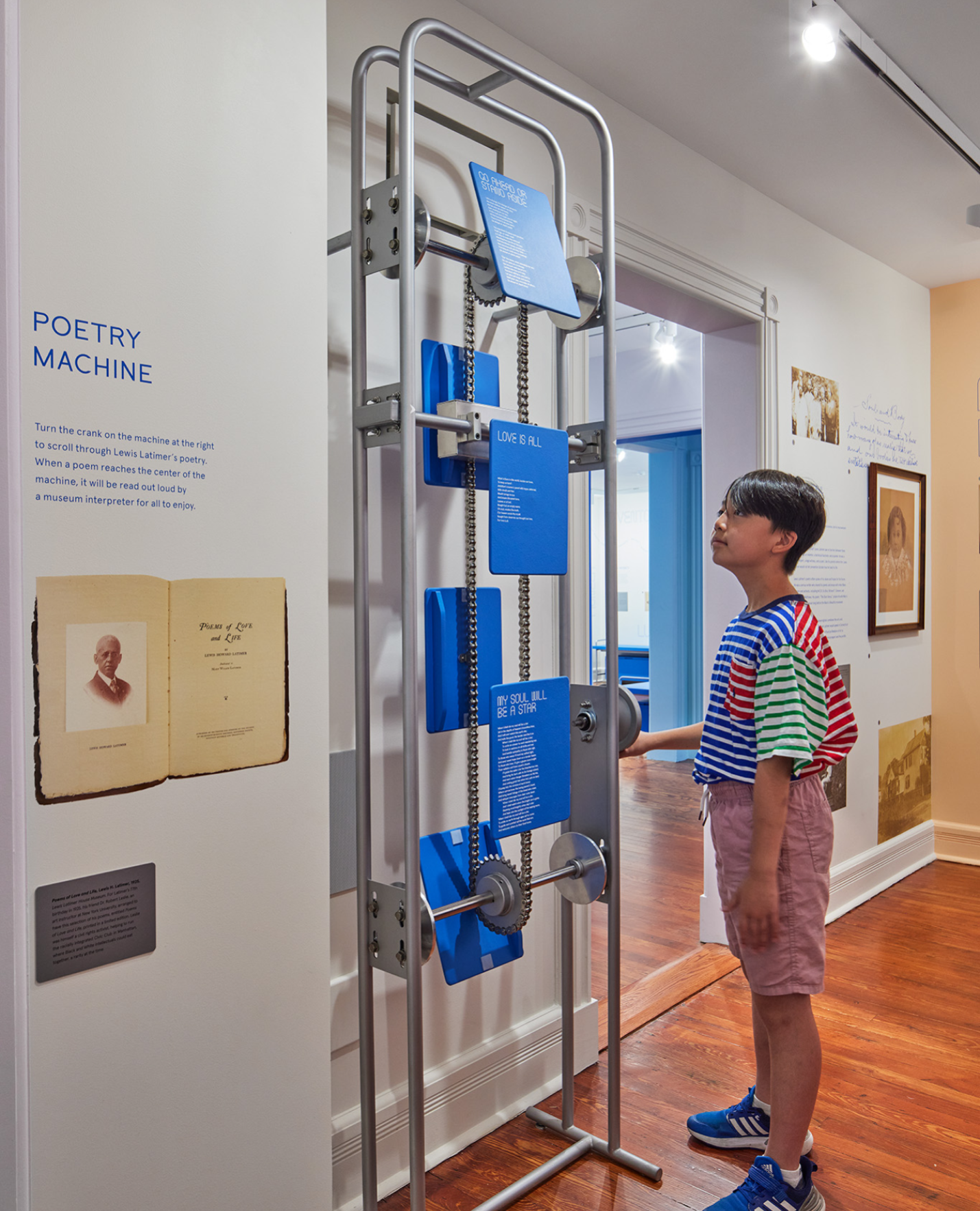
POETRY MACHINE
A skeletal mechanical crank allowing visitors to rotate between panels of Latimer’s poetry. When cranked to the right position, the selected poetry plays audibly, allowing visitors to experience the poetry as an audio-visual sensory experience.
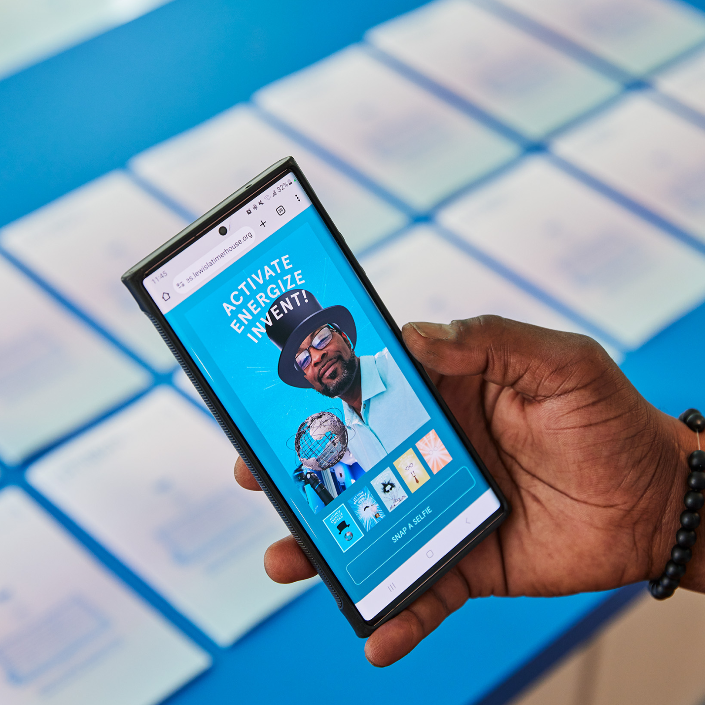
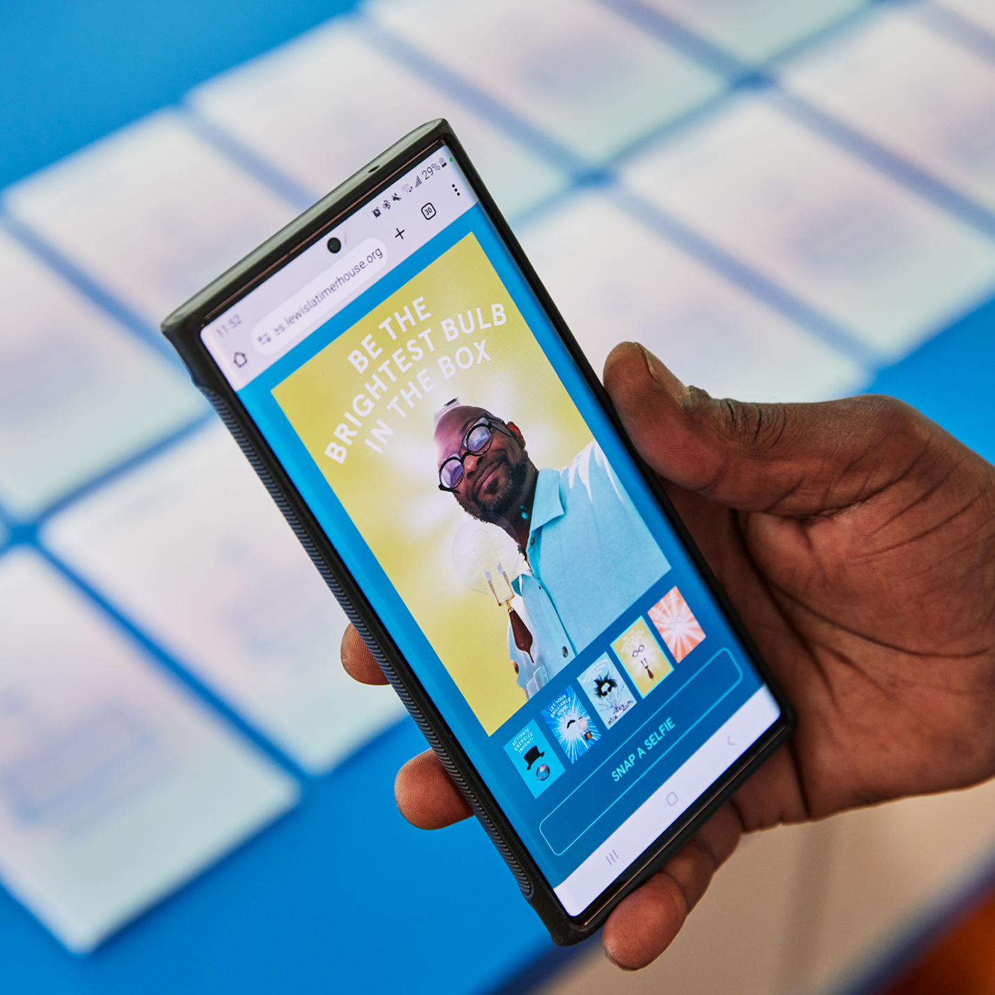
LATIMER BUZZ SELFIE APP
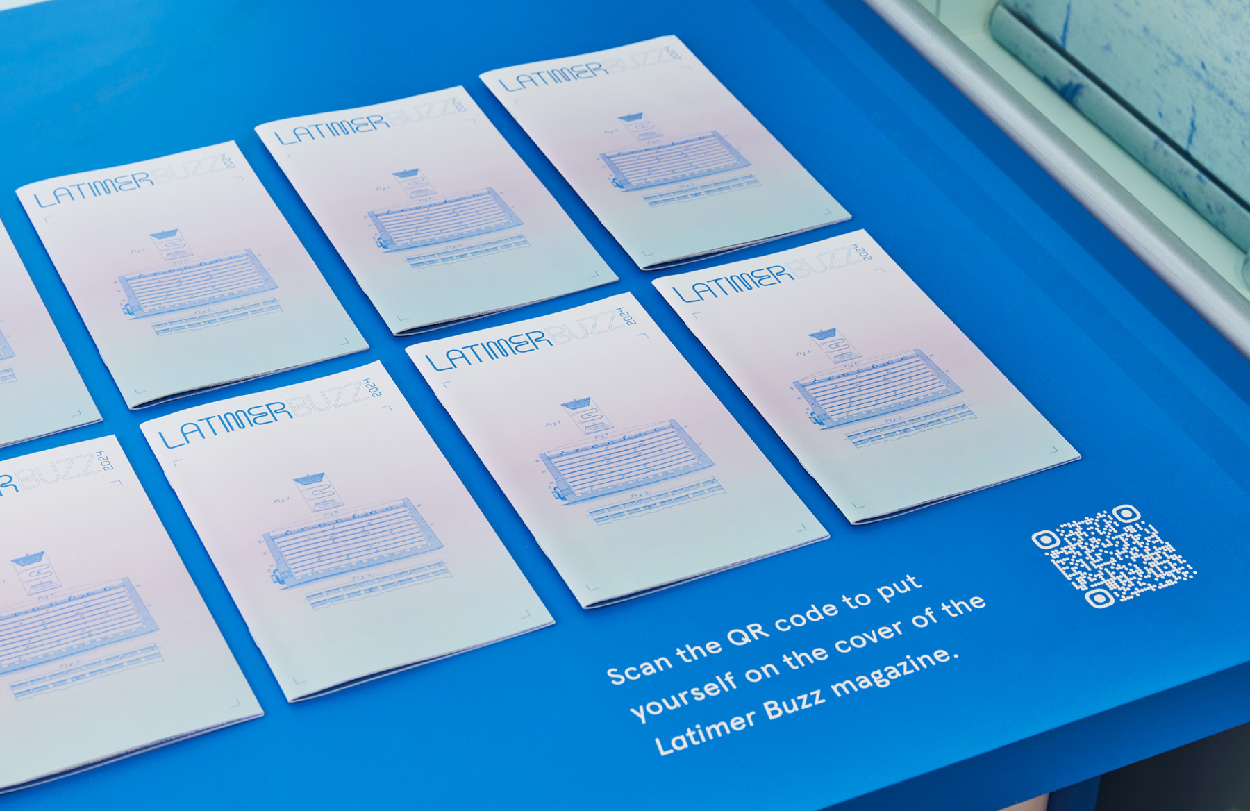
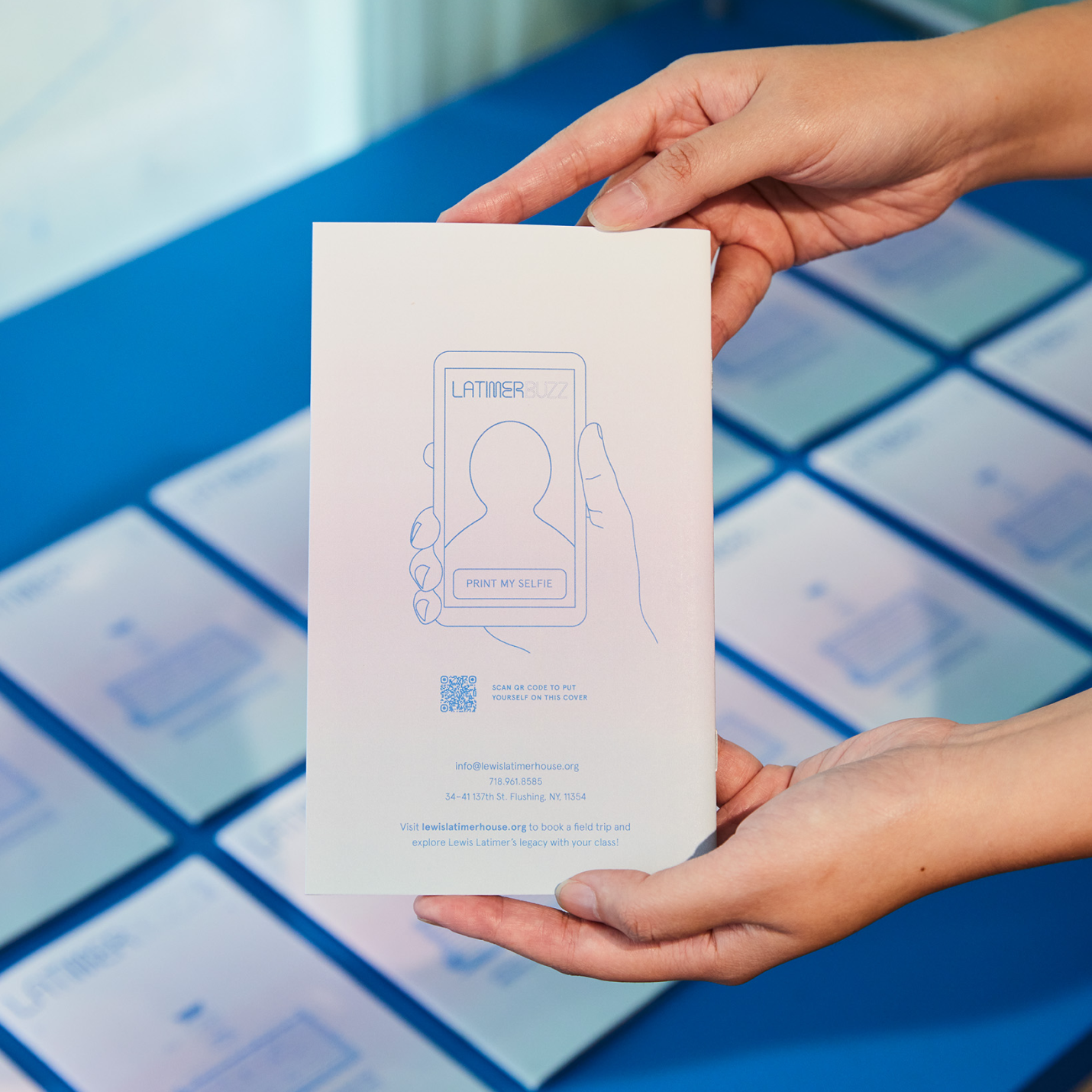
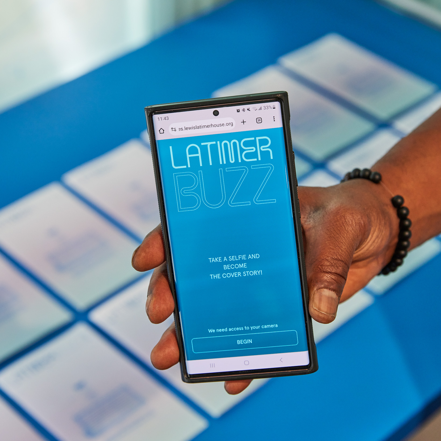
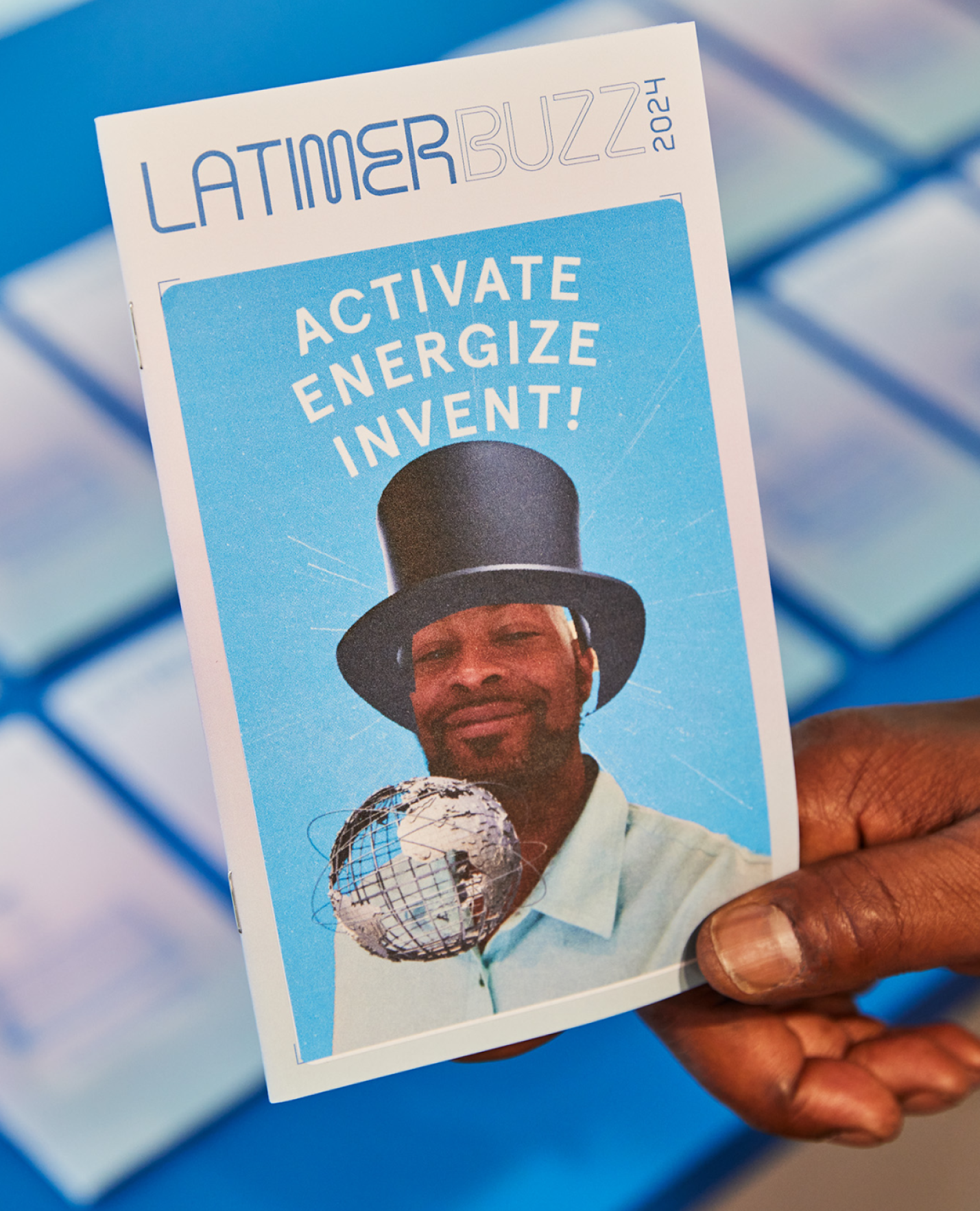
A selfie app that can be loaded directly on visitor’s smart phones using a QR code on the printed Latimer Buzz magazine. Through the app, everyone can take a fun selfie image as the cover of Latimer Buzz magazine, and actually print a physical sticker that can be affixed to the magazine as a keepsake item—a kid-friendly activity and souvenir from a memorable experience.
KUDOS Design Collaboratory
-
John Kudos
Creative Director -
Robert de Saint Phalle
3D Creative Director -
Jess Mackta
Project Manager -
Jamus Marquette
Lead Designer -
Fay Qiu, Owen Febiandi
Designer -
Imam Fadillah
3D Designer -
Chris Manlapid, Arif Widipratomo, Faris Han
Software Developer -
Ed Bear
Engineer -
Levy Murphy
Fabricator -
Electrosonic
A/V Consultant
Isometric
- Lead Exhibition Design

Young Ones Call for Entry
The One Club for Creativity
Capabilities
Focus Area
Client
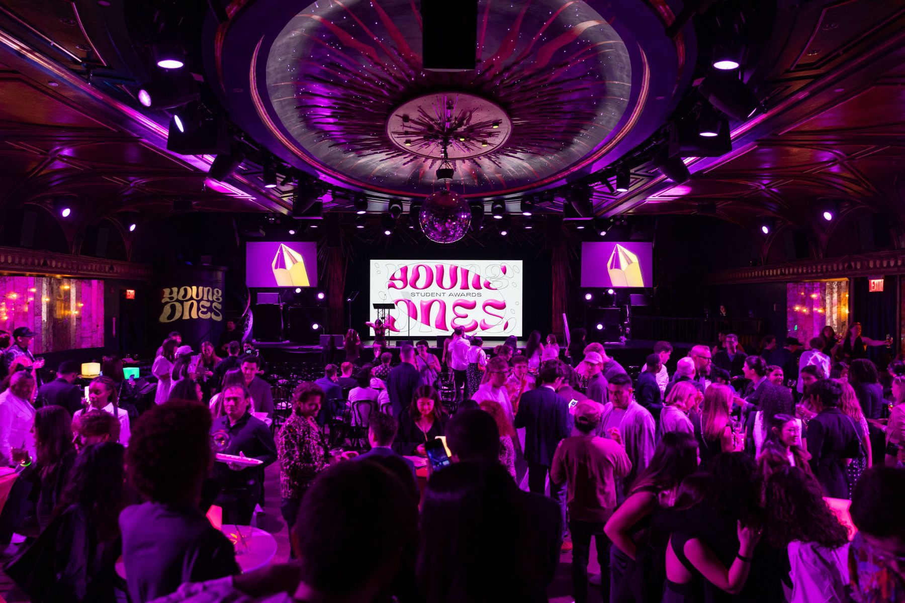
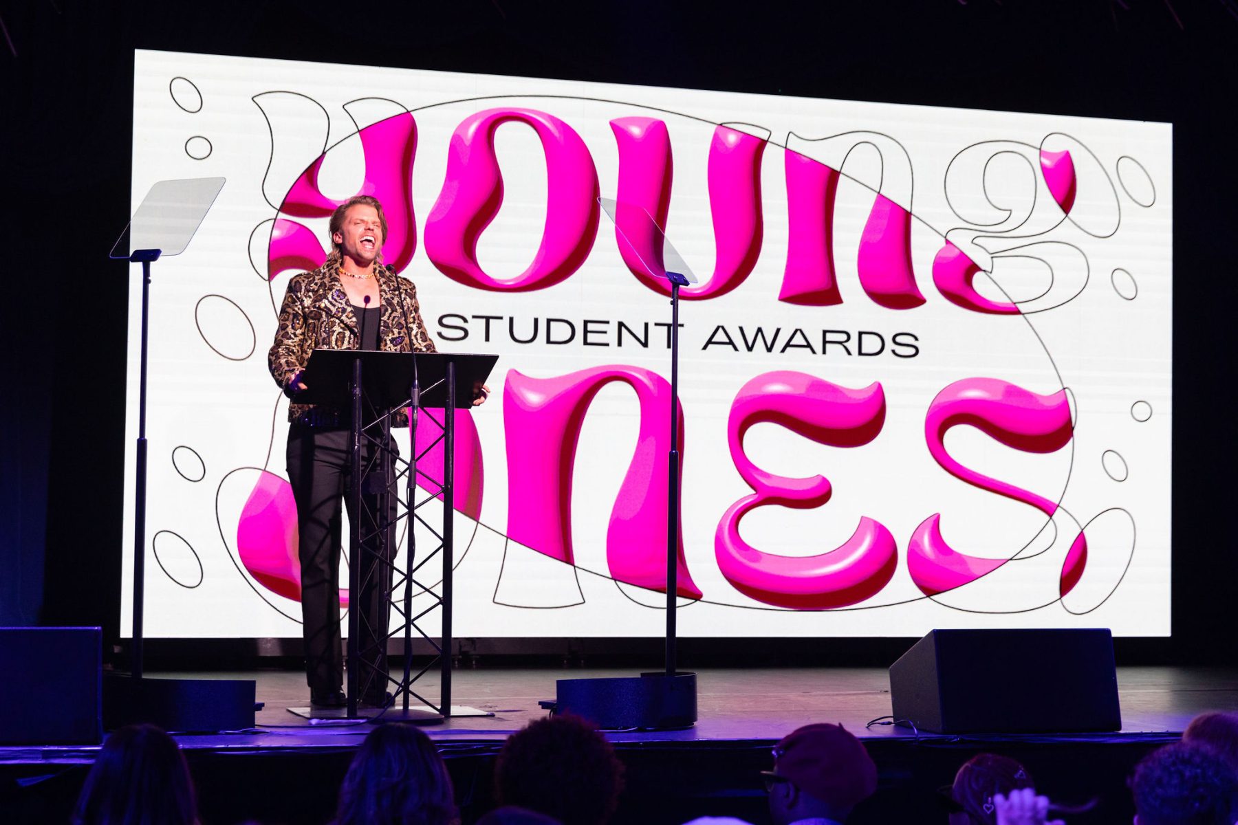
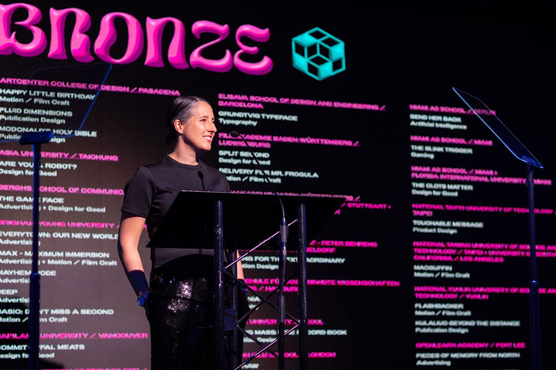
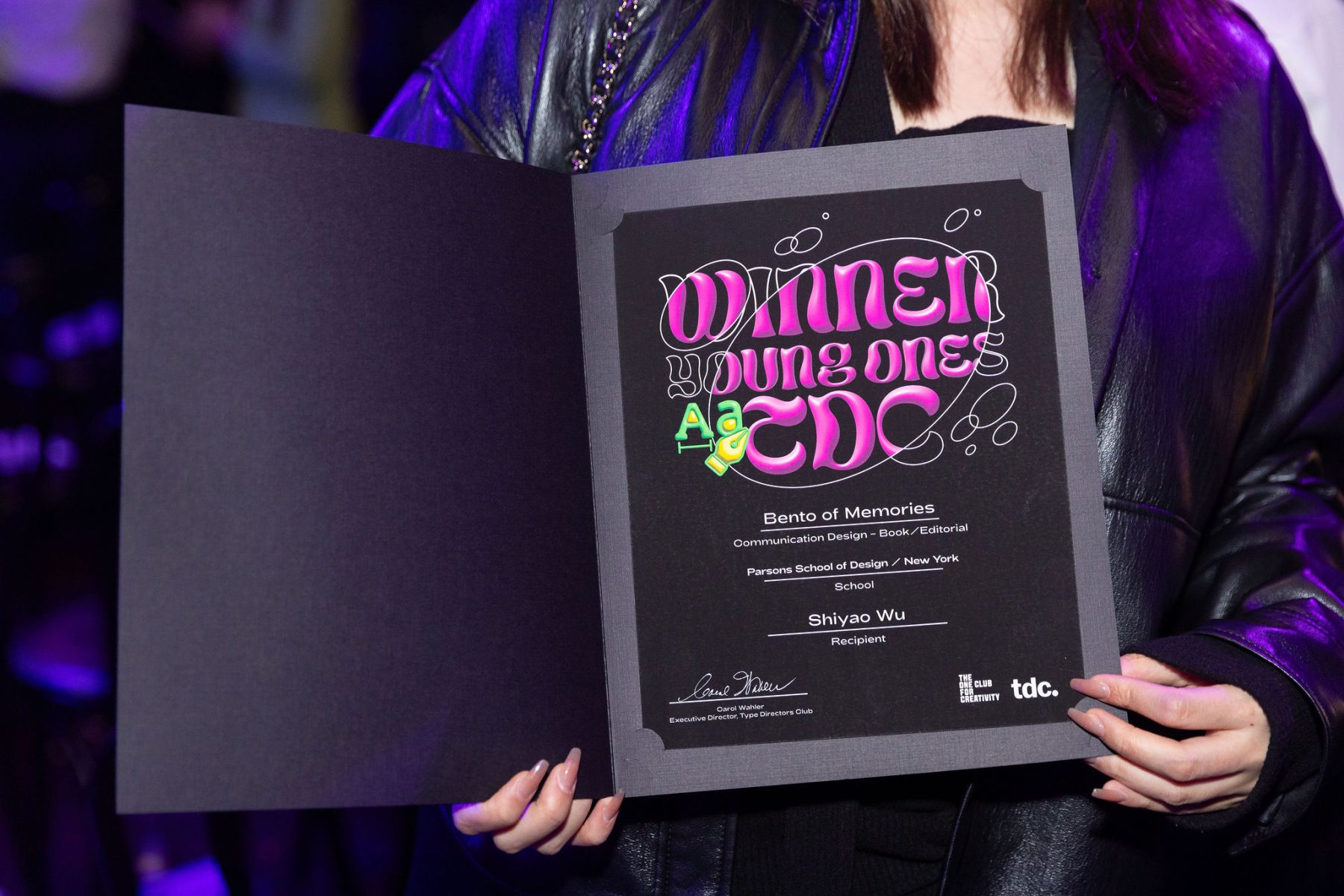
The Young Ones is The One Club for Creativity’s premier competition for students and recent graduates, spanning four unique contests: Young Ones ADC, One Show, Portfolio, and TDC. This global platform challenges emerging creatives to showcase their best work and launch their careers.
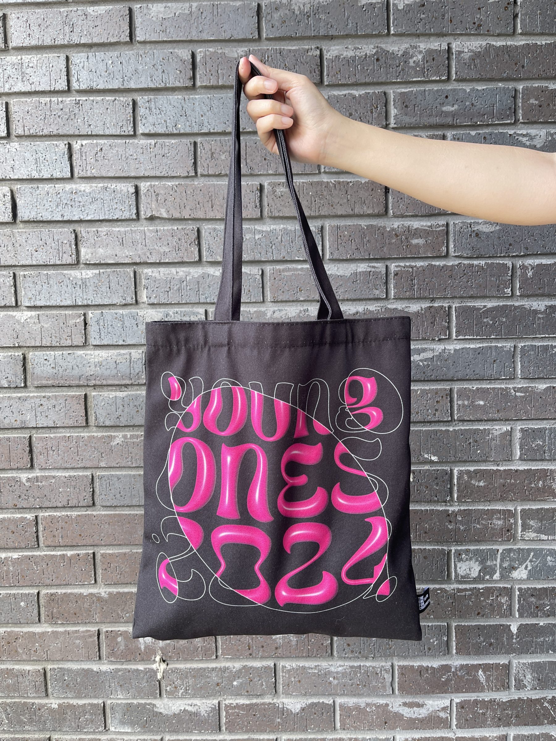
This year’s branding highlights the evolution from concept to creation. We paired 2D linear sketches with 3D-rendered typography of the custom Young Ones logotype, brought to life with animated circular bubbles that reveal the final design—symbolizing the transformative journey of creativity.
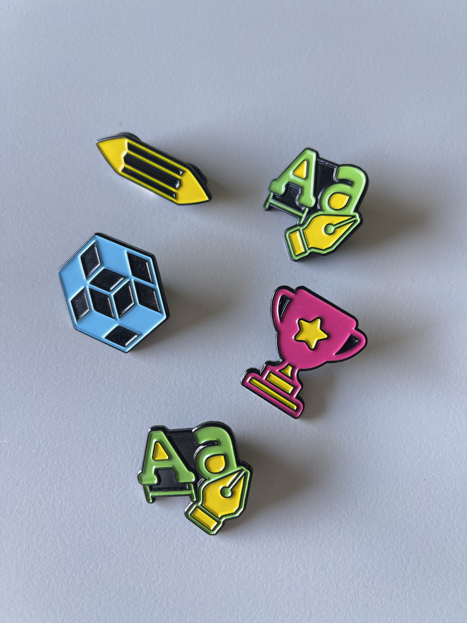
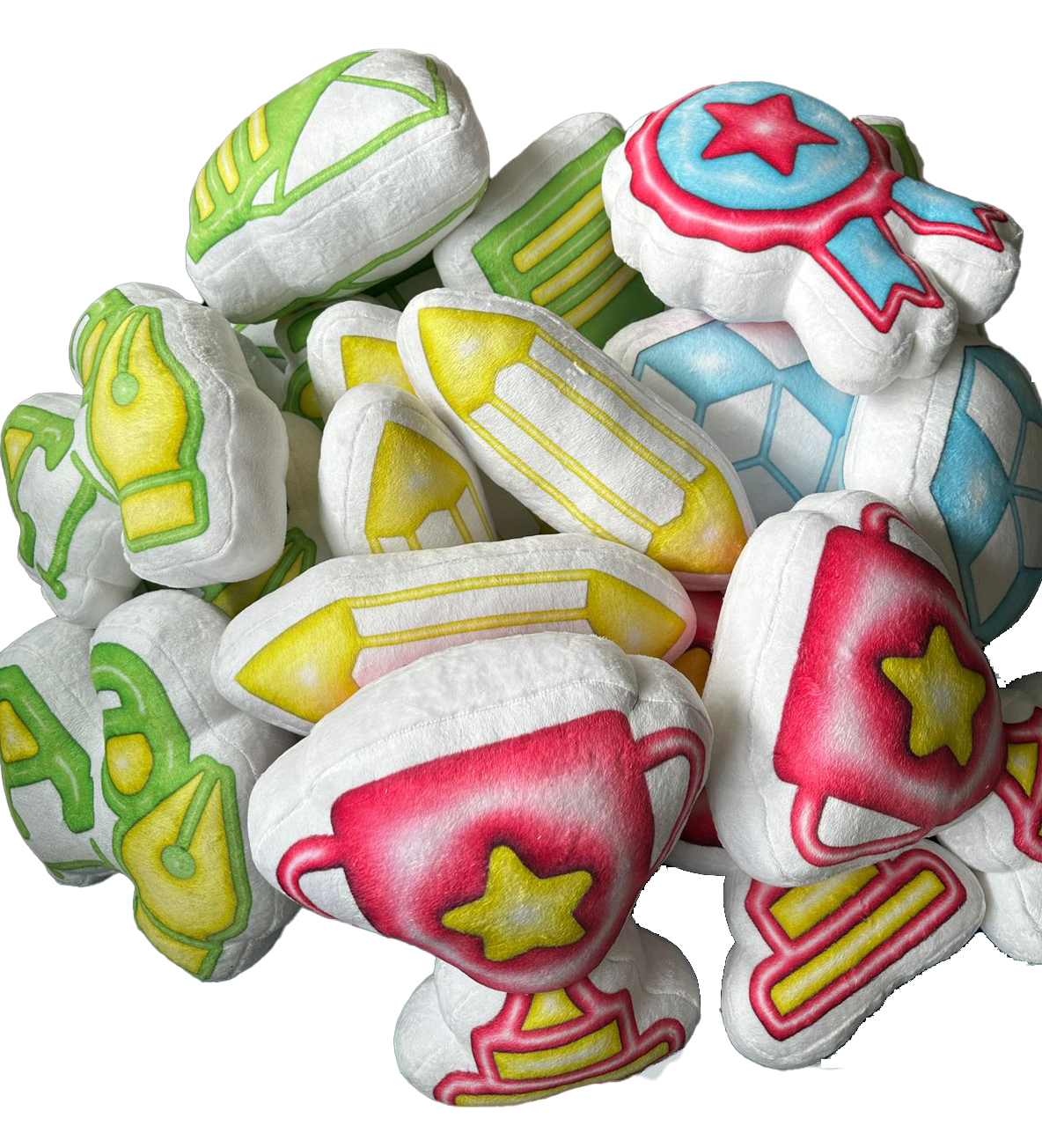
To round out the visual identity, we designed custom icons for each competition, creating a bold and cohesive system for the Young Ones Awards. To celebrate the winners, we also created lovable plushies, enamel pins, and stickers, adding a playful touch to the celebration.
KUDOS Design Collaboratory
-
John Kudos
Creative Director -
Amanda Knott
Project Manager -
Fay Qiu
Lead Designer -
Owen Febiandi
Designer -
Imam Fadilah
Animator -
Reza Risnaldi
Animator


Black Power to Black People
Poster House
Capabilities
Focus Area
Client
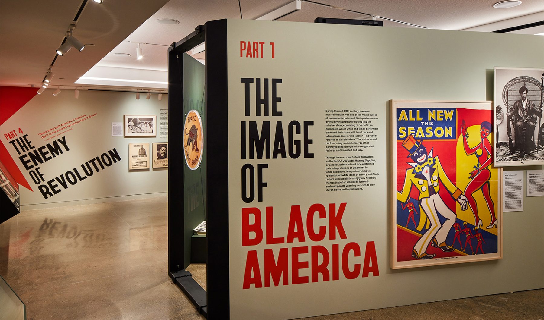
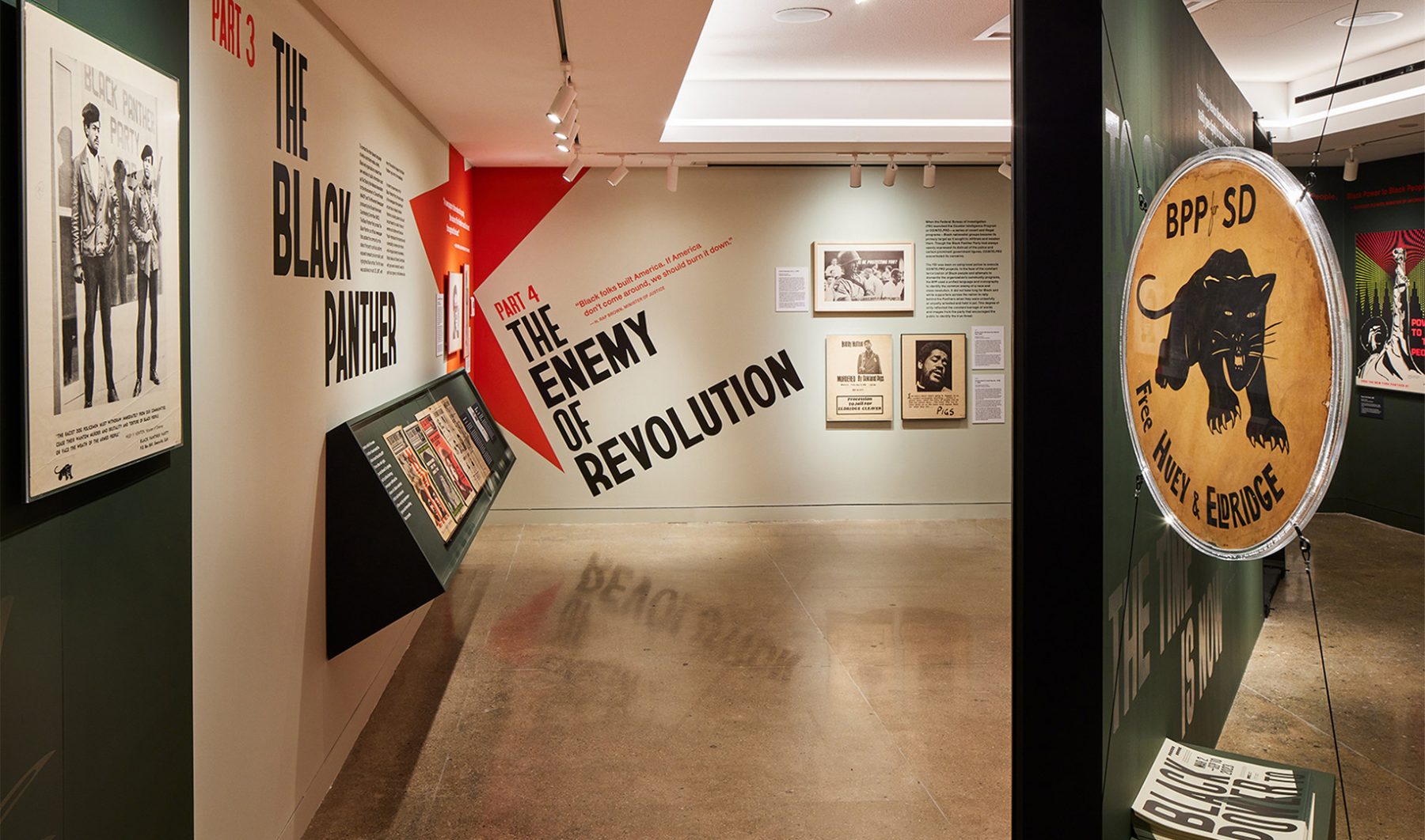
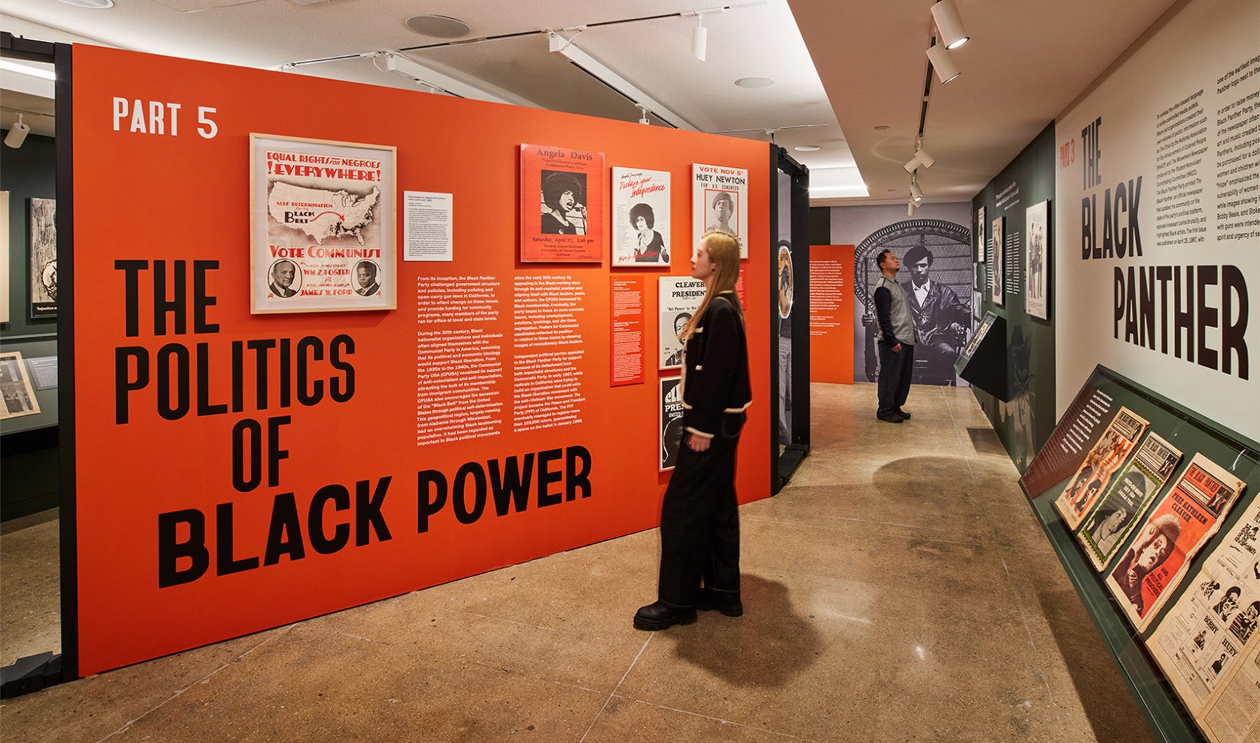
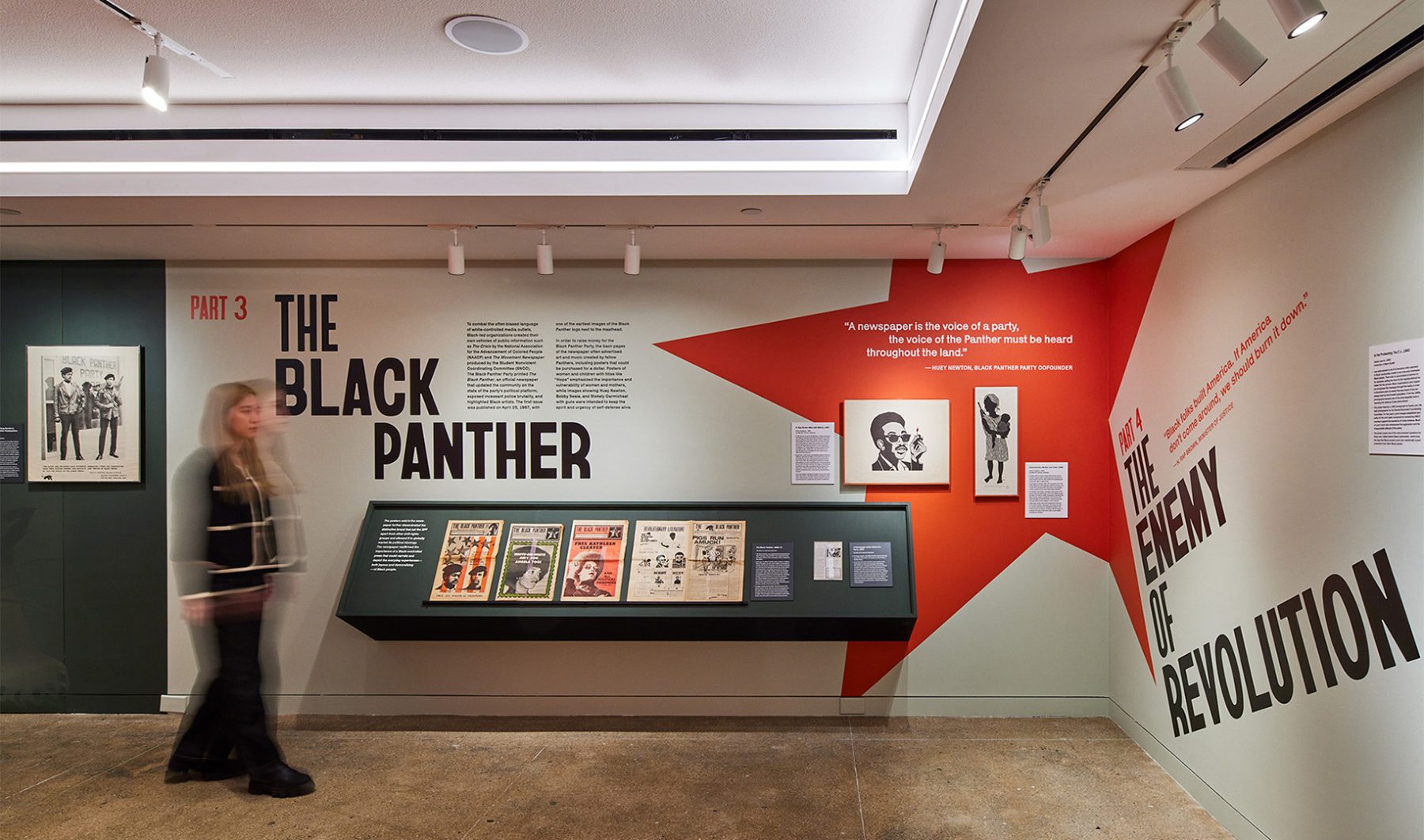
Poster House’s “Black Power to Black People” exhibit was an intimate look at how the Black Panther Party harnessed the power of branding and media to control its own narrative, rally community support, and become one of the most influential militant groups of its time.
Our exhibition design began outside the gallery with two oversized protest signs leaning against the wall, amplified with hand-painted lettering reminiscent of protest signs from the Civil Rights era.
Bayard (typeface) evokes lettering from the 1960s Civil Rights protest signs. Condensed, bold and handmade…transporting viewers to that era.
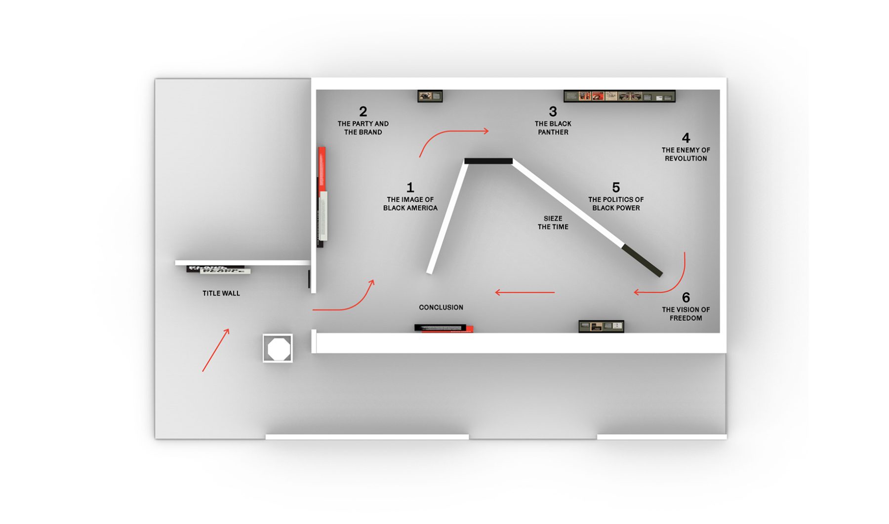
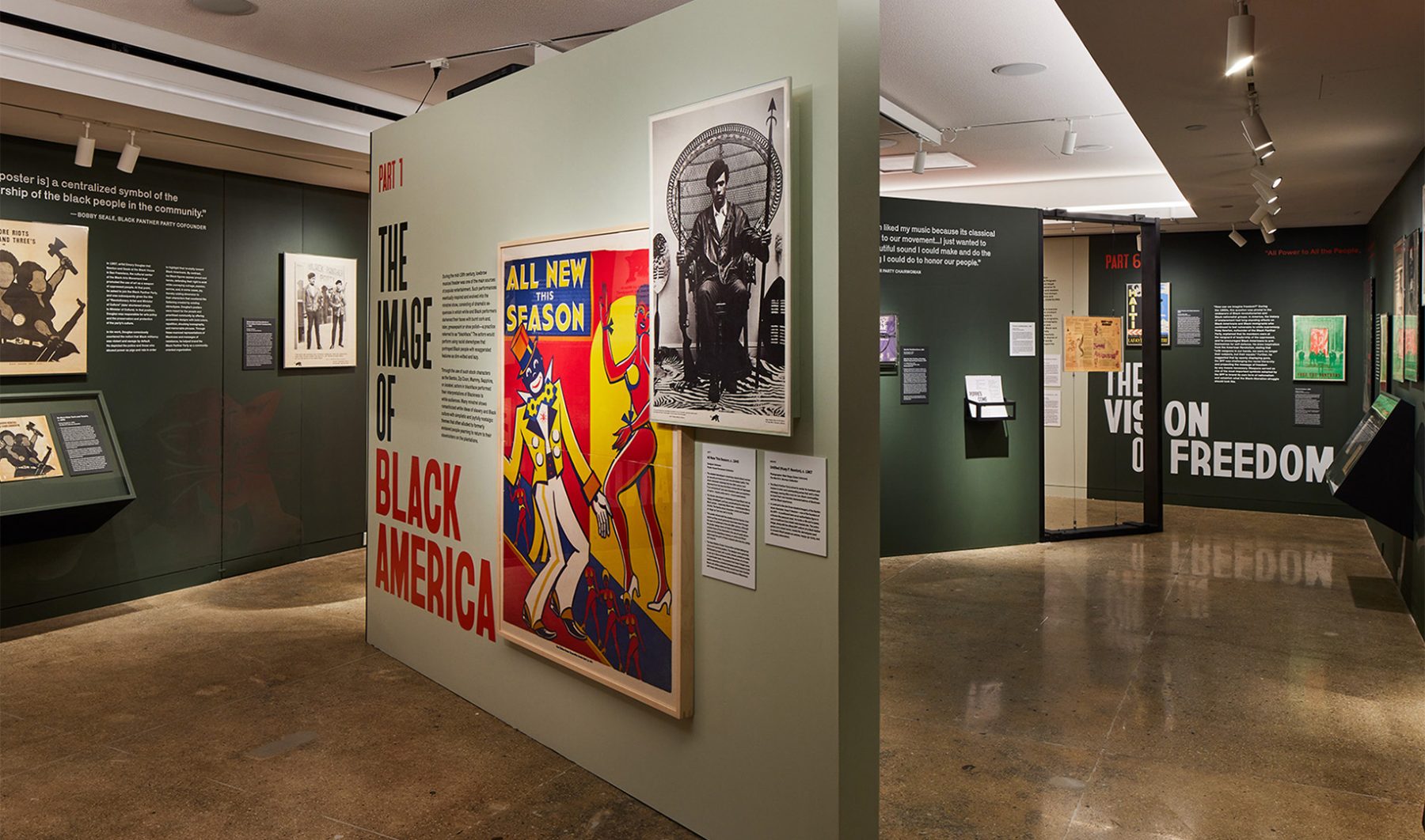
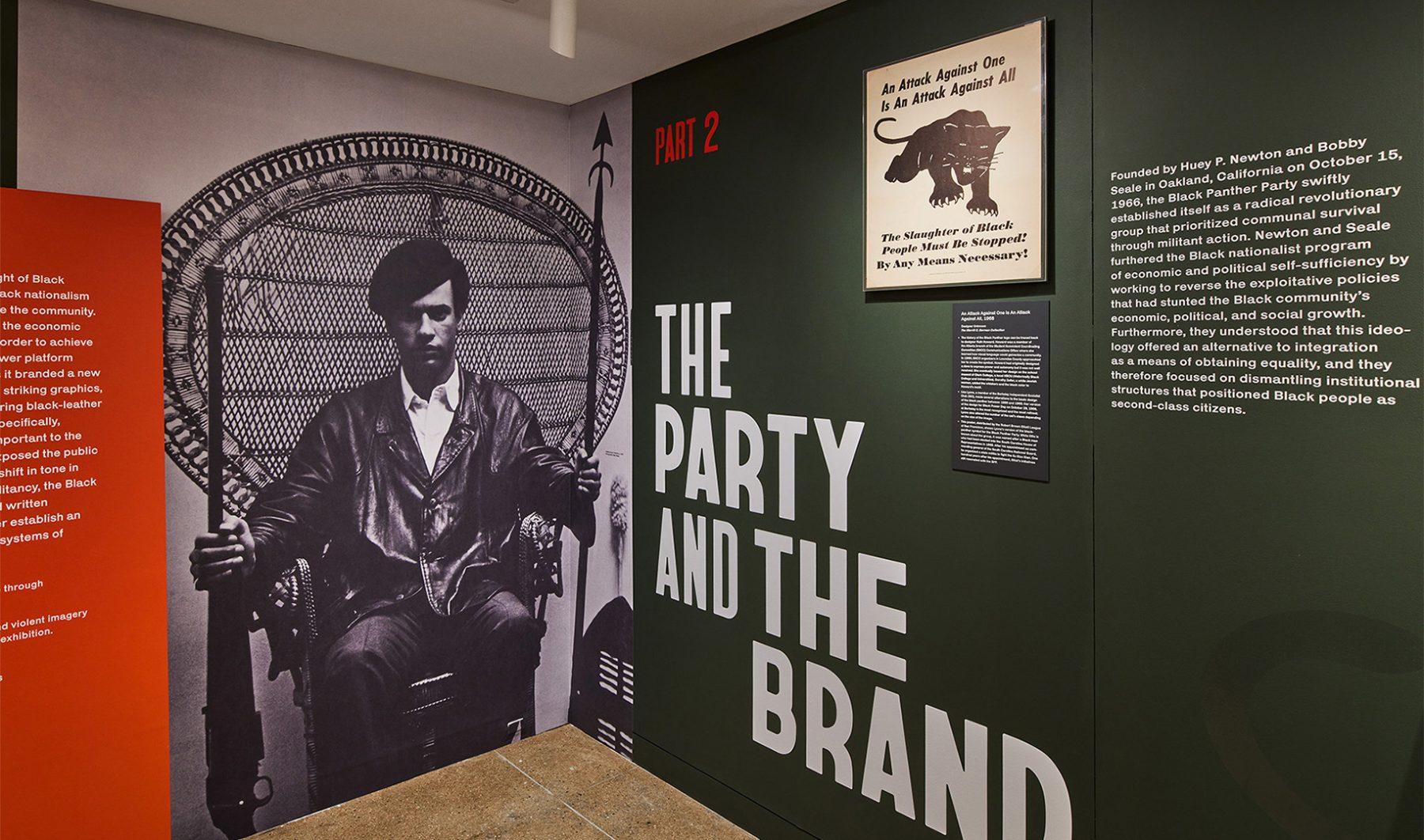
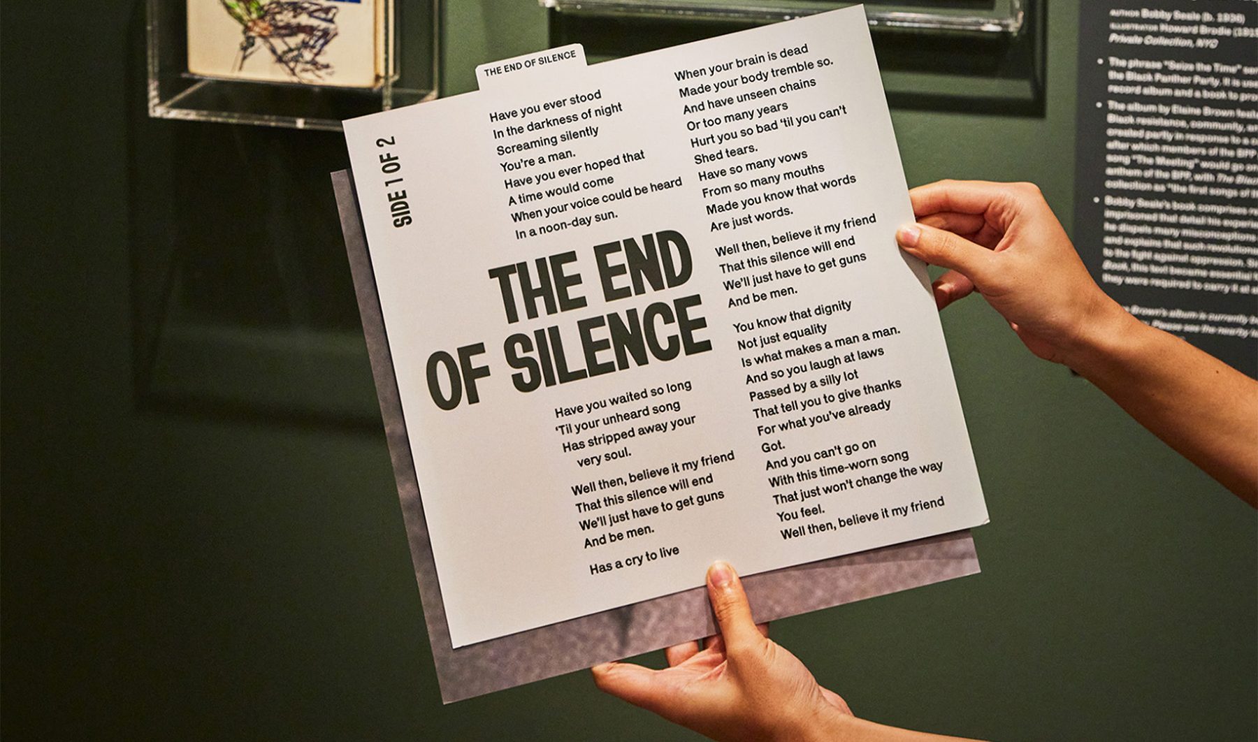
Inside, the exhibit started with an iconic photograph of Huey Newton (1967) and followed the development of Black Panther branding through six chronological sections. In the background, tracks from Seize the Time LP by Elaine Brown played on a loop, capturing the aspirations of the Black Panther Party.
We used bold type, militaristic colors, striking icons, and heroic photographs of Black Panther members carrying exposed firearms to echo the powerfully moving design strategies used by the Black Panthers themselves—and to show how effective those strategies remain, even decades after the party’s rise to fame.
KASA Collective
-
John Kudos
Creative Director -
Robert de Saint Phalle
3D Creative Director -
Ashley Wu
Art Director -
Fay Qiu
Designer -
Saskia Wulandiarti
Design Intern -
Imam Fadillah
3D Renderer -
Amanda Knott
Project Manager -
Samuel Sachs Morgan
Photographer
POSTER HOUSE
-
Es-pranza Humphrey
Curators -
Angelina Lippert
Chief Curator & Director of Content -
Ola Baldych
Director of Design & Exhibits -
John F. Lynch
Associate Director of Exhibits -
Mihoshi Fukushima Clark
Assistant Director of Design -
Rob Leonardi
Fabricator
Made in Japan
Poster House
Capabilities
Focus Area
Client
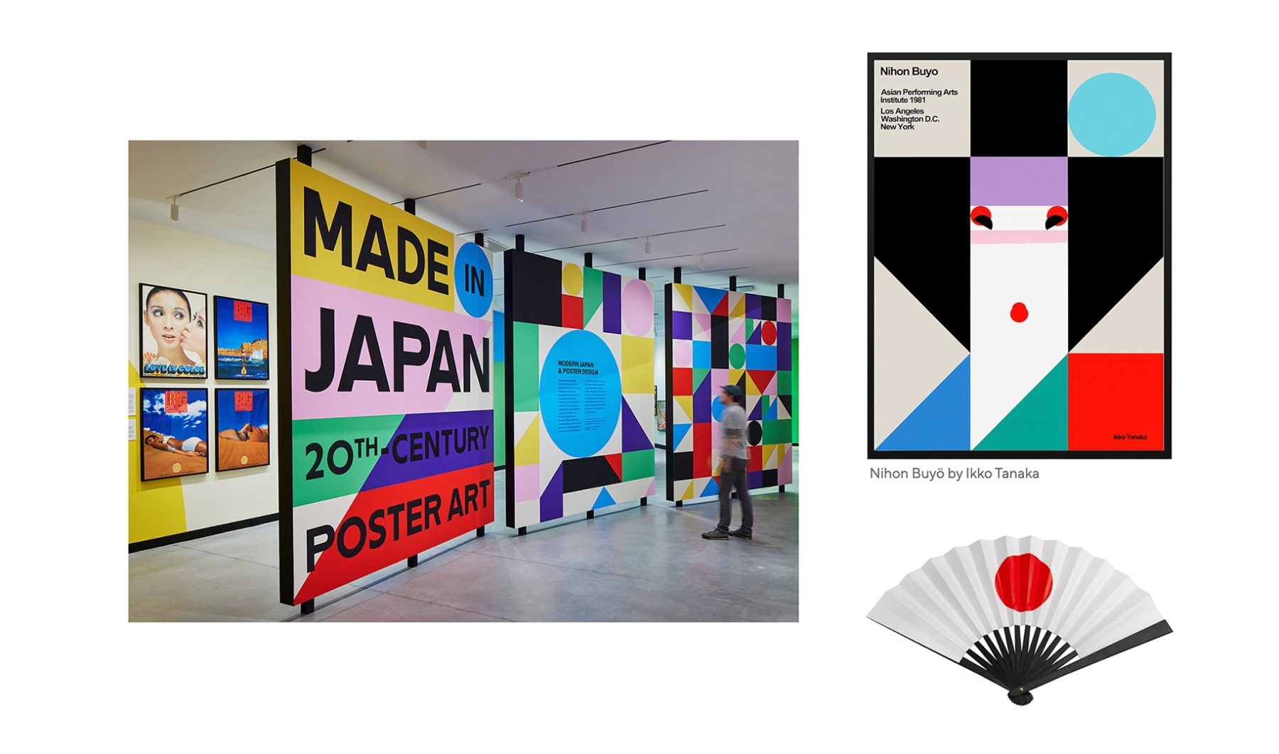
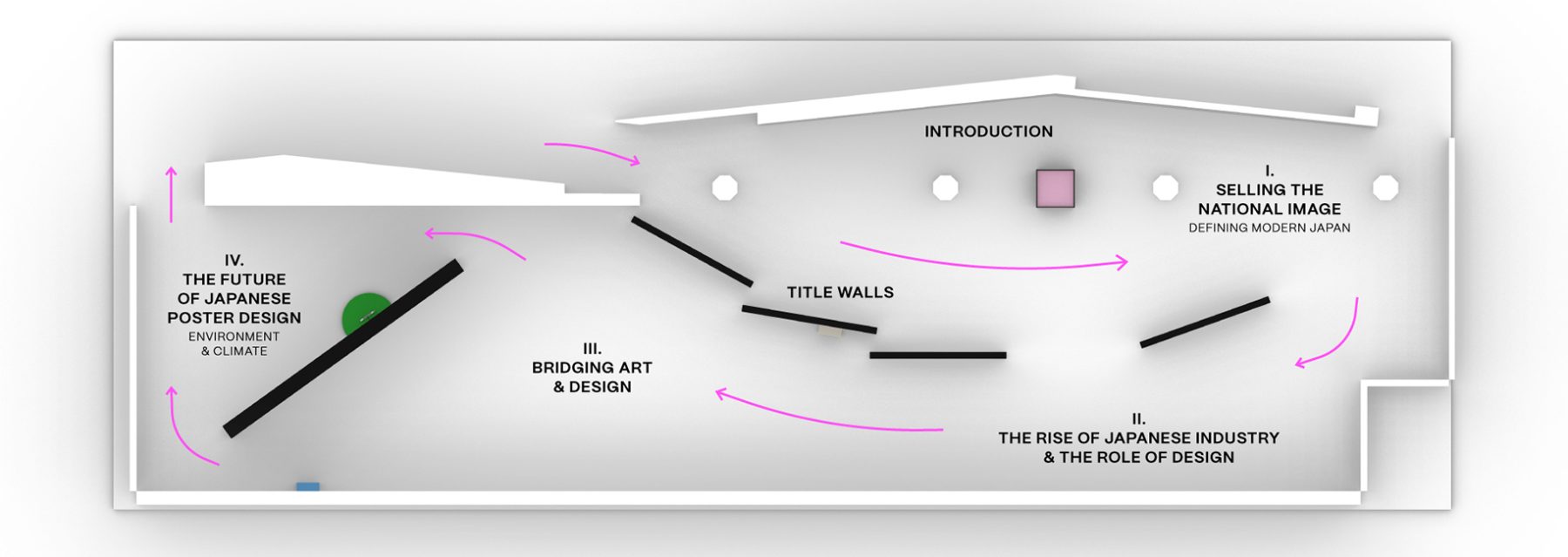
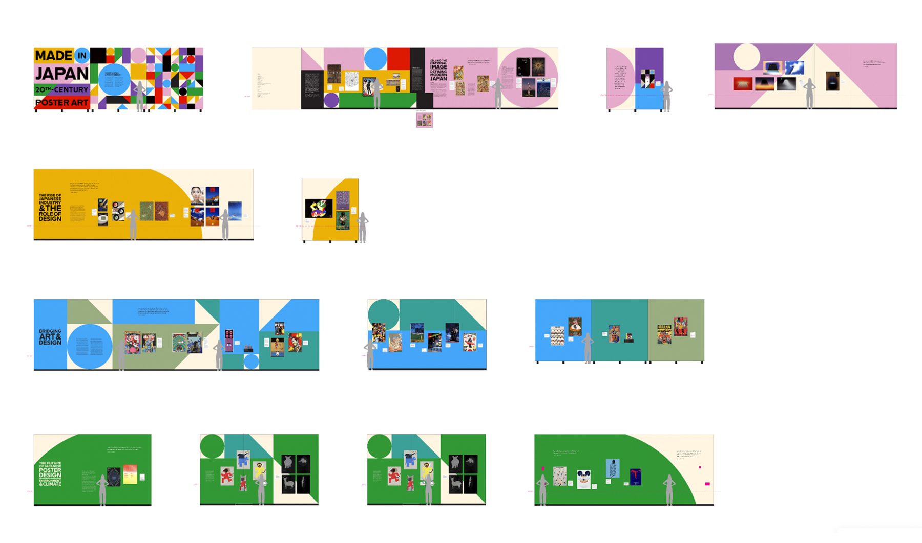
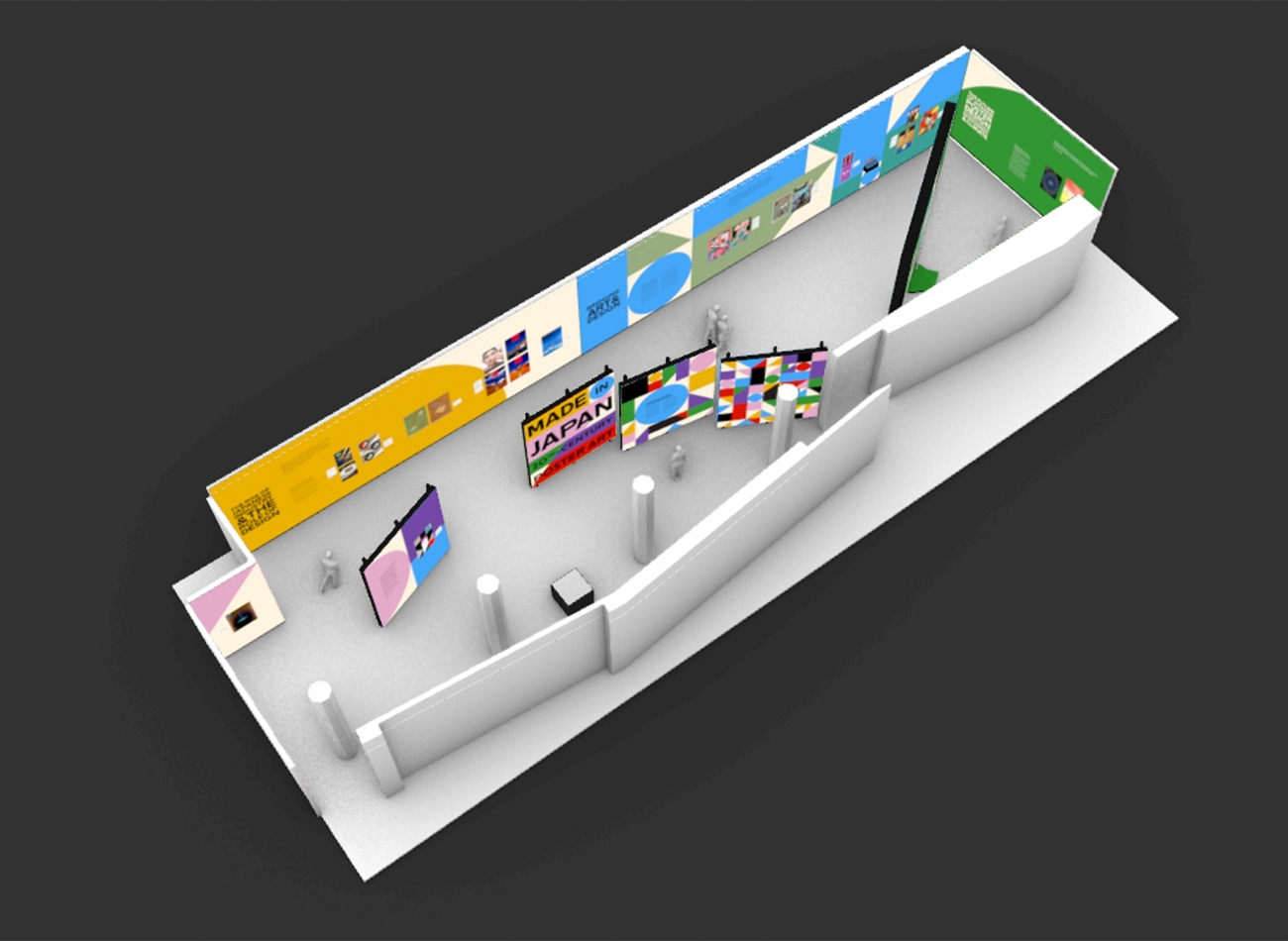
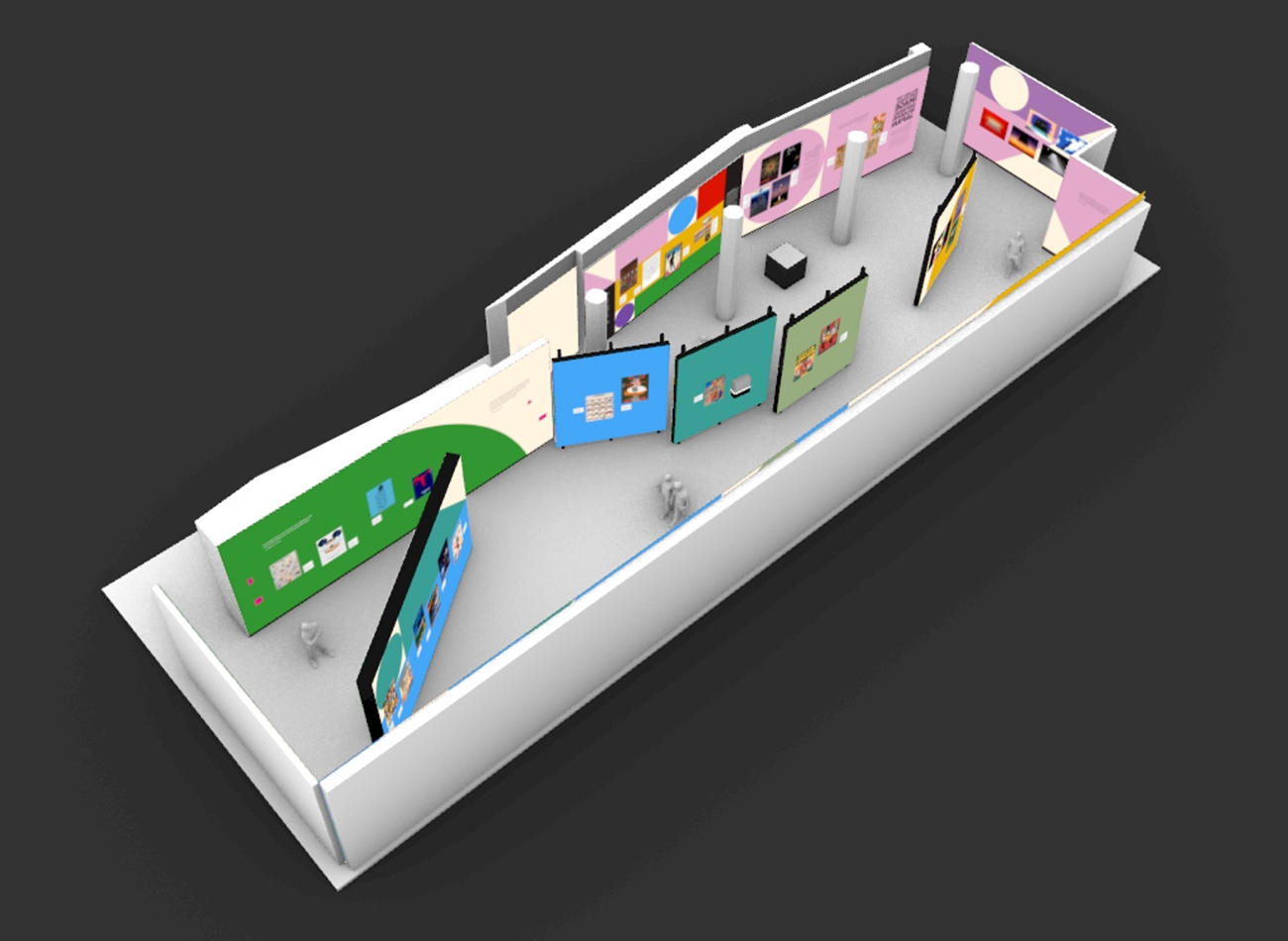
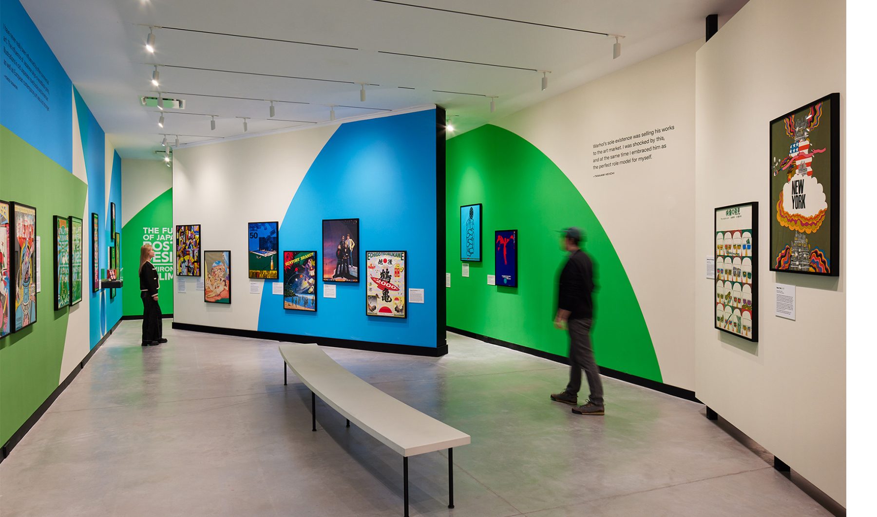
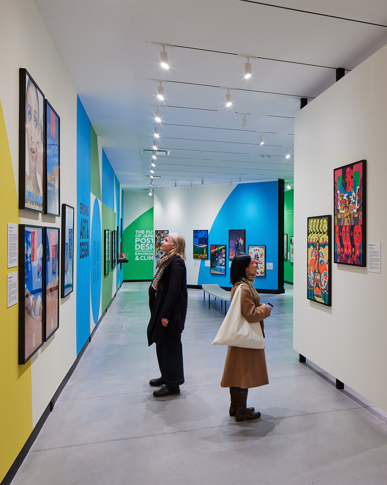
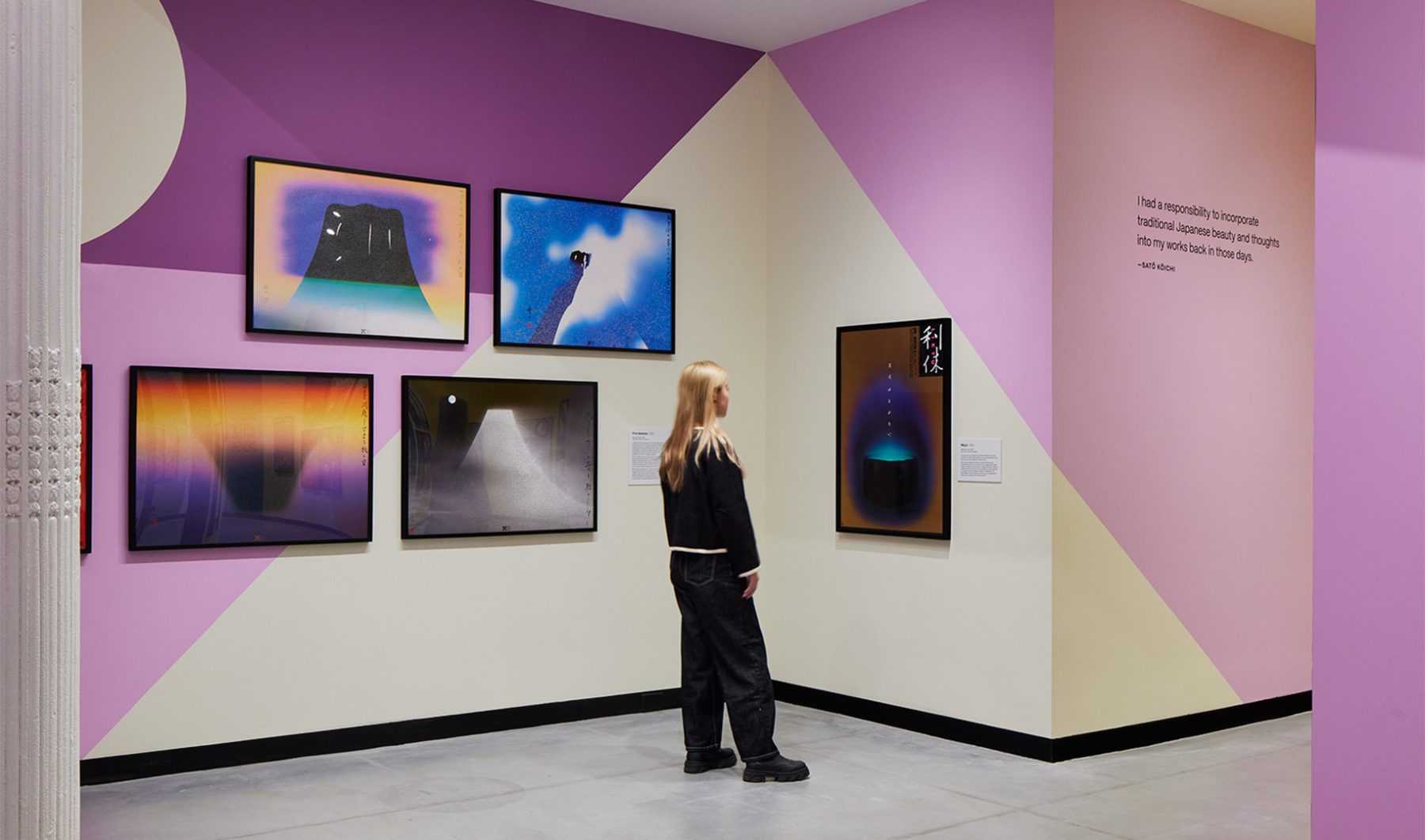
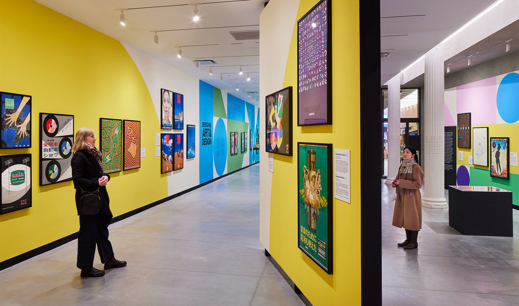
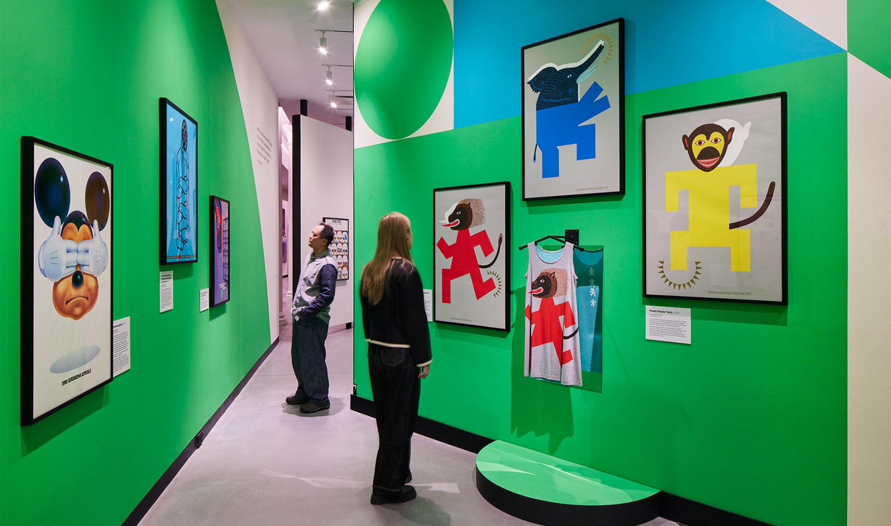
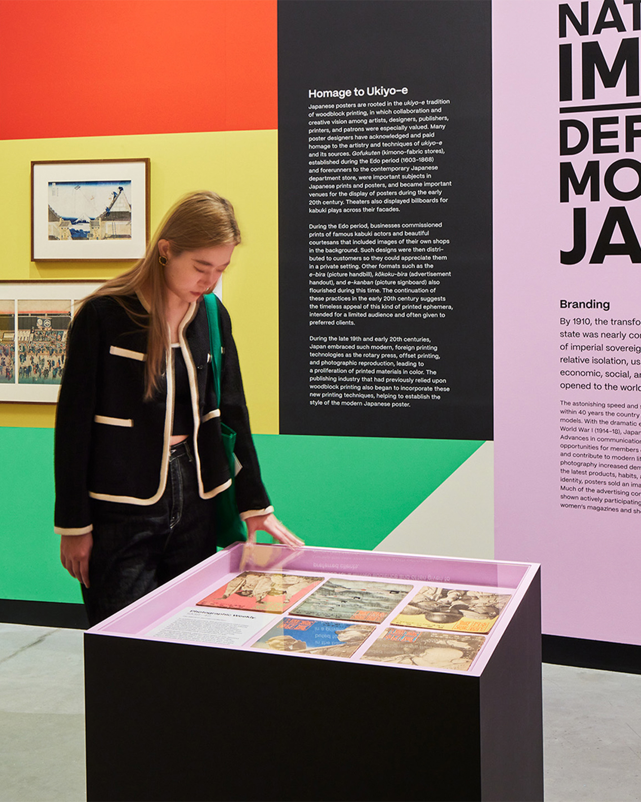
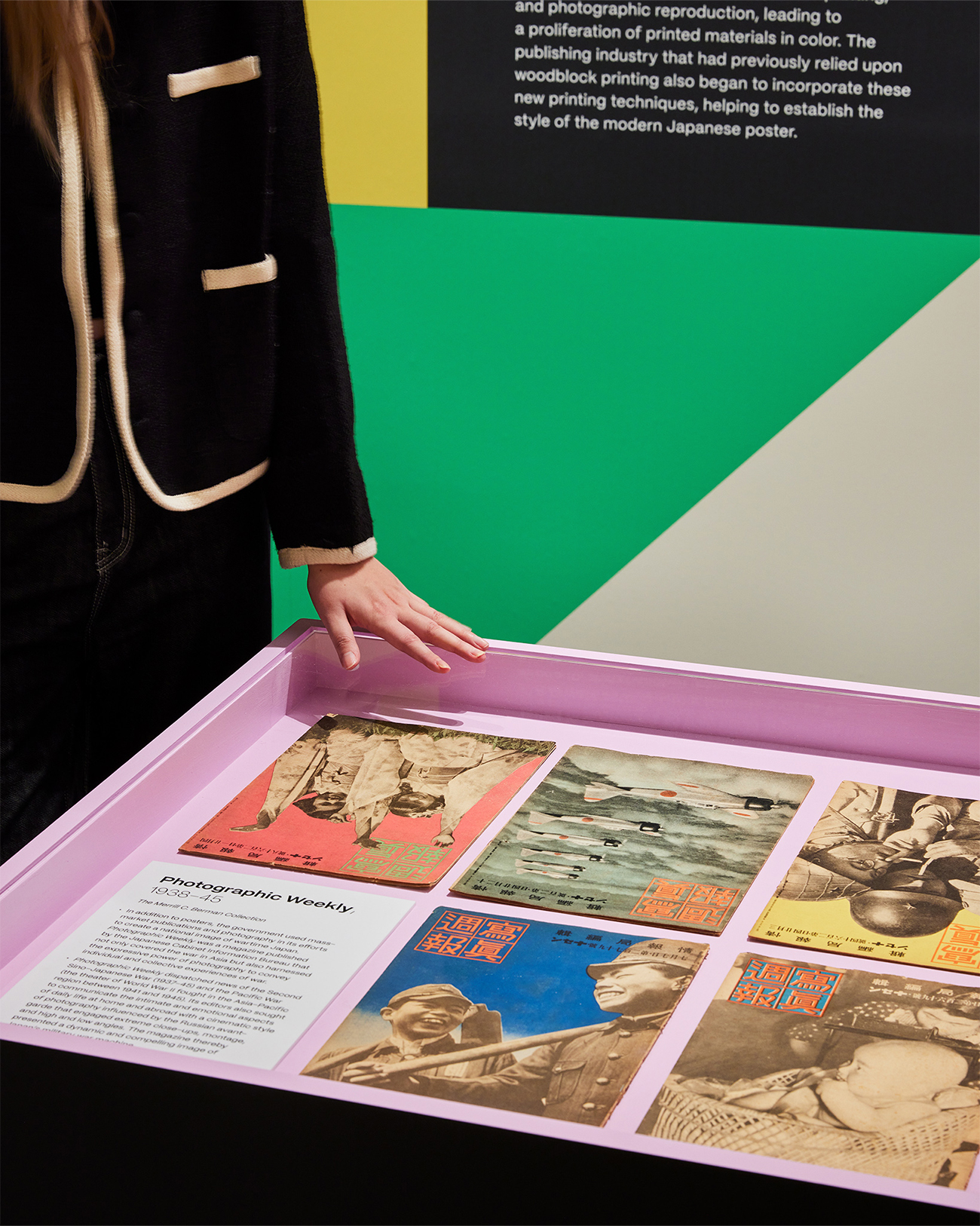
“Made in Japan” was an immersive visual journey through Japan’s golden age of graphic design, told through posters. Curated works from the Merrill C. Berman Collection ran the gamut from century-old to recent design.
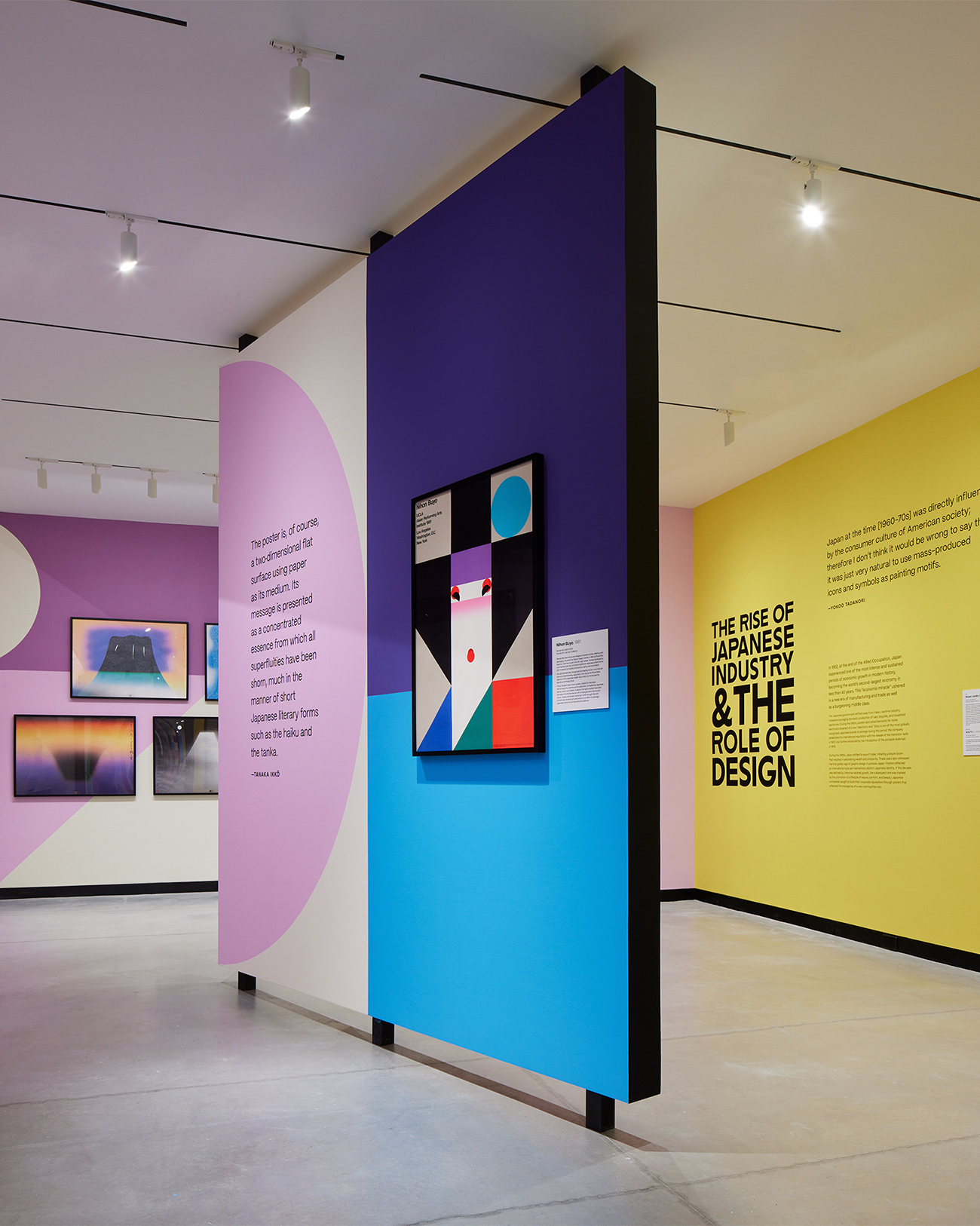
Our exhibition design for Poster House took inspiration from geometric shapes found in Nihon Buyö, a poster designed by Ikko Tanaka, a godfather figure in Japanese graphic design history. A triptych of oversized title walls unfurled like a Japanese folding fan to greet visitors at the entrance and create a permeable exhibit space to carry them seamlessly through the exhibit timeline.
We wanted an immersive motif to accentuate the posters and create a visual through-line for all the posters designed in the last century.
We chose color hues to serve as thematic backdrops for each section of the gallery. These vividly colorful shapes started small but quickly became larger as one progressed through the exhibit, finally becoming larger than the gallery walls.
Oversized typography—inspired by lettering found on the ships that brought Japanese immigrants to the American continent—infused the exhibit with a sense of industrialization and globalization, two forces that greatly influenced the evolution of graphic design in Japan.
KASA Collective
-
John Kudos
Creative Director -
Robert de Saint Phalle
3D Creative Director -
Ashley Wu
Art Director -
Fay Qiu
Designer -
Imam Fadillah
3D Renderer -
Amanda Knott
Project Manager -
Samuel Sachs Morgan
Photographer
POSTER HOUSE
-
Nozomi Naoi
Erin Schoneveld -
Angelina Lippert
Chief Curator & Director of Content -
Ola Baldych
Director of Design & Exhibits -
John F. Lynch
Associate Director of Exhibits -
Mihoshi Fukushima Clark
Assistant Director of Design -
Rob Leonardi
Fabricator
Legal Information Institute
Cornell University School of Law
Capabilities
Focus Area
Client
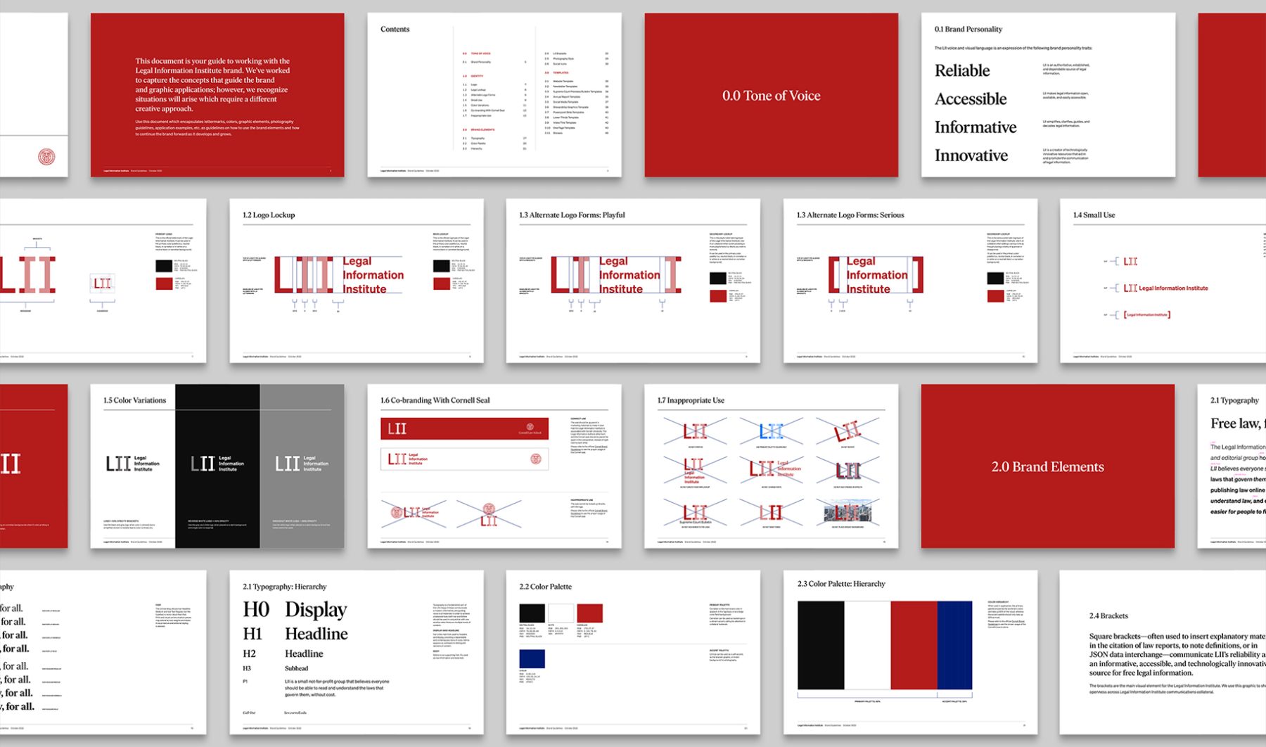
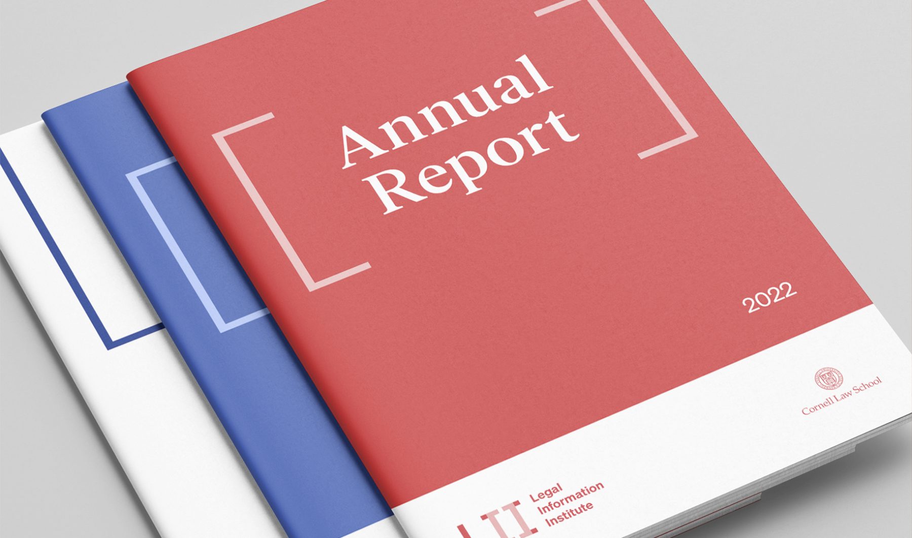
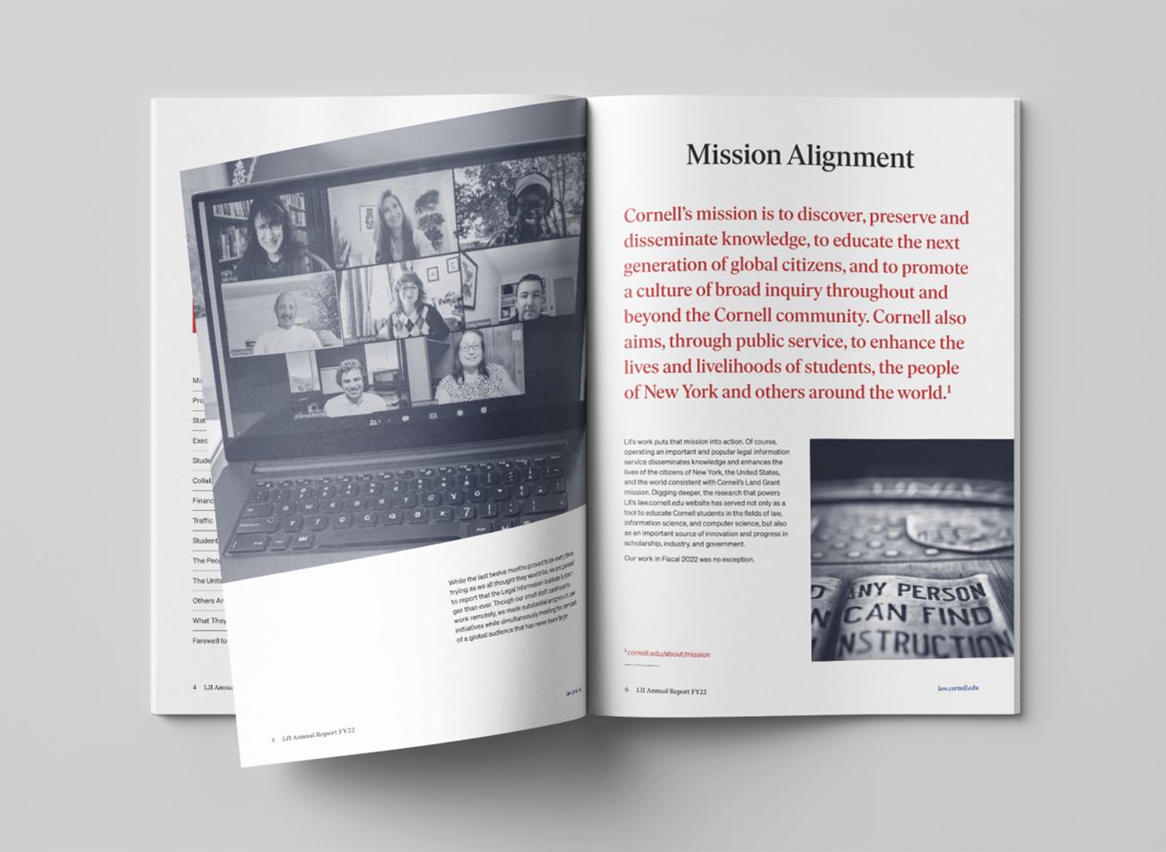
The Legal Information Institute (LII) is a small, semi-autonomous nonprofit organization within Cornell University. It provides free access to legal information to over 30 million people annually through a university-hosted website (law.cornell.edu) and focuses on making the law more accessible through technology. We were tasked with designing a comprehensive brand identity for the LII, aimed at aligning the organization’s brand with future goals, audience needs, and its relationship with Cornell.
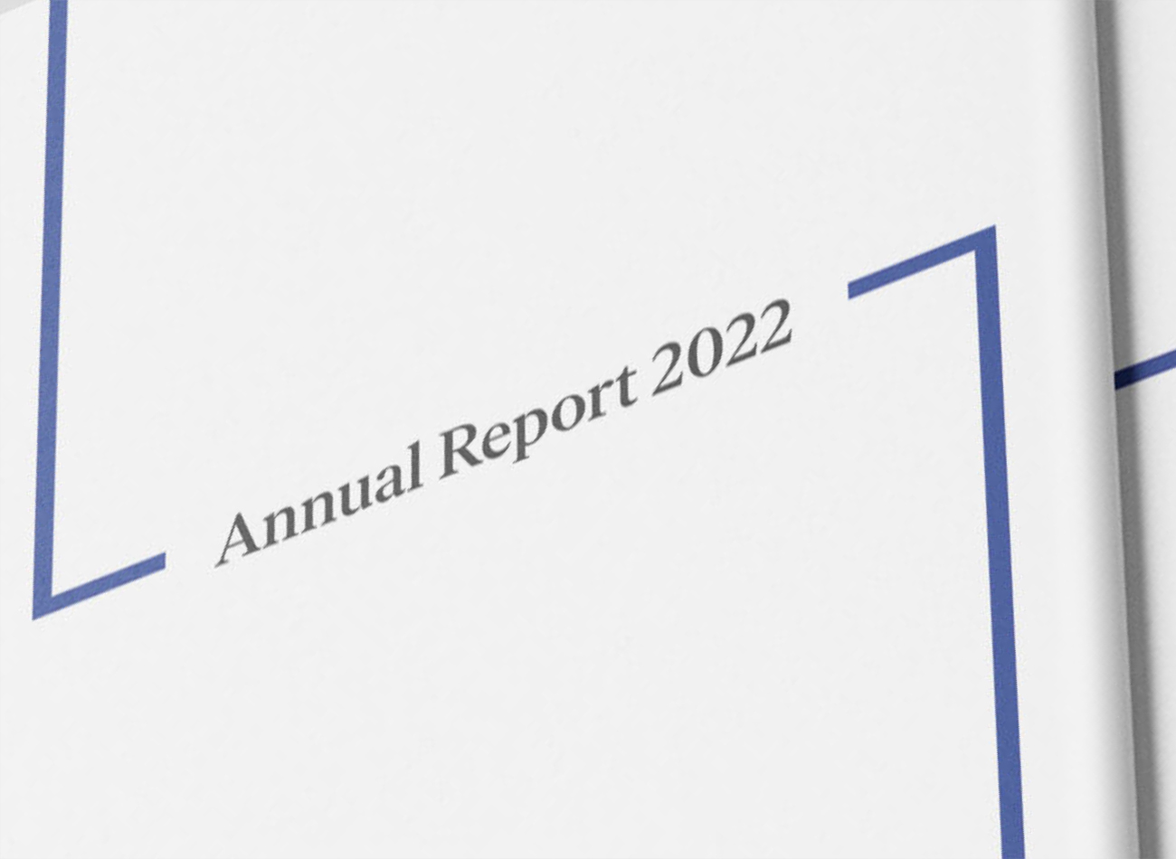
After first extensively researching and workshopping our branding strategy, we developed a new design system to define the LII brand across its various platforms. Incorporating the brand’s existing bracket logo—built around the square typographical brackets used to insert explanatory or citational material in legal reports—we created a new logo and visual language to represent LII’s reliability and accessibility as an informative source, conveying the organization’s commitment to legal information for all.
KUDOS Design Collaboratory
-
John Kudos
Creative Director -
Jamus Marquette
Lead Designer -
Owen Febiandi
Designer -
Putu Yogiswara
Designer -
Project Manager
Amanda Knott




Connecting Stories Interactive
Smithsonian National Museum of Asian Art
Capabilities
Focus Area
Client
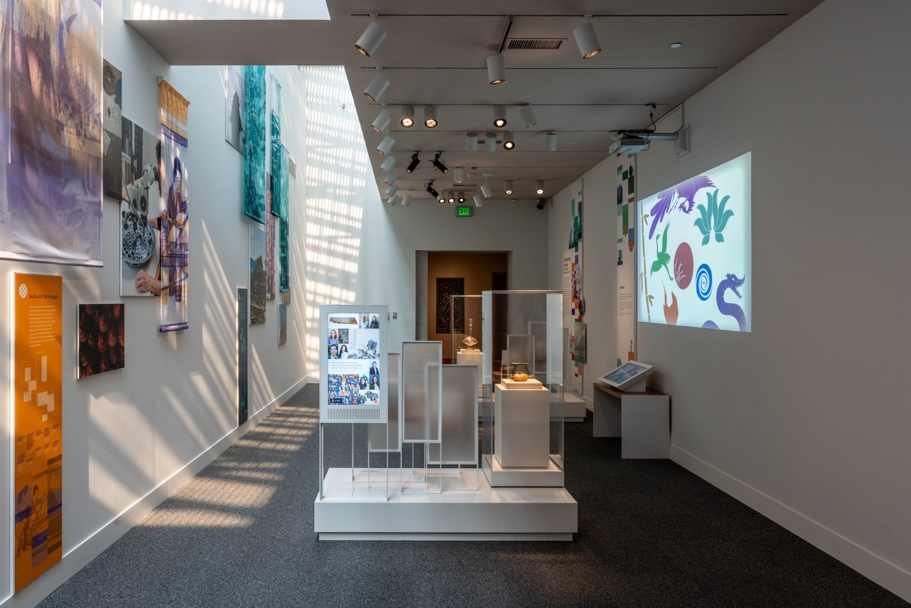
The “Connecting Stories” exhibition opened on the Mall on April 29, 2023, at the Smithsonian National Museum of Asian Art in Washington, D.C. “Connecting Stories” was designed to encourage visitors to explore the museum’s collection and develop personal connections to the stories and artwork preserved by the museum.
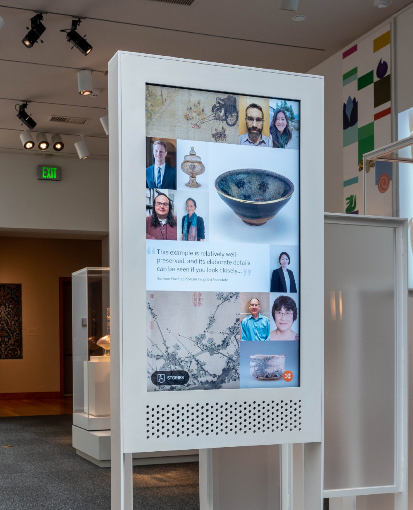
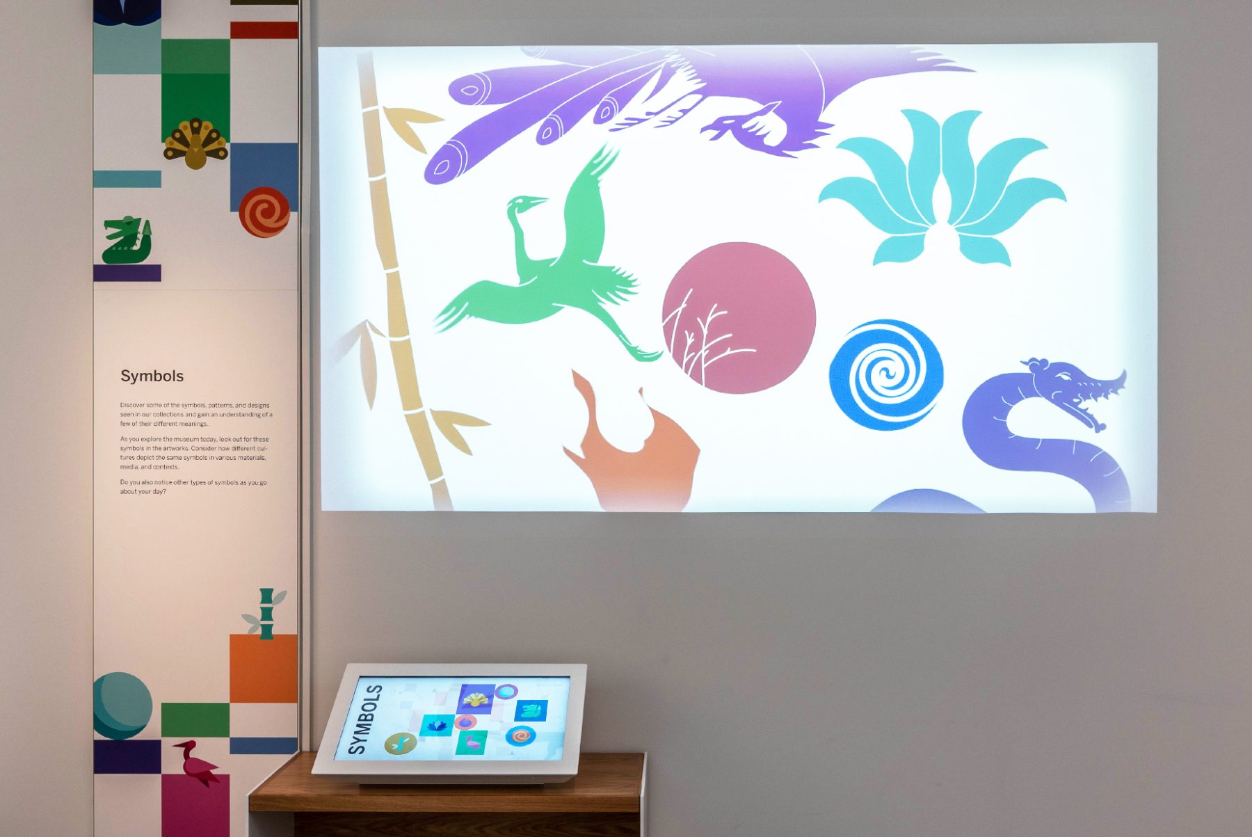
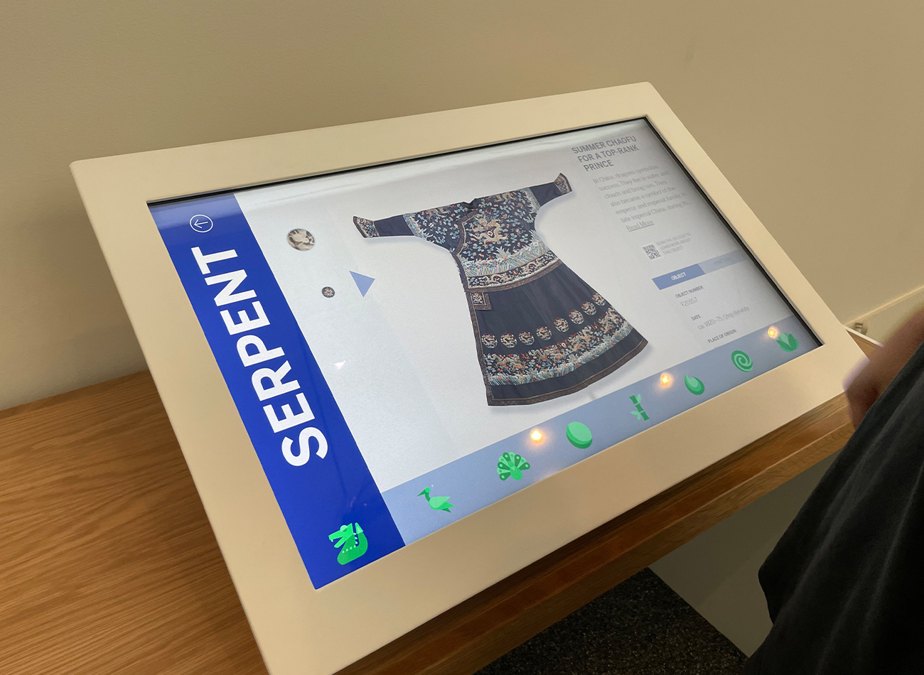
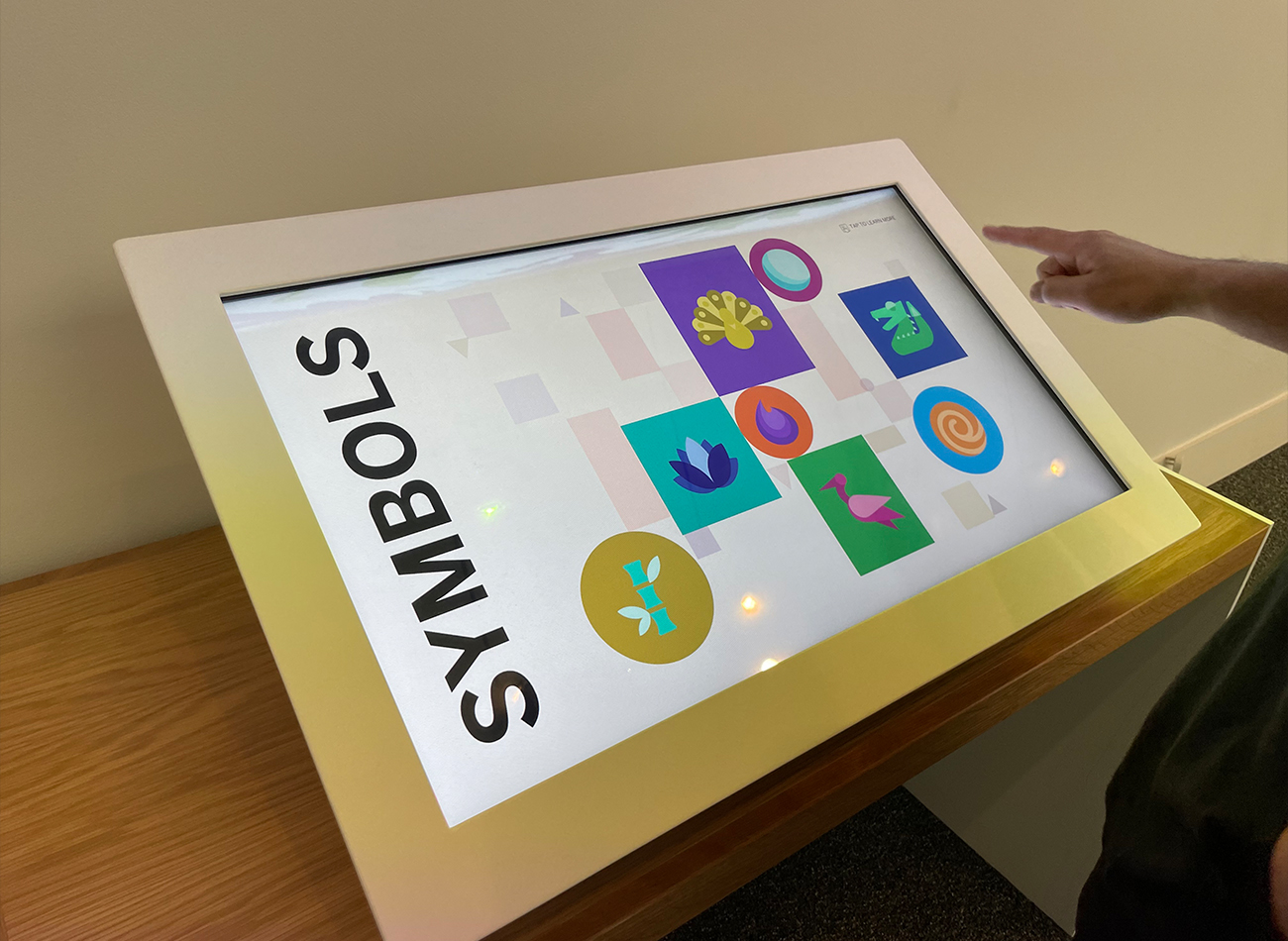
The interactive experience at the museum’s Freer Sackler Gallery offered visitors an engaging journey through the rich tapestry of Asian art, via a carefully curated selection of objects, images, maps, and interactive displays. Via a digital touchscreen and a colorful, animated projection, audiences could discover some of the symbols, patterns, and designs seen across the collection and learn about how their meanings change in different contexts. On a second touchscreen, National Museum of Asian Art staff and volunteers shared stories of their personal connections to objects in the collection.
We designed our two interactive pieces to enhance visitor engagement by deepening their understanding and appreciation of the gallery’s treasures. The first horizontal touchscreen unveiled the intricate motifs and symbols recurring across artworks, offering visitors an immersive exploration of their meanings and significance. The complementary vertical touchscreen panel invited audiences to explore the perspectives of gallery staff, tapping on headshots to discover their insights into selected artworks. Additionally, our motion design for the exhibit’s screensaver mode enhanced the space’s ambiance, projecting captivating visuals onto the gallery walls and ensuring an enriching and immersive experience for visitors.
Bridging the gap between audience and artifact, these interactive installations served as dynamic tools for deciphering and interpreting the complexities and cultural significance of Asian art. The experience fostered a deeper connection with the artworks, enriching visitors’ Freer Sackler Gallery experience.
Exhibition Teams
-
Cultural Innovation
Lead Exhibition Design -
KASA Collective
Interactive Kiosks -
Kubik Maltbie
A/V Fabrication
KASA Collective
-
John Kudos
Creative Director -
Robert de Saint Phalle
3D Creative Director -
Ashley Wu
Art Director -
Fay Qiu
Lead Designer -
Owen Febiandi
Designer -
Putu Yogiswara
Designer -
Imam Fadilah
Animator -
Muhammad Syamil Haqqoni
Designer -
Chris Manlapid
Lead Software Developer -
Joe Baker
Engineer (Informal) -
Jess Mackta
Project Manager
Kubik Maltbie
-
Thomas Miller
A/V Fabricator -
Donald Sweetman
A/V Fabricator
Einhorn Center for Community Engagement Branding & Website
Cornell University
Capabilities
Focus Area
Client
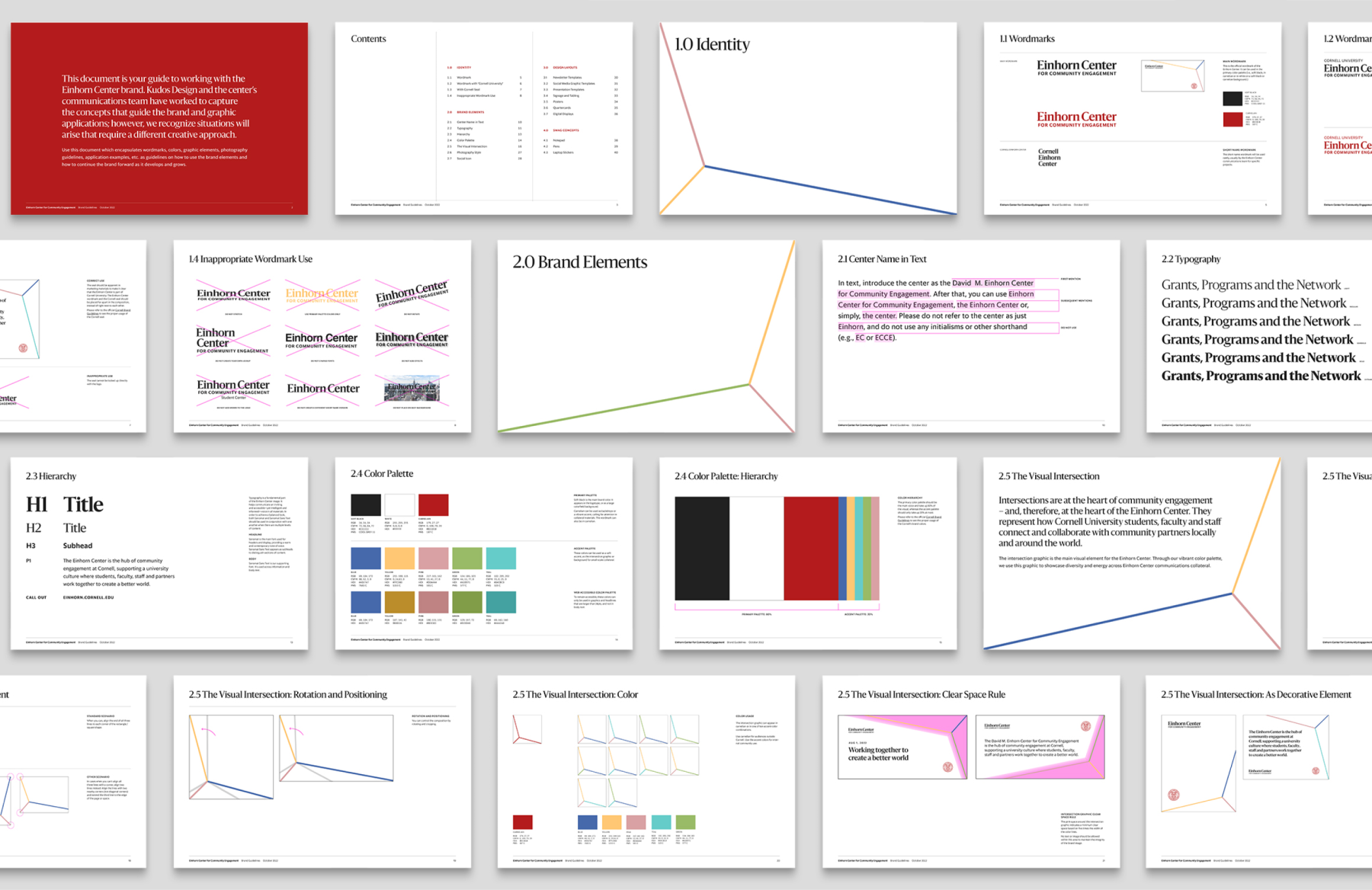
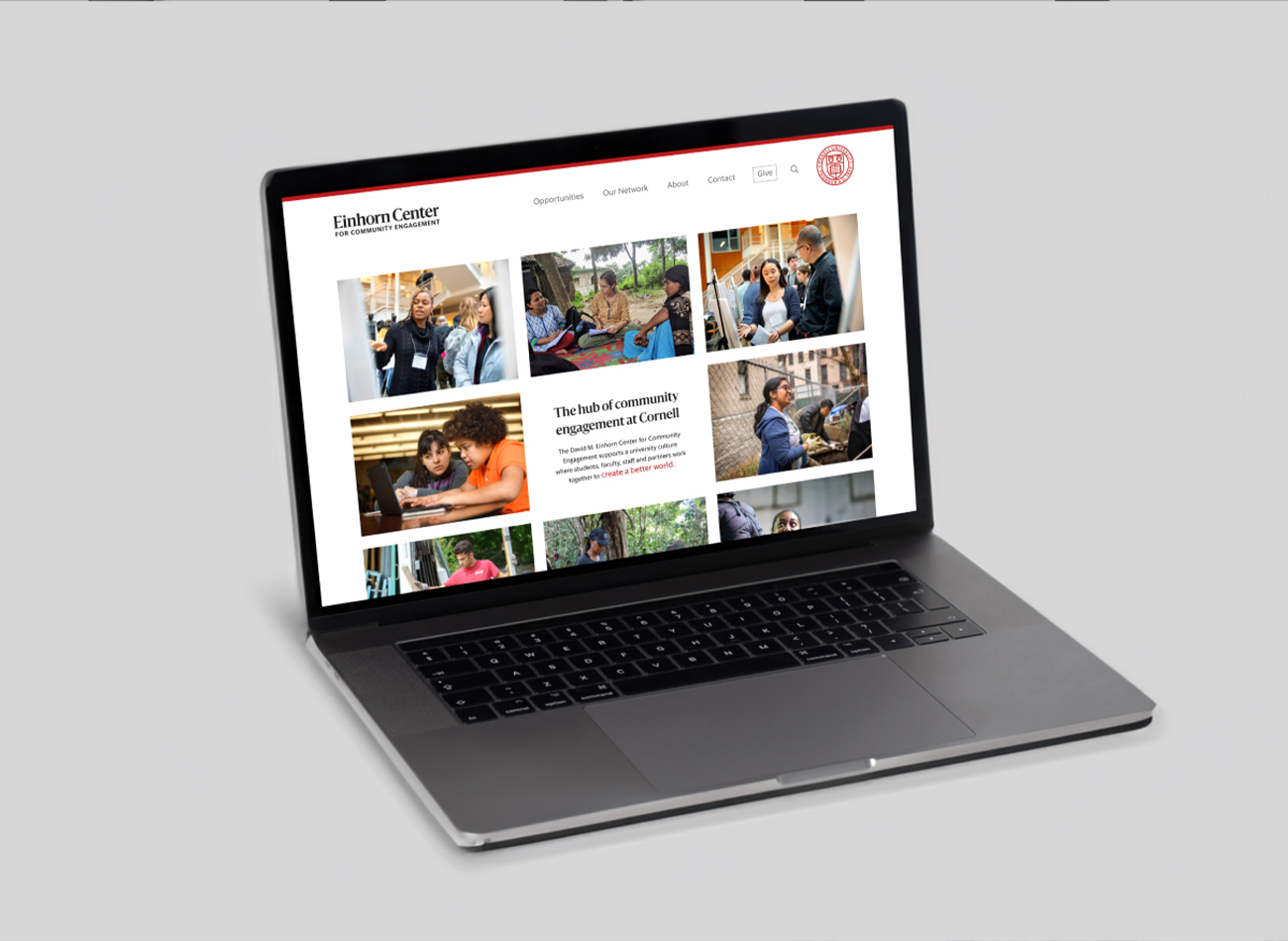
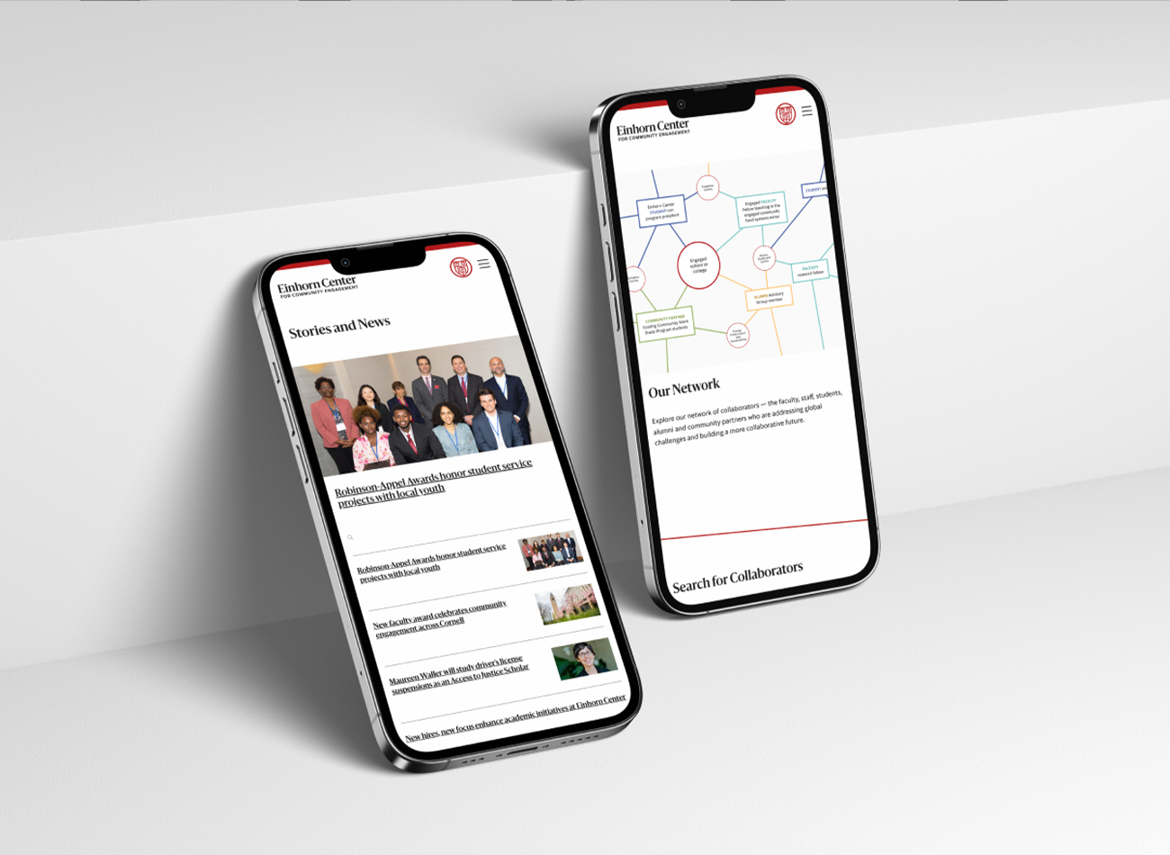
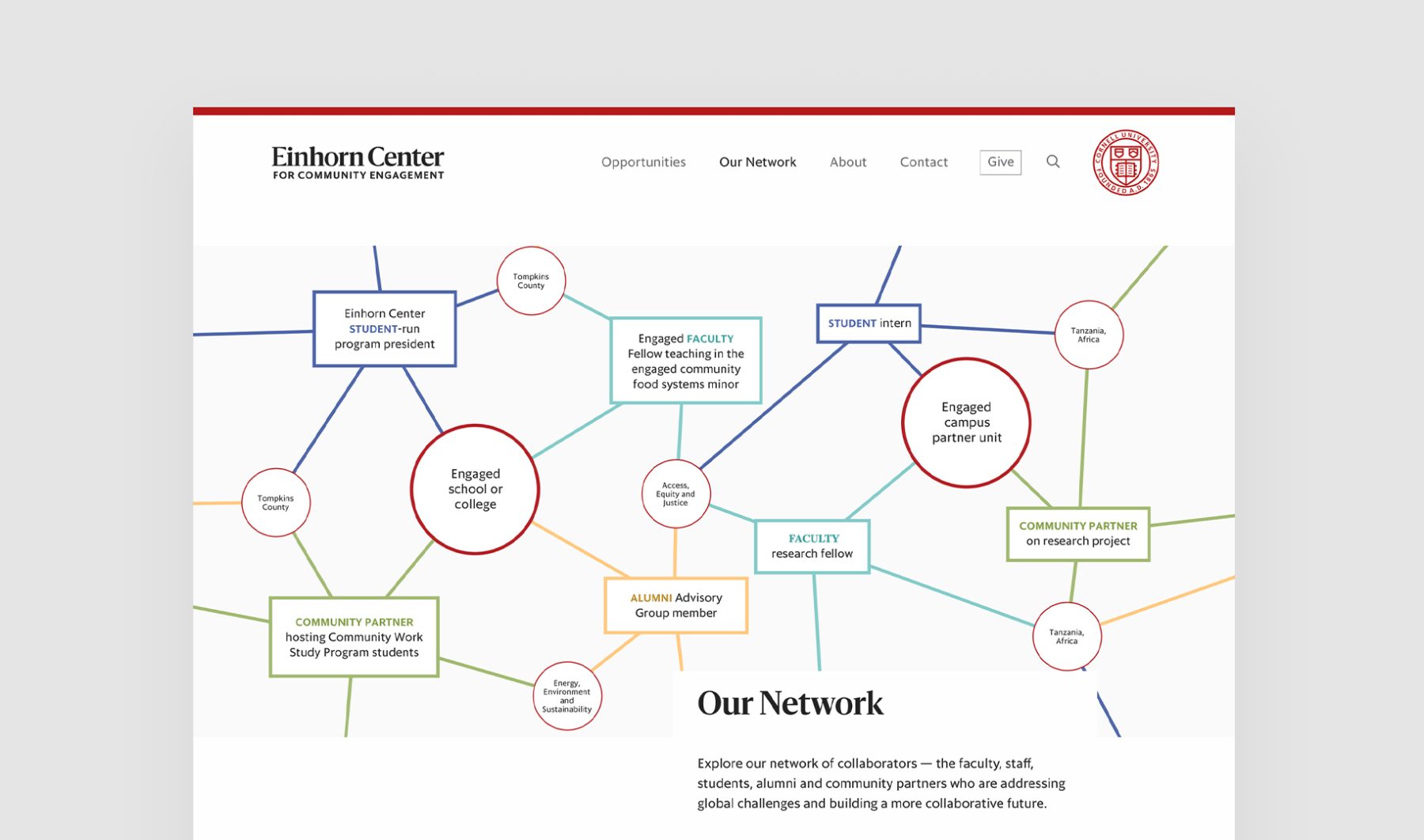
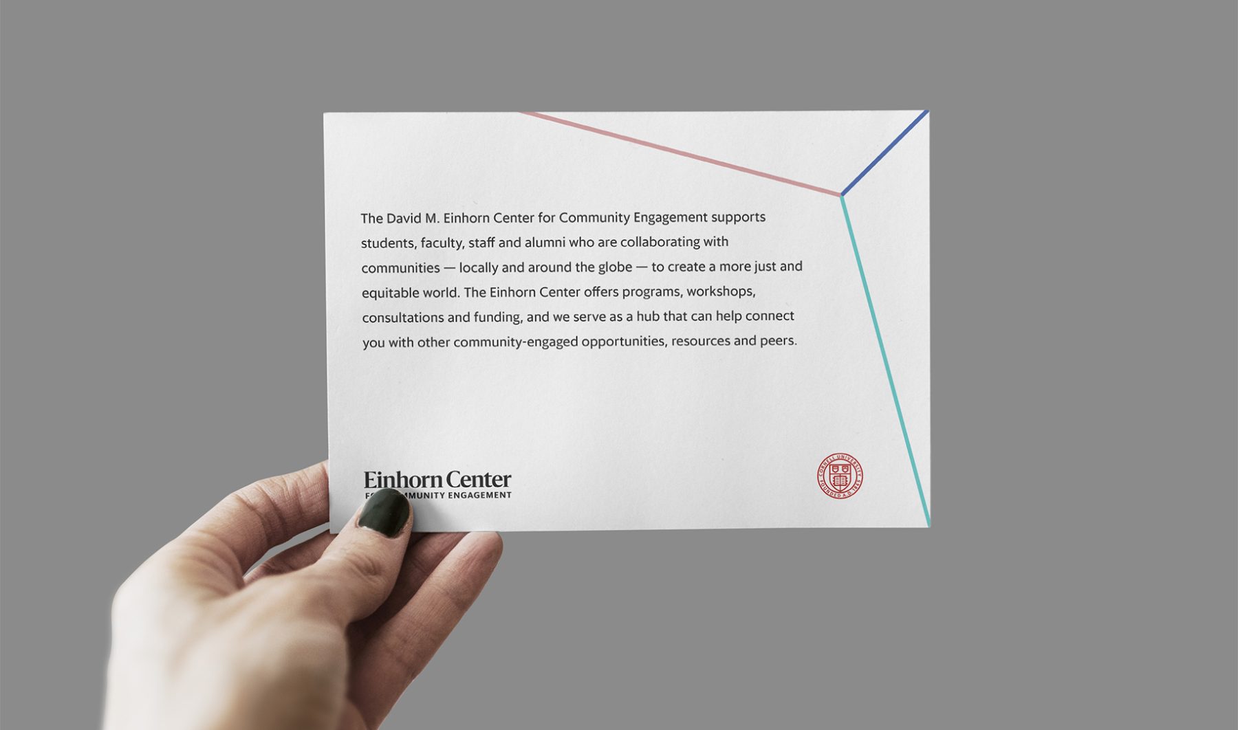
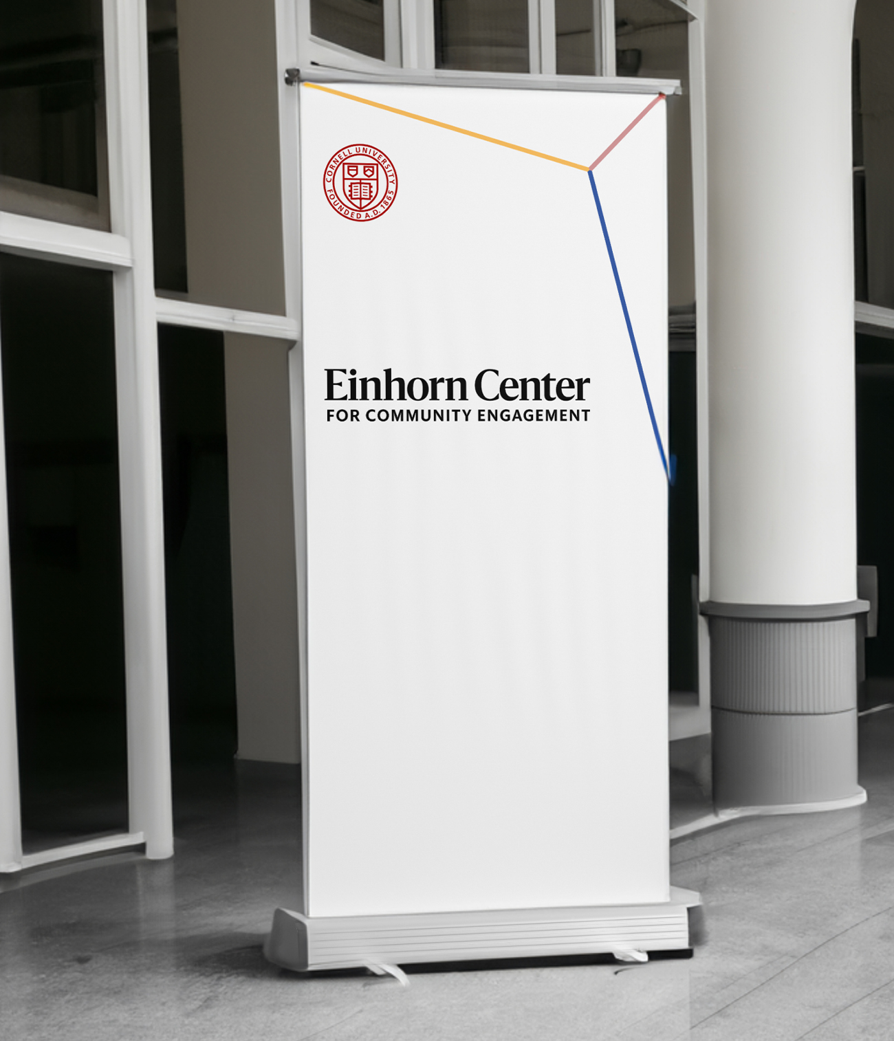
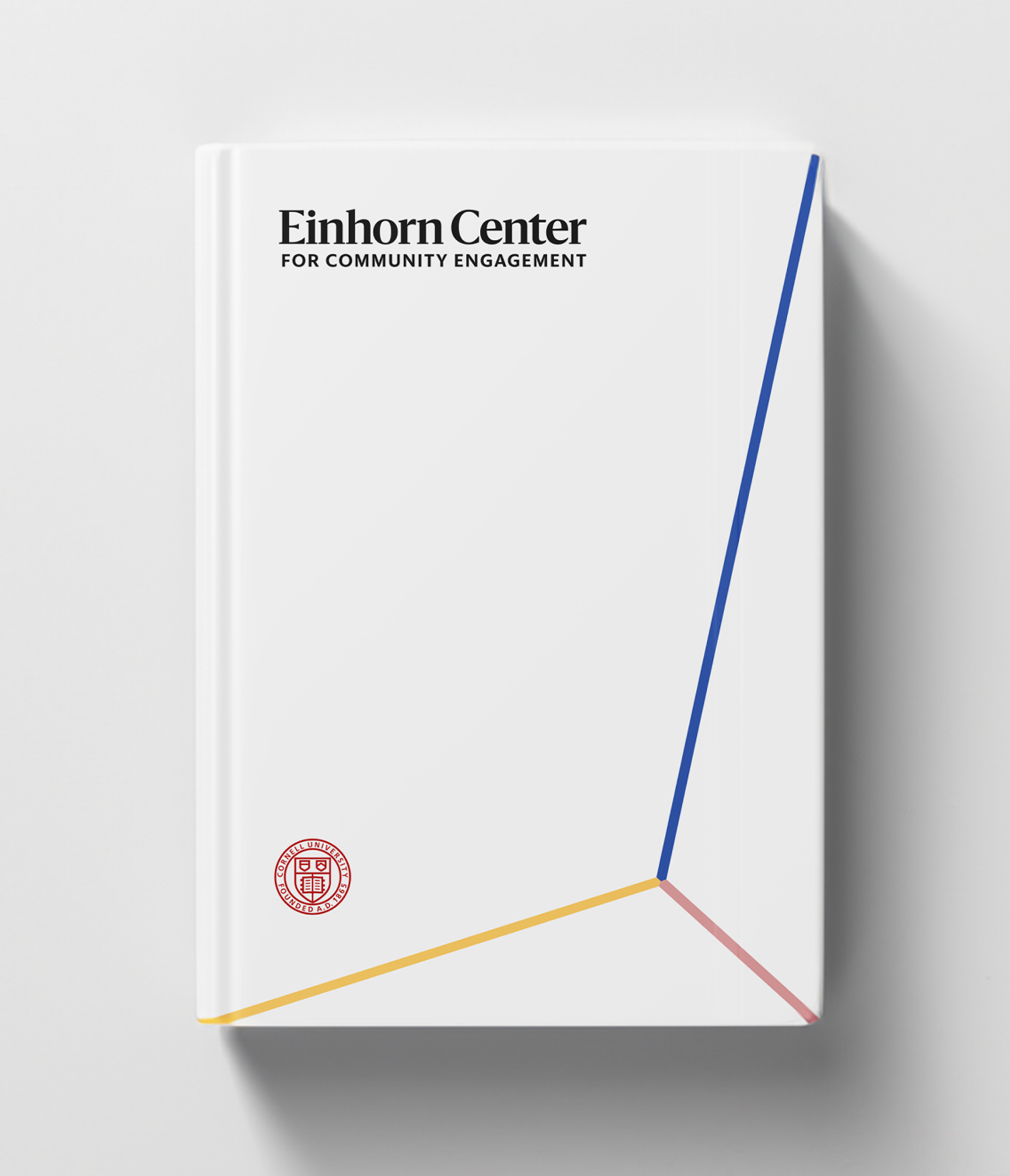
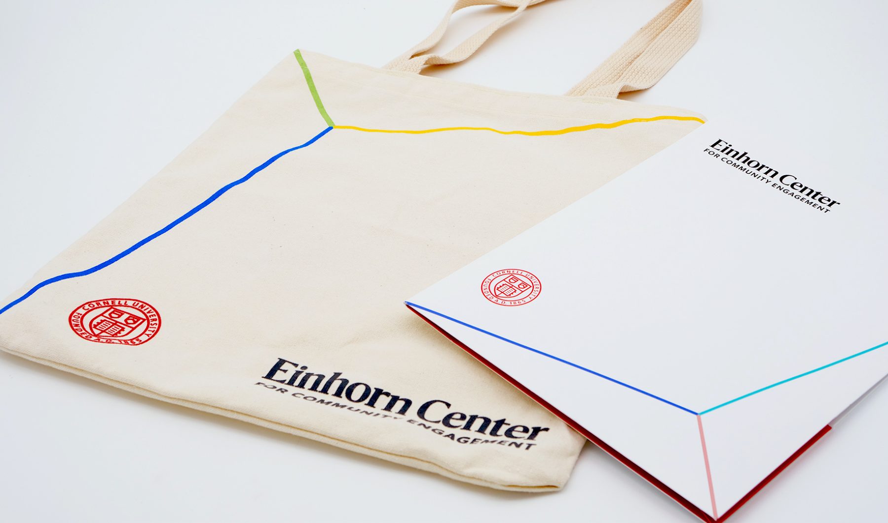
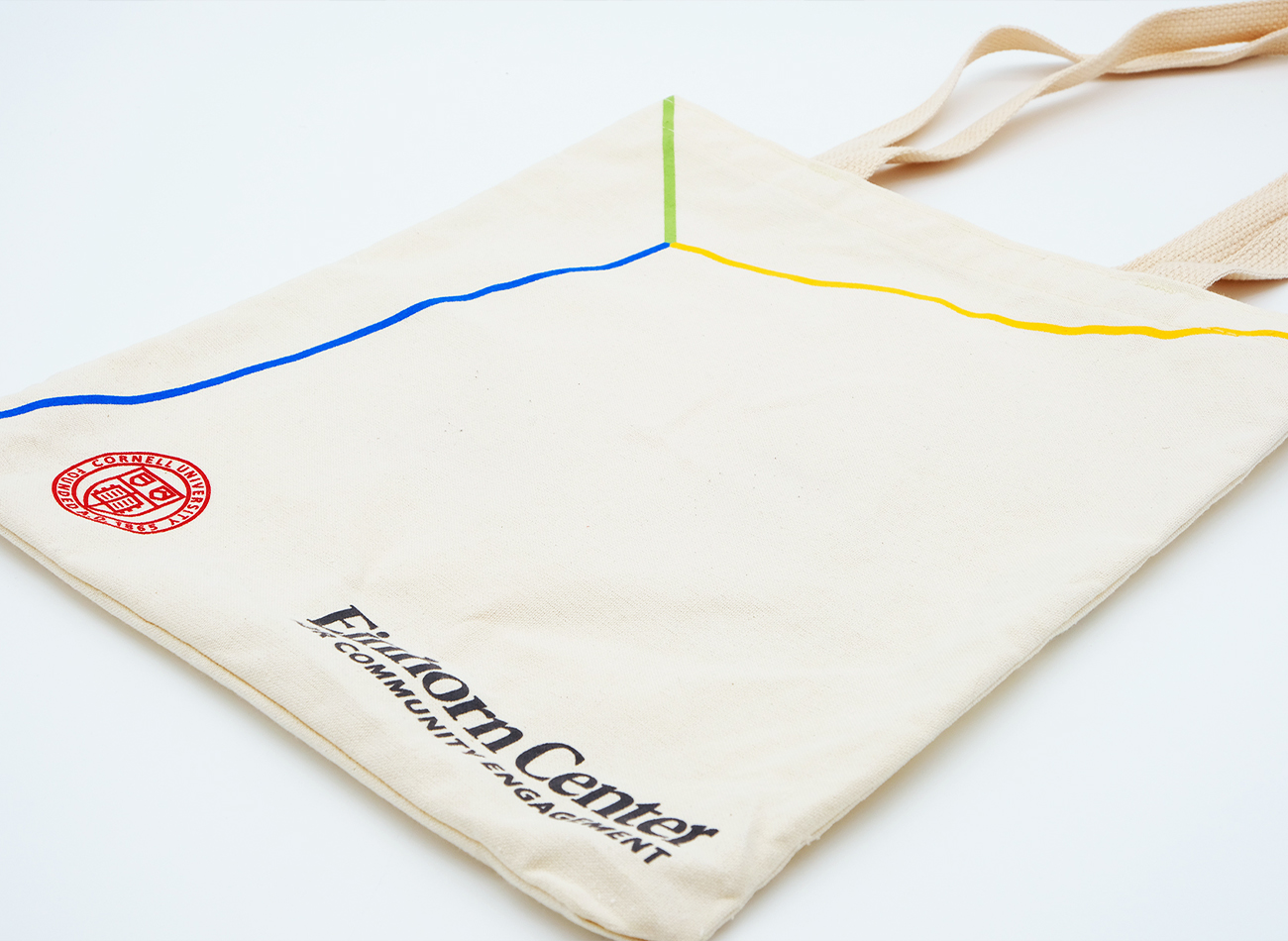
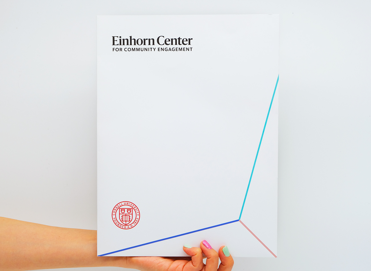
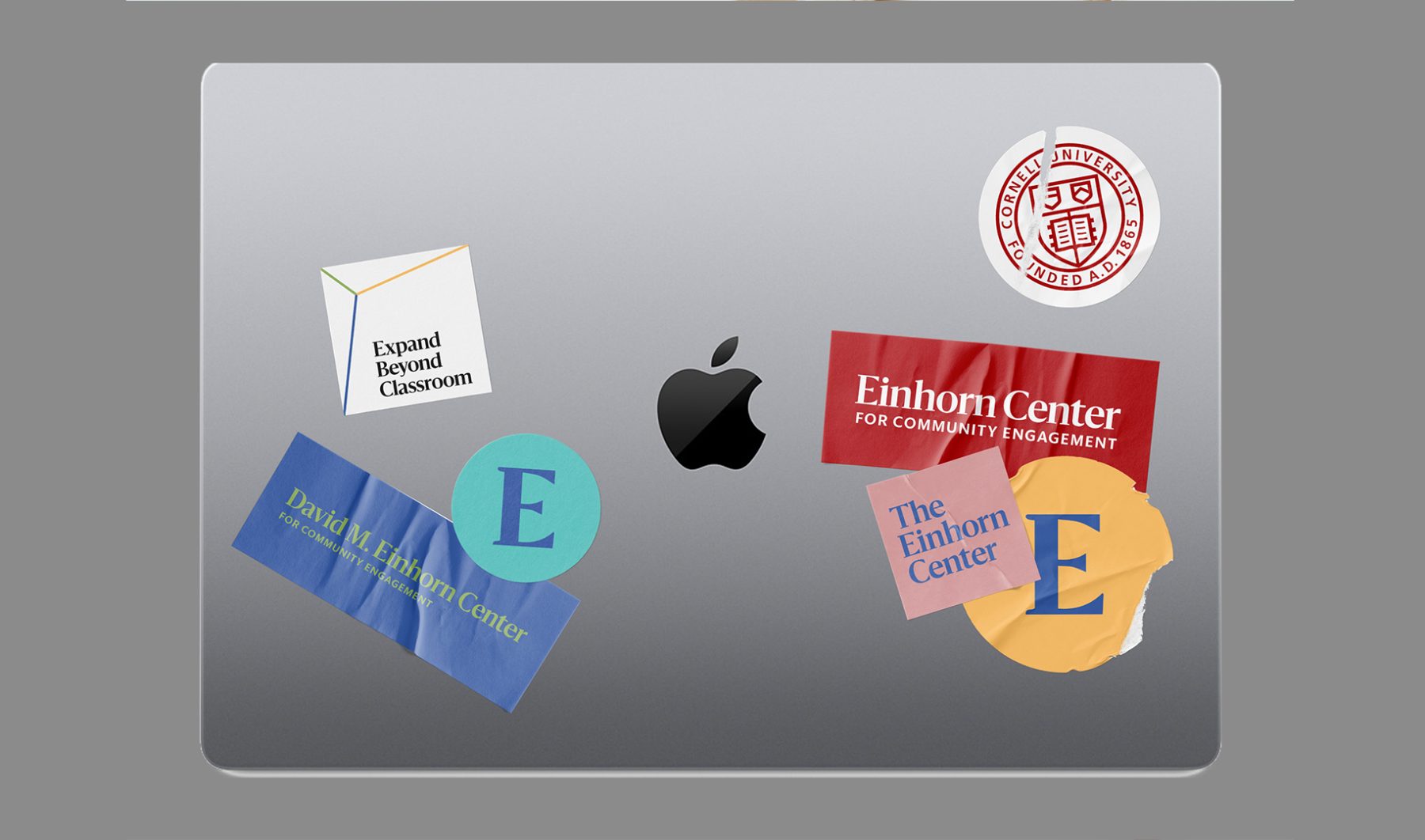
In this comprehensive branding and website project for returning client Cornell University, KUDOS successfully leveraged our past collaborative experience with Cornell AAP and Cornell Tech to develop and implement design and communication strategies to reach current students and faculty at the David M. Einhorn Center for Community Engagement.
To ensure our website’s new visual identity sat clearly under the larger umbrella of the Cornell brand, we first conducted an extensive design discovery and strategic consultation process. We then created a visually appealing and cohesive visual identity and website, along with UX/UI design for an enhanced user experience and WordPress development for easy maintenance. We executed the content-entry and migration process seamlessly and provided ongoing support as needed, ensuring that the David M. Einhorn Center for Community Engagement’s website provided a fully integrated, user-friendly, and highly engaging resource across platforms.
View einhorn.cornell.edu
KUDOS Design Collaboratory
-
Creative Director
John Kudos -
Project Manager
Jess Mackta -
Designers
Jamus Marquette, Fay Qiu, Owen Febiandi - Developers
Cornell AAP Magazine
Cornell AAP
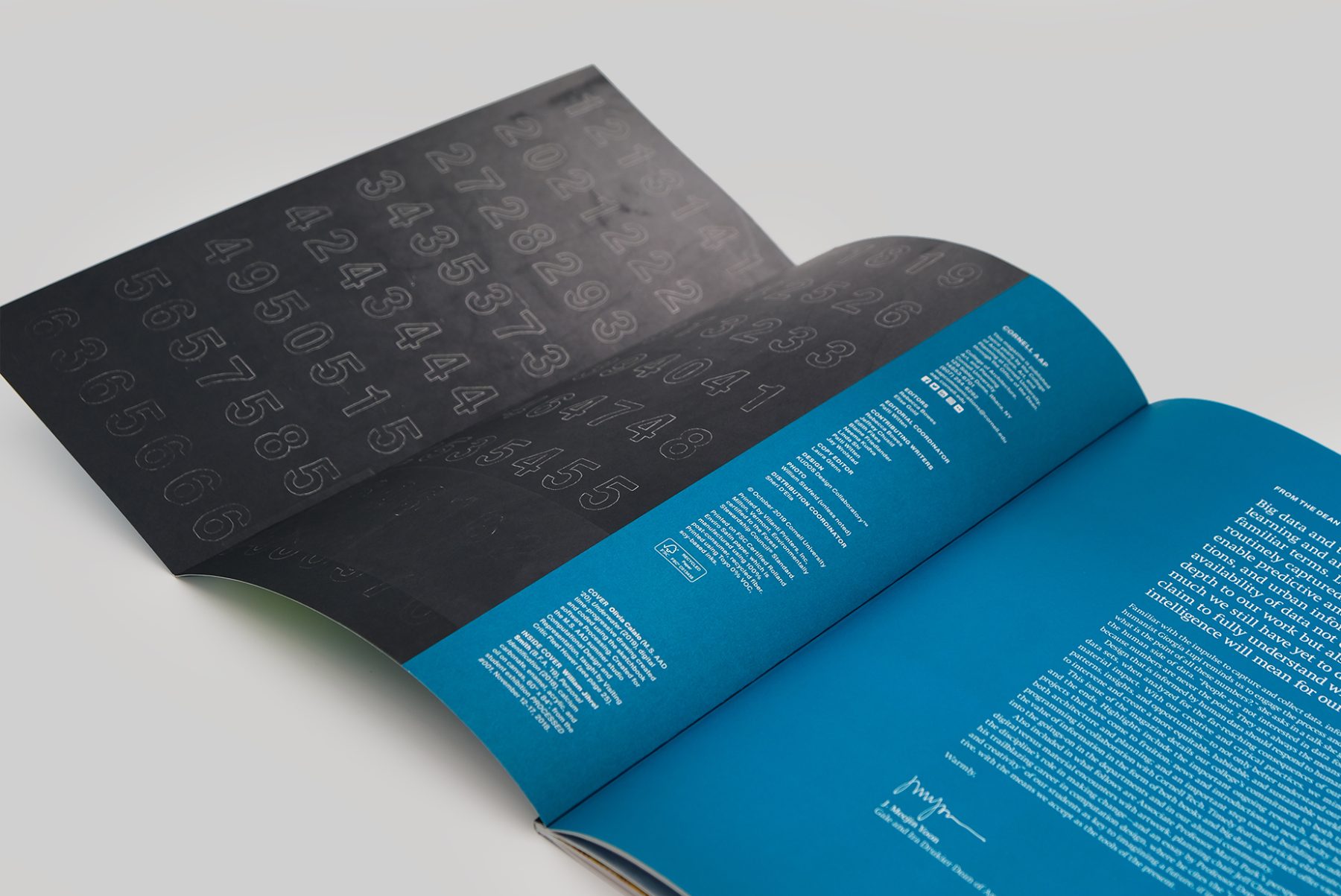
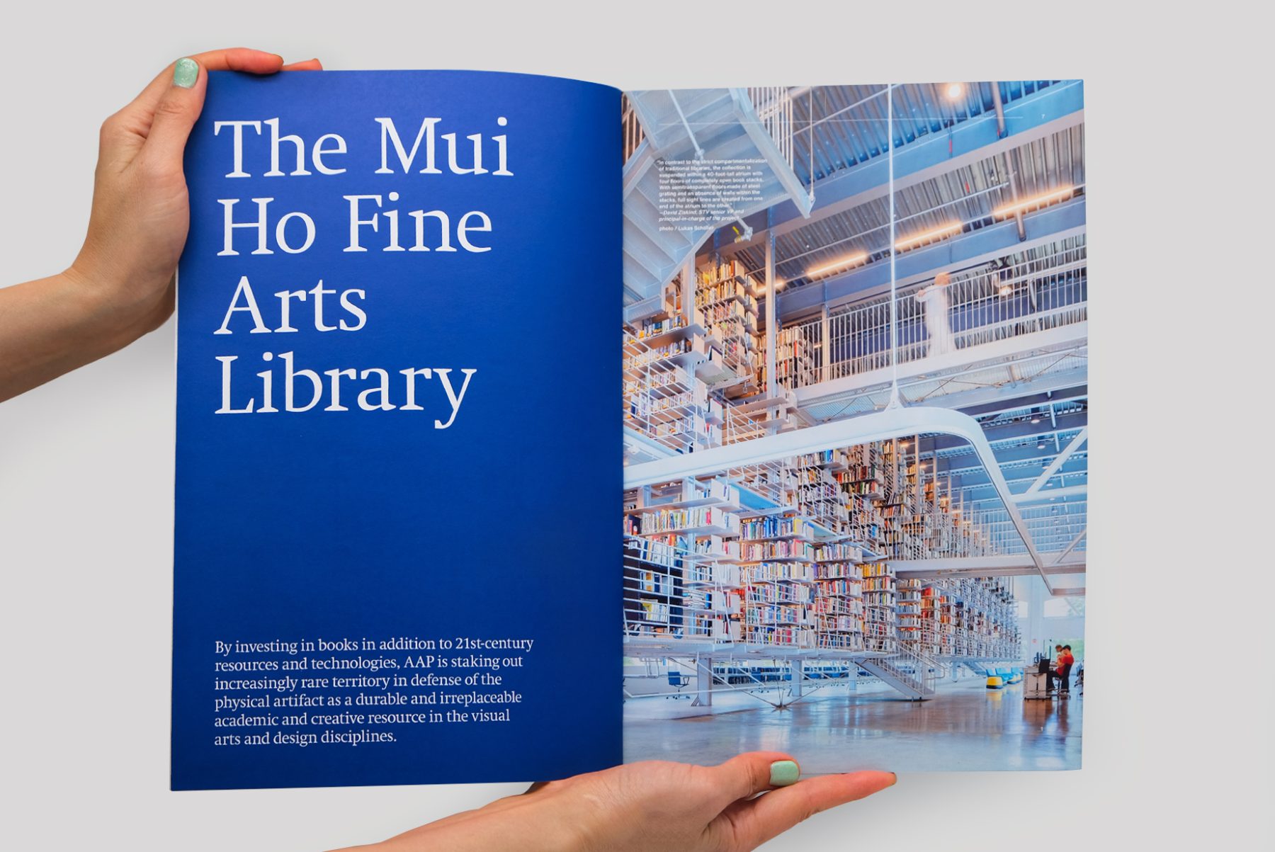
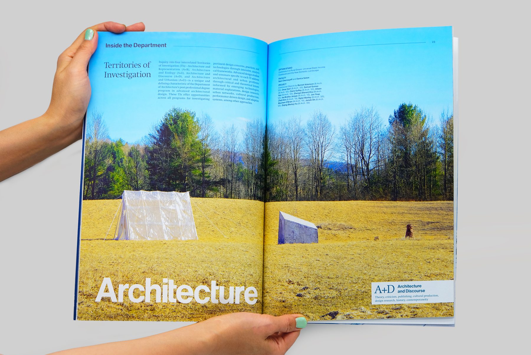
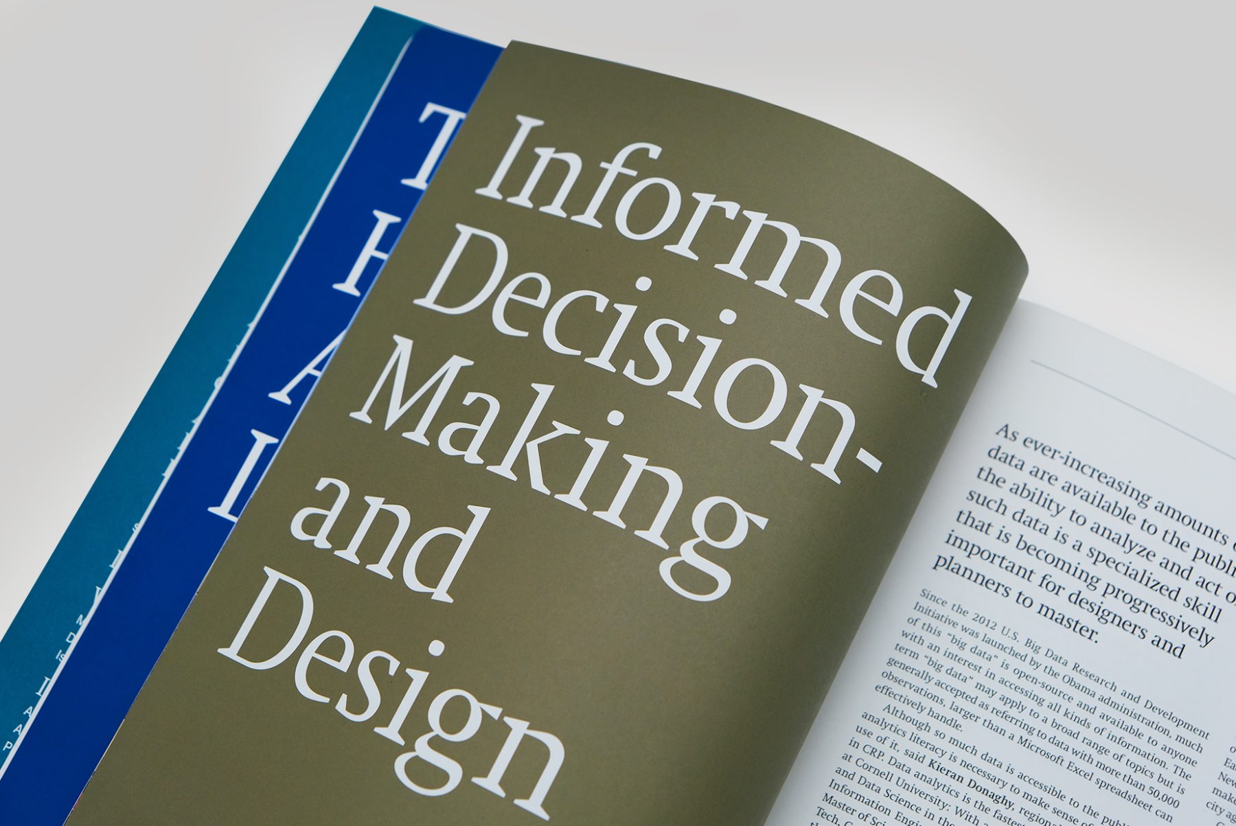
Cornell AAP is, a world-renowned college offering a triple focus of studies in architecture, fine arts, and regional planning. We’ve been producing printed communications for the college since 2011.
For this project, we produced bespoke magazines for the college. Each issue featured a spot color on the cover and table of contents, which was echoed in various highlight spots inside. The short cover reveals the table of contents on one side, inviting readers to open the magazine and explore the articles inside.
KUDOS Design Collaboratory
-
John Kudos
Creative Director -
Karen Vanderbilt
Designer
Poster House Website
Poster House
Capabilities
Focus Area
Client
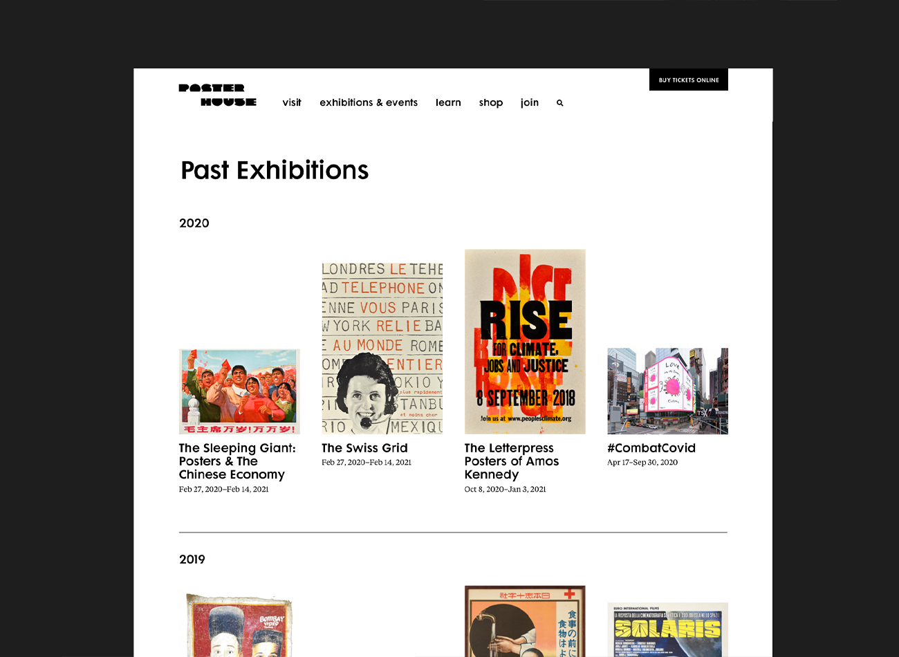
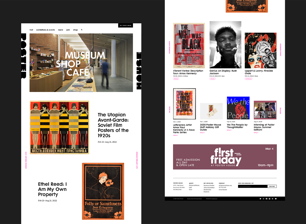
Poster House (New York City) is the first museum in the U.S. to be dedicated exclusively to posters, presenting a global view of the medium from its earliest appearances in the late 1800s to present-day uses.
We designed a seamless, clean, and immersive new website for the museum that carries the boldness, simplicity, and clarity of a poster exhibition, ensuring the museum’s events and poster collections were showcased prominently. On the back end, we developed the website to provide comprehensive information on events, collections, and admission, along with an online shop—all delivered with rigorously tested web-accessibility.
View posterhouse.org
KUDOS Design Collaboratory
-
Ashley Wu
Designer -
Owen Febiandi
Designer -
Putu Yogiswara
Designer -
Amanda Knott
Project Manager -
Christian Juniady Setiawan
Web Developer

Cornell Tech Inauguration Book
Cornell Tech
Capabilities
Focus Area
Client
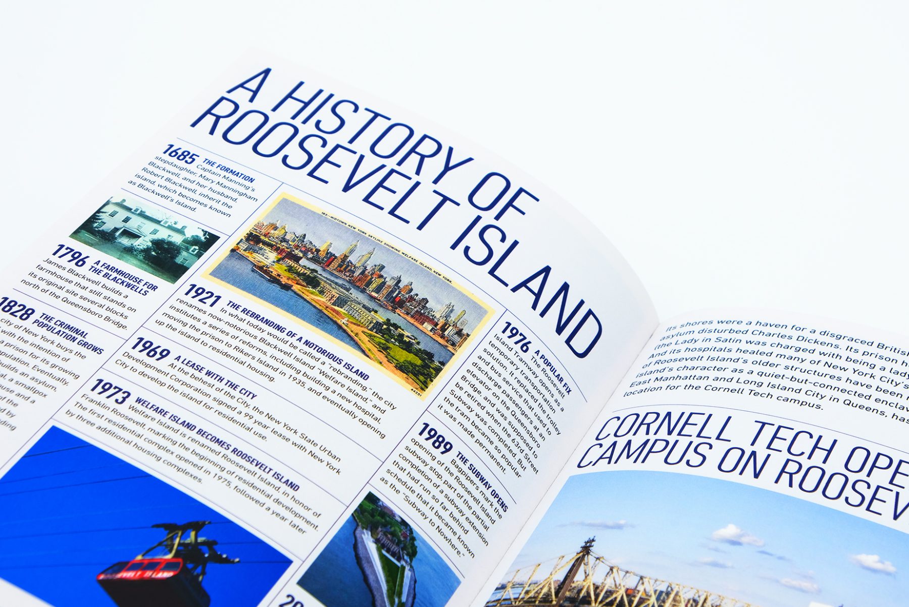
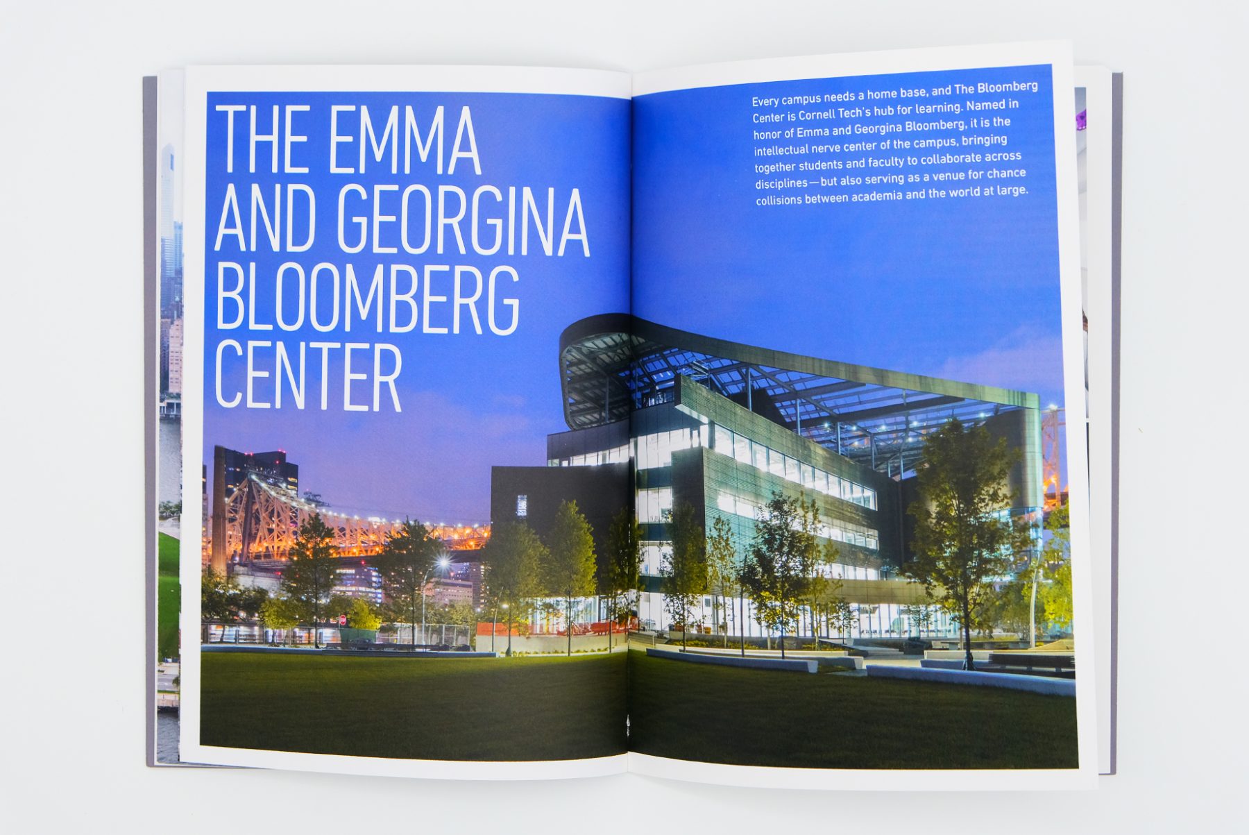
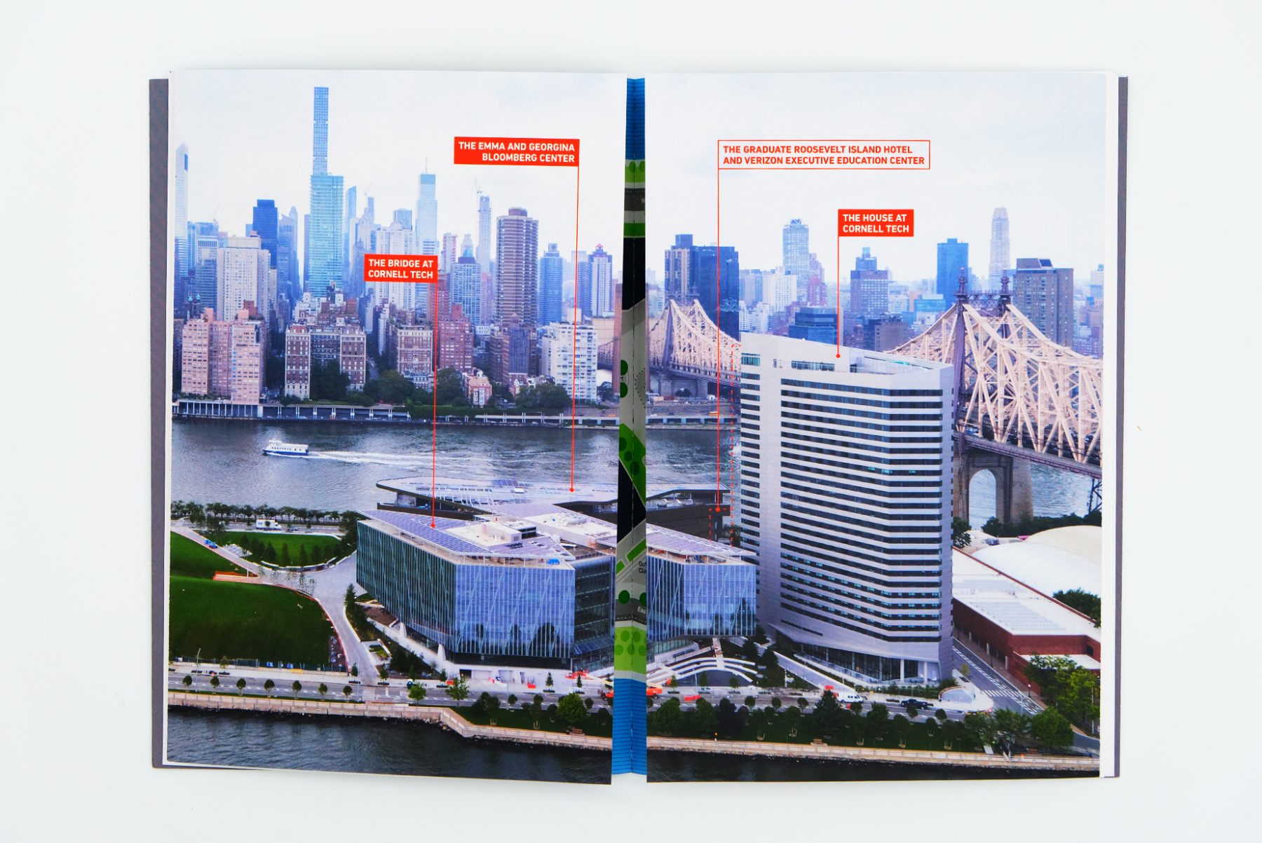
The Jacobs Technion-Cornell Institute at Cornell Tech is a place for dynamic experimentation, where the boundaries of academia are expanded to integrate technology, business, law, and design in service of economic impact and greater societal good.
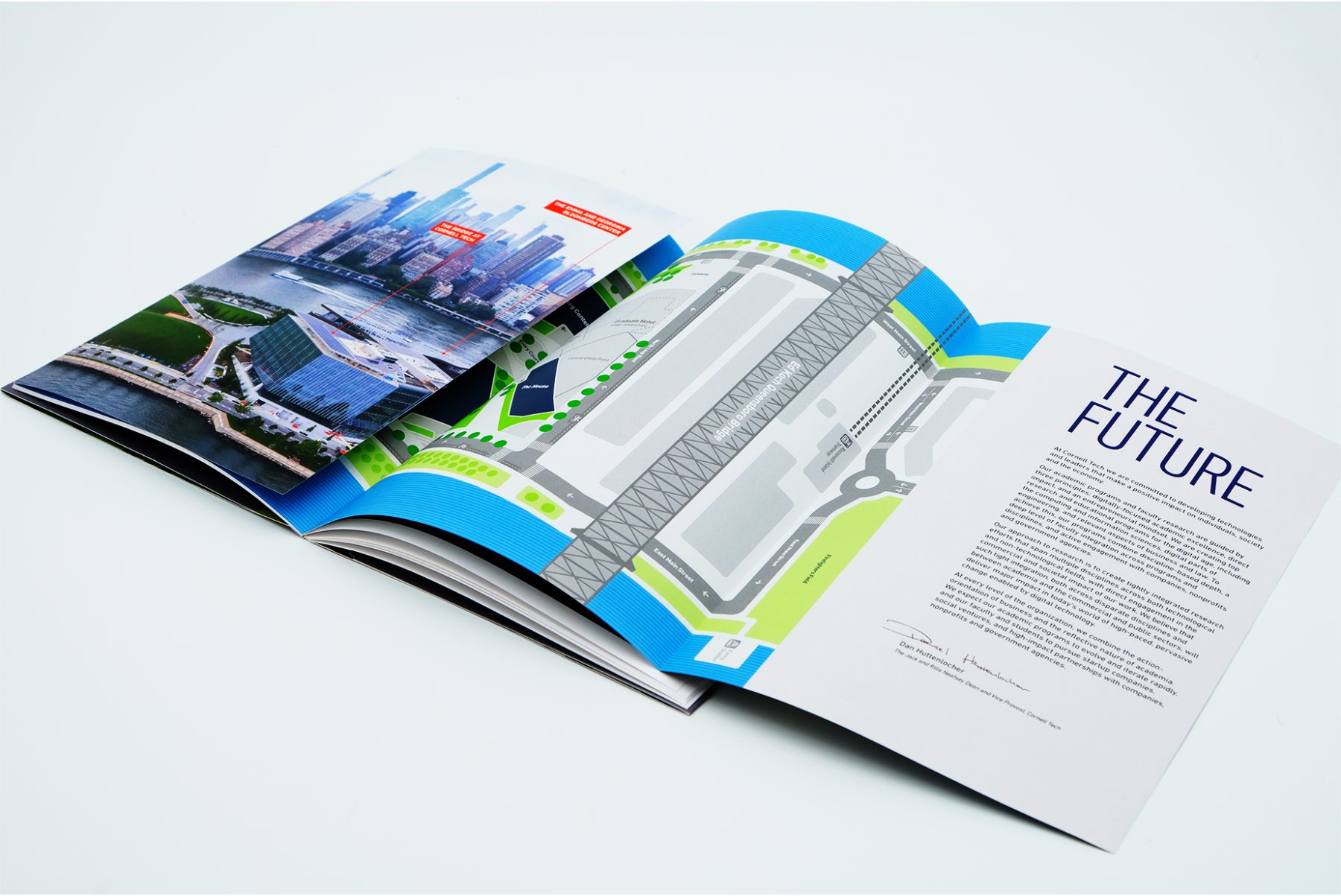
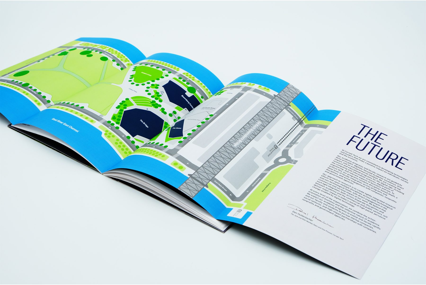
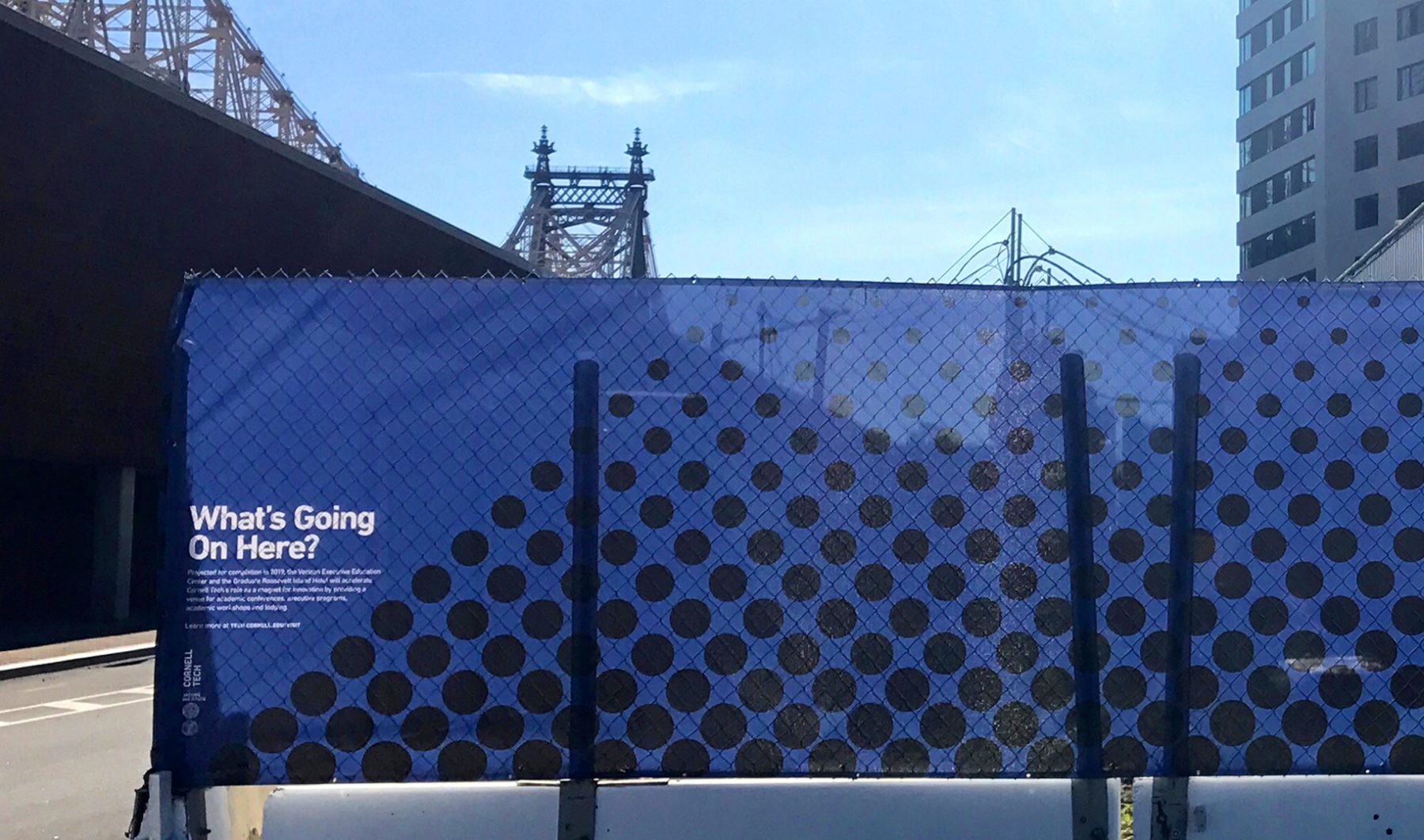
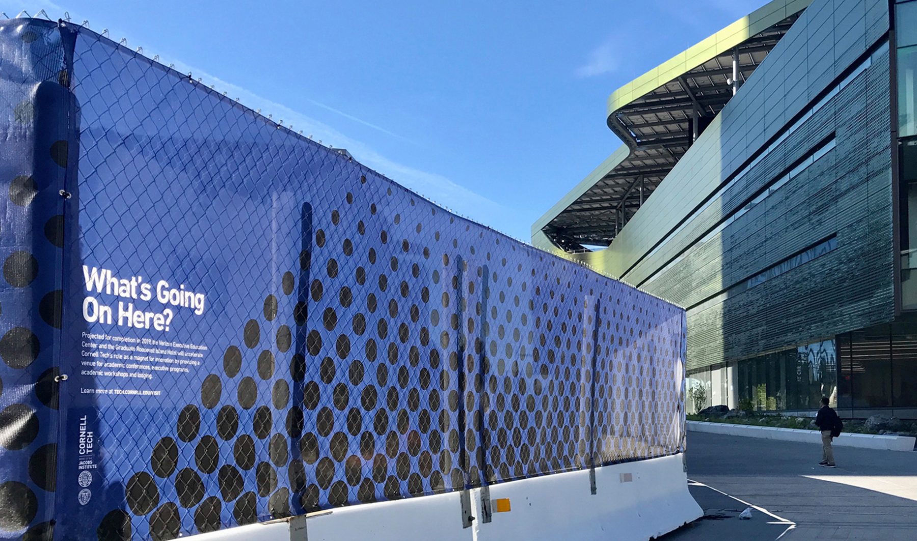
We were tasked with designing a keepsake book and construction-fence display for the inauguration of the Institute’s campus in September 2017. The book’s cover features a T-shaped die cut revealing details of the Bloomberg Center, one of the campus’s architecture highlights. A gatefold map of Roosevelt Island highlights future plans for the campus’s development. For the campus opening, we designed a 632-foot fence covering an ongoing construction site, with materials identifying the architect behind the building under construction.
KUDOS Design Collaboratory
-
John Kudos
Creative Director -
Saori Tahara
Designer
Cornell Tech
Cornell Johnson Museum Website
Cornell University
Capabilities
Focus Area
Client
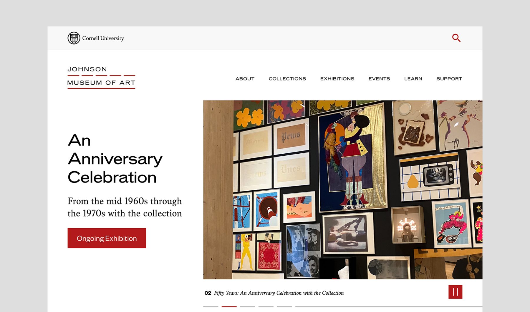
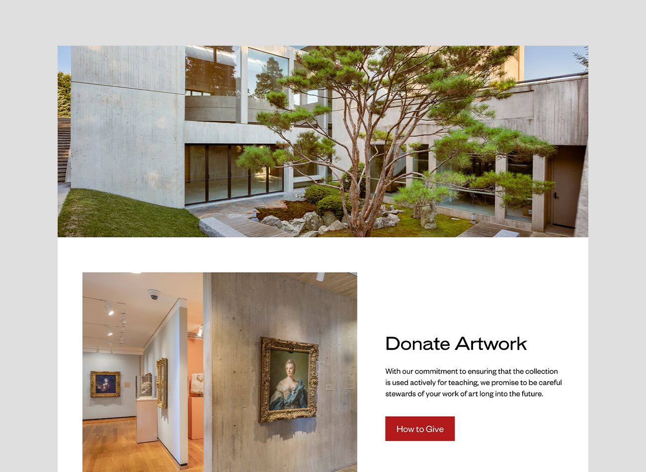
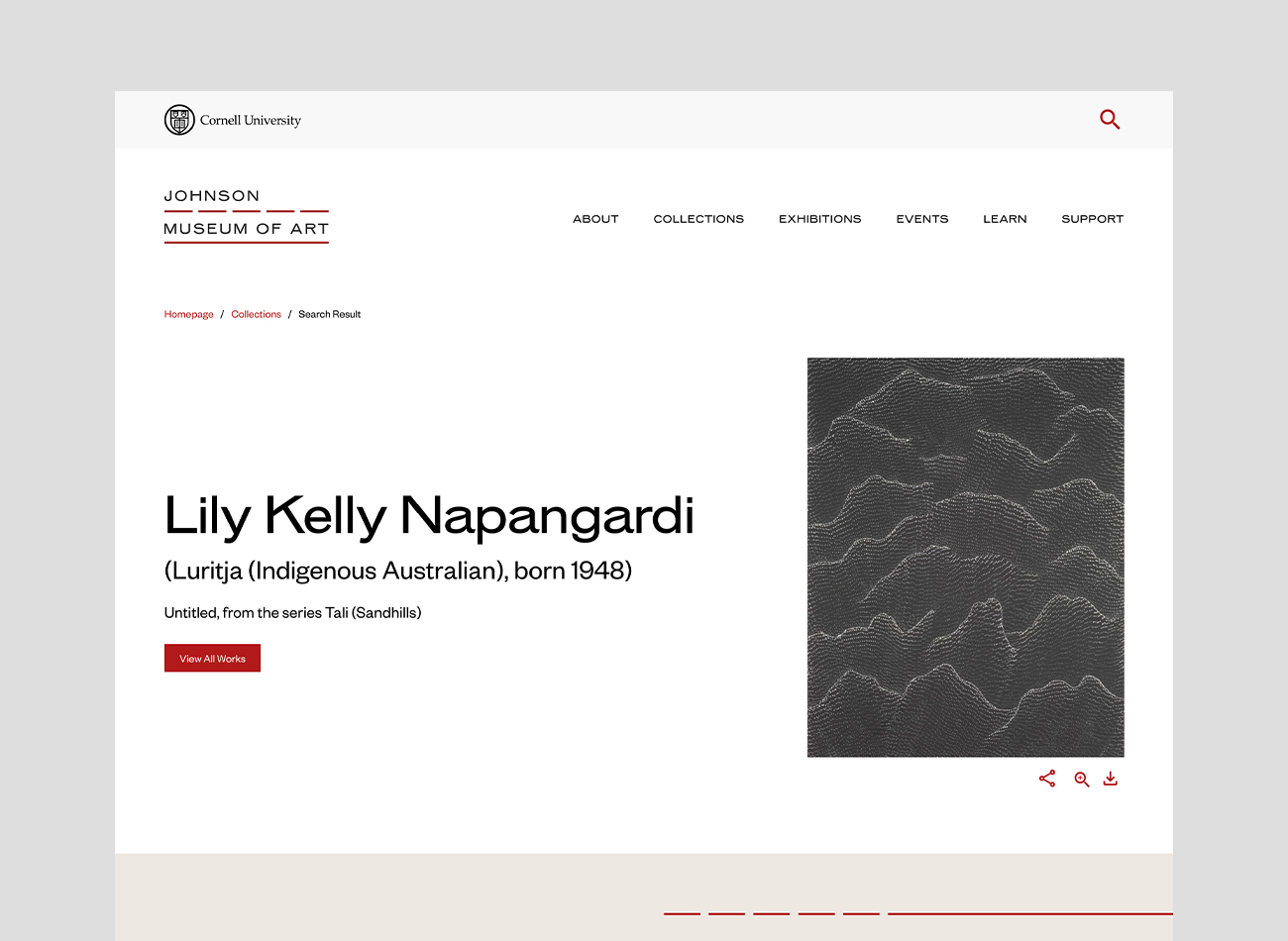
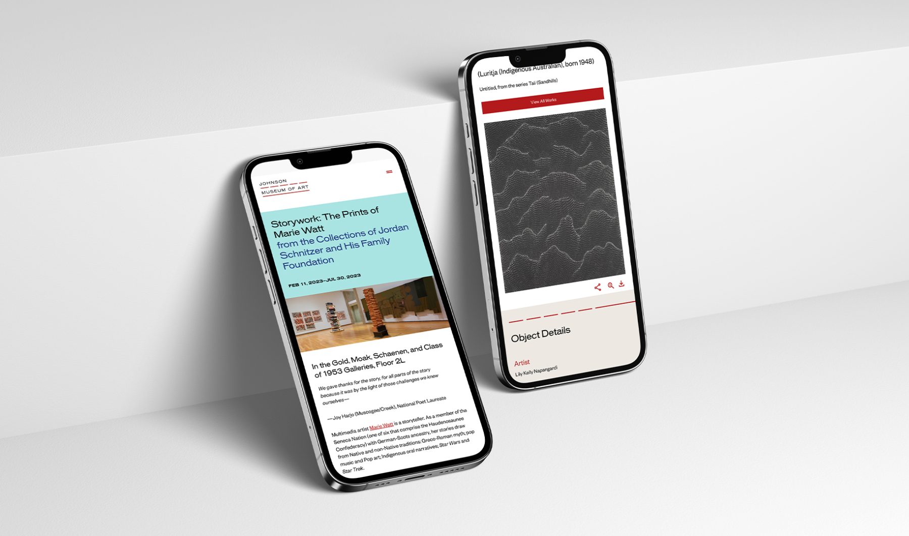
In 2022, Isometric rolled out a wide-ranging new visual identity and website design for the Johnson Museum of Art at Cornell University. Coinciding with the 50th anniversary of the museum, the new design celebrates its architecture by I.M. Pei, abstracting its iconic ribbon window into a simple, dashed line motif to signify the view from the museum onto the picturesque landscape of Ithaca and its role in interpreting the world beyond. KUDOS was tasked with developing the website, created in close collaboration with the museum and Isometric’s design team.
The resulting site is a transformative online platform that gives visitors unprecedented access to the Johnson’s astounding collection of 40,000 works that span six millenia and most world cultures. Beyond serving as a crucial archive, the website also acts as a dynamic educational platform, offering a variety of activities for children via the Johnson Kids portal, and an opportunity through the Community Exhibition Creator for visitors to create their own online exhibitions incorporating artworks from the museum’s collection. Through these functions, visitors are empowered to engage with the collection on their own terms, creating an egalitarian and inclusive experience of the museum.
View museum.cornell.edu
PROJECT TEAMS
-
Isometric
Visual Identity & Website Design -
KUDOS Design Collaboratory
Web Development
KUDOS Design Collaboratory
-
Amanda Knott
Project Manager -
Chris Manlapid
Lead Web Developer -
Christian Junaedi Setiawan, Faris Hanugraha, Arif Widipratomo
Web Developer
GII 100 Exhibition
GII Hok Im Tong
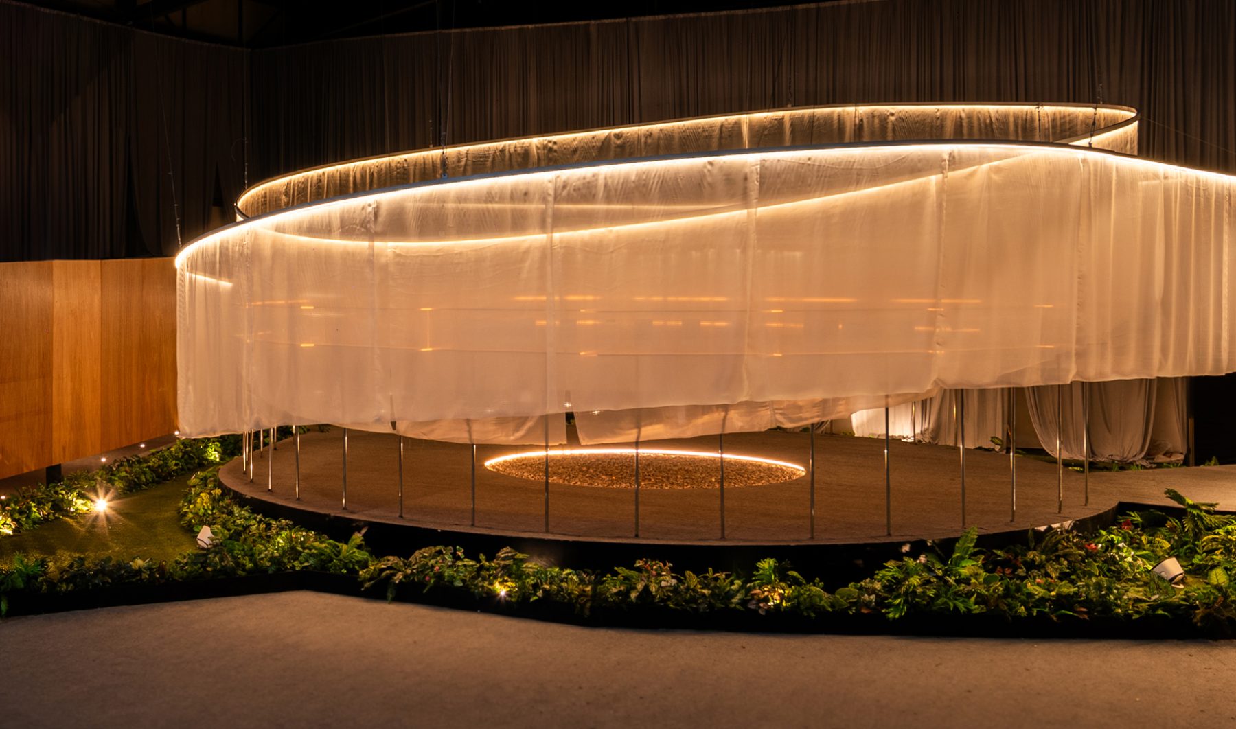
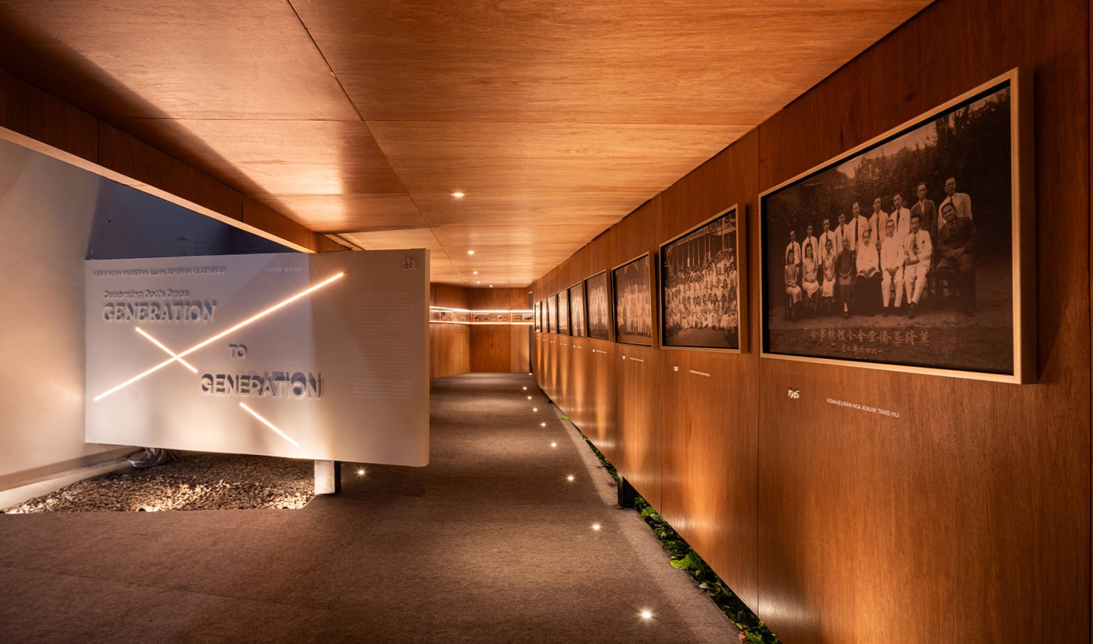
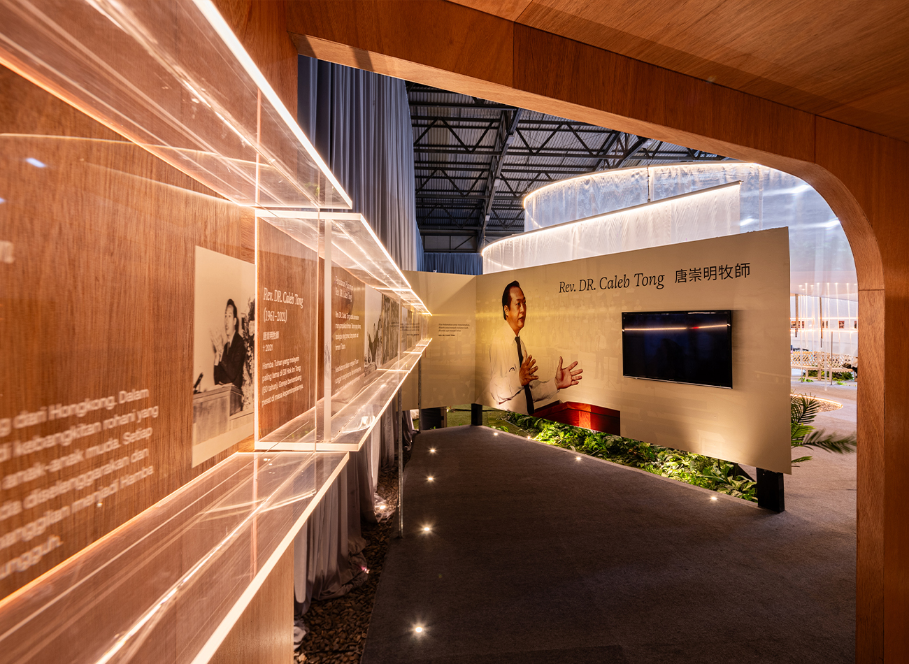
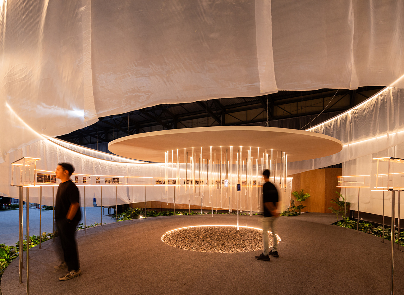
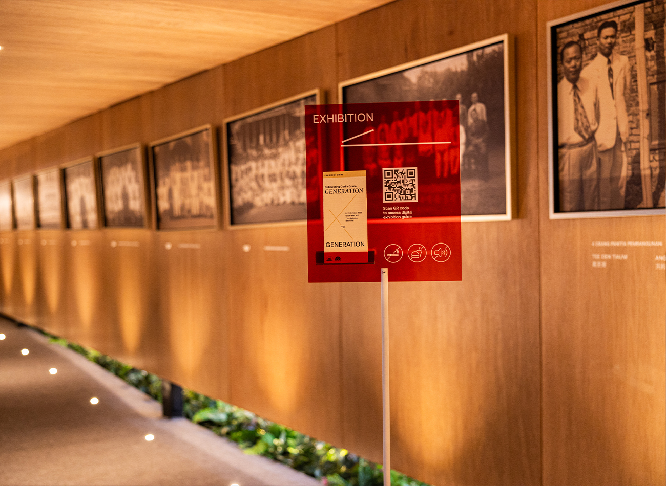
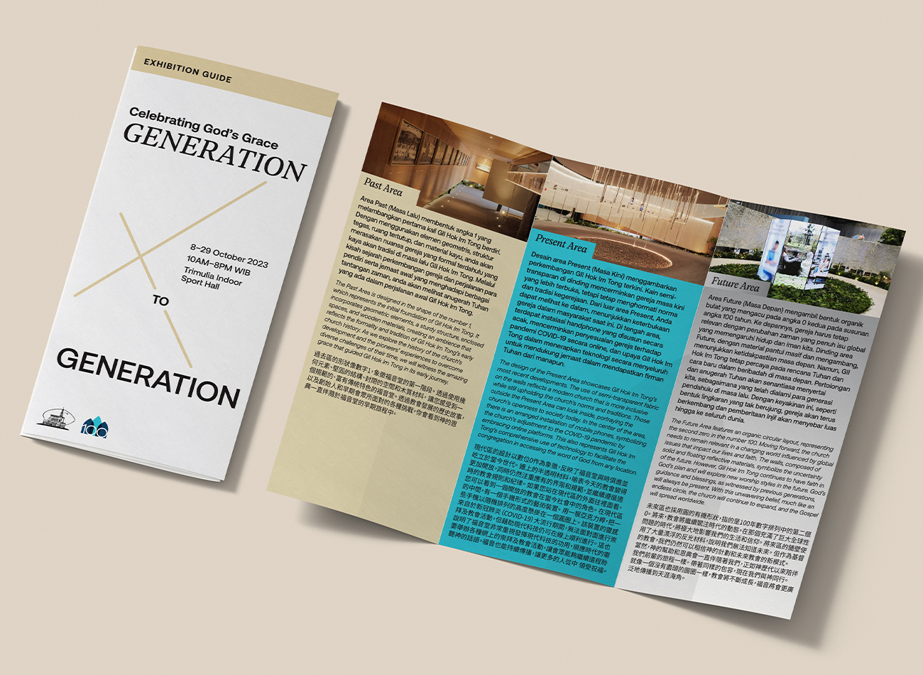
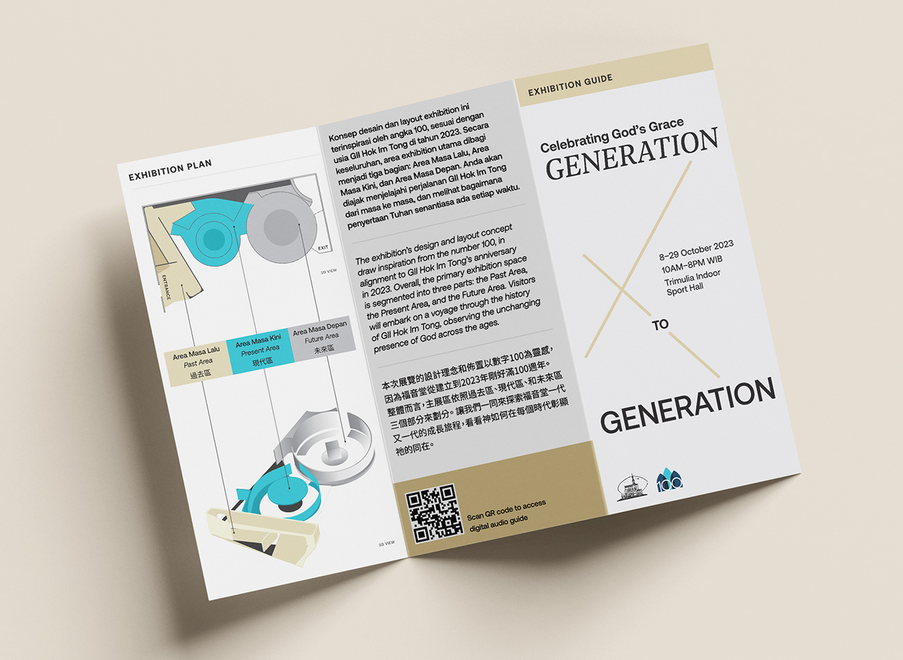
The church of Gereja Injili Indonesia (GII) Hok Im Tong in Indonesia celebrated its 100th anniversary in 2023. To commemorate the occasion, the church organized a three-week exhibition and tasked Kudos with creating the space—complete with branding, an information display and wayfinding system, and a full exhibition guide.
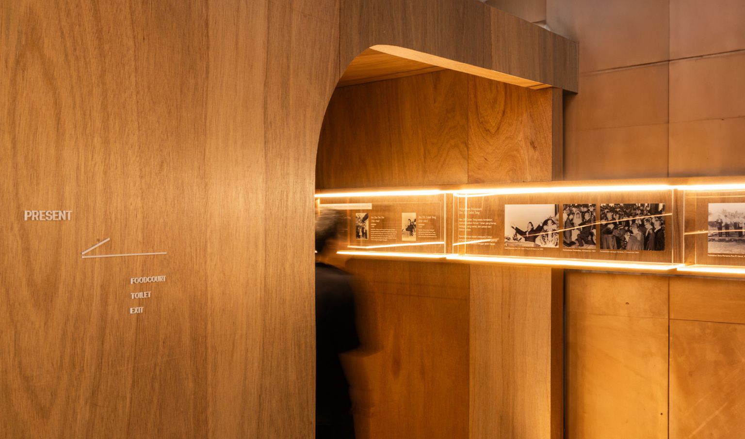
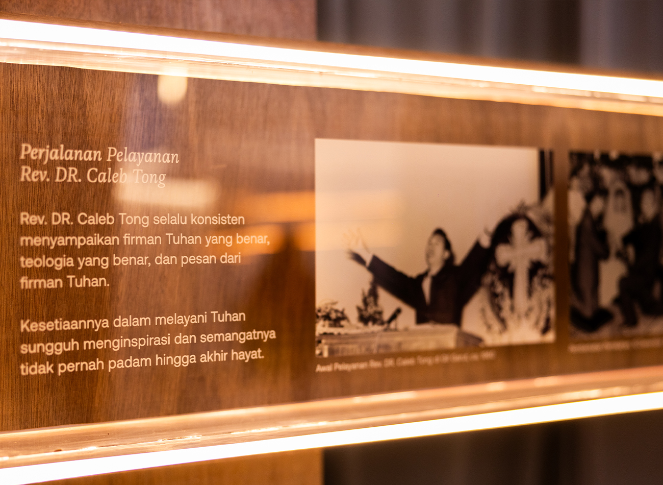
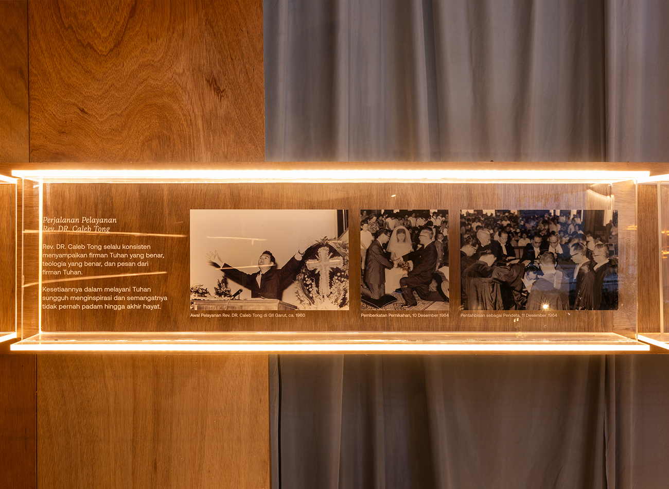
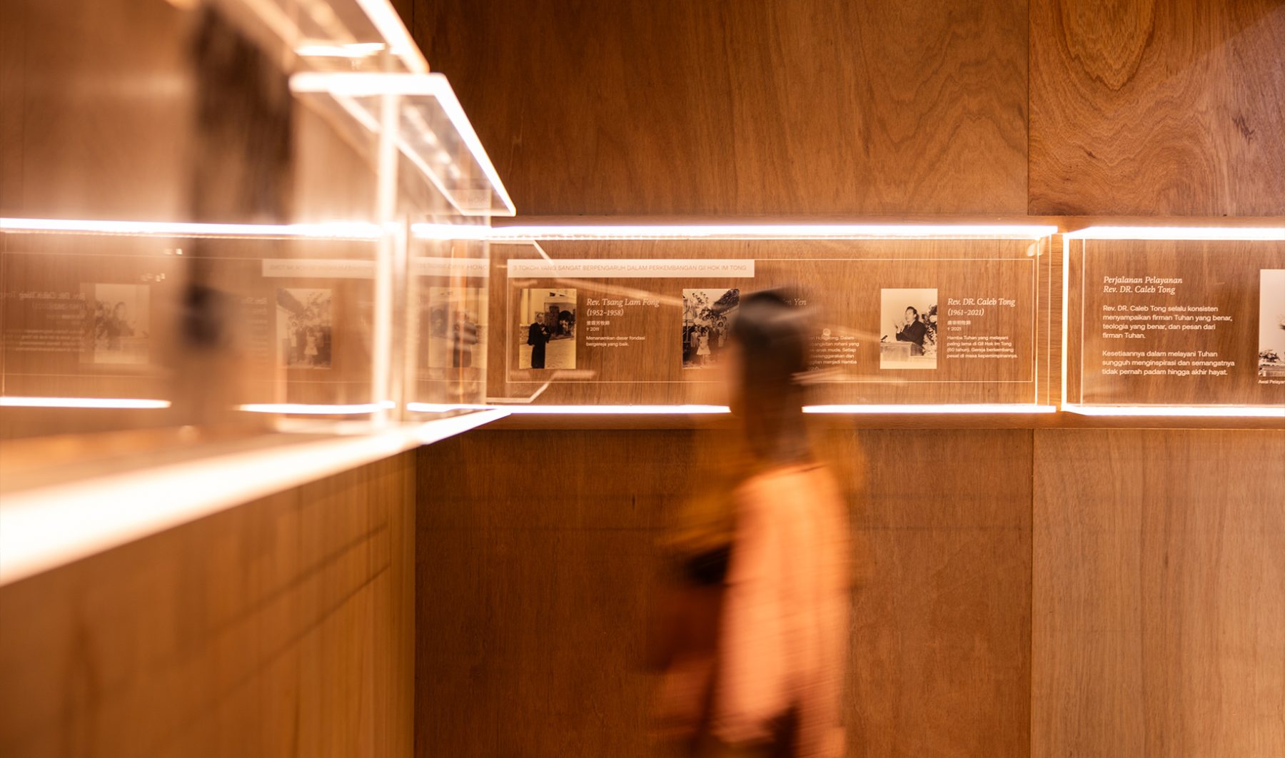
Our exhibition space was subdivided into three sections, representing the past, present, and future of the church. Visitors were invited to embark on a voyage through GII Hok Im Tong’s 100-year history and observe the unchanging nature of God’s grace through the ages. We presented key exhibition information on a 12-inch wall-mounted display illuminated by warm-white LED strips, which provided a thorough review of the church’s history, leaders, and activities along with a guide to the exhibition’s three sections. Ultimately, more than three thousand people visited the exhibition to take part in the church’s ongoing journey.
KUDOS Design Collaboratory
-
Andy Kurniawan
Creative Director -
Owen Febiandi
Art Director -
Imam Fadilah
Designer -
Reza Risnaldi
Designer
Bahtera Associates
-
Donny Kristianto
Architect -
Ryan Setiadi
Architect
Elway Studio
-
Alvin Yonathan
Interior & Architecture Photographer

Poster House Interactive Exhibitions
Poster House
Capabilities
Focus Area
Client
Poster House (New York City) is the first museum in the U.S. to be dedicated exclusively to posters, presenting a global view of the medium from its earliest appearances in the late 1800s to present-day uses.
We were tasked to create four interactive exhibits (three digital exhibits and one children’s area) as permanent fixtures of the museum, to be seamlessly integrated into its newly built architecture. In acknowledgement of the poster medium’s journey from oversized ink-on-paper communications to its many contemporary forms—digital, animated, interactive, generative—we ensured that all of our interactive components offered a good mix of tactile, physical, and screen-based experiences.
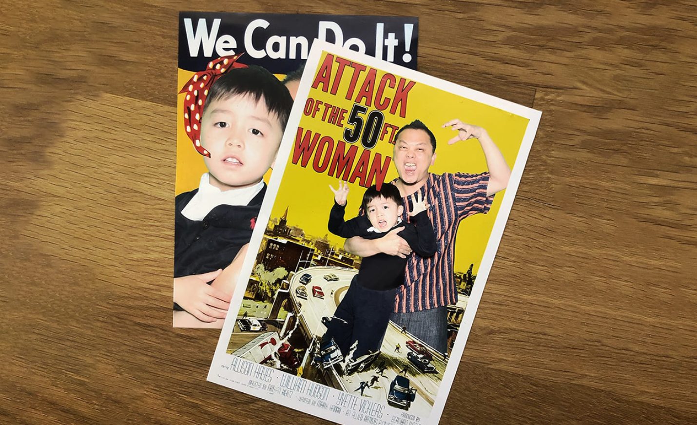
PHOTO BOOTH
This green-screen photo booth, visible from the street and embedded into an alcove at the museum’s entrance, allows visitors to place themselves in iconic posters using a custom interface, and receive the final posters via email, text message, and print.
Since the museum’s opening 5 months ago, over 6,500 images have been texted, emailed, and printed through the highly visible photo booth.
The photo booth continues to be a big draw for passersby, with an average of 15 minutes per visitor engagement.
DIGITAL POSTER WALL
This oversized 4K screen displays a curated grid of larger-than-life posters from the collection, which are randomly enlarged periodically, or whenever a visitor presses a nearby button. Located adjacent to the ticketing counter, our digital poster wall provides a good preview of what to expect in the museum.
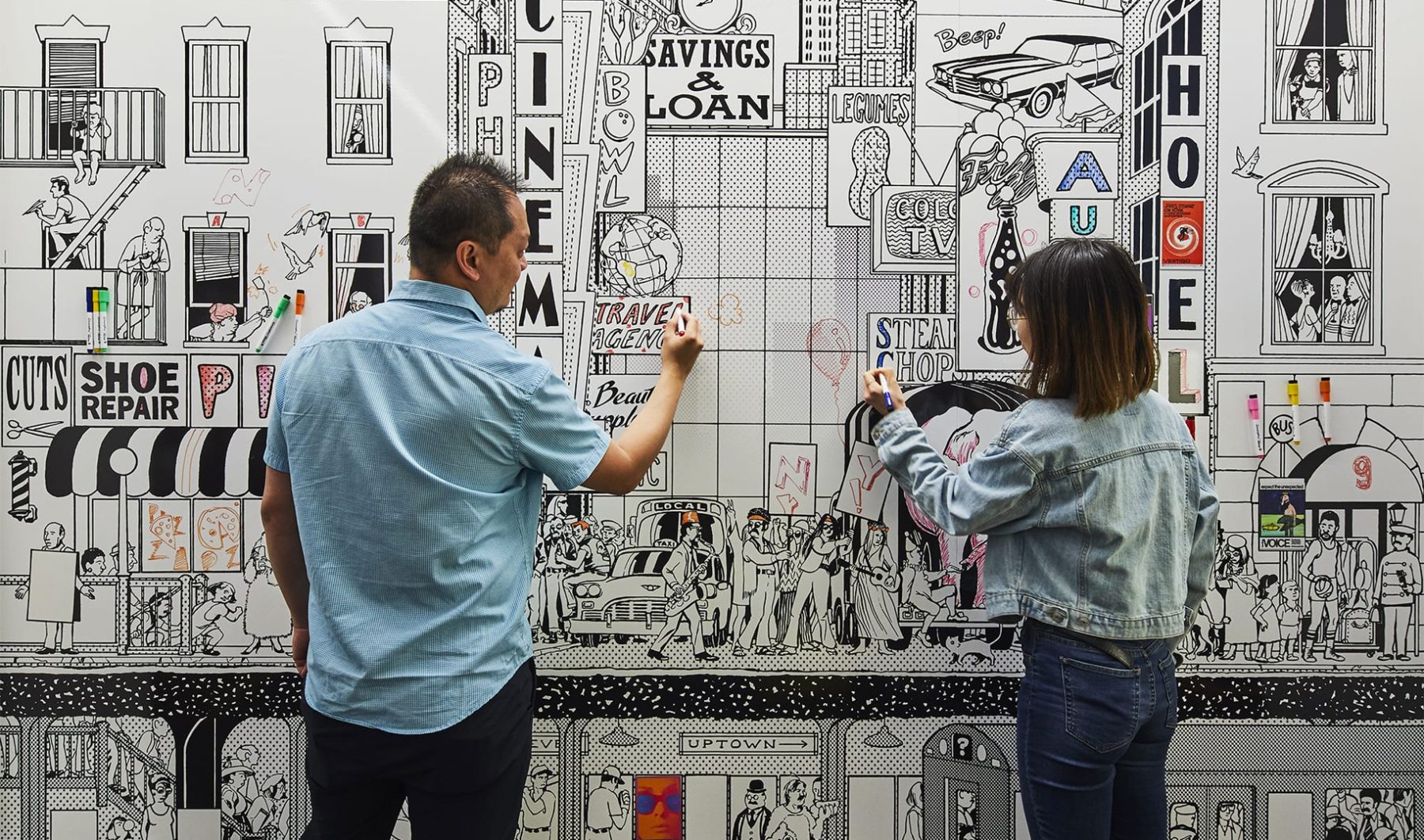
CHILDREN’S AREA
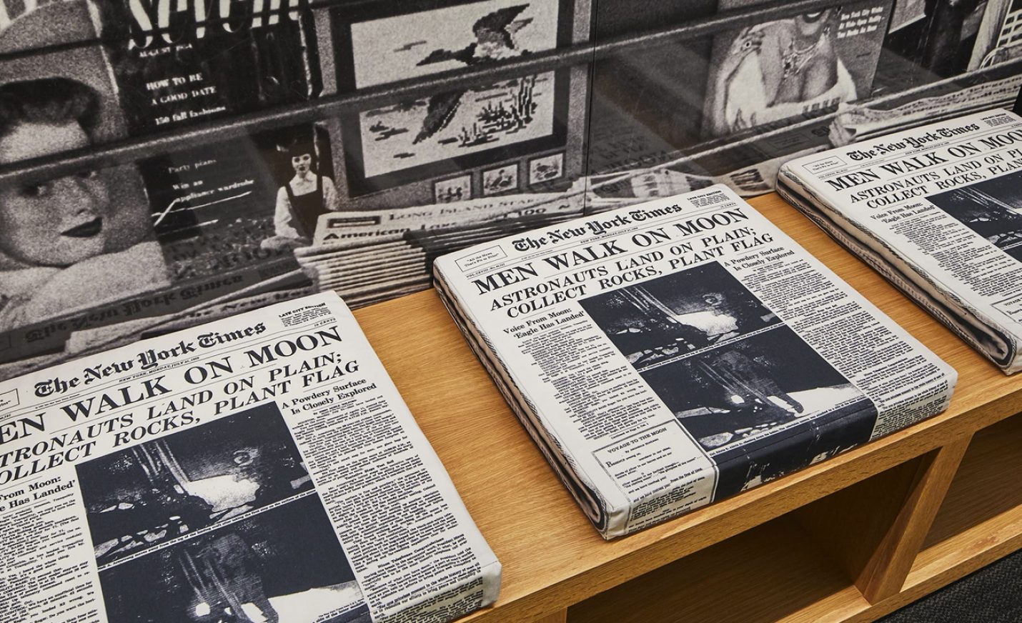
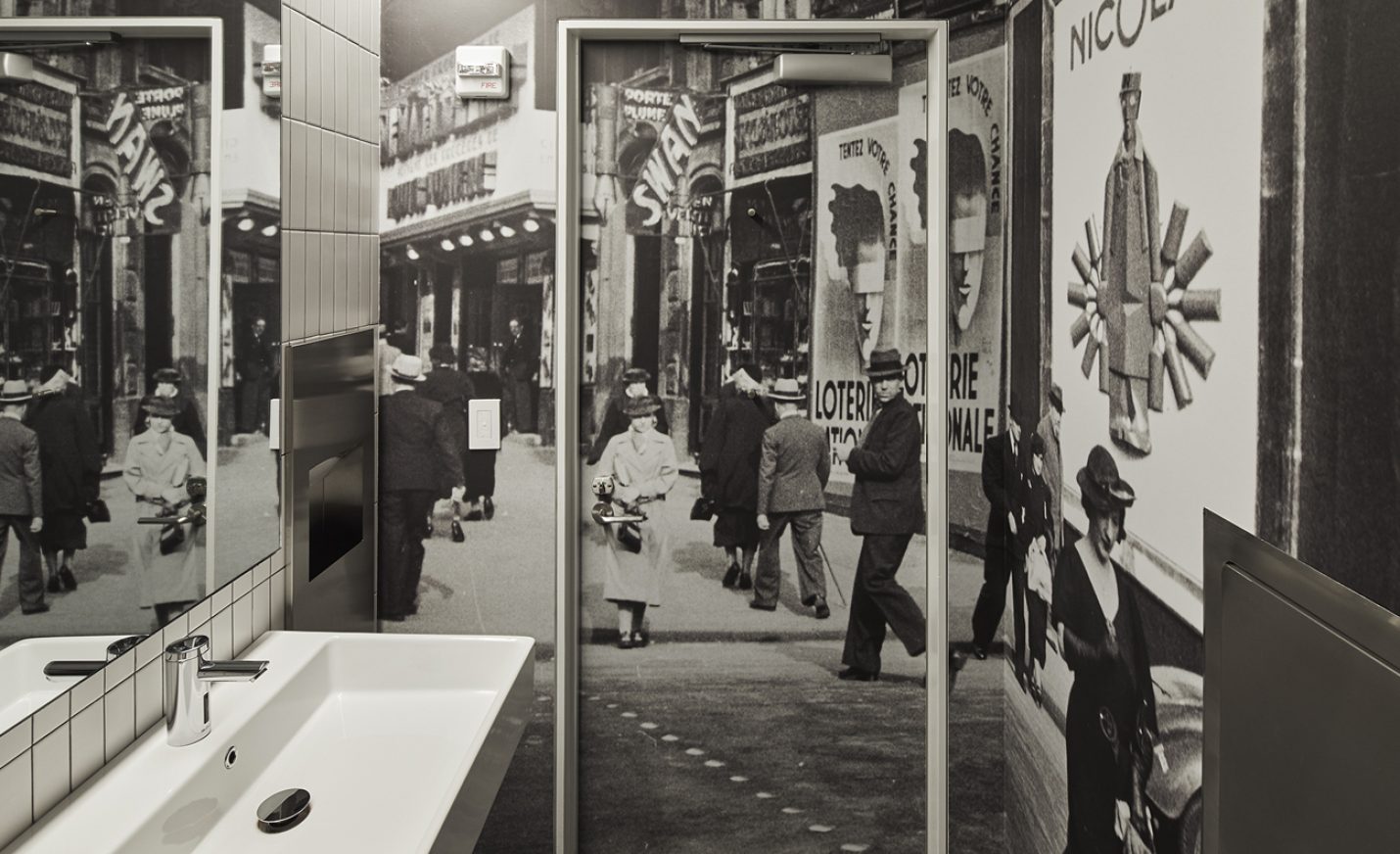
Our children’s area is a blast from the past, featuring 1960s New York City scenes. A coloring mural wall with magnetic posters, interactive vintage payphones by a newsstand, and layering stations explaining how posters are made engages an audience of all ages.
POSTER MACHINE
These tabletop interactive kiosks allow visitors to experience the poster-creation process. To design them, we deconstructed what goes through a designer’s brain to create a choose-your-own-adventure poster-design game, each step of which explains the significance and thought process behind the basic ingredients of any poster—symbols, colors, phrases, fonts, and design styles. There are three themes—Propaganda, Film, or Advertising—for which we created over 143,000 images to represent all the possible design paths one can take.
KUDOS Design Collaboratory
-
John Kudos
Creative Director -
Ashley Wu
Designer -
Sumit Paul
Designer -
Whatever
Software Developer -
Darius Wang
Animator






Journal of Architectural Education
Association of Collegiate Schools of Architecture (ACSA)
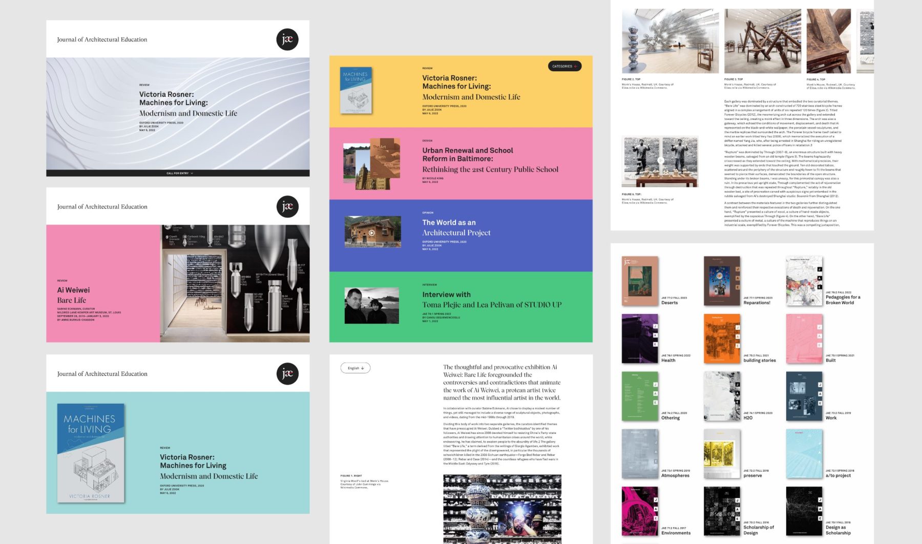
This branding and website project for the Journal of Architectural Education (JAE) embodies the journal’s longstanding commitment to scholarly discourse and progressive architectural education. As a peer-reviewed international journal published under the auspices of the Association of Collegiate Schools of Architecture (ACSA), JAE serves as a vital platform for fostering inclusive, just, and sustainable architectural practices.
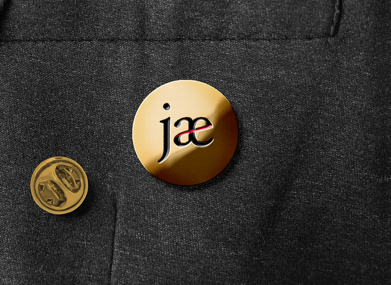
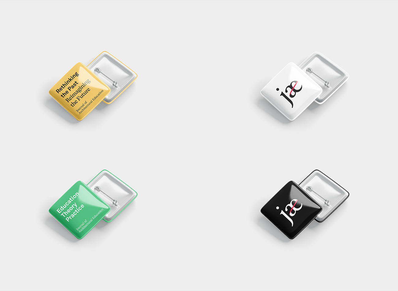
Through meticulous design choices and a commitment to visual storytelling, the JAE branding and website project exemplifies the journal’s mission to shape the future of architectural discourse and education. Our vibrant branding reflects the journal’s unique ethos, featuring a scholarly serif typeface for the main logo and an abbreviated logomark symbolizing social connectivity with a red stroke linking the letters a and e. Incorporating a diverse palette that represents the breadth of essays included in the journal, the website offers a dynamic interface for architectural educators, scholars, and designers to engage in thoughtful discussions about the evolution of architectural education and practice, contributing to the journal’s relevance and impact for future generations.
View jaeonline.org
KUDOS Design Collaboratory
-
John Kudos
Creative Director -
Fay Qiu
Designer -
Amanda Knott
Project Manager -
Chris Manlapid
Web Developer
Fragile Legacy
Corning Museum of Glass
Capabilities
Focus Area
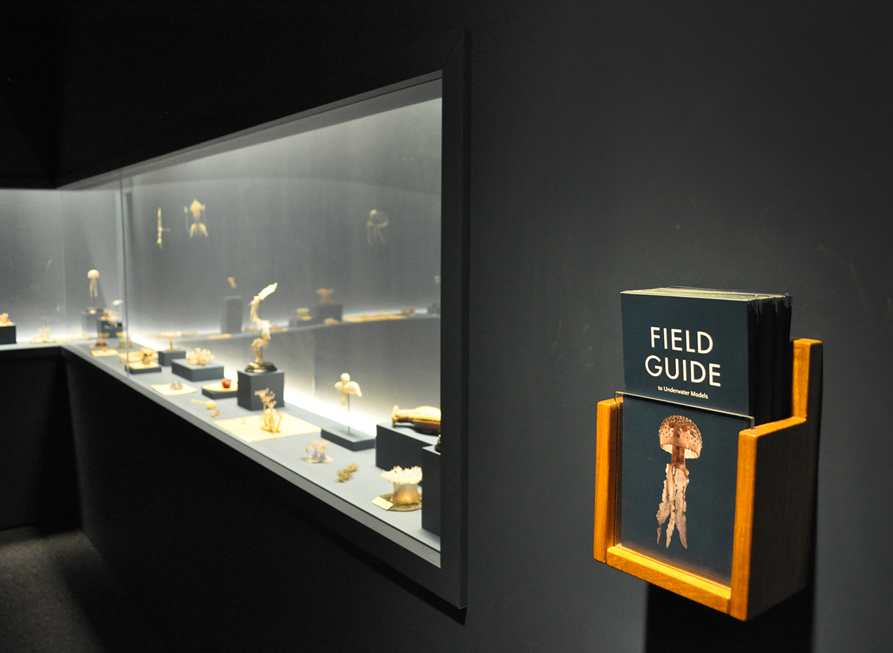
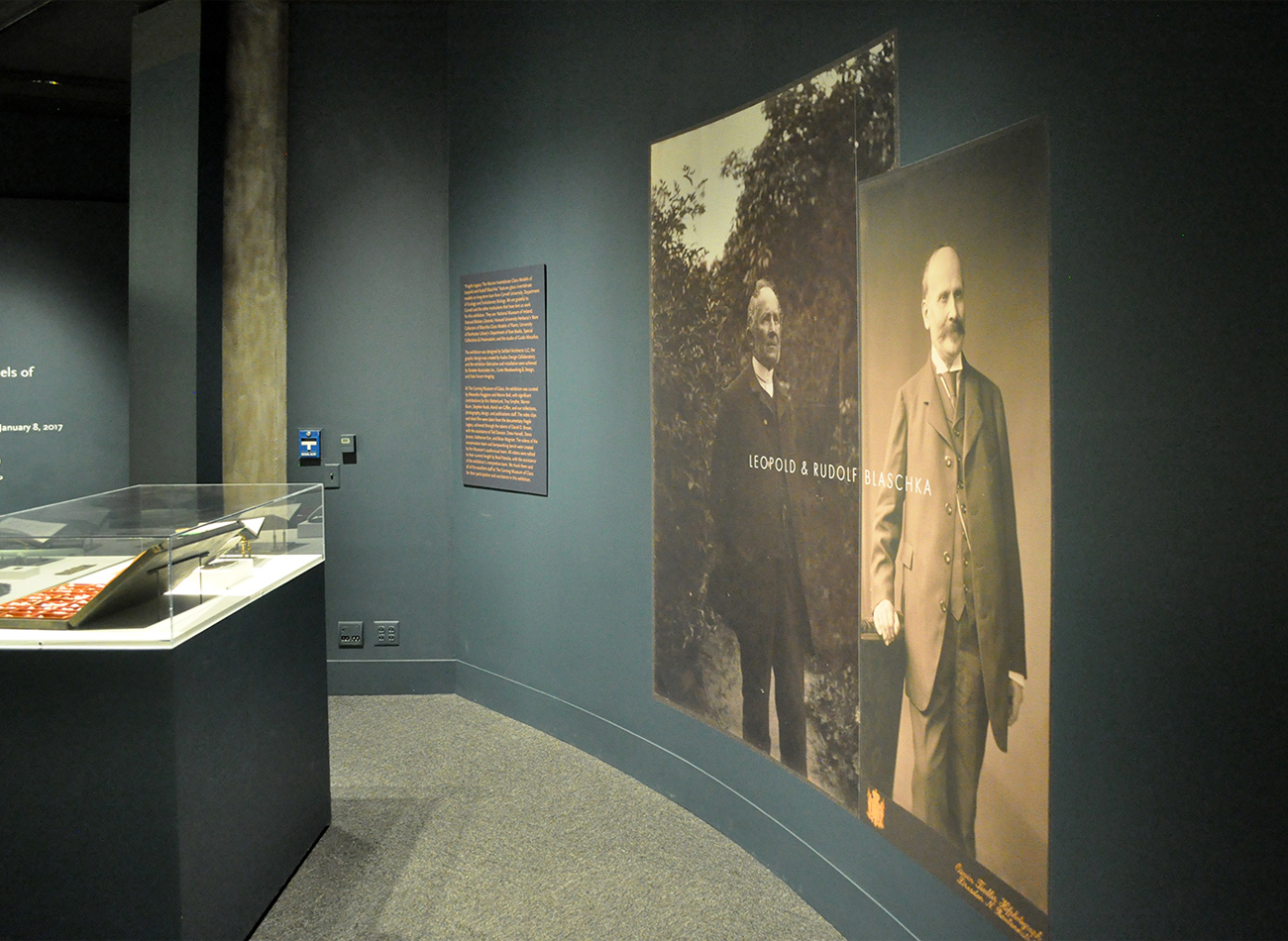
For these exhibition graphics for “Fragile Legacy” at the Corning Museum of Glass, we collaborated with Selldorf Architects and the museum’s in-house team to ensure that all graphic and text panels followed the museum’s visual theme.
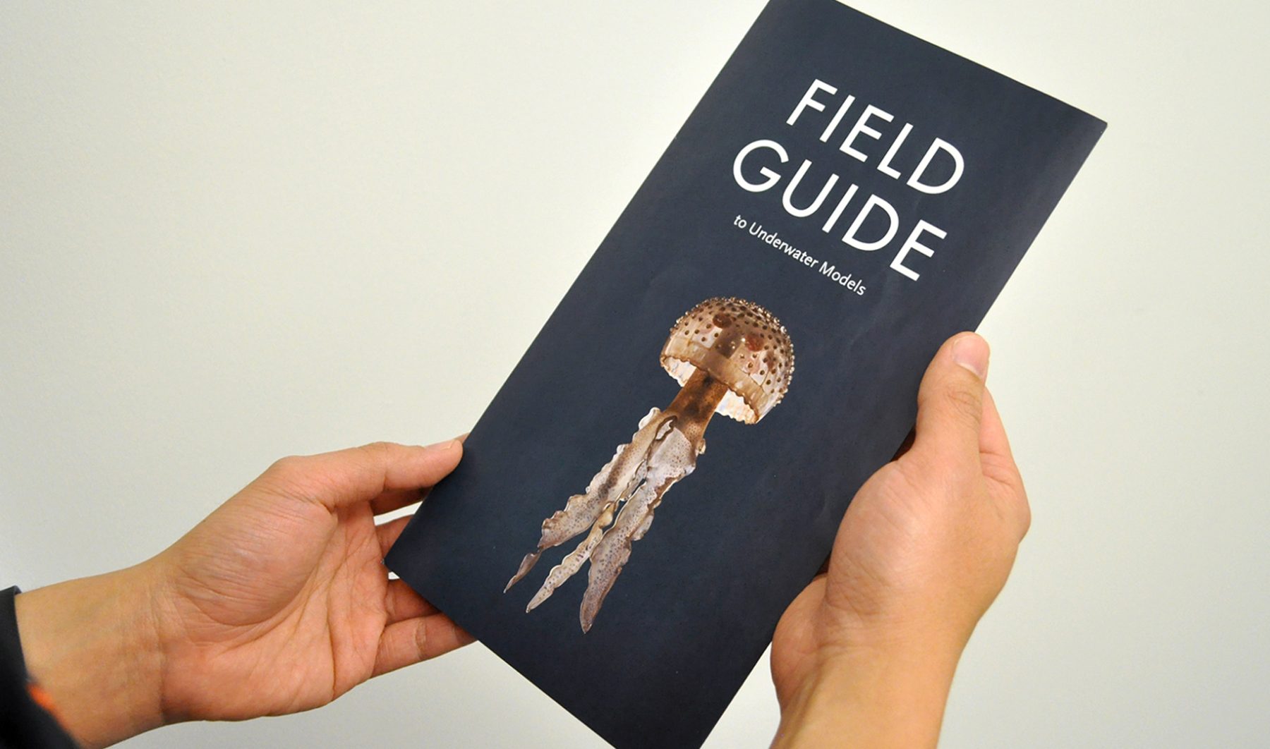
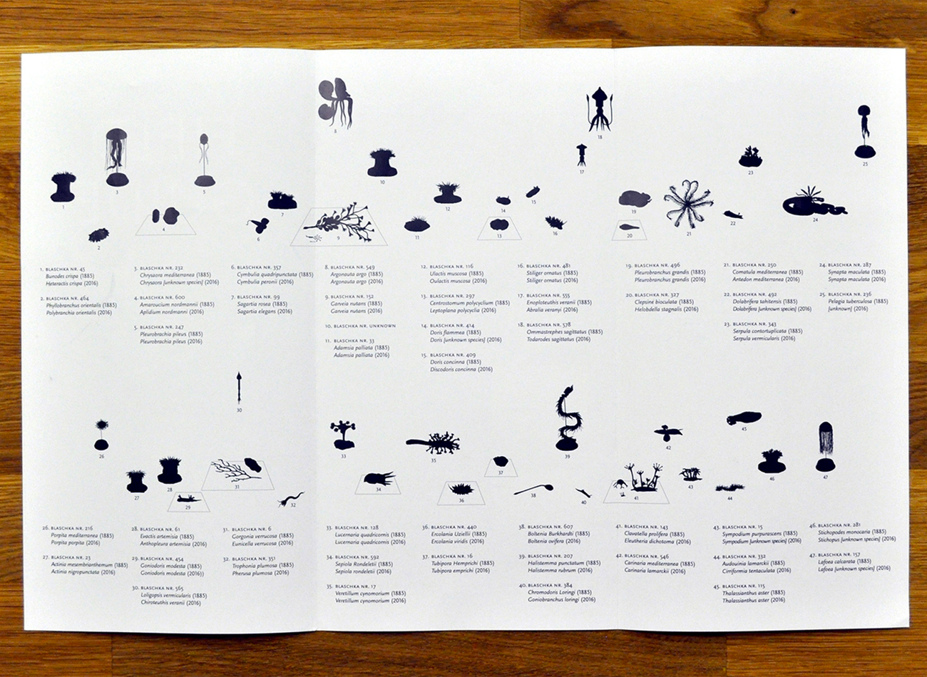
For the show’s exhibition of Blaschka marine invertebrate glass models, we combined Futura and Scala Sans typefaces to create a classic-modern underlying tone, starting with the oversized typography on the title wall. A “field guide” trifold brochure provided detailed information on displayed objects, eliminating the usual clutter of text labels.
KUDOS Design Collaboratory
-
John Kudos
Creative Director
Selldorf Architects
-
Lisa Green
Partner in charge
UIII Branding
Universitas Islam Internasional Indonesia
Capabilities
Focus Area
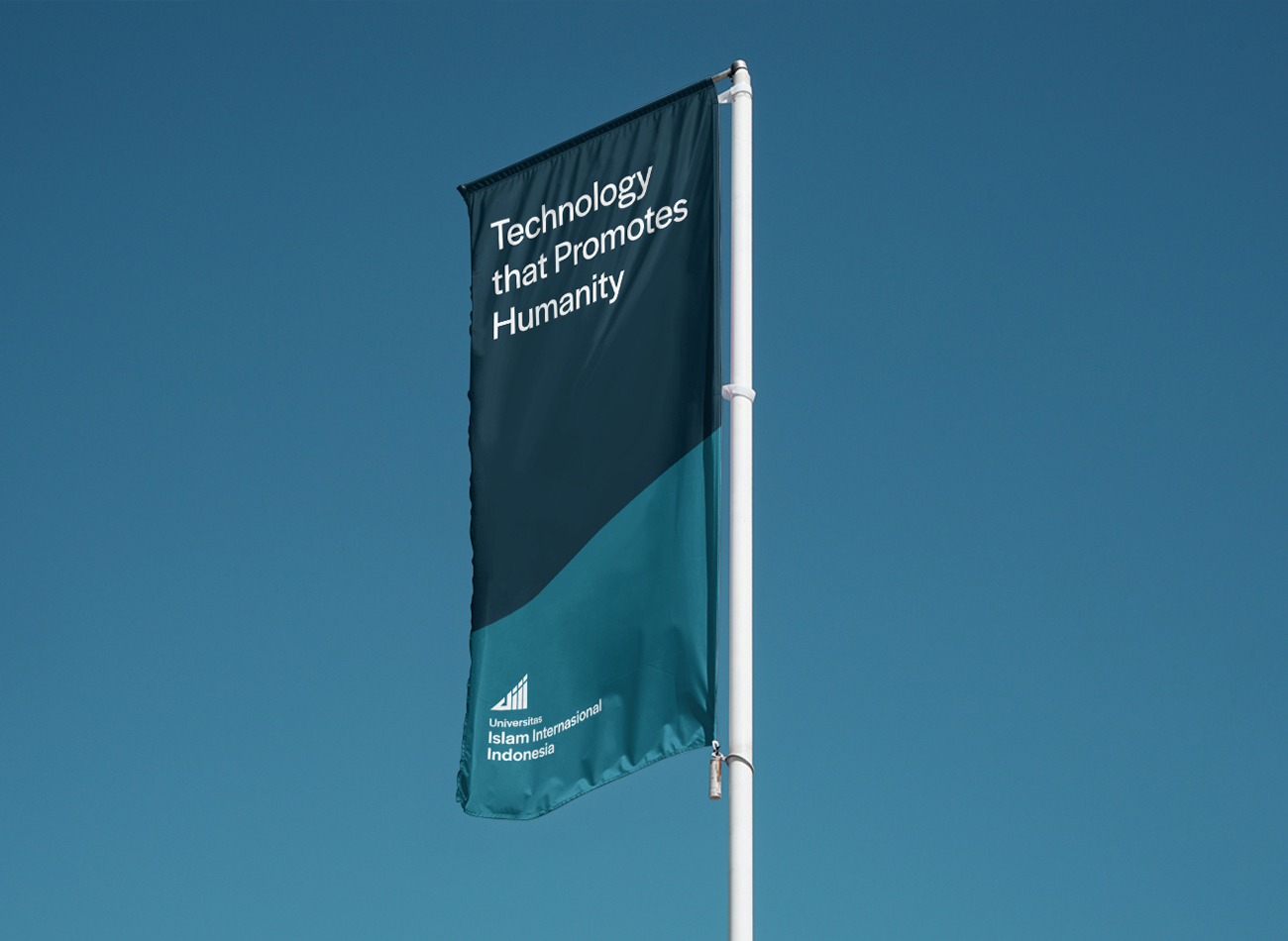
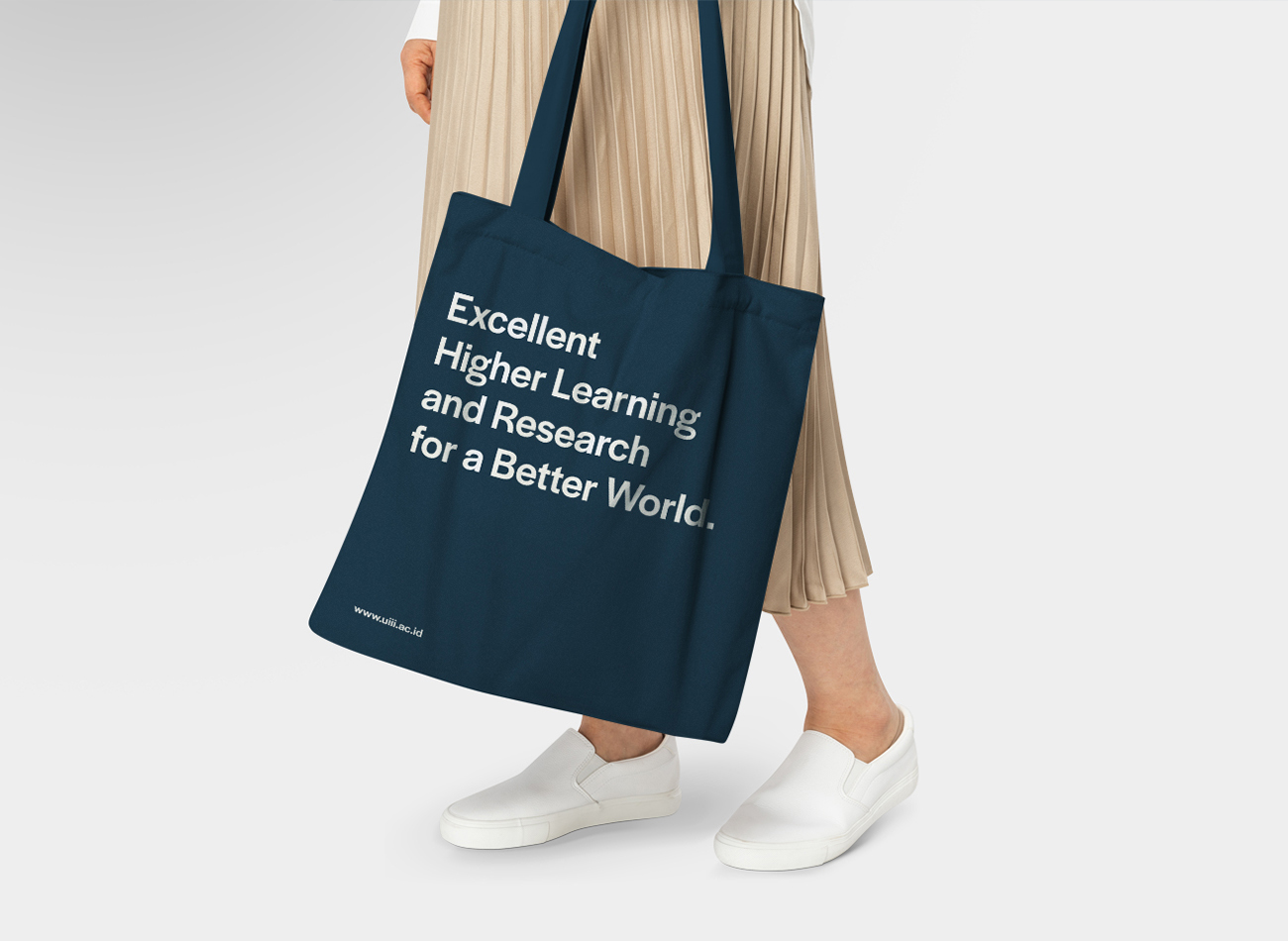
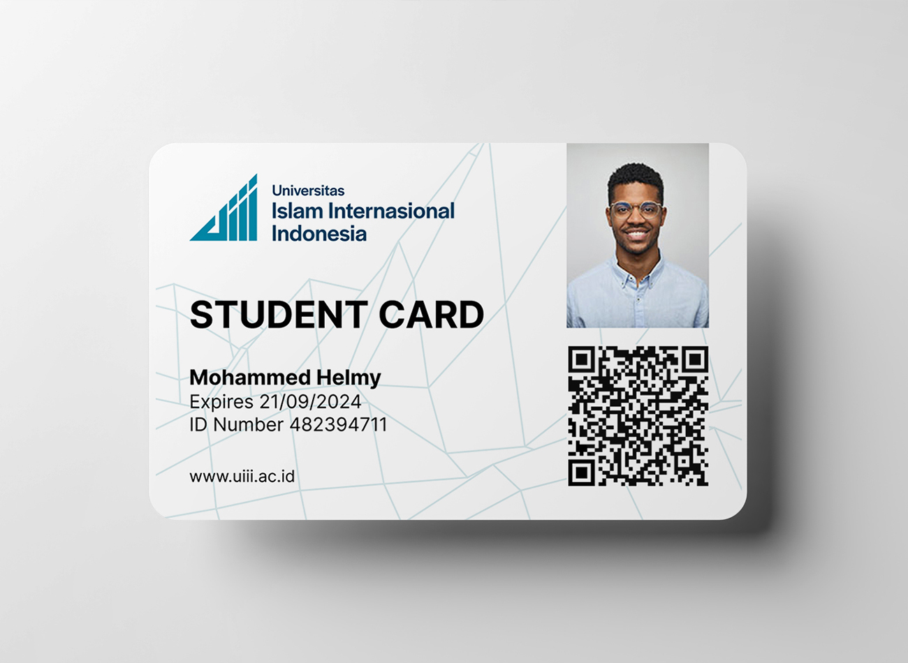
Universitas Islam Internasional Indonesia (UIII) is Indonesia’s premier institution for higher education in Islamic studies, aiming to become a hub for Islamic research globally.
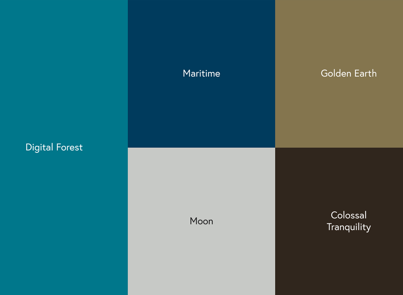
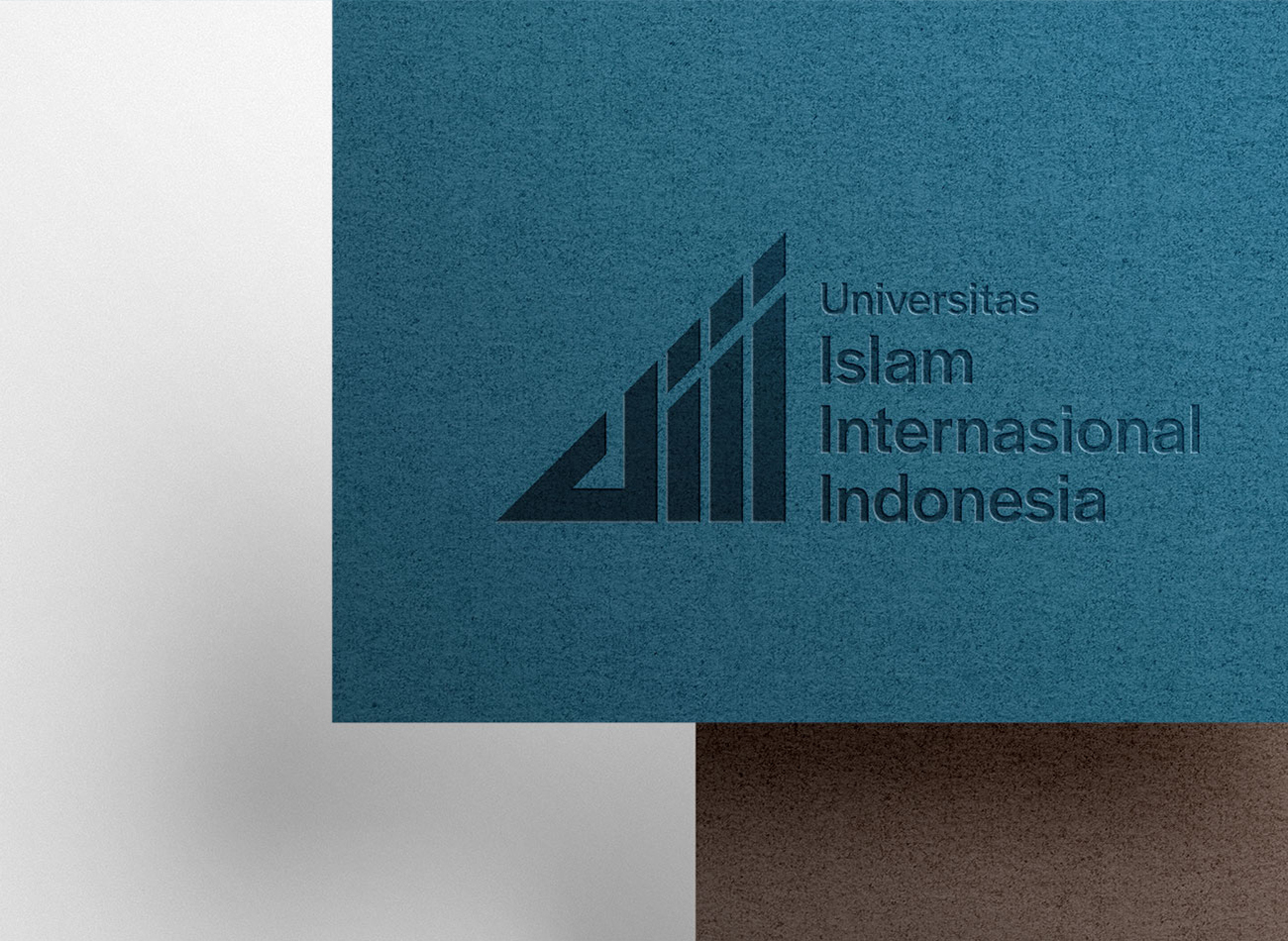
Confronted with the challenge of establishing a world-class presence for the university, we refined its existing logo to meet legal standards and developed a comprehensive visual identity to match, including photography, videography, and communication guidelines. The enhancements to UIII’s brand have led to an increase in international applications and greater recognition of the university as a prestigious LPDP scholarship destination, effectively marrying the institution’s Indonesian roots with its global aspirations.
KUDOS Design Collaboratory
-
Creative Director
Andini Pratiwi -
Brand Strategist
Andini Pratiwi -
Brand Strategist
Andini Pratiwi -
Designer
Zaki Fitria, Andini Pratiwi -
Motion Designer
Rias Amalia -
Public Relation
Fahmi Ramdhani -
Web Developer
Arif Widipratomo, Faris Han -
Project Manager
Robi Dafit

AAP Event Posters
Cornell AAP
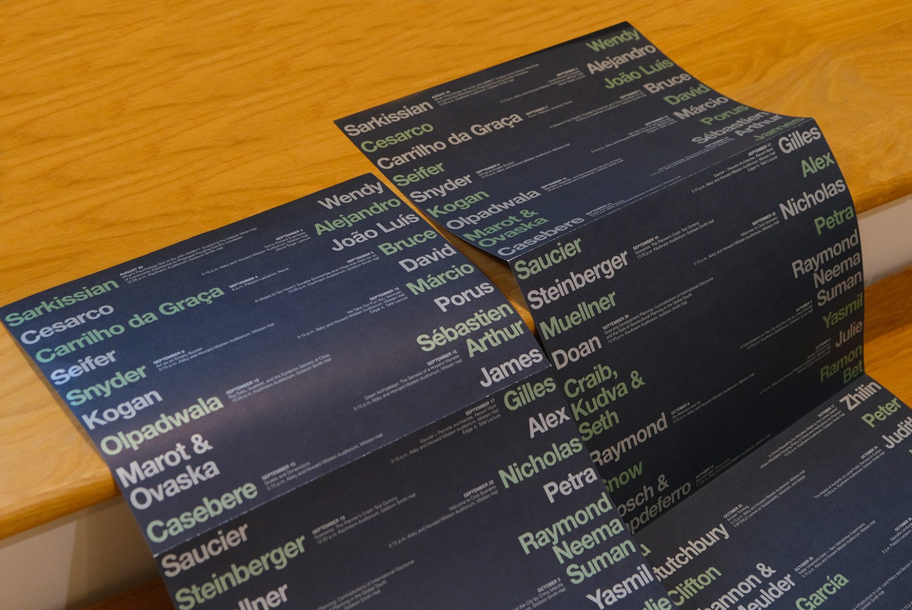
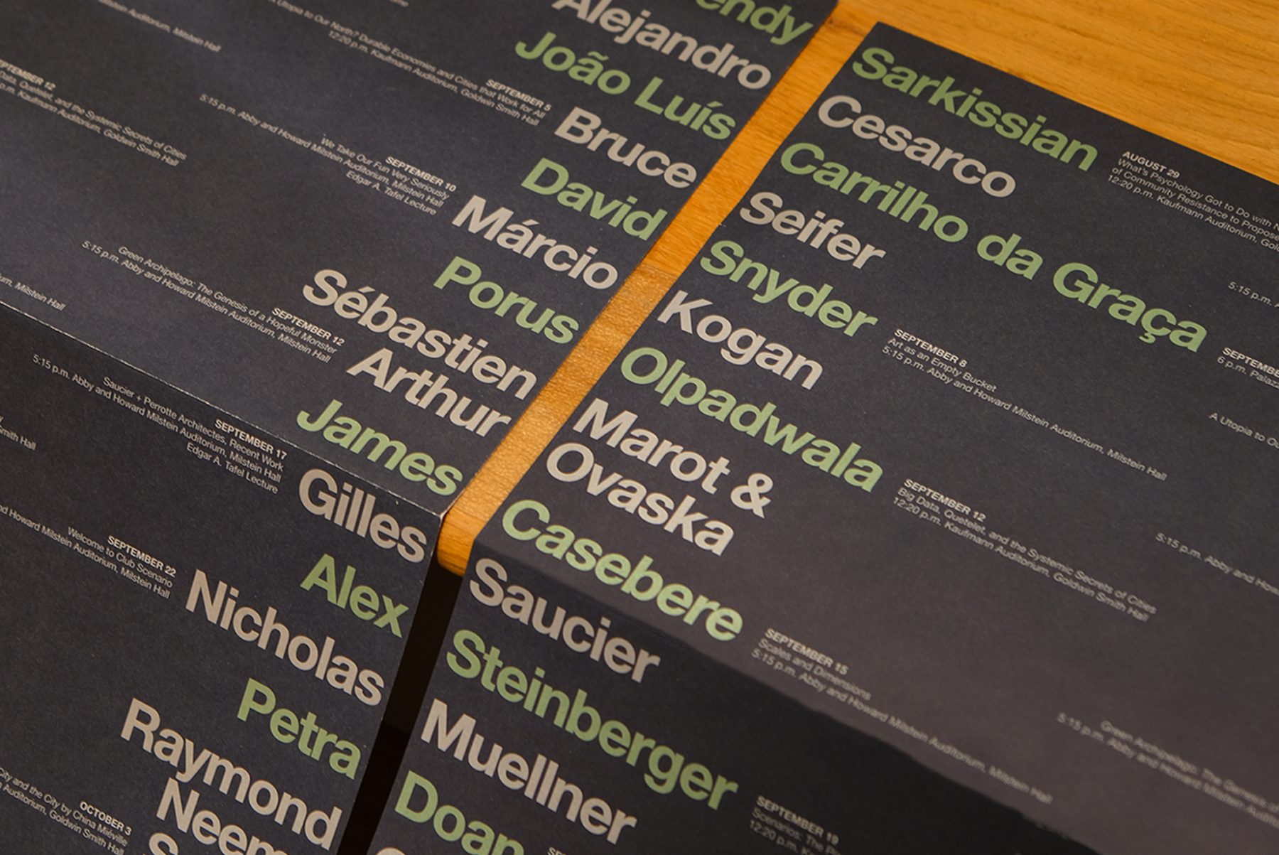
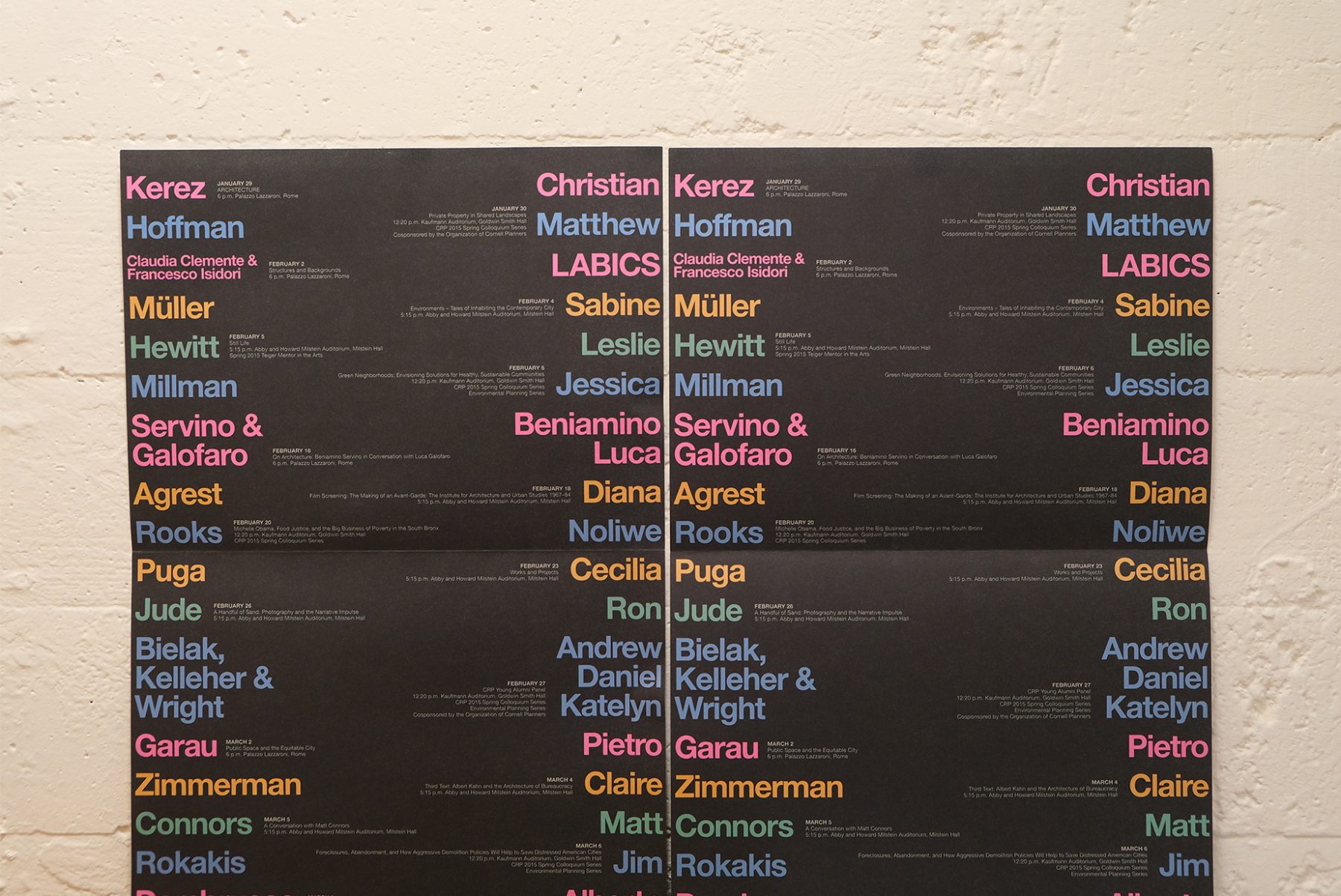
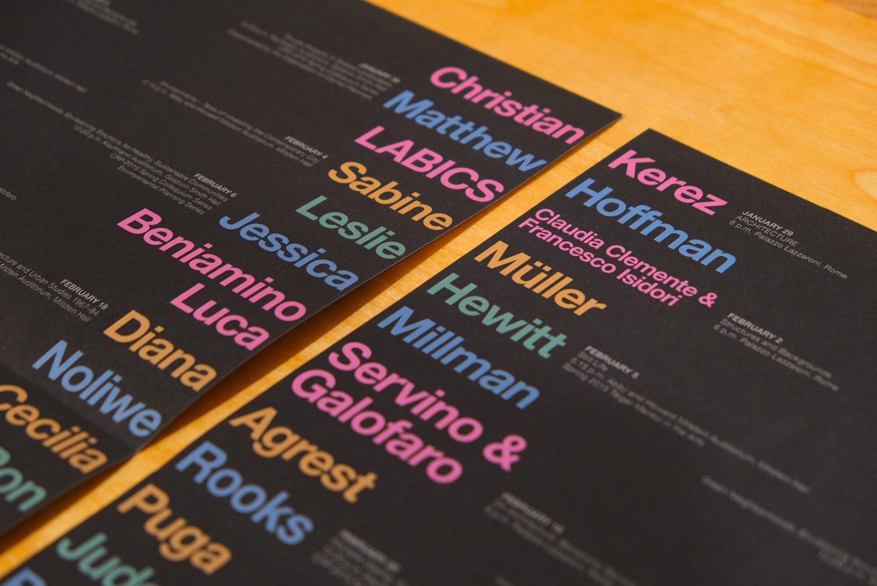
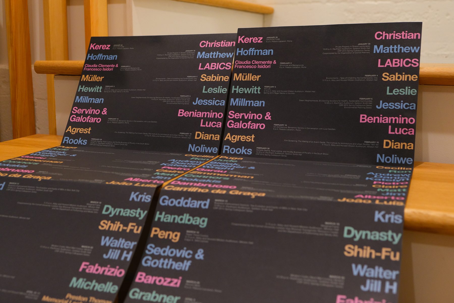
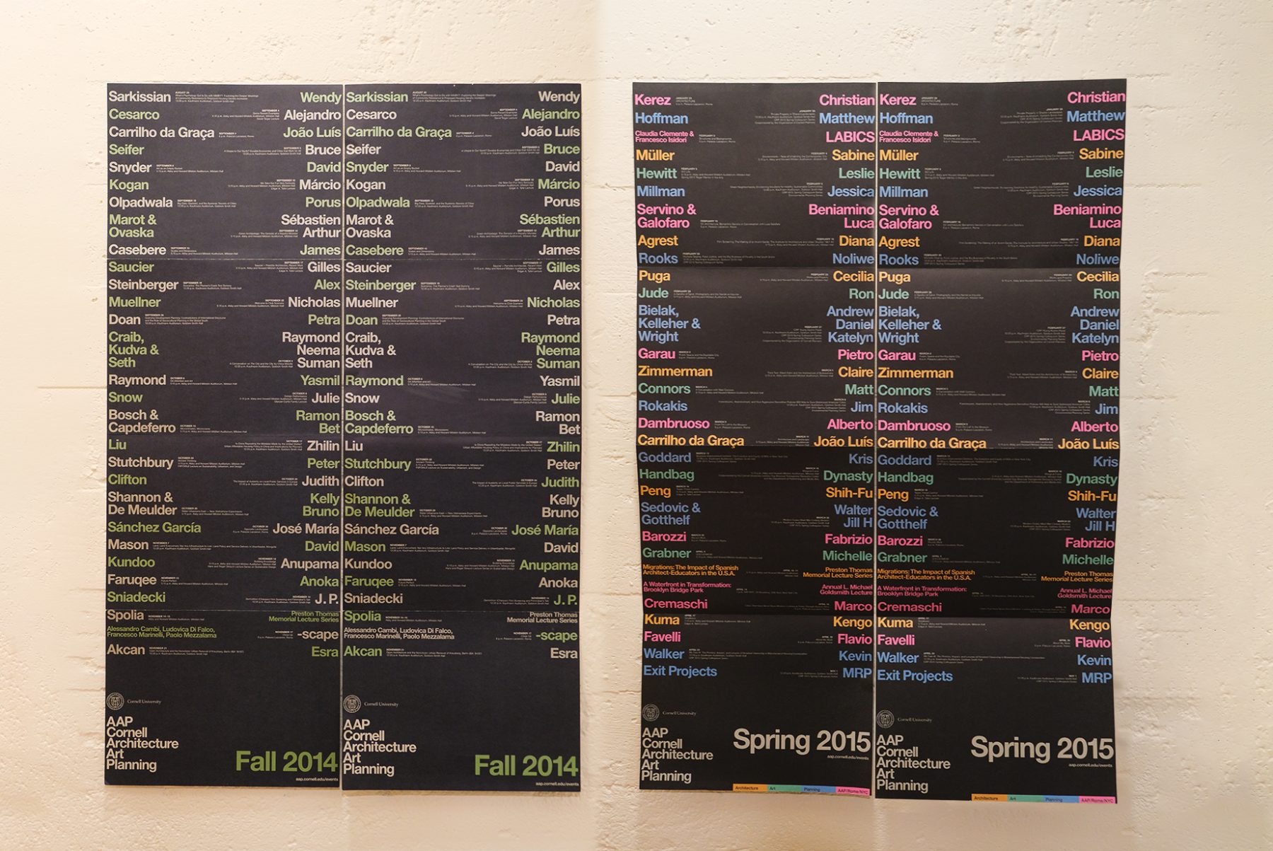
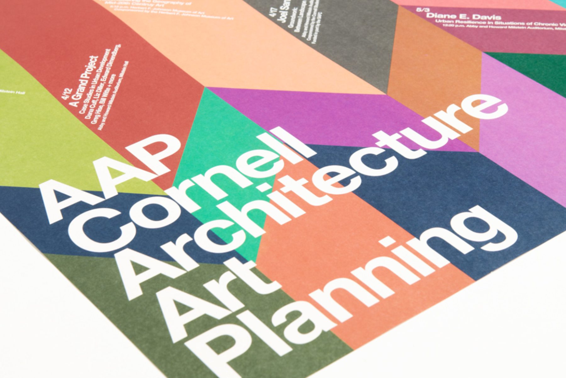
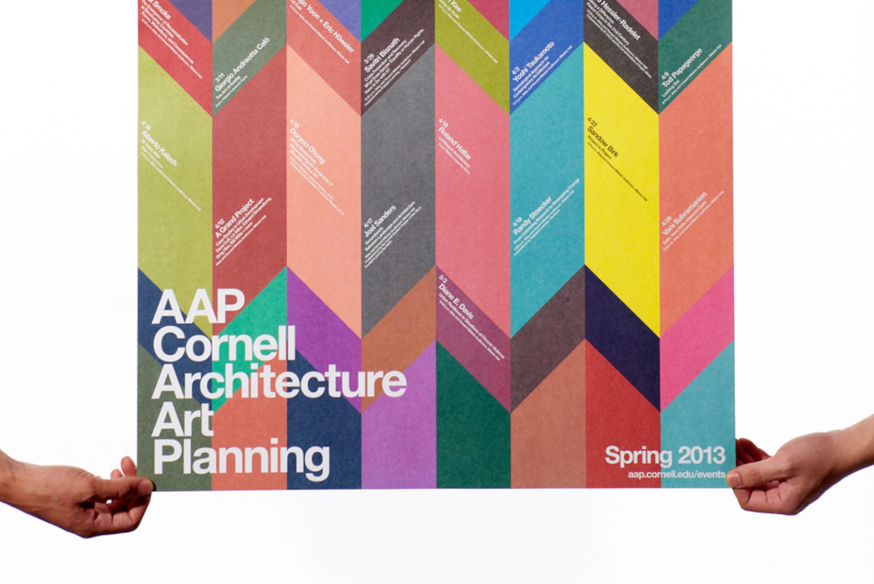
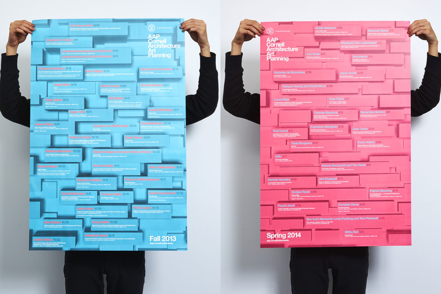
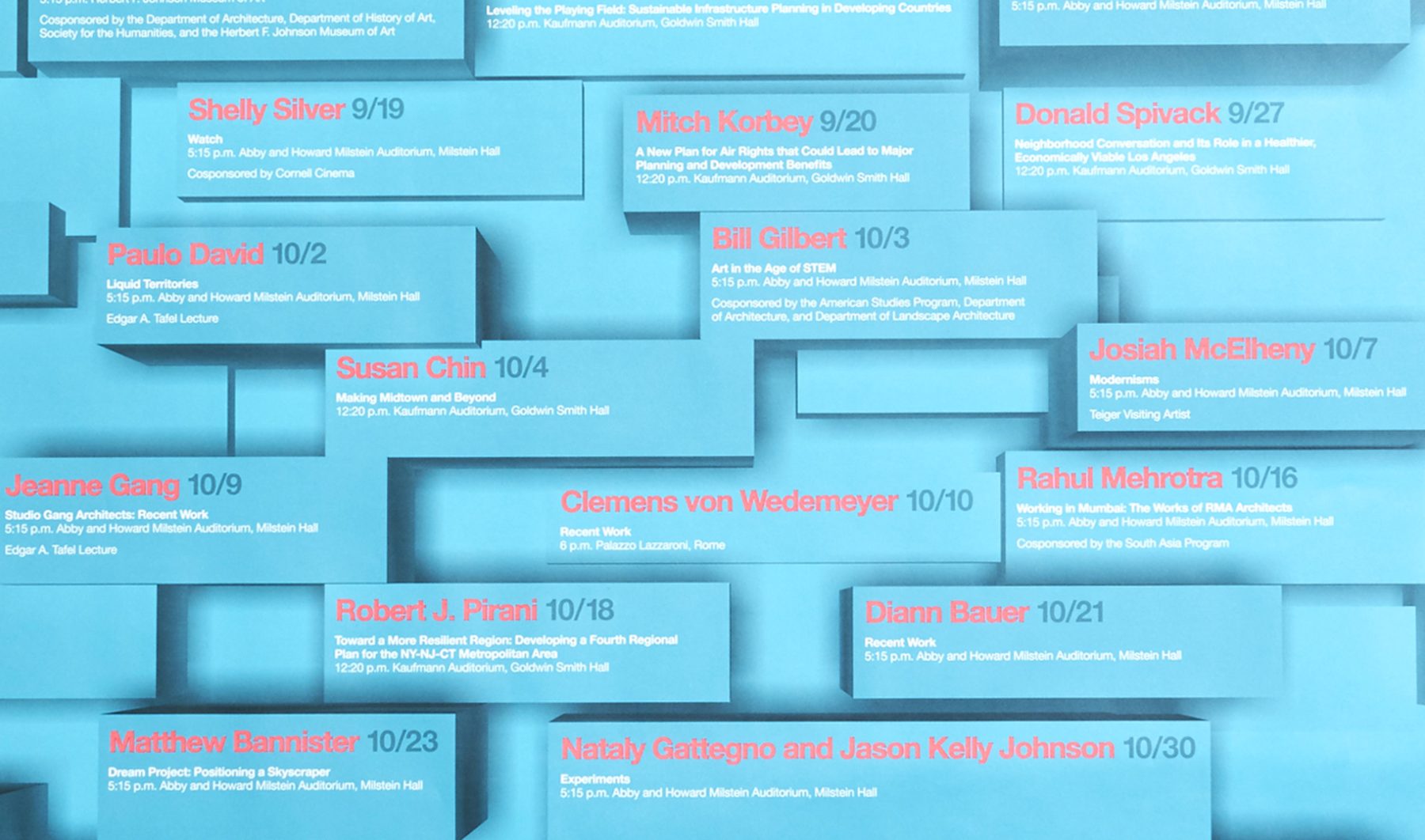
Cornell AAP is a world-renowned college offering a triple focus of studies in architecture, fine arts, and regional planning. We’ve been producing printed communications for the college since 2011.
For this event’s poster, we were tasked by the Department of Architecture, Art, and Planning at Cornell University to experiment with new ways of presenting its array of distinguished speakers. We concluded with a concept that blends an origami folding pattern with color planes that challenge viewers’ sense of depth. Smaller posters were also distributed on campus to promote individual departmental events.
KUDOS Design Collaboratory
-
John Kudos
Creative Director -
Karen Vanderbilt
Designer
Power of Science
The Phillip and Patricia Frost Museum of Science
Capabilities
Focus Area
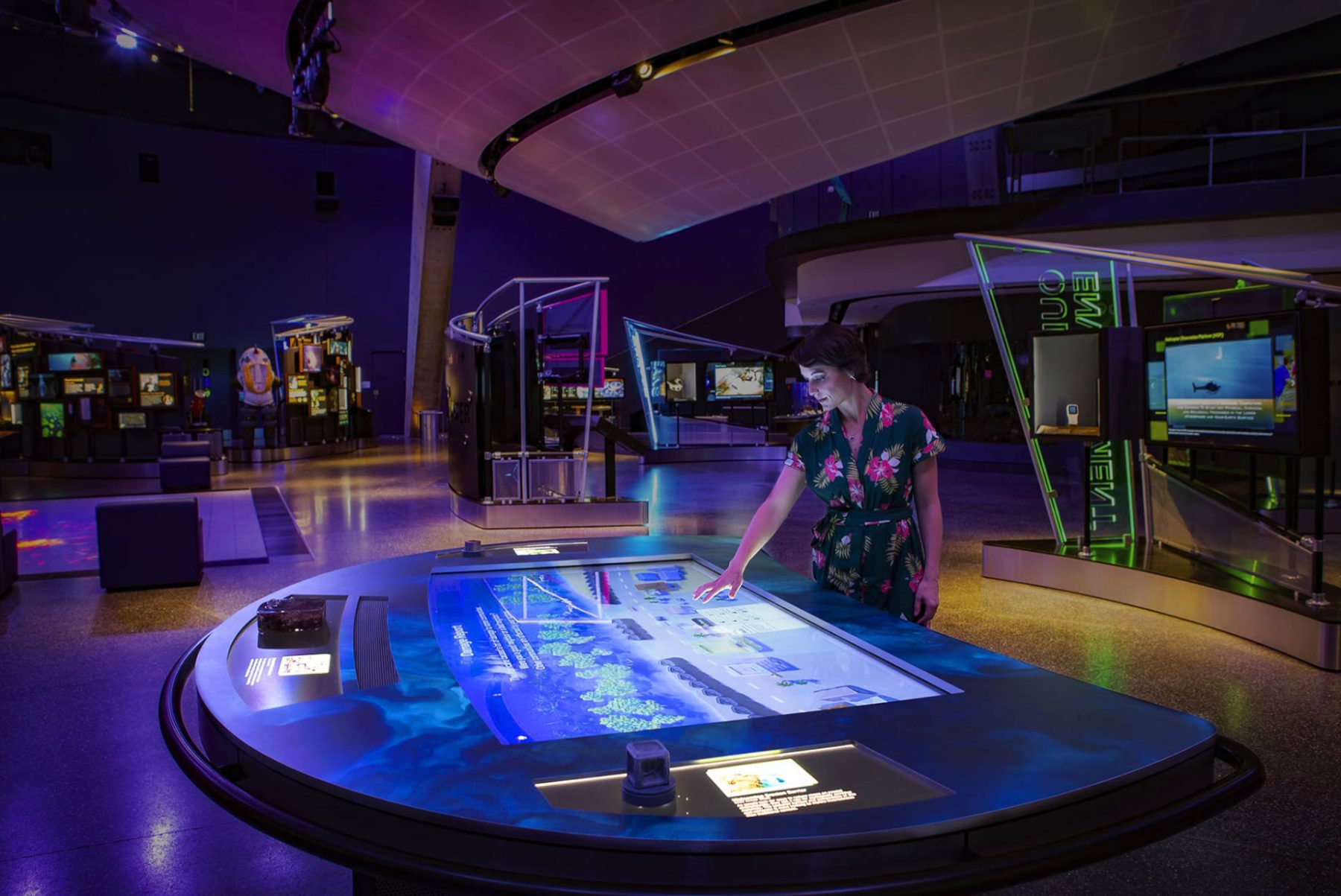
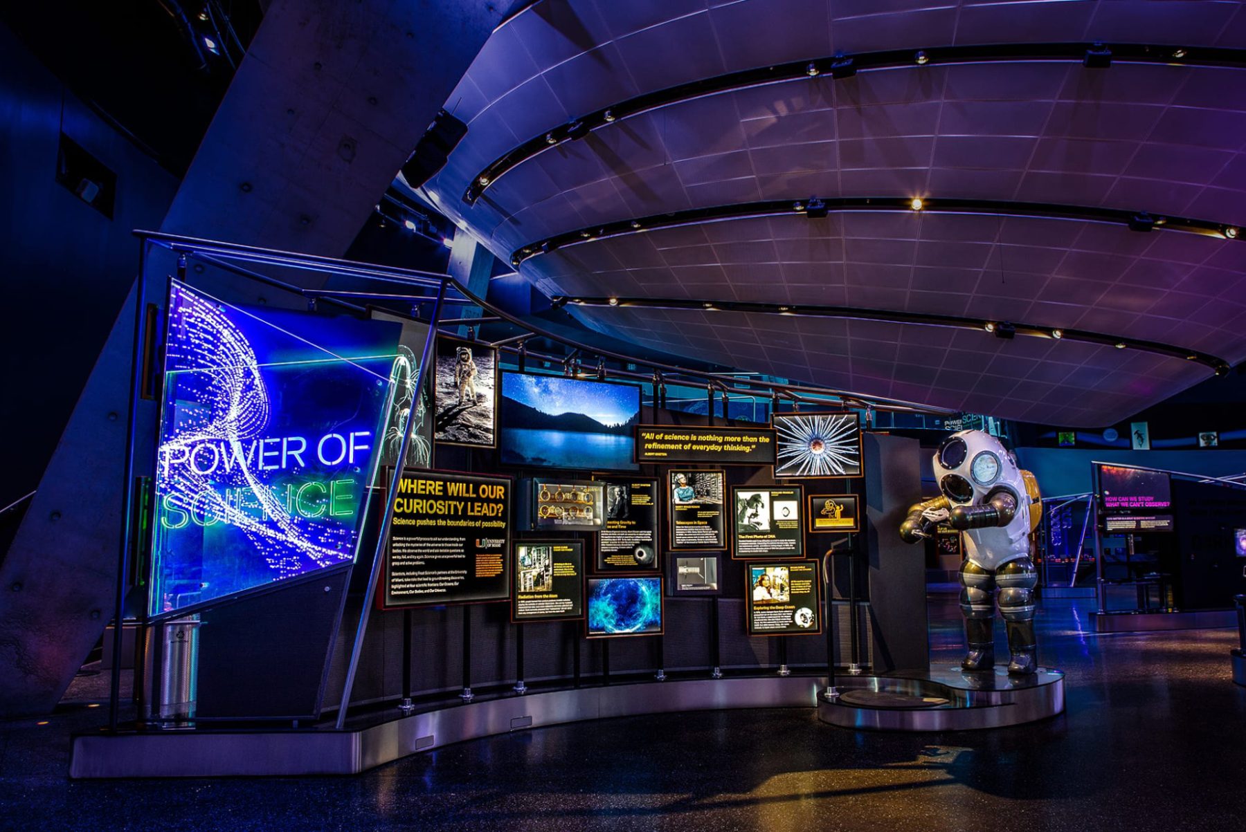
The “Power of Science” exhibition, now on view at the Frost Museum in Miami, Florida, invites visitors to explore how science pushes the boundaries of possibility as they learn about groundbreaking scientific research and discoveries. The exhibit is a playground for curious minds, filled with tangible and digital experiences spanning a 6,000-square-foot area.
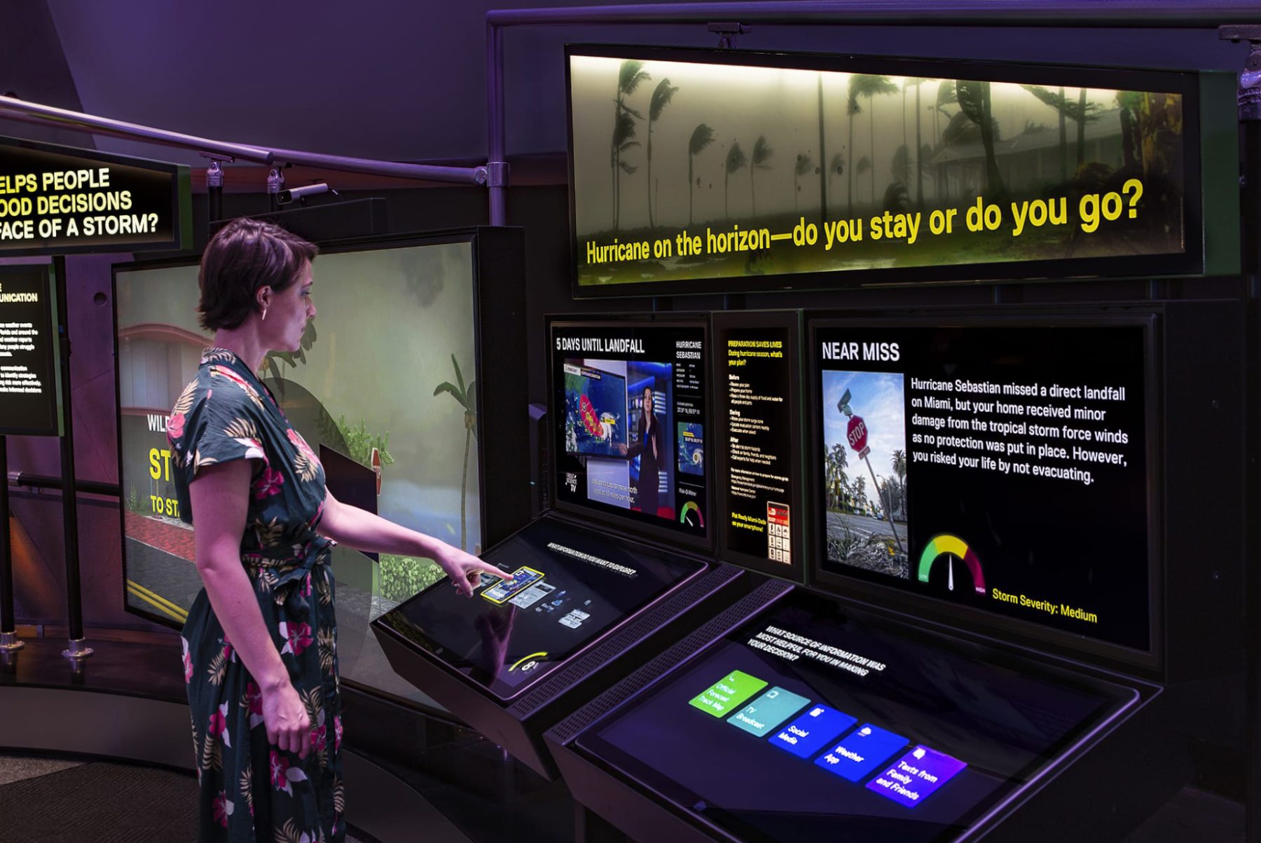
We worked with Squint/Opera to develop user flows and UX/UI components for various gamified exhibits in the exhibit’s Environment section, including:
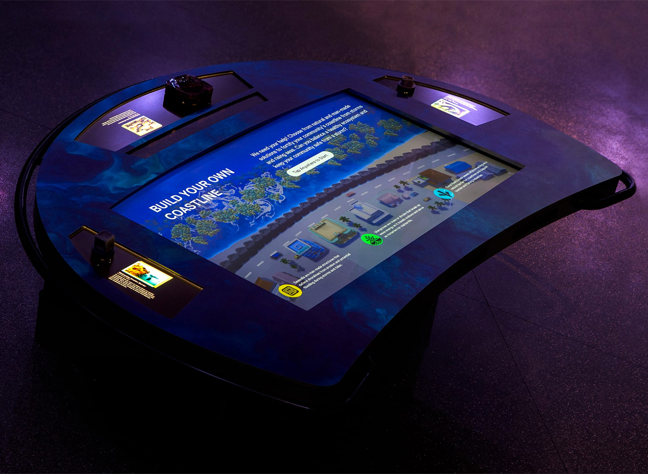
BUILD YOUR OWN COASTLINE
This activity engages up to three players in building natural and man-made infrastructures on shorelines to help against natural disasters.
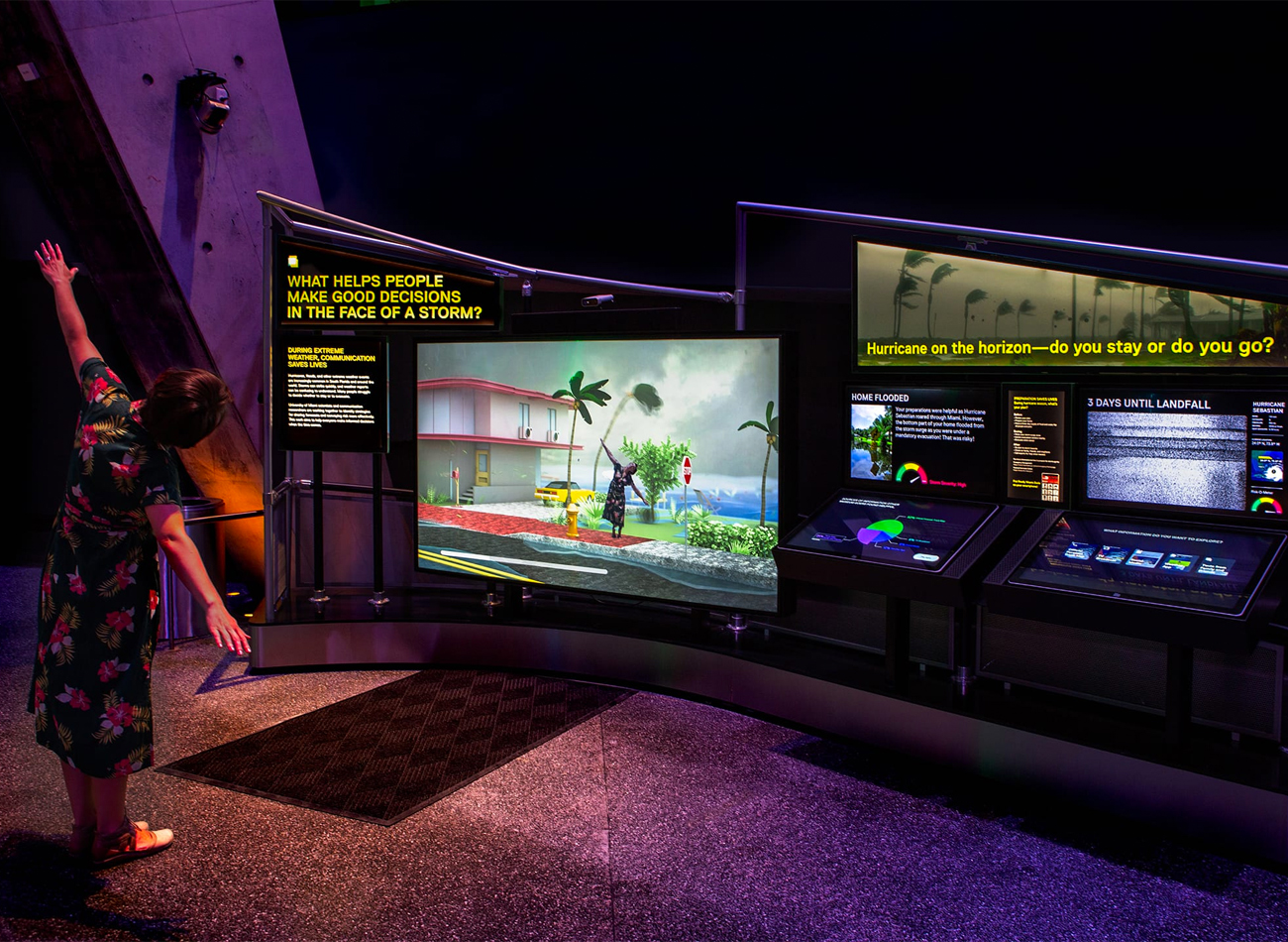
HURRICANE HINDSIGHT
This dual-screen game explores how we measure the risk of hurricanes, and whether it’s safer to stay or evacuate—a topic of great importance in Florida.
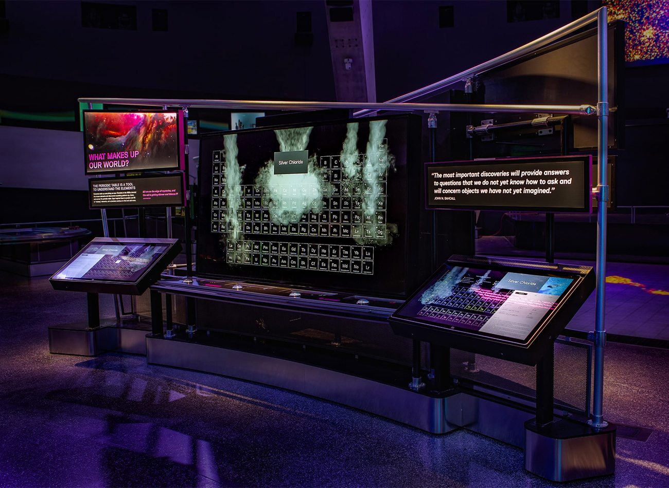
PERIODIC TABLE
This two-player station allows in-depth study of the periodic elements, enabling the discovery of chemical reactions when the right elements are combined by both players.
RAMP ANIMATIONS
These animated narratives on transparent LEDs reveal related artifacts behind their glass display case.
The Power of Science is on view at Frost Museum of Science in Miami, Florida.
Exhibit Team
-
Thinc Design
Lead Exhibition Design -
Squint/Opera
Lead Digital Media -
KUDOS Design Collaboratory
UX/UI Design -
Kubik Maltbie
Fabrication & Hardware
KUDOS Design Collaboratory
-
John Kudos
Creative Director -
Sumit Paul
UX/UI Designer -
Ashley Wu
UX/UI Designer
Revealing the Invisible
Corning Museum of Glass
Capabilities
Focus Area
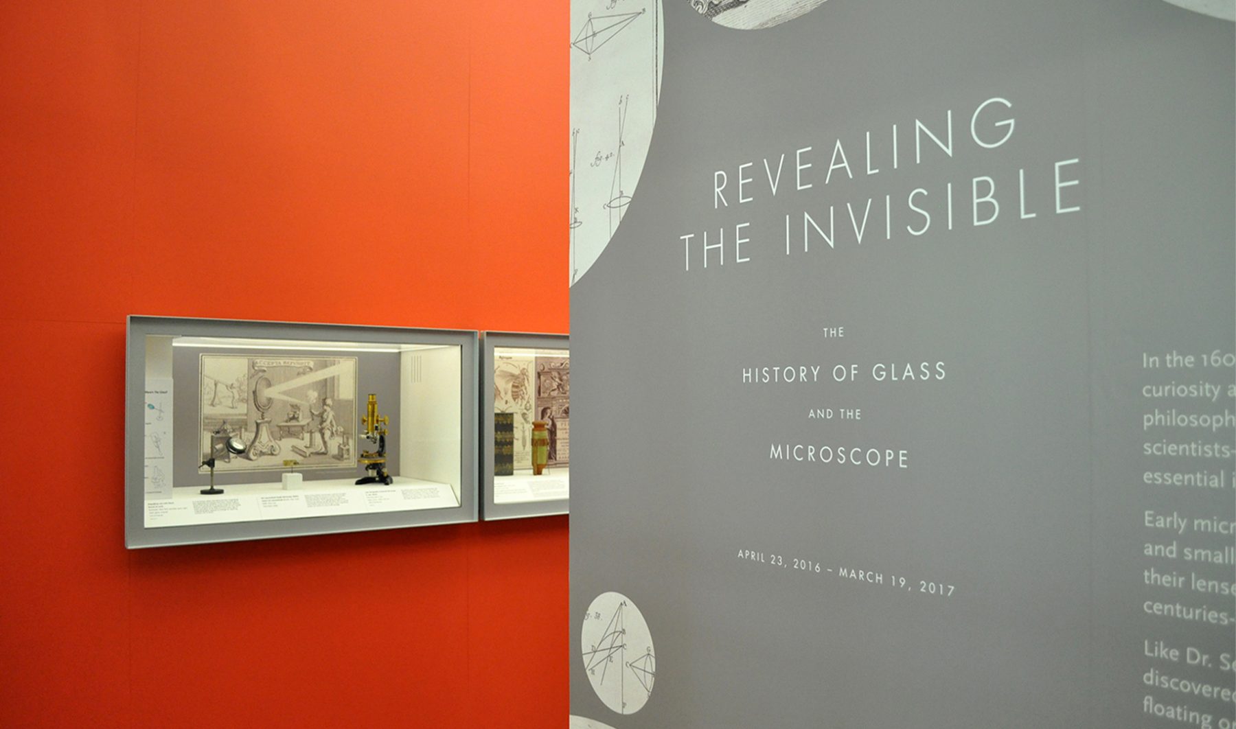
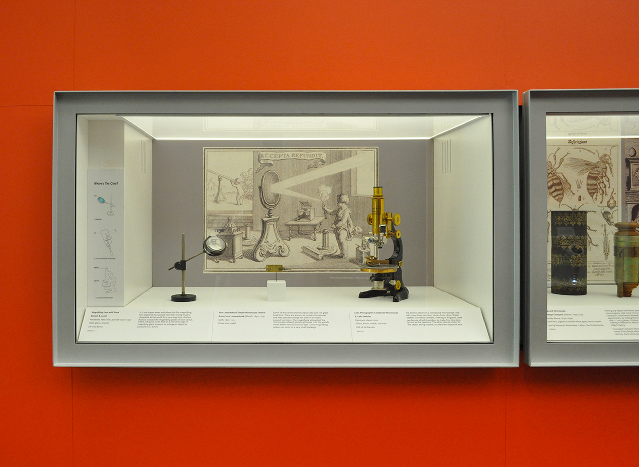
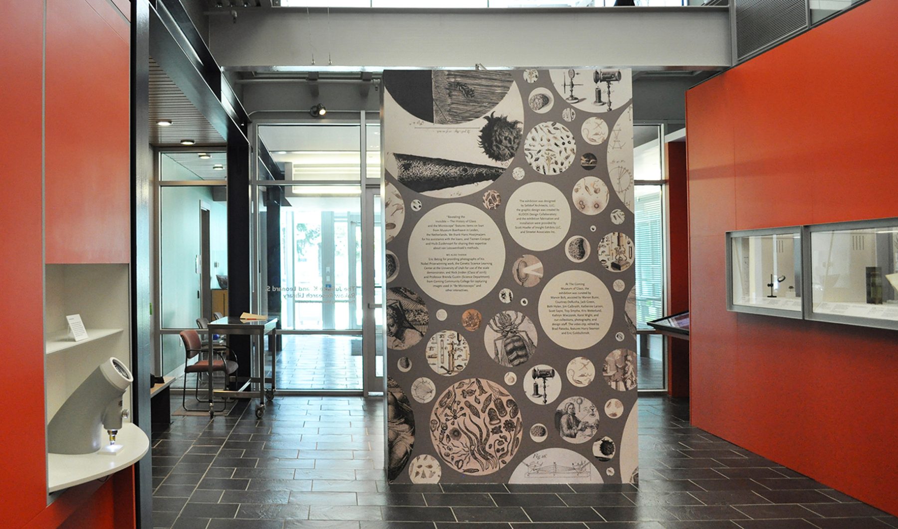
For these exhibition graphics for “Revealing the Invisible” at the Corning Museum of Glass, we collaborated with Selldorf Architects and the museum’s in-house team to ensure that all graphic and text panels followed the museum’s visual theme.
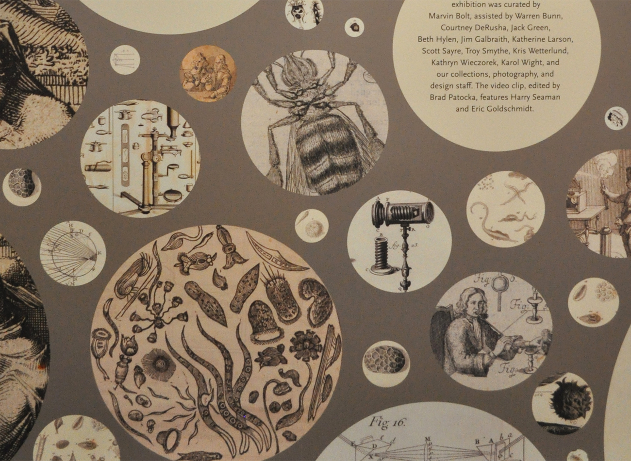
We designed a circular graphic pattern, inspired by the microscope lens, to cover the title wall. Each circle contains a close-up detail of drawings depicting objects that were discovered through the microscope.
KUDOS Design Collaboratory
-
John Kudos
Creative Director
Selldorf Architects
-
Lisa Green
Partner in charge
Techpolitan Branding & Space
Techpolitan
Capabilities
Focus Area
Client
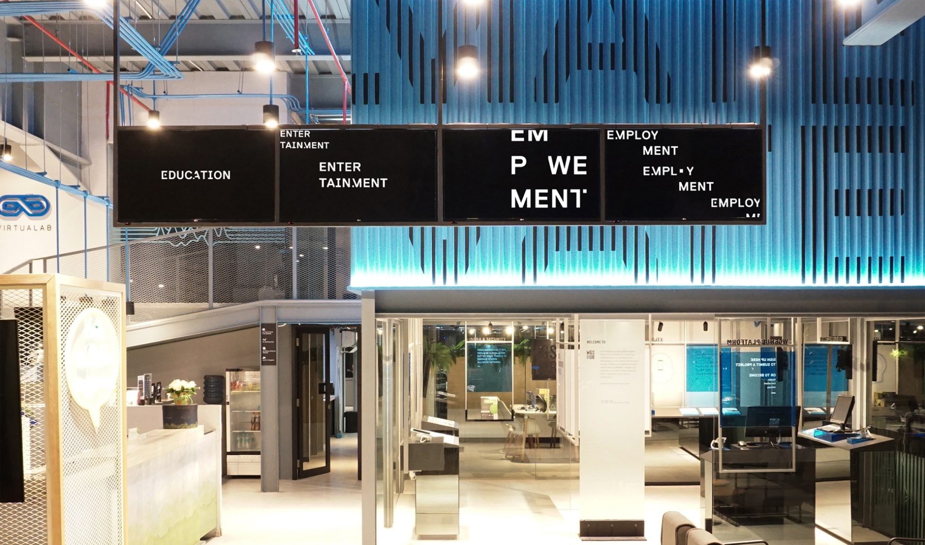
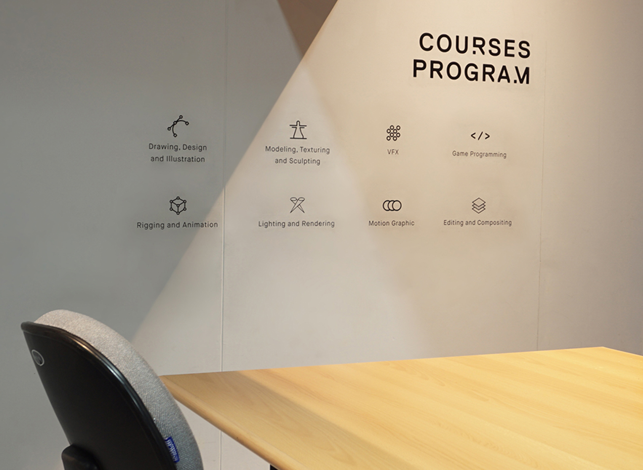
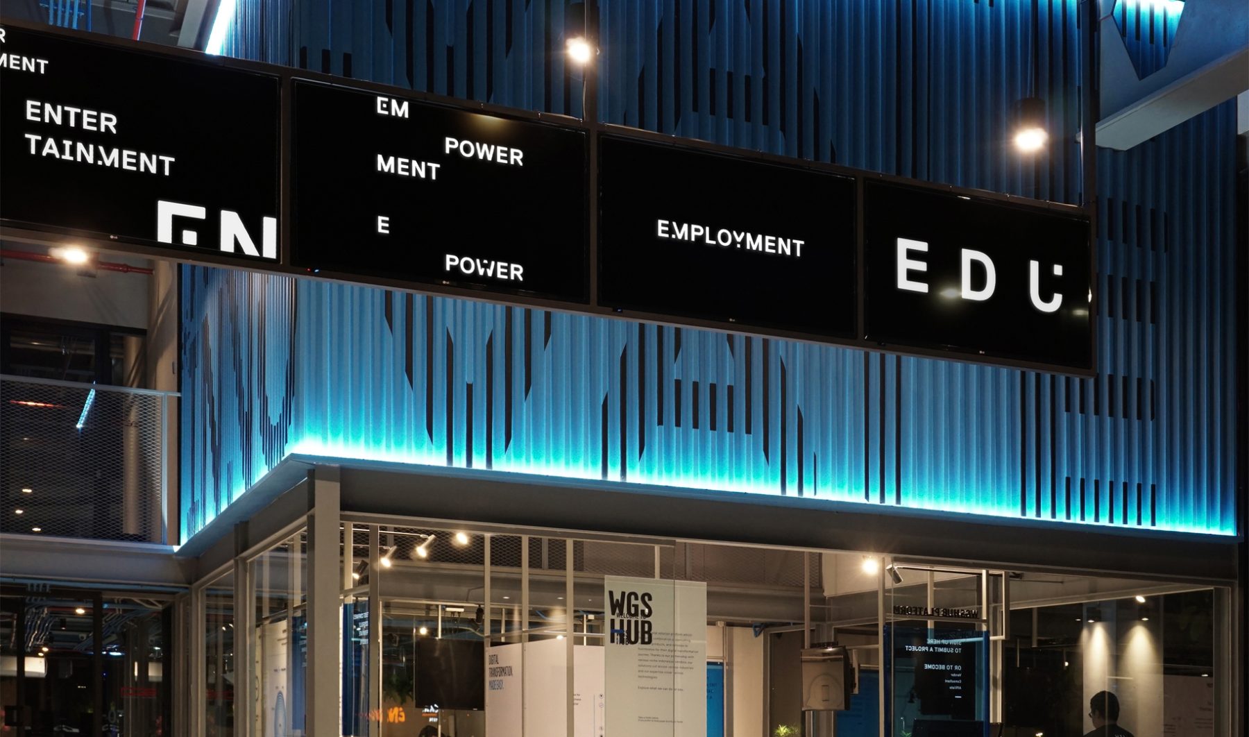
Headquartered in Jakarta, Indonesia, Techpolitan is a digital hub built on four pillars: entertainment, education, employment, and empowerment. Techpolitan seeks to cultivate youngsters’ passion for gaming as a positive driver to develop a technology-literate society through mentorship, talent placement, and seed funding.
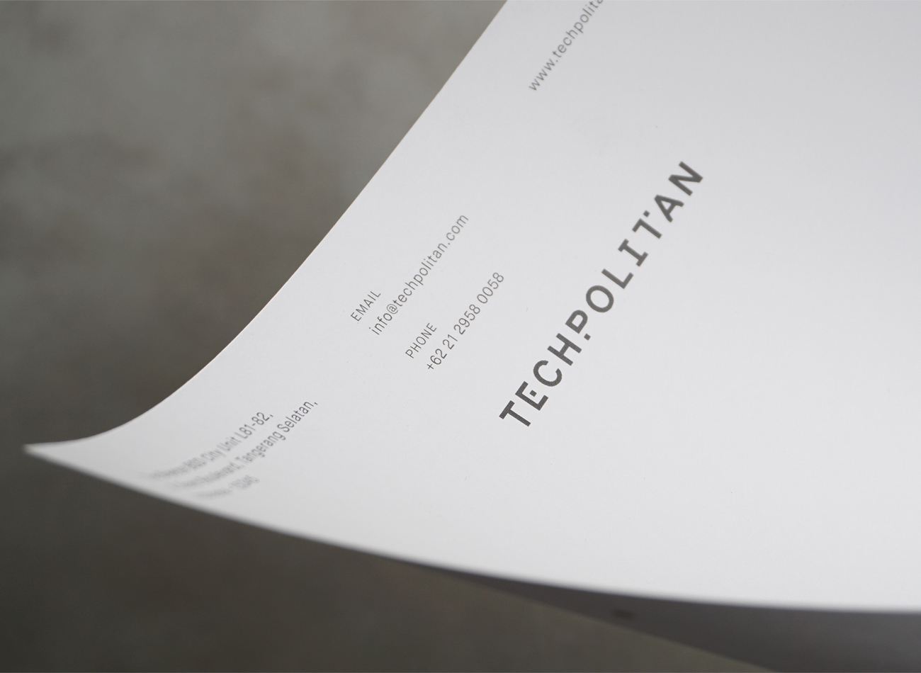
For the organization’s branding and space, we designed a typographic system that drew inspiration from the appearance of an onscreen pixel glitch. In our design, these pixel bits become a dynamic graphic element that expresses Techpolitan’s graphic identity in interactions with its logotype, signage, motion graphics, and various communications.
KUDOS Design Collaboratory
-
Andy kurniawan
Creative Director -
Ryan Adenata
Art Director & Designer
Techpolitan
Whiteness Project: Intersection of I at Storyscapes
Tribeca Film Festival
Capabilities
Focus Area
Client
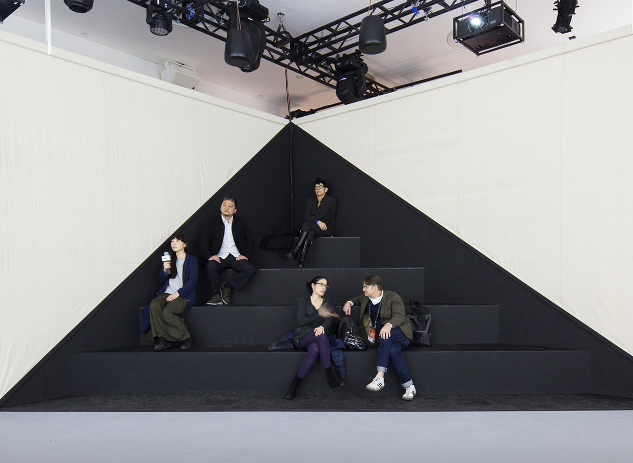
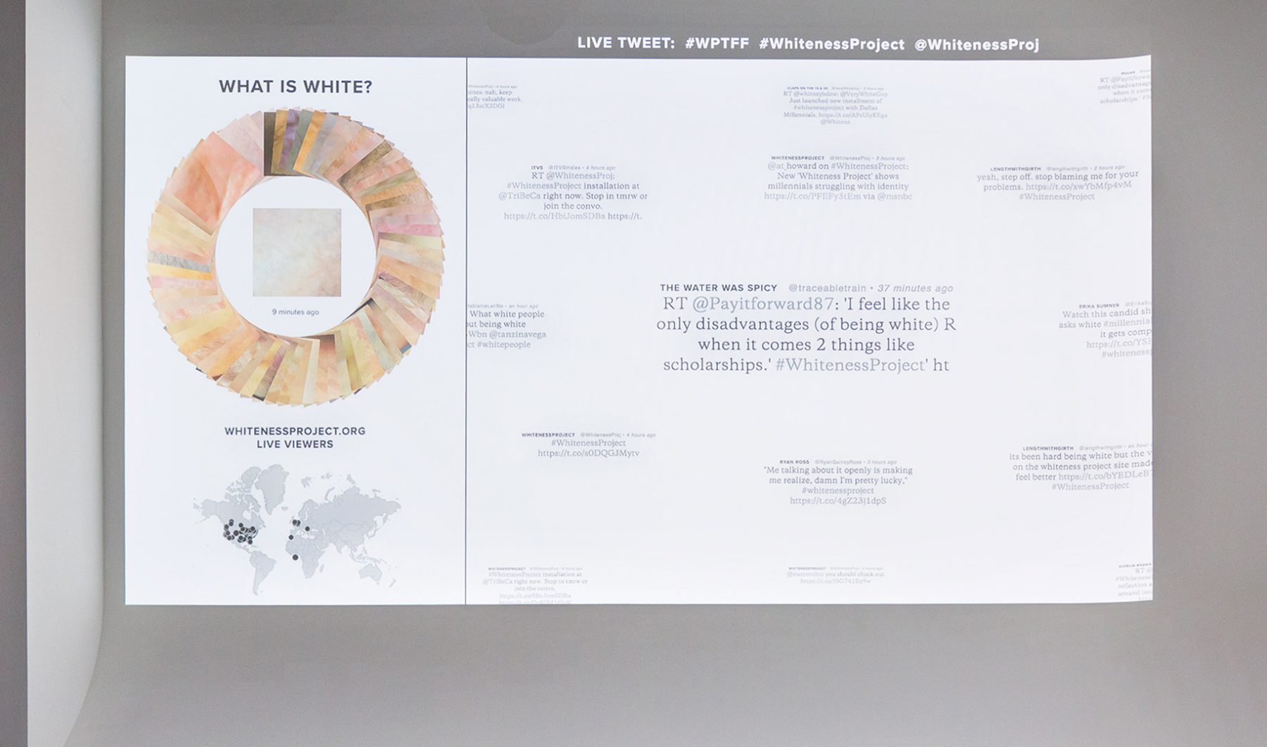
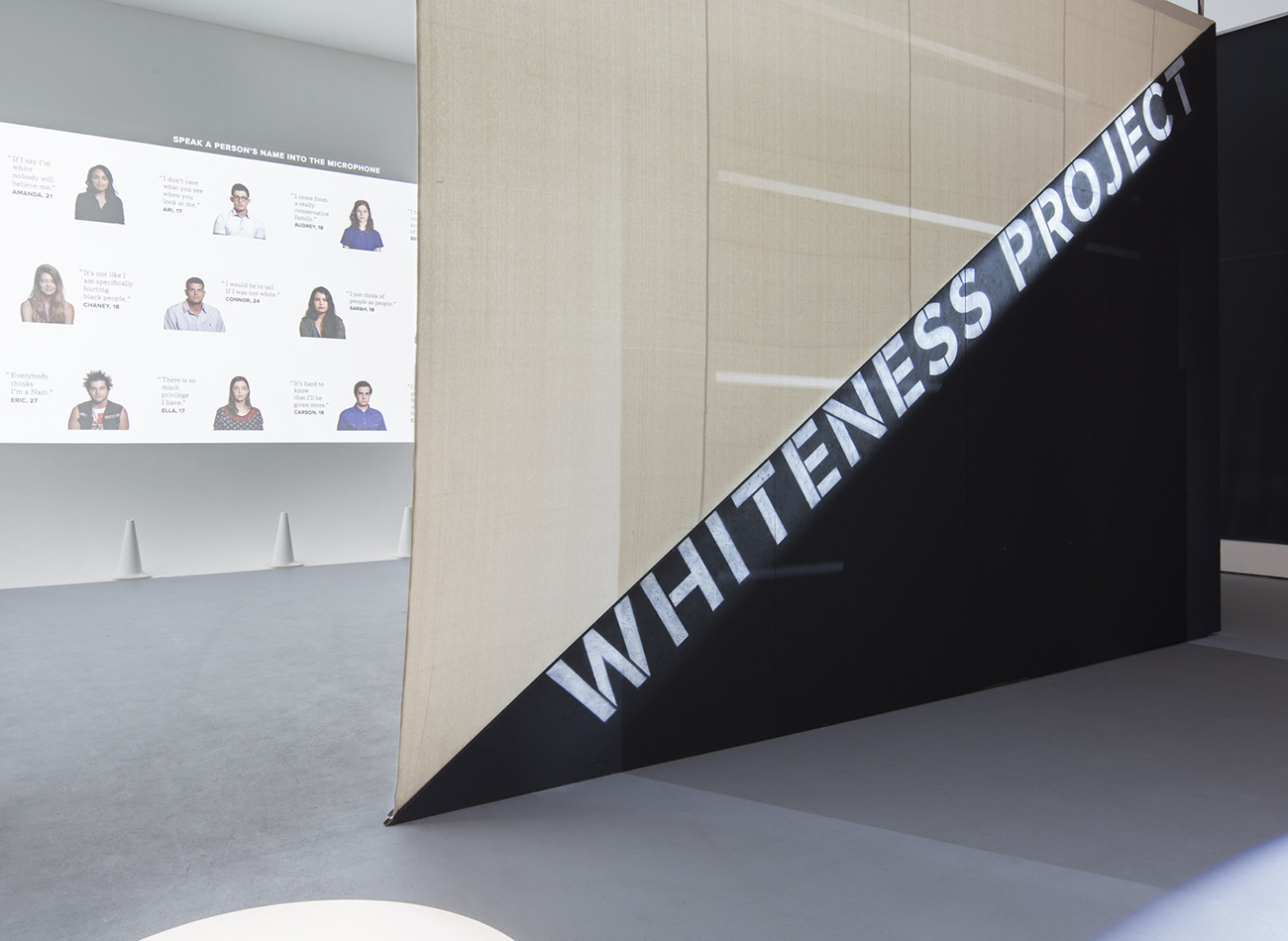
Created in collaboration with filmmaker Whitney Dow, this second installment of the Whiteness Project took form as a week-long interactive installation at the Tribeca Film Festival in New York. With a space designed by LOT-EK and audiovisuals by Arup, the Festival tasked Kudos with the project’s exhibition design.
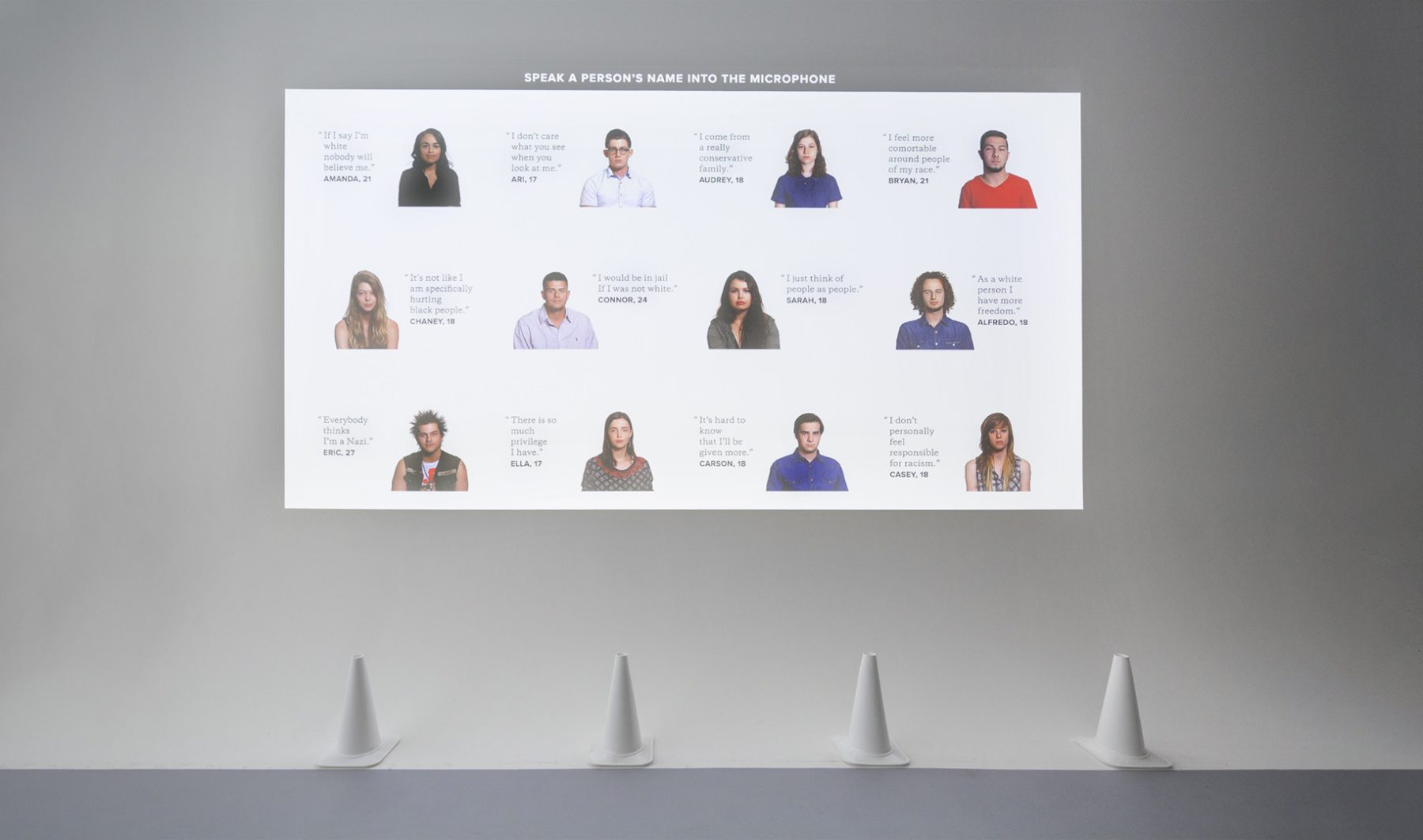
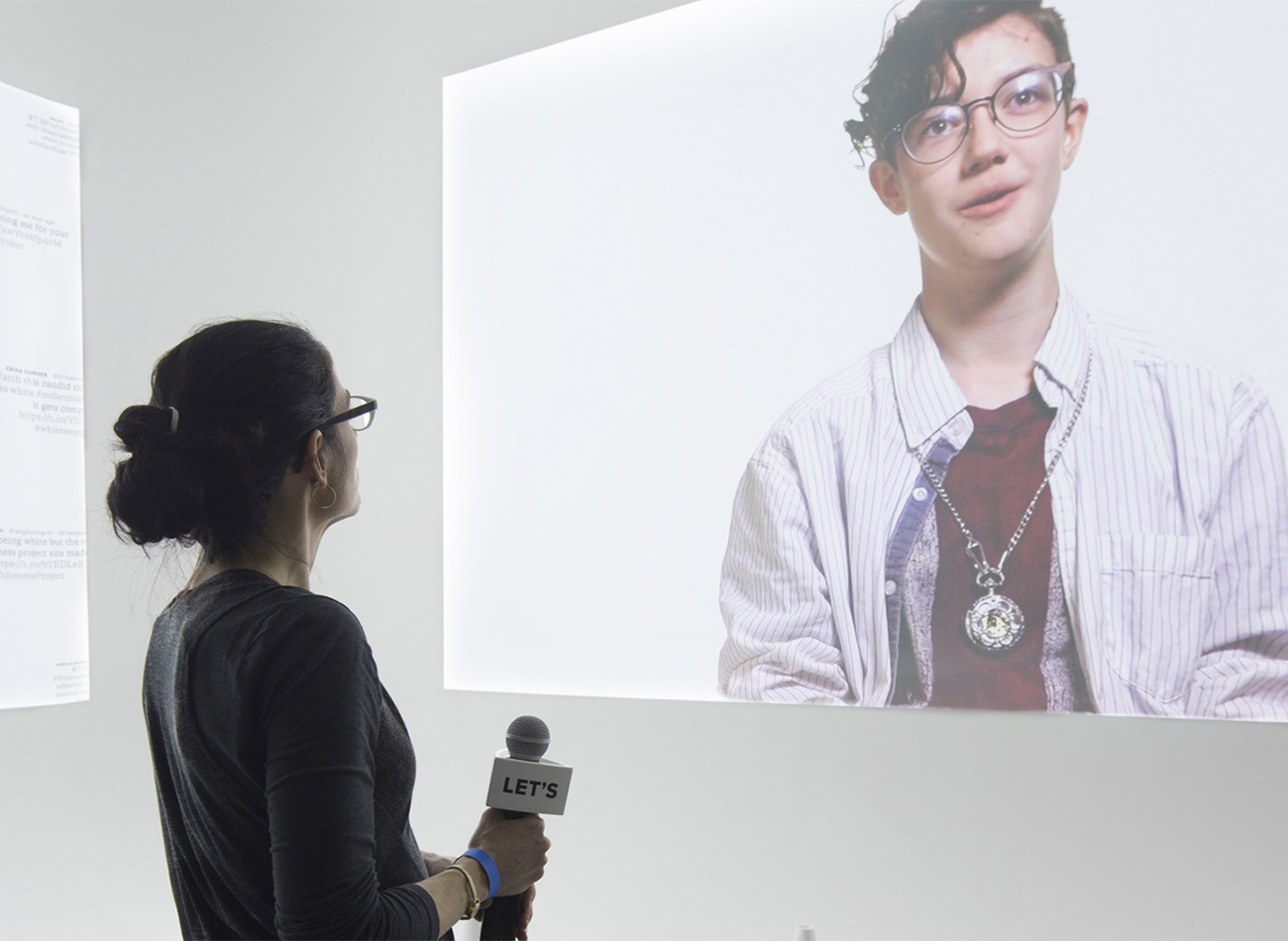
In our resulting exhibition, audience members were photographed as they entered the space. Within seconds their skin tones were added to a color wheel arranged from dark to light, engaging them in questioning the perceived color of their skin and public perceptions of racial identity. The audience was then able to use a provided microphone to activate interviews by calling out the name of a person displayed on the grid.
Read full article on GDUSA.
KUDOS Design Collaboratory
-
John Kudos
Creative Director -
Sumit Paul
Web Design & Development -
Chris Manlapid
Software Developer -
Whitney Dow
Filmmaker
Tribeca Film Festival

Americans Exhibition
National Museum of The American Indian
Capabilities
Focus Area
Client
Awards
-
GDUSA 2018 American Graphic Design Awards
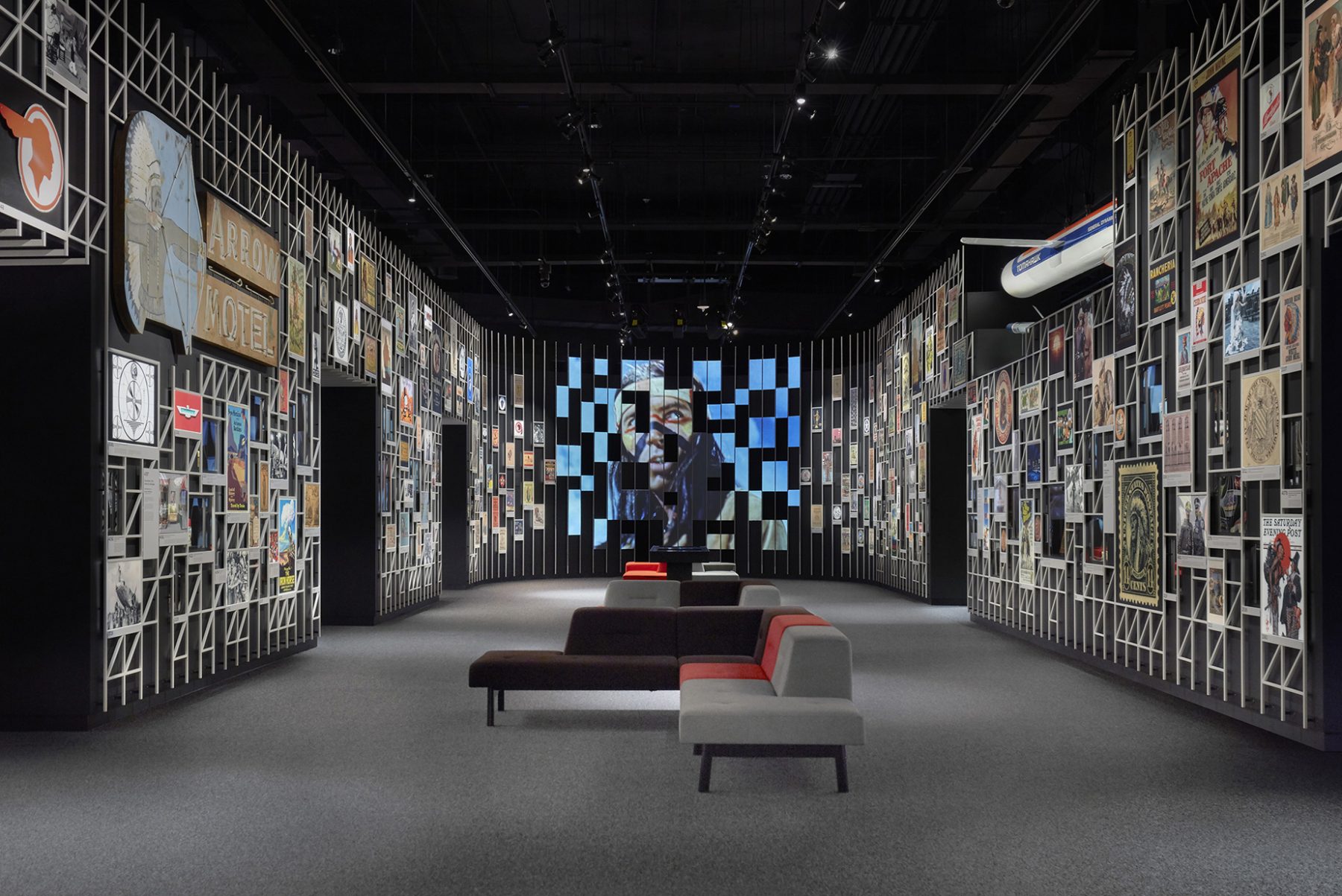
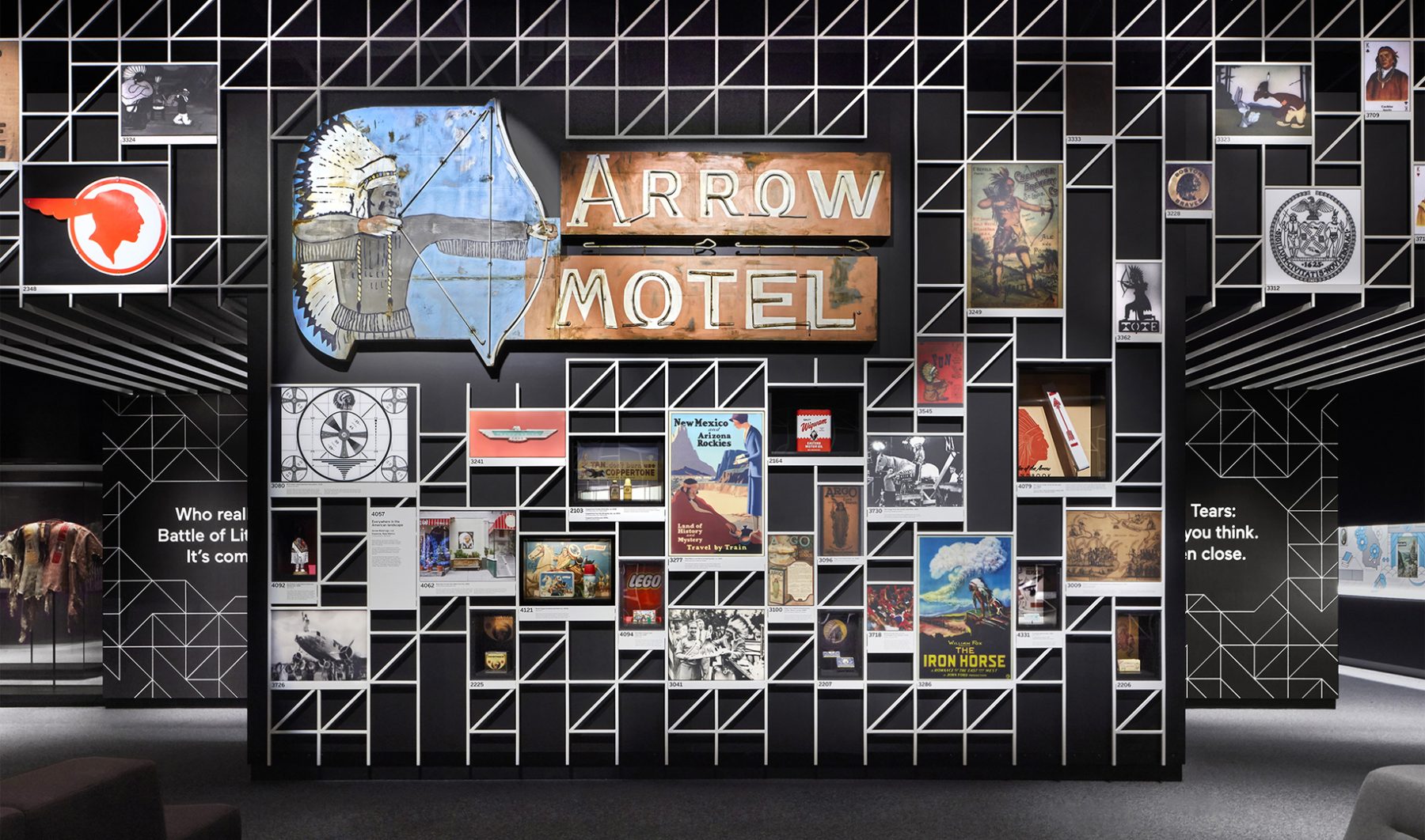
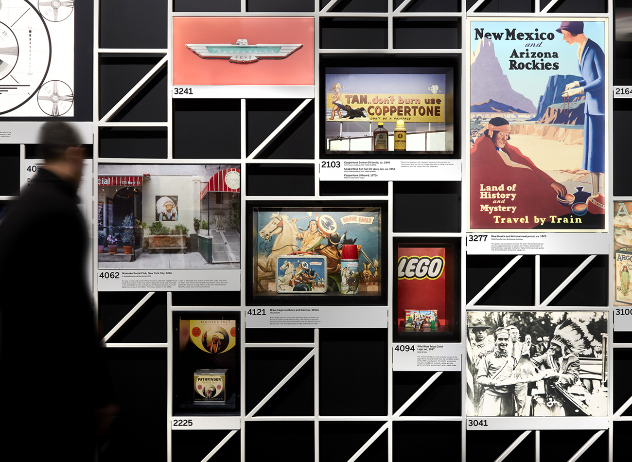
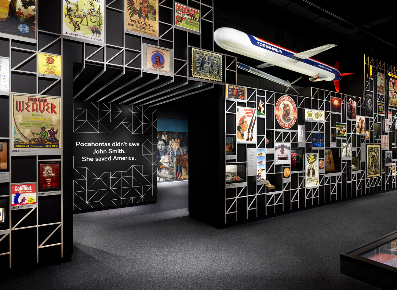
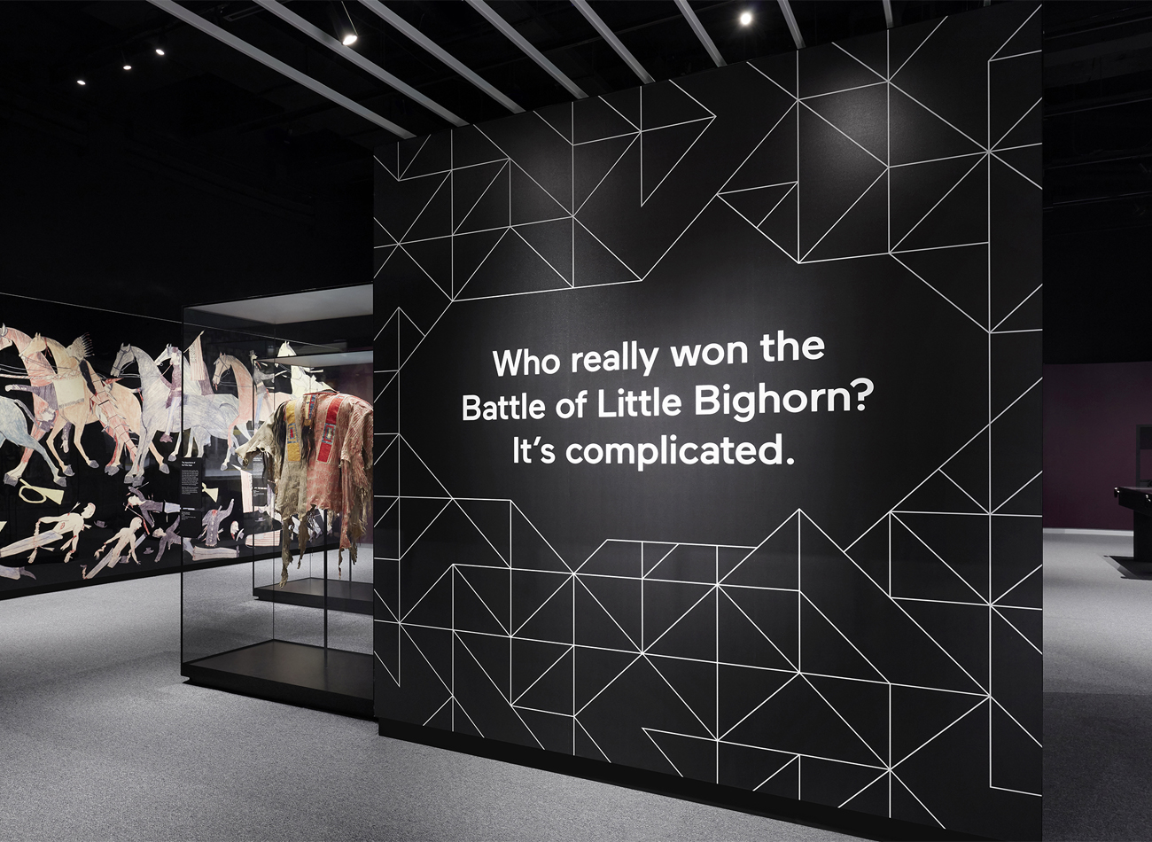
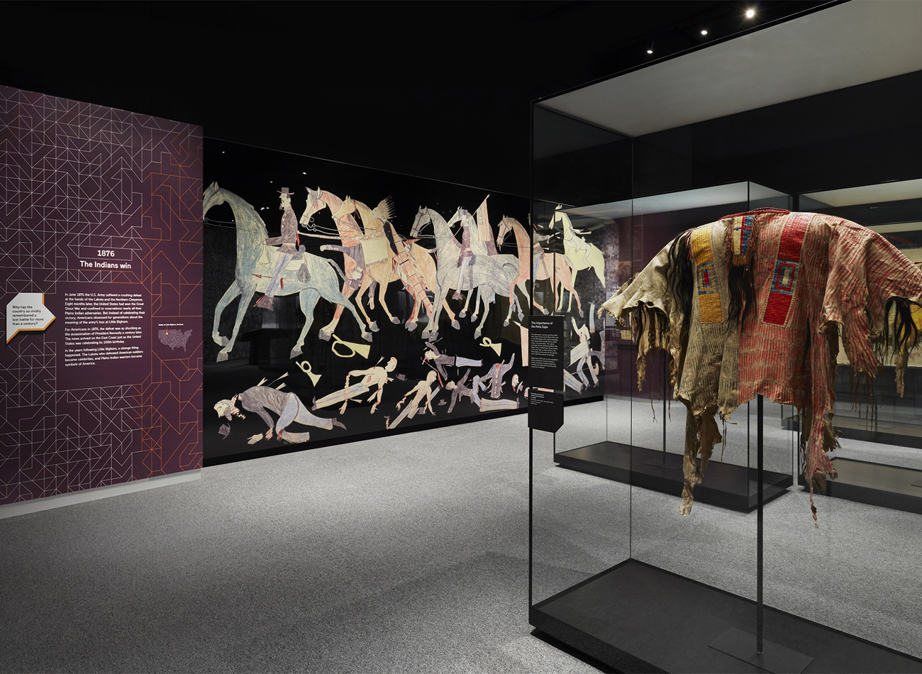
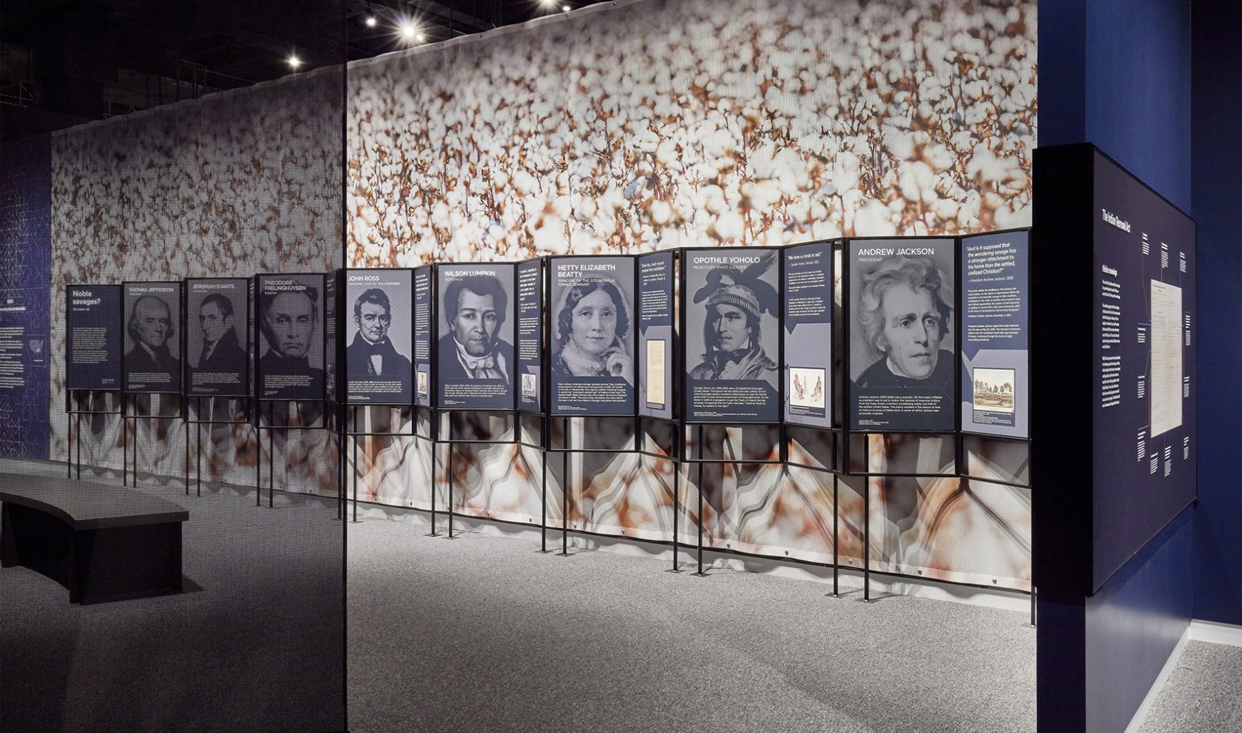
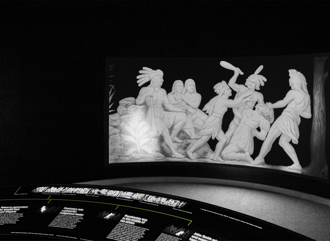
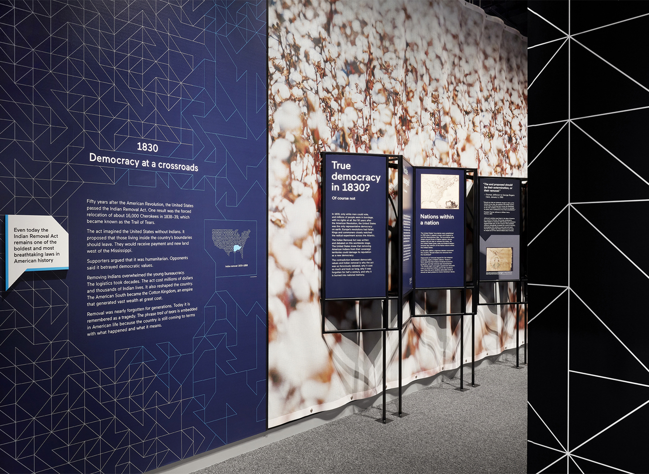
For the “Americans” exhibition at the National Museum of the American Indian, Kudos was tasked with the exhibition’s production design.
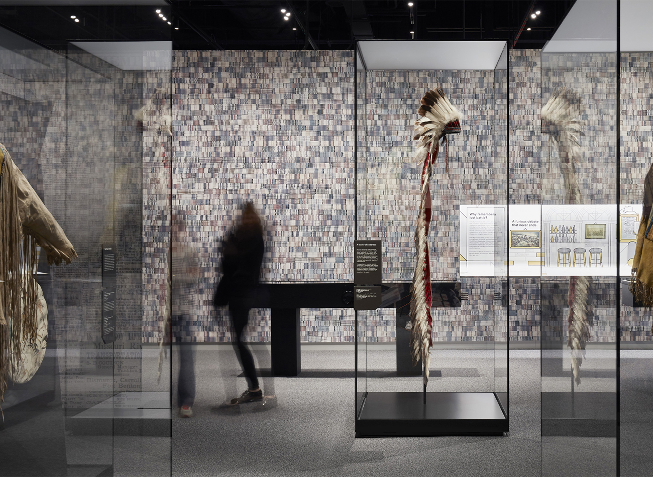
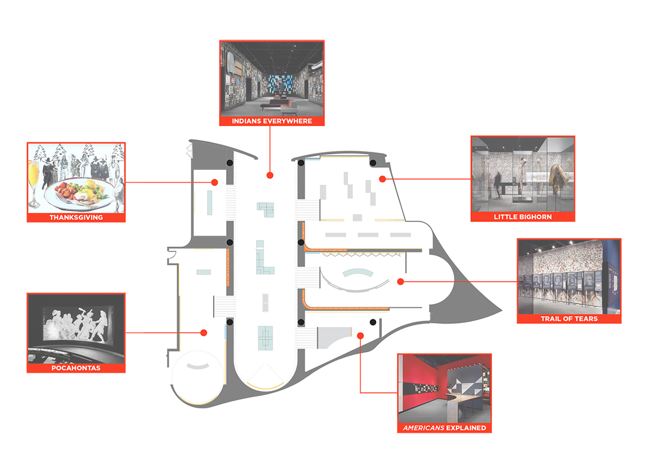
We showcased hundreds of graphics and artifacts representing American Indians from three centuries of American life, all gathered in six interconnected galleries in the southwest wing of the museum. Each gallery covered a familiar topic like Pocahontas, the Battle of Little Bighorn, Thanksgiving, and the Trail of Tears. We worked closely with Studio Joseph to ensure a clear typographic hierarchy and optimum production/installation methods for all graphic components across the various galleries and surfaces.
KUDOS Design Collaboratory
-
John Kudos
Creative Director -
Ashley Wu
Designer
National Museum of the American Indian
Photography
- Thomas Loof
Colonists Citizens Constitutions Virtual Exhibition
Dorothy Tapper Goldman Foundation
Capabilities
Focus Area
Awards
-
GDUSA 2020 American Web Design
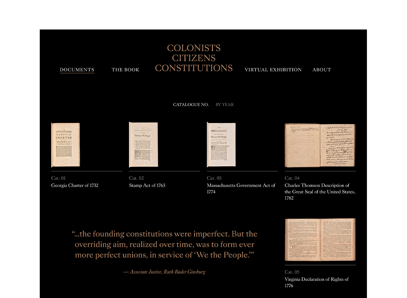
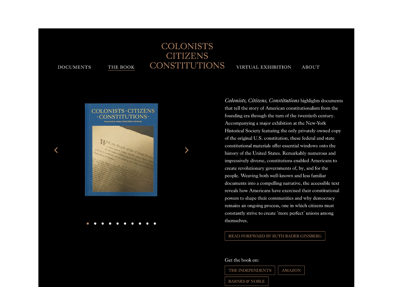
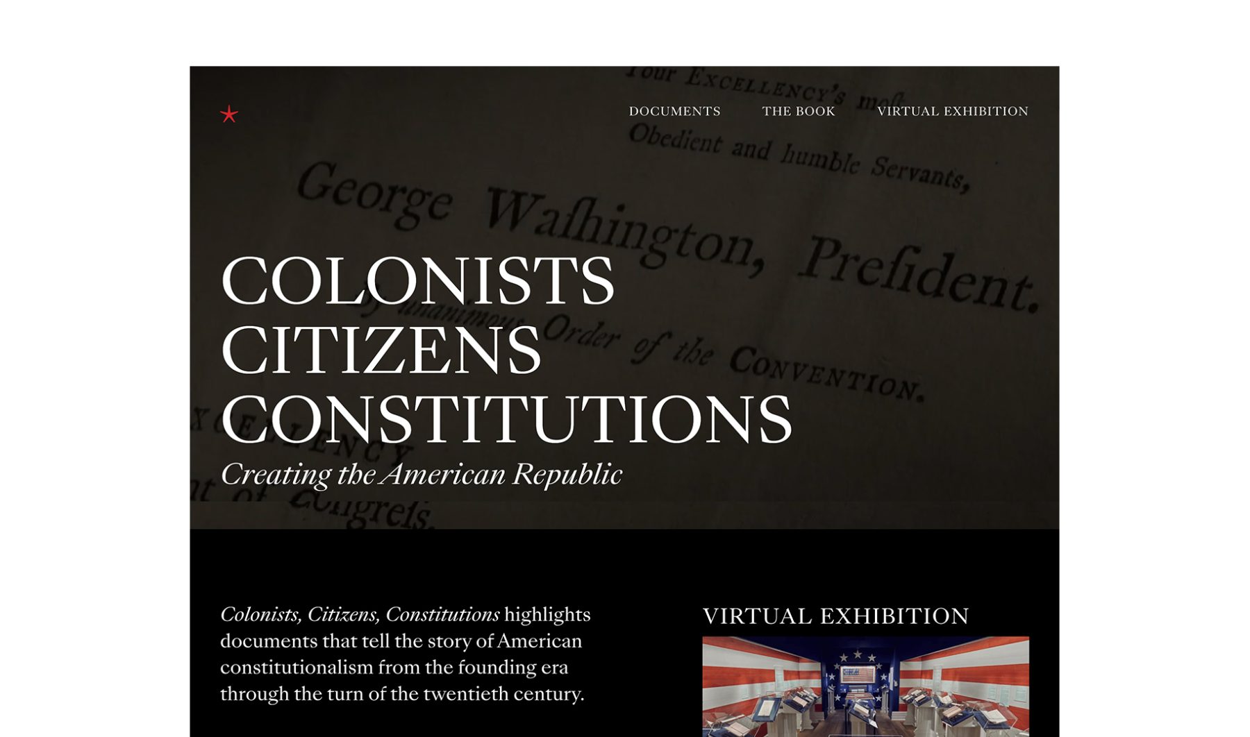
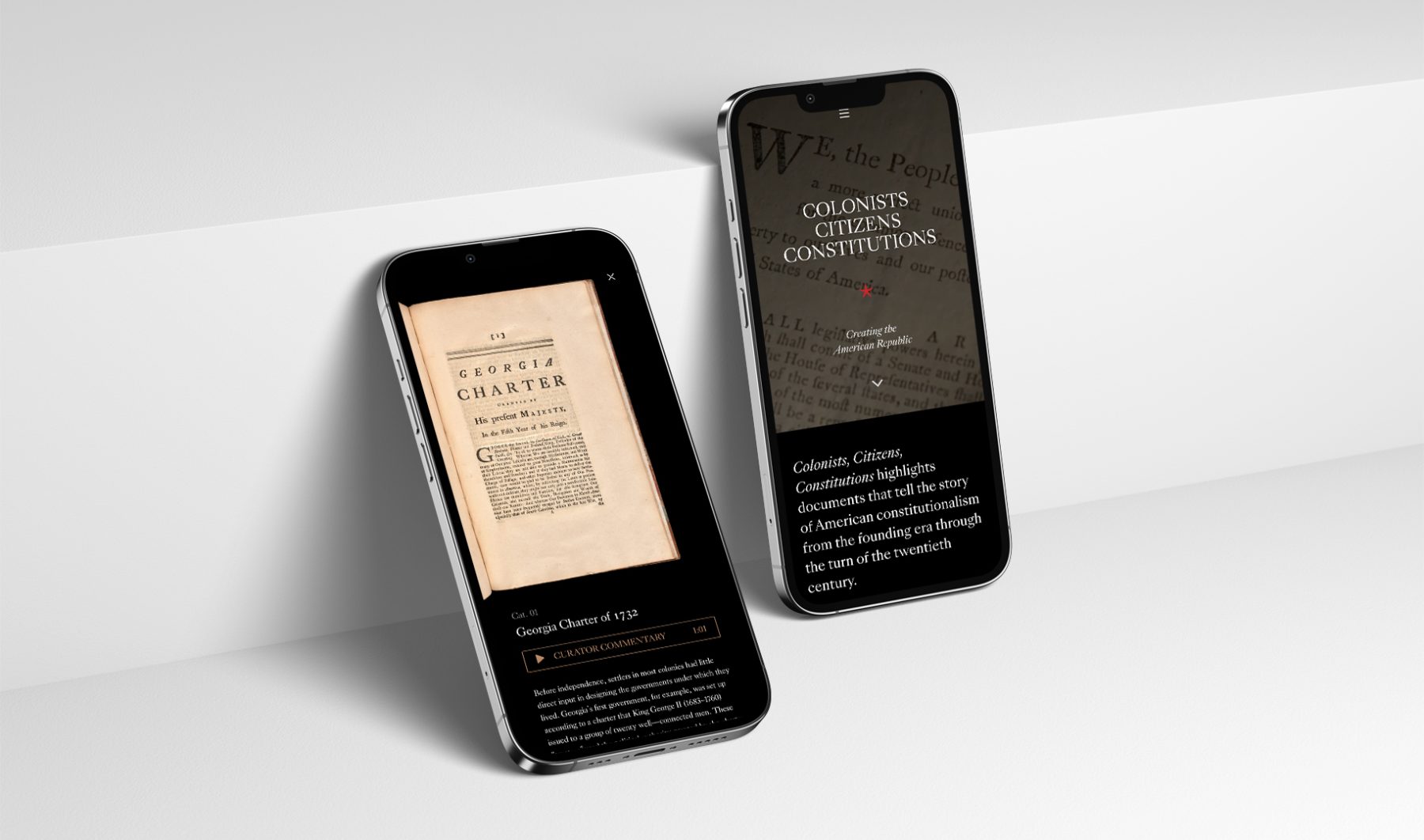
The “Colonists Citizens Constitutions” exhibit, launched in February 2020 in collaboration with the Dorothy Tapper Goldman Foundation, spotlights 42 rare documents from the Foundation’s extensive collection of Americana, telling the story of how our state and federal constitutions were imagined, formulated, written, and approved by ordinary people. These individuals arrived in America as colonists then made themselves its first citizens, while codifying their philosophies of governance and human rights via the writing of constitutions.
We originally designed the show’s website to serve as a supplement to the in-person exhibition at the New-York Historical Society. However, due to museum closures caused by COVID-19, we ultimately published a virtual tour of the gallery instead, ensuring its documents remained accessible to the public.
KUDOS Design Collaboratory
-
John Kudos
Creative Director -
Owen Febiandi
Designer -
Chris Manlapid
Web Developer
Colonists Citizens Constitutions
The Swiss Grid
Poster House
Capabilities
Focus Area
Client
Poster House (New York City) is the first museum in the U.S. to be dedicated exclusively to posters, presenting a global view of the medium from its earliest appearances in the late 1800s to present-day uses.
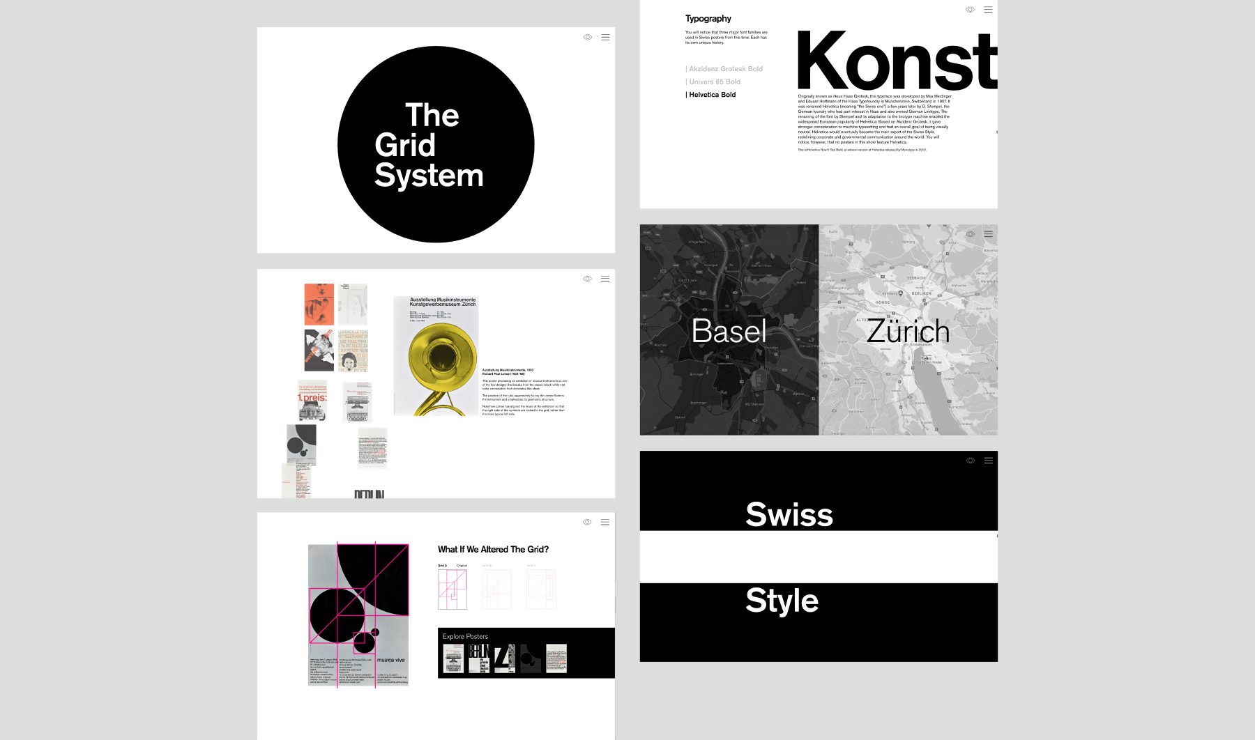
The Swiss Grid was a Poster House exhibition that launched on February 26, 2020. Ten days after the opening, the museum shut down due to COVID-19. We helped Poster House transition the exhibition into a remote-learning tool that provides historical and pedagogical context for some of the technical teachings of design.
Using core material from the original exhibition, the microsite shows how a particular aesthetic—referred to as “The Swiss Grid”—developed in post–World War II Switzerland and spread around the world through generations of practitioners, and how that aesthetic was used to create incredible posters for the cultural sector. The site interweaves contemporary attitudes toward teaching mid-century Modernism and the desire to both break free of and find new use for grid systems in contemporary design.
KUDOS Design Collaboratory
-
John Kudos
Creative Director -
Ashley Wu
Designer -
Fay Qiu
Designer -
Chris Manlapid, Arif Widipratomo
Web Developer
ACT Report
Snap Inc. x The Aspen Institute
Capabilities
Focus Area
Client
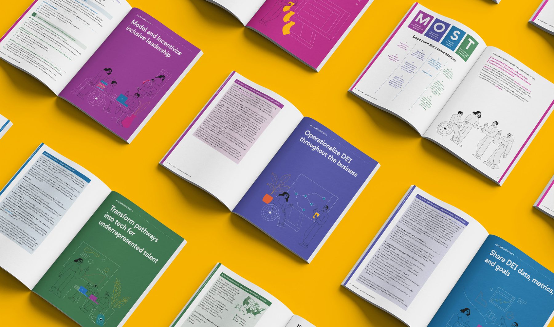
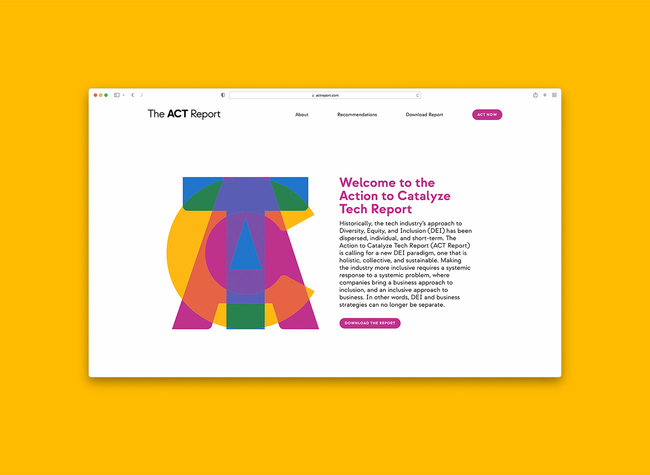
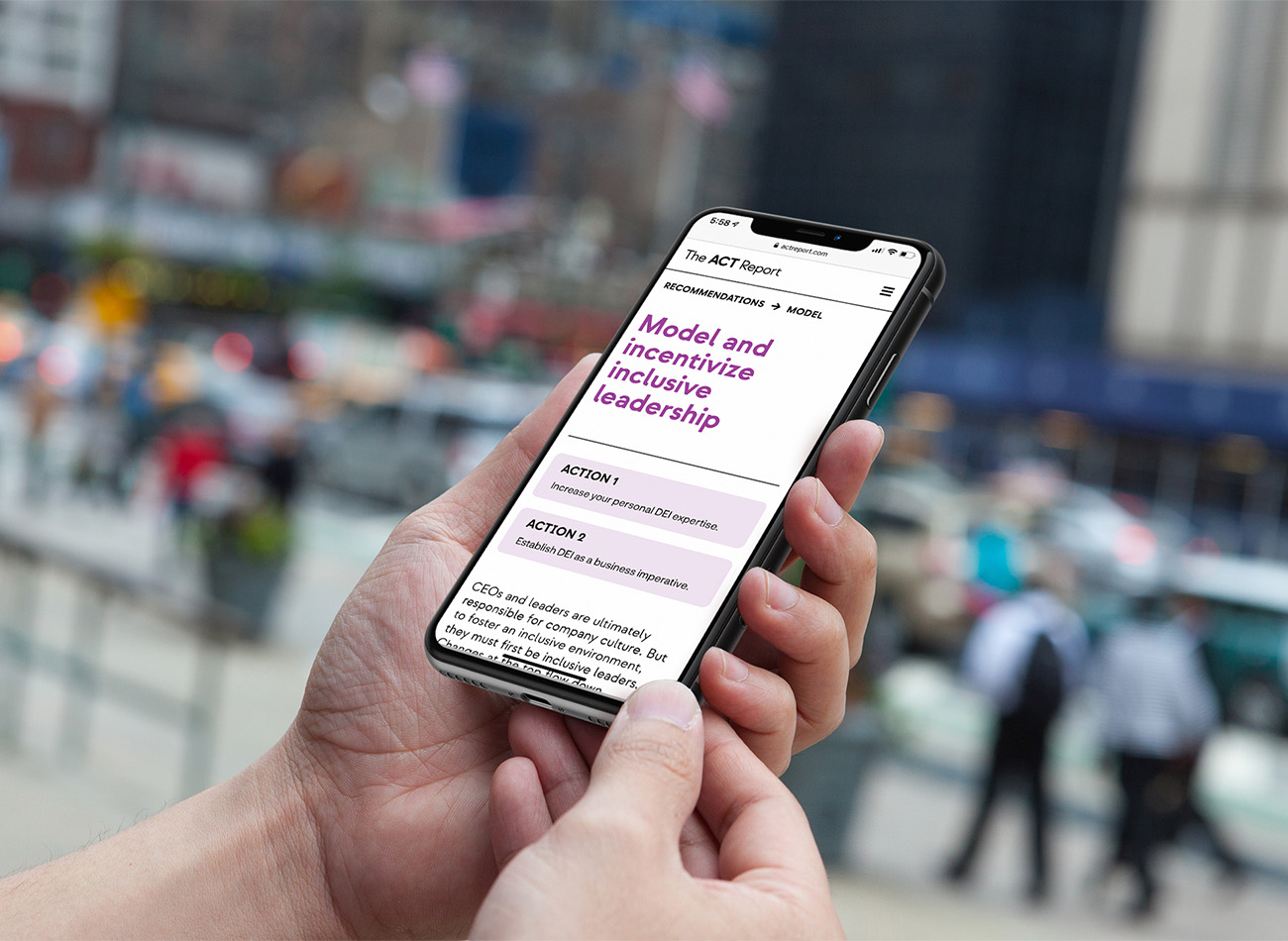
The Action to Catalyze Tech (ACT) Report is an ever-evolving repository for accountability and engagement in the tech industry, created in response to an industry-wide call to action to improve diversity, equity, and inclusion in the sector.
KUDOS created a comprehensive PDF report hosted on a responsive website that features ever-expanding video archives of talks on this topic. We incorporated a call to action for engagement and accountability, along with multimedia integration and annual updates to reflect the organization’s current summit. Engaging visual elements like illustrations and color blocks were used to offset the heavy amount of information, making the report accessible and visually appealing.
KUDOS Design Collaboratory
-
John Kudos
Creative Director -
Ashley Wu
Art Director -
Owen Febiandi
Designer -
Chris Manlapid
Software Developer -
Christian Juniady Setiawan
Software Developer
Openlab Branding & Website
Wesleyan University
Capabilities
Focus Area
Client
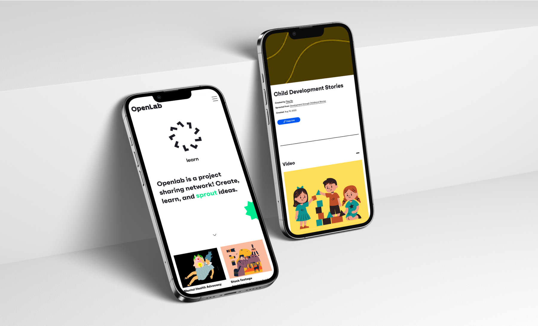
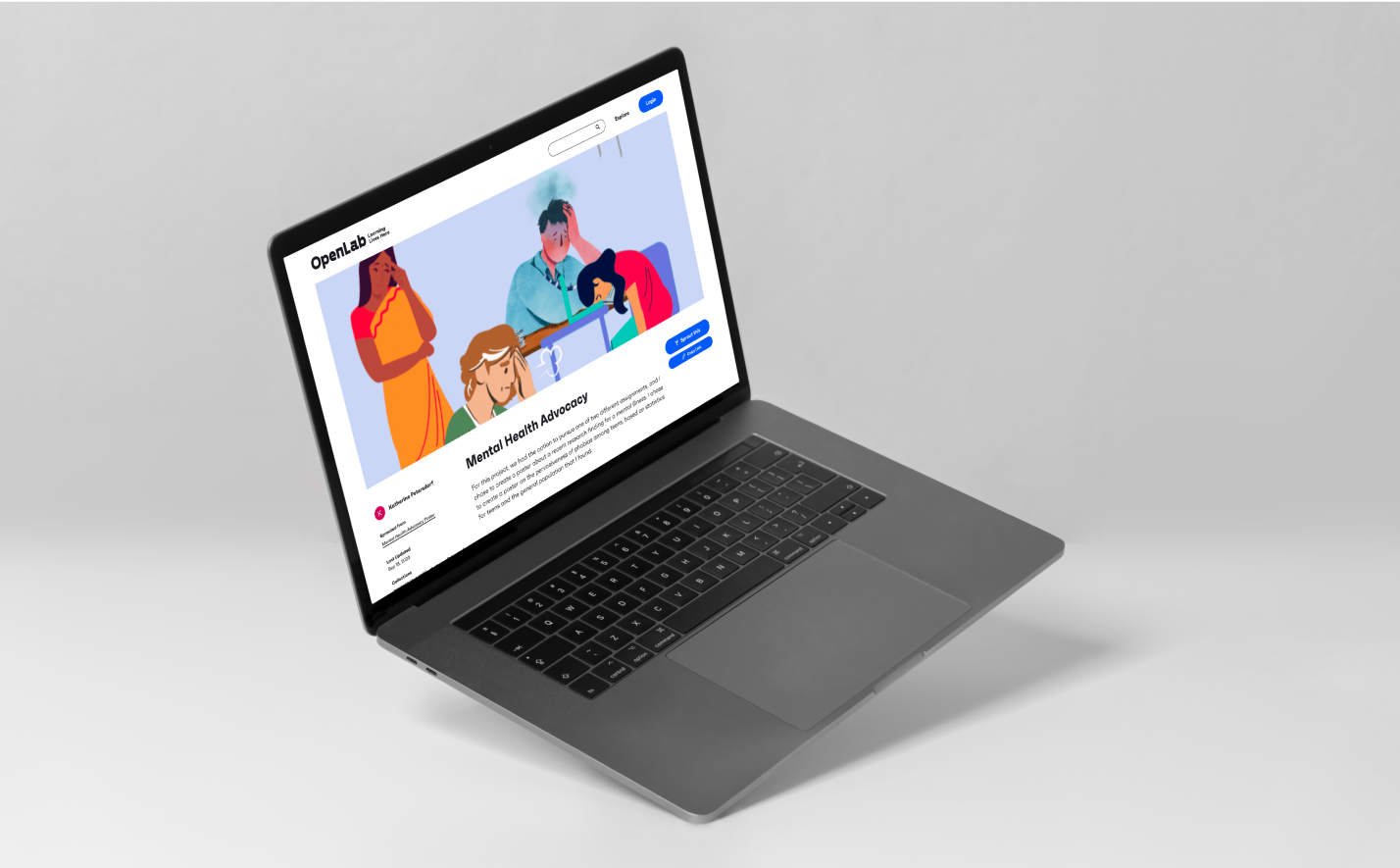
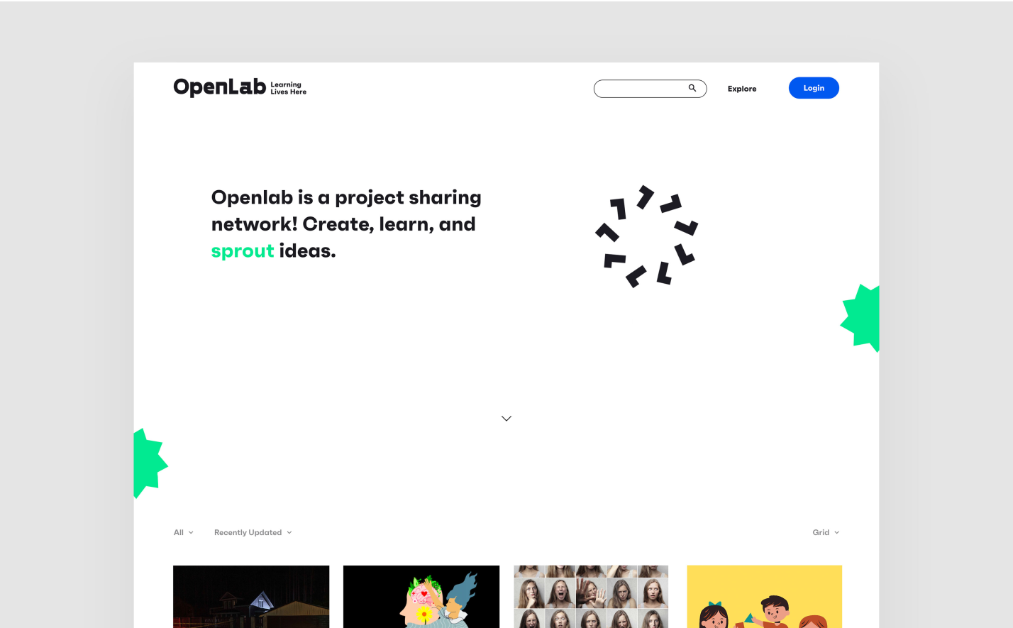
OpenLab is an online community platform created by Wesleyan University professor Lisa Dierker to provide project-based learning and collaboration opportunities.The project is funded through a National Science Foundation grant and supports the sharing of projects, both among students within partner classrooms and across partner schools.
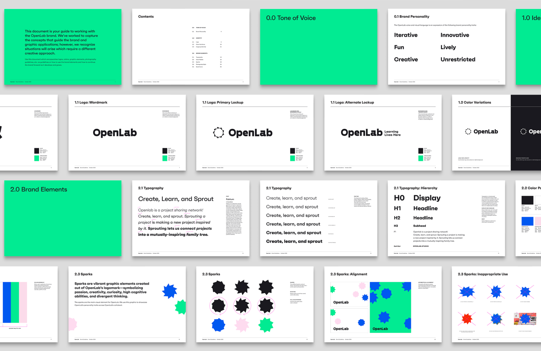
KUDOS was engaged to create branding for the program, including web design and content planning. Centering our approach around the Spark—an original graphic element we created to symbolize the brand’s passion, creativity, curiosity, and divergent thinking—we developed a comprehensive visual branding system and style guidelines, complete with naming, a tagline, and a dynamic logo mark. The resulting platform was engaging, cohesive, and elegant, inviting engagement through elegant, fun design.
View openlab.studio
KUDOS Design Collaboratory
-
John Kudos
Creative Director -
Amanda Knott
Project Manager -
Jamus Marquette
Lead Designer -
Christian Juniady Setiawan
Developer
Design Tech Brochure
Cornell University AAP
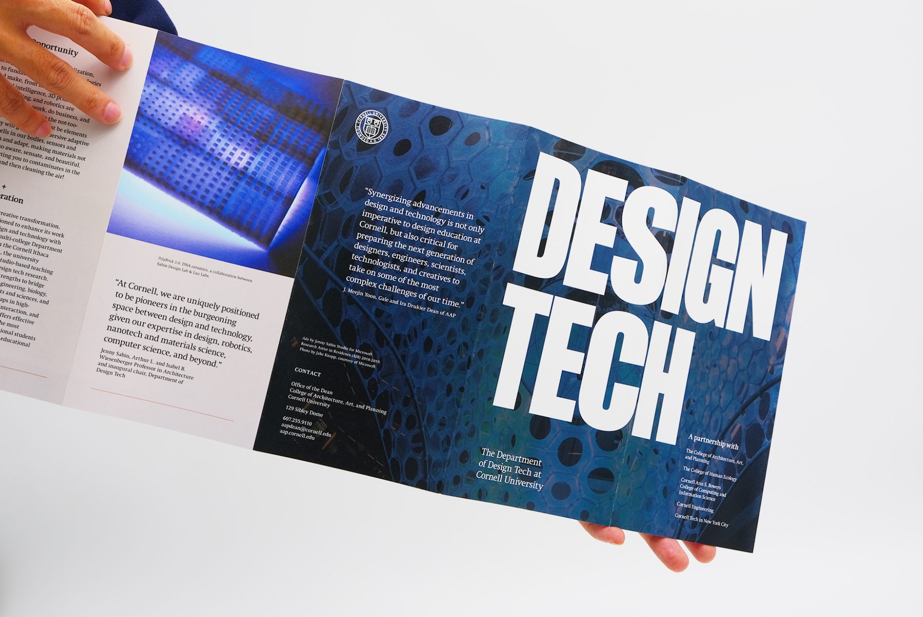
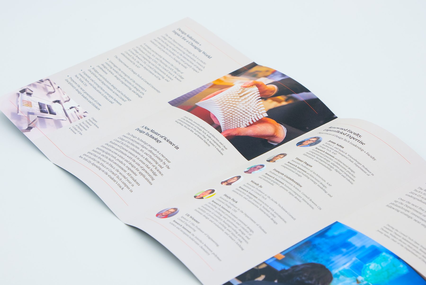
Cornell University’s new Department of Design Tech is a multi-college, transdisciplinary initiative pioneering innovation, research, and teaching on those topics at the intersection of design and emerging technology that most greatly impact research, industry, and practice in an ever-evolving world.
The five-panel pamphlet we designed for the Department of Design Tech serves as a captivating gateway into the innovative world of design and emerging technology. With a bold “Des Tec” letterform adorning the front cover, the brochure invites viewers to explore further, unveiling the full “design tech” message as they delve deeper into its contents. Curated images, serving as full-blown backgrounds, seamlessly merge with the technological narrative, showcasing the department’s commitment to innovation, research, and education. Integrated red lines weave subtly throughout the pamphlet, harmonizing the college’s existing branding with the pamphlet’s fresh and contemporary aesthetic.
KUDOS Design Collaboratory
-
John Kudos
Creative Director -
Fay Qiu
Designer -
Amanda Knott
Project Manager
Cornell Tech
Celebrate Milstein Hall
Cornell University AAP
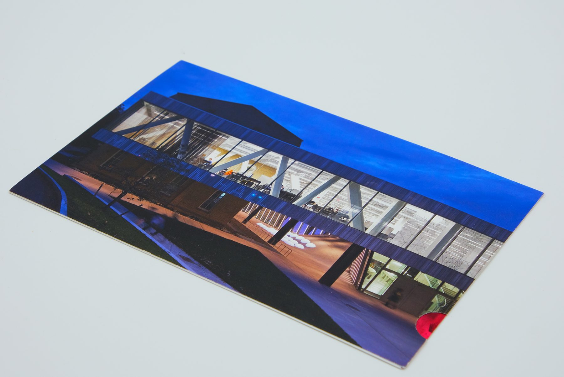
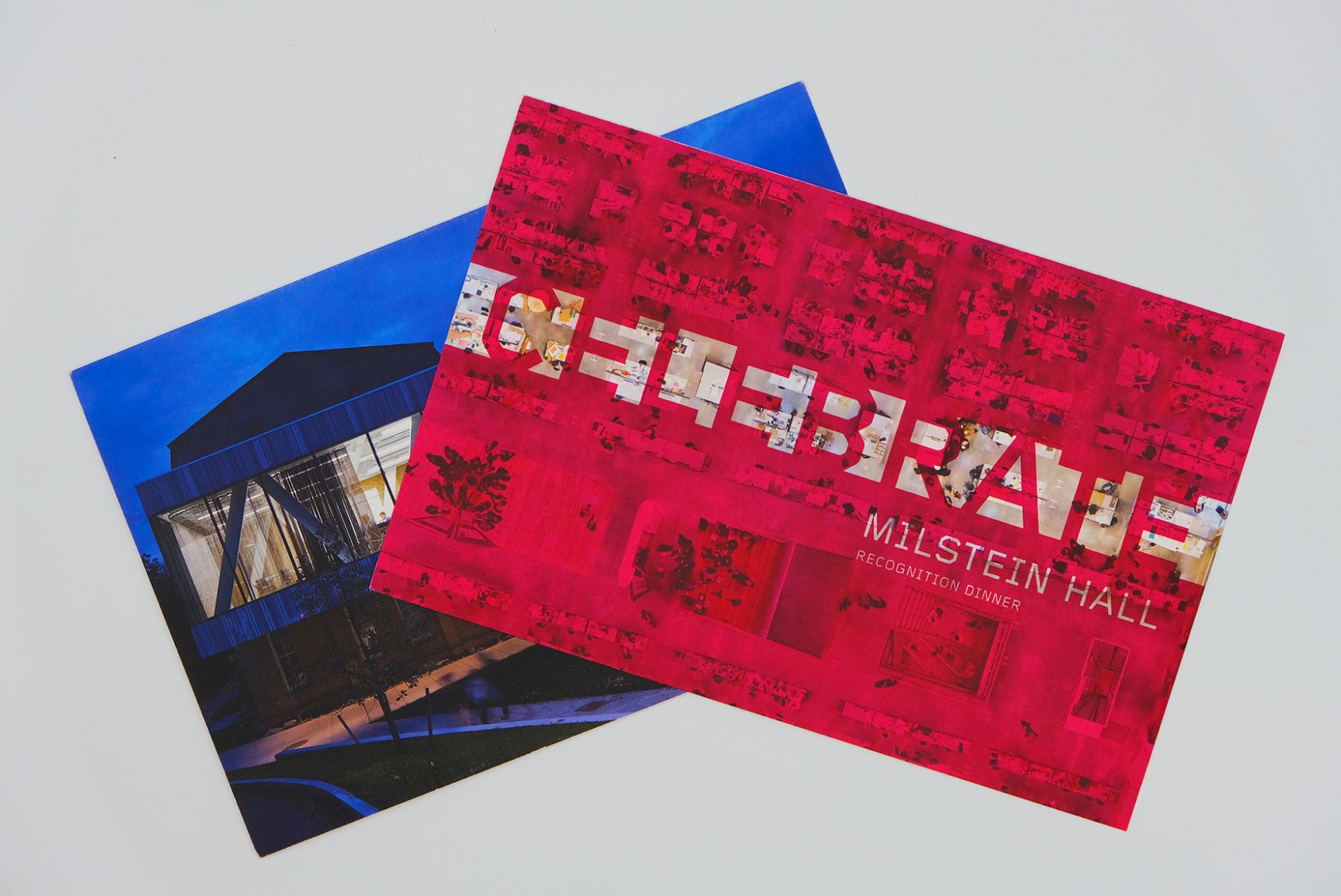
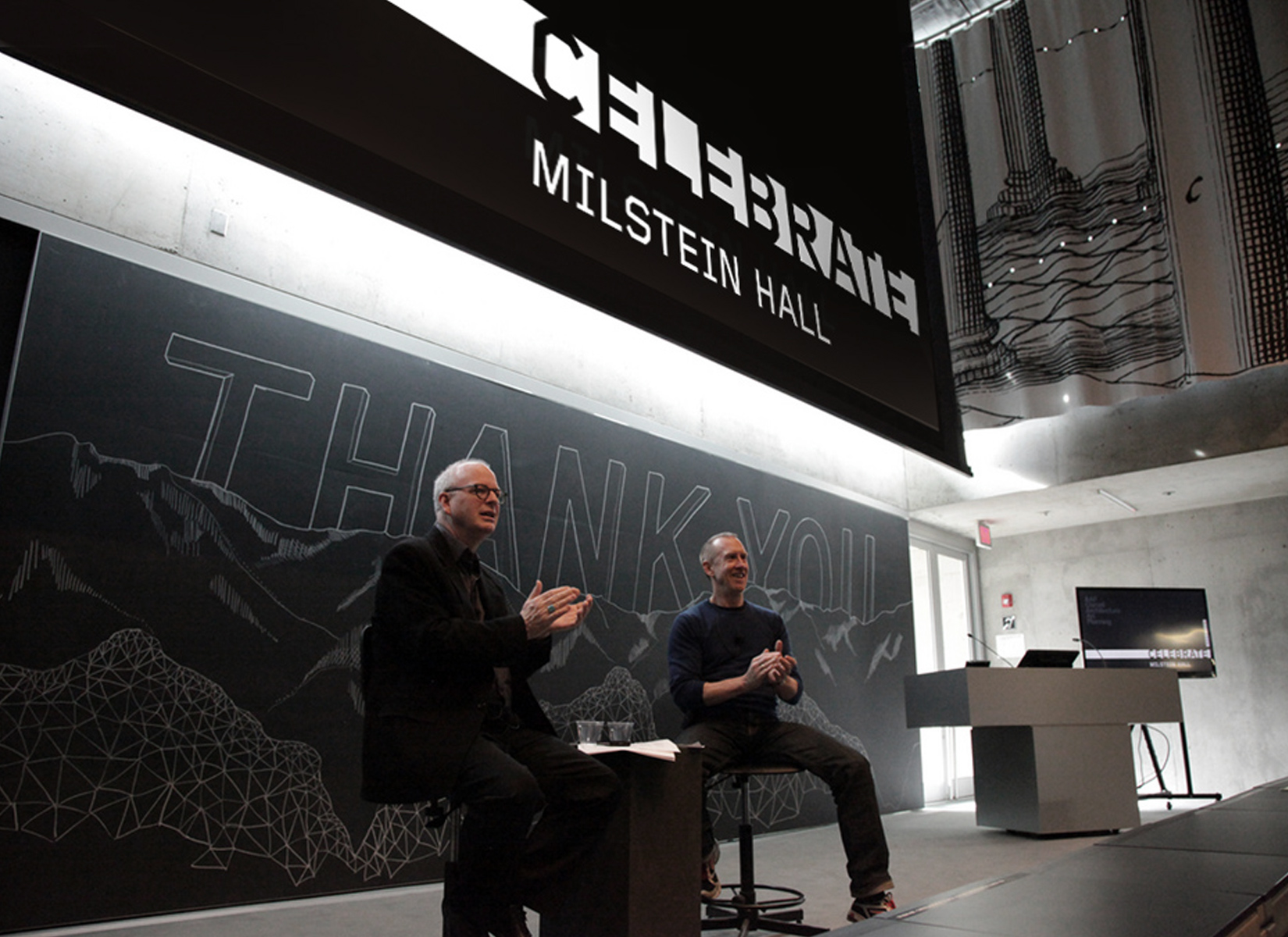
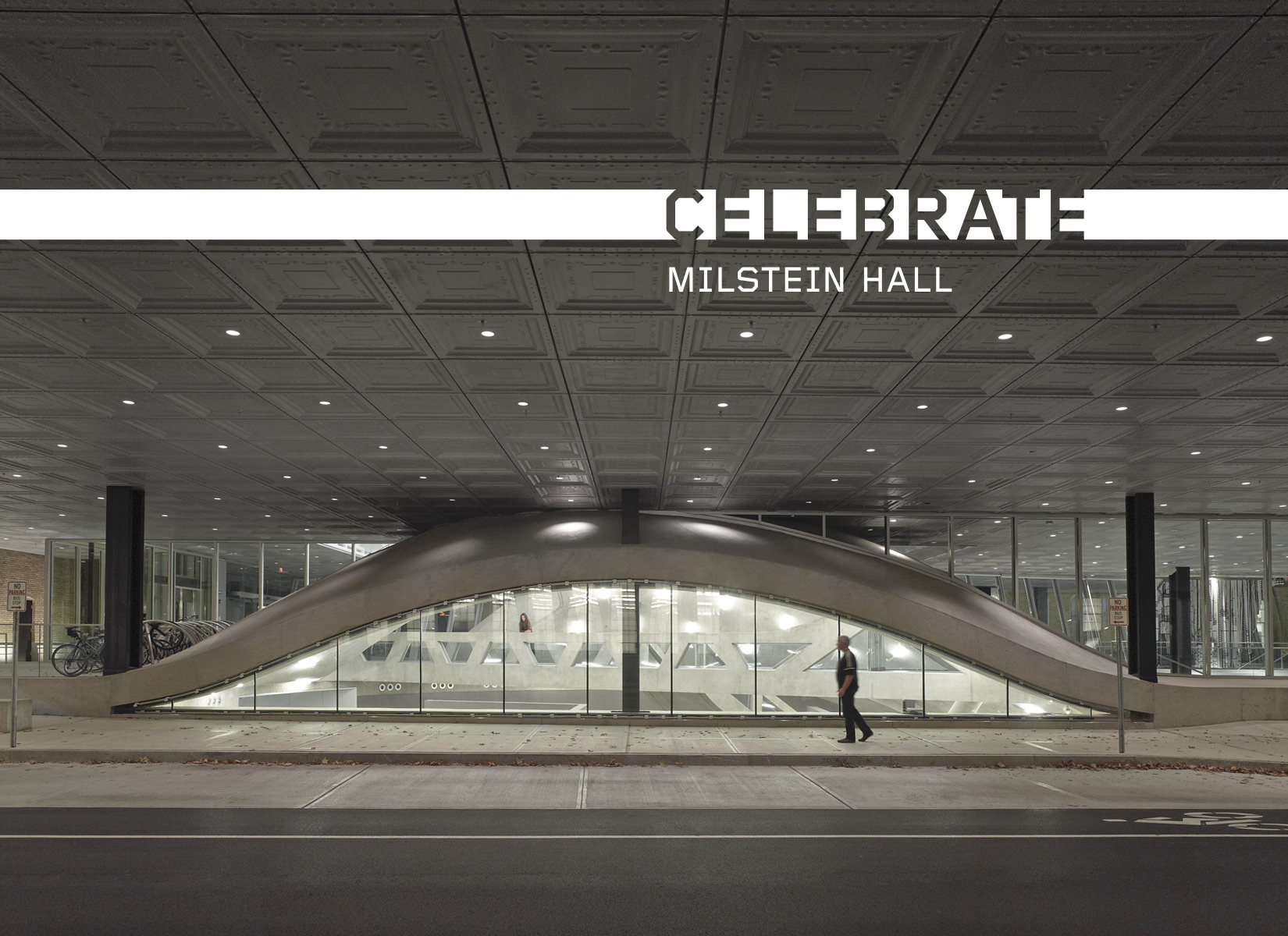
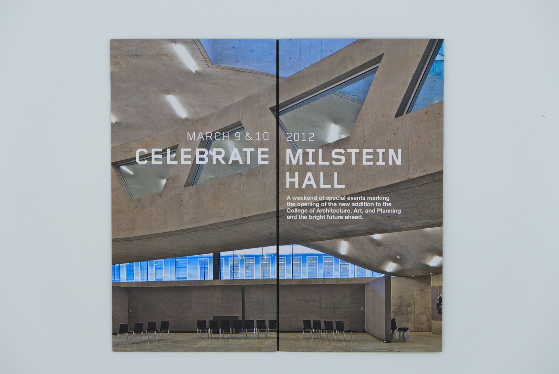
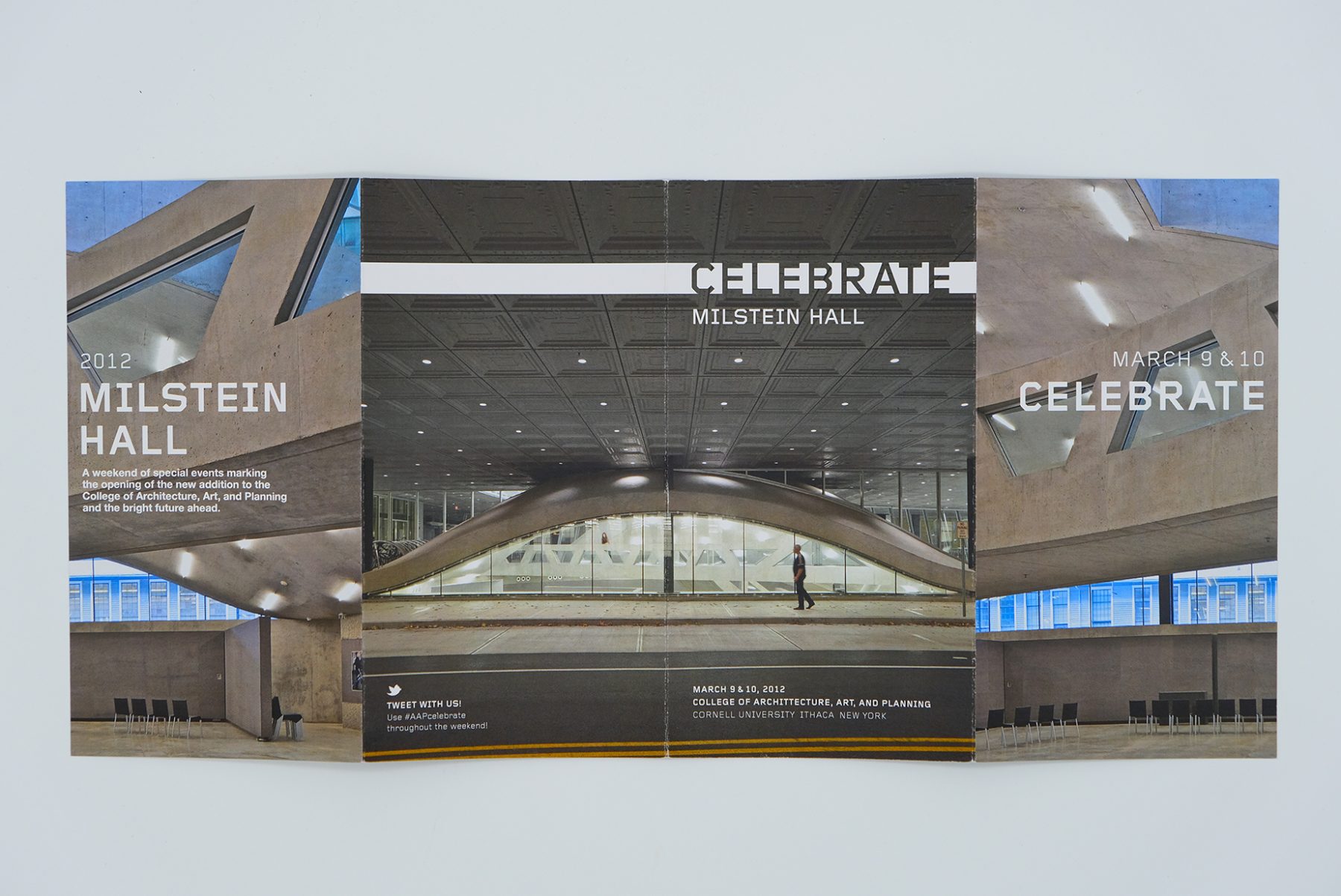
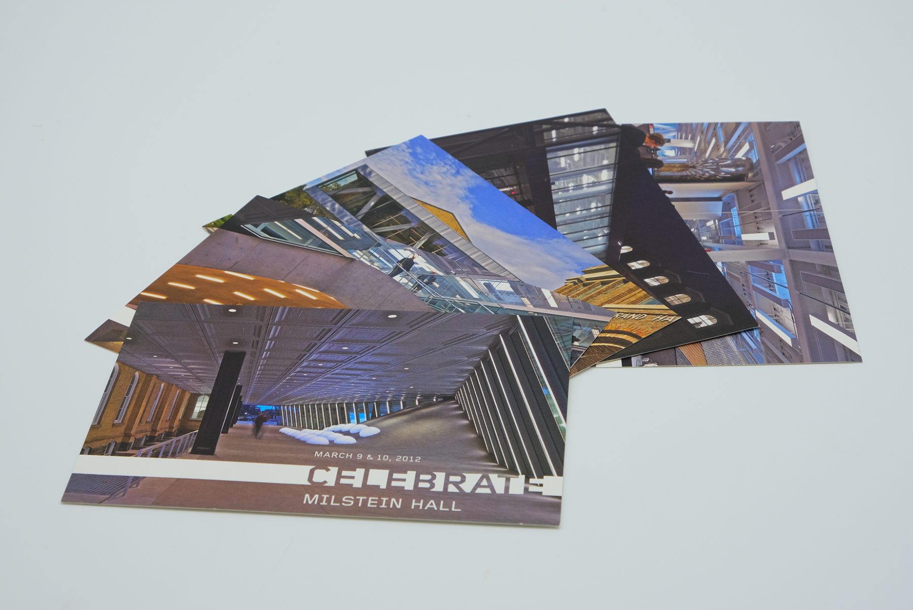
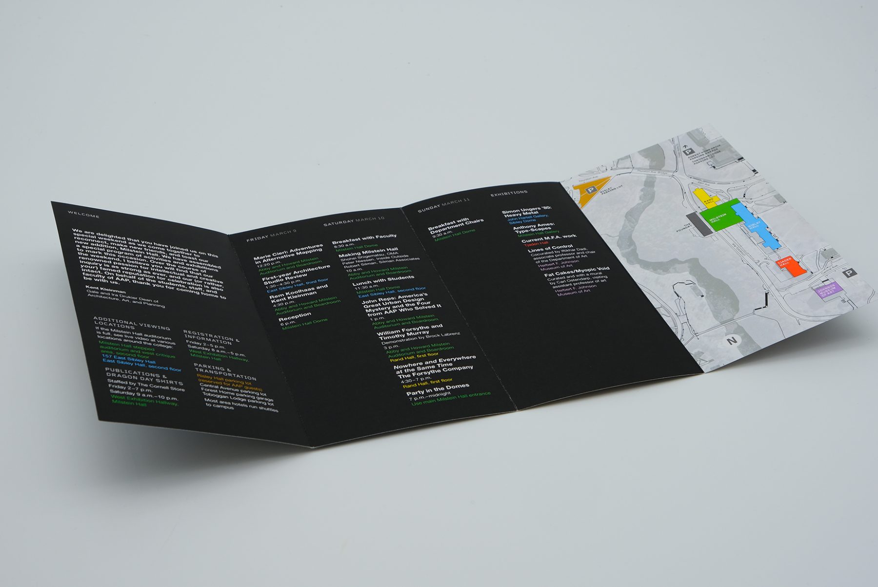
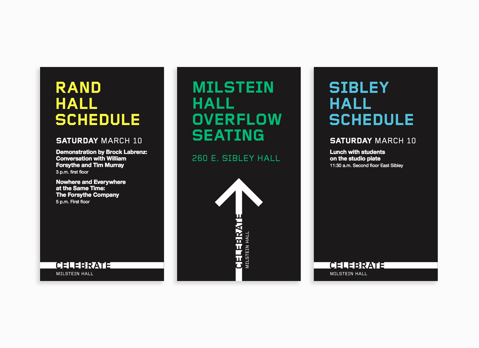
To celebrate the opening of Milstein Hall at Cornell University, we developed a look-and-feel for the event collateral.
We developed our stencil-bar logotype based on the building’s floor-to-ceiling windows. We also produced a series of printed materials for the opening event, from postcards and brochures to invitations and wayfinding posters.
KUDOS Design Collaboratory
-
John Kudos
Creative Director -
Karen Vanderbilt
Designer
