Blueprints Branding & Website
Blueprints for Arts and Policy
Capabilities
Focus Area
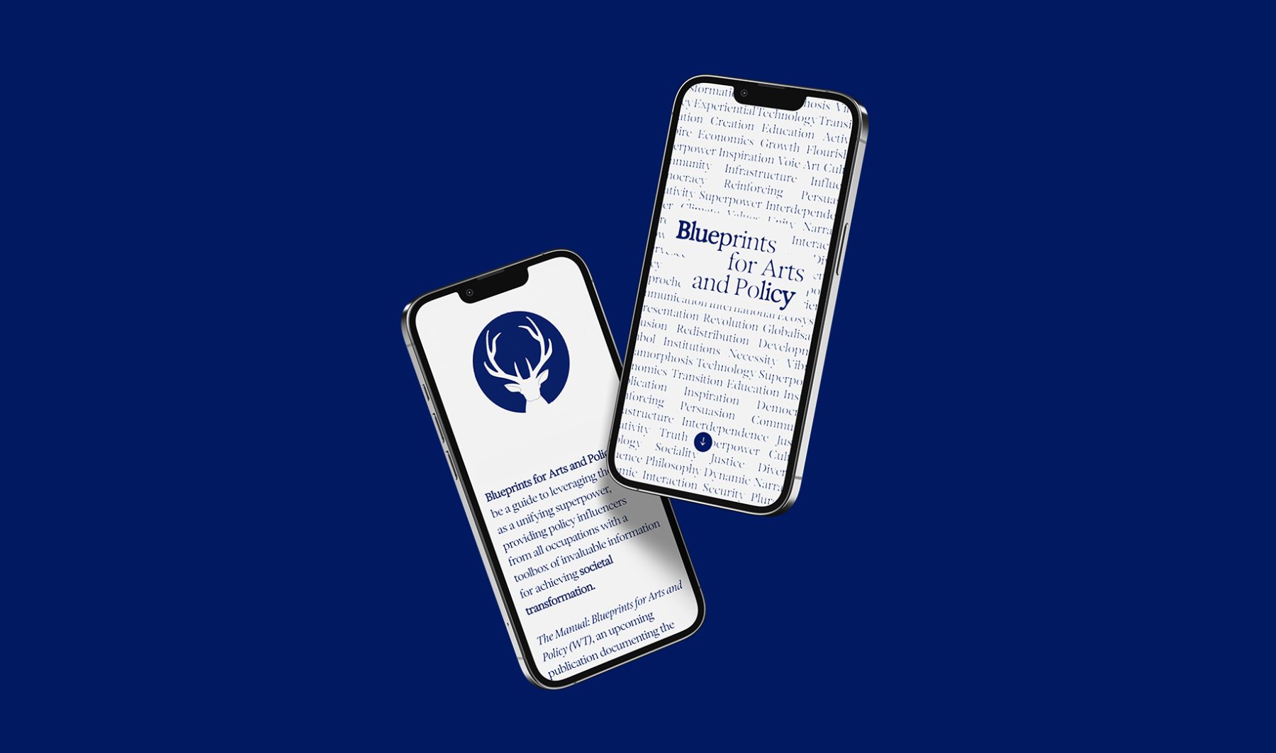
Blueprints for Arts and Policy is a platform in which esteemed global voices in arts and policy exchange ideas, case studies, and recommend actions to inspire collective creativity and bridge ideological, economic, cultural, and social divides. A series of salons will be held in contribution to the project, bringing together leaders in a variety of fields to discuss how the arts can be harnessed for social and policy interventions.
KUDOS developed a generative type branding system that embody the ever-changing nature of these complex exchanges. We also created a series of icons that morph through a Rorschach effect, visualizing the melding of unconscious minds and voices.
Visit blueprintsartpolicy.com
KUDOS Design Collaboratory
-
John Kudos
Creative Director -
Owen Febiandi
Lead Designer -
Putu Yogiswara
Designer -
Iman Fadillah
Motion Designer -
Amanda Knott
Project Manager -
Christian Juniady Setiawan
Web Developer
Shigeko Kubota Video Art Foundation Branding
Shigeko Kubota Video Art Foundation
Capabilities
Focus Area
Shigeko Kubota (1937–2015) was a pioneering video artist, recognized as a significant early progenitor of the medium through her multifaceted roles as an artist, curator, critic, and essayist.
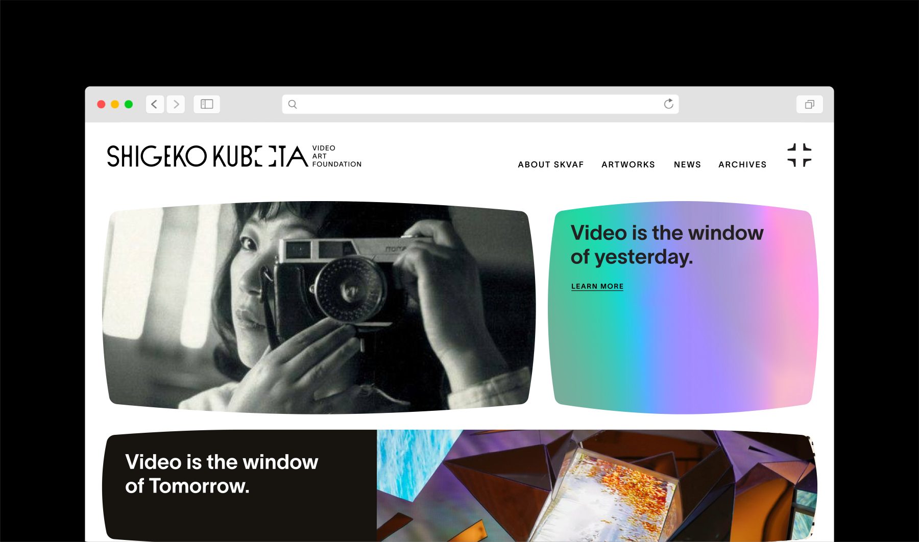
The Shigeko Kubota Video Art Foundation is dedicated to preserving her work and cultural legacy while fostering broader awareness, appreciation, and understanding of the history and future of video art through diverse programs and initiatives.
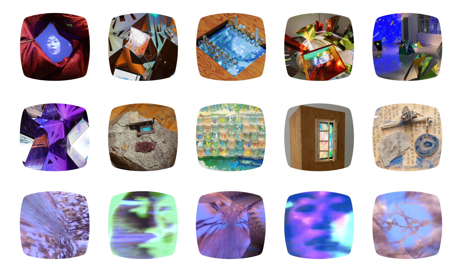
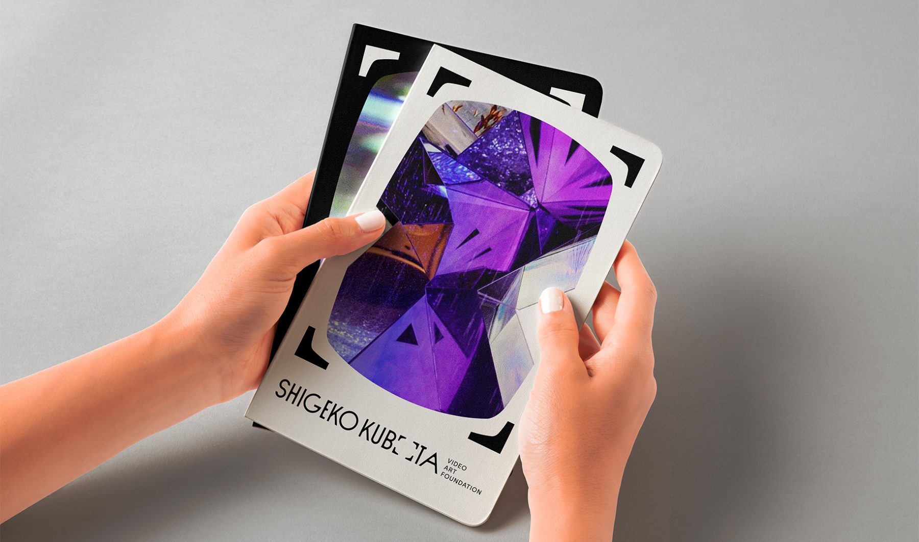
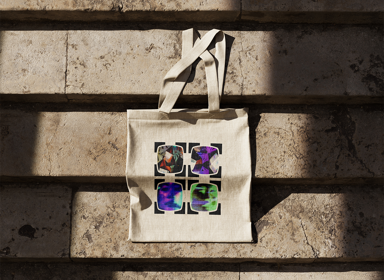
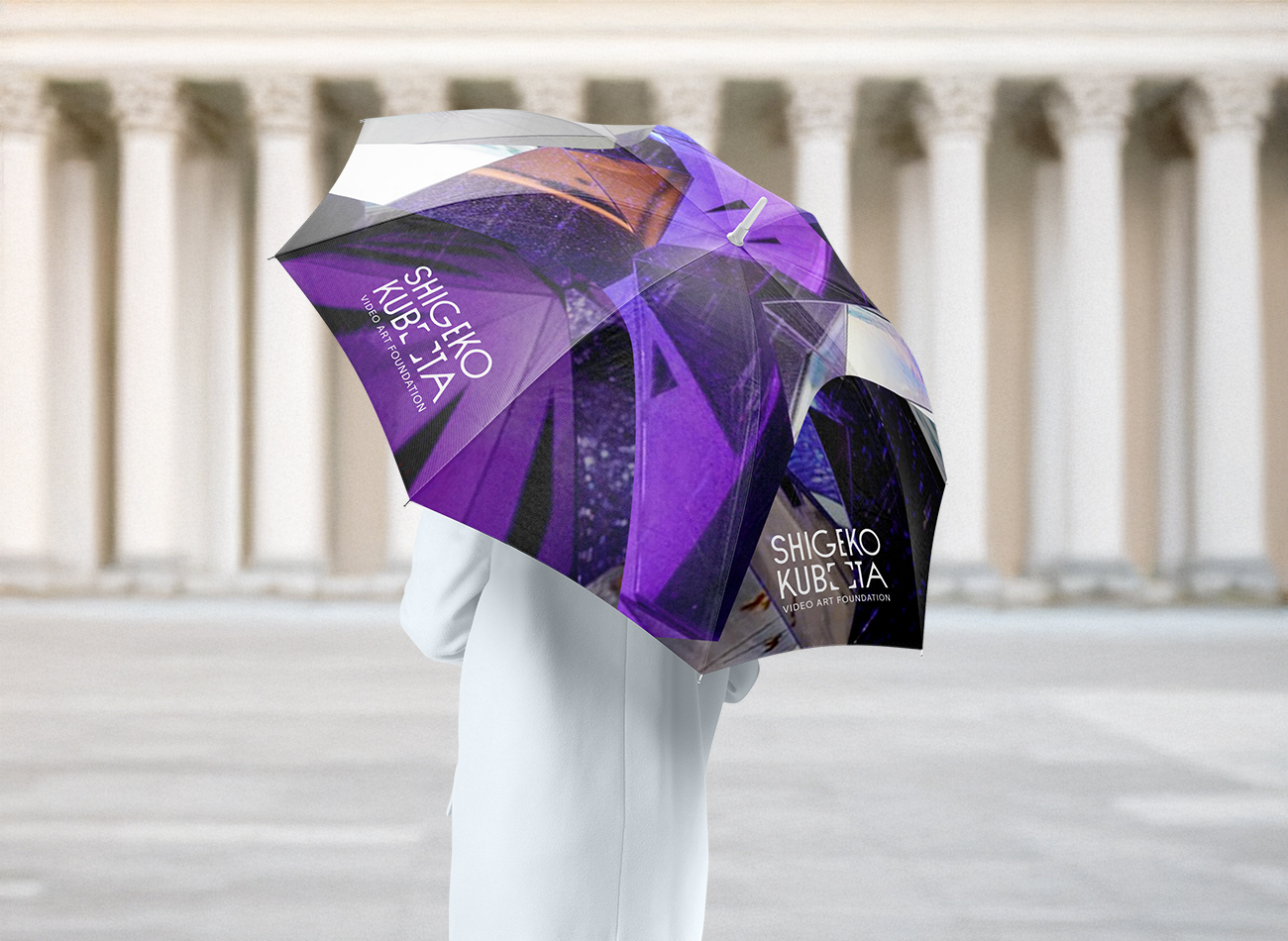
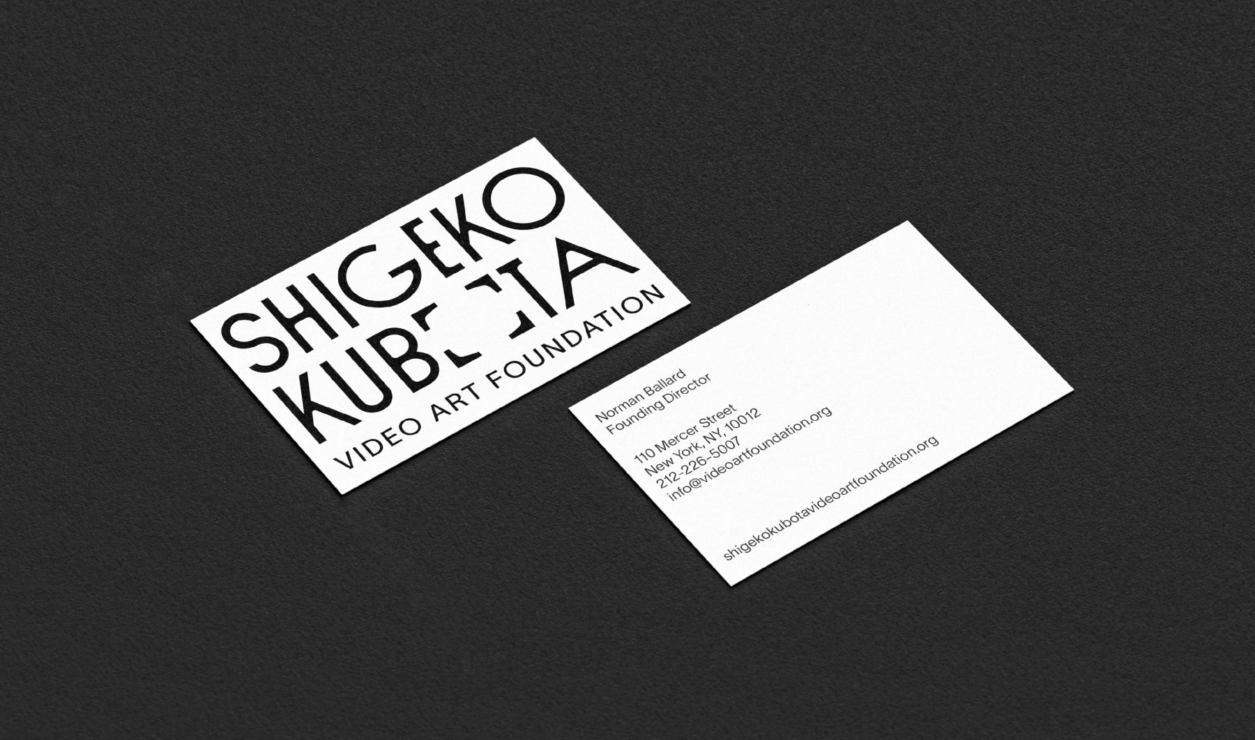
To brand the foundation, we drew inspiration from iconic visual cues in Kubota’s work—most notably the 4×3 television frame and her 2004 artwork, Video is the Window of Yesterday, Video is the Window of Tomorrow. The new visual identity system modernizes these forms within the logotype, allowing the frames to dynamically expand around any subject. Deliberately minimalist and monochromatic, the identity reflects the enduring and timeless nature of Kubota’s contributions to the field of video art.
KUDOS Design Collaboratory
-
John Kudos
Creative Director -
Fay Qiu
Designer -
Owen Febiandi
Designer -
Putu Yogiswara
Designer -
Muhammad Syamil Haqqoni
Designer -
Imam Fadilah
Motion Designer -
Amanda Knott
Project Manager
Lincoln Square Branding & Website
Lincoln Square BID
Capabilities
Focus Area
Client
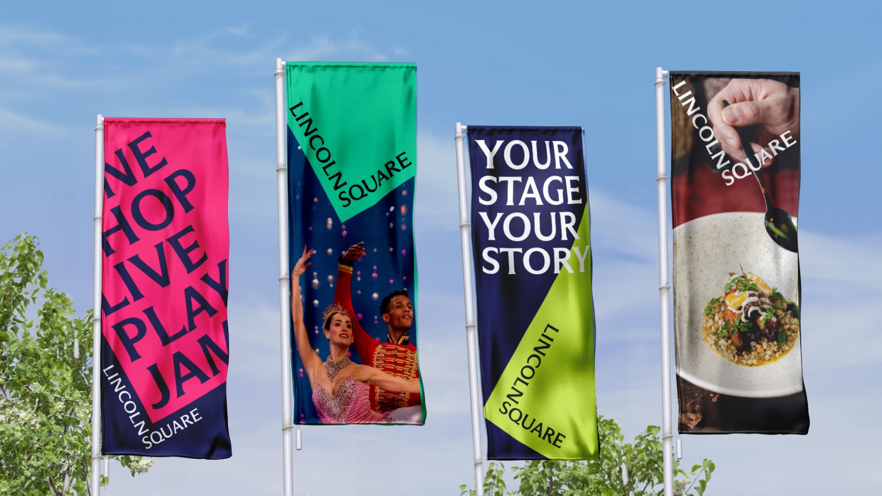
Lincoln Square BID is a nonprofit organization dedicated to keeping the neighborhood clean, safe, and beautiful while promoting its vibrant cultural, commercial, and residential life year-round. Through dynamic marketing efforts, the BID ensures Lincoln Square remains in the spotlight across all seasons.
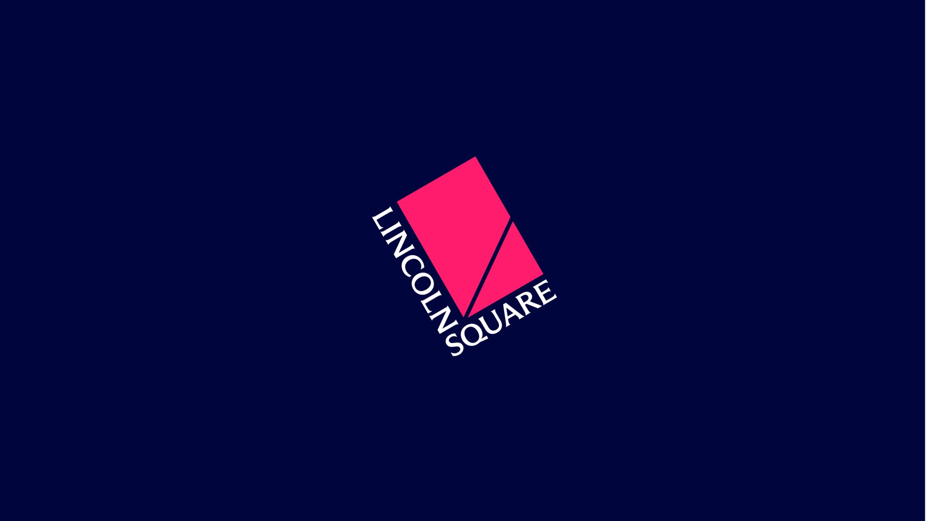
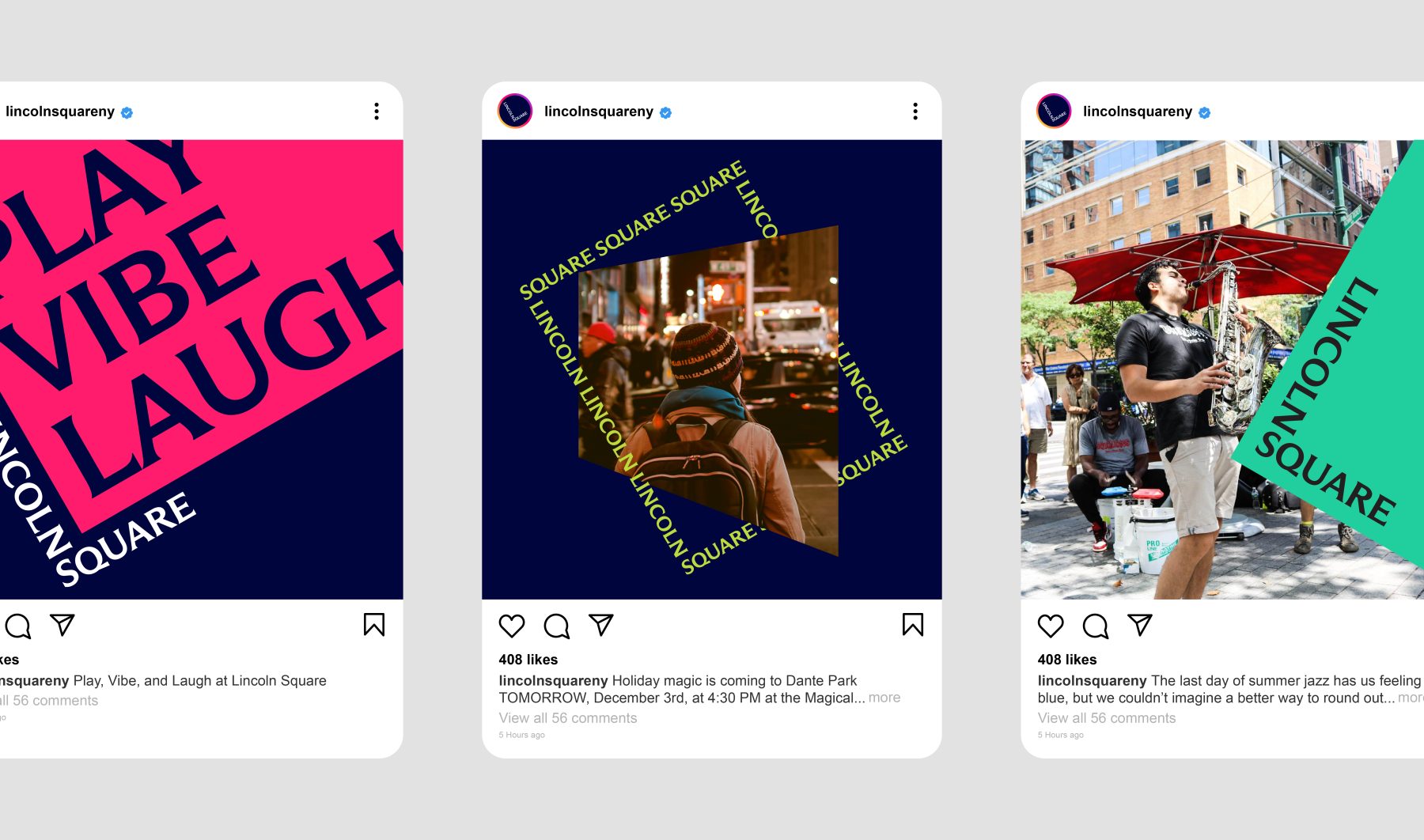
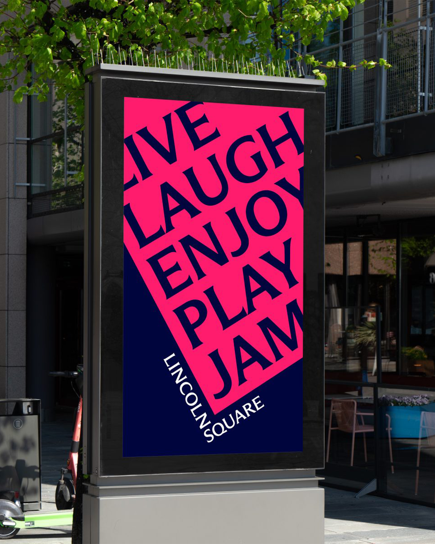
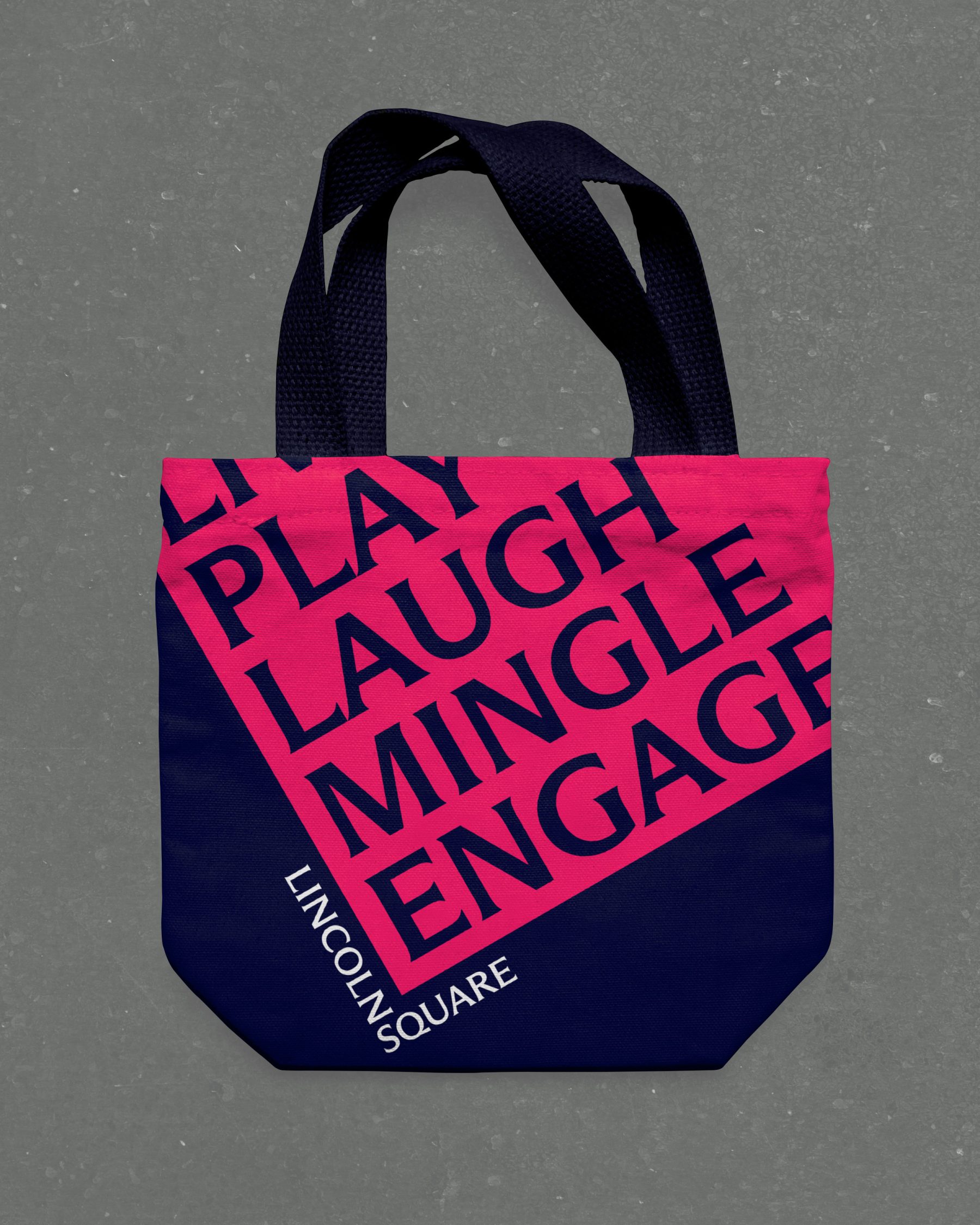
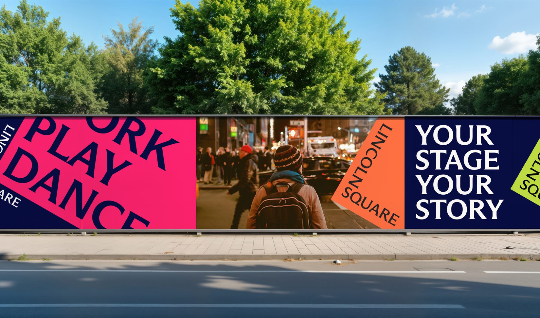
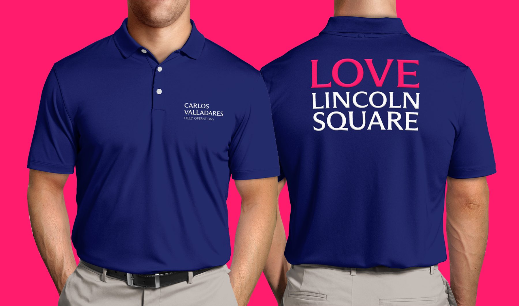
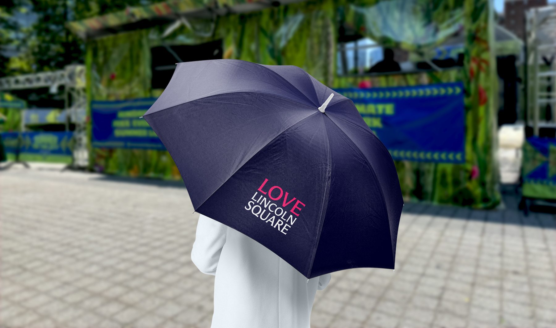
For this project, we introduced a bold new design system. The words LINCOLN and SQUARE interlock to form an “L,” wrapped around a rubin red block tilted at a 30º angle—a visual nod to the way Broadway cuts diagonally through the heart of Manhattan’s Upper West Side.
The block itself serves as a dynamic window into Lincoln Square’s rich cultural landscape. It rotates, shifts colors, and reveals visual moments and words that capture the neighborhood’s spirit, energy, and enduring legacy as one of New York City’s iconic destinations.
A new website will be coming in the Spring of 2025.
KUDOS Design Collaboratory
-
John Kudos
Creative Director -
Fay Qiu
Lead Designer -
Owen Febiandi
Designer -
Jamus Marquette
Designer -
Amanda Knott
Project Manager -
Imam Fadilah
Animator

Lewis Latimer Interactives
Lewis Latimer House Museum
Capabilities
Focus Area
Client
Lewis Howard Latimer was the son of self-emancipated enslaved people, a self-taught draftsman, and major contributor to the invention of the lightbulb and the telephone. Some of his own inventions are the early air conditioning unit and the railroad car bathroom.
Growing up, Latimer faced many challenges due to racial discrimination prevalent at the time. He enlisted in the Union Navy in 1864 at the age of 16 and—with no access to formal education—taught himself mechanical drawing which eventually led him to become a chief draftsman, patent expert, and inventor.
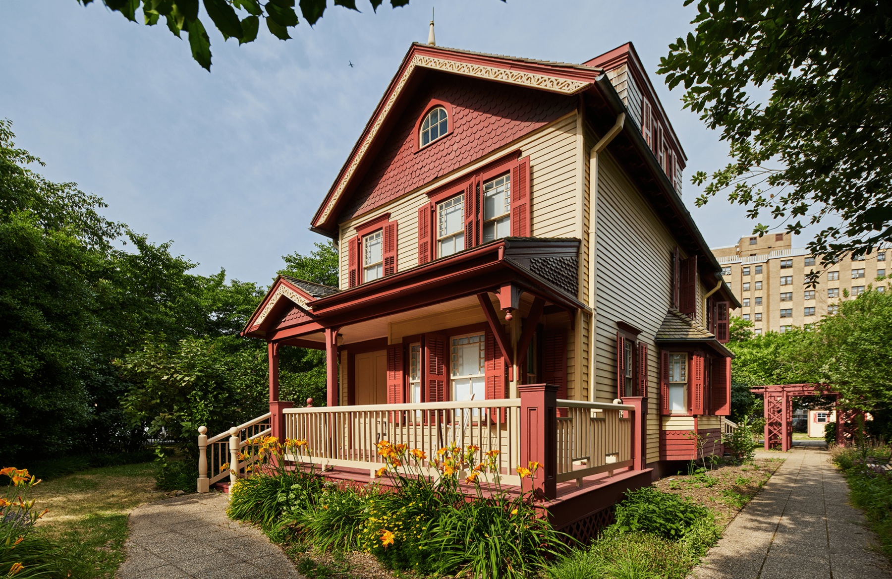
The Lewis Latimer House Museum in Flushing, New York is the very same house that Latimer lived in from 1903 until his passing at the age of 80 in 1928. Threatened with demolition, the house was relocated from Holly Avenue in East Flushing to its present location in 1988. It is now a historic house museum owned by the New York City Department of Parks & Recreation, operated by the Lewis H. Latimer Fund, Inc., and is a member of the Historic House Trust.
We worked closely with Isometric, the lead exhibition designer, to produce four interactive exhibitions through a combination of digital and physical experiences that educate, entertain, and inspire—all rooted in Latimer’s legacy as an mold-breaking inventor of his time.
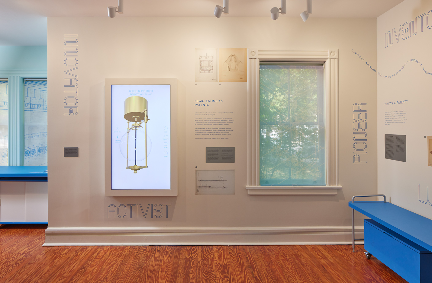
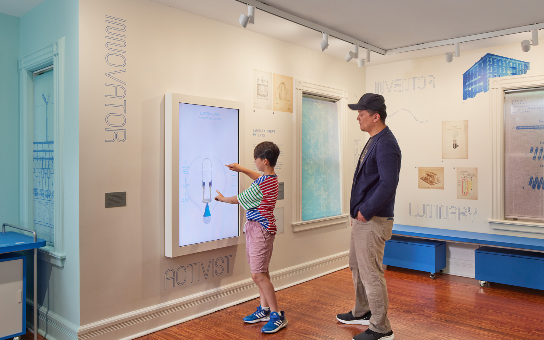
INVENTION MACHINE
Vertical screen displaying inventions Latimer patented, but never built. Oversized blueprints reimagined as 3D objects which brings the inventions to life.
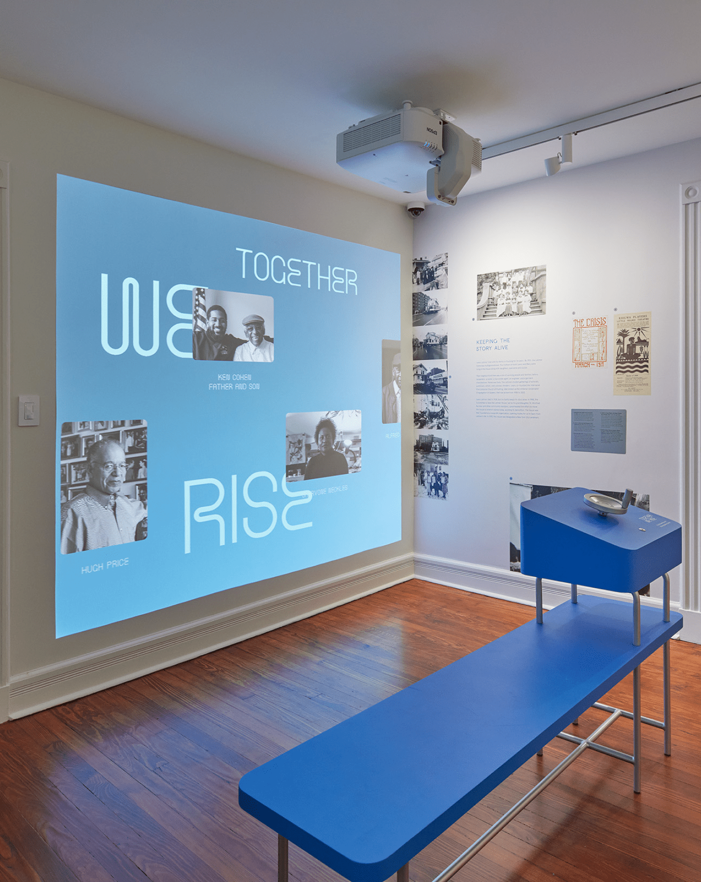
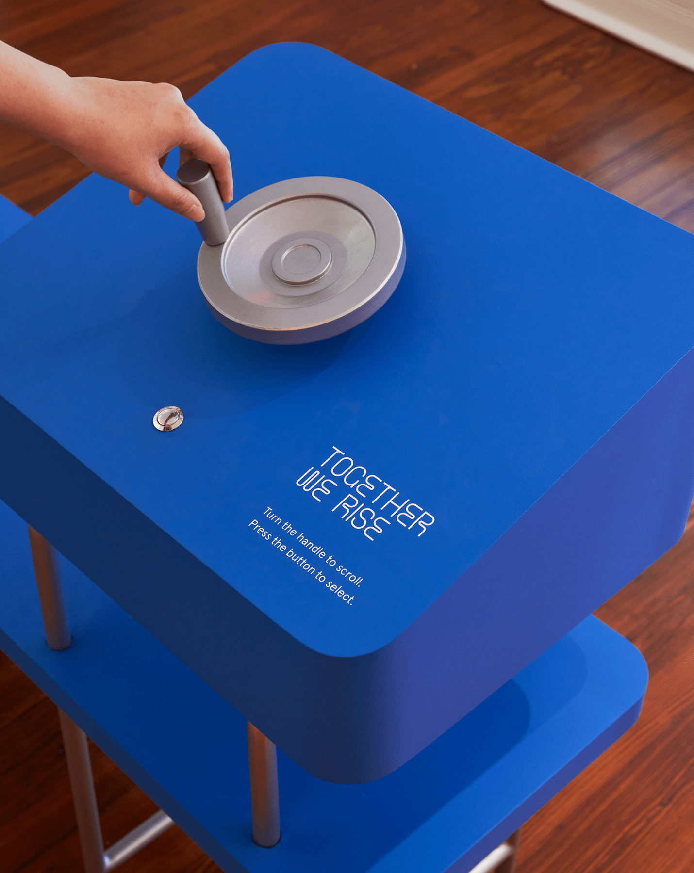
TOGETHER WE RISE
An interactive “family portraits wall” of contributors and leaders integral to Latimer’s legacy. A bench in front of the projection wall holds a hand-crank allowing viewers to navigate to a particular profile by rotating and pressing a physical button.
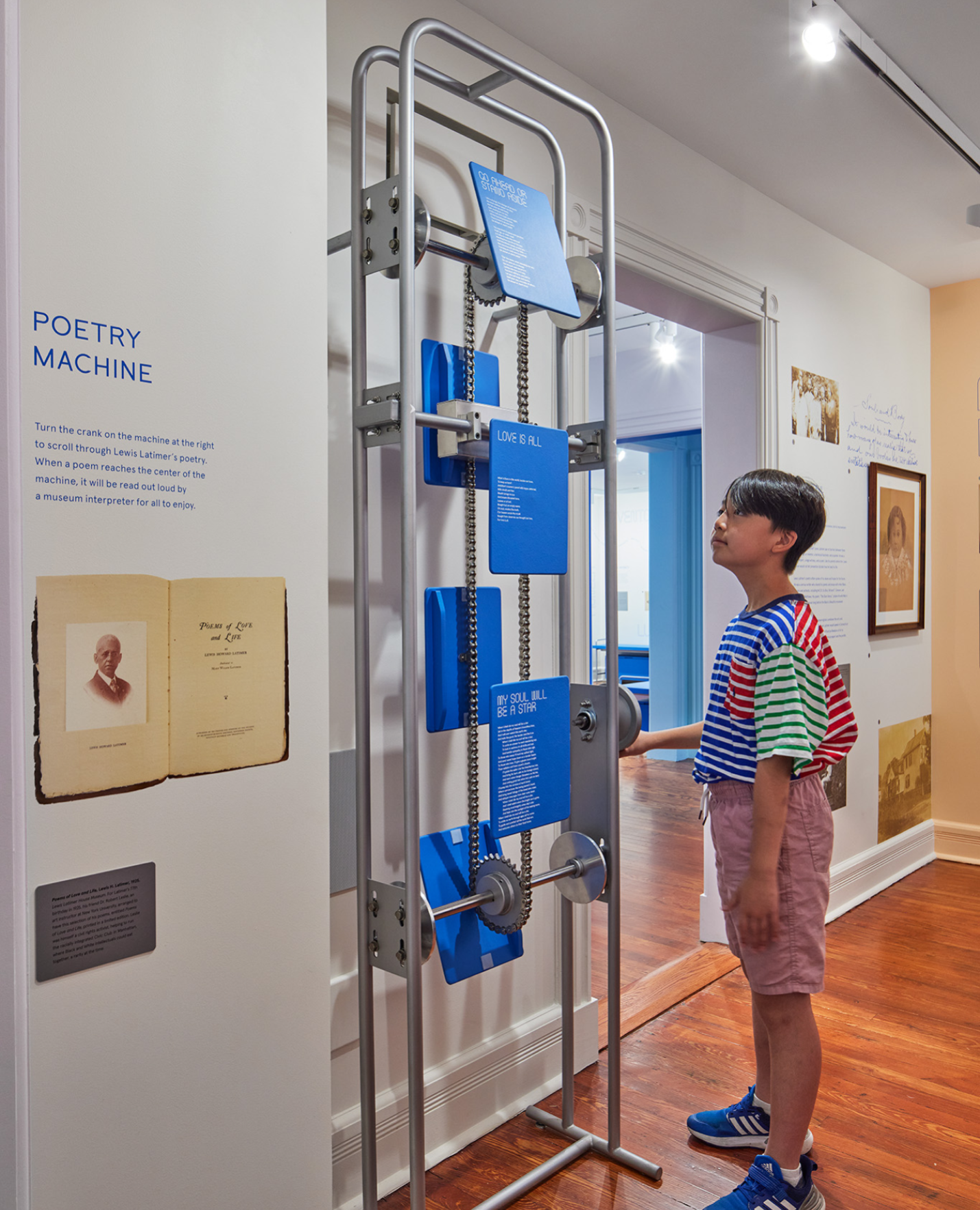
POETRY MACHINE
A skeletal mechanical crank allowing visitors to rotate between panels of Latimer’s poetry. When cranked to the right position, the selected poetry plays audibly, allowing visitors to experience the poetry as an audio-visual sensory experience.
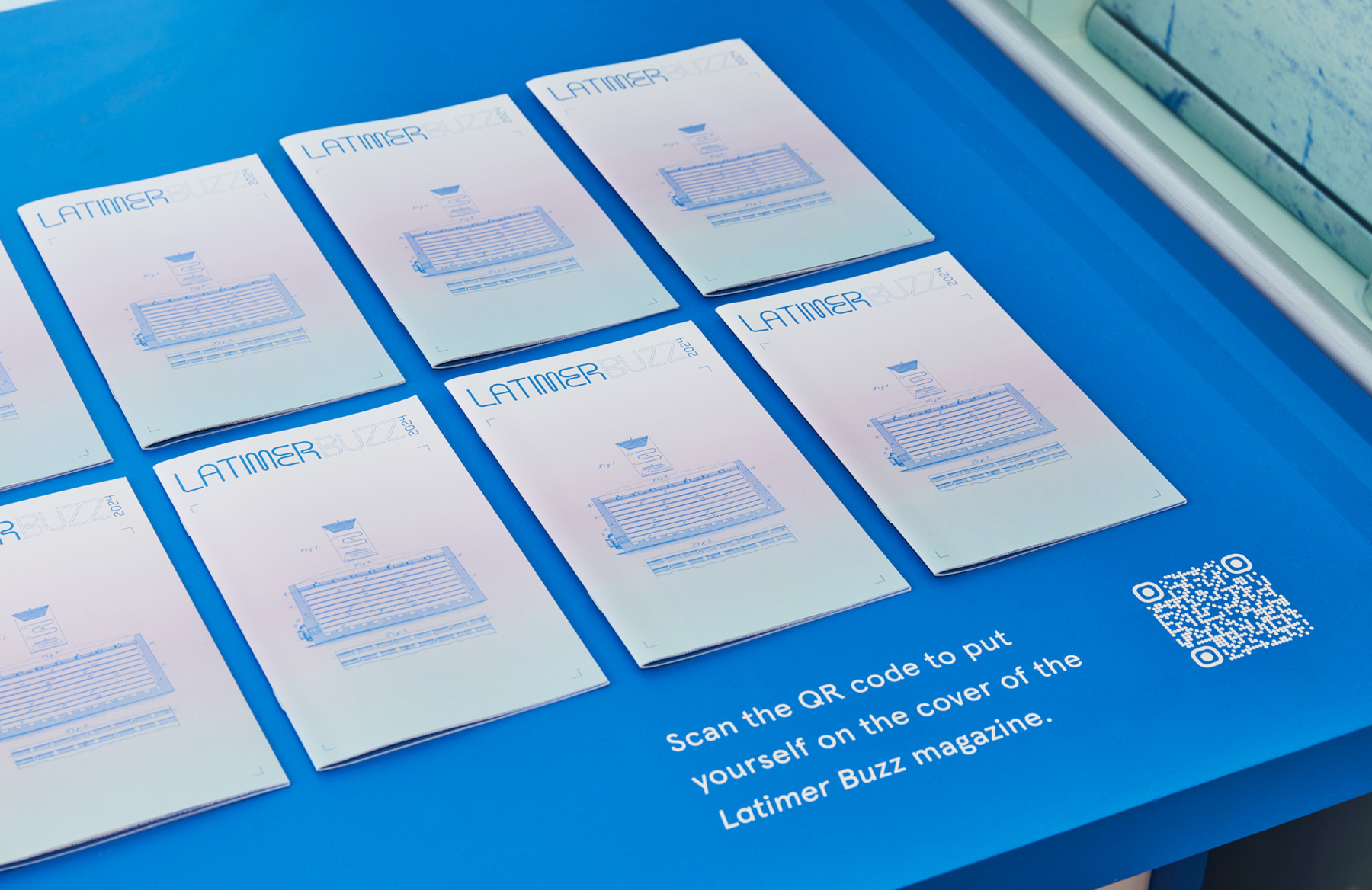
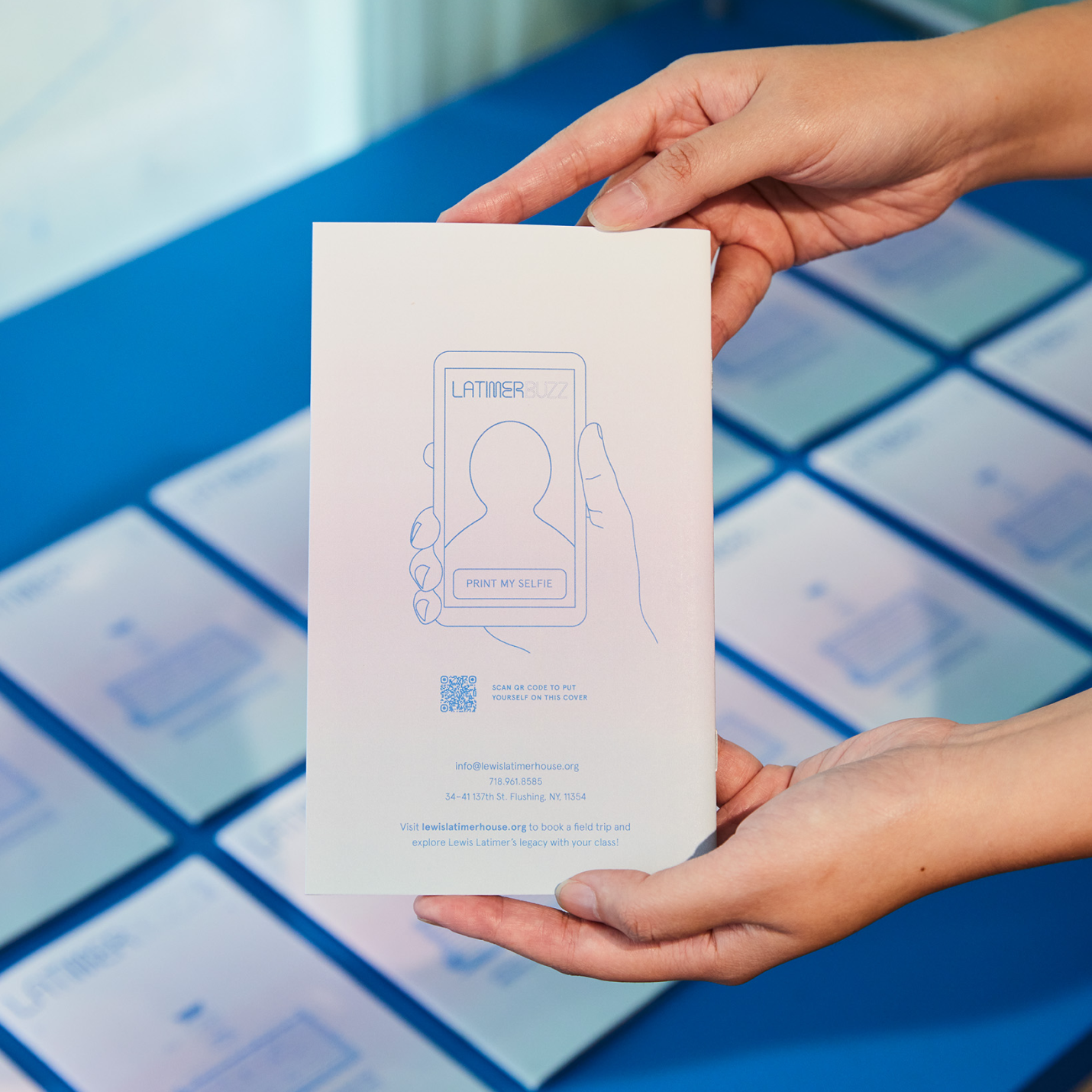
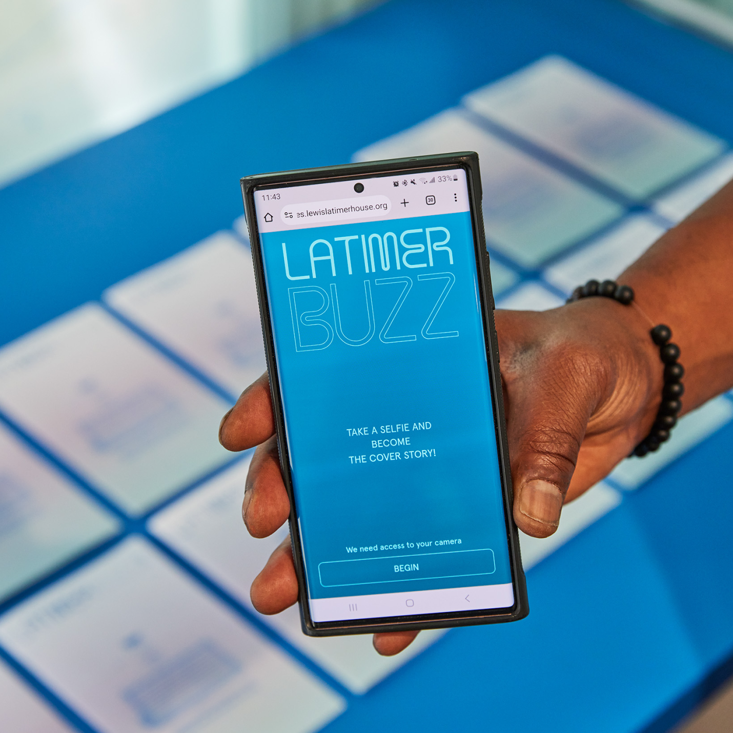
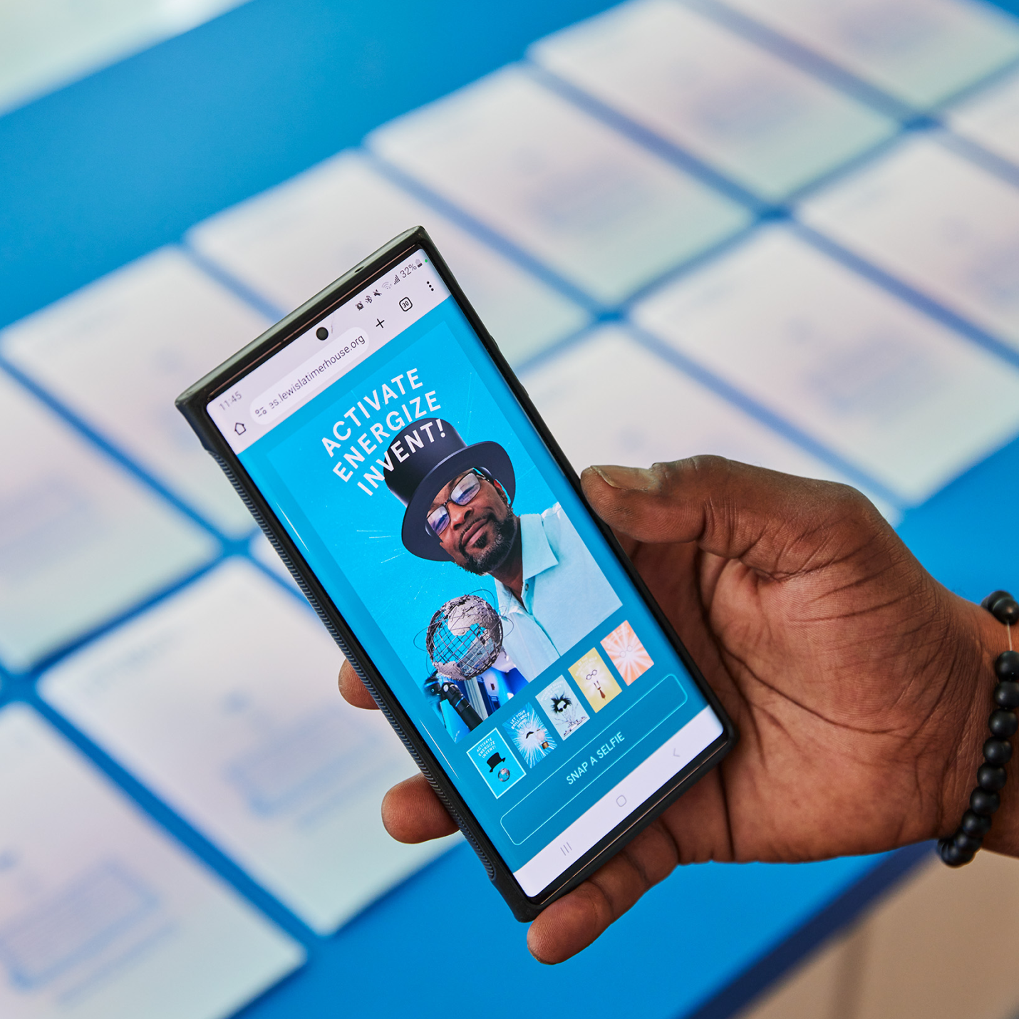
LATIMER BUZZ SELFIE APP
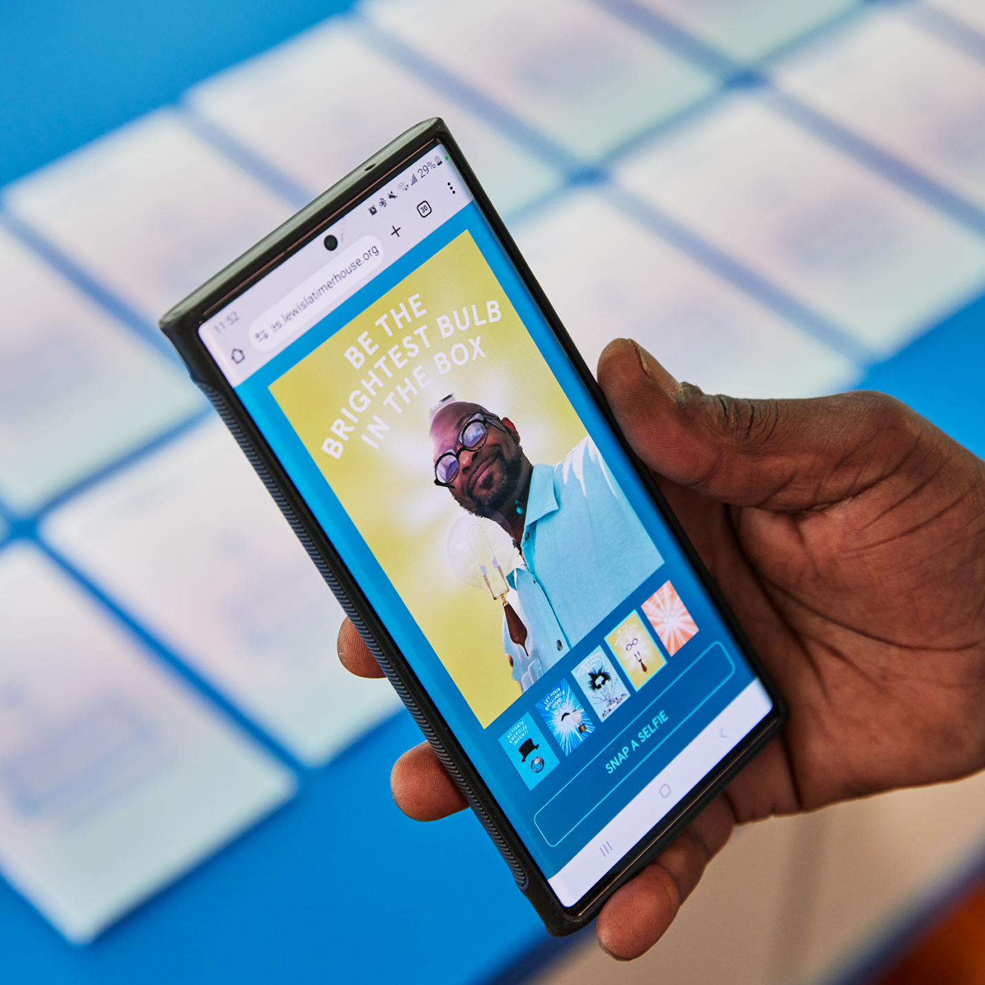
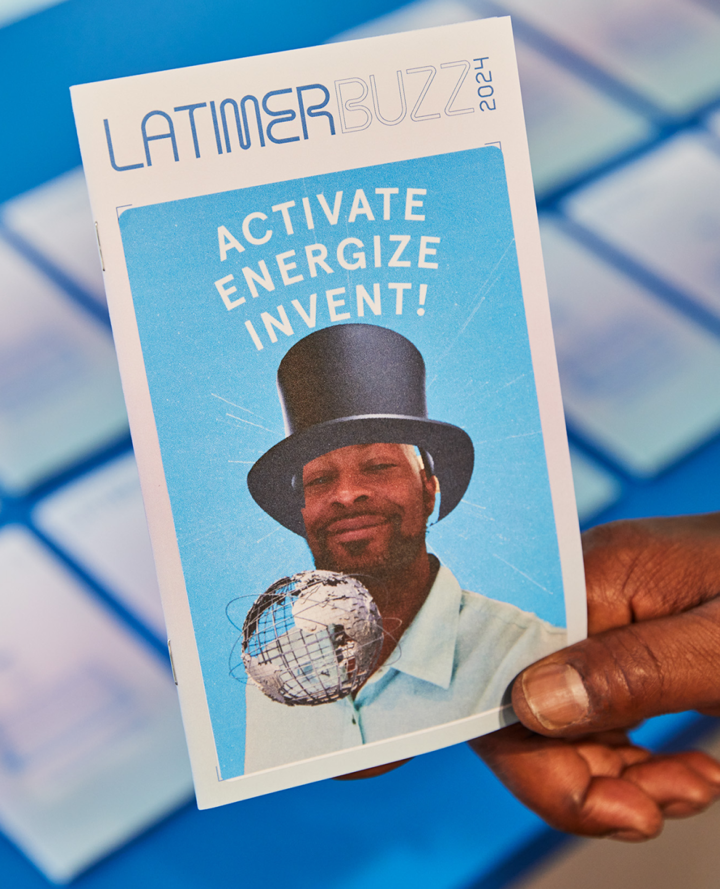
A selfie app that can be loaded directly on visitor’s smart phones using a QR code on the printed Latimer Buzz magazine. Through the app, everyone can take a fun selfie image as the cover of Latimer Buzz magazine, and actually print a physical sticker that can be affixed to the magazine as a keepsake item—a kid-friendly activity and souvenir from a memorable experience.
KUDOS Design Collaboratory
-
John Kudos
Creative Director -
Robert de Saint Phalle
3D Creative Director -
Jess Mackta
Project Manager -
Jamus Marquette
Lead Designer -
Fay Qiu, Owen Febiandi
Designer -
Imam Fadillah
3D Designer -
Chris Manlapid, Arif Widipratomo, Faris Han
Software Developer -
Ed Bear
Engineer -
Levy Murphy
Fabricator -
Electrosonic
A/V Consultant
Isometric
- Lead Exhibition Design

Black Homeownership Project
Center for NYC Neighborhoods
Capabilities
Focus Area
Client
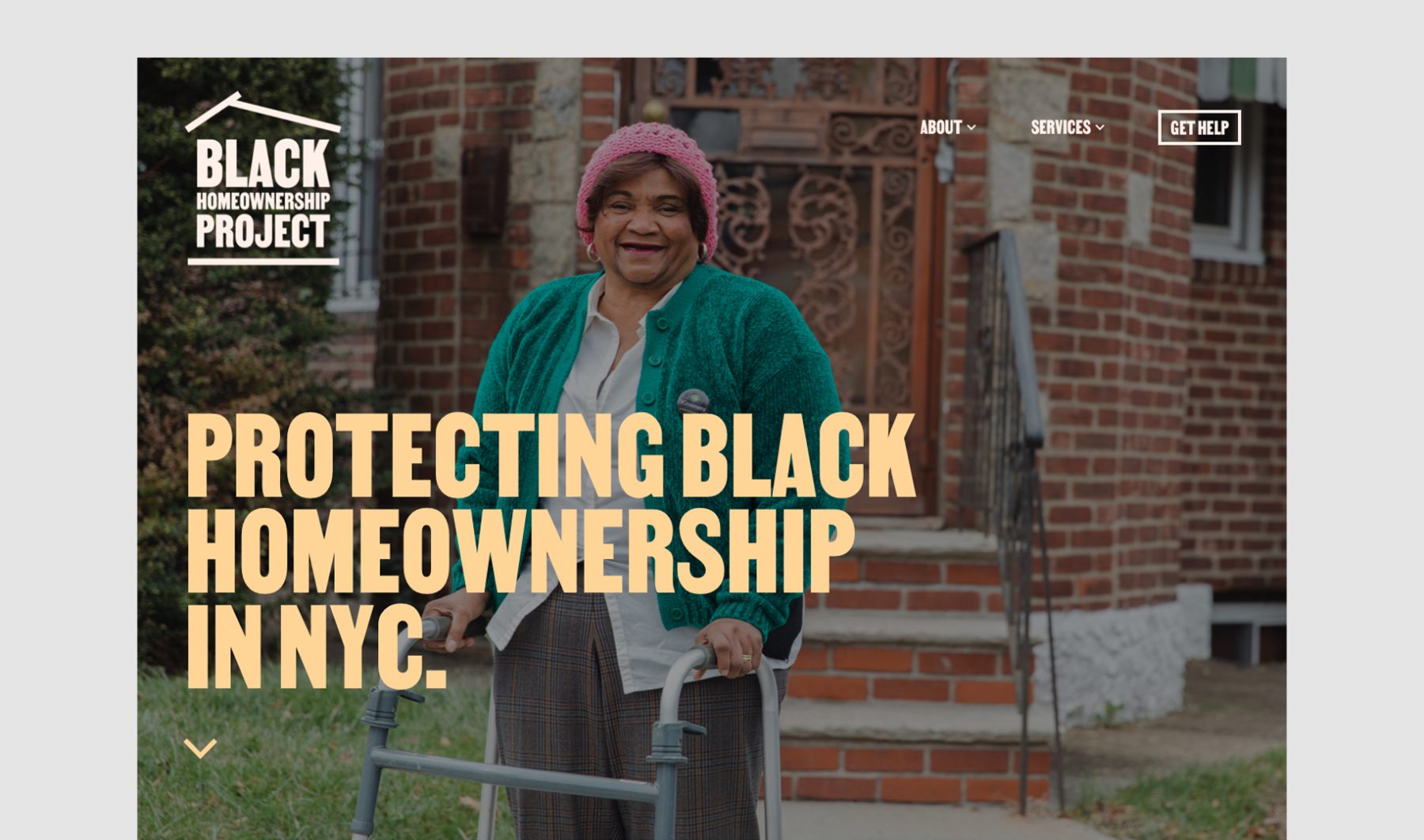
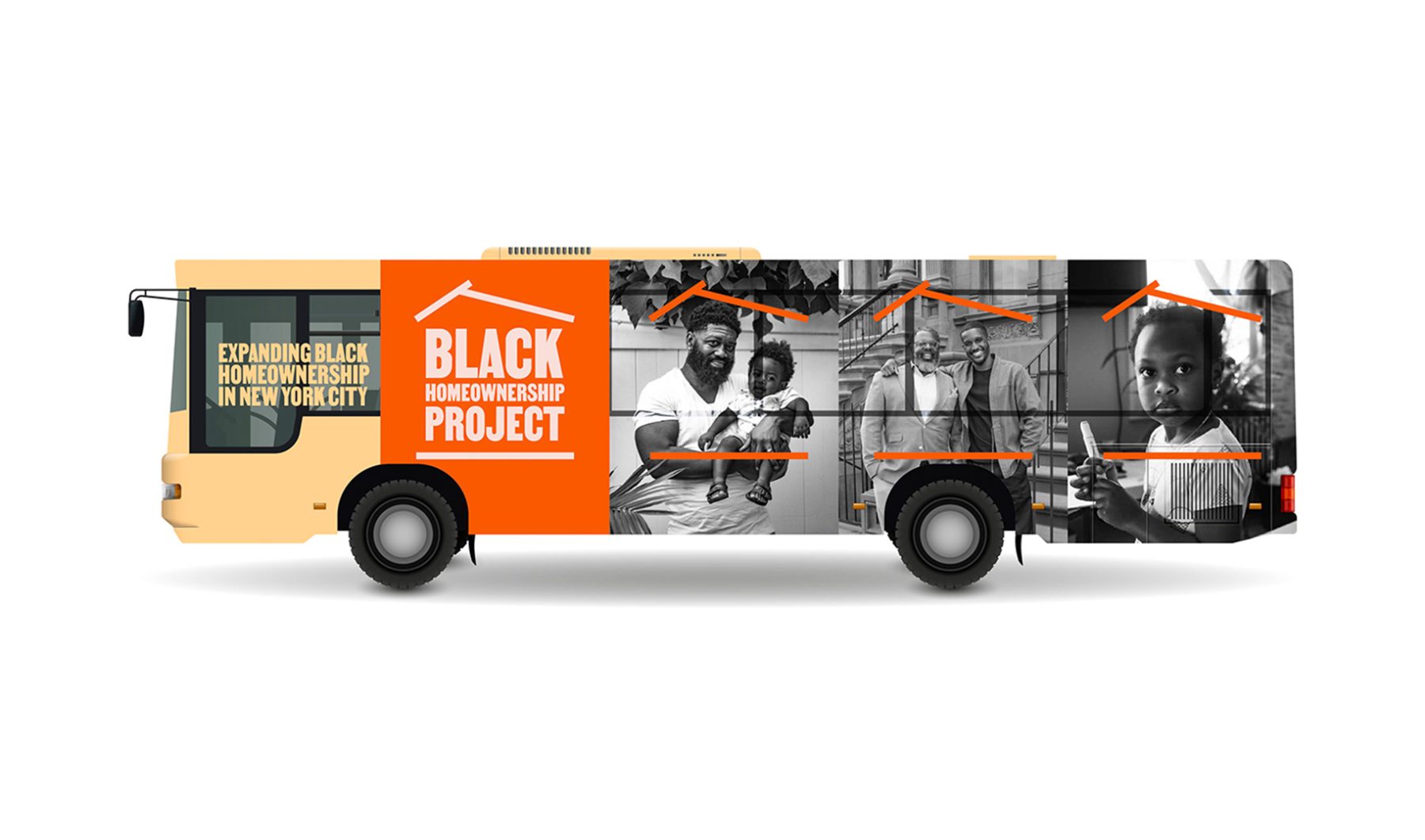
The Black Homeownership Project aims to expand and protect Black homeownership in NYC by connecting Black homeowners with expert local-housing counseling organizations and legal-services providers at no cost.
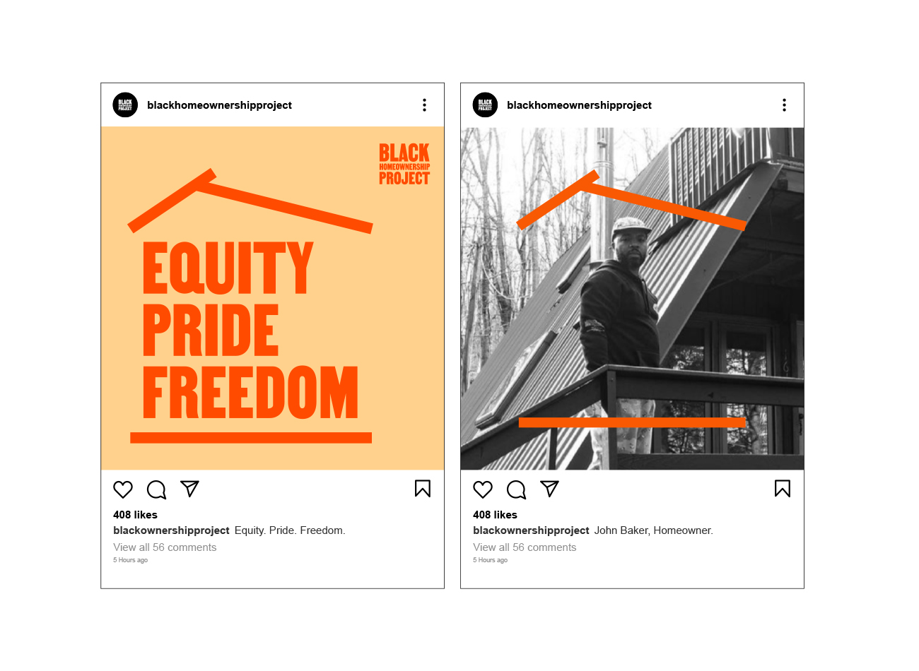
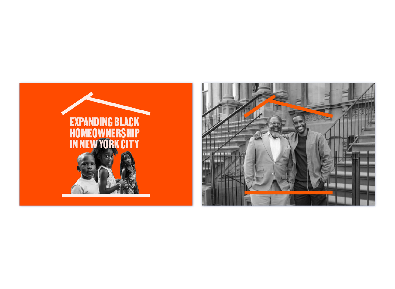
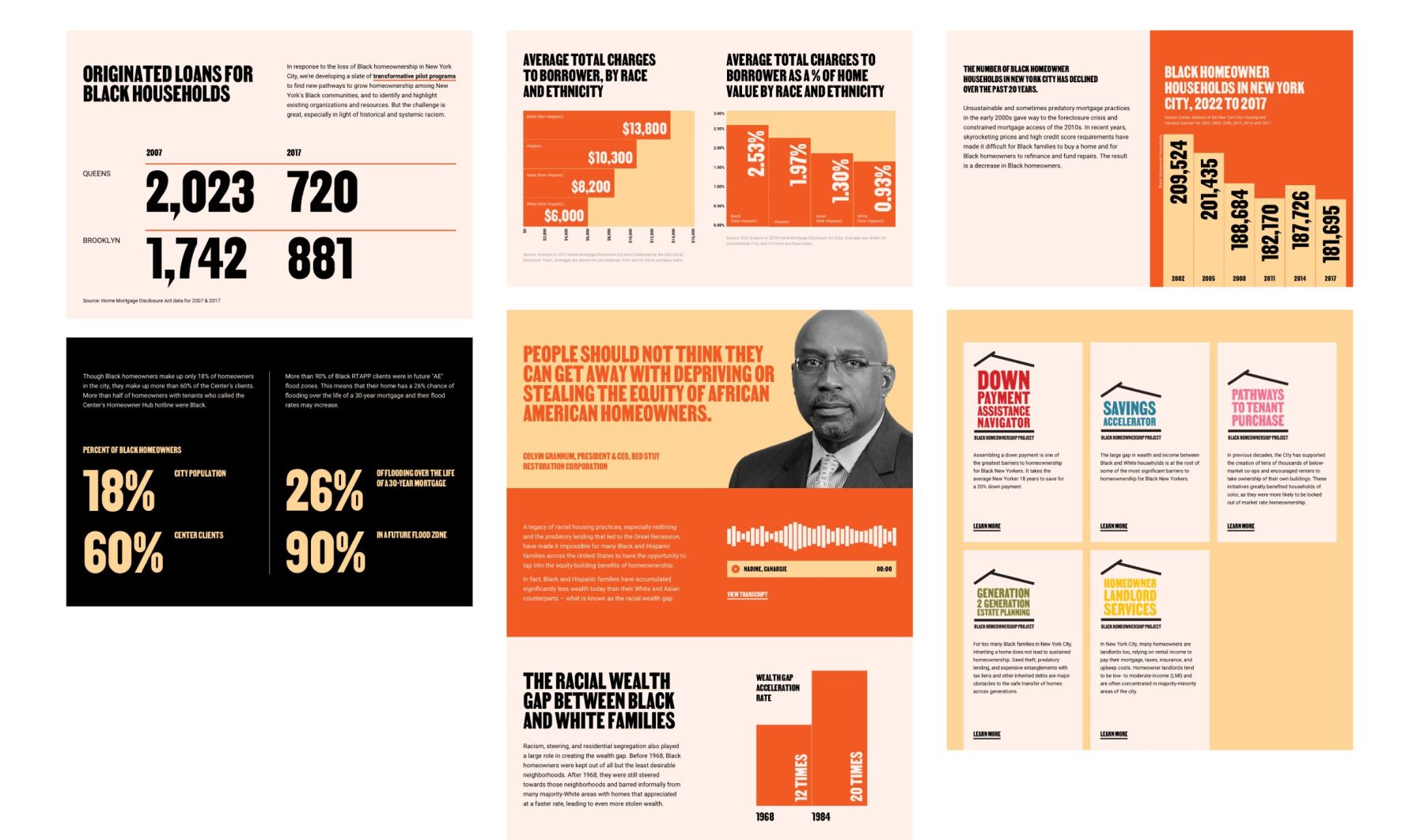
Our branding and website design aimed to embody the project’s mission of expanding access to homeownership opportunities for Black communities. The logo, featuring a rooftop graphic housing the logotype, symbolizes the initiative’s commitment to providing more homes for Black individuals. With a vibrant orange palette and a visual language characterized by simplicity, approachability, and trustworthiness, the branding reflects the project’s values of empowerment and innovation, resonating with a diverse audience and inspiring aspirations for homeownership.
KUDOS Design Collaboratory
-
John Kudos
Creative Director -
Fay Qiu
Designer -
Owen Febiandi
Designer -
Putu Yogiswara
Designer -
Amanda Knott
Project Manager

Community Wellbeing Index 2023
Datahaven
Capabilities
Focus Area
Client
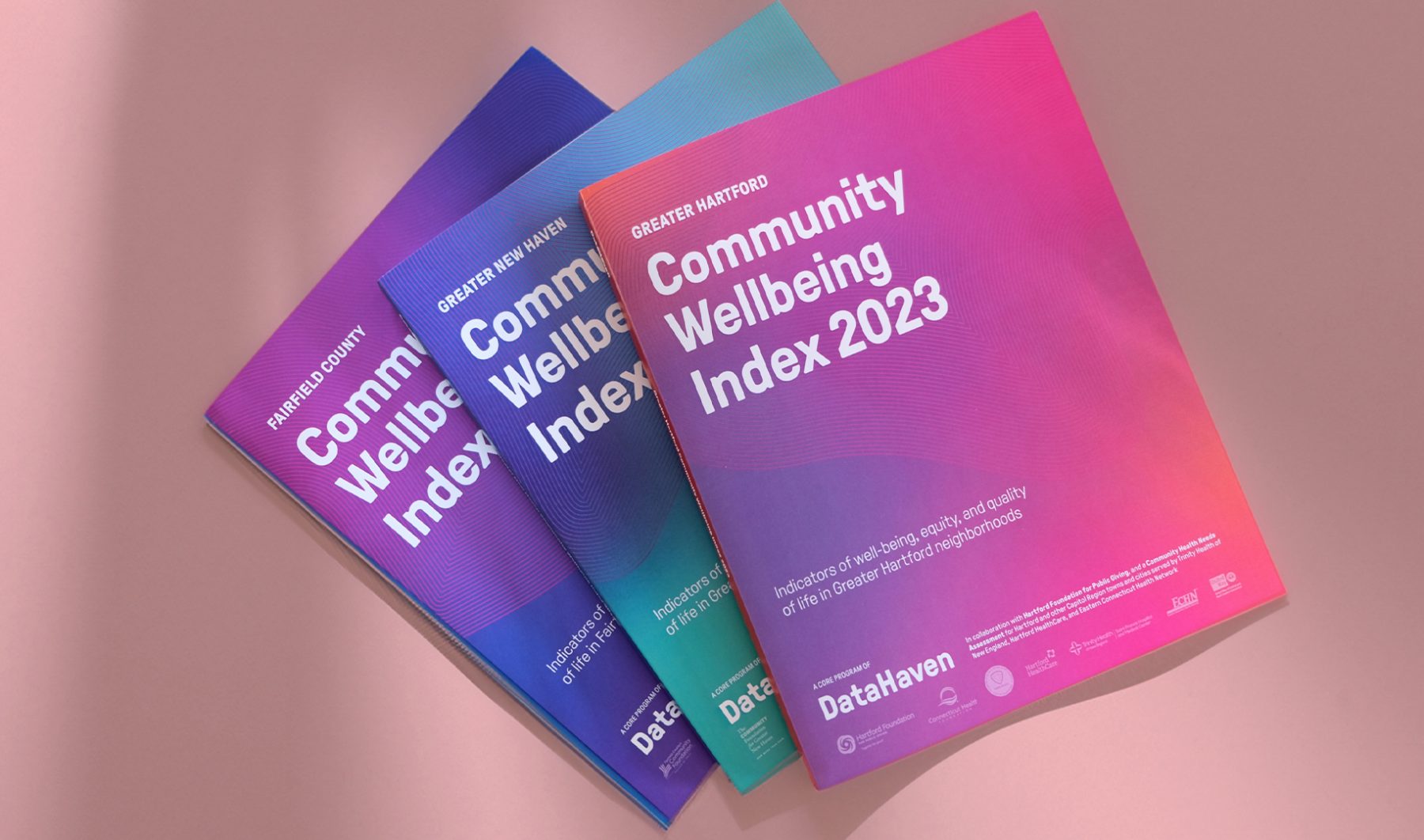
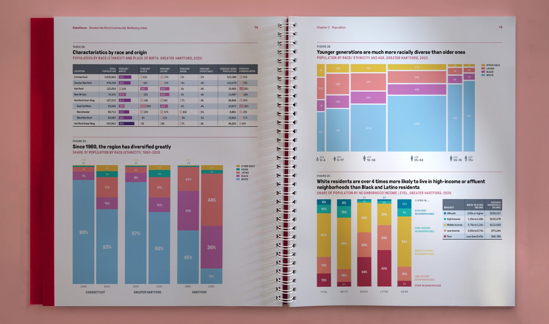
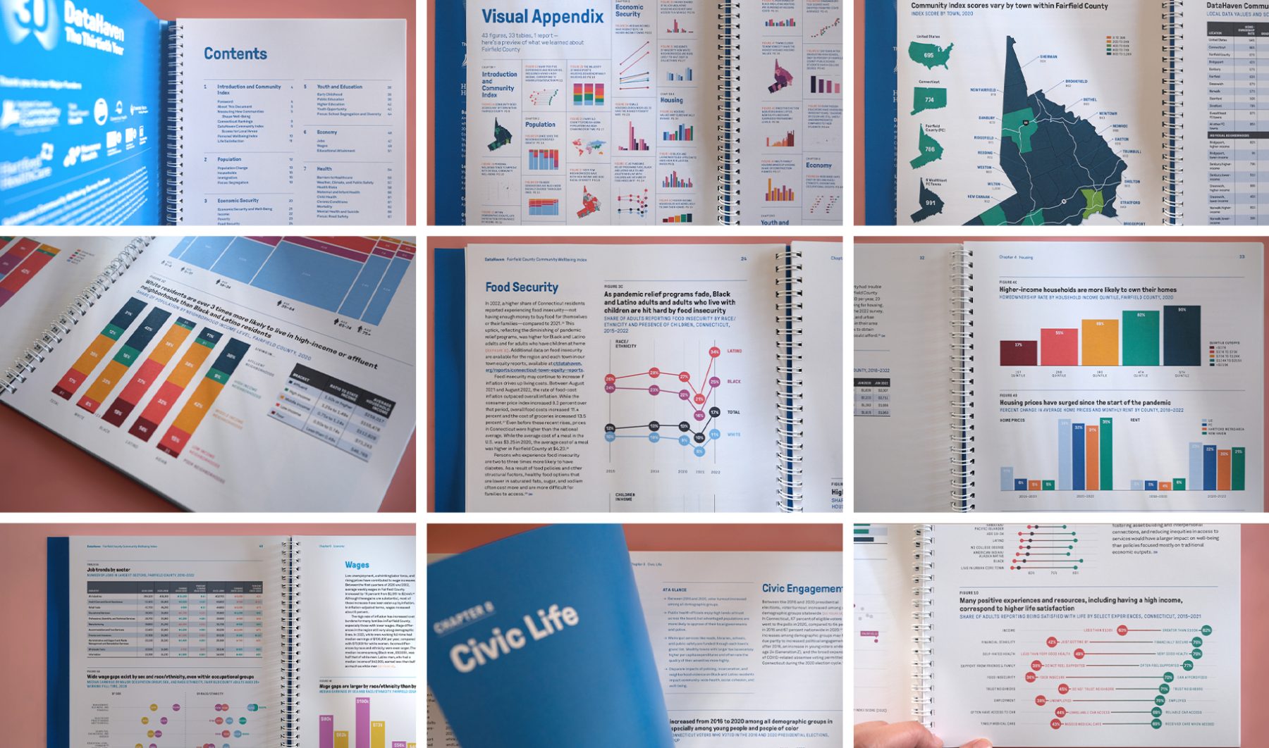
DataHaven’s Community Wellbeing Index is a report focusing on wellbeing, equity, and quality of life in Greater New Haven, Fairfield County, and Greater Hartford, Connecticut.
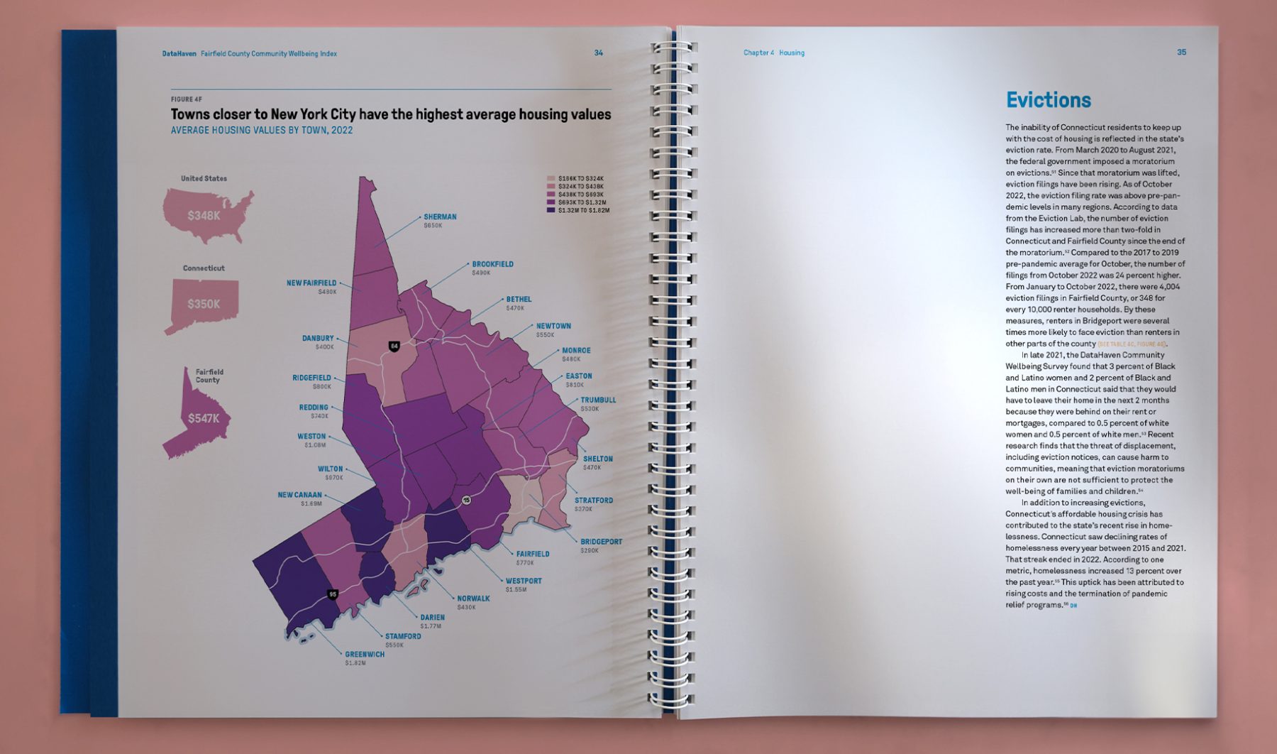
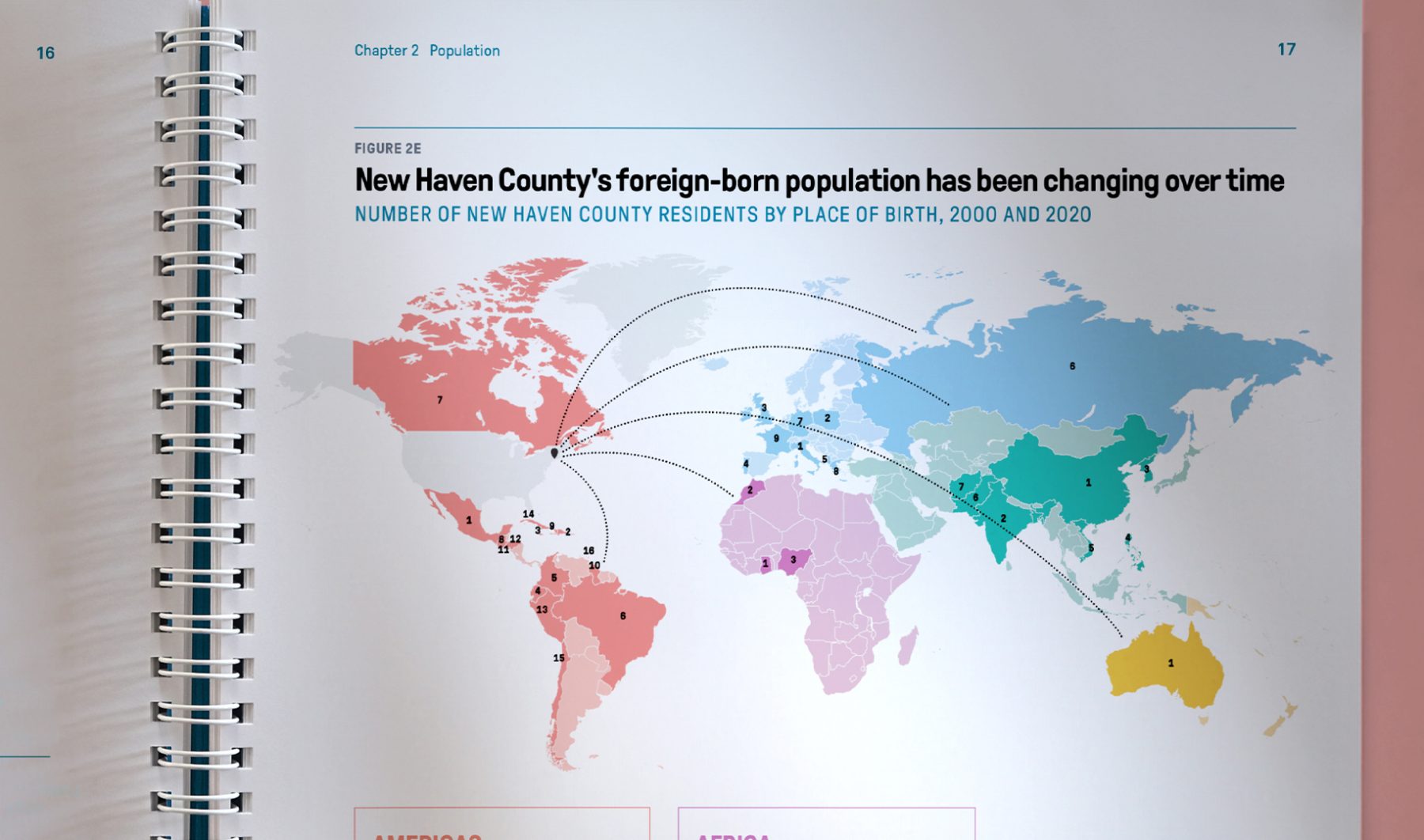
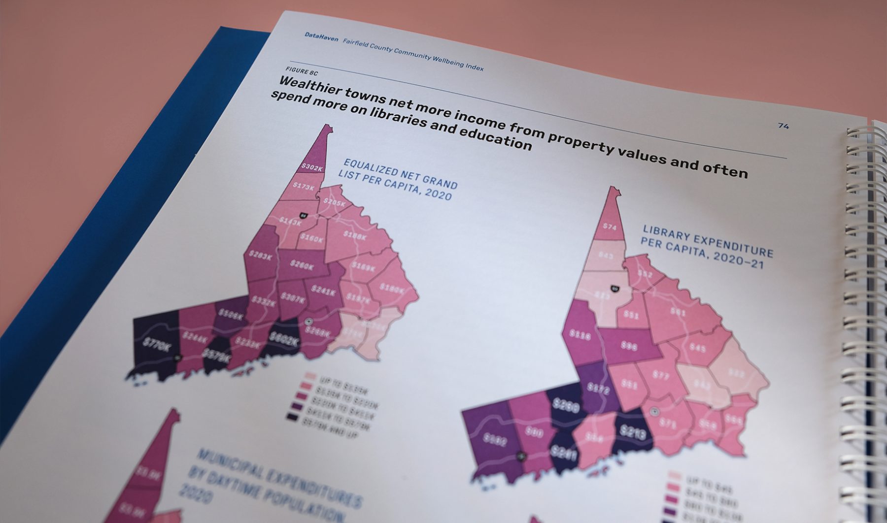
For this project, we were tasked with the design of variant cover concepts and interior layouts for three reports presenting the latest data around these three topics for New Haven. Designed elements including cover design, layout, pagination, visualizations (tables, maps, icons, and infographics), and print mechanicals, as well as distinct color palettes for the visual identities of the three reports.
KUDOS Design Collaboratory
-
Creative Director
John Kudos -
Art Director
Ashley Wu -
Lead Designer
Jamus Marquette -
Designer
Fay Qiu -
Project Manager
Amanda Knott
Downtown Brooklyn Partnership Website
Downtown Brooklyn Partnership
Capabilities
Focus Area
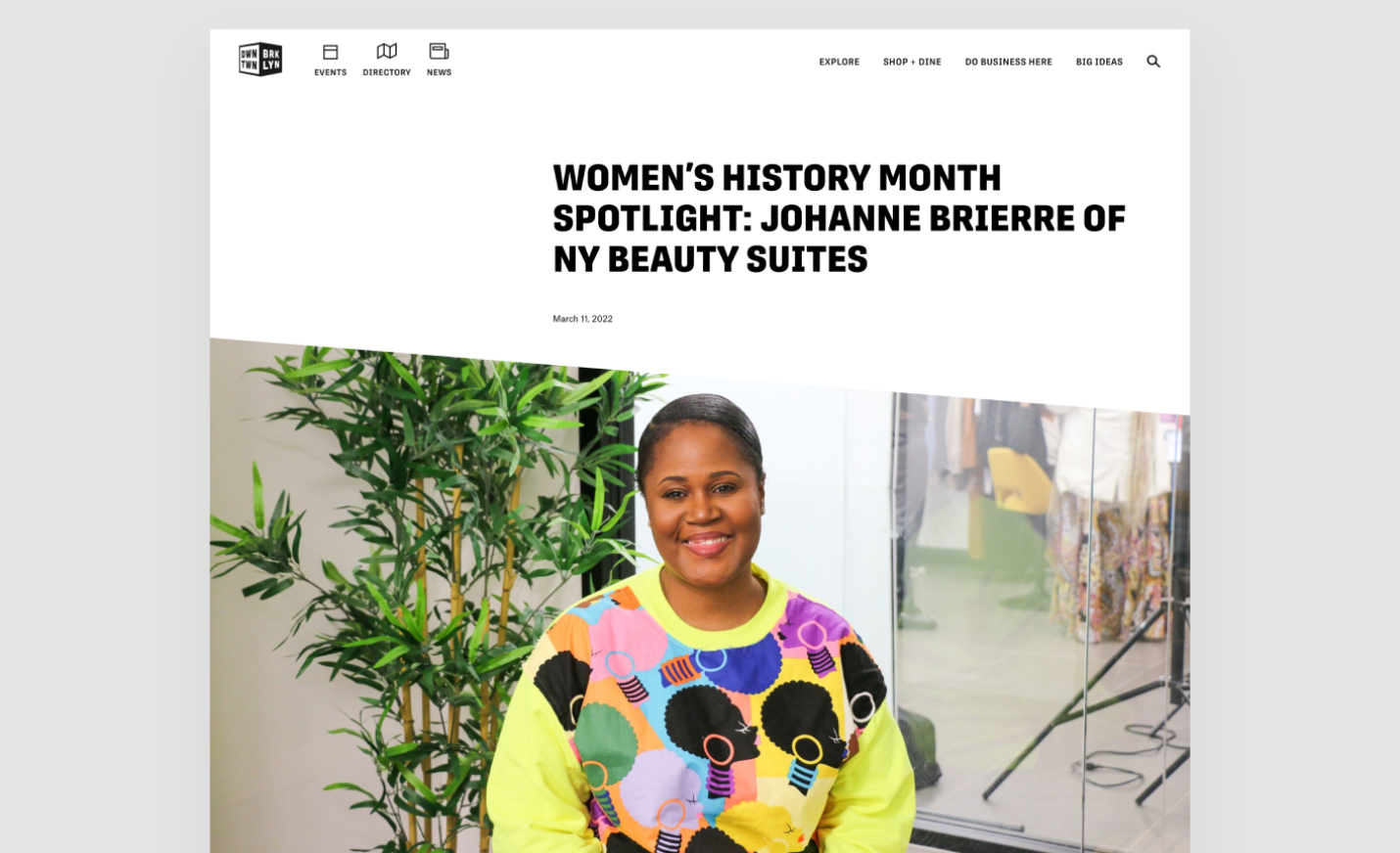
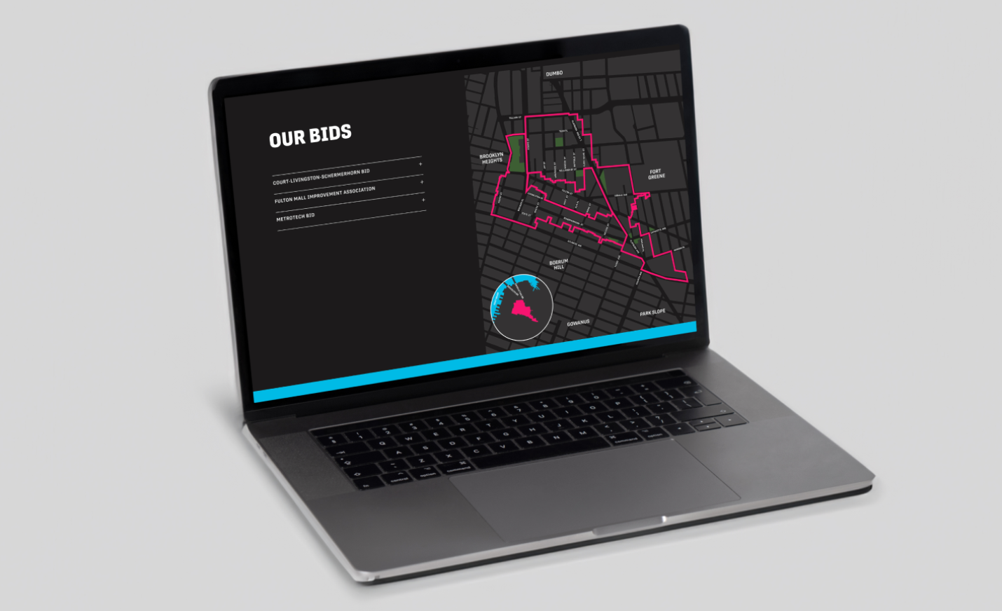
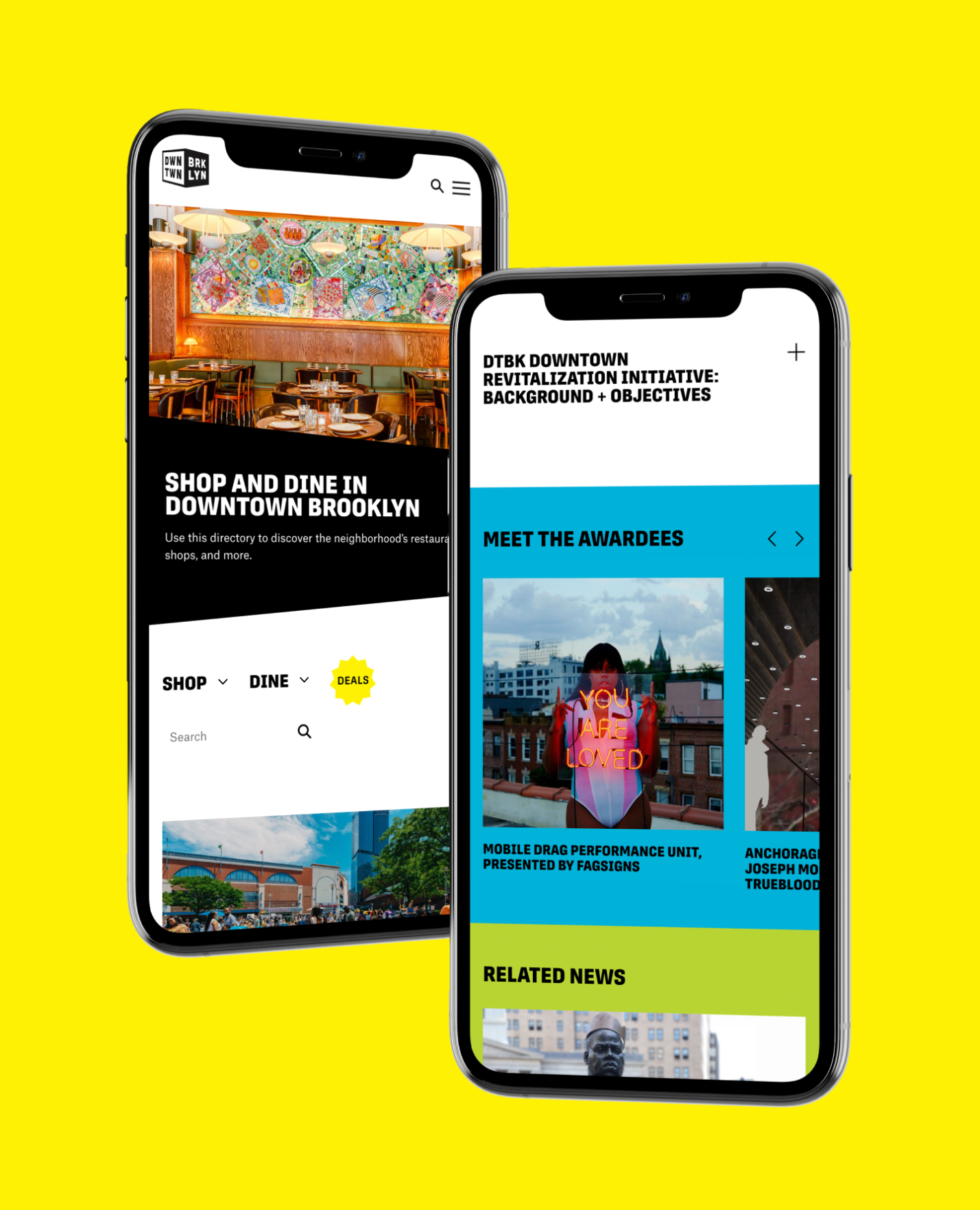
The Downtown Brooklyn Partnership is a not-for-profit local development corporation that manages the three Business Improvement Districts (BIDs) that make up Downtown Brooklyn, promoting the area as a world-class business, cultural, educational, residential, and retail destination. KUDOS was tasked with designing and implementing a new website for the organization.
Addressing the challenge of attracting new visitors, promoting local businesses, and providing easy content-management functionality for staff, we used WordPress CMS to create a visually engaging, welcoming, and accessible design, optimized for mobile devices and web browsers. We retained and improved specific features and integrations from the previous website—including a dynamic home page, interactive maps, clear real-estate presentations, and events calendar, a blog page, and easy-to-access video content from platforms like YouTube and Vimeo—and integrated social media platforms and an improved navigation function for an enhanced user experience.
View downtownbrooklyn.com
KUDOS Design Collaboratory
-
John Kudos
Creative Director -
Jess Mackta
Project Manager -
Jamus Marquette, Owen Febiandi
Designers -
Chris Manlapid, Arif Widipratomo
Web Developer
Made in Japan
Poster House
Capabilities
Focus Area
Client
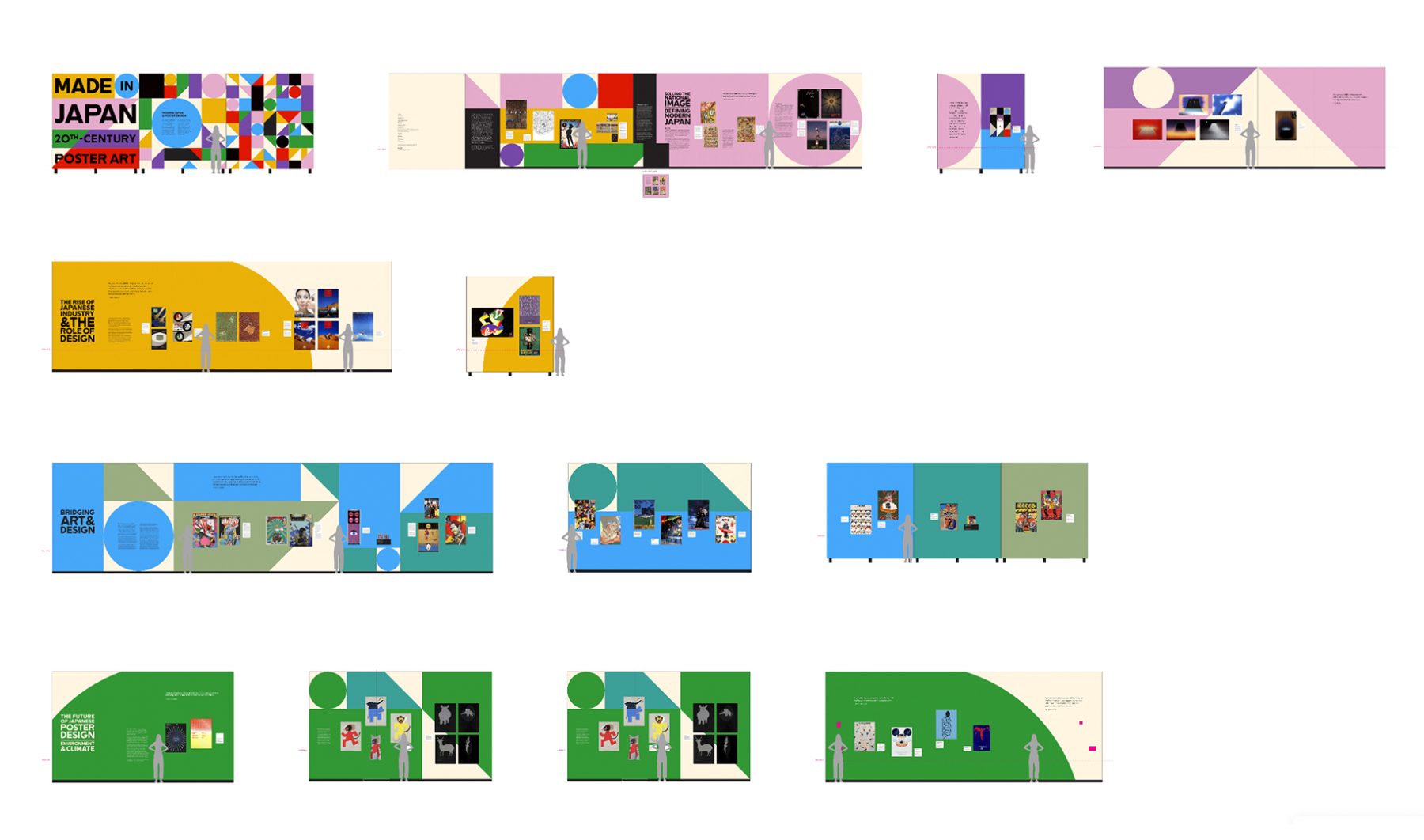
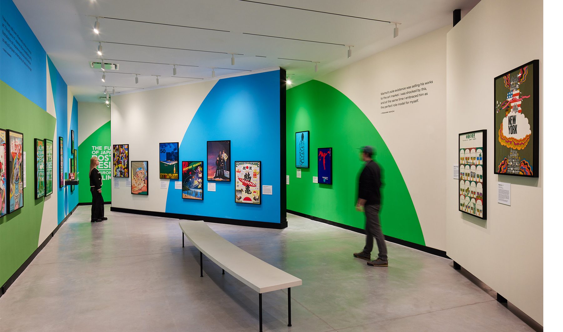
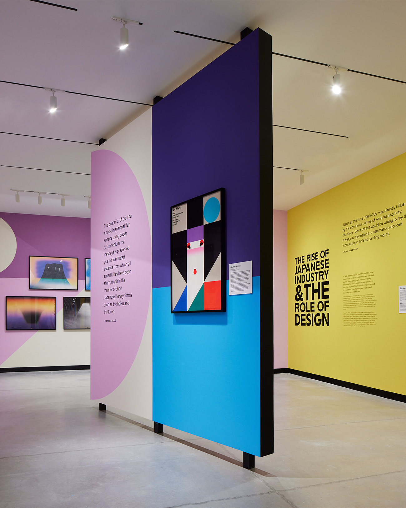
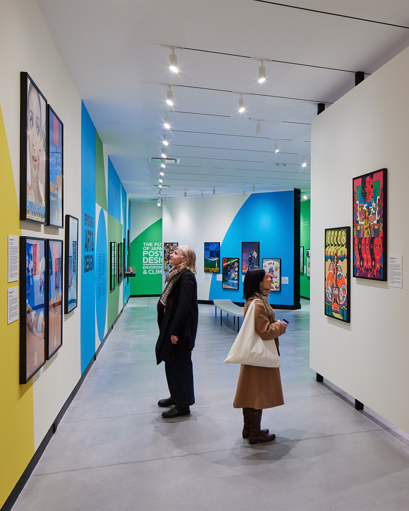
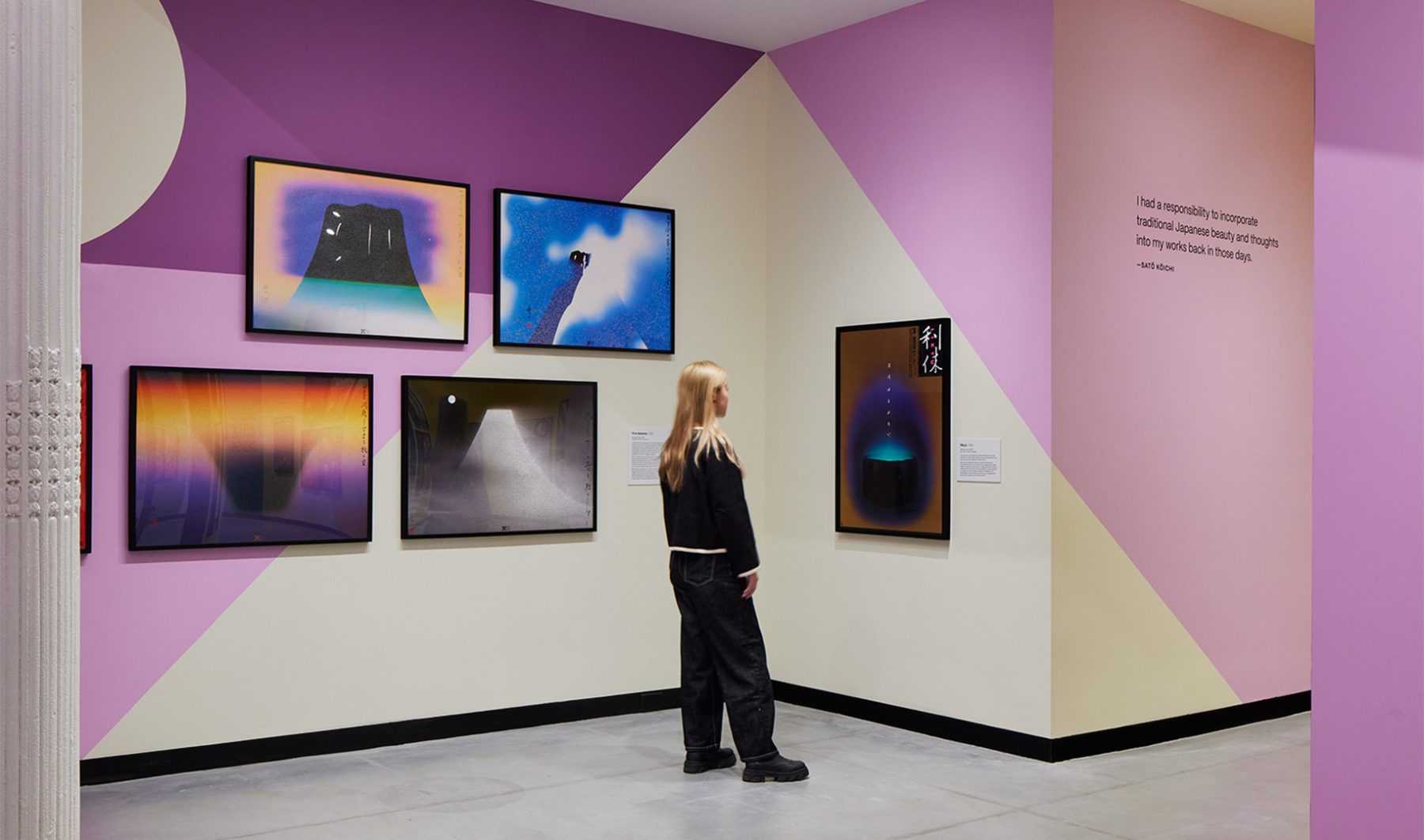
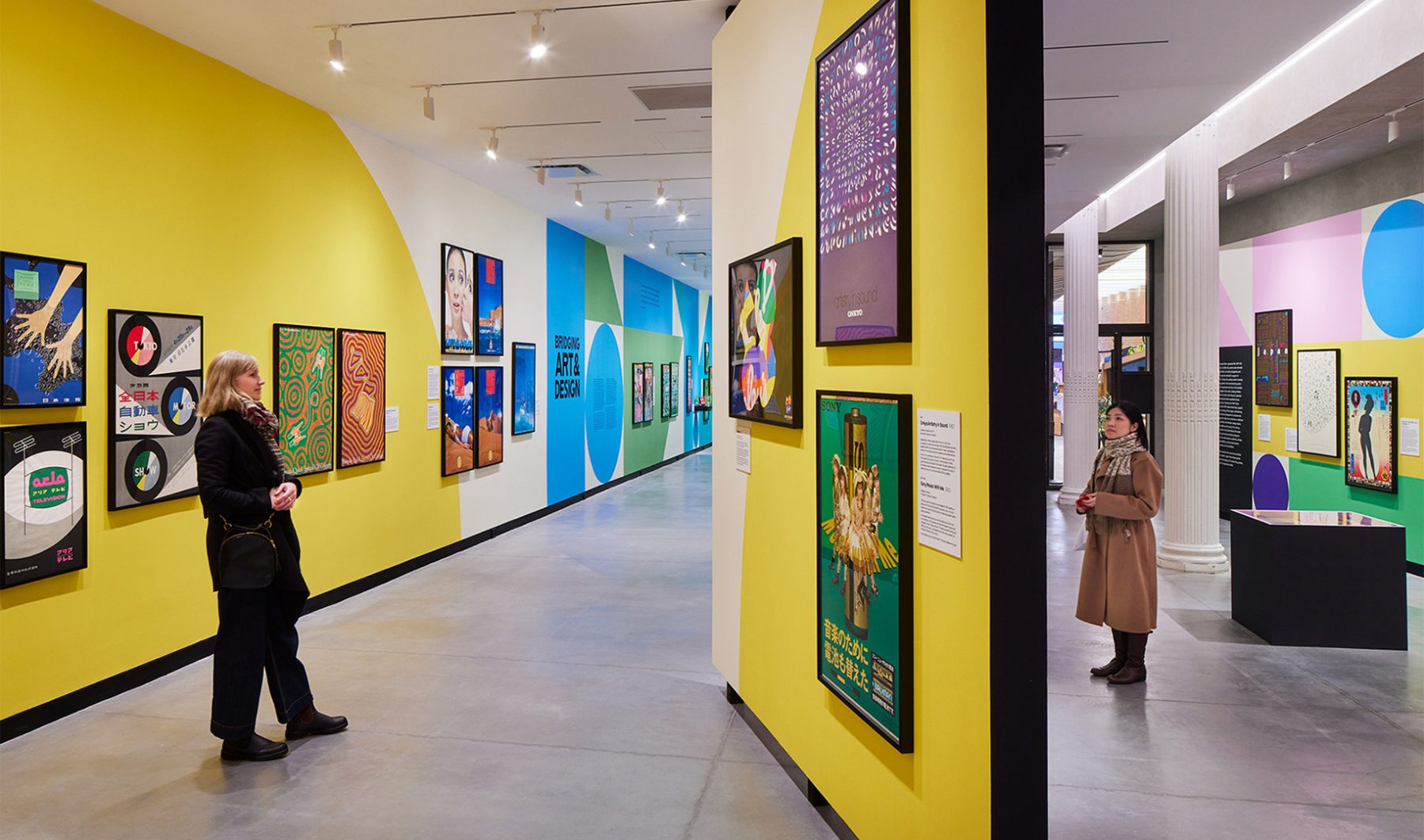
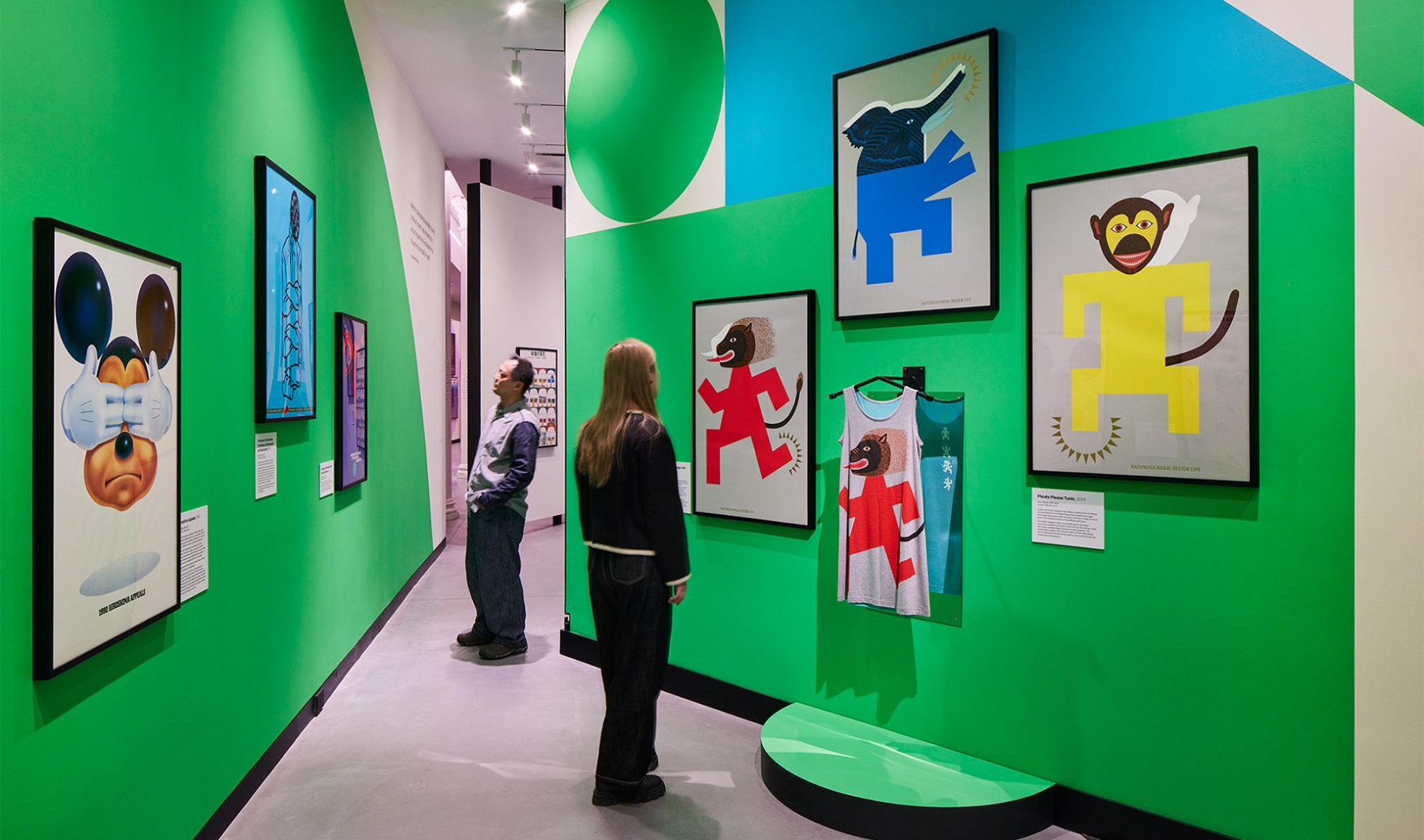
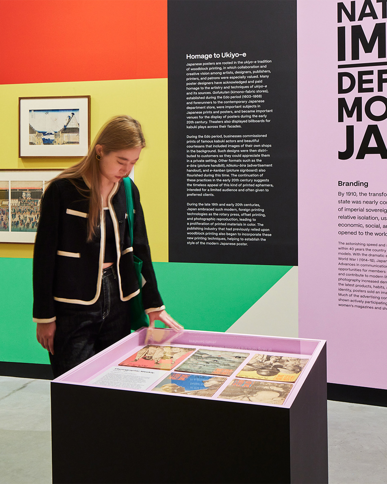
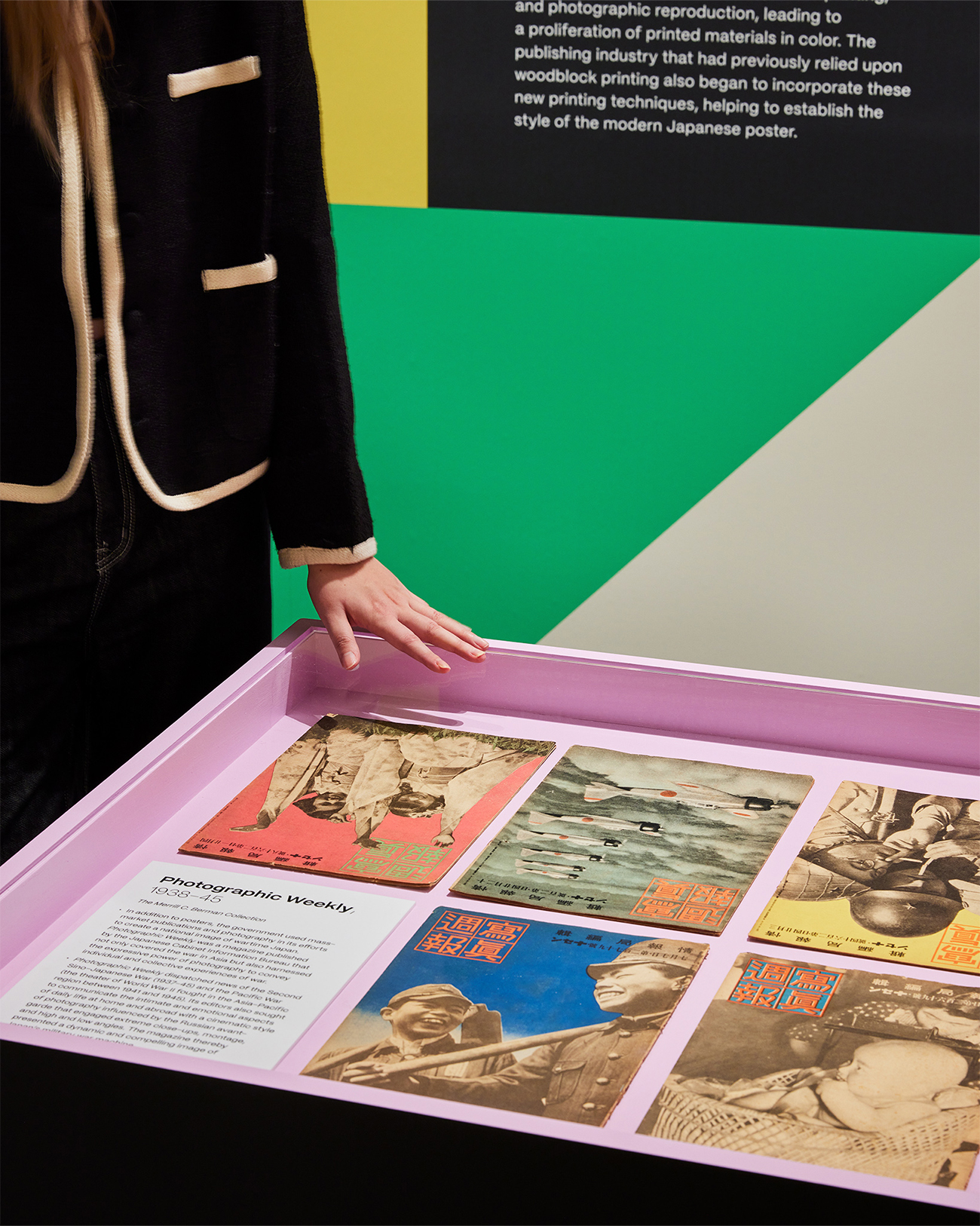
“Made in Japan” was an immersive visual journey through Japan’s golden age of graphic design, told through posters. Curated works from the Merrill C. Berman Collection ran the gamut from century-old to recent design.
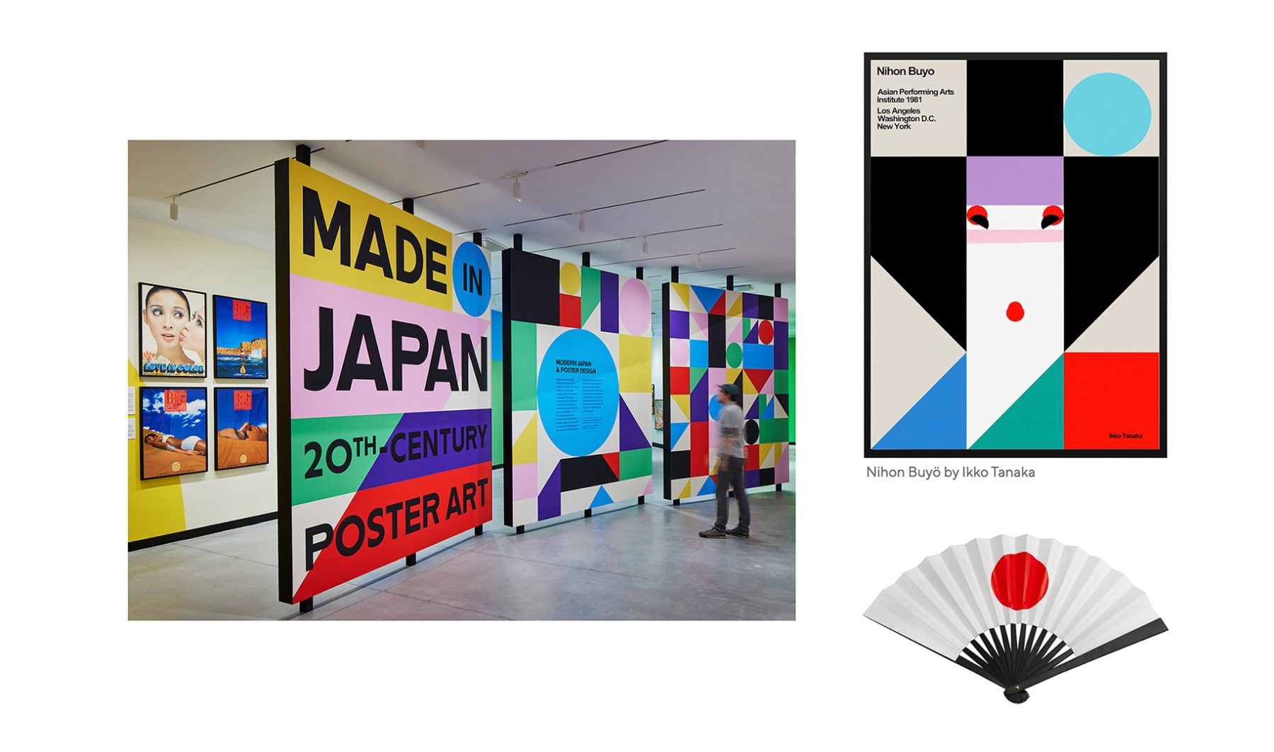
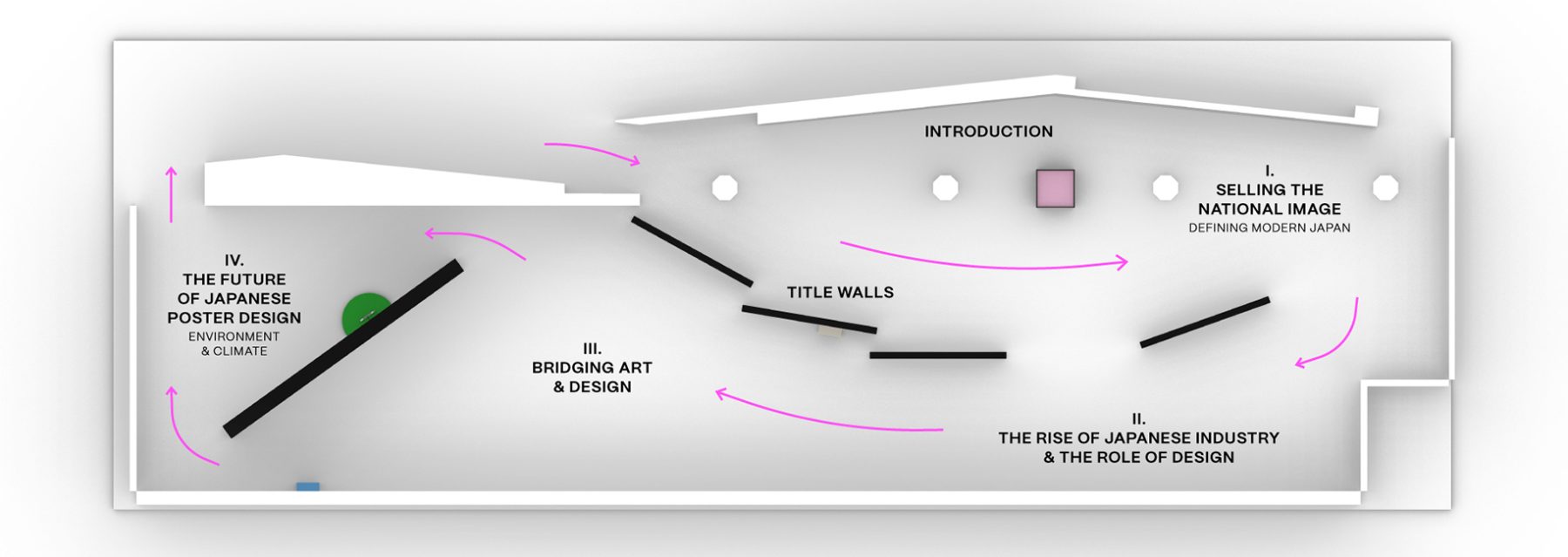
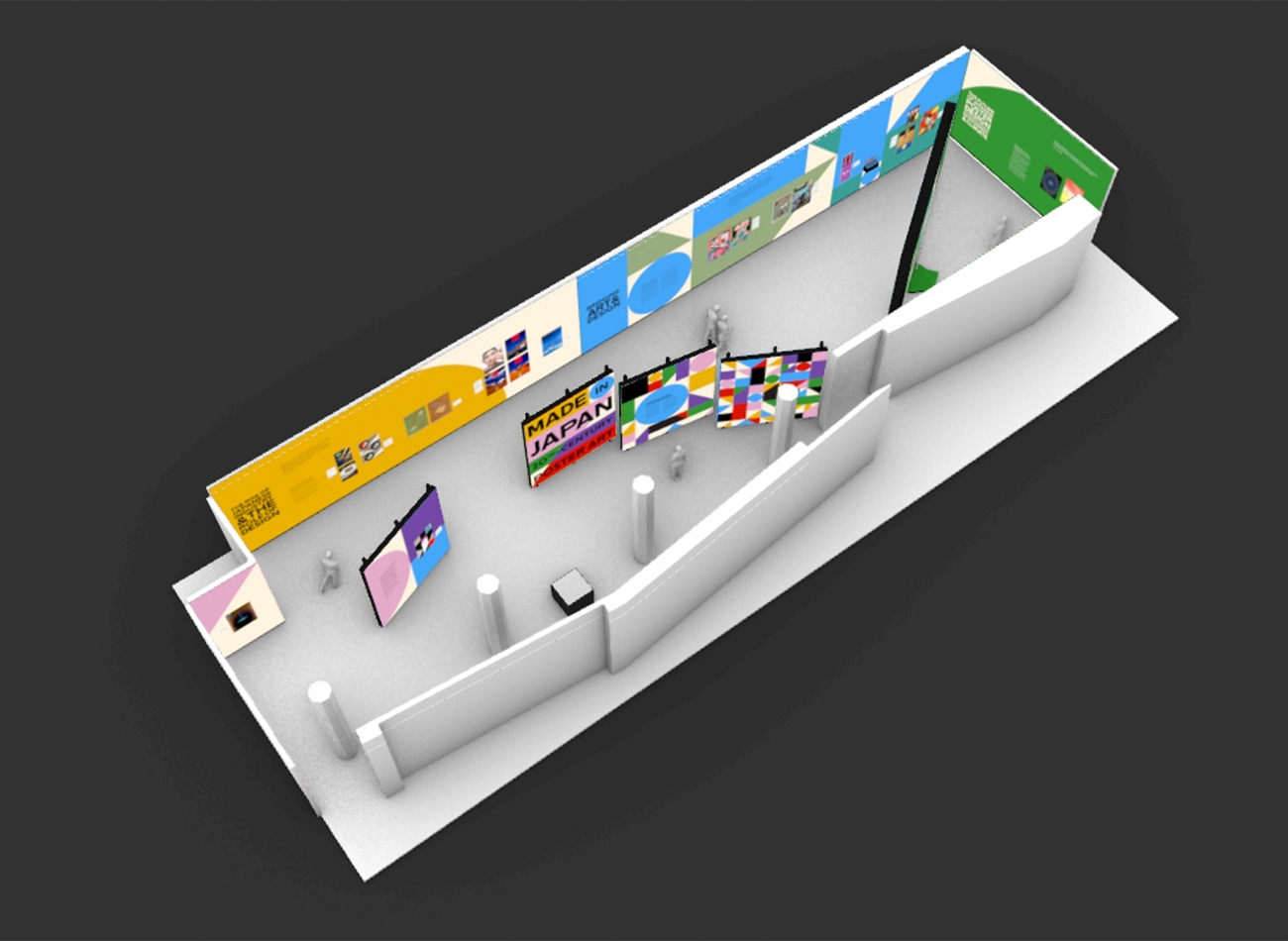
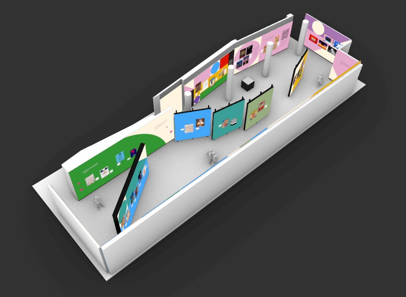
Our exhibition design for Poster House took inspiration from geometric shapes found in Nihon Buyö, a poster designed by Ikko Tanaka, a godfather figure in Japanese graphic design history. A triptych of oversized title walls unfurled like a Japanese folding fan to greet visitors at the entrance and create a permeable exhibit space to carry them seamlessly through the exhibit timeline.
We wanted an immersive motif to accentuate the posters and create a visual through-line for all the posters designed in the last century.
We chose color hues to serve as thematic backdrops for each section of the gallery. These vividly colorful shapes started small but quickly became larger as one progressed through the exhibit, finally becoming larger than the gallery walls.
Oversized typography—inspired by lettering found on the ships that brought Japanese immigrants to the American continent—infused the exhibit with a sense of industrialization and globalization, two forces that greatly influenced the evolution of graphic design in Japan.
KASA Collective
-
John Kudos
Creative Director -
Robert de Saint Phalle
3D Creative Director -
Ashley Wu
Art Director -
Fay Qiu
Designer -
Imam Fadillah
3D Renderer -
Amanda Knott
Project Manager -
Samuel Sachs Morgan
Photographer
POSTER HOUSE
-
Nozomi Naoi
Erin Schoneveld -
Angelina Lippert
Chief Curator & Director of Content -
Ola Baldych
Director of Design & Exhibits -
John F. Lynch
Associate Director of Exhibits -
Mihoshi Fukushima Clark
Assistant Director of Design -
Rob Leonardi
Fabricator
SwAA Branding & Website
Stand with Asian Americans
Capabilities
Focus Area
Client
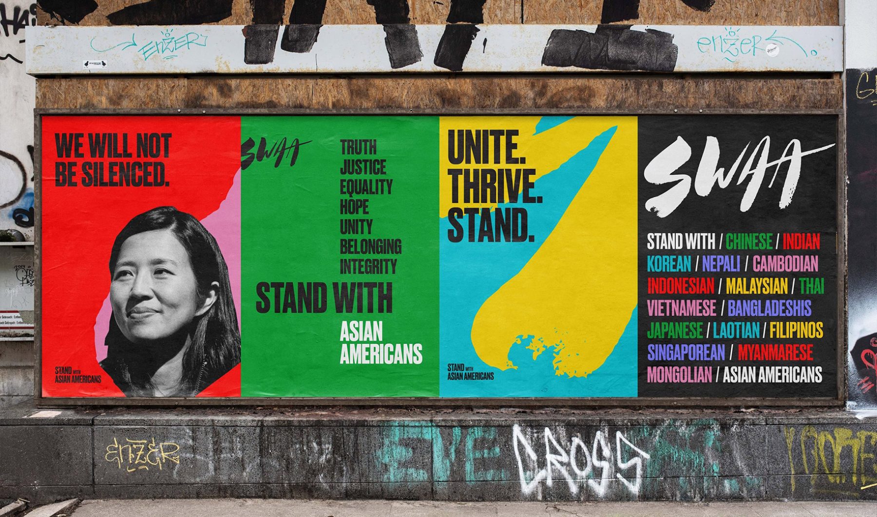
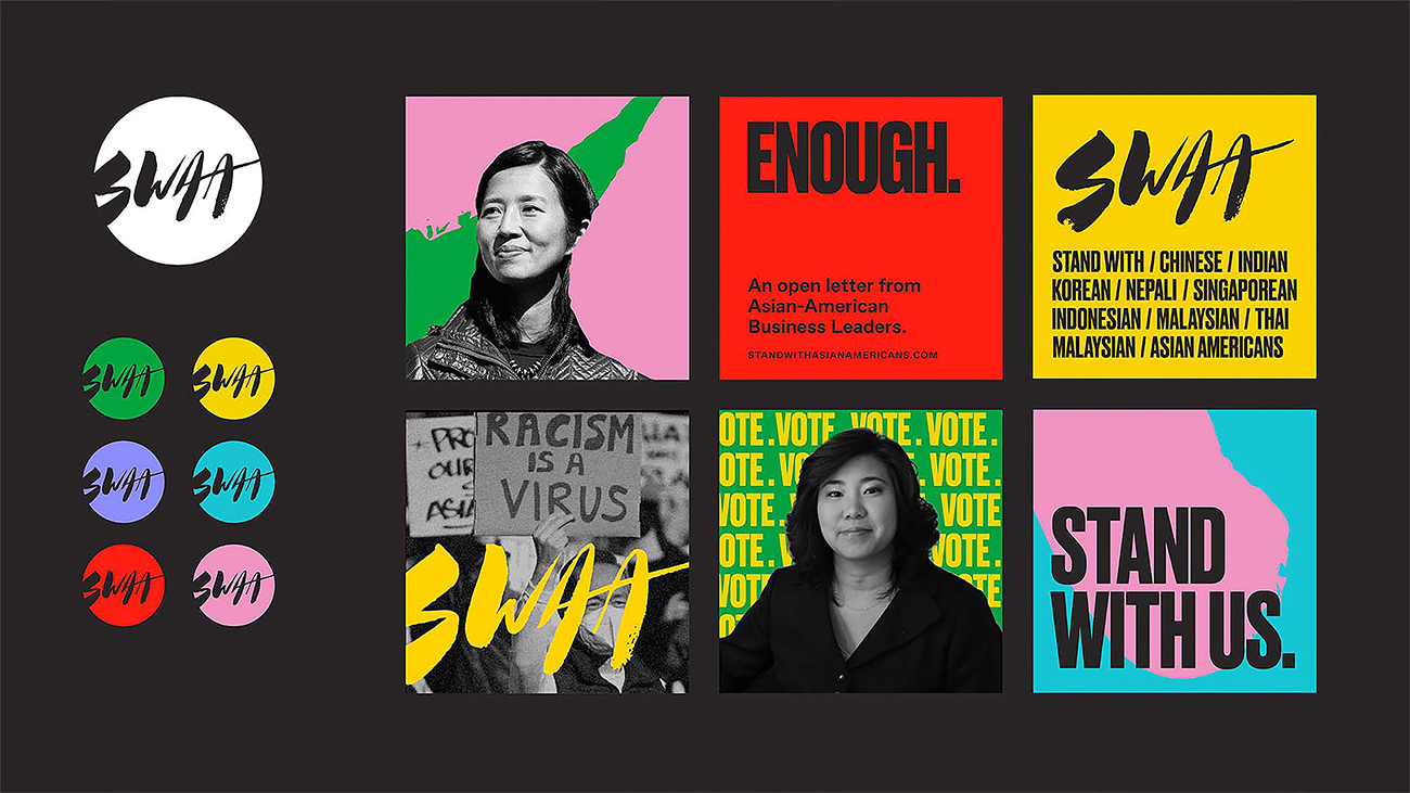
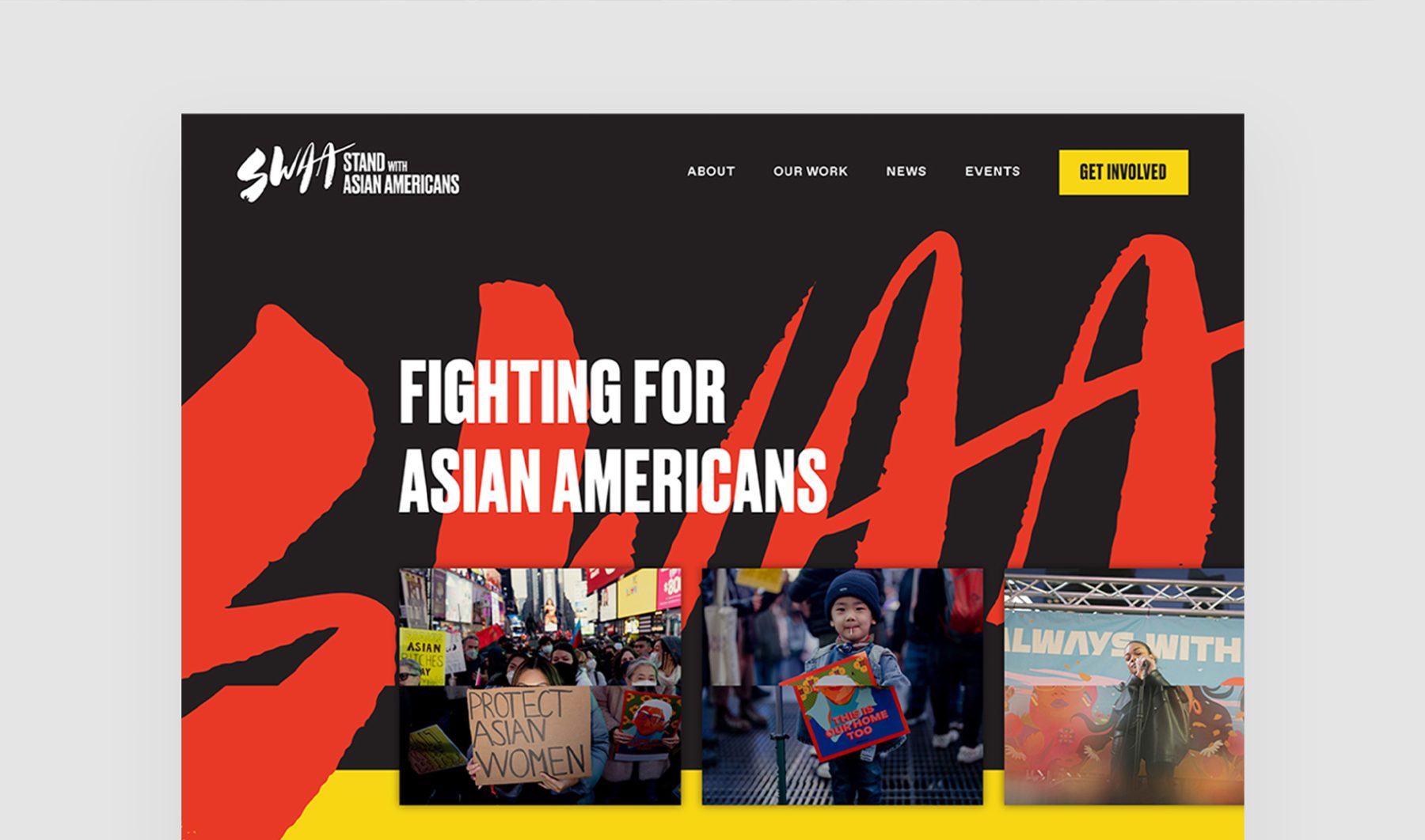
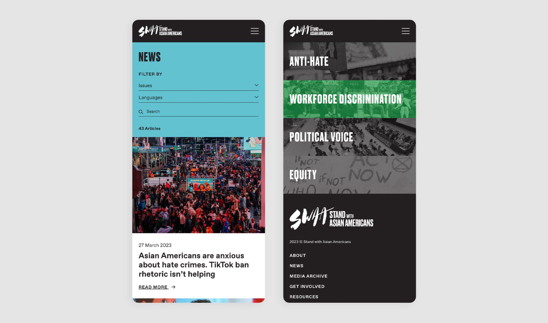
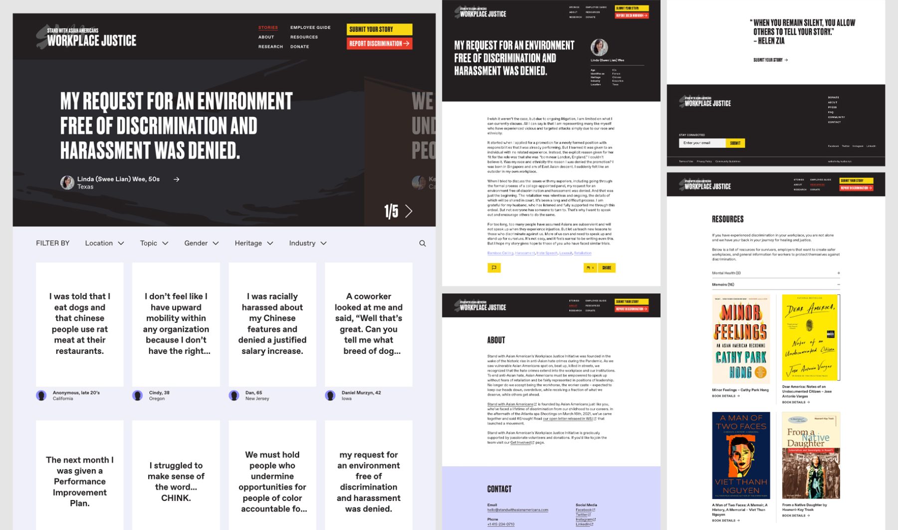
Stand with Asian Americans (SwAA) was established as the largest coalition of Asian American entrepreneurs, investors, and activists. KUDOS was tasked with developing comprehensive branding and a website for the organization.
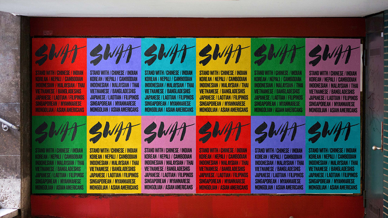
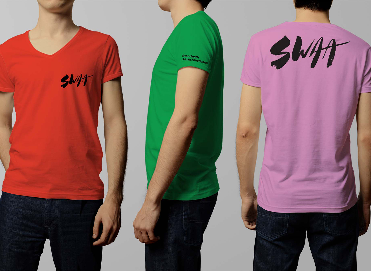
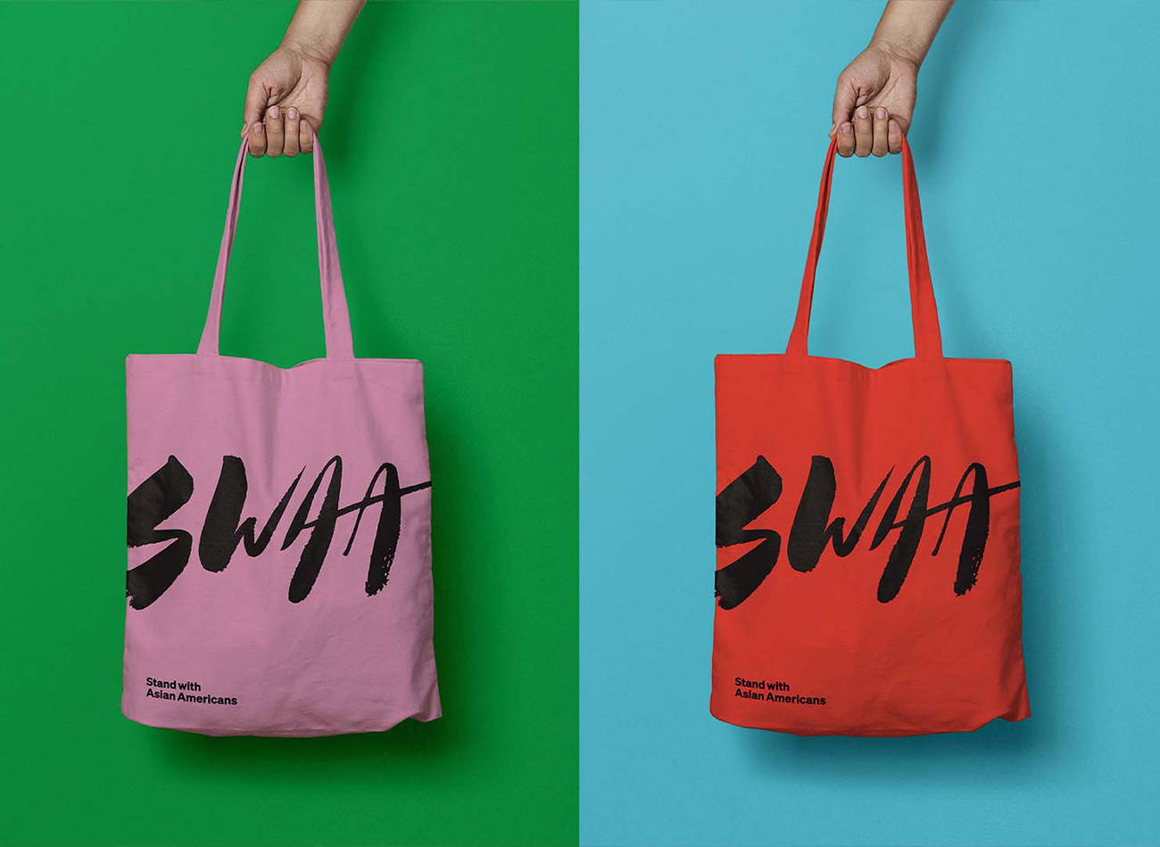
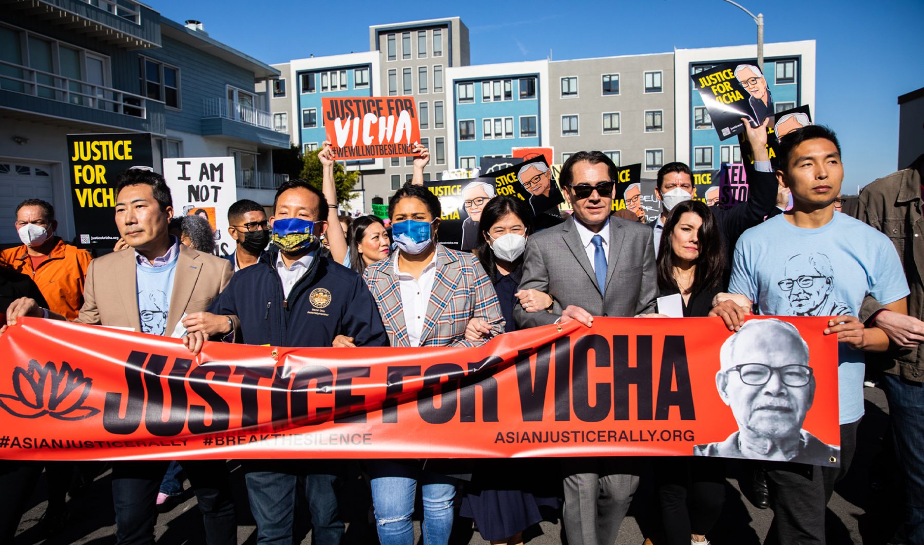
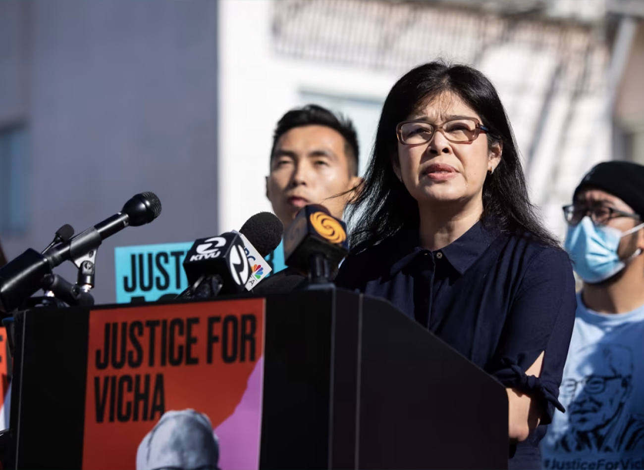
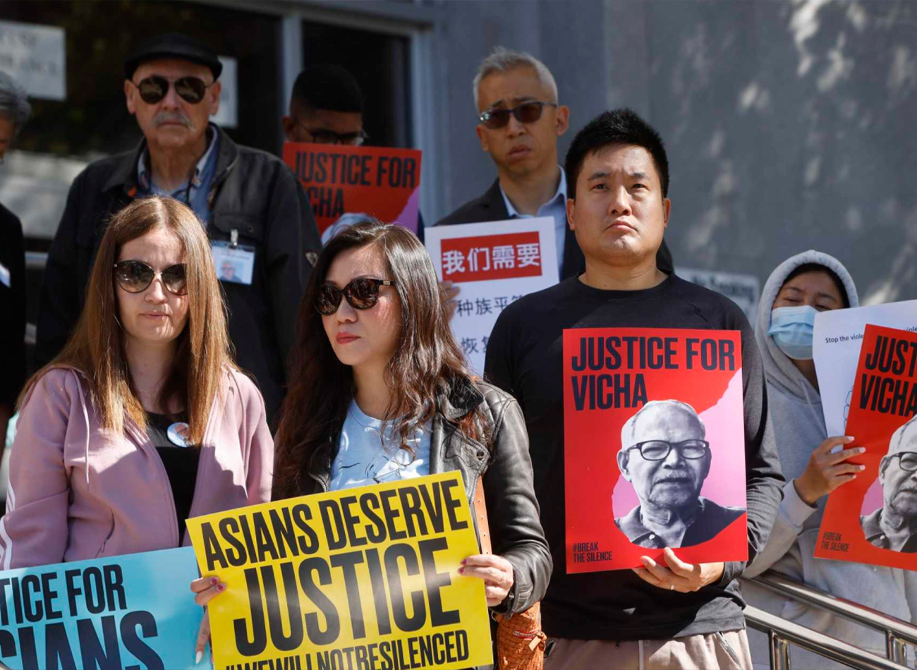
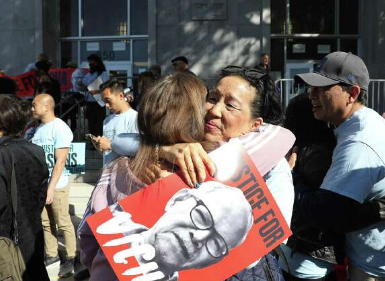
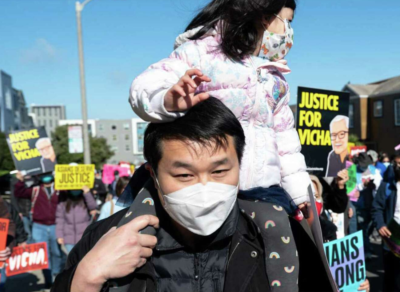
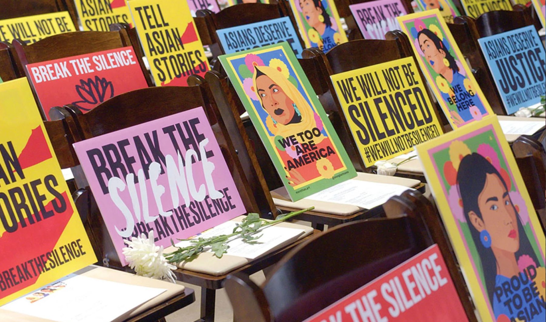
We achieved an iconic visual identity through experimentation with brushed lettering combined with a modern, dynamic, and progressive look. The resulting identity communicates a sense of urgency while avoiding alienation by maintaining an approachable, inclusive, and universal appeal. This branding was featured in Asian American Justice Rally posters and signage, the organization’s website, and a separate workplace-justice website that gave users the opportunity to share personal stories of workplace discrimination. In our website design, we also utilized animation to express unity among diverse ethnicities.
KUDOS Design Collaboratory
-
John Kudos
Creative Director -
Amanda Knott
Project Manager -
Jamus Marquette, Fay Qiu, Owen Febiandi
Designers -
Chris Manlapid, Christian Juniady Setiawan
Web Developers
Flatiron NoMad Website
Flatiron NoMad BID
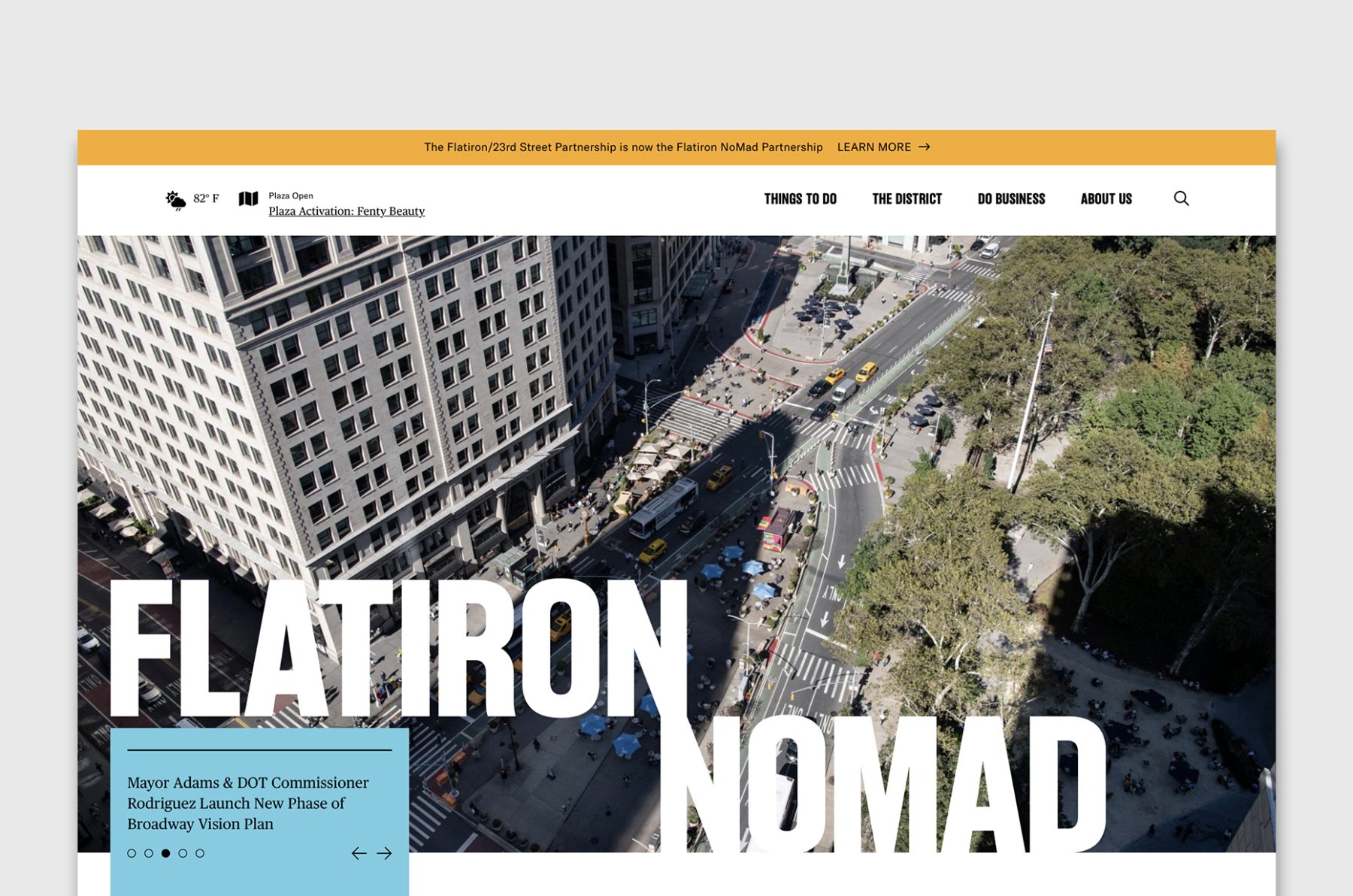
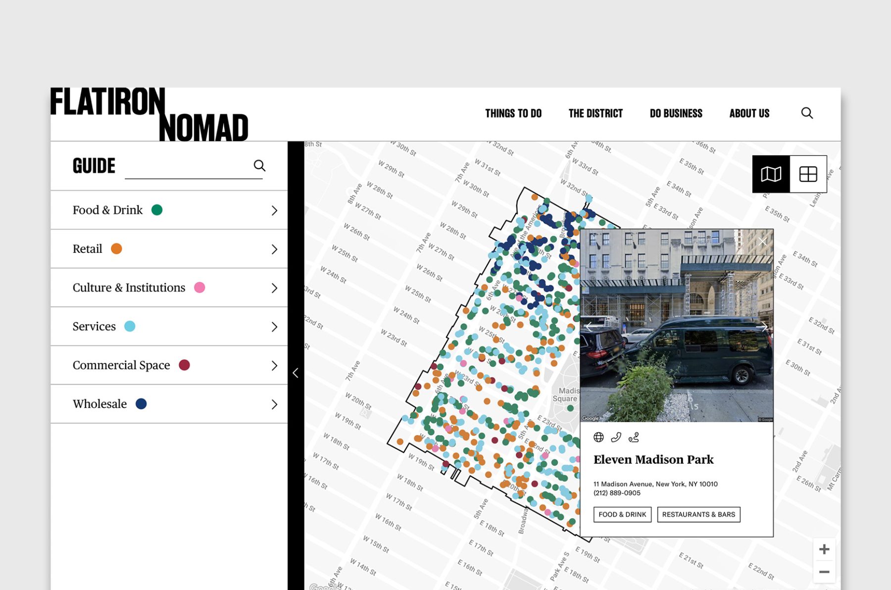
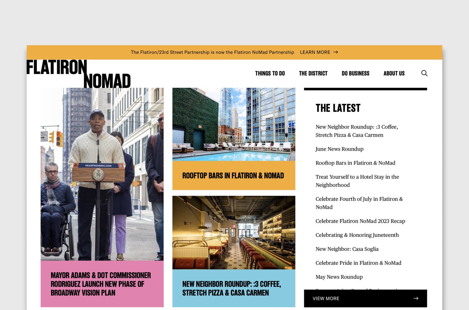
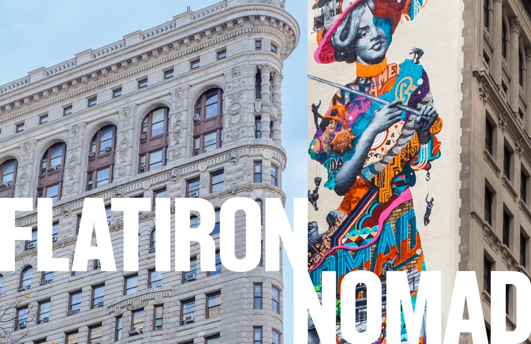
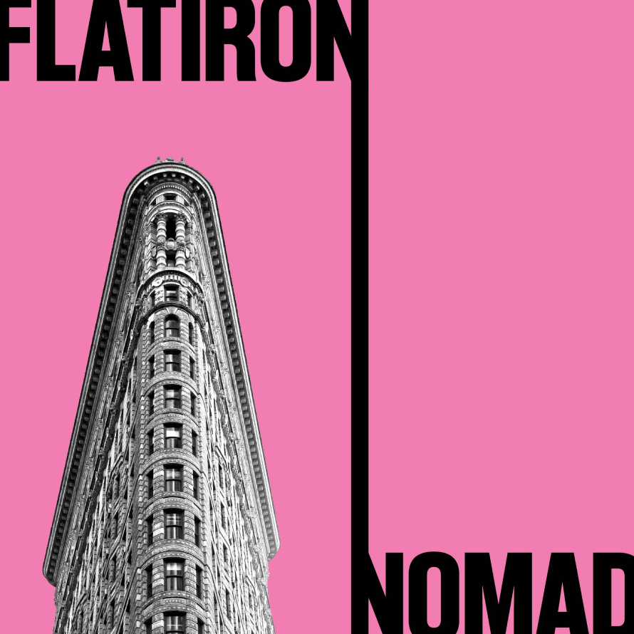
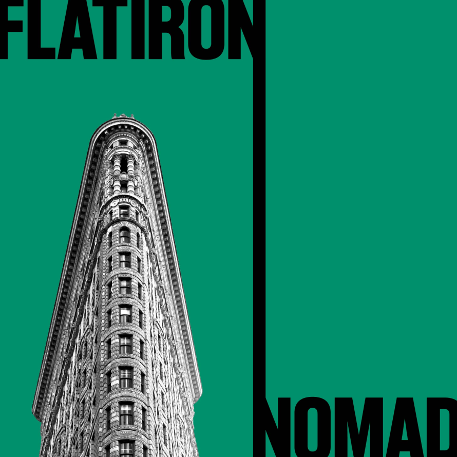
The Flatiron NoMad Partnership serves the businesses, people, and places that help make this district one of Manhattan’s most iconic and authentic destinations. In January 2022, their service area expanded from Flatiron proper to include all of NoMad and extend to 20th Street and Sixth Avenue—and the Partnership needed a new website to match.
We designed the website with a bold diagonal line dynamically connecting the two Ns from “Flatiron” and “NoMad,” along with a colorful navigation element that animates when opened. The new website has been well received by many New York Business Improvement Districts and helped the Flatiron/NoMad neighborhood rebound from the unfortunate impact of COVID-19, as shown through survey data.
View flatironnomad.nyc
KUDOS Design Collaboratory
-
John Kudos
Creative Director -
Fay Qiu
Designer -
Chris Manlapid, Arif Widipratomo
Web Developer
Poster House Website
Poster House
Capabilities
Focus Area
Client
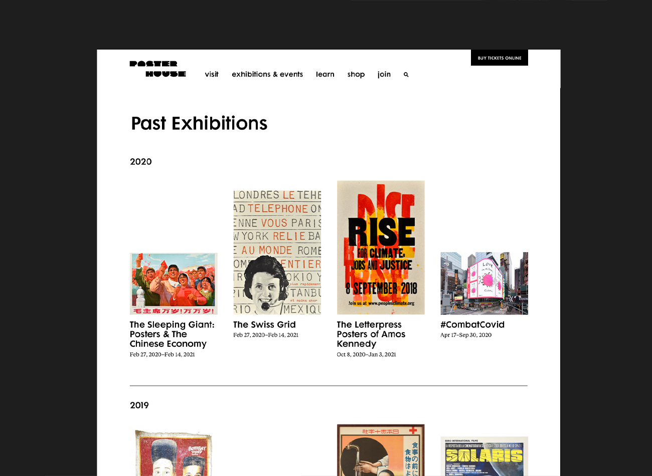
Poster House (New York City) is the first museum in the U.S. to be dedicated exclusively to posters, presenting a global view of the medium from its earliest appearances in the late 1800s to present-day uses.
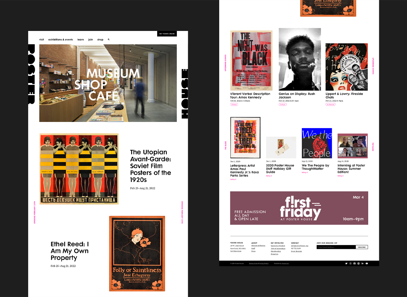
We designed a seamless, clean, and immersive new website for the museum that carries the boldness, simplicity, and clarity of a poster exhibition, ensuring the museum’s events and poster collections were showcased prominently. On the back end, we developed the website to provide comprehensive information on events, collections, and admission, along with an online shop—all delivered with rigorously tested web-accessibility.
View posterhouse.org
KUDOS Design Collaboratory
-
Ashley Wu
Designer -
Owen Febiandi
Designer -
Putu Yogiswara
Designer -
Amanda Knott
Project Manager -
Christian Juniady Setiawan
Web Developer

Poster House Interactive Exhibitions
Poster House
Capabilities
Focus Area
Client
Poster House (New York City) is the first museum in the U.S. to be dedicated exclusively to posters, presenting a global view of the medium from its earliest appearances in the late 1800s to present-day uses.
We were tasked to create four interactive exhibits (three digital exhibits and one children’s area) as permanent fixtures of the museum, to be seamlessly integrated into its newly built architecture. In acknowledgement of the poster medium’s journey from oversized ink-on-paper communications to its many contemporary forms—digital, animated, interactive, generative—we ensured that all of our interactive components offered a good mix of tactile, physical, and screen-based experiences.
PHOTO BOOTH
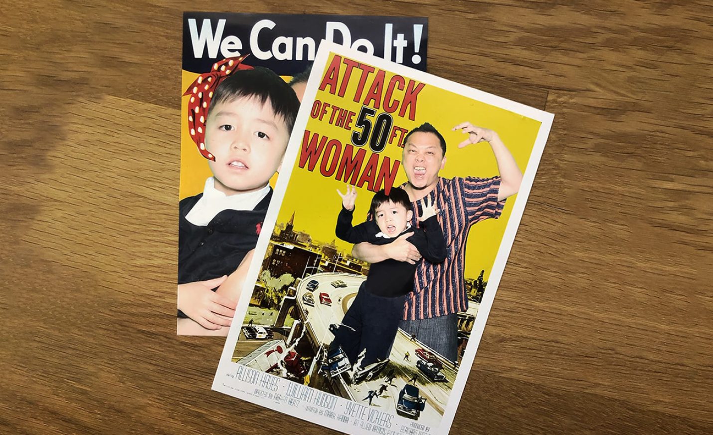
This green-screen photo booth, visible from the street and embedded into an alcove at the museum’s entrance, allows visitors to place themselves in iconic posters using a custom interface, and receive the final posters via email, text message, and print.
Since the museum’s opening 5 months ago, over 6,500 images have been texted, emailed, and printed through the highly visible photo booth.
The photo booth continues to be a big draw for passersby, with an average of 15 minutes per visitor engagement.
DIGITAL POSTER WALL
This oversized 4K screen displays a curated grid of larger-than-life posters from the collection, which are randomly enlarged periodically, or whenever a visitor presses a nearby button. Located adjacent to the ticketing counter, our digital poster wall provides a good preview of what to expect in the museum.
CHILDREN’S AREA
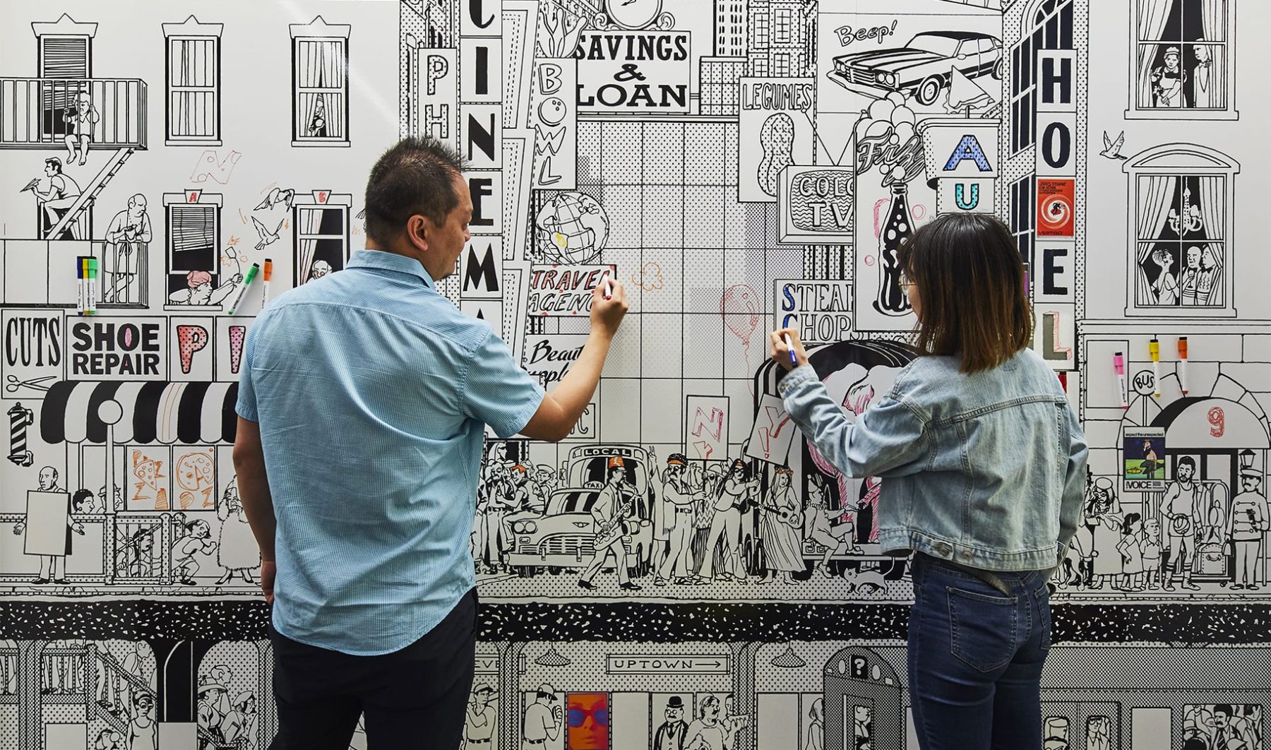
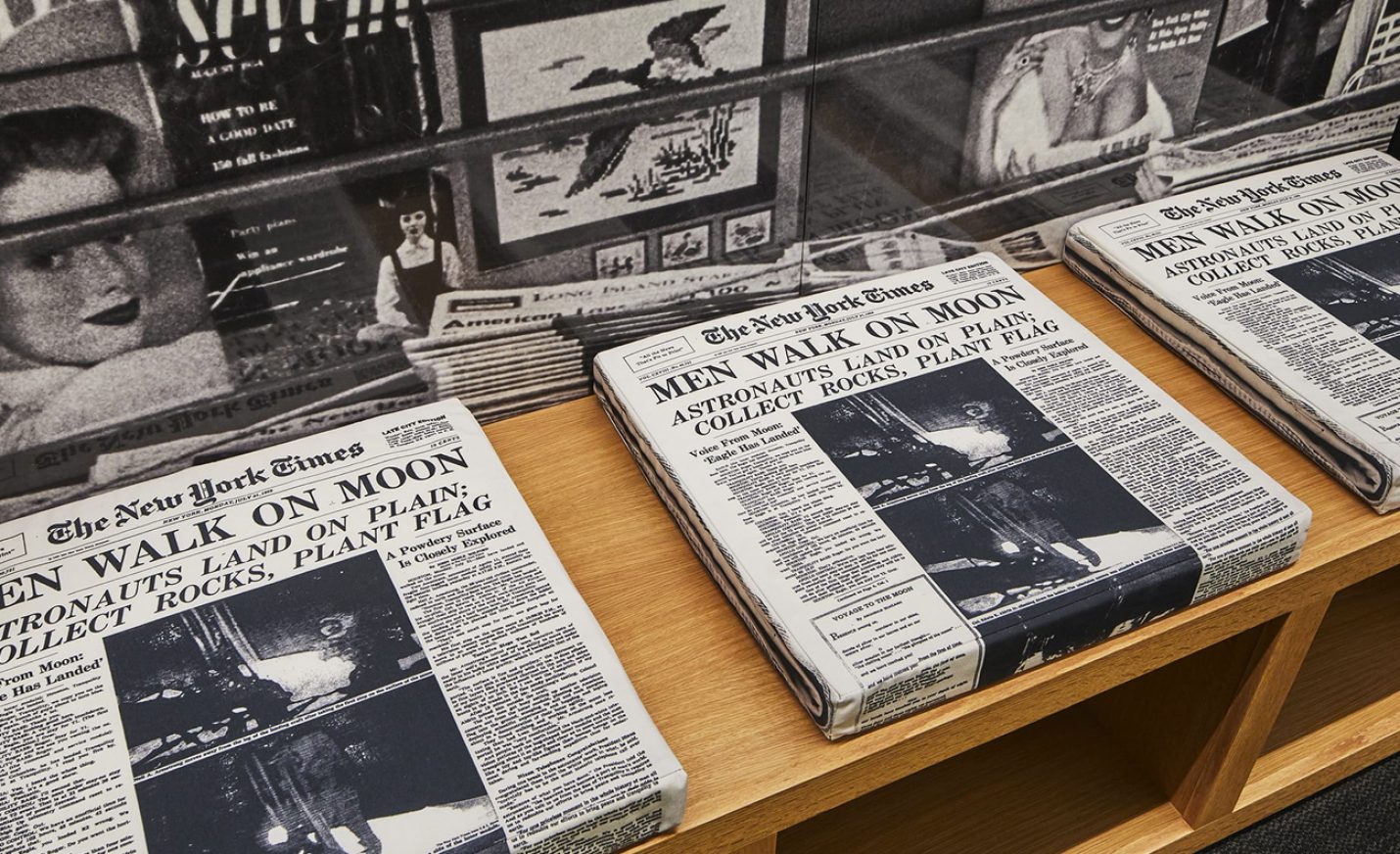
Our children’s area is a blast from the past, featuring 1960s New York City scenes. A coloring mural wall with magnetic posters, interactive vintage payphones by a newsstand, and layering stations explaining how posters are made engages an audience of all ages.
POSTER MACHINE
These tabletop interactive kiosks allow visitors to experience the poster-creation process. To design them, we deconstructed what goes through a designer’s brain to create a choose-your-own-adventure poster-design game, each step of which explains the significance and thought process behind the basic ingredients of any poster—symbols, colors, phrases, fonts, and design styles. There are three themes—Propaganda, Film, or Advertising—for which we created over 143,000 images to represent all the possible design paths one can take.
KUDOS Design Collaboratory
-
John Kudos
Creative Director -
Ashley Wu
Designer -
Sumit Paul
Designer -
Whatever
Software Developer -
Darius Wang
Animator






TDC62 Traveling Exhibition, Jakarta
Type Directors Club
Capabilities
Client
Awards
-
HOW 2017 International Design Awards
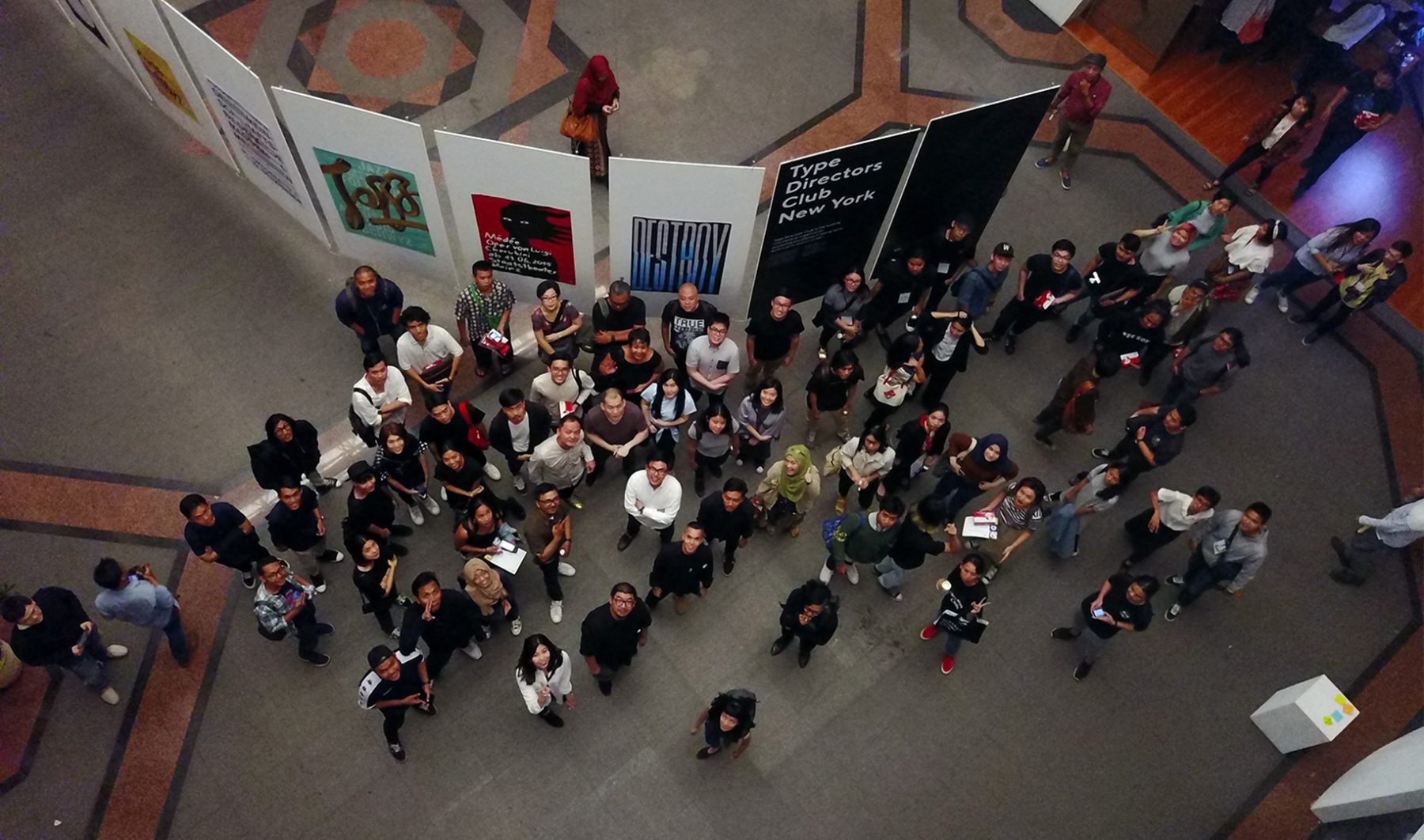
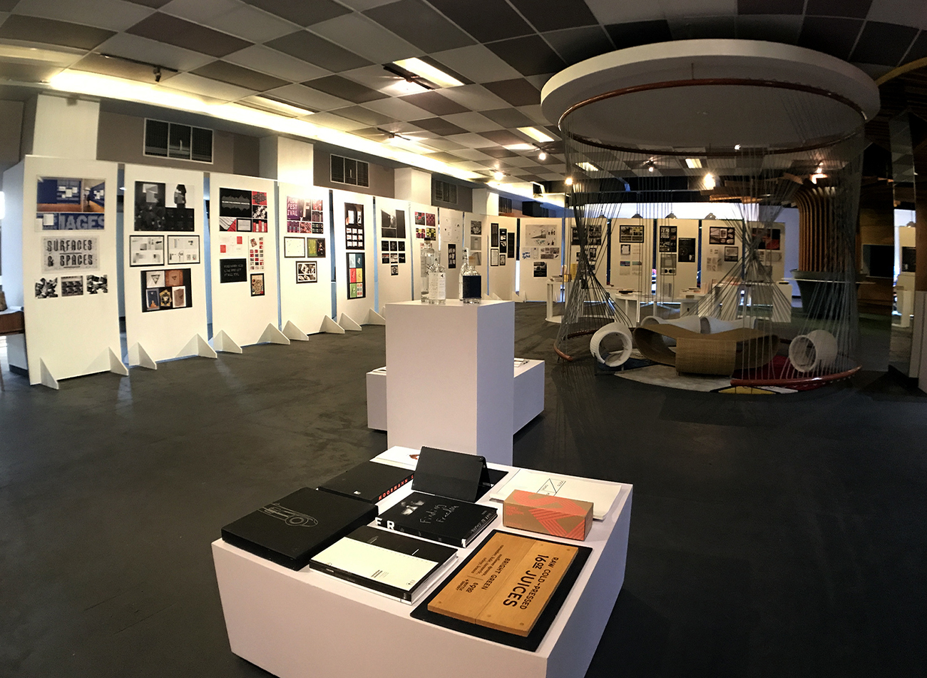
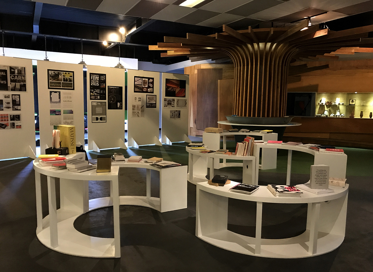
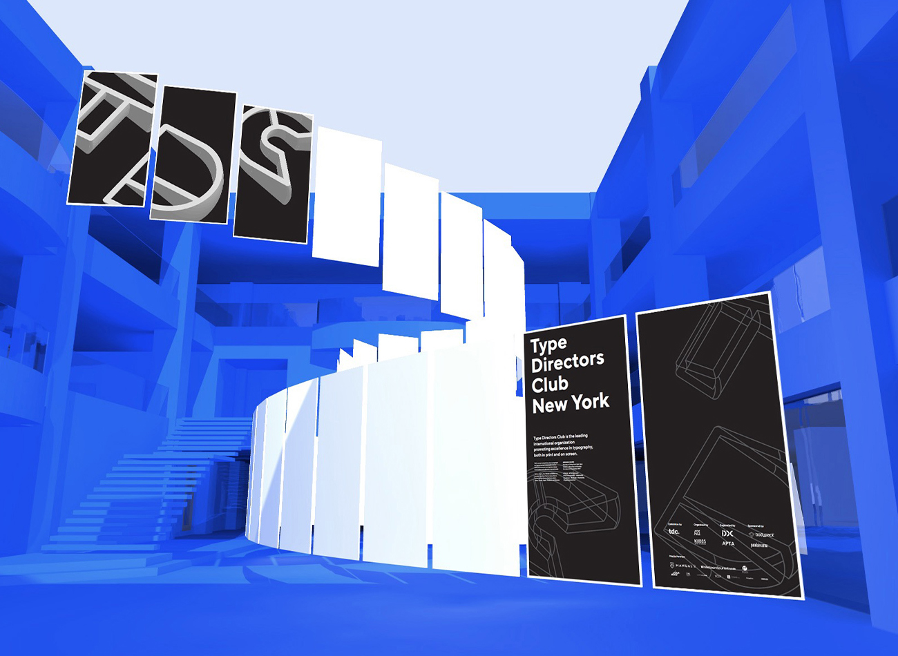
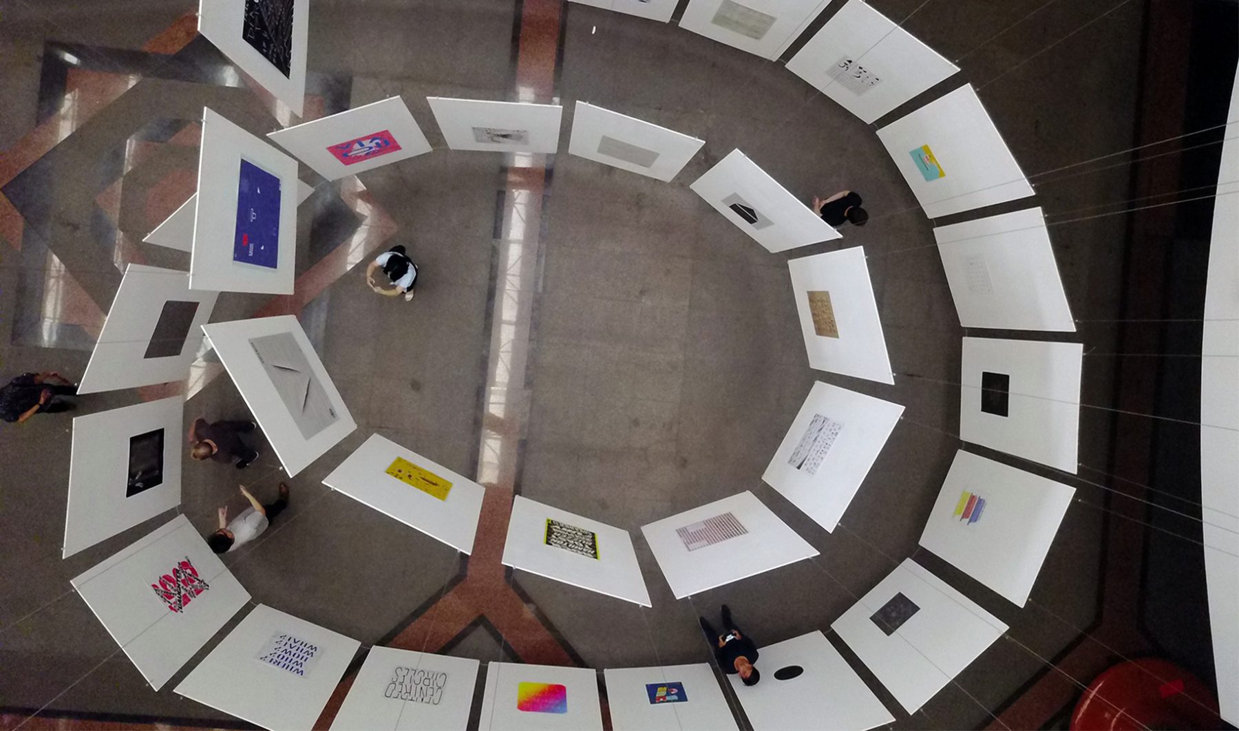
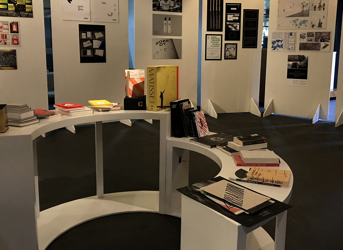
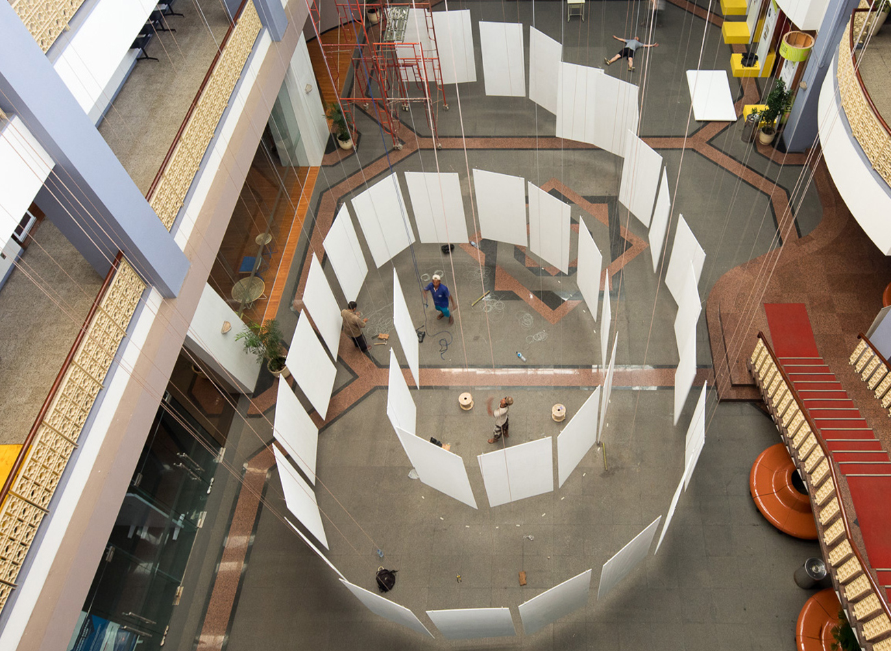
The Type Directors Club in New York produced a traveling exhibition showcasing over 400 winners of its 2016 annual competition, which highlighted the best of the best in typographic work in both communication and typeface design from studios and individuals internationally. After visiting many cities in the U.S., France, Germany, Spain, China, Taiwan, Japan, Thailand, and Vietnam, the exhibition traveled to Jakarta, Indonesia, where it was on view from August 12 to September 7, 2017, at the Indonesian Design Development Center (IDDC). Design and typography lectures were held at this venue during the exhibit. In partnership with the IDDC and Asosiasi Design Grafis Indonesia (ADGI), Kudos was tasked with developing design graphics for the traveling exhibition.
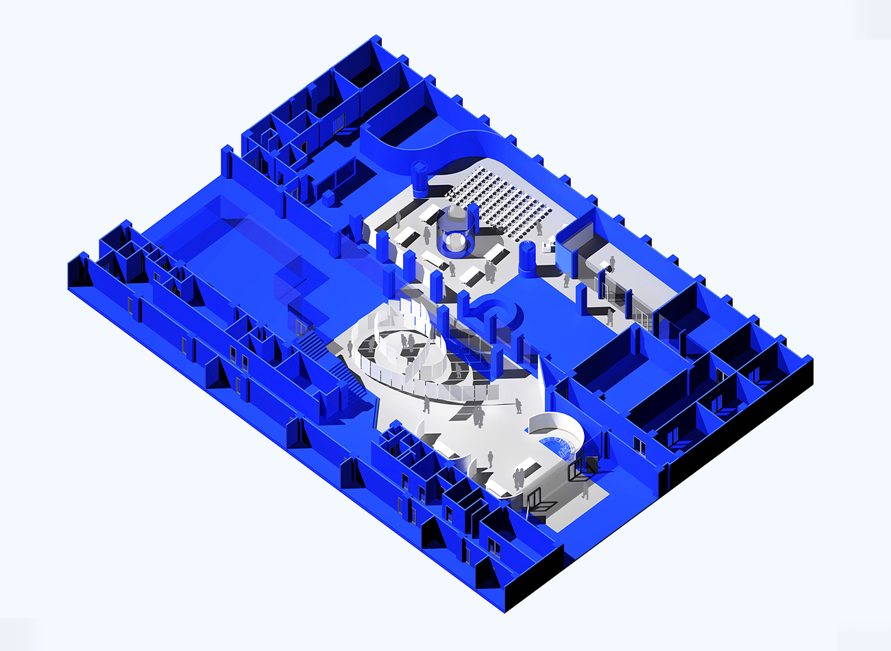
We designed 3D graphics for the exhibition by revolving T-D-C letterforms in sequential angles and floating them in space. These graphics were then applied to all aspects of marketing communications. For the exhibit space, we collaborated with APTA to design spiraling poster panels to be suspended in space.
KUDOS Design Collaboratory
-
John Kudos
Creative Director -
Andy kurniawan
Art Director -
Ilham Muhamad Firdaus
Designer -
Fahmi Maulana Fajar
Designer
Type Directors Club
NY 22 Benefit
Design Trust for Public Space
Capabilities
Focus Area
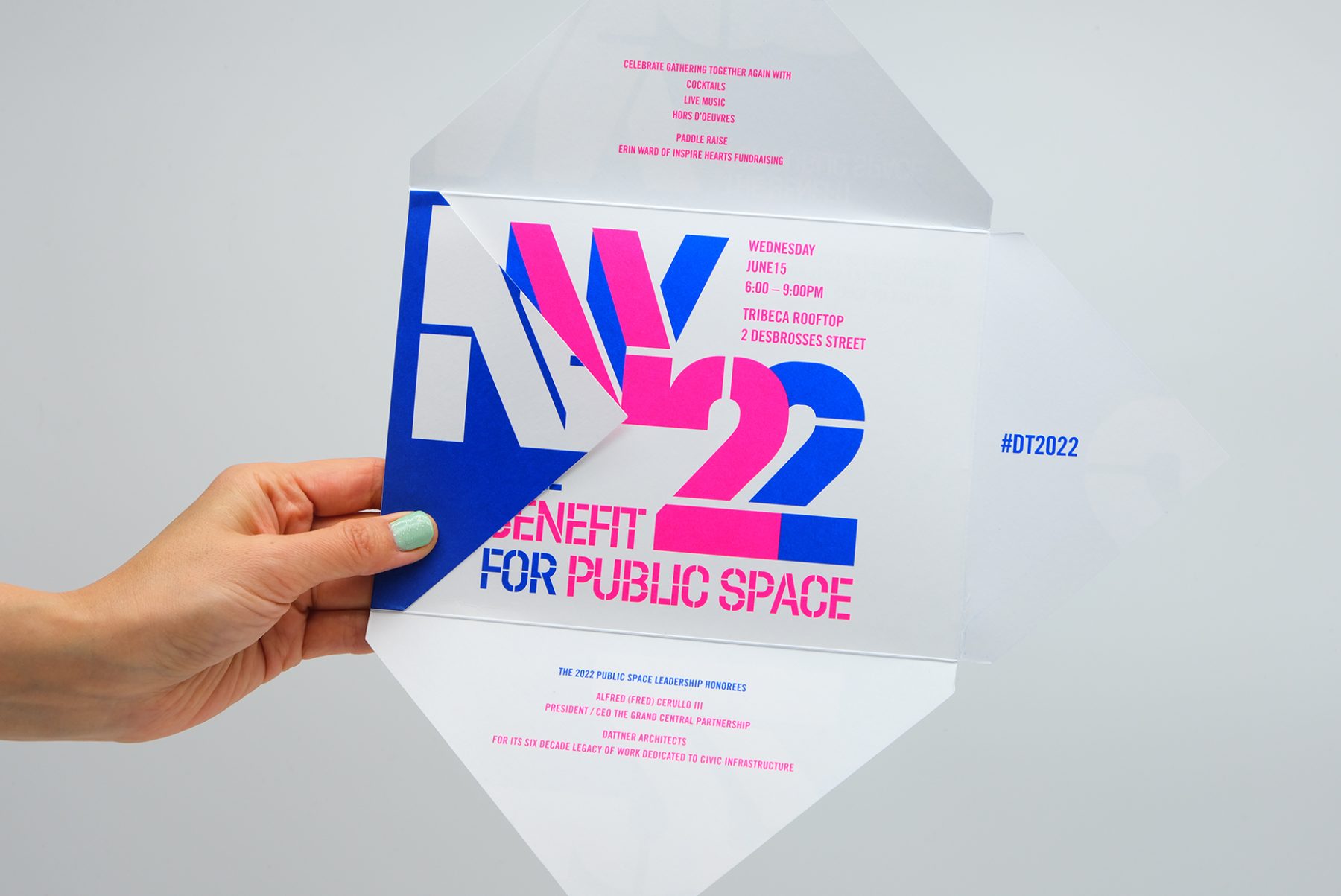
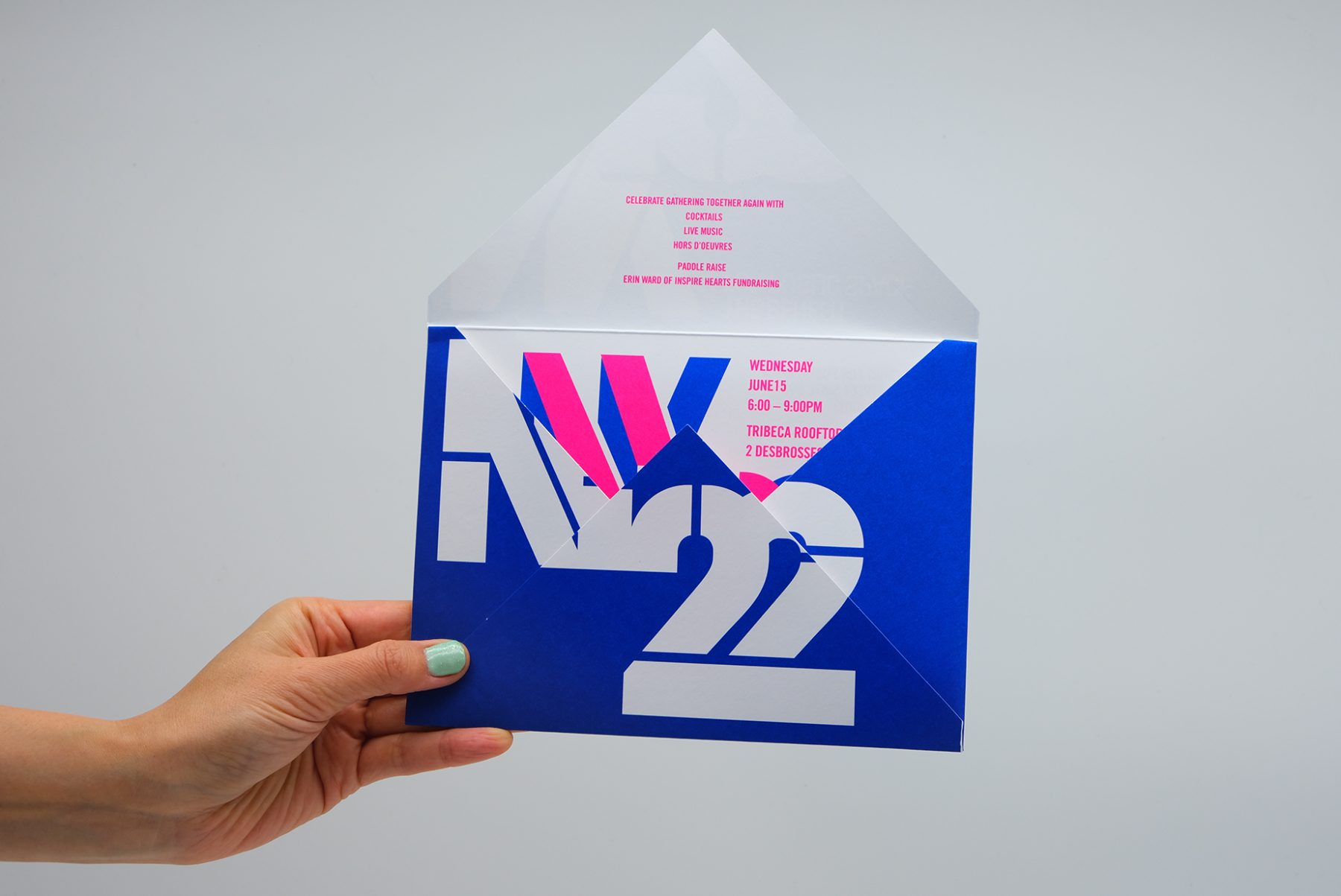
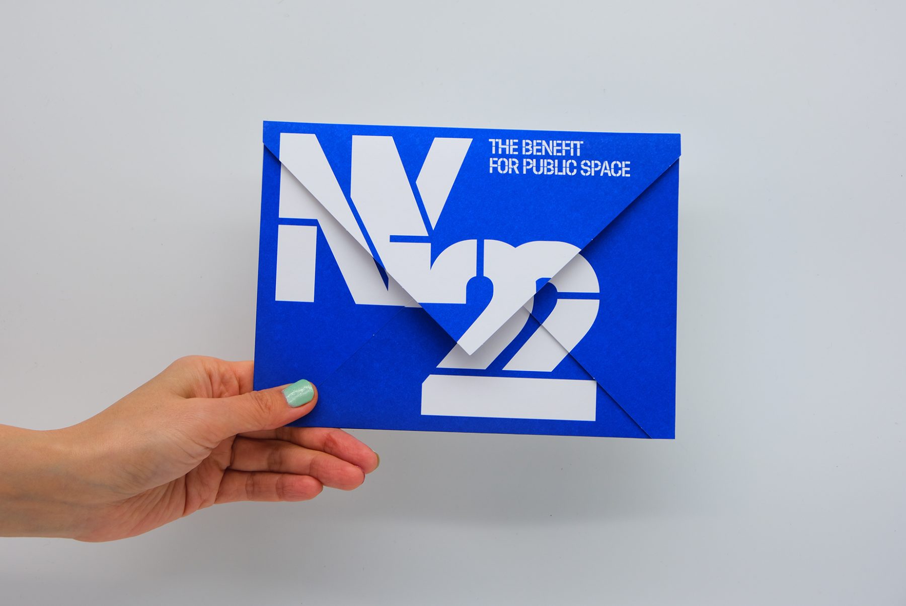
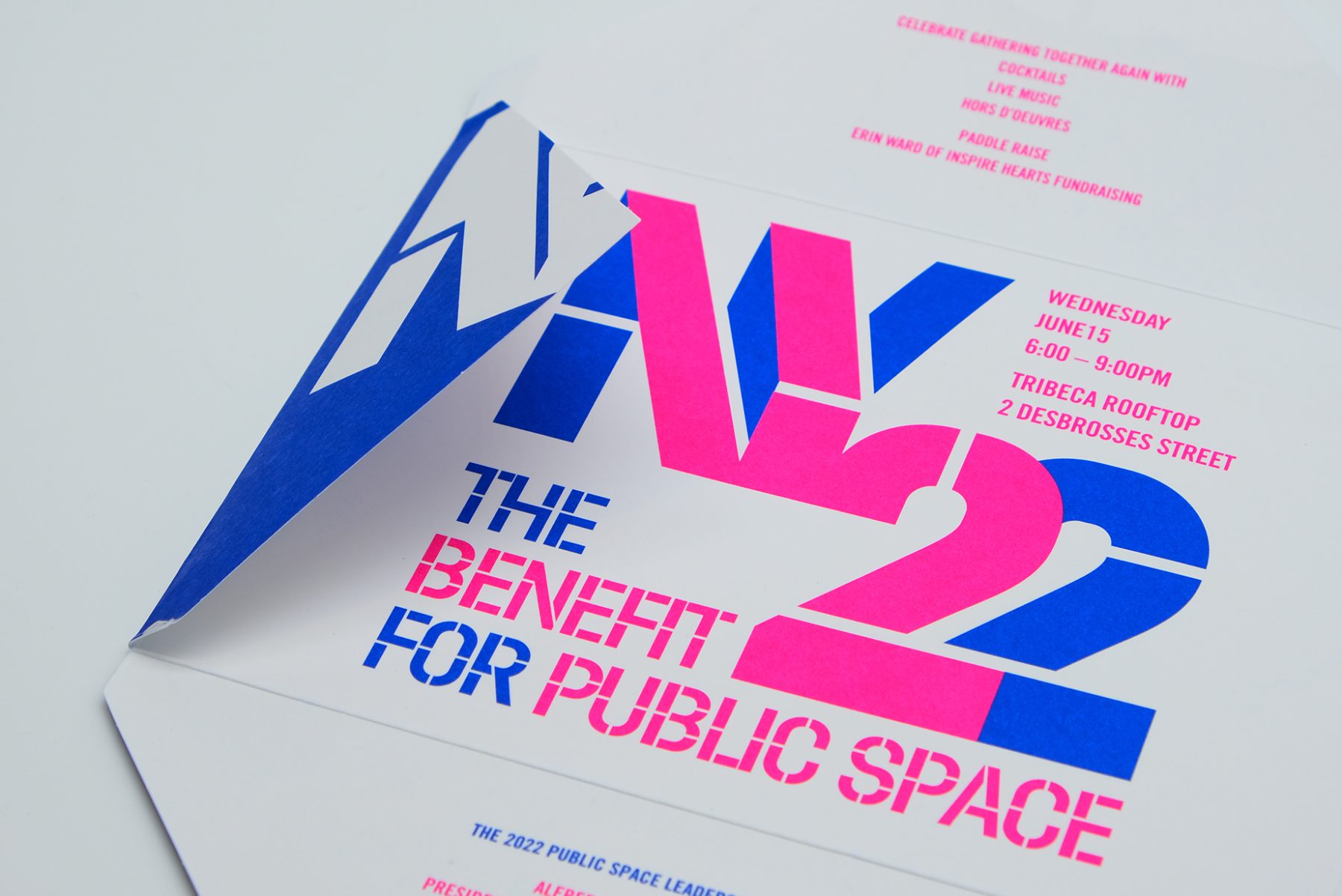
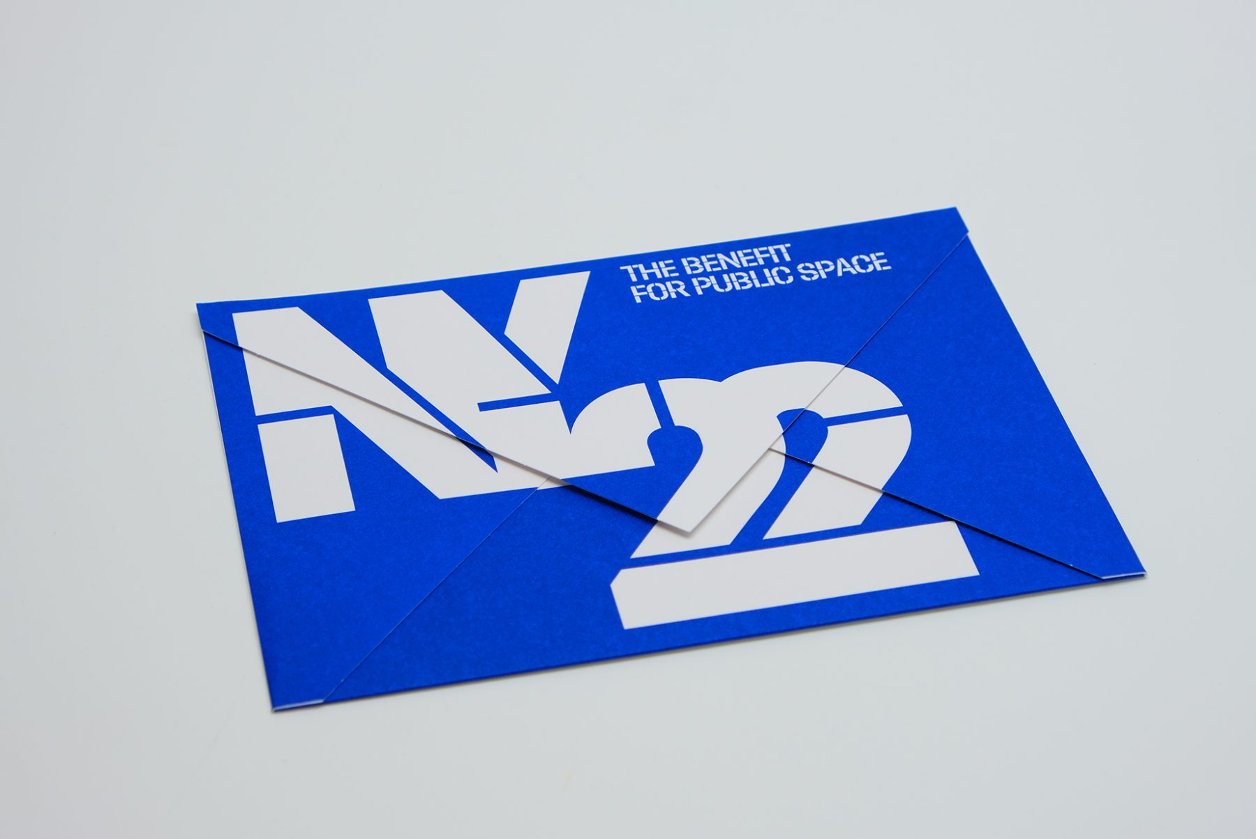
This was our invitation design for an annual benefit hosted by the Design Trust for Public Space, a New York–based nonprofit whose members believe in the transformative power of design within urban landscapes.
We crafted a unique invitation in which each panel of the envelope reveals a message as it unfolds. We combined typography, vibrant colors, and the angular shape of the envelope to emulate architectural forms, creating a visual metaphor for the symbiotic relationship between design and public space.
KUDOS Design Collaboratory
-
John Kudos
Creative Director -
Fay Qiu
Designer -
Amanda Knott
Project Manager
#CombatCovid Poster
Poster House
Capabilities
Focus Area
Client
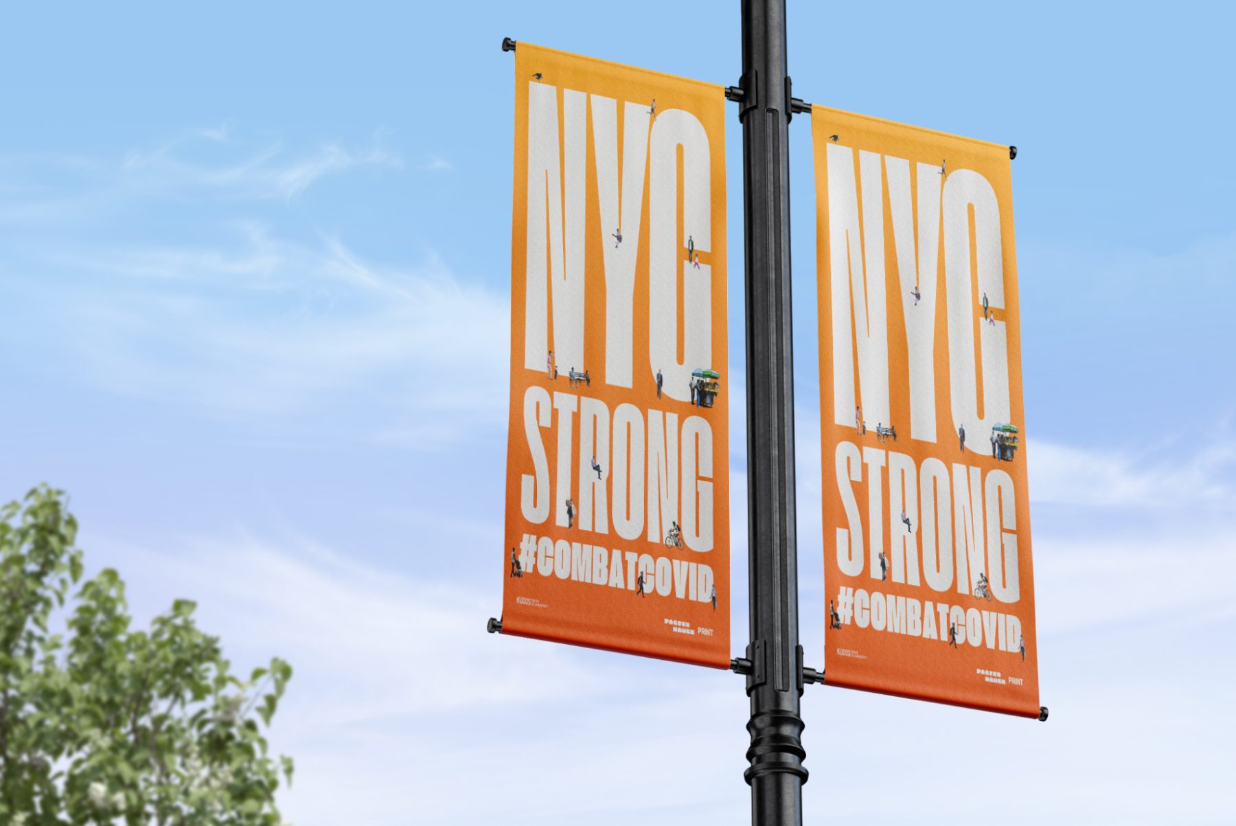
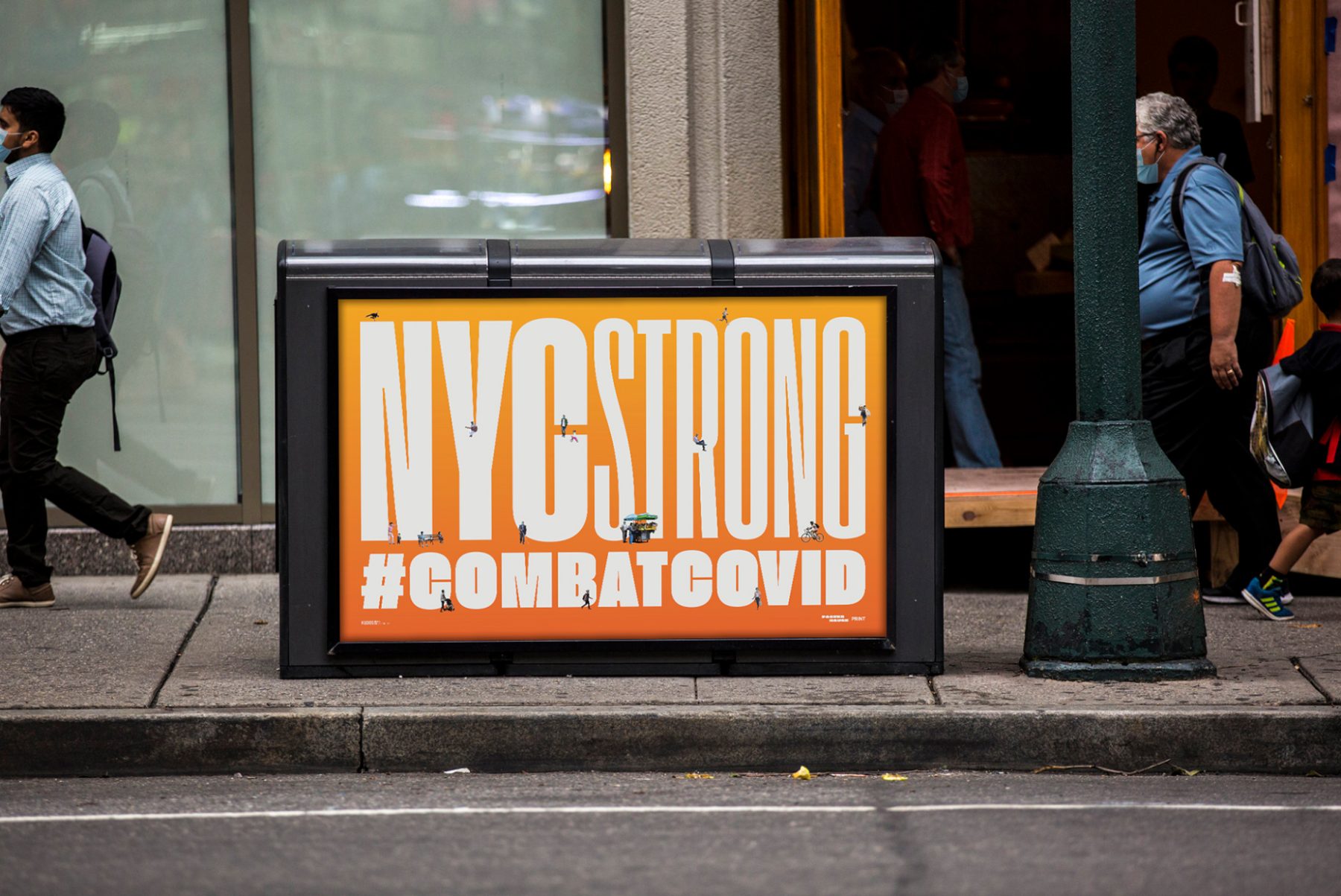
At the height of the COVID-19 pandemic in New York, Poster House teamed up with PRINT magazine, Times Square Arts, and For Freedoms to launch a citywide public art campaign featuring PSAs and messages of love, gratitude, and solidarity with New York City’s frontline workers.
For this project, we produced uplifting poster designs around the theme of “New York Strong.” These can now be found throughout New York City on nearly 1,800 digital screens and billboards, thanks to partnerships with LinkNYC, JCDecaux, Silvercast, Pearl Media, and Times Square Arts.
KUDOS Design Collaboratory
-
John Kudos
Creative Director -
Ashley Wu
Designer -
Giovanni Adrian Sitepu
Animator

Bandung City Wayfinding
Bandung City
Capabilities
Focus Area
Client
Awards
-
PRINT Regional Design Awards 2017
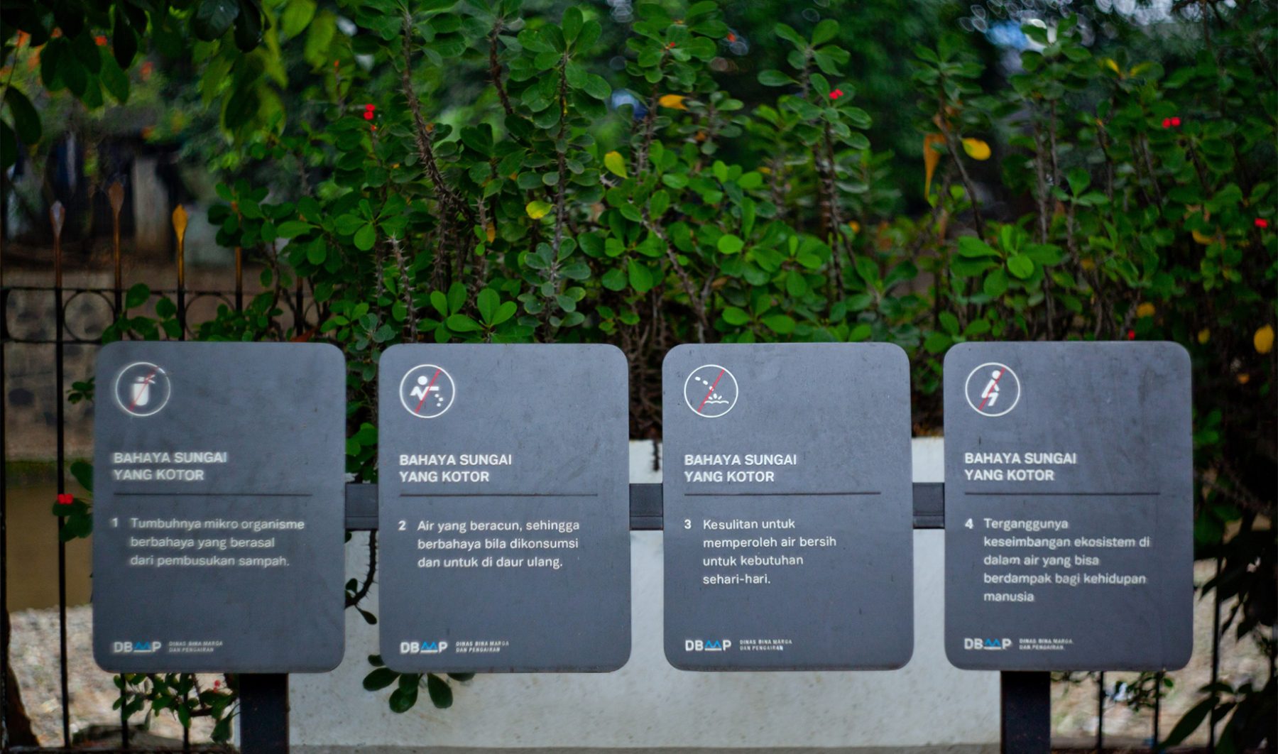
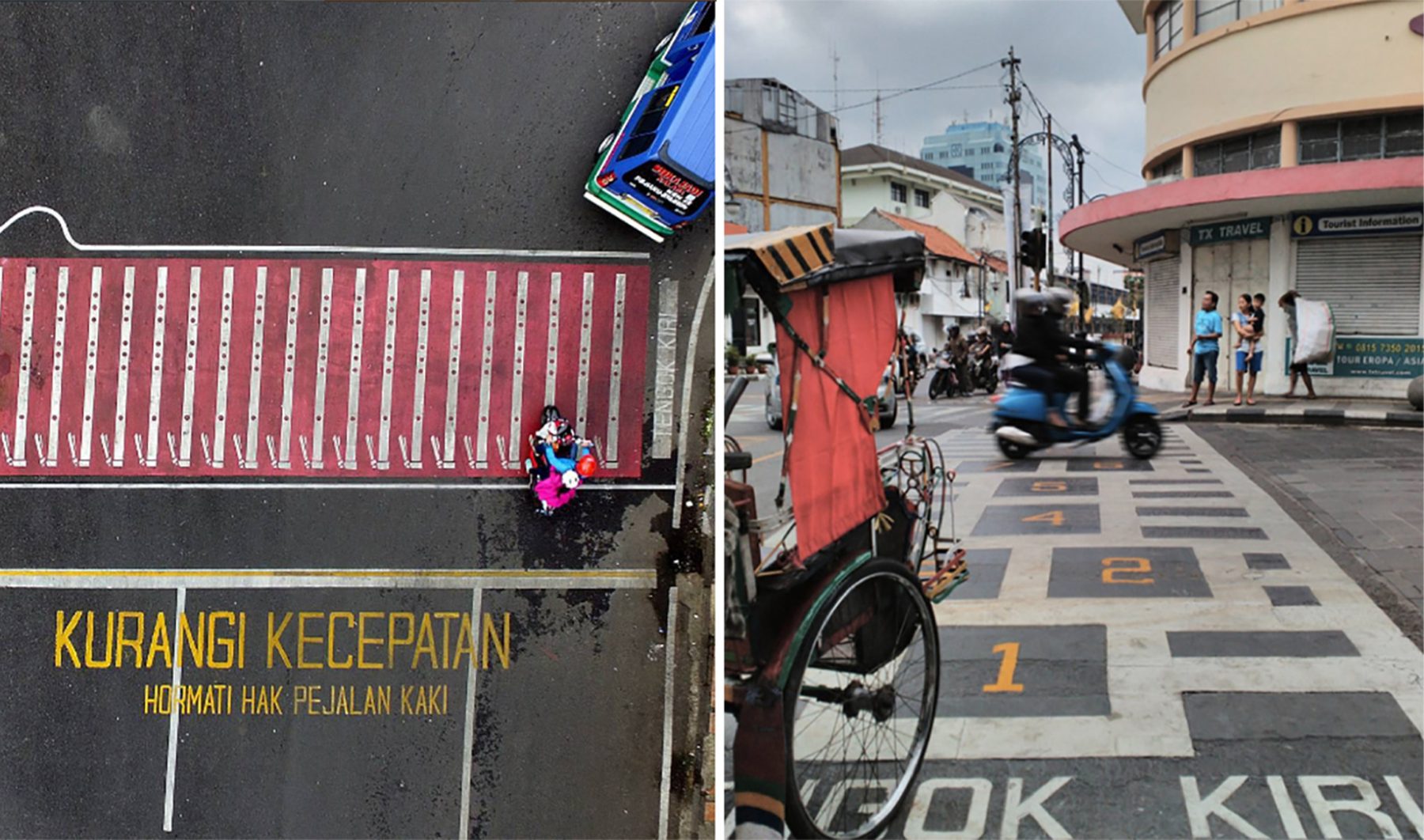
Led by Mayor Ridwan Kamil’s vigorous efforts, the city of Bandung, Indonesia, is in the process of redefining and redesigning itself as a more humane and creative city. Working in partnership with the city in this project, we have been tasked to produce wayfinding signage, crosswalk graphics, and an e-transport card for Bandung.
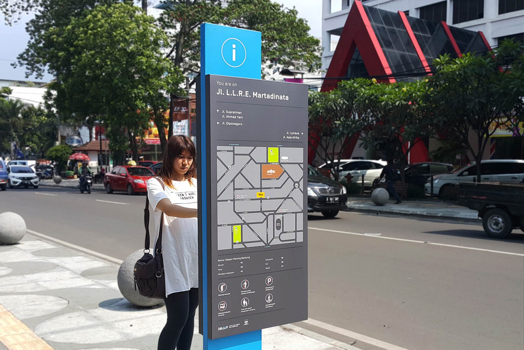
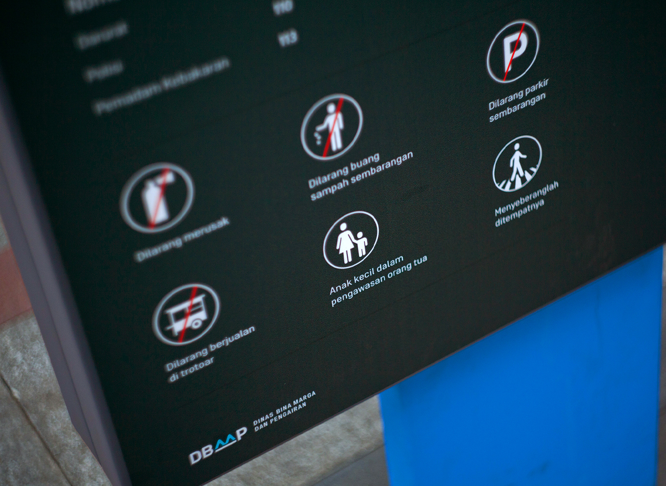
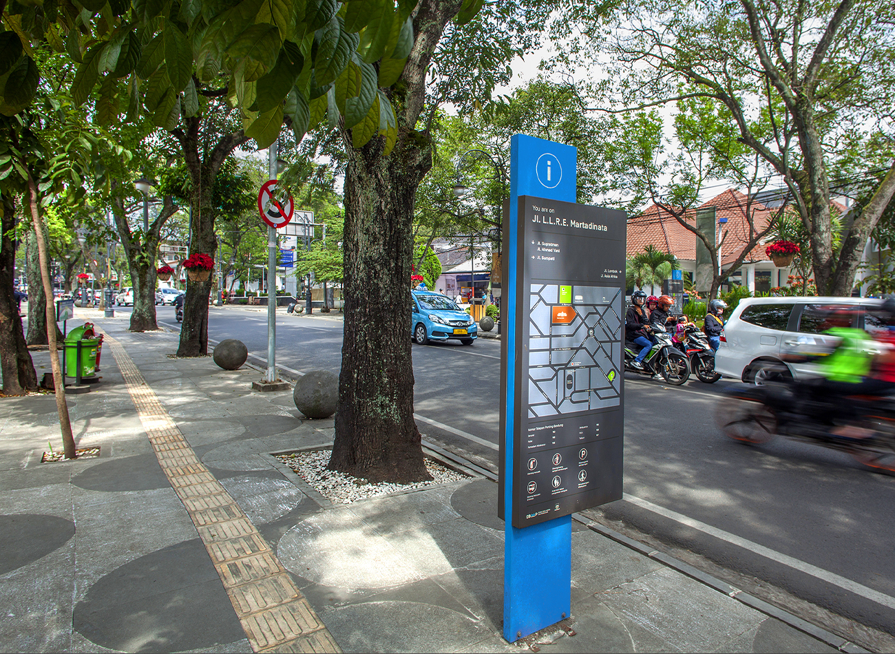
The first installment of the city’s new wayfinding signage was officially announced in December 2015, followed by others across town. We designed a signage system that consists of a vibrant blue totem pole sandwiched by neutral-colored maps on both sides, providing tourist-friendly signage to help orient pedestrians and drivers alike.
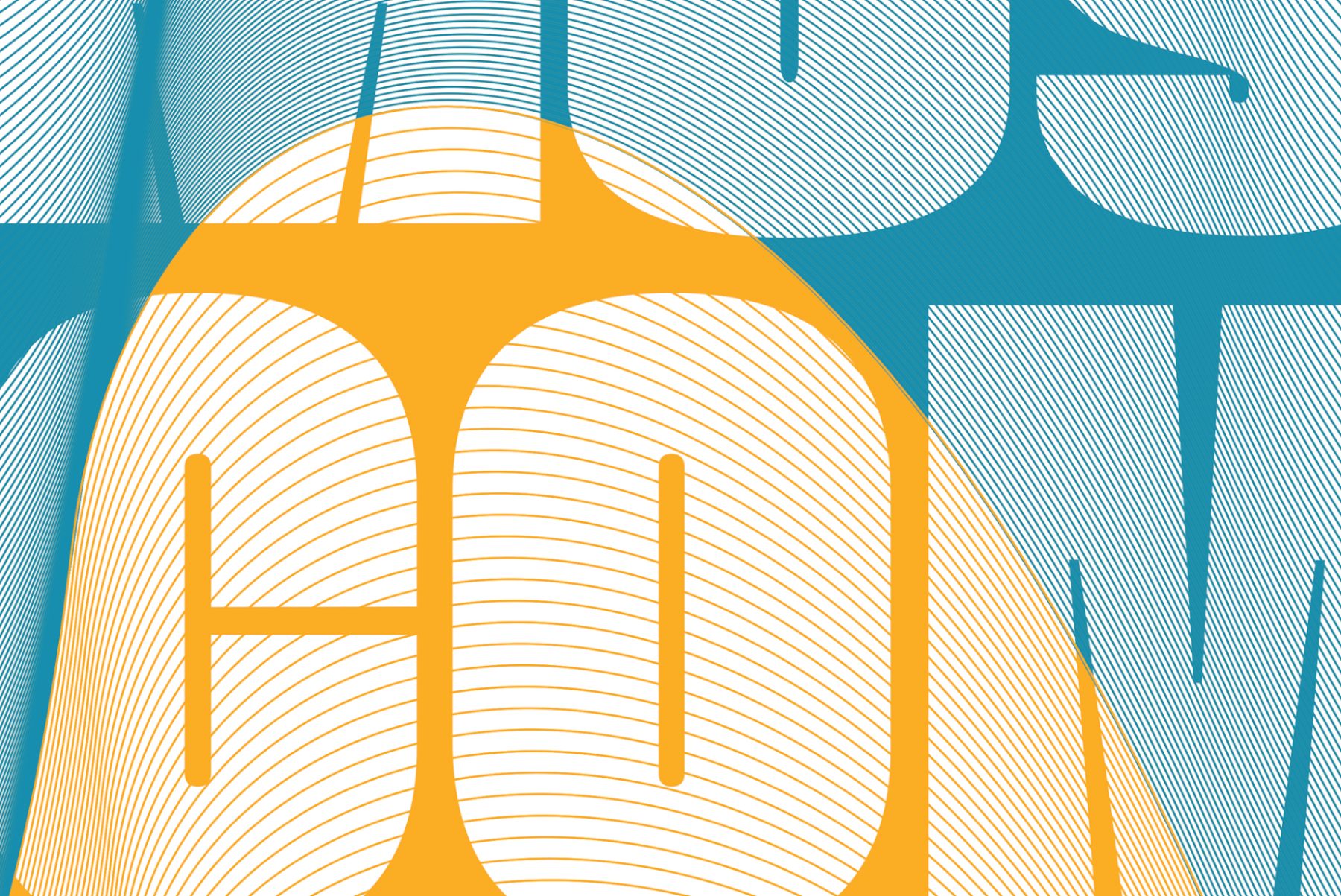
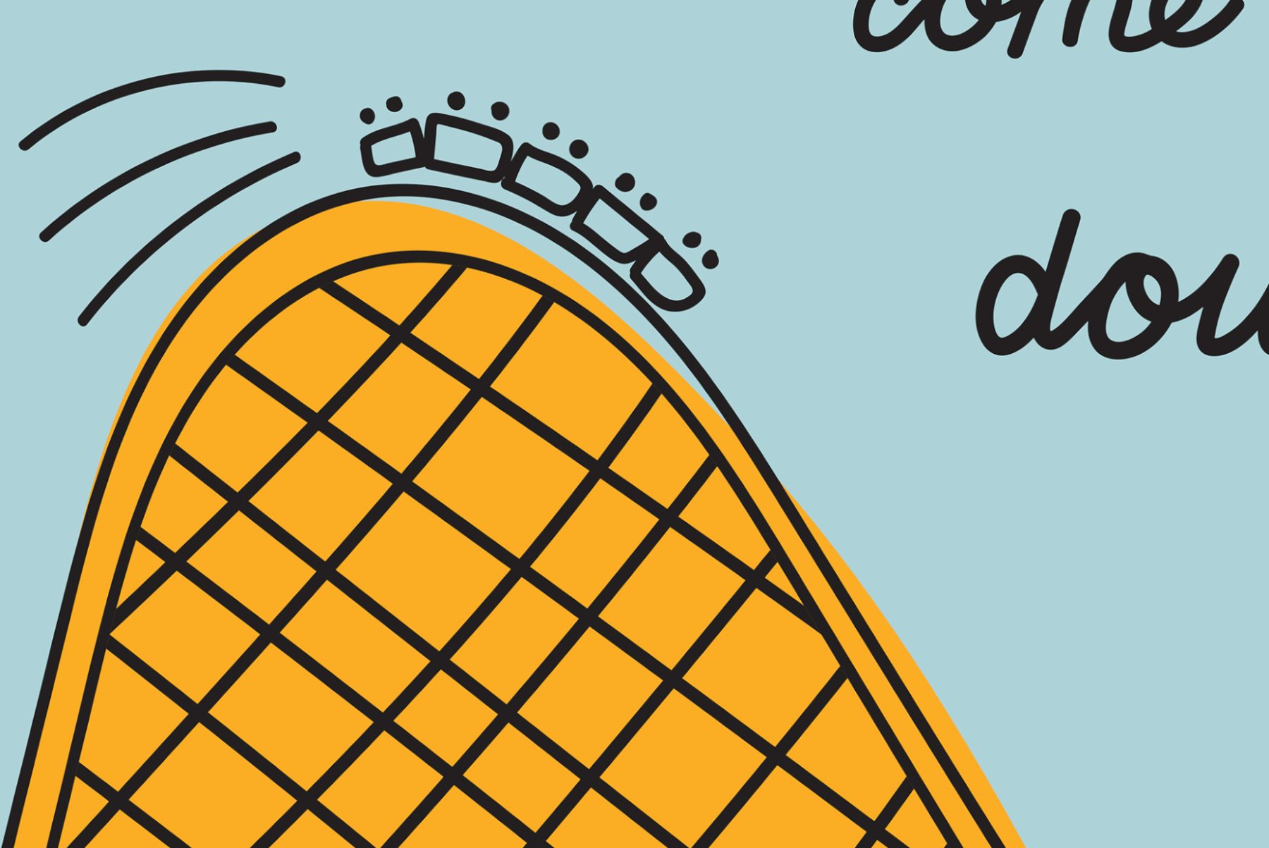
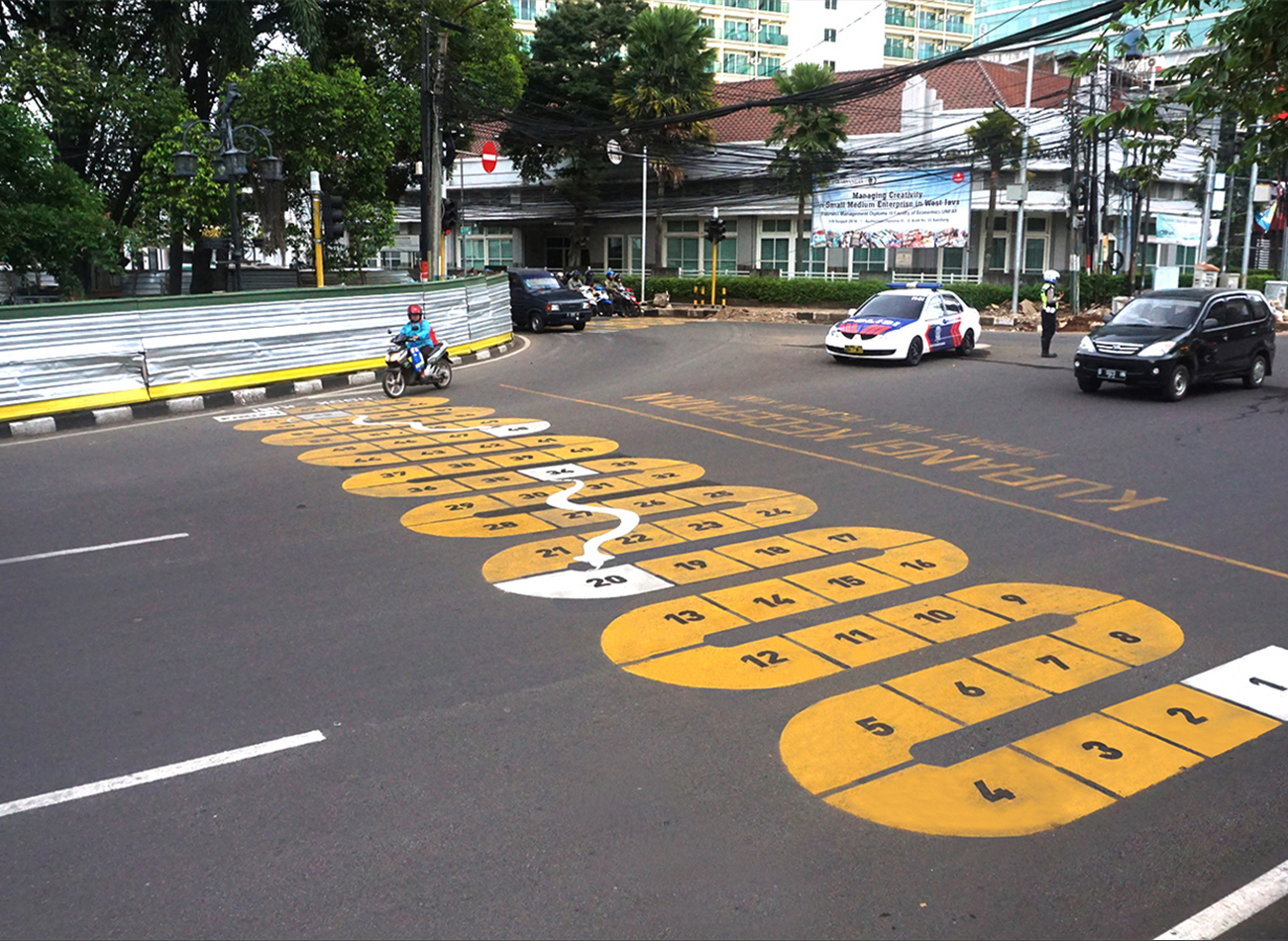
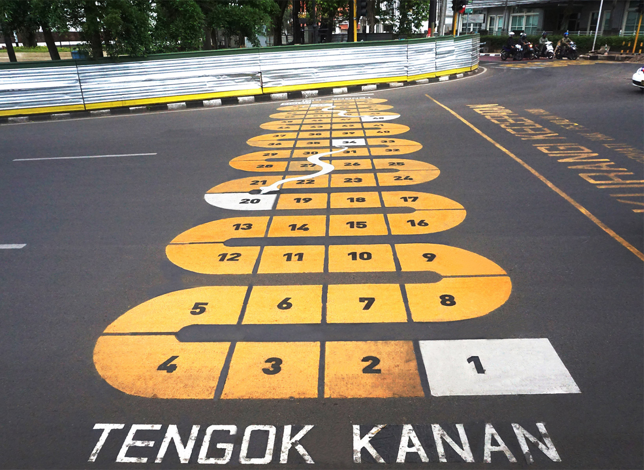
For our fun crosswalk graphics, designed to increase awareness of designated crossing zones, we built upon traditional games like ular tangga (Snakes and Ladders) and engklek (hopscotch), as well as patterns from local bamboo musical instruments like angklung and suling. Finally, our unique e-transport cards—used for public-bus fare, bicycle rental, or paying parking fees—represent the rich visual history of Bandung City as well as its progression into the future, with distinctive graphics for each card to identify its specific function.
KUDOS Design Collaboratory
-
Andy kurniawan
Creative Director -
Ryan Adenata
Art Director -
Ilham Muhamad Firdaus
Designer
Aerial Photography
- Dudi Sugandi

Community Wellbeing Index 2019
DataHaven
Capabilities
Focus Area
Client
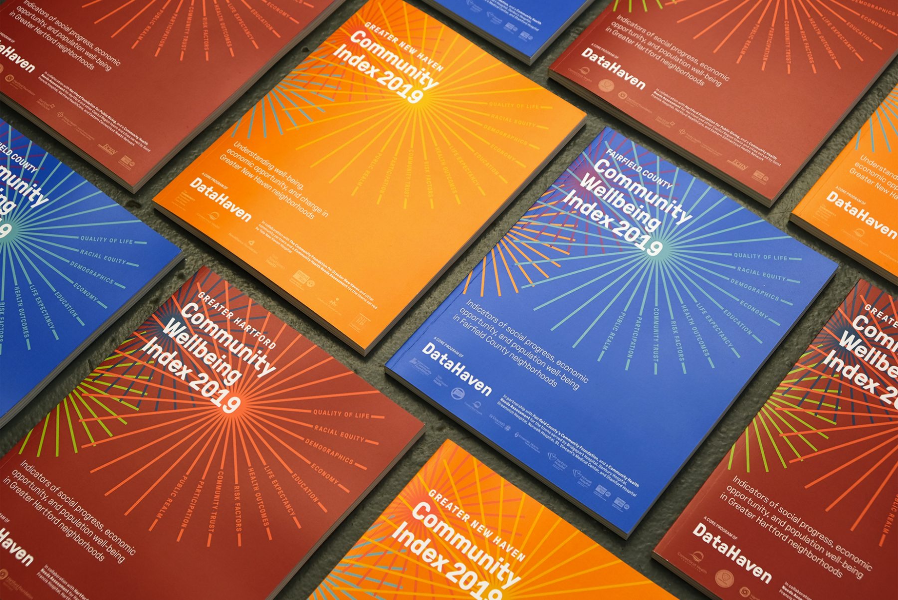
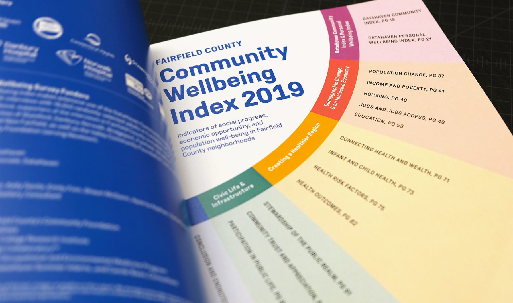
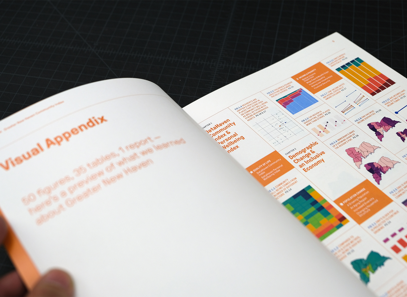
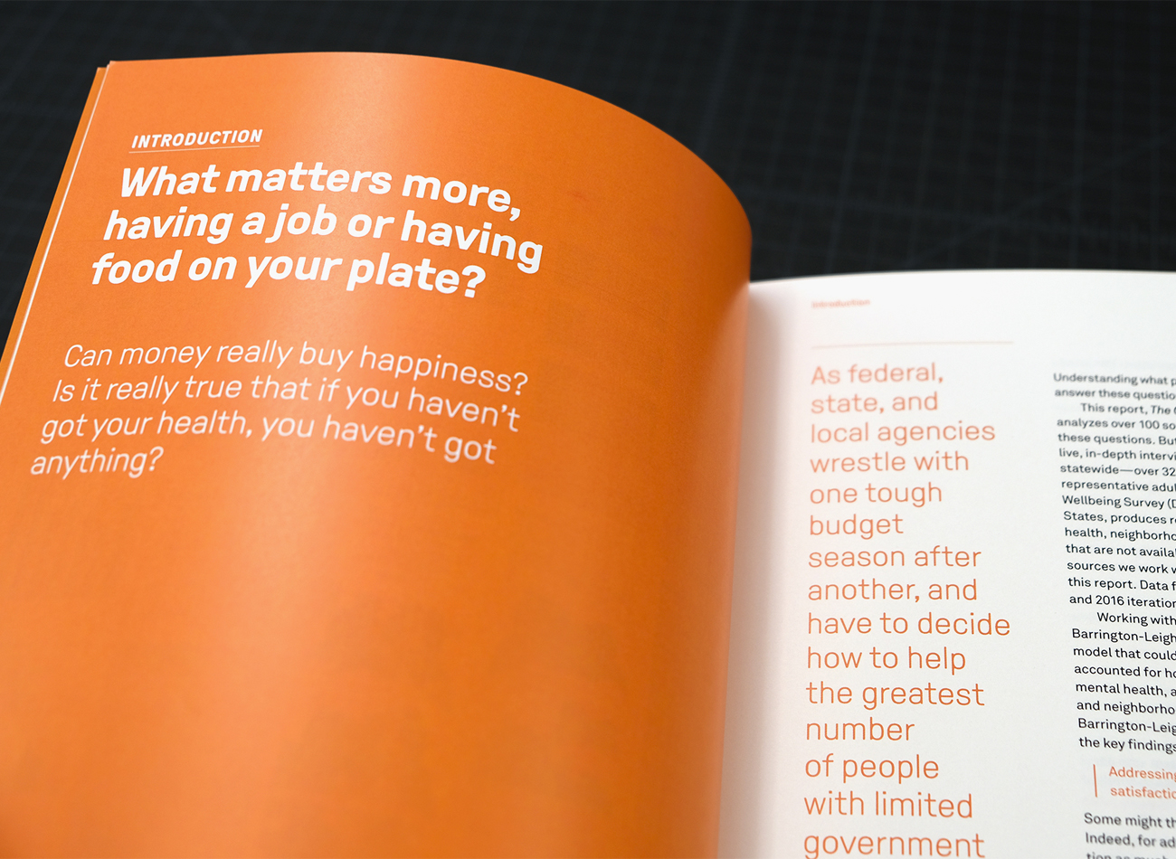
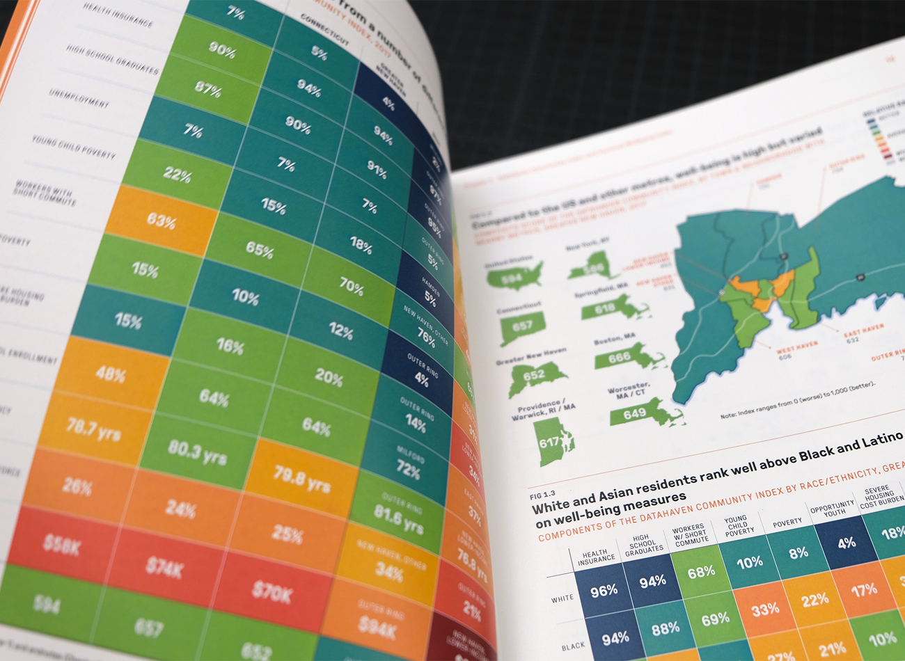
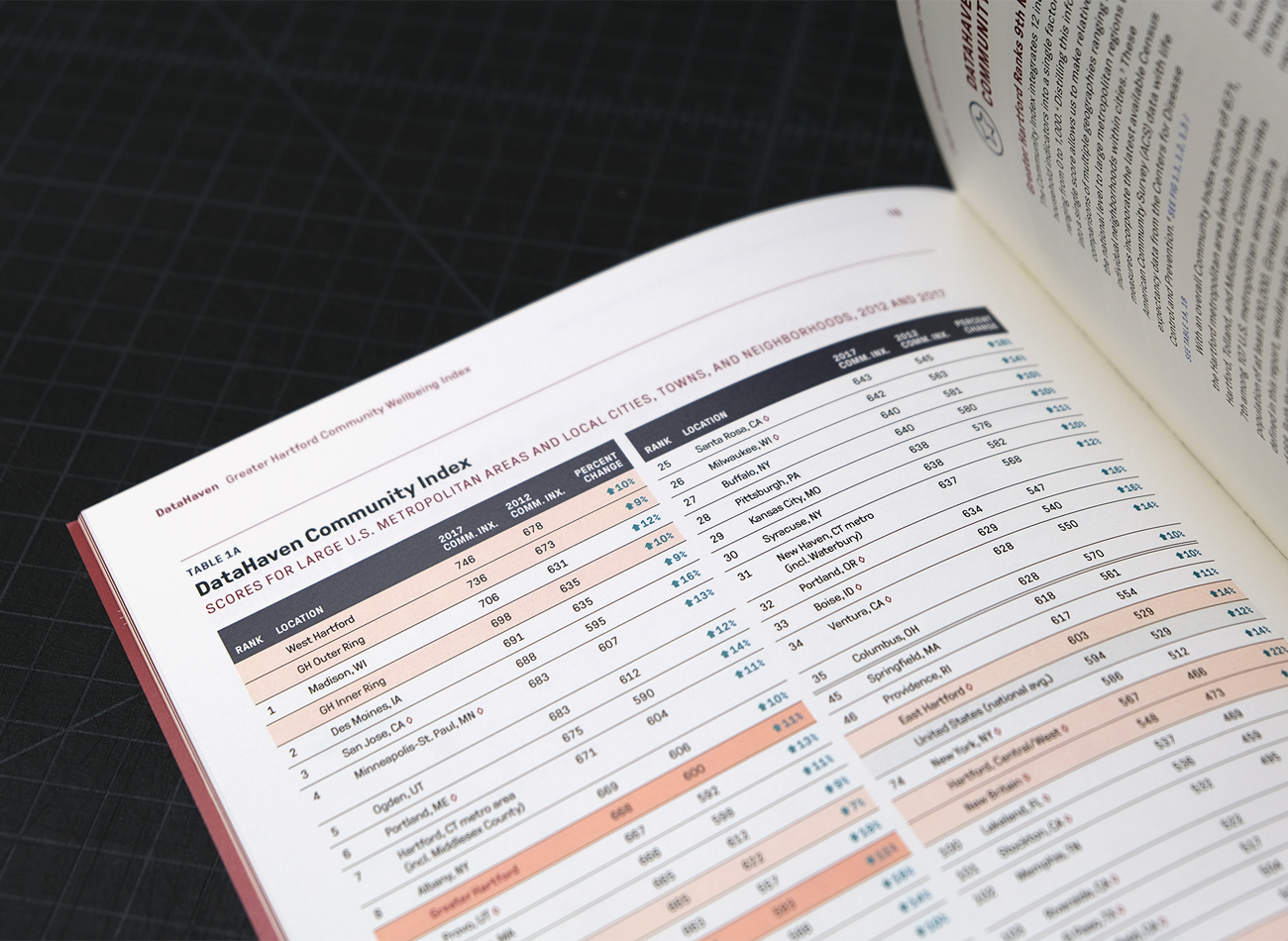
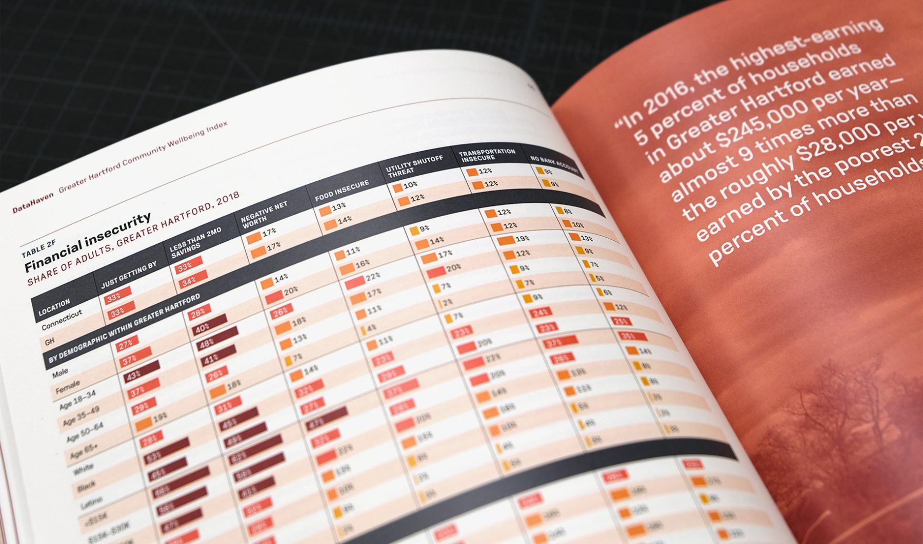
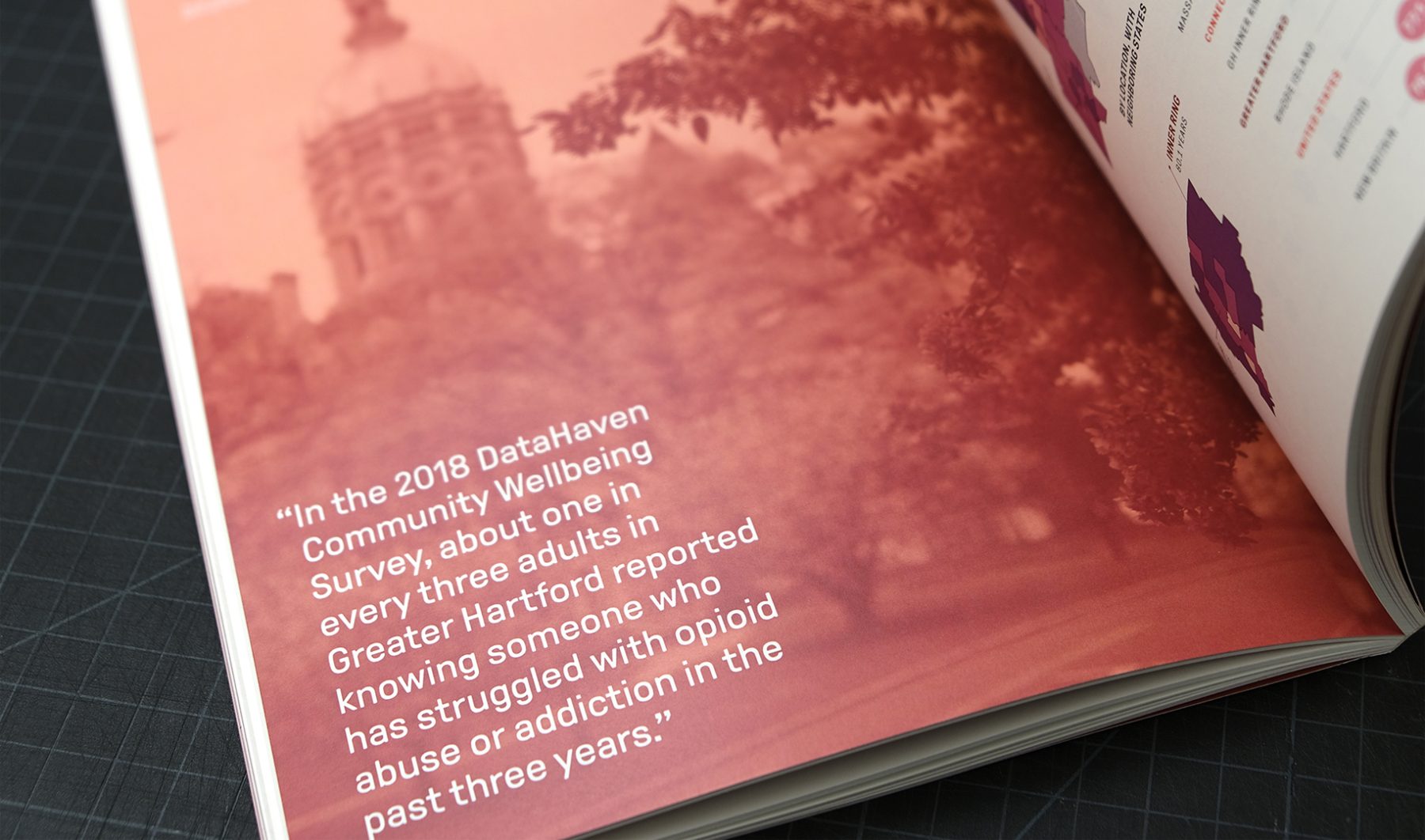
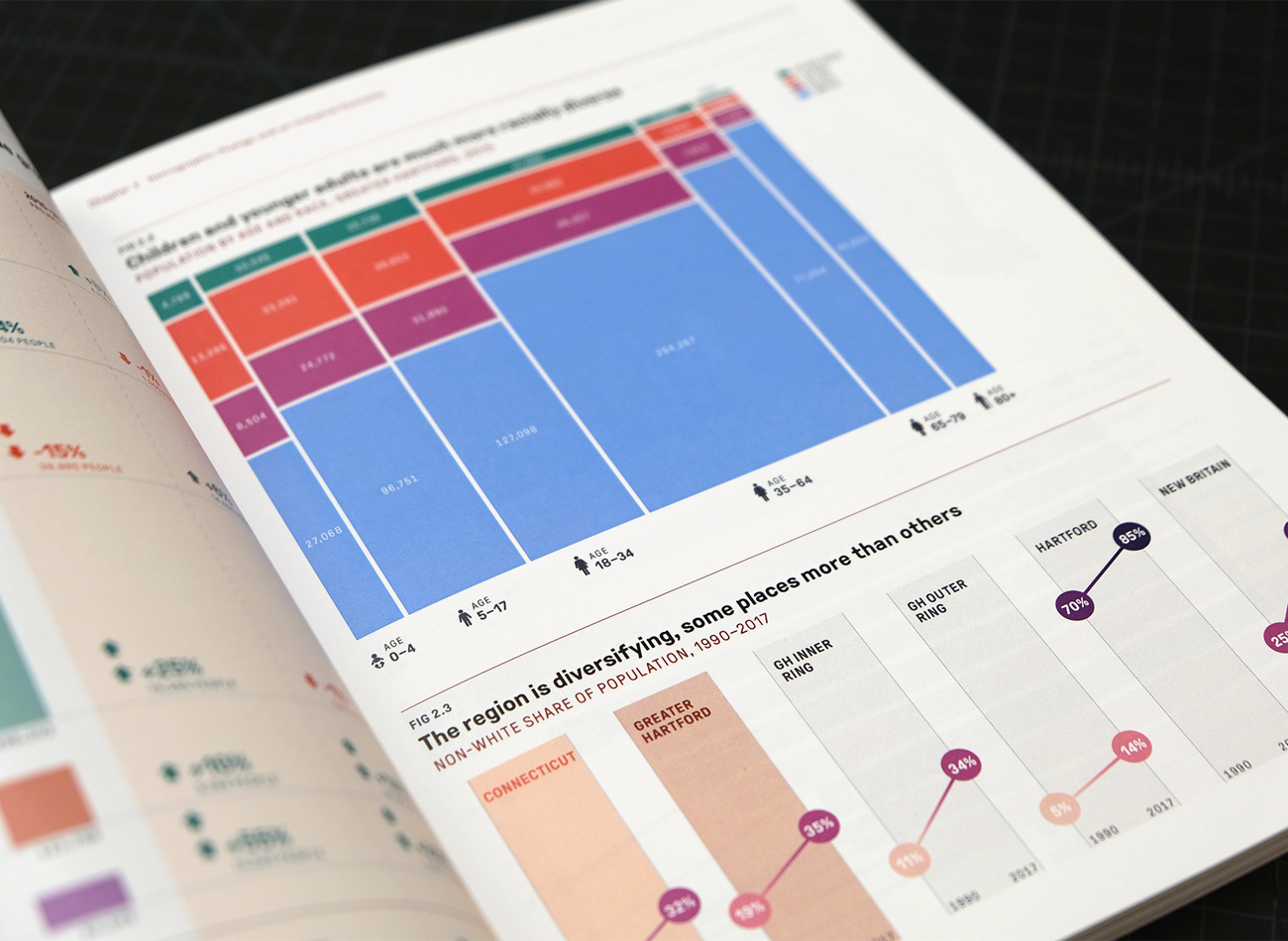
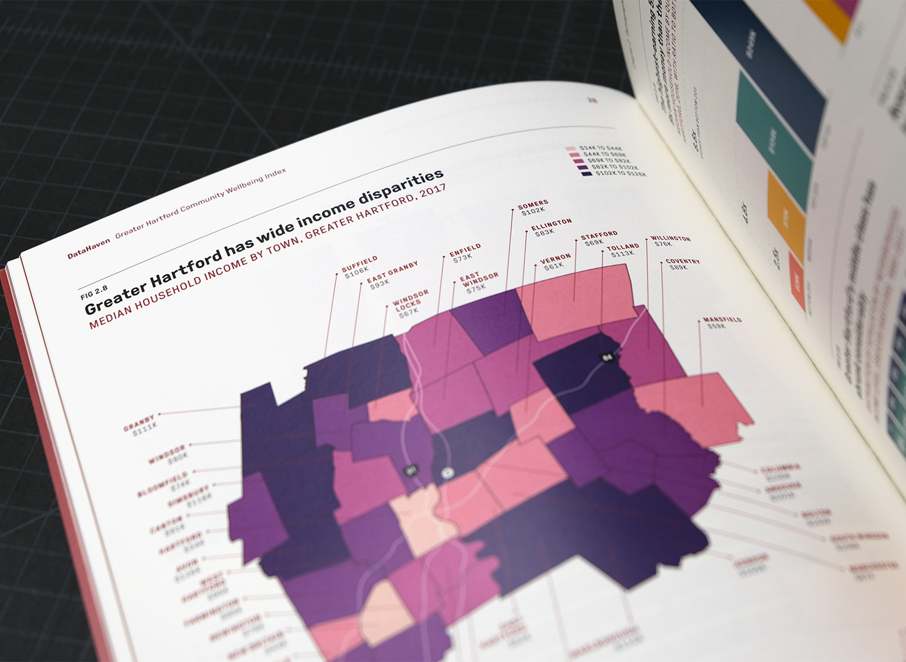
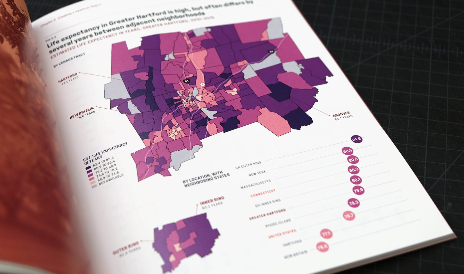
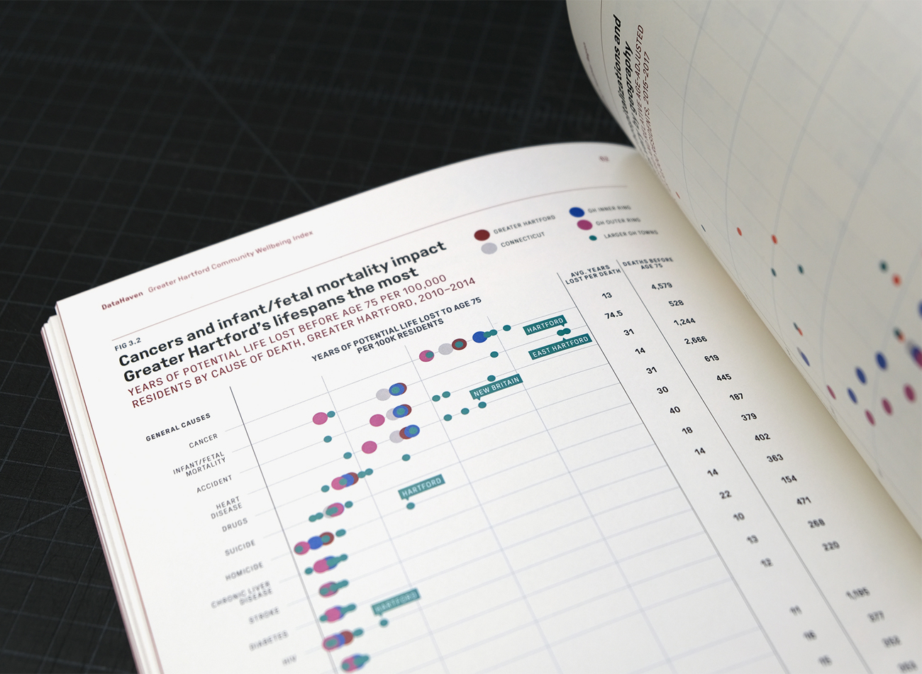
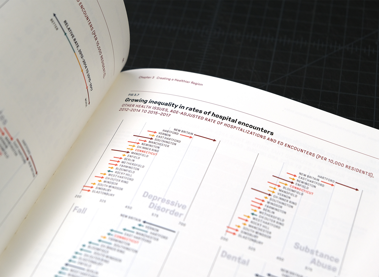
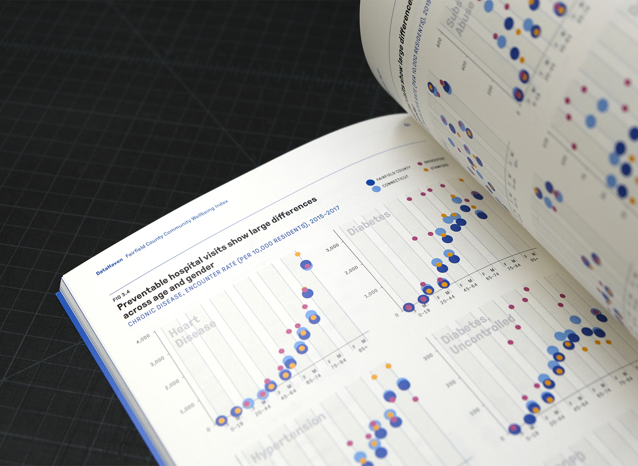
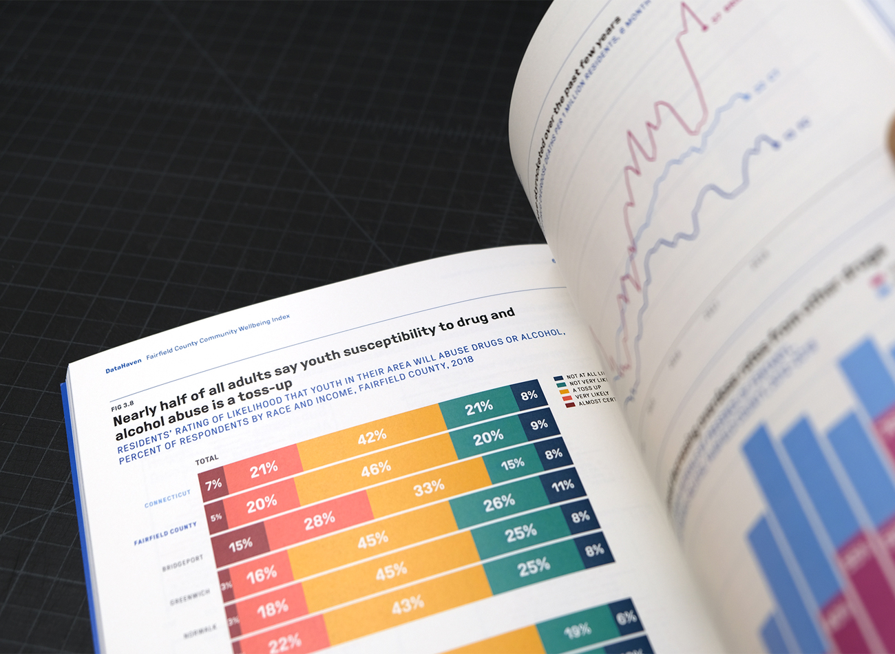
DataHaven is a nonprofit that collects, interprets, and shares public data to inspire effective decision-making, improving the quality of life in local communities.
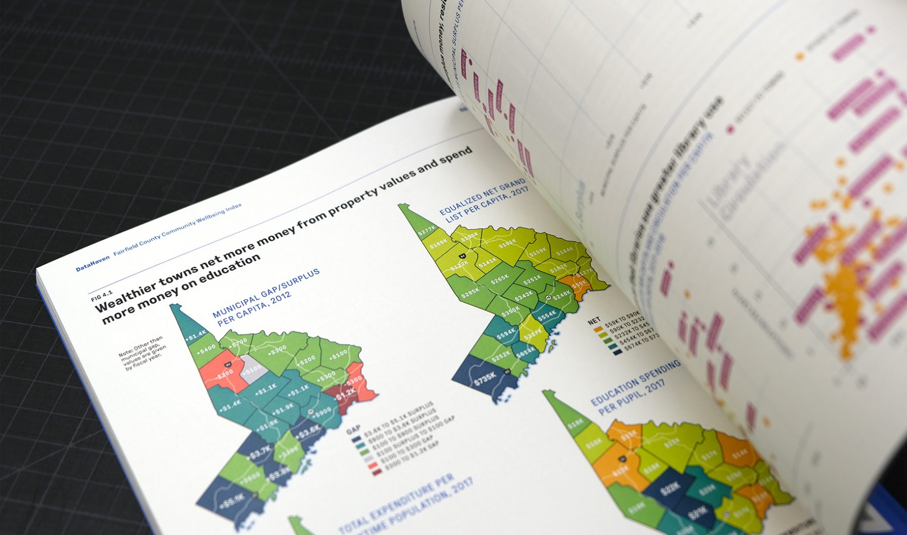
For this data-visualization and publication-design project, we designed a series of three DataHaven reports for Fairfield County, Greater Hartford, and Greater New Haven, Connecticut. We developed variant cover concepts and interior layouts for the three reports, along with data visualizations on almost every page interpreting data produced for more than 100 partners throughout Connecticut and its neighboring states.
KUDOS Design Collaboratory
-
John Kudos
Creative Director -
Ashley Wu
Designer
Assembly: Civic Design Guidelines
Center for Active Design
Capabilities
Focus Area
Client
Awards
-
GDUSA 2018 American Graphic Design Awards
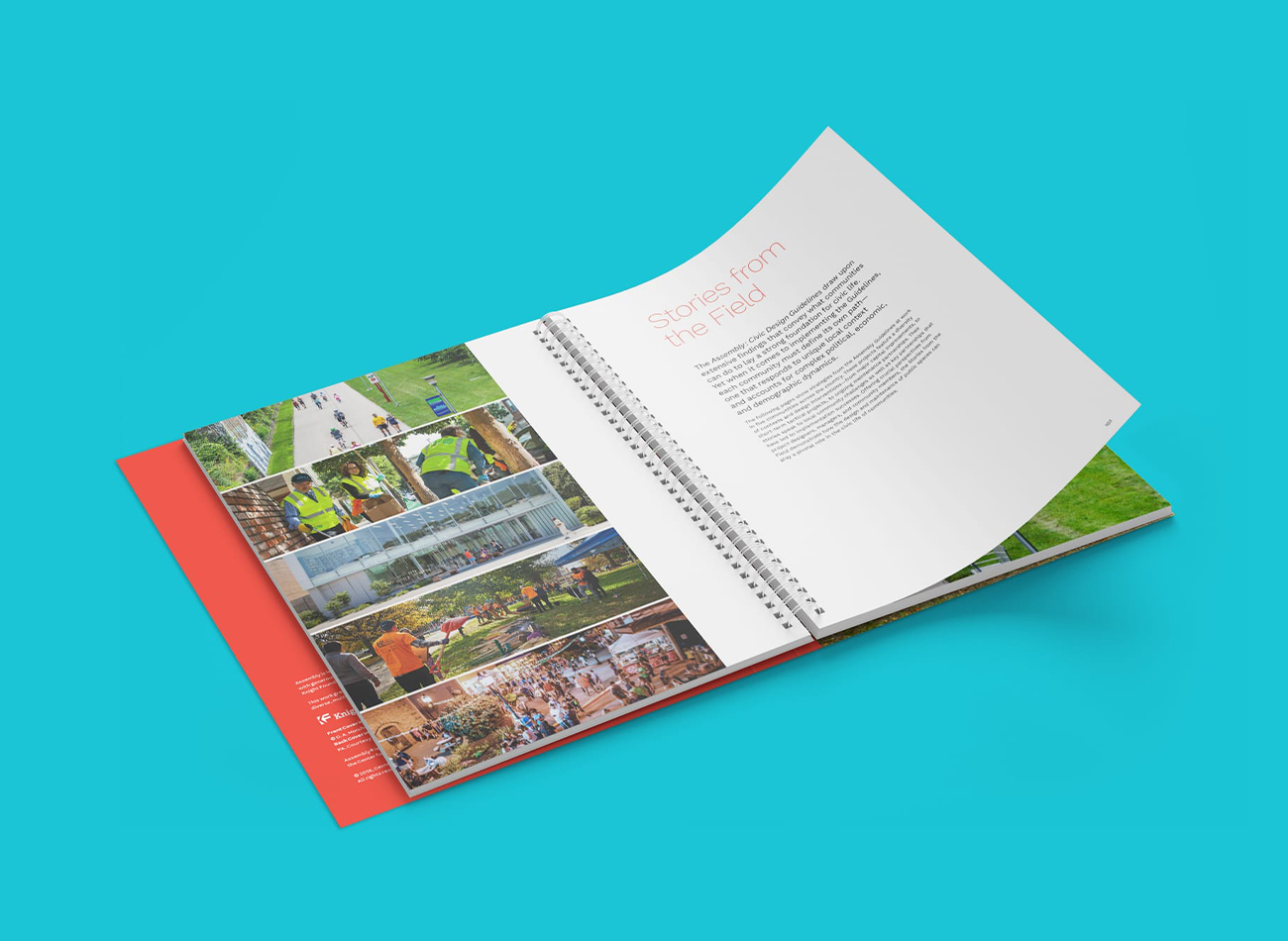
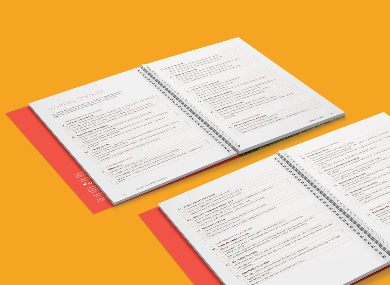
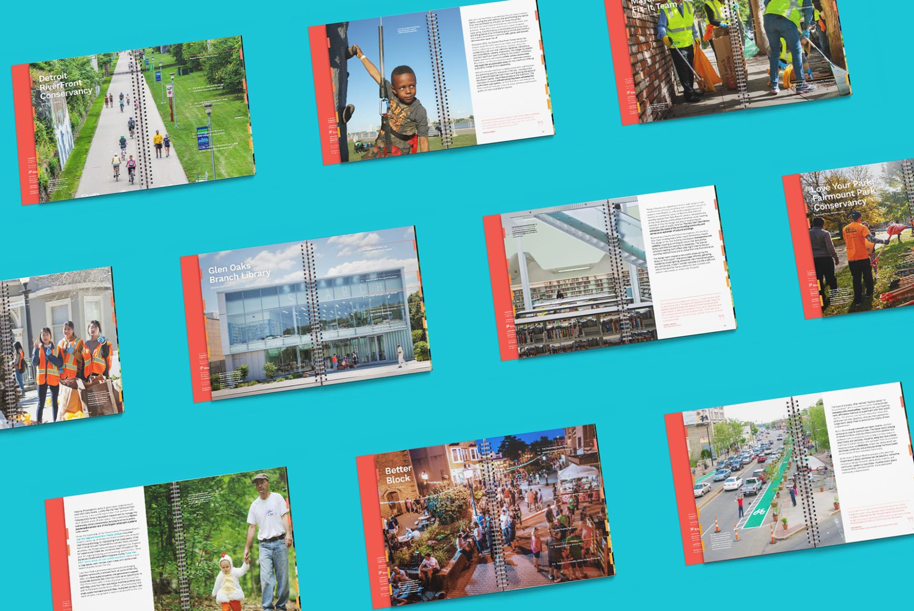
Produced in close collaboration with the Center for Active Design, “Assembly: Civic Design Guidelines” is a groundbreaking playbook for creating well-designed and well-maintained public spaces. The guidelines encapsulate four years of research—involving over 200 studies, 50 cities, and dozens of experts—highlighting the role of public spaces as a force for building trust and healing divisions in local communities.
We designed the published guidelines to incorporate vibrant colors and simple hand-drawn illustrations to help explain the significance of these research findings in simple terms, along with practical methods that policymakers can adopt to bring about great public spaces for all.
KUDOS Design Collaboratory
-
John Kudos
Creative Director -
Saori Tahara
Designer

Americans Exhibition
National Museum of The American Indian
Capabilities
Focus Area
Client
Awards
-
GDUSA 2018 American Graphic Design Awards
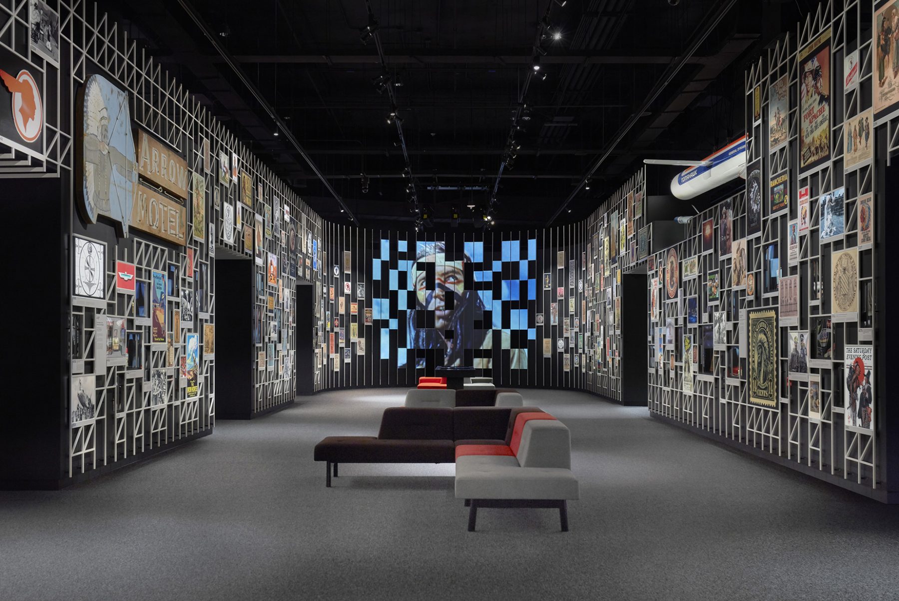
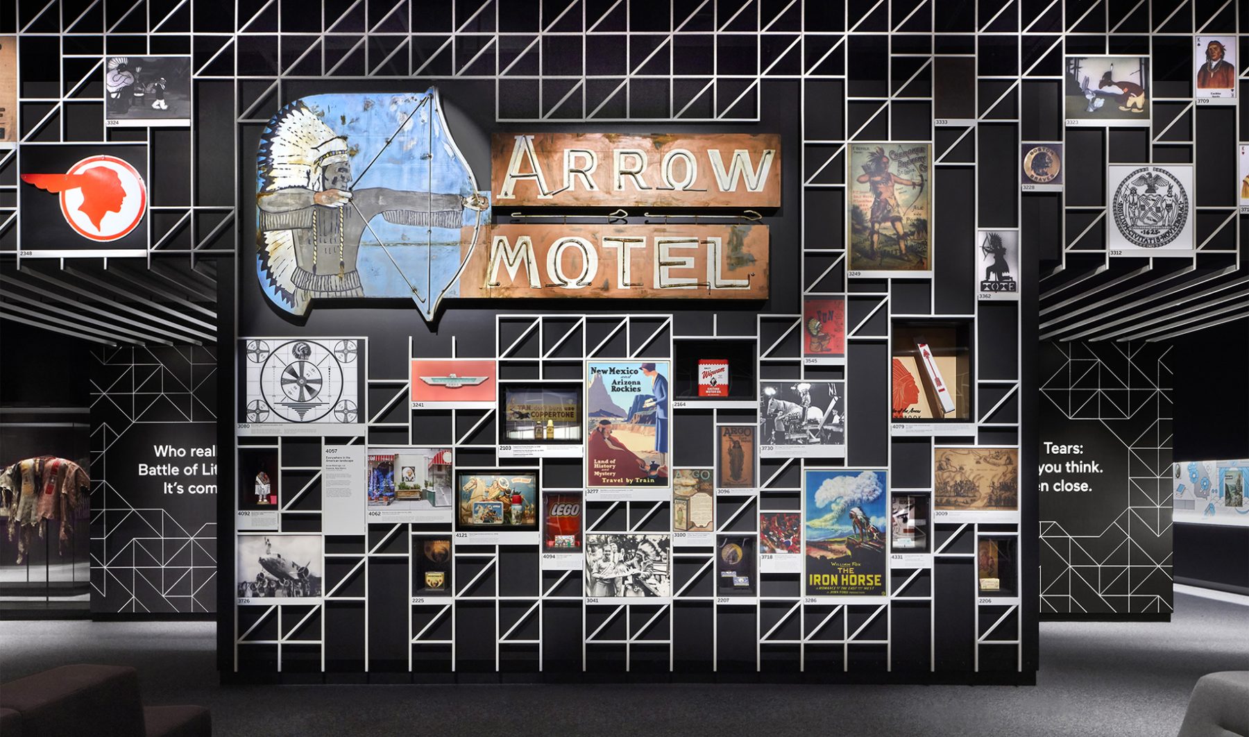
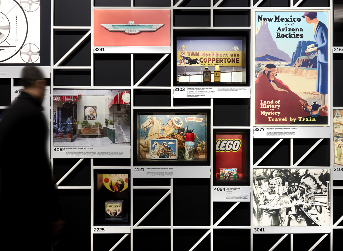
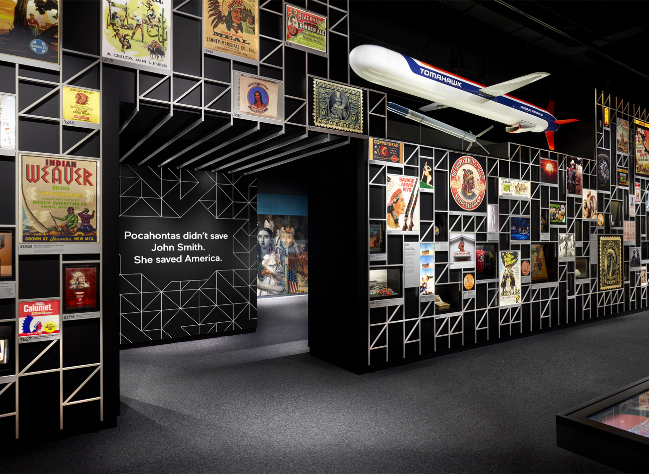
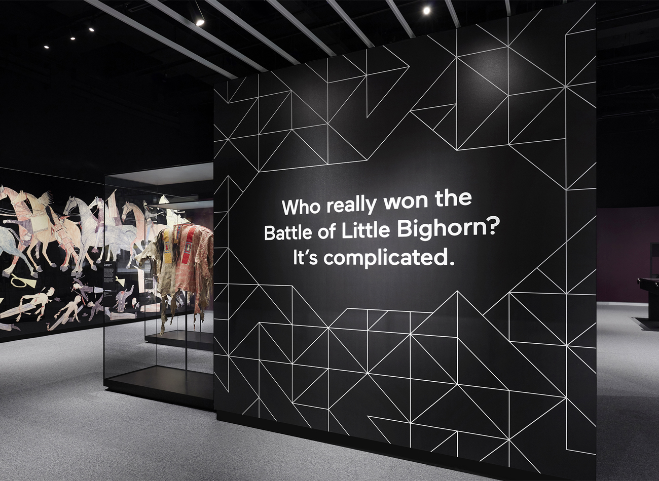
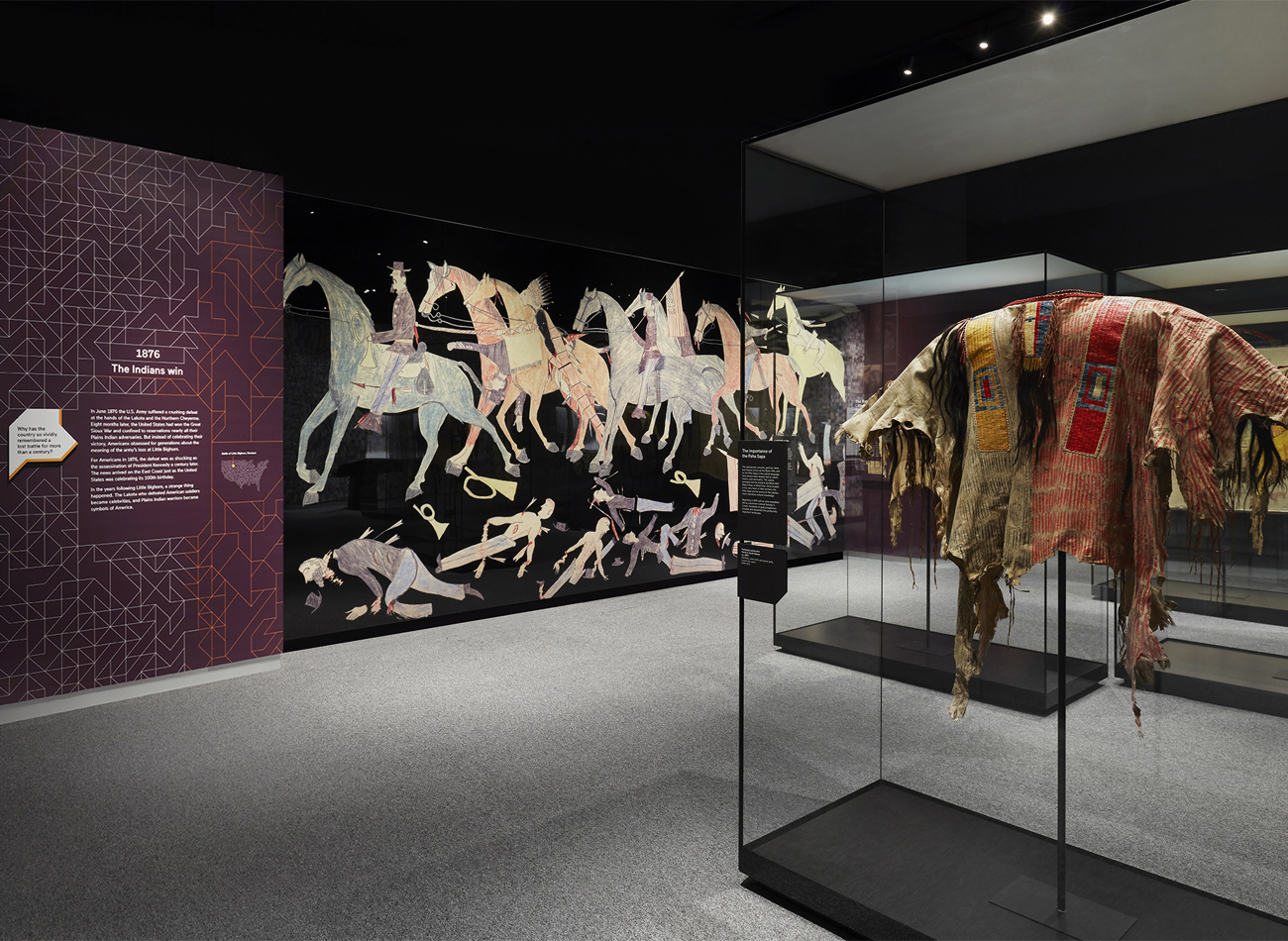
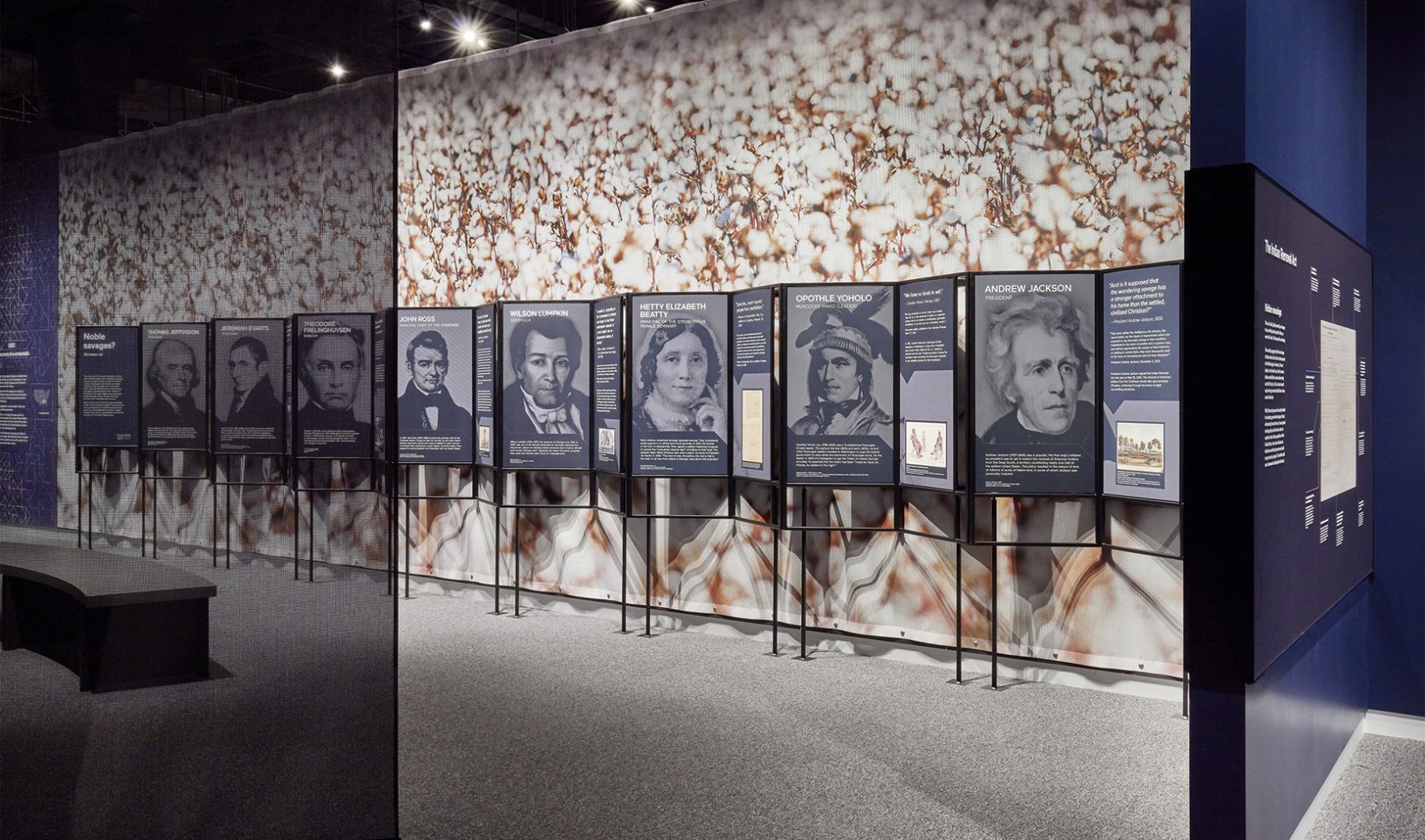
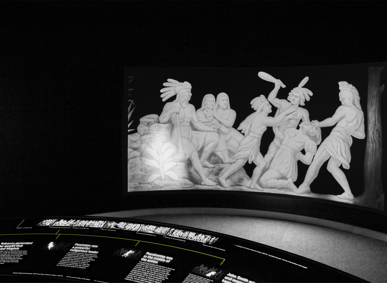
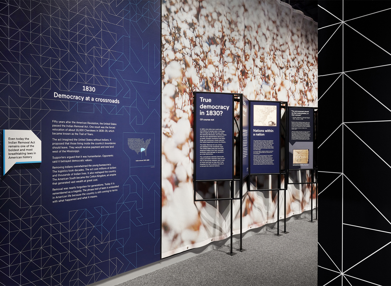
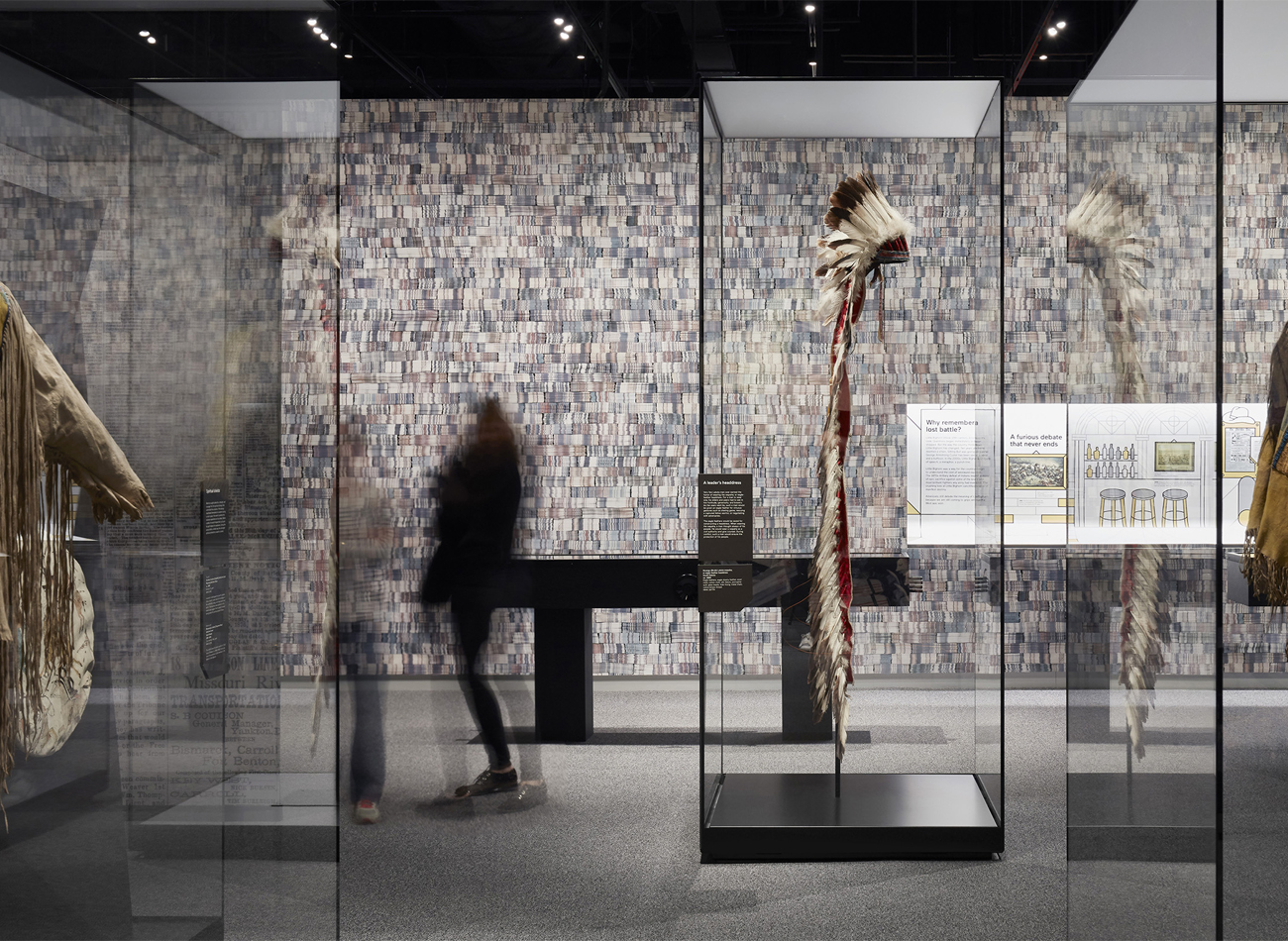
For the “Americans” exhibition at the National Museum of the American Indian, Kudos was tasked with the exhibition’s production design.
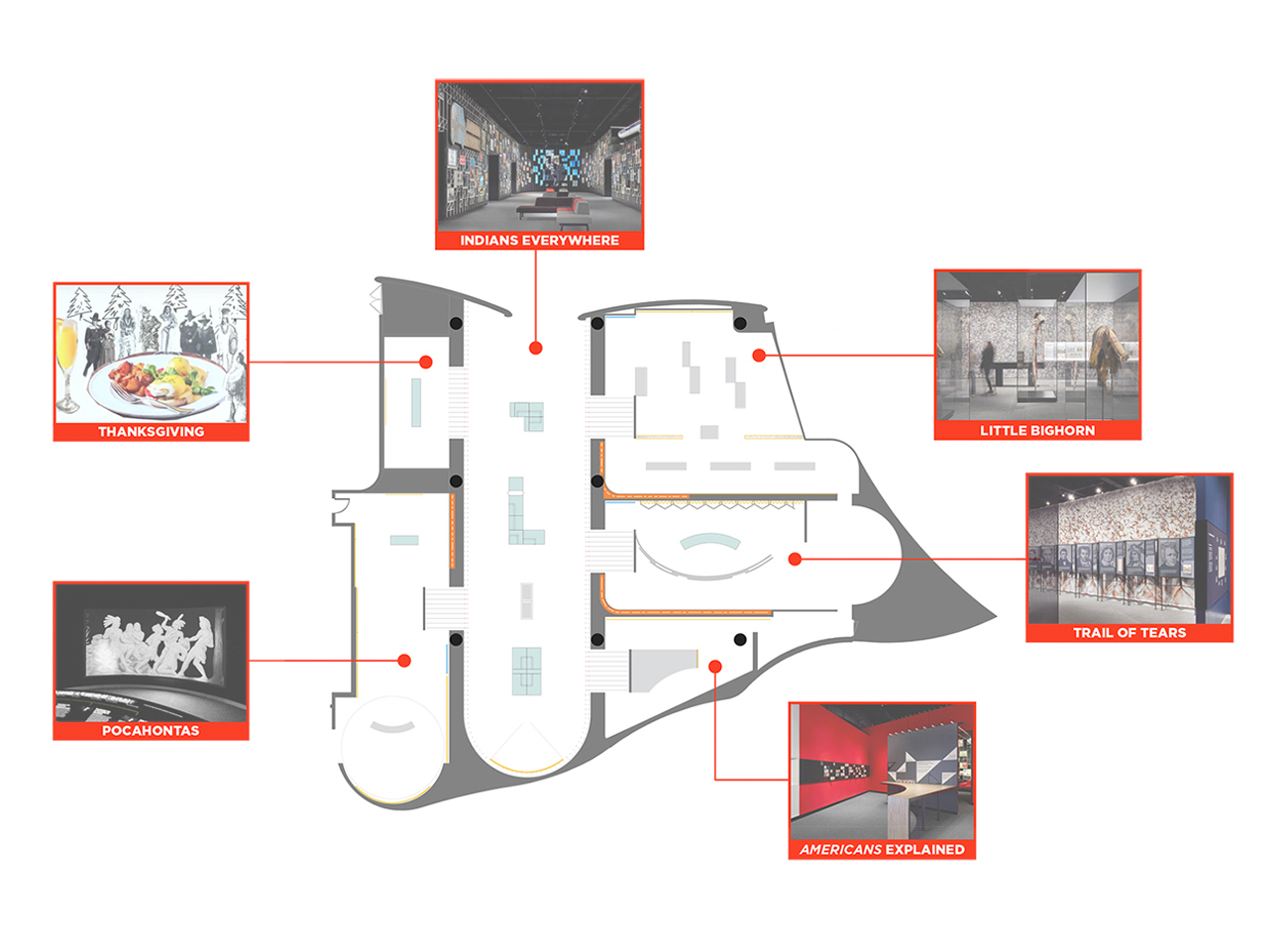
We showcased hundreds of graphics and artifacts representing American Indians from three centuries of American life, all gathered in six interconnected galleries in the southwest wing of the museum. Each gallery covered a familiar topic like Pocahontas, the Battle of Little Bighorn, Thanksgiving, and the Trail of Tears. We worked closely with Studio Joseph to ensure a clear typographic hierarchy and optimum production/installation methods for all graphic components across the various galleries and surfaces.
KUDOS Design Collaboratory
-
John Kudos
Creative Director -
Ashley Wu
Designer
National Museum of the American Indian
Photography
- Thomas Loof
NYS Equal Rights Heritage Center Interactive Exhibition
New York State Office of Parks, Recreation, and Historic Preservation
Capabilities
Focus Area
Client
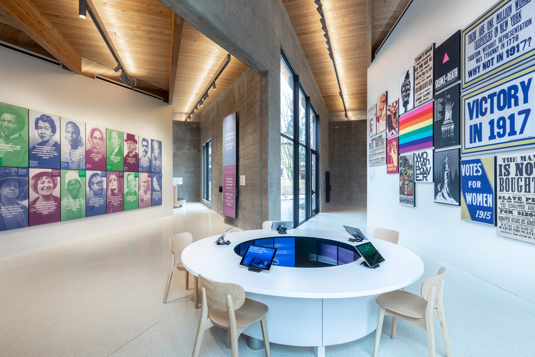
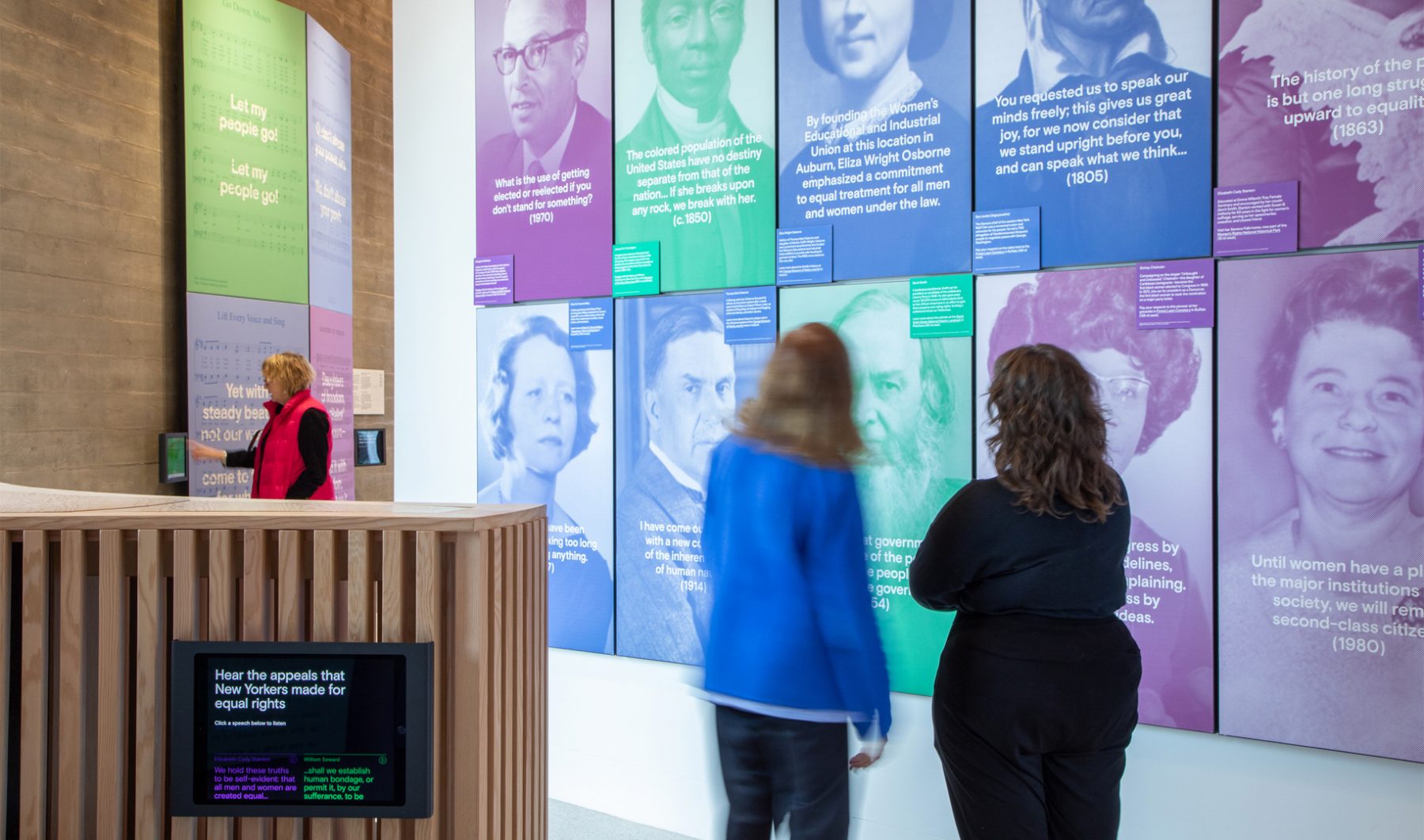
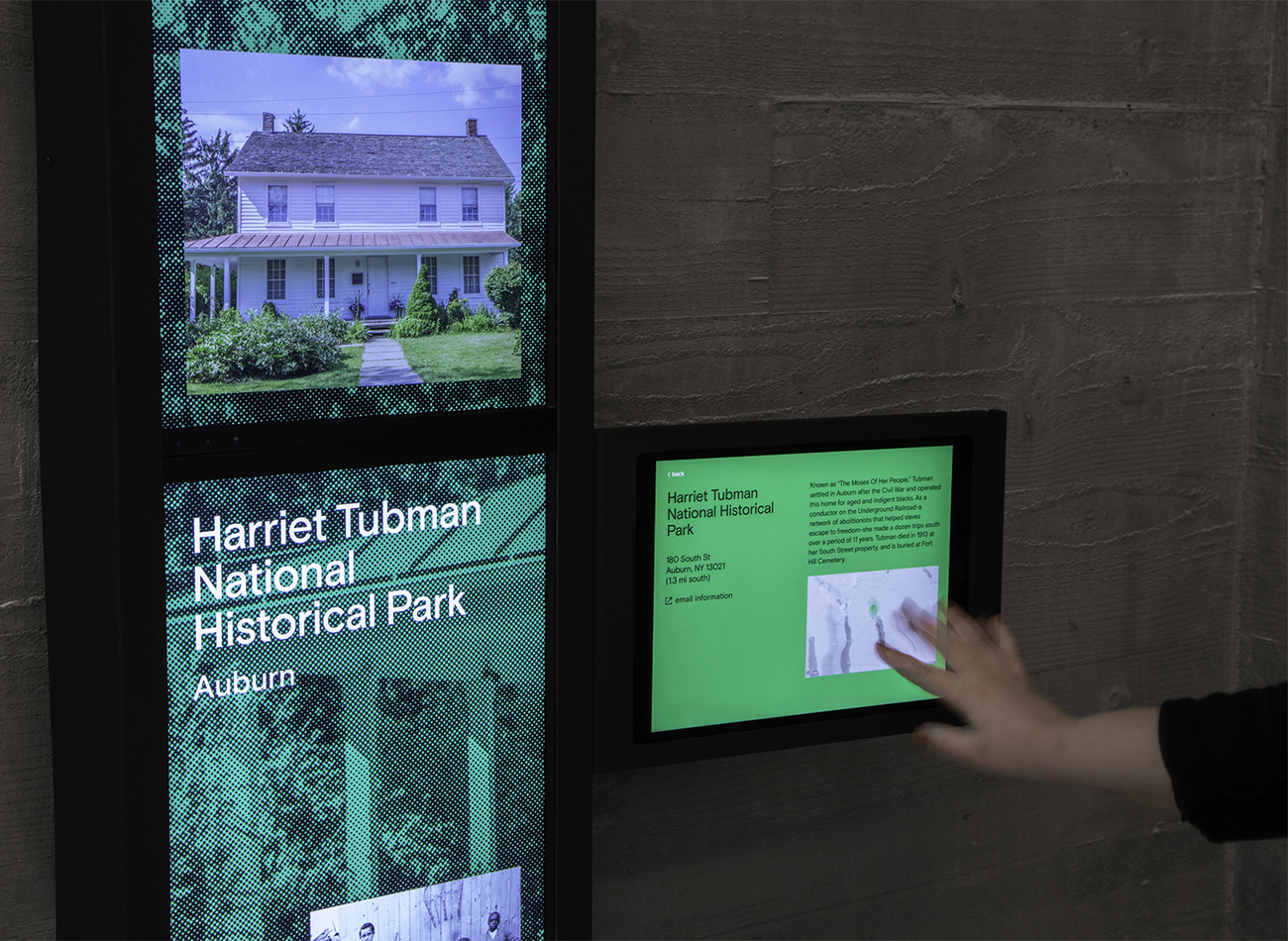
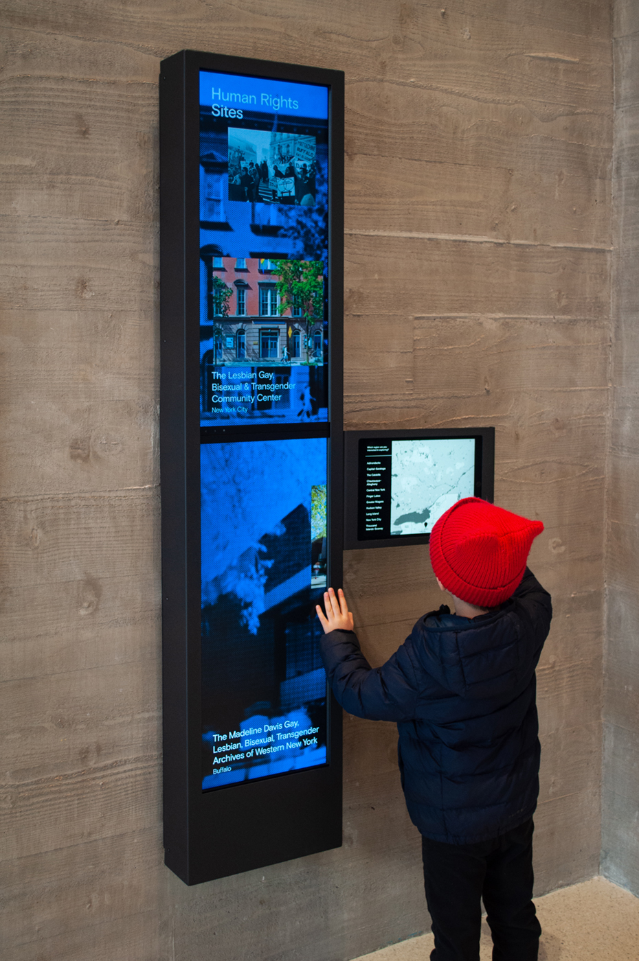
Opened in November 2018, the New York State Equal Rights Heritage Center is part of a series of Regional Welcome Centers established by Governor Andrew Cuomo to support the state’s growing tourism industry. Just a mile from the newly designated Harriet Tubman National Historical Park and a short drive from Seneca Falls, the Center highlights statewide attractions related to the ongoing struggle for equal rights.
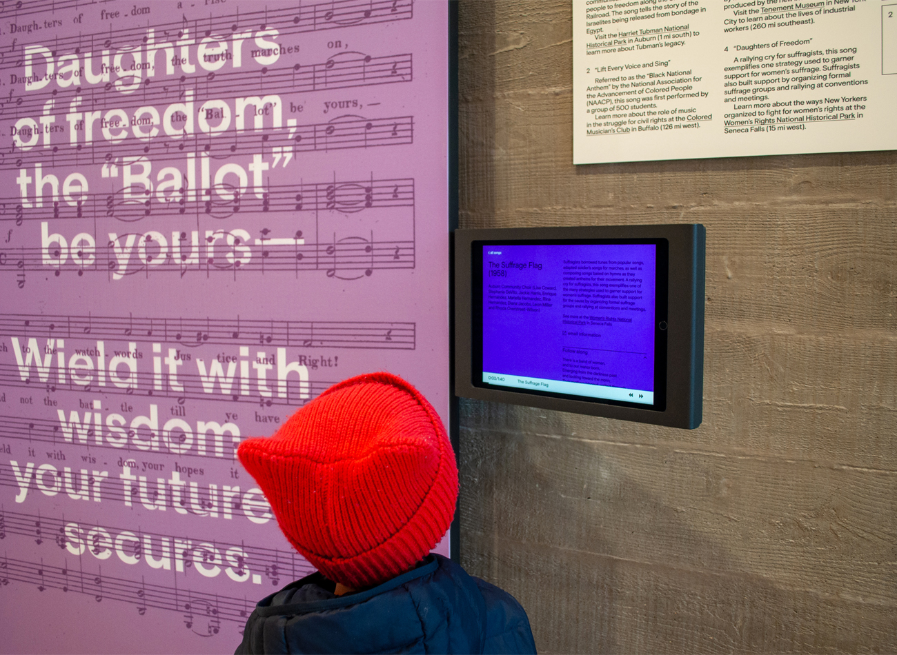
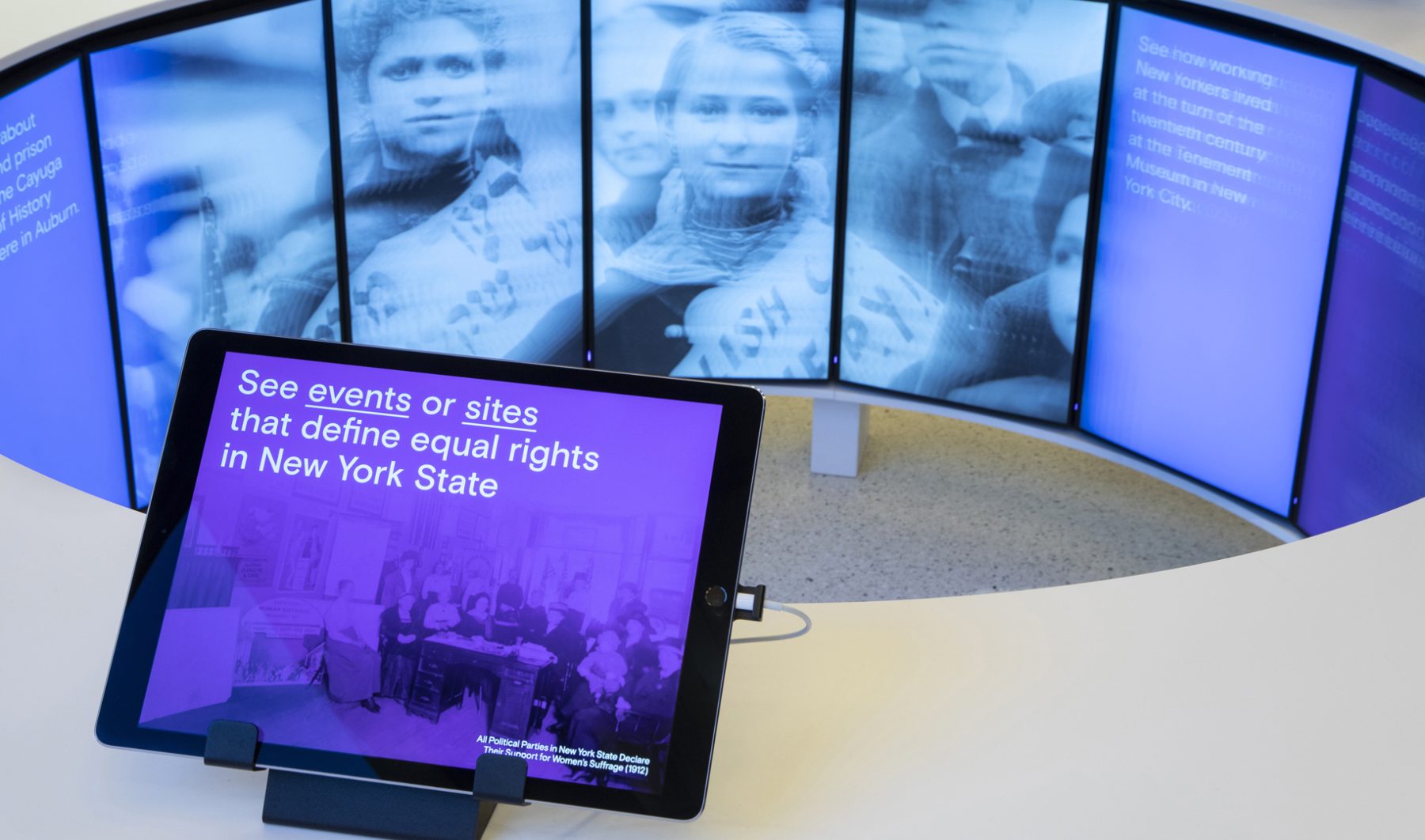
To serve the Center’s purpose as a launching pad for visitors to explore New York State, we developed four types of interactive iPad kiosks that allow visitors to browse highlights by geographic location, navigate social-justice milestones, and listen to songs and speeches. We worked collaboratively with MTWTF, who was commissioned by the New York State Office of Parks, Recreation, and Historic Preservation to develop the content strategy, design, and media for a permanent exhibition at the Center, “Seeing Equal Rights in New York State.”
Project Team
-
MTWTF
Lead Exhibit Design -
KUDOS
Software Development
KUDOS Design Collaboratory
-
John Kudos
Technical Director -
Sumit Paul
Designer -
Sumit Paul
Software Developer
The Swiss Grid
Poster House
Capabilities
Focus Area
Client
Poster House (New York City) is the first museum in the U.S. to be dedicated exclusively to posters, presenting a global view of the medium from its earliest appearances in the late 1800s to present-day uses.
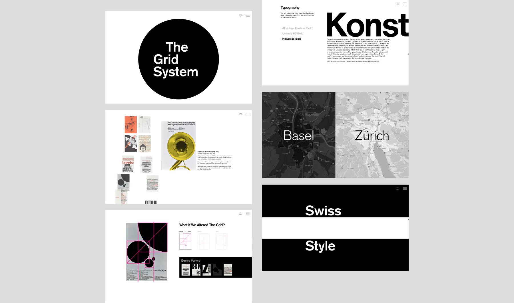
The Swiss Grid was a Poster House exhibition that launched on February 26, 2020. Ten days after the opening, the museum shut down due to COVID-19. We helped Poster House transition the exhibition into a remote-learning tool that provides historical and pedagogical context for some of the technical teachings of design.
Using core material from the original exhibition, the microsite shows how a particular aesthetic—referred to as “The Swiss Grid”—developed in post–World War II Switzerland and spread around the world through generations of practitioners, and how that aesthetic was used to create incredible posters for the cultural sector. The site interweaves contemporary attitudes toward teaching mid-century Modernism and the desire to both break free of and find new use for grid systems in contemporary design.
KUDOS Design Collaboratory
-
John Kudos
Creative Director -
Ashley Wu
Designer -
Fay Qiu
Designer -
Chris Manlapid, Arif Widipratomo
Web Developer
Bronx & Brooklyn Energy Hub
Center for NYC Neighborhoods
Capabilities
Focus Area
Client
New York State and NYSERDA, the force behind the Bronx & Brooklyn Energy Hub, are funding an array of renewable energy technologies—offshore and onshore wind power, solar power, hydro power, battery storage, and clean hydrogen—to meet their goal of 100% emissions-free electricity by 2040.
The Bronx & Brooklyn Energy Hub isn’t just about making renewable energy accessible; it’s about forging meaningful connections—bridging gaps and fostering a sense of camaraderie among neighbors, providing benefits, and empowering people regardless of their income and status. The logo we designed for the Hub reflects this purposeful connectivity, as embodied in three intertwining and extending vibrant lines. These lines represent the accessibility of renewable-energy technologies, as well as unity among community members.
KUDOS Design Collaboratory
-
John Kudos
Creative Director -
Fay Qiu
Lead Designer -
Owen Febiandi
Designer -
Putu Yogiswara
Designer -
Iman Fadillah
Motion Designer -
Amanda Knott
Project Manager


House of Hope Branding
House of Hope
Capabilities
Focus Area
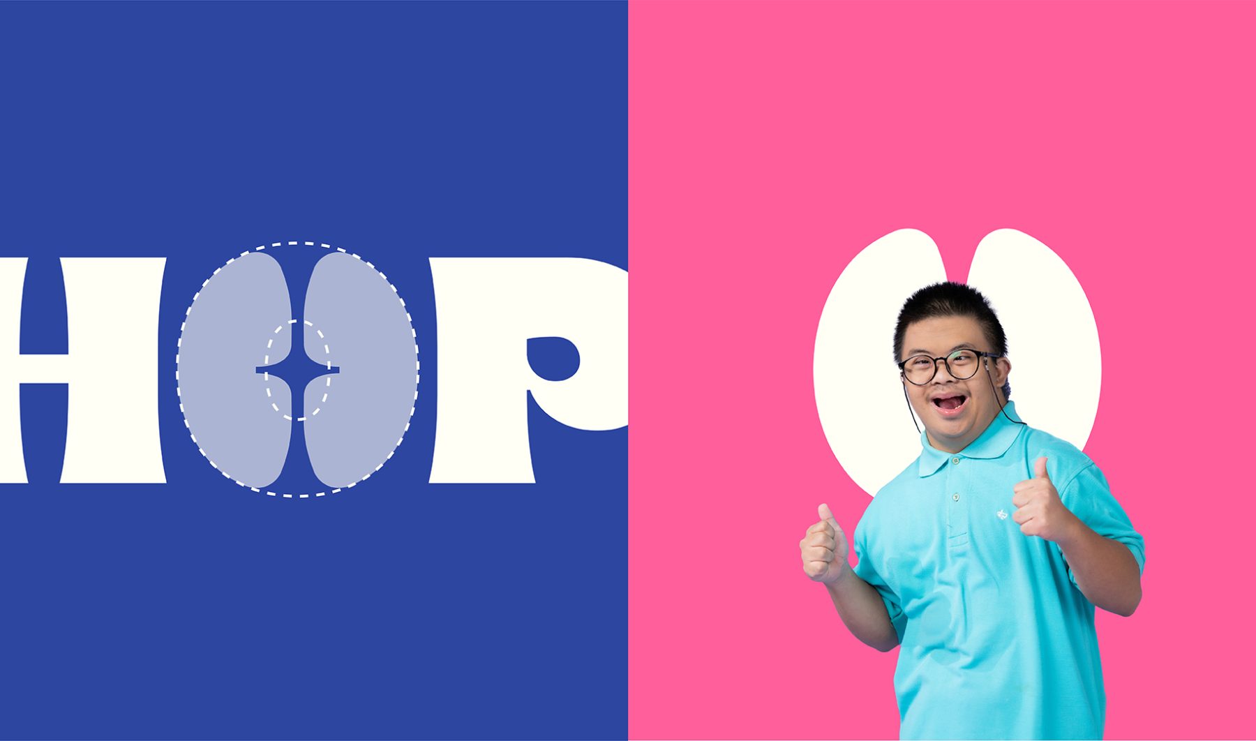
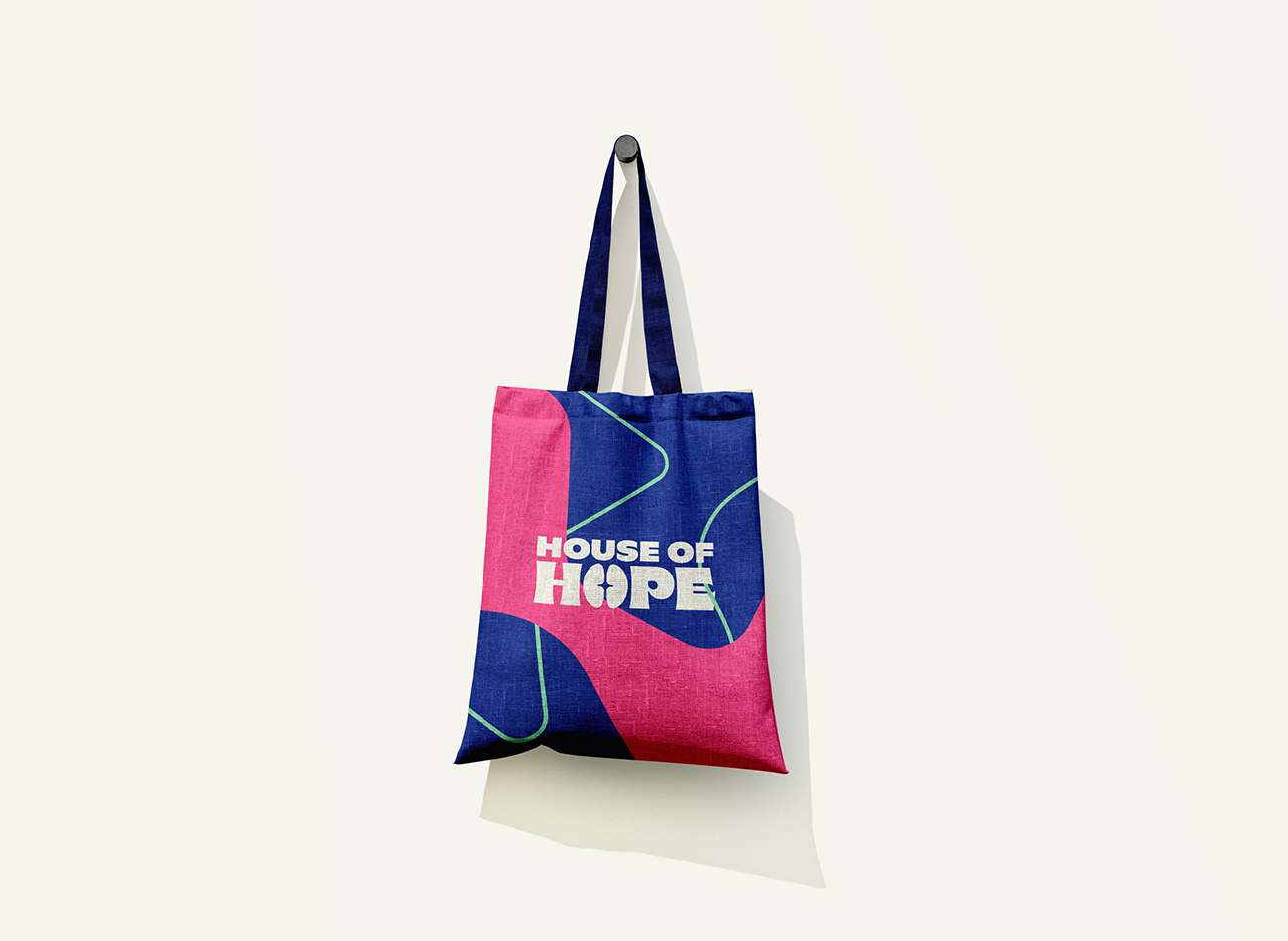
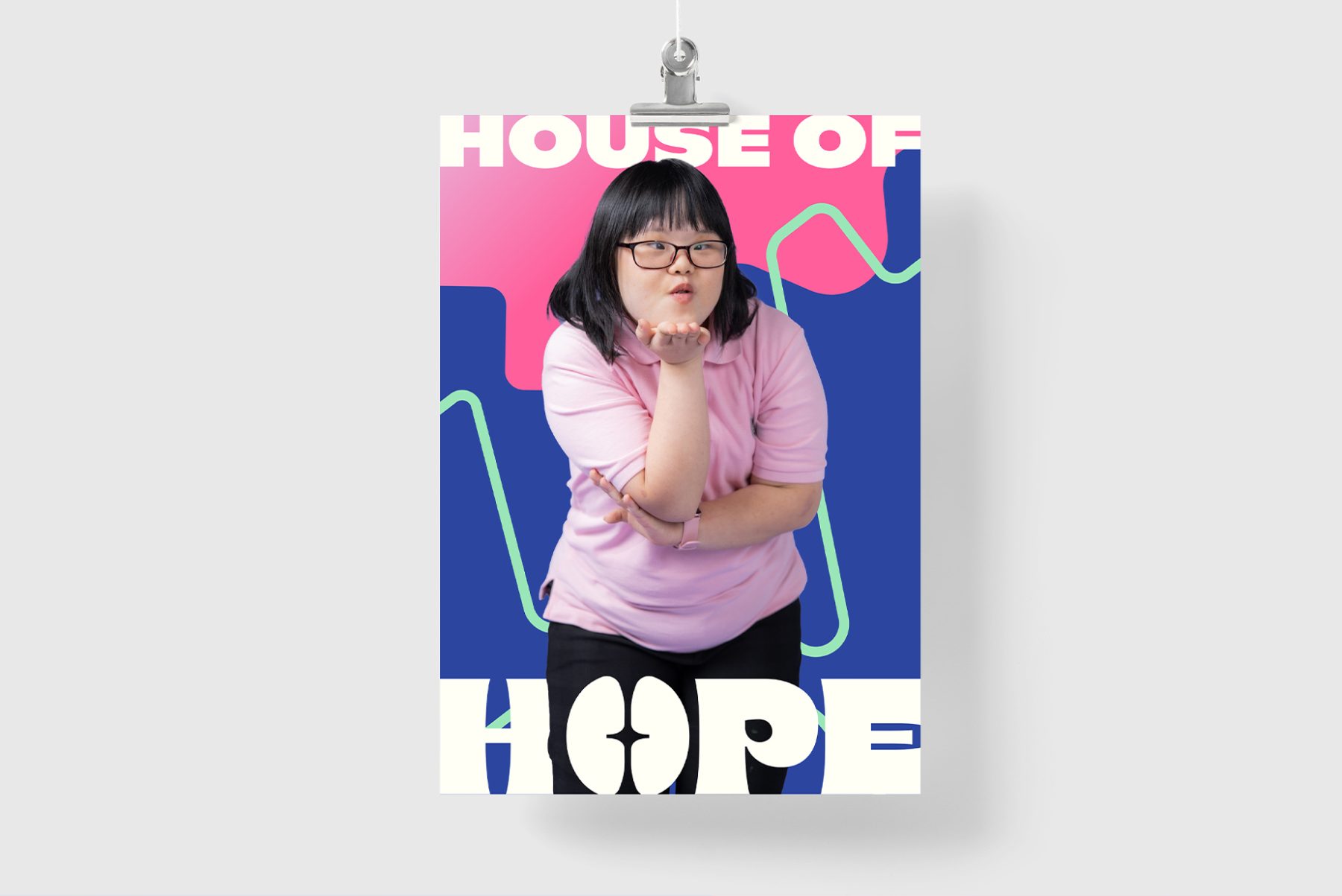
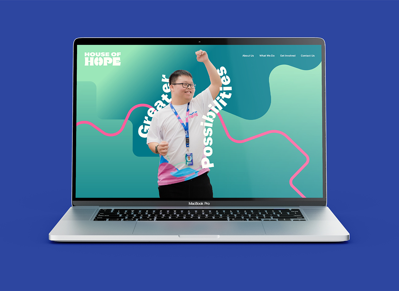
House of Hope exists as a bridge to the world of work for individuals aged 18 and up with special needs. With the support of the Blessindo Harapan Mandiri Foundation, House of Hope empowers these individuals to explore their potential and thrive in the workplace.
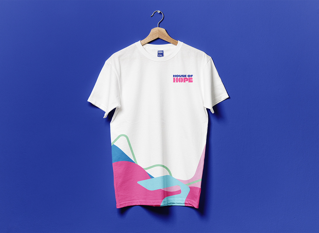
KUDOS collaborated closely with the foundation’s internal team to ensure our brand-design solution addressed their primary concern: shifting perceptions from solely seeing the foundation as a fund-raising organization to showing its focus on empowerment, in alignment with their core mission. The rebranding project comprises a notable logomark, a versatile and human-centered graphic patterns, an uncluttered and informative typographic hierarchy, a lively yet welcoming color palette suitable for individuals with special needs, and straightforward but understandable iconography, all consistently reflected throughout the brand’s various applications.
KUDOS Design Collaboratory
-
Andy Kurniawan
Creative Director -
Owen Febiandi
Art Director -
Muhammad Syamil Haqqoni
Designer -
Imam Fadilah
Designer -
Mares Rayeshtyan
Designer -
Darlene Rowena
Designer
SoCal Grantmakers Branding & Website
SoCal Grantmakers
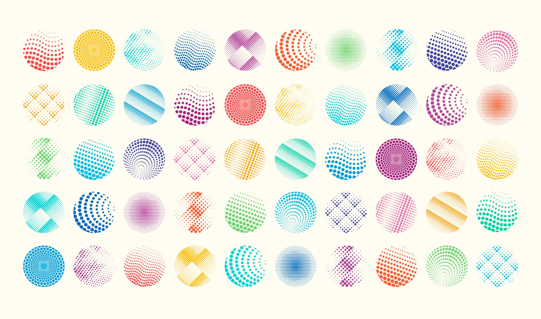
Southern California Grantmakers is a community of philanthropists and grantmakers working to make a difference in communities and around the world. Its members include family, private, public, independent, community, and corporate foundations, along with corporate giving programs, individuals, and government agencies.
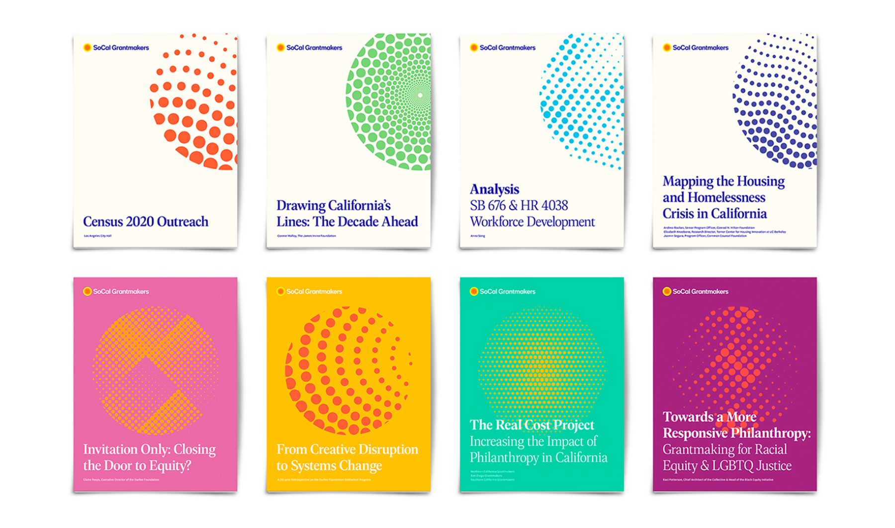
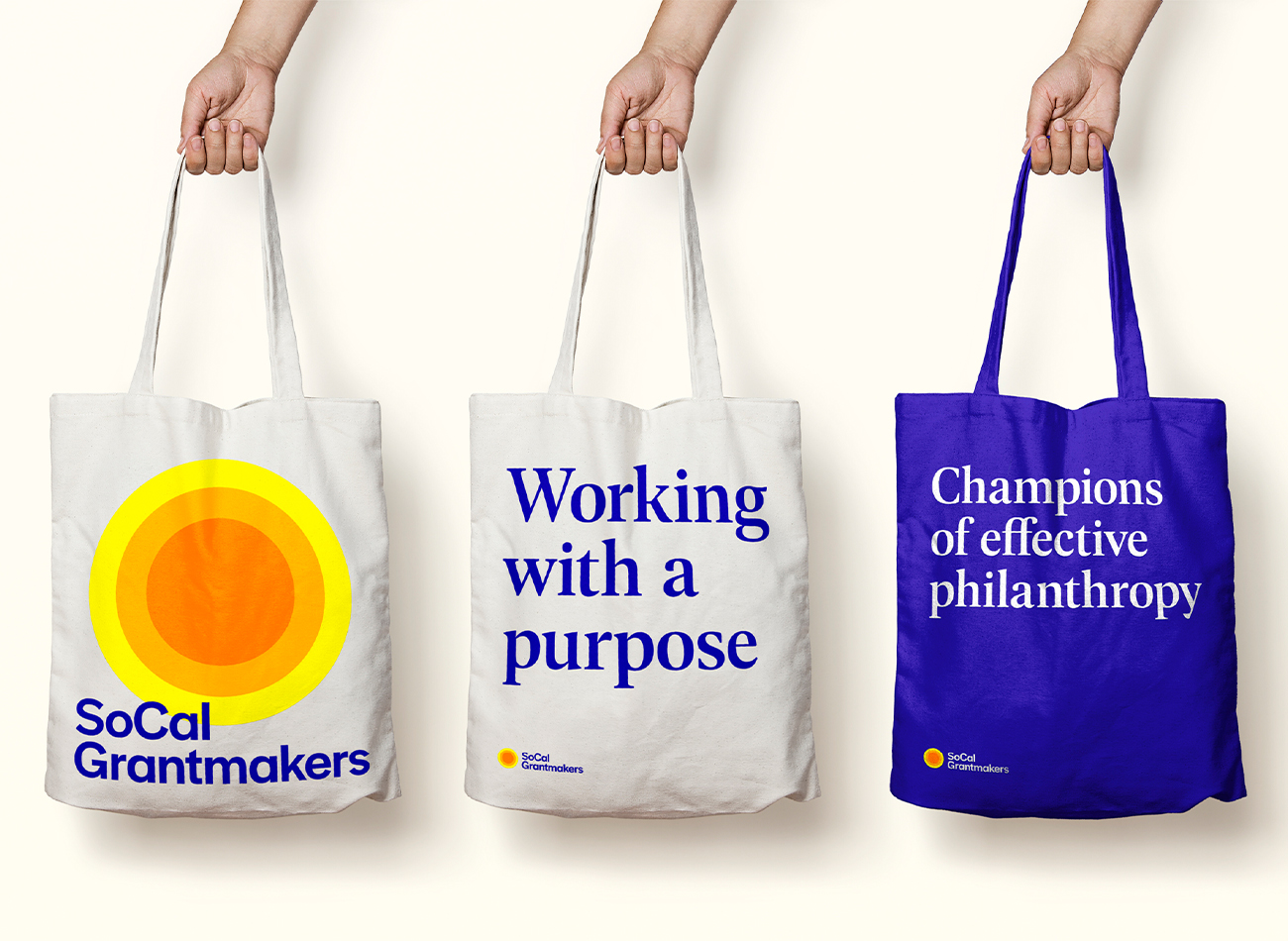
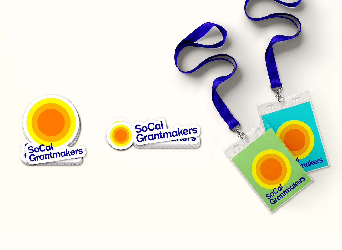
We developed a comprehensive branding suite for the philanthropy membership-based organization, encompassing various brand elements including a distinctive logo, extensive color palette, typography, and graphic patterns. The meticulously crafted graphic patterns, color scheme, and typography system we developed provide the organization with a cohesive visual identity, strengthening their brand presence both internally and externally.
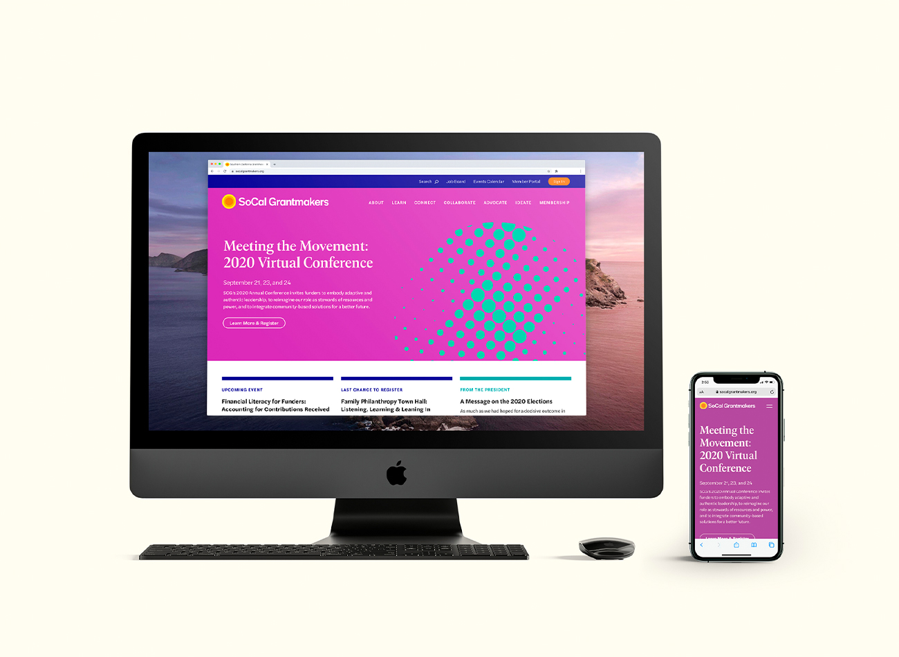
For the website, we developed a new website architecture that simplifies the information-rich site into a single-layer navigation which creates better accessibility for all target users. We also deliberately avoids the use of uninspired photography and rely on branded graphics, clear information hierarchy and strong color palette to evoke a sense of freshness and energy.
View socalgrantmakers.org
KUDOS Design Collaboratory
-
John Kudos
Creative Director -
Ashley Wu
Designer -
Arif Widipratomo
Web Developer -
Faris Han
Web Developer -
Robi Dafit
Project Manager
Four Freedoms Park Conservancy
Four Freedoms Park Conservancy
Franklin D. Roosevelt Four Freedoms State Park is a public memorial to former President Franklin D. Roosevelt, whose term lasted from March 4, 1933 to April 12, 1945. Construction of the Park, following architect Louis Kahn’s original design, began March 29, 2010, and was completed on budget and on schedule in September 2012. The dedication ceremony was held on October 17, 2012, with President William J. Clinton, Governor Andrew Cuomo, Mayor Michael Bloomberg, and Ambassador vanden Heuvel participating. At the ceremony FDR Four Freedoms Park was officially designated a New York State park by Governor Cuomo. The Park opened to the public on October 24, 2012.
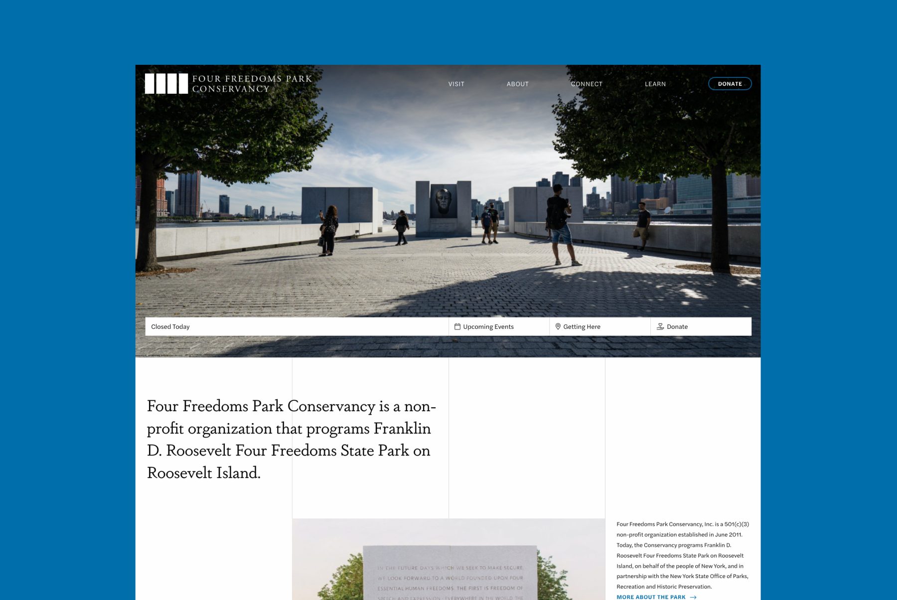
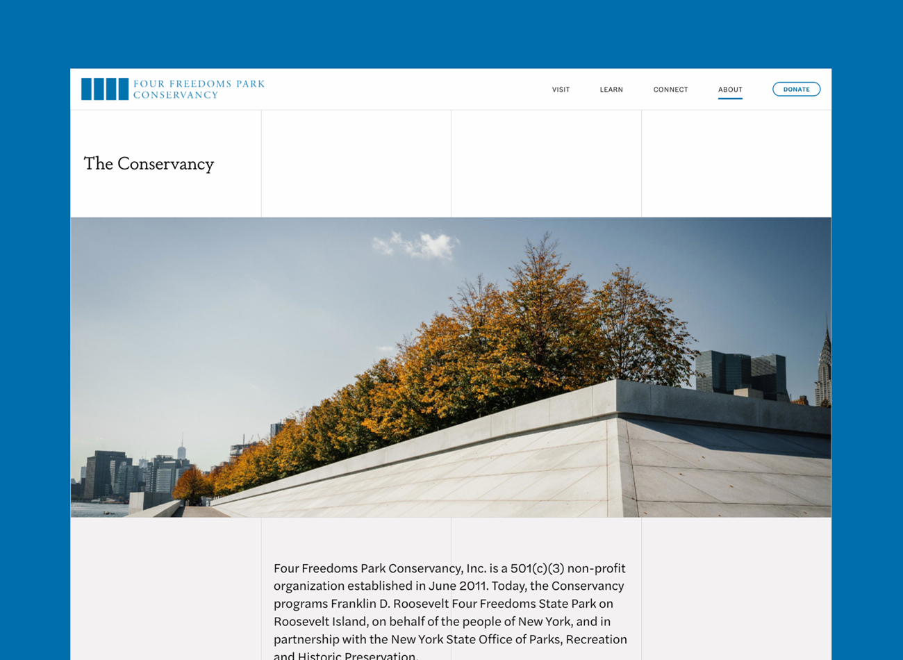
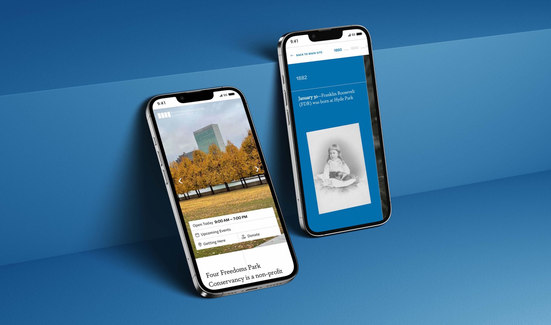
The primary website design aesthetic revolves around exposed vertical grids inspired by the park’s logomark, seamlessly integrated throughout the site and optimized for various screen sizes to ensure consistent visual impact.
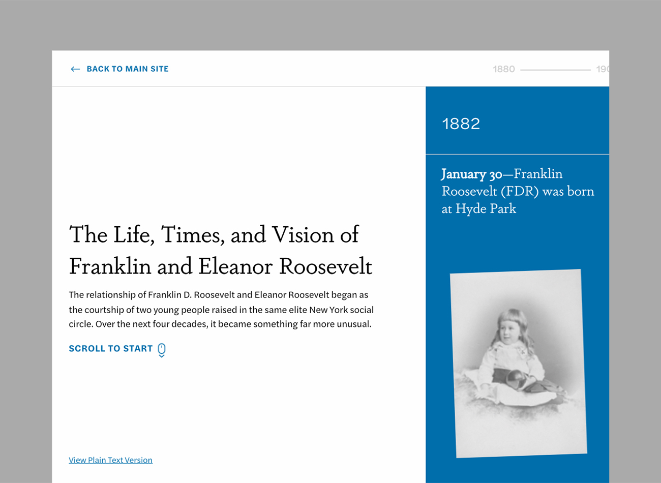
Another standout feature of the website is a microsite linked to the main website showcasing the timeline of Franklin and Eleanor Roosevelt. Users are immersed into Franklin and Eleanor’s life through a unique horizontal display controlled by scrolling the mouse or trackpad. While ensuring accessibility through the availability of a plain text, static version of the timeline for all users.
KUDOS Design Collaboratory
-
Owen Febiandi
Designer -
Putu Yogiswara
Designer -
Christian Juniady Setiawan
Web Developer
