Fallout: Atoms for War & Peace
Poster House
Two days before the outbreak of World War II, a scientific paper was published explaining the theoretical process of nuclear fission in which the controlled splitting of an atomic nucleus releases a vast amount of energy.
Over the next decade, scientists around the world would perfect the process of harnessing that energy, developing two of the most impactful inventions of the modern era: the nuclear bomb and the nuclear power station.
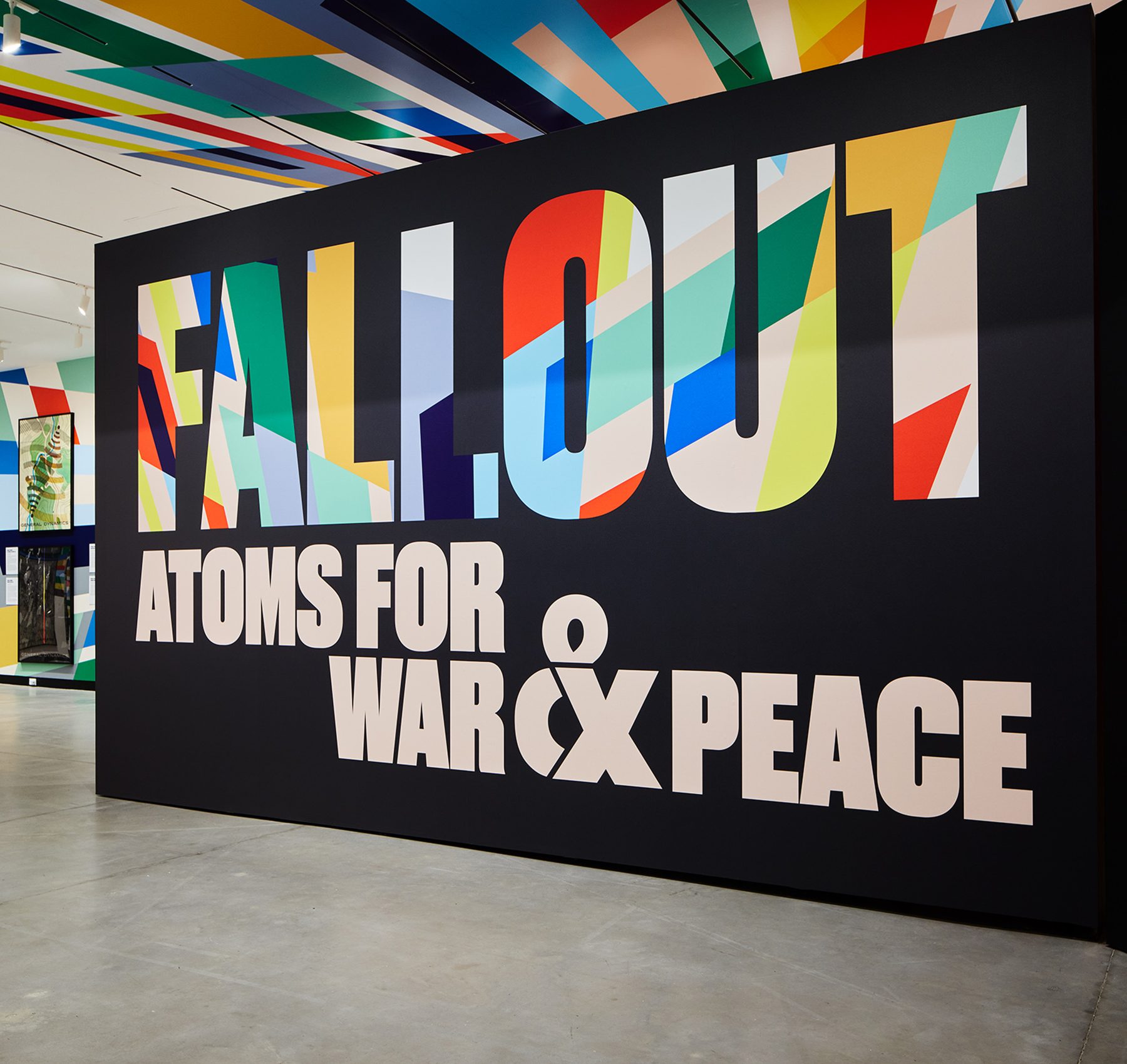
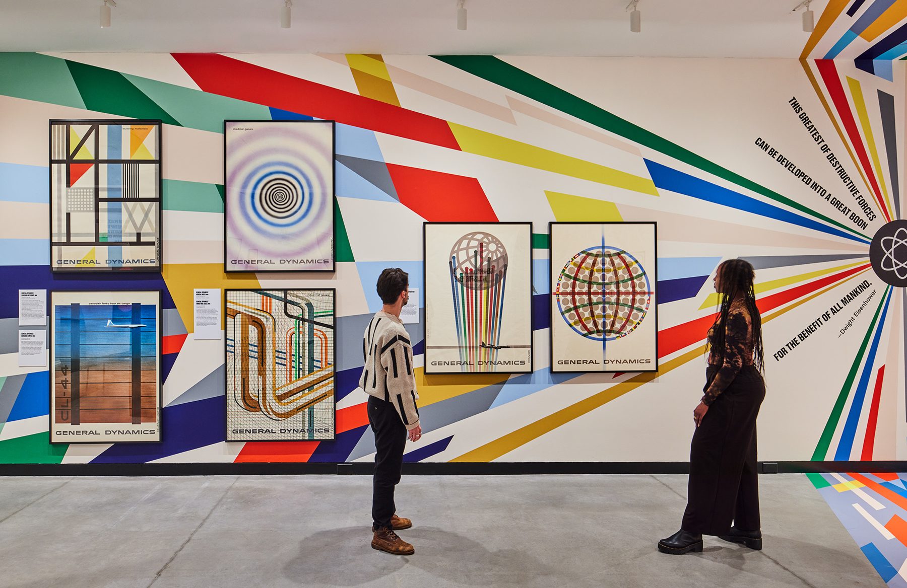
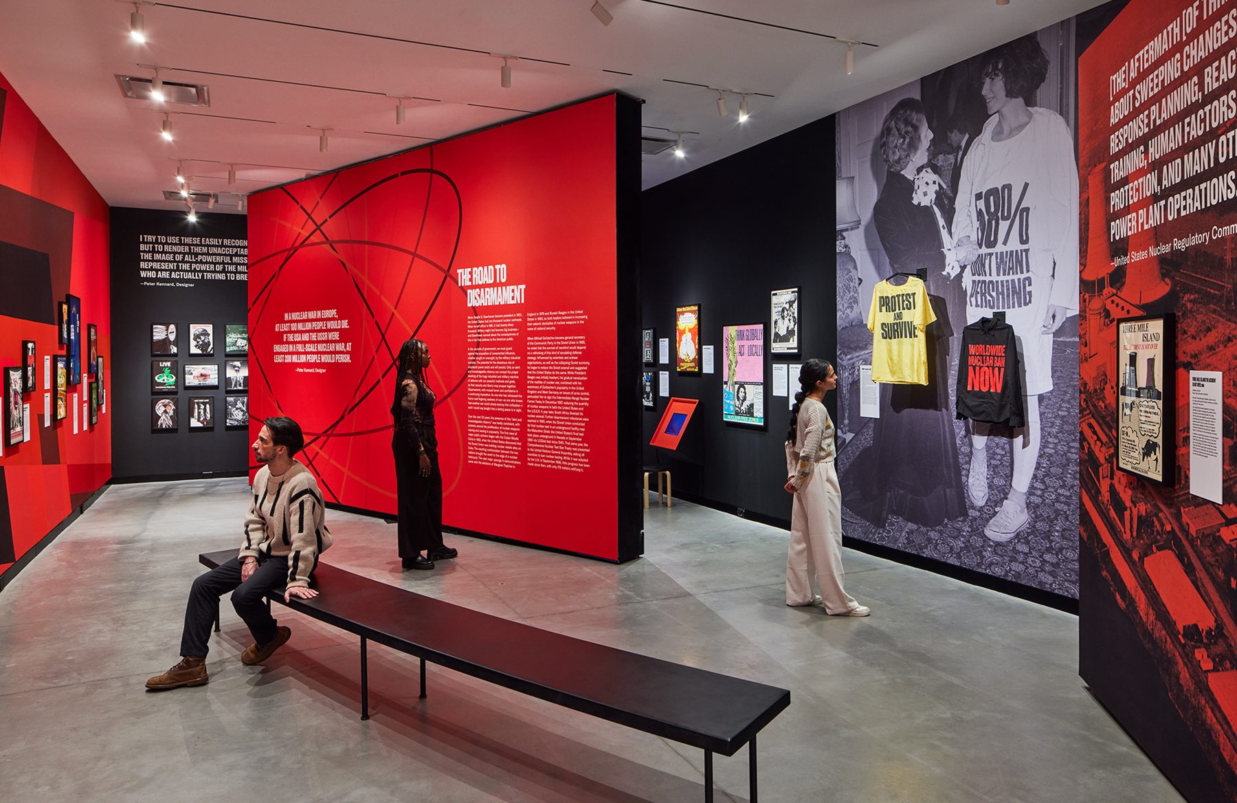
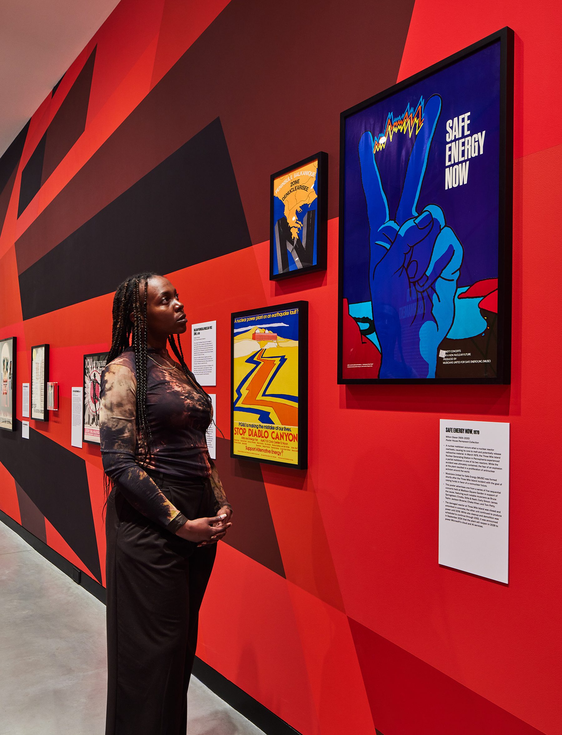
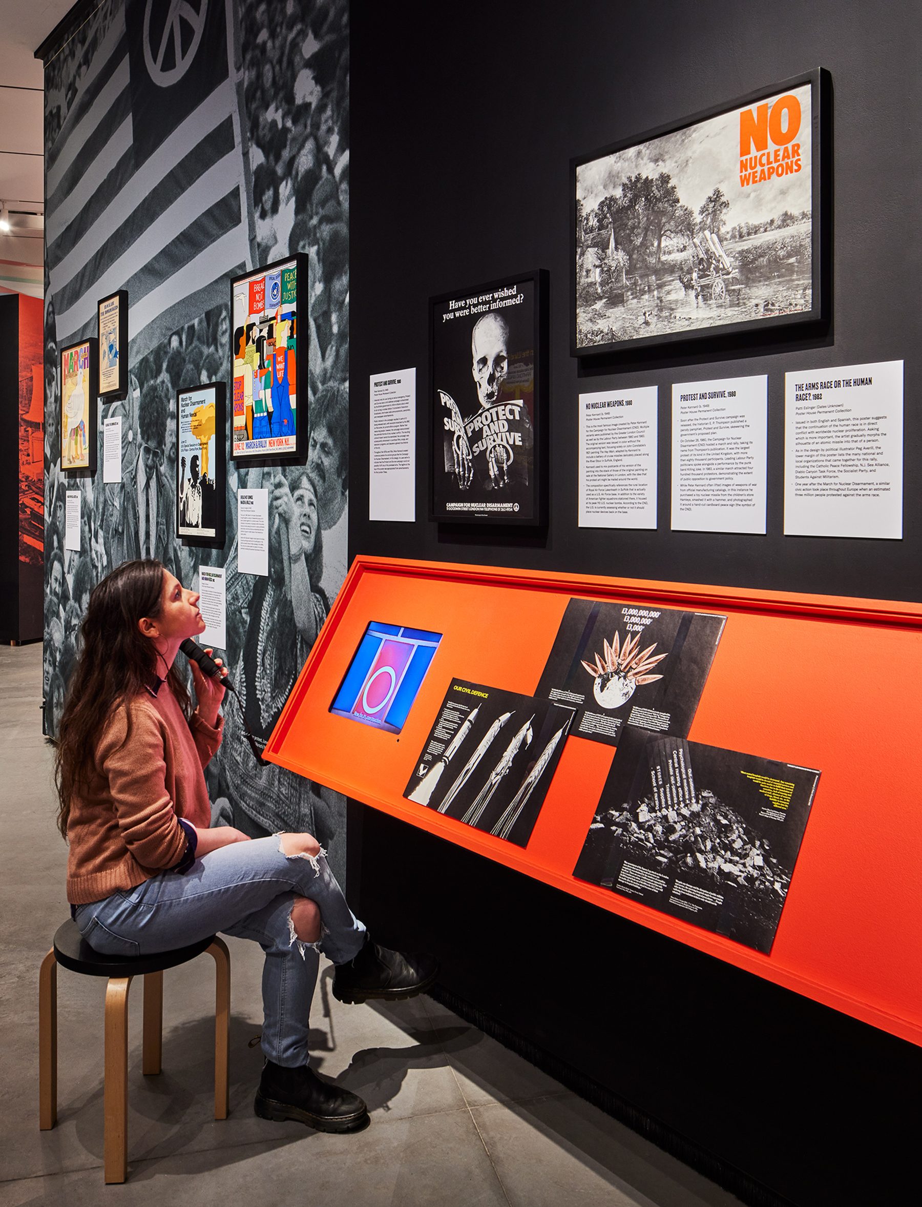
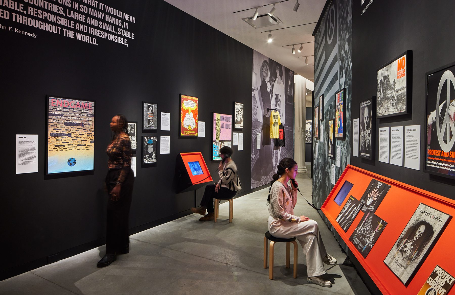
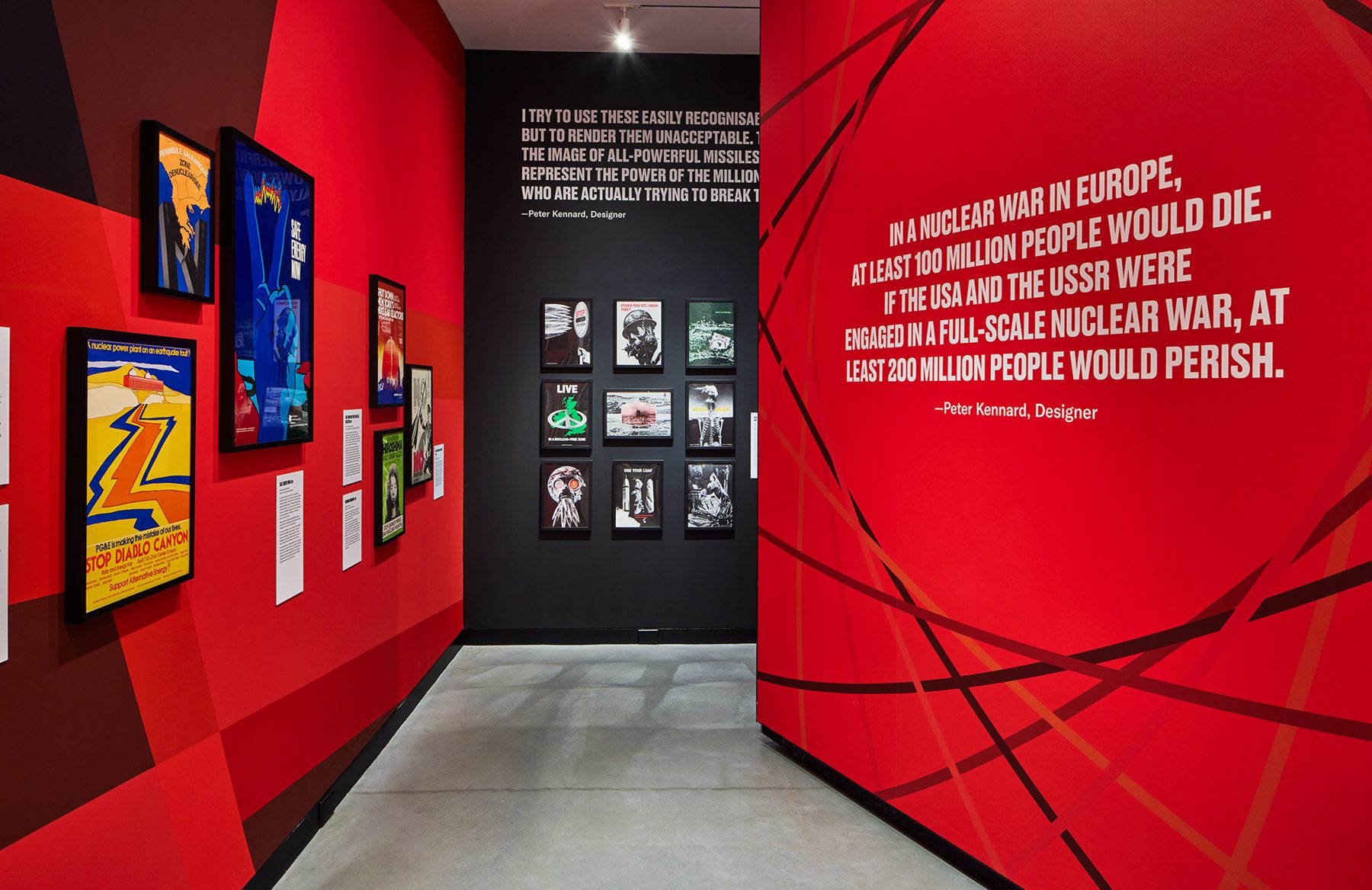
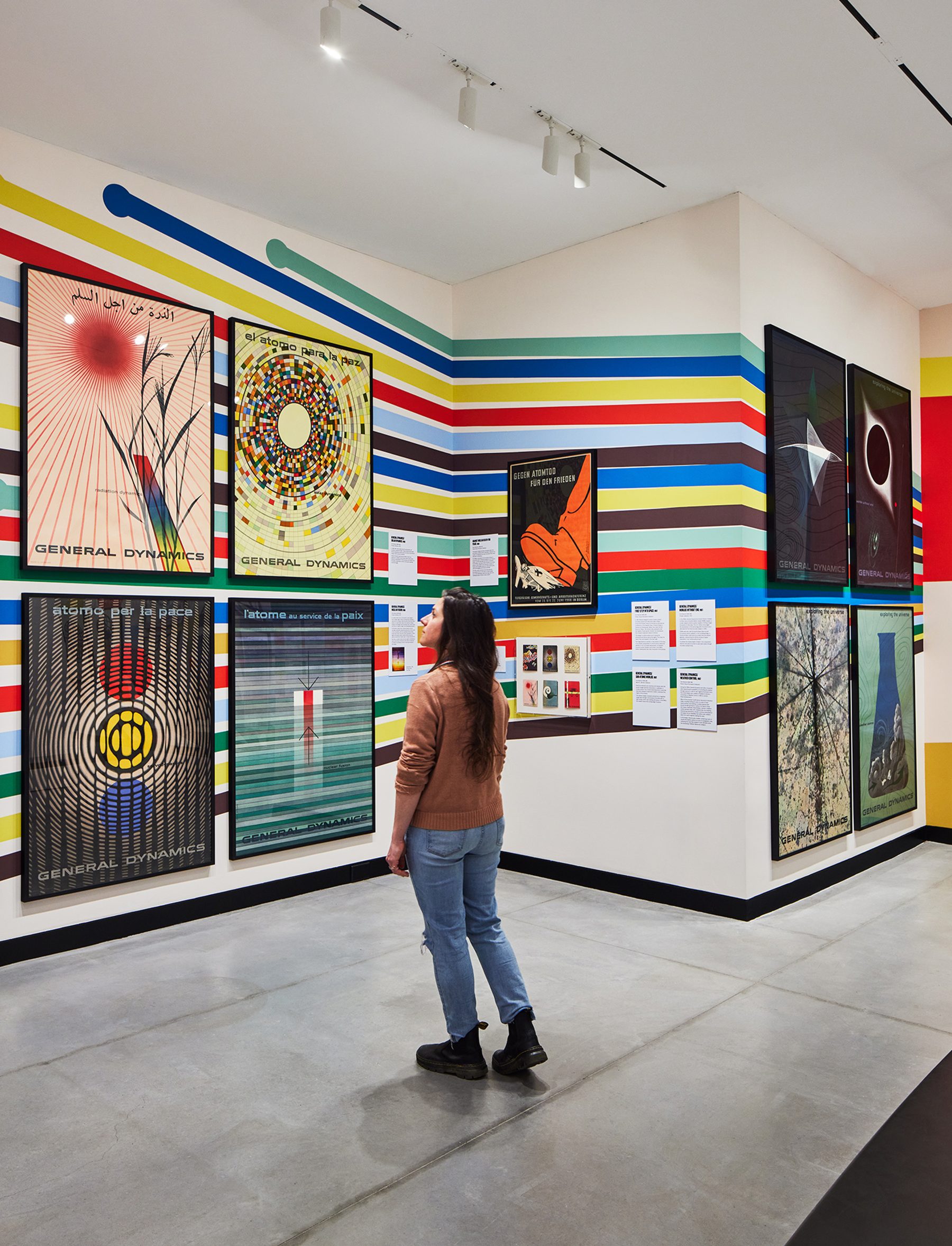
Fallout chronicles the global development of the nuclear industry, for peaceful and offensive means, examining posters that both promoted and protested its use throughout the second half of the 20th century. It features the entire General Dynamics poster series, the finest examples of corporate propaganda ever created against over 60 other posters criticizing the proliferation of nuclear technology.
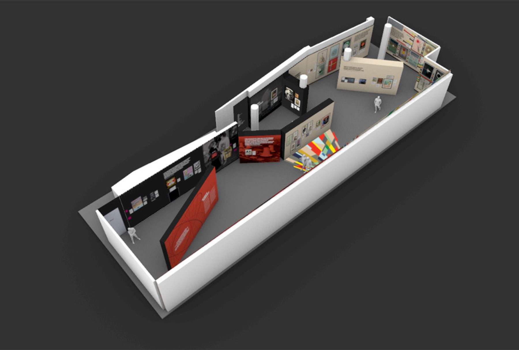
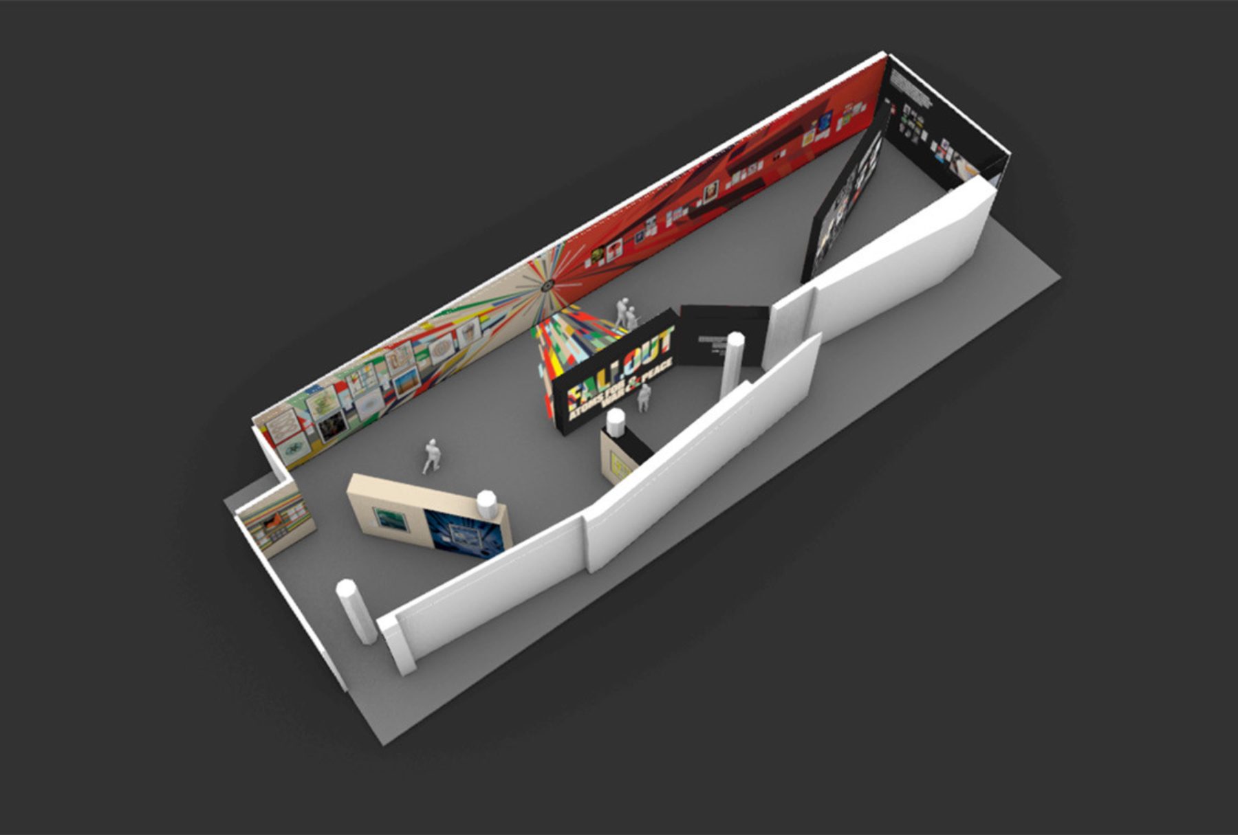
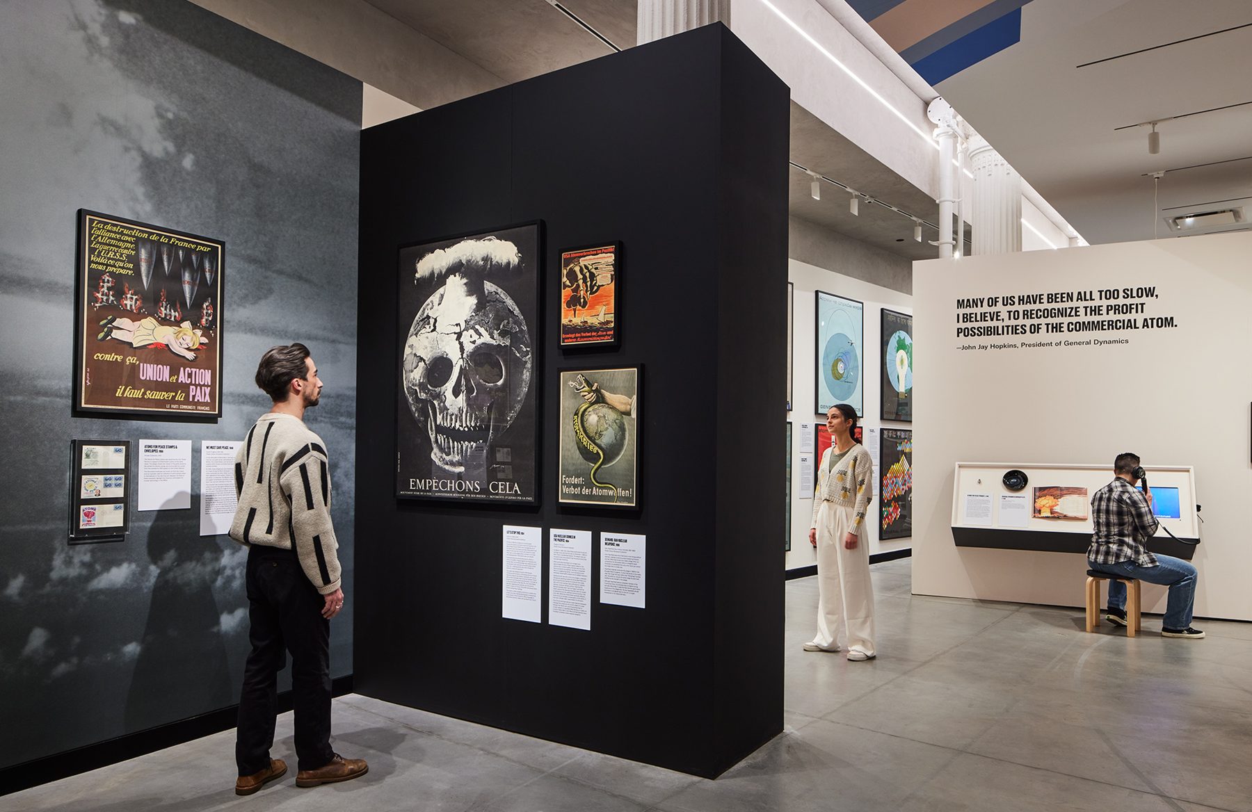
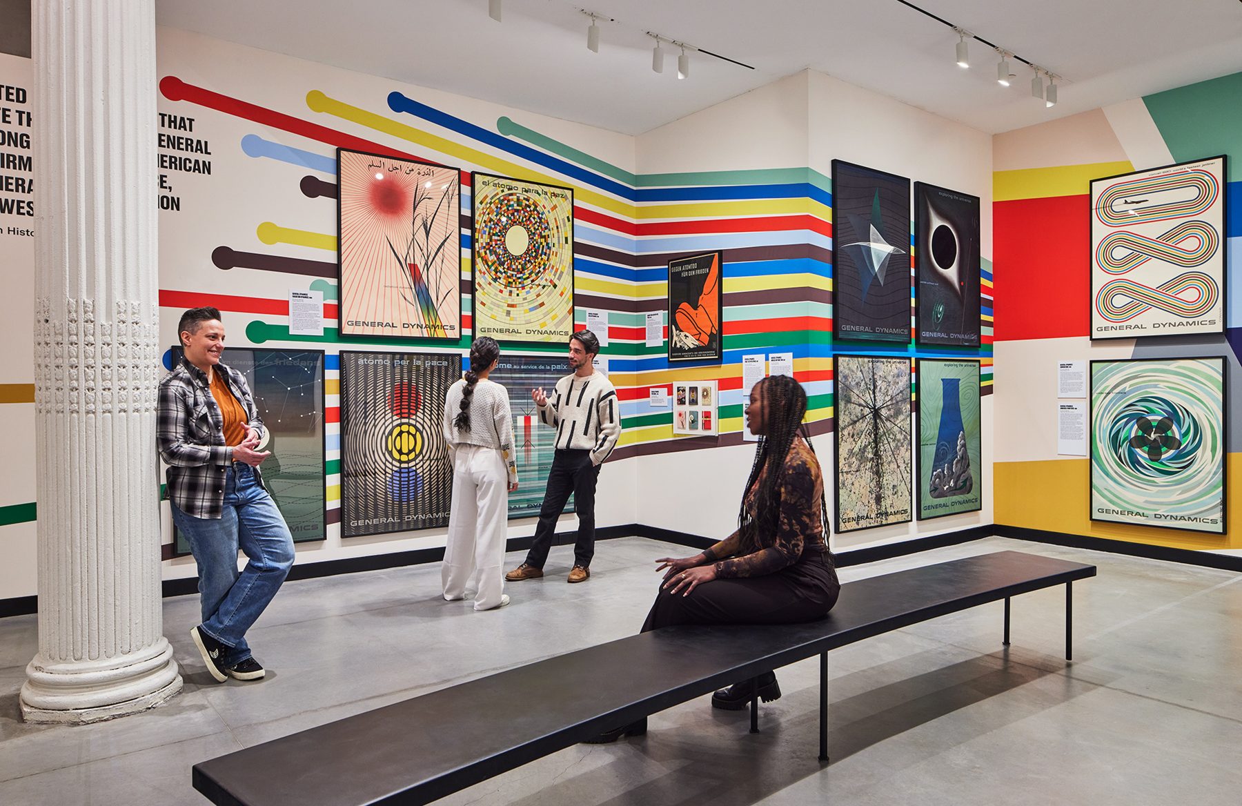
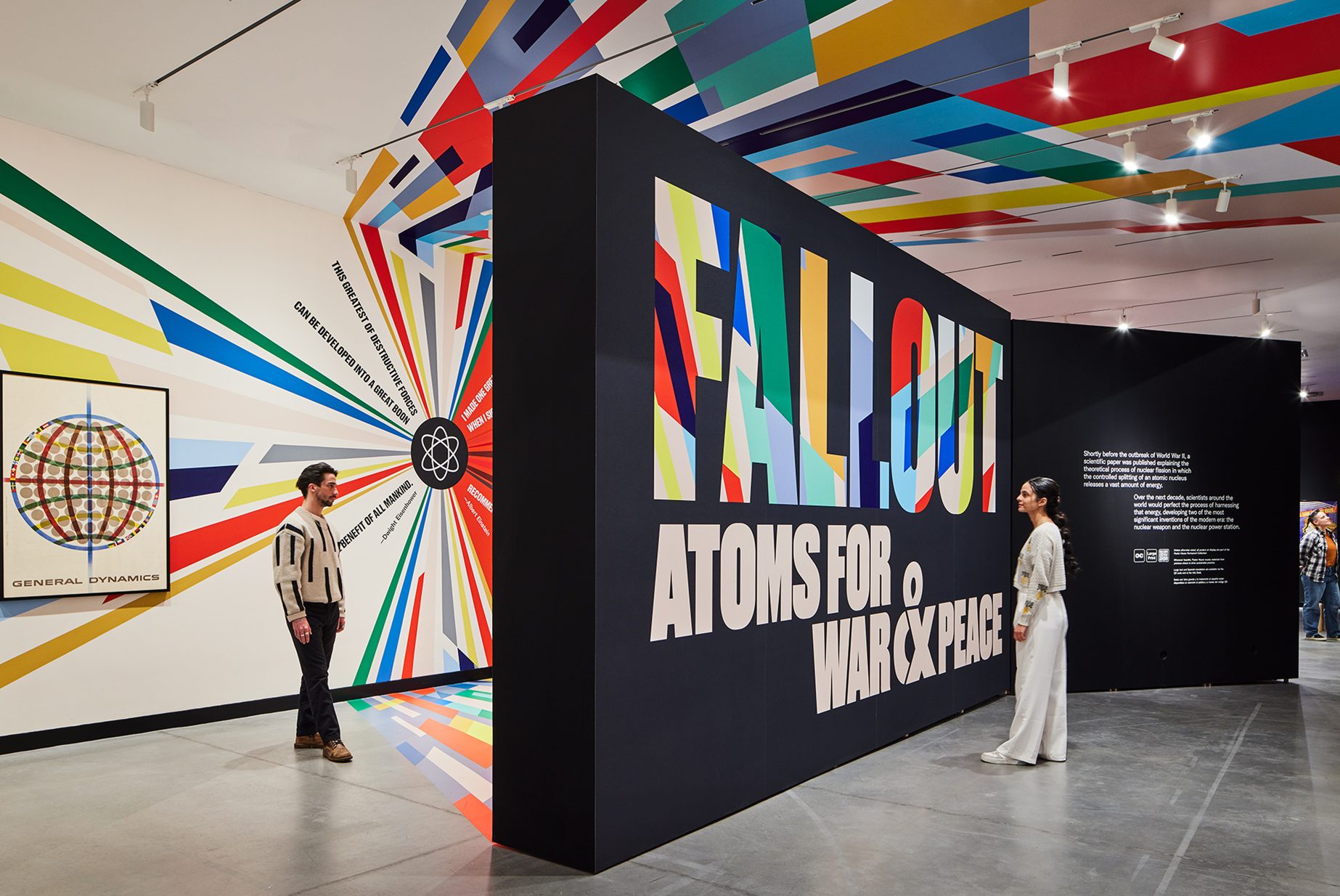
We designed the exhibition as two conjoined chapters. The colorful side features General Dynamics’ Atoms for Peace poster campaign, originally designed by Erik Nitsche. The darker half explores the nuclear arms buildup, the military industrial complex, and the corresponding poster protest. For those of a certain generation, the exhibition revisits the intense anxiety triggered by constant fear that the Cold War could heat up at any time.
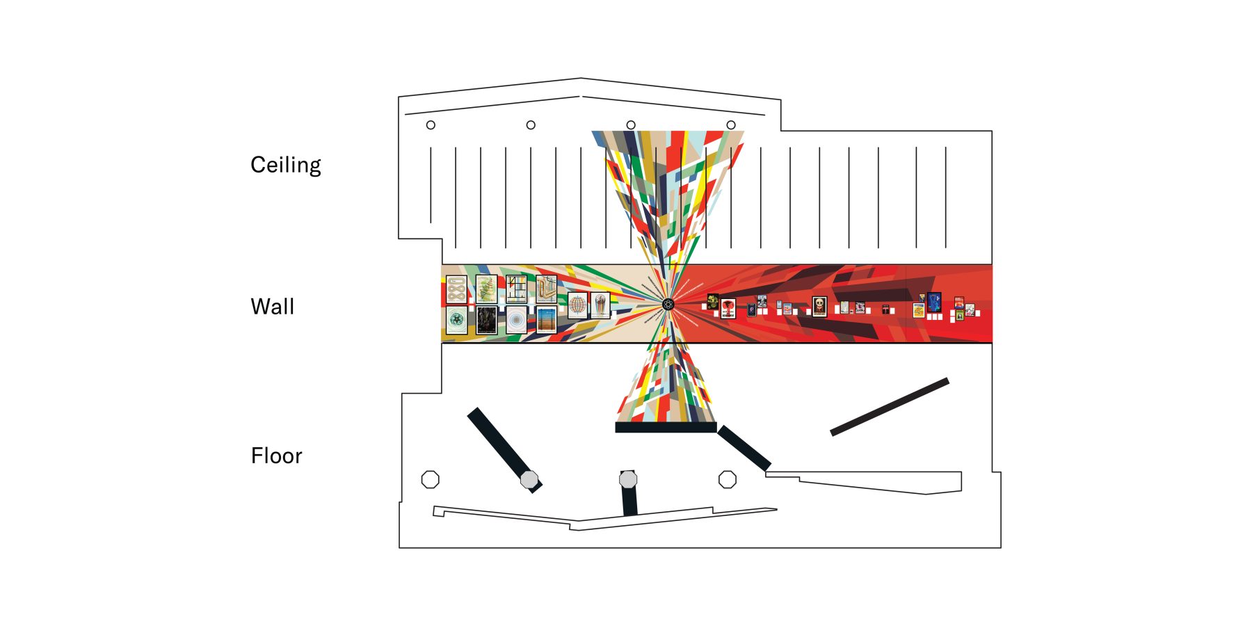
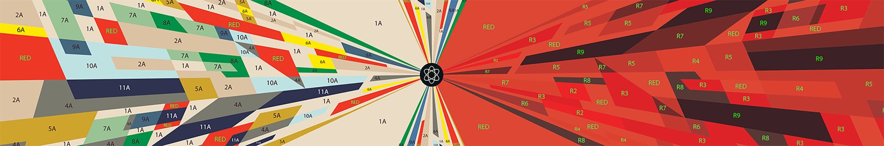
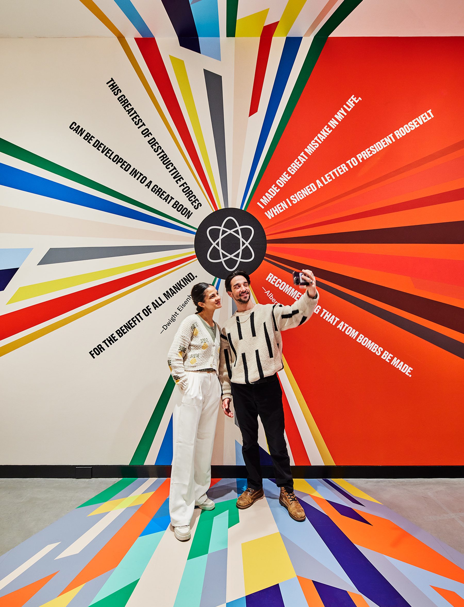
There is a clear opposing duality to the exhibition. We determined that there needs to be a clear indicator when the overarching narrative took a 180-turn, both visually and spatially.
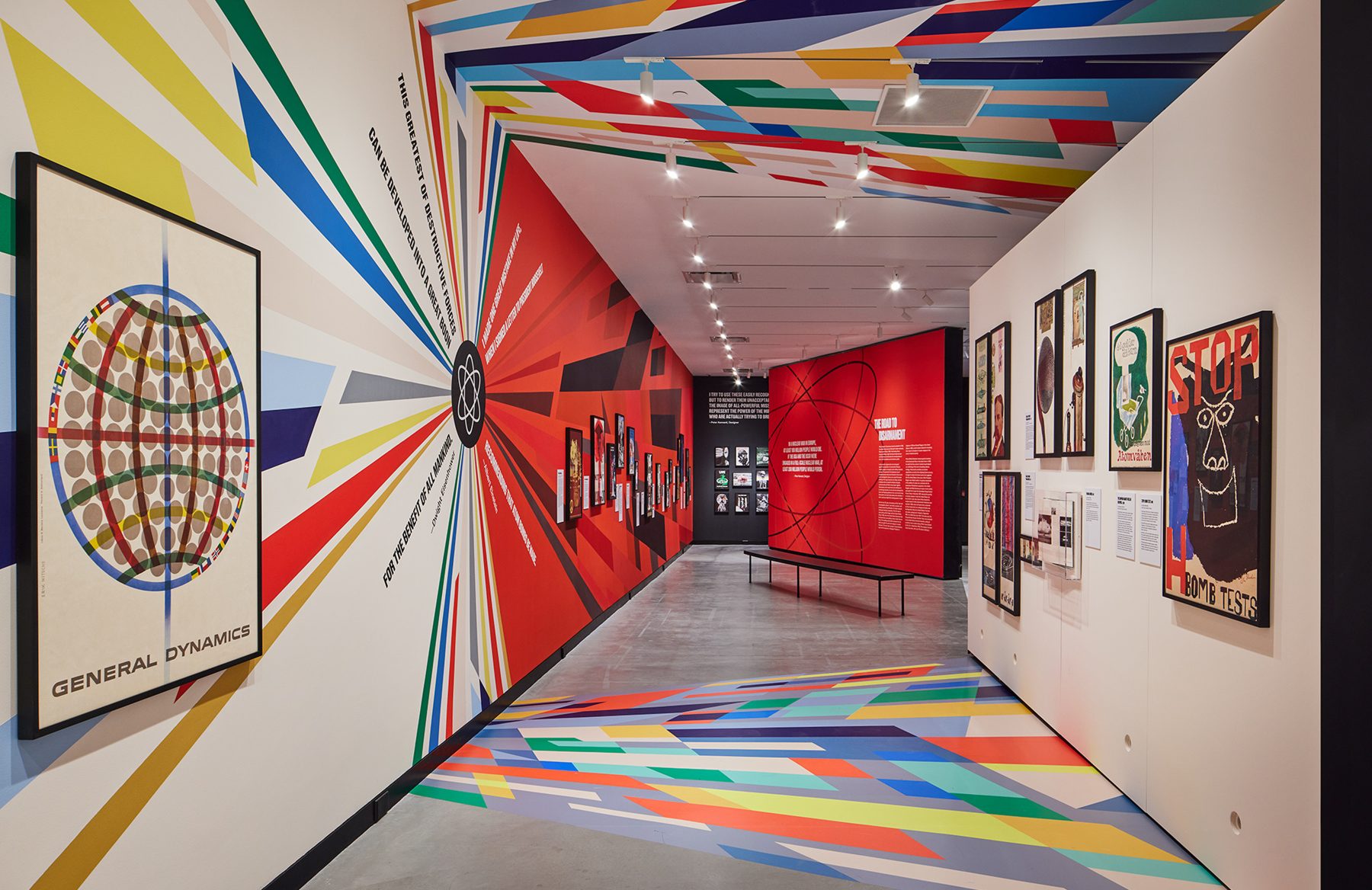
We wanted to carve out a physical threshold within the gallery that forces visitors to experience an inflection point in the narrative as they walk through. We refer to it as the quantum superposition moment in the gallery, where a particle can exist in multiple states (like being in two places at once, or two narratives at once) until measured, at which point it “chooses” one state.
Within this area, we juxtaposed a hopeful quote from Eisenhower against Einstein’s horrific regret, in the form of a colorful explosion, a schism resulting from the splitting of the atom, releasing color graphics that span distances, time and surfaces. These color fields were hand-painted color-by-number on the longest wall surface available in the gallery and meticulously wallpapered to the ceiling and the floor.
The exhibition is about the ideal future versus grim reality filled with contradictions. This is captured in the ‘x’ within the title graphic that also forms an ampersand.
KUDOS Design Collaboratory / KASA Collective
-
John Kudos
Creative Director -
Robert de Saint Phalle
3D Creative Director -
Fay Qiu
Designer -
Amanda Knott
Project Manager
POSTER HOUSE
-
Angelina Lippert, Tim Medland
Curator -
Ola Baldych
Creative Producer -
Mihoshi Fukushima Clark, Randee Ballinger, John F. Lynch, Rob Leonardi
Production