Typographic Objects Museum
Typographic Objects
Capabilities
Focus Area
Client
Typographic Objects is a private museum of small objects from around the world featuring curious, hyperlocal, beautiful, and timeless typography in various languages. The museum is located within the workspace of KUDOS Design Collaboratory in Forest Hills (NYC). Visiting the museum is an intimate guided tour for designers, students, and educators alike.
Since its opening in December 2024, more than 350 objects have been acquired from Africa, America, Bangladesh, Brazil, Canada, China, France, Greece, India, Indonesia, Italy, Japan, Malaysia, Netherland, Portugal, Russia, Saudi Arabia, Singapore, Taiwan, Thailand, and United Kingdom. We developed an AI-powered app to read and identify any objects in the collection.
Visit typographicobjects.com and the instagram museum
Contact us to schedule a private visit!
KUDOS Design Collaboratory
-
John Kudos
Creative Director -
Inwoo Baek
Lead Designer -
Chris Manlapid
Web Developer


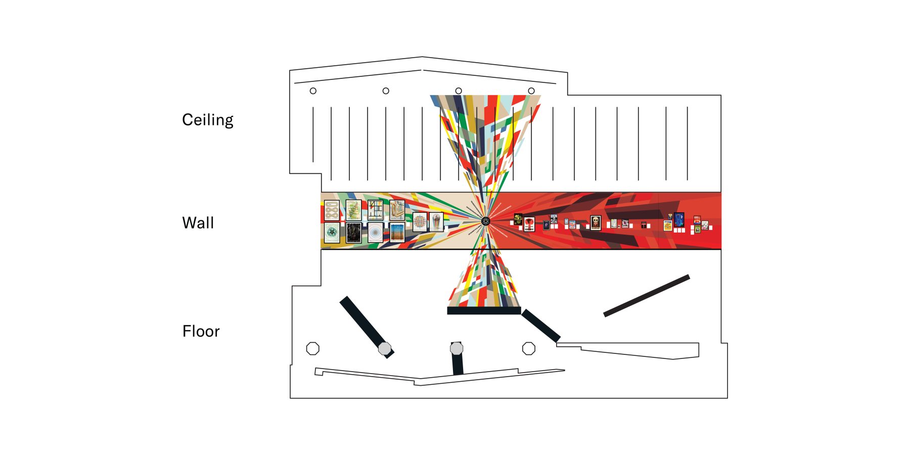
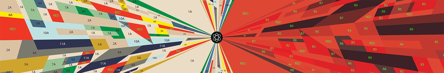
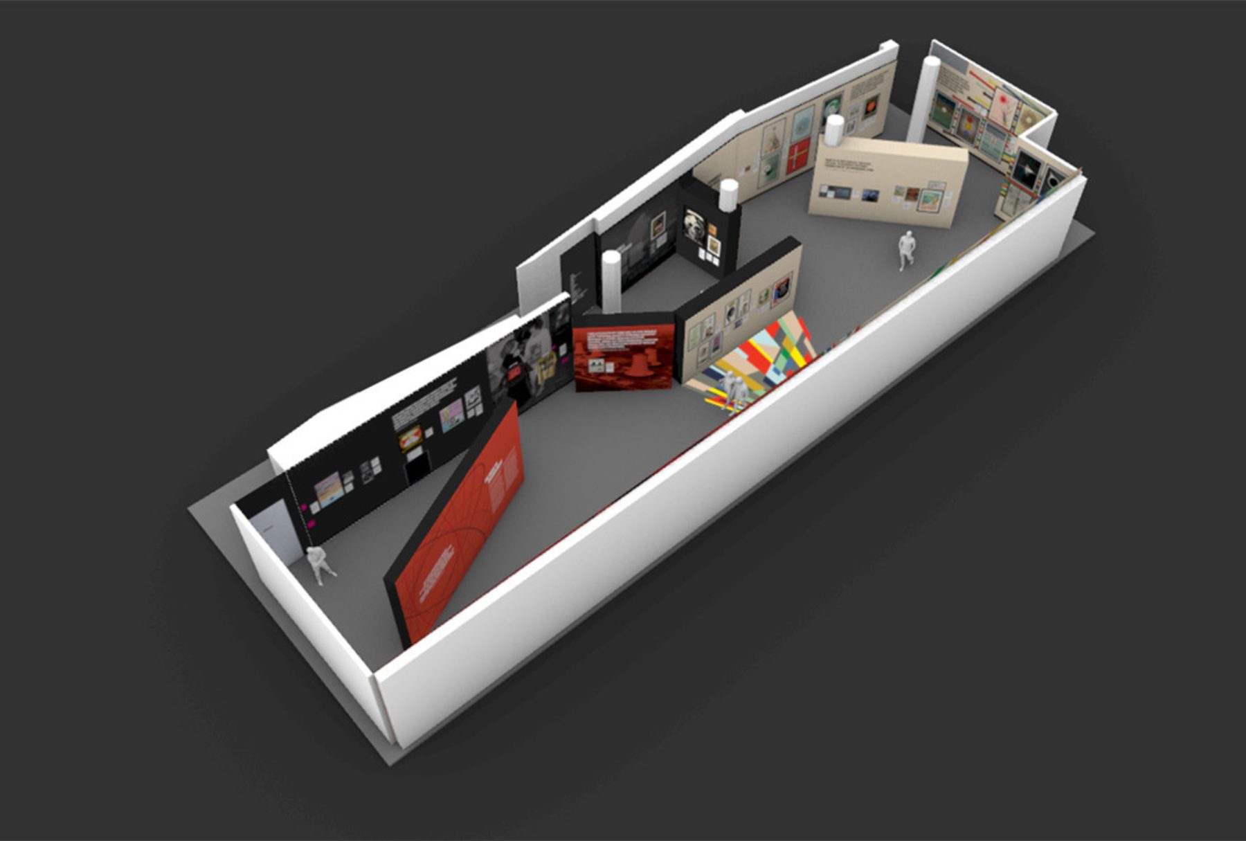
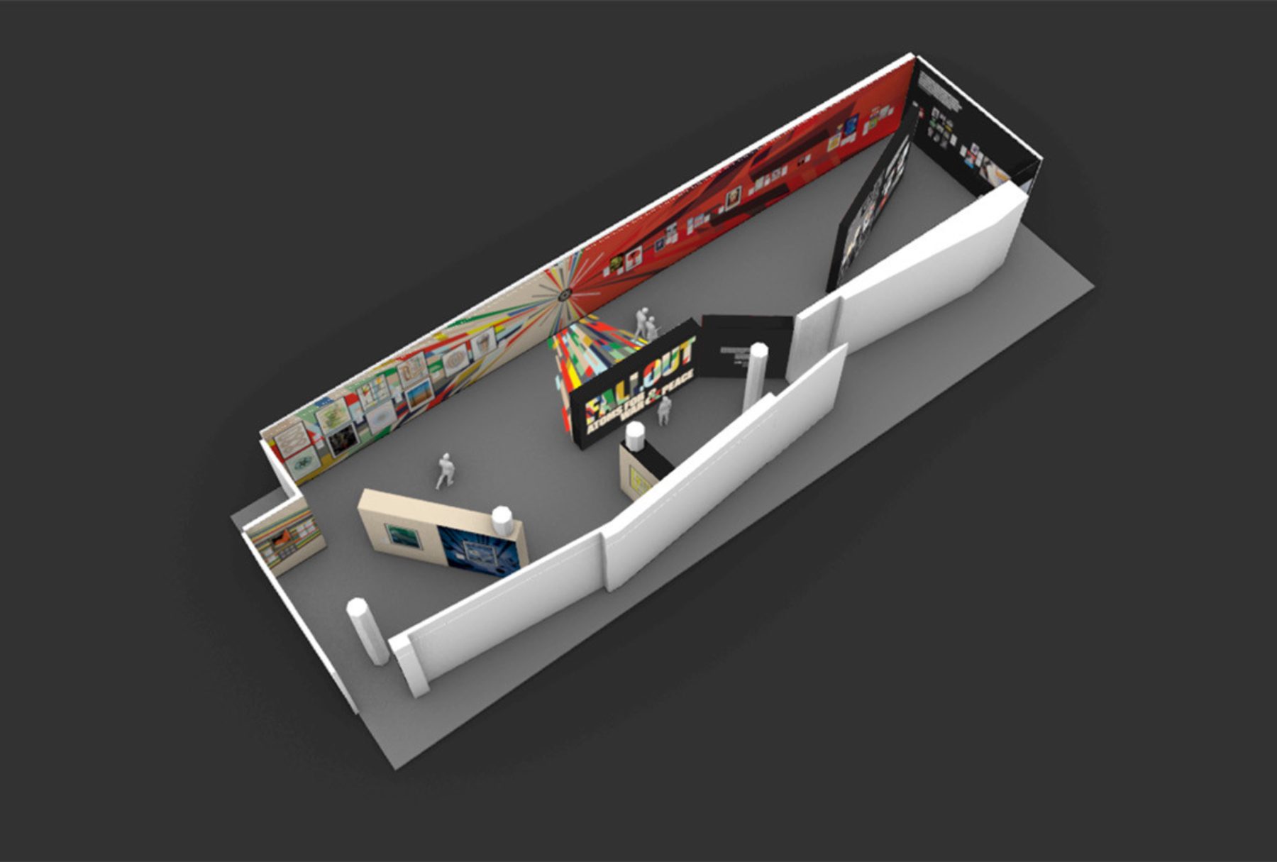
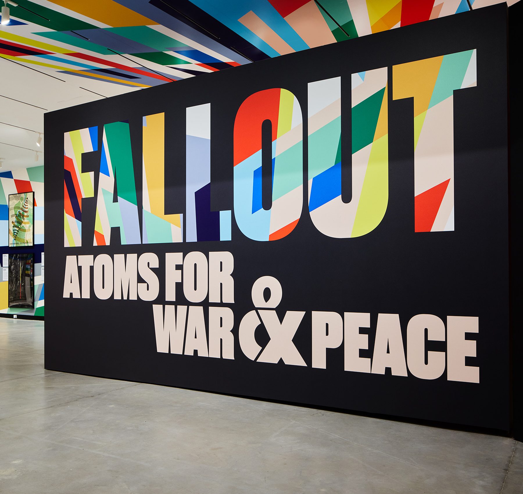
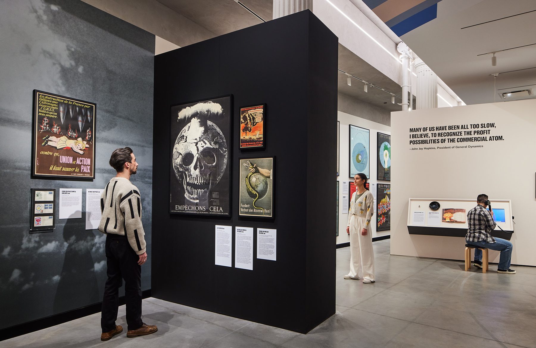
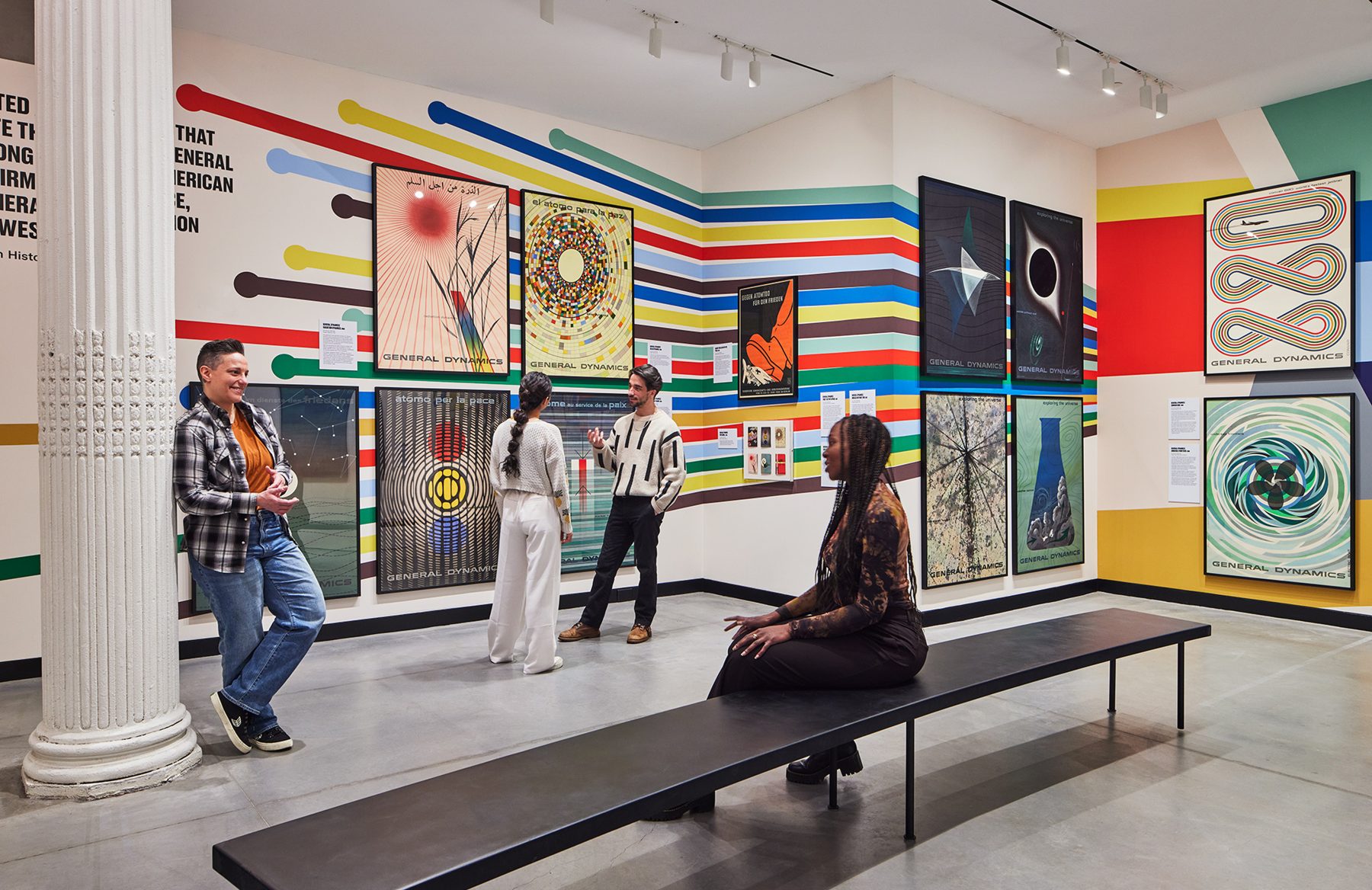
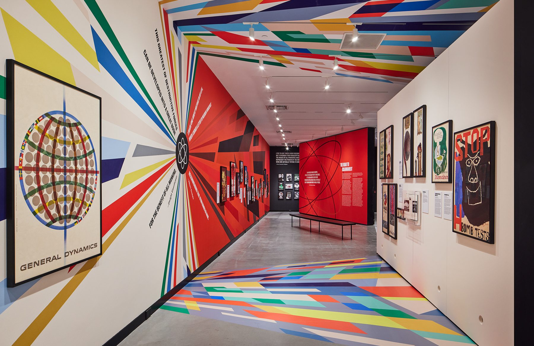
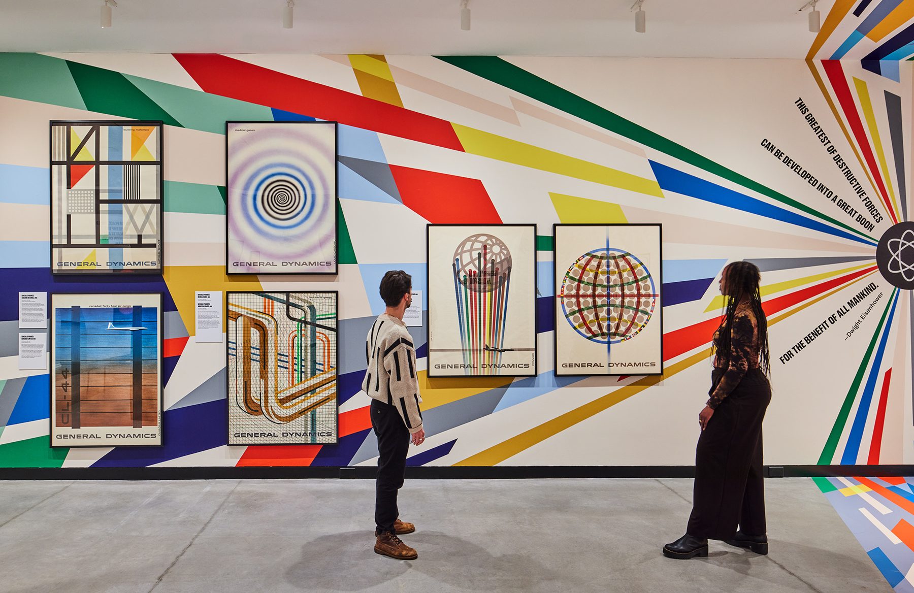
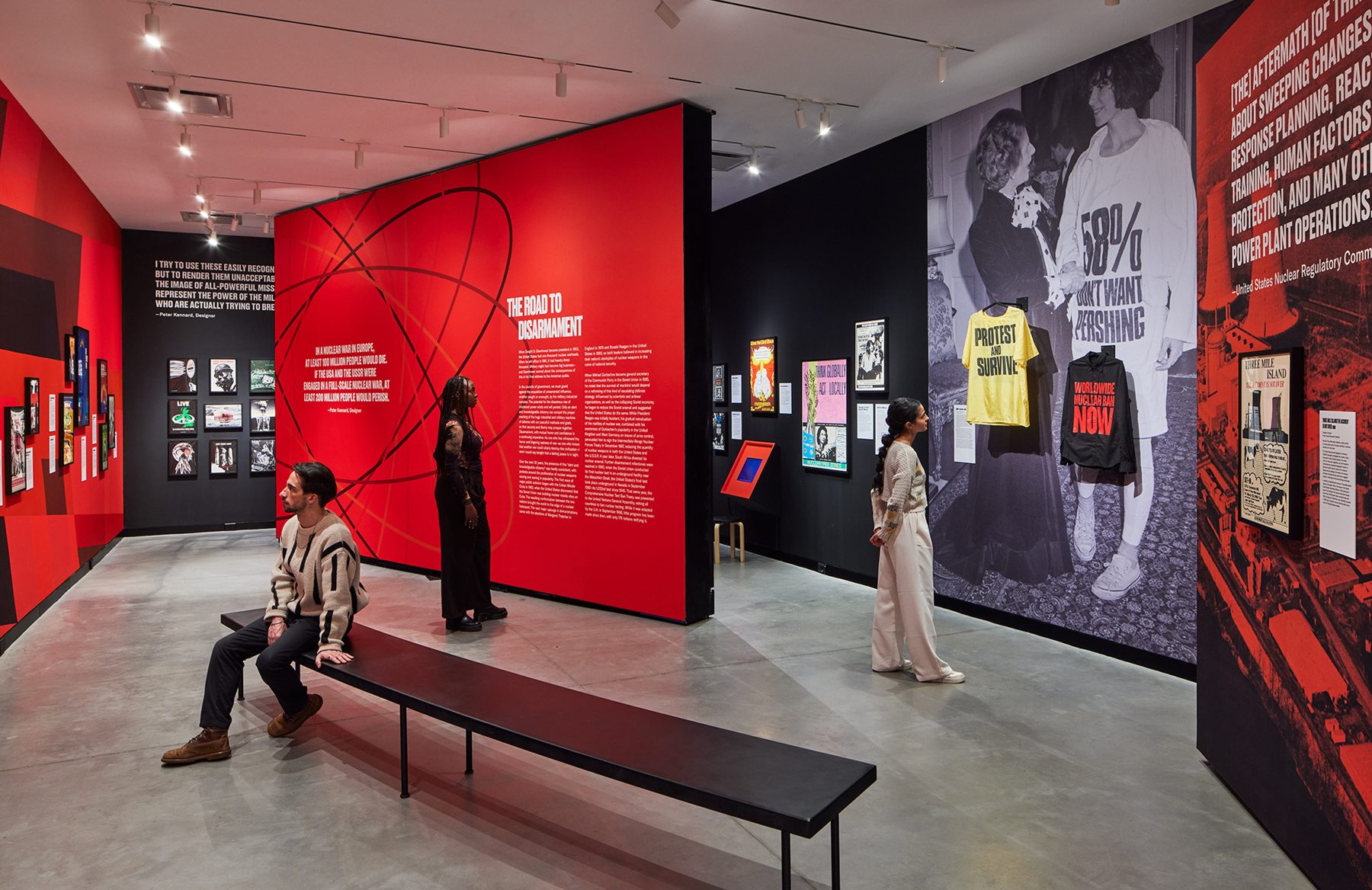
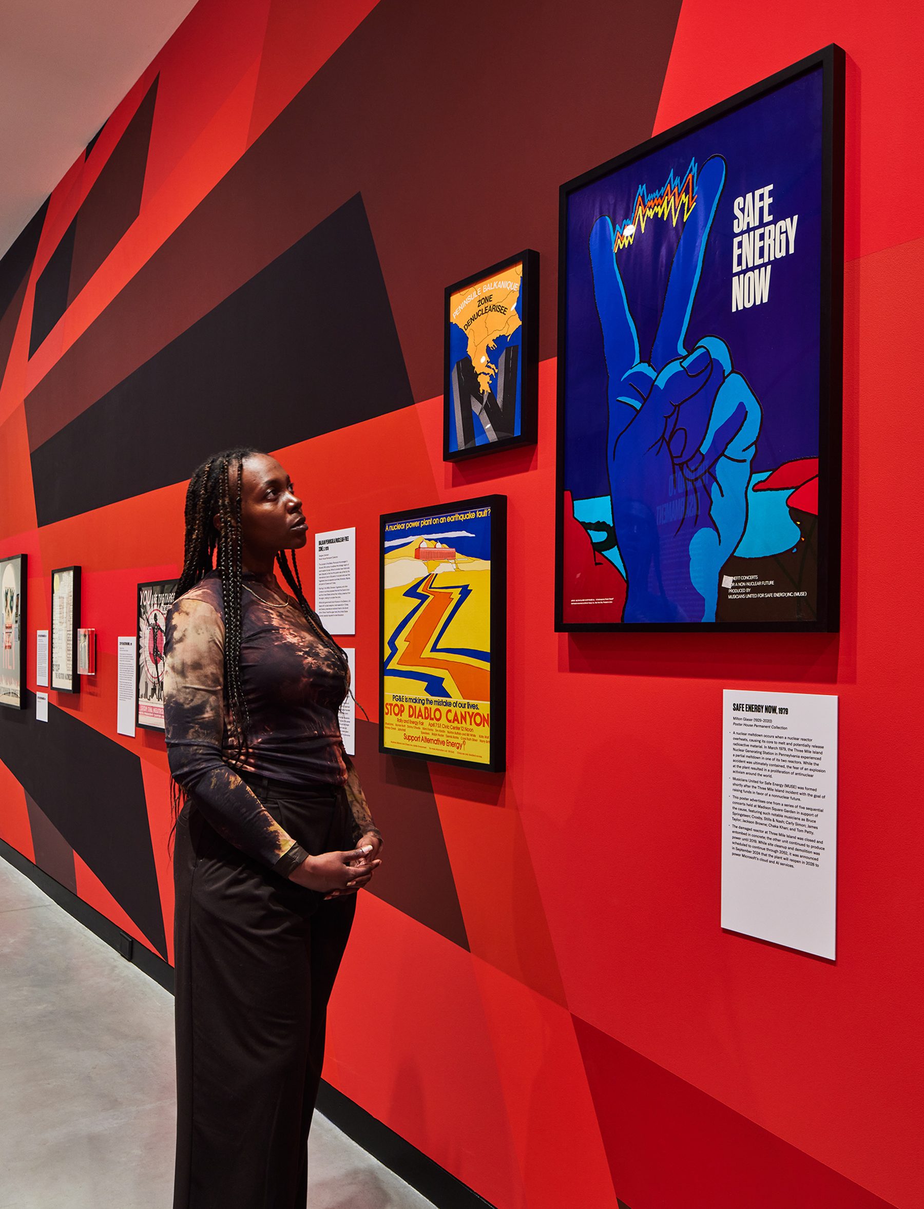
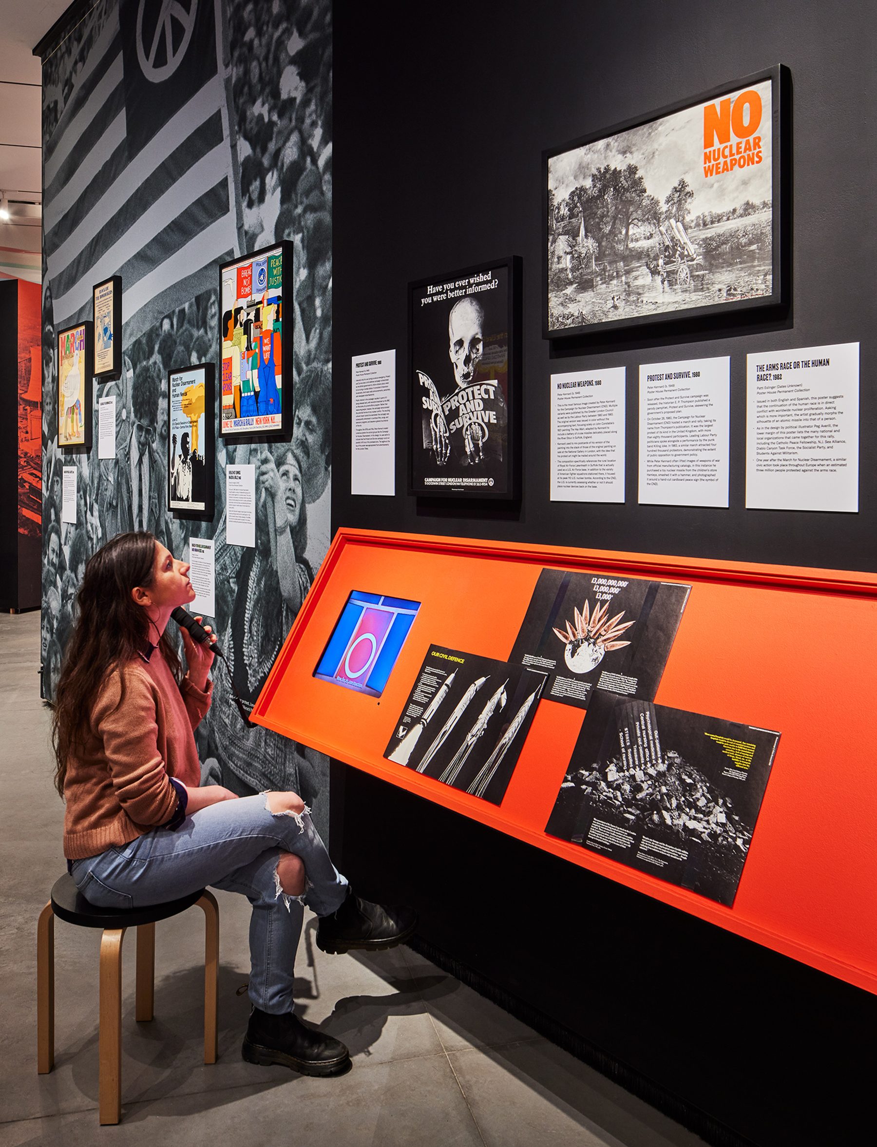
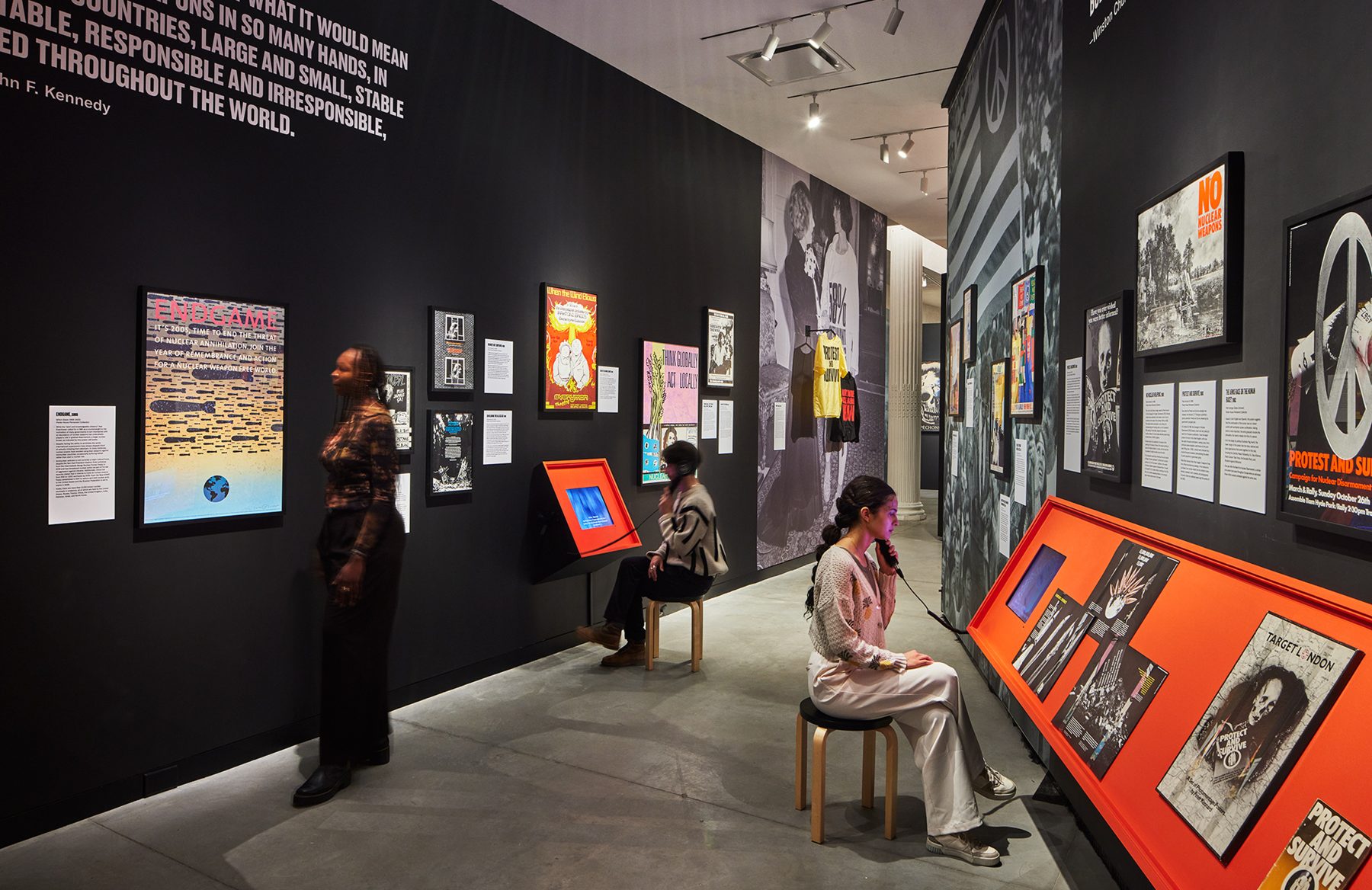
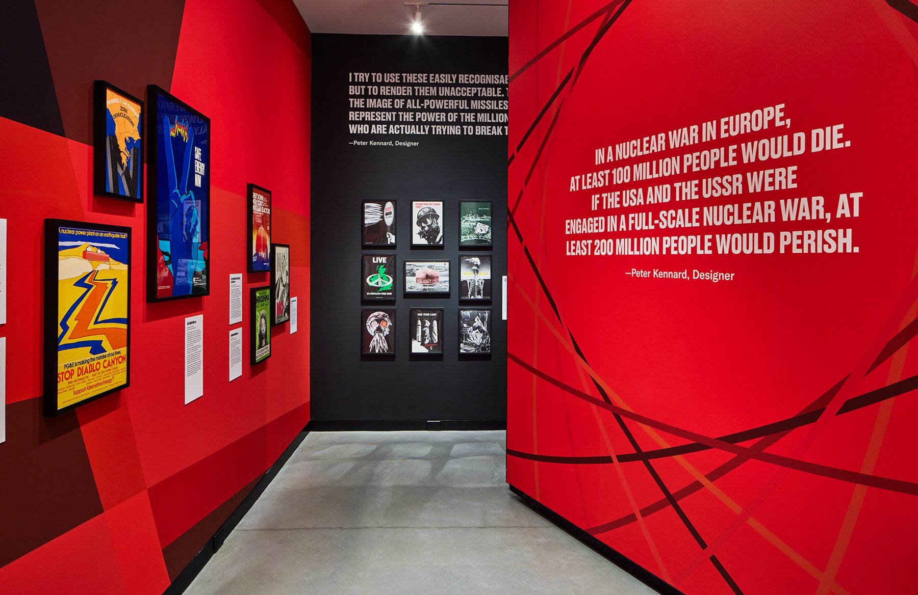
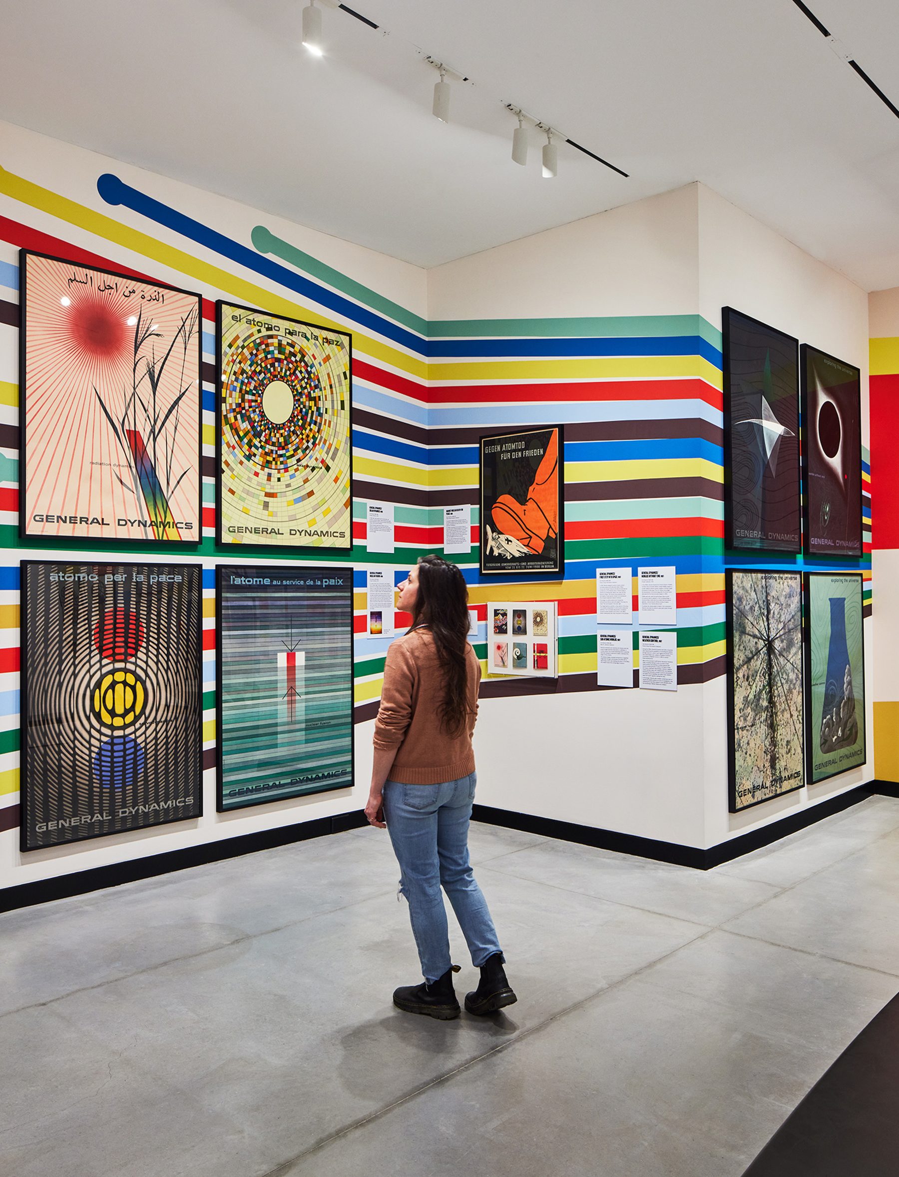
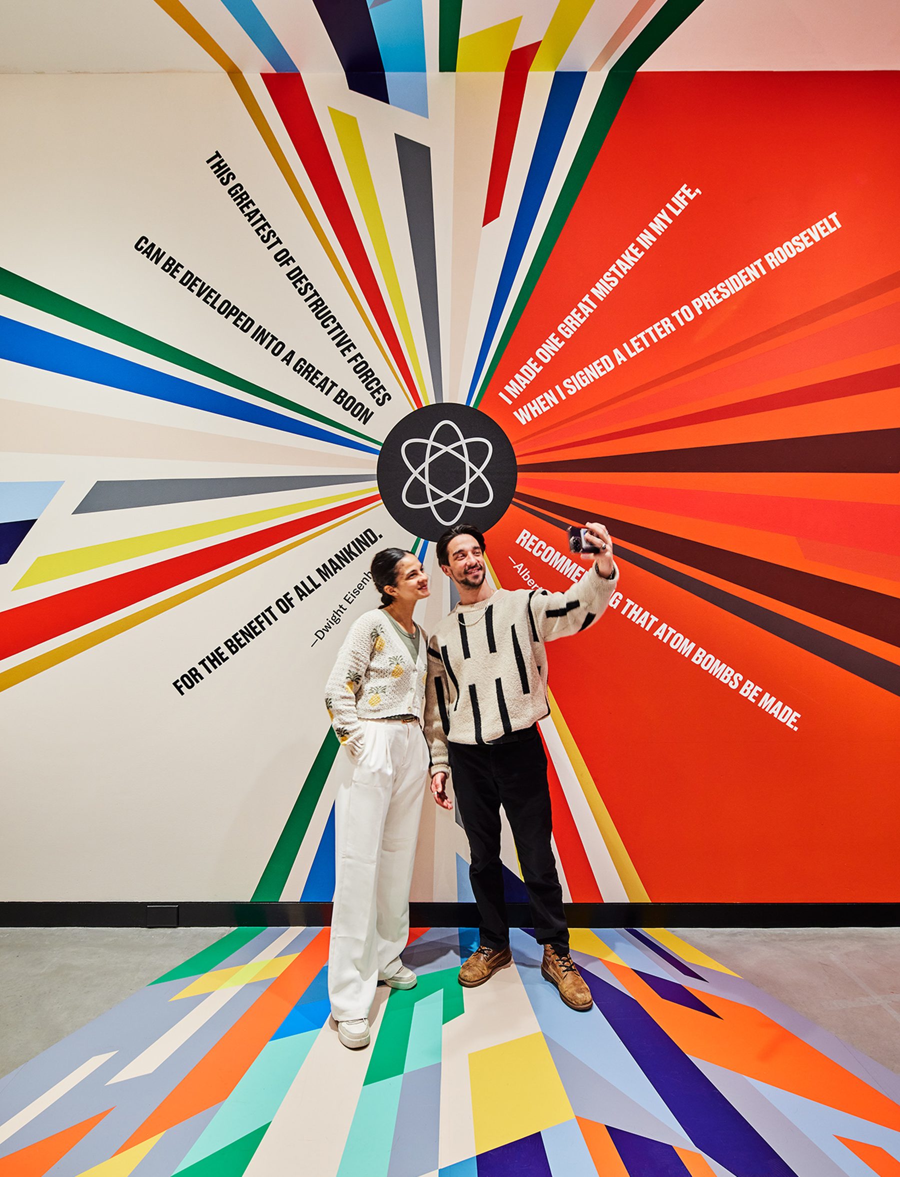
Fallout: Atoms for War & Peace
Poster House
Fallout chronicles the global development of the nuclear industry, for peaceful and offensive means, examining posters that both promoted and protested its use throughout the second half of the 20th century. Featuring General Dynamics poster series, the finest examples of corporate propaganda ever created against over 60 other posters criticizing the proliferation of nuclear technology.
Curated by Angelina Lippert and Tim Medland.
Our exhibition design extrapolated Erik Nitsche’s design for Atom for Peace poster that juxtaposed a quote from Eisenhower against Einstein’s, in the form of a colorful explosion, a schism resulting from the splitting of the atom, releasing color graphics that span distances, time, and surfaces.
KUDOS Design Collaboratory / KASA Collective
-
John Kudos
Creative Director -
Robert de Saint Phalle
3D Creative Director -
Amanda Knott
Project Manager -
Fay Qiu
Designer
Poster House
-
Ola Baldych
Creative Producer -
Mihoshi Fukushima Clark, Randee Ballinger, John F. Lynch
Production
Blueprints Branding & Website
Blueprints for Arts and Policy
Capabilities
Focus Area
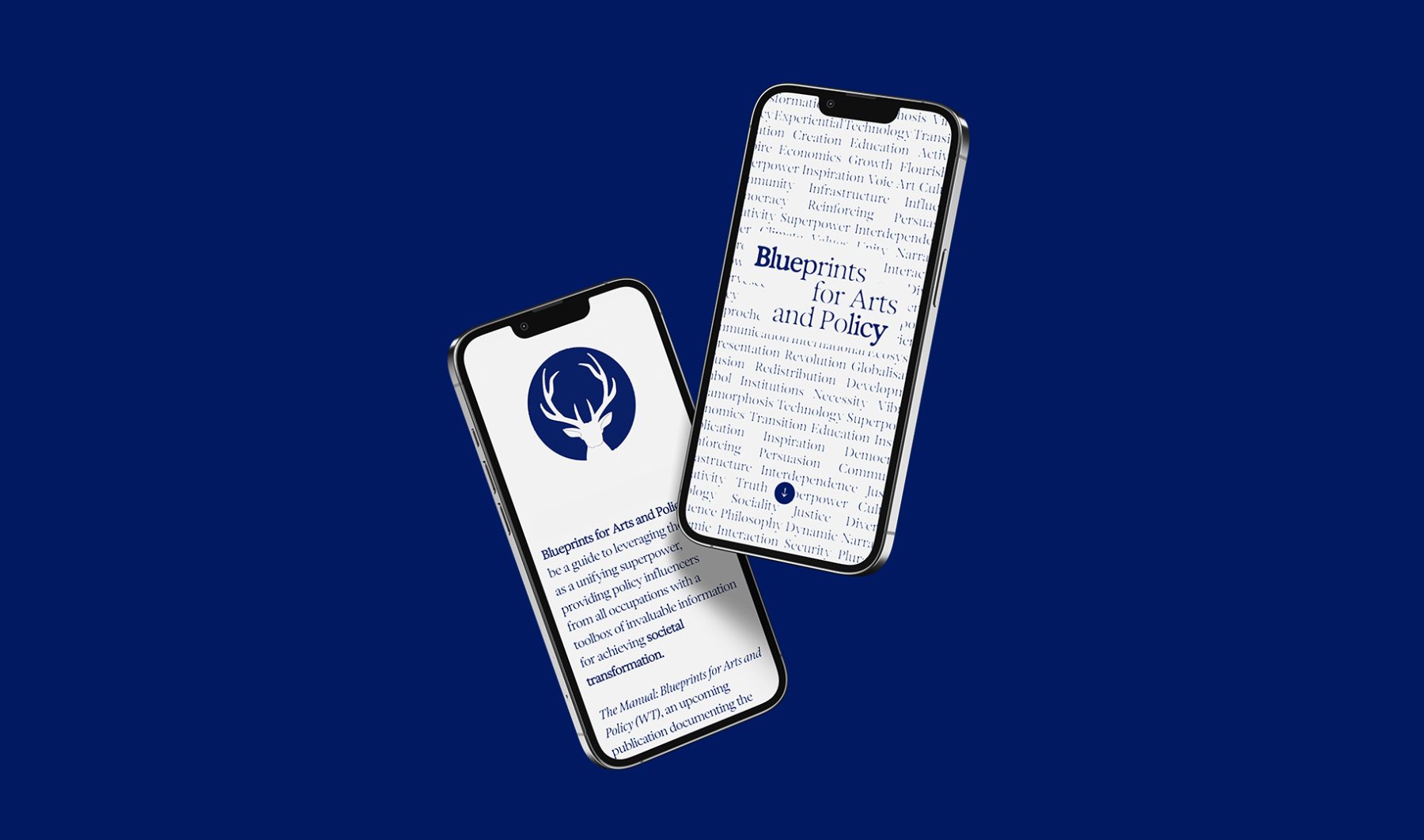
Blueprints for Arts and Policy is a platform in which esteemed global voices in arts and policy exchange ideas, case studies, and recommend actions to inspire collective creativity and bridge ideological, economic, cultural, and social divides. A series of salons will be held in contribution to the project, bringing together leaders in a variety of fields to discuss how the arts can be harnessed for social and policy interventions.
KUDOS developed a generative type branding system that embody the ever-changing nature of these complex exchanges. We also created a series of icons that morph through a Rorschach effect, visualizing the melding of unconscious minds and voices.
Visit blueprintsartpolicy.com
KUDOS Design Collaboratory
-
John Kudos
Creative Director -
Owen Febiandi
Lead Designer -
Putu Yogiswara
Designer -
Iman Fadillah
Motion Designer -
Amanda Knott
Project Manager -
Christian Juniady Setiawan
Web Developer
Shigeko Kubota Video Art Foundation Branding
Shigeko Kubota Video Art Foundation
Capabilities
Focus Area
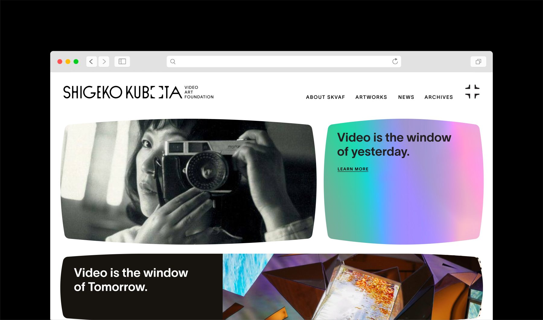
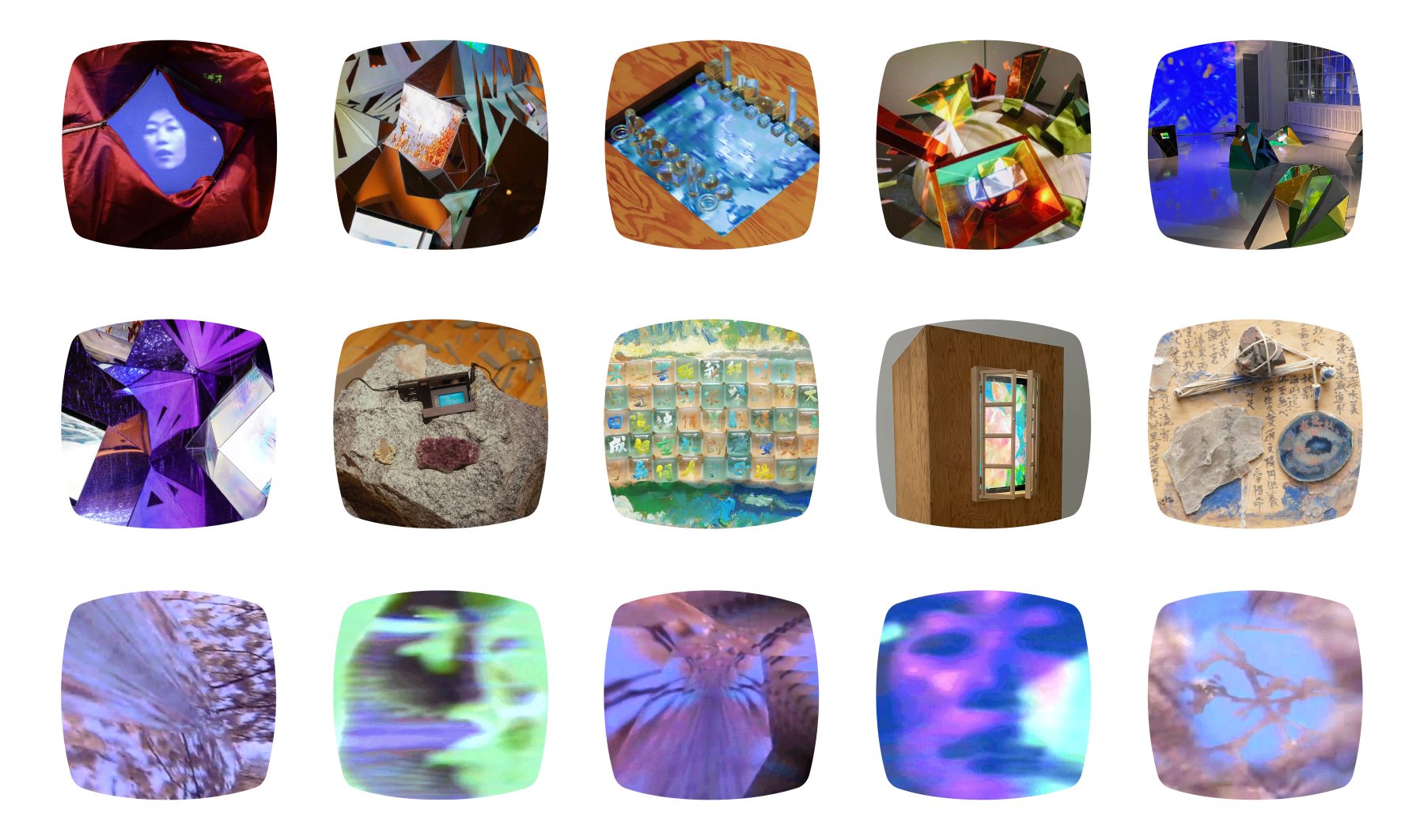
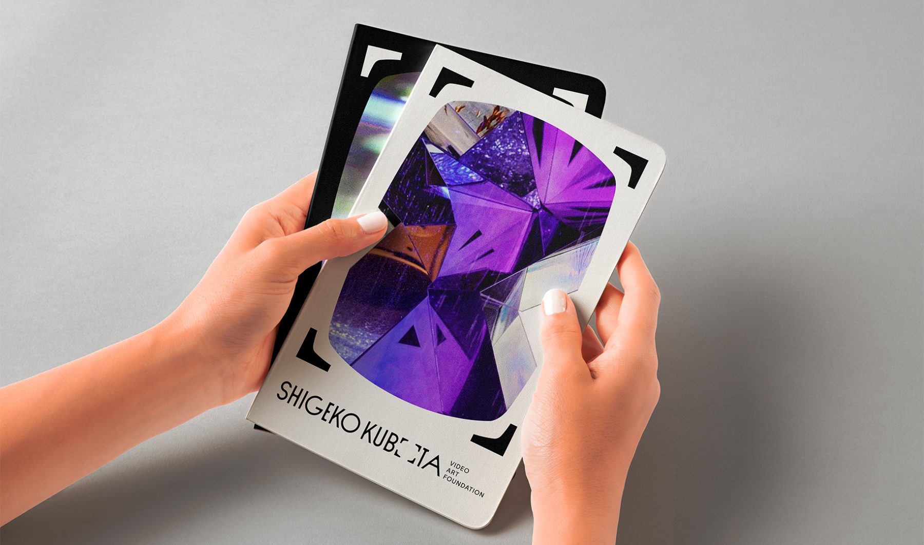
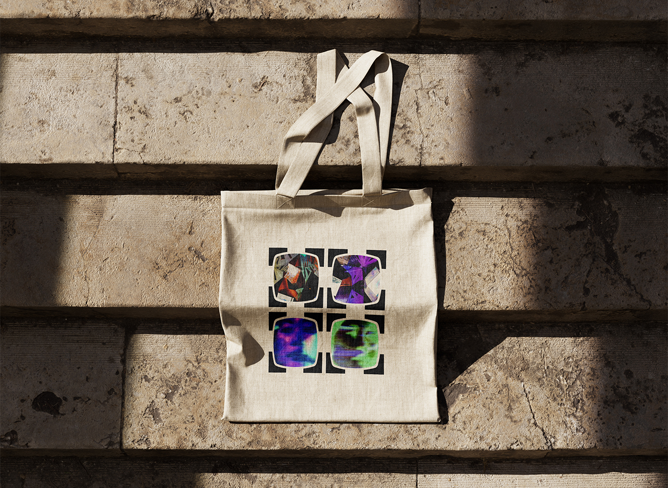
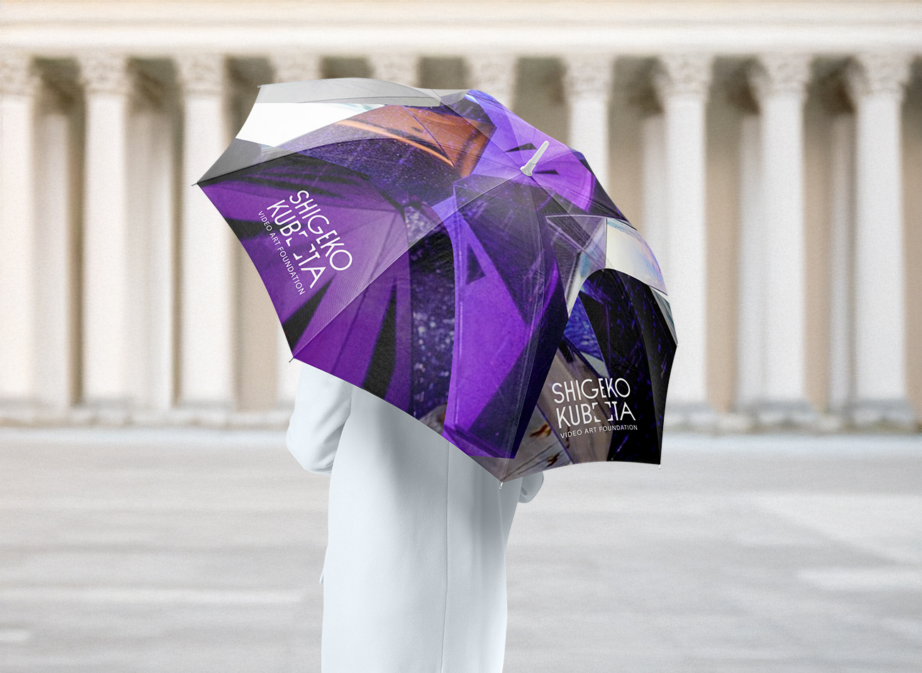
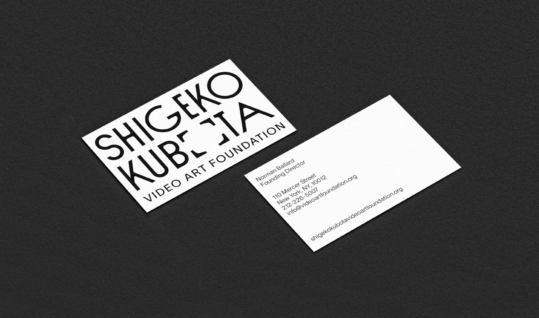
Shigeko Kubota (1937–2015) was a pioneering video artist, recognized as a significant early progenitor of the medium through her multifaceted roles as an artist, curator, critic, and essayist.
The Shigeko Kubota Video Art Foundation is dedicated to preserving her work and cultural legacy while fostering broader awareness, appreciation, and understanding of the history and future of video art through diverse programs and initiatives.
To brand the foundation, we drew inspiration from iconic visual cues in Kubota’s work—most notably the 4×3 television frame and her 2004 artwork, Video is the Window of Yesterday, Video is the Window of Tomorrow. The new visual identity system modernizes these forms within the logotype, allowing the frames to dynamically expand around any subject. Deliberately minimalist and monochromatic, the identity reflects the enduring and timeless nature of Kubota’s contributions to the field of video art.
KUDOS Design Collaboratory
-
John Kudos
Creative Director -
Fay Qiu
Designer -
Owen Febiandi
Designer -
Putu Yogiswara
Designer -
Muhammad Syamil Haqqoni
Designer -
Imam Fadilah
Motion Designer -
Amanda Knott
Project Manager
Austin+Mergold Branding & Website
Austin+Mergold
Capabilities
Focus Area
Client
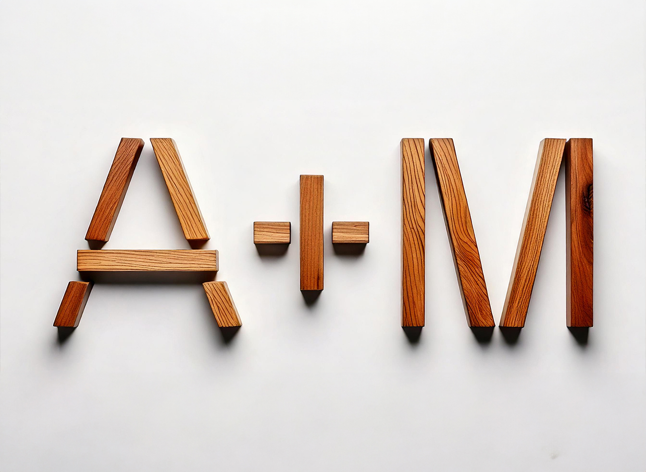
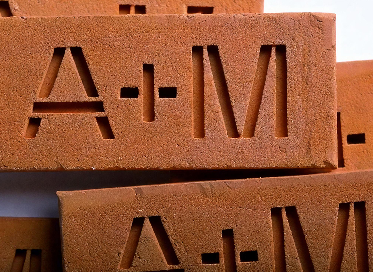
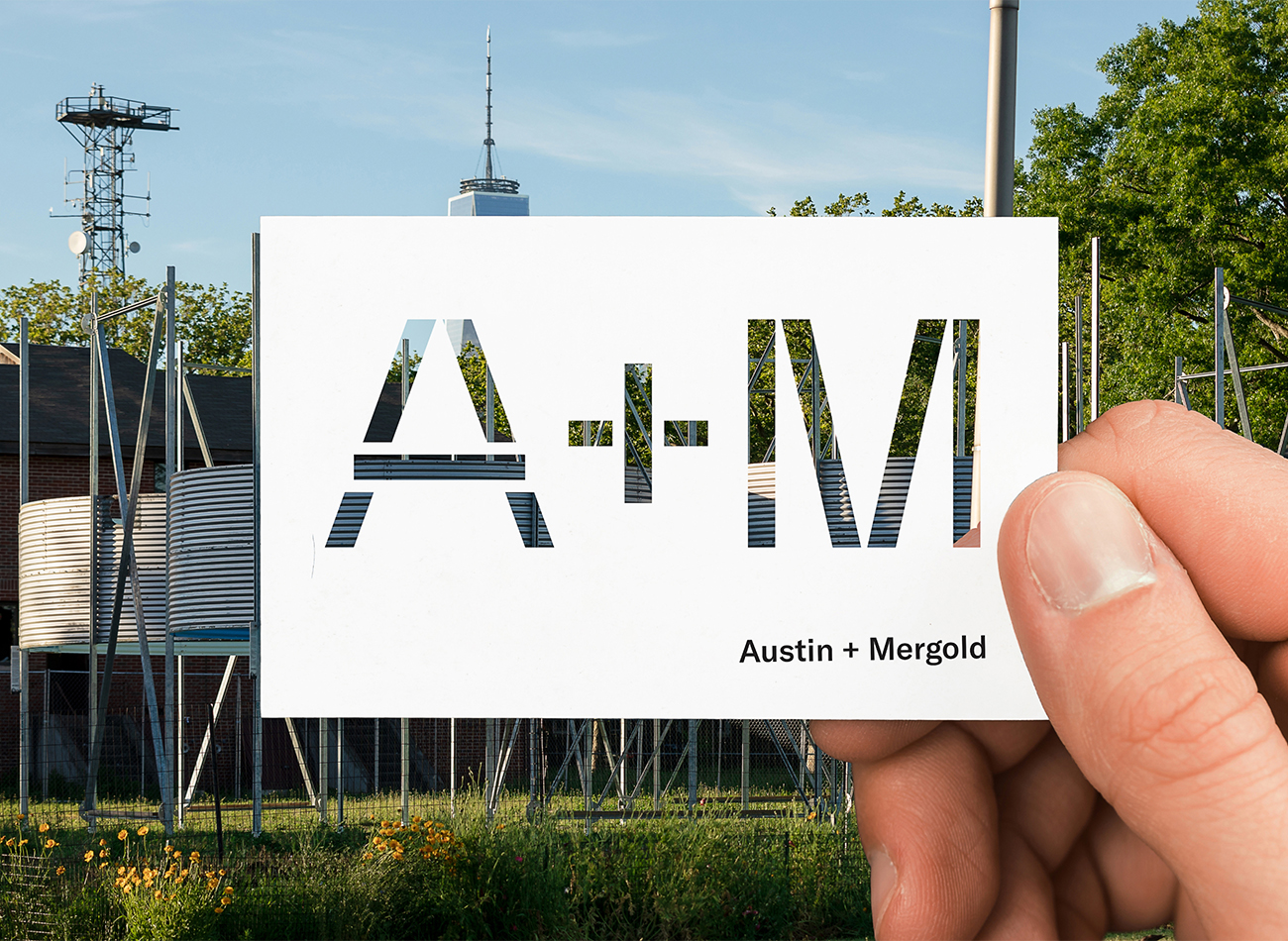
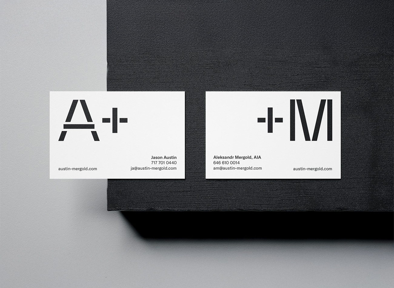
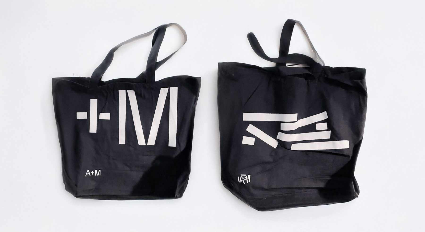
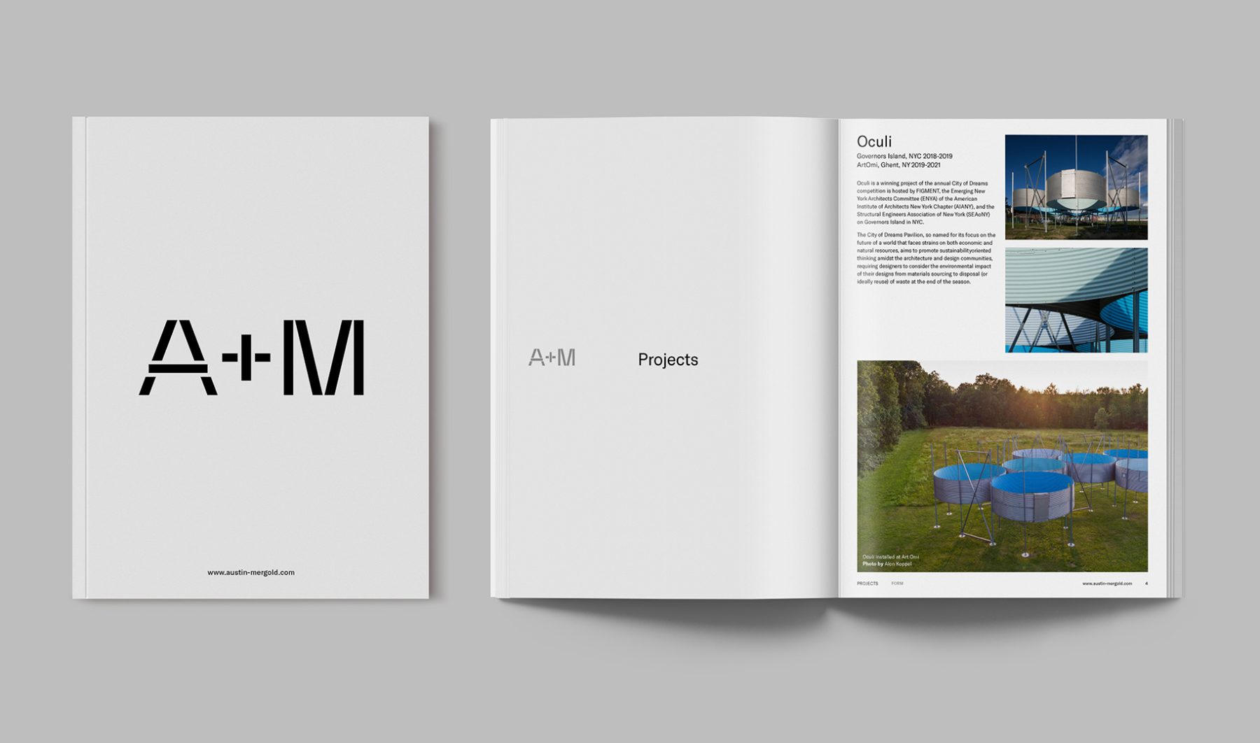
A+M, a design collective led by Jason Austin and Aleksandr Mergold, serves as a platform for collaboration and inquiry across architecture, landscape, and design.
We crafted a bold typographic logo that embodies their process of rethinking and repurposing forms and materials, creating thoughtful expressions that evolve over time.
Their website reflects this vision with a dynamic sorting system that rearranges content blocks, echoing A+M’s philosophy of transforming built forms into fresh innovative designs.
View austin-mergold.com
KUDOS Design Collaboratory
-
John Kudos
Creative Director -
Jamus Marquette
Lead Designer -
Owen Febiandi, Putu Yogiswara
Designer -
Christyan Junaedi Setiawan
Web Developer -
Amanda Knott
Project Manager
Lincoln Square Branding & Website
Lincoln Square BID
Capabilities
Focus Area
Client
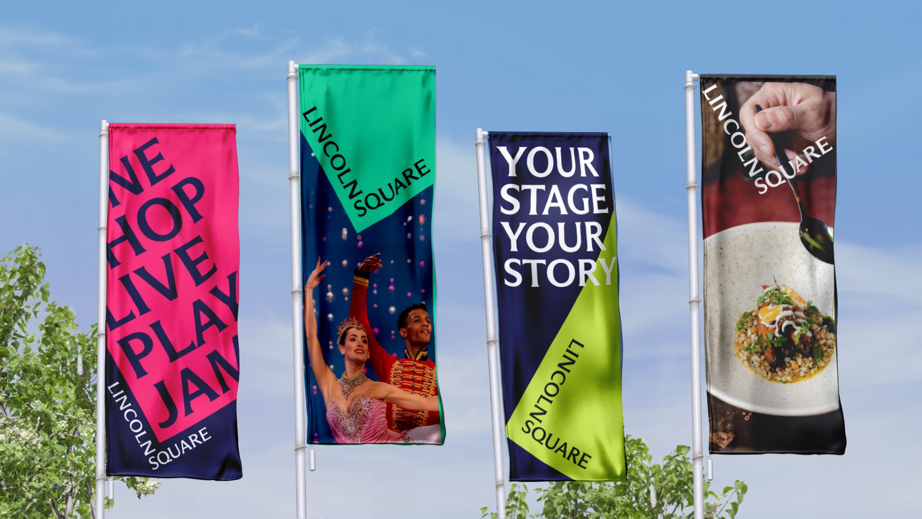
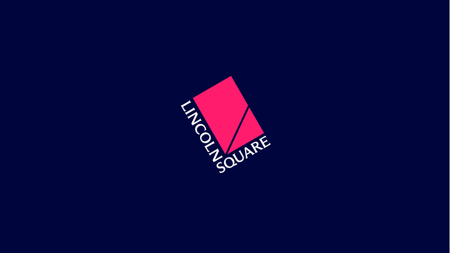
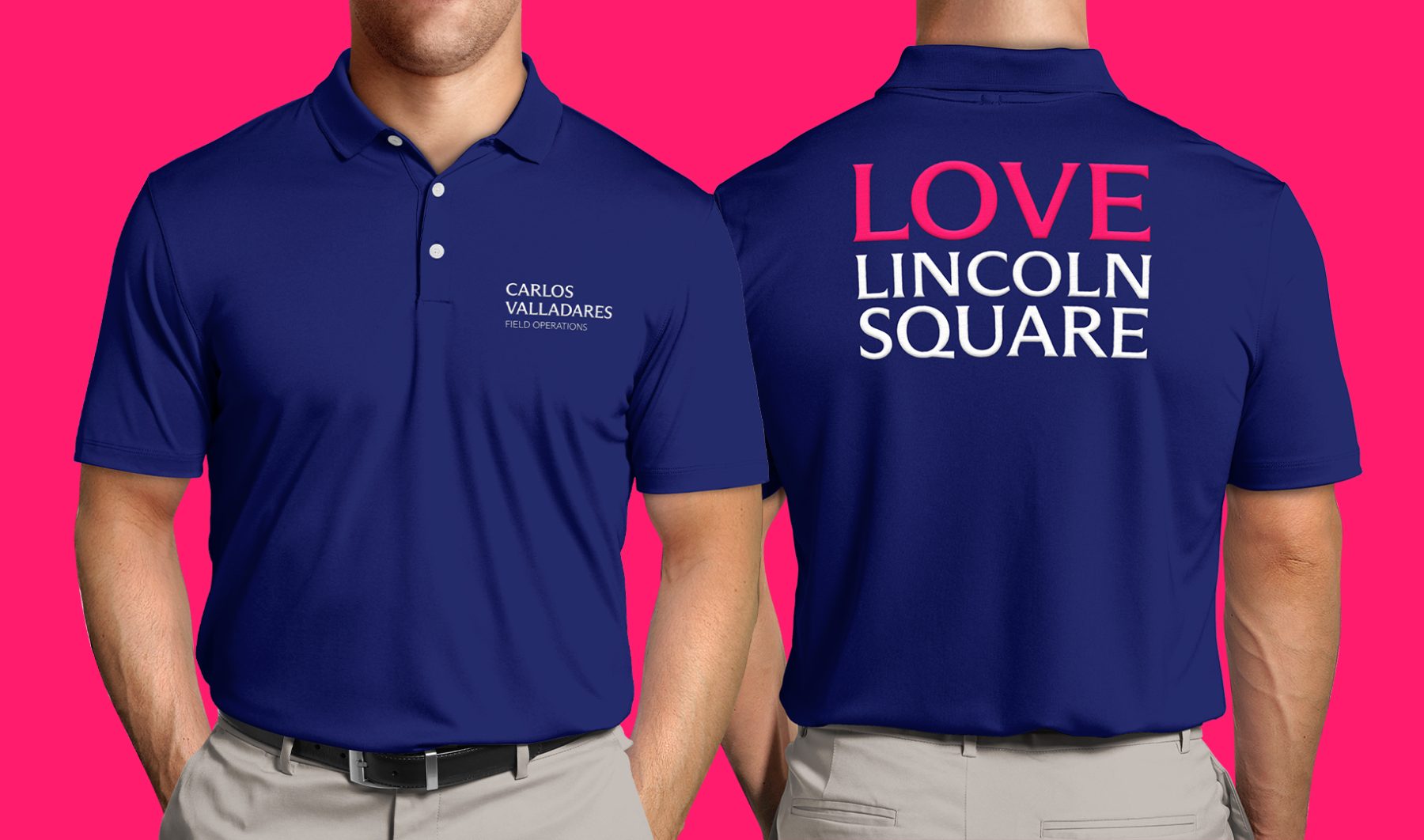
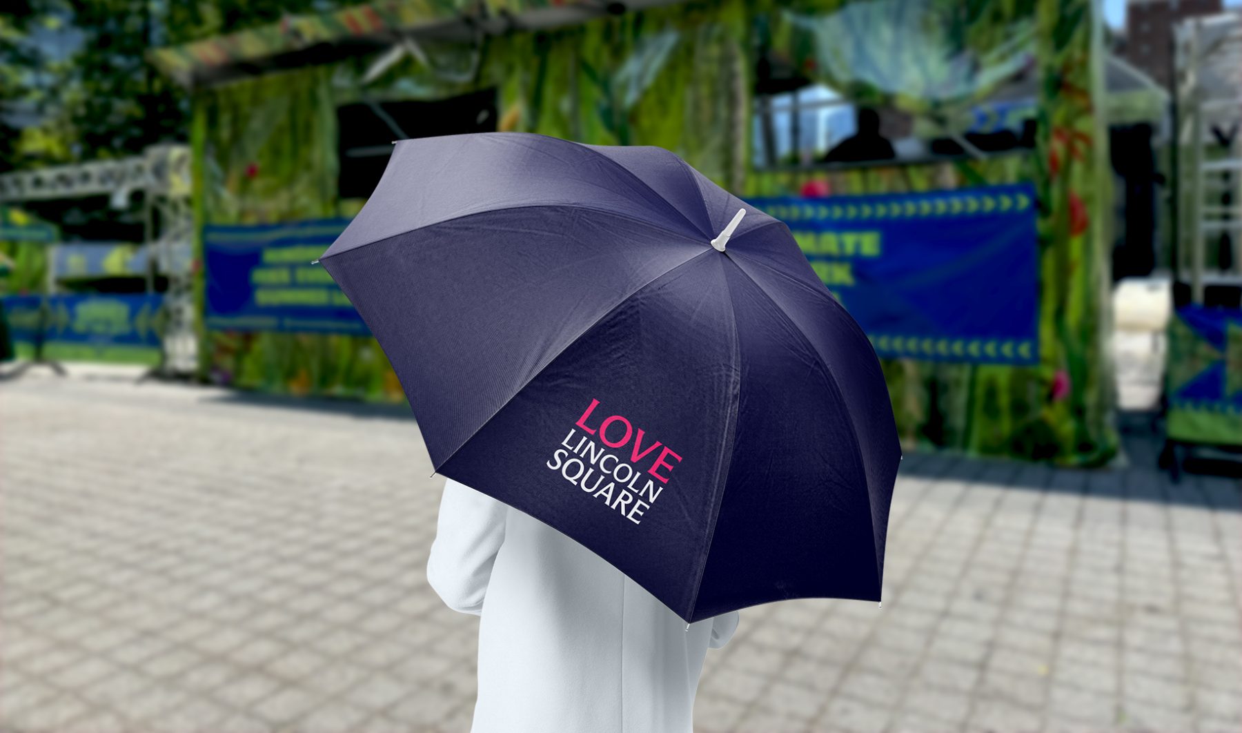
Lincoln Square BID is a nonprofit organization dedicated to keeping the neighborhood clean, safe, and beautiful while promoting its vibrant cultural, commercial, and residential life year-round. Through dynamic marketing efforts, the BID ensures Lincoln Square remains in the spotlight across all seasons.
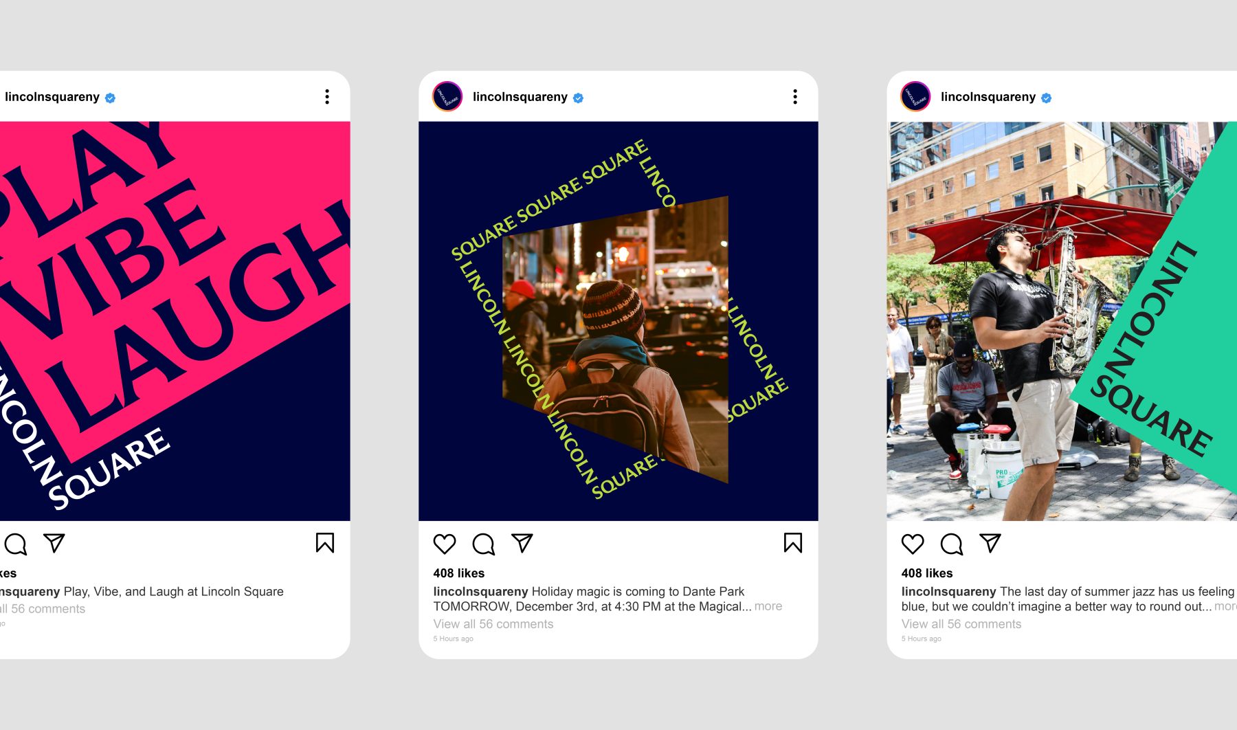
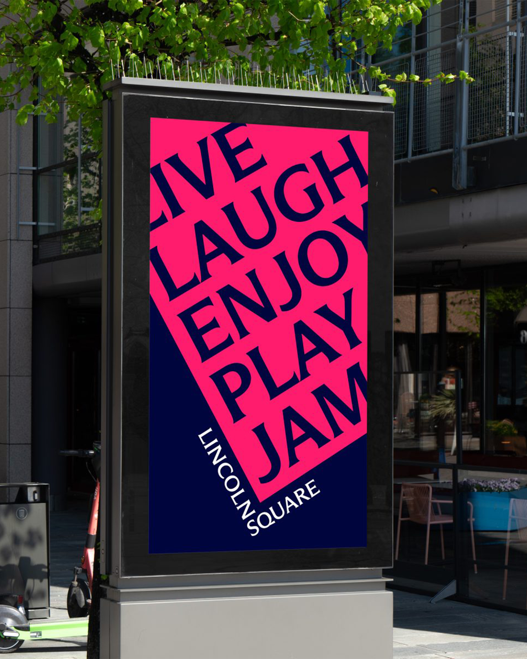
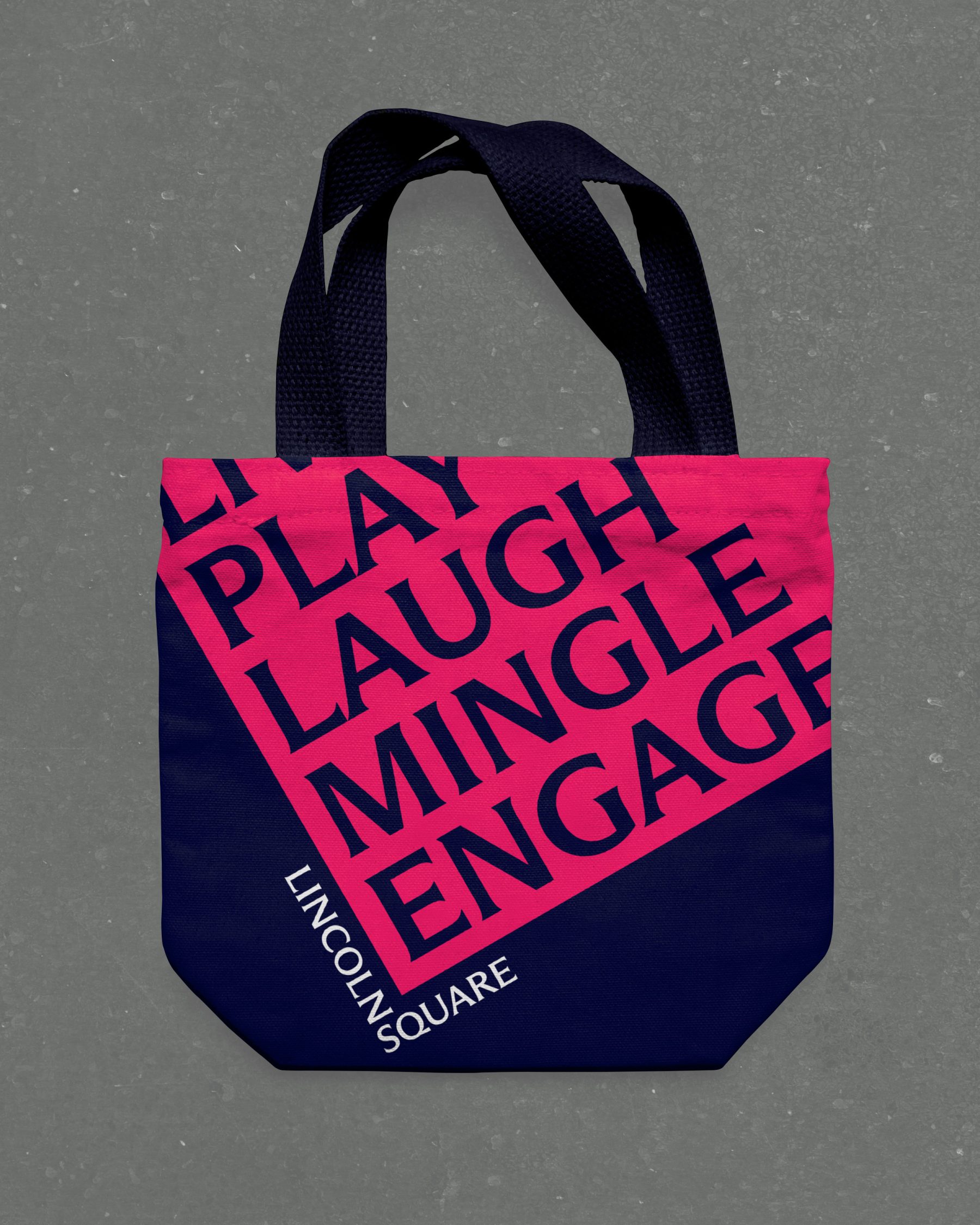
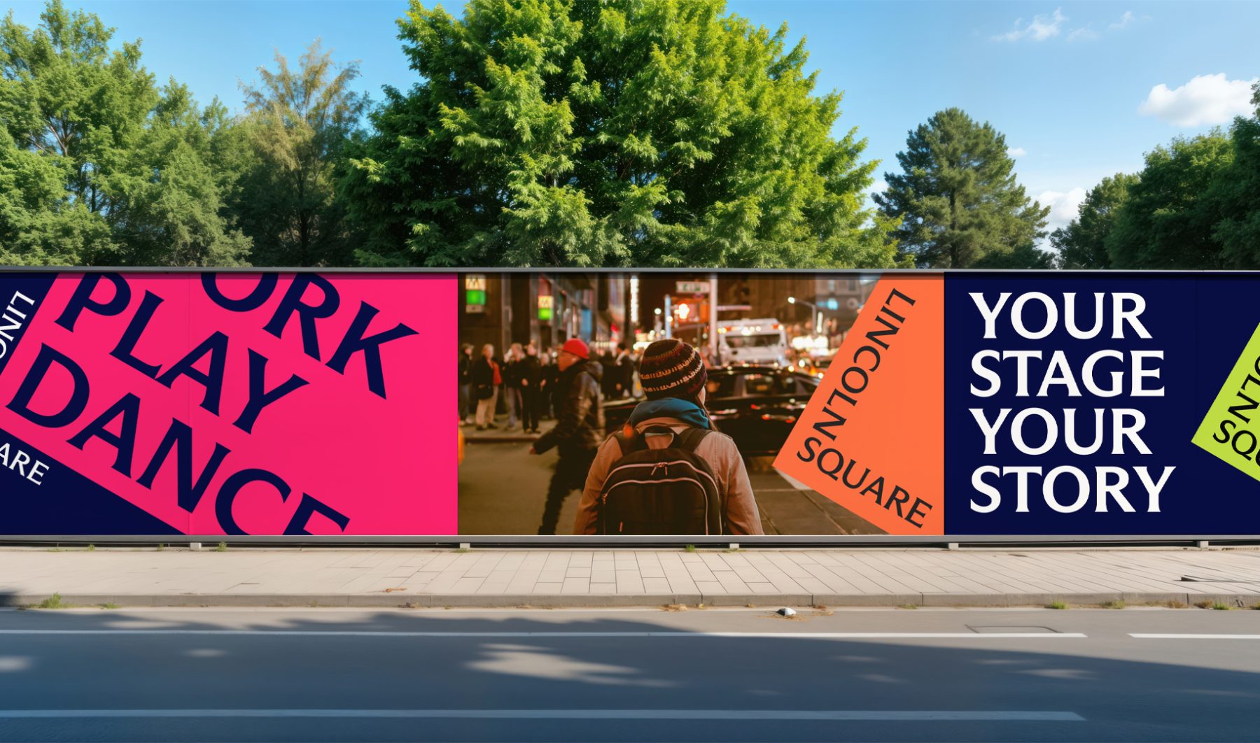
For this project, we introduced a bold new design system. The words LINCOLN and SQUARE interlock to form an “L,” wrapped around a rubin red block tilted at a 30º angle—a visual nod to the way Broadway cuts diagonally through the heart of Manhattan’s Upper West Side.
The block itself serves as a dynamic window into Lincoln Square’s rich cultural landscape. It rotates, shifts colors, and reveals visual moments and words that capture the neighborhood’s spirit, energy, and enduring legacy as one of New York City’s iconic destinations.
A new website will be coming in the Spring of 2025.
KUDOS Design Collaboratory
-
John Kudos
Creative Director -
Fay Qiu
Lead Designer -
Owen Febiandi
Designer -
Jamus Marquette
Designer -
Amanda Knott
Project Manager -
Imam Fadilah
Animator

Medical Inflatables Branding & Website
Medical Inflatables
Capabilities
Focus Area
Client
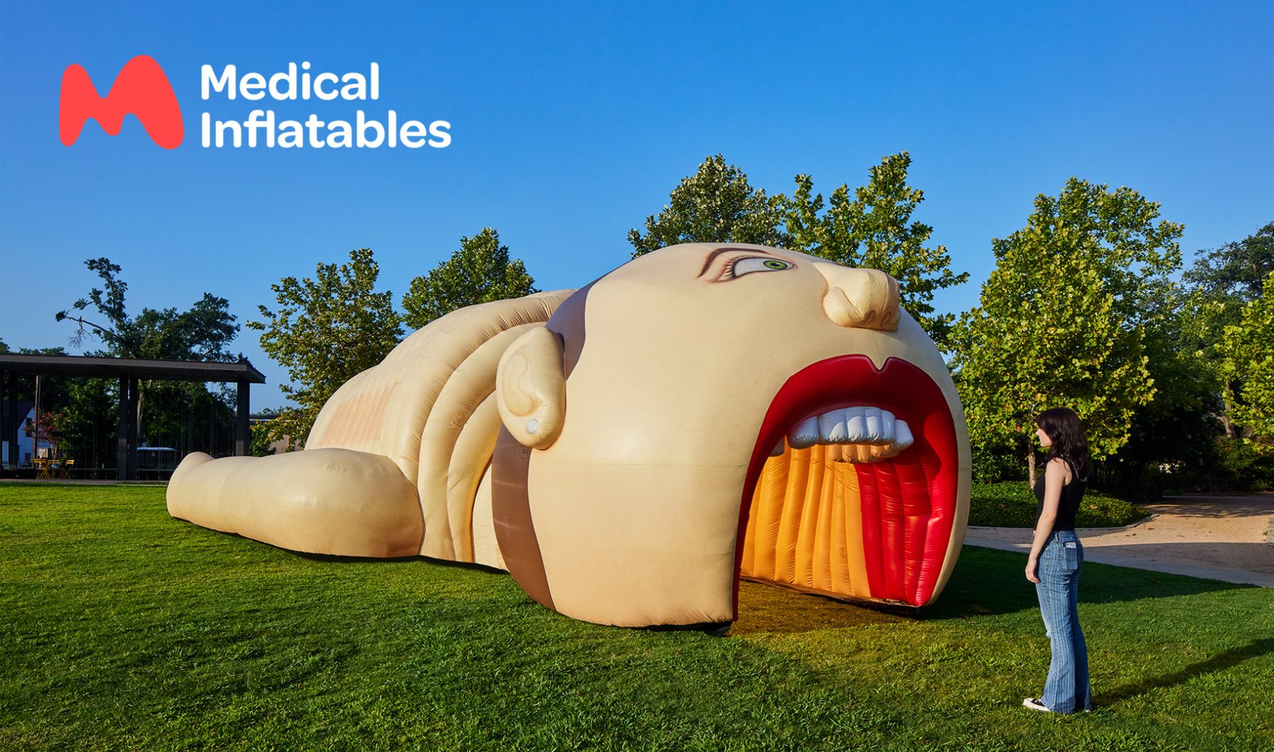
Medical Inflatables is revolutionizing health education with larger-than-life, interactive anatomy models that make serious health topics approachable for all ages.
For their latest rebrand, we crafted a dynamic visual identity inspired by their mission to promote health awareness in engaging and meaningful ways. The new organic “M” logo mimics the shapes of human organs, seamlessly adapting across applications. Each inflatable now features a quirky mascot—perfect for stickers, t-shirts, and signage—paired with playful taglines that spark smiles.
The revamped website combines parallax scrolling and fluid animations, offering users an organic and intuitive experience while effortlessly guiding them to information and booking options. Together, we’re making health literacy accessible, friendly, and impactful—one “mega” inflatable at a time.
Visit medicalinflatables.com
KUDOS Design Collaboratory
-
John Kudos
Creative Director -
Fay Qiu
Lead Designer -
Owen Febiandi
Designer -
Amanda Knott
Project Manager -
Imam Fadilah
Animator -
Inwoo Baek
Illustrator -
Samuel Sachs Morgan
Photography


Lewis Latimer Interactives
Lewis Latimer House Museum
Capabilities
Focus Area
Client
Lewis Howard Latimer was the son of self-emancipated enslaved people, a self-taught draftsman, and major contributor to the invention of the lightbulb and the telephone. Some of his own inventions are the early air conditioning unit and the railroad car bathroom.
Growing up, Latimer faced many challenges due to racial discrimination prevalent at the time. He enlisted in the Union Navy in 1864 at the age of 16 and—with no access to formal education—taught himself mechanical drawing which eventually led him to become a chief draftsman, patent expert, and inventor.
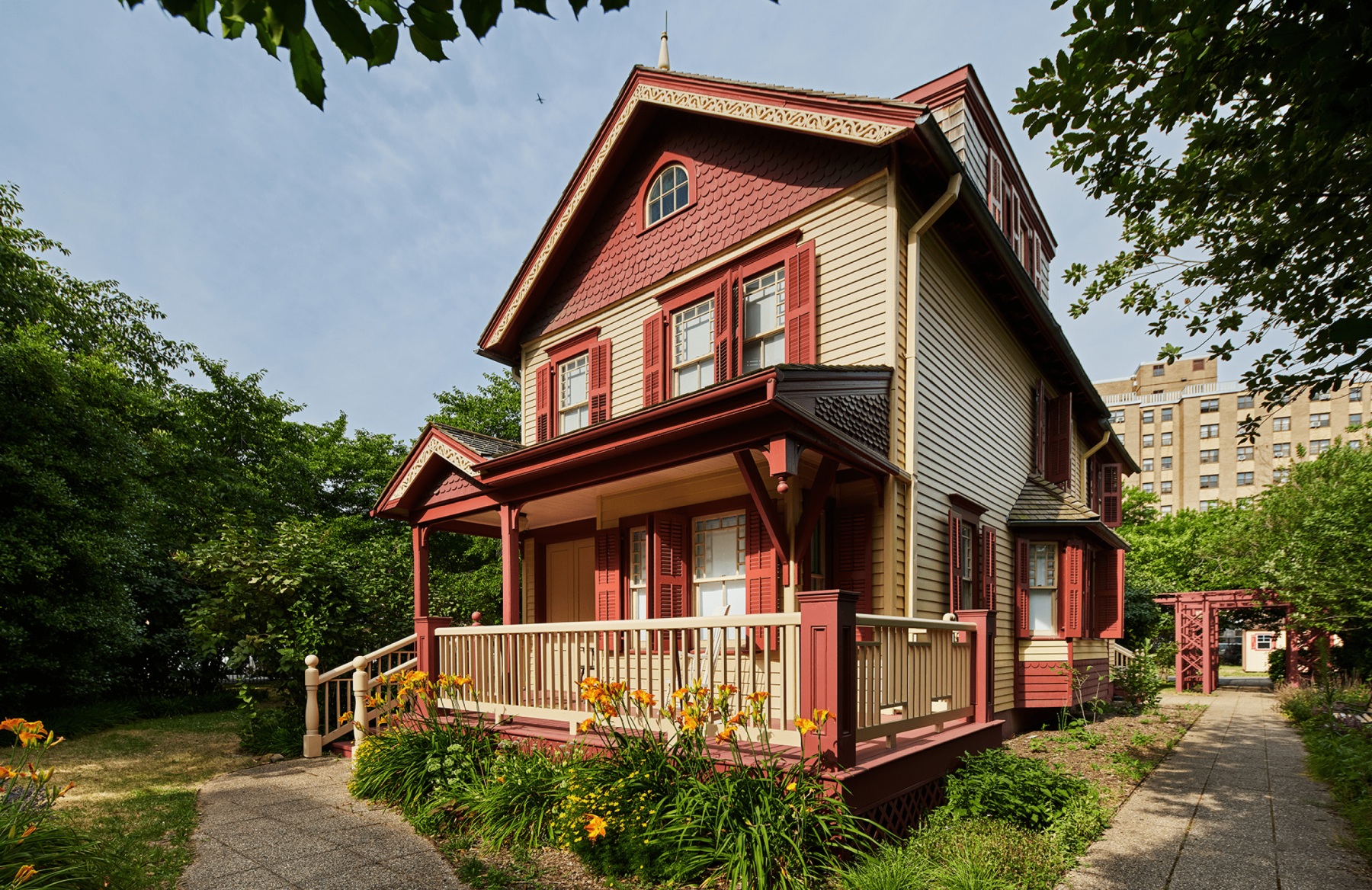
The Lewis Latimer House Museum in Flushing, New York is the very same house that Latimer lived in from 1903 until his passing at the age of 80 in 1928. Threatened with demolition, the house was relocated from Holly Avenue in East Flushing to its present location in 1988. It is now a historic house museum owned by the New York City Department of Parks & Recreation, operated by the Lewis H. Latimer Fund, Inc., and is a member of the Historic House Trust.
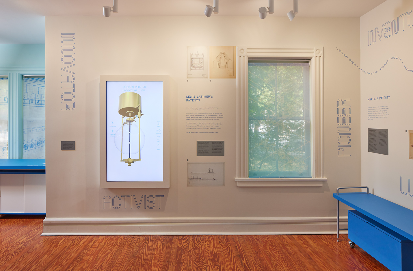
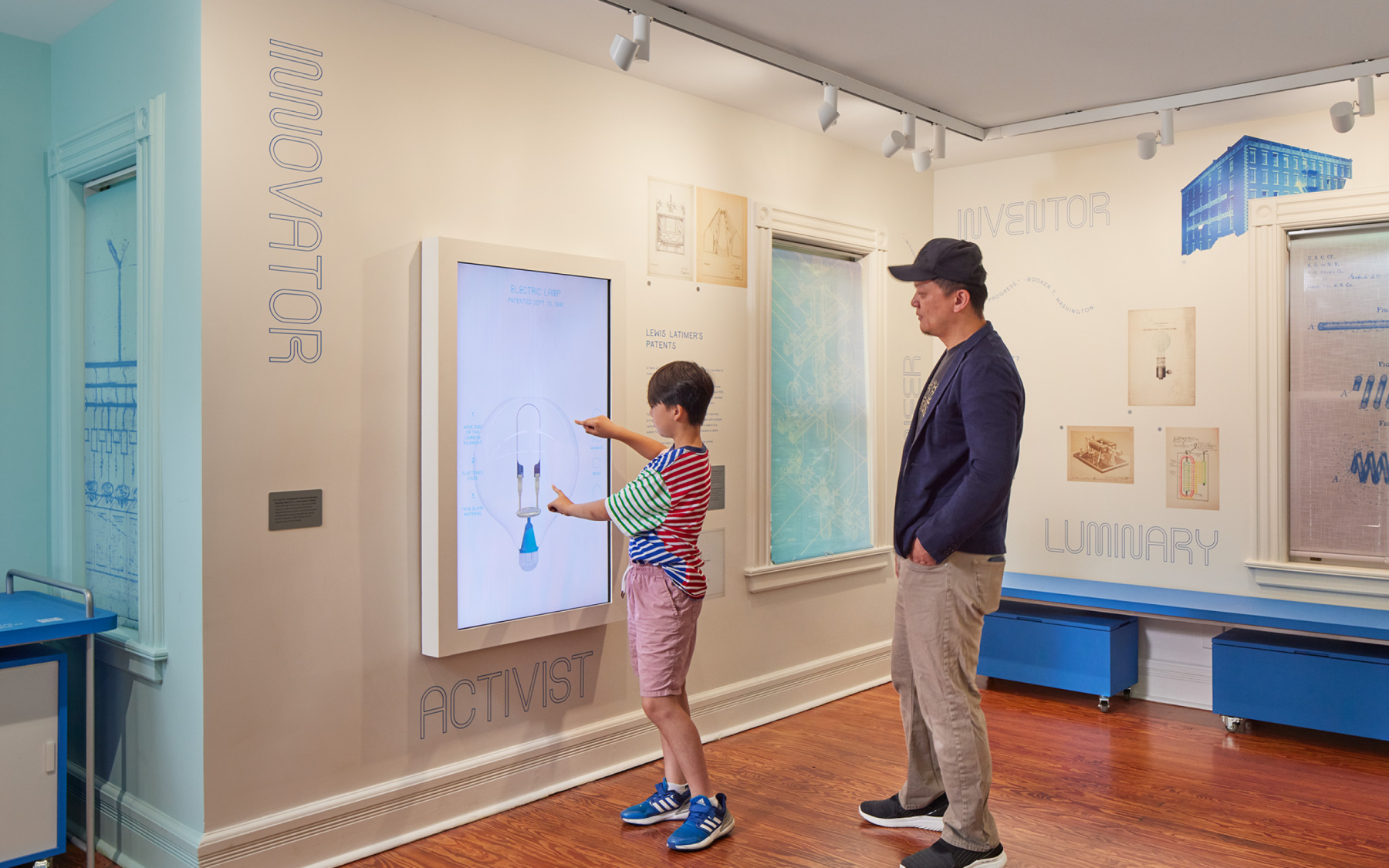
We worked closely with Isometric, the lead exhibition designer, to produce four interactive exhibitions through a combination of digital and physical experiences that educate, entertain, and inspire—all rooted in Latimer’s legacy as an mold-breaking inventor of his time.
INVENTION MACHINE
Vertical screen displaying inventions Latimer patented, but never built. Oversized blueprints reimagined as 3D objects which brings the inventions to life.
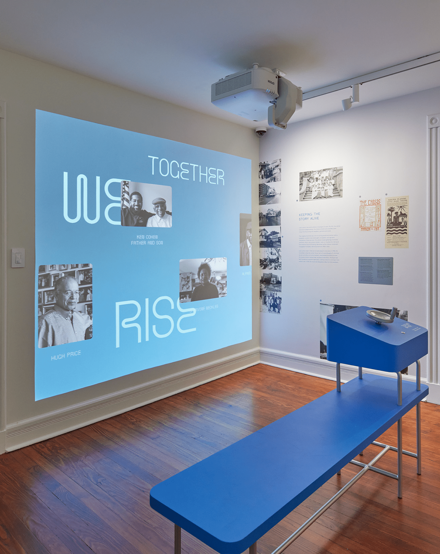
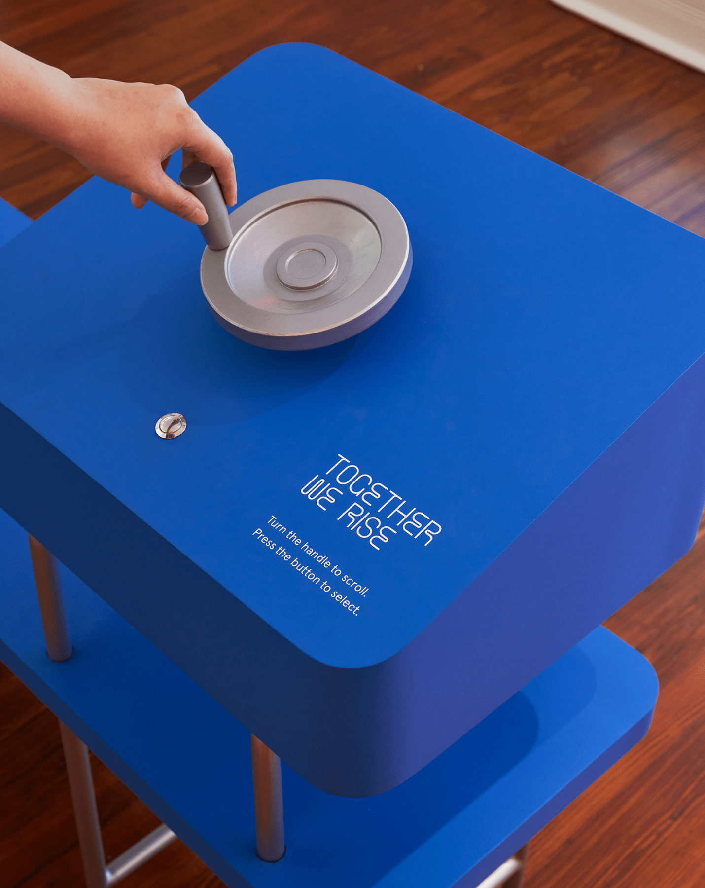
TOGETHER WE RISE
An interactive “family portraits wall” of contributors and leaders integral to Latimer’s legacy. A bench in front of the projection wall holds a hand-crank allowing viewers to navigate to a particular profile by rotating and pressing a physical button.
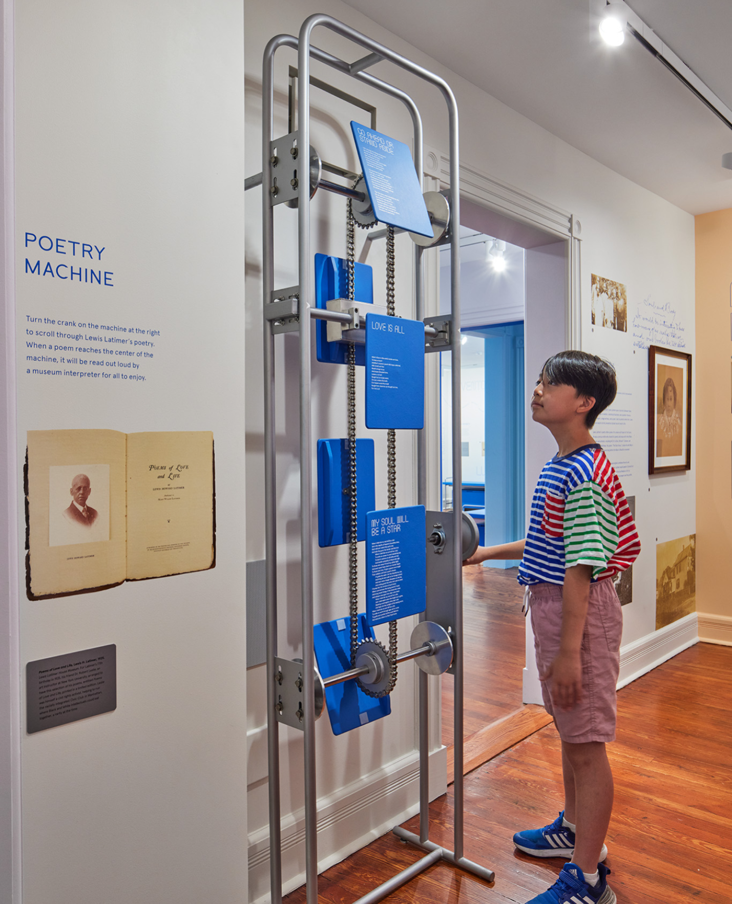
POETRY MACHINE
A skeletal mechanical crank allowing visitors to rotate between panels of Latimer’s poetry. When cranked to the right position, the selected poetry plays audibly, allowing visitors to experience the poetry as an audio-visual sensory experience.
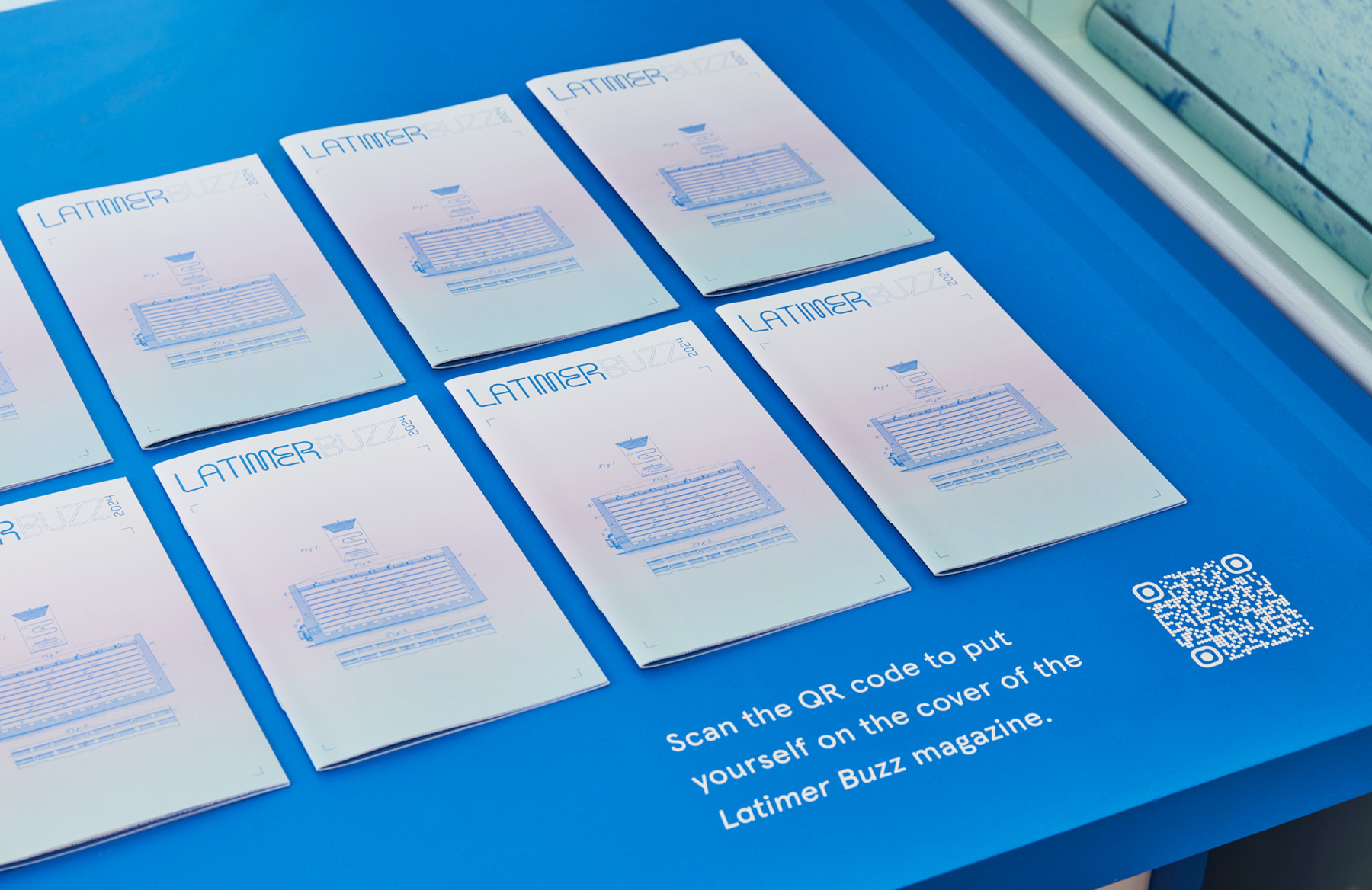
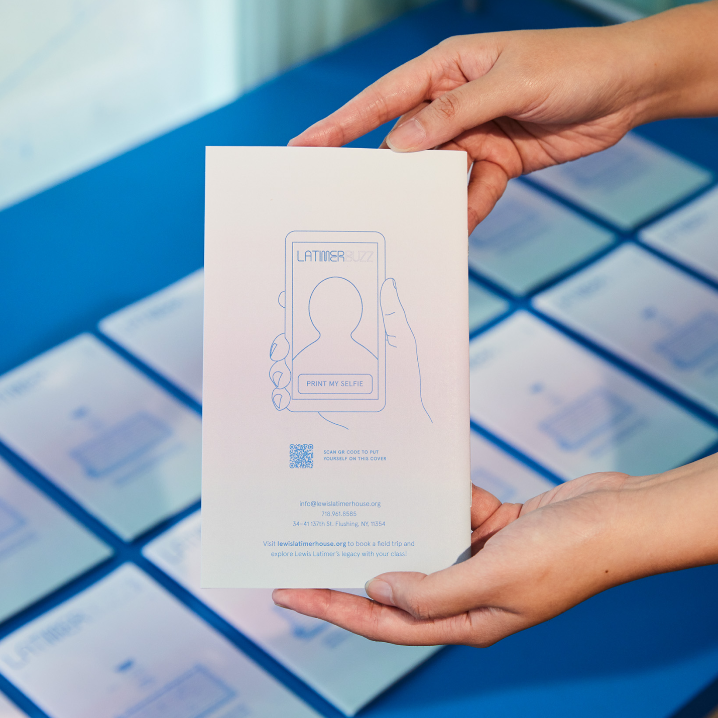
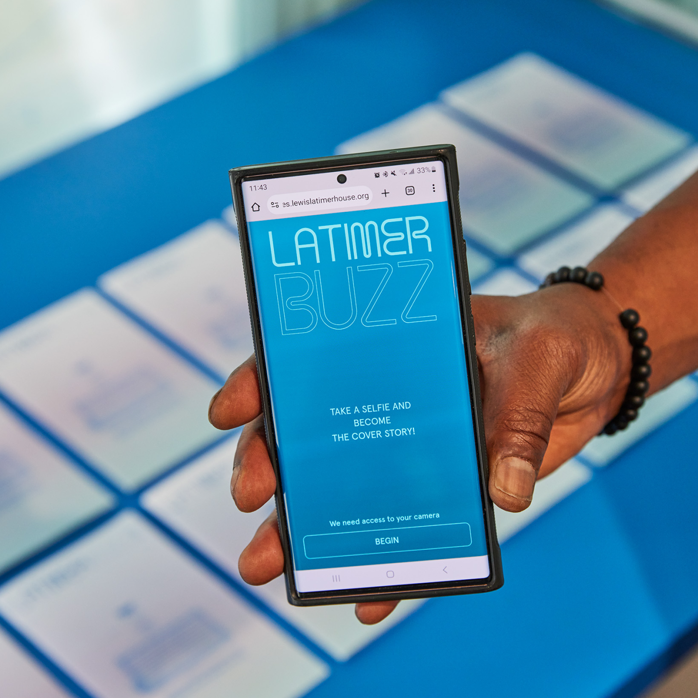
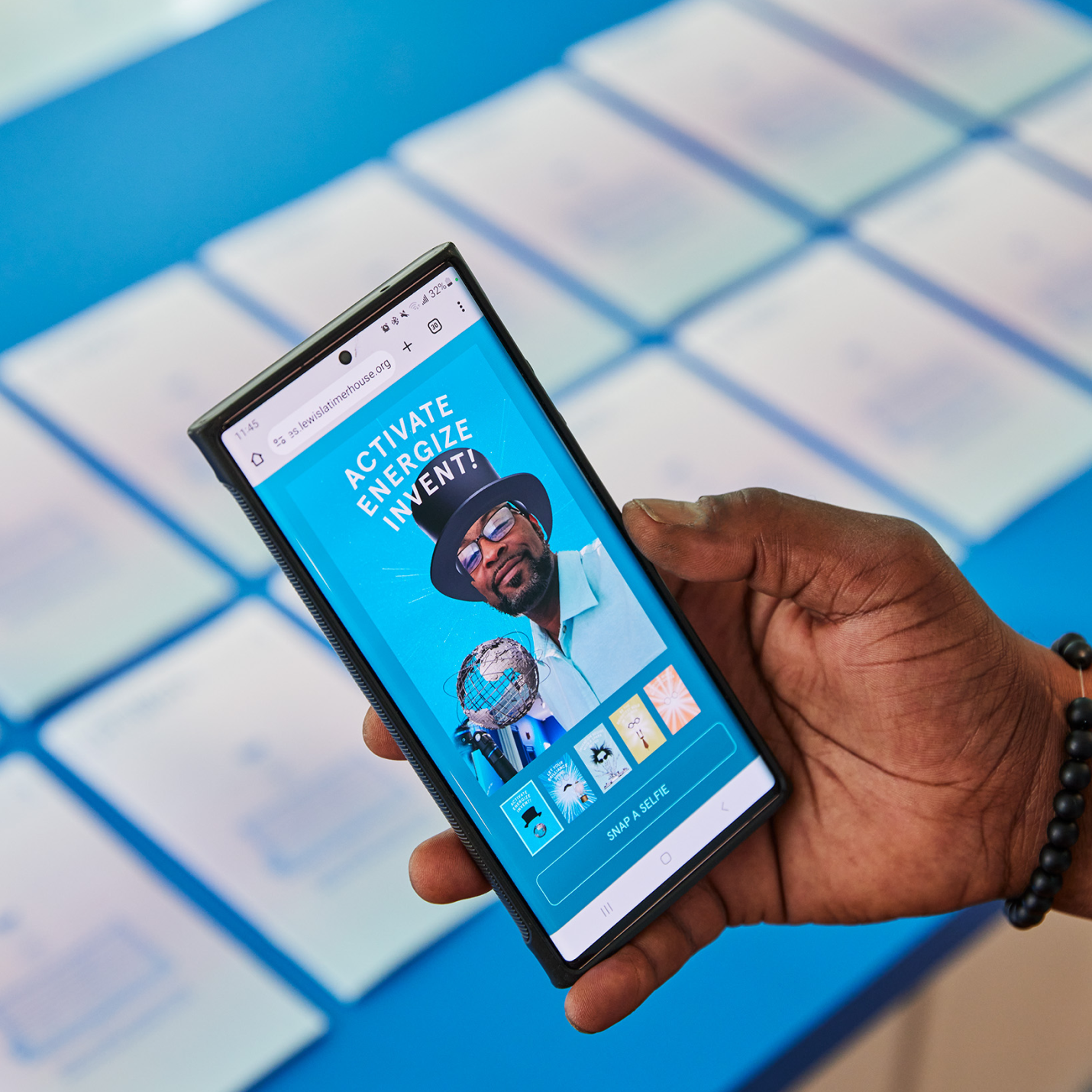
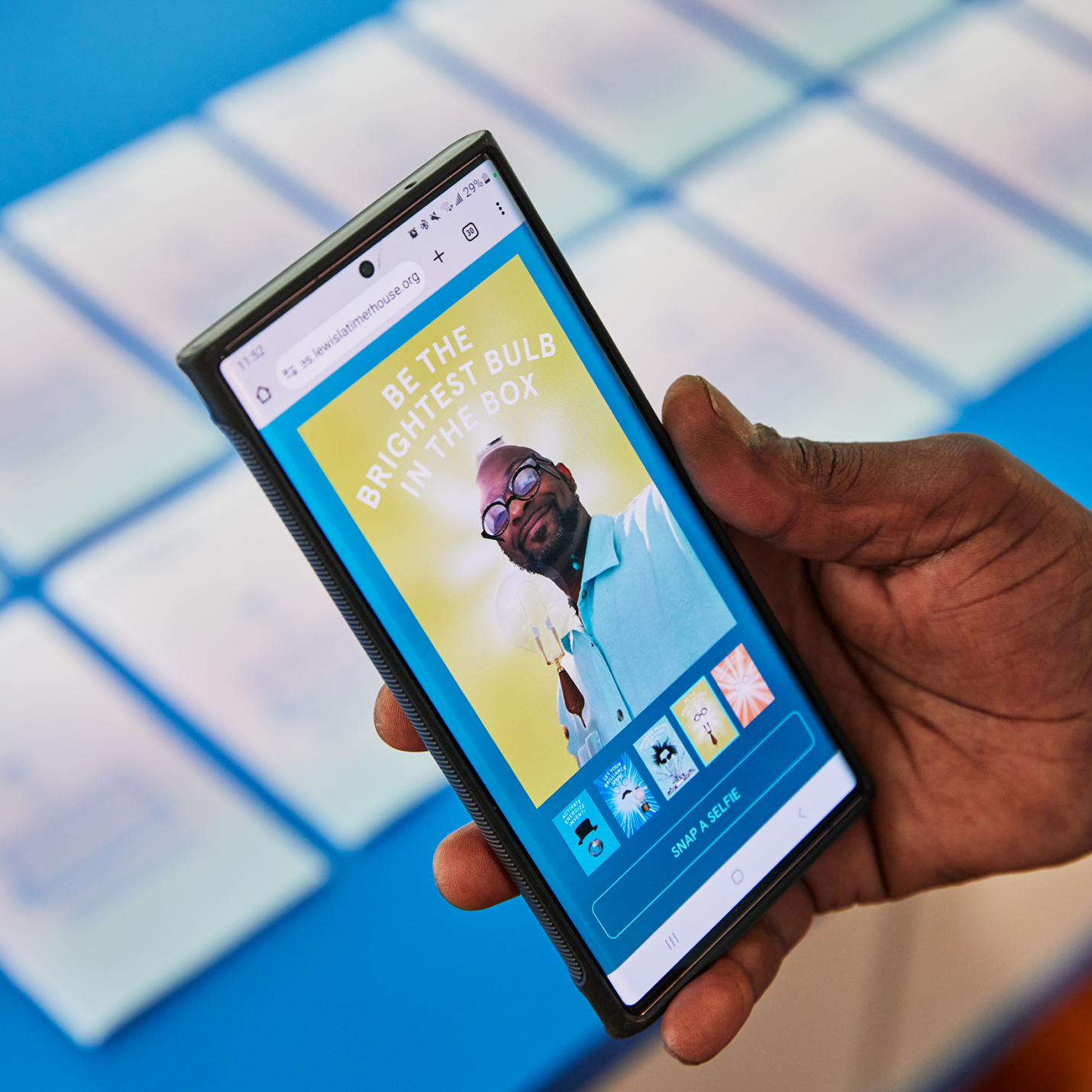
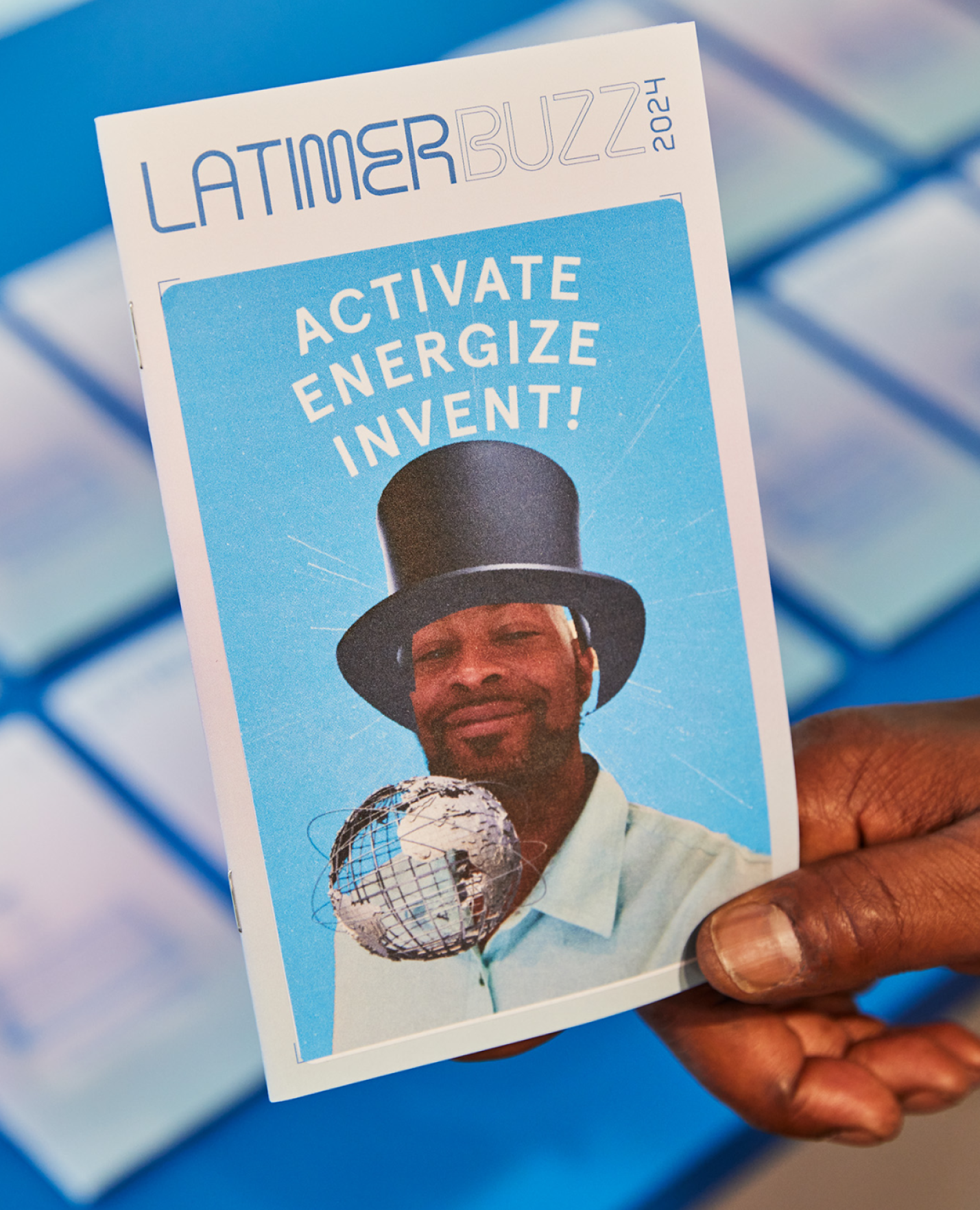
LATIMER BUZZ SELFIE APP
A selfie app that can be loaded directly on visitor’s smart phones using a QR code on the printed Latimer Buzz magazine. Through the app, everyone can take a fun selfie image as the cover of Latimer Buzz magazine, and actually print a physical sticker that can be affixed to the magazine as a keepsake item—a kid-friendly activity and souvenir from a memorable experience.
KUDOS Design Collaboratory
-
John Kudos
Creative Director -
Robert de Saint Phalle
3D Creative Director -
Jess Mackta
Project Manager -
Jamus Marquette
Lead Designer -
Fay Qiu, Owen Febiandi
Designer -
Imam Fadillah
3D Designer -
Chris Manlapid, Arif Widipratomo, Faris Han
Software Developer -
Ed Bear
Engineer -
Levy Murphy
Fabricator -
Electrosonic
A/V Consultant
Isometric
- Lead Exhibition Design

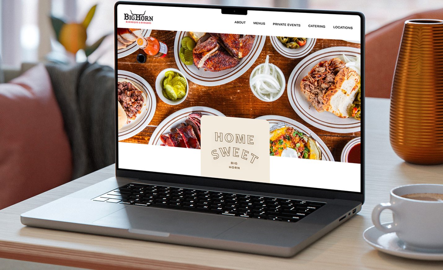
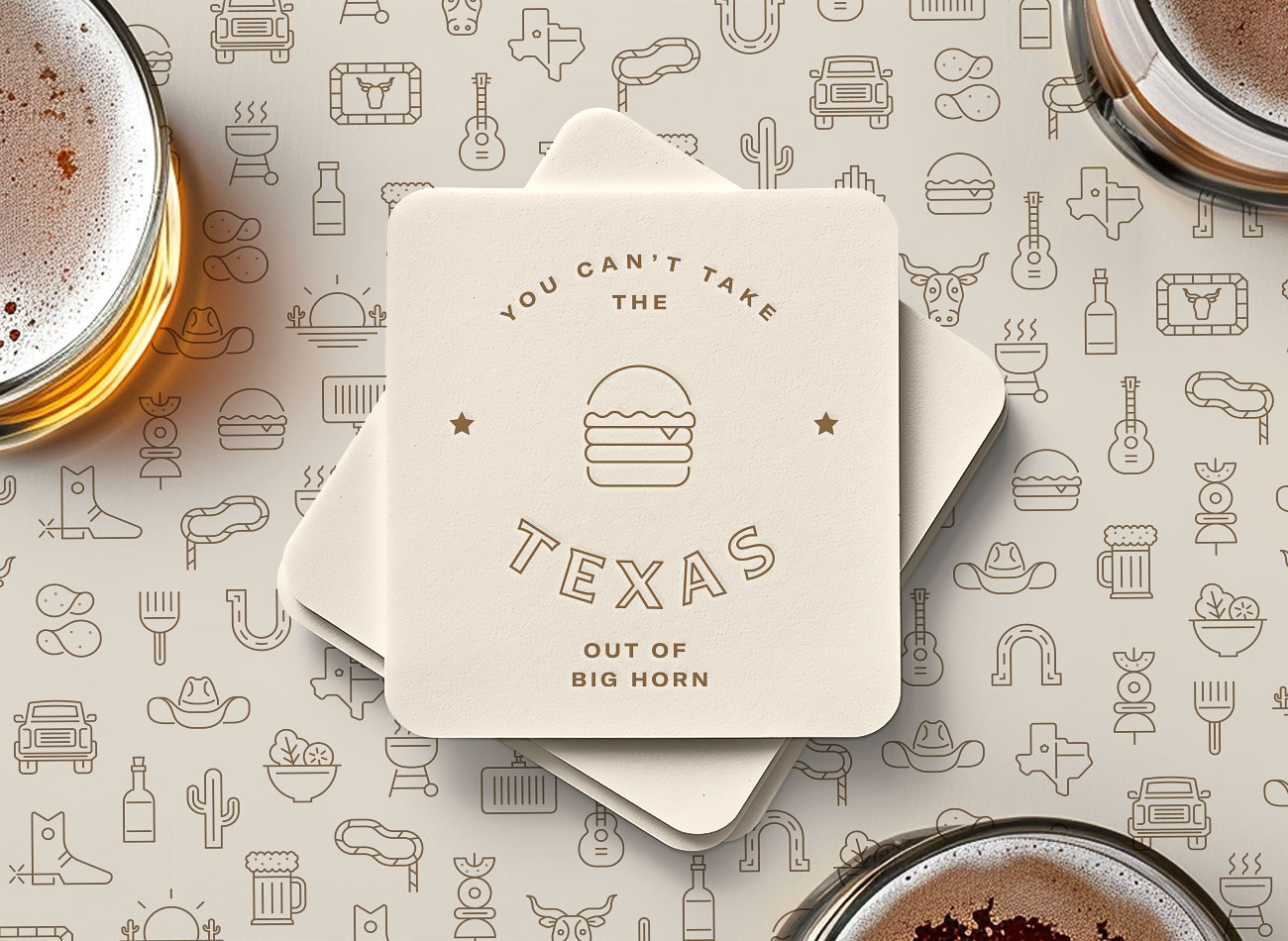
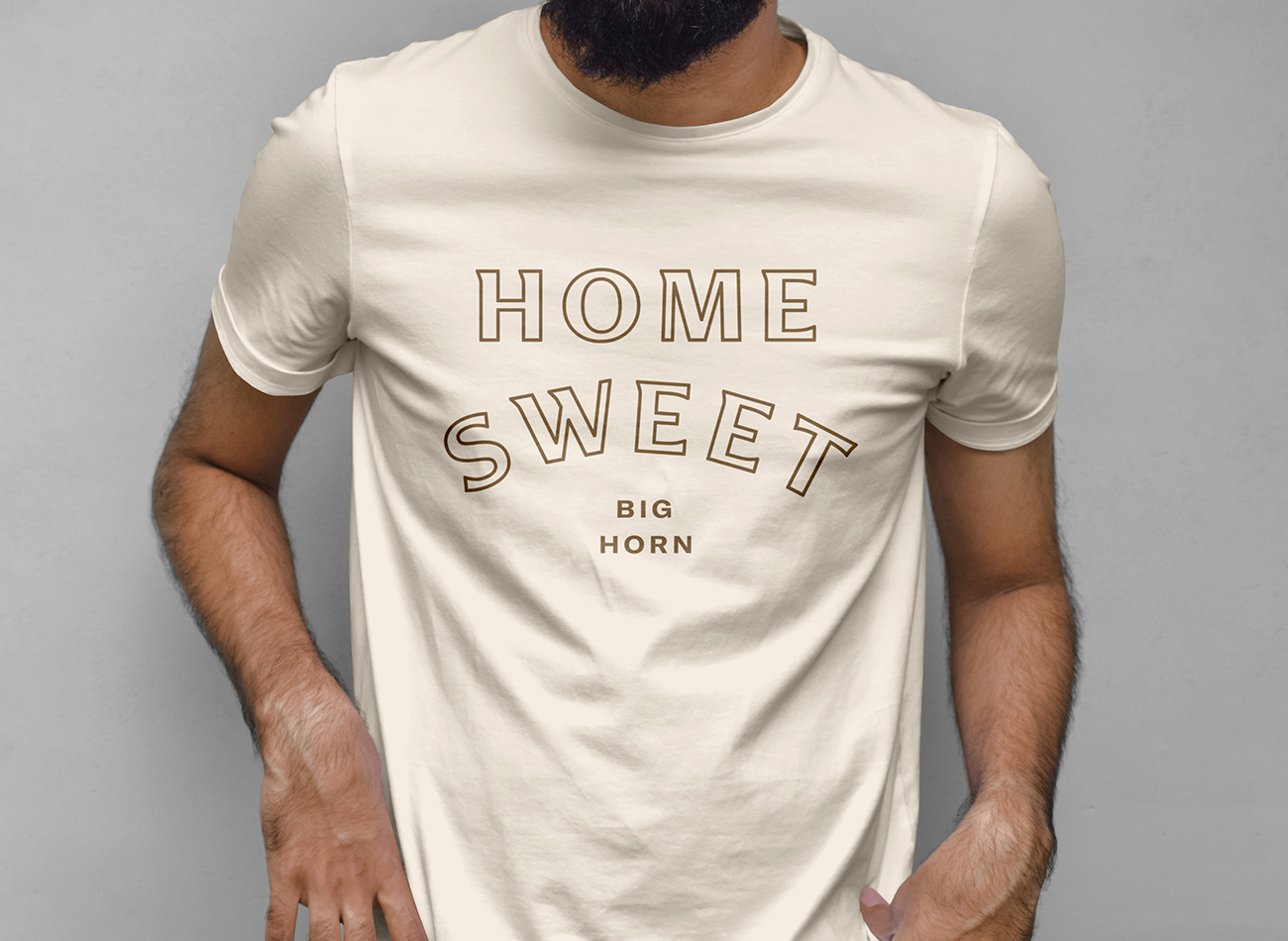
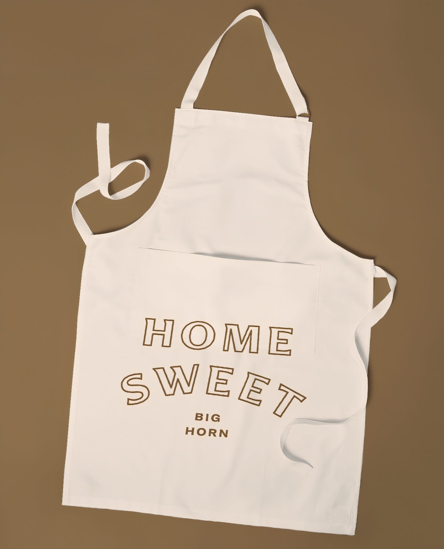
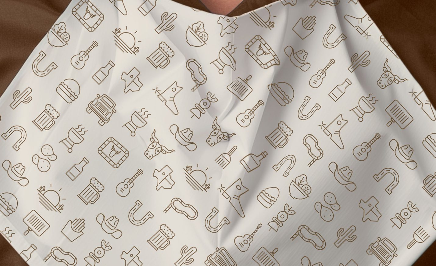
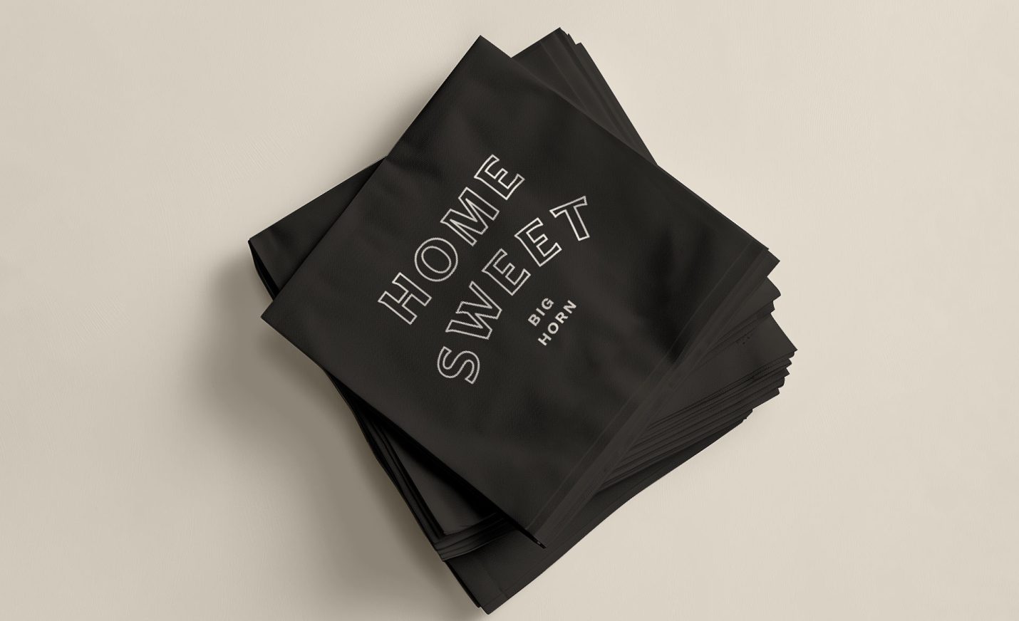
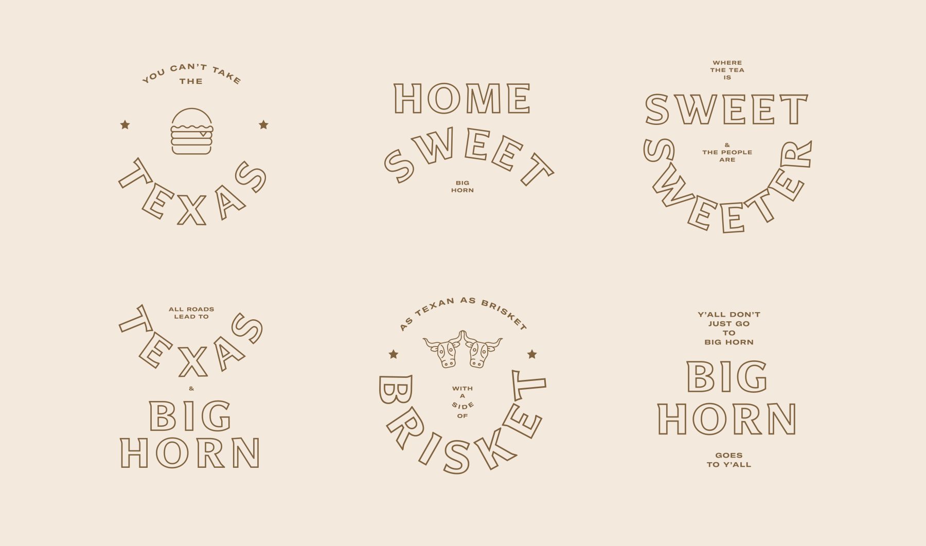
Big Horn BBQ Website & Type Design
Big Horn BBQ
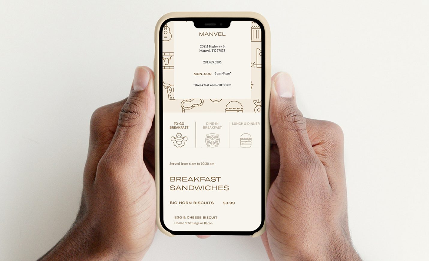
Fueled by Texas-sized hospitality, Big Horn dish out the finest BBQ, deliver grade-A customer service, and keep things clean as a whistle in a friendly, family-style setting for the folks in our communities. Big Horn is not just a restaurant, it’s a tight-knit second home for the staff where excellence and warmth intersect.
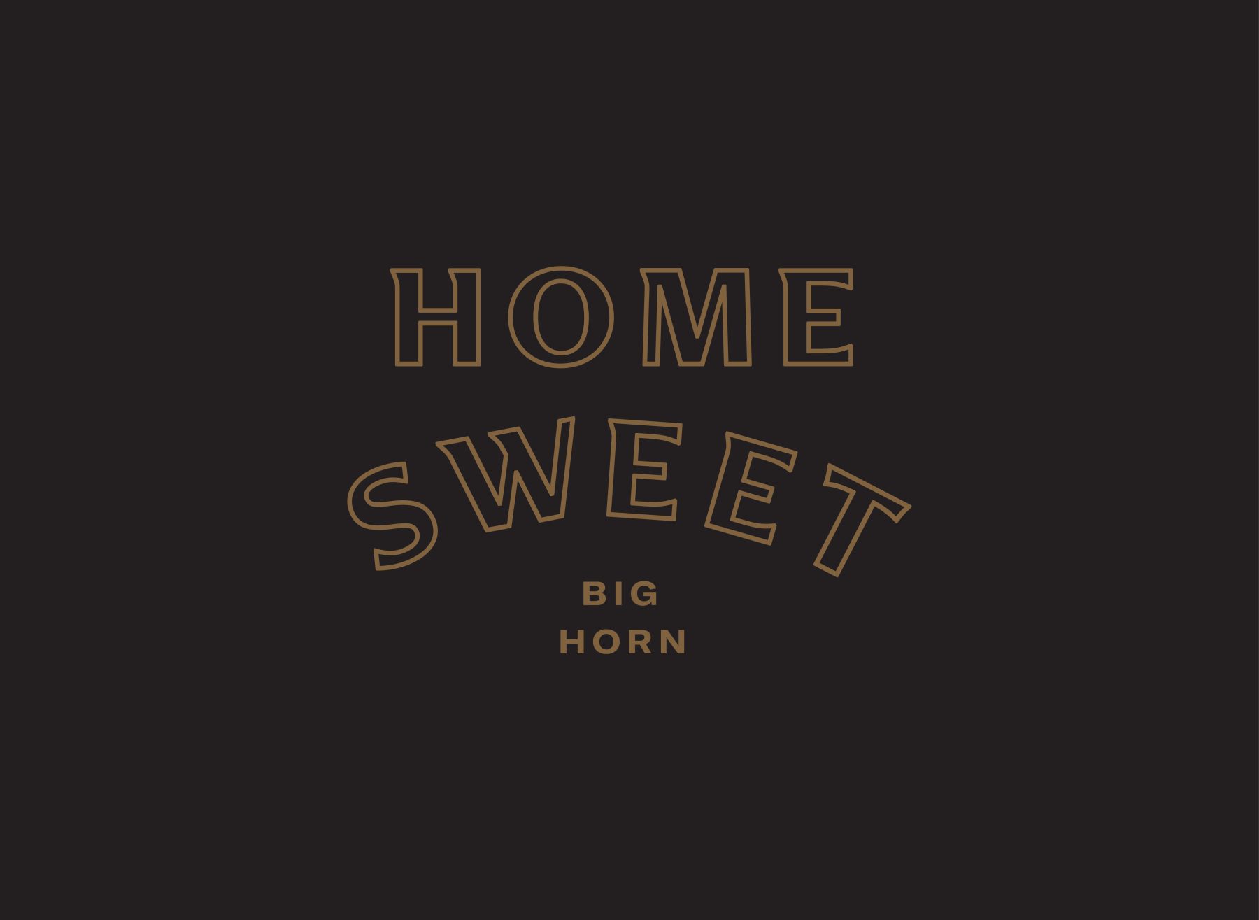
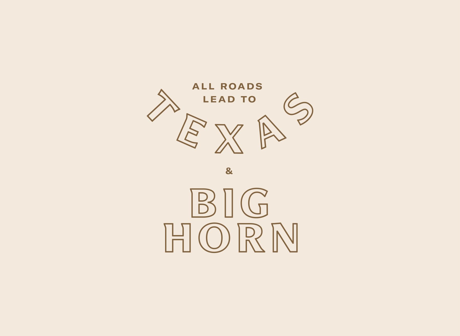
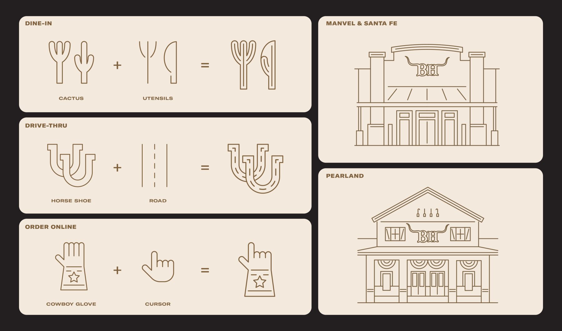
When tasked to refresh Big Horn’s website, we identified the need to refresh its brand messaging. Without changing its locally known bullhorn logo, we infused a new ethos to the brand by introducing wit to the website copywriting, rendered in newly custom-designed typeface, BH Classy. We also designed illustrations that compliment the new tone of voice, each time combining 2 objects into a playful new icon that looks great on their own and as a wallpaper.
Visit bighorn-bbq.com
KUDOS Design Collaboratory
-
John Kudos
Creative Director -
Amanda Knott
Project Manager -
Jamus Marquette
Lead Designer -
Owen Febiandi
Designer -
Mares
Type Design -
Chris Manlapid
Web Developer -
Christyan Junaedi Setiawan
Web Developer
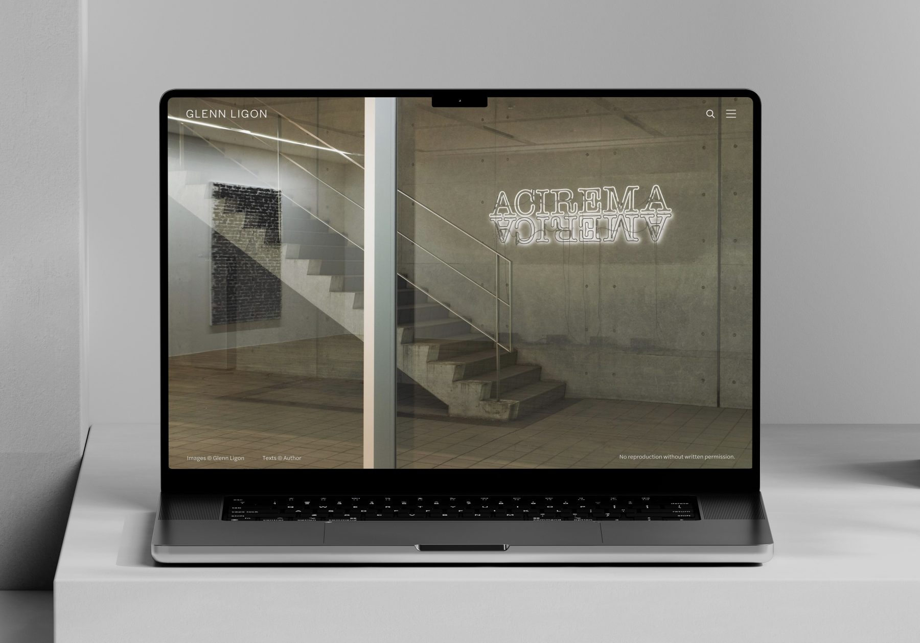
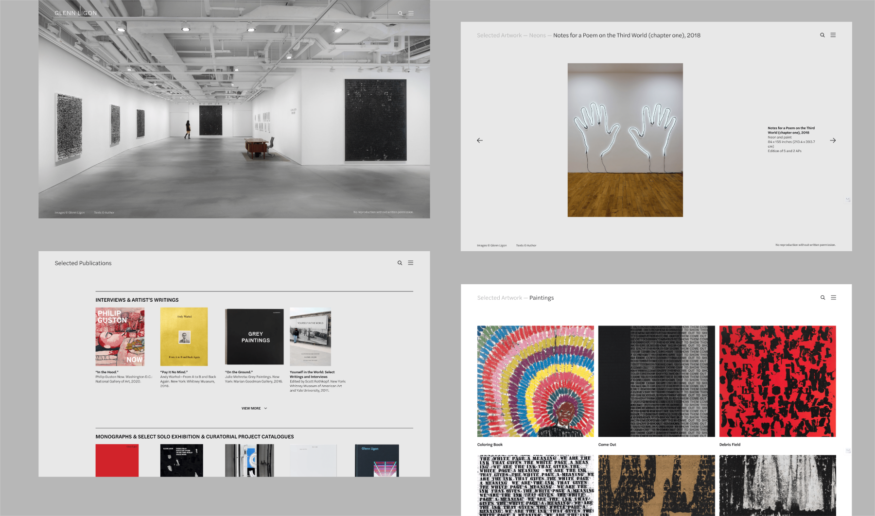
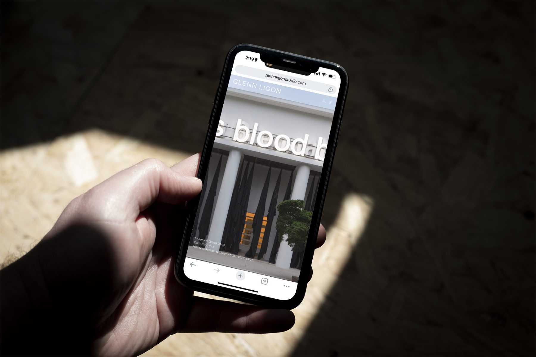
Glenn Ligon Website
Glenn Ligon
Glenn Ligon is an artist living and working in New York pursuing an incisive exploration of American history, literature, and society across bodies of work that build critically on the legacies of modern painting and conceptual art.
We worked closely with Ligon to produce a website that showcases the full breadth of of his work, from neons, paintings, prints, photo-based, to videos and multimedia installations. The website is designed with minimal interface to allow viewers to discover Ligon’s work as if experiencing the work in a physical gallery space.
Visit glennligonstudio.com
KUDOS Design Collaboratory
-
John Kudos
Creative Director -
Amanda Knott
Project Manager -
Fay Qiu
Lead Designer -
Chris Manlapid
Web Developer
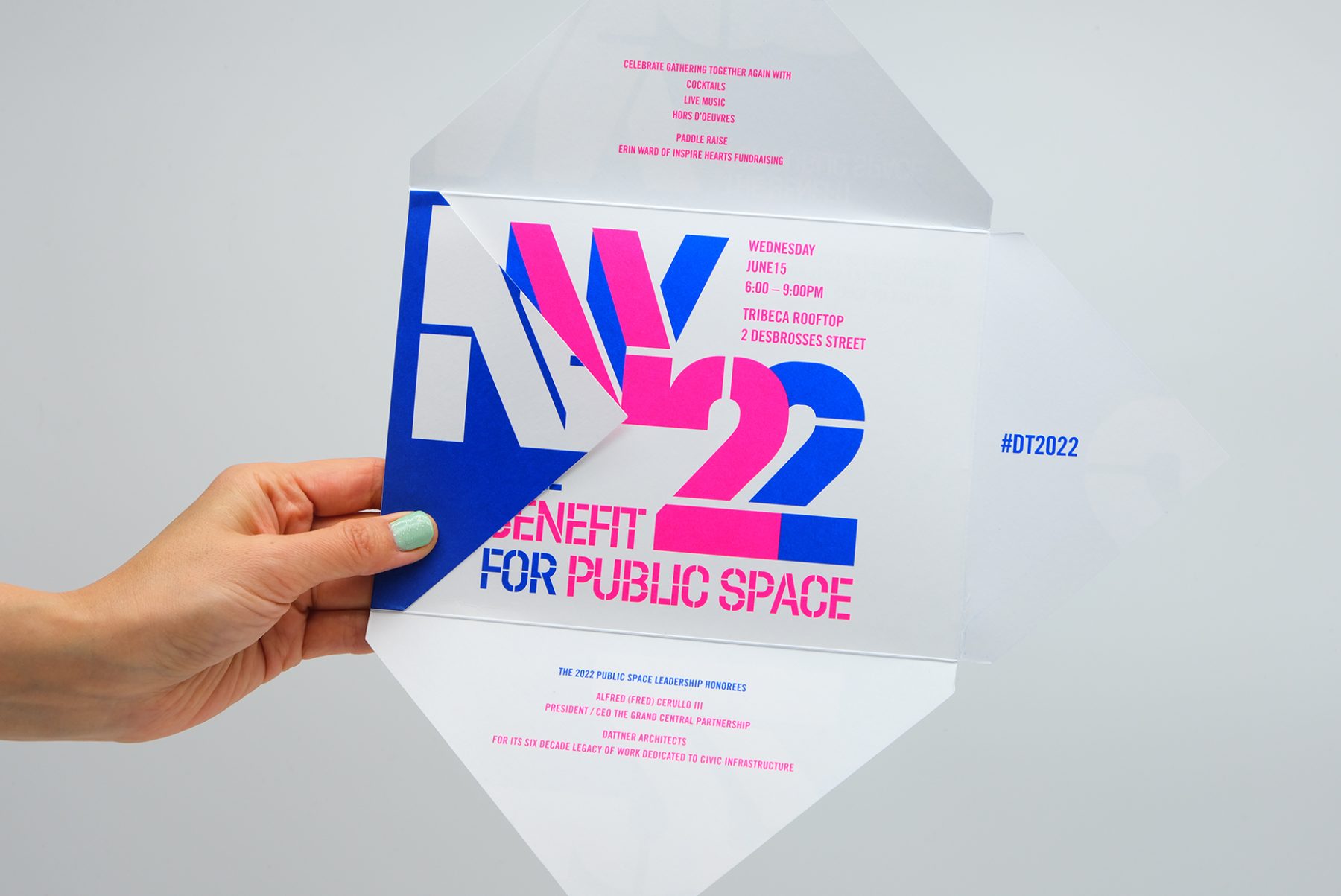
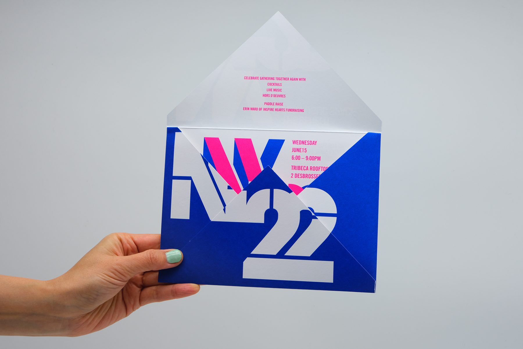
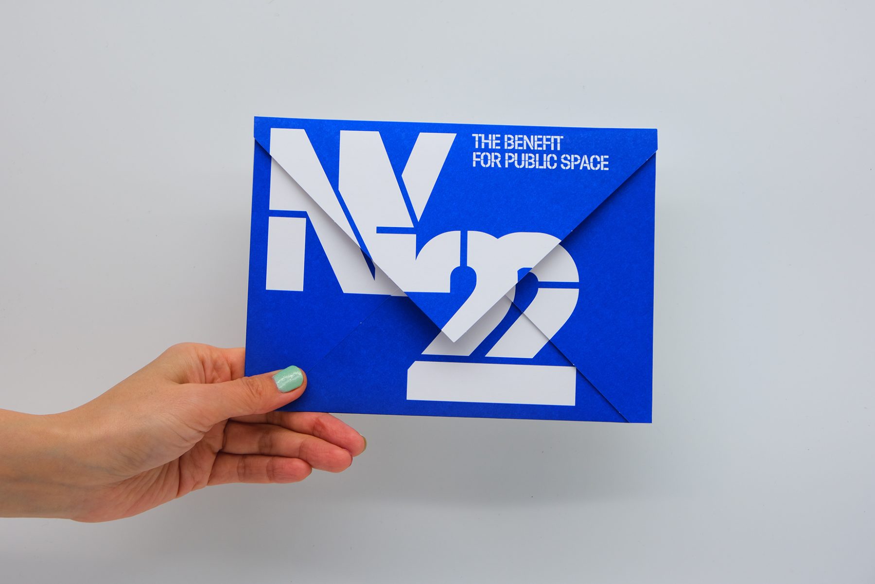
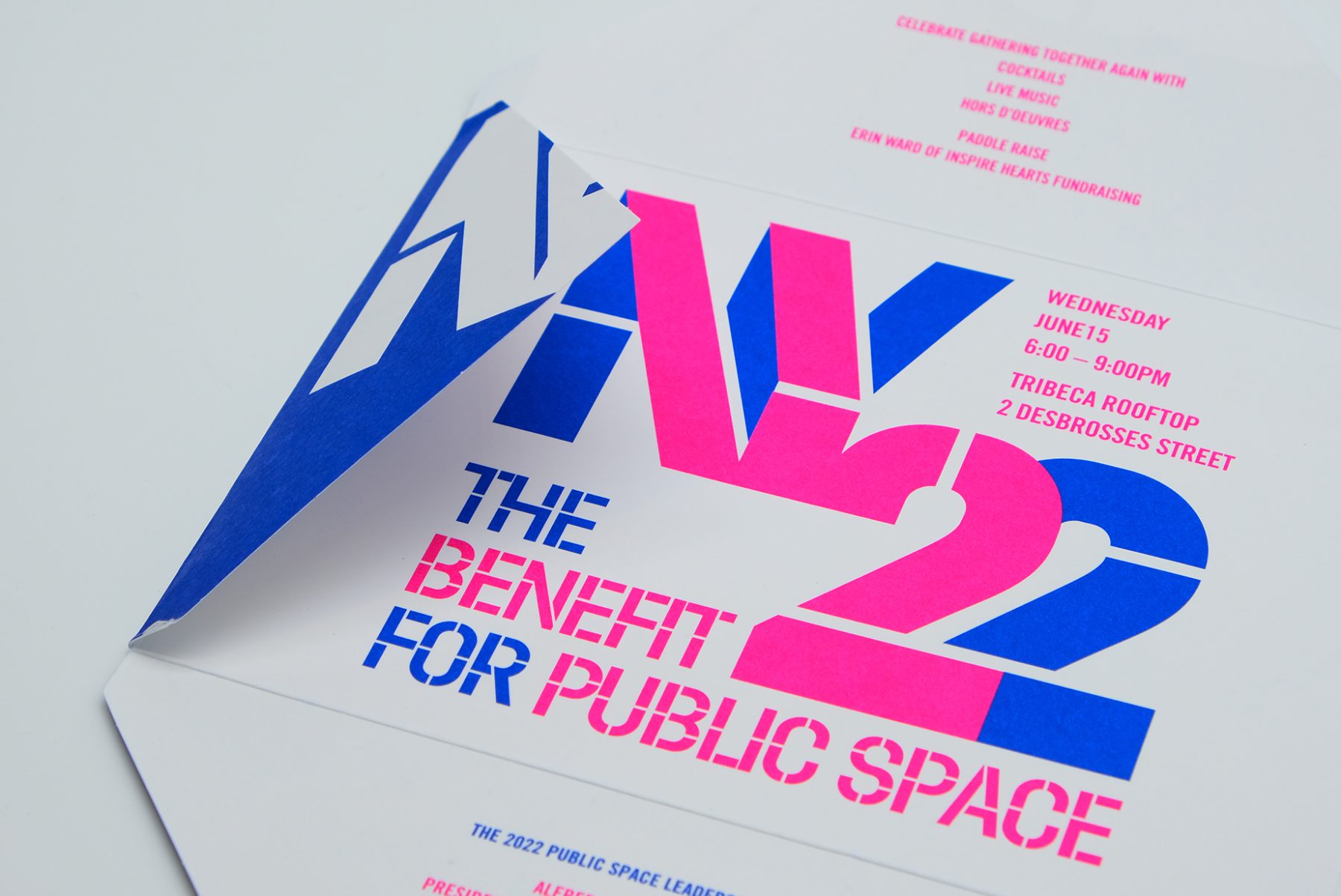
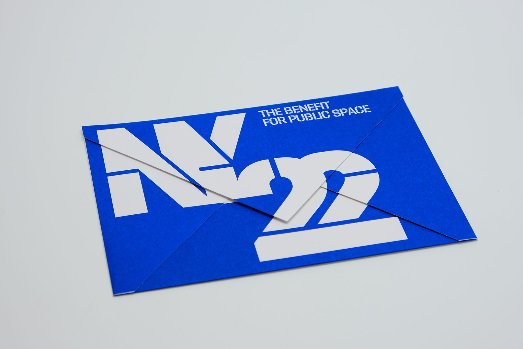
NY 22 Benefit
Design Trust for Public Space
Capabilities
Focus Area
This was our invitation design for an annual benefit hosted by the Design Trust for Public Space, a New York–based nonprofit whose members believe in the transformative power of design within urban landscapes.
We crafted a unique invitation in which each panel of the envelope reveals a message as it unfolds. We combined typography, vibrant colors, and the angular shape of the envelope to emulate architectural forms, creating a visual metaphor for the symbiotic relationship between design and public space.
KUDOS Design Collaboratory
-
John Kudos
Creative Director -
Fay Qiu
Designer -
Amanda Knott
Project Manager
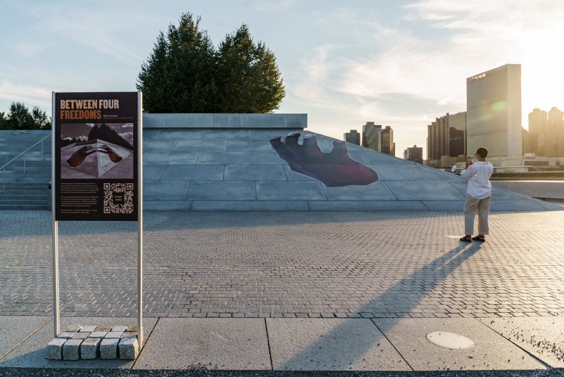
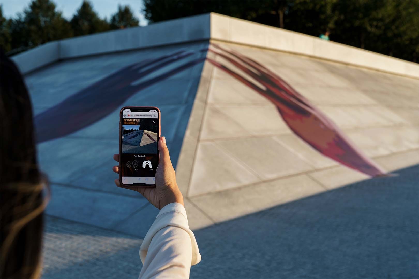
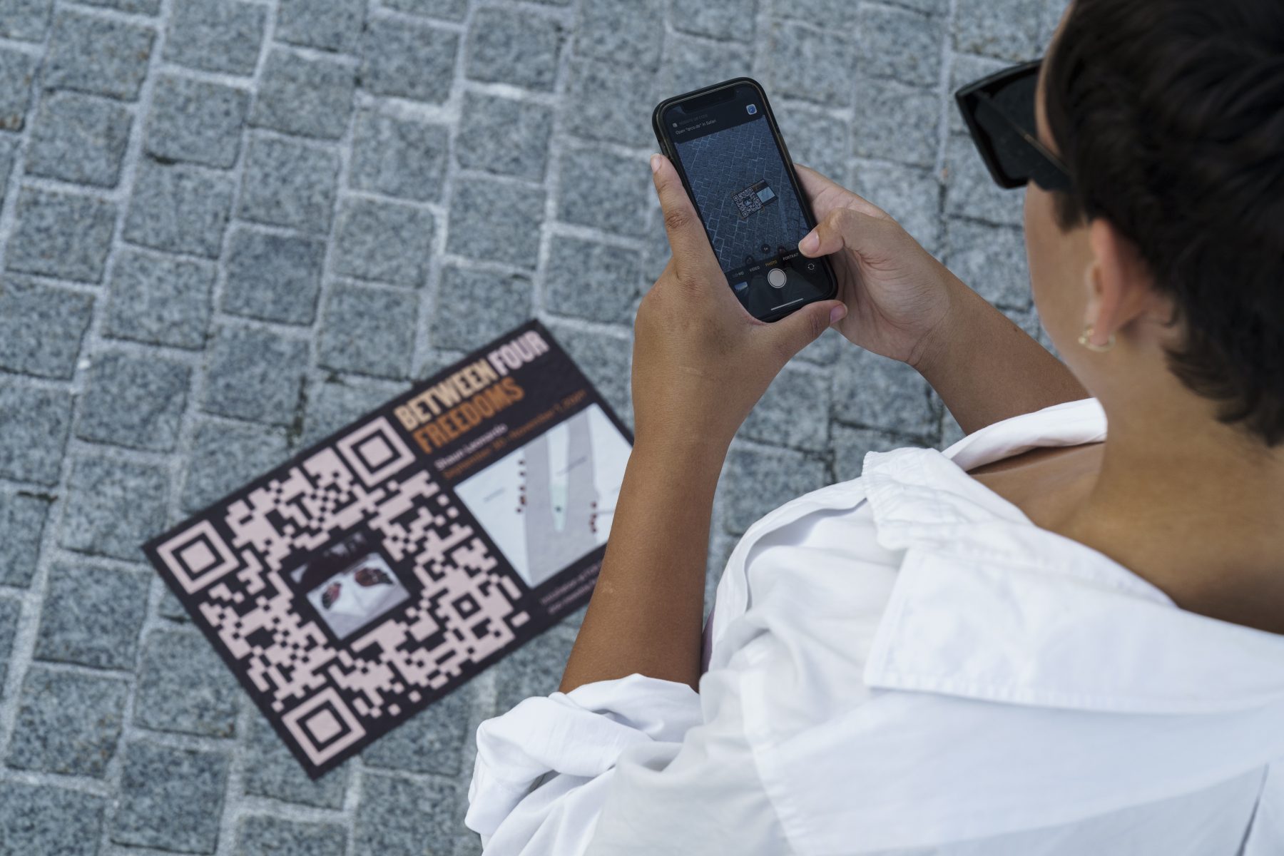
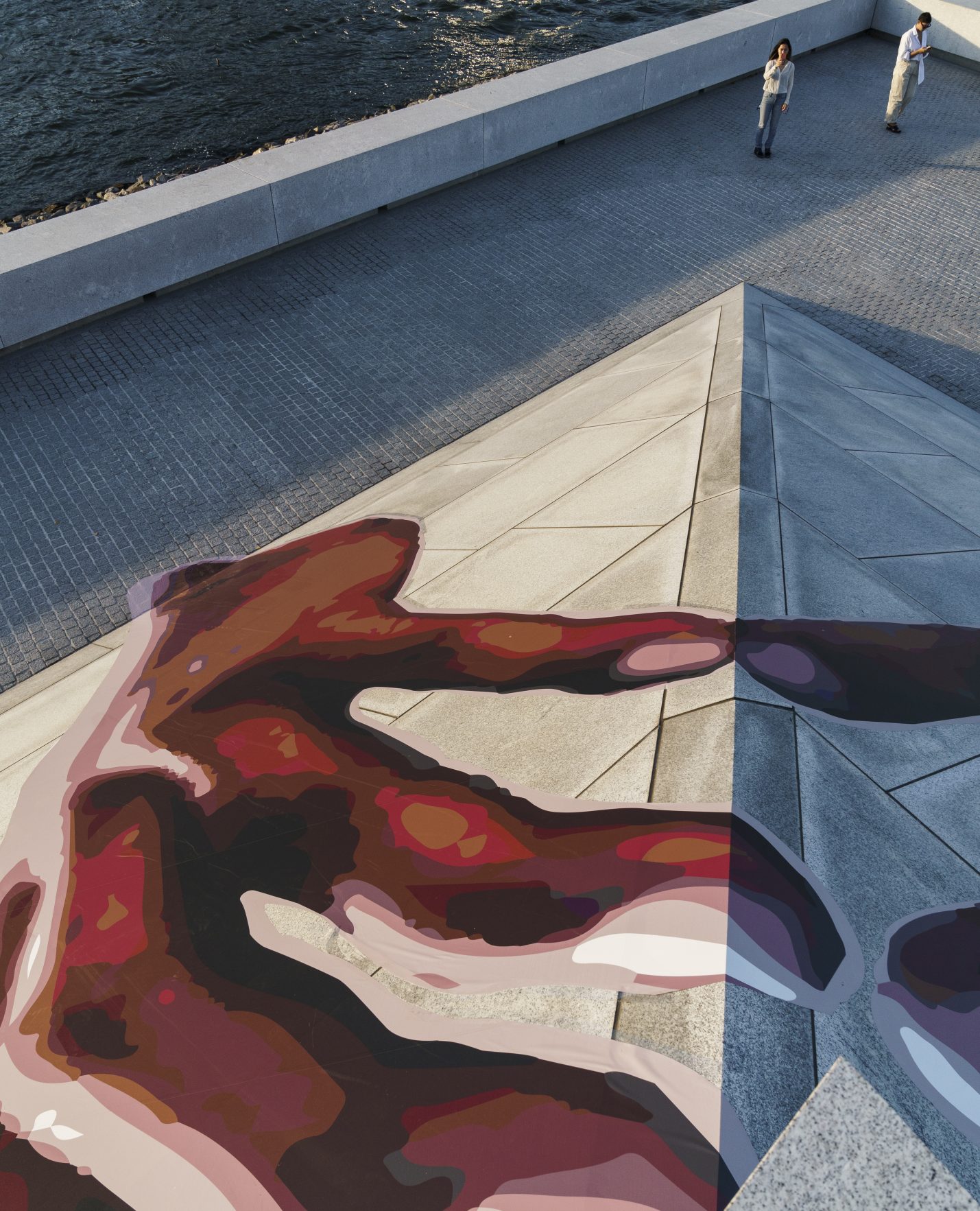
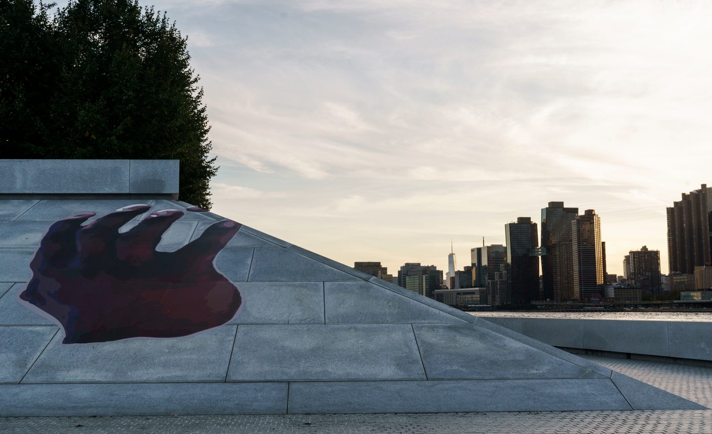
Between Four Freedoms
Four Freedoms Park Conservancy
Artist Shaun Leonardo’s 2021 outdoor installation “Between Four Freedoms” reinterpreted and celebrated Franklin D. Roosevelt’s seminal 1941 address calling for freedom of worship, freedom of speech, freedom from want, and freedom from fear. The interactive experience for the installation at Franklin D. Roosevelt Four Freedoms State Park redefines public engagement with art and social discourse.
Guided by Leonardo’s vision, our branding mirrors the project’s ethos, employing a brown color scheme evocative of human skin tones and the “Martin” typeface, inspired by the Memphis Sanitation Strike of 1968, to represent a message of non-violence and inclusivity. Leveraging innovative technology such as image recognition, we enabled visitors to engage with the artwork by scanning QR codes, launching the mobile website, and exploring workshop videos led by Leonardo. With over 25,000 images collected, the installation ensured accessibility and interactivity on both the Manhattan and Long Island City sides, inviting visitors to delve into the narratives of vulnerable communities and rediscover Roosevelt’s timeless call for freedom and dignity.
KUDOS Design Collaboratory
-
John Kudos
Creative Director -
Fay Qiu
Designer -
Christyan Junaedi Setiawan
Web Developer -
Imam Fadilah
Animator
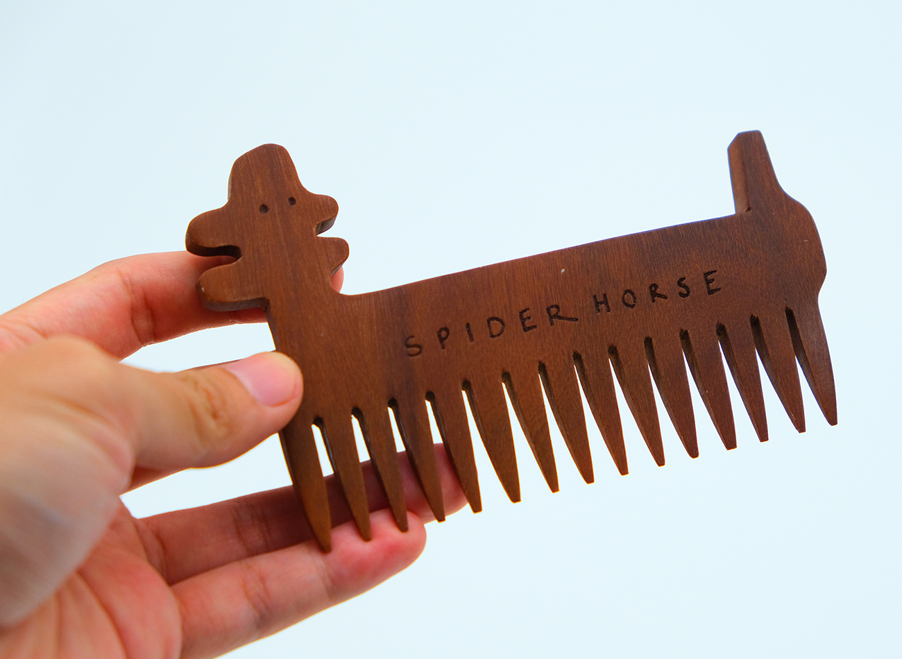
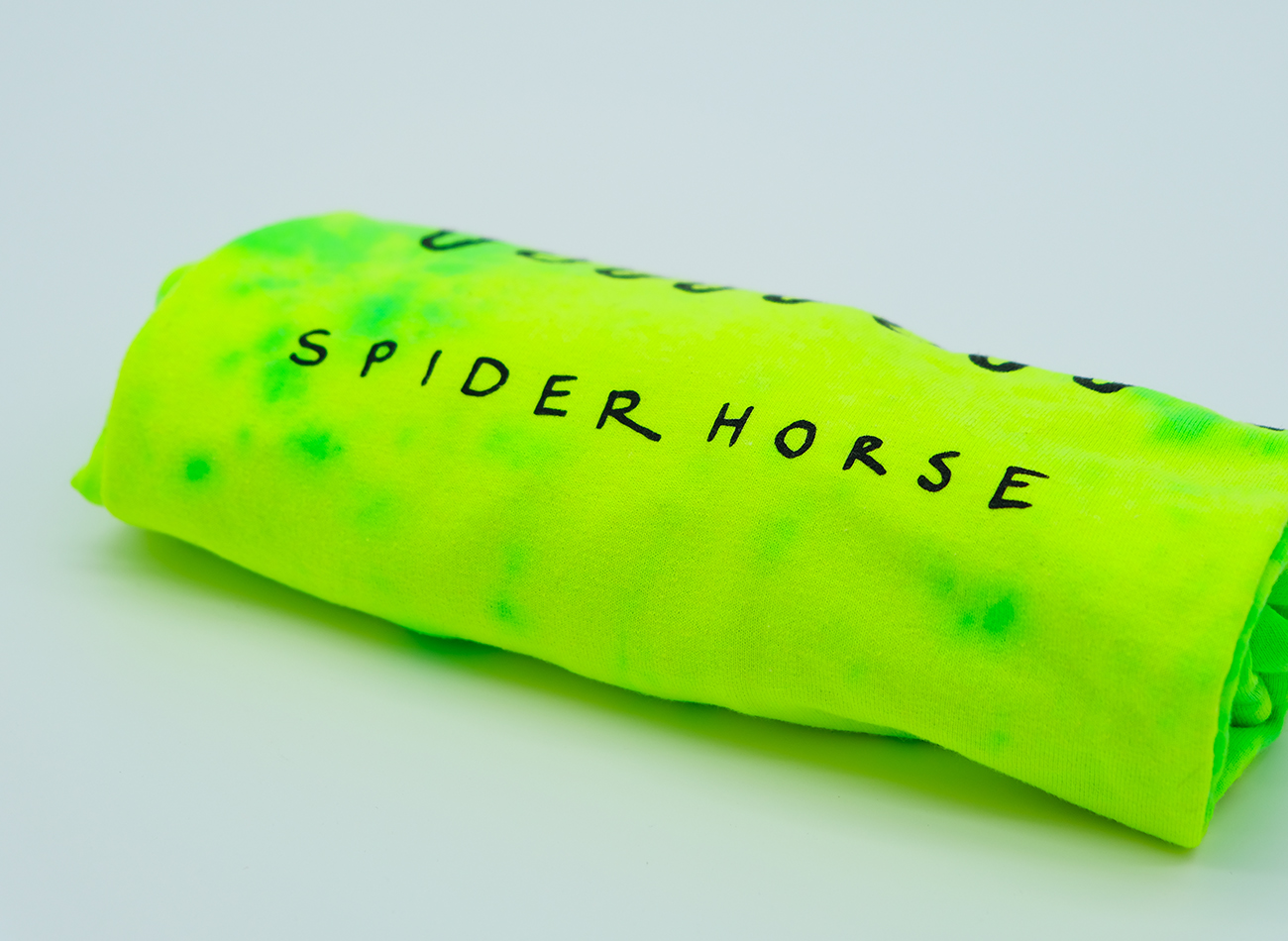
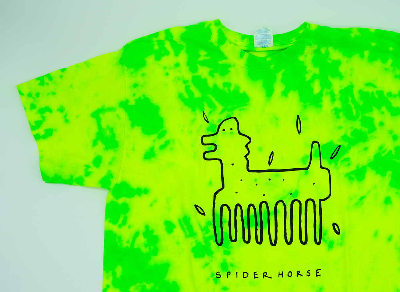
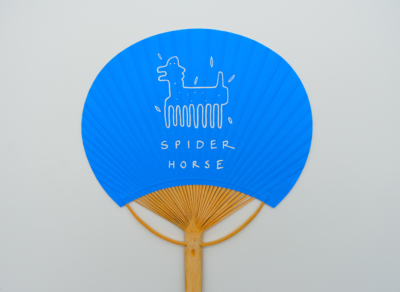
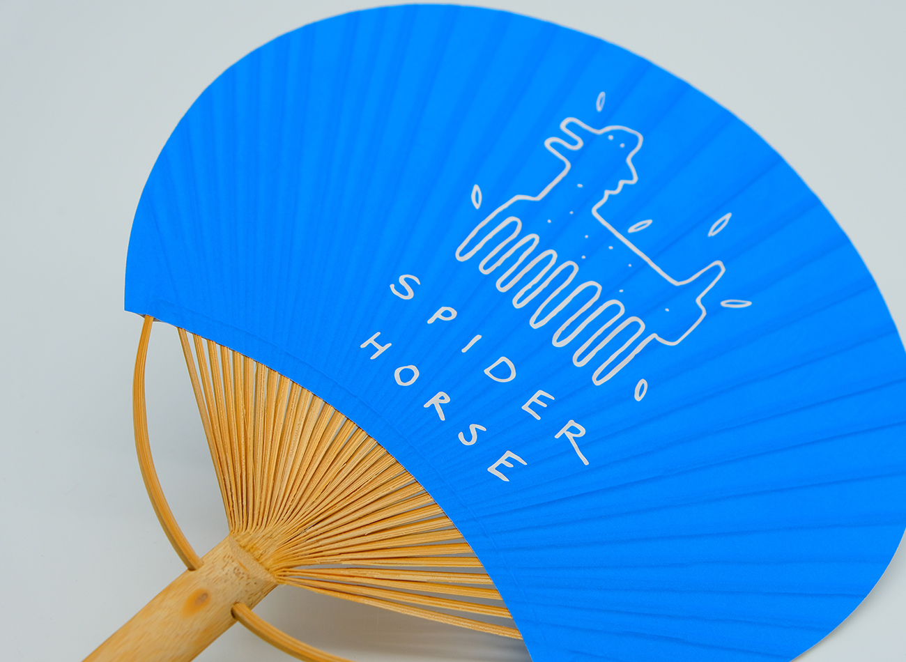
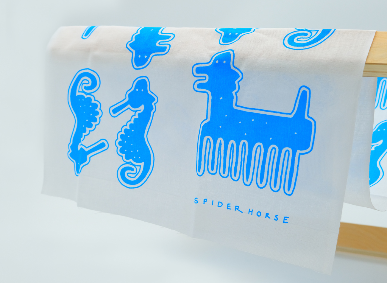
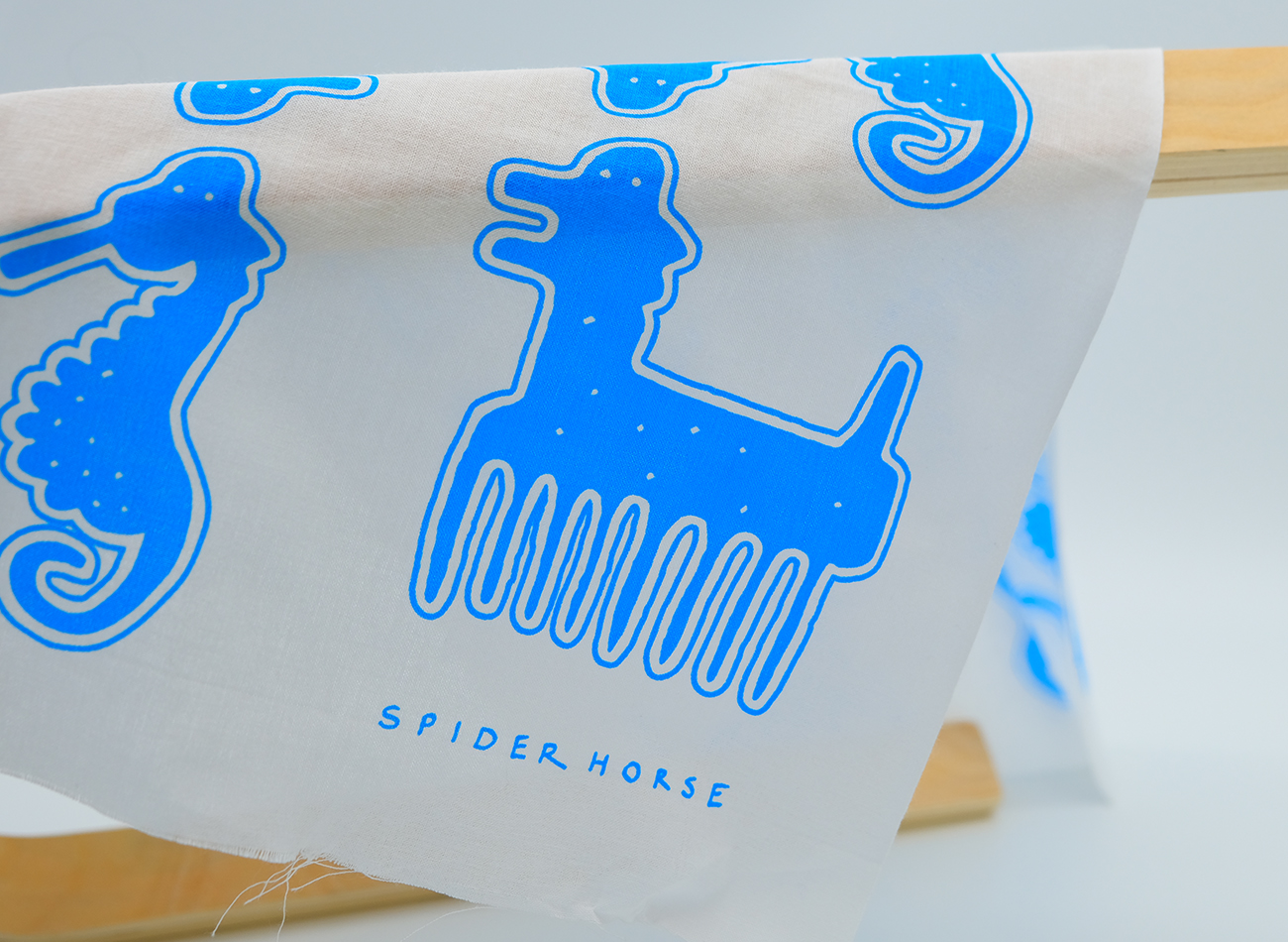
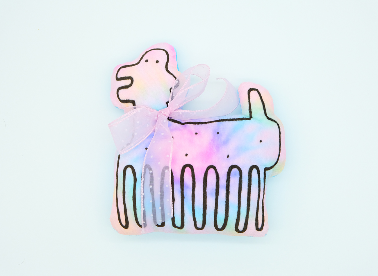
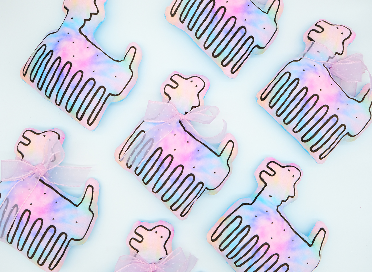
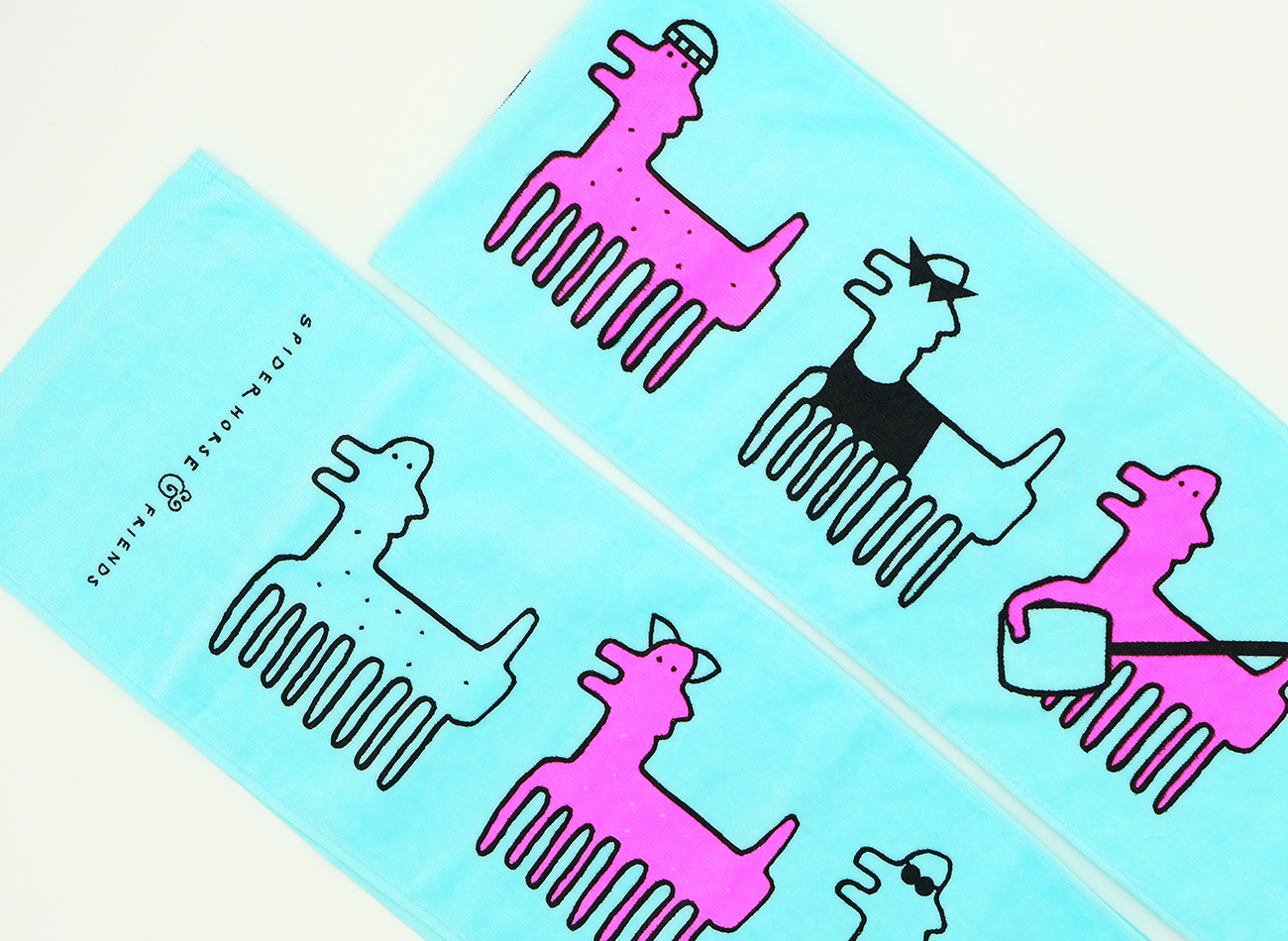
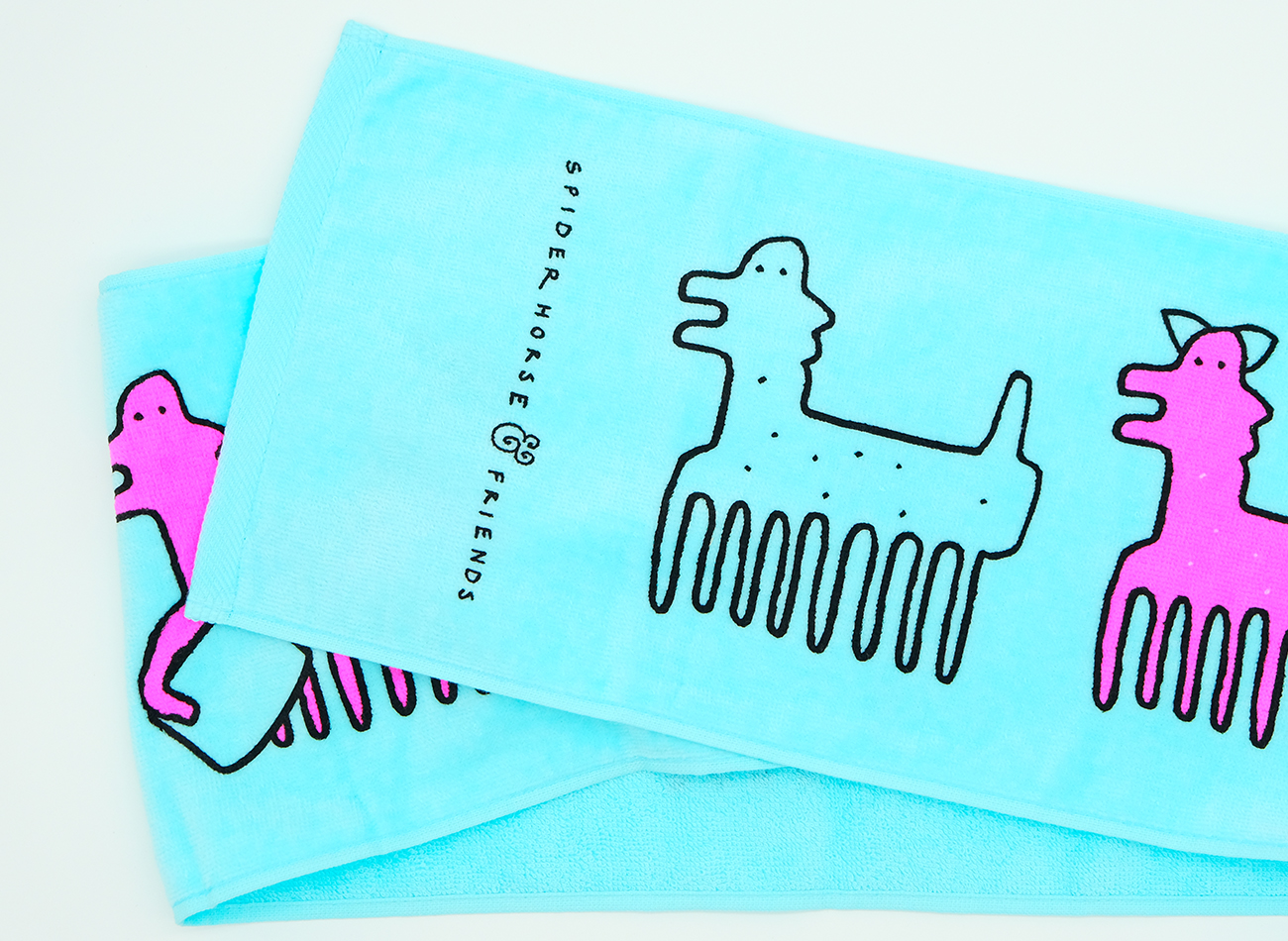
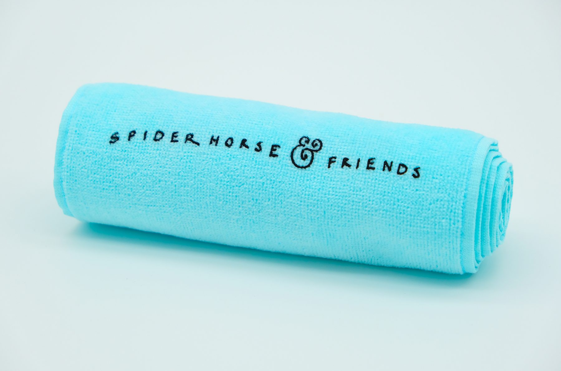
SPIDERHORSE Visual Identity System & Swag
SPIDERHORSE
Focus Area
Client
Based out of New York City, SPIDERHORSE is an award-winning beatbox duo composed of Chris Celiz and Gene Shinozaki. The two have been creating music together for seven years and expanding the capabilities of the human voice in an innovative and exciting way. The group’s symbolic mascot—a character called Mr. SPIDERHORSE—and logotype were hand-drawn by ReepsOne, their artistic idol (who is also a beatboxer).
To develop SPIDERHORSE’s new identity, we digitized that original artwork and developed a complete visual branding system and supporting assets around it that work in various formats, including an animated version. We also designed and developed their new website. We used SPIDERHORSE as a versatile character to narratively accompany the group’s music; animated, he acts as the show’s MC, guiding the event and expressing the music’s mood. (He can even multiply his legs to double as a hair comb!)
We also enjoyed pushing the boundaries of SPIDERHORSE merchandise with unique materials and techniques, including hand-dyed T-shirts, wooden combs sourced from a local woodshop in Indonesia, bamboo-handled fans, and plush toys incorporating a plethora of pastel colors to reflect the group’s vibrant artistry.
View spider.horse
KUDOS mgmt
-
Kiki Katahira
Creative Director, Designer
SPIDERHORSE
-
Chris Celiz and Gene Shinozaki
Conceptualizers
ReepsOne
- Logo Designer