Pug Bag
Product Design & Branding
Capabilities
Focus Area
Client
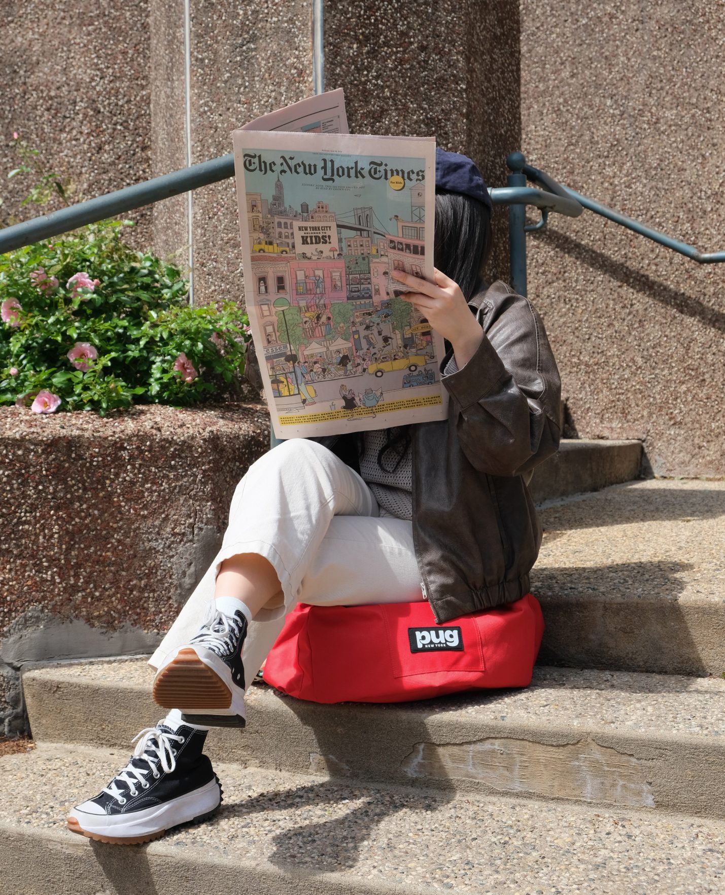
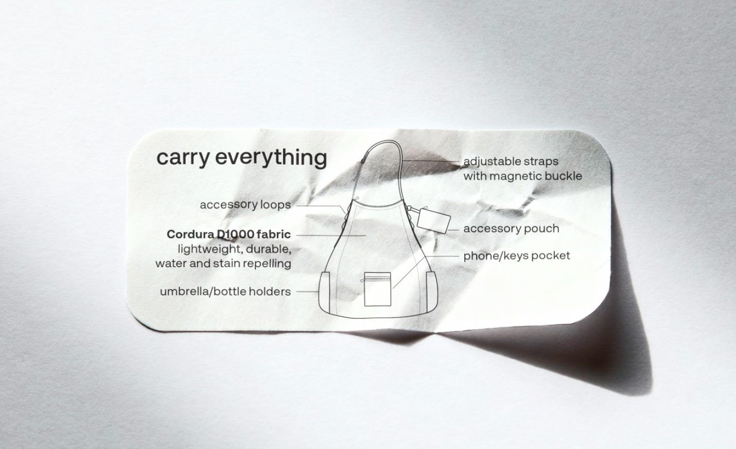
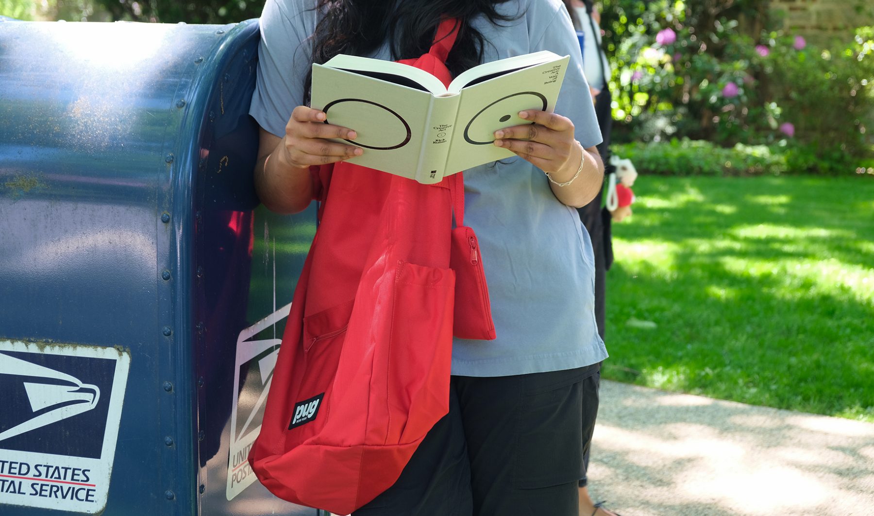
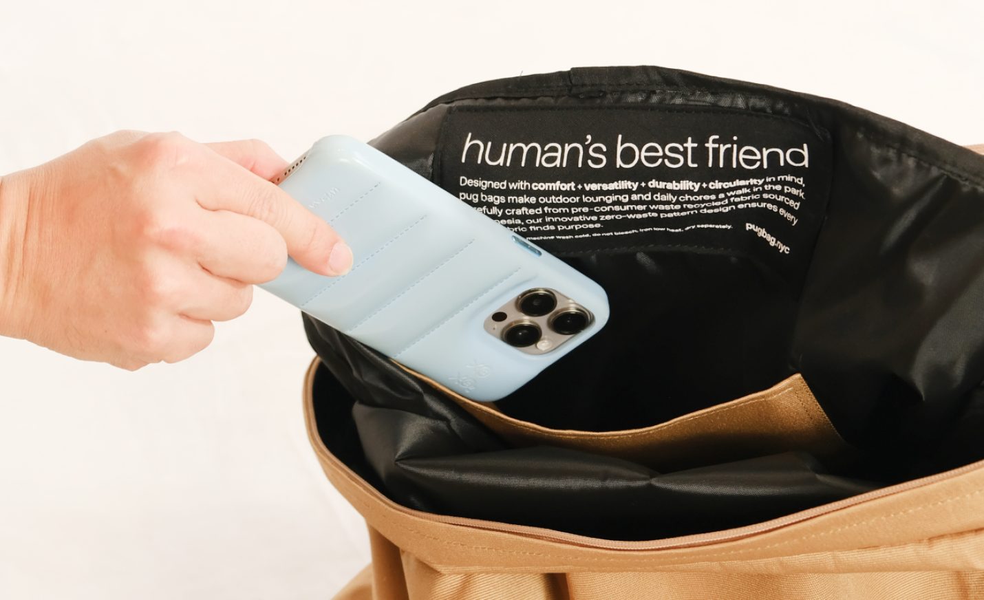
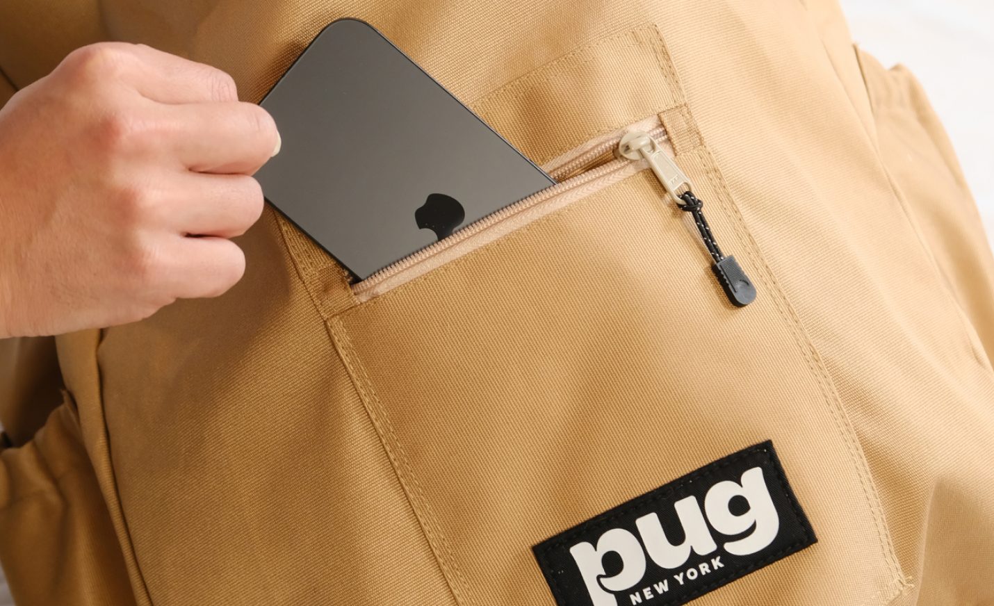
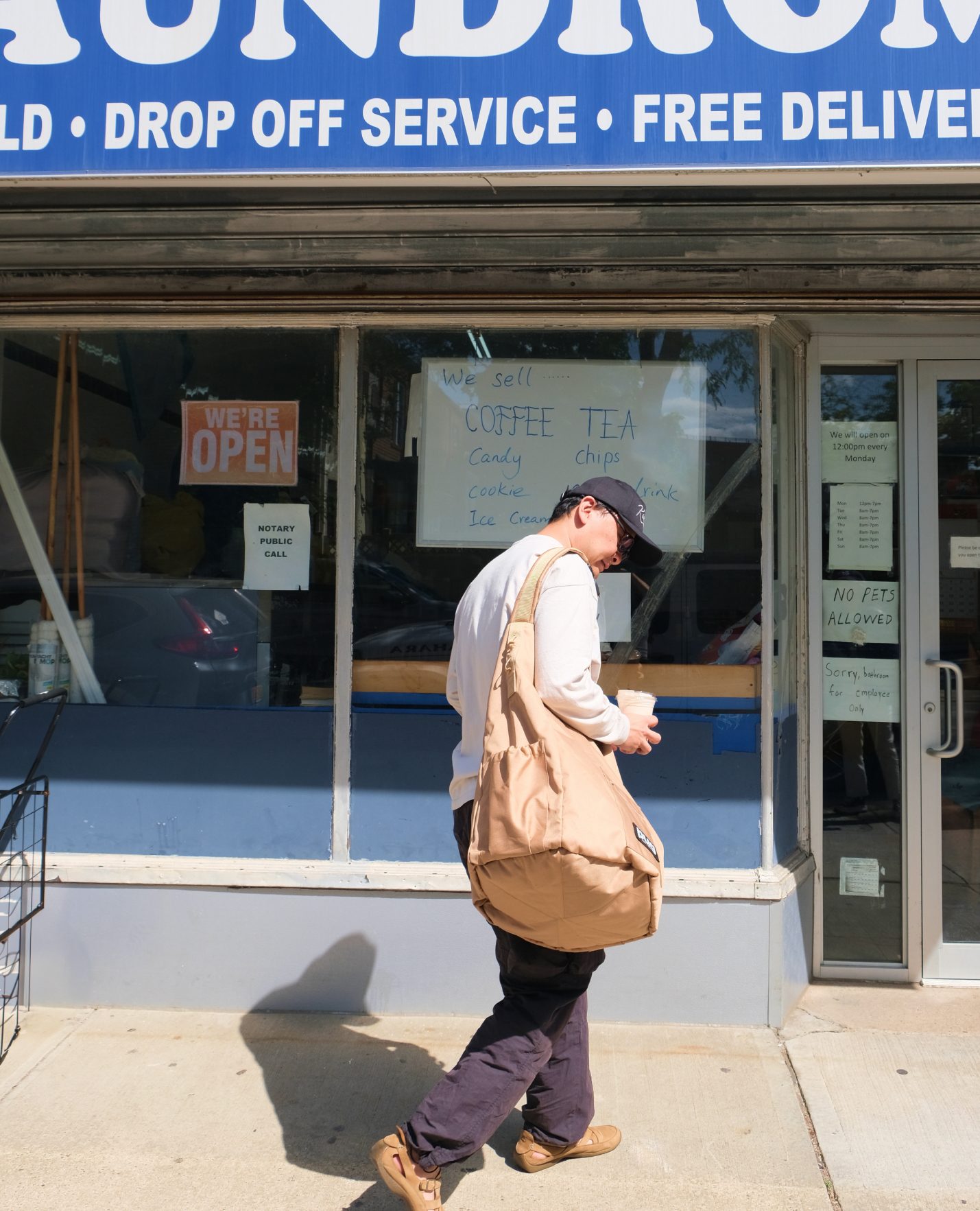
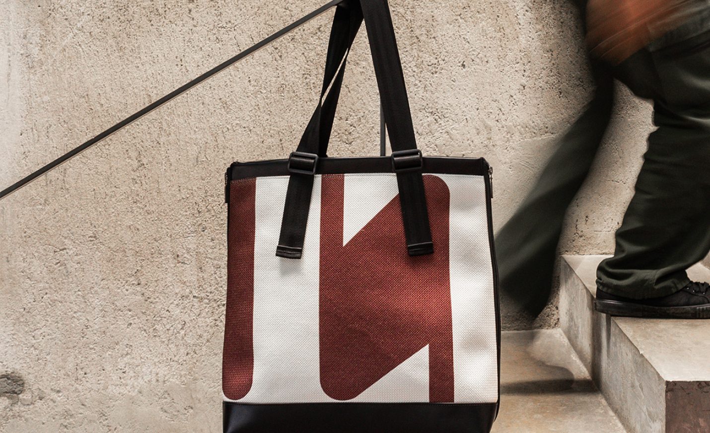
Pug Bag is a versatile sling that transforms with a removable beanbag—designed for both movement and pause. Inspired by New York City and the ease of Central Park, it reimagines everyday carry as an invitation to sit, rest, and enjoy the moment.
Conceived and developed in-house by KUDOS, the name “Pug” draws from the idea of a loyal companion—grounded in four core values: comfort, versatility, durability, and circularity.
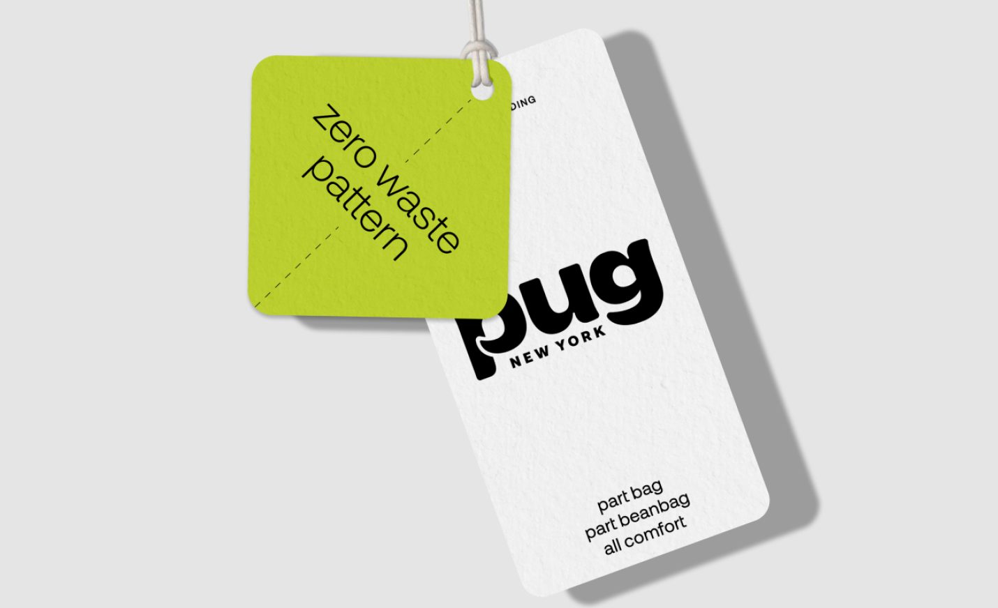
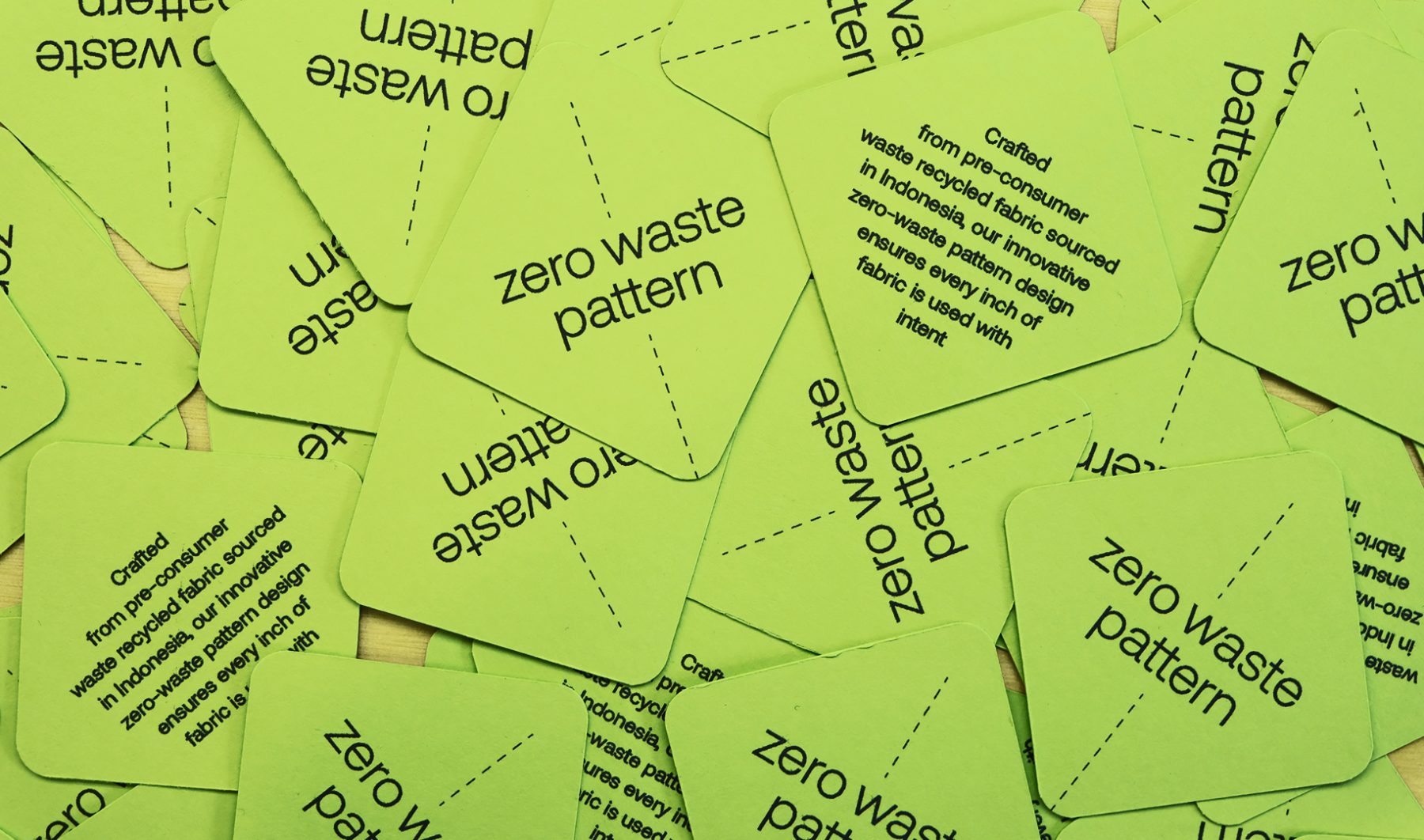
The bag is constructed using fabric sourced from excess production in Indonesia and a zero-waste pattern that maximizes every cut. The result is a thoughtfully engineered product that blends utility, sustainability, and urban lifestyle into one adaptable form.
Purchase on pugbag.nyc
KUDOS Design Collaboratory
-
John Kudos
Creative Director -
Andini Wijendaru
Zero Waste Template Designer -
Muhammad Syamil Haqqoni
Graphic Designer -
Jocelyn Lau, Samiha Alam, Inwoo Baek
Photography
Taki Matcha Branding
Taki Matcha
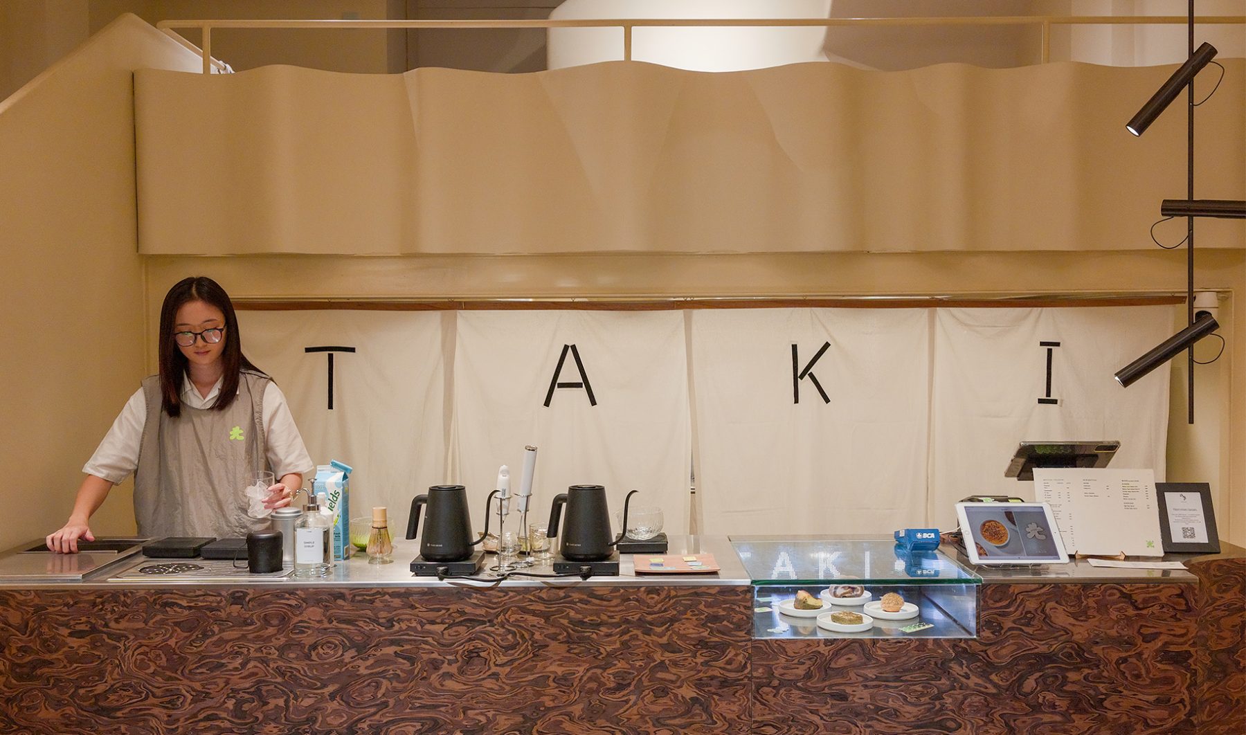
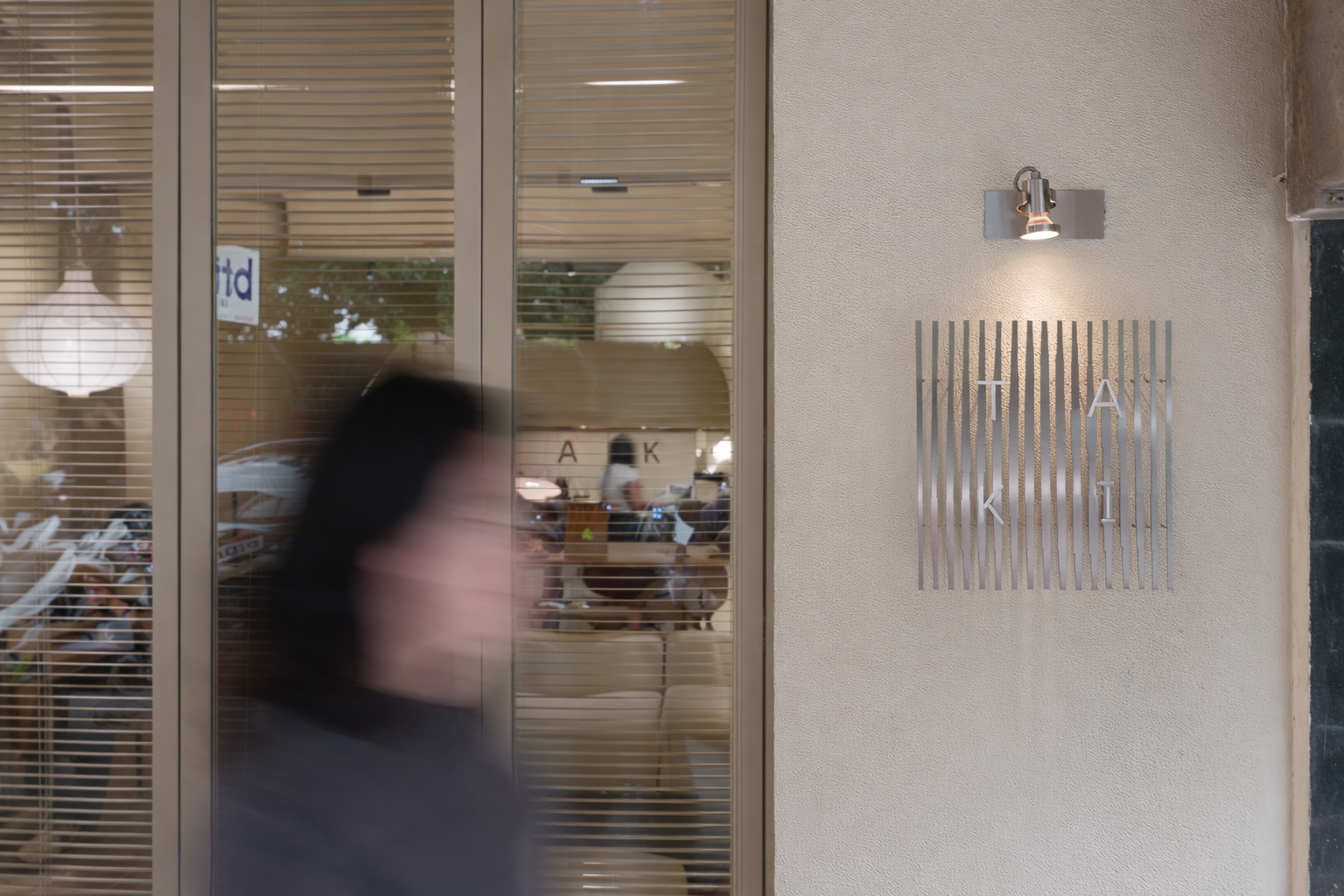
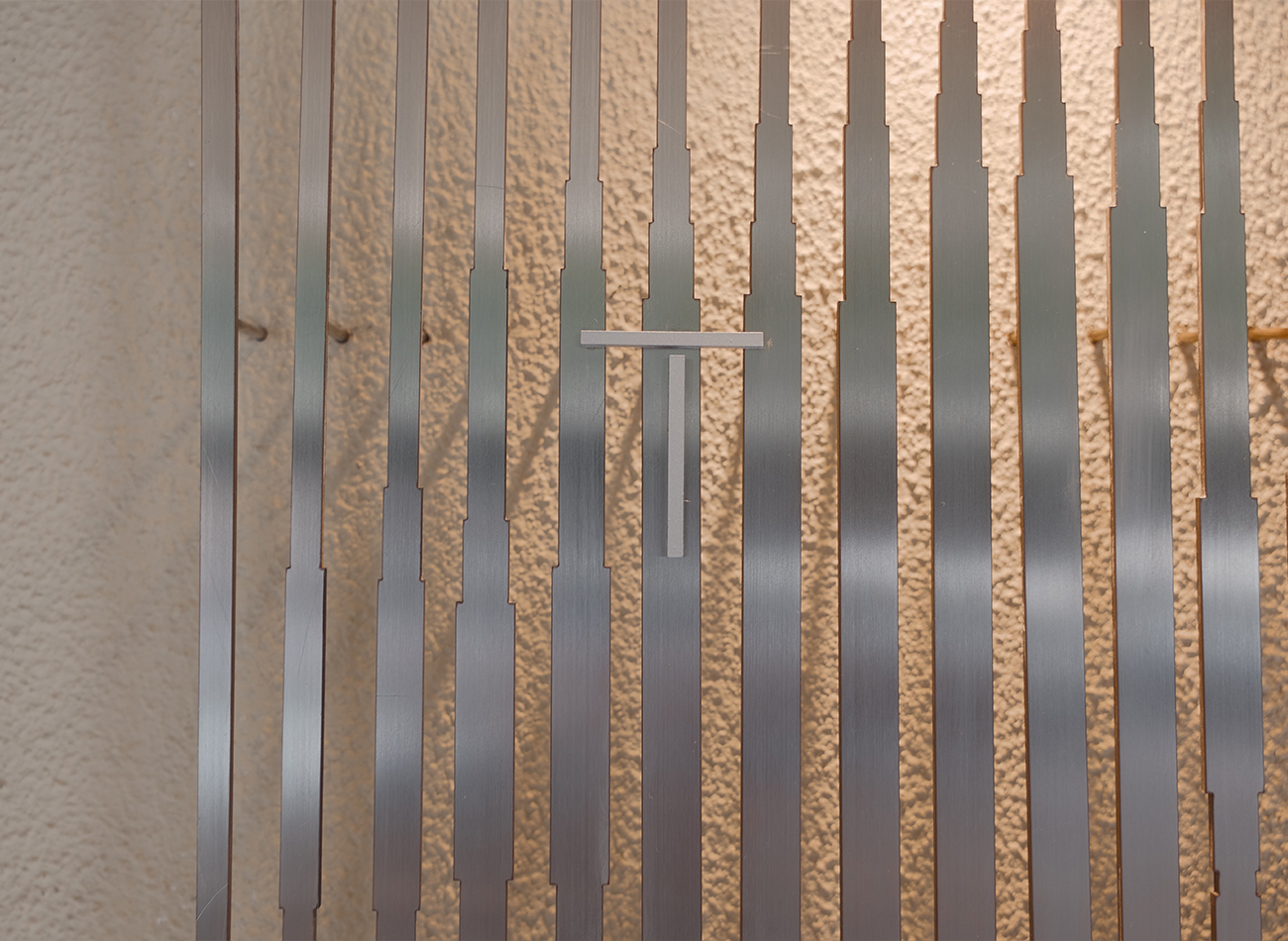
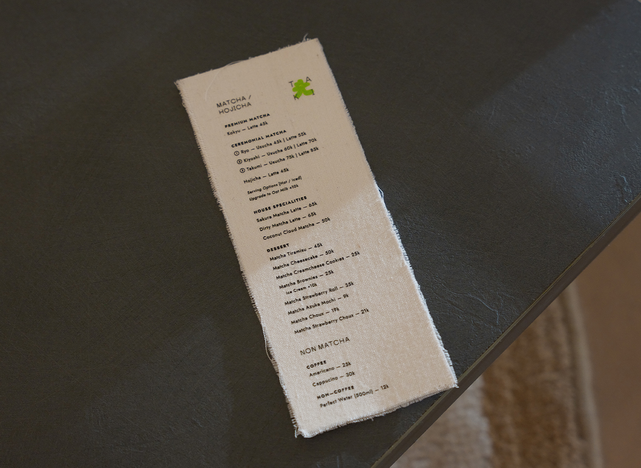
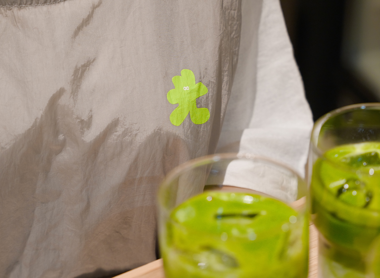
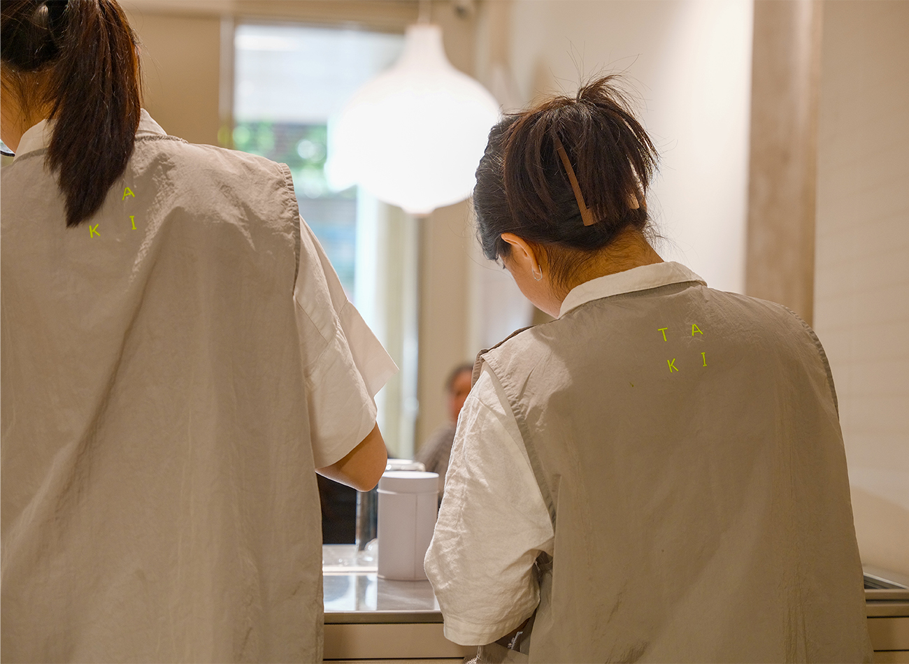
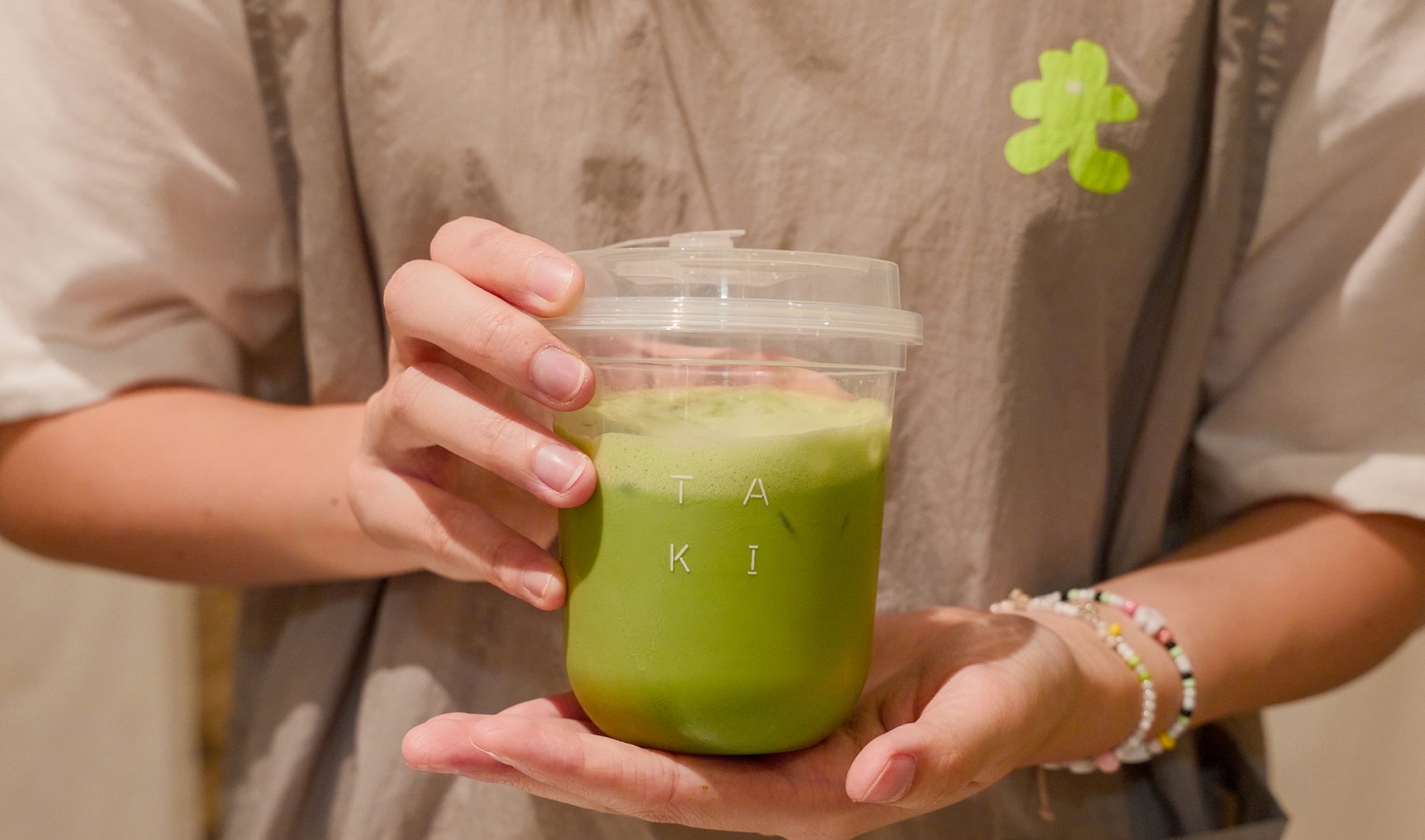
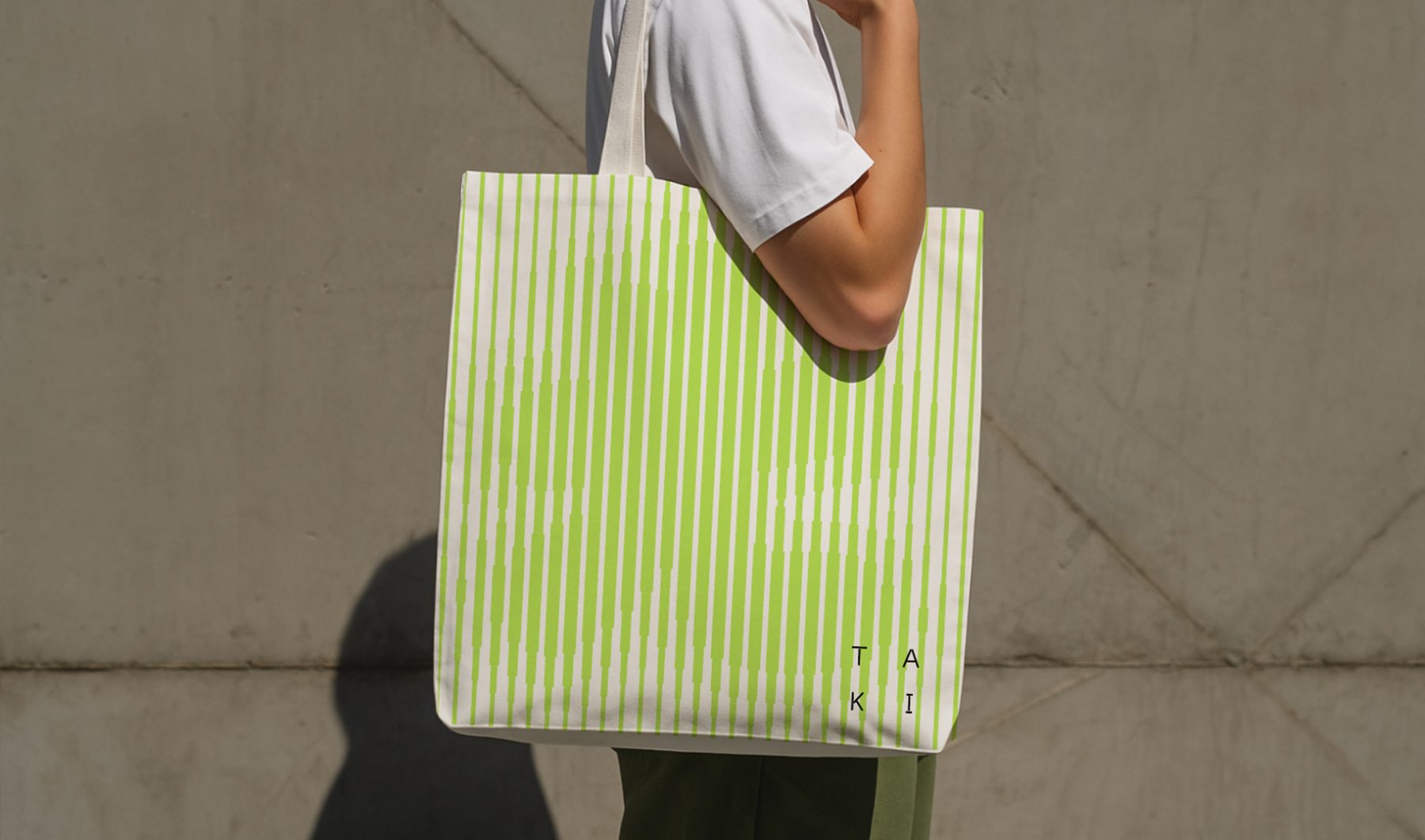
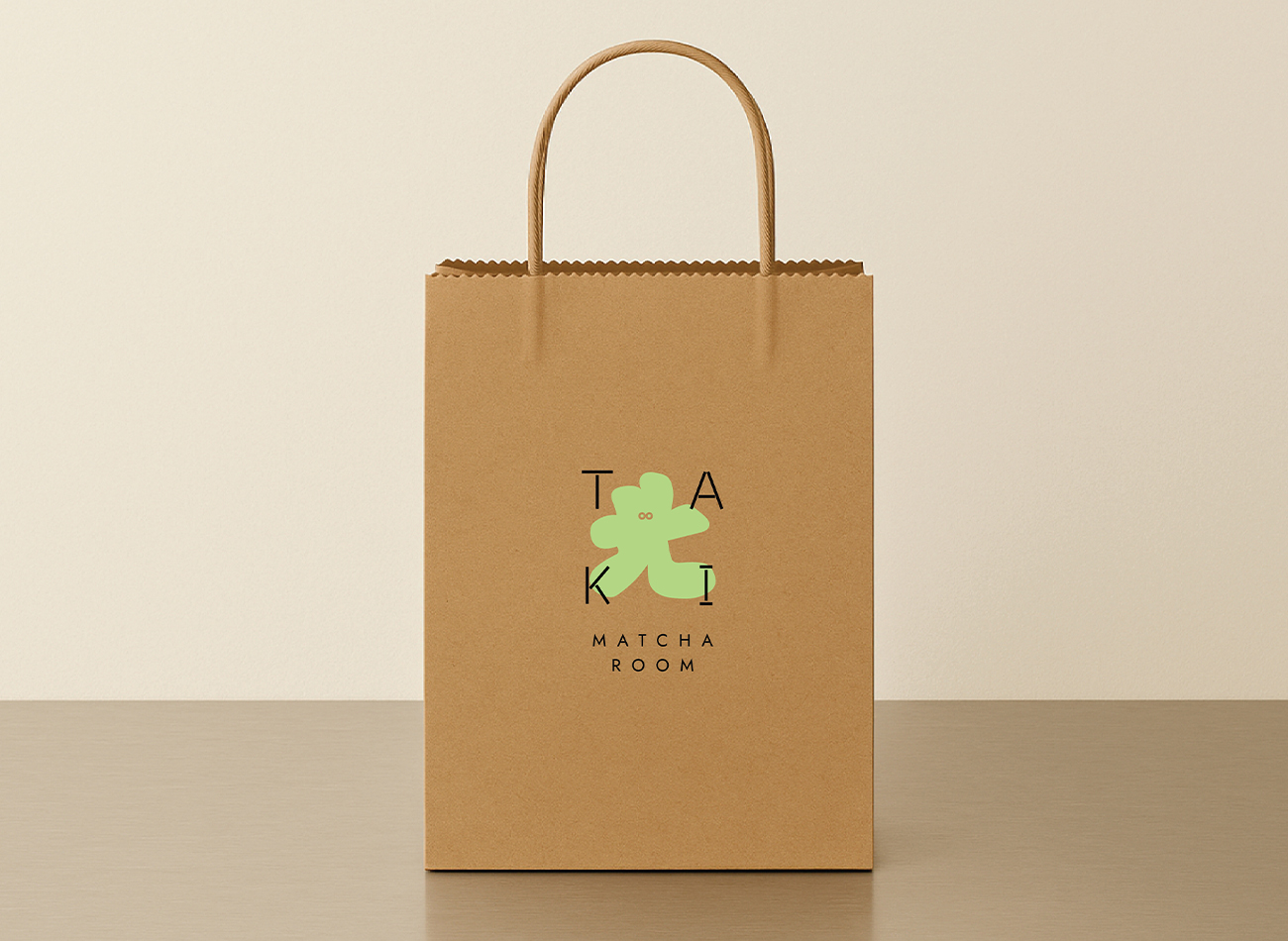
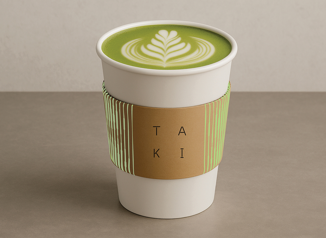
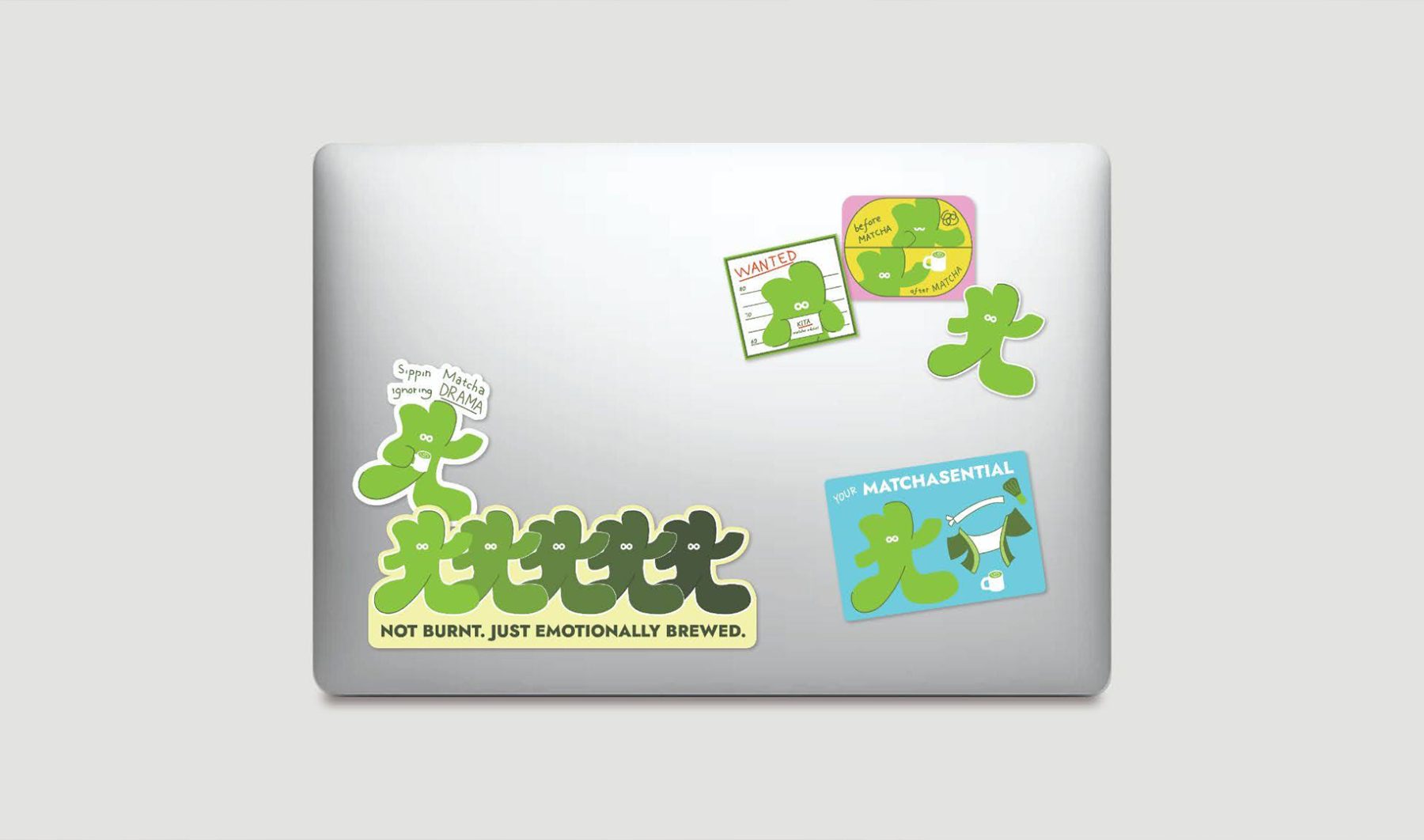
Taki is an artisanal matcha tea room tucked inside Dwellingpals Space, Bandung. Dedicated to authenticity, it serves premium matcha drinks crafted from powders sourced across Japan. The name ‘Taki’ is an anagram of ‘Kita.’ In Japanese, ‘Kita’ means ‘north,’ pointing to its location in northern Bandung, while in Indonesian, it means ‘us,’ representing the passionate team behind the brand. KUDOS created Taki’s brand identity—its logo and supergraphics inspired by the fluid motion of whisked matcha and the whisk itself. Alongside the logo is Kita, Taki’s cheerful mascot shaped after the Japanese kanji for ‘Kita’ (北). Playful and versatile, Kita can transform into many forms.
Since opening, Taki has quickly become a go-to destination for both locals and tourists—whether it’s for a calming tea ritual, a cozy catch-up spot, or simply to enjoy its playful branding and unique atmosphere. It’s not just about the drinks; it’s the whole experience that keeps people coming back.
KUDOS Design Collaboratory
-
Andy Kurniawan
Creative Director -
Owen Febiandi
Lead Designer -
Lisa Andrea Nolwen, Syamil Haqqoni, Wandytjen
Designer
Tiffani Fabrics Branding
Tiffani Fabrics
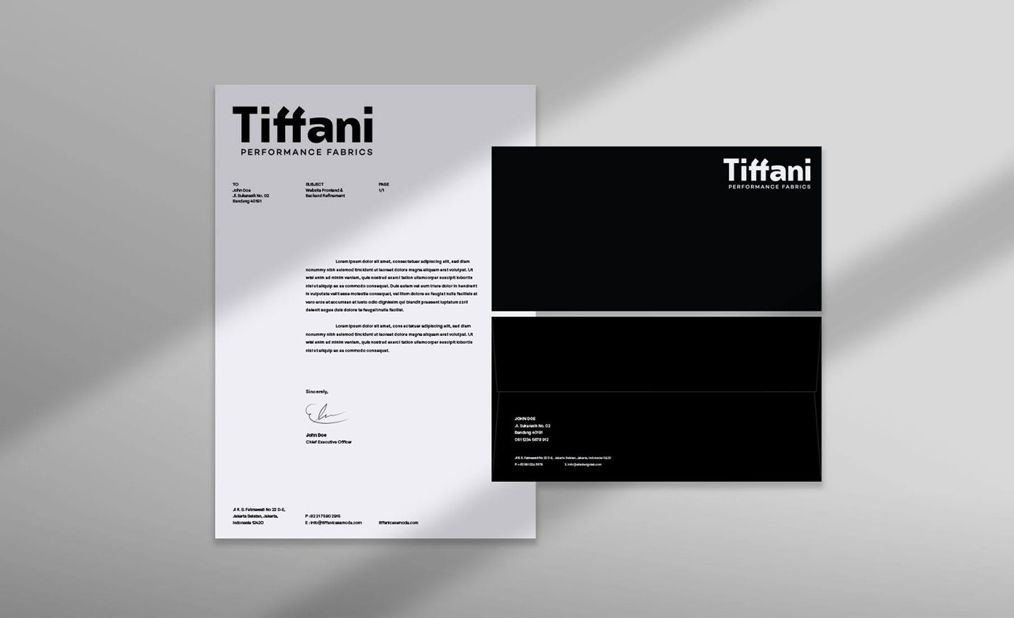
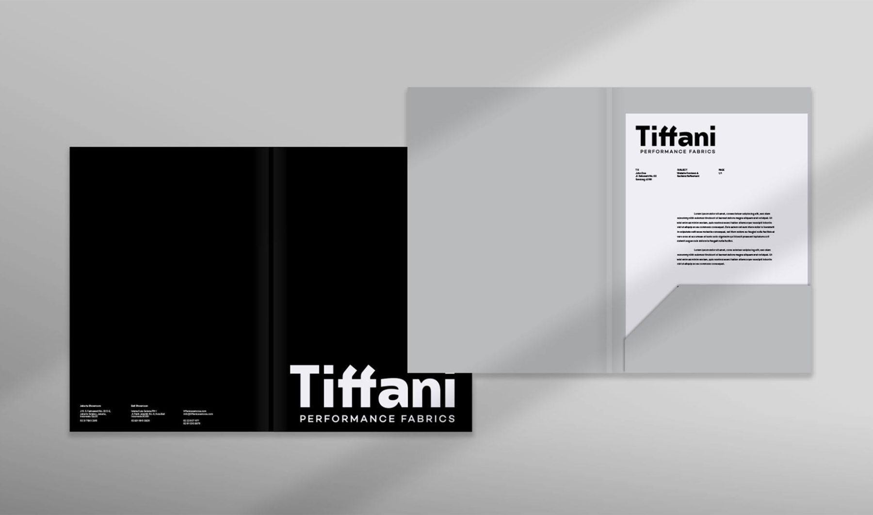
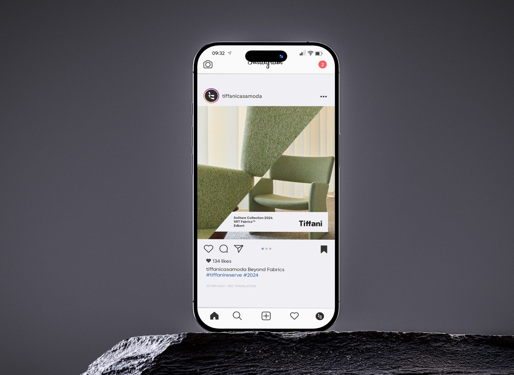
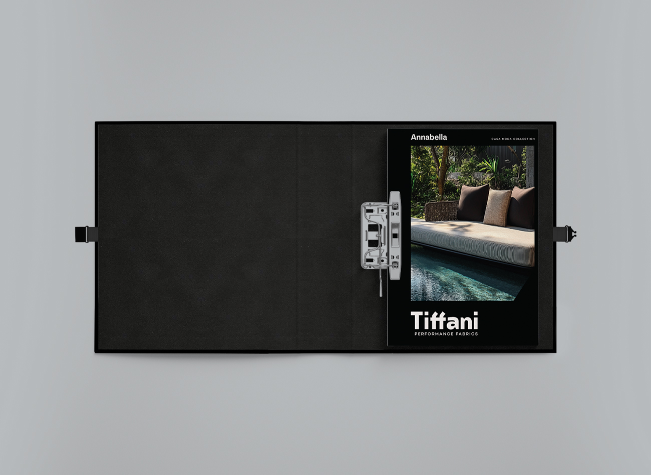
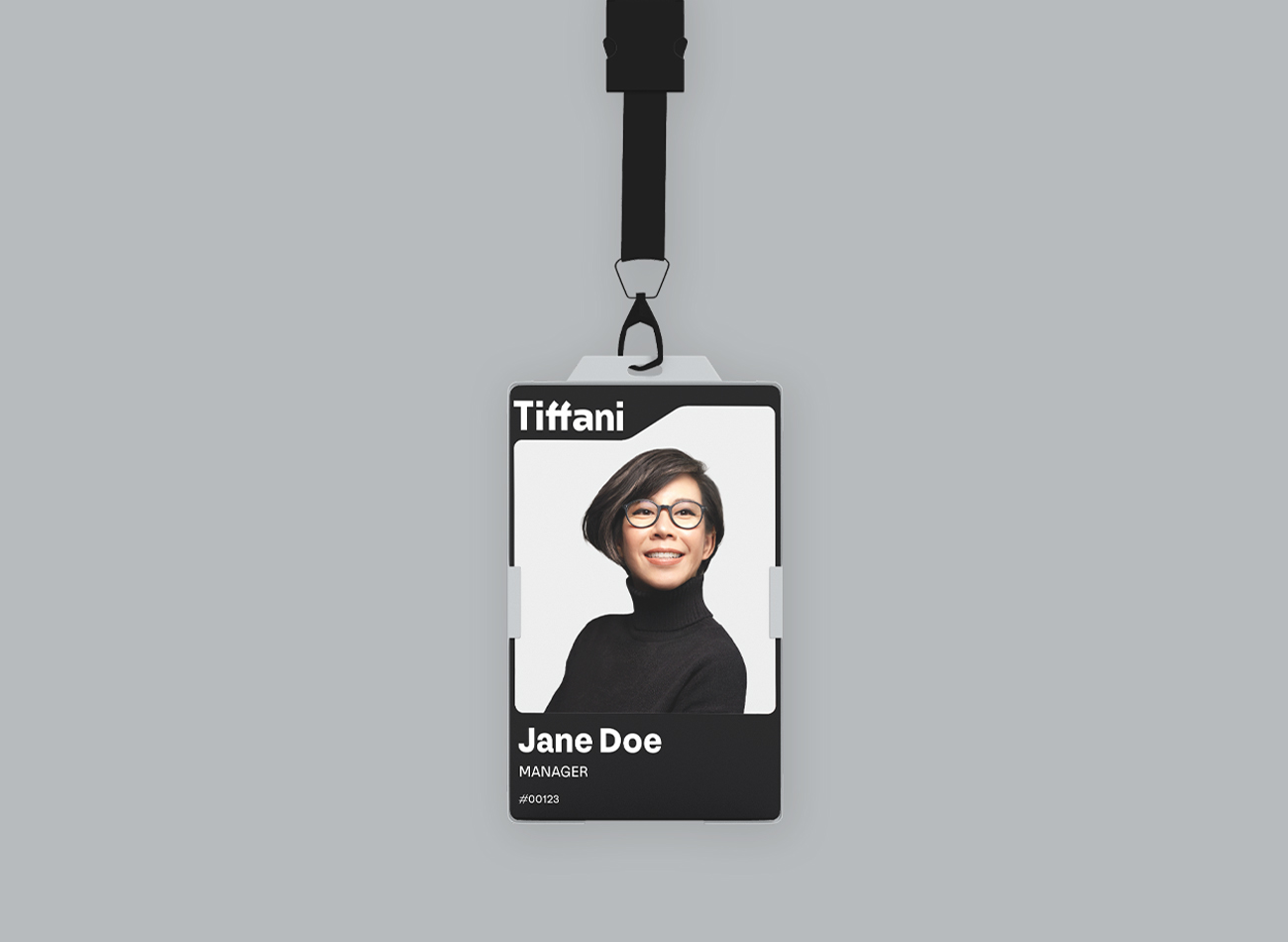
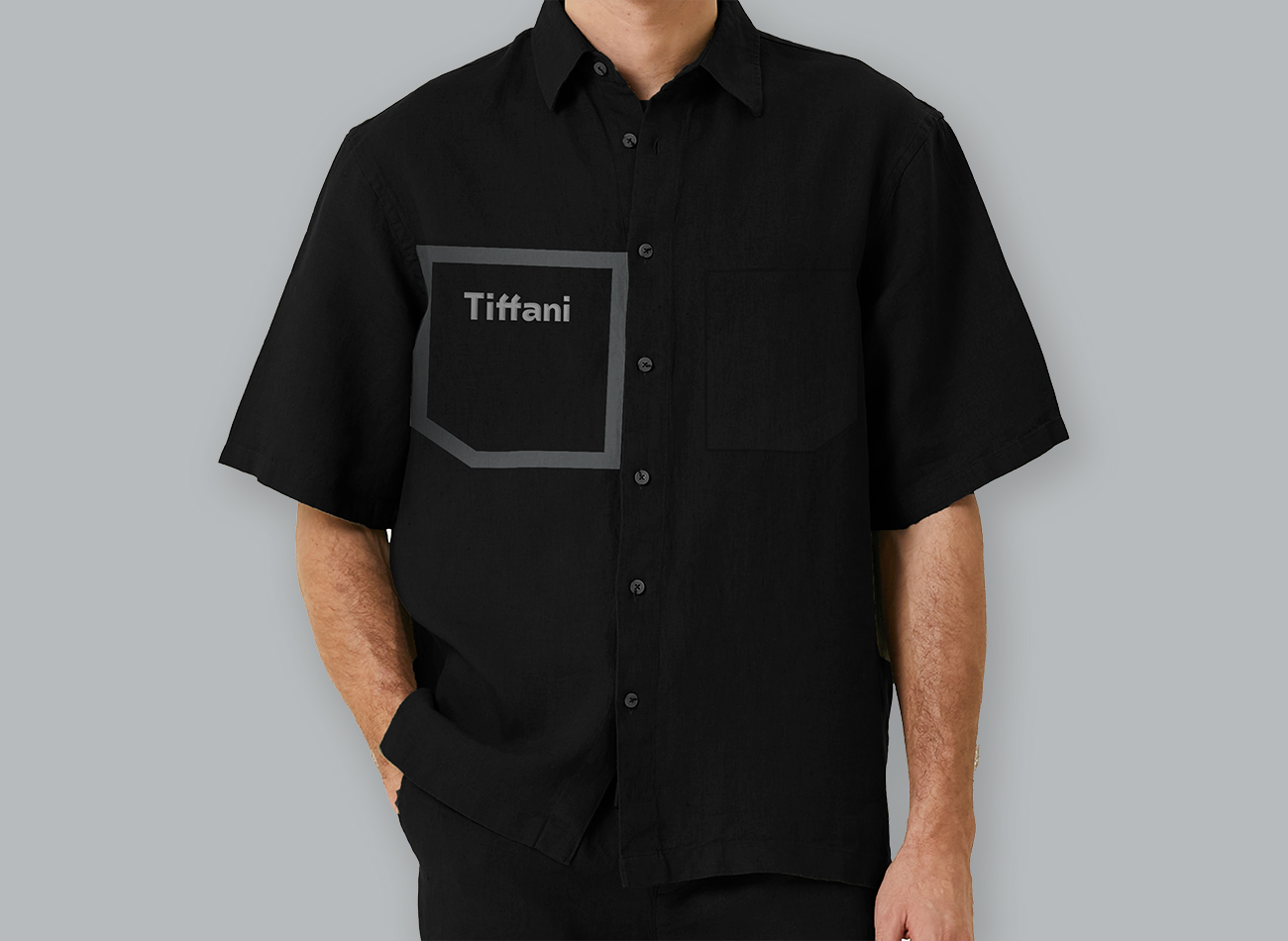
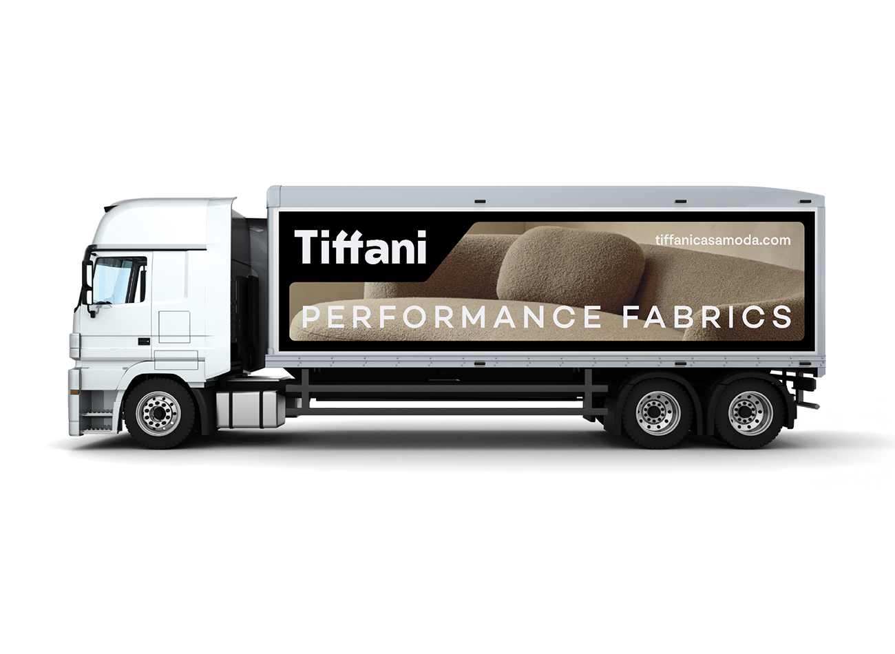
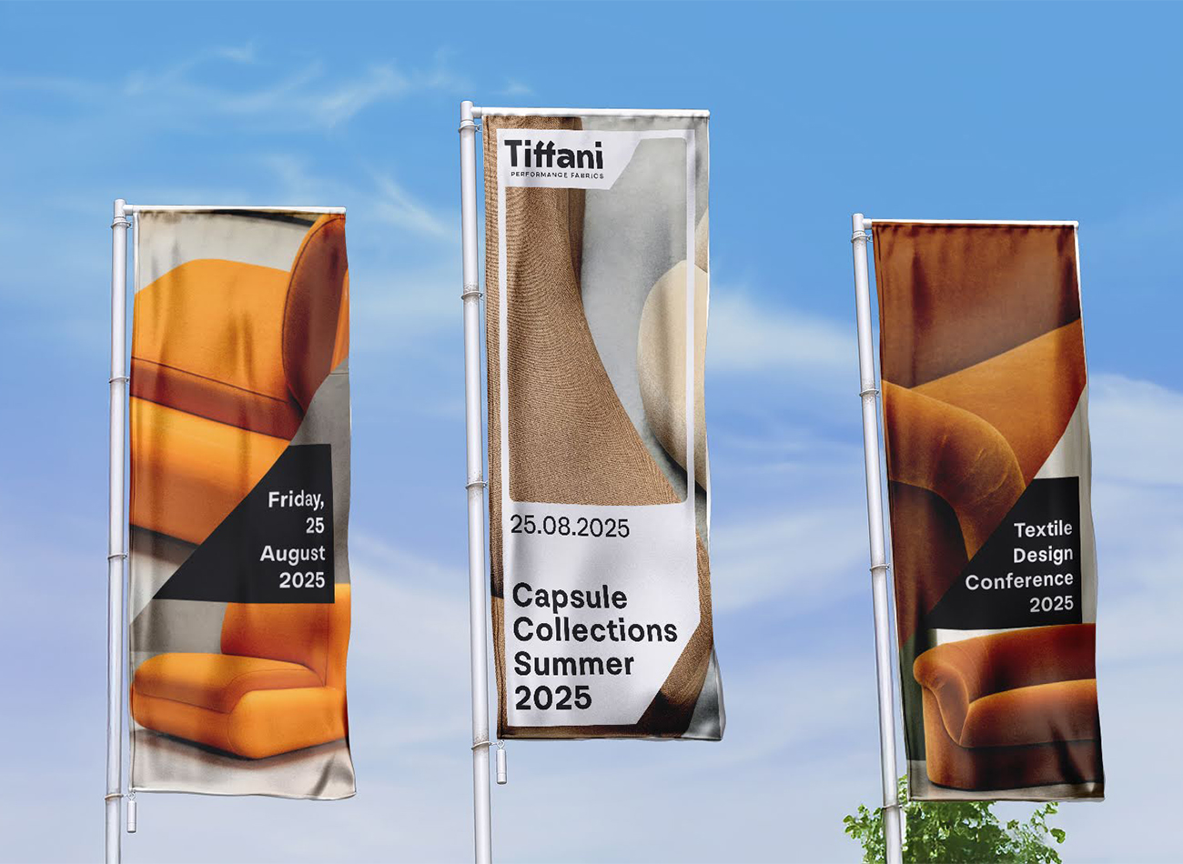
Tiffani is a luxury fabric producer based in Jakarta and Bali, specializing in high-end commercial interiors. Since 2000, the brand has partnered with interior designers and project owners locally and internationally, guided by a belief that beauty has the power to transform spaces.
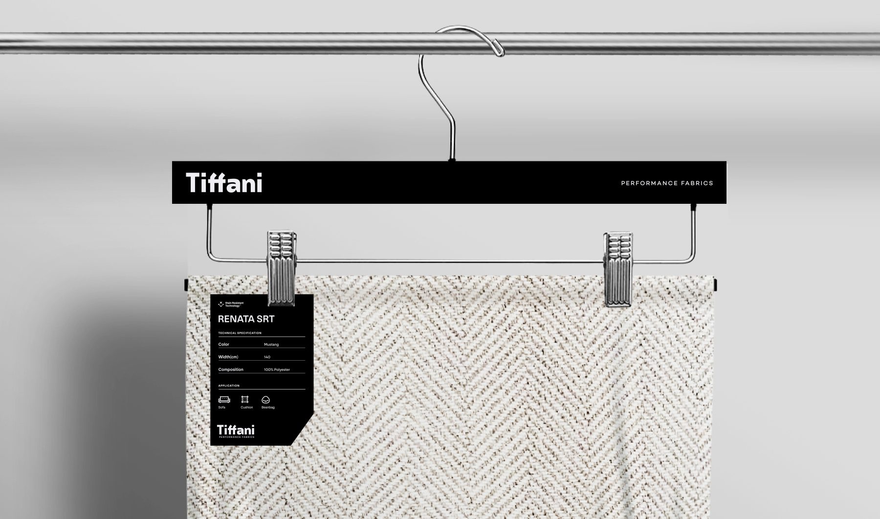
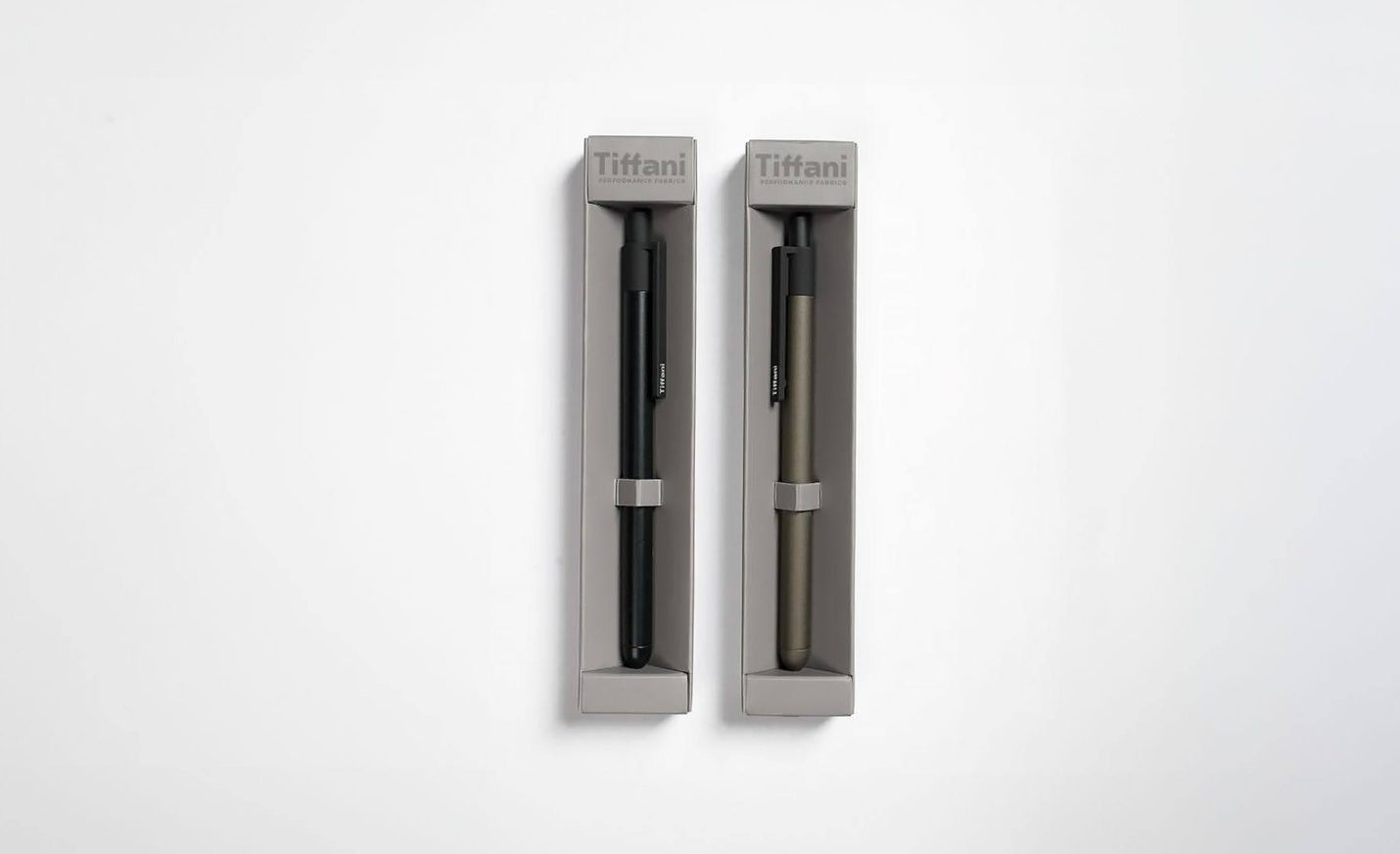
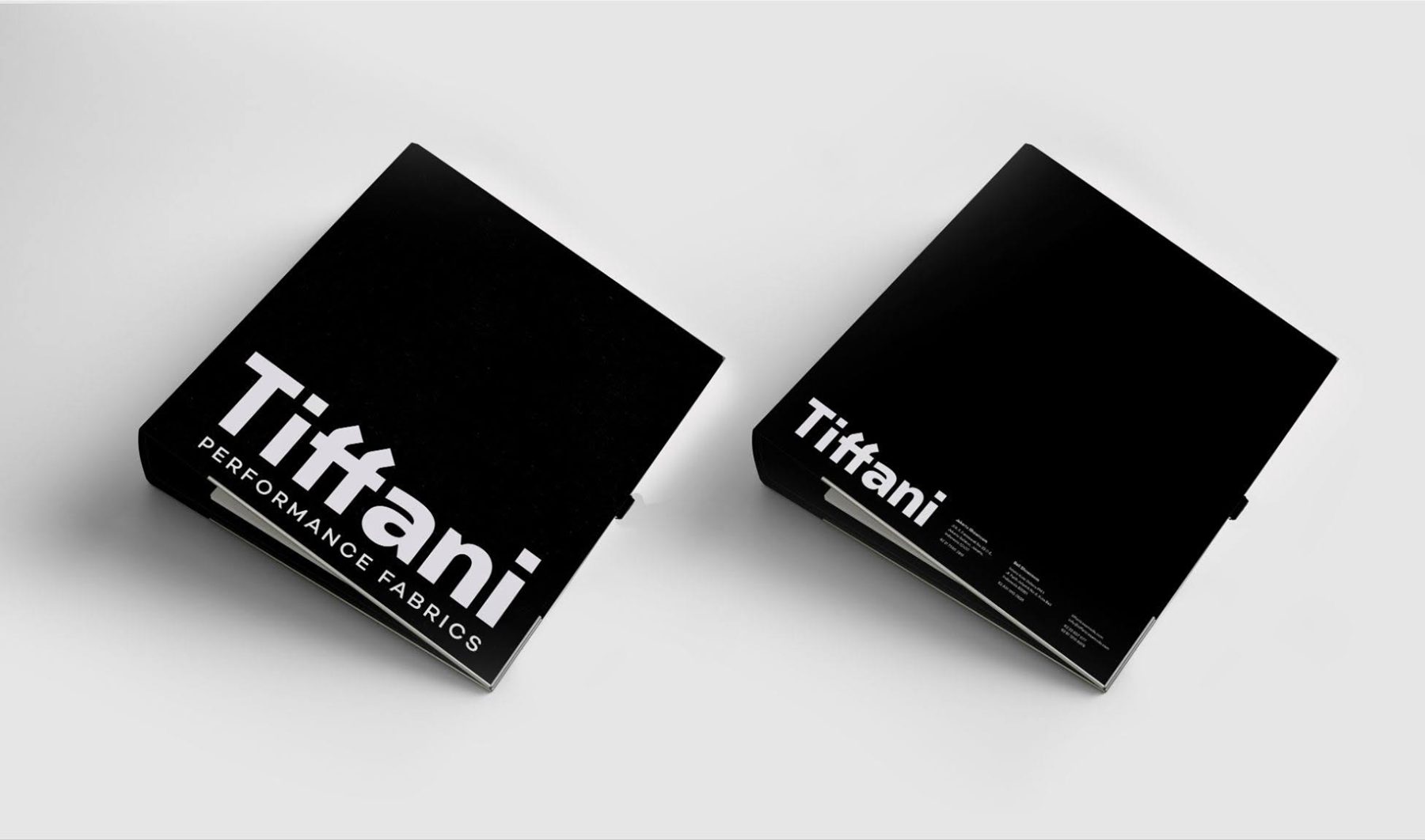
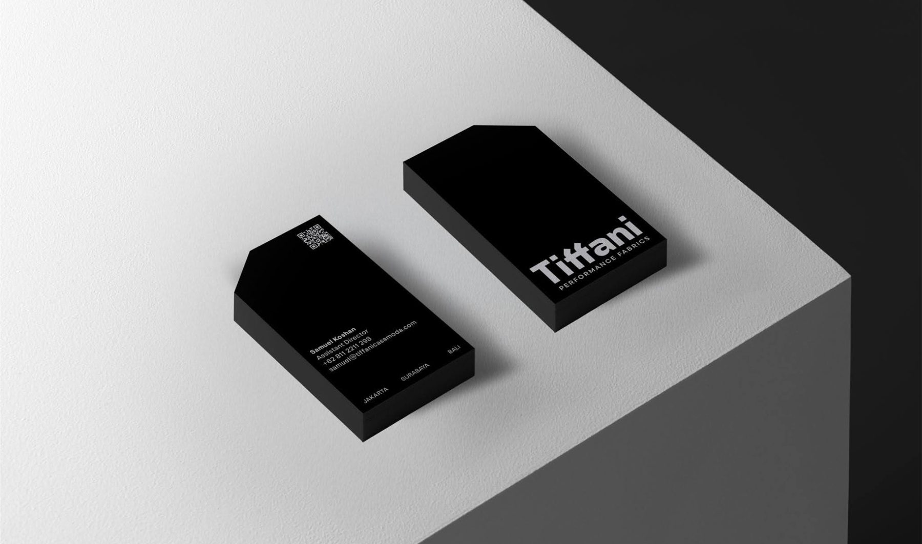
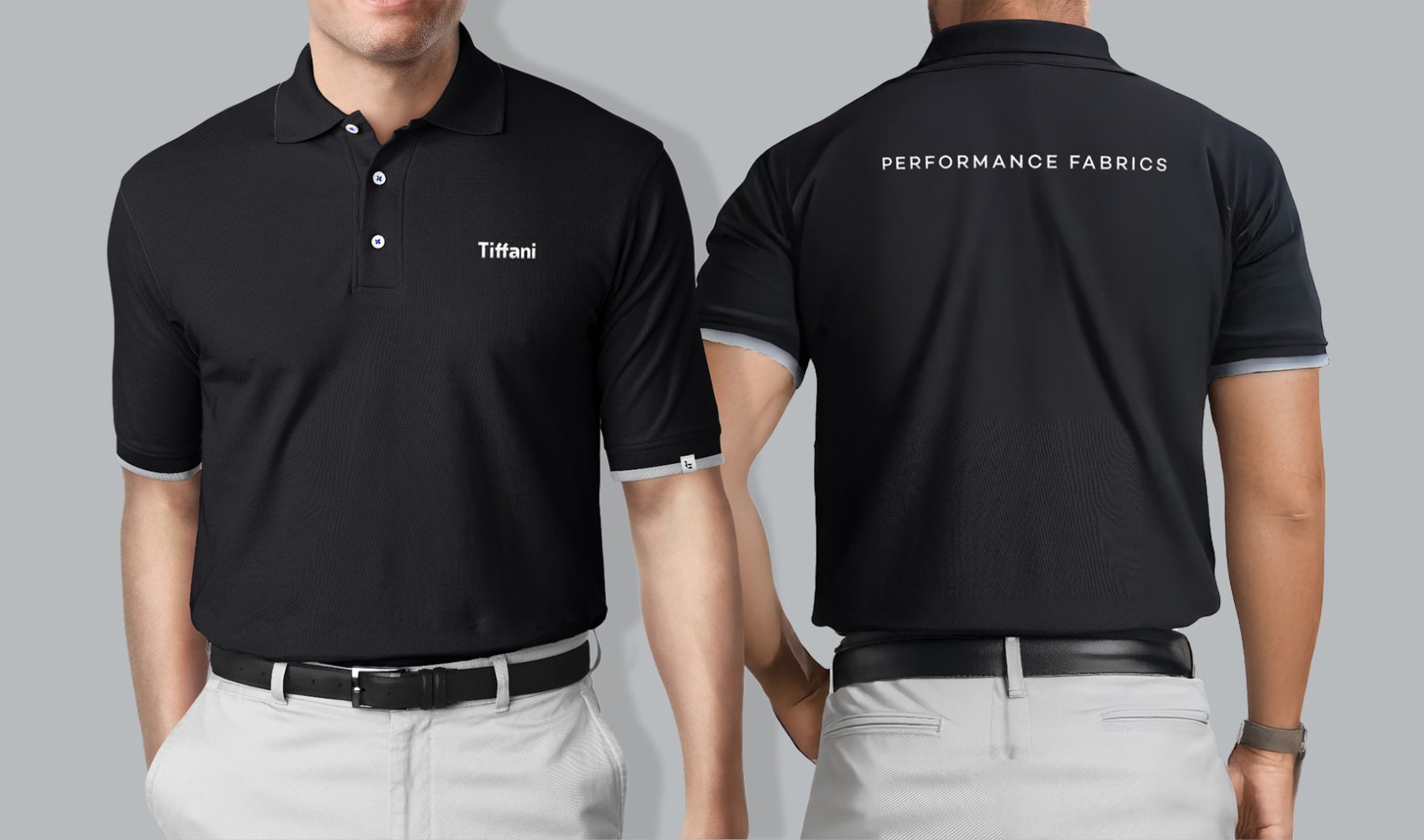
We developed a brand identity rooted in clarity and function. The logotype features sharp edges and angled cuts to convey precision and credibility, with a distinctive ‘ff’ ligature inspired by the structural lines of modern upholstery. This angular language extends across the visual system—shaping graphic frames, buttons, and information containers with consistency and intent.
Since the relaunch, Tiffani has expanded its collaborations with leading architects and interior designers, reinforcing its manifesto of bringing refined beauty into every space.
KUDOS Design Collaboratory
-
Andy Kurniawan
Creative Director -
Owen Febiandi
Lead Designer -
Imam Fadillah
Designer
Alta Design Lab Branding
Alta Design Lab
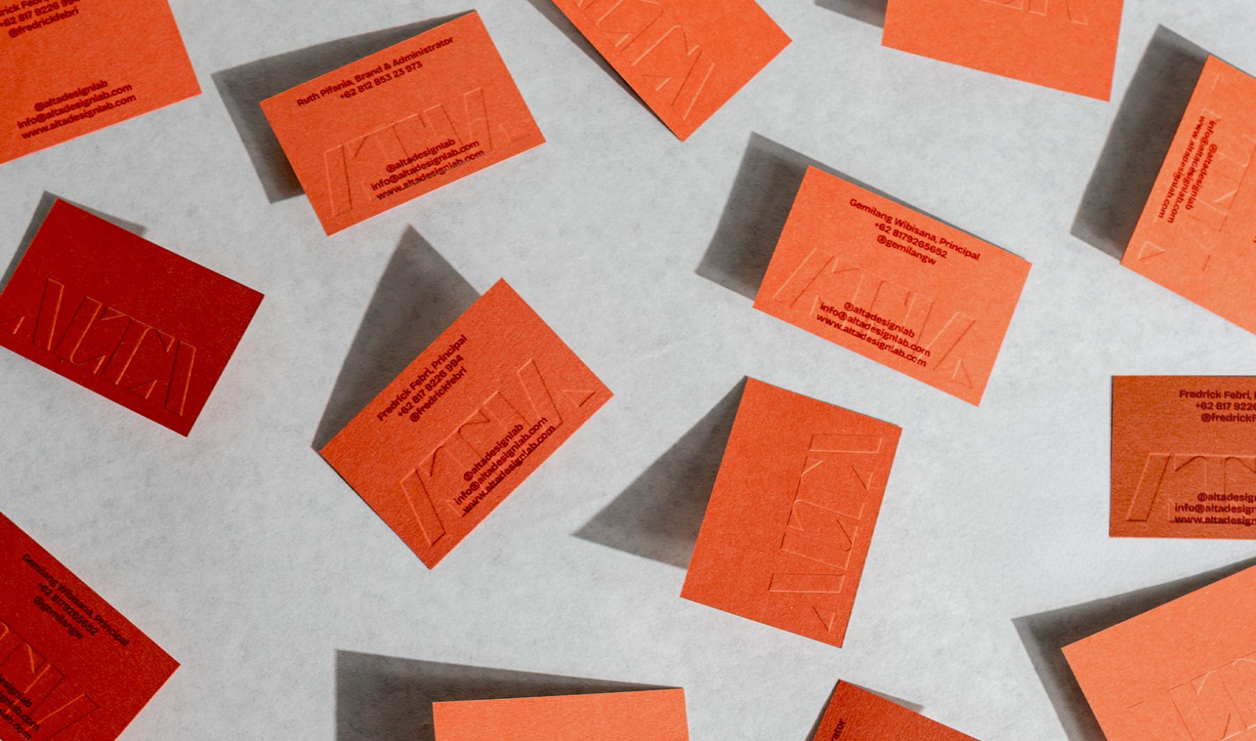
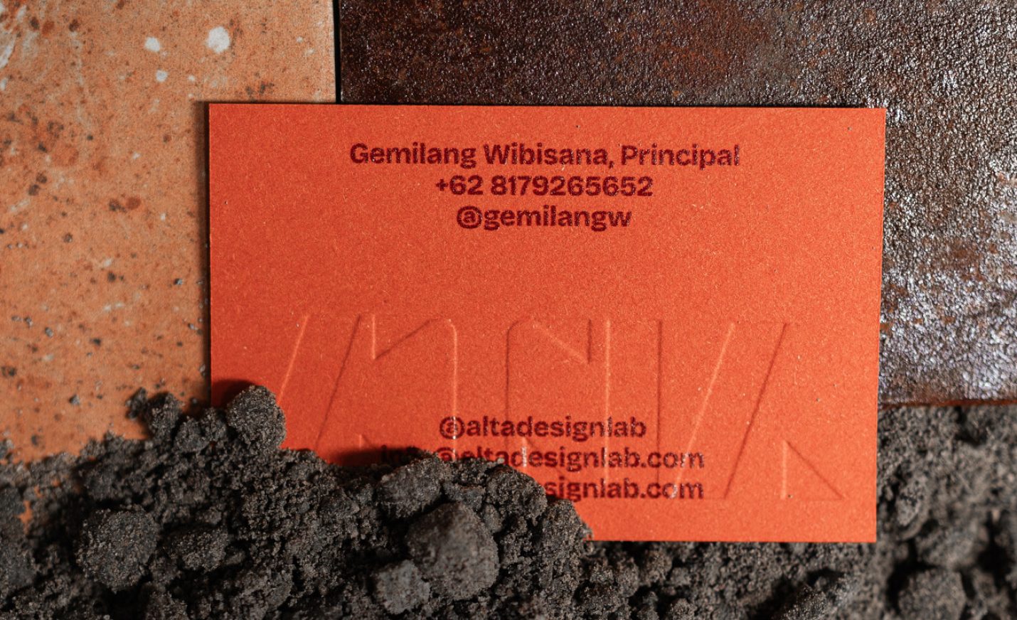
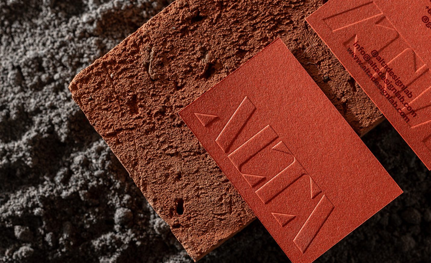
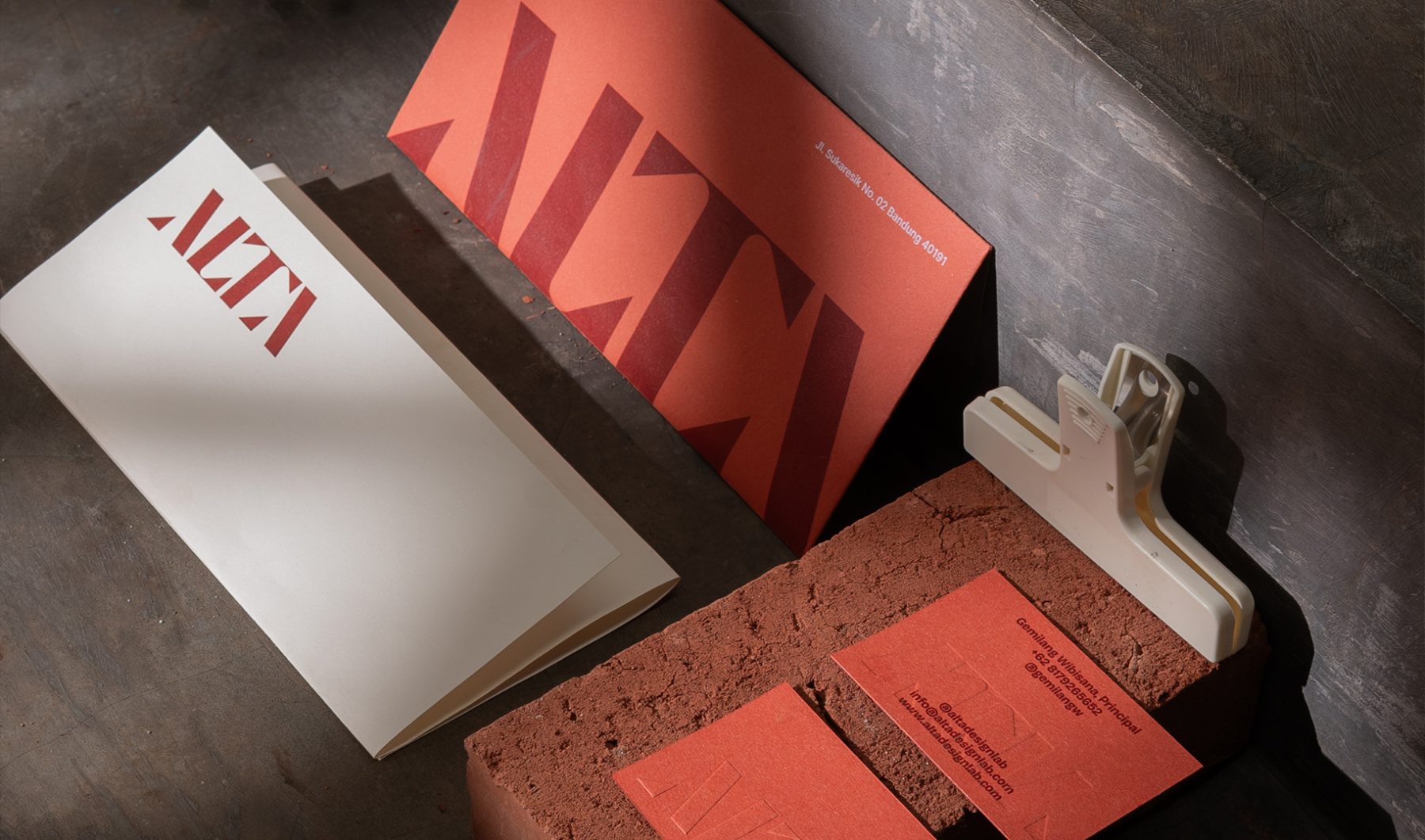
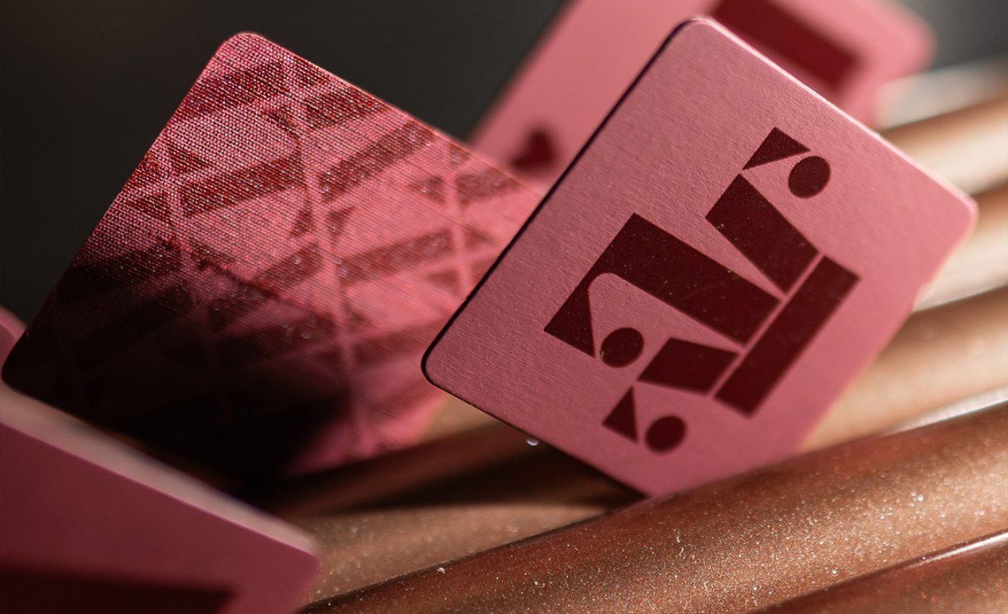
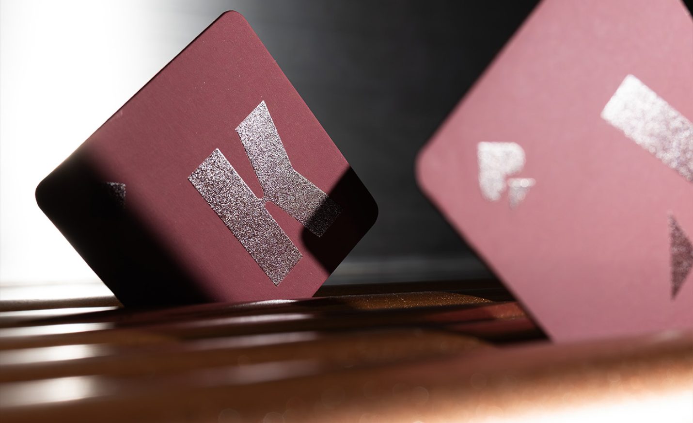
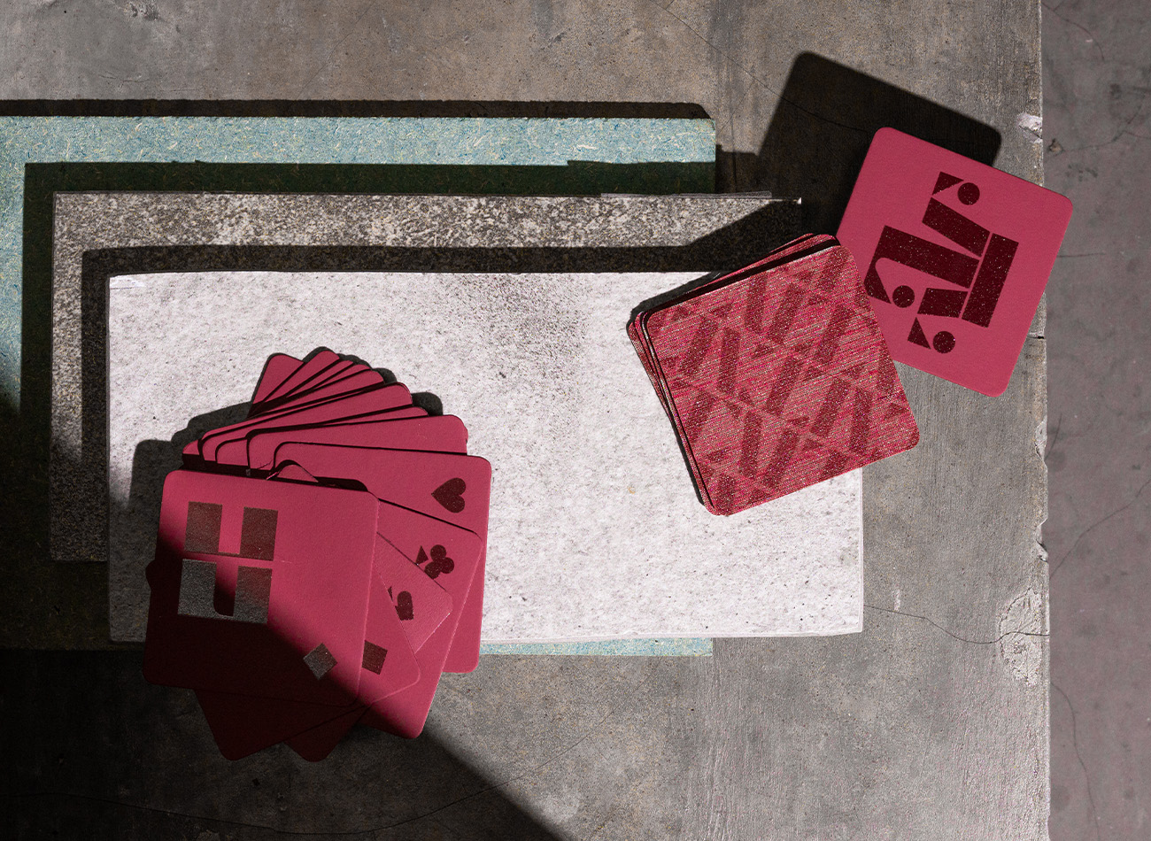
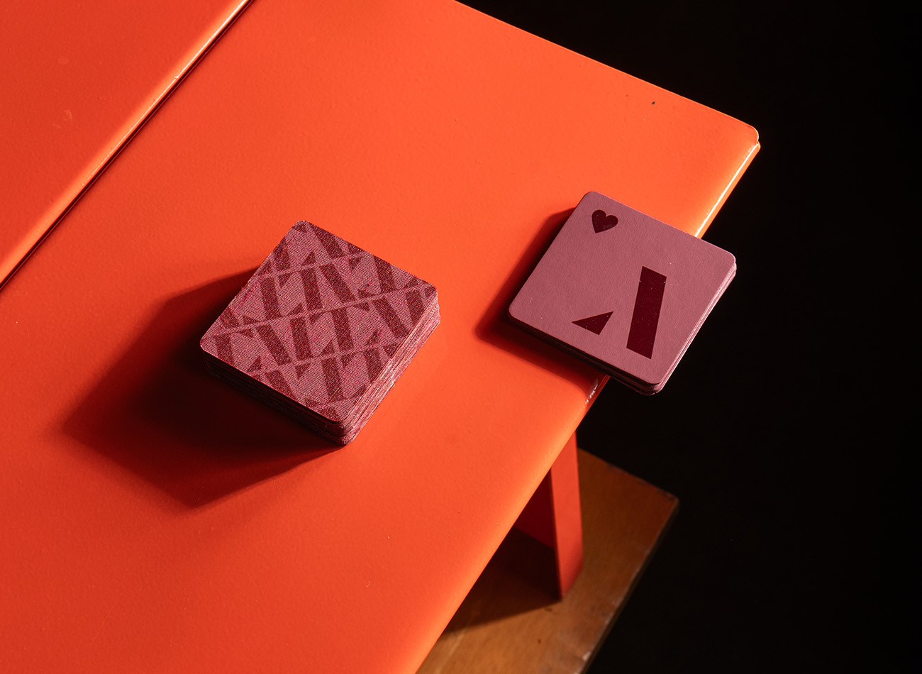
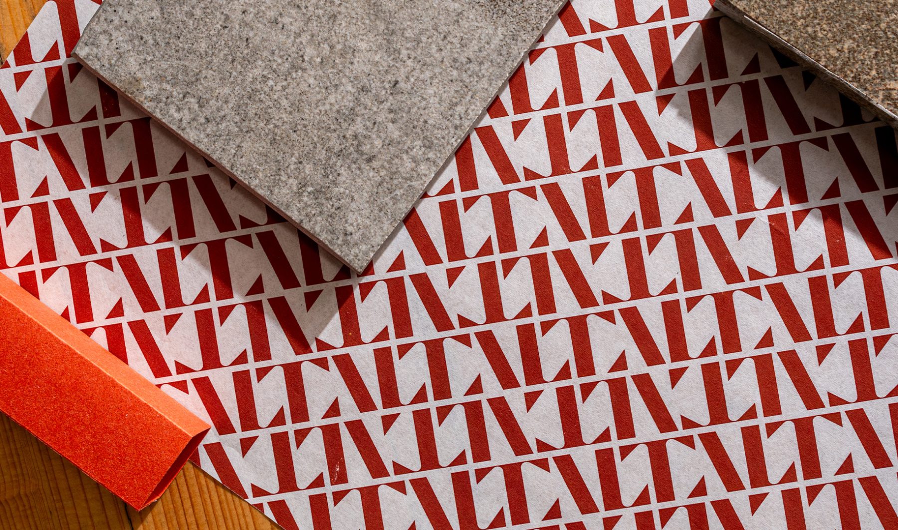
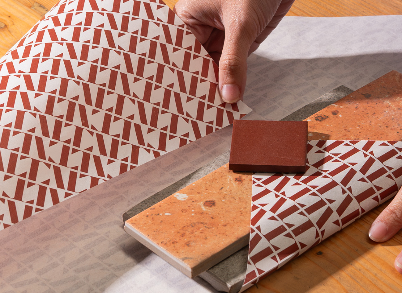
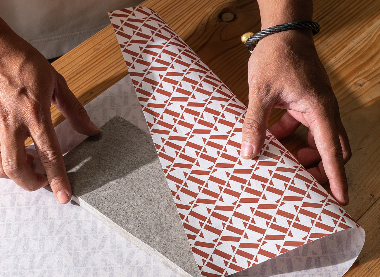
Rooted in the belief that design is identity, ALTA Design Lab’s brand system distills philosophy into form. Inspired by Sanskrit letterforms and Indonesian material culture, the identity balances confidence, pattern, and artisanship across digital and spatial touchpoints.
The custom uppercase logotype features carved edges that nod to traditional craft, paired with a grounded palette—Forest Green, Tabanan Sand, Canting Copper, and Jati Wood—bridging contemporary clarity with natural warmth. A flexible system aligned around four pillars—Philosophical, Personalized, Professional, and Collaborative—guides typography, color, imagery, and pattern applications.
The result is a culturally resonant identity that feels confident yet personal, structured yet expressive—designed to scale consistently across environments while remaining deeply rooted in place.
KUDOS Design Collaboratory™
-
Andy Kurniawan
Creative Director -
Mares Rayeshtyan
Lead Designer -
Imam Fadhillah, Syamil Haqqoni
Designer -
Ferrian R
Photographer
Blueprints Branding & Website
Blueprints for Arts and Policy
Capabilities
Focus Area
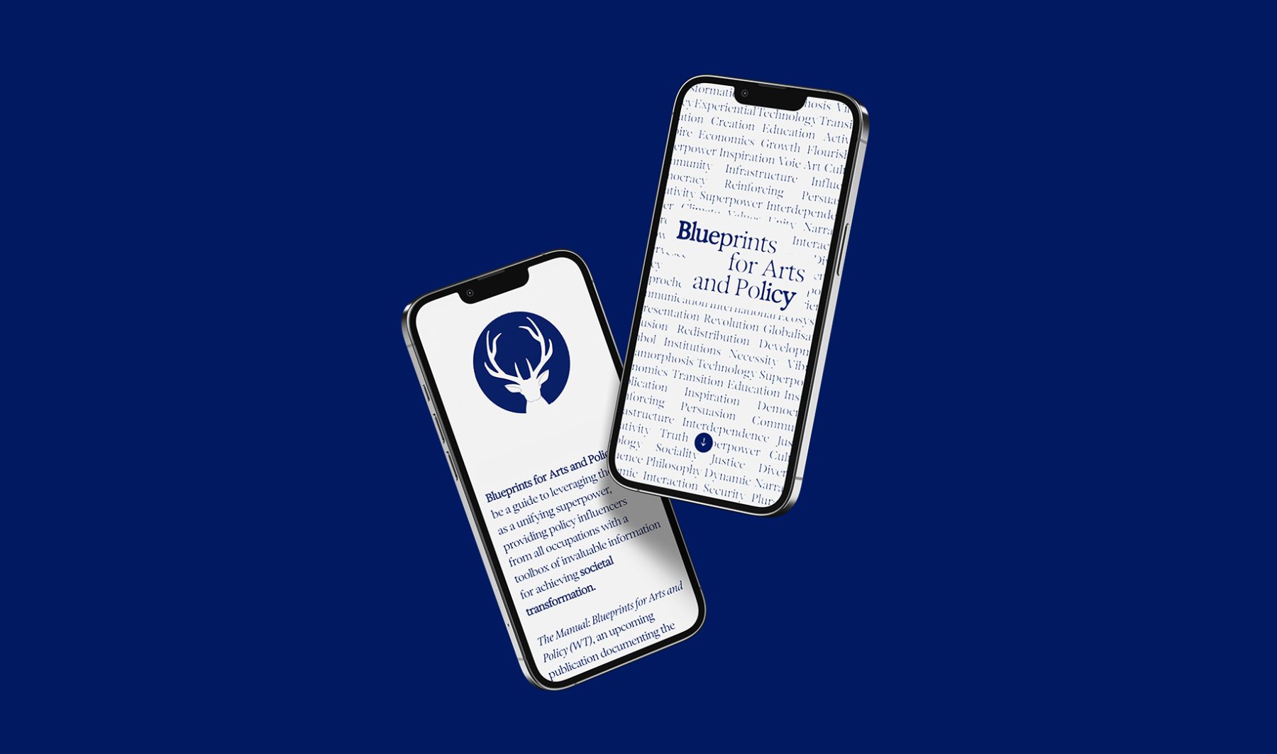
Blueprints for Arts and Policy is a platform in which esteemed global voices in arts and policy exchange ideas, case studies, and recommend actions to inspire collective creativity and bridge ideological, economic, cultural, and social divides. A series of salons will be held in contribution to the project, bringing together leaders in a variety of fields to discuss how the arts can be harnessed for social and policy interventions.
KUDOS developed a generative type branding system that embody the ever-changing nature of these complex exchanges. We also created a series of icons that morph through a Rorschach effect, visualizing the melding of unconscious minds and voices.
Visit blueprintsartpolicy.com
KUDOS Design Collaboratory
-
John Kudos
Creative Director -
Owen Febiandi
Lead Designer -
Putu Yogiswara
Designer -
Iman Fadillah
Motion Designer -
Amanda Knott
Project Manager -
Christian Juniady Setiawan
Web Developer
Shigeko Kubota Video Art Foundation Branding
Shigeko Kubota Video Art Foundation
Capabilities
Focus Area
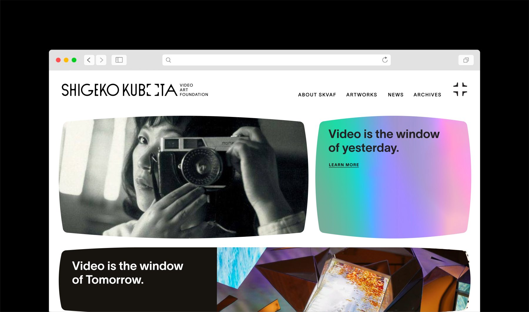
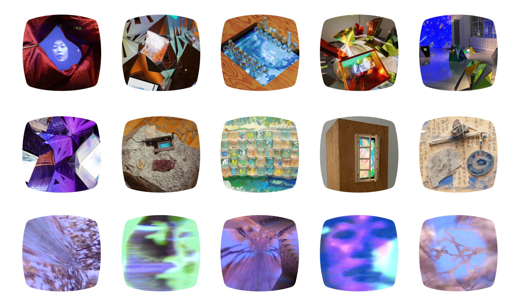
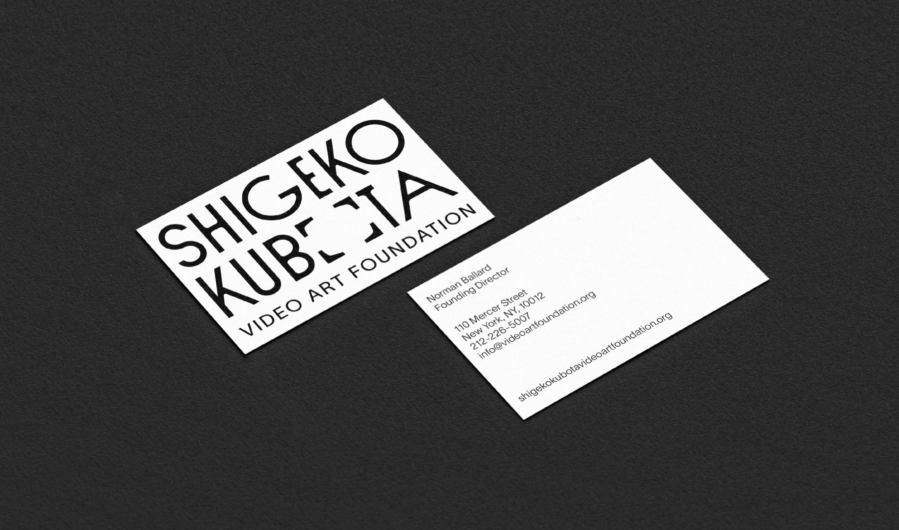
Shigeko Kubota (1937–2015) was a pioneering video artist, recognized as a significant early progenitor of the medium through her multifaceted roles as an artist, curator, critic, and essayist.
The Shigeko Kubota Video Art Foundation is dedicated to preserving her work and cultural legacy while fostering broader awareness, appreciation, and understanding of the history and future of video art through diverse programs and initiatives.
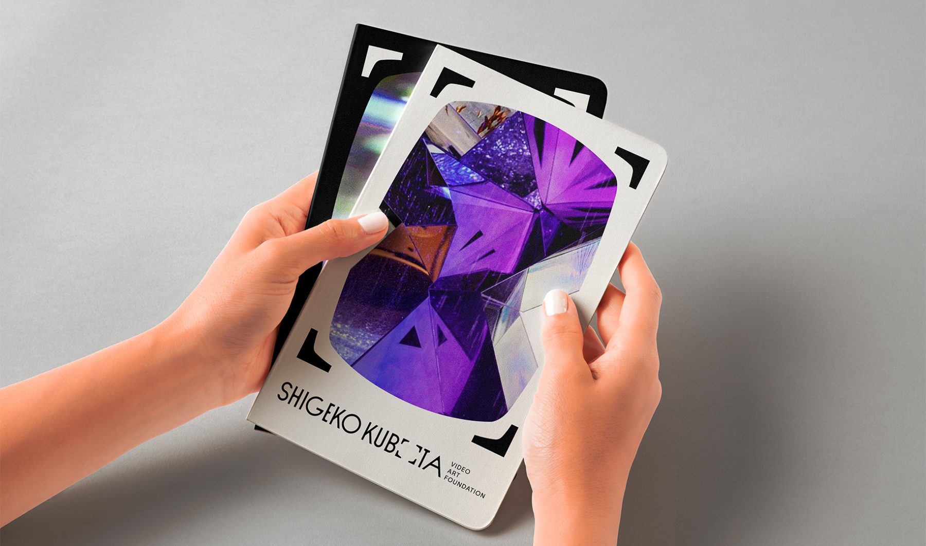
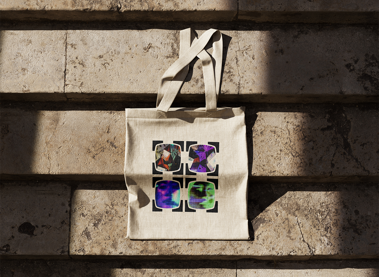
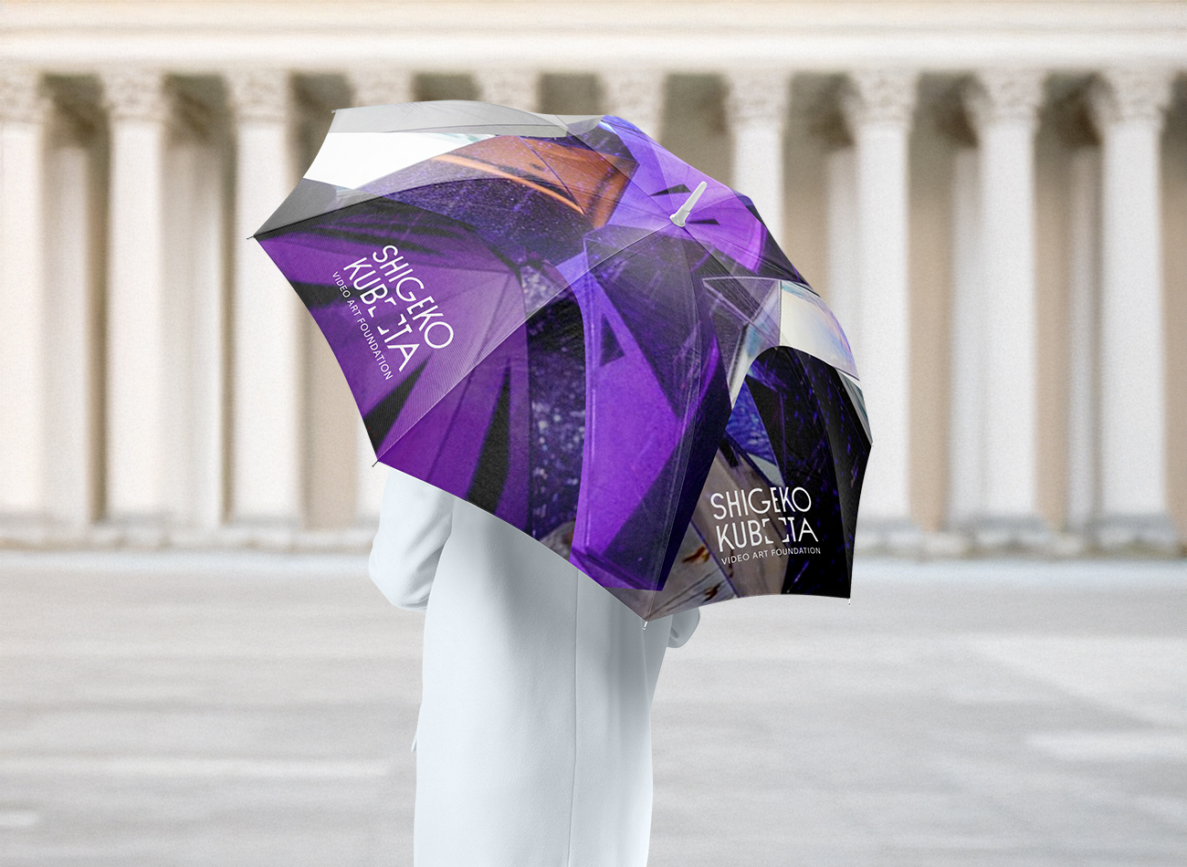
To brand the foundation, we drew inspiration from iconic visual cues in Kubota’s work—most notably the 4×3 television frame and her 2004 artwork, Video is the Window of Yesterday, Video is the Window of Tomorrow. The new visual identity system modernizes these forms within the logotype, allowing the frames to dynamically expand around any subject. Deliberately minimalist and monochromatic, the identity reflects the enduring and timeless nature of Kubota’s contributions to the field of video art.
KUDOS Design Collaboratory
-
John Kudos
Creative Director -
Fay Qiu
Designer -
Owen Febiandi
Designer -
Putu Yogiswara
Designer -
Muhammad Syamil Haqqoni
Designer -
Imam Fadilah
Motion Designer -
Amanda Knott
Project Manager
Austin+Mergold Branding & Website
Austin+Mergold
Capabilities
Focus Area
Client
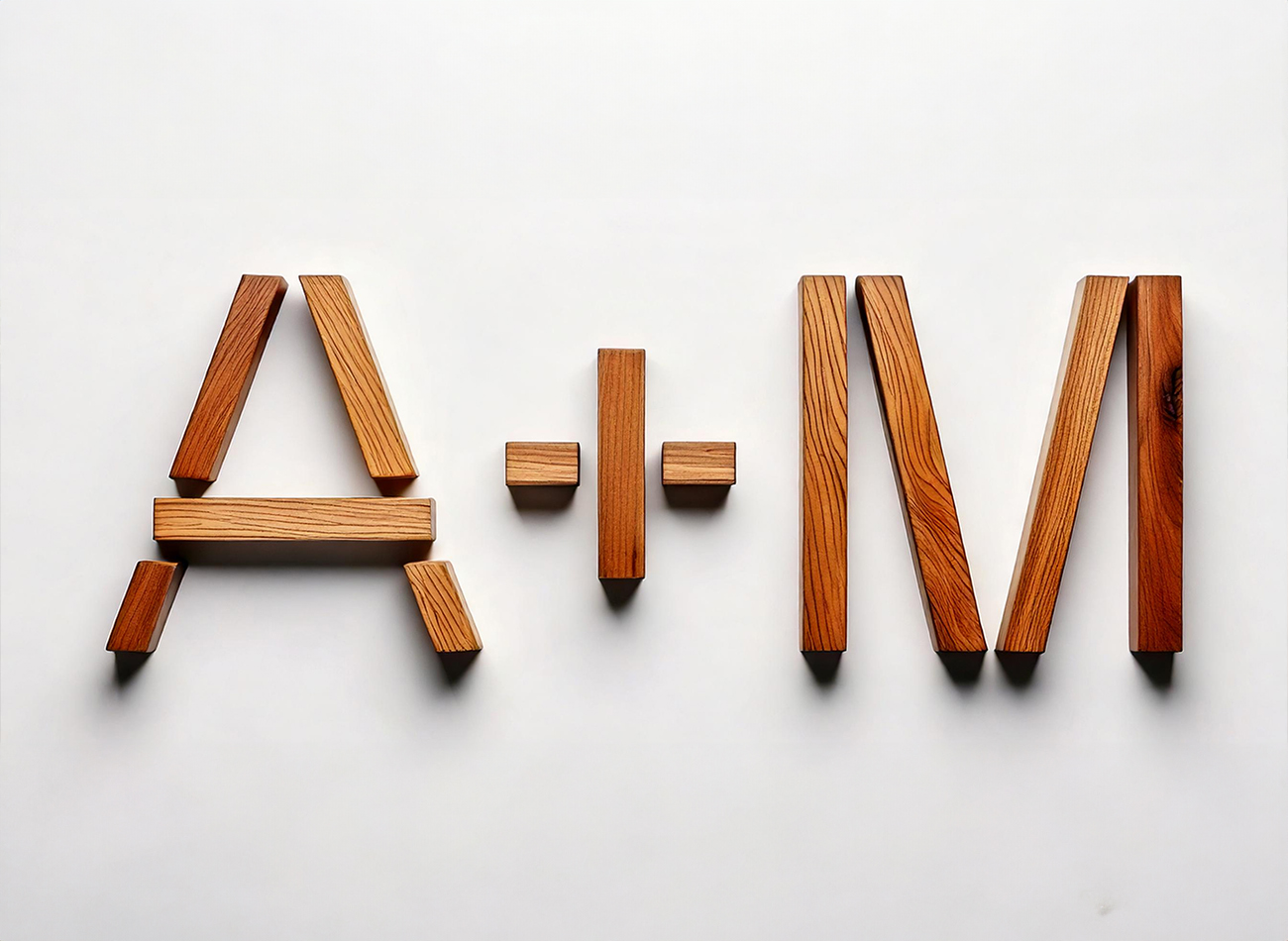
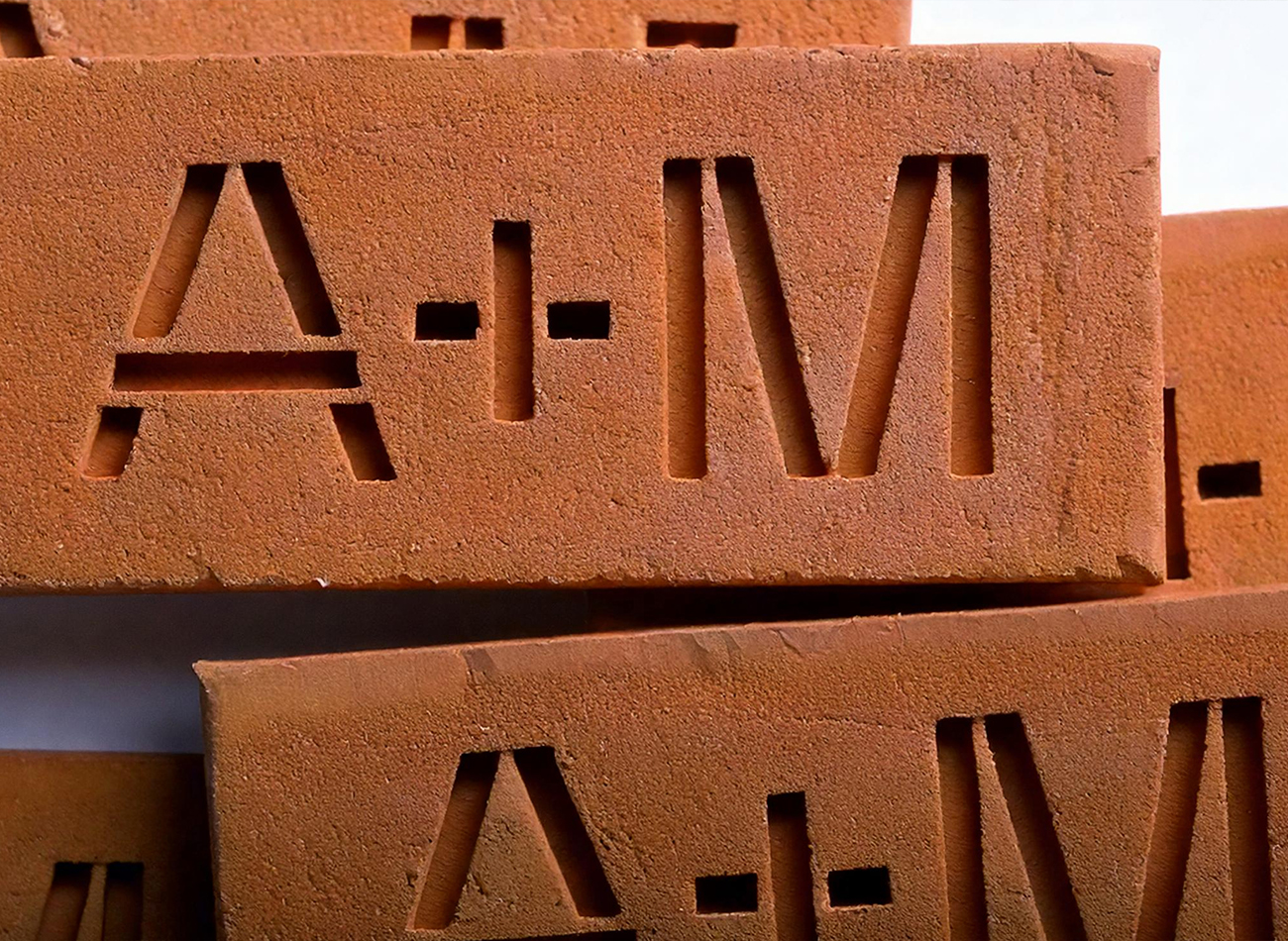
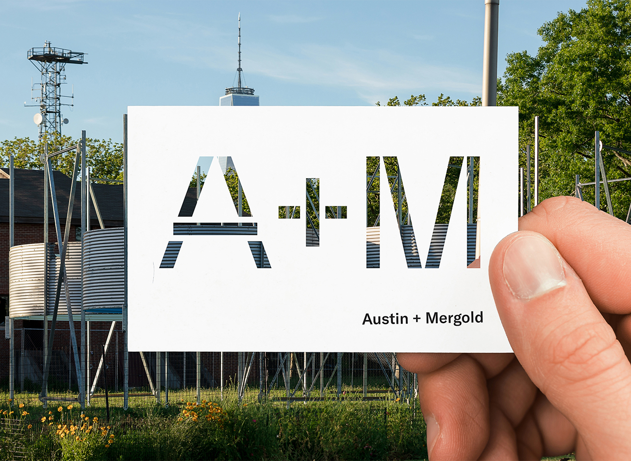
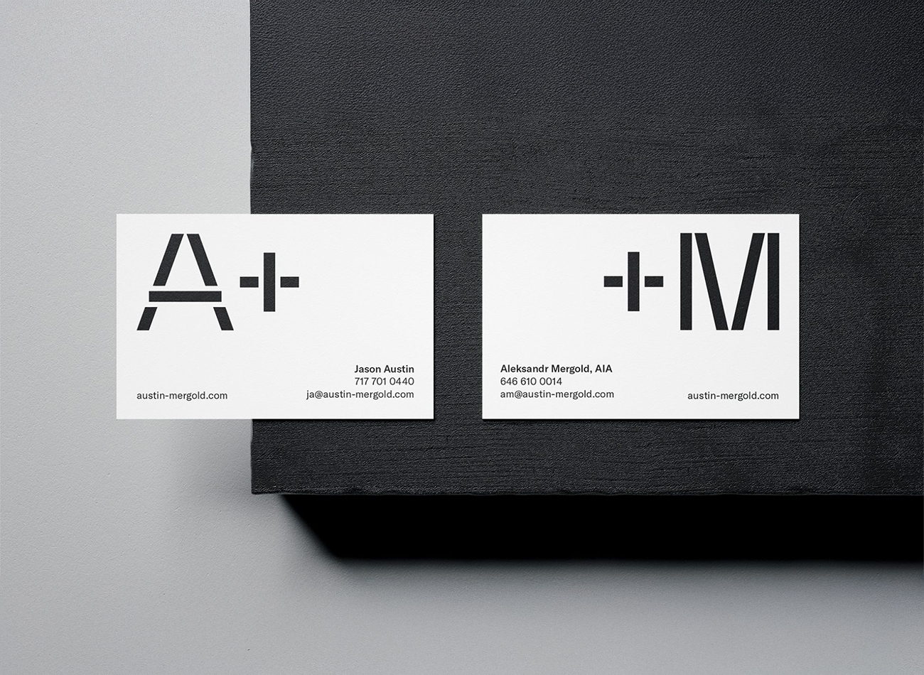
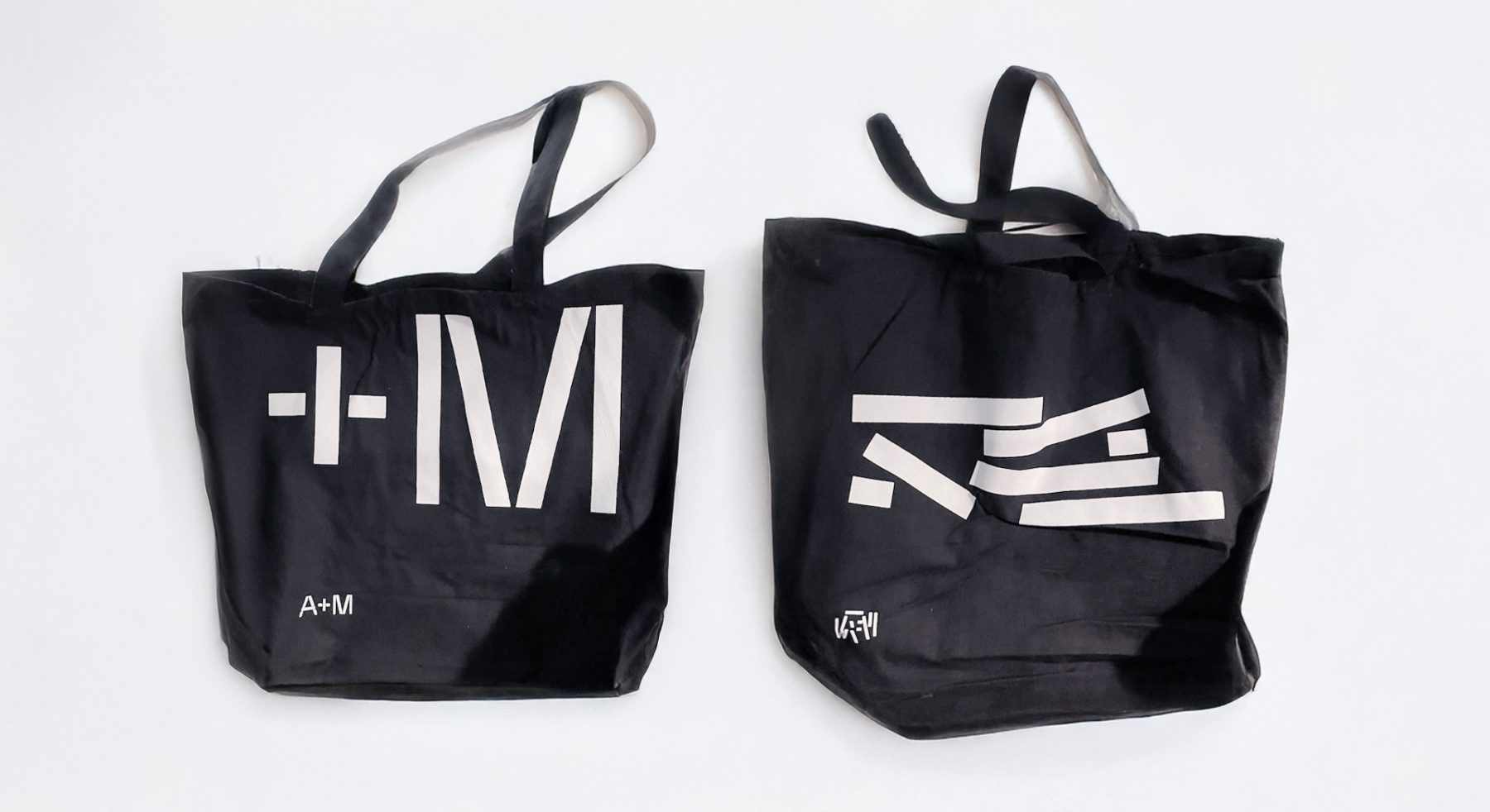
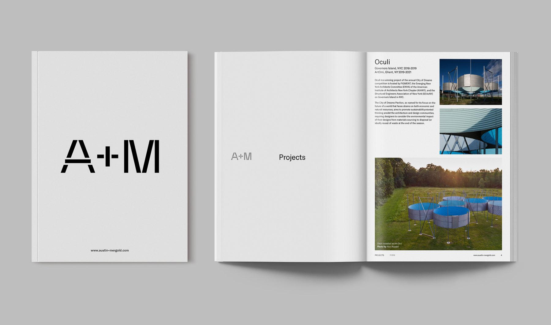
A+M, a design collective led by Jason Austin and Aleksandr Mergold, serves as a platform for collaboration and inquiry across architecture, landscape, and design.
We crafted a bold typographic logo that embodies their process of rethinking and repurposing forms and materials, creating thoughtful expressions that evolve over time.
Their website reflects this vision with a dynamic sorting system that rearranges content blocks, echoing A+M’s philosophy of transforming built forms into fresh innovative designs.
View austin-mergold.com
KUDOS Design Collaboratory
-
John Kudos
Creative Director -
Jamus Marquette
Lead Designer -
Owen Febiandi, Putu Yogiswara
Designer -
Christyan Junaedi Setiawan
Web Developer -
Amanda Knott
Project Manager
Lincoln Square Branding & Website
Lincoln Square BID
Capabilities
Focus Area
Client
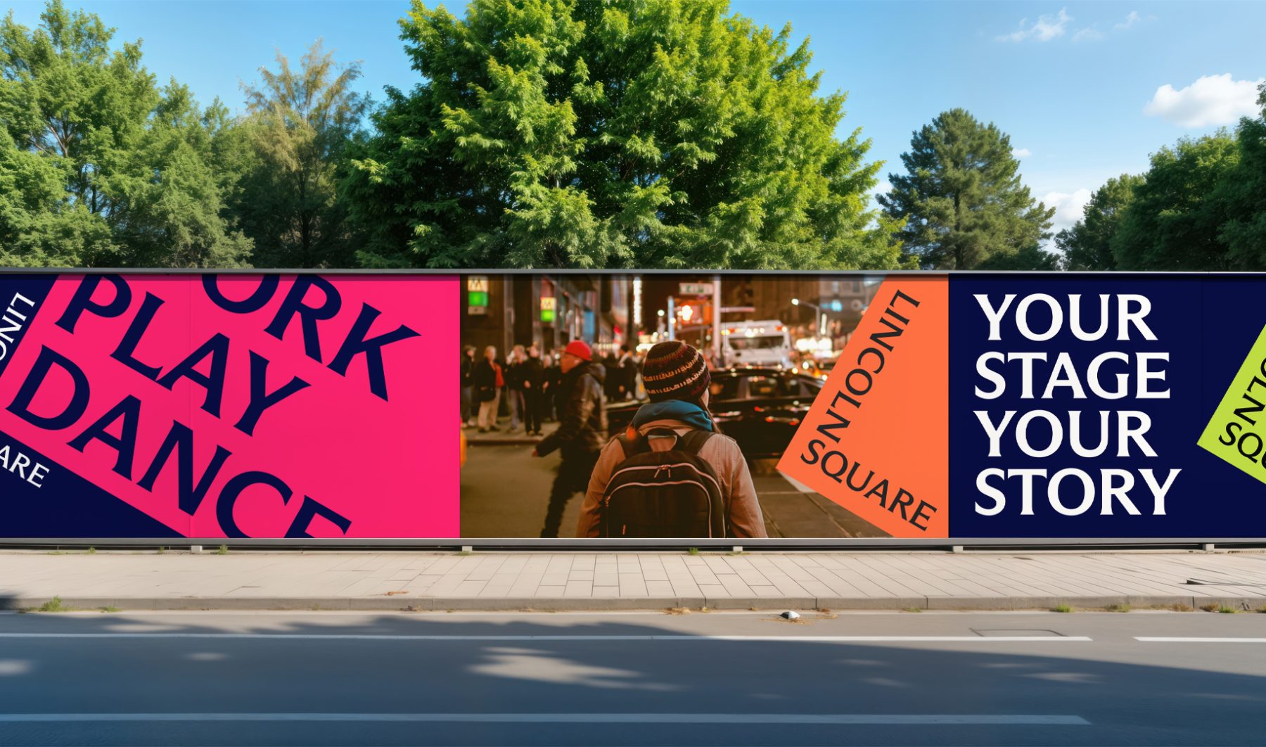
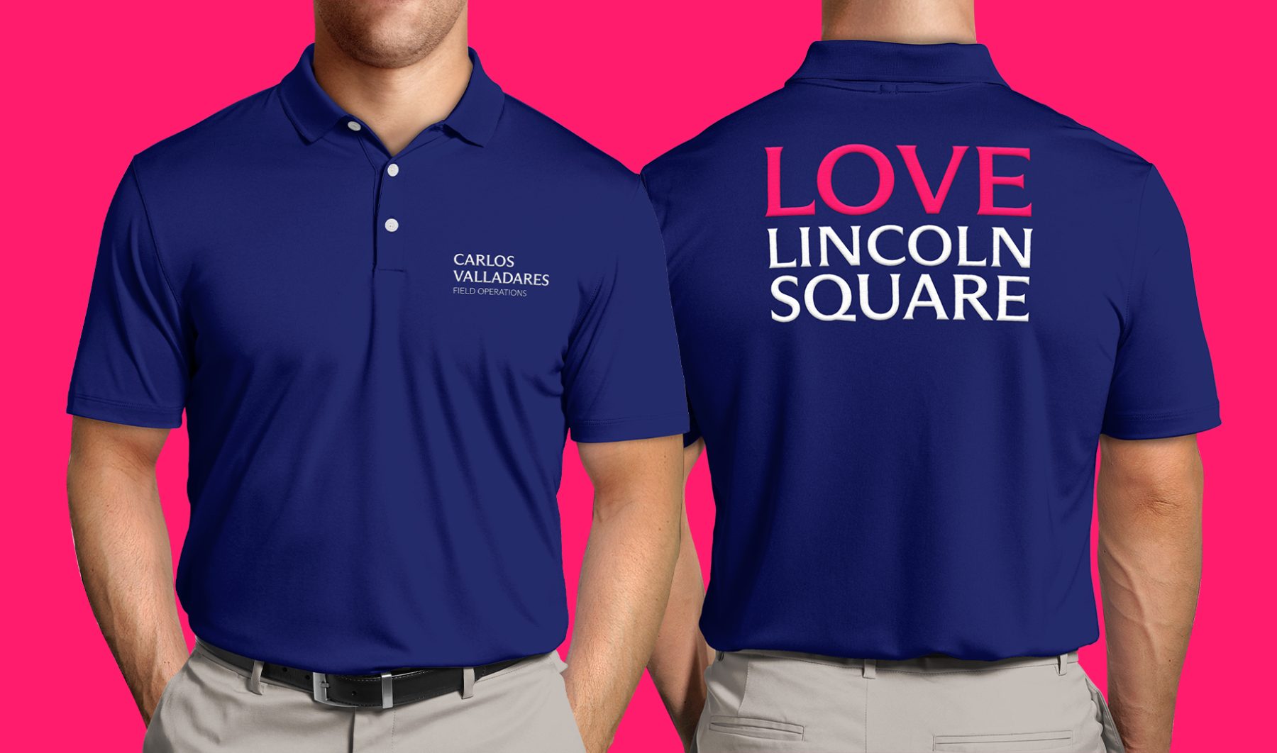
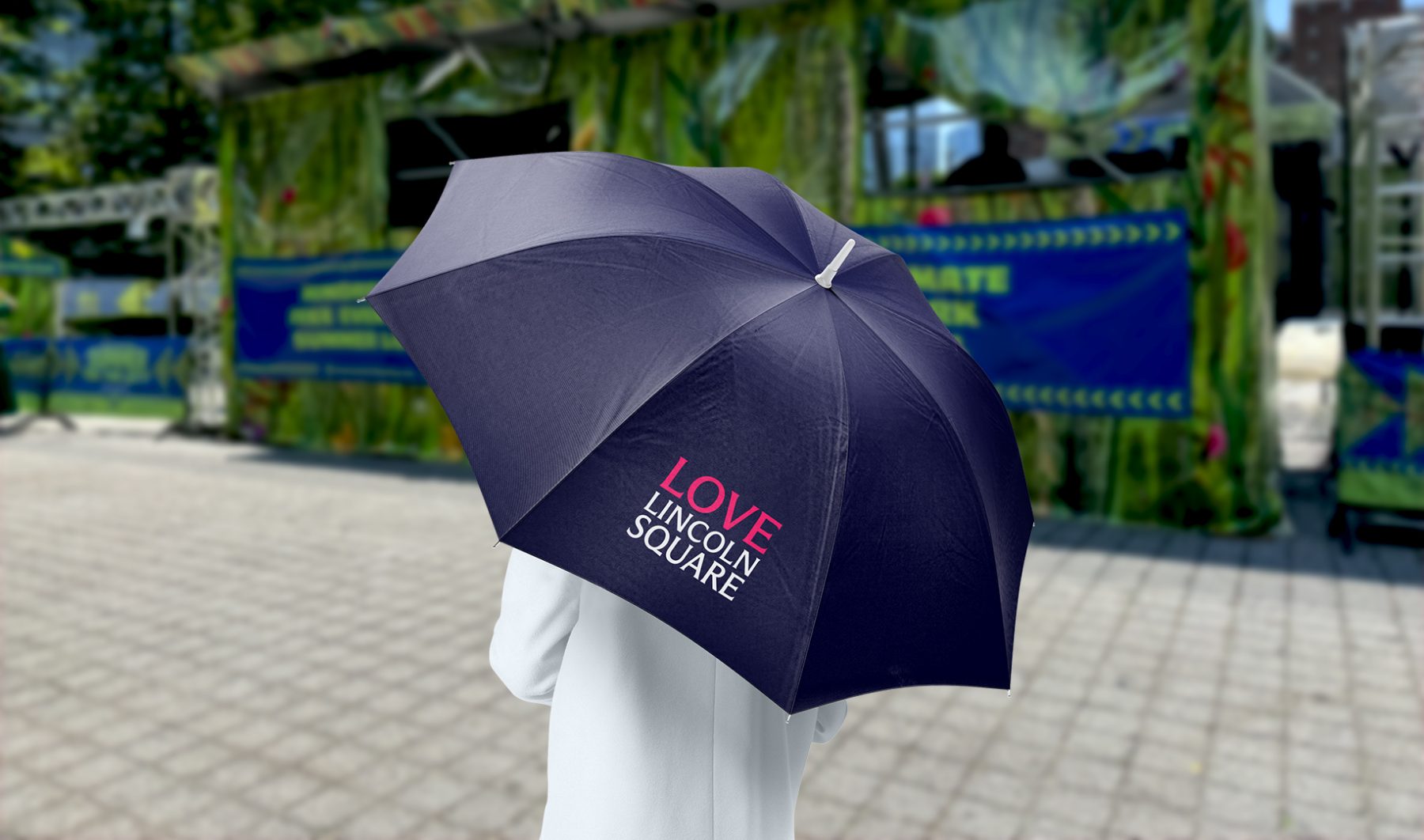
Lincoln Square BID is a nonprofit organization dedicated to keeping the neighborhood clean, safe, and beautiful while promoting its vibrant cultural, commercial, and residential life year-round. Through dynamic marketing efforts, the BID ensures Lincoln Square remains in the spotlight across all seasons.
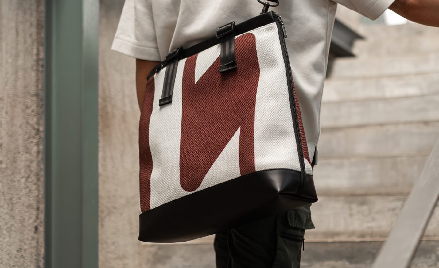
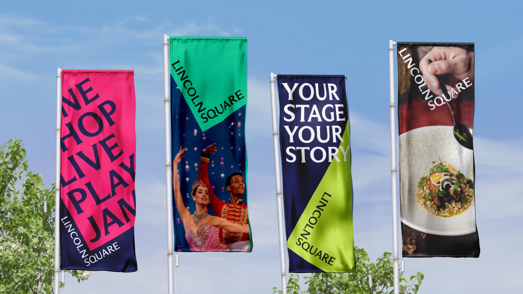
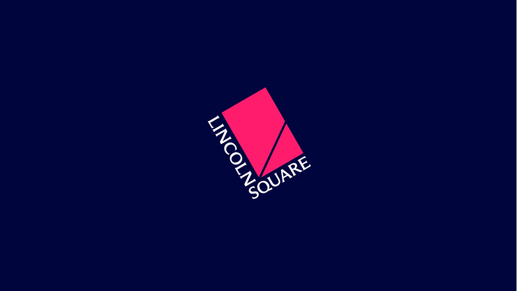
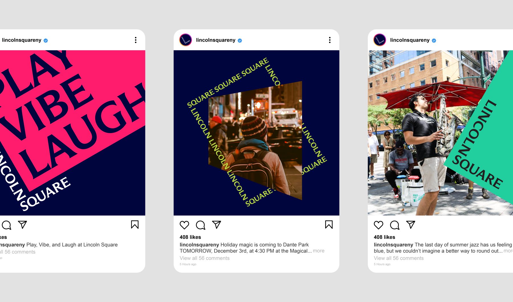
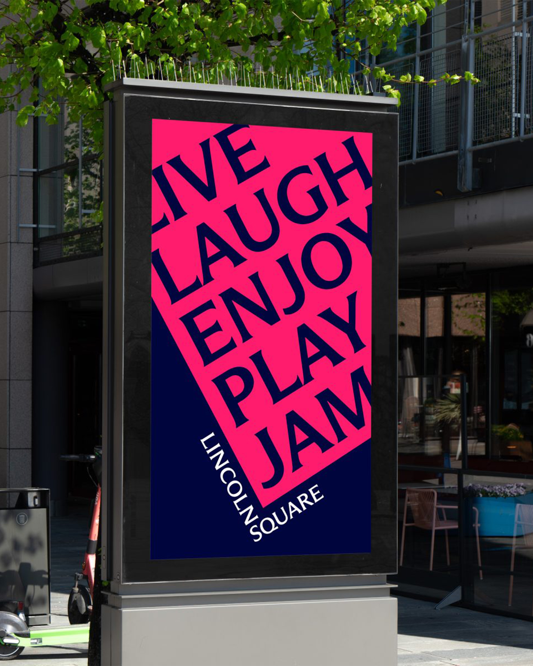
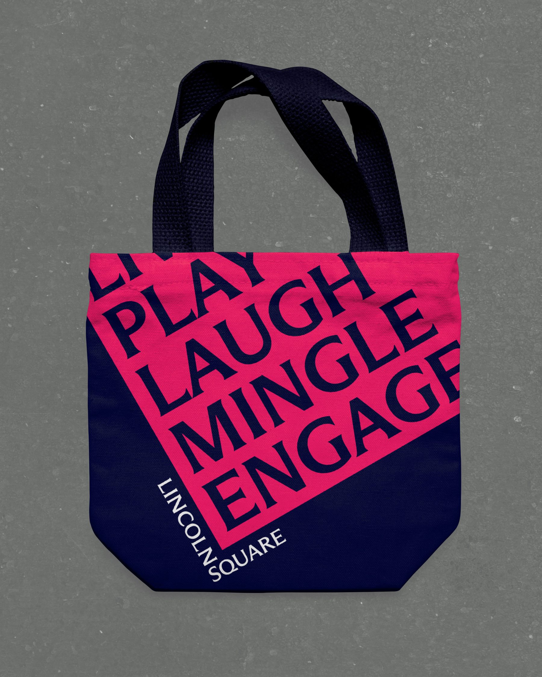
For this project, we introduced a bold new design system. The words LINCOLN and SQUARE interlock to form an “L,” wrapped around a rubin red block tilted at a 30º angle—a visual nod to the way Broadway cuts diagonally through the heart of Manhattan’s Upper West Side.
The block itself serves as a dynamic window into Lincoln Square’s rich cultural landscape. It rotates, shifts colors, and reveals visual moments and words that capture the neighborhood’s spirit, energy, and enduring legacy as one of New York City’s iconic destinations.
A new website will be coming in the Spring of 2025.
KUDOS Design Collaboratory
-
John Kudos
Creative Director -
Fay Qiu
Lead Designer -
Owen Febiandi
Designer -
Jamus Marquette
Designer -
Amanda Knott
Project Manager -
Imam Fadilah
Animator

Medical Inflatables Branding & Website
Medical Inflatables
Capabilities
Focus Area
Client
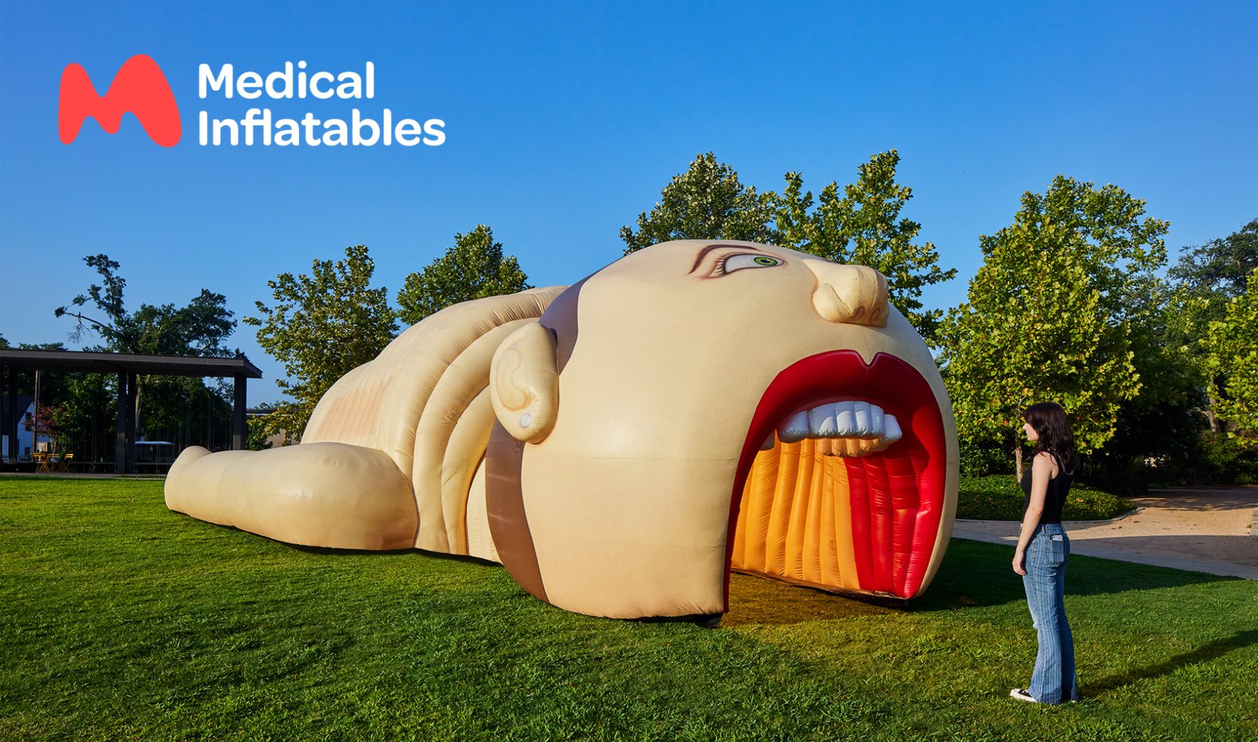
Medical Inflatables is revolutionizing health education with larger-than-life, interactive anatomy models that make serious health topics approachable for all ages.
For their latest rebrand, we crafted a dynamic visual identity inspired by their mission to promote health awareness in engaging and meaningful ways. The new organic “M” logo mimics the shapes of human organs, seamlessly adapting across applications. Each inflatable now features a quirky mascot—perfect for stickers, t-shirts, and signage—paired with playful taglines that spark smiles.
The revamped website combines parallax scrolling and fluid animations, offering users an organic and intuitive experience while effortlessly guiding them to information and booking options. Together, we’re making health literacy accessible, friendly, and impactful—one “mega” inflatable at a time.
Visit medicalinflatables.com
KUDOS Design Collaboratory
-
John Kudos
Creative Director -
Fay Qiu
Lead Designer -
Owen Febiandi
Designer -
Amanda Knott
Project Manager -
Imam Fadilah
Animator -
Inwoo Baek
Illustrator -
Samuel Sachs Morgan
Photography


Young Ones Call for Entry
The One Club for Creativity
Capabilities
Focus Area
Client
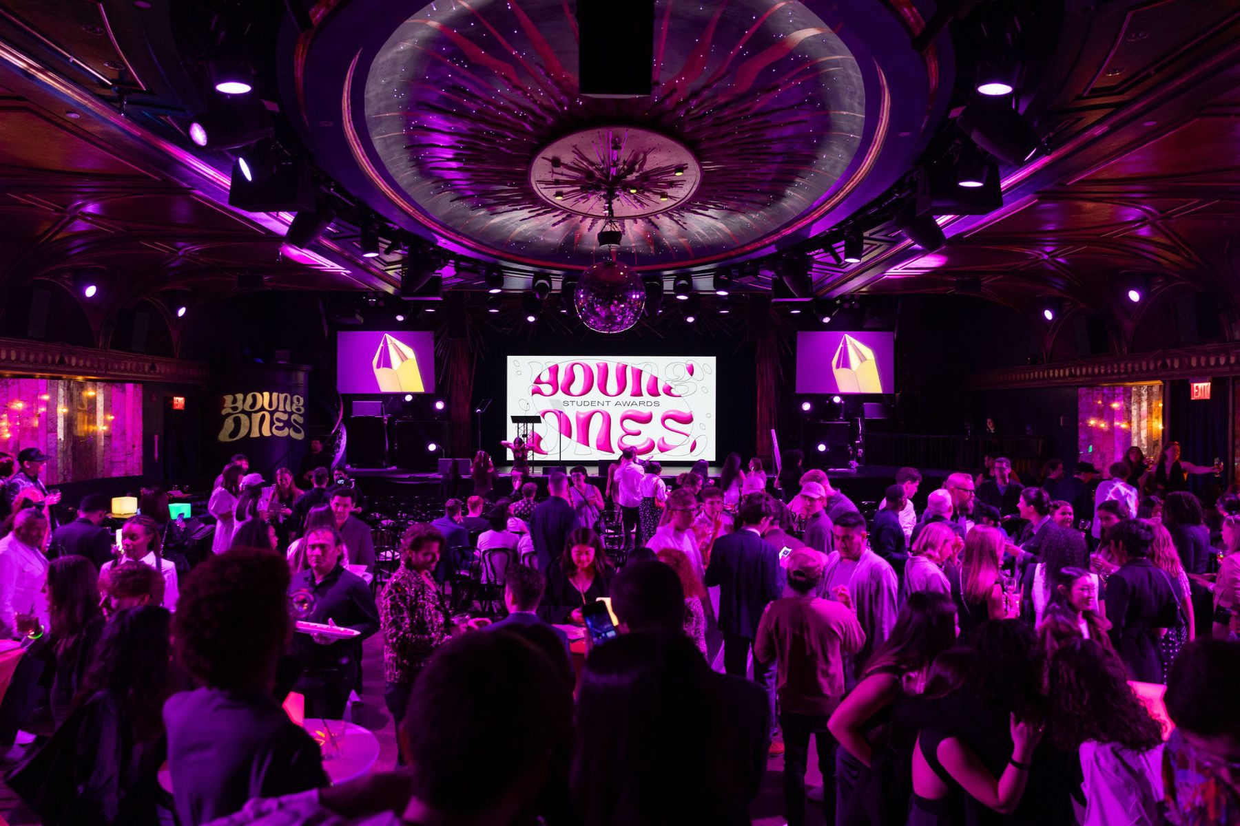
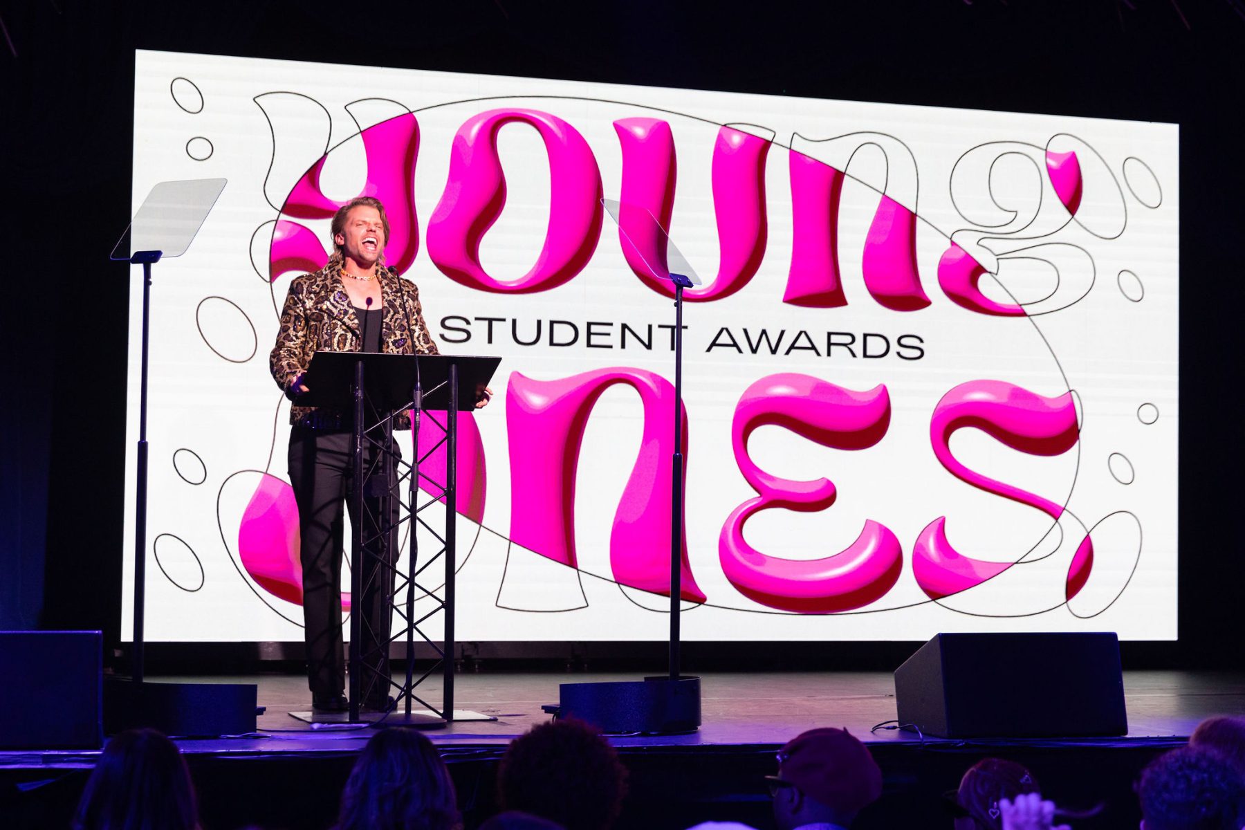
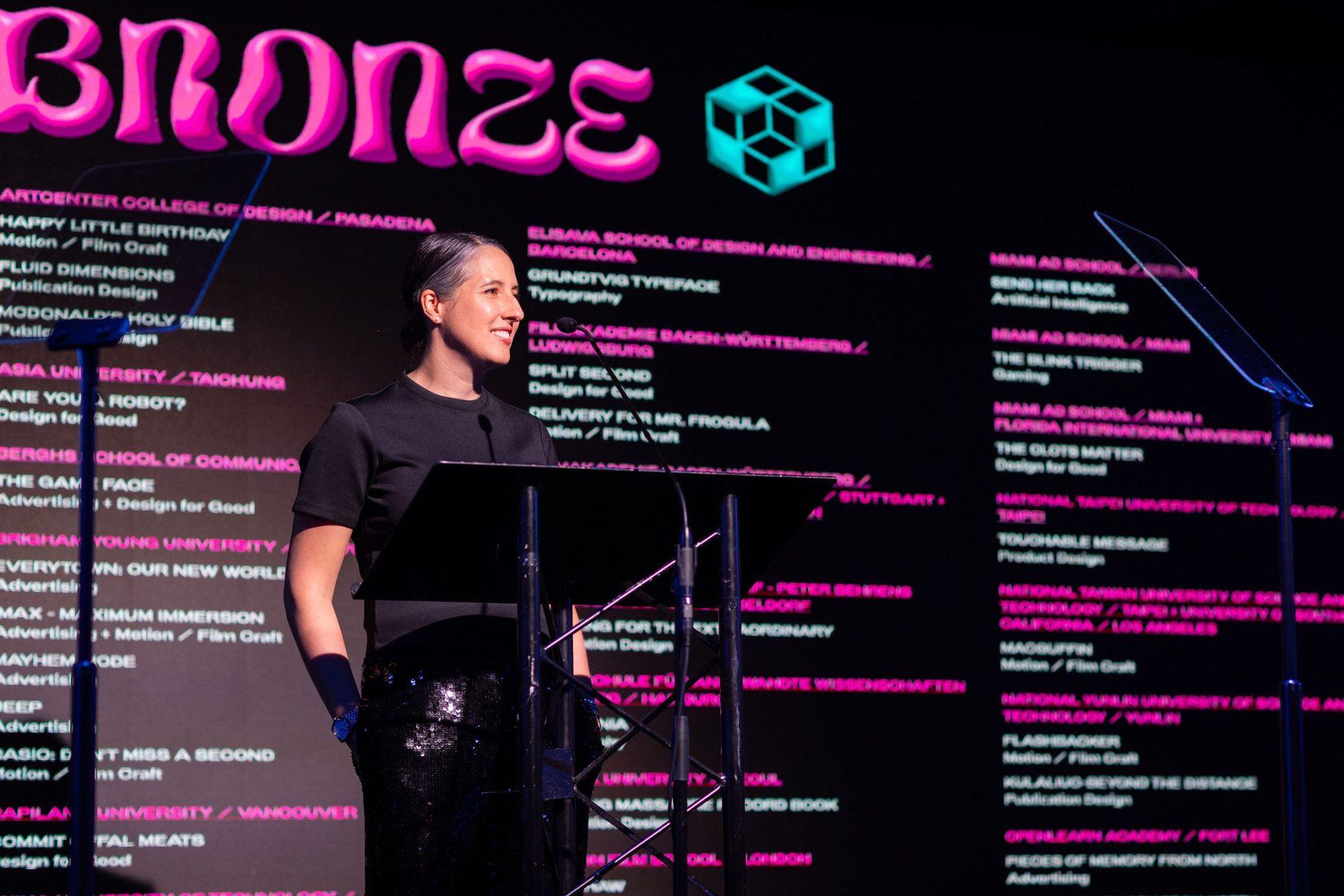
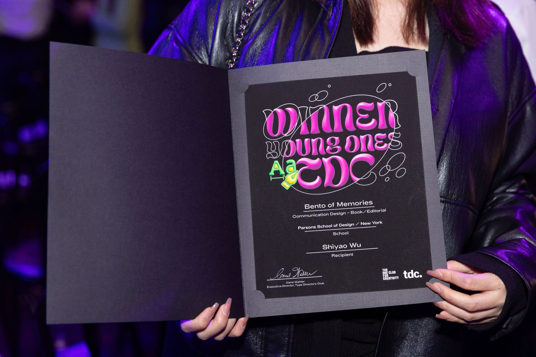
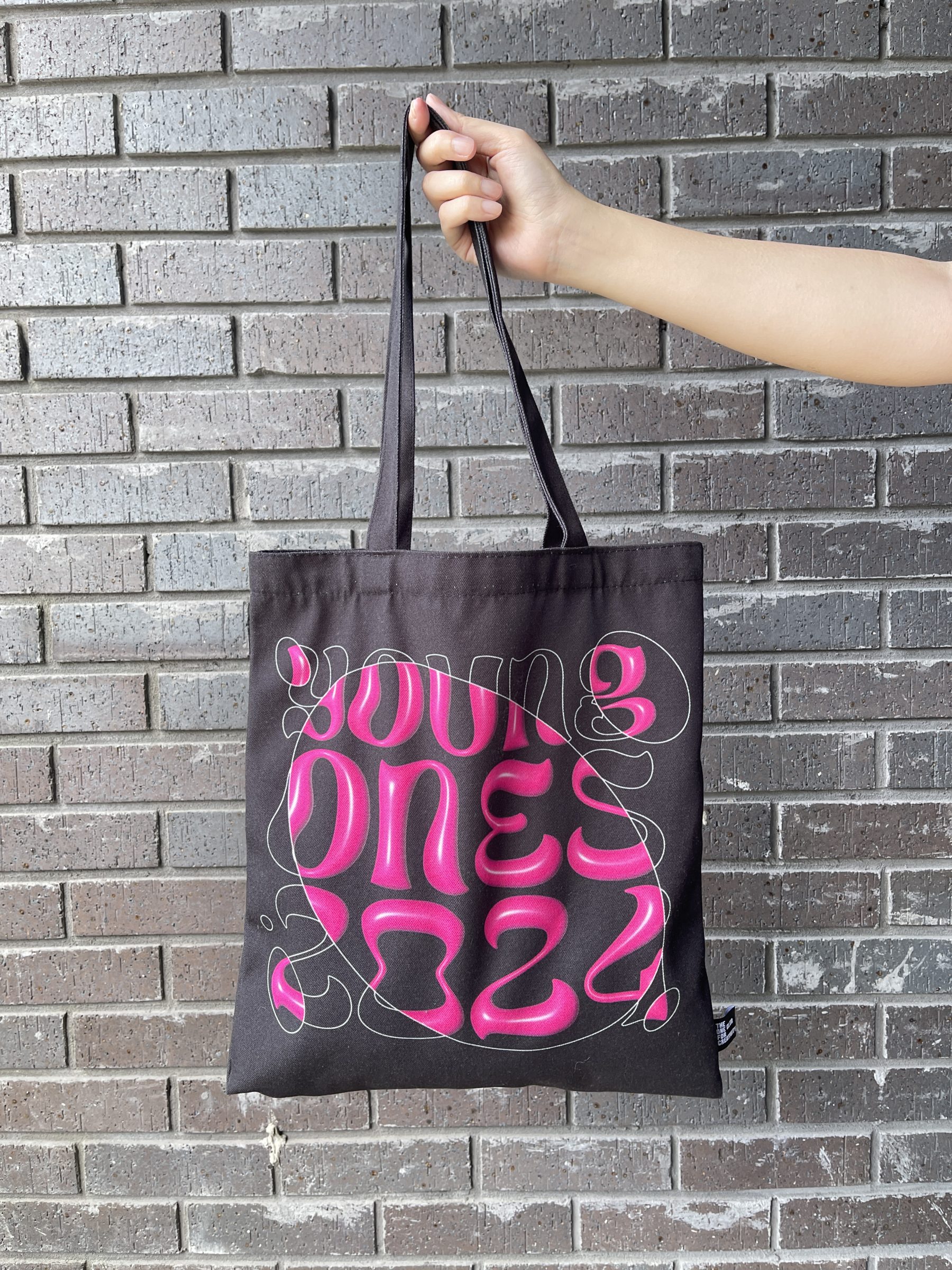
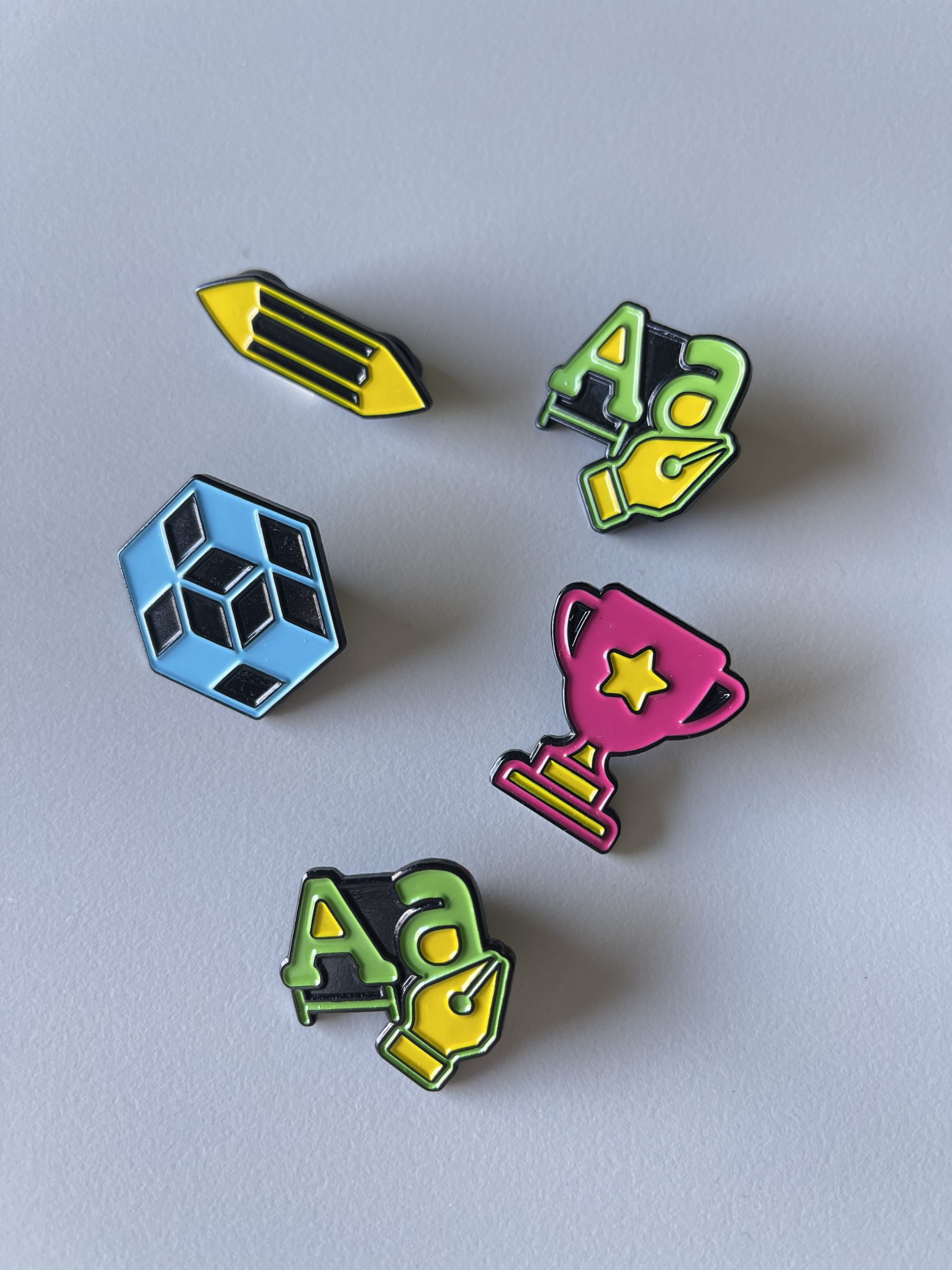
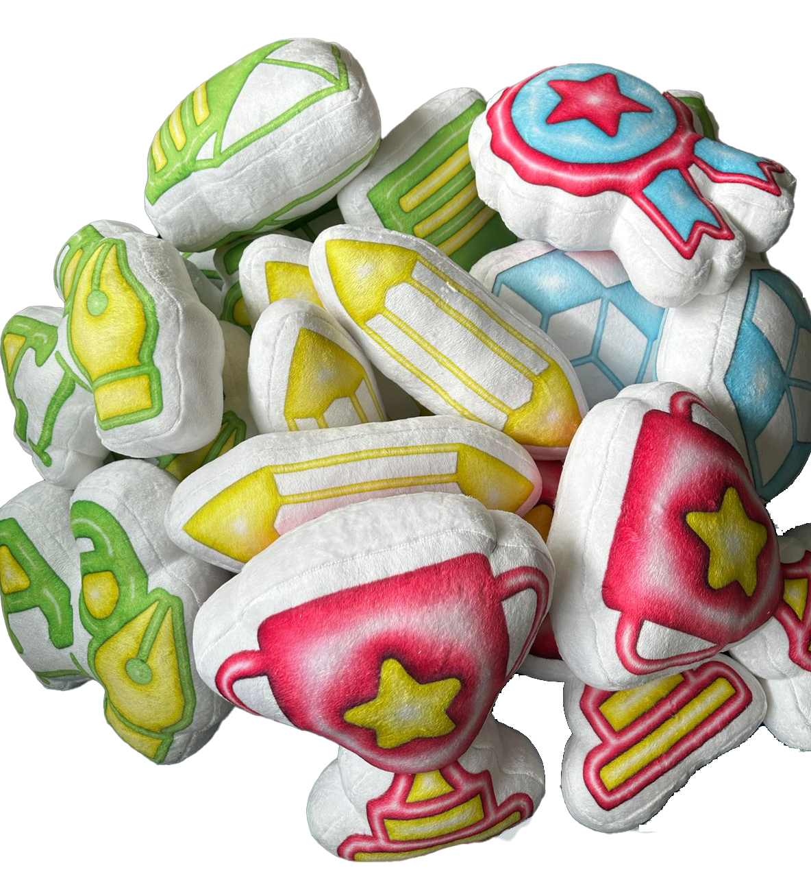
The Young Ones is The One Club for Creativity’s premier competition for students and recent graduates, spanning four unique contests: Young Ones ADC, One Show, Portfolio, and TDC. This global platform challenges emerging creatives to showcase their best work and launch their careers.
This year’s branding highlights the evolution from concept to creation. We paired 2D linear sketches with 3D-rendered typography of the custom Young Ones logotype, brought to life with animated circular bubbles that reveal the final design—symbolizing the transformative journey of creativity.
To round out the visual identity, we designed custom icons for each competition, creating a bold and cohesive system for the Young Ones Awards. To celebrate the winners, we also created lovable plushies, enamel pins, and stickers, adding a playful touch to the celebration.
KUDOS Design Collaboratory
-
John Kudos
Creative Director -
Amanda Knott
Project Manager -
Fay Qiu
Lead Designer -
Owen Febiandi
Designer -
Imam Fadilah
Animator -
Reza Risnaldi
Animator


Black Homeownership Project
Center for NYC Neighborhoods
Capabilities
Focus Area
Client
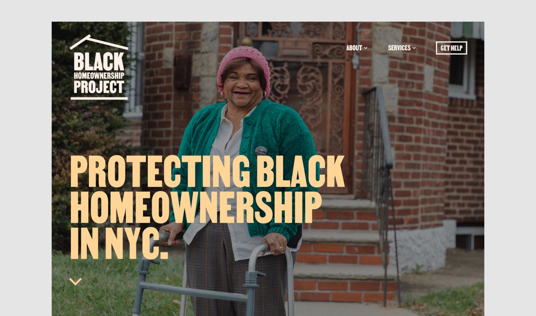
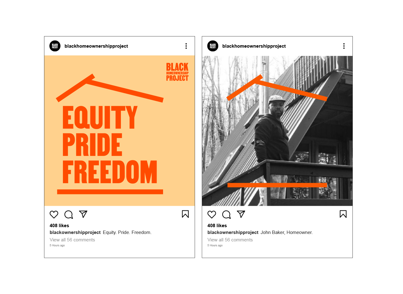
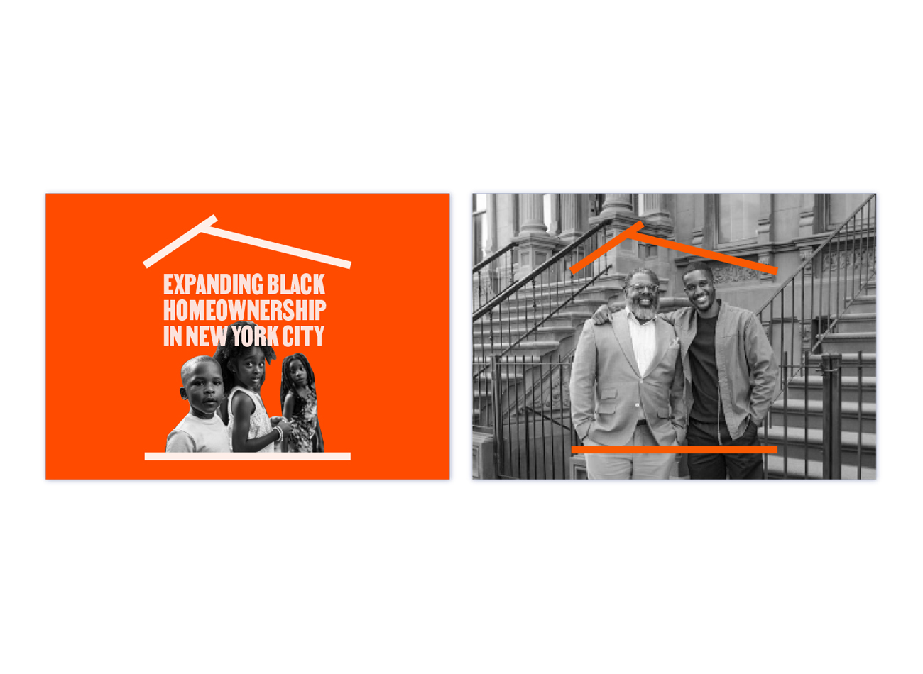
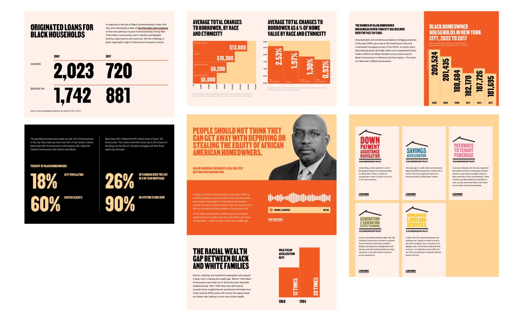
The Black Homeownership Project aims to expand and protect Black homeownership in NYC by connecting Black homeowners with expert local-housing counseling organizations and legal-services providers at no cost.
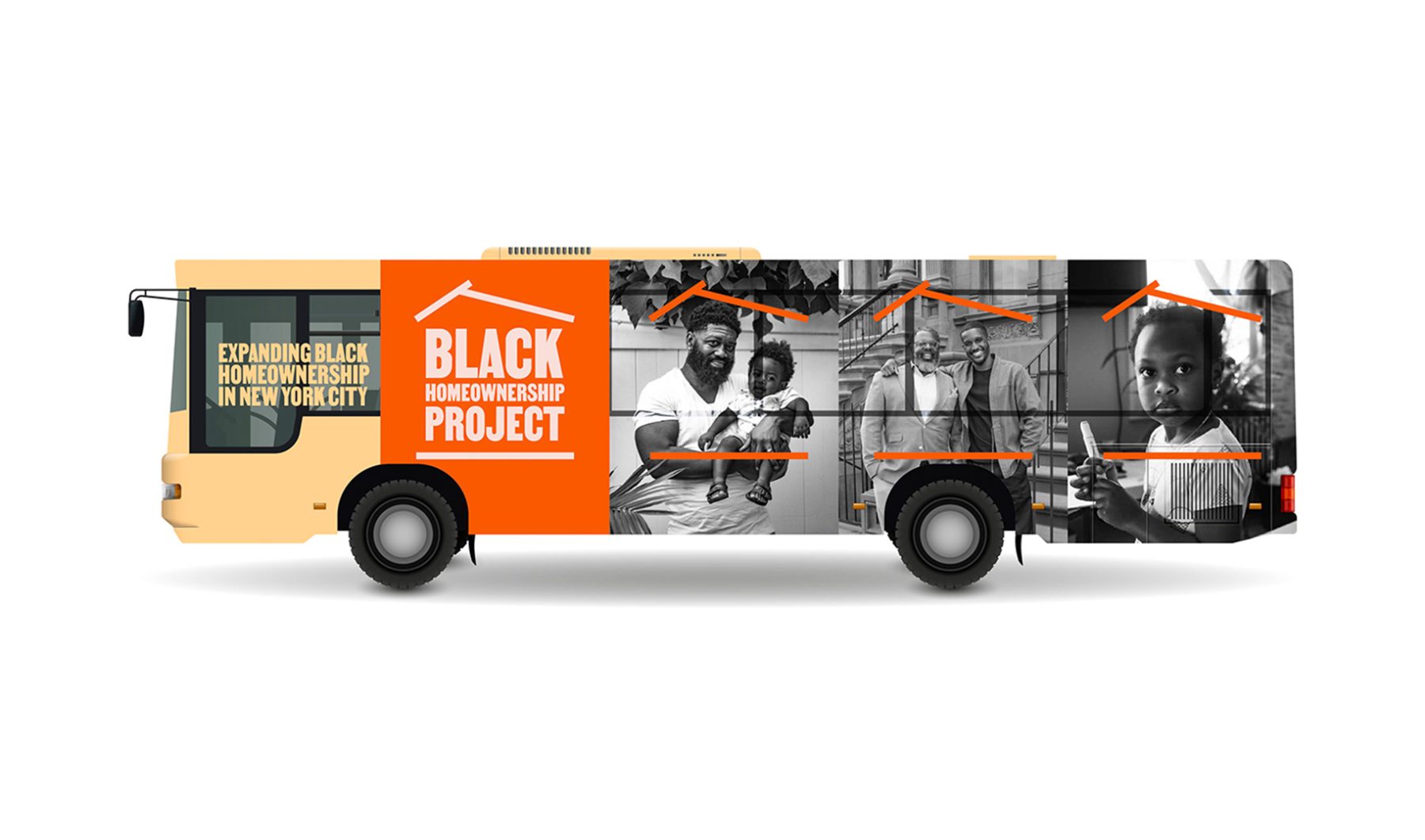
Our branding and website design aimed to embody the project’s mission of expanding access to homeownership opportunities for Black communities. The logo, featuring a rooftop graphic housing the logotype, symbolizes the initiative’s commitment to providing more homes for Black individuals. With a vibrant orange palette and a visual language characterized by simplicity, approachability, and trustworthiness, the branding reflects the project’s values of empowerment and innovation, resonating with a diverse audience and inspiring aspirations for homeownership.
KUDOS Design Collaboratory
-
John Kudos
Creative Director -
Fay Qiu
Designer -
Owen Febiandi
Designer -
Putu Yogiswara
Designer -
Amanda Knott
Project Manager

Boston Lyric Opera Season Artworks
Boston Lyric Opera
Capabilities
Focus Area
Client
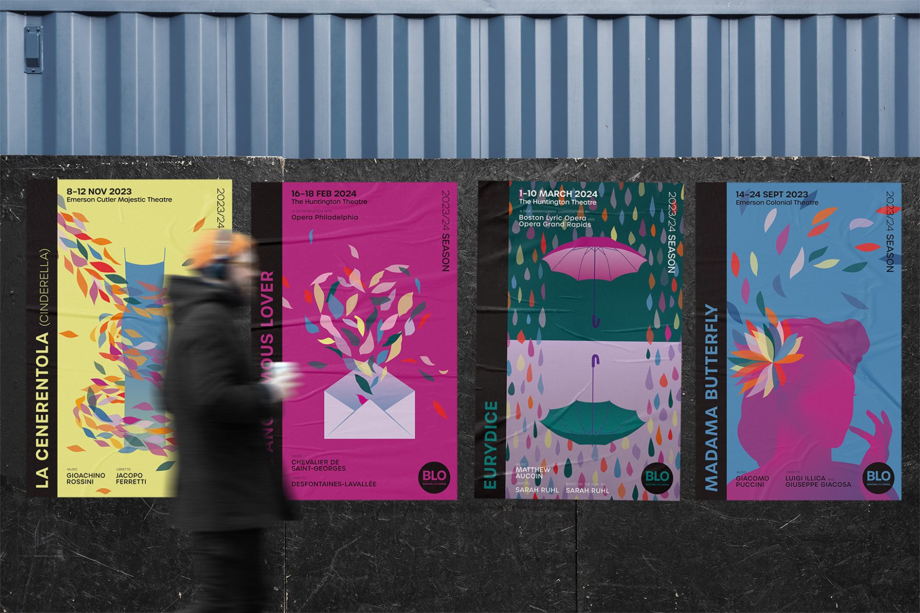
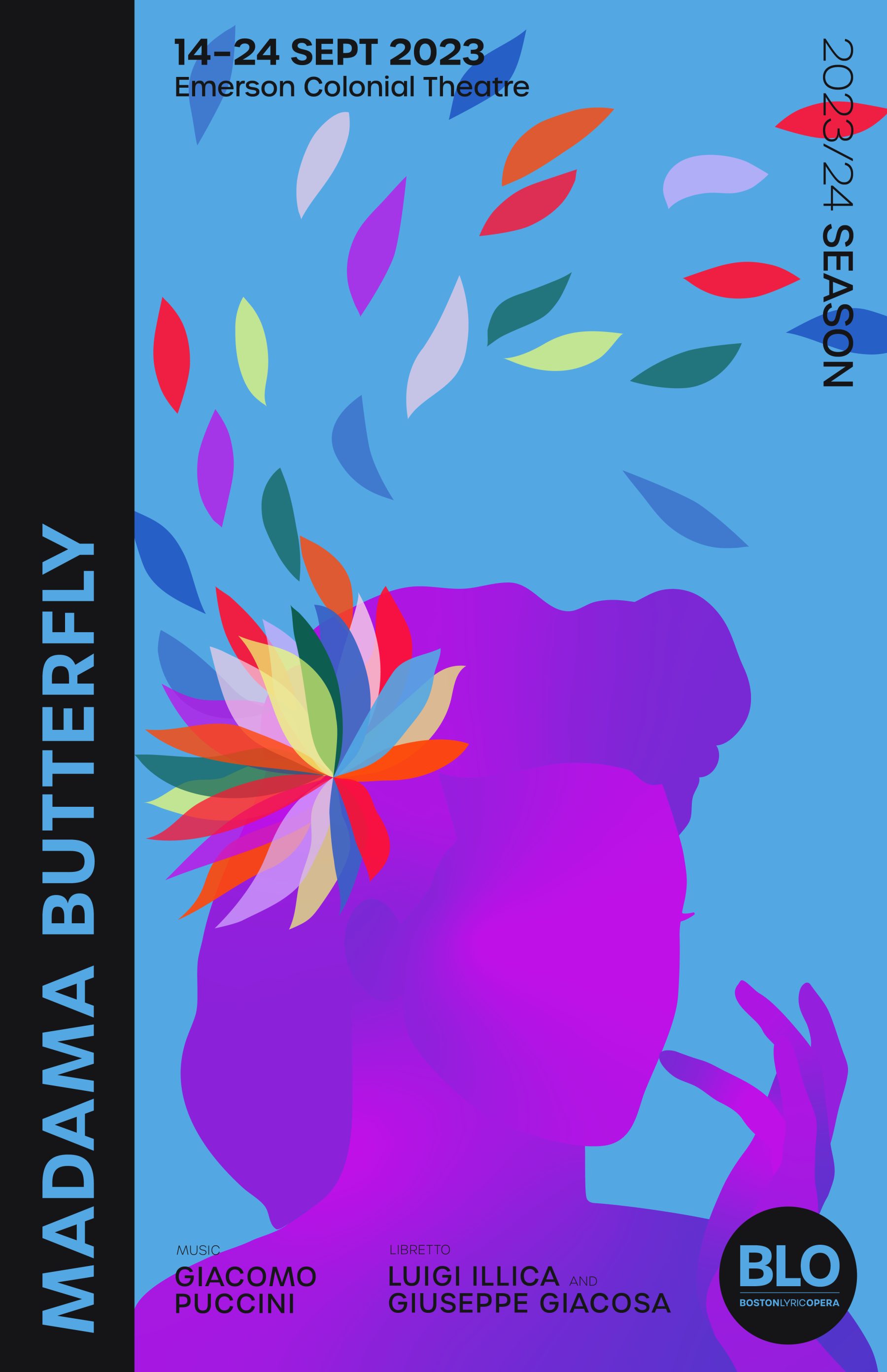
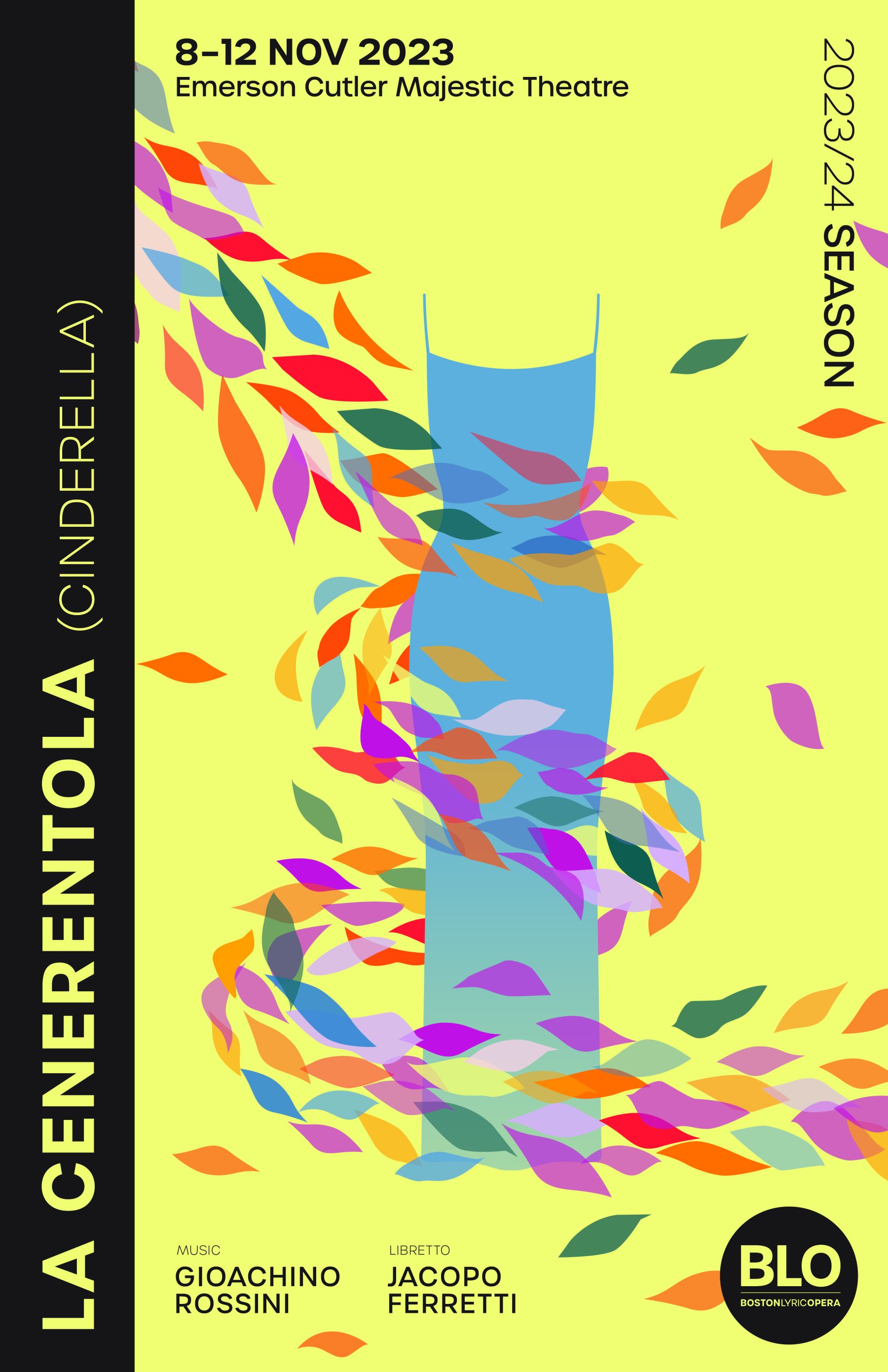
Boston Lyric Opera’s mission is to inspire, entertain, and connect the community through compelling opera performances, programs, and gatherings.
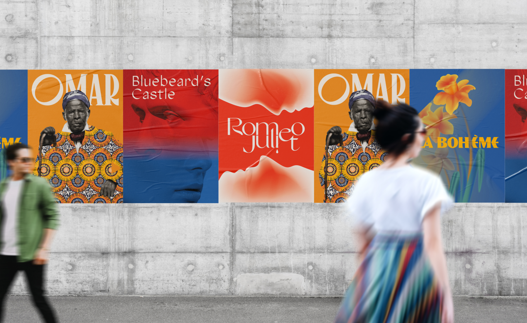
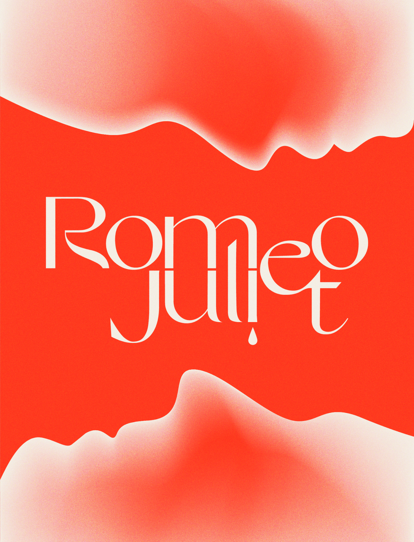
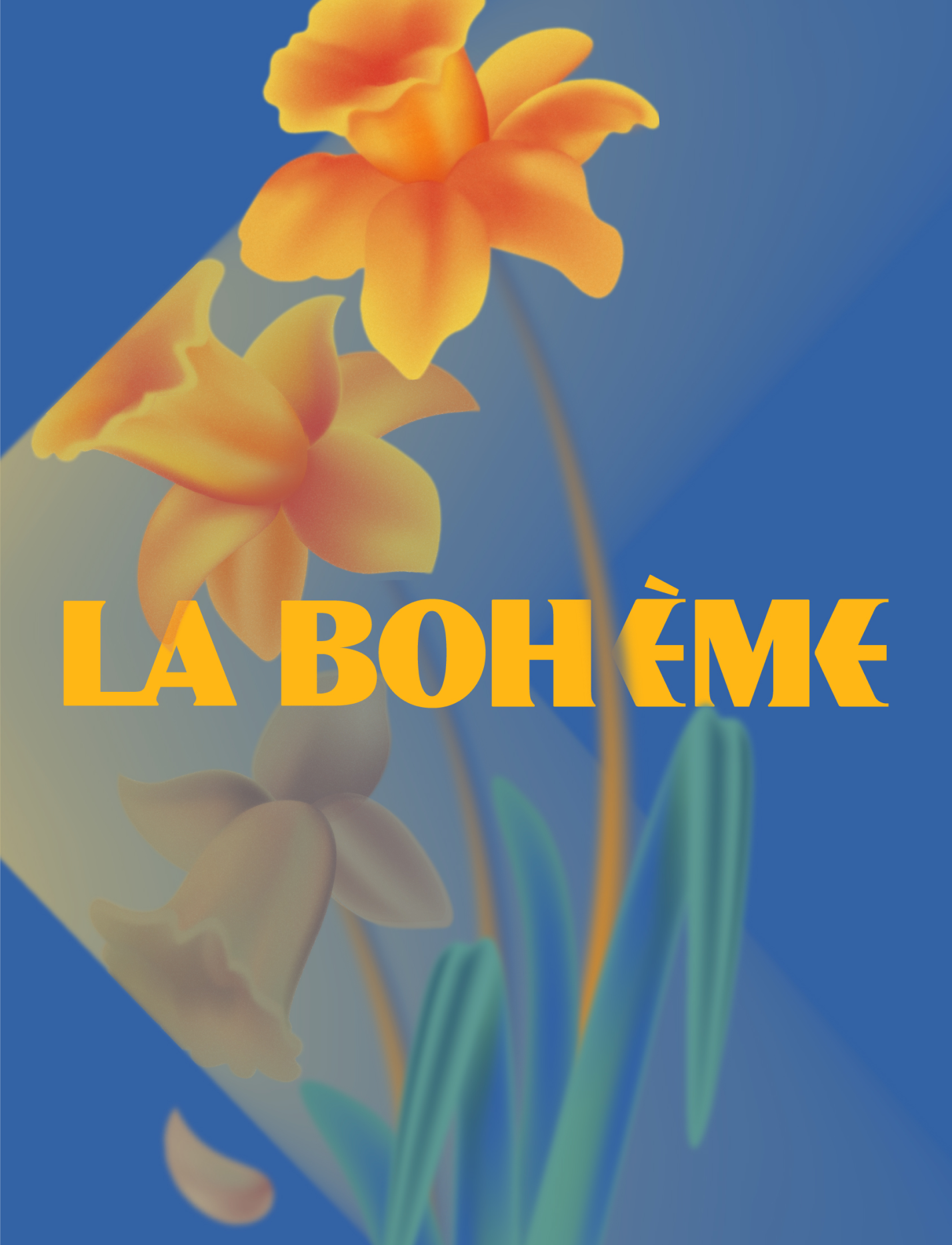
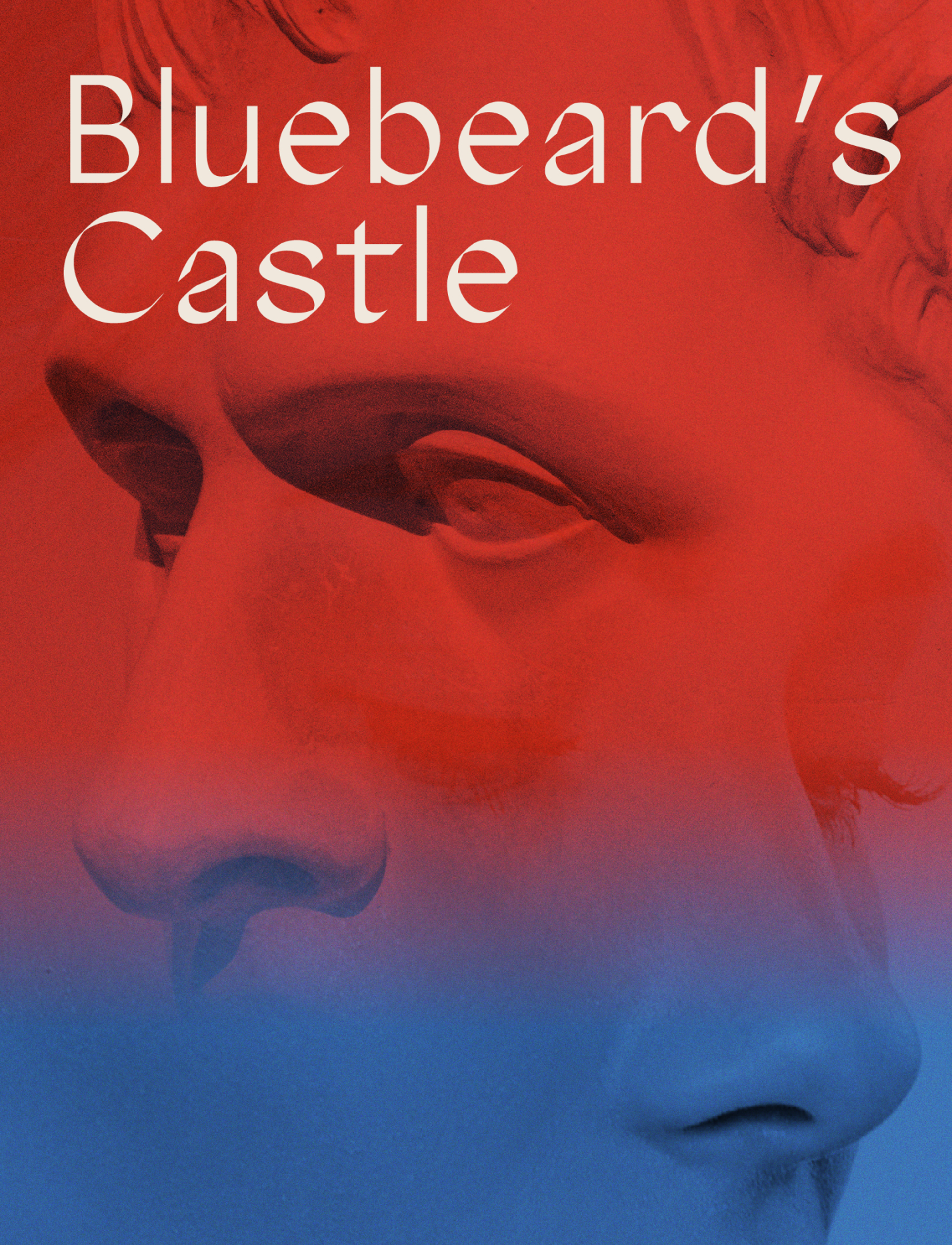
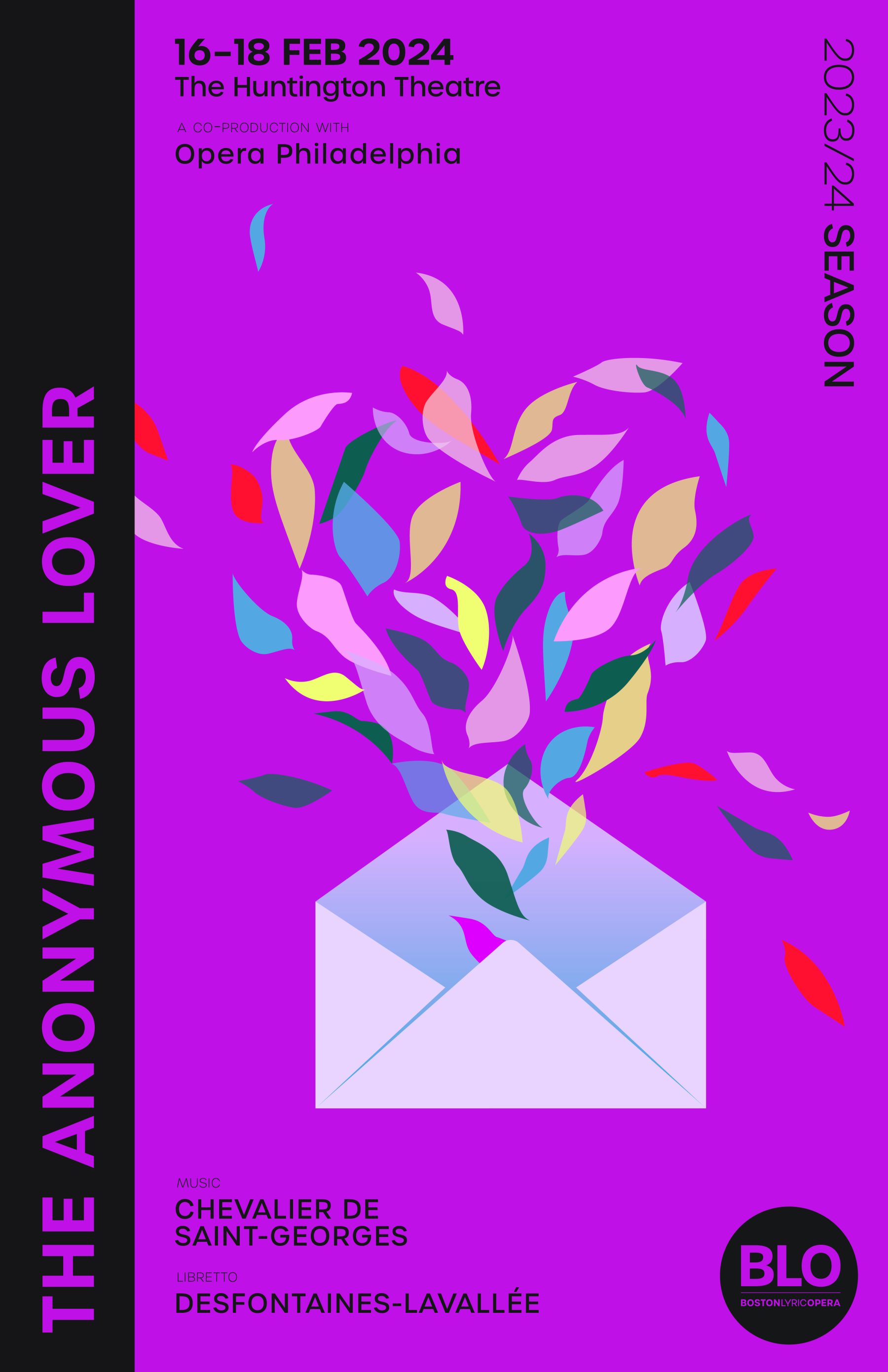
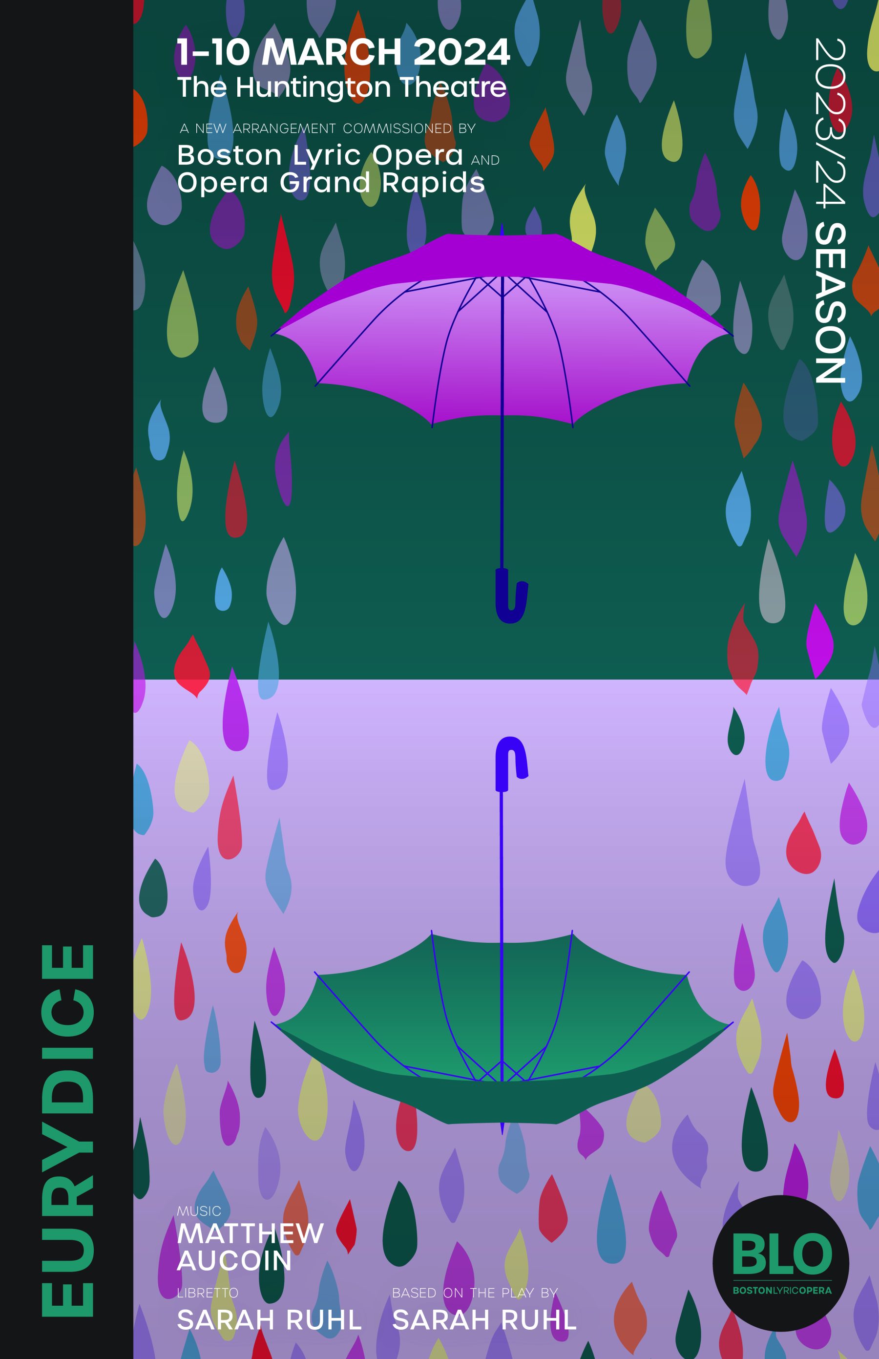
We were tasked with designing a cohesive visual branding system for the Opera and its 2022-23 and 2023-24 seasons, along with distinct concept art for each of four opera productions for each season. For the Opera as a whole, our brand refresh included the creation of a new BLO logo and typeface. For each production, we developed a unique typography language and matching color palette, as well as design elements reflecting their distinctive themes and concepts.
KUDOS Design Collaboratory
-
John Kudos
Creative Director -
Jamus Marquette, Imam Fadilah, Owen Febiandi, Fay Qiu, Jennifer Wiriawan, Putu Yogiswara, Andini Pratiwi, Irpan Alfian
Designer -
Amanda Knott, Robi Dafit
Project Manager -
Asha Adelia Rahayu, Rias Amalia
Illustrator -
Rias Amalia
Motion Designer -
Faris Han
Motion Developer
SwAA Branding & Website
Stand with Asian Americans
Capabilities
Focus Area
Client
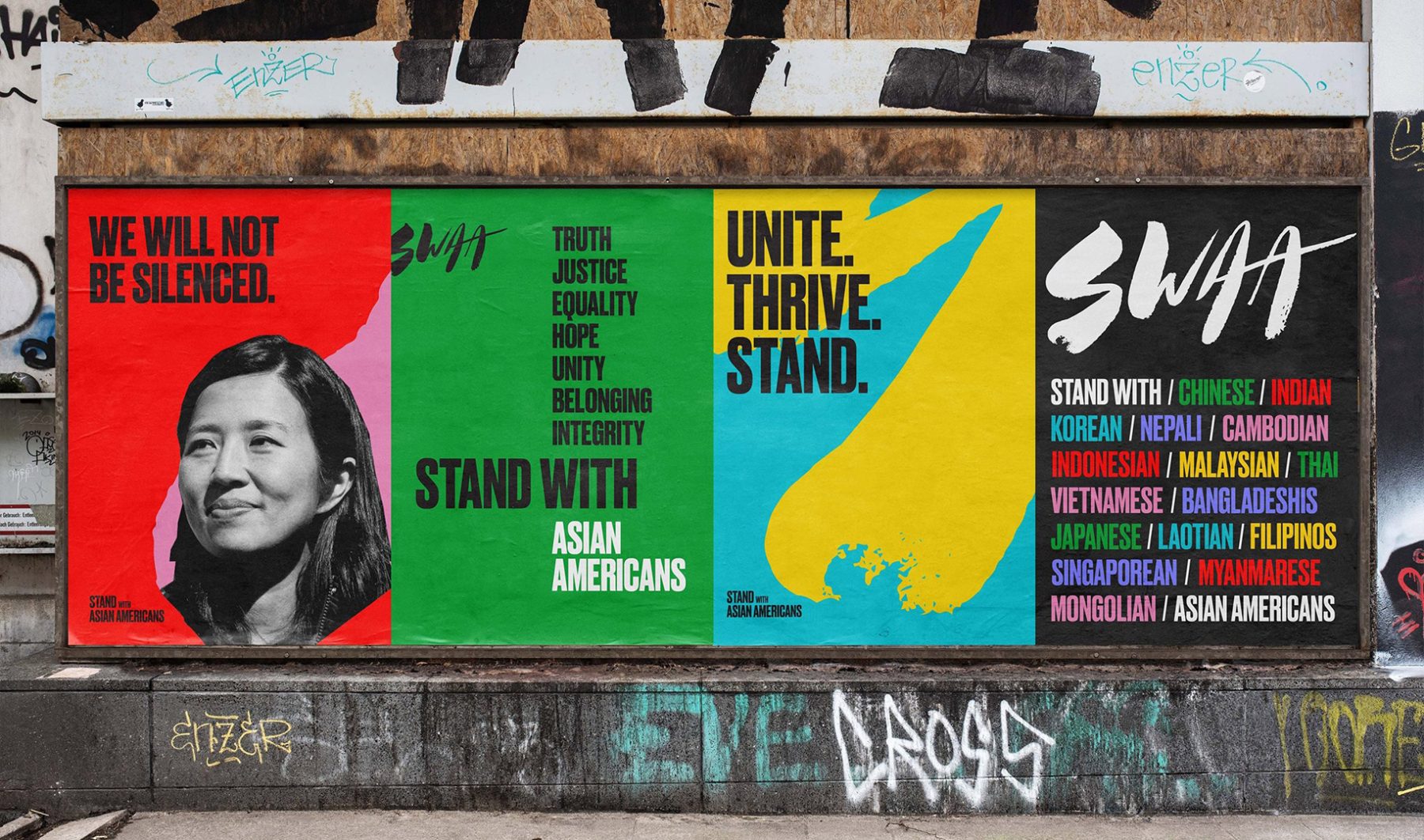
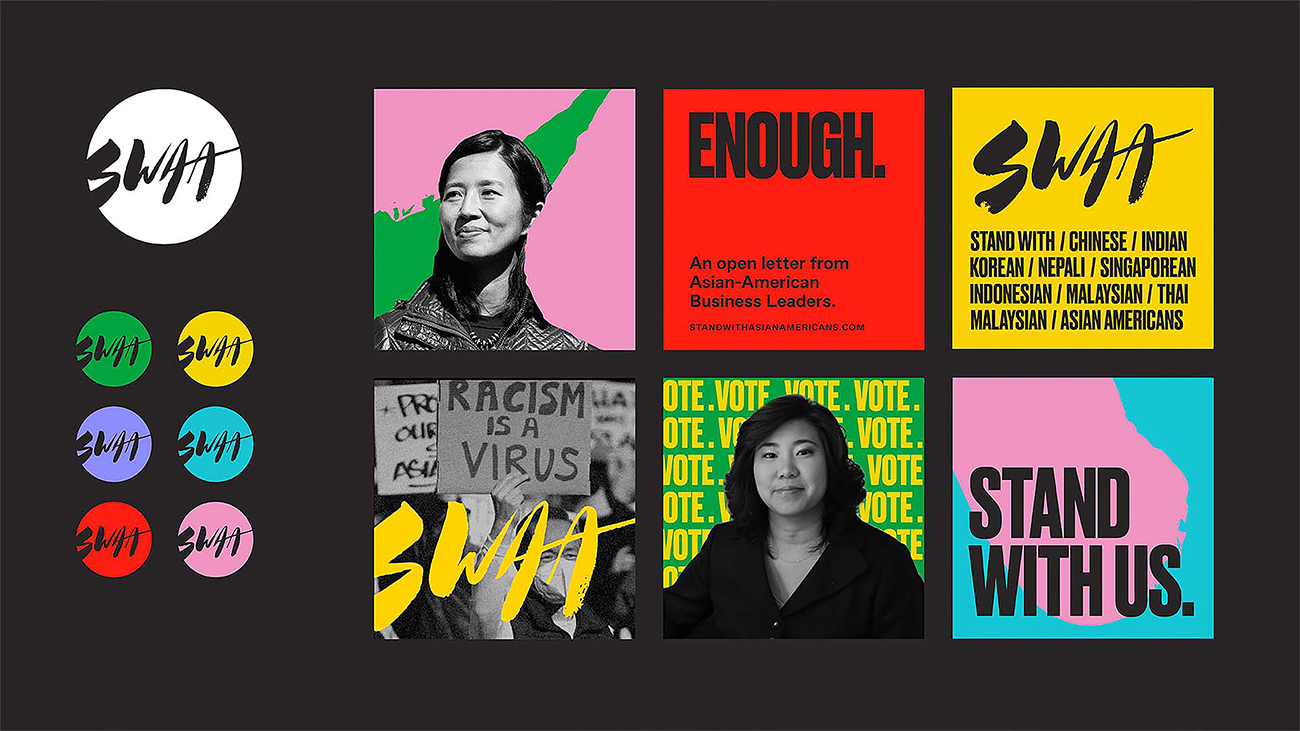
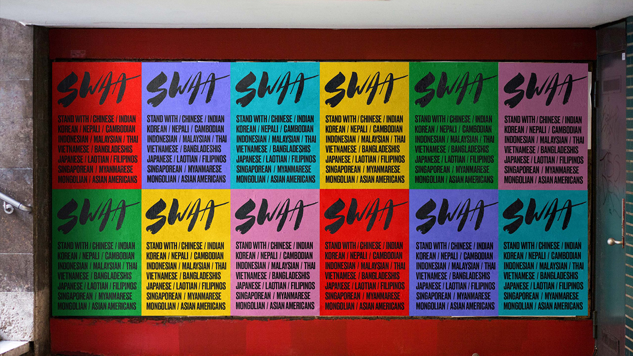
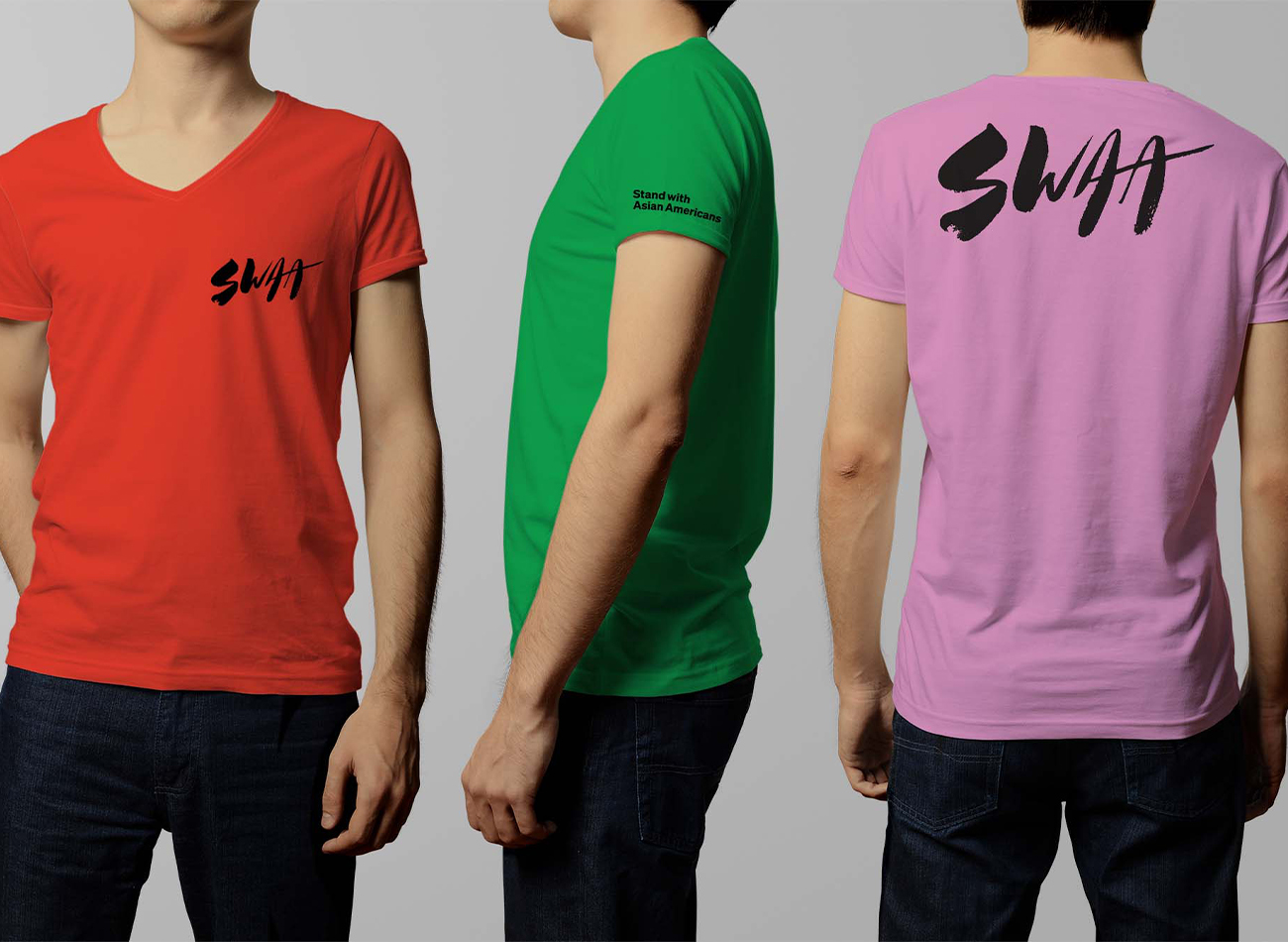
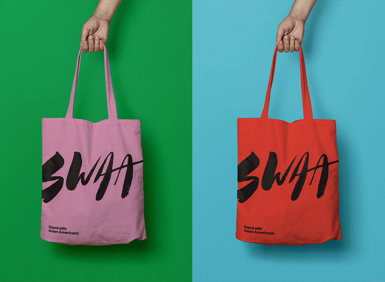
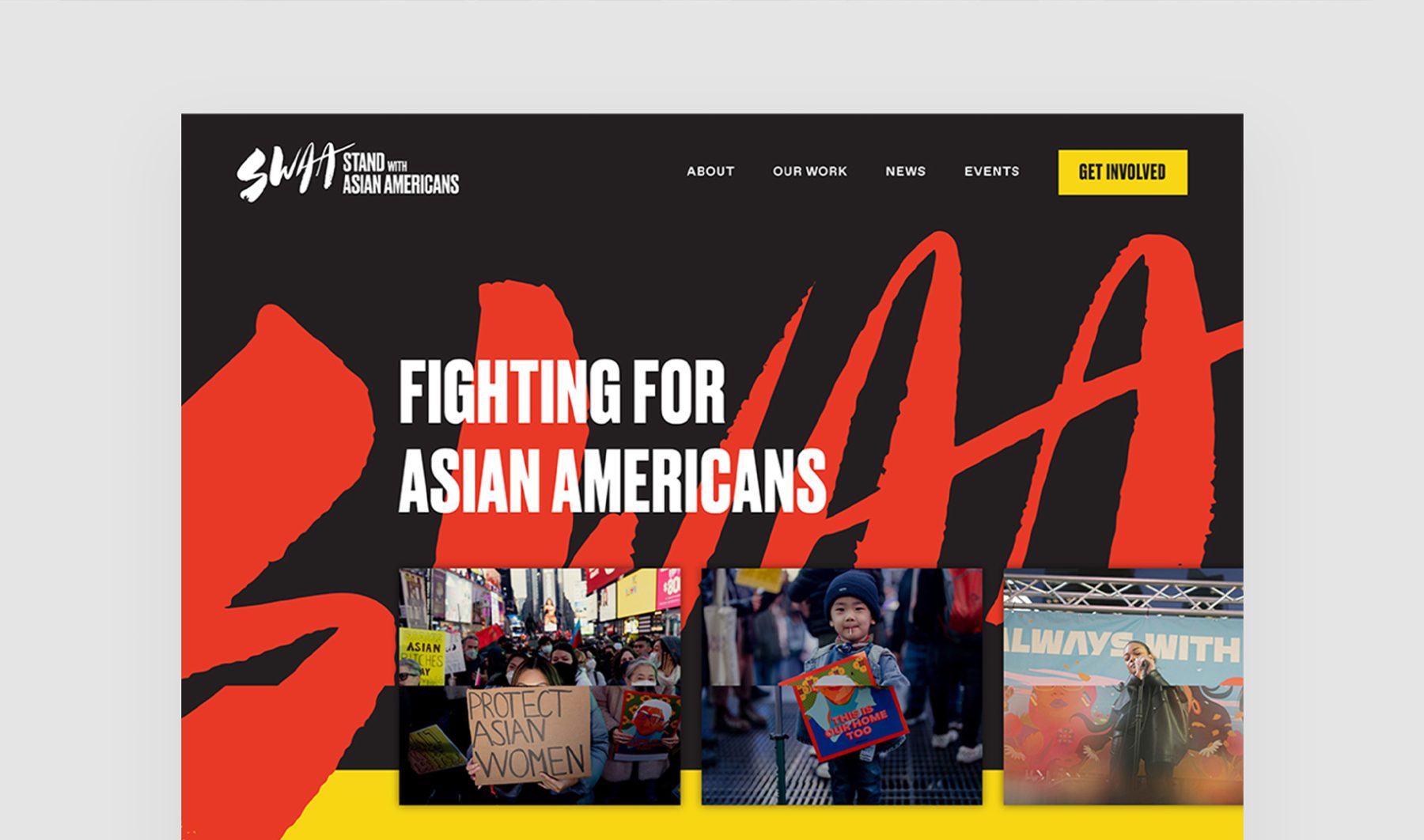
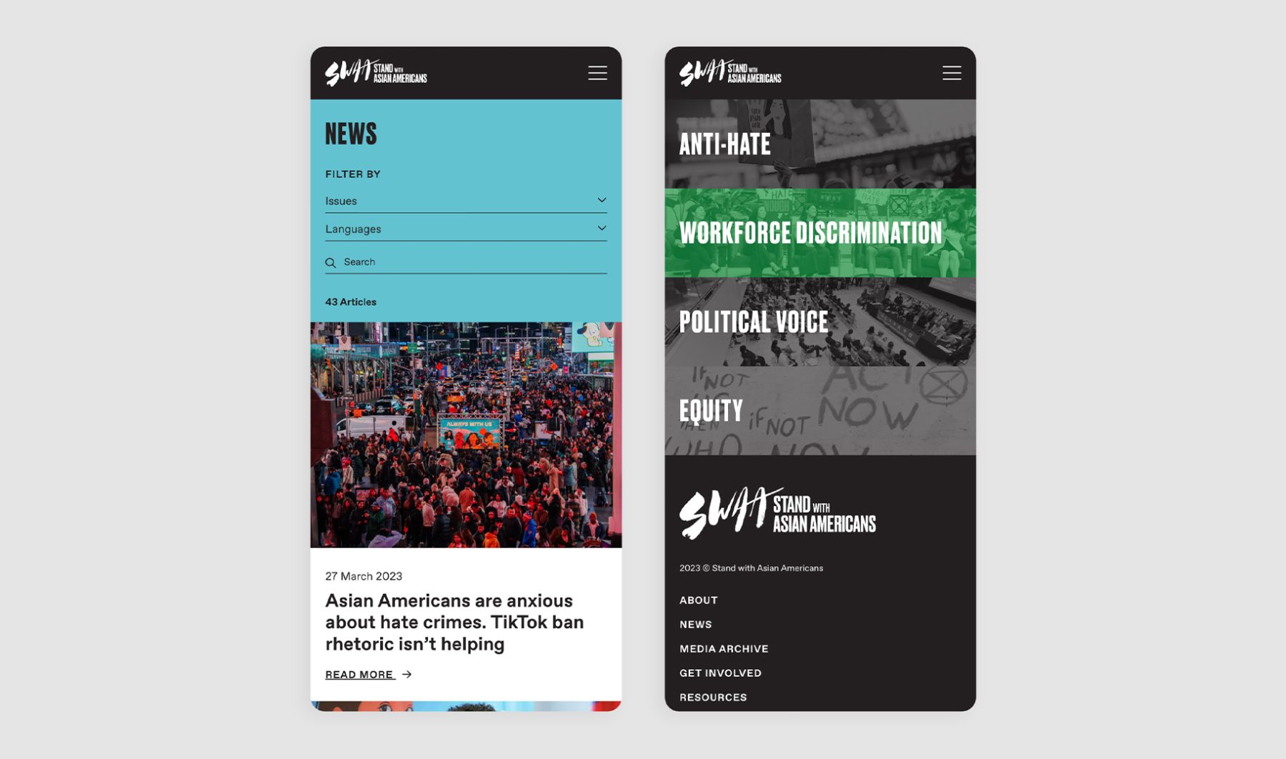
Stand with Asian Americans (SwAA) was established as the largest coalition of Asian American entrepreneurs, investors, and activists. KUDOS was tasked with developing comprehensive branding and a website for the organization.
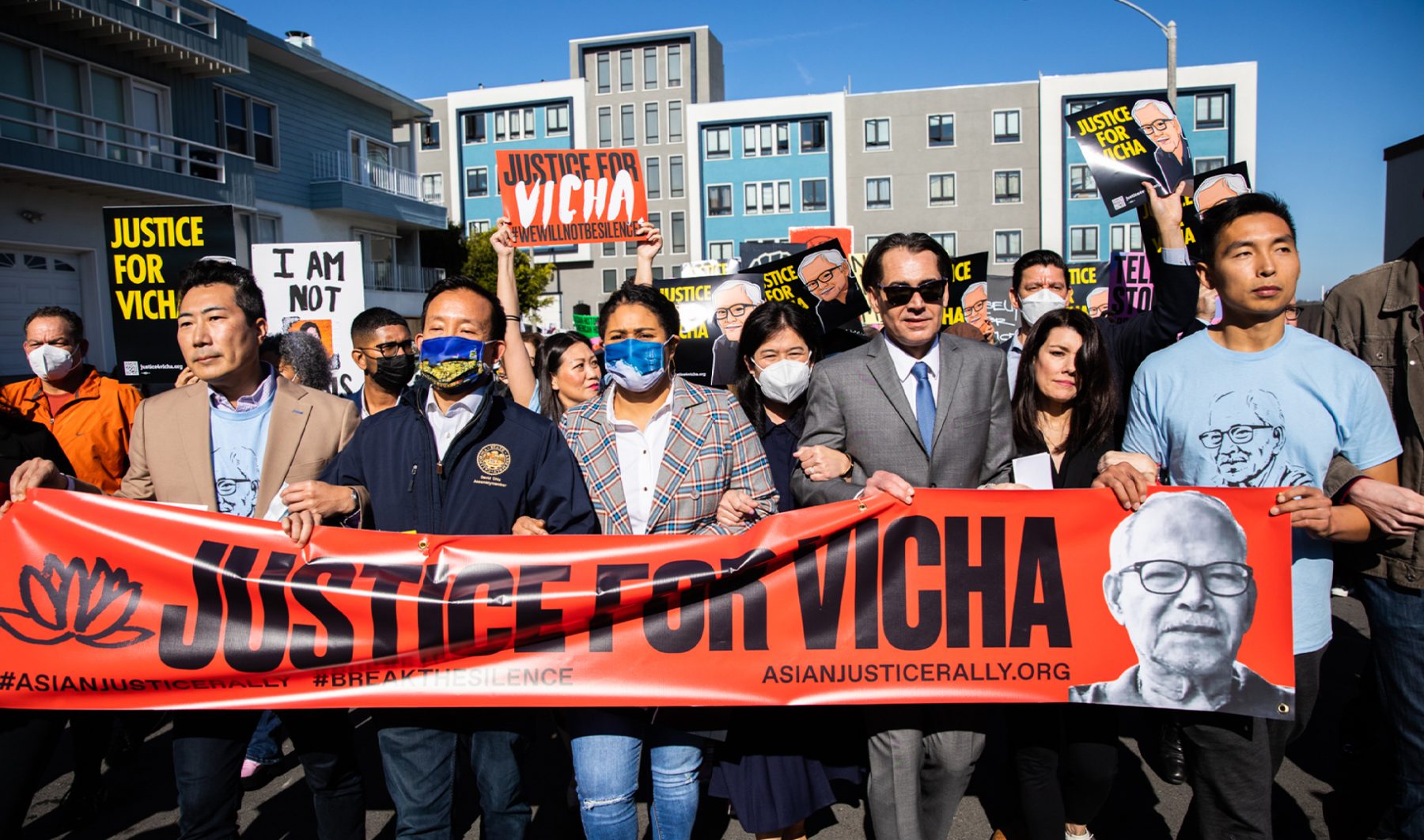
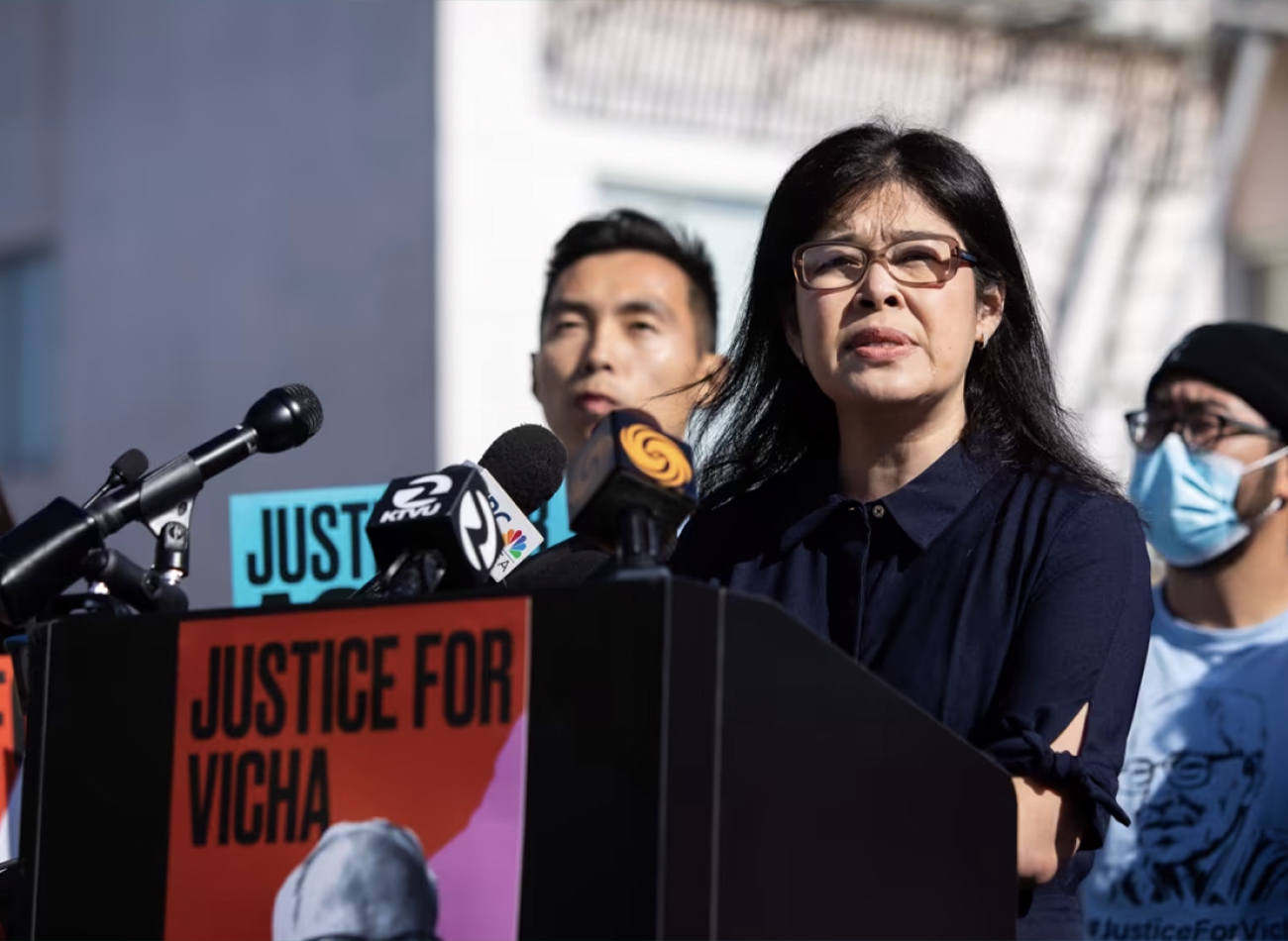
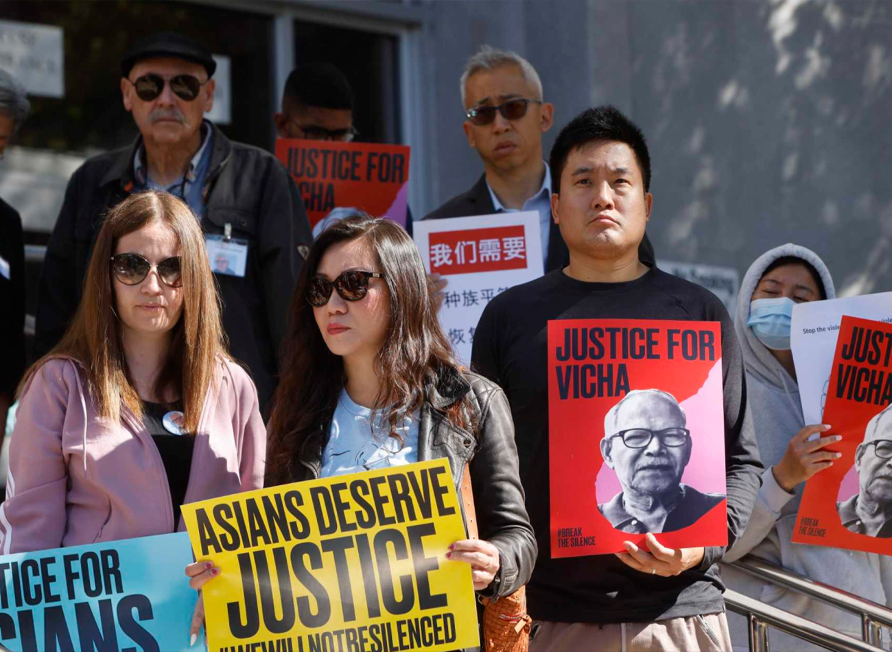
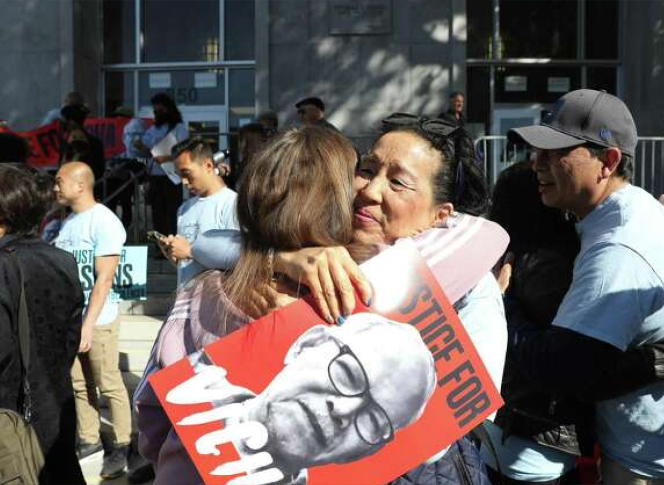
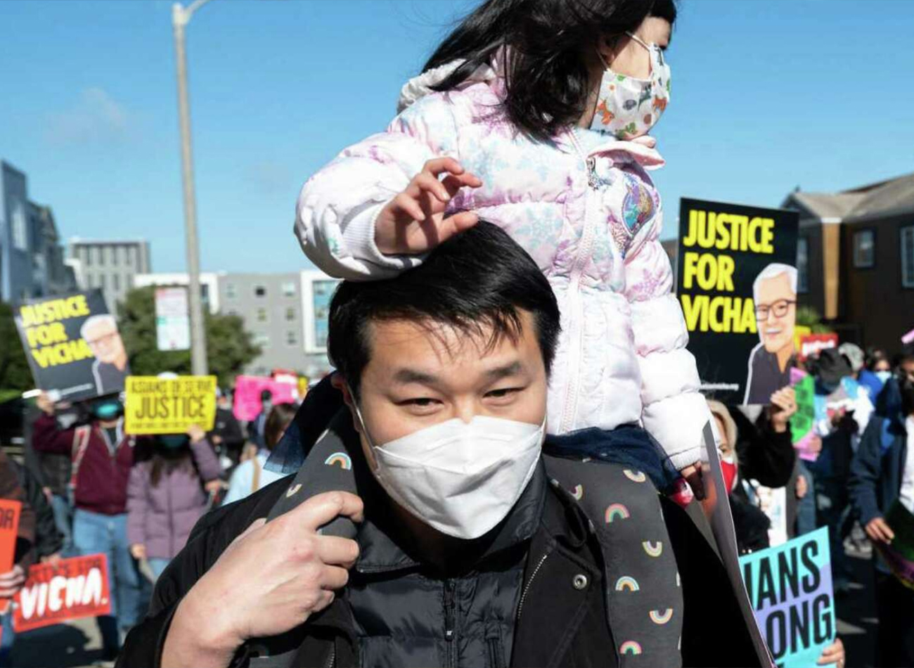
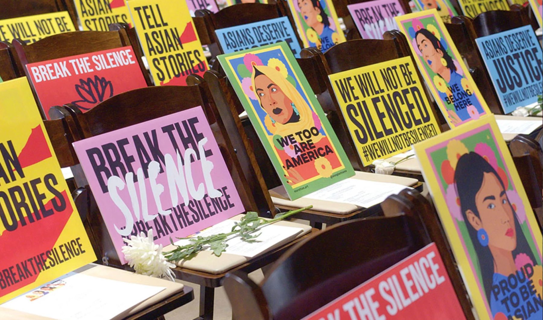
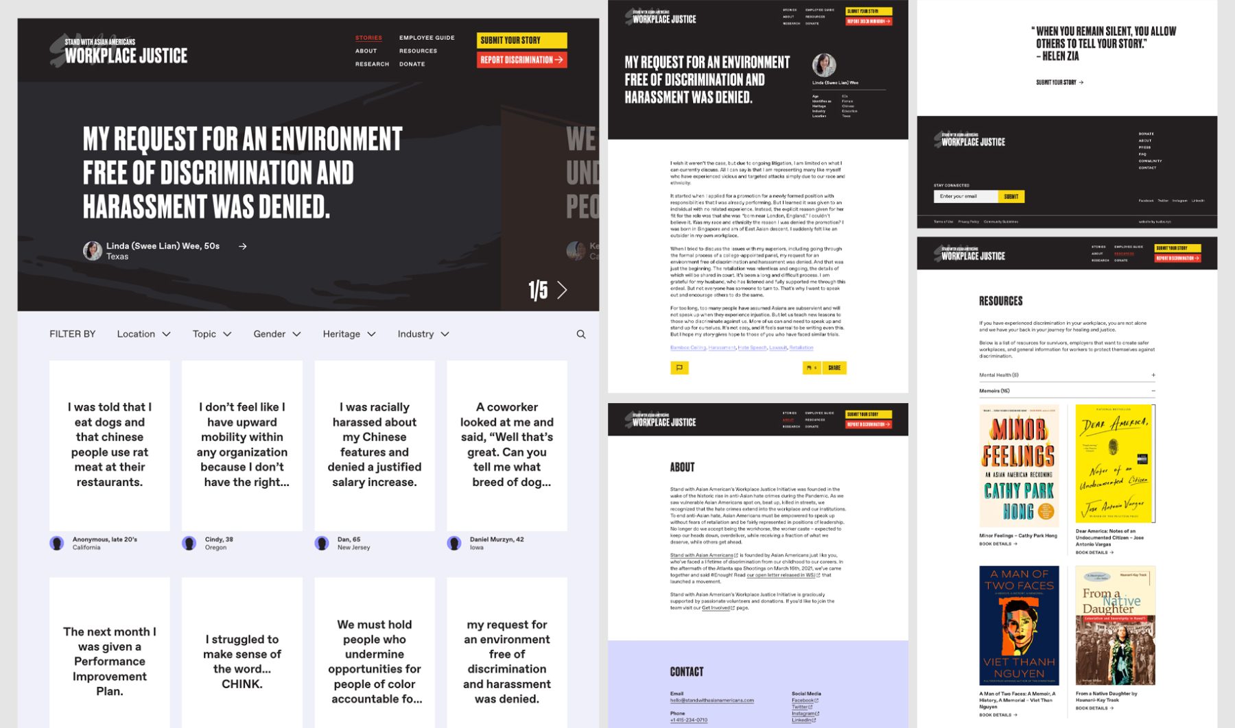
We achieved an iconic visual identity through experimentation with brushed lettering combined with a modern, dynamic, and progressive look. The resulting identity communicates a sense of urgency while avoiding alienation by maintaining an approachable, inclusive, and universal appeal. This branding was featured in Asian American Justice Rally posters and signage, the organization’s website, and a separate workplace-justice website that gave users the opportunity to share personal stories of workplace discrimination. In our website design, we also utilized animation to express unity among diverse ethnicities.
KUDOS Design Collaboratory
-
John Kudos
Creative Director -
Amanda Knott
Project Manager -
Jamus Marquette, Fay Qiu, Owen Febiandi
Designers -
Chris Manlapid, Christian Juniady Setiawan
Web Developers
Legal Information Institute
Cornell University School of Law
Capabilities
Focus Area
Client
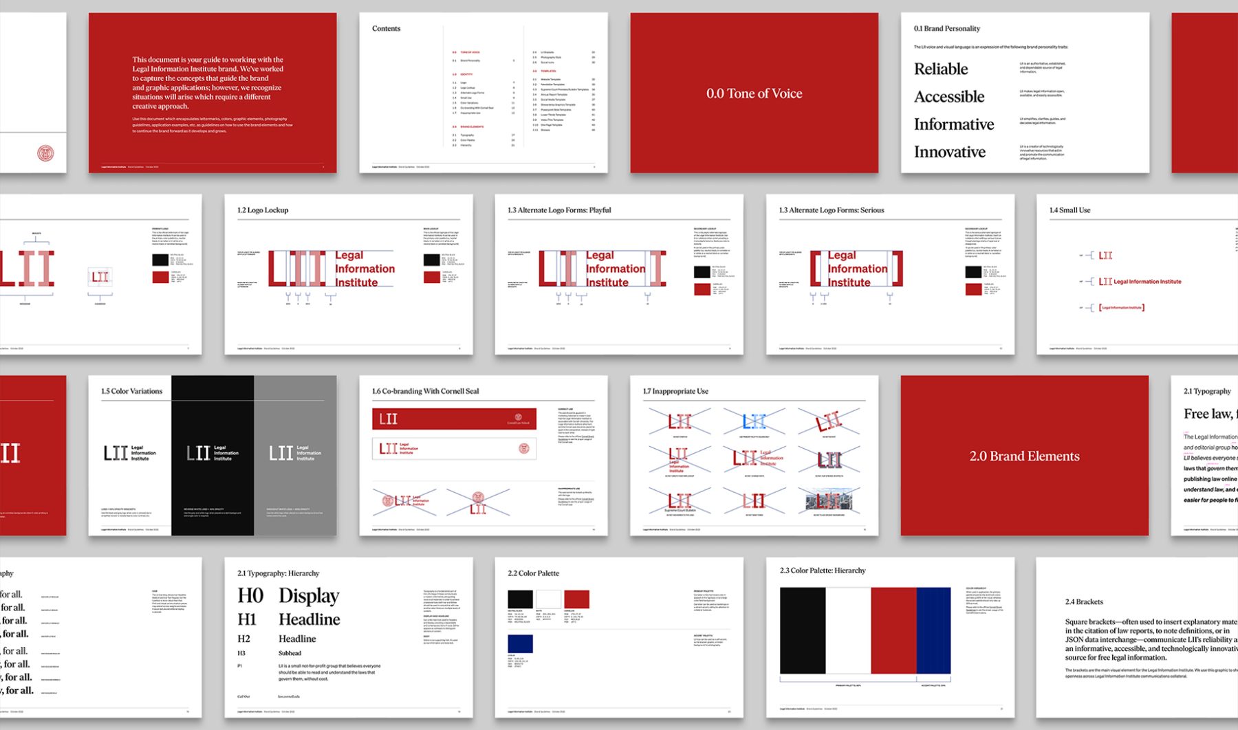
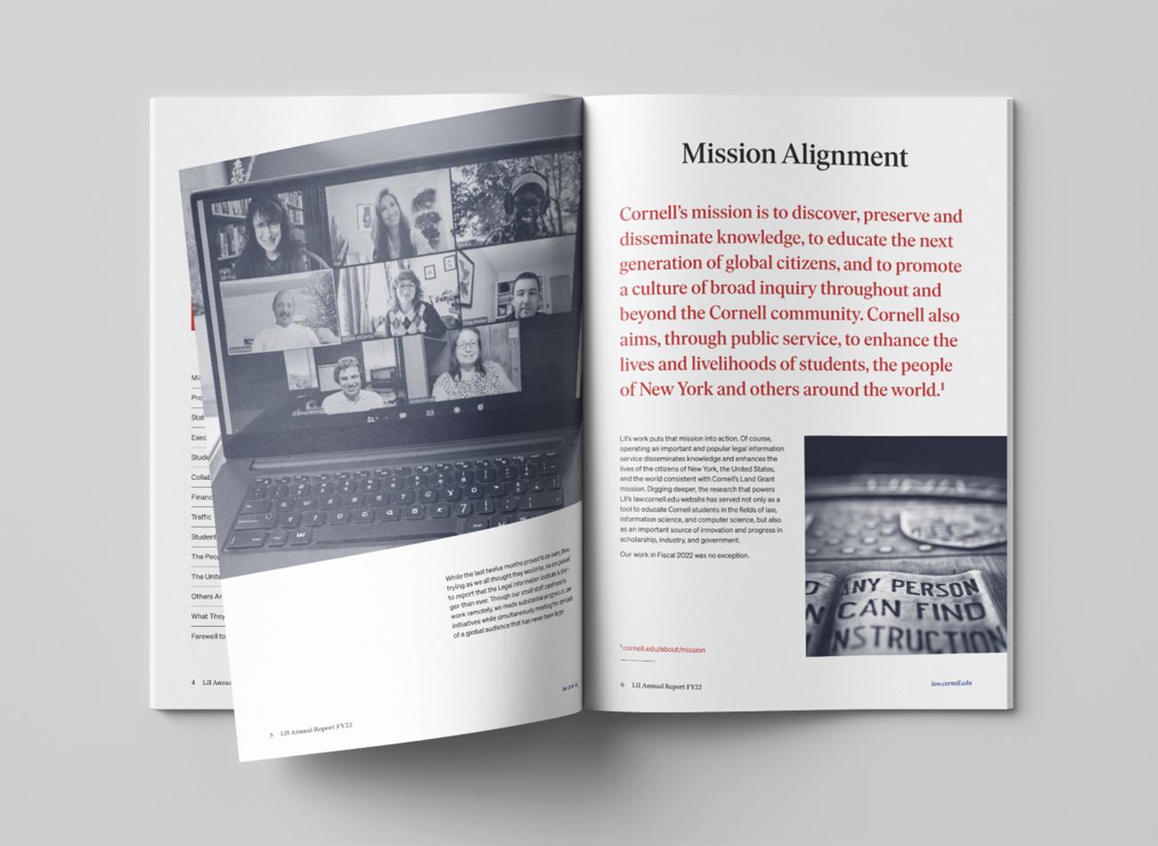
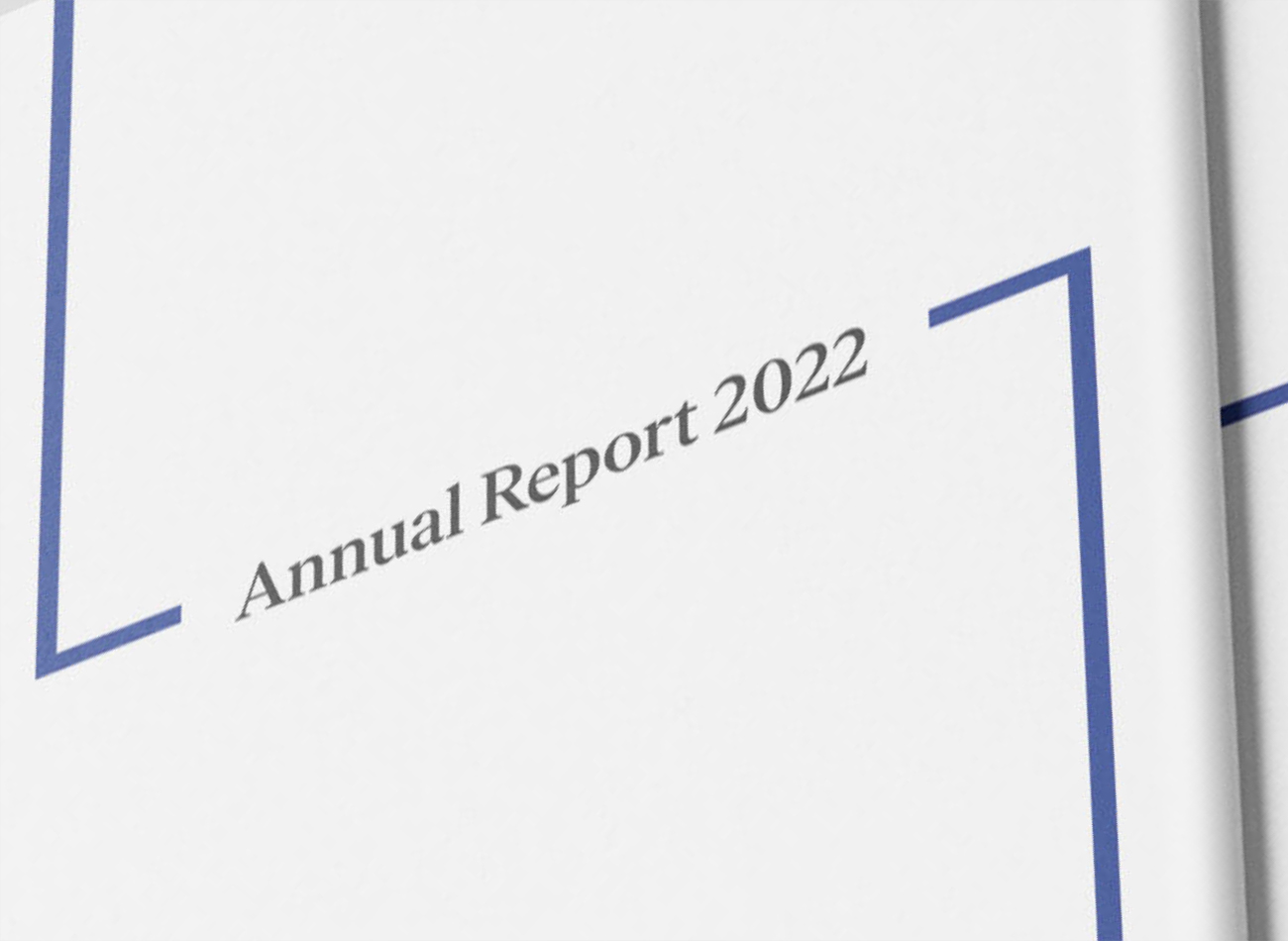
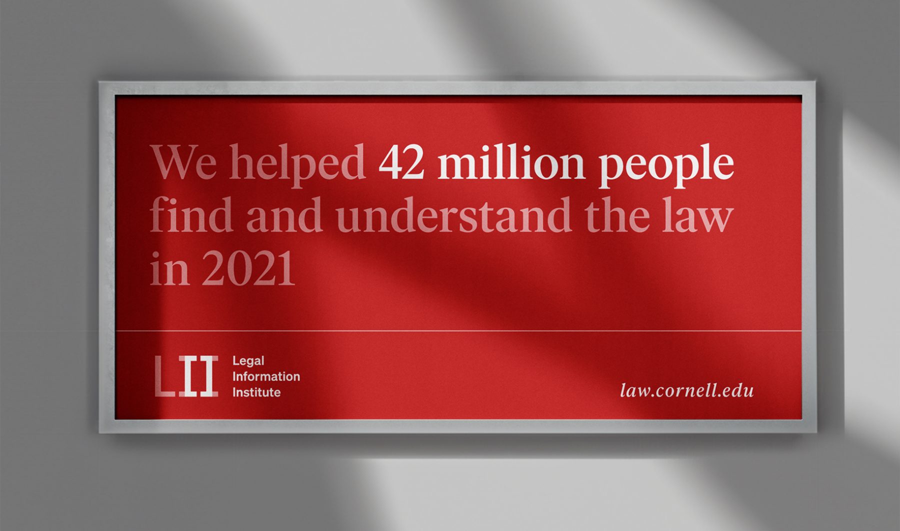
The Legal Information Institute (LII) is a small, semi-autonomous nonprofit organization within Cornell University. It provides free access to legal information to over 30 million people annually through a university-hosted website (law.cornell.edu) and focuses on making the law more accessible through technology. We were tasked with designing a comprehensive brand identity for the LII, aimed at aligning the organization’s brand with future goals, audience needs, and its relationship with Cornell.
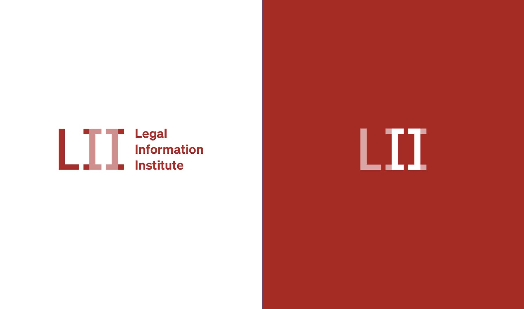
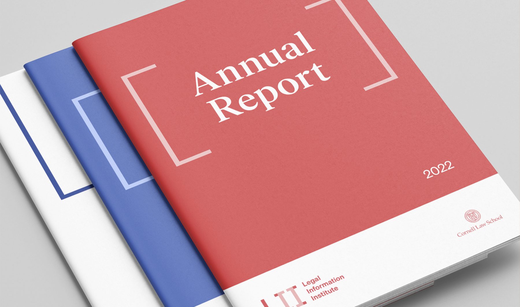
After first extensively researching and workshopping our branding strategy, we developed a new design system to define the LII brand across its various platforms. Incorporating the brand’s existing bracket logo—built around the square typographical brackets used to insert explanatory or citational material in legal reports—we created a new logo and visual language to represent LII’s reliability and accessibility as an informative source, conveying the organization’s commitment to legal information for all.
KUDOS Design Collaboratory
-
John Kudos
Creative Director -
Jamus Marquette
Lead Designer -
Owen Febiandi
Designer -
Putu Yogiswara
Designer -
Project Manager
Amanda Knott


BCL @ SXSW 2022
Blockchain Creative Labs
Capabilities
Focus Area
Client
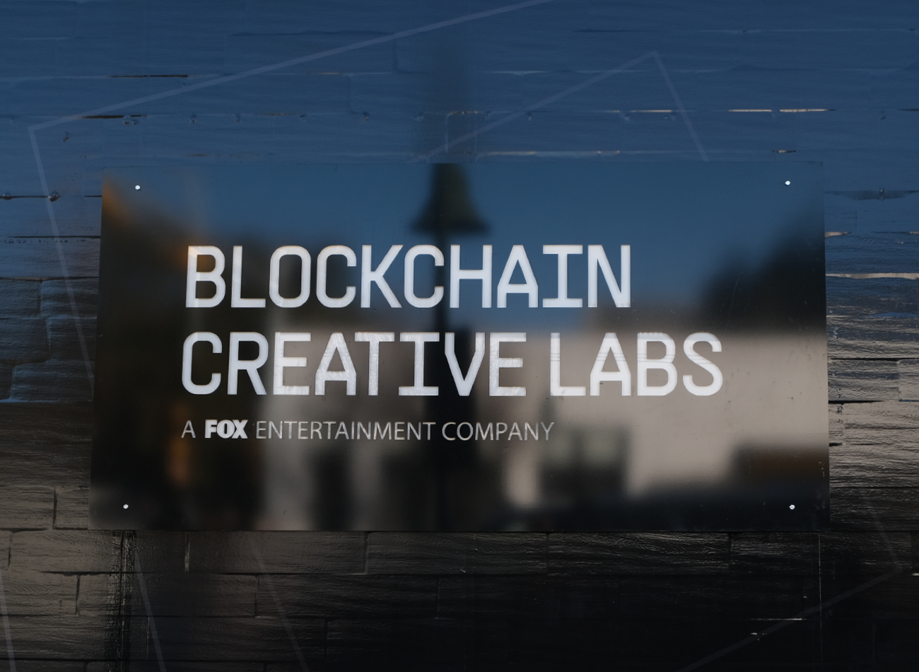
Blockchain Creative Labs (BCL), FOX’s technology research and development arm, is on a mission to shape the future of content creation, distribution, and monetization by connecting creators and communities using innovative technology.
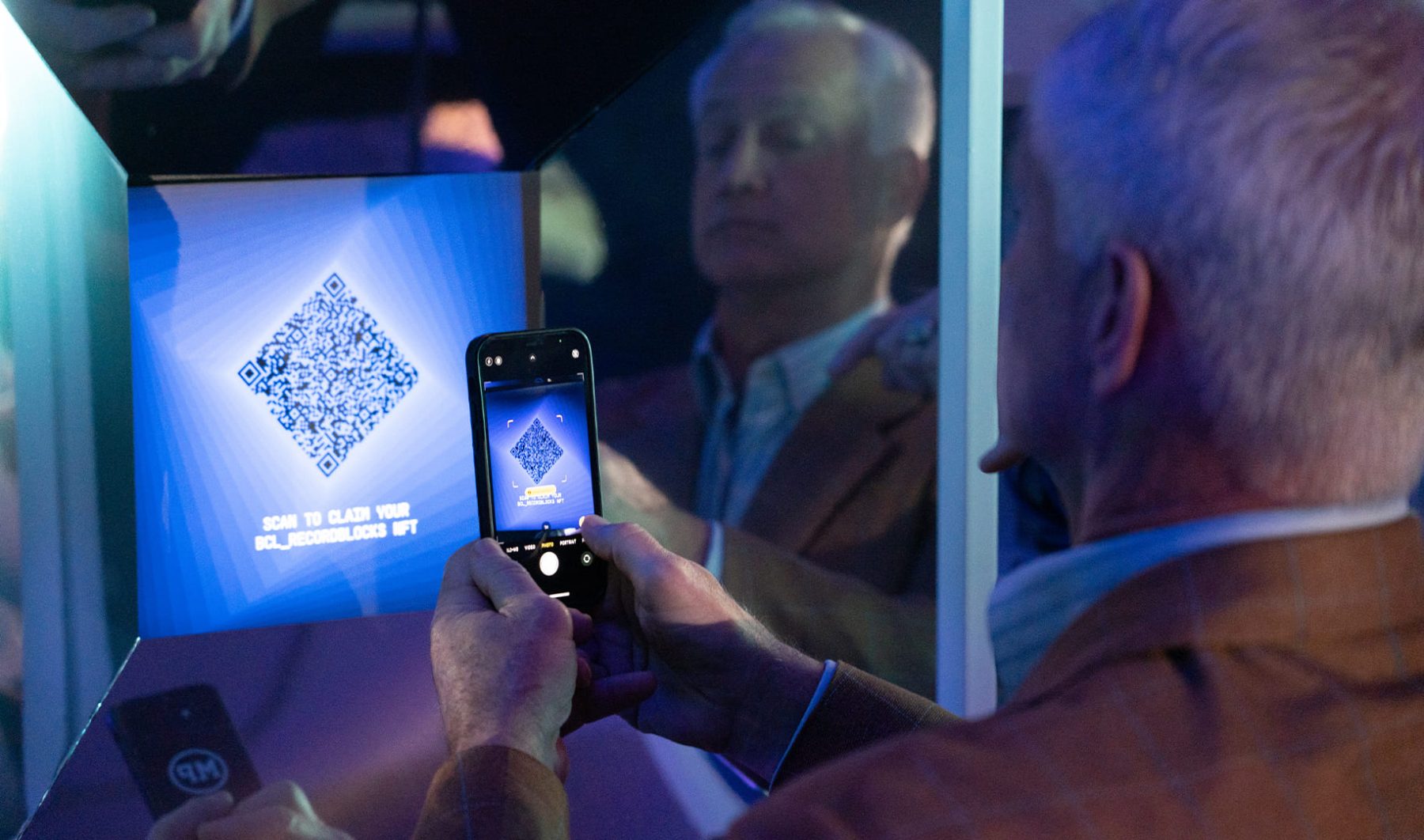
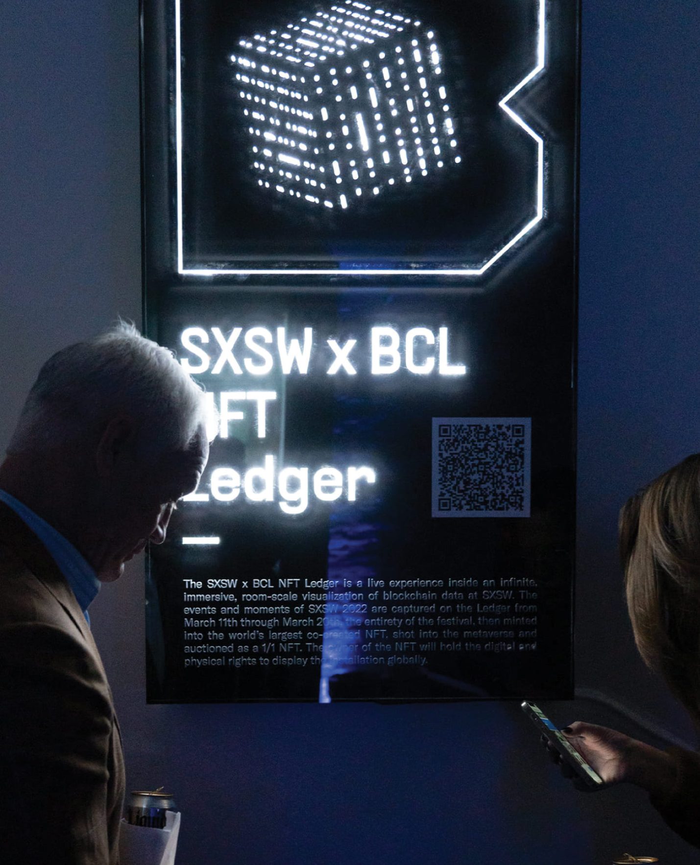
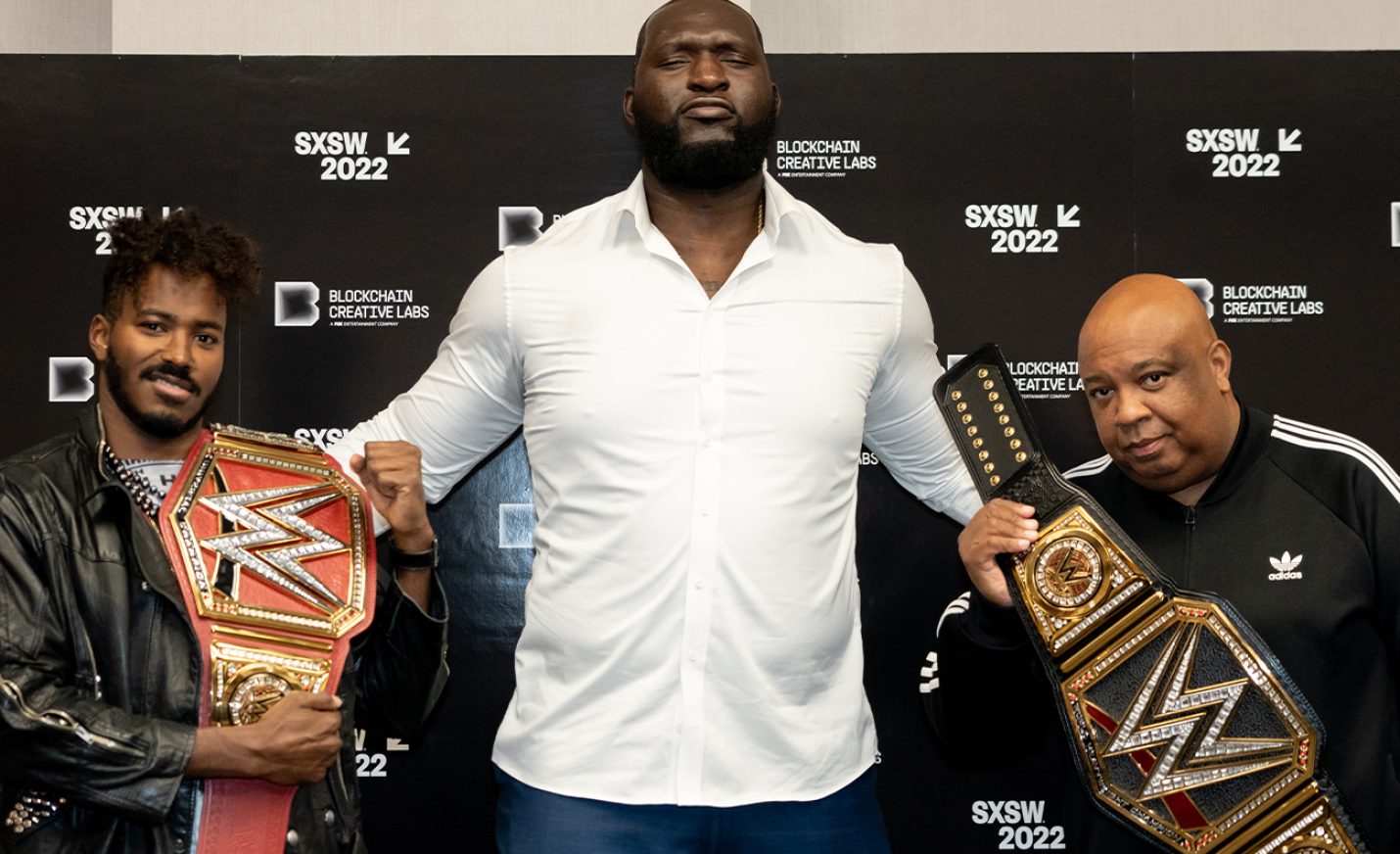
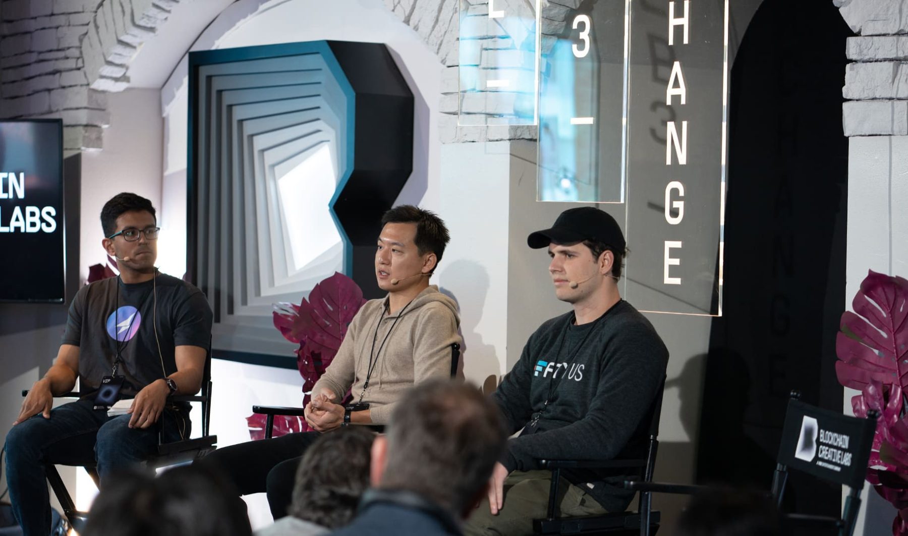
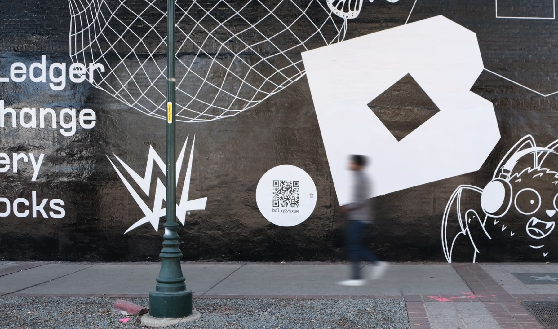
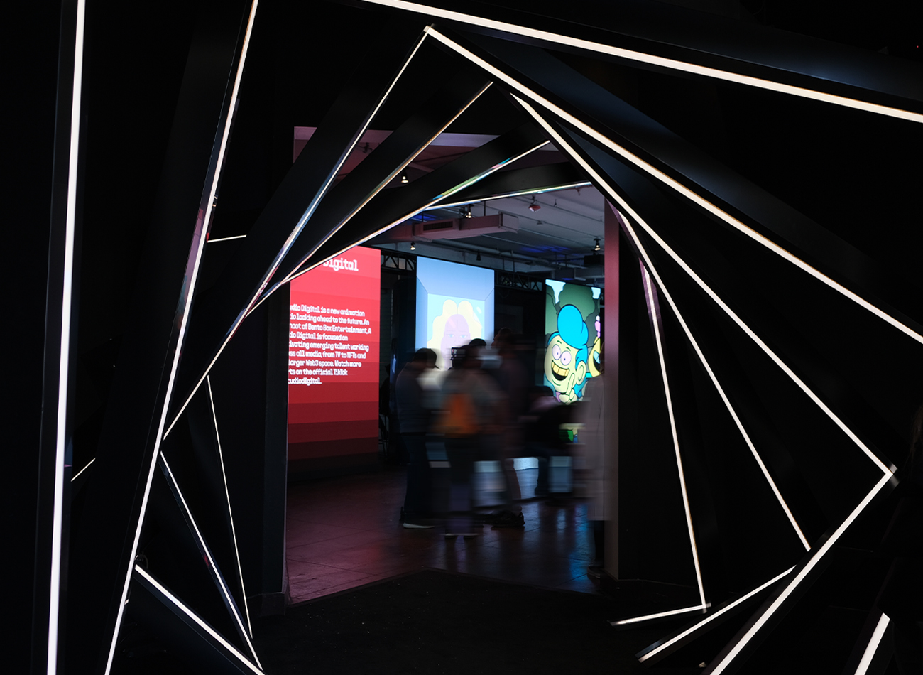
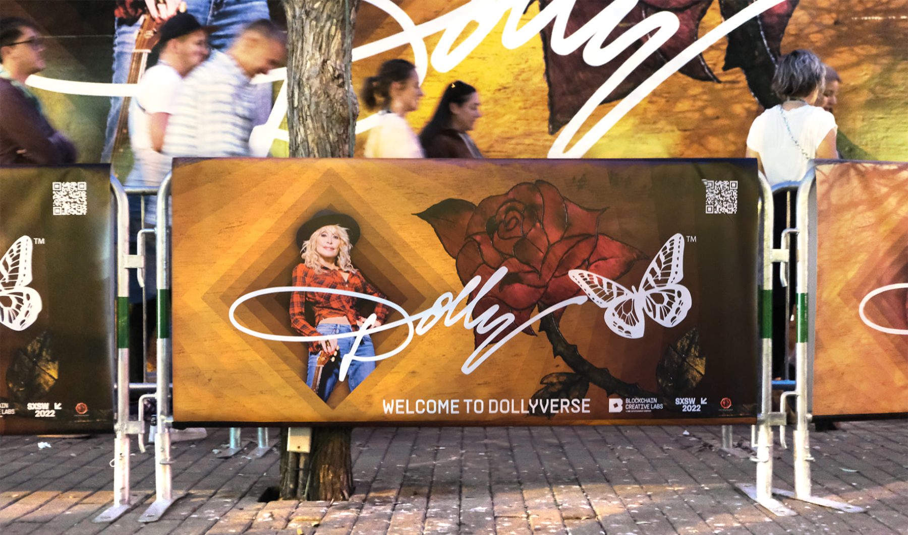
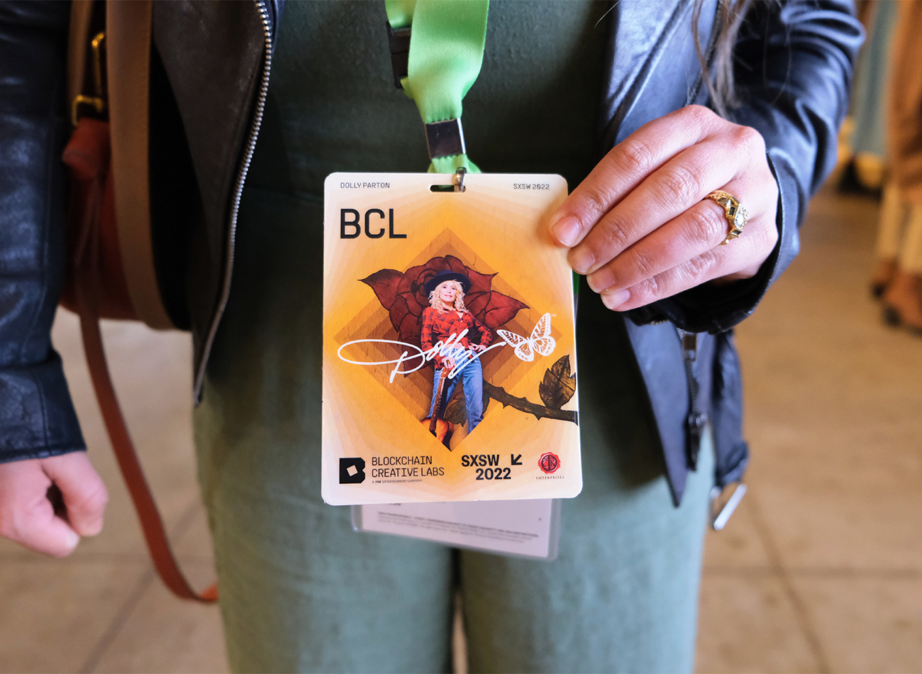
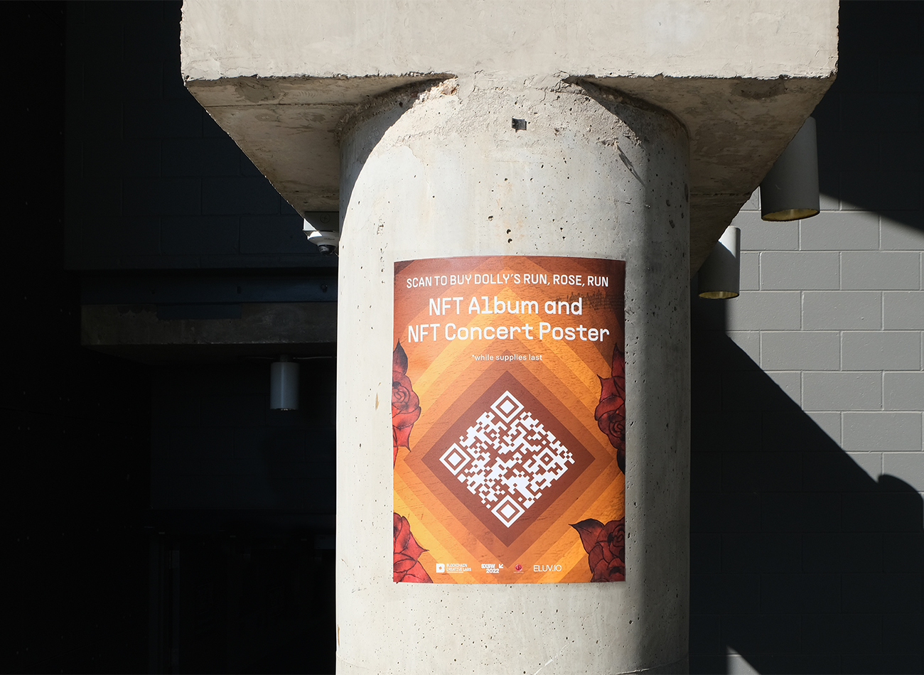
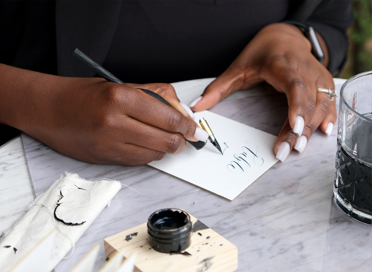
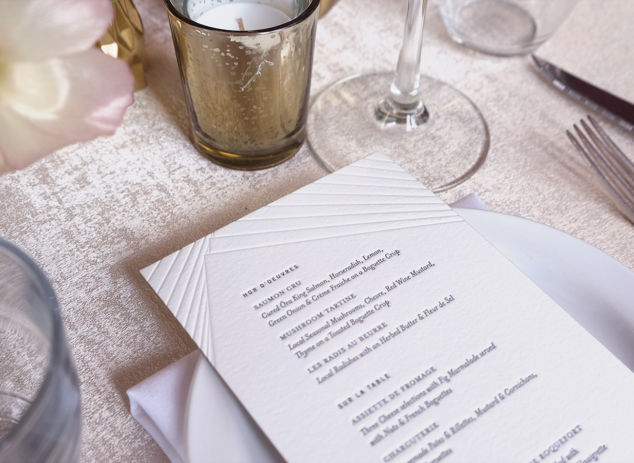
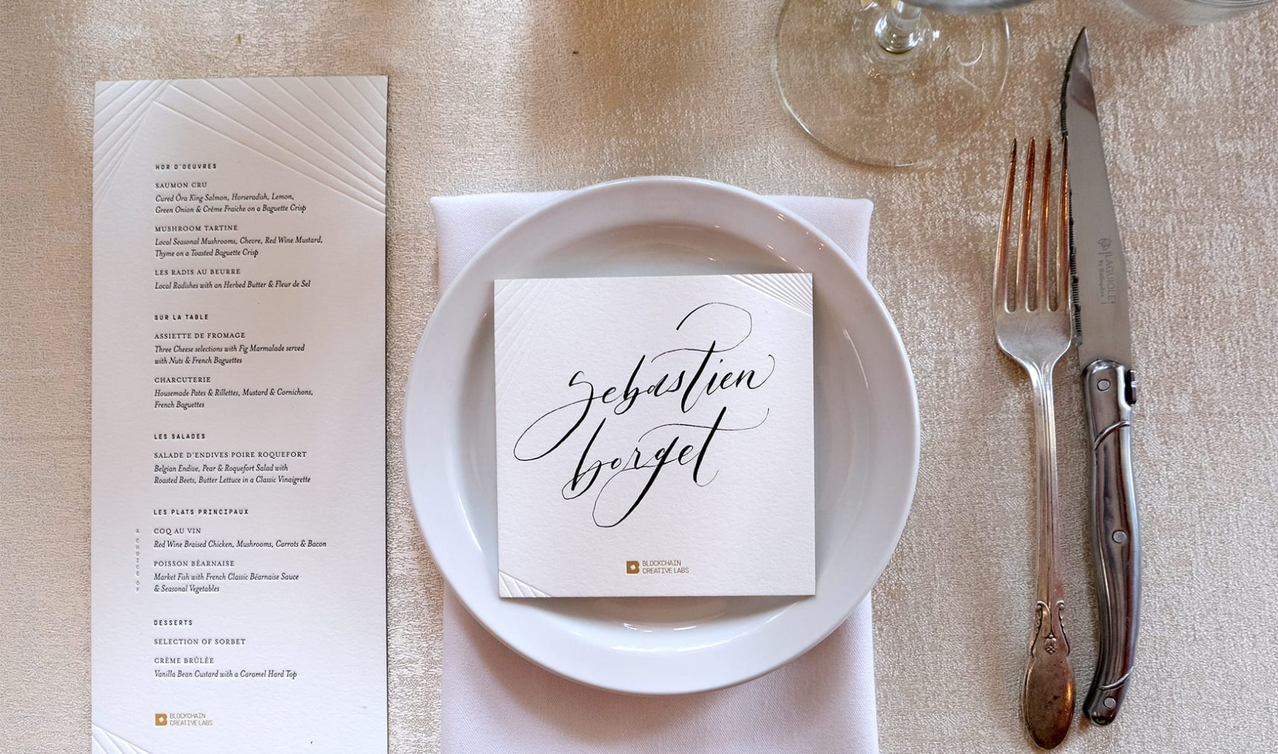
Whatever.co teamed up with KUDOS and a large cohort of producers to launch the BCL brand at the SXSW festival in March, 2022, in Austin, Texas. KUDOS was put in charge of creating a new visual branding system for BCL that was then applied to all aspects of the BCL House venue at SXSW. This included everything from a logo to a Web3-inspired website, lenticular badges, event posters, wayfinding graphics, animated POAP NFTs, Dolly Parton’s Dollyverse, and letterpress cards for the exclusive gala dinner—all aimed at delivering an immersive experience that spotlighted FOX’s new foray into the world of blockchain.
PROJECT TEAMS
-
Blockchain Creative Labs
Client -
Whatever
Lead Concept & Creative Direction -
KUDOS Design Collaboratory
Branding & Graphic Design -
Small Bands of Misbehavior
Production Design
KUDOS Design Collaboratory
-
John Kudos
Managing Director -
Ashley Wu
Art Director -
Jessica Mackta
Project Manager -
Fay Qiu, Jamus Marquette, Owen Febiandi, Lauwrencia E. D., Putu Yogiswara, Ilham Muhamad Firdaus, Greg Wong, Brian Smith, Adriana Marquette, Erica Remmele, MacKenzie Schroeder
Graphic Designers -
Imam Fadilah
3D Design -
Christian Marc Schmidt, Joseph Gray, Kevin Hanes
POAPs
Flatiron NoMad Website
Flatiron NoMad BID
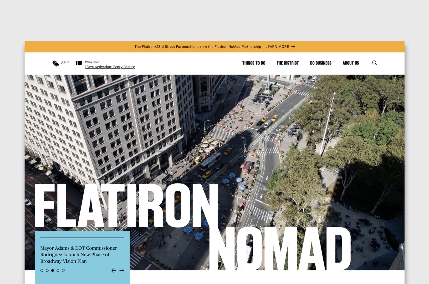
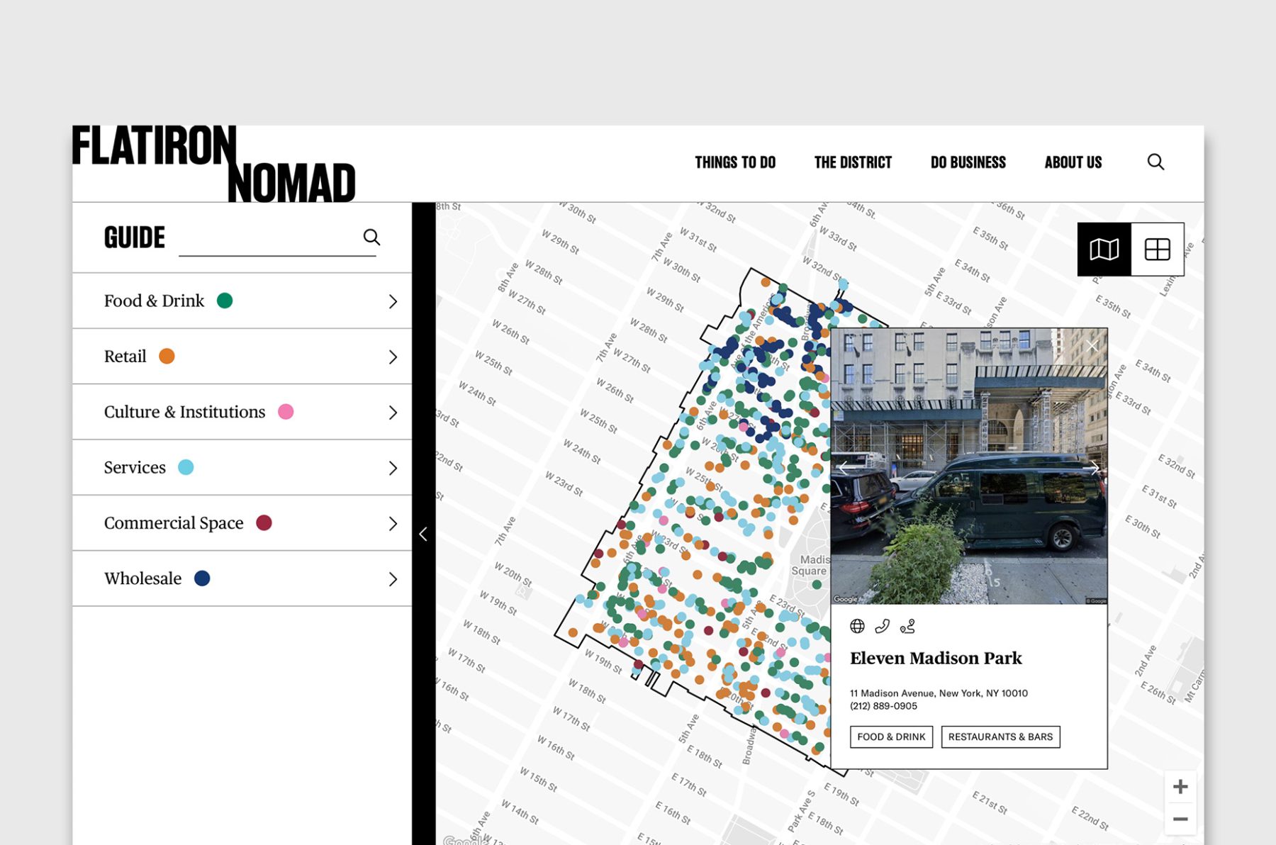
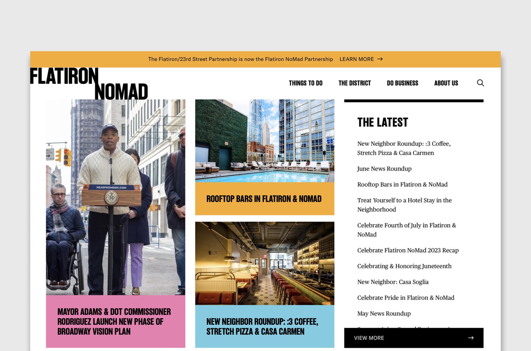
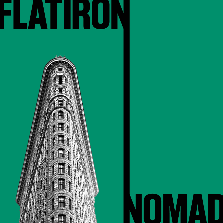
The Flatiron NoMad Partnership serves the businesses, people, and places that help make this district one of Manhattan’s most iconic and authentic destinations. In January 2022, their service area expanded from Flatiron proper to include all of NoMad and extend to 20th Street and Sixth Avenue—and the Partnership needed a new website to match.
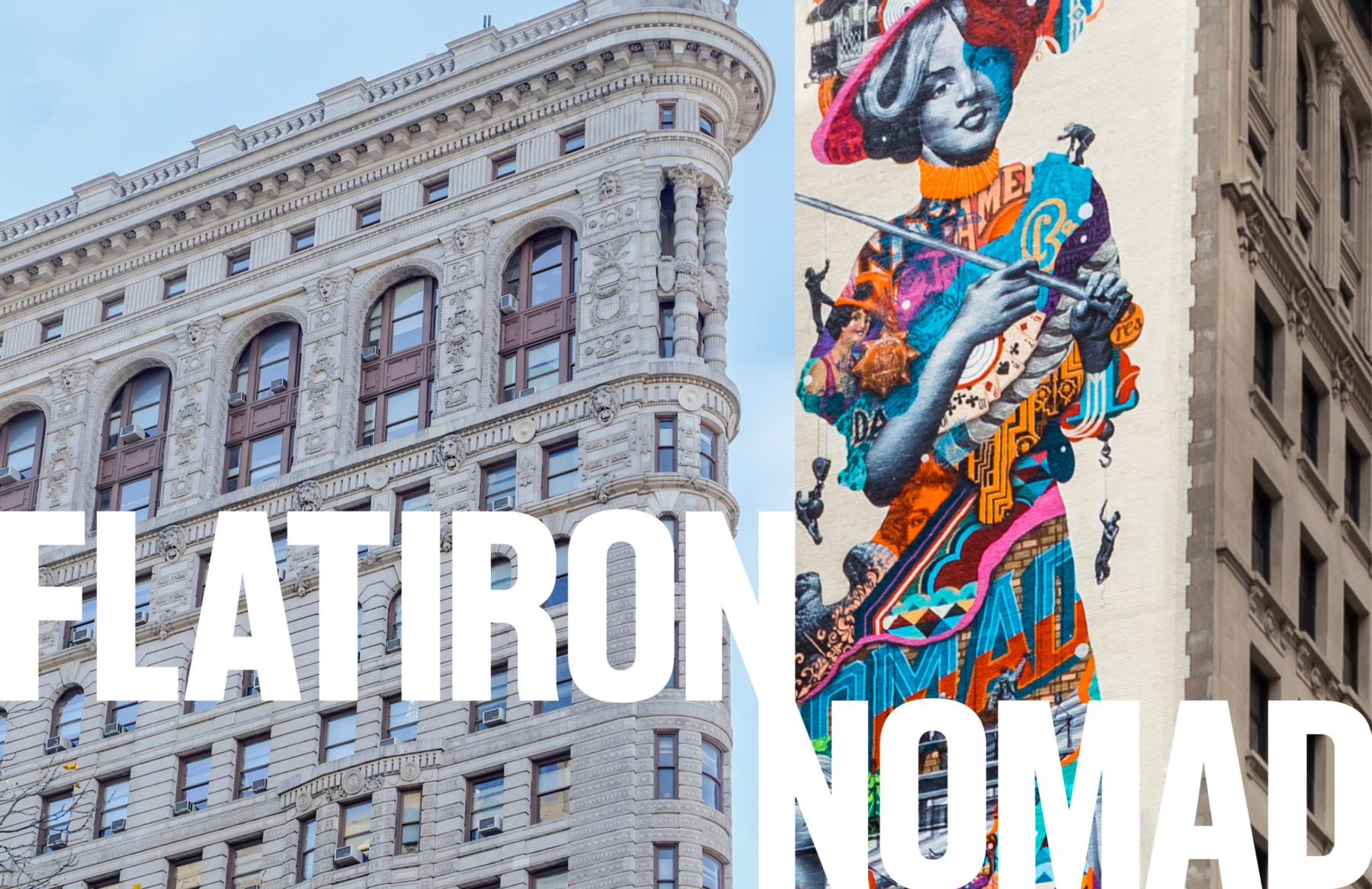
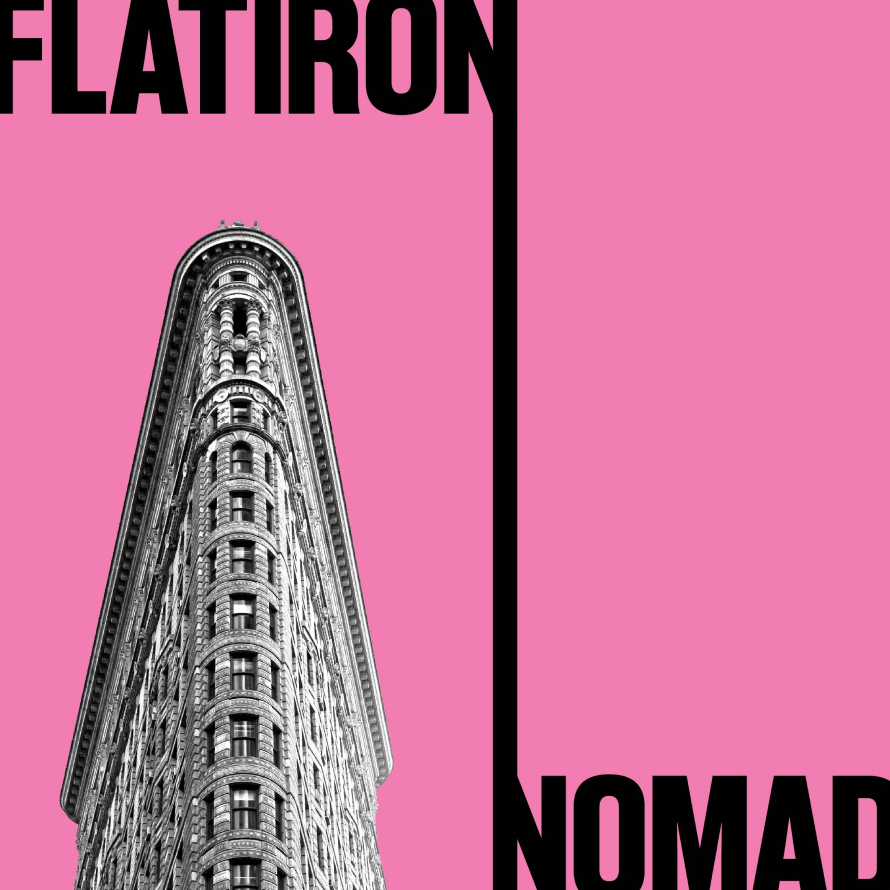
We designed the website with a bold diagonal line dynamically connecting the two Ns from “Flatiron” and “NoMad,” along with a colorful navigation element that animates when opened. The new website has been well received by many New York Business Improvement Districts and helped the Flatiron/NoMad neighborhood rebound from the unfortunate impact of COVID-19, as shown through survey data.
View flatironnomad.nyc
KUDOS Design Collaboratory
-
John Kudos
Creative Director -
Fay Qiu
Designer -
Chris Manlapid, Arif Widipratomo
Web Developer
Lilla Branding & Super-App
Social Bella Indonesia
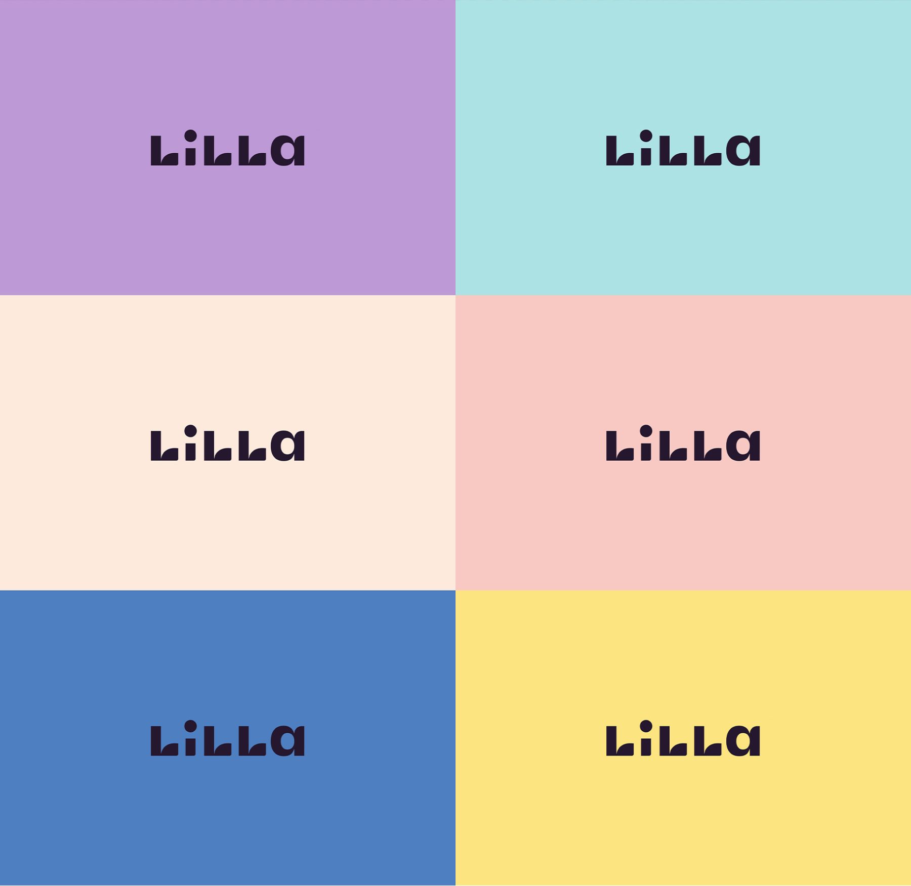
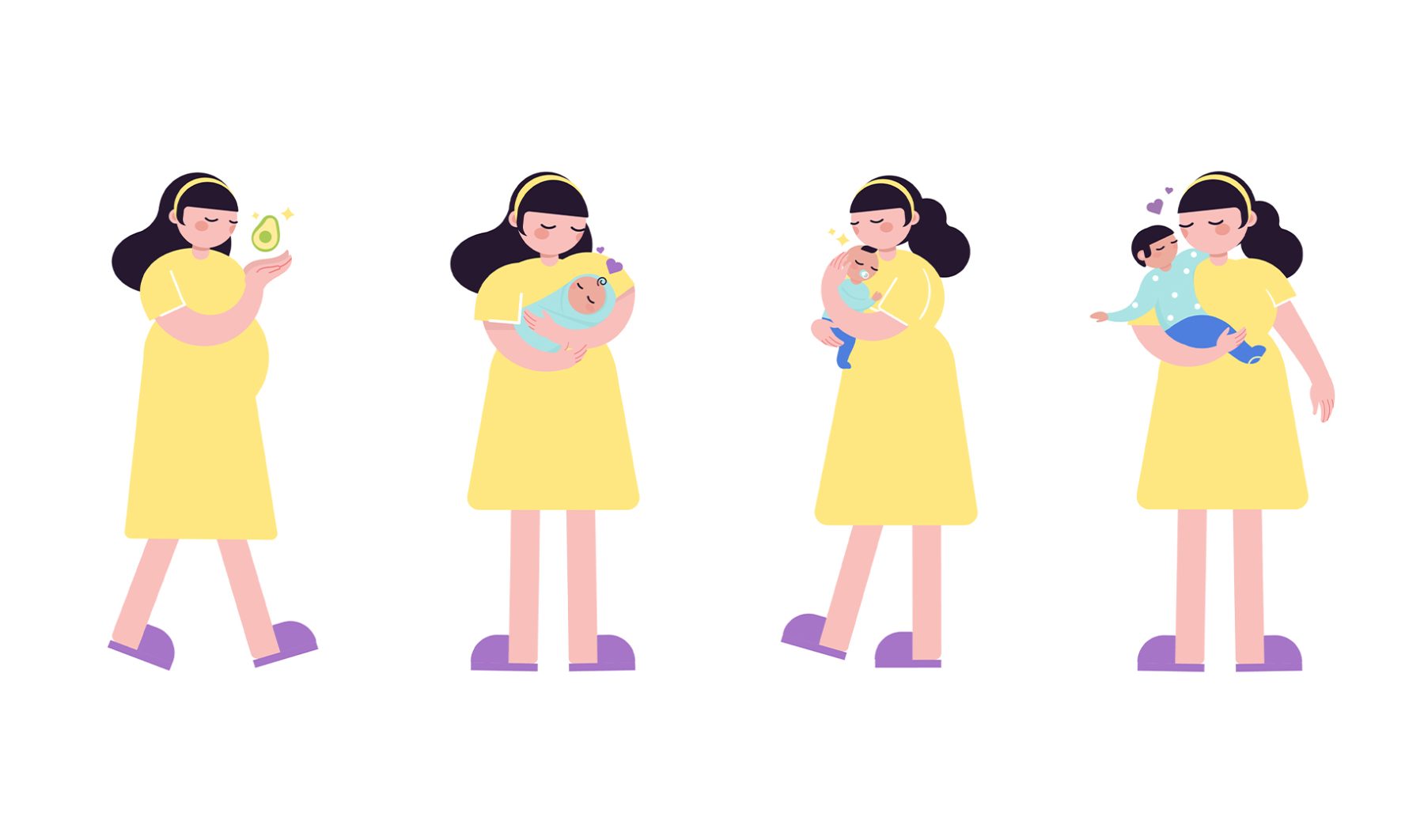
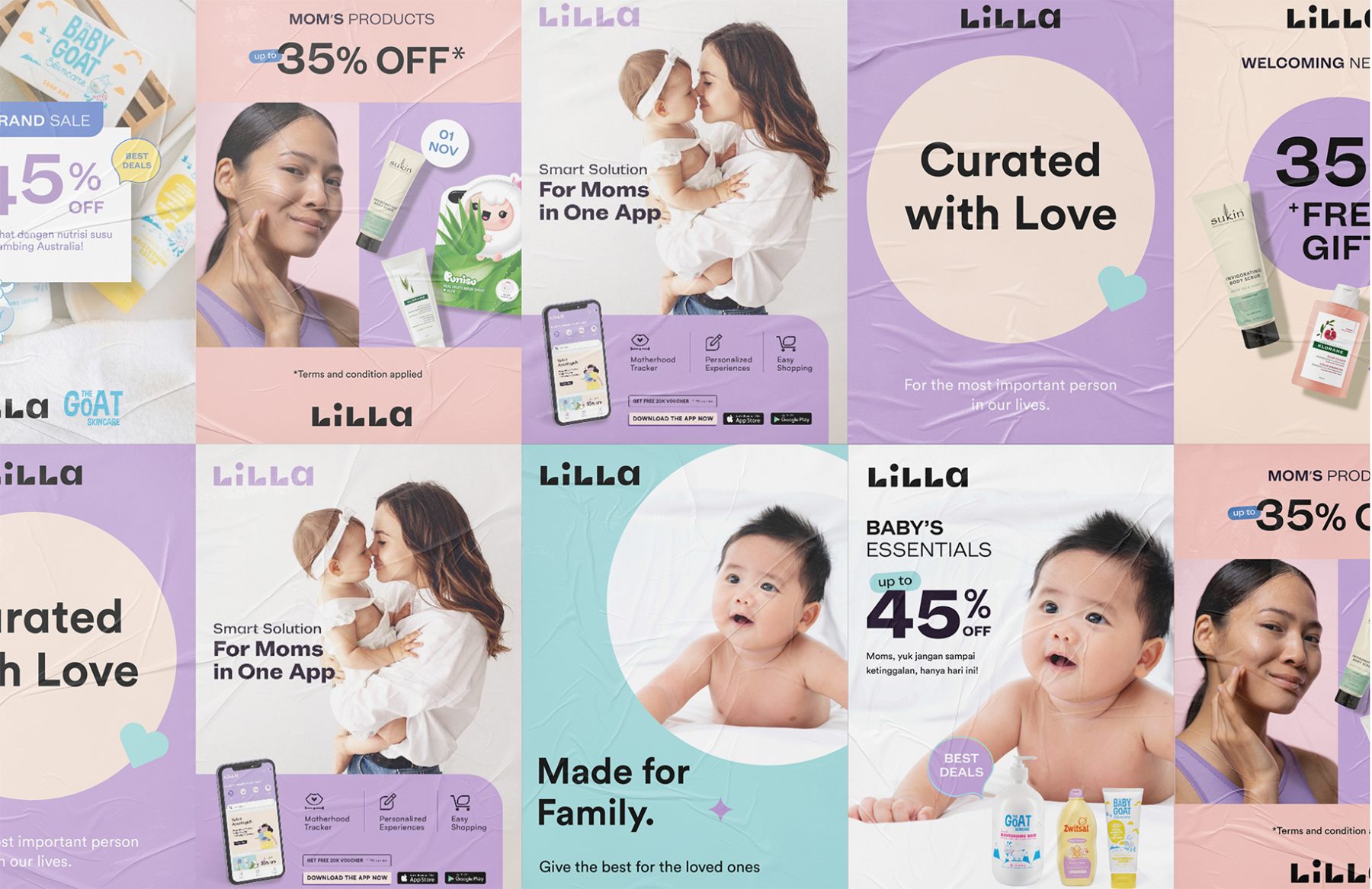
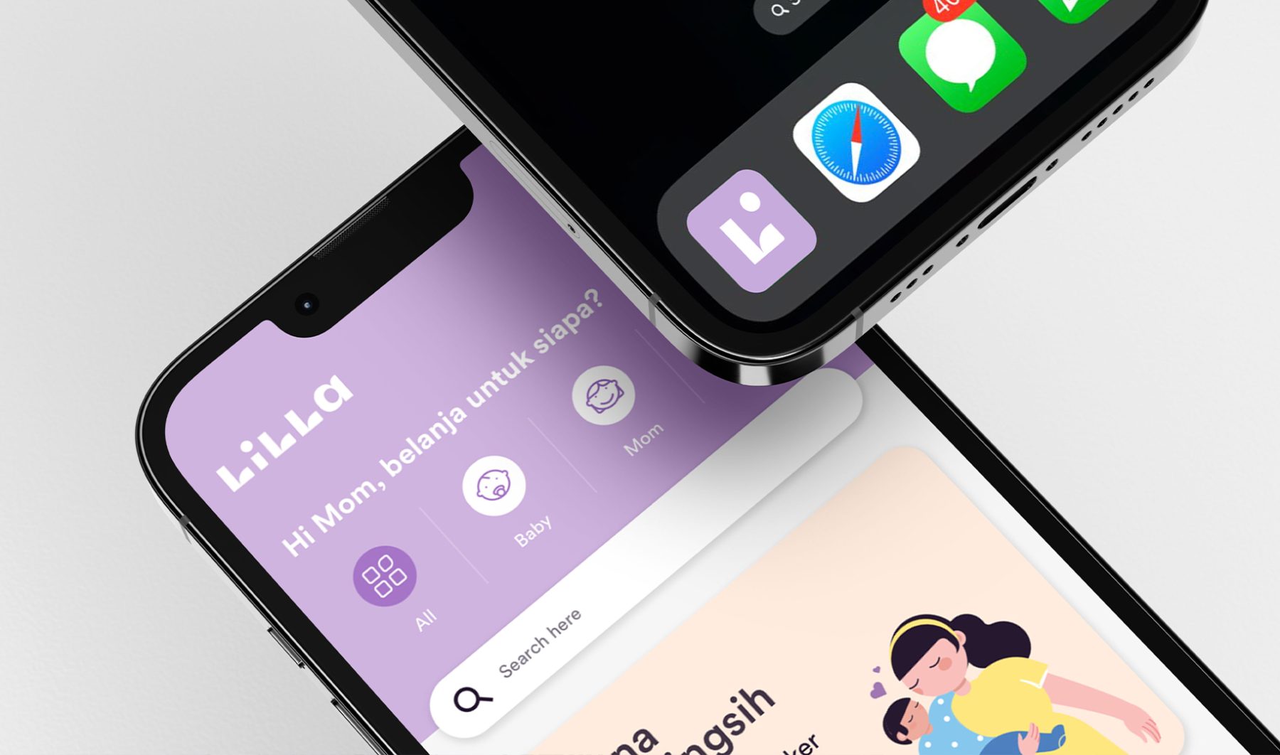
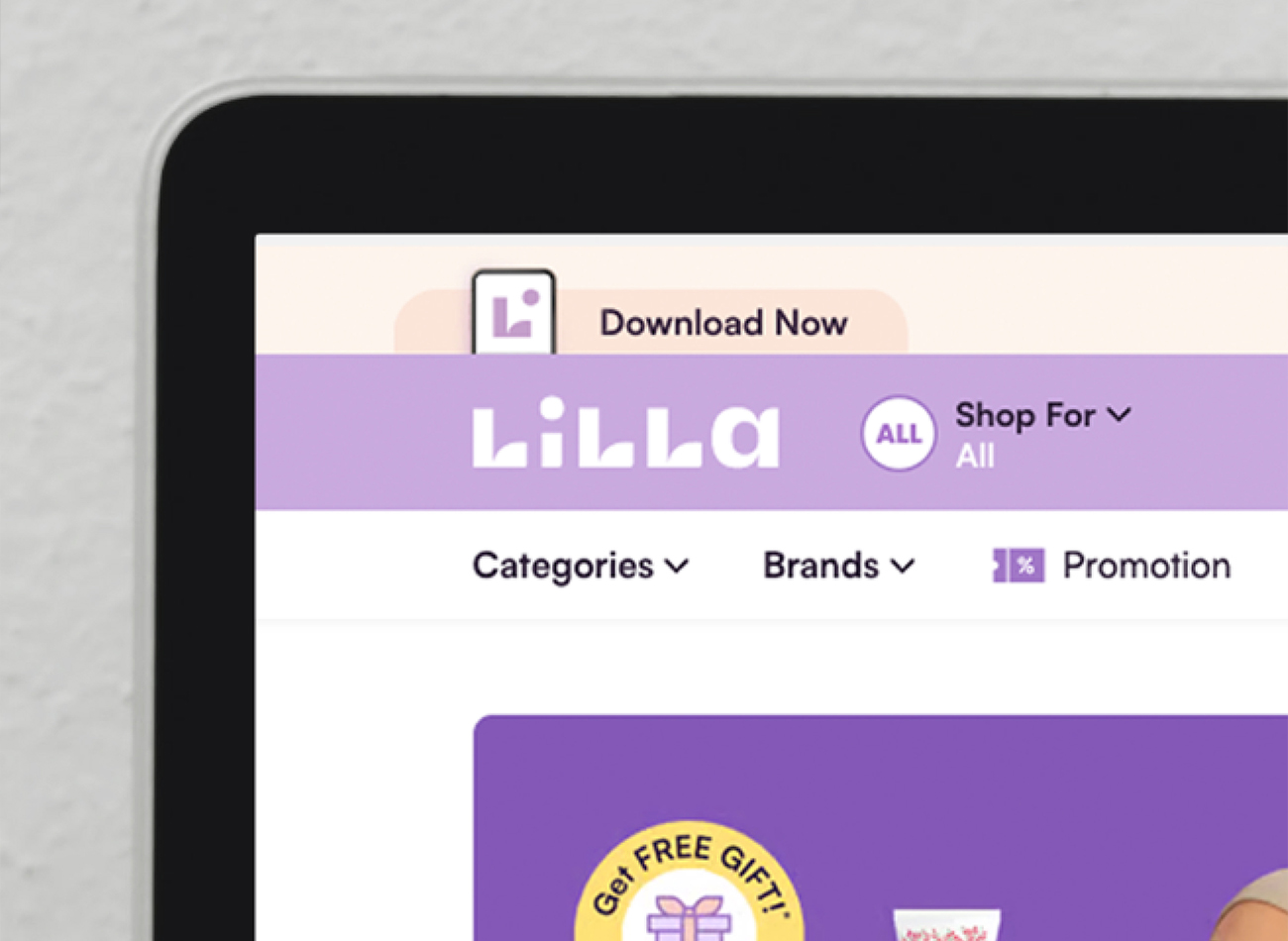
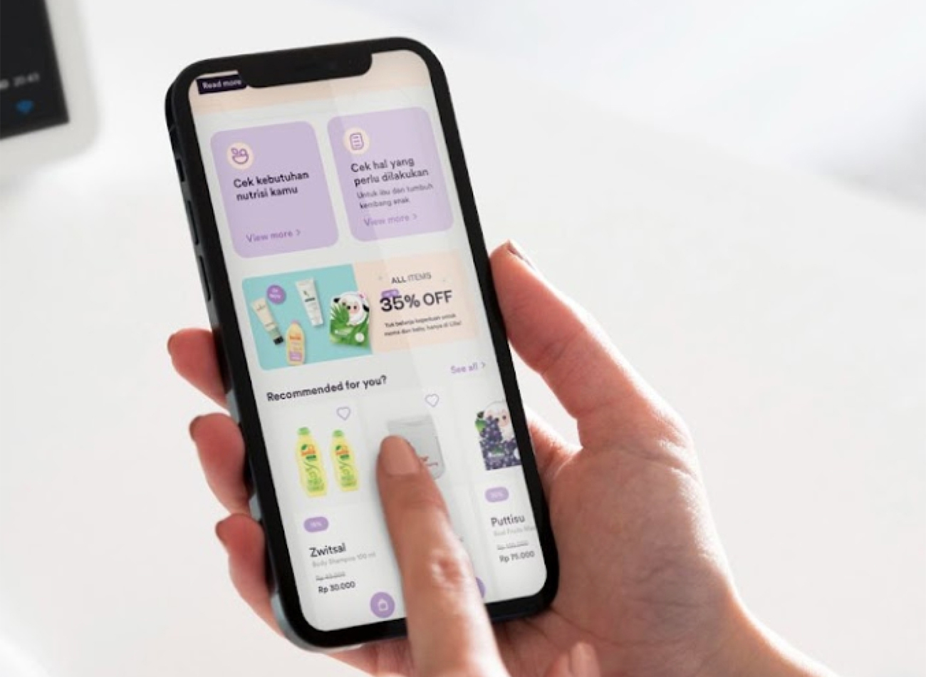
Specifically tailored for young mothers, Lilla offers a comprehensive super app to provide easy access to shopping, educational materials, and invaluable knowledge about the motherhood experience. Their simple mission: a commitment to mothers, to provide for them whenever, wherever, and in whatever way they can.
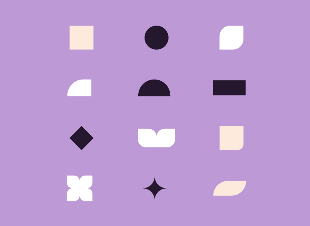
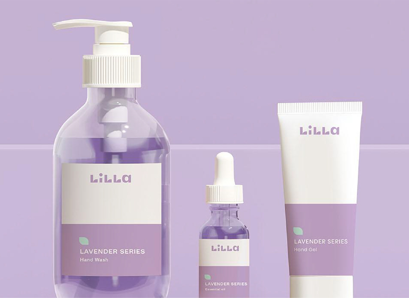
To resonate with this key audience, rebranding was vital for the company. KUDOS delivered a comprehensive 360-degree design solution, encompassing super-app UI design, key brand visuals and graphic systems, templates, illustrations, packaging, and detailed elements designed to appeal to modern young moms.
KUDOS Design Collaboratory
-
Andy Kurniawan
Creative Director -
Carla Stephano
Art Director -
Putu Yogiswara
Designer -
Imam Fadilah
Designer -
Nadya Permana
Designer -
Kelly Rahardja
Designer -
Fanicia Meilian
Designer




Einhorn Center for Community Engagement Branding & Website
Cornell University
Capabilities
Focus Area
Client
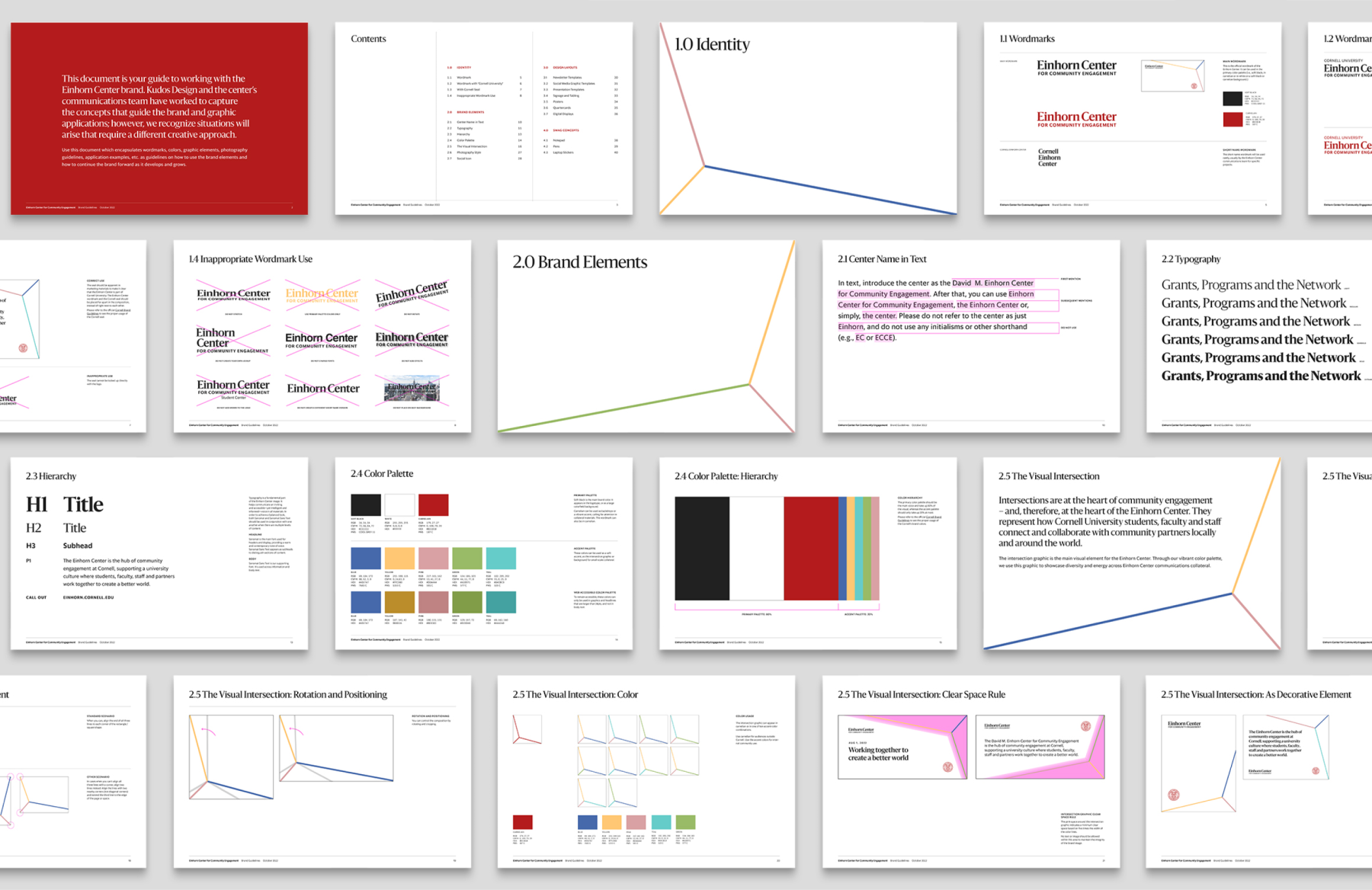
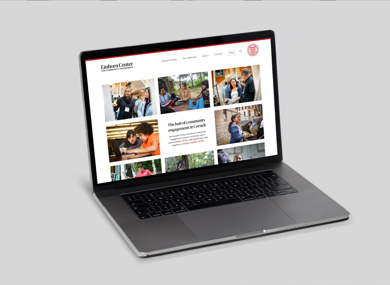
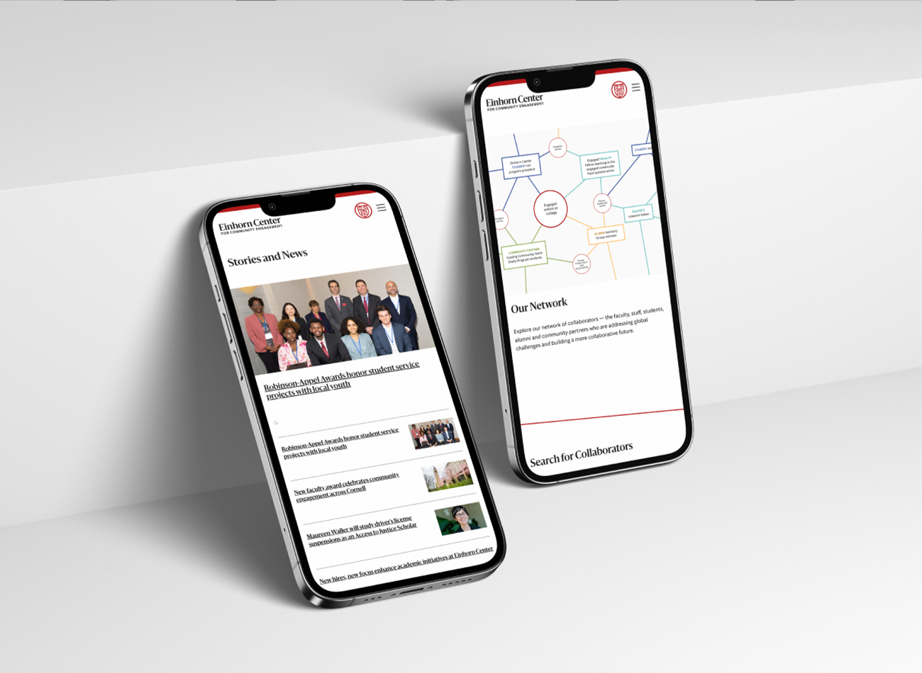
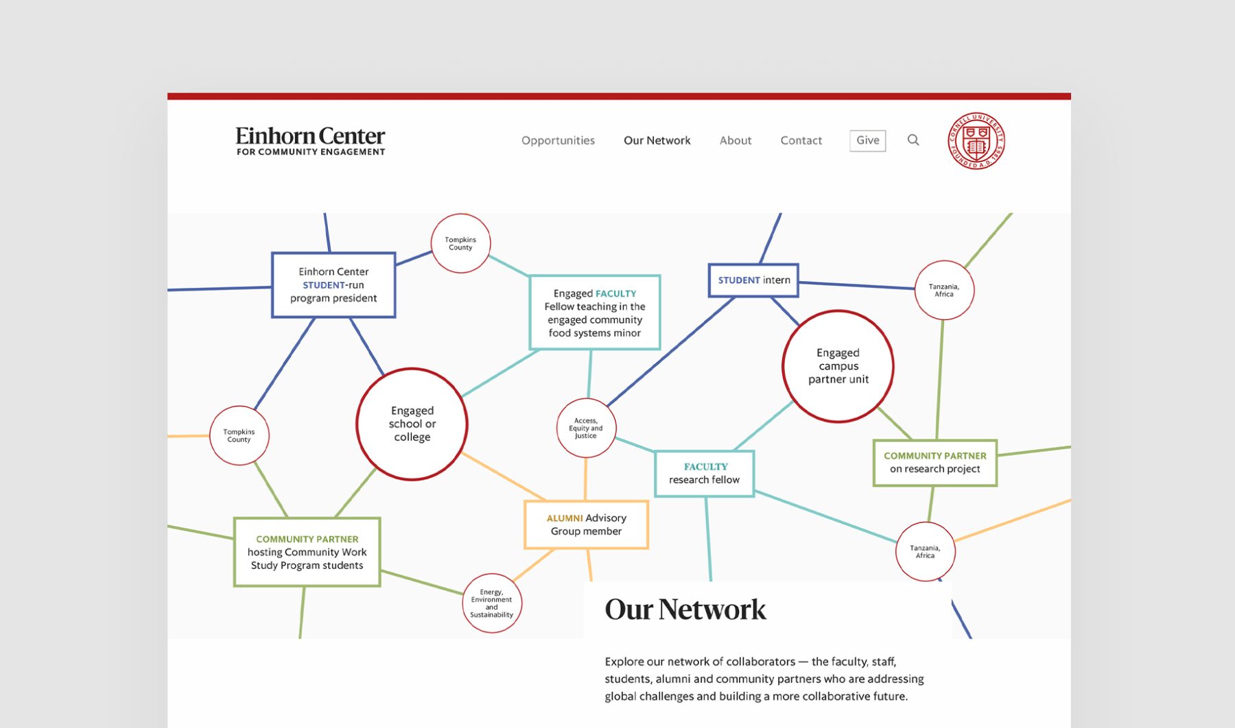
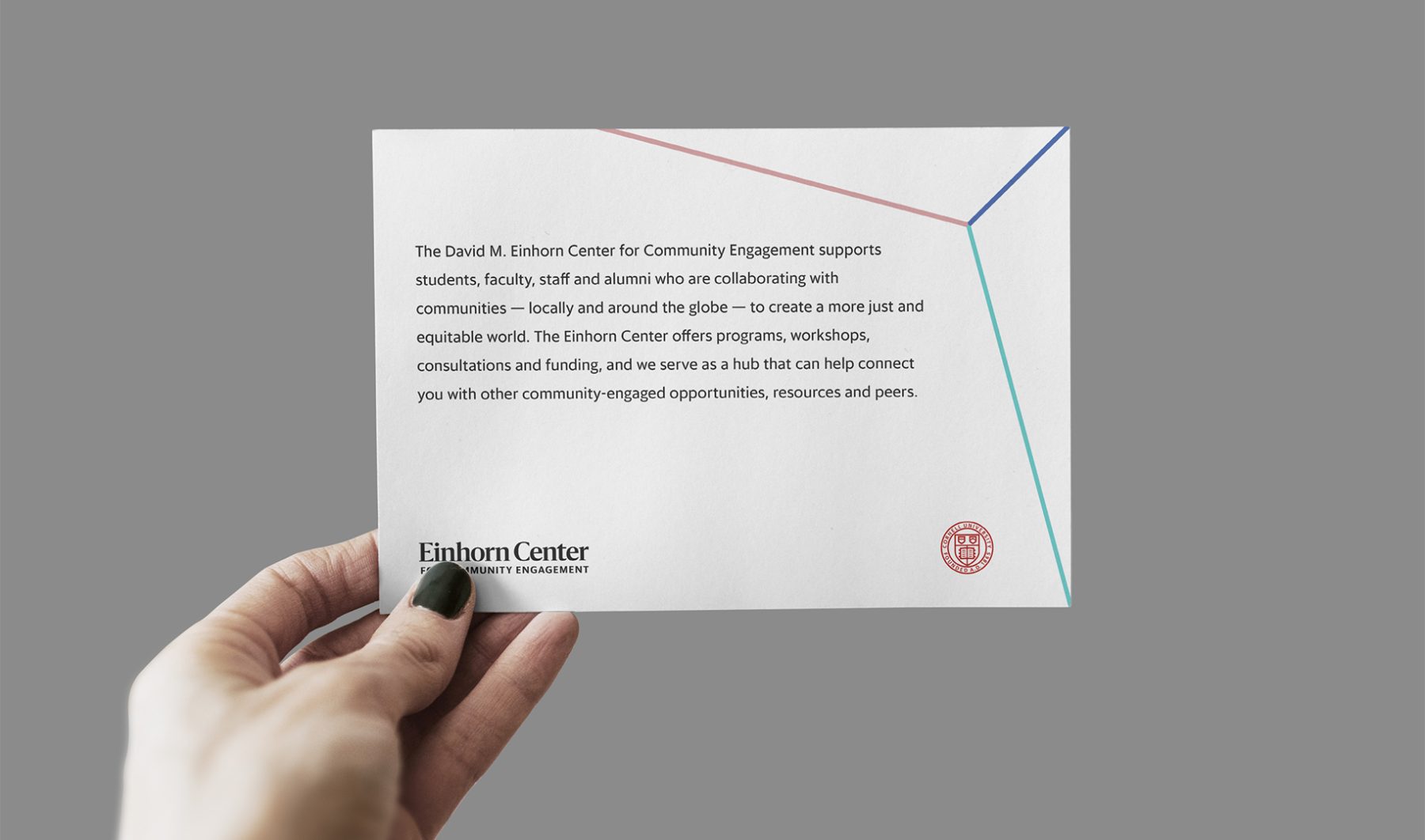
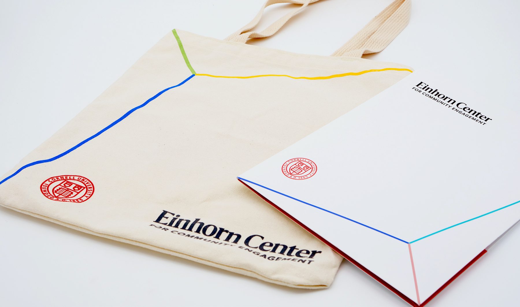
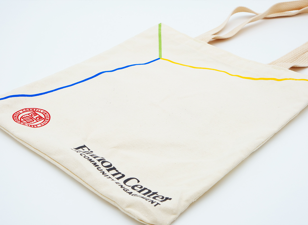
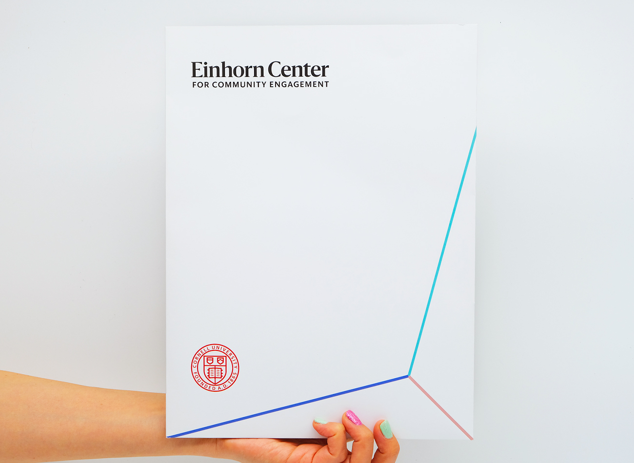
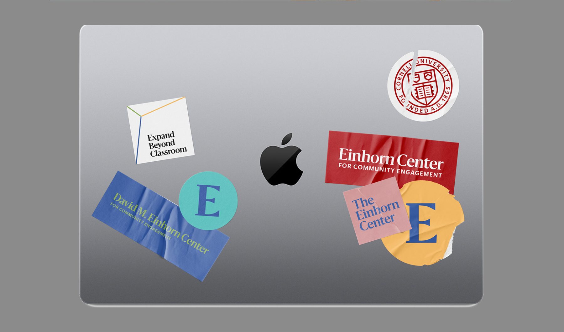
In this comprehensive branding and website project for returning client Cornell University, KUDOS successfully leveraged our past collaborative experience with Cornell AAP and Cornell Tech to develop and implement design and communication strategies to reach current students and faculty at the David M. Einhorn Center for Community Engagement.
To ensure our website’s new visual identity sat clearly under the larger umbrella of the Cornell brand, we first conducted an extensive design discovery and strategic consultation process. We then created a visually appealing and cohesive visual identity and website, along with UX/UI design for an enhanced user experience and WordPress development for easy maintenance. We executed the content-entry and migration process seamlessly and provided ongoing support as needed, ensuring that the David M. Einhorn Center for Community Engagement’s website provided a fully integrated, user-friendly, and highly engaging resource across platforms.
View einhorn.cornell.edu
KUDOS Design Collaboratory
-
Creative Director
John Kudos -
Project Manager
Jess Mackta -
Designers
Jamus Marquette, Fay Qiu, Owen Febiandi - Developers
Biofarma Distribution
Biofarma
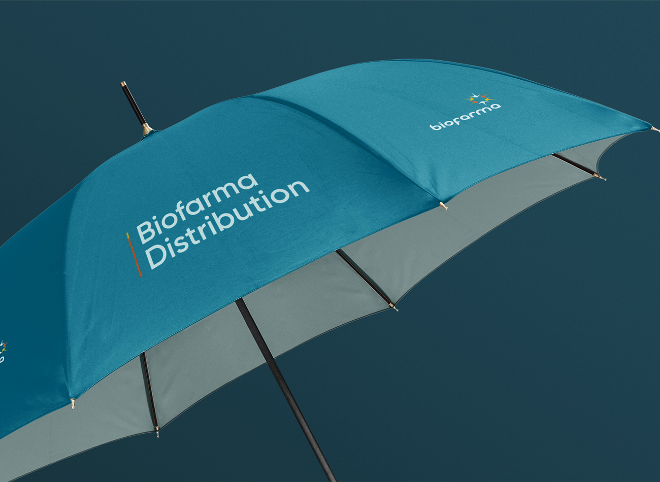
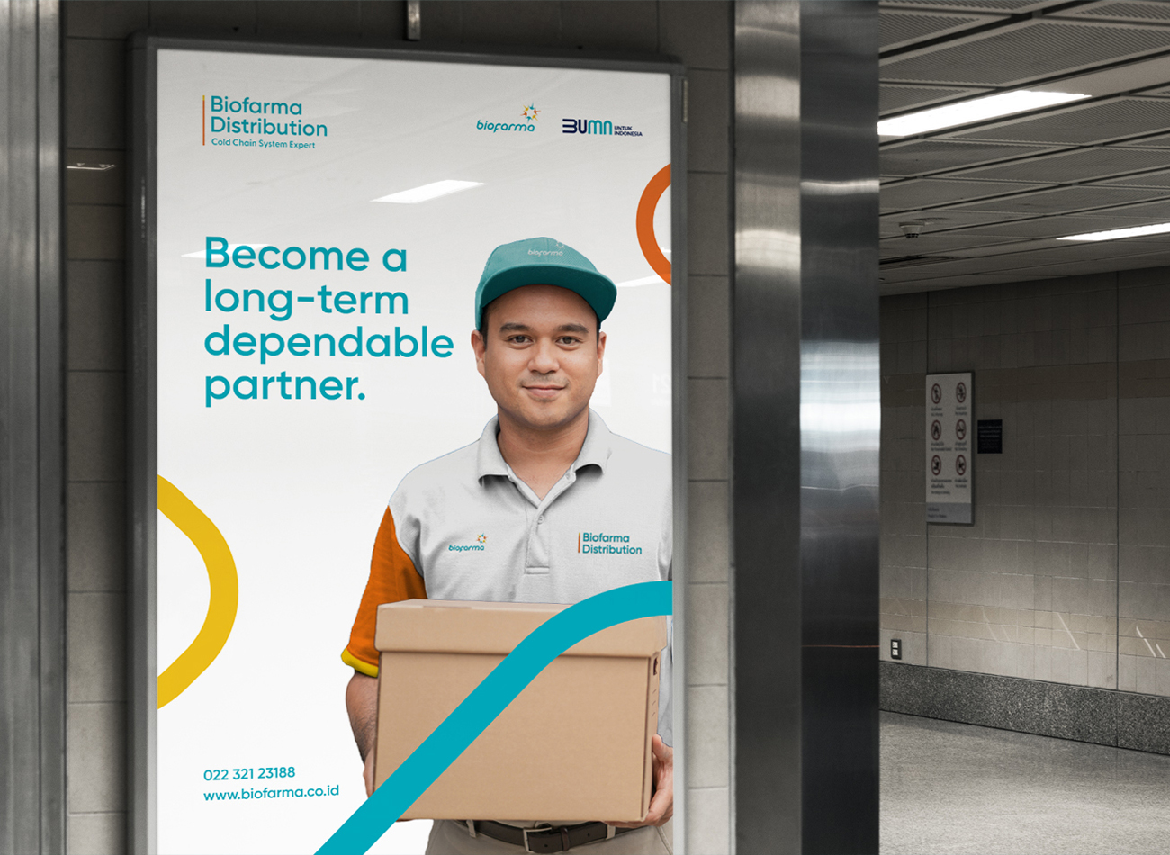
Biofarma Distribution, a subsidiary of the Biofarma group, specializes in the internal distribution of pharmaceuticals, with aspirations to expand its service offerings to other companies.
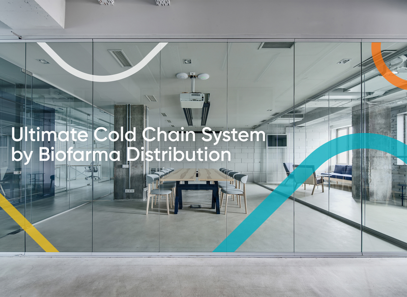
KUDOS developed a comprehensive brand architecture strategy and refreshed brand identity to enhance Biofarma Distribution’s market presence, maintaining its ties with the parent brand while also promoting its unique services. This rebranding effort led to a distinct and independent brand for Biofarma Distribution, built around a vibrant color scheme and the pictorial symbolism of distribution roads.
KUDOS Design Collaboratory
-
Brand Strategist
Andini Pratiwi -
Designer
Zaki Fitria -
Motion Designer
Rias Amalia -
Project Manager
Robi Dafit
Journal of Architectural Education
Association of Collegiate Schools of Architecture (ACSA)
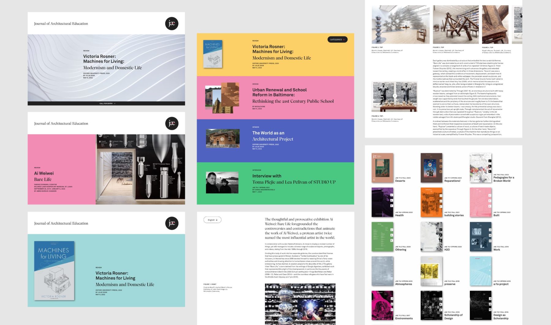
This branding and website project for the Journal of Architectural Education (JAE) embodies the journal’s longstanding commitment to scholarly discourse and progressive architectural education. As a peer-reviewed international journal published under the auspices of the Association of Collegiate Schools of Architecture (ACSA), JAE serves as a vital platform for fostering inclusive, just, and sustainable architectural practices.
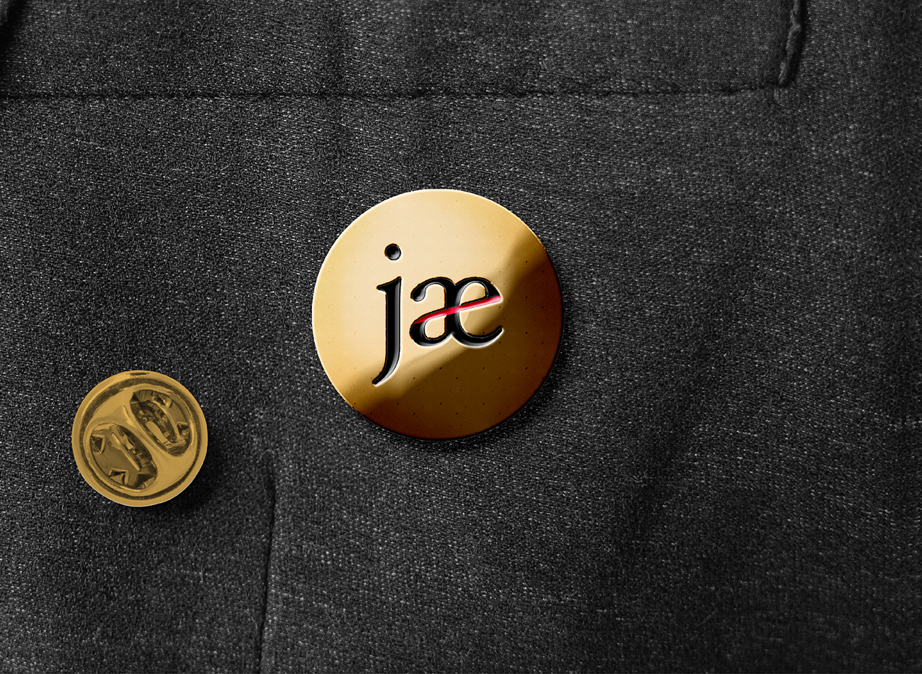
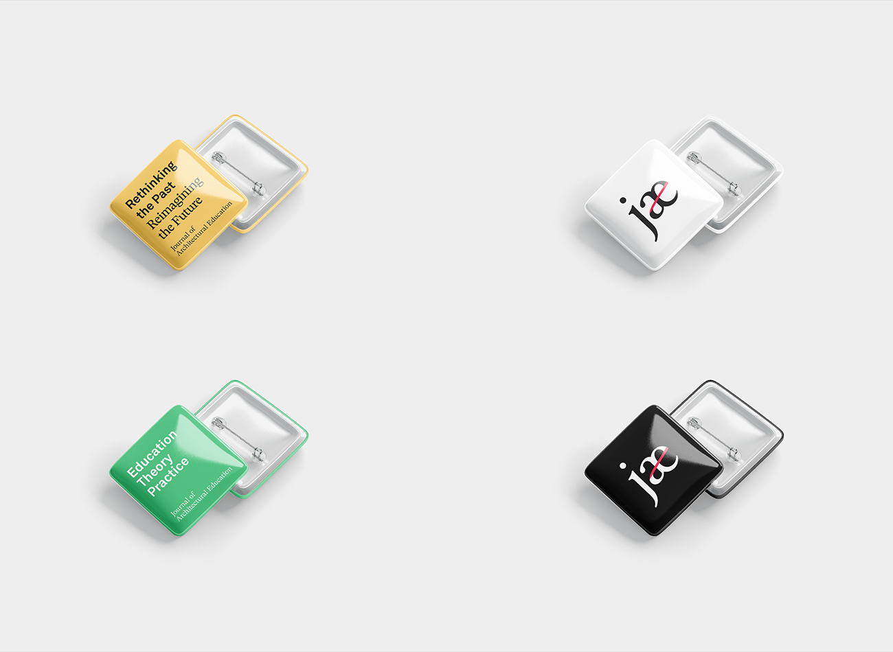
Through meticulous design choices and a commitment to visual storytelling, the JAE branding and website project exemplifies the journal’s mission to shape the future of architectural discourse and education. Our vibrant branding reflects the journal’s unique ethos, featuring a scholarly serif typeface for the main logo and an abbreviated logomark symbolizing social connectivity with a red stroke linking the letters a and e. Incorporating a diverse palette that represents the breadth of essays included in the journal, the website offers a dynamic interface for architectural educators, scholars, and designers to engage in thoughtful discussions about the evolution of architectural education and practice, contributing to the journal’s relevance and impact for future generations.
View jaeonline.org
KUDOS Design Collaboratory
-
John Kudos
Creative Director -
Fay Qiu
Designer -
Amanda Knott
Project Manager -
Chris Manlapid
Web Developer
UIII Branding
Universitas Islam Internasional Indonesia
Capabilities
Focus Area
Universitas Islam Internasional Indonesia (UIII) is Indonesia’s premier institution for higher education in Islamic studies, aiming to become a hub for Islamic research globally.
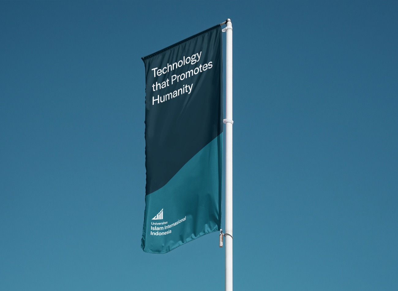
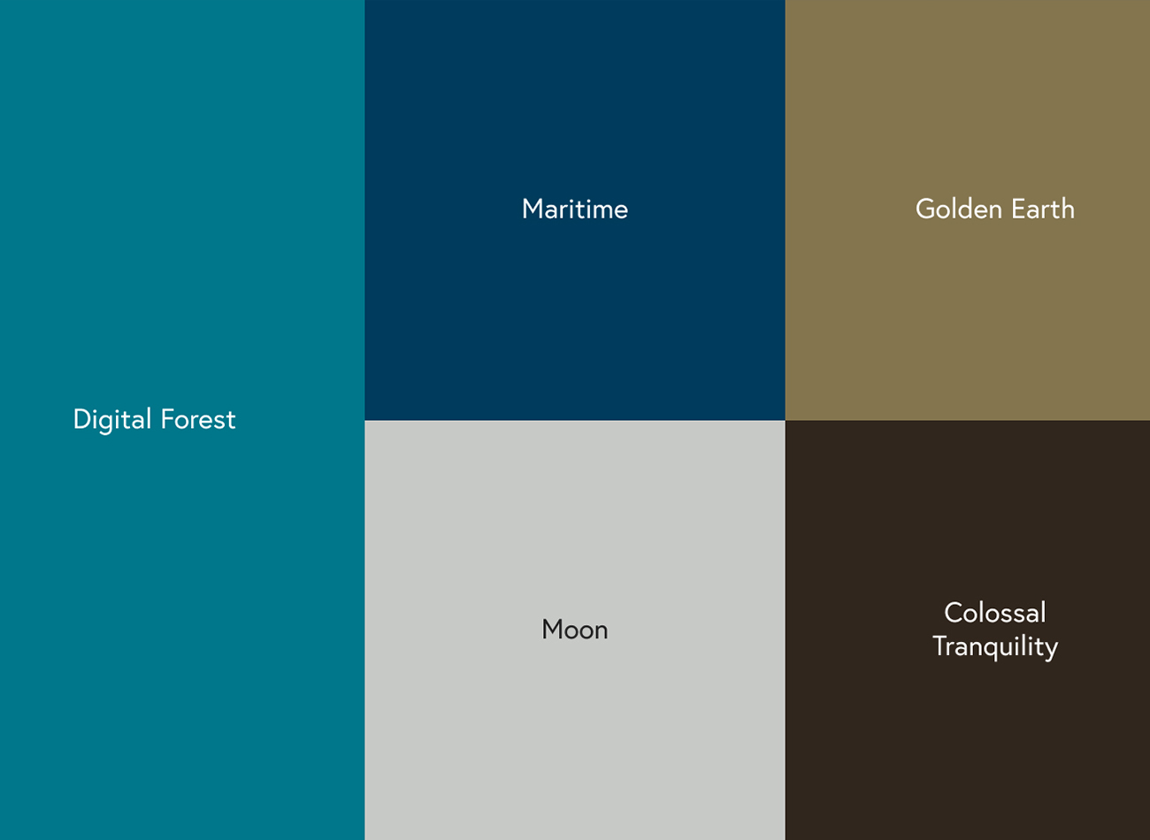
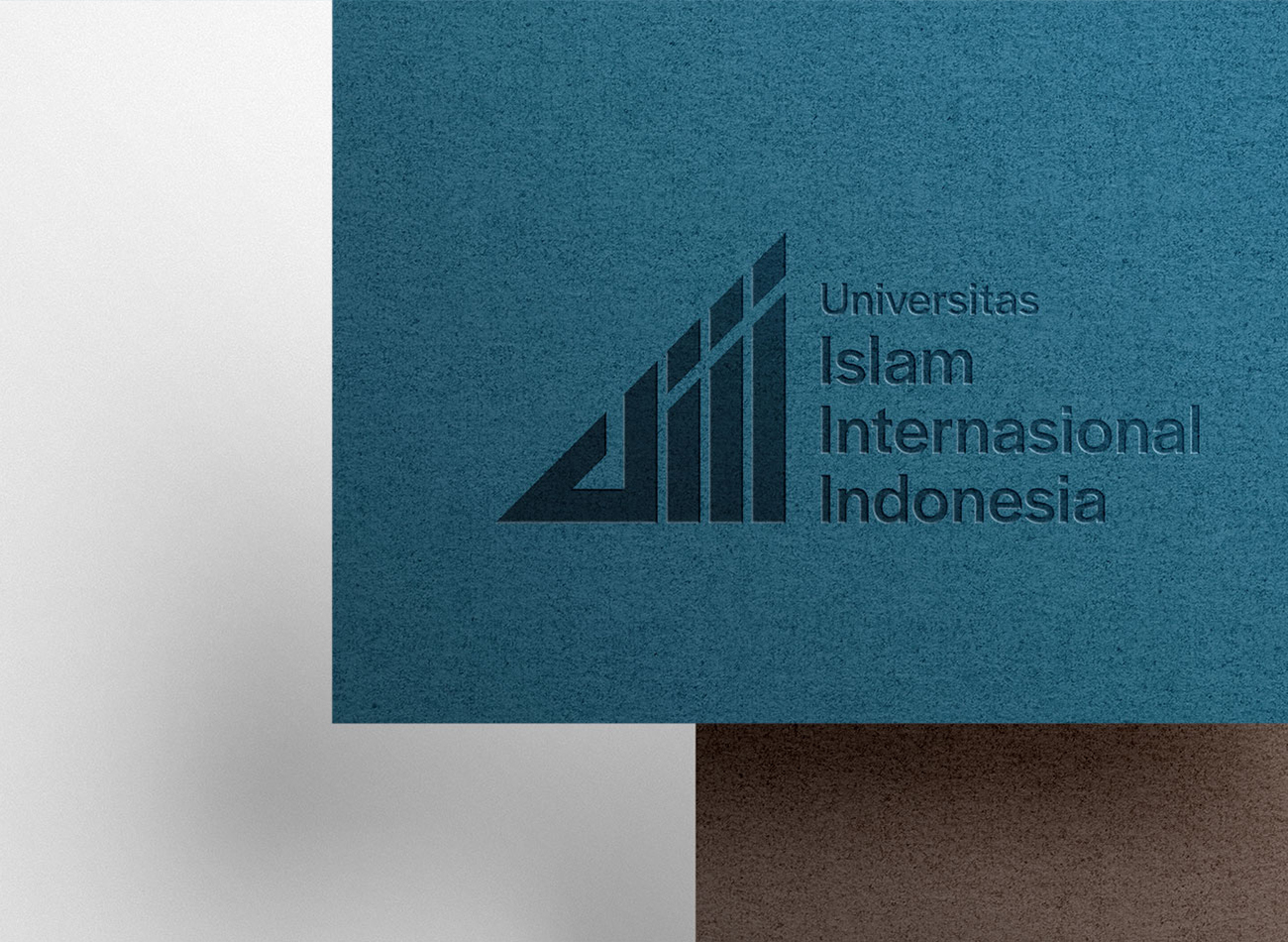
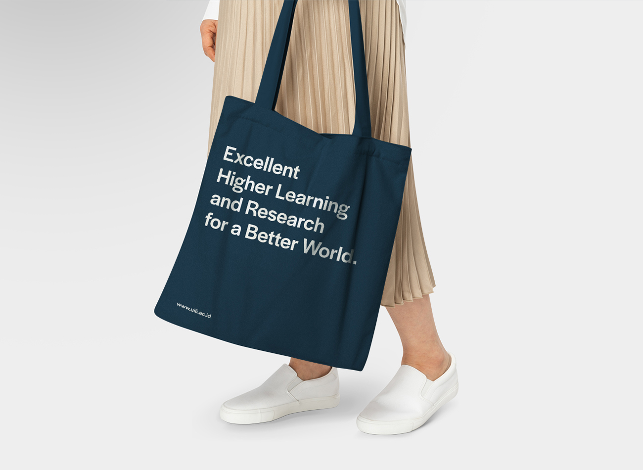
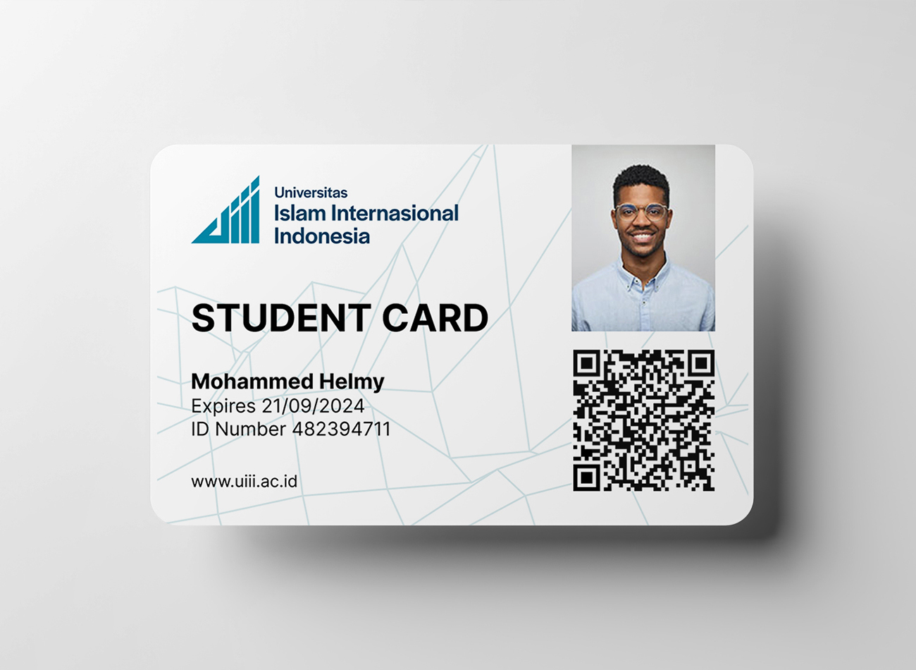
Confronted with the challenge of establishing a world-class presence for the university, we refined its existing logo to meet legal standards and developed a comprehensive visual identity to match, including photography, videography, and communication guidelines. The enhancements to UIII’s brand have led to an increase in international applications and greater recognition of the university as a prestigious LPDP scholarship destination, effectively marrying the institution’s Indonesian roots with its global aspirations.
KUDOS Design Collaboratory
-
Creative Director
Andini Pratiwi -
Brand Strategist
Andini Pratiwi -
Brand Strategist
Andini Pratiwi -
Designer
Zaki Fitria, Andini Pratiwi -
Motion Designer
Rias Amalia -
Public Relation
Fahmi Ramdhani -
Web Developer
Arif Widipratomo, Faris Han -
Project Manager
Robi Dafit

NY 22 Benefit
Design Trust for Public Space
Capabilities
Focus Area
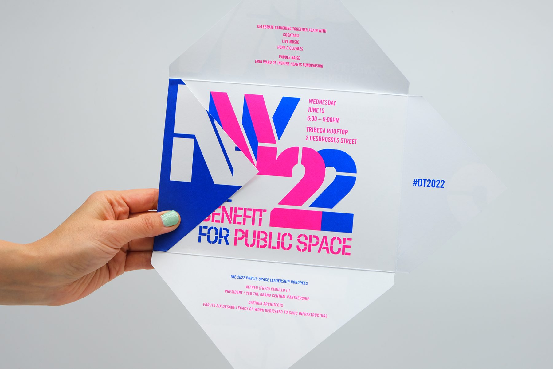
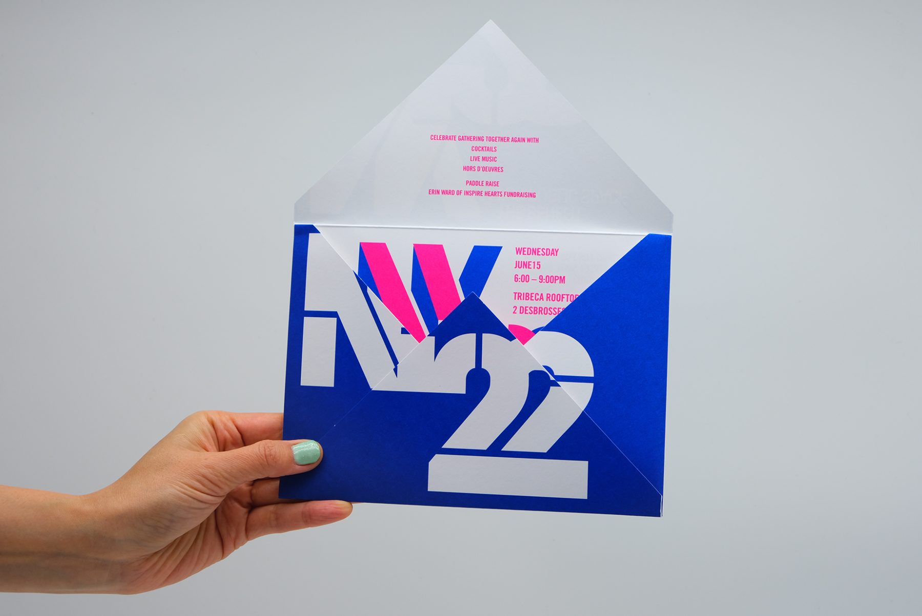
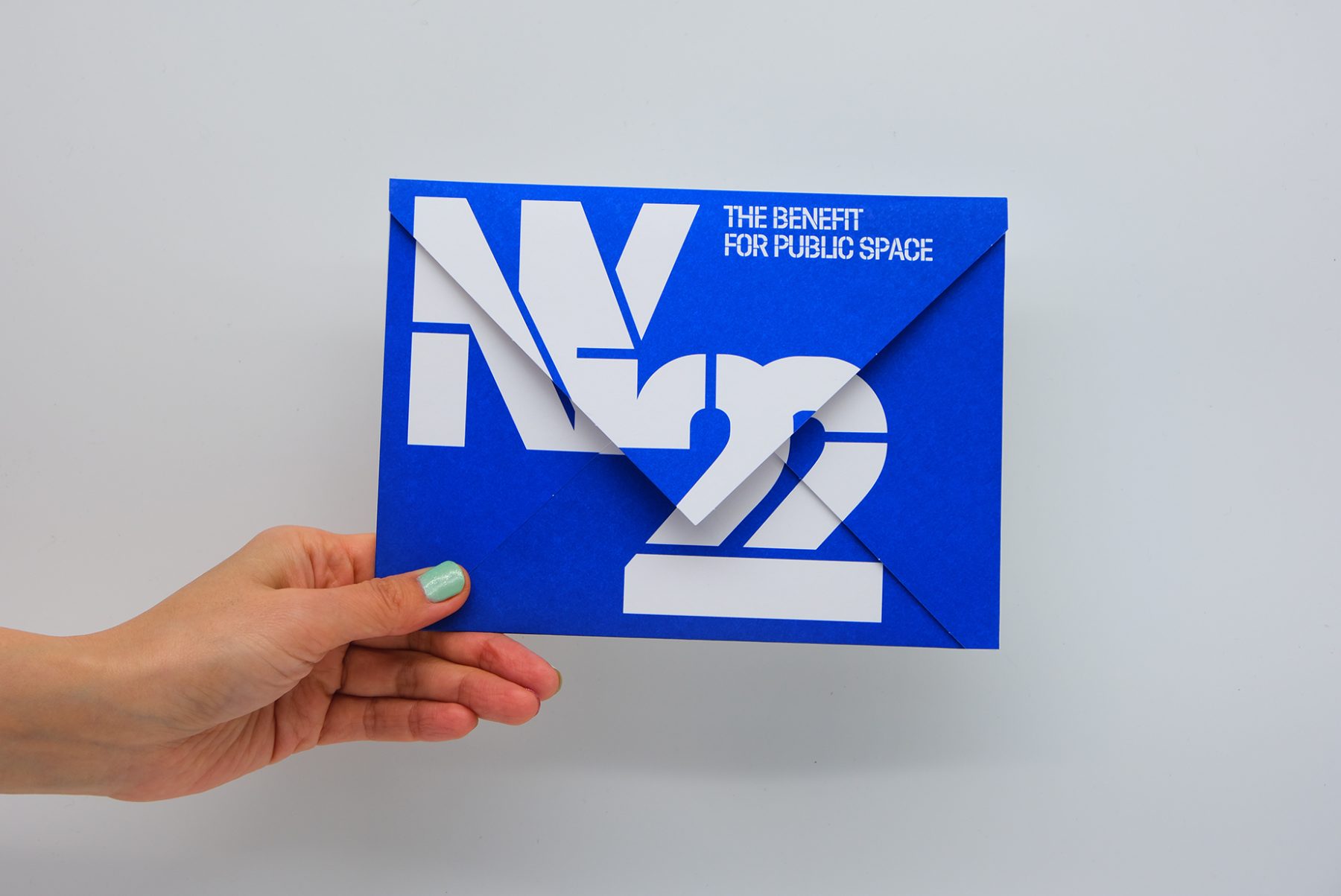
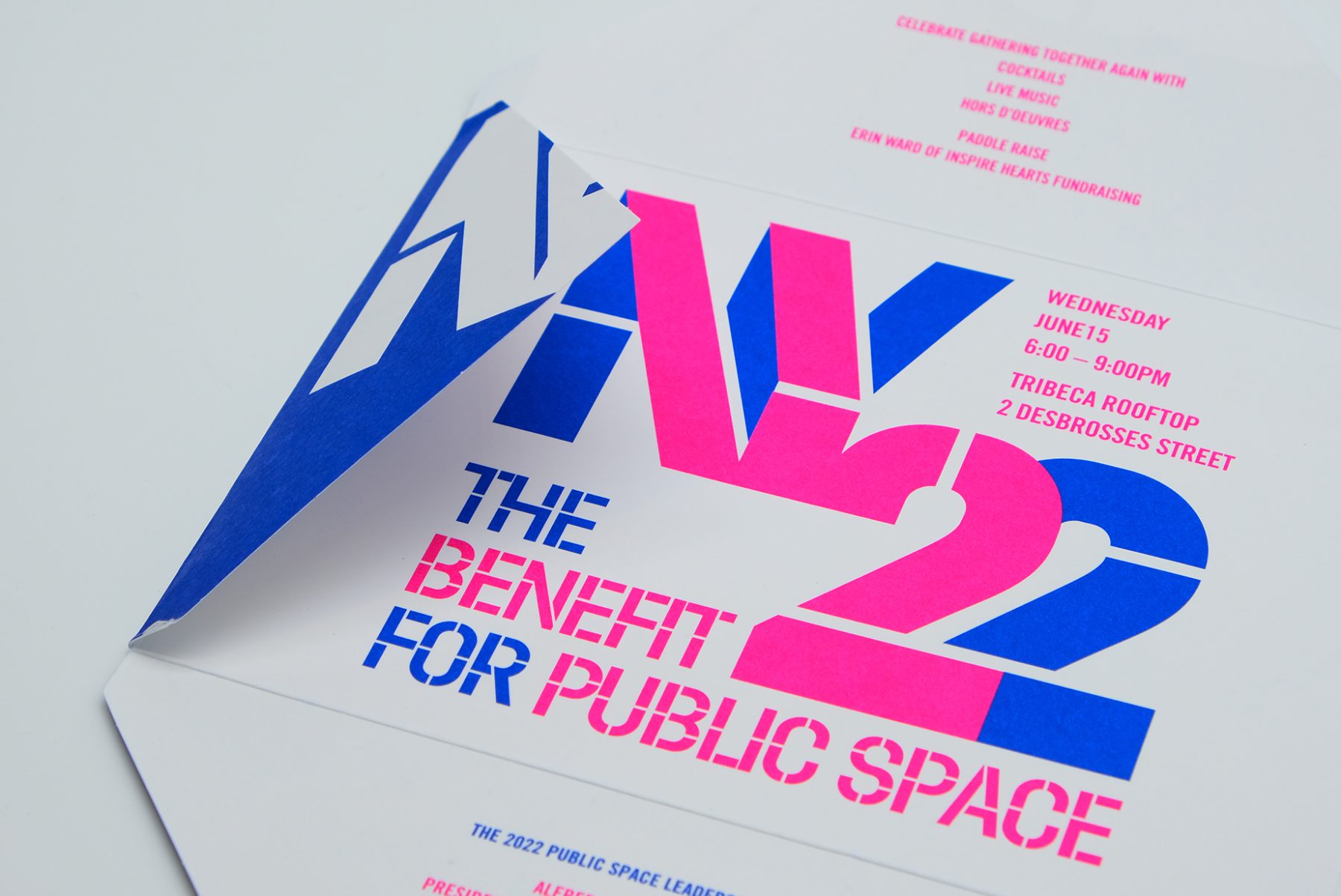
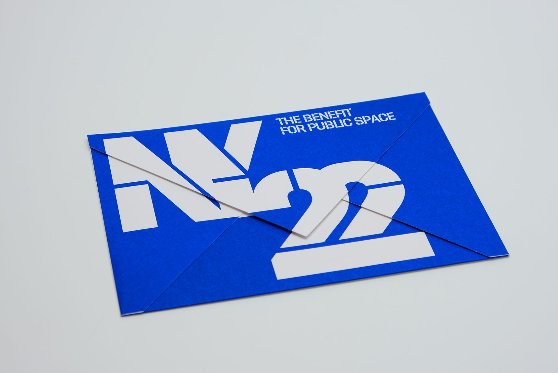
This was our invitation design for an annual benefit hosted by the Design Trust for Public Space, a New York–based nonprofit whose members believe in the transformative power of design within urban landscapes.
We crafted a unique invitation in which each panel of the envelope reveals a message as it unfolds. We combined typography, vibrant colors, and the angular shape of the envelope to emulate architectural forms, creating a visual metaphor for the symbiotic relationship between design and public space.
KUDOS Design Collaboratory
-
John Kudos
Creative Director -
Fay Qiu
Designer -
Amanda Knott
Project Manager
Between Four Freedoms
Four Freedoms Park Conservancy
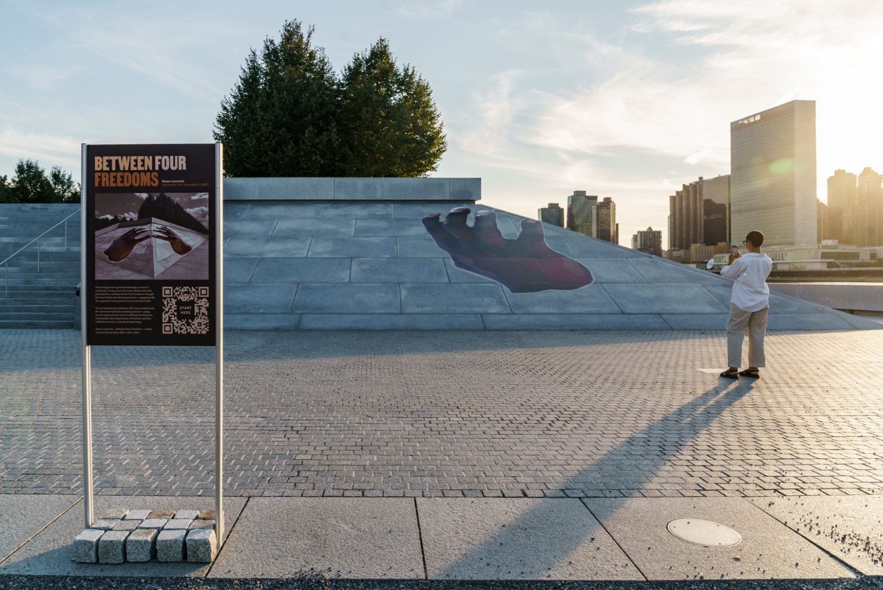
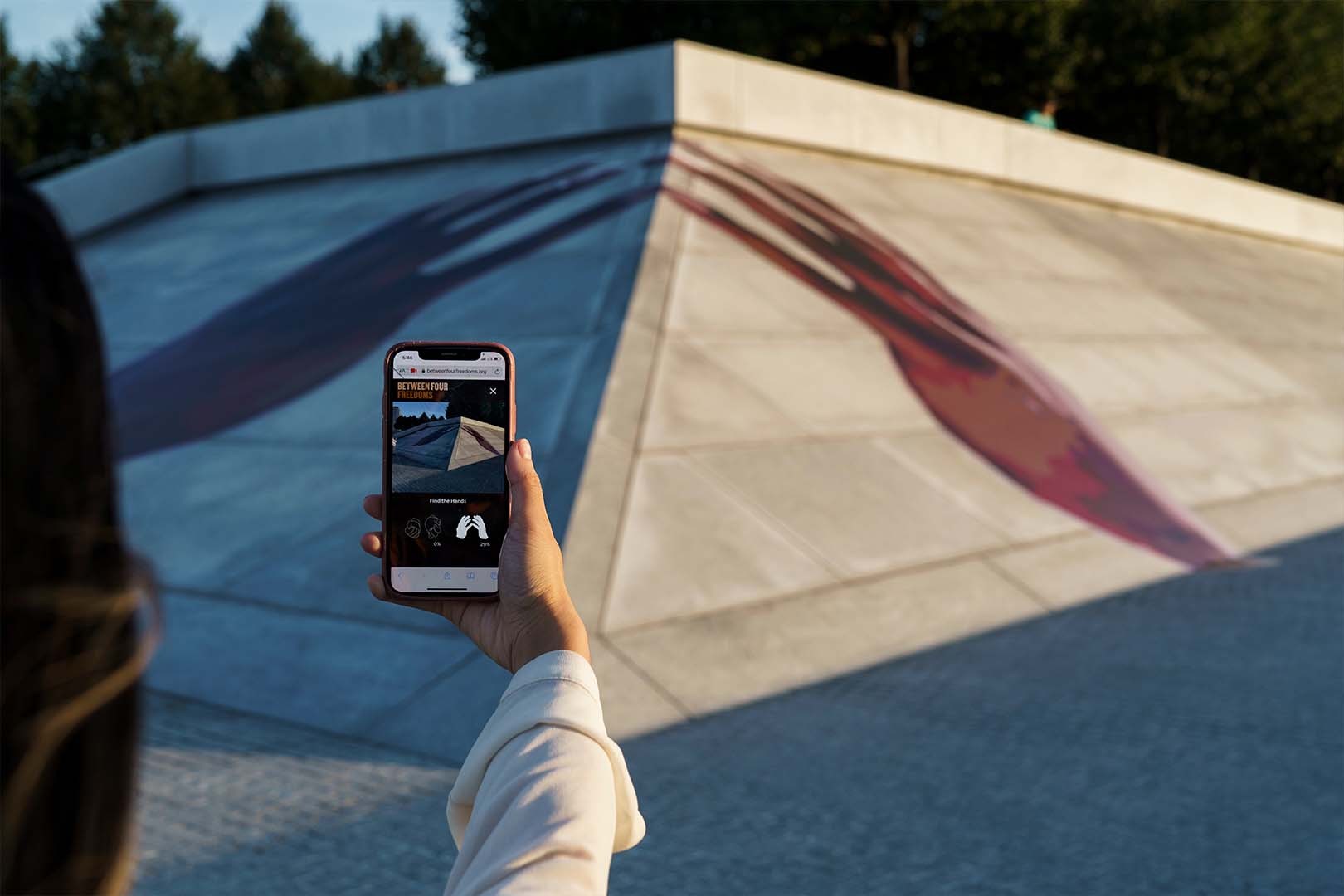
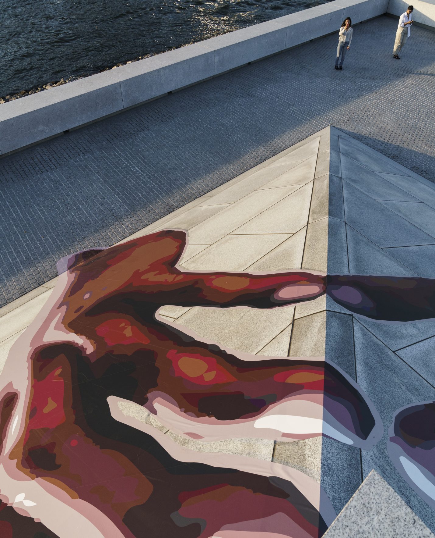
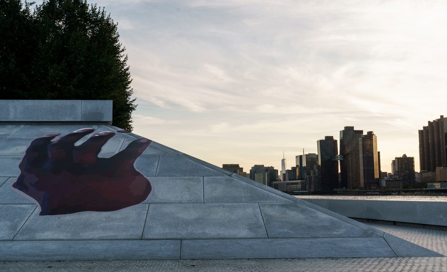
Artist Shaun Leonardo’s 2021 outdoor installation “Between Four Freedoms” reinterpreted and celebrated Franklin D. Roosevelt’s seminal 1941 address calling for freedom of worship, freedom of speech, freedom from want, and freedom from fear. The interactive experience for the installation at Franklin D. Roosevelt Four Freedoms State Park redefines public engagement with art and social discourse.
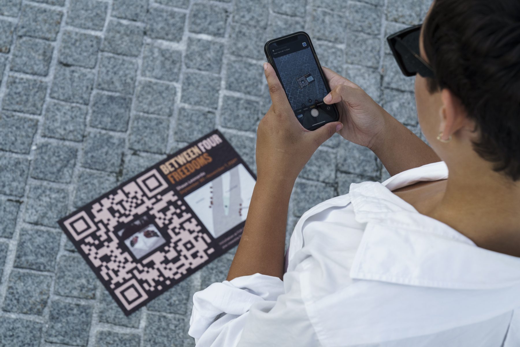
Guided by Leonardo’s vision, our branding mirrors the project’s ethos, employing a brown color scheme evocative of human skin tones and the “Martin” typeface, inspired by the Memphis Sanitation Strike of 1968, to represent a message of non-violence and inclusivity. Leveraging innovative technology such as image recognition, we enabled visitors to engage with the artwork by scanning QR codes, launching the mobile website, and exploring workshop videos led by Leonardo. With over 25,000 images collected, the installation ensured accessibility and interactivity on both the Manhattan and Long Island City sides, inviting visitors to delve into the narratives of vulnerable communities and rediscover Roosevelt’s timeless call for freedom and dignity.
KUDOS Design Collaboratory
-
John Kudos
Creative Director -
Fay Qiu
Designer -
Christyan Junaedi Setiawan
Web Developer -
Imam Fadilah
Animator
IFFestNY 2019 Branding
Indonesian Film Forum NY
Capabilities
Focus Area
Client
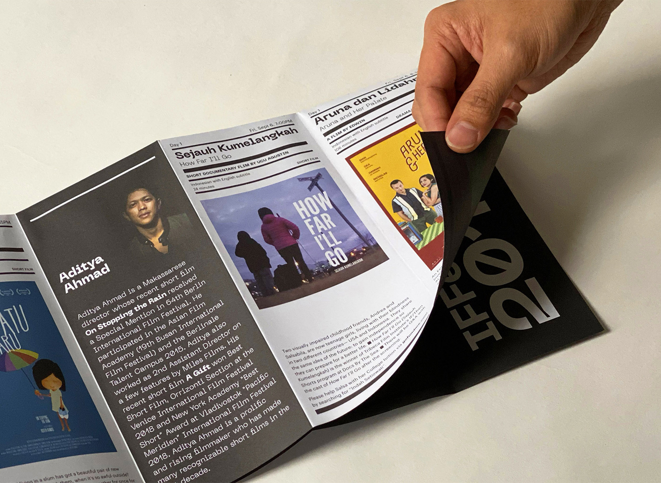
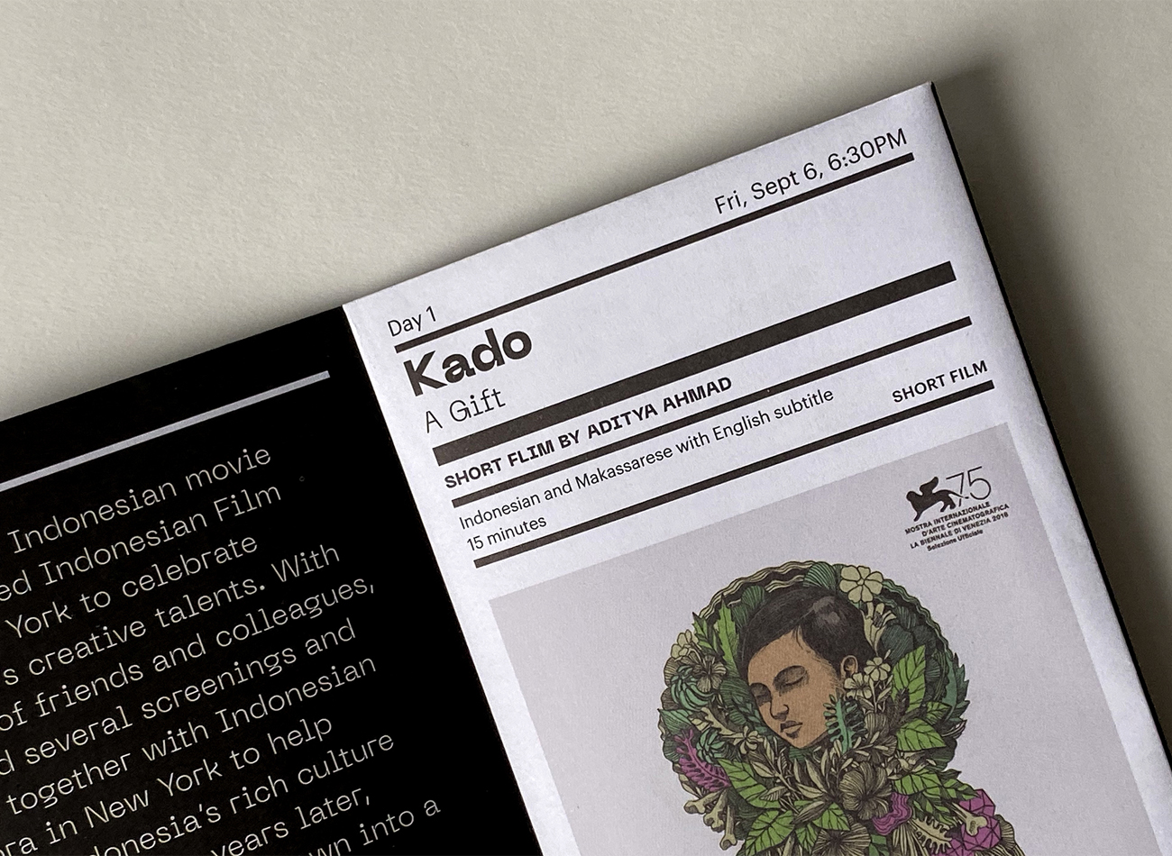
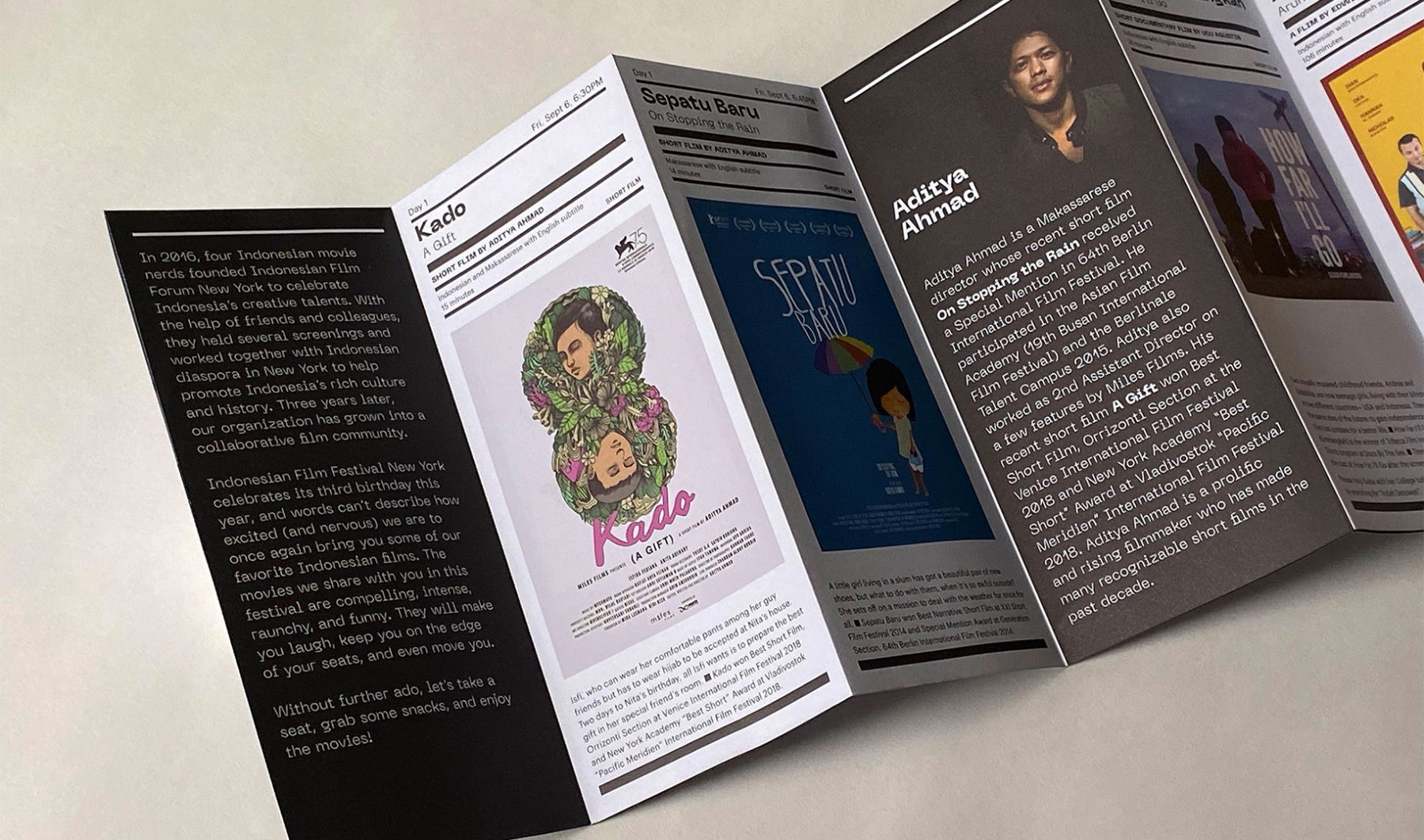
IFFestNY is the biggest Indonesian film festival in the East Coast. Held annually, the festival introduces works by internationally acclaimed Indonesian filmmakers. In 2019, the festival took place at SVA Theatre (New York) on September 6–7.
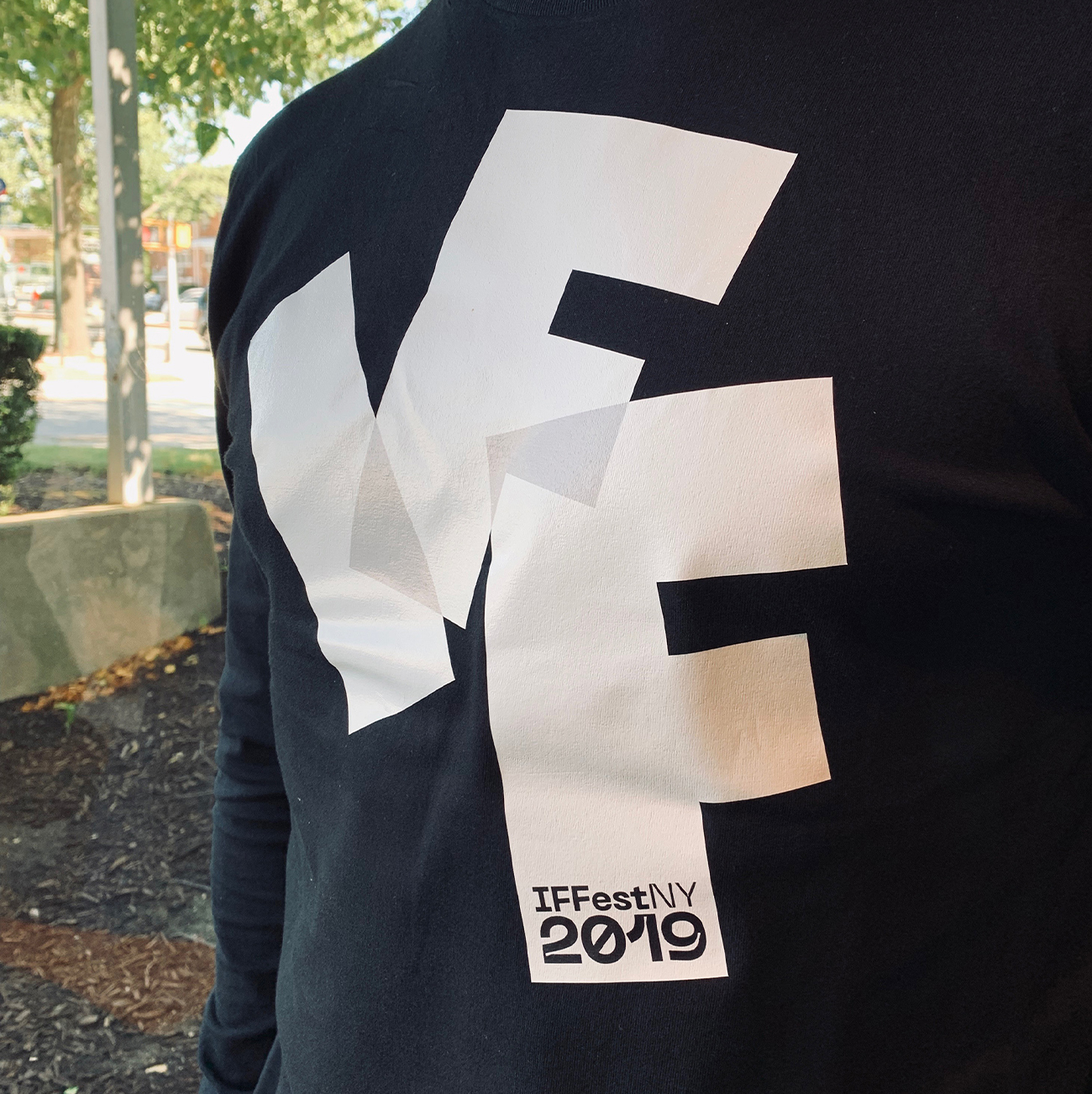
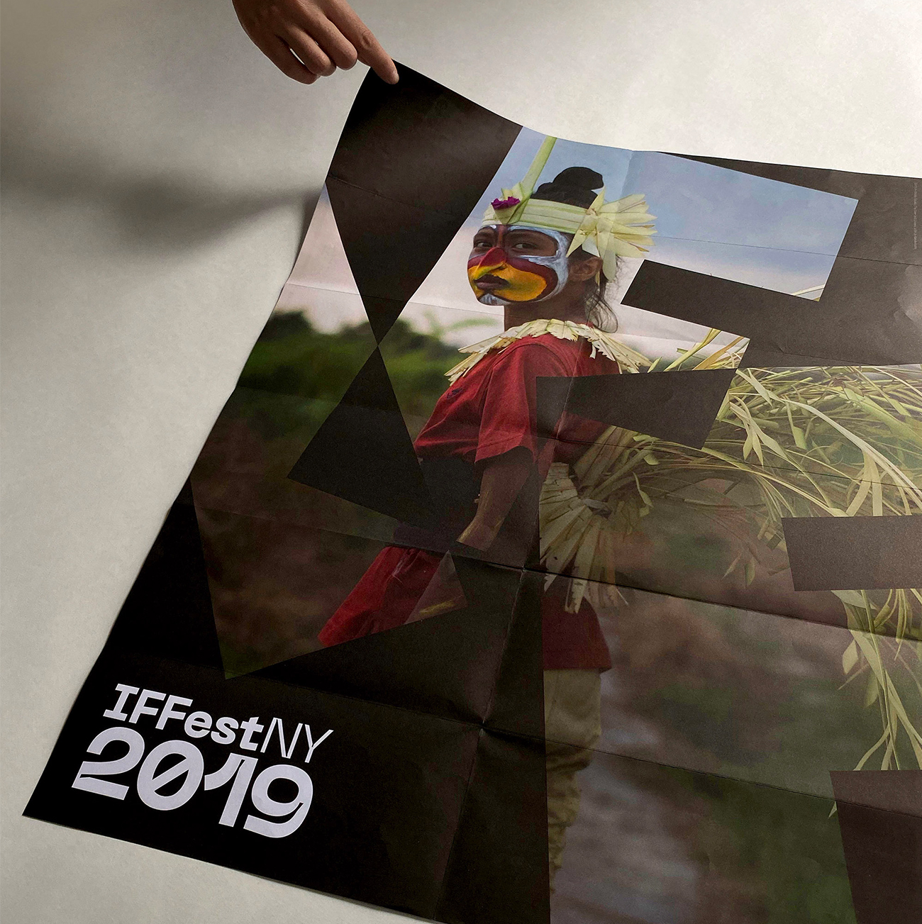
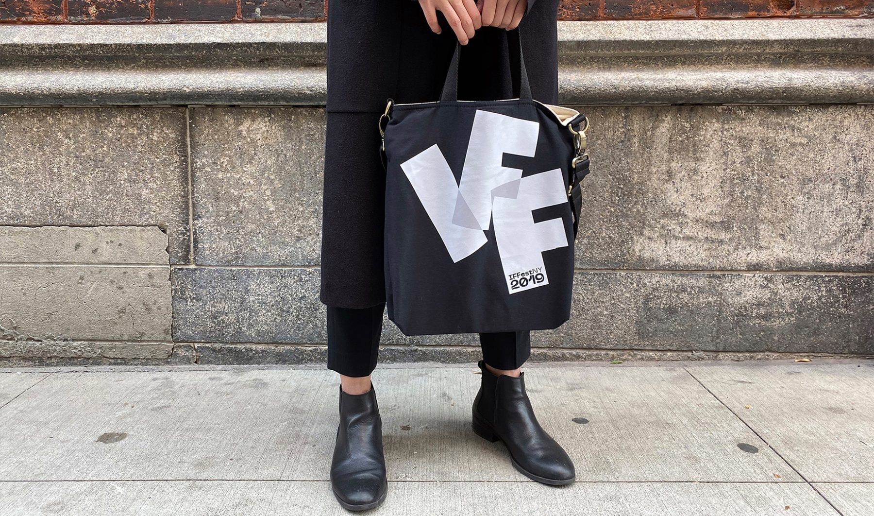
We designed a brand identity system for the festival that was made up of three overlapped letterforms, I-F-F, which animate the surrounding frame. The program brochure unfolds to reveal a poster featuring a striking scene from one of the festival’s showcased films.
KUDOS Design Collaboratory
-
John Kudos
Creative Director -
Owen Febiandi
Designer -
Aditya Bayu Perdana
Designer
Indonesian Film Forum NY
ARITA: Eternally Modern at NY NOW
Made in Japan Project
Capabilities
Client
Awards
-
GDUSA 2018 American Web Design
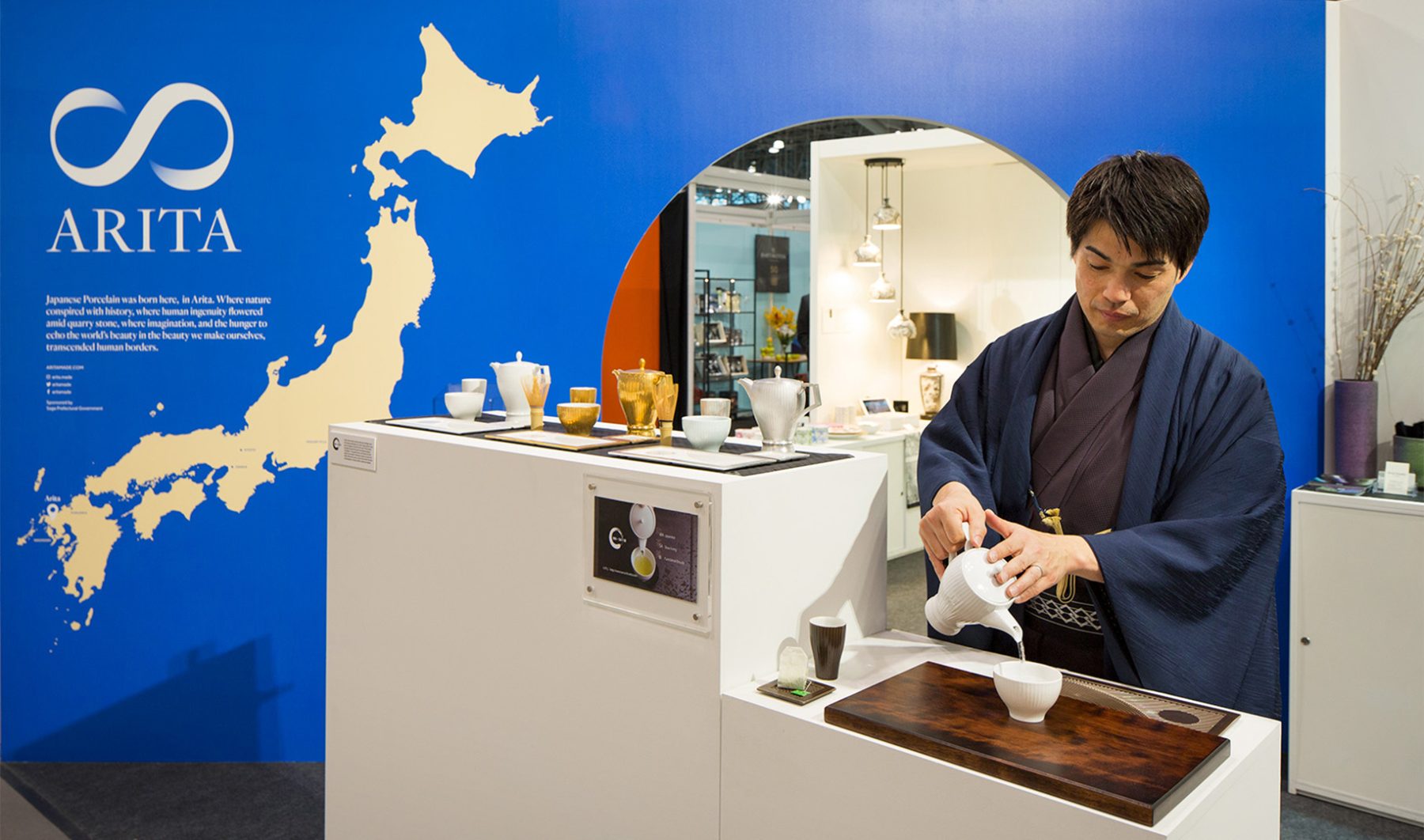
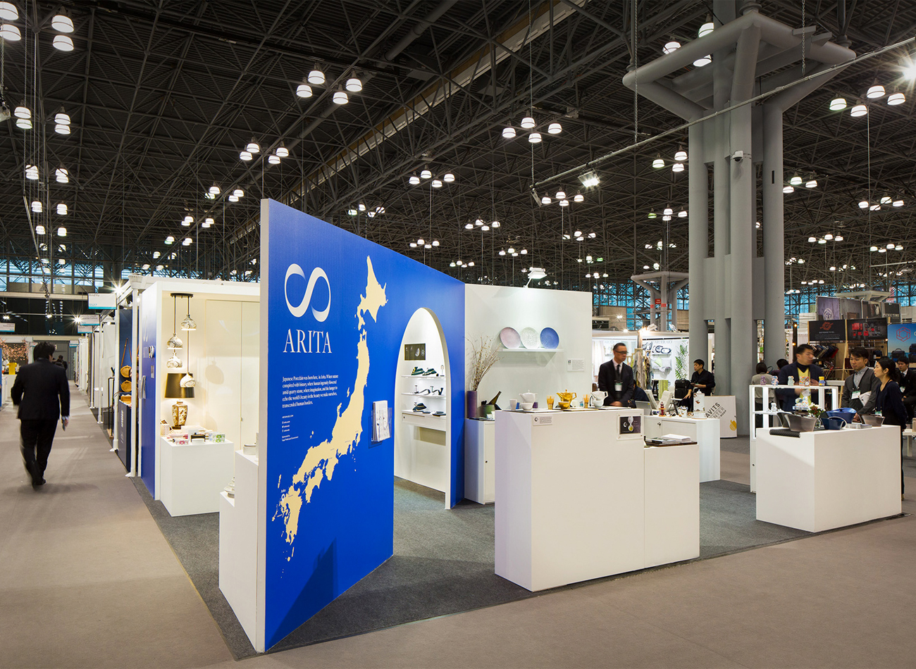
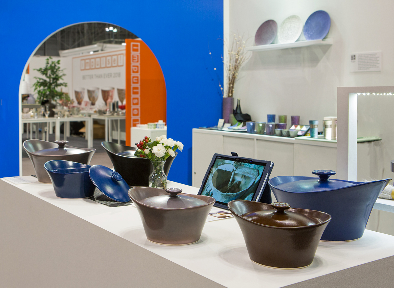
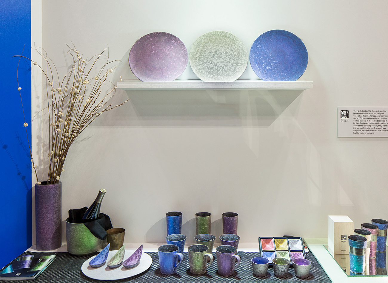
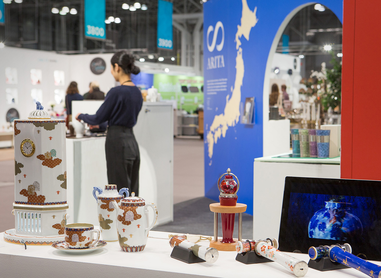
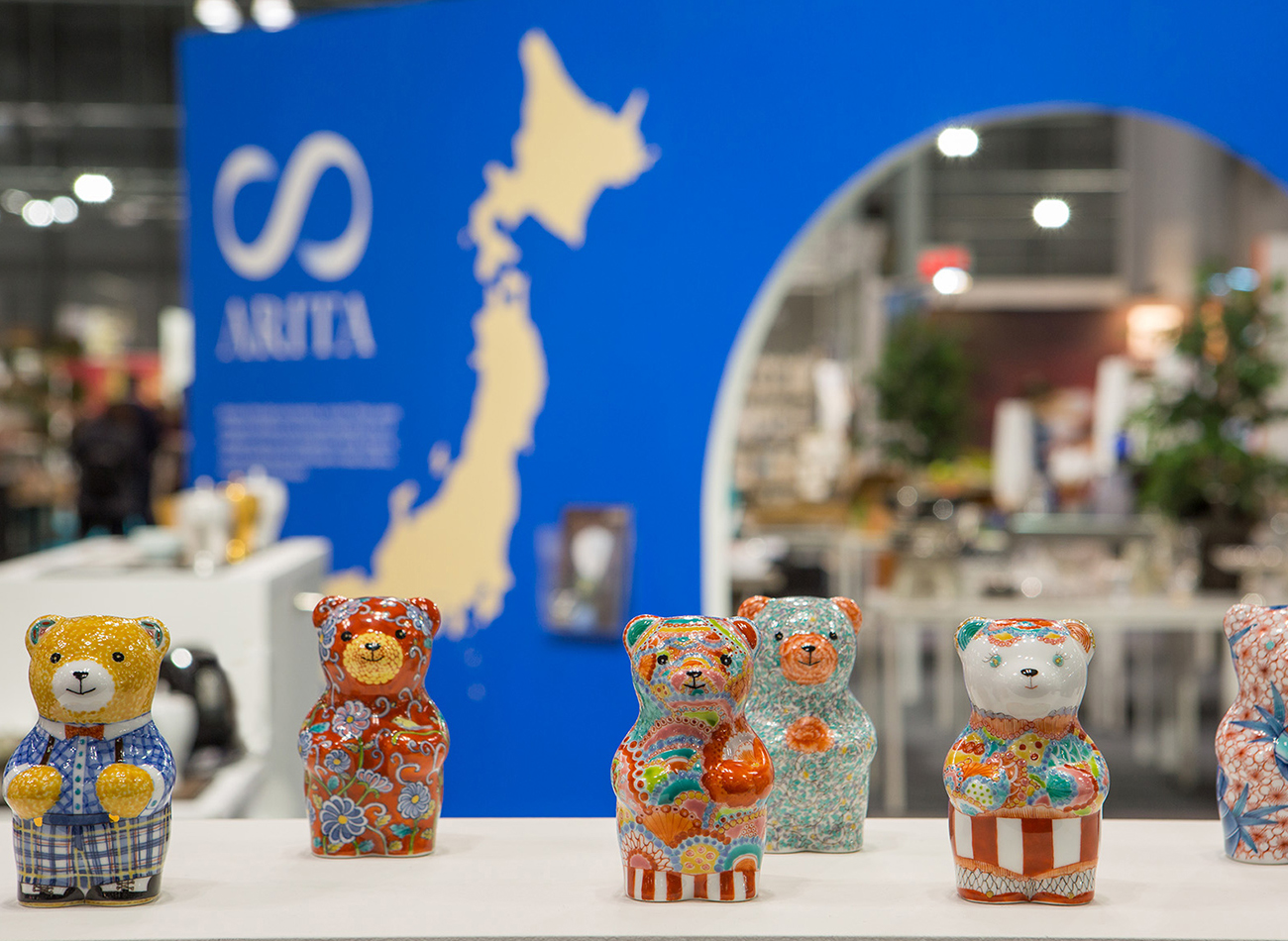
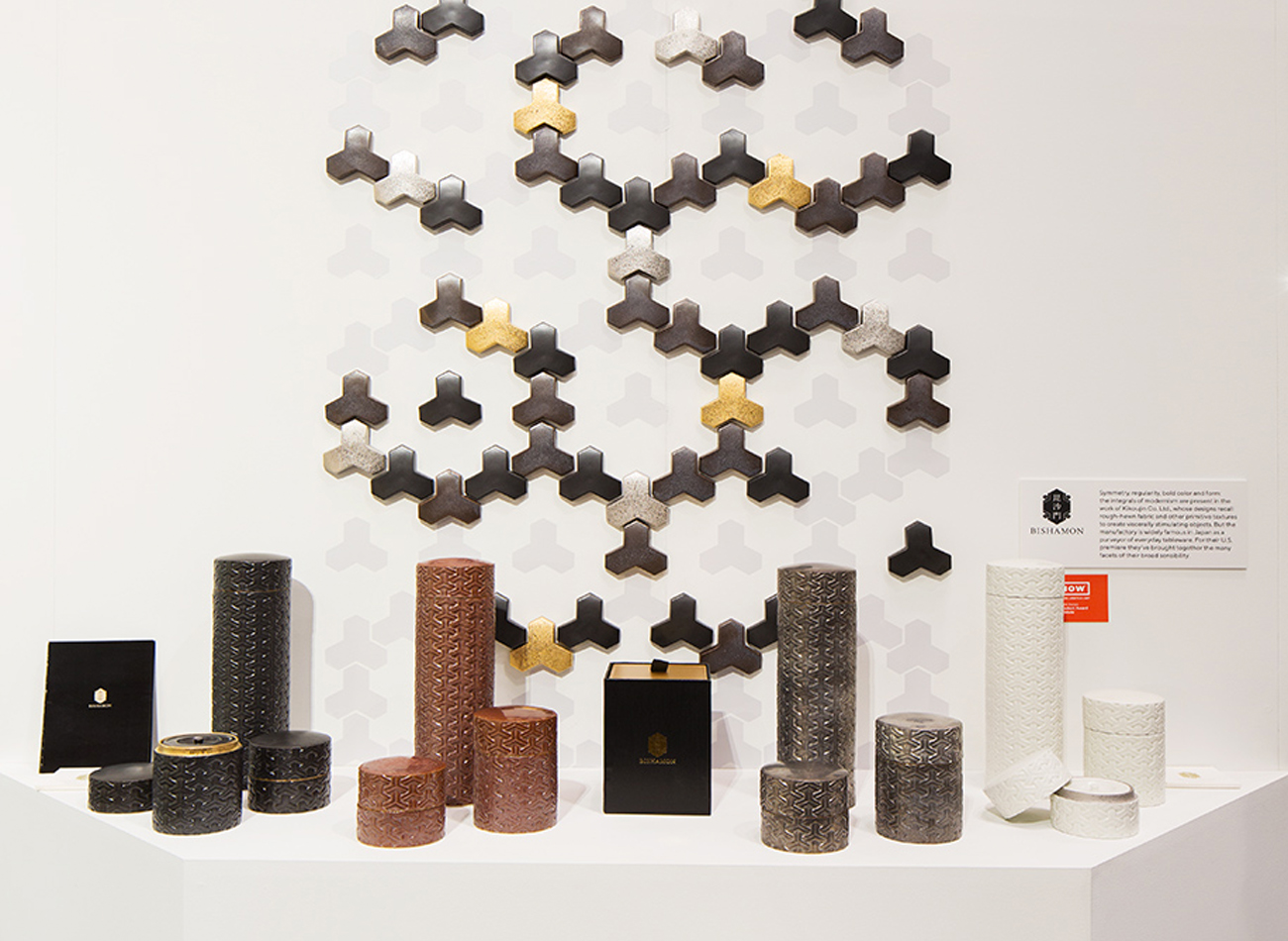
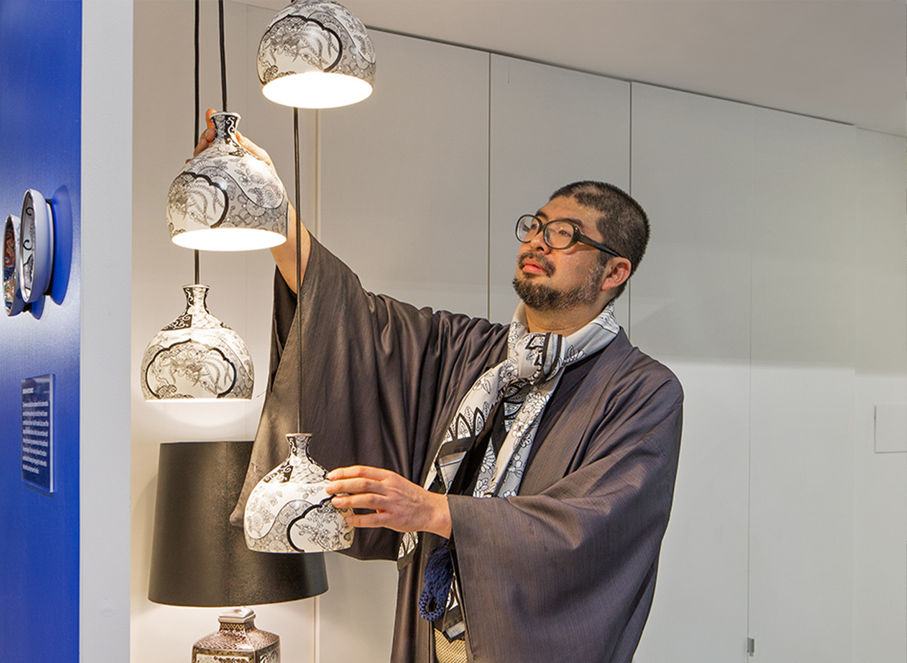
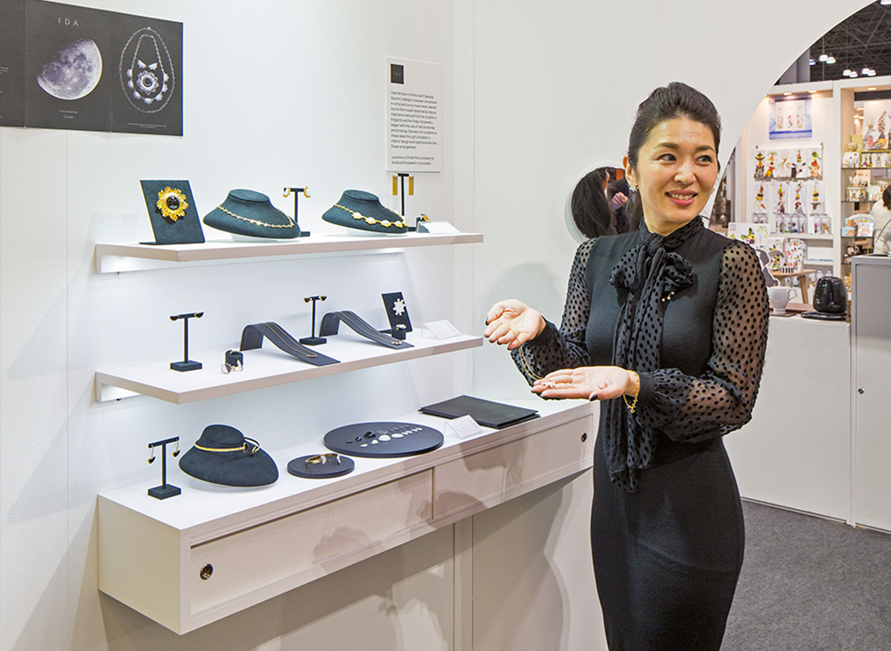
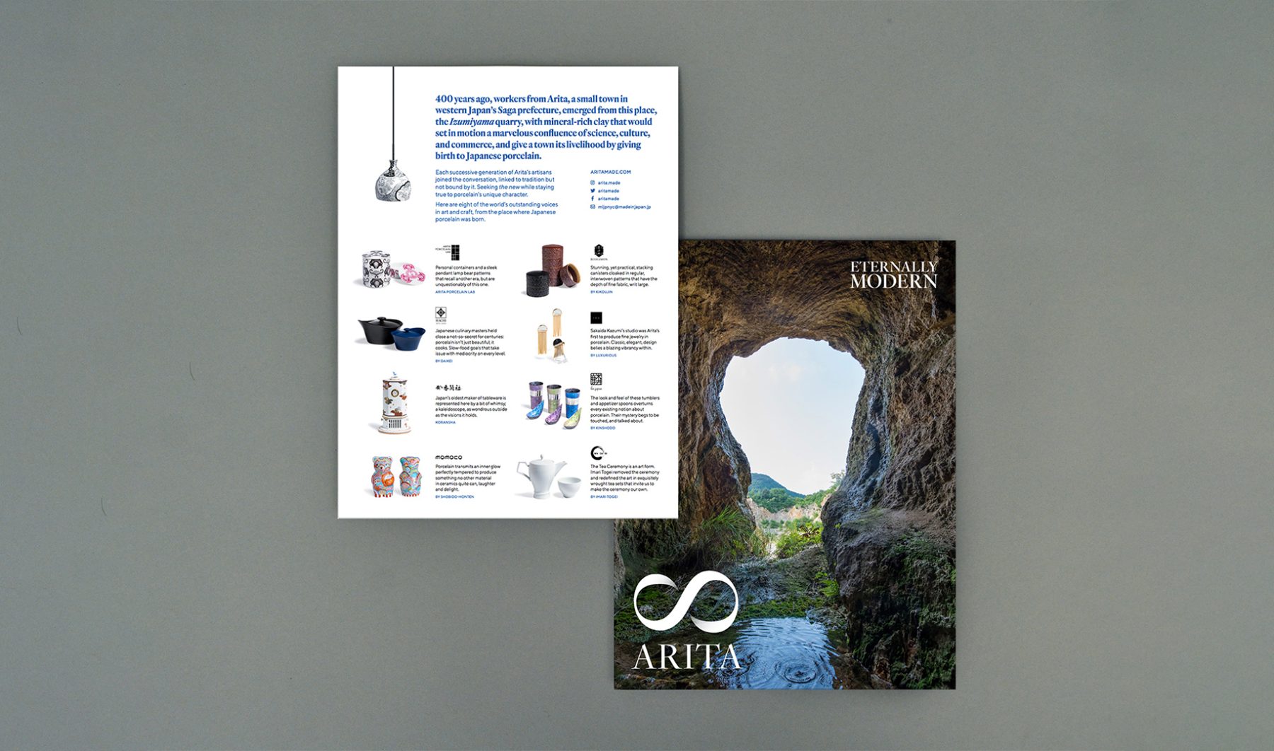
This was a collaboration with Made in Japan Project, funded by the Saga Prefectural Government. For the project, we completed the overall brand strategy, naming, exhibition design, art direction, website, and product design consultation for a government-led initiative promoting porcelain creators from Arita and their efforts to bring innovative Japanese design to the American market through NY NOW.
RESEARCH & CONSULTATION
Over the course of nine months, we visited Arita—the birthplace of porcelain in Japan—to consult with participating kilns and distributors over ideas for their product design, brand positioning, and marketing strategy for the U.S. market.
BRANDING
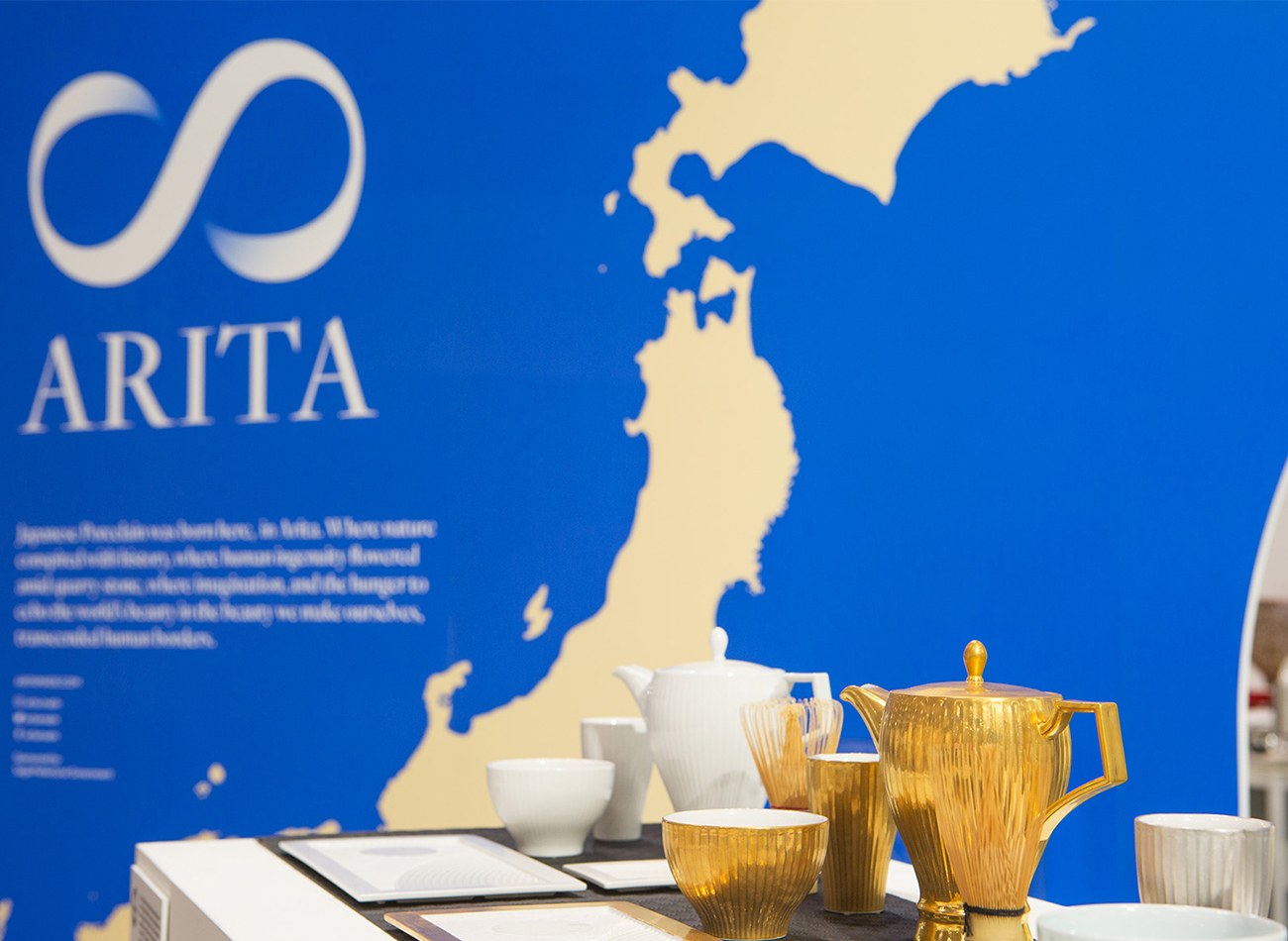
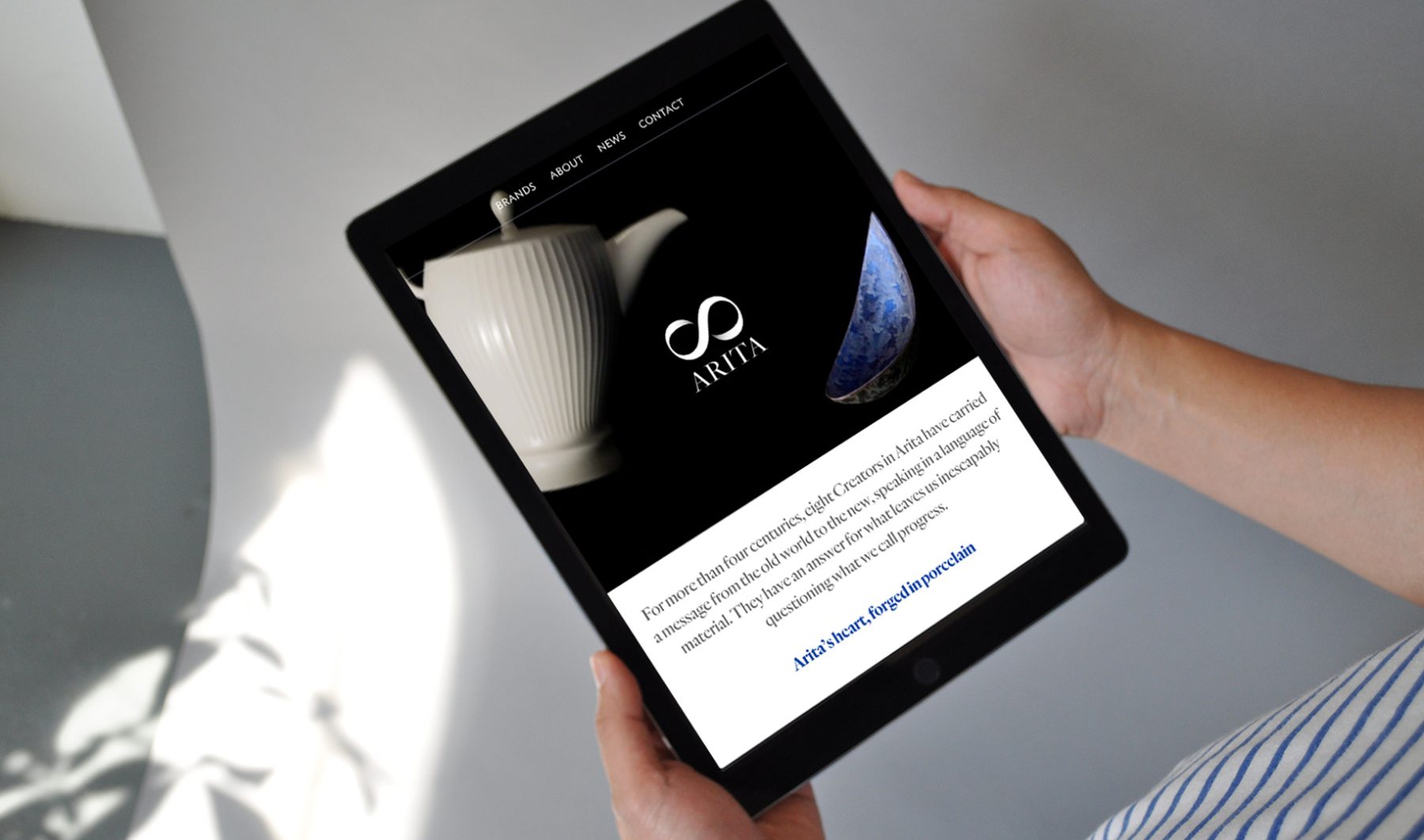
For the visual identity, we designed a lemniscate ∞ paired with the town’s name and the tagline “Eternally Modern,” pointing to how Arita creators continue to evolve four centuries of tradition, craftsmanship, and innovation into distinctively modern everyday products.
WEBSITE
Our responsive bilingual website was written for both Western and Japanese readers, with distinct messaging catered to each audience. We art-directed all of the website’s videos and photography, including a portrayal of key products falling in slow motion, close-ups in 360-degree rotation, documentary photos of Arita, and a video showing the porcelain-creation process.
EXHIBITION BOOTH
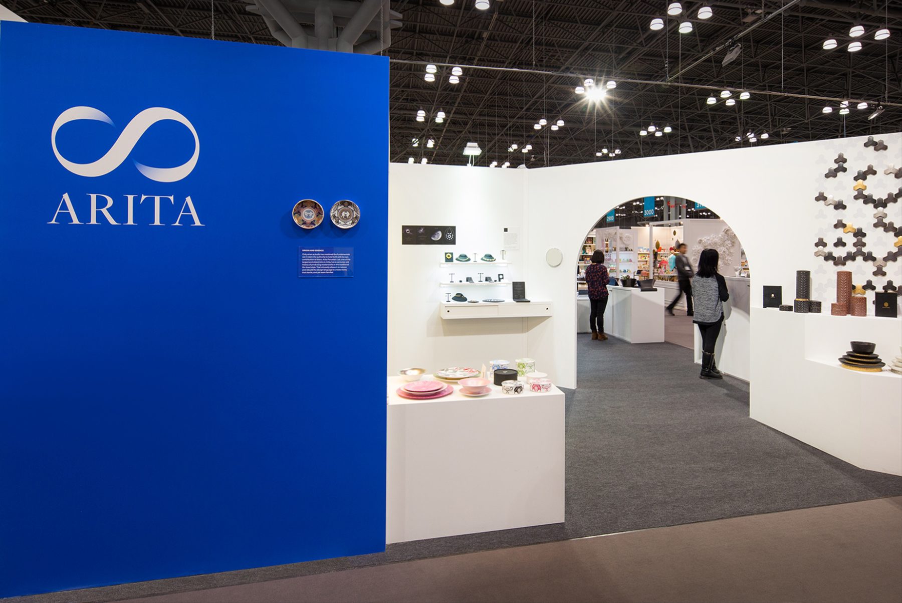
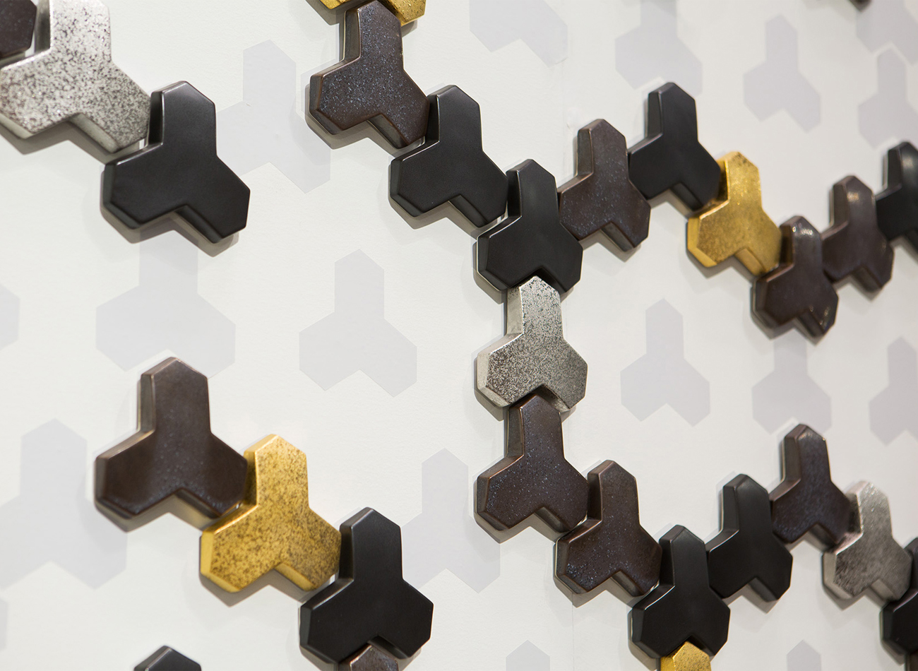
For the NY NOW market exhibition in February 2018, we designed a corner booth divided by a diagonal wall archway similar to those typically found in traditional porcelain kilns. Each creator had a museum-like stage and hidden storage underneath.
KUDOS Design Collaboratory
-
John Kudos
Creative Director -
Kiki Katahira
Art Director -
Ashley Wu
Designer -
Sumit Paul
Web Designer & Developer -
Mika Yoshida & David Imber (Maniform)
Copywriter
MANIFORM
-
David Imber
Copywriter -
Mika Yoshida
Copywriter
Photography
- Sam Morgan Photography
Quasquicentennial Campaign
AIA Brooklyn
Capabilities
Focus Area
Client
Awards
-
GDUSA 2019 American Graphic Design Awards
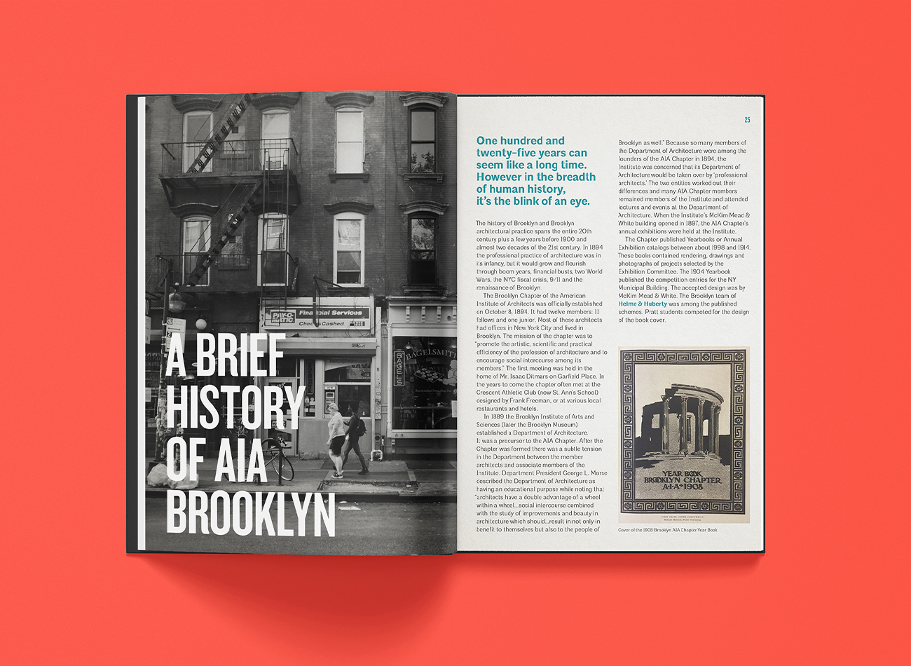
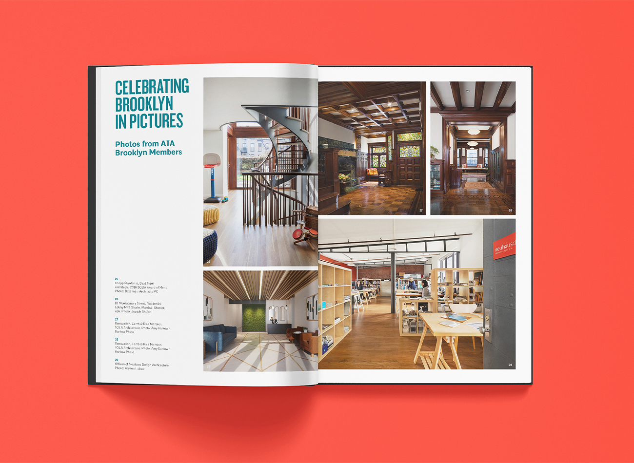
The Brooklyn Chapter of the American Institute of Architects (AIA), established in 1894, is the second-largest of the Institute’s five chapters in the New York City region.
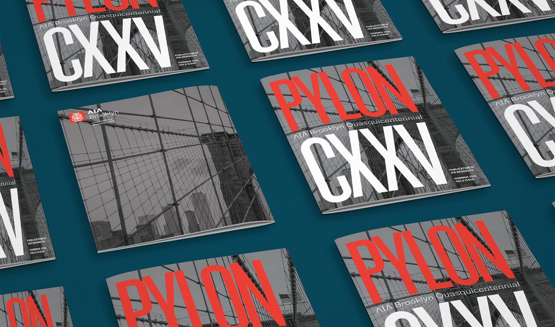
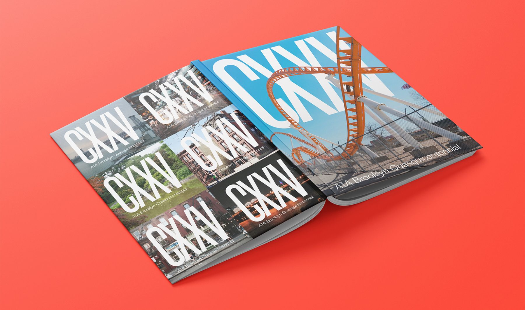
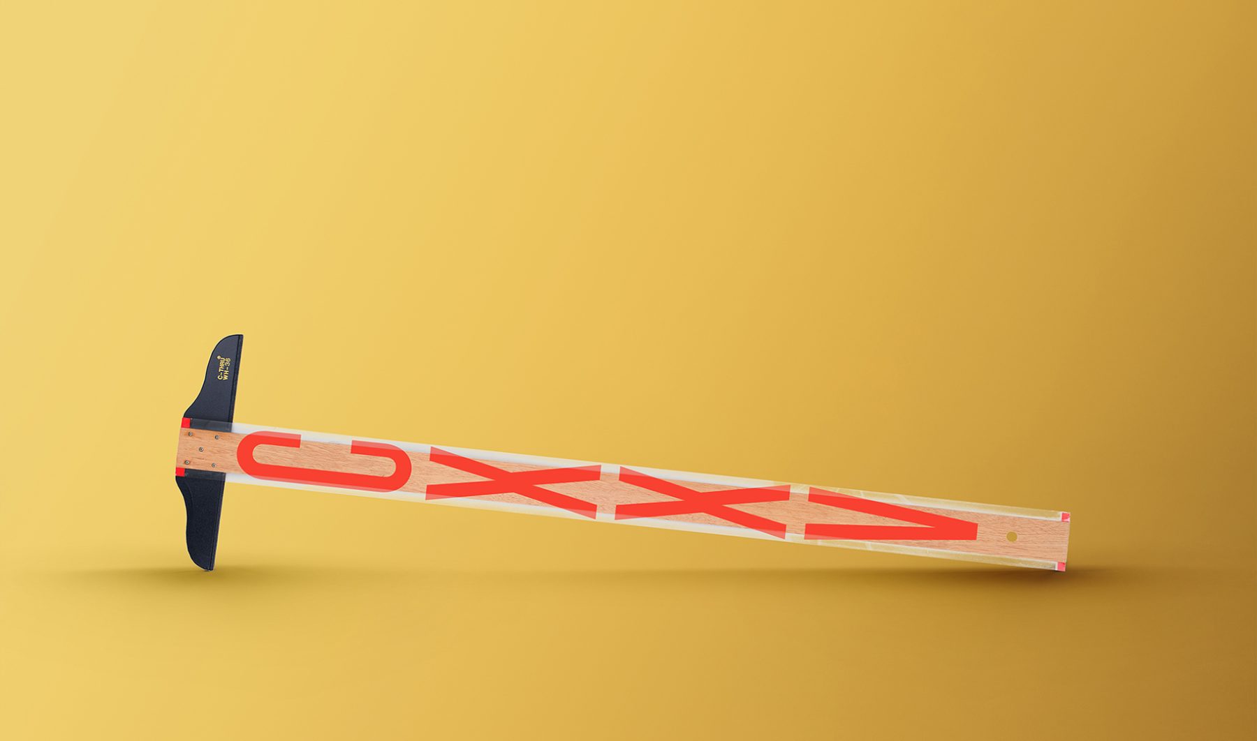
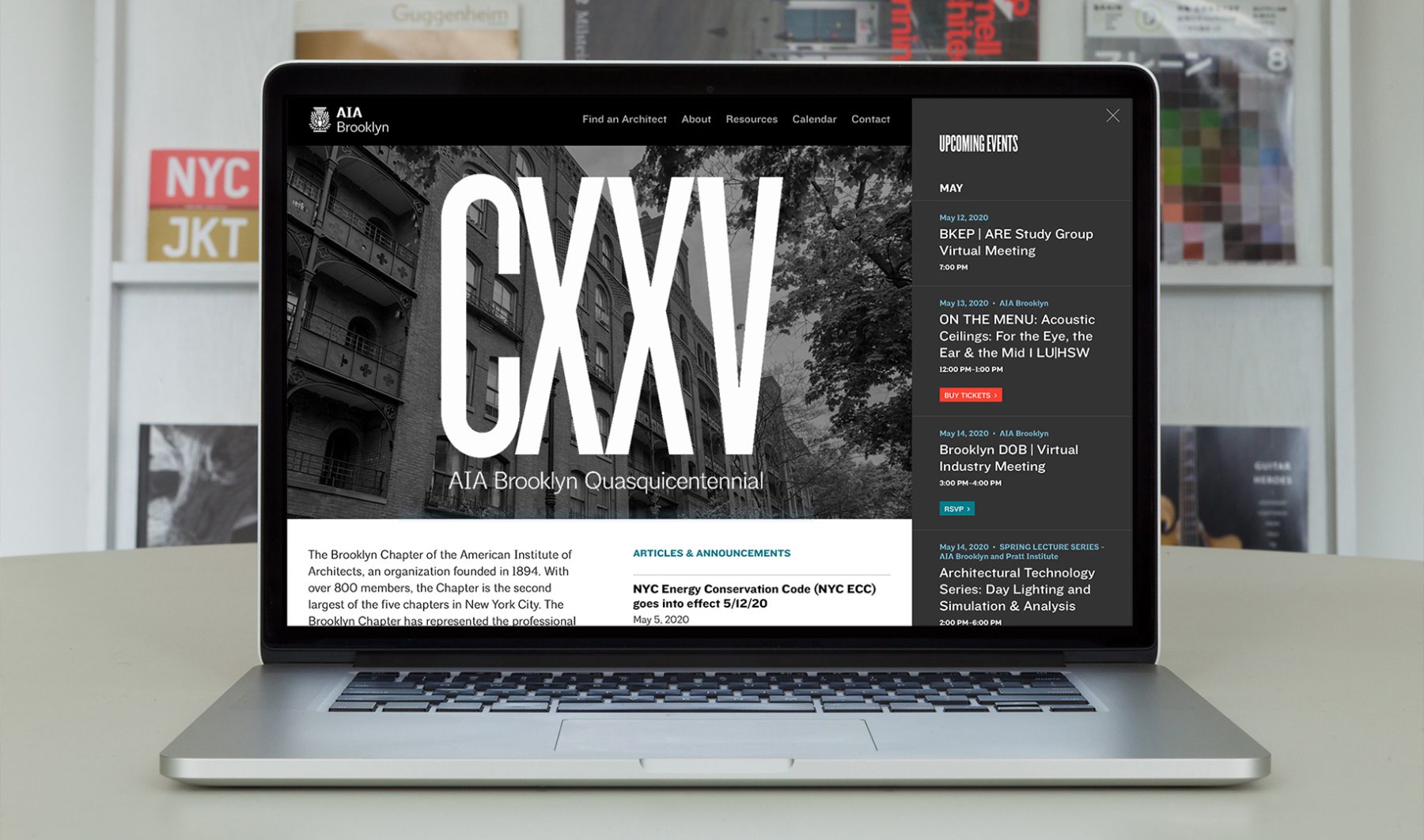
To help the Brooklyn Chapter celebrate its 125th anniversary, we designed a campaign that visually centers the Roman numeral representation of 125—CXXV, or the quasquicentennial—as supergraphics on all of the Chapter’s platform materials, from website to gala booklets, umbrellas, and T-shirts.
KUDOS Design Collaboratory
-
John Kudos
Creative Director -
Ashley Wu
Designer
AIA Brooklyn
Techpolitan Branding & Space
Techpolitan
Capabilities
Focus Area
Client
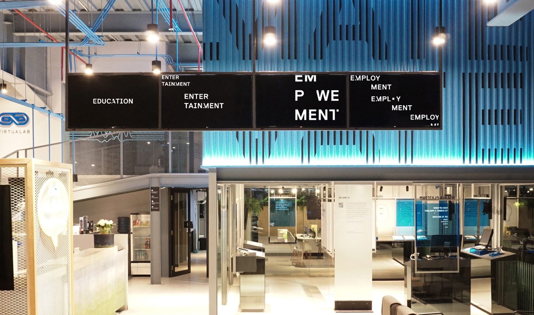
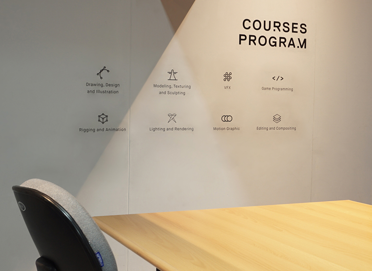
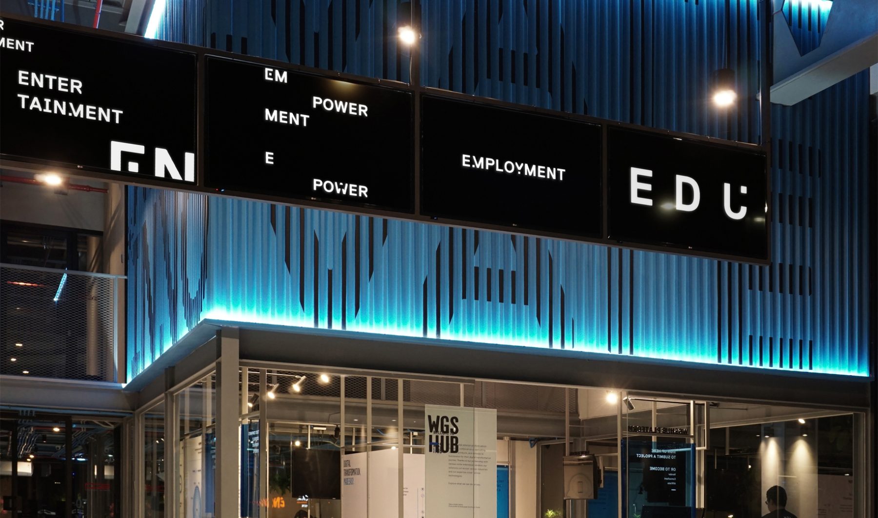
Headquartered in Jakarta, Indonesia, Techpolitan is a digital hub built on four pillars: entertainment, education, employment, and empowerment. Techpolitan seeks to cultivate youngsters’ passion for gaming as a positive driver to develop a technology-literate society through mentorship, talent placement, and seed funding.
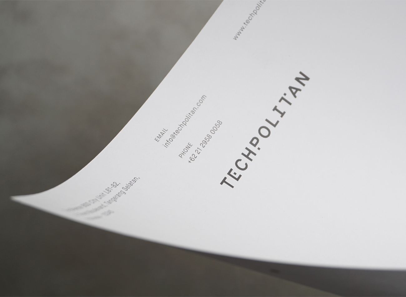
For the organization’s branding and space, we designed a typographic system that drew inspiration from the appearance of an onscreen pixel glitch. In our design, these pixel bits become a dynamic graphic element that expresses Techpolitan’s graphic identity in interactions with its logotype, signage, motion graphics, and various communications.
KUDOS Design Collaboratory
-
Andy kurniawan
Creative Director -
Ryan Adenata
Art Director & Designer
Techpolitan
Meditap Branding
Teknologi Pamadya Analitika
Capabilities
Focus Area
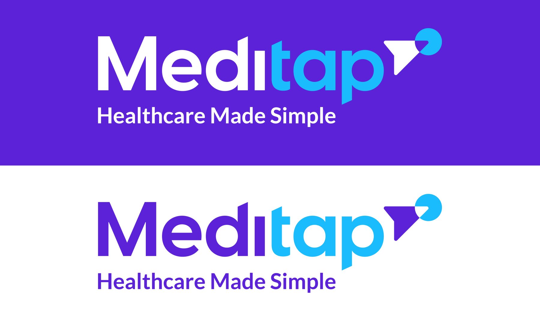
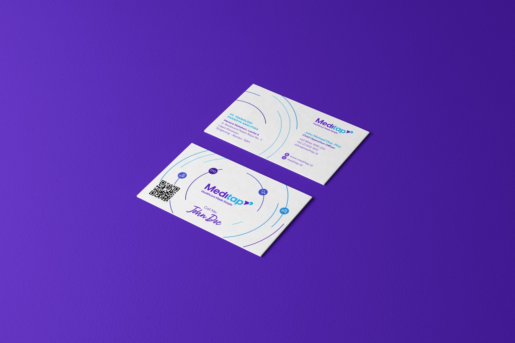
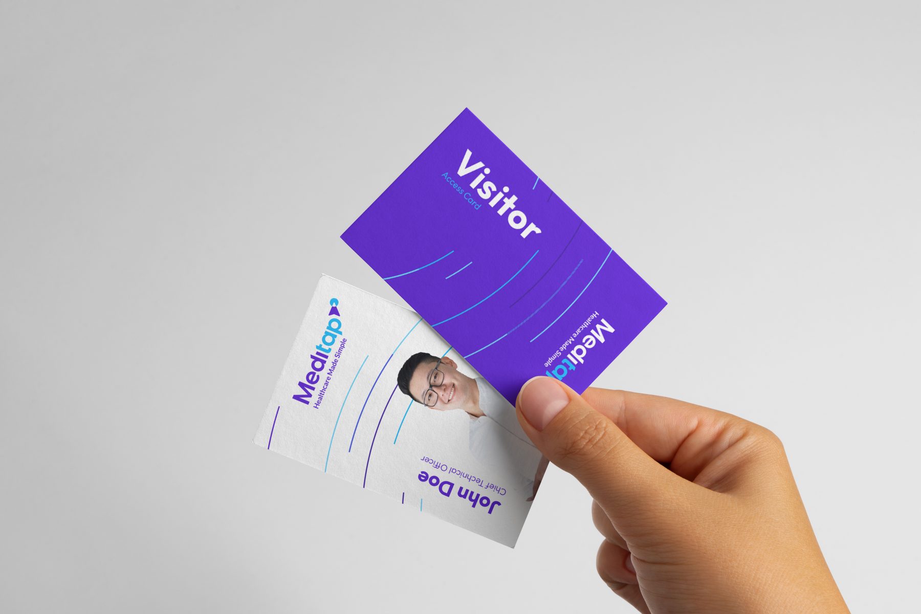
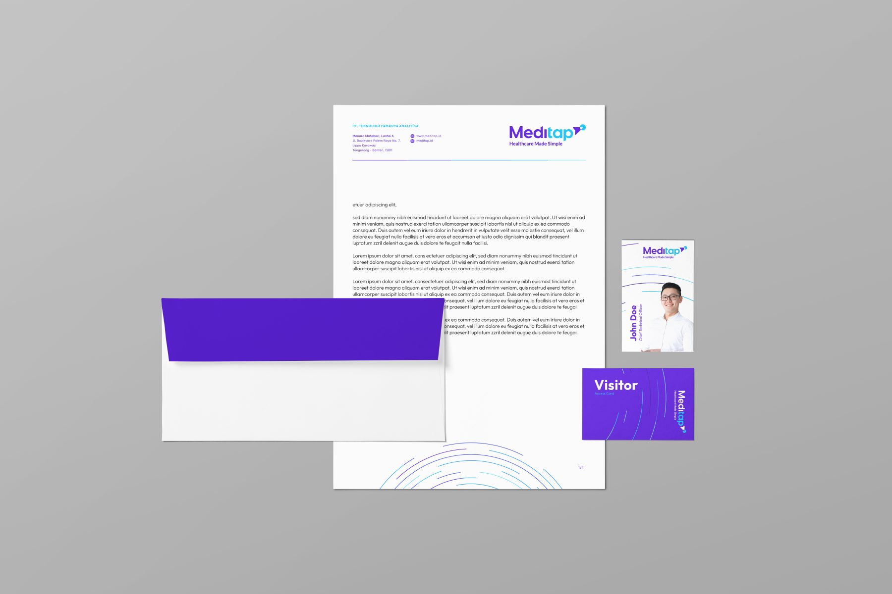
This was a rebranding project for one of the largest privately owned health-service companies in Indonesia. KUDOS was tasked with creating fresh, young, and relevant new branding that would resonate with vibrant and dynamic markets.
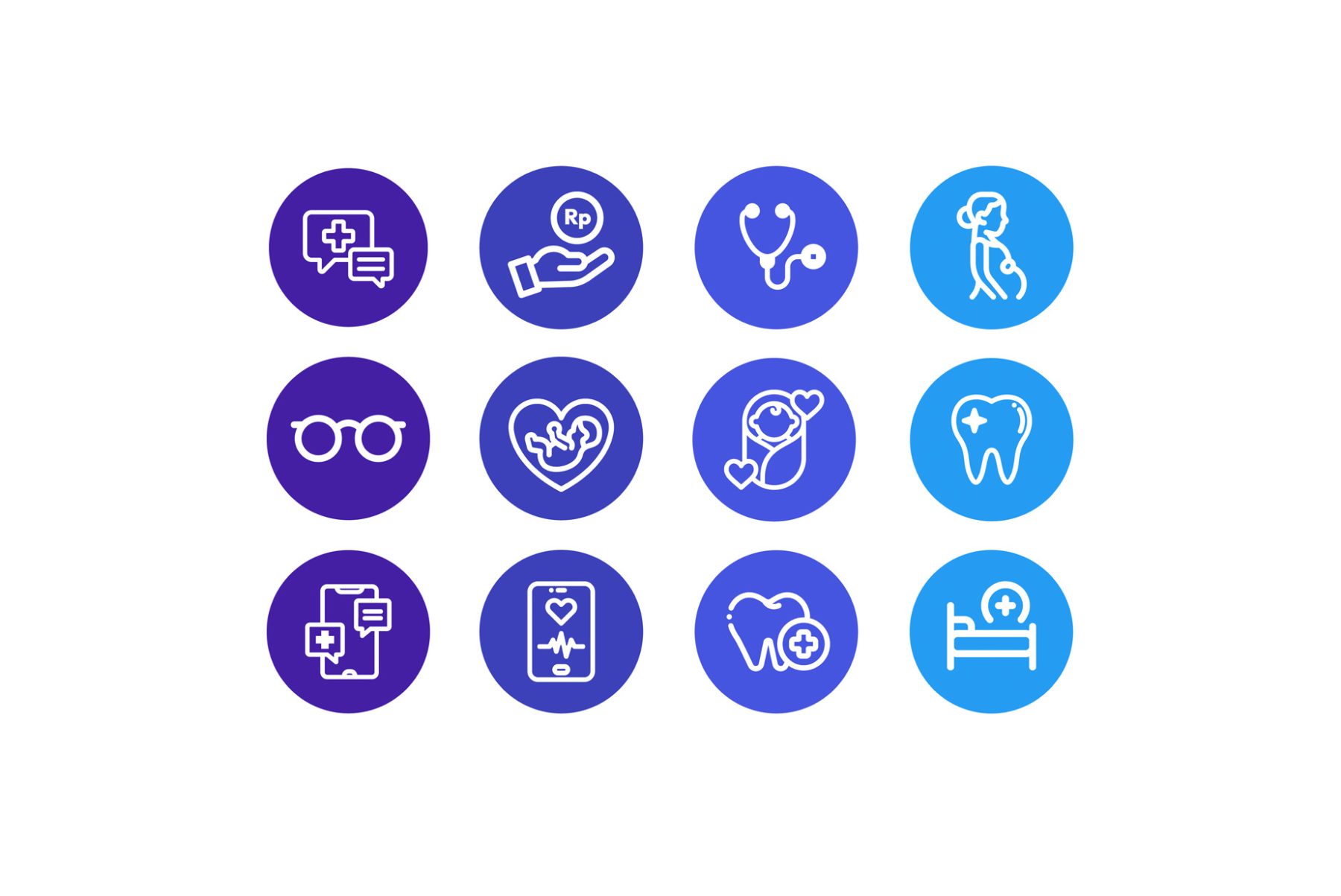
Our paper-plane logogram was designed to convey the brand’s forward-thinking, flexible approach. We incorporated purple and blue colors to represent trust, health, positivity, and youth, resulting in a playful but reliable look and feel.
KUDOS Design Collaboratory
-
Calvin
Creative Director -
Melvin Junior
Art Director

MPC Branding & Website
MPC
Capabilities
Focus Area
Client
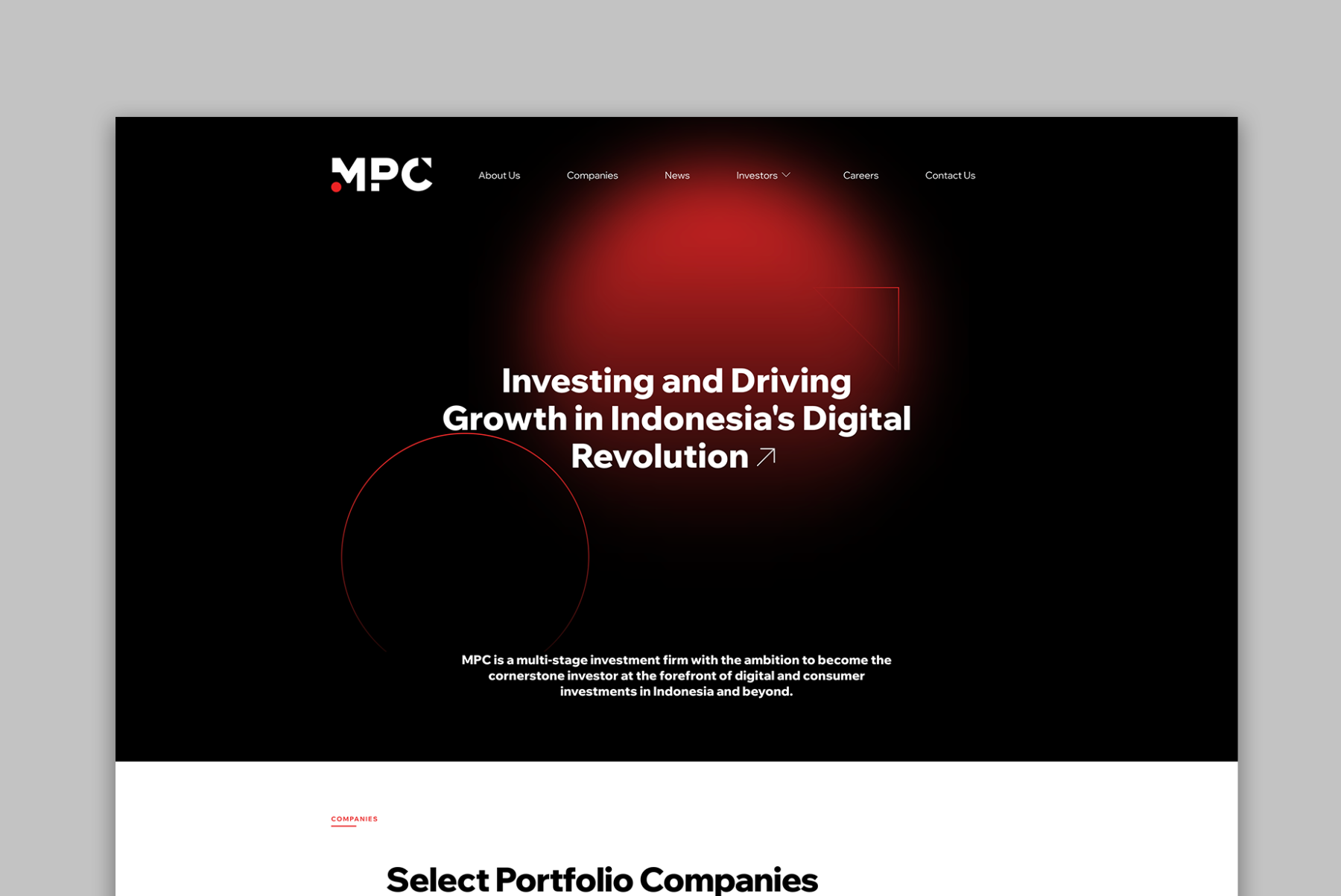
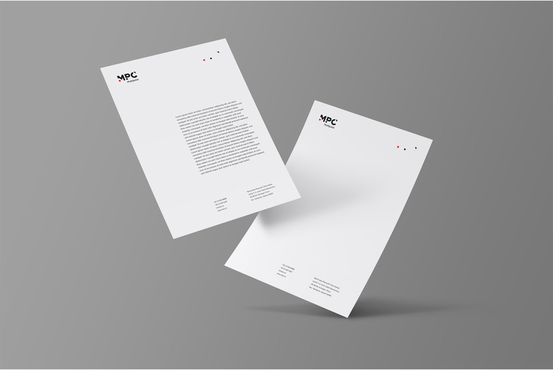
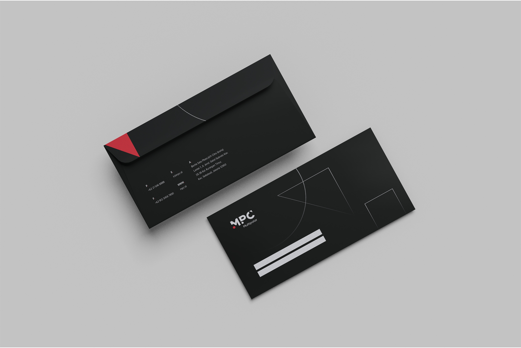
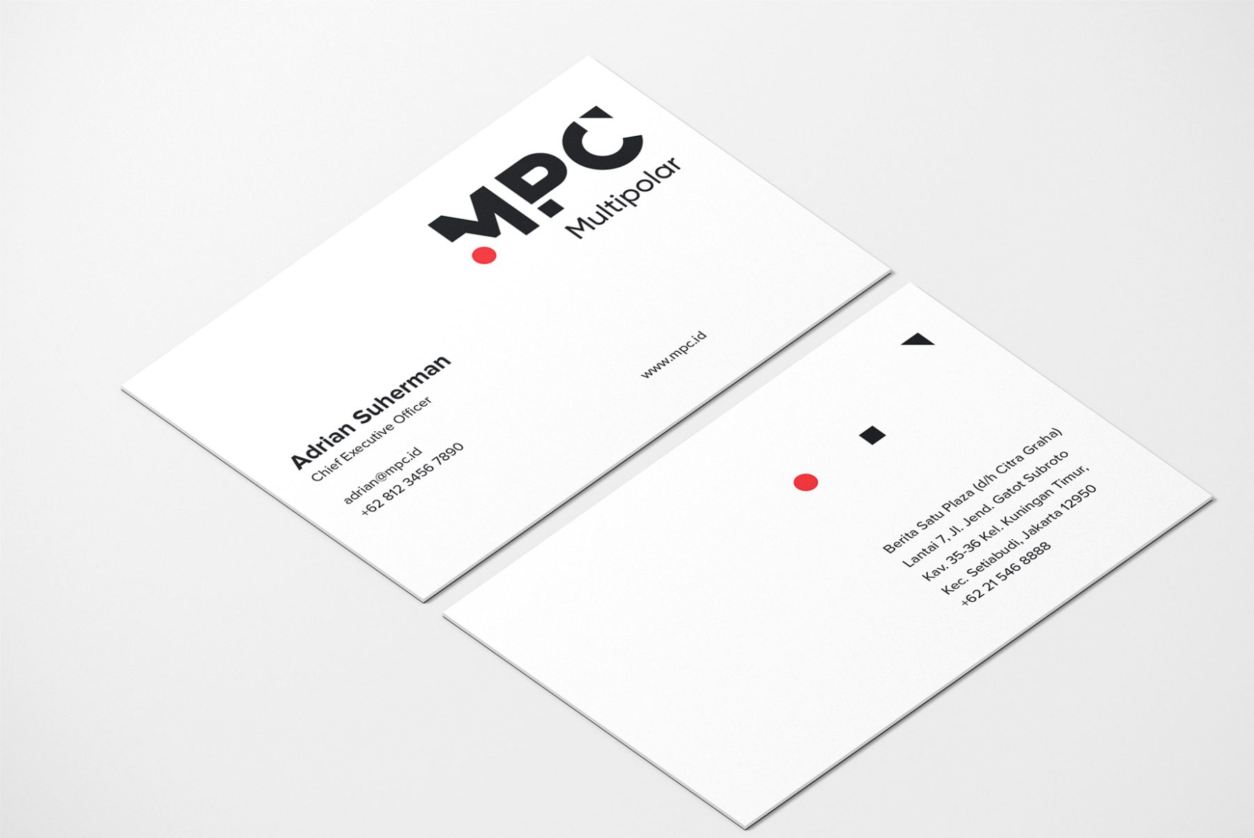
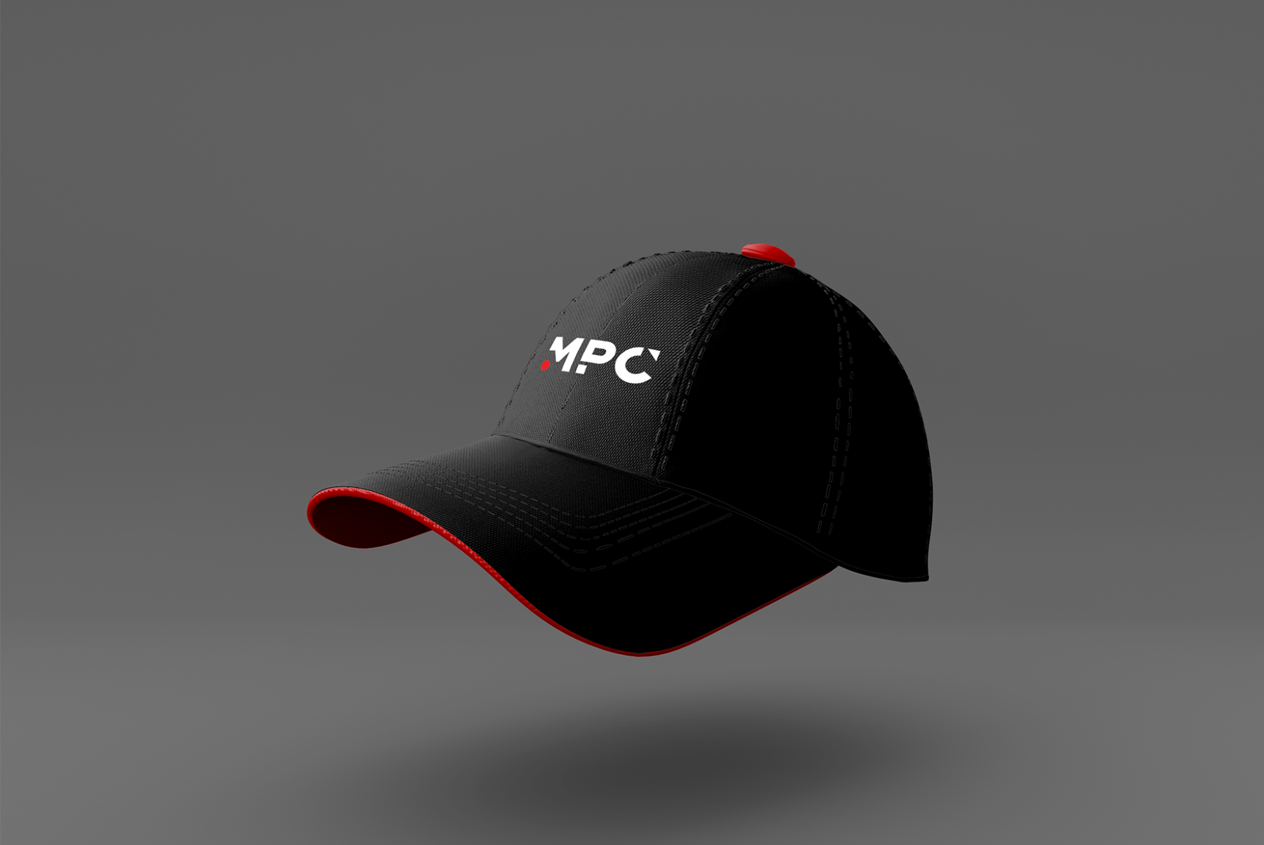
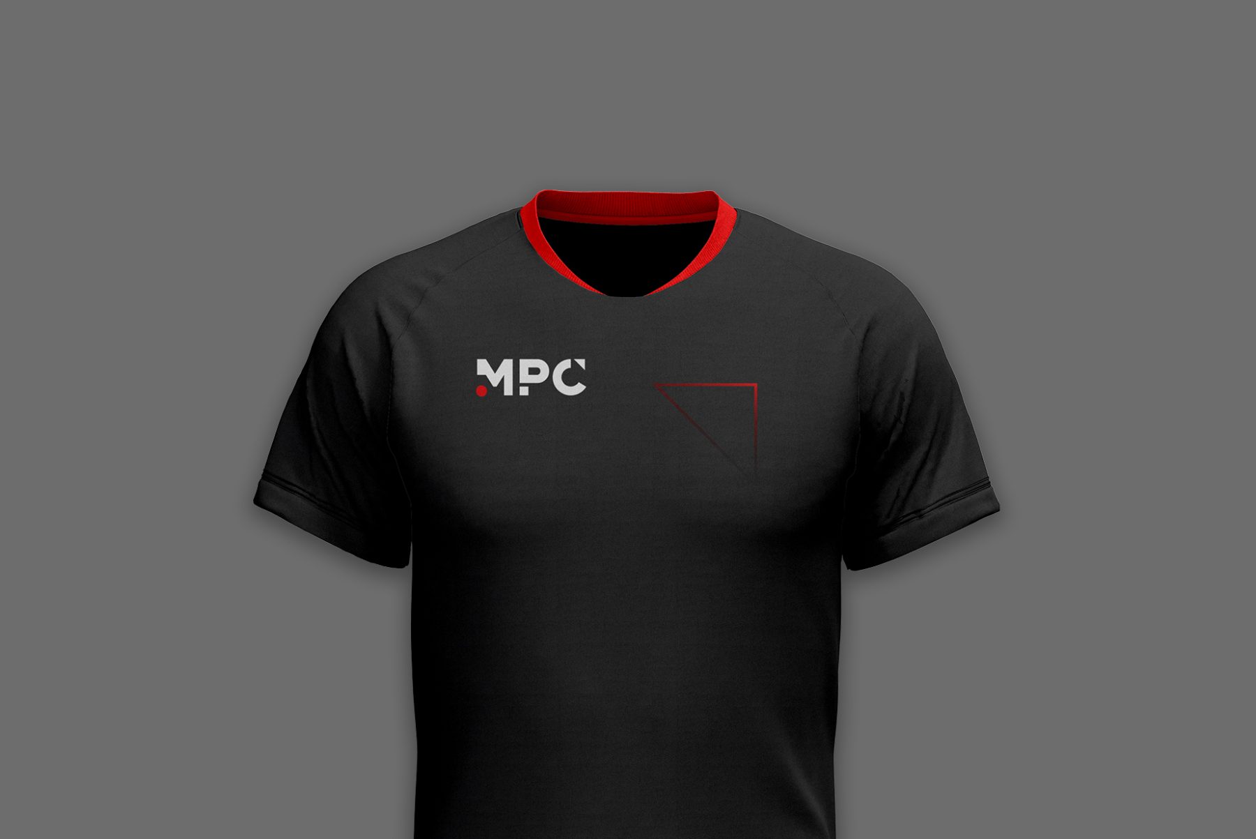
MPC is one of the biggest investment companies in Indonesia. The company recently shifted its strategy toward digital business, and engaged KUDOS to complete a comprehensive rebranding to accompany that shift.
We created our logotype to maintain relevance and solidity in the digital-business realm. The color we chose for the logotype is a nod to the company’s holding company, Lippo Group, ensuring continuity across applications.
KUDOS Design Collaboratory
-
Calvin
Creative Director -
Melvin Junior
Art Director -
Ericaldo Ryadi
UI Designer -
Christian Juniady Setiawan
Software Developer -
Kevin Ryan Setiadi
Graphic Designer
Bronx & Brooklyn Energy Hub
Center for NYC Neighborhoods
Capabilities
Focus Area
Client
New York State and NYSERDA, the force behind the Bronx & Brooklyn Energy Hub, are funding an array of renewable energy technologies—offshore and onshore wind power, solar power, hydro power, battery storage, and clean hydrogen—to meet their goal of 100% emissions-free electricity by 2040.
The Bronx & Brooklyn Energy Hub isn’t just about making renewable energy accessible; it’s about forging meaningful connections—bridging gaps and fostering a sense of camaraderie among neighbors, providing benefits, and empowering people regardless of their income and status. The logo we designed for the Hub reflects this purposeful connectivity, as embodied in three intertwining and extending vibrant lines. These lines represent the accessibility of renewable-energy technologies, as well as unity among community members.
KUDOS Design Collaboratory
-
John Kudos
Creative Director -
Fay Qiu
Lead Designer -
Owen Febiandi
Designer -
Putu Yogiswara
Designer -
Iman Fadillah
Motion Designer -
Amanda Knott
Project Manager


House of Hope Branding
House of Hope
Capabilities
Focus Area
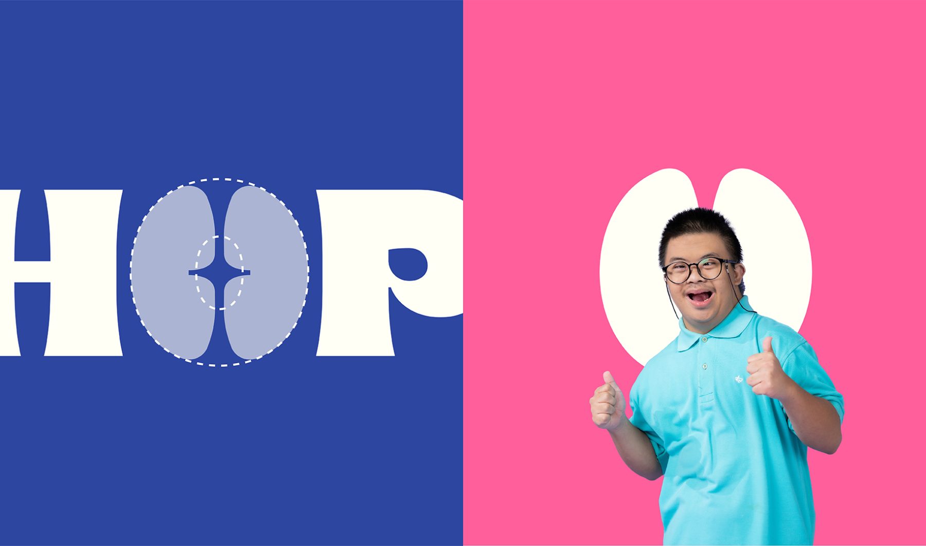
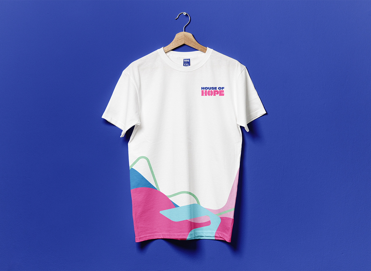
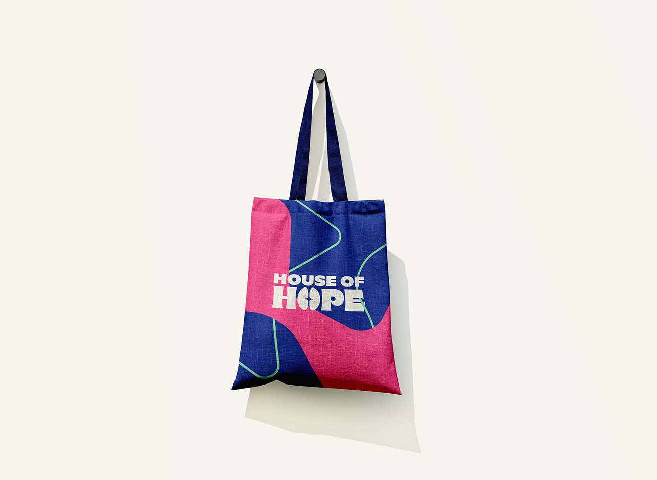
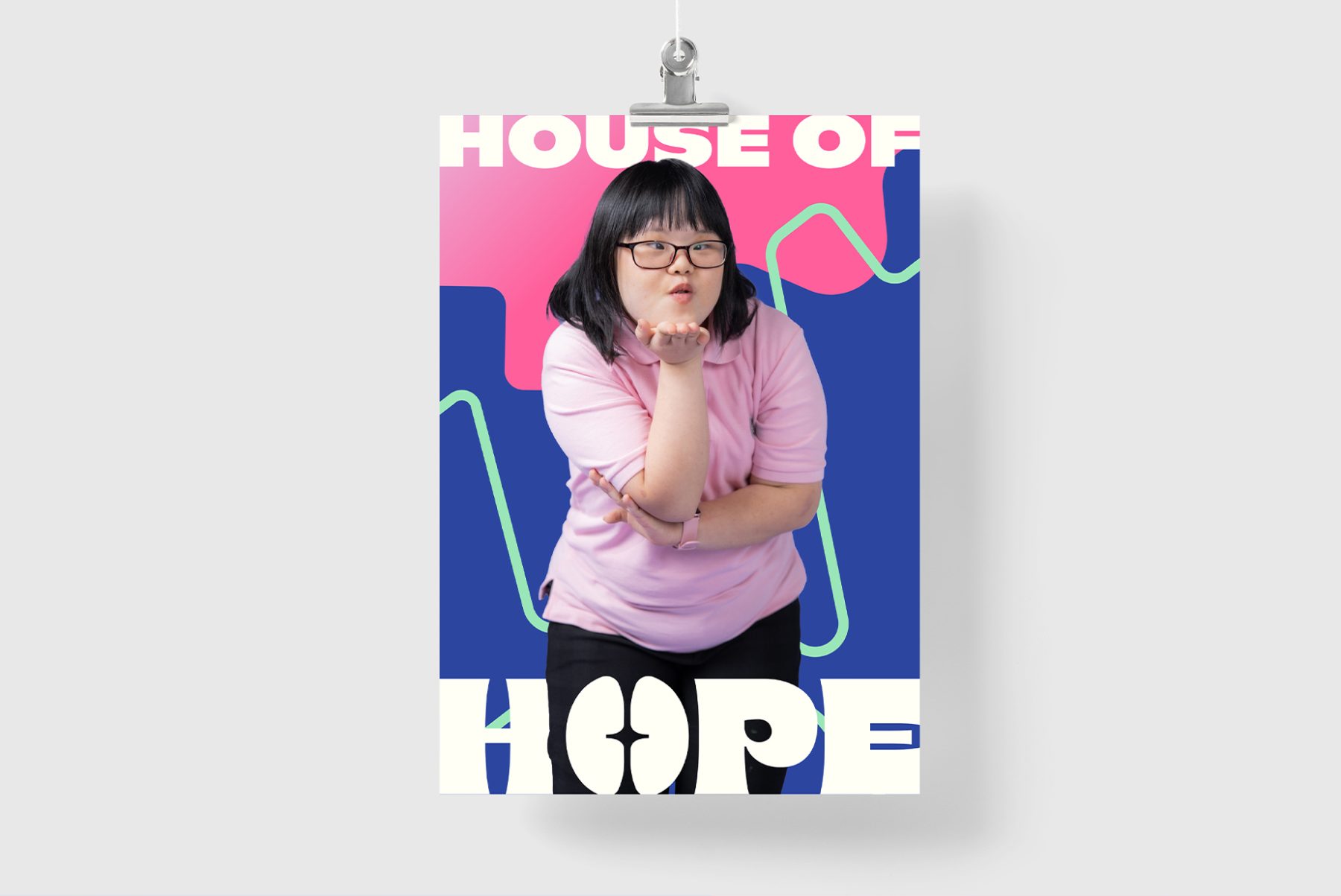
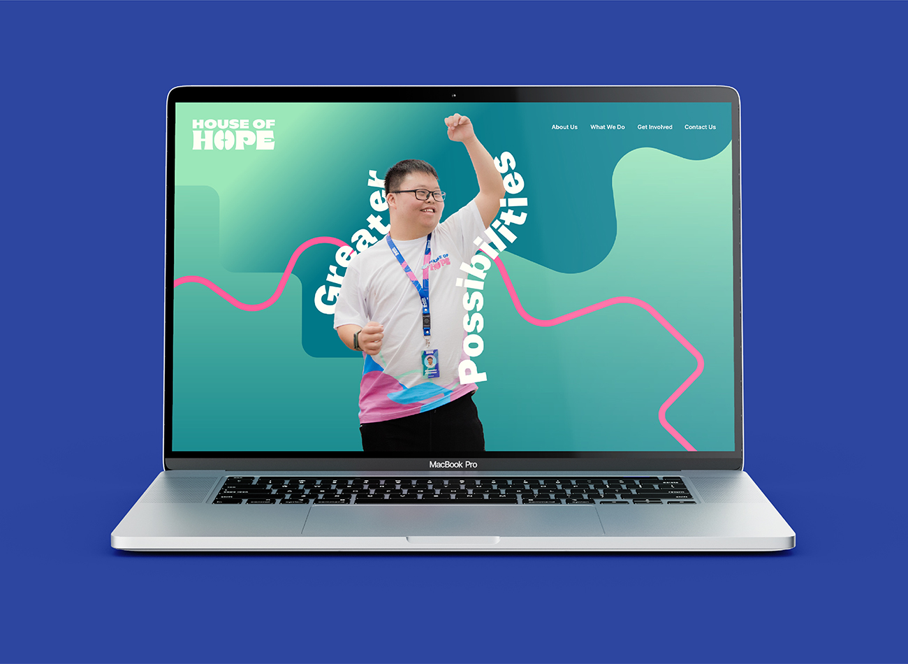
House of Hope exists as a bridge to the world of work for individuals aged 18 and up with special needs. With the support of the Blessindo Harapan Mandiri Foundation, House of Hope empowers these individuals to explore their potential and thrive in the workplace.
KUDOS collaborated closely with the foundation’s internal team to ensure our brand-design solution addressed their primary concern: shifting perceptions from solely seeing the foundation as a fund-raising organization to showing its focus on empowerment, in alignment with their core mission. The rebranding project comprises a notable logomark, a versatile and human-centered graphic patterns, an uncluttered and informative typographic hierarchy, a lively yet welcoming color palette suitable for individuals with special needs, and straightforward but understandable iconography, all consistently reflected throughout the brand’s various applications.
KUDOS Design Collaboratory
-
Andy Kurniawan
Creative Director -
Owen Febiandi
Art Director -
Muhammad Syamil Haqqoni
Designer -
Imam Fadilah
Designer -
Mares Rayeshtyan
Designer -
Darlene Rowena
Designer
Estica
Estica
Capabilities
Focus Area
Client
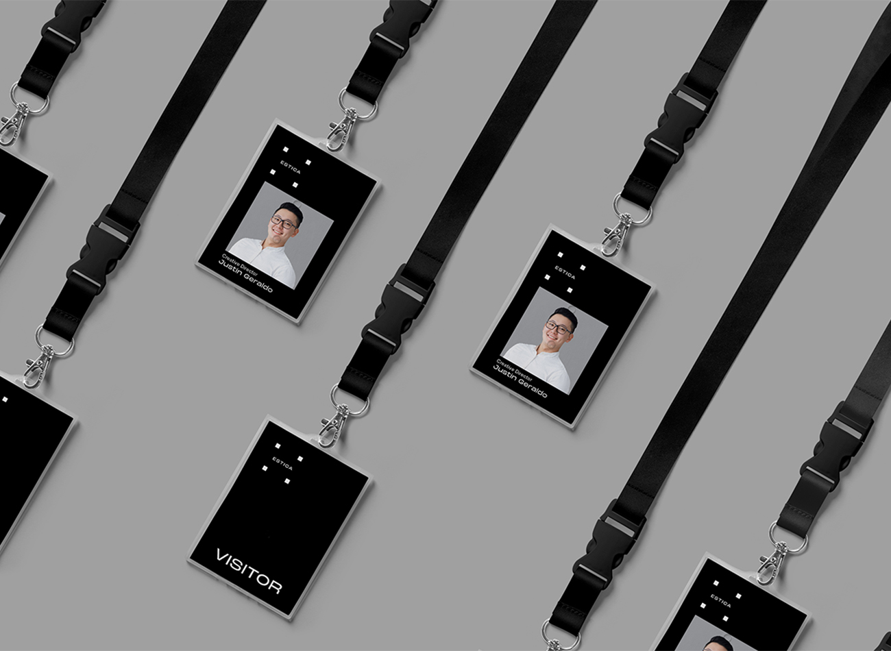
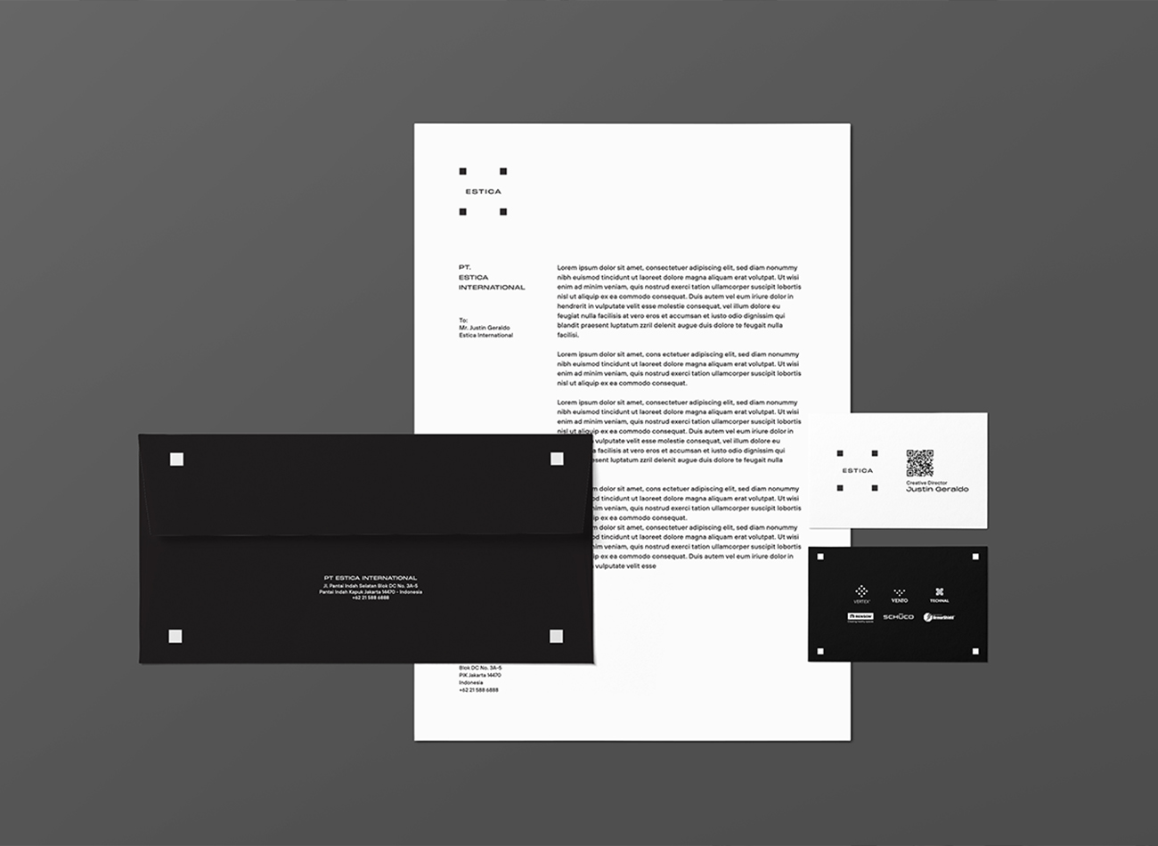
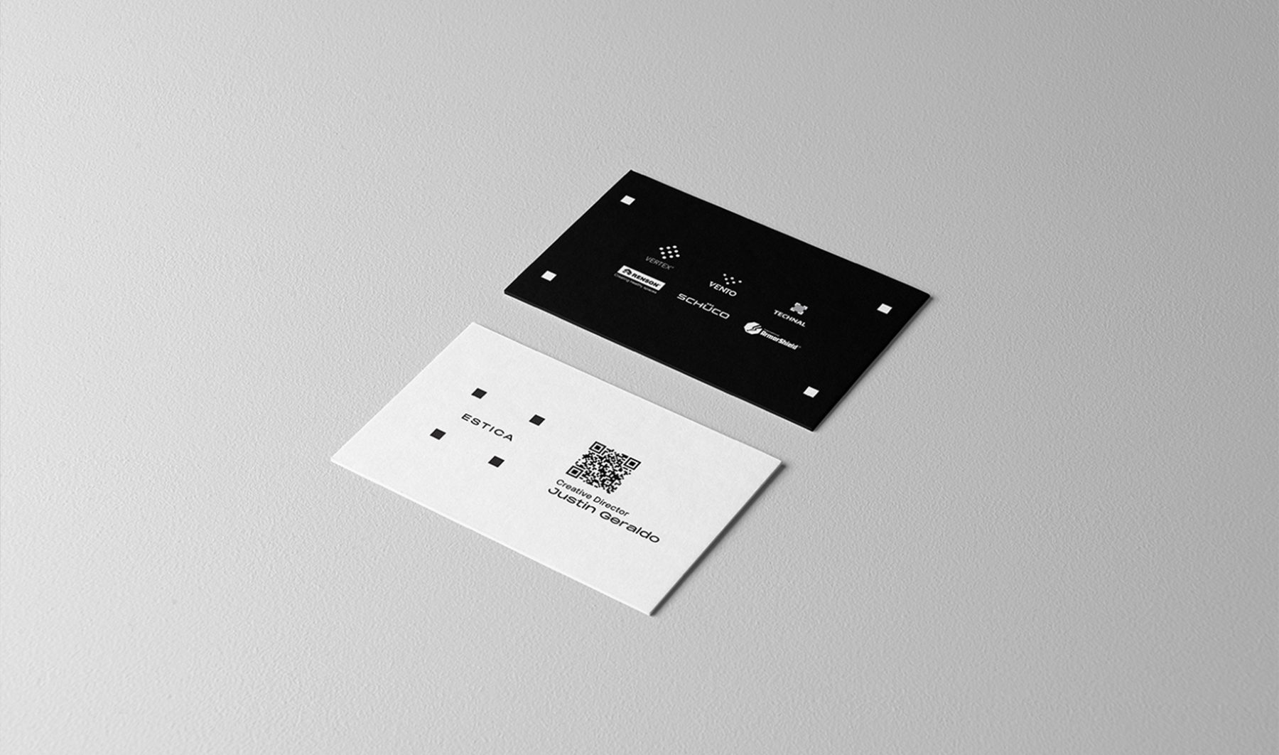
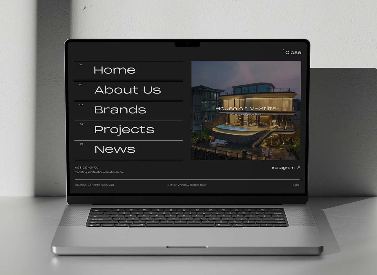
Estica is one of the largest manufacturers of aluminum door and window frames in Indonesia. They specialize in producing movable frames using high-end materials imported from Europe.
KUDOS designed a simple branding system for the company, using four squares to form a flexible open frame. Each square represents a pillar that can be positioned to create new compositions, representing Estica’s unique ethos as an outside-the-box creator.
KUDOS Design Collaboratory
-
Calvin Hao
Creative Director -
Melvin Junior
Art Director -
Ericaldo Ryadi
Designer
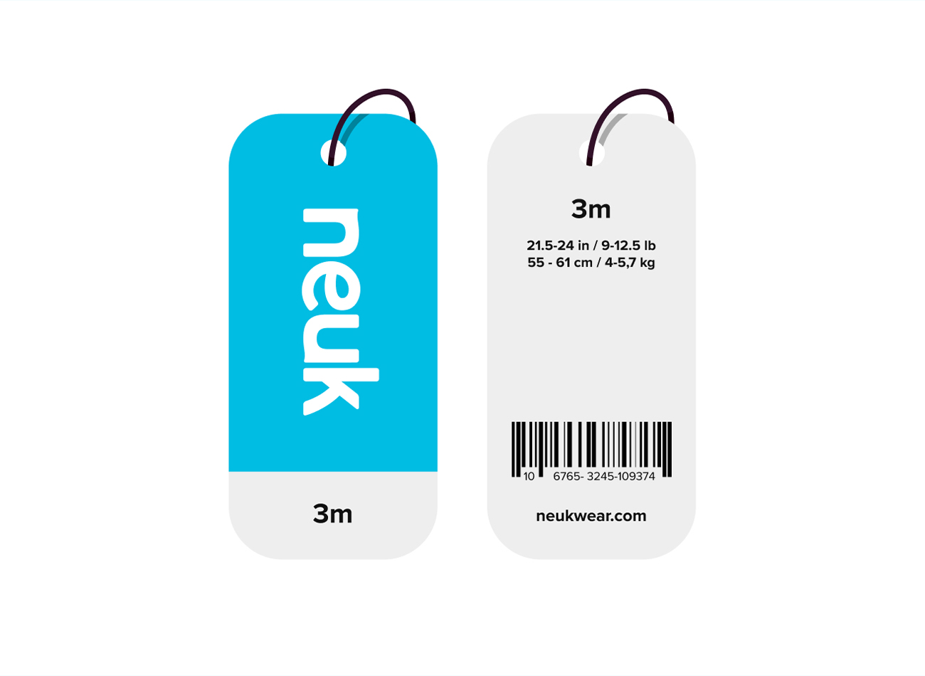
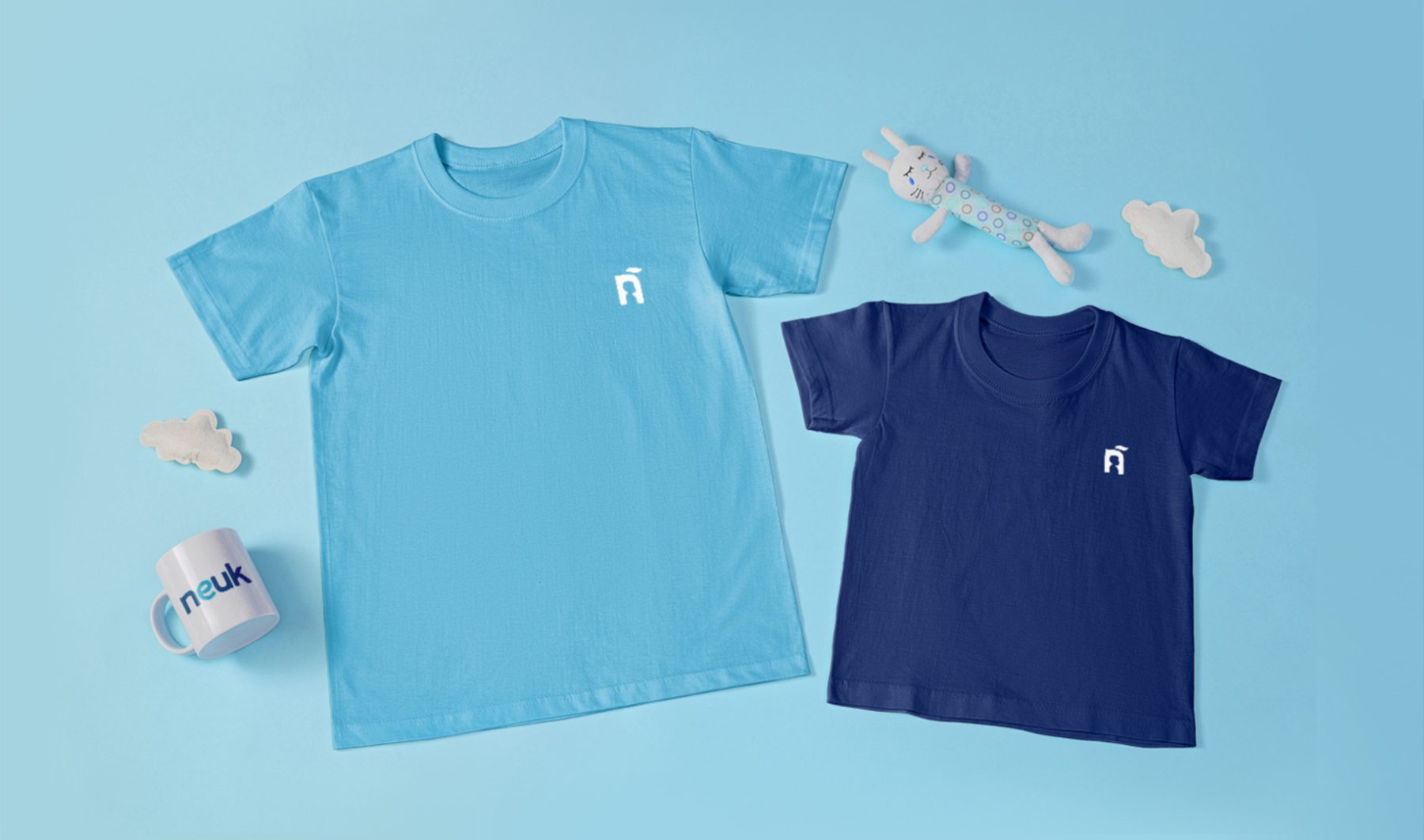
Neuk is an innovative kidswear brand that blends local Indonesian craftsmanship with global fashion sensibilities to promote sustainable production and local garment manufacturing.
Our engagement involved creating a strong visual identity for Neuk to convey its commitment to safety, comfort, and world-class standards in children’s fashion. We also provided strategic branding development to position Neuk alongside other internationally renowned kidswear brands. This revitalization of Neuk’s brand identity has allowed them to confidently market their products at a higher value point, emphasizing their unique strengths in the competitive global market.
KUDOS Design Collaboratory
-
Creative Director
Zaki Fitria -
Brand Strategist
Andini Endah Pratiwi -
Designer
Zaki Fitria -
Project Manager
Robi Dafit
Higrowth is a Belgium-based service agency specializing in propelling businesses to rapid, scalable, and predictable growth through data-driven campaigns focused on maximizing revenue and minimizing marketing waste.
To redefine their brand identity in alignment with their core values, KUDOS developed a new brand name and a cohesive visual identity, website, and social media presence. Our rebranding effort showcased Higrowth’s strengths and established a more professional, data-driven image for the brand, attracting new clients and partners and leading to significant client success metrics—including an average revenue growth of 75%, a 96% success rate, and a 37% increase in high-quality leads.
View higrowth.eu
KUDOS Design Collaboratory
-
Creative Director
Andini Pratiwi -
Brand Strategist
Andini Pratiwi -
Designer
Zaki Fitria, Andini Pratiwi -
Motion Designer
Rias Amalia -
Web Developer
Arif Widipratomo, Faris Han -
Project Manager
Robi Dafit

Parpulo Batak Art Branding
Indonesian Ministry Of Tourism And Creative Economy
Capabilities
Focus Area
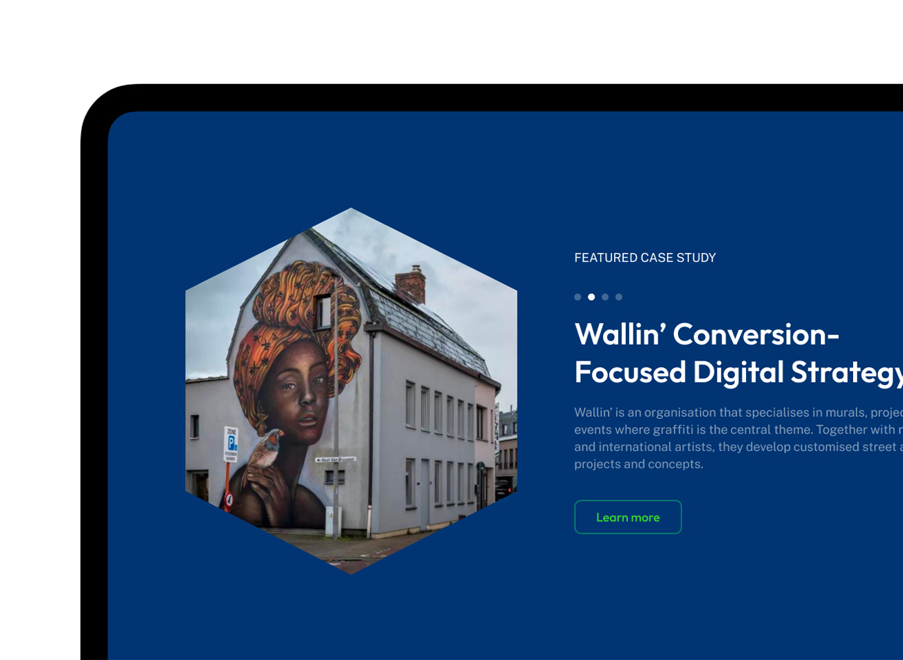
Parpulo is the foremost custodian of Batak art, offering unique wood carvings, textiles, and cultural experiences from the picturesque region of Toba, Indonesia. Since 1983, Parpulo has been instrumental in promoting Batak culture, supported by the nation’s Ministry of Tourism and Creative Economy.
In response to the pandemic, we revamped Parpulo’s brand, creating a fresh visual identity, innovative packaging, and captivating photography to enhance their global presence in a post-Covid global market. Our rebranding efforts successfully positioned Parpulo on the international stage, ensuring that the brand’s rich cultural heritage and artistic value are now shared with a wider audience.
KUDOS Design Collaboratory
-
Creative Director
Zaki Fitria -
Designer
Zaki Fitria -
Researcher
Angela Muliana -
Motion Designer
Rias Amalia -
Project Manager
Robi Dafit
Brand Strategist
- Andini Endah Pratiwi


Rendr Branding & Website
Rendr Care
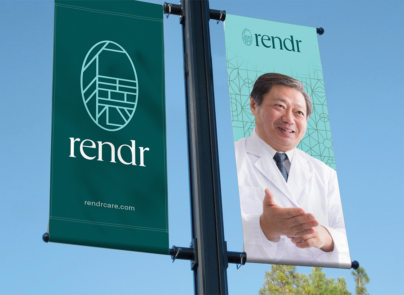
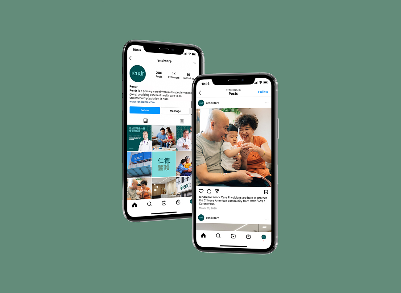
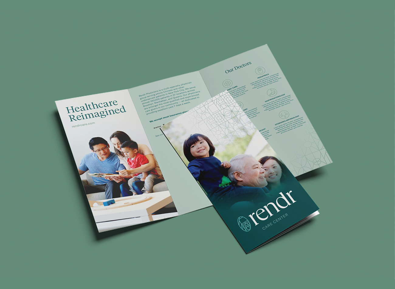
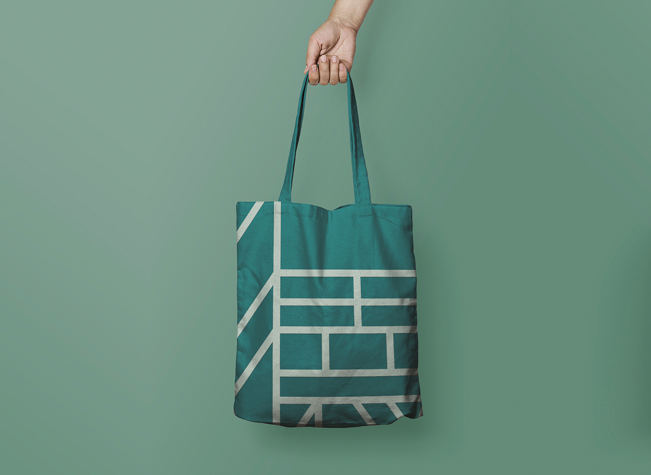
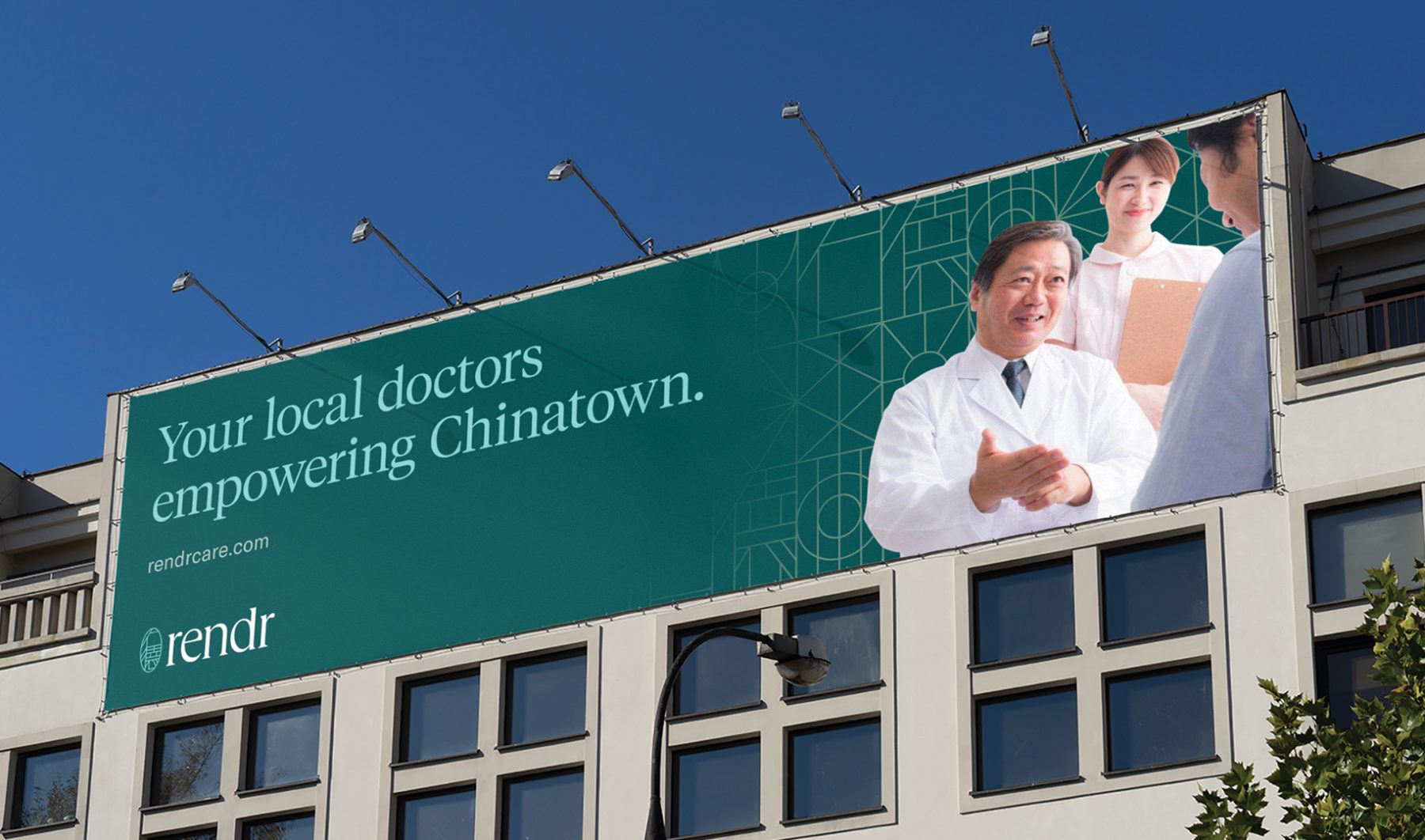
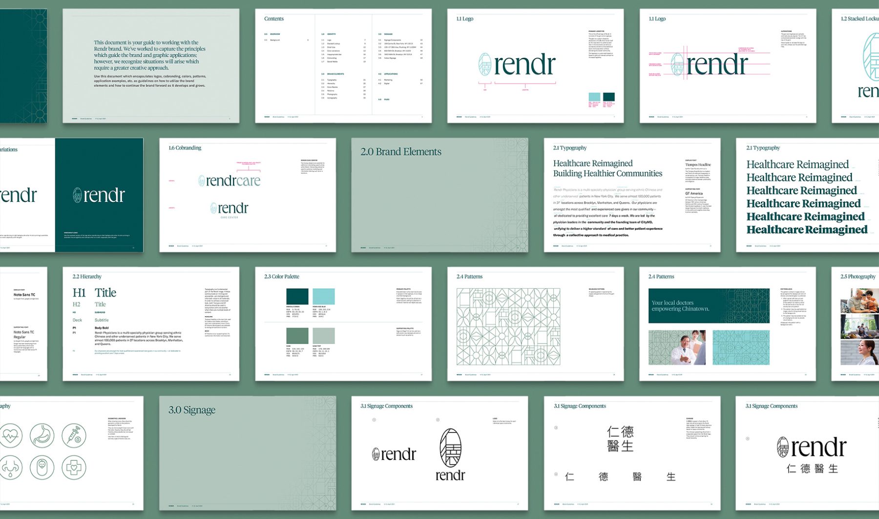
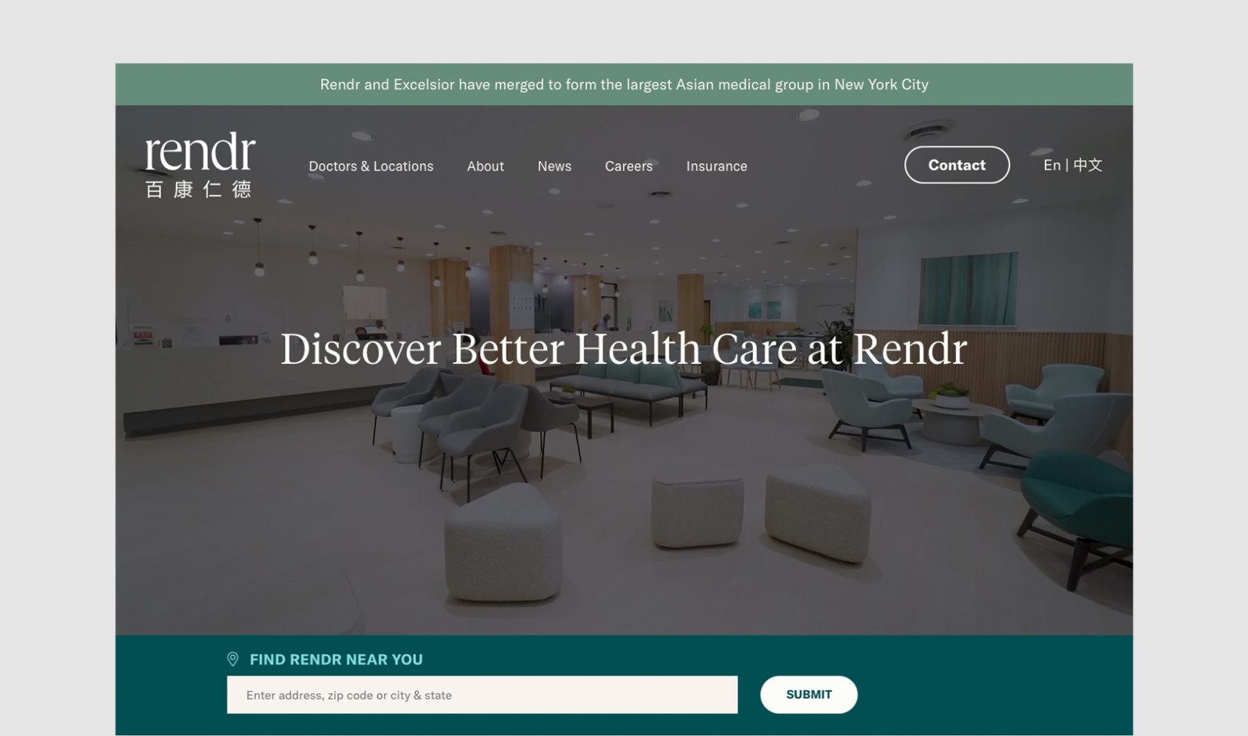
This branding project for Rendr Care encapsulated the brand’s harmonious blend of cultural resonance and healthcare excellence. Founded by esteemed community physicians in New York City, Rendr Care boasts a cadre of highly trained healthcare providers who are dedicated to serving their communities with empathy and expertise.
Tailored to engage the Chinese American demographic, the logomark seamlessly integrates Chinese characters into a gem-like emblem, ensuring inclusivity without sacrificing aesthetic appeal. The brand’s visual identity, characterized by a green palette and a blend of humanist English and sans-serif Chinese typefaces, reflects Rendr Care’s commitment to holistic health and cultural sensitivity, and creates a cohesive and inviting brand experience for all.
KUDOS Design Collaboratory
-
John Kudos
Creative Director -
Fay Qiu
Designer -
Ashley Wu
Designer -
Amanda Knott
Project Manager
Gimongo
-
Greg Wong
Chief Strategist
SPIDERHORSE Visual Identity System & Swag
SPIDERHORSE
Focus Area
Client
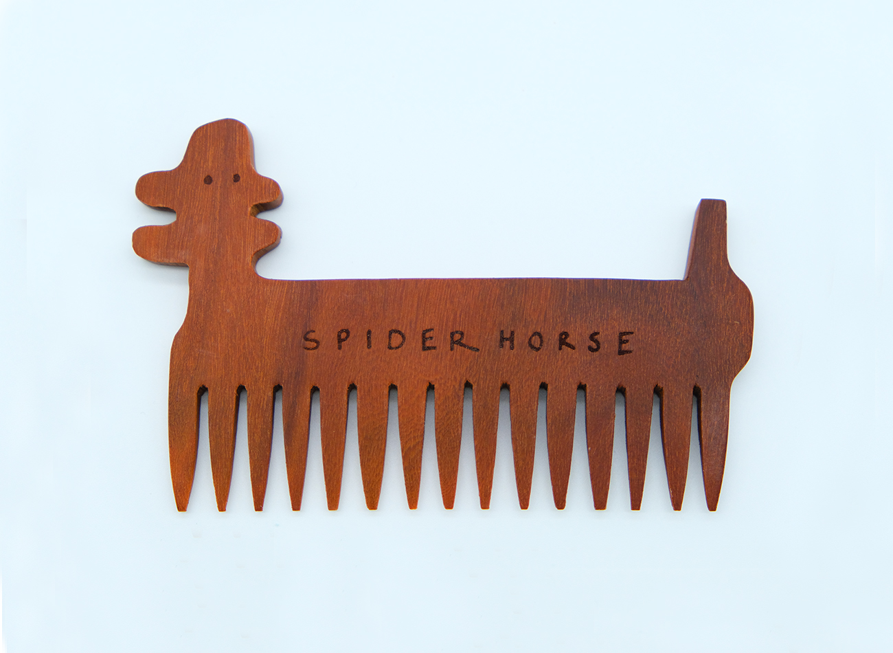
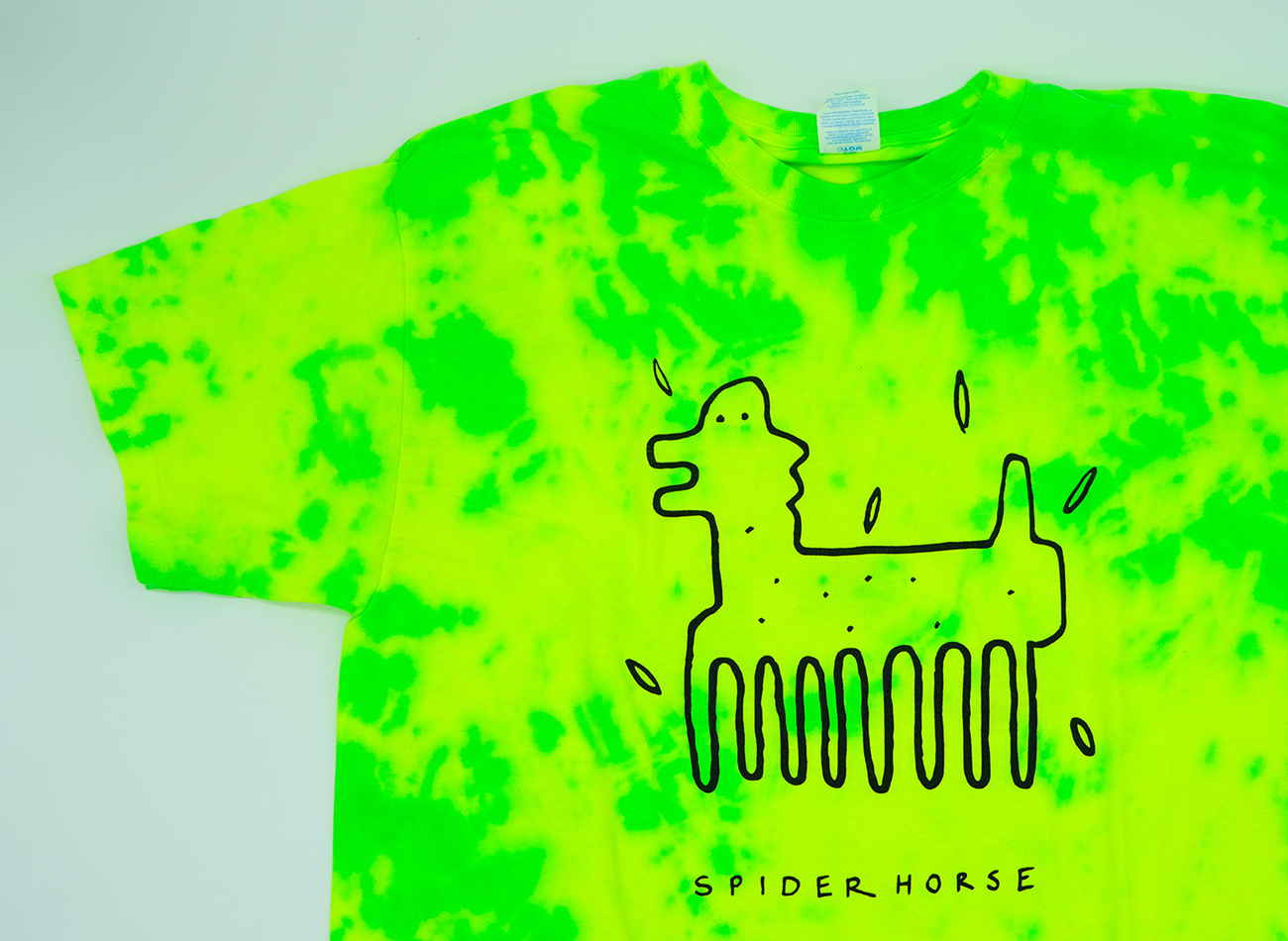
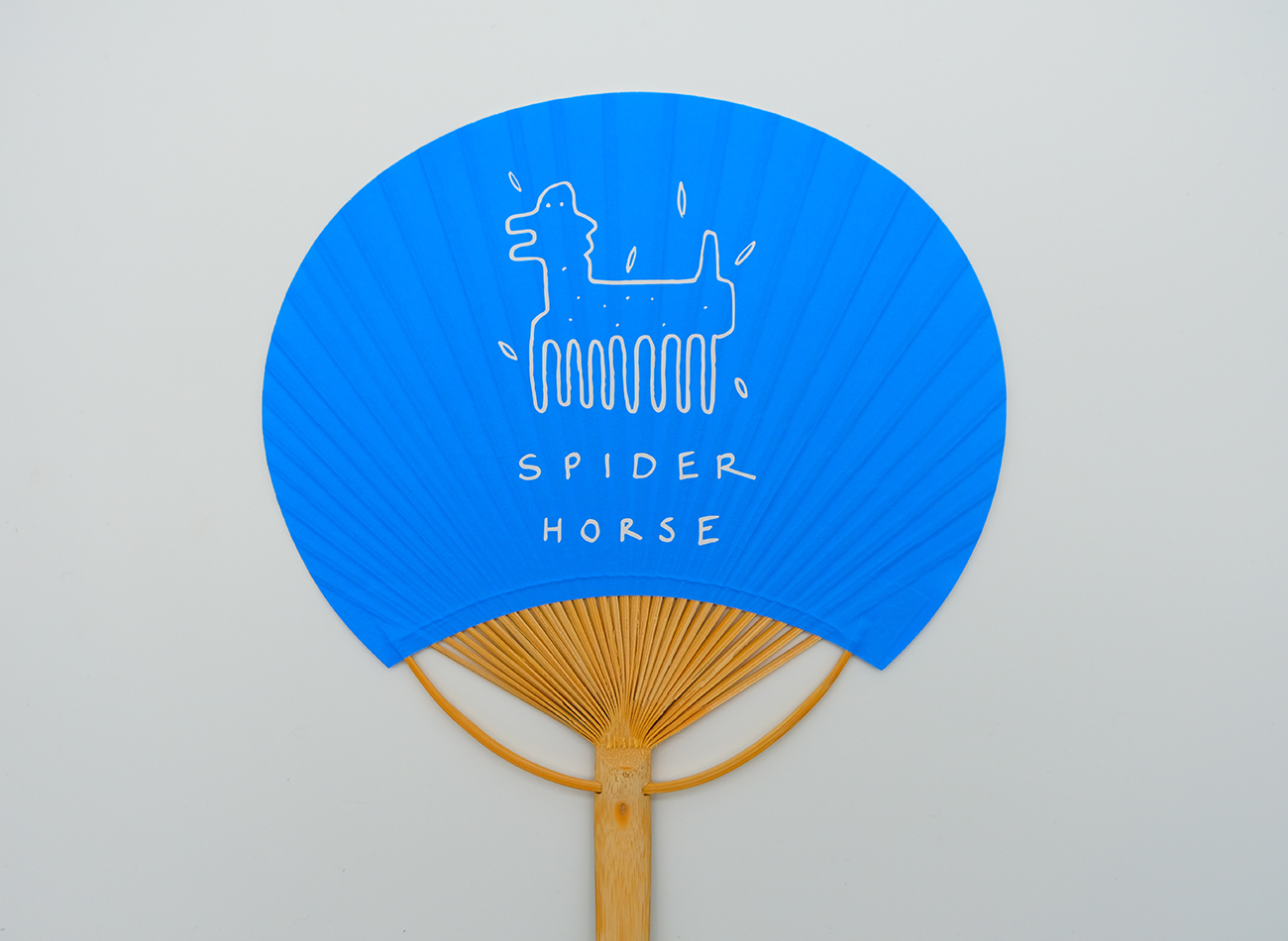
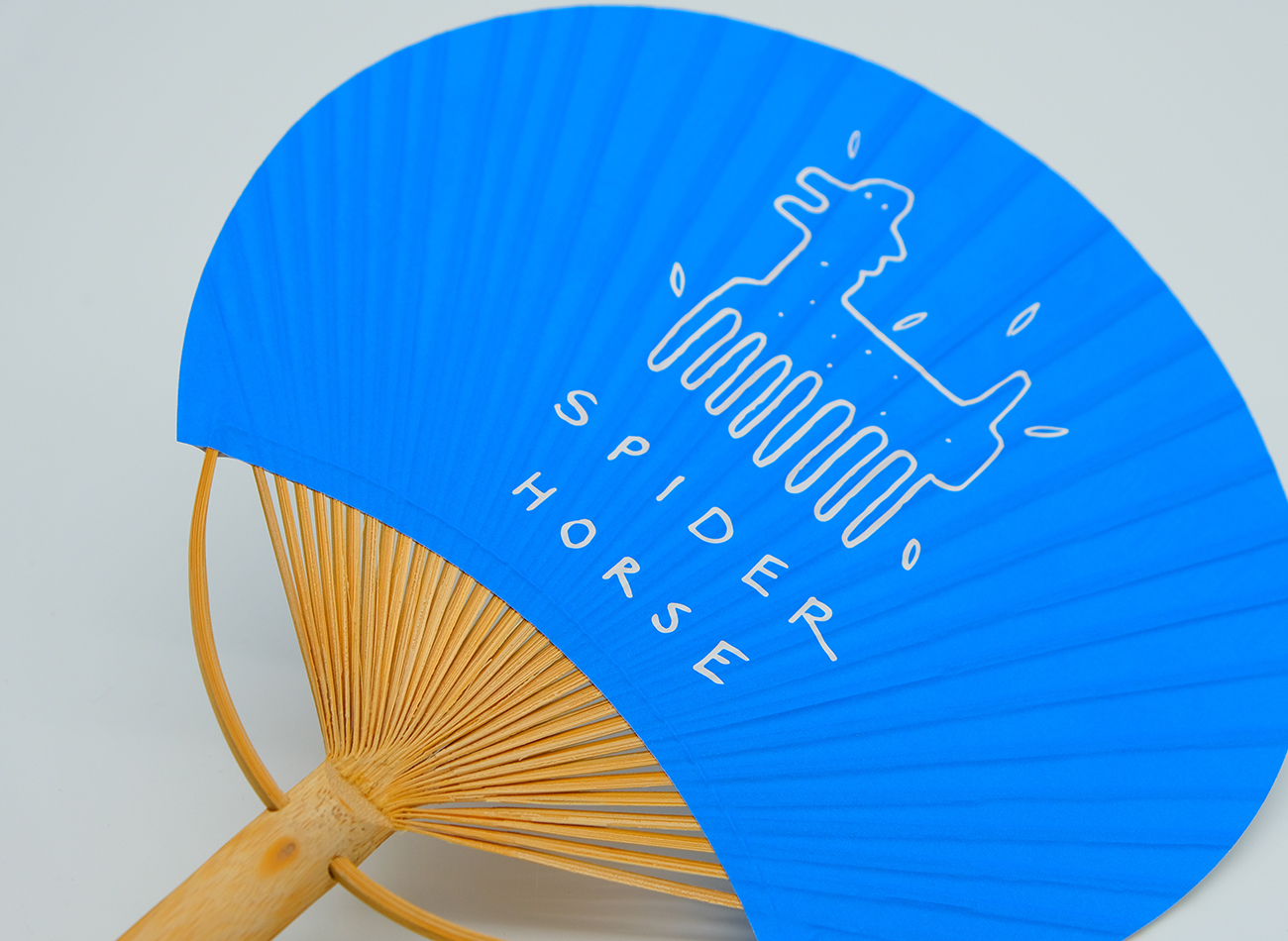
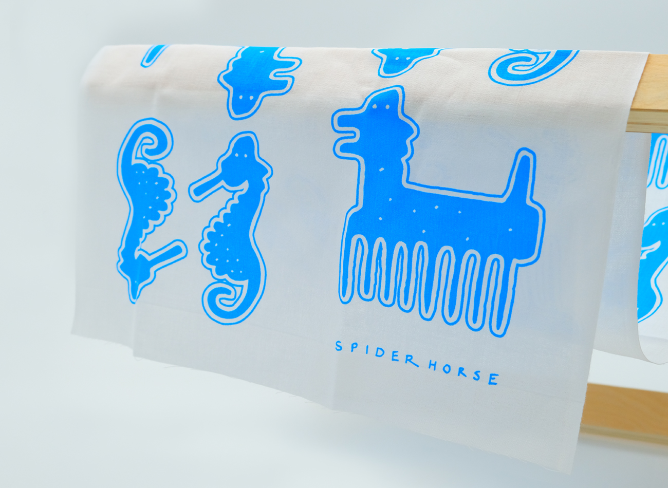
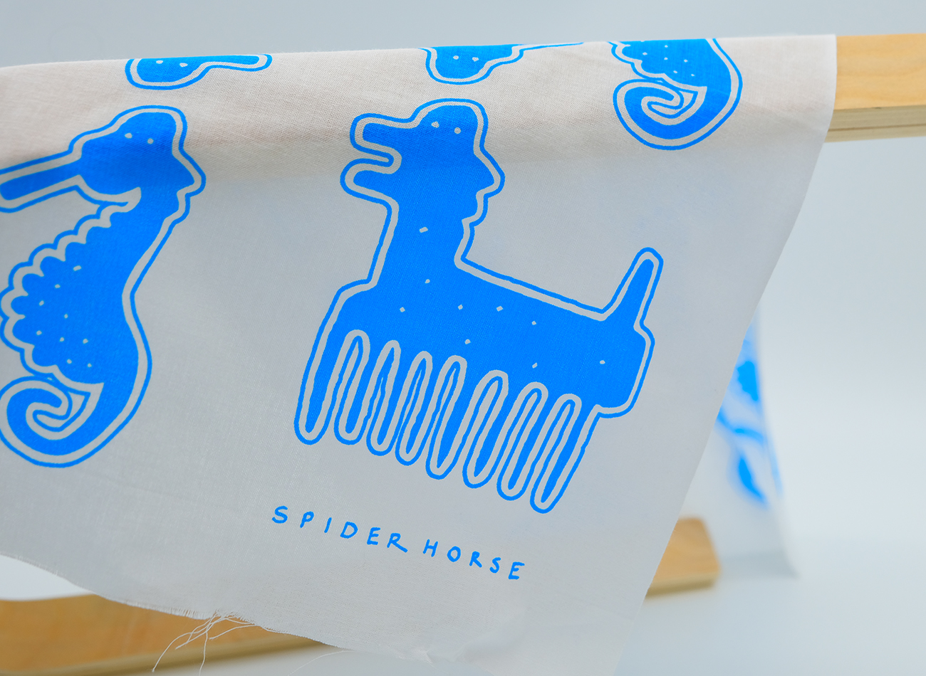
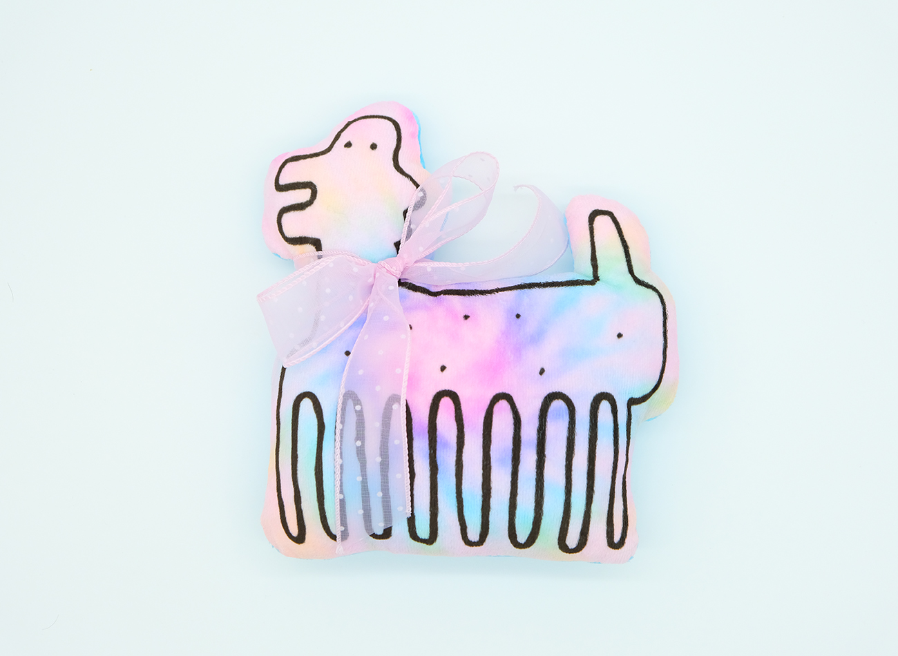
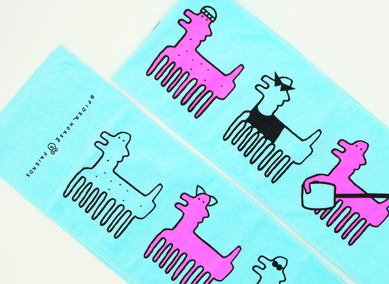
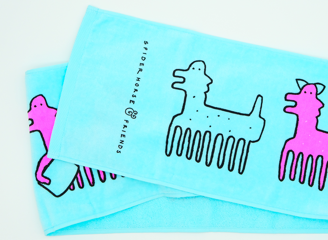
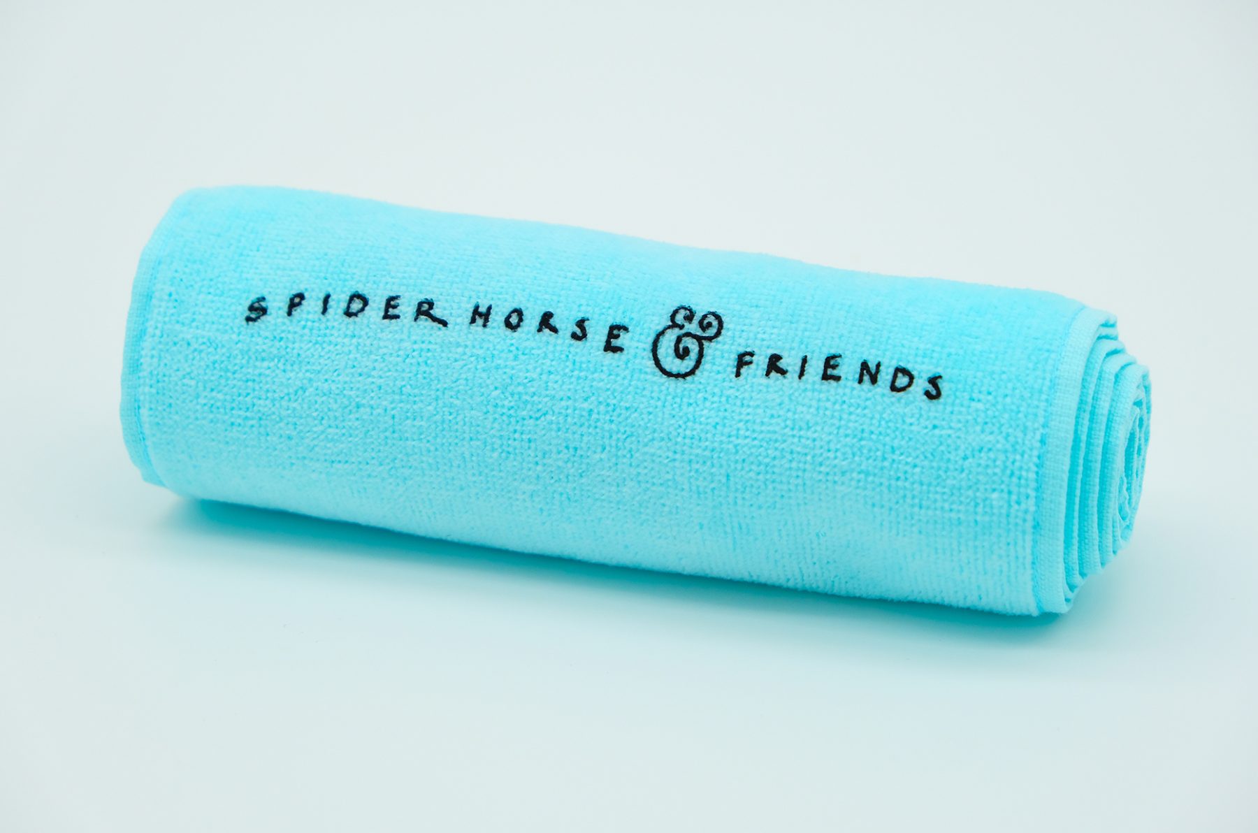
Based out of New York City, SPIDERHORSE is an award-winning beatbox duo composed of Chris Celiz and Gene Shinozaki. The two have been creating music together for seven years and expanding the capabilities of the human voice in an innovative and exciting way. The group’s symbolic mascot—a character called Mr. SPIDERHORSE—and logotype were hand-drawn by ReepsOne, their artistic idol (who is also a beatboxer).
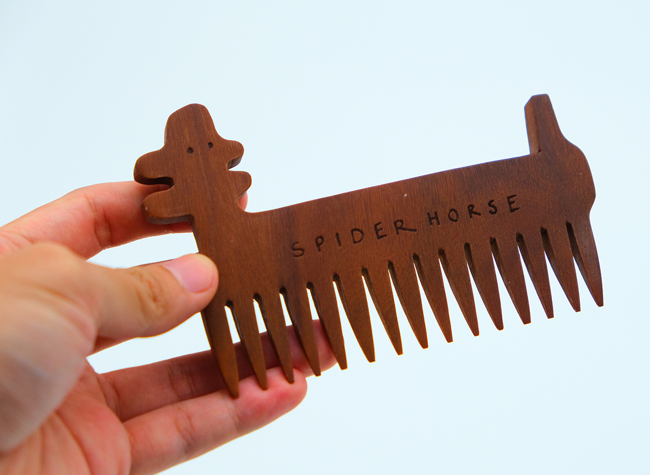
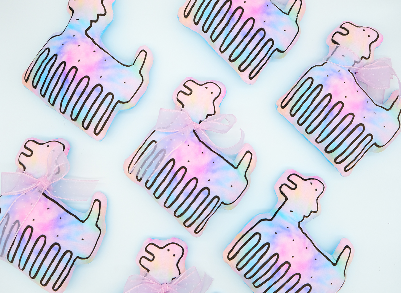
To develop SPIDERHORSE’s new identity, we digitized that original artwork and developed a complete visual branding system and supporting assets around it that work in various formats, including an animated version. We also designed and developed their new website. We used SPIDERHORSE as a versatile character to narratively accompany the group’s music; animated, he acts as the show’s MC, guiding the event and expressing the music’s mood. (He can even multiply his legs to double as a hair comb!)
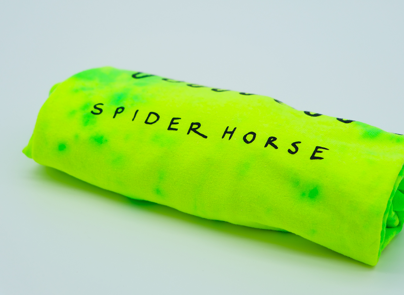
We also enjoyed pushing the boundaries of SPIDERHORSE merchandise with unique materials and techniques, including hand-dyed T-shirts, wooden combs sourced from a local woodshop in Indonesia, bamboo-handled fans, and plush toys incorporating a plethora of pastel colors to reflect the group’s vibrant artistry.
View spider.horse
KUDOS mgmt
-
Kiki Katahira
Creative Director, Designer
SPIDERHORSE
-
Chris Celiz and Gene Shinozaki
Conceptualizers
ReepsOne
- Logo Designer
Circular Branding & Website
Circular
Capabilities
Focus Area
Client
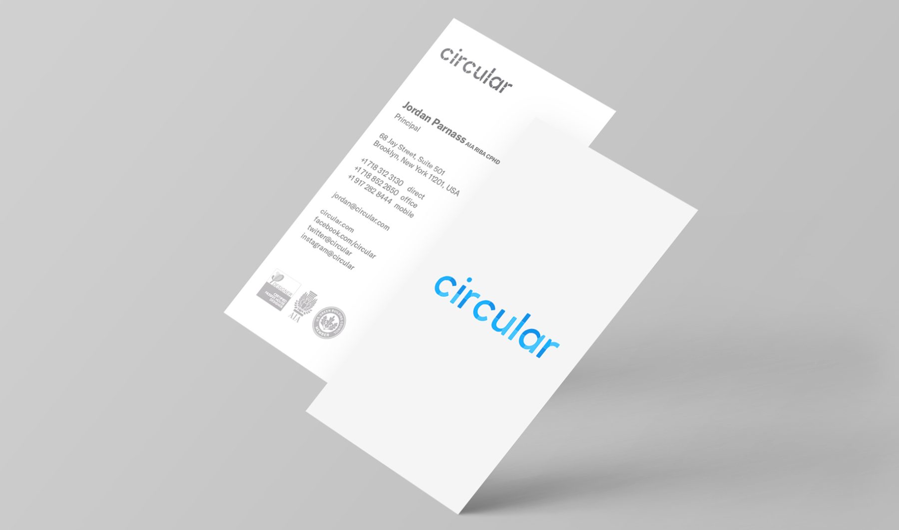
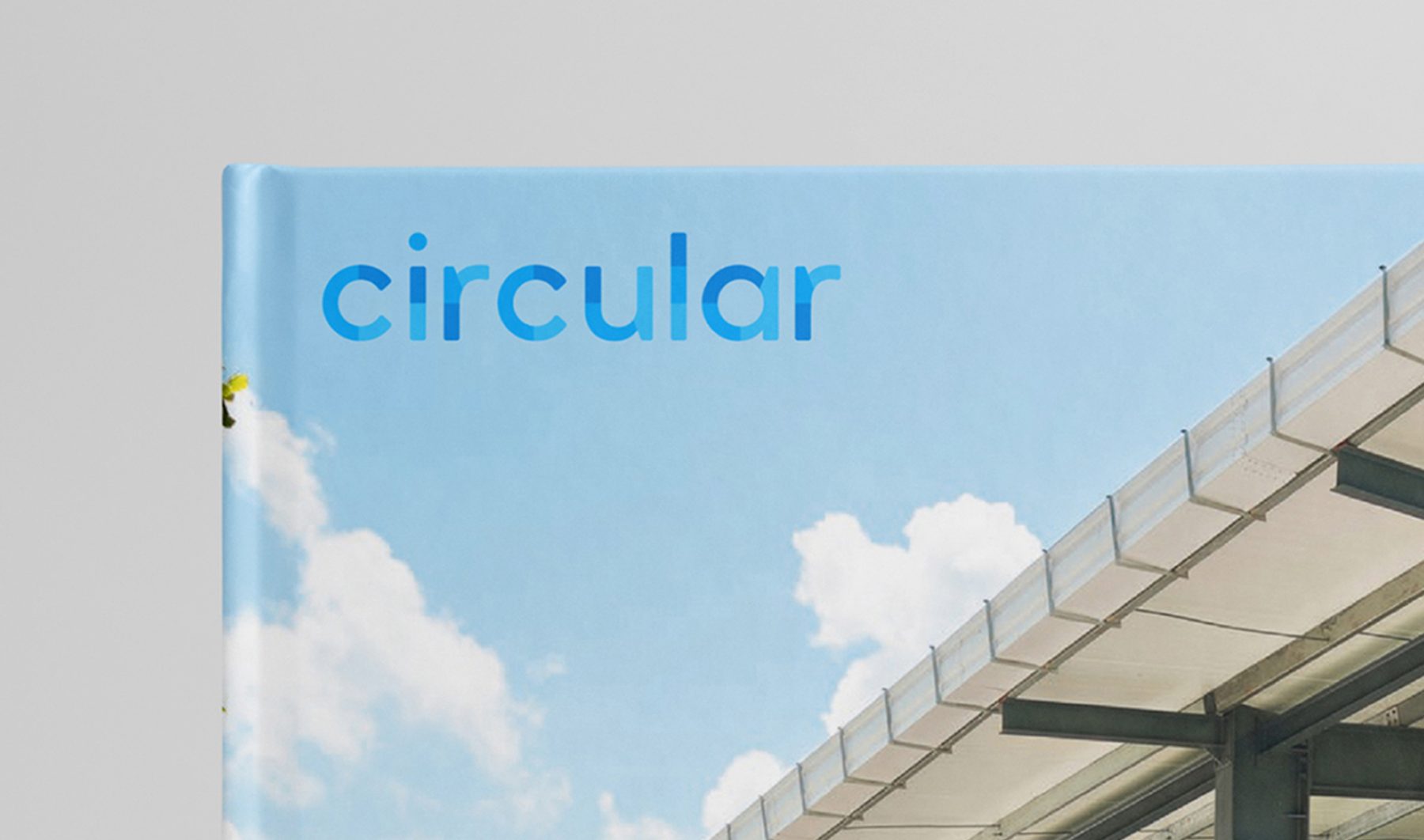
Circular is an award-winning multidisciplinary practice combining sustainable architecture, interiors, digital media, branding, and experience design. KUDOS was tasked with developing a complete and cohesive branding system across all platforms for the company, encompassing logo, color palette, stationery set, publication materials, and website.
At the heart of our visual branding system are three shades of blue. Primarily featured in the logo, these colors were used to create a distinctive aesthetic and dynamic vibe that carries through the brand’s digital and print applications. The website’s overall design relies on large, compelling images optimized for fast-loading and optimal viewing across all platforms, ensuring a seamless and immersive user experience.
View circular.cx
KUDOS Design Collaboratory
-
John Kudos
Creative Director -
Amanda Knott
Project Manager -
Owen Febiandi
Designer -
Putu Yogiswara
Designer -
Muhammad Syamil Haqqoni
Designer -
Imam Fadilah
Animator
Digital Equity Accelerator Brand & Illustration Playbook
Aspen Digital
Capabilities
Focus Area
Client
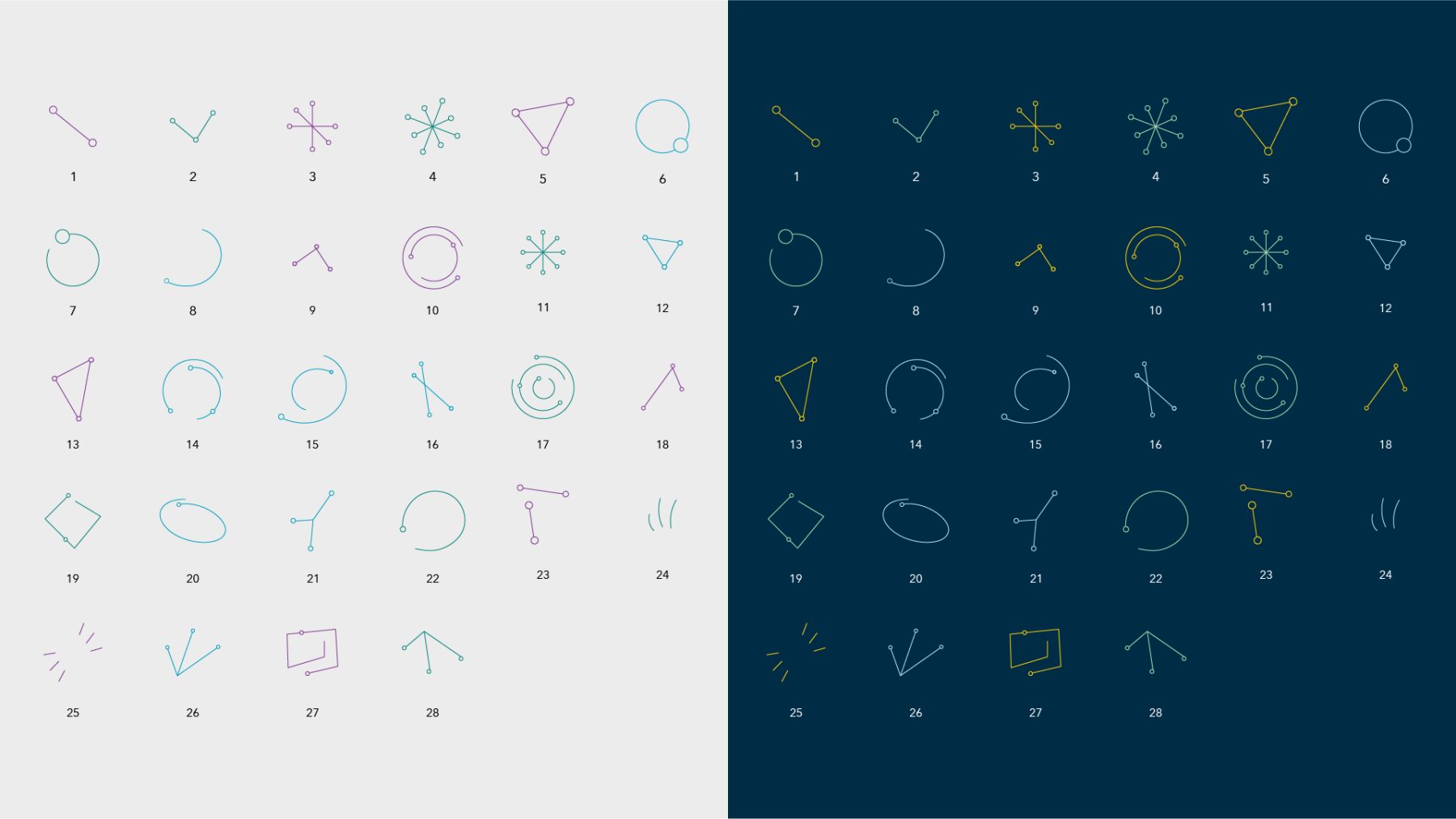
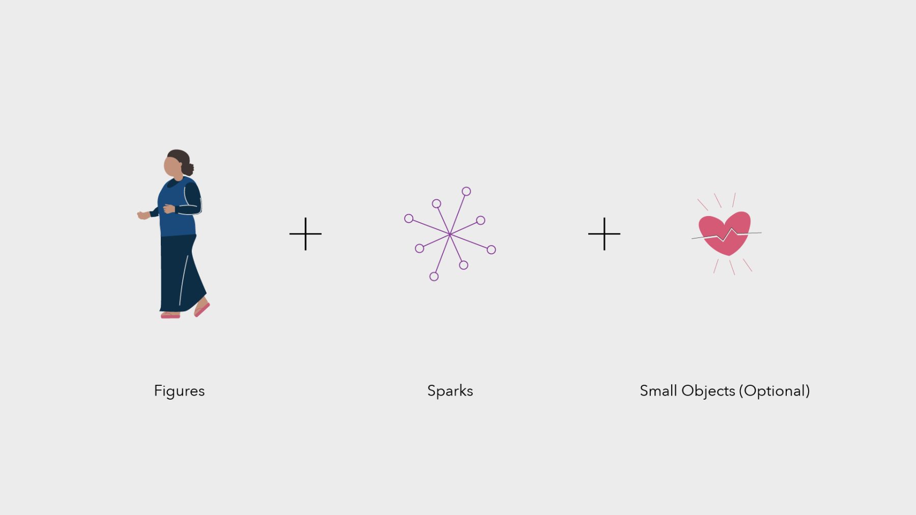
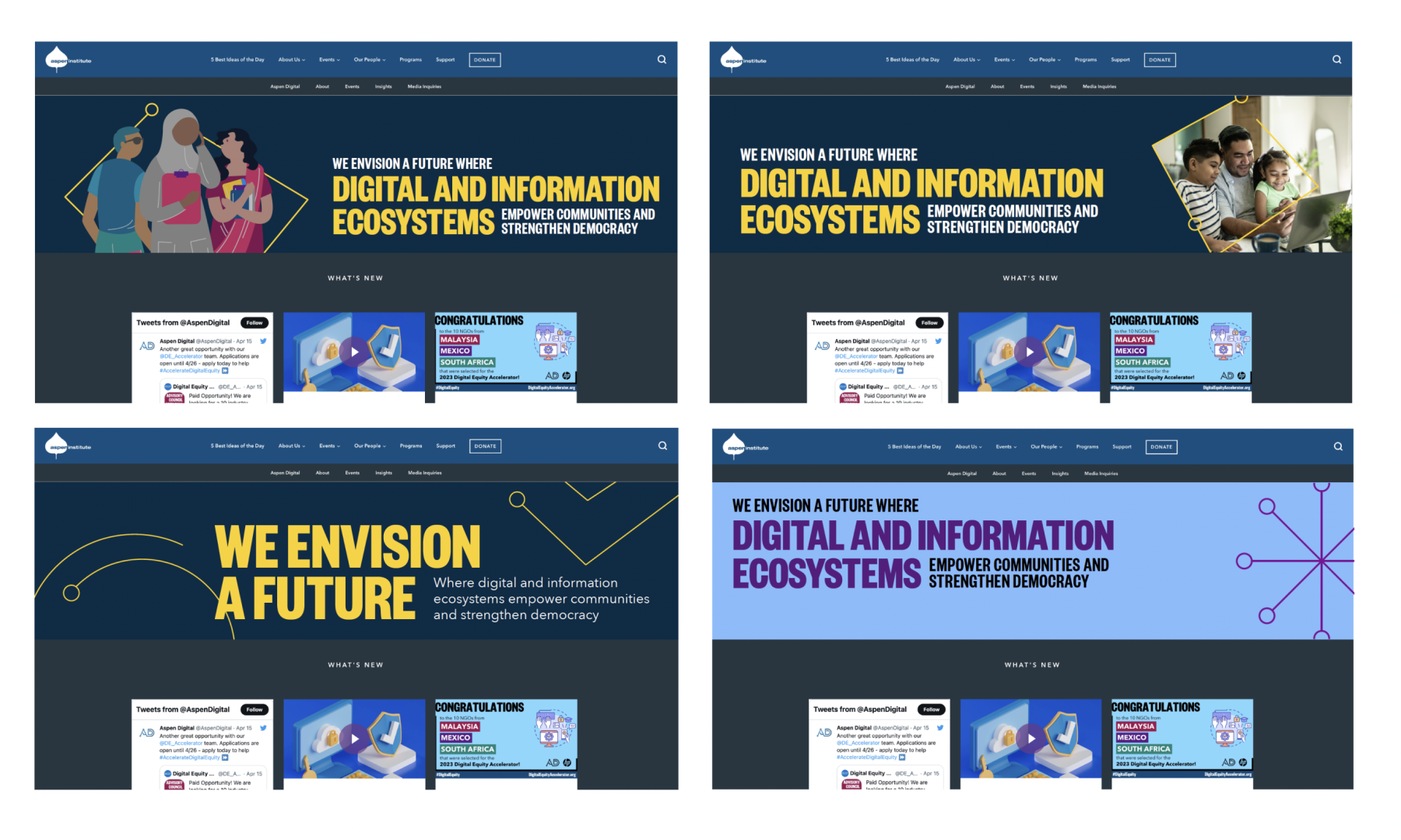
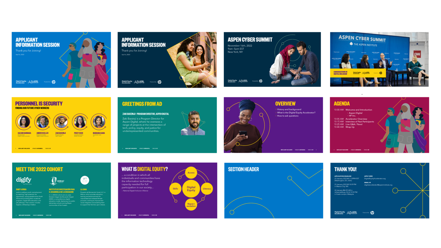
By empowering local NGOs and non-governmental organizations to accelerate digital inclusion in their communities, Aspen Digital Equity advances social and economic equality, bridging the digital divide and creating opportunities for all.
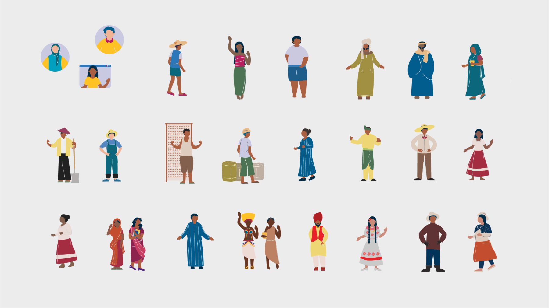
This branding project for Aspen Digital Equity reflects their commitment to fostering social innovation and digital inclusion worldwide. Collaborating with Aspen Institute’s Aspen Digital, we crafted a vibrant and inclusive visual identity, characterized by a fun, vivid palette. Custom digital templates and an illustration playbook were also developed, enabling seamless customization and reinforcing the organization’s commitment to inclusivity.
KUDOS Design Collaboratory
-
John Kudos
Creative Director -
Andini Pratiwi
Art Director -
Fay Qiu
Designer -
Jessica Mackta
Project Manager -
Syamil Haqqoni, Imam Fadhillah, Nicole Olivia Mulya, Salma Azhar, Asha Adelia Rahayu
Illustrator -
Robi Dafit
Project Manager

Openlab Branding & Website
Wesleyan University
Capabilities
Focus Area
Client
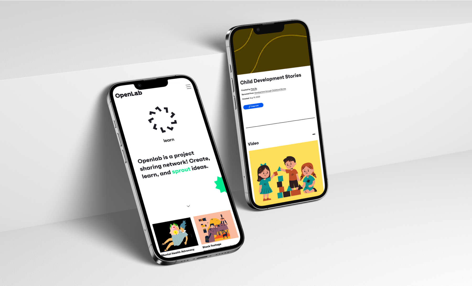
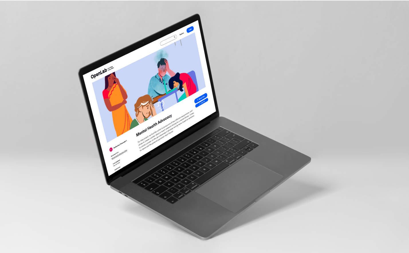
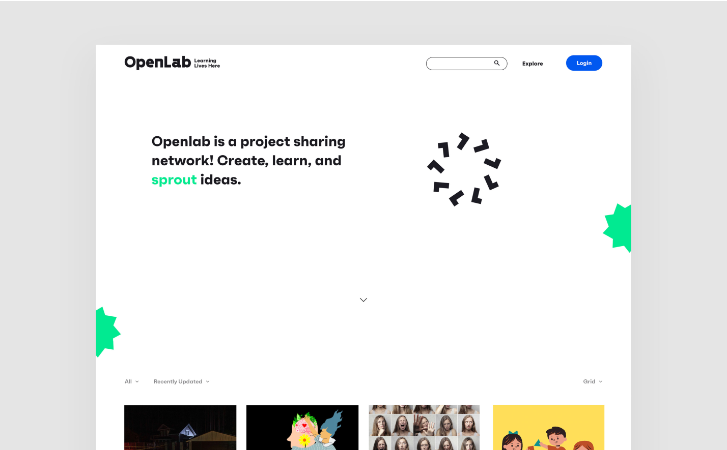
OpenLab is an online community platform created by Wesleyan University professor Lisa Dierker to provide project-based learning and collaboration opportunities.The project is funded through a National Science Foundation grant and supports the sharing of projects, both among students within partner classrooms and across partner schools.
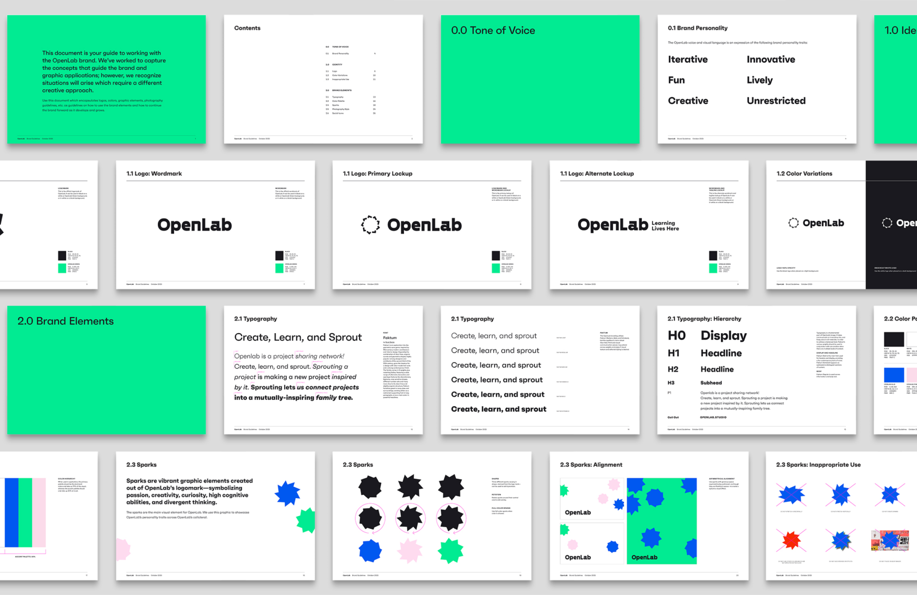
KUDOS was engaged to create branding for the program, including web design and content planning. Centering our approach around the Spark—an original graphic element we created to symbolize the brand’s passion, creativity, curiosity, and divergent thinking—we developed a comprehensive visual branding system and style guidelines, complete with naming, a tagline, and a dynamic logo mark. The resulting platform was engaging, cohesive, and elegant, inviting engagement through elegant, fun design.
View openlab.studio
KUDOS Design Collaboratory
-
John Kudos
Creative Director -
Amanda Knott
Project Manager -
Jamus Marquette
Lead Designer -
Christian Juniady Setiawan
Developer
